Transcripts
1. Intro to Procreate: Making the move from hand drawing to digital
drawing can be scary. But I'm here to make it
a little bit less scary. My name is Shana Sal
and I'm an Illustrator. And today, I'm going to show you how you can make
the transition from drawing by hand to drawing on
your iPad using Procreate. And the good news is to do that, you don't have to lose your
own unique hand drawn style. We'll go through the
basics of the program, some tools and tricks, and I'll also cover the
benefits of working digitally, like changing colors,
trying out new ideas, and fixing errors and mistakes. I'd recommend taking
this class for anyone who's completely
new to digital drawing. Maybe you hardly even
understand what that means. You just know that you
want to start drawing on your iPad and moving from
paper to the digital world. This is a great starting point. I also want to point
out that this class isn't necessarily
a drawing lesson. It's more about
translating how you draw and your style from
paper to the iPad. I'm going to move through
things pretty quickly in this class so that you can
go ahead and get started. I'm not going to waste your
time with a ton of fluff. So if you are looking for
something more comprehensive, I do have another class on
Procreate here in Skillshare. You can also look out for
classes from other teachers. But anything that you
need from the class will also be found in
the class resources. So if that sounds good to you, grab your iPad and
let's get started.
2. Class Needs: Okay, so first things first, I'm going to start off with
what you need for this class. And I've broken it down into the must haves and
the nice two haves. So your must have is obviously
going to be an iPad. I don't remember
what model I have. I'm not a huge tech person. You can get them refurbished if you want to get
a cheaper deal. I get a lot of my things
refurbished from Apple, so it's a little bit cheaper. And then that way I
can get an iPad with more storage rather
than the latest model. So it's kind of a next thing you'll need is an Apple pencil, and you have to get
an Apple pencil that will work with the
model of iPad that you have. So there are some
older iPads that don't work with the
next generation pencil. And I have included these
details in the class resources. So refer to that if you
have any questions. So just make sure that if you're going to purchase
a pencil that you double check that
it's compatible with the version of
iPad that you have. And then, obviously, you
will need the app Procreate. It's a one time fee, so it's not a subscription model the way that some
other programs are. So it's really nice and it's relatively inexpensive
in comparison. So you'll need to purchase
that and download it. And then, technically,
you're ready to get started. There are a couple of
other things that I want to point out that
are nice to have. So one is a screen protector
that is made for drawing. So there are a few brands
out there, but basically, you're going to look for
something that says that it mimics paper or
it's like paper. And that will just make drawing
way easier on your iPad, especially if you're
used to drawing by hand. It'll just kind of create
more of a drag and a little bit more
resistance than a screen without this
special screen protector. Now, I haven't
tested many brands, so I'll include a link
to the one that I have, but there may be others
out there that are better. I don't really
know, like I said, not a huge tech person, but I do think it makes
a huge difference. You know, it's nice to
have. I would recommend it. But for this class, you technically don't need it. And then something else
that I would highly recommend is getting a
nice case for your iPad. It'll protect it when
you're on the go. Something maybe that's magnetic. This one I like because I can fold it in a couple of ways. I can prop it up higher, or I can set it like this and
draw on a bit of an angle, which can be nice for my wrist. However, there are
some out there that have way more
configurations. I actually kind of want to
get one of those instead. But for now, this does the job. It protects my iPad, and I'm able to put it in different positions,
which is nice. Are other gadgets out there
and things that you can use. But these are what I use. So that's what I feel
comfortable recommending. You can also get grips for your pencil the way that
you would a regular pencil. Oh, and I almost
forgot for this class, you will need one
more thing, and that is an object to draw. So I have this
giant funky tomato here that I'm going to use. I just think it's really
fun. I like all the curves. I think it'll be a fun thing to draw a few different
versions of. My only requirement is
that it's something that you want to draw and
that you enjoy drawing. So just pick an object
from around your house, could be a piece of food, could be a cool
looking glass or vase. You can draw a
person or an animal. But we are going to do
three iterations of the same drawing and move
through them somewhat quickly. So I don't know if I
would choose, like, a super complex object,
but dealer's choice. Whatever you want to
do, that's up to you. But just go ahead
and find something. I kind of want you
to work through things alongside
me in this class. So it'll be great if you
start with an object to draw. So that's everything you
need. We can go ahead and get started with
the next lesson and open up Procreate.
3. Procreate Basics and Set up: Now we can go ahead and
dive right into Procreate. So first, I'm going
to open up the app, and in the upper
right hand corner, there's this plus sign here, and that's where we'll go
to create a new document. So I'm just going to tap.
And then immediately, it comes up with all
of these options for different sizes
for the Canvas. So the canvas basically
means document. So they have multiple
default sizes. They'll also save your
recently used sizes here. And I'm just going
to go ahead and make a custom size instead of using
one of the default sizes. So I'm going to tap on this rectangle with
the plus sign here, and then this window
will pop up where we can customize
our canvas size. So for the purposes
of today's class, I'm going to make a canvas in a four by five ratio
because I want to make this work well with
posting on Instagram. So the default Instagram, like portrait size is
1080 pixels by 13 50. If you're not super familiar with pixels and how they work, this by default had pixels
here, so it's just Px. And then that's how
I set that size. You can also use inches. So we have the
options here to use inches, centimeters
or millimeters. So use whatever works for you. For this case, I'm going
to stick with pixels. So then our next field
is going to be DPI, and DPI is dots per inch. So that's how many dots will be included per inch
of your canvas. So 300 is really high quality and pretty standard for
print projects in general. And I make all my
work at 300 DPI because I'm mostly working in pieces that are going
to end up printed. And you can learn a
lot more about that, but I want to keep
things really simple for this class for the
purposes of this class, and if you're going to
be working in print, 300 DPI is going to be perfect. Now at this time, we can also move on from our dimensions
to the color profile. So if I tap that,
it's going to give me all these options here
for either RGB or CMYK. RGB is better for digital. It's brighter because
we have a screen. So there's just more
possibilities of color, and they just have a lot
more of a pop to them. CMYK is generally used
for print pieces, and sometimes they are a
little bit duller than RGB, and that's just because
ink can't necessarily replicate the same color
that a screen can display. So that's just something
to keep in mind. But if your final end use of what you're drawing
is going to be printed, CMYK is probably a
pretty good option. And I would recommend sticking with this
first color profile. Honestly, I don't even know
what all of these are. If you're super involved in printing and you have
familiarity with that, feel free to choose a
different color profile, but this generic one should
be fine for most use cases. And then RGB, I
just usually leave it at this default SRGB, IEC. You can see there's
other options here, but I'm not an expert on those. I'm just not going
to mess with them. Okay, then we also have
this time lapse settings. So Procreate can actually
record your drawing process, and you can watch it back later. So some people will use this for sharing on social media
to show their process, things like that, and that is
something you can disable. So these are just options here. This isn't something
that I mess around with. Either, you don't have
to worry about it unless it's something
that you want to use. And we have our Canvas
properties here, so we can choose a default
like background color. It's set to white by default. We can also choose to
hide the background. I've never touched this before, so I'm just going to
leave that as is. And then if we tap up here, we can actually change
the name of our canvas. So I'm just gonna call this tomato because
that's what I'm drawing. And then I'm going
to hit Create.
4. Layers and Brushes: Okay. So now we have
our document here. If I Oops. If I rotate my iPad, it doesn't automatically rotate, so that's just something
to keep in mind. Now, if I lift this, that will rotate the orientation
of all of our bars here, but I have to manually
rotate the canvas. So I just wanted to draw
that to your attention, cause for some reason,
I always think that it should flip automatically,
and it doesn't. So I'm gonna work
in this direction. And then now we have
our Canvas created. I'm going to cover the basics of the display of Procreate. So we have this menu at the
top here and then a sidebar. So you can go ahead and
play around with these. But for the sake of time,
I want to dive right into drawing and we'll visit these
options as they come up. So first, I'm going
to start with the color on this
right hand side. So right now, if I tap on this, it's going to bring
up the colors panel. So I want to keep things
really simple right now, so I'm going to go ahead
and just select black I can do that by just tapping in this bottom
left hand corner here, or I can use one of these
other options down here. So we have Classic, which I'm set on right
now. We have disc. So with this disc option, you can play around
with colors here, and I will dive into these a little bit more in one
of the next lessons. Then we have harmony,
value, and palettes. So if I scroll all the way down, I have a lot of custom
palettes that I've created, but if I scroll
down to the bottom, these are going to be
the default palettes that come with Procreate. So that's just a quick
overview of the colors. Like I said, I'll go into those deeper a
little bit later. So for now, we just
want to stick to simple black as we're learning the basics
of this program. So the next option over, I'm going to tap on this
is the Layers panel, and we have a
background color layer here and then our first layer. So when we were
setting up the canvas, I had that option to
set a background color, and by default, it's white,
so you can see that here. So pretty much any
digital program, if you've never used anything like Photoshop or
Illustrator before, all of these programs use layers to build up a drawing
or illustration. The first layer is technically this background color layer, and then we have a layer
above it by default. So if I draw something, it's only going to be on the
layer that I have selected. So a quick way to
show you that is I can actually hide the
layer that I just drew on. So that's what this
checkbox indicates. If I uncheck it, the
layer is hidden. It didn't get deleted
or disappear. It just means that right now
I'm choosing not to show it. So if I tap on
that square again, now the layer's showing again. That's just a really quick intro to how layers work in
these kind of programs. And then we do have the option to make new layers
and delete them. So I can drag over to the
left to clear the layer. I can't get rid of it
completely because we do need to have at least
one layer in Procreate. So let me show you real quick. I can tap this plus
sign, add a new layer, and then if I swipe
over to the left, instead of clear, we have
the option to delete. So it's just going to
completely delete that layer. For this first lesson, we're just going to work in
one layer for everything, but I wanted you to get
that basic understanding. Okay, so next, I'm going to
talk about the brushes panel, which is maybe one of the most important because Procreate
is a drawing app. So everything you do
will be using a brush. So if I open up the panel, you'll see these brushes here. And I have some custom
brushes that are saved, so this is going to look a little bit different than yours. There are also
default brushes that come with procre that
are pretty amazing. So for this class, I wanted
to highlight some of these kind of pencil
like sketching brushes. If you're new to
drawing this way, these are a really
nice way to make a transition to
drawing on your iPad because they just have a feel and a look closer
to actual pencils, and I think it's a nice
way to transition. If I draw in here, there's just a nice amount
of resistance. And you'll kind of understand
more what that means as you get into Procreate
and get a feel for it. But it feels so similar
to drawing with a pencil, especially if you have one of those screen protectors
that feels like paper. So I'm just drawing these lines. And you can see that if I
change the angle of my brush, it looks more shaded. If I press down hard, it makes like a thick line
that's much more opaque. So it's really
pretty amazing how much it acts like a real pencil. So at this point, I
think it'll be helpful if I show you how
to undo something. So just like any
computer program, you can redo and undo
certain actions. We can do that in Procreate. So to undo something, all I have to do is tap two
of my fingers onto here. And you'll see something
will flash up at the top and it'll say undo
whatever the action is. So right now, it'll
say undo paint stroke. And I can just keep tapping until all of these
lines disappear. If I hold down, it'll
undo things much faster. And then at the same time,
I can also redo action. So if I use three fingers, I can redo everything
that I did. And just like when I undo, if I hold down, I'll
redo much faster. So those are just some
nice shortcuts to know and ones that you'll be
using all of the time. Okay, so I'm going to go ahead and clear that layer again. The next most important
thing to know about the brushes is this
left hand side panel. So this is where we can change the size of our
brush with this slider. So right now I have
it the largest size, and that's as thick as
that line is going to be. It gets a little thicker if
I go on the edge like this. But essentially, this is as
large as this brush will get. And then I'll move it down
for a much skinnier line. And then if I find a size that I really like and want
to keep working with, I can move this
slider up and down, and then I'm actually
going to tap, and then I can hit this plus sign and
it'll save that size. So instead of having
to guess and move that slider around to get
the size that I really like, it's saved right there and
I can refer back to it. Then the other option
down here is for opacity. So at the very top
is the most opaque. So that means that it's going to be nice and dark and black. If I move my opacity down, it's basically going to
be more translucent. So it looks pretty black here, but if I draw over top of this, you can actually see
both lines because it's essentially shear and
much less opaque.
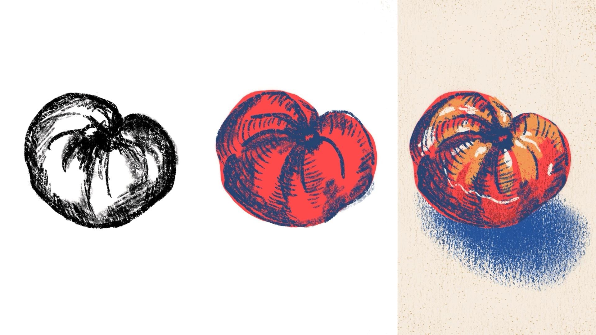
5. Drawing 1: Black and White Sketch: So finally, finally,
we can start drawing now that we have some of those
basics out of the way. I'm going to keep
my opacity at 100%. That's another feature that
I don't use very much. I'm going to make this
size a little bigger, and I'm actually going to
select a different brush. So with this class, I have included some custom
brushes for free, but you can buy brushes online on Etsy or Creative Market,
websites like that. But I've included a couple
of ones that I've made here. And I'm going to go ahead
and select this flat pencil. This is one of my
favorite brushes. Okay, so let's get
to actual drawing. So I'm going to just draw on
one layer to get started, because I really just
want you to get a feel for what it's like to
draw on your iPad. I've got my tomato
that I'm going to be drawing and using
as a reference, and I'm just gonna go for it. That's a little big.
Let's adjust that. So you can make something
that's more of a line drawing. Or I can get really sketchy, like I would with a pencil. So I can change the pressure. I can really push down
hard and get darker lines. The choice is yours. And that's what makes procreate really fun because it's so easy to
stay within your styles. So if you draw simple
lines, this might be it. If you like to have
a sketchier approach with some more shading,
you can do that, too. So I can kind of
soften my pressure. And already, it just doesn't
have that digital look that you might think
of when you hear the words digital drawing
or digital illustration. It's way more intuitive and closer to that pen and paper field
that you might be used to. Okay, so let's say
you made a mistake and you don't want to undo
everything you just did. We do have the eraser option, which is up here in the upper right hand
corner, this eraser. And we can just go ahead and
raace our lines that way. I overdid it a little bit. And if I tap on it again, you'll see that the eraser does also use different
kinds of brushes, too. So it will not default to be using the same brush
that you drew with. So if I want to use
that flat pencil that I was using to draw with, I could just select that here or let's say I have
the brush selected. If I tap and hold down, a thing will pop up that will say erase with current brush. So that's a really convenient
shortcut because I generally will erase with whatever the latest brushes
that I've been using. Okay, so in just a really
short amount of time, I have this lovely
little tomato sketch, and it looks like something that I drew on a piece of paper. So you can already see that the possibilities
are kind of endless. Spend as little or as much time you want working on
this first version. This is all we're doing for the first version
of our drawing. So if you want to make it
really detailed, go for it. You can do things
like cross hatching. I'm gonna hold this
even more flat. I'm gonna up the size to try to get even more of
this shaded look. Yeah, that'll look nice. And this is what's happening
with just one brush. And I would challenge
you to stick with one brush for this part just as you're getting a
feel to keep things simpler.
6. Drawing 2: Two Color Drawing: This point, you should have
your first drawing done, and you could totally stop there if you want
to draw in black and white and just kind of mimic that pencil to paper look. But for this lesson, we're
going to go ahead and incorporate color and explore
that a little bit more. So first thing I'm
going to do is I actually want to work
in a new document. I don't want to mess with this
one I originally created. We don't want to edit
anything else on here. So I'm going to go to gallery, and that's how we get back
out to this main screen, and then I'm going to tap Select and then I'm going
to select my Canvas there, and then I'm going
to tap on duplicate. Now we have an
exact copy of that. So here's our original. This is the new copy, and I'm going to work
in the new one. So now we have our layer that
has this original drawing, mine is that tomato, and I'm actually going
to work off of that. This is another great
way to use Procreate because you can
use it to draw out a sketch and then
make something more refined and get rid of the
original sketch later. So, to show you that, I'm going to go ahead and
create a new layer. And then I'm actually going to move the new layer
below the old one. And then I'm going to
tap on this N here. So that N stands for normal. So this is just
normal as we drew it. And I can move this slider to make that opacity
much lighter. And you'll see why in a second. So I mentioned
before that I wanted to work in color
with this example. So I'm going to go
over to our color tab. As I showed you before, we have all these
different options. I'm just going to use
classic because I kind of already have an idea of a
color that I want to use. And I can move this
slider to change the hue, and I want to go for
kind of I don't know, a bright tomatoy color. Mm. Okay. I like that, so I'm going
to stick with that. And then if I want to save that color that I just selected, I can save that under palettes. So really quickly, I'm
going to go to palettes, and you can see all the
ones I've created before. To create a new palette, I'm going to tap on this plus
sign. Create new palette. And then if I tap
into the square, it's going to save
that color that I just pulled from
the other panel. So for this round,
I'm going to keep it simple with just two colors. I want to have my base color and then a color that I'm going
to use for lines and shading. And I want to use something
that's the exact opposite. I'm going to go over to harmony and I can actually find the exact opposite
of this color here. So I really want to
play up the contrast, and it'll show only two colors if you have this set
to complimentary. We have these other options
here for split complimentary, analogous, Triatic and tetratic. I'm not going to go
through all of those because the focus of this
class isn't on color, but I do go further into this in my other Procreate class
here on Skillshare. So you can check that out
if you want to learn more. But for now, I'm going to
stick with complimentary. And I'm just going to play
around this is pretty bright. I'm going to use that as a base, and then I'm going to
go over to Classic and I want to desaturate
it a little bit, so that's what this is here. I want to make it a
little bit darker. Even though I wanted
the opposite, I think I actually do want
something a little bit more of a true blue. Yeah. I think I
like that together. Maybe you'll mess with it. I kind of know what
I'm looking for here, so I'm being a little bit fussy. You don't have to do
all this. But sometimes it can be helpful to watch
someone select colors. So I'm just giving myself a few options for
this color palette, even though I'm really going to try to
stick with just two. Okay. So I've got my palette here, and I'm going to focus, I think on the bright kind of red coraly color and
this last blue here. And I'm just going
to get started by drawing my basic shape, and I'm going to do
that on its own layer. So let me go back to that color. And this is where we're going to use that original drawing. So we have the opacity way low so that I'll be able to
see if I draw underneath it. So you can see that we
still see that sketch. So let me undo that.
I'm going to change my pencil. Let's see. I want to do something
that isn't as fuzzy. As my flat pencils, so I gonna draw this. So at this point in the class, I want you to go ahead and draw, like, a base layer
for your object. So this will be kind of the basis of what
you're working from. And I drew this outline
and made it connect here. So I could go ahead and, you know, color this
in with my brush. But because this is
like a closed loop, I can go ahead and fill this with one color in
one quick step. So to do that, I'm
going to go up to the upper right
hand corner and tap and pull and then hold
until it fills that shape. So you can see that
I didn't have to go and draw through this. I could just fill it
in one quick step. Now I'm going to work
in my blue layer. So I'm going to change
back to that blue. And since I'm only
working in two colors, I can switch between those
colors really quickly by tapping this color and holding it till it
turns that blue. So that really only
works if you're working back and forth
between two colors, but it can come in handy. So it will just when
you tap and hold, go to the previously
selected color. And then I'm going to use that sketch to draw some
of these lines here. I'm not going to use
it the whole time, but it's going to
basically give me a guide for drawing this version. And I'm gonna go back
to my flat pencil, 'cause I just love that brush. And I'm gonna go for
a little bit more of an illustrated look this
time, not super realistic. That's just how I'm
choosing to do it. You can go as realistic
as you would like. But I'm just having
fun with this here and wanted to play around, so do what you would like. I can shade it like before. At this point, I'm
going to go ahead and hide the layer
I started with. So that initial sketch, let's say, I don't
want to use it anymore. All I have
to do is hide it. So at this point, you
might be wondering why I'm doing this
in different layers. Well, the reason is it gives me a lot more freedom if I keep the layers
separated by color. So if I wanted to change something with my drawings
and shading here, I can do that without affecting the base
layer of the kind of, like, base of my tomato. That also means that if I
want to get really detailed, I could add another
layer and draw on top of that and make
really refined lines. So let's see. So I could go in and
let's say I wanted to do some kind of, like,
hatching here. Even though I'm using
that same color, it's not gonna
affect anything on the layer that I have
those shady spots. And that's one of the
biggest differences between working with
a medium that's more analog and one
that's digital is that it's so much easier
to make simple changes. I would have to
completely start over potentially if I was
working on a drawing, and, you know, everything is on one layer when you're
drawing and painting. But here we have the freedom of all these different layers, and I can hide them I could delete it and
start completely over, and I can just undo deleting it. So there's just so
much more flexibility. So I think you'll find
out pretty quickly why drawing digitally can
be so beneficial. Alright, so I feel like we're moving along at a good pace. So let's go ahead and go
into our next lesson, and we're gonna make
something even more complex.
7. Drawing 3: Complex Layered Drawing: Just like last time,
I want to go ahead and preserve everything I
did with this document. So I'm going to go
back to our gallery, select, and then tap on
this and select duplicate. I'm just going to tap the X to get out of the
selection menu. Okay. So now we
have our new copy, and we're going to dive
a little bit deeper. So the first thing I want to
cover are clipping masks. You can see here that I
have this area where it went outside the edges of
the red of the tomato, and maybe I actually want
it to be cut off just exactly in line with the
red part of the tomato. I could try and erase that. I can use Oh, I don't have that
layer selected. So that is another good point something I need to
point out to you. So you can only work within the layer that you have
selected in the Layers panel. So I can erase as
much as I want, but because I have that
other layer selected, I'm getting rid of
all these lines. That's not what I wanted to do. So I'm just going to
tap a few times to undo and then go back and
select the proper layer. And you'll see that I
can erase this edge, but it's not going
to be super crisp, but it's not really cutting it. I can also accidentally
erase too far into it, and then I'm losing some
of that blue shading here. So I'm just going to undo that. So there's a really
easy way to get this to be in line exactly
with the red from this tomato. And that's to use
a clipping mask. So I'm just going to tap on that layer and then
tap clipping mask. And essentially, I
like to think of the clipping mask
as a cutting mask. So it's like you took a pair
of scissors and you cut the shading to fit exactly around the lines of
the layer below it. So it's being clipped
to the red shape. So if I zoom in,
you can see that all those pixels are clipped to where the red
was or where the red is. And that is no longer going outside the bounds
of the red area. All right, so I want
to make things a little bit more complex
with this round. So I have kind of these
yellowy areas of my tomato. I want to find a yellow that
will work well with this. I'm just going to
look through some of my old palettes here. This is another great way
to use this palettes tab. I get to preserve colors I've
used for other projects. And sometimes it does save
me a little bit of time. I wonder if this would look.
Yeah, I kind of like that. Okay. So I'm going to go ahead and I'm going to create
it above this layer, but below this line one. So I'm just going
to go ahead and add these yellows to where that tomato has
these streaky areas. Okay, so I like how this looks, but it does seem like it's
not quite the right color. So this is where we
can use our masks again to easily change this color without having
to undo all of our work. So I'm going to go back
to our layers panel, and I'm going to
create a new layer. And then I'm going to find, let's try this more like
orange golden color. I want to see how that looks. I'm going to pull and drag, and that actually just filled the entire area because I'm working on a layer with
nothing in it right now. And I'm going to tap on
this and hit clipping mask, and it's gonna
apply the color to the shapes in the next layer. So we had those shapes for the lighter
parts of the tomato, and it just applied the
orange directly there. And I actually really
like how that looks. Okay, next, I want to
add some highlights, so I'm going to
add another layer. And I just kind of want to
add a little bit of, like, shine to the areas where the
light is hitting the tomato. We already have the shadows, so maybe that'll be fun
to add some highlights. And then something I
forgot to point out before is how easily you
can zoom in and out. So I'm just using two fingers, and if I spread them
apart, we'll zoom in. If I pull them closer, that's how we zoom back out. So it's just really easy to
move pretty quickly here. Okay, I'm just getting this to a place where I'm happy
with how it looks. And then I'm going
to show you just a couple more things
before we wrap up. So the next one is how we can use a clipping mask
to add texture. So even though I've drawn some kind of shading
and lines here, it has somewhat of a flat look. So we can make this even more interesting by
adding some texture. So I'm going to go and add a layer just
above that tomato, and I want to add kind
of like a darker red. So let's go back to my palette. I'm going to select that red, and then to make a darker red. Let's go to Classic and
I'm going to make it. Let's try this.
Have a brick red. Then I'm going to use, I
have a texture brush here, this brush is designed to
make texture and not lines. If I just draw really quickly, Okay, so I just tried to draw
and nothing was happening. And that's because
I added this layer between this existing
clipping mask and the tomato. So it automatically
became a clipping mask. So that's why I draw
if I try to draw outside the bounds of that tomato shape,
nothing will happen. If I draw in it, that's
when things start happening. I'm just gonna undo. And I want to change the size. And I just gonna go through
add in a little texture here. So you can see that it doesn't have quite
as much control because it's a much broader, bigger brush that I'm painting
with or drawing with. And I could sweep across
the whole thing just to quickly add some
of that texture. And that doesn't have quite
as much of that digital look. And then let's see. I want to add a background color because I think it's a
little born with the white. So I'm going to go
ahead and let's see. I like that. And I want
to add a shadow, too. So right at this point, like, we're basically done
with the class. I've covered a lot of the basics and things to get you started. Like I said, this class doesn't cover everything in procreate, but I want it to be a nice
transitional lesson for you, so you can be a little bit less afraid of digital
drawing and what that means and see how you
can retain your own style. So I'm just going to keep
going and gonna add a shadow. All right, so I'm happy with how that looks for
the most part. Alright, so I think I've showed
you a lot of the basics. There's one more
thing I want to go over that I like to do to
make things extra special. So I'm going to show you
how to use a stamp brush. So we've already used kind of our basic more pencil ink brush that will draw regular lines. There are also those
texture brushes which we use to add
this shading here. And then finally, I'll
show you a stamp brush. I'm going to show
you one that I made and I'll show you one I made and that's
included in this class. I like to use this at the end
sometimes for how I work. The way that a stamp brush works is that instead of
drawing like this, you just tap and it's going
to add whatever that stamp is onto your canvas. It is not for drawing lines, you can't just
continuously draw. I'm going to make this
a little smaller. The way that this
stamp works is if I tap lighter, more faded. I don't know exactly
what it's going to look like when I stamp. Sometimes I end up
deleting some of it. But it can just be a fun way to add something that
looks a little bit more random and organic. So it looks kind of
funny looking right now, but another trick that I can do is drag it to my bottom,
change the color a bit. So just like before, I'm going to create a new layer and I'm going to use a color that's a little bit darker than my background color. Okay, so I got that
color selected, so I'm going to drag here, create that clipping mask, and then you'll see that it's
a little bit more subtle, but it's still standing
out more than I like. I'm not super happy
with how it looks, so I'm gonna play with
the blending mode. So before we pulled up this panel by tapping
on this here, which stands for normal, which is normal blending mode, that basically means what
you see is what you get. But we can play around
with these other modes. So I'm going to zoom in so
you can see a little better. But I selected multiply, which made it a
little bit darker, darken, not that
different than multiply, linear burn, darker color. These are all just going
to have a little bit of a different effect
on how this appears. Some of the differences are
really subtle. So aren't. I'm going to go
back to multiply. These. I'm just going to
make this less opaque. Playing around with textures
and backgrounds are just some more ways that
we can add a little bit of interest to a piece and
something maybe that makes it feel a little bit more
handmade or human made, especially as things like
AI become more popular. I just really appreciate
those little touches. Point, we're basically
done with the class. So I want you to go ahead and use this last piece
to really play around, do those things that you
would normally do on paper that make
it feel like you.
8. Export & Class Project: Once you're satisfied
with all your drawings, don't forget to share them
in the class projects. To export your drawings, you'll go to this wrench icon in the upper left hand
corner and then tap on share and then save
it as either a JPEG or PNG. Those are probably the best for uploading here on Skillshare. So I'm just going to tap JPEG. And then I can actually
share it right to my computer, so I'm
just going to do that. And then now I have a copy of my tomato already
saved on my computer. So do that with all
three of your drawings and share them with the rest of the class. We'd love
to see your work.
9. Keep Going: Alright, we did it. You already have three drawings
done in Procreate. I'd love to see what
you drew in the class, so please make sure to share those under the
class projects tab, and take a look at your fellow
classmates drawings, too. If you'd like to dive
deeper into Procreate, I do have another class
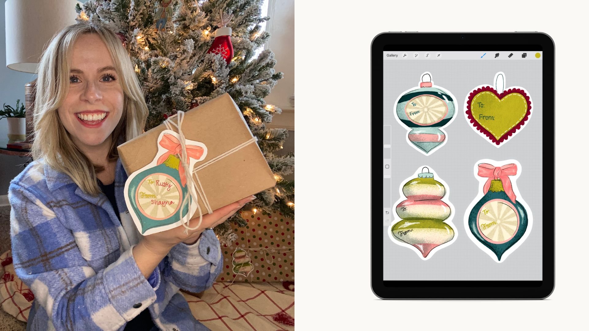
here on Skillshare. That's all about creating
stickers and gift tags, so be sure to check that out. And don't forget to download the free brushes from the class. If you enjoyed the class,
please leave a review. And if you want to
hear more from me, you can follow me
on Instagram at Shana Sell Art or sign
up for my newsletter. Until next time, Happy
During. That's all I got.
 Shayna Sell, Illustrator and Creator