Transcripts
1. Getting Started in Food Illustration: I'm an artist, and I love food. I love cooking food, eating food, and drawing food. If you ever wanted
to dip your toe into food illustration,
this class is for you. I'm going to show you how to
make food illustrations that pop with some easy
techniques like layering, adding texture, and
playing with color. Drawing food isn't that much different than other
types of drawing, but there are some
things that we can do to make our drawings look extra appetizing and make that food look like you want to eat
it right off the page. For the class, you'll
pick a theme and make four new food illustrations
around that theme. I'll be working in guache paint. However, you'll be able to apply these techniques and
principles to any medium, whether you're a digital artist or you prefer to draw by hand, or maybe you use another type of paint.
We'll cover it all. And by the end of the
class, you'll have four awesome food illustrations just for fun or to add
to your portfolio. So that all sounds good to you, let's go ahead and
make something that looks good enough to eat.
2. Food Illustration Overview: Before we get started, I'm going to cover a few of the basics that I like to focus on when making food illustrations
that really pop. And these are color,
contrast, and texture. Now there are, of
course, other elements of art and design, things like line, shape, form, value, but
I really want to keep things simple and focus on those three for
today's class. If you want to dive deeper on making well rounded artwork, I do have a class here on Skillshare called
Let's Get Critical, where I go further
in depth on all of those elements and principles
of art and design. So first, I want to
talk about color. And I think color is really key, especially when you're
working with foods that maybe are less
appealing in color. Obviously, it's really
fun to talk about, you know, vibrant work
like these tomatoes here. Sometimes it can be a struggle
when you're working with things like bread, pastries, any foods that are just kind of brown or maybe a little
bit more dull looking, we want to make those pop and look appealing
and appetizing, that's kind of the point
of food illustration. So here I have an
example of some kebabs that was kind of like a ground
meat, not so appealing. That's where color
comes into play. So I'm trying to pick out any colors that aren't
just, like, a flat brown. It's a little bit
reddish looking. I added some kind of green here to add some maybe
texture or contrast. And then I'm really
focusing on all of the elements around the
meat to make it pop. So the meat itself still isn't the most
appetizing on its own, but we have this bright
green of the parsley, and then we have
this garnish here. I believe these were peppers, but that's where color can
come into play to try to make something that
maybe is a little bit boring, more interesting. And then I'm going to
show you another example. So this is a dessert,
and obviously we have, like, this bright
red strawberry here. The fruit looks
really delicious. But the pastry itself is where we need a
little bit more work to make it interesting and look like something
you actually want to eat. This, I was looking
at a photograph of some food that I
had at a restaurant. So I really focused on looking
for areas of contrast. So where is there some shading, maybe more golden and kind
of darker brown bits. And then I also used some line work to
differentiate things. And then here is another use of pulling out colors that maybe aren't so
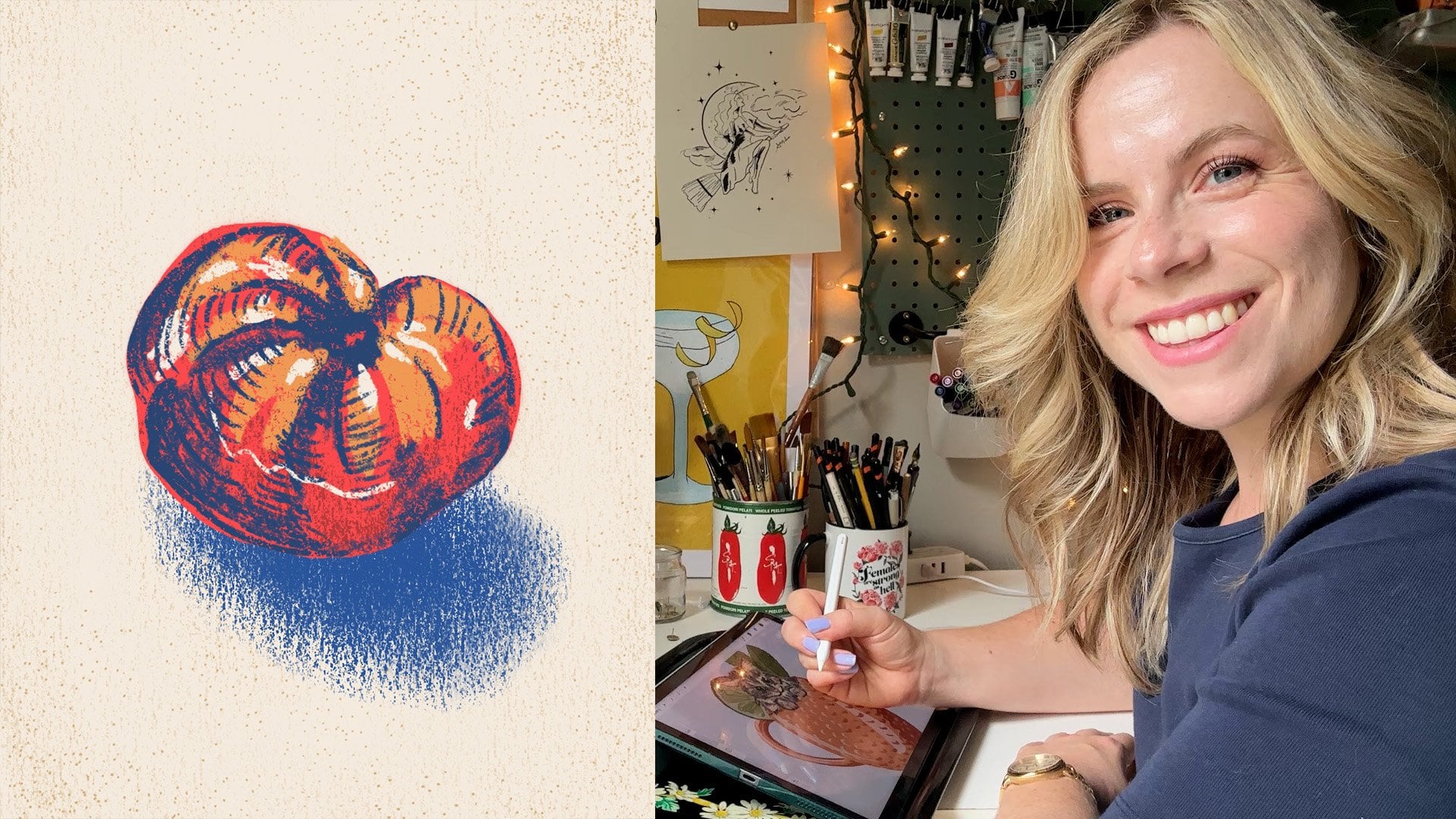
obvious right away. So we have these tomatoes
at the top here. We all know tomatoes
are usually red if they're a red
variety of tomato. But I was looking for nuances in kind of more
orange tones, pink tones. They can really have
so much variation. And even if they're subtle in person when I'm
looking at the tomato, I really wanted to highlight
those differences. And then one more
note on color because not everything really has
a dark or punchy color. So, for example, this here, this was a really unique salad. They actually had
ranch ice cream, so it was, like, kind of like a ranch dressing
that was frozen. But it was very
white, obviously. So to give that a little
bit more interest, I tried to add a little bit
of kind of a creamy white and then left some
spots that are more sparse where just
the paper shows through. So that can be another way to use color or the
absence of color. And then, so we can
see that this is an actual part of the dish. I'm using the green around
it to create this shape. We also have some radishes that are kind of sprinkled
around the salad here. So really with all
of the examples, it's a combination of playing up the colors and trying to increase contrast where I
can to make things pop. Let's talk about that
a little bit more. Here we also have our tons. I'm using the white
from the paper to show the shininess of the
tons and make that a little bit more dimensional instead of just completely flat. And this is something
I like to do a lot with silverware or utensils, but also with a lot of foods. So another example is here, we have some kind of
subtle highlights, but showing off that
this is more liquidy. This is just kind of the sauce from the strawberry shortcake. And I really love to
leave white space or add white to add that
contrast and dimension. And honestly, it
just makes things look a little bit more tasty. Also have the example
of these tomatoes here, just leaving that
little bit of shine. It adds a lot more depth. Let's see if I have
another. Oh, okay. I think this is a really good
example of that, as well. So this is peach cobbler, W's got liquid and a sauce, and that's where adding these white highlights
can really help. It's emphasized so
much by that contrast. Okay, so now let's talk a
little bit more about texture. So this is also a little
bit interesting to look at because we have a lot of texture going on with the food and less so with the
background elements. So even though a majority of the page is the tablecloth here, I really wanted to keep the
focus on the food itself. So it's colorful.
It draws your eye, but there's so much
more detail in the food that we know that
that's the focal point. Lot of that is not only
because of the detail, but also the texture. So this had cinnamon
and spices in it, so I added these little dots
to add some more texture, so it would be less flat
than the background. I also have a lot of texture going on in the peaches up here. We have kind of the fuzzy skin. I was really trying to mimic that added a lot more detail, and that really provides some contrast with the flat
texture of the background. So in this piece, you
can really see that color contrast and texture
are all really at play here. Another way to add some
texture is with how you use your paint brush or your drawing materials,
whatever you're using. I have these two
pepperonis here or salami. I don't remember which I really
used some kind of brief, quick strokes and
kind of a little bit of stippling here to
add that texture. So instead of using nice flat strokes and making
this really perfect tomato, I'm being much more
loose and less precise. And adding that
texture naturally. So it's mimicking the
look of the pepperoni. We have the texture
of the pepperoni, you know, that has a mixture
of fat and the meat. And then, you know, peppercorns. That's what these little
kind of black dots are. So that's how we're
getting to the place where this actually looks
like some real food. And then I don't do this with
all of my illustrations, but a lot of times I do like to add black lines at the end or a really dark line to add a little bit more contrast
and also texture. Once again, all of those
elements are combined here. I have kind of black
outlines. Around all these. And then I'm also adding a little bit of texture
with some kind of scribbly lines to mimic shading and up that
contrast a little bit more. So now that we've covered
those kind of basics, let's go ahead and just get started on our food
illustrations.
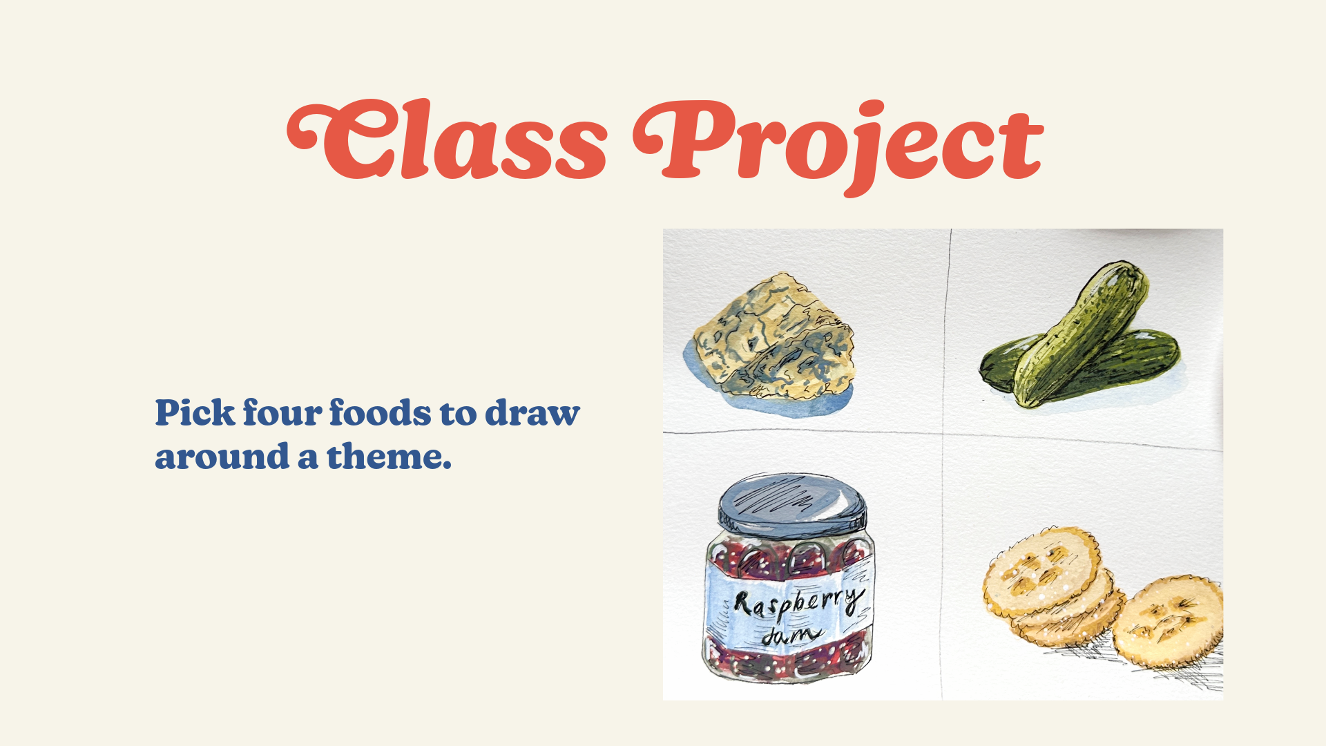
3. Basic Shapes: This class is for you to dip your toe into food illustration. So I'm going to ask you to pick four different foods
around a theme, and then we're going to make drawings based
around that theme. So I'm going to do some
quick food illustrations, focused on snack foods or foods that you might find
on a charcuterie board, little cheeses and crackers and pickles, things like that. So that's what I'm
going to focus on, and I think it will
give us a nice variety of types of food to draw. So I'm just going to sketch out a little grid here
to separate them. And it doesn't have
to be perfect, but I just want to keep things
a little bit separated. And then I do also have some
references here with me. So I have a jar of jam. Some pickles. And I've
got some blue cheese. I'm also going to
do some crackers. I don't have any with me. So that I'm just going to
do off the top of my head. And you don't need to
have references nearby. You could look them up on
your computer or an iPad, or you don't need any
references at all. You can do it totally
from your imagination. But I do like to have
some kind of reference because sometimes there
are just little details that are kind of charming
or maybe different colors that you weren't expecting,
things like that. So I think that's where
it can be helpful to have some references on hand. Then I'm going to be using gouache paints for
today's class, and my goal is to just use paint that I already
have stuck on my trays. So I'm using leftover paint. I'm not using anything new. And that's where something like this can be kind of fun, too, because we're doing such
small illustrations, we won't need a lot of paint. You can use guash
paint like I'm using. If you prefer watercolors,
go ahead and use those. This class is not focused on how to use guash necessarily, so feel free to use whatever material you're
comfortable with. Alright. And I
really like to focus on creating a basic
shape or form first. So I'm going to get started
with my blue cheese. So the cheese that
I have, obviously, the base of it is going to be more of a
creamy kind of color. And that's what I'm
going to start with. And I've got, like, this
basic triangle shape. And because I'm focused on working quickly
for this class, I'm going to narrow it
down by the basic shape. So I've got this triangle, a three dimensional triangle. And I like to make things
a little bit wobbly, 'cause I think
that adds a little bit more to that
food element, too. Not all foods are
perfect shapes, especially something like
a crumbly blue cheese. So that's the effect
I'm going for. Okay, so we got our basic
shape down for the cheese. And just to show you how I'm using color here,
cheese all over the place. This is much lighter in person, but I'm working on white paper. I want it to stand out, so I'm really kind of playing
up a little bit more of the yellowy kind of tones of the cheese instead of
the more light creamy. And I'm getting cheese all
over the place as I do it. But that's part
of the fun. Okay. Alright, so I have
that base down. Because I am working with guash, I'm going to be
working in layers. And if you're using
something like a marker or maybe even
some type of crayon, you could work on layers,
you know, one at a time, but I'm going to kind of move around to my
different snack items. Okay, next, I have my pickles. So I'm going to start
with my lightest color because I'm going to be
layering on top of it. So that's something
to keep in mind, pretty much with most mediums, especially if you're
working quickly like this. And if you're working with
a medium, that does blend. So if you're working with
something like acrylics, you can kind of start with your lighter color,
your darker colors. But since I am working with
something that is, like, water soluble, it's a lot easier if I start
with the lighter colors. So I'm going to start with
kind of a yellowy green. As my base. And I don't like to make things just
straight up and down too. That's just another
trick to make something a little
bit more interesting. I'm going to do a
few pickles here because I think that will also add a little bit more interest. These are gonna blend
together a little bit because I'm doing them
right next to each other, but we can kind of
define the separation. As I work in my later layers. I'm just keeping these to
their basic shapes for now. And then now I'm going
to do my jar of jam. So generally, I do
like to start out with shapes of my paint. I am going to be working
with pen, as well. So I'm going to add some
pen details at the end, but I'm going to use ink
for the glass of the jar. So I'm gonna draw that first. And you don't have to draw in the exact style that
I'm doing for yours. Especially if you're doing
different kinds of foods, and I really do want you to
pick out your own foods. You can do this combination for this exercise
if you would like, but I think it's
going to be a lot more fun if I get to see some of your favorite foods in
the class projects. I would love to see
a variety there. Okay. And this is not
perfect, and that's okay. Sometimes I think
that adds to the fun. I'm a recovering perfectionist, so that is hard for me to say, but I'm getting better at it. And I am going to
include the label. So I'm just kind of
drying that there. And we don't really have
to wait for that to dry, so I'm going to go
in with my paints. And I'm going to start with
the jam on the inside. And that's because I'm thinking ahead to our other layers. So I am going to try to
emphasize the glass, so the shininess of the
glass and the edges of it. But I want to do that last. That's going to
be our last layer because the jam is
inside the jar, so the details of the glass
will be over top of it. I'm just getting
a baseline here, so I'm not actually super
worried about the colors. Okay, so I think this is a
good starter raspberry color, and I'm just going to be
really kind of loose here. So think about the quality of the food that you're drawing. There's so much variety
and types of food. This is liquidy, kind
of more like a gelatin. So I'm leaving some
random white spaces. I'm thinking about the
thickness of the jar, so I'm not going right
up to the edges of the jar either. Okay. That's a good
start. And finally, I'm going to add some crackers. I'm going to do a
bunch of crackers. And obviously, if
you're working on something that's going
to be more planned out, you can add some pencil sketches first and do more prework. But this is really
more of a exercise. This is just meant to be fun. So I'm working
pretty loosely here. When you have the mentality
that it's just practice, it changes things quite a bit. Then maybe I'll do
like one cracker. It's not part of the pile. Okay, so we have a
good base going. I'm just gonna see. Okay,
this is kind of dry now. Okay, now I can go in and start working on
my second layer.
4. Creating Depth: So I'm excited to go
ahead and dive in and add some of those kind of blue
elements of the blue cheese. But before I do
that, I want to add a little bit more contrast
and some shading. So I'm going to go in with,
like, a darker color, and I want to go
for a little bit of a darker kind
of yellowy cream. And he's sort of a light brown. But I want it to be a little bit more interesting
than just, like, a plain brown with no
other tones to it. So I'm gonna try
to achieve, like, a little bit of a
yellowish, warm brown tone. So I'm working with my paints
here just so you can see. I might grab another piece of paper that I can test things on too while I try to
get the right color, so I'm not wasting
it on this paper. I'm just trying to be
careful here because I just don't want
this to get dull. That could be a style.
Some people work in a much more desaturated
color palette. But I like things to be
a little bit brighter. I think it can
help things look a little bit more appetizing. My goal with food
illustration is I want things to look yummy. You want to eat them
right off the page. Okay. I think that's good. So I'm looking to look at my reference and add in some
shading and craggy. I don't know if
that's a word. Lines. With this food illustration, I'm not worried about
being photorealistic. So I am making things
up a little bit. Really trying to get the feel of the food and not perfection. If you're just starting out,
you're not comfortable, you can try to replicate
exactly what you see, but when drying a lot of foods, it's so much more organic than, let's say, something
like the glass jar. That is much more concrete. They're all going
to look the same. All the jars from the same lot are going to look
exactly the same. Something like cheese and a
blue cheese at that is going to be crumbly and weird and have all of its
own little quirks. So that's another reason I think that I like
to work with food, aside from that I
like to eat and cook. Okay. So we got a little bit
more going on there. I think it looks
more interesting. Let's move on to our pickle. Okay, so now I'm ready to
go in with a darker color. I'm also going to go in
with a more opaque color. This is kind of see
through right now. So I'm going to get a little
bit of shading and texture. So this is both shading
of the actual pickle, and I'm also making
it a little darker. It's behind the first one, and not all pickles look
exactly the same, either. All right. And now
let's go to our jam. So we kind of
started with, like, our lightest jam color, and now I'm going
to add more depth. So really with all of these, I'm kind of doing the
exact same thing, but I'm just adapting
it to the food. So now I'm gonna go in with
a darker raspberry color, maybe one with a
little bit of blue. I try not to just add black. And the reason for
that is that we just want things to
pop a little bit more. I don't want things
to look muddy. Okay, so And here I am looking at my jar because the glass does affect the way that some of
the jam looks, too. And I'm definitely going
to leave little bits of white to emphasize where some shininess might be from the glass, from the jam itself. Okay. And then now I can
move on to the crackers. And I'm going to
use a similar color that I used for the cheese, but maybe a little
bit more of a brown. Gonna start. I don't
love this color, but if I blend it, I
think that'll work. Guash is very forgiving. You can see how I'm just
going over what I did before. Then here, I'm going for a little bit of
a smoother texture. We had the crumbliness
and the cheese. For this, crackers are a
lot smoother in texture. I'm just trying to
lean into that. That's really what is going
to help you make food that looks somewhat realistic
and closer to reality. I guess that's the same thing. You get what I'm saying. Okay. Alright, so I'm just going
to wait for that to dry, and I'm ready to go in
with even more detail.
5. Large Details: So now I'm going to go in
with some more detail, and I'm going to work
on the kind of bluish, greenish color of
the blue cheese. So those little I
guess, moldy parts. I've got a smaller brush here, and I'm just going to go in and work on some more
details with our cheese. This is my favorite part
because this is when it starts to look more like the actual food to me is adding these little tiny details
and bits of texture. I'm using a combination of
kind of wispy little lines. There's like these little lines that run through the cheese. I'm purposely holding
my brush really loose and not being super precise because this
isn't a perfect grid of lines. So that's something to keep in mind as you're illustrating, knowing when to be
precise and have, like, perfect straight lines and when you can be a
little bit more loose and care free to match the dynamic of what
you're illustrating. And I'm making this up as I
go along a little bit, too, so I'm not trying to make
this photo realistic. I'm just trying to make it realistic to the
characteristics of the cheese. Okay, I'm going to
stop there because I have a feeling
if I keep going, I'm going to add too much, and I'm going to
lose the balance of the kind of main cheese
color and then that blue. Okay, let's move
on to our pickle. And this is where we can
start adding some of those kind of fun little
bumps and more texture. I'm going to go in
with a darker green, but I also want to change
the color up a little bit. So I have this
other palette here. I'm using this dark green. There's kind of, like, I
don't know, striations, if that's the right
word on the pickle. So that's what I'm
mimicking here. I'll probably go in
with a smaller brush to add the actual bumps. But I can also kind of wiggle my brush and add some
imprecise ones here. I'm using the brush
a little bit dry. That's another way
to add some texture if you're working with guash or watercolor Really any paint. And then to add
some contrast here, I'm going in with a line, so kind of creating a little bit more of a separation between the pickle that's
kind of standing up in front and then the one
that's lying down behind it. Even though I'm working
loosely for the most part, you can see I'm being a
little bit more careful here as I get into more
of the details. Depending on your style, you can keep things much looser. There's a lot of ways to draw in the way that you're comfortable with or in the
style that you work with. So do what feels right for you. And if you're just
starting out, you can kind of imitate
what I'm doing here. It's okay to copy a
little bit when you're learning as long as you're not only
copying other artists. So the more you practice, the more you'll develop
your own style. All right, so let's
move on to our jam. So now this is going to be a
little bit more loose again, even though we're getting
into more details. So I don't have a ton
of depth in here yet. The colors are
really just a little bit lighter and a little bit
darker from one another. So I want to make a little
bit more of a purple. I'm trying to stick with what I have on my palette already, but I might have to add some more paint if I can't
get the right color. So I'm going to add
an ultramarine blue because I want to make it darker without losing too much pigment. So if you're not used to mixing colors or aren't super
into color theory, using two colors to make things darker will be a little bit more interesting than just adding black to make something darker. I'll get a richer, darker color. And sometimes I actually like if the blue kind
of comes through. So I'm going to, like, mix this. There we go. And this will create more of
a contrast, too. Something else I like to do when I have, like, a highlight, like, a really shiny one
like that is to go right up on the edge
with a really dark color. So it's going to make
that pop even more. I'm going to go a little bit more kind of golden brown
with my colors for this. As I'm adding these details, I'm also keeping my paint a little bit more opaque
and less water color than I did at the beginning. So that's what I like
about gouache paint is you can really get pretty
opaque with it. And I'm trying to mimic
those ridges a little bit, but I'm not worrying about
drawing actual little lines. At this point, I'm
just kind of shaking my brush to get some of that texture of
the edge of the cracker. And then I will be adding
the little dots later. And then with the crackers that are more in the background, being a little
looser with those. Okay. So I'm getting
closer to being done. I realize just now that I don't really have
anything for this label, and I'm just gonna make
something up here. I like a little bit of
that rougher texture. And because this is meant to be a little bit of a
octagonal shape, I'm thinking about where the light would be
hitting the jar. I don't have the jar in
front of me right now. I'm gonna go grab that again. Alright, that works
for now for our label. And I'm gonna add a lid, too. So I'm gonna go in with this more opaque gray Right now, all of these food illustrations are just floating in space. So we don't have any
shadows or background, and that's totally fine depending on what
you're working on. If you want simple
spot illustrations, let's say you're illustrating
a recipe and you want to represent all of the ingredients or maybe you're making stickers. So it would make
more sense to have cut lines around each object. Then I don't think
we really need any background shadows or anything in the background
that's additional. But if we do want to make
these look like they're not quite floating in
this white space here, we can add some shading. And even if you're not
adding shading here, we could still do some
very simple basic shading to the object itself. So we're going to do that
with some kind of washes. So one way I like to do that is using very transparent paint. And once again, I try not to do this in just a pure black. I like to use some kind
of color that's going to be darker than the
main color of my object. So I think I am going
to use kind of a blue, and then I just have a
scrap piece of paper here. I am going to test
it out first because I don't want to ruin
everything that I just did. So I'm making sure to get a
lot of water on my brush. Okay, I think that
is transparent enough to go in and
add some shading. So I'm just going to use, like, bigger strokes
to add some shading. I might have to go
back in and fix some of those details a little bit
because it is smearing it. I think it wasn't quite
as dry as I thought. That is the risk when
I'm working with something as water
soluble as squash too. There's some shading that
comes in over here too. Okay. That just instantly added a little bit more depth
and a couple of strokes. Then if I want to take
this even further, I can add a shadow. This one, I'll show you an
example of a sharp shadow. When I go in with the pickles, I'll do a softer shadow. Let's get this nice and opaque. Okay. Then sometimes I do this. I realized I don't even
realize I'm doing it. I do practice lines before I'm even touching the paper.
That's something I do a lot. You might see me
doing that throughout the class. It's just
something that I do. It's almost like a little
bit of practice before I put the paint down so that I can do it with
a lot more confidence, especially if I want
to do something with a really sharp, definitive line. For this, I'm following the shadows from
my example piece that I have right
in front of me. O Okay. So now we have a shadow, and then I'll go back in to fix some of those
details that got a little bit muddied by my
kind of wash of the shadow. Alright, let's move on
to our pickle again. And now I'm gonna go in and add some more detail with
those little bumps. I'm going to use my
smaller brush for that. I'm actually gonna use
the smallest one I have. The bumps are just a
little bit darker, so I'm darkening my
paint a little bit more. And I'm gonna go ahead
and start adding those. And I'm not worried about
adding every single one. If you want to paint or draw
in a really realistic style, you can go ahead and do that. I like to keep things
a little bit more loose and more of a
suggestion of the bumps. So even just by adding them, I'm adding some texture. I don't have to add
every single one. Lovely. I'm like, kind
of obsessed with this. I love drawing pickles, eating pickles, painting them. They're just really fun to me. And let's add some detail here. Okay, and then just a
quick little trick here. I felt like this wasn't
standing out enough, so I'm just adding a
little extra line. I don't have to add a line
around the entire pickle. Just adding some extra contrast here where these two
pickles intersect. So now I'm going to go
ahead and I'm going to add in, like, all
the little seeds. This is raspberry jam. They usually have those tiny
little light colored seeds. So for this, I could go
ahead and use, like, a light colored gouache paint, but it's not gonna
be very opaque. It's gonna be kind
of hard to see. So I'm actually going to
go in with a paint pen, just barely an off white
color, if you can see here. It's a thicker pen. I'm just trying to
stick with what I have. I'm not going out and
buying anything new, so I'm just going to add
some little dots with that somewhat randomly to mimic the seeds. I'm kind of pulling a
little bit as I add them so that they're not
only little circles. Okay. I think that looks good. I'm going to add a little bit
more to the lid of our jar. I'm covering some
of our inclines, but I'm gonna add more at the
end, so I'm okay with that. Alright, and then
onto our crackers. So I'm gonna go in
with my tiny brush. To add a little bit more detail. I'm gonna use a little
bit of a darker color. So I'm using this
kind of brownish red. And this ocher yellow. And then I'm adding just
more fun little ridges, being really loose with it, adding in those little
dots from the cracker. For this cracker, it's a
little bit more sideways, so I'm kind of adding
more detail to the edges, then just a little
bit more shading. Alright, I'm going to go
back into our cheese now and reinforce some of those details that we lost
when I added the shadows.
6. Final Details and Flourishes: Like I have a lot of
really good depth in here. We have a lot of nice contrast
between light and dark. If I really want to
add a highlight, I can go ahead and
add something in, like, kind of like what we
did with the seeds here. So I could add just a
little extra shine. I want to make this look
like it's actually, like, wet and glossy. I think this actually
isn't light enough. I might have to go in
with an actual white. I don't love using
a pure white color. But sometimes that is a good
way to get things to pop. So it's So just a
little something extra. And then I'm going to go
ahead and like I said before, I was going to do a
softer shadow with this. So I'm going to do a similar
blue color as before. But I'm just gonna get
it really desaturated. Sometimes another way
to do that is to get the paint on your brush and then run the brush
into the water. You get really light color.
So let's just do that. Real light shadow. And then this one I am
making up a little bit because I'm looking my
reference is pickles in a jar. So I'm going to have to imagine the light is
hitting the pickles here, the shadow's going to be coming back kind of back this way
and down to the right. Okay, so back to our jam. Now I want to mimic the
look of glass for the jar. So I'm going to use
some very light, more watered down
paint for that. Do this kind of greenish blue. I'm gonna be pretty light
here with my paint to start. I'm gonna do it
like the light is just kind of coming
from up above. So these edges are going
to be a little darker. When I'm working with glass, I definitely leave white space because we can see
through glass. I don't want it to
be totally opaque. That's all I'm gonna
do for now because I'm gonna have to wait for
this to dry a little bit. Okay, and then our crackers, we're actually ready to go
ahead and add in some ink. So I like to add in ink
details at the end. You could also just use, like, a much darker color or maybe a color that's really high contrast to make this stand out, but I like to add in
little details at the end. So I'm going to go ahead
and use pen for that. And this has a little bit
more to do with kind of my style of working than
anything you have to do. So take this with
a grain of salt. Sometimes I like
to add some kind of line squiggles to
suggest some shading. And then I could also use
my ink to add shadows. So that's another way we can add some contrast with the
background if we would like. Totally optional. You could also do some kind
of cross hatching. And then finally, just
because I want to finish the little crackers off, I'm going to add some flex
to mimic the look of salt. I'm going to use
my pen here again, and I can just, you know, dab and add little flex
of salt in a random way. That. This brush or this paint pen is a little bit thicker
than I would like. So another thing
that I could do is get some paint or some ink and kind of
do a splatter effect. So I have white inky here. And the reason that I like
to use ink or a paint like the paint pen is that it's gonna show up
more against the guash. If I just use guash paint, it might just kind of soak
into the rest of the painting. So this will kind
of stand out more. And I'm going to grab,
like, a bristly brush. I think this could work.
I'm just gonna dip it in. It's important that it's
a pretty dry brush. This is just, like, super cheap brush
that I got in a pack. I'm gonna test it out
before I do it on my actual paper. I'm
just gonna tap it. You can see that it'll
paint splatters. This brush steady and tap
it with something else. The closer I get, the
larger the splatters will be the further I get,
the smaller they'll be. But it does have a chance of spraying elsewhere.
I'm okay with that. This is just exercise
for the class. You don't have a ton of
control where it's gonna go. Okay, so now that looks
a little bit more organic maybe and some kind of, like, smaller specks of salt. So I'm done with the
crackers completely now. I'm gonna consider that done. And then I'm just going to add some final details to
the rest of these. So I got to make sure
they're dry first. I'm going to do the same thing
with the pen on my cheese. So sometimes with my
ink, I'm just kind of reinforcing some things I
already have on the page. Maybe I want to add a
little more definition here between the
edges of the cheese. I can add some squiggles. I can also reinforce some depth. The shadows. And I think it looked
fine before adding these, but I just wanted
to show you that there's a few different
ways of working. Alright, with our pickles, I'm going to show
you more options instead of using my micron. I'm going to use a brush pen to add those, like, ink details. I'm just going to show
you what that looks like. My pen is getting a
little bit low on ink, so this might not work. I might have to use
an actual brush and ink, but let's try it out. So I like this because we can get just a different quality than you get with
a fine tip pen. I can reinforce some
details and shading. This one's dry. I do
like the effect of that. It's a little bit messy looking. This can be really nice too, if you wanted to make
something flatter and then use the ink to
make a lot of the details. Here we already have
a lot of details, so we don't need
to add a ton here. Ink can also be a nice way to separate this from the
white of the paper, too. So it's another simple
trick to do that. Alright, I think I'm all
done with my pickles now. Alright, so I worked
very lightly initially. Now I can go in with
more opaque paint to add some of those
details to the glass. Basically, what I'm going to
do is add details that will help us see the edges of the glass and how
the jar is shaped. So still a little bit ser, and I want to make it more
opaque. Let's do that. Okay. So that's drying, but I can work on the top of the jar for now. So I'm going to use
this pen again. And then I could add some words on here if I wanted,
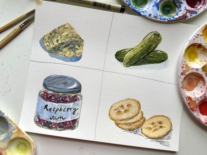
so maybe I'll do that. Alright, so now we have four
little food illustrations, and I hope you feel a
little bit more confident going into drawing
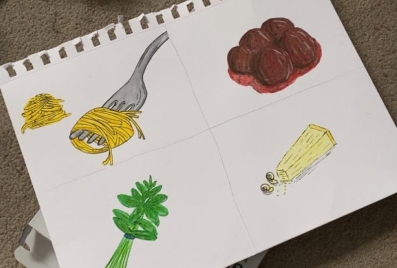
your favorite foods. So don't forget to add yours
to the class projects.
7. Thank You: Thank you so much for joining
me in this class today. I can't wait to see your
food illustrations, so please don't forget
to share those. If you enjoy this class, be sure to leave a review, and I'd love to hear if there's anything else you'd
like to learn around food illustration or
drawing or any other topic. So please let me
know. Follow me here on Skillshare for updates, new classes, and discussions. I'll also provide feedback if you do submit any
class projects. You can also follow
me on TikTok and Instagram at Shana Sell
Art. See you next time.
 Shayna Sell, Illustrator and Creator