Transcripts
1. Intro: Hello, and welcome to this intermediate
class on Procreate. In this class, we're going to deep dive into more
complex aspects and features of Procreate so you are in control of what
you're doing in Procreate. We're going to talk about the blending modes and what they do, the adjustments menu,
and all its options, different ways of working
on your layers and masks. You know what does what, as well as making your
brushes, customizing them. Sharing them and inpting as well as being able to
organize your whole space, your whole brush space to
be as perfect as you need. Not only that, we'll also talk about the quick menu as well as some gesture controls
that may make your life much easier while
drawing on Procreate. I'll be also giving
you some resources to help you out in
understanding some parts of Procreate and so it
makes this whole class much easier to follow
and to practice as well. Are you ready to
start? Then let's learn more about Procreate.
2. Quick TIP: Working With The Reference Window: Hello, and welcome back. Now, we had quite a bit of information in
the past videos. Now let's talk about
something that is a bit more simple but very useful. I want to talk to you about
the reference window. The reference window is a place where you can add
an image, a photograph, a sketch of yours, anything you need to decide any size you want
of your canvas. You can always reference that
image if you want and you don't really want it to be
inside the canvas itself. To access that and
to activate it, simply go to the Actions menu. Then go over here to
reference and toggle that on. As you can see, right away, we have this small window here appearing that you can move
anywhere on your screen. You can always also
make it bigger or smaller depending
on what you want. You can close it, of course. Then as you can see right now, we have it open in the Canvas. A lot of people
sometimes like to have their whole work
zoomed out while they're zooming in and
working so they can see what's happening in the whole canvas
at the same time. This is something you
can do if you work with Clip Studio Paint or Photoshop
or other drawing software, you're familiar with
this reference window. But you can also open
any image you want. For that, you can
just go to Image. And then import image. Now you'll go to
your gallery and you can choose anything you want
and tap it and open it. There we go. I have
here my hand image, and now I can draw it to the
side following my reference. Obviously, this
is not very good. This is just a very
quick drawing, so you have an idea. Besides that, you can
also take a photo. You can clear it if you
don't want it anymore. If you go to face over here, you can take a photo. As you can see, the camera
will open right now it's pointing to the
to the area here. There we go. High. And you can take a photo right
away and use it. This is the reference
image, very, very useful. I admit I don't really
use it that often. I like to have the images I'm using the
references I'm using. I put them on the canvas. But I know a lot of artists like to have this reference
window to the side. It's a very common tool to use, especially in other
drawing software. It can be really useful, especially if you're
doing, for example, if we have the Canvas
reference activated, it's very useful when you
have a very detailed drawing, a very detailed
illustration and you really need to go in to
work on something, but you still want to have the full view of
your illustration and be sure that everything is going according to plan
and is looking good. This is the reference window. Once you don't want it anymore, just tap the cross and close it. If you go over here, you'll see that reference option
is toggled off again. Very simple to use, very simple to find it, and I think it can be very handy for most artists out there.
3. Resources & Assignment: Hello, and welcome. Now, before we start, I just want to talk to you
a bit about the resources I have for you as well
as your assignment. First of all,
throughout this class, we talk about a lot
of new information and some things that can be a bit hard to remember at times. I got some templates for you, some reference sheets
for you that you can download and use them to help you out in memorizing all this stuff or perhaps just
to understand them better. Other than that, there's
also other materials for you to use throughout this class to help you out making
your own brushes. But if you want, you can
use your own material. You'll see what I'm talking about a bit later in the course, but we'll be making
our own brush, so you can download those materials if you
want to use in this class. Now we reach the part where
we talk about our assignment, which is making your own brush. No, all you have to do is
follow the steps of making your own brush category of this class and then share
your brush with me. You don't really need to
share the file of the brush, but you can make a screenshot
of you using your brush, just a bit of a scribbling of your new
brush so I can see it. Others can see it as well. It can be always fun and I actually can't wait to see
what you can come up with. There are lots of ways to
making different brushes, so that will be fun. And if you want, you can use
the materials I gave you and create your own brush because even using
the same materials, we can make different
things with them. So, this is it for now.
This is your assignment. Don't forget to download
the resources that I gave you and I will see
you in the next video.
4. Advanced Layer Techniques: Hello and welcome. We're now going into
Procreate and see some more specific or even more intermediate
features of Procreate. And the first thing I
want to talk to you about is some masking
options that we have. So layer options
that you can use to edit or to facilitate some parts of your
illustration process. The first one we have
is the mask option. If you've used other
drawing software, you might know about masking. But mask is this
option right here, so you just tap your layer and all the options will appear, and then you just tap mask. As you can see, your original
one will be linked to it. It will appear a new layer
on top that is linked to a layer mask linked to
the layer you selected. Now what you can do
is basically remove or add again stuff that you
don't want to see on it, and you can do this by keeping
always the original layer. You won't be changing
the original layer. So what we do usually is we pick black to remove like this. As you can see, I'm
erasing this area here. I can pick a bigger
brush here, there we go. If you go over here, you see this is the
area I removed. But as you can see, the
original layer stays as is. You're not removing or adding anything on
the original layer. This is a great way for
you to remove stuff or add some effect to your drawings without messing with
the original layer. If you want to have
the original layer back as it was, you can. Now, yes, we use the black to remove and then we
use white to add. As you can see, I added white and I can just
put it back as it was. But obviously, there
are other ways that you can remove or stop
seeing this mask. So one thing you can do
obviously is delete the mask, so you just swipe to the
left and then tap delete. You can also tap the mask
itself and you can clear it. There we go, or of course, you can turn off its visibility. You can just tap
here this check mark and you can see the
layer mask anymore. This is very useful to
hide certain parts of your drawing that you want
to hide in certain layers, but maybe not in other
stuff like that. It can be very, very useful. Now, another one I'm going
to do here another shape. It's a bit easier to understand
what's happening here, just something very random. Another option you have
here in your layer options. I tap my layer is
the clipping mask. The clipping mask is
similar to the mask itself, but here you have a
proper layer for it. What I want to do, for example, is I'll go here to the plus
and add a new layer on top. Now, let me go here. You see immediately the effect. I'm going to choose another
color and I'm going to add random blobs here and there. This is what we have in our layer above the
original layer. Now, if I tap it and
tap clipping mask, as you can see, it will
clip to the layer below, so my original layer
and everything that is outside what I have drawn in
the layer below, disappears. As you can see here,
my whole drawing, the things I drew
are still there. They haven't been erased. But when you use clipping mask, procreate and other
drawing software, we only take into account whatever is in the layer
that has been clipped. Even if I go over
here and I move this, as you can see, the whole
drawing is still here, but it does not go beyond the limits of
whatever you drew below. If I go here to this layer again and I decide to
add here some more, see, it will start
appearing whatever I drew. Now, what is clipping
mask useful for? For me, I like to use this to create some shading
on my characters, for example, I
have my character. I'll just add lay
above my main drawing, my main colors, and I clipped
it to my main colors. Then I'll, for example, add a blending mode, and I'll start
adding shadows and I can just freely paint without worrying going outside of the boundaries of
my drawing because the clipping mask will
only take into account what is inside the layer below. So it's very useful
to shadow to adding some shading to adding some
highlights, for example, or even sometimes
to add some kind of pattern and then remove or make it invisible whatever goes outside of the
boundaries that you choose. This is it for the
clipping mask, and then finally, another
similar option is the offal og. To go to the off log, just tap your layer
and then tap off log. Now, as you can see, when
we look here at our layers, you will see the difference from this layer to the others. We now have this grid here. Basically, what that means
is that anything that goes beyond the area you just
painted is off limits. For example, now if I go
here with another color and if I paint inside my
shape, that's all good. If I go beyond it,
it won't show. So your layer basically is just a painted area
that you originally had. You can't go out of it. Now, this one, using the alpha low can be a
bit more limiting in terms of you are using
and editing this layer. So if you change your mind, it's a bit more difficult to
undo those things at times, but it can be useful and some people prefer
to do it that way. I find that, for example,
clipping mask is more useful because you
have things separated, you can do whatever you want, and if you don't like it, you can edit one
layer or the other. Same thing with the mask,
although the masking is more to add or removing
stuff in your drawing. The alpha log I feel is
a bit more limiting. But once again, it's
all up to preferences, but the main idea is that you lock whatever you
draw on that layer and you can't go out of
those boundaries and you will work in
that same layer. Yeah, this is it for this main and a bit not
as clear layer options. All the others are pretty clear. I talked about all of
these very loosely. On my Procreate basics class. These three are the ones
that I feel are the most complex to
understand and very, very useful to use on your drawings on Procreates.
This is it for now. I will leave you
a reference sheet for all of these so you can see the differences and how
to access them as well, and you can download that to use or to keep somewhere so
you never forget about it. Download that if it's useful for you and I will see you
in the next video.
5. Blending Modes And Their Applications: So hello and welcome back. We've seen some layer options and we talked about
them and how they work. Now I also want to go
through something else that it can be a bit
daunting at first. Don't mind this image just yet. We're going to talk about the
blend options in Procreate. Once again, these appear
in other drawing software. It's mostly all the same. But I know that it can be there too many and sometimes it
can be a bit confusing. Once again, I did
mention them on my previous class on
Procreate basics, but I did not go into them
and I just want to go through them for a bit so you can understand them
a bit more easily. Now, once again, I do have here this comprehensive
sheet of each blending mode. You can download
this and you can see the differences
each blend mode makes. But one thing you
should know is that depending on the drawing you
have or the layer you have, you might have
different results, and I really recommend you to take a look at them
and experiment with them because
some of them might behave differently depending
on the colors you're using. If it's a layer where
you'll be using Lenard or coloring, you know, they can behave a bit
differently or they might not look exactly like the
examples I have in here. That's mostly it. We're
going to start from top to bottom and
the first plan mode, and this is the one I use
the most is multiply. Now, what multiply
does is that it multiplies the luminosity
of your drawing. Usually when you're
going to use it, you're going to see your drawing your colors darker than
they are originally. What I use this for the most
is to add some shading. Instead of picking a
color for my shading, what I usually do is I create a layer on top of my
drawing of my base colors, then I clip it to
the layer below using the clipping mask we
talked about previously, and then what I'll do is
set that layer as multiply. And then all I have to do is pick my base colors,
for example, this blue. Once I start painting, that blue will appear darker than the original one
because of the multiply. Of course, maybe this is a bit too much, this
is due too dark. What you can do is
just go to the opacity of the layer and lower
it and you can control how strong this blend mode is on your drawing and this goes
for every kind of blend mode, you can always use opacity to control how intense
it's going to be. Then we got the darken or shade, which are very similar, although it will both of them appear in your blending modes
if you want to see them, we have Area darken and shade. What darken does is
that it will compare your base layer colors
and the new ones, the blend colors that you use. For example, if you
use other ones, and it will keep the
ones that are darker. As you can see, it's a bit
more intense than multiply because multiply will keep
some of the saturation there. Here, darken only focuses on the how dark the color
is and will keep that. Once again, it can be used to do some shading or to darken
certain areas of your drawing. If for example, you see that your background is a bit
too light, let's say, you can use darken to make
the background a bit more dark and contrast and contrast
it better with the rest. Next, we have color burn, which mimics the burn tool. If you used Photoshop before, this used to be a
very popular tool to use to create
this kind of effect. Usually it will
have a darker look than the multiply for example. But as you can see it burns
up your drawings a bit more. As you can see here,
the red right. It's much stronger than
the original one here, the mouth is much darker, it applies a burning
look to your drawing. It has some more saturation
and also creates much more contrast between your normal layer and
your blend layer. Then we got linear burn, which is pretty
similar to color burn, but it's less saturated as you can see in both
of these examples. Then we got darker color, which as the name describes, it's very similar to darken and it can be maybe
a bit more intense. As you can see here,
I think it has a bigger contrast than the original darken
that I have right here. Lighten, as you can imagine, is the opposite of darken, so it will compare
the luminosity of your original layer and the blended layer and you'll
keep the lightest one. So great way for you
to add more light or to make a layer brighter
than it used to be. Then we got screen, which
will brighten your image and the intensity will depend on the luminosity you use
on the blended layer. This is a great way for you to add highlights to your
drawings, for example, multiply is great
to add shading and screen is great to adding some highlights
to your drawings. Next, we got color touch, which is based on the
touch tool and basically, it will also brighten your drawing but it is
more intense than screen. If you want more intense results than you're having with screen, you can use Color Dodge. As you can see, it's much
more saturated than screen. Next, we got ads, which once again,
as you can see, it's an even more intense way of brighten up your drawings. Usually, this will add even more light more
brightness to your drawings. If you want to add something
that is pretty shiny, for example, this might be
the one that you want to use. And as we had previously, we got lighten color, which is pretty similar
to ten but less intense. If we look at both of these, this one is a bit less
intense, but once again, it all depends on your drawing and the blending
that you're doing, the colors that you're
using on your blend layer. Then we got overlayer, which is also very
popular choice to make when drawing
and using bind modes. What it does is
basically a mix of multiply and screen
at the same time. Basically, whatever is
darker will become darker, while what is lighter
will become lighter. As you can see, we also have some improvements
of saturation here. Next, we got soft light, which is a softer
version of overlay, it will have a very soft
darkening and lighting. If you don't want something as intense and contrasting
as overlay, you can use soft light. Next, we got hard light, which is basically the
opposite of soft light. So it will have a
more intense result. Next, we got vivid light, which as you can see, it's very, very intense. It's a bit of a combination
of overlay with soft light, let's say it has
stronger effects. Wever is darker will
become even darker, whichever is bright will
become even brighter. As you can see, we
can clearly see a big difference even from
overlay to vivid light. Linear light is a
combination of touch and burn with a very
contrasty effect, as you can see, quite
intense once again. As you can see, some of these can be pretty similar
and it's usually a bit of a matter of preference and whichever blending
mode you prefer to use. Most of these you
probably won't even use. Pin light is a very
extreme blend mode, so it will darken and
brighten your drawing, but it will remove
all the midterms. As you can see here, the skin color, especially
is basically white. You can barely see
the difference between the skin color
and the dress color. Very very extreme. Next, we have heart mix, which you can see also has
a very intense effect. It will only work with black, white, and the six
primary colors. Cyan, magenta, yellow,
red, green, and blue. If you use any other color, you won't really
see a difference. We got difference, this will create an effect if you
use inverted colors, it will create that negative
effect on your drawing. Then we got exclusion, which got a very similar effect, but it's usually less saturated. As for subtract, it darkens the colors to its maximum
and as you can see from me, it goes all the way to black
because what I used was this image and it just assumes everything is black because it's
in the same image. But basically, it will darken drawing or whatever you
draw in the blending layer, it will remove any brightness
you have in your drawing and the lightest areas you have are the ones you'll
notice the most difference. Divide, as you can see, is basically the opposite, so the darker areas are
the ones that you will see the most difference
because they will become brighter than
the original word. The last few can be a
bit weird sometimes, but very, very useful to use. You have hue and what
hue does is that it will change the hue or the color that you
used previously, but maintains the luminosity and the saturation of the layer. Those two parameters
will maintain. The only thing that changes
in the layer is the hue, so the color that you chose. Then we got saturation. Here what you're changing is the saturation of your drawing, so you can change the color. Here, the only thing that changes is the
saturation of the layer, the colors really main the The luminosity will
remain the same, but what can change is the
saturation of your layer. Moving opacity
below or above will also play an effect here on how saturated your
layer is going to be. Then we got to the
color blend mode. This one can be very useful if you like to draw in gray scale. What it does here is
that it will keep the luminosity of it will preserve the luminosity
of your original layer. And what it will change is the saturation and
the colors of it. This works great with
monochromatic images. Let's say you have
your character and you colored your
character in gray scale. Basically, you used value to add shading and different
lights to your drawing. You have all that done. You have your shading, you have your light in the character, and now you want to add
some colors to them. Well, what you can do is
adding a layer on top of that. Then you choose the
bland mode color, and then you just need to
pick any color you want for each part of your character
and the values will maintain. The values that are in your
original layer will maintain. The only thing you're
adding is color. It can make coloring
your characters, much quicker once you already decided on the overall
value of your drawing. Now finally, we have luminosity, well, it's the only thing
that we are missing. I will preserve the hue or the color and the
saturation of your image. The thing that changes
is the luminosity. You can add more
or less brightness to your image and yes, these are a lot and I know that sometimes it can be a bit complicated to
remember all of this. But once again, I
have this example, this template here
for you to download. So if you want to have it nearby you so you can remember
it once in a while. But what I do recommend, first of all, is not worry too much about the
blending modes. It's nice to know what I
do and understand them. But chances are you won't
be using them that often. What I recommend is
for you to go into Procreate and depending
on what you're drawing, just experiment with it a
bit, try different things, try one blending mode one day, the other day, try another one, and then basically realize
what you like to use, what you don't like to use, what will be useful for
you in the art you make, and you'll just
pick a few that you enjoy using from time to
time and stick with those. If as you learn and
evolve in your art, you find something else to use then add that to your
arsenal as well. For example, for
me, I like using multiply overlay and scream the most depending on what
I'm doing and if I want a more intense
effect on my drawings, I might use something else, but these three are
the ones I use the most and I very rarely
go beyond this three. Yeah, this is it for
blend modes right now. Take your time if you want, just go explore procreate and
the blend modes for a bit, draw something, and then I will see you in
the next video.
6. The Adjustments Tab: So hello and welcome. In this video, I
want to go through your adjustments tab
over here on Procreate. This is a bit
similar, let's say, to the blot modes because the
adjustments will basically allow us to add some extra
effects to our drawings. As you can see, we have
quite a lot of them here, and I just want to
go through each of them very quickly because
there's not a lot to say. Let's say, some of them are
more specific than others, but it all comes down
to exploration as well. So first of all, so the adjustment stab
is your second icon, your second round icon here, so we got here our seconds, our actions, and then we
got the adjustment stab. The first one and
this might be one of those that you'll
be using the most, which is hue saturation
and brightness. Now, if you tap it, it will
open a small menu here below, and as you can see, we have three parameters
to work with. So we have hue and
what we will do is change the color or the
colors of our drawing. Now as you can see, I have here, my drawing is all in one layer, so it will change the whole
colors of my drawing. But let's say that I
have my background in one layer and the
rest in another. If I picked my background layer, it would only change the colors and the brightness and the
saturation in that layer. It won't be editing or changing
anything in other layers. It's always in the layer you have selected. Let's
go back to it. Yeah, we have the
use saturation. Let's say, maybe I
want something a bit more greenish
here. There we go. Then we got saturation, so we can have our
drawing more or less saturated until we go to
the gray scale realm here. All you control here is a
saturation of your drawing. Then of course, we
have brightness. It goes from black to total white and everything in between. You use this one to add or remove brightness
to your drawing. If you tap one on your screen, you can undo one of
the actions you did. You can apply it, cancel, reset, and so on. I don't want any of these. Yeah, this one, one, the first option is very useful. I use it all the time
when I add colors to my drawing and
then I realize I'm not really enjoying
that as much. I just go to hue saturation
and change those as I want. Then we got color balance, which is also very useful, but here you control
more specific colors. For example, if you want
more cien in an image, you can do so you
can add more red. I will pick up the
reds you have in your image and heighten them. The same goes for the scion. If you have some magenta again, the reds, it will pick up
and add more magenta to it. If you have lots of greens, it will change that as well. So it's based on the colors on the pigment you
have on your drawing. It will look where you
have the most green, the most magenta,
the most scient. If you go here to
these three dots here, you can also choose
more detailed options. You can focus on the highlights, shadows or the tons. Once again, this is
a very flat image, so I can't really
show the shadows and highlights differences. But as I always recommend, take a look at it and experiment because you never know the
kind effect you might have. Once again, if you
don't like it, you can just cancel it. Another thing I want to show
you is that, for example, I have here color balance and you can choose if
you want to change the whole layer
or if you want to use an area and change it. As you can see, we have
here these parameters, but I want only in
certain places. I go in and I paint
those areas and now I can also just change them
and see what I prefer. This is also useful. I admit I rarely use it, but I have a very
simple art style and I don't feel the
need to use that. But I want you to know that you can apply these effects to the whole layer or just
the areas you draw upon. Next, we have curves, which basically will allow
you to have some control over the brightness of your image and some of the
saturation as well. So you have this graphic. It's a bit you have
more control over all of these and using the hue
saturation and brightness. For me that's the
biggest difference, but you can also
control the reds, the blues and the greens. But I find it a bit more
complicated to control, but that's just me, but
you have this graphic and you can change the
curves of your drawing. Then we got gradient map and this one is also
very, very useful. We got several different options here that you can add
more and make your own. We got these bluish gradients, a gray scale, the mystic one, which has some blues and pinks, the breeze, which is
mostly focused on blues. Instance, Venice, Place,
Neon, noir and Mocha. As you can see, you have here several options and you can
control their intensity, and this is useful for you to create a balance in
your whole drawing. Usually a lot of
artists use this when they finish the drawing and then they have everything in one place and they will
add a gradient map. To create to create more harmony to the overall
color of the illustration. As you can see, if I use this, we will have every layer, everything in my drawing
will be in the same realm of tones inside the
one that you chose. Here is your original and
now I have here something a bit more interesting and a bit more balanced in my colors. The gradient maps
are very useful, especially at the end
of an illustration. At least that's how I use them. It's how a lot of other
artists use them is to go over your colors once again and try to balance
things a bit more. You can create your own
grading maps as well. Then we got the blurs. We got the Gaussian blur. Here you control the intensity. As you can see, it will add this unfocused look
to our drawings. This is great if you're drawing something
in the distance of your drawing and you
don't want it to be as focused as what's in front. You can add some Gaussian
blur to create that effect. We also got the motion blur
that will do exactly that. It will make something
appear in motion and the perspective blur that you
can move things around. I put it on the side, we have the blur
going to that side, if I move it to the other side, you have a bit more control
where everything goes. I just forgot here
in the motion blur. You can do it horizontally
or you can do it vertically. So if you move vertically, you'll add your motion
blur vertically. If if you swipe horizontally, it will do a horizontal motion. Now we got something that has
a bit of a visual effect, a bigger visual effect,
we got the noise. This is great to add
noise to your drawing. So adding this grainy
look to your drawings, and as you can see,
there are a lot of options here for
you to work with. You can change the kind
of texture you have. Blows look like this. We got
the clouds and the ridges. So you have a lot to
choose from here. I like to clip things simple. But once again,
it all depends on the kind of effect
that you want to do. Then we got sharpen, which I don't think well, it does show some noise here. I will sharpen your image. If you want something to have some more definition,
for example, bloom. It will bloom your
drawing with brightness. You can change here some parameters to If you want
some glow in your drawing, this might be it. This might help doing that. Once again, it's all about
trying different things and see how intense you
want the effect to be. The glitch one is very fun. I will create those glitches that you see on screens or that you used to see on screens, we have different ones. We can also change here some parameters such as the block size, the
amount of them. And there are different
ones to choose from. We have artifact,
we have the wave. So when you didn't have a good signal on your TV back in the day,
this would be it. We got signal, which is
similar to the artifact one, but it's more exaggerated, let's say, and then
we got diverge. Which is the most
intense of all of those. As you can see in each
one of these effects, you can add different
parameters. You can control a
lot of things here. Then we got of tone. If you like to have that animal look in your drawing or
newspaper look in your drawings, this is it, but
this will add it to the whole layer
as you can sip or you can choose the pentel
version once again. We got the full color. We got the screen print version, and then the newspaper
which is going to be in grayscale you can always choose how much of this effect you
want in your drawing. Then we got chromatic
aberration. This one is also really fun, it does give us this very tripping
effect on our drawings. Once again, we can
control several things. We also got display. We see here some duplicates of our drawing in
different colors. We can add some blur, transparency, very, very fun. Then we got the liquefier,
which is something. This one, as you can see,
only works with brush. But this is something that
people ask a lot and procreate because liquefy basically will help you fix some things
in your drawings, for example, I think this
arm is a bit too thick. Again, just push it or pull it to make it a bit
thicker, for example. Of course, you can have
more exaggerated effects and we have so
many effects here. To change things so you can have some weird effect
on your drawing or you can just fix some
things in your drawings. A lot of artists use this tool to fix some things
in their anatomy drawings, but as you can see, you can
do much more than that. Then finally, we got clone which works as the
contemp on Photoshop. For example, I choose
here and area, and if I start painting here, it will apply whatever is
in this area that I choose. For example, if I now move it here and start painting here, it's adding whichever
is in this area. This is usually nice to
do some image editing, for example, that you want to raise an area of
it, you want to make, let's say you have a
forest and you want to duplicate that foliage throughout the
rest of your file, you can use clone for that. This was very useful for image editing but for
illustration as well if you want to clone certain
areas of your drawing without having to redraw
them all over again. So yeah, this is mostly it
for our adjustments tab. As you can see, there's
a lot you can do here. Once again, just go
through each one of them. You don't need to
use every option here in all your drawings. It all depends on
your art style, what you want in
your illustrations, but it's nice to know
about them and to learn what they do,
to understand them. Just take your time
exploring all of these and I will see
you in the next video.
7. Creating Custom Brushes: All right, so we had
a bit of a break. Welcome back, and now we're
going to go through, again, a meatier part of procreate, which is creating brushes, editing brushes, and so on. We're going to start by
creating a new brush. For that, very simply, we're going to go
to the brush menu. It doesn't really matter which
library you are right now, but if you want to have
things more organized, you can choose where
to put it more detailed and we'll also talk
about that a bit later on. But we're going to tap here
the plus sign on our library. Now we have here a few options. We can create a new brush. We can create a new set or we can import a brush
from our files. What we want right now is create a new brush and the brush
studio opens right away. Now, the two most
important things when creating a brush is choosing the shape of your brush and the grain
that is right over here. The grain is basically the
texture of your brush. Now obviously, if you don't want any extra texture on your brush, this part doesn't
really matter for you, but we're going to
use both of these. For that, we'll start
with the shape. We got to shape over here. Don't think too much about all the other options
here right now. We're just focusing on the shape and grain
menu right now. And to change shape of a brush, just tap here, edit, and now we can import something. Now, Procreate already has a source library with a
lot of options right here. As you can see, there are more than 100 shapes
for you to choose from. There's a lot of
things here for you to use and you can
pick one of these. However, I have one that I made for this class
that you can download, so you can go and
download that right now and then use it to
make your own brush. Or if you want, you
can make your own. I have here something
very, very simple. I'm going to go
to Import a Photo and I'm going to
choose this one. This is I just picked a marker that I had
and made this shape, this irregular shape on the sketchbook on the
paper, took a photo, erase the background, and
then just save this as a PNG, and now I imported it here. Very simple. You can
download this to use. Once you open the
shape you want to use, just press the shake mark
over here and there we go. Now, let me just clear
here the drawing pad. You can always take test
your brush to the side here. As you can see, this is
what we have right now. Nothing much yet, but
already pretty interesting. Of course, now we have
here a few options, so if we want the brush
to scatter a bit, if we want it the
other way around, more or in this case, the count will change the
opacity of your brush, and if I press more or less, you'll have different
levels of opacity. You always have quite a few
options here to play with. But for now we leave
everything as it is. Let's clear our
drawing pad again. And what we want now is
go to the grain menu, and once again, let's
choose a texture. Again, we tap edit and
now we tap Import. Again, as you can see, there's a source library
that you can choose from, so there are a lot of
different textures here. You can choose one of them. But I do have also a
texture for you to use, so be sure to download that
if you want to use it. So I'm going to tap
Import a photo, and I'm going to
port my texture. I did this very simply. I used the colored pencil. Then I found some
textured surface, put the paper on
top and then used my pencil to create that
texture on the paper. This is it. This is the result. Now, if you want to have
a more seamless texture, we can tap here the Auto
repeats there we go. Once again, we can
change some things here. I want to keep the grain
scale to a minimum. You can rotate it. You can mask the
hardness of the texture. We don't want it
to overlap a lot. Play with it until you are
happy with the results, something like this.
I think I like this. Once you are happy
with what you have, tap the check mark
and it is done. As you can see here, my brush already looks quite different. Now we have that shape, but we have a lot of texture
here. I really like this. Once again, we can
change things here. As you can see, we
have a blur here, a movement happening, right. We can change the
scale of the grain itself if we want it
more or less textured. I like something like this. This is all up to
your preference. There's not a lot I
can say about all of these options here
because I feel that most of it is about
experimenting and seeing what you
want for your brush. I'm just moving things around so you can
see what happens. But depending on the
texture that you have, you also have different
results. There you go. Now I can go back to the shape, for example and see here if
there's something I can do. Maybe I wanted to have a
bit more count perhaps. Let's see. Yes, I
rather have that. Let's see here the deter.
I like it how it was. You see there's a lot of
things you can change here. This is basically it. Your brush is finished. Not going to talk about more
options here to the side. We're going to see that
in the next video. For now, our brush is ready. Let's tap the check mark. And there we go. Our new
brush is right here. Let's try it out a bit and there we go.
I really like this. I think it looks really nice, very textured, very
similar to a pencil. There we go. Your
brush is finished. You created a brush, and as
you can see, very simple. Even if you're someone who's not really used to making brushes, I think Procrit does
it very, very simply. I'm not someone who enjoys
creating brushes very much, but I find it very
easy to do if I need it for some reason, procreate. Now, this is it for now. And I will see you in
the next video where we're going to take a
look at editing a brush, changing the names,
stuff like that. Take your time, download
the resources I gave you, both the shape and the texture, if you want to use it,
create your brush, and then I'll see you
in the next video.
8. Modifying Existing Brushes: Hello again and welcome back. As I said, we're now
going to learn how to edit a brush or our
own brush in this case. Now, if you haven't done the brush in the previous
video, that's fine. Just take your time
and if you want, I will also leave you the file of the brush I just
created to download. You can download that and use it on this part of the class. Now, First things first, our brush doesn't have a name. We can change it. Right now, it's only called untitled brush, obviously, and to change its
name simply tap and hold. And now tap rename and
let's say my brush. You can be more creative
with it if you want. Now let's tap it once to enter the brush
studio once again. As you can see,
there are a lot of things we can do here
that we didn't see. We have the stroke pad that
For example, if I change it, you'll see that the shape
instead of being continuous, will start to present itself as individual shapes
throughout the brush, but I like it as it was. Let's say, 15%, it's good. Let's make it a bigger one. See there are a lot of things
that you can change here. If you want something that
is a bit more abstract, you can do so as well like this. This is a nice texture. I think it could work as well. I'm just moving the
sliders around so you see what happens mostly. Again, I think this is a
lot of experimentation. You can change the
rendering that you have. Do you want it to
be intense, heavy. You see, all of these
will change your brush. So more than others. It all depends on the shape or even
texture that you have. Let's see here the
dilution charge. Here, for example, it
doesn't change a lot. Sometimes we see just the blur. Sometimes we see small changes, sometimes we see
a lot of changes. It really depends
on what you have. Color dynamics, color
dynamics is the funnest one. Color dynamics, what it
does is that the brush will apply different
colors depending on the settings that you put
here. Let me see here. Let me put this hue here and then add some
saturation. Let me see. I want it more
yellow. Yeah, sure. Do want it lighter,
something like this. Now let's see here, some green. All right. Now we can also
change here look at this. Very neon. I like this.
I'm happy with this. Let me clear and see as I draw we have different
color effects. If you noticed on
procreate itself, there are a few
brushes that do have these options and I find
them very, very fun. Depending on the effect or you want to have
on your drawing, this can be really
fun and also make it easy for you to
create some effects. For example, if you want
to draw some flowers, I'll show you in a minute. But yeah, really nice
and as you can see, we have here different colors
can be really fun to use. I'm just going to put it. I back again because
I don't want it on my brush right now,
I want a simple brush, but I wanted to show you
dynamics also change it a few things and this one can be quite useful to go through. For example, I like
the size of it to be a bit more
controlled like this. For example, for the size, I like to put it on
Max so I can have the brush as big as
I can. This is it. If I go the other way, as you can see, it's very small. For me, I like to put it up on Max the opacity is all
up to you as well, how opaque you want
your brush to be. I keep it as it is
most of the time. This one, we got a bit
more texture there, but we also play a
bit with the opacity. I like to keep it as it is. Again, it's all up to you and how textured do you want your brush to be
honestly. There we go. Another good one to
go to is the preview. This is how your brush will
look on the brush panel. And you can change it
to look differently. So as you can see, I change the size and it will
change over there. It's not super important. It really depends
on what you want. I like to make this
quite big so I can have the biggest brush I can have
and then when I use it, I can just lower it down
to something smaller. Why is this important? For me, it's mostly because
imagine that I have my canvas and I want
to paint a big area. If the brush is too small,
take a longer time. The texture sometimes doesn't look as good because
I have to go through my canvas too many times and the texture overlaps, and if I have the
brush as big as I can, I don't have that issue anymore. I will be able to paint a bigger surface with the
brush turned to the max. This is why I mostly like to
have it as big as I want. As you can see, depending
on the size you choose, the preview on your
brush will also change. Finally, we have
the batis brush. Now, again, this
is an extra thing, but you can actually
sign your name, something like this,
or you can just tap here on the name and write
it, and there we go. That means that when
you export your brush, it will appear the file
will have your name. Who made this brush. It's very useful if you want to share brushes with others. But there we go, once you
finish editing your brush, just tap the check mark, and this is it. Now, I was mentioning about the color dynamics
that there are some brushes here that do
have that kind of option. If you go here to the artistic
in the classic library, if you go to the artistic tab, we have the Adoro one. As you can see, I have
the blue over there. And once I start to paint C, it does have colo dynamics activated and we see
different shades of blue. This can be really fun to play with when making your brushes. I just wanted to show you
this very, very quickly, just so you could see colo
dynamic brush in action. For example, I really
like using this brush for creating flowers
or fields of flowers. It can be really, really fun. Oh yeah. Basically, this is it. You can edit any
brush that is on procrete even the ones that
are already pre installed. What I do recommend you, though, is to first duplicate that
brush you want to edit just so you don't lose your original and then work on the duplicated one. For that, just pick
the brush you want, slide it to the left
and then tap duplicate. Now, as you can see, we have
here or two, now we tap it, we open it up and we can do
whatever we want with it. If you don't want it anymore, you can just slide it to
the left and tap delete. You can also rename it as
we saw at the beginning, tap and hold, then tap rename and change the
name of your brush. This is it right
now. Take your time, experiment with
different options and settings on
the brush studio. There's a lot there and I know
it can be a bit confusing. Most of the time I
forget what some of the things do because
there's so much information. I don't think most
of the artists that make their
own brushes really know what each thing will do
for them is mostly playing. They just open it up and
play with the settings until they got something they
enjoy. They think it's fun. It looks like what's the
head in mind and so on. Yeah, just play with
things, have fun, take your time and
whenever you're ready, follow me to the next video.
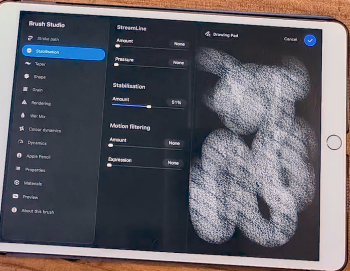
9. Pressure Sensitivity & Stabilization: All right. Hello,
and welcome back. We're almost done
talking about brushes. I promise you there's
just a few more things that I want to talk about so you really know everything you
can do over here. Let's go back to
our brush studio, open the brush menu then tap
the brush you want to edit, and the brush
studio will appear. Now, what I want
to talk right now is pressure sensitivity of your brushes and something
that is about accessibility. That's the stabilization
of your brush. So let's talk about
stabilization first and this can
be very useful. For example, right now, let me clear it again, but my brush right now doesn't
have any stabilization. Now, if you want to have all
the control over your lines, it's good as it is. Now, if you want some
help with your lines, so you want to draw
a straight line or even the curve line
without it seeming trembly, it's nice to add some
stabilization to it. If I go over here and now I
try it again as you can see, it is following and helping in making these curves
very perfectly. Now this is very useful. First of all, it will
make it drawing a bit easier for you if you're
like me, for example, my hands tremble a lot and this makes my work
a bit more easier, so I don't have to be
repeating lines over and over. I will get my hands tired
more quickly and drawing will become much harder and I will have to take more
breaks and so on. If I have stabilization on
and as you can see you can choose how much do you want procreate to help
you create those lines? It will make my job a bit easier and also
much less tiring. I can draw for longer. As you can see, very stimulus, I don't really have to make a lot of effort here
to draw my lines. And you can add as
much as you want. It really depends. I like
to go with a 35% at least. Then depending on the brush and what I'll use the brush for, I can add more or less. For example, a brush for Lenard, I need more stabilization or
prefer more stabilization. If it's a brush to color, then I don't need that as much. Now the second thing that I
talked about is the pressure. If we go over here
to the Apple pencil, you can control here this curve. And control, how much
do you need to press down your pencil to
draw your lines? For example, for this brush, if I have it lower down, I'm not really pressing too
hard here and as you can see, it's very, very soft. If I press harder, I need to press harder to have some more opacity to this brush. If I do the opposite, now if I press very, very softly, it will
appear more opaque. This is mostly what
the pressure will do. It can change the opacity of your brush or how thick
the lines will be. Once again, this comes a bit to accessibility as well
and your preferences. Depending on how much you press, the brush will
behave differently. For me, I rather not have to make more effort
while using my brush, but I also have a
very simple style, so I don't really need that. I prefer to have
this going higher, my curve going higher up. I already have what I need without pressing
much on my pencil. That way, my hands won't
tire as easily, but again, it's all up to you and if you're used to using a drawing tablet on your
computer or something, you're already familiar
with this curve. Again, if you're not
play around with it, you can add more
dots to this place to this curve and put
it at different levels, play around, see what
you want to do with it. That way, you can
more easily tell how you prefer to work with your
pencil and your brushes. Once again, there are a lot of options here that
you can play with, take a look at them, experiment. But yeah, this is
mostly it right now. Now before we go, I
want to show you how to export your brushes
once you're done with that and it's
very, very simple. Just have the brush you
want to Export Selected, then slide it to the
left and tap Share. As you can see, you'll have
this export window open, and now you can just
save it anywhere. You can save it to your Cloud. You can save to the
files, for example. This is a name, the location appears and then just
tap safe. This is it. Now you have a file of
the brush that this file, I'm going to have
available to you to download and now you can share
it with anyone you want. If you want to share
it with a friend of yours, you can
give it to them. You can also put it up online
and sell your own brushes. It's all very simple. All you have to do is
tap the share button, choose a place you
want to keep the file, and then you can access the
file whenever you want. Yeah, this is it right now. Now that you learn how to
export or share your brushes, we're going to talk
in the next video, how to import and
how to organize your libraries and your brushes
in general inappropriate. Again, take your time, explore
the stabilization feature, the pressure feature
on the brush studio, take your time with it,
try different things, see what you prefer, and I will see you in
the next video.
10. Importing Brushes & Building Your Own Libraries: Hello, and welcome back. Now, I promise we're almost done with talking about brushes. I just want to talk to you about the libraries and organizing your brush space as well as importing new
brushes into Procreate. First of all, let's
talk about libraries. Now, libraries are something
pretty recent in Procreate. It allows you basically to organize better
your whole space, how you have your brushes organized into
different libraries instead of being all in the same place through
different categories. So we have, for example, the classic library that is
usually the default one. If I tap this small
arrow here to the side, you'll see a few options. We can rename the
library. We can share it. You can share the whole library of brochures instead
of a specific sets. The sets are the
small categories that we have inside a library, and then we can tap two go
back to your main libraries. This is what it looks,
your brush libraries. In my case, we have here the classic library,
Procreate library, and I have the
audio brushes which are brushes that I bought
from another artist. There's another way to
access your libraries. You can actually use a
pinch gesture to go back to the overview or the
whole view of your library. If I pinch like this, I'll go back to
my brush library. What I want to
show you right now first is create a new library. For that, we have to be in the brush library's menu and
then press the plus button. And as you can see,
we can either create a new one or import a
new one from our files. If you got a whole library of brochures from someone else, you can use this button right
here, impart from files. As long as the library is in our files or in
your iCloud Drive, you can just access it and
import it into Procreate. We're going to create
a new library. Just tap new library, and now we can name it. Let's say my brochures, for example, apply
and there we go. As you can see, we have
here our new library. Just tap it to enter
it and as you can see, it is empty right now. What I want to do
right now is to import the brush I made
into this library. Now, to do that, I'll just
simply press the plus button, and then we have three
options, create a new brush, so you can just start a new brush right now like we
did in the previous videos, create a new set a
new category here to the side or import
from our files. What I want to do right now is import a new brush
from my files. I go here to my iCloud and
now I will tap my brush, and there we go. I was imported. As you can see, Procreate
will automatically create an imported set right here and you will find the brush you just imported in that set. I do have this brush
if you want to use it. I have this brush
for you to download. If you can use
that for this part of the class to import it
into Procreate, or if not, you can do that
with your own brush just for practice so you can you can gain some muscle memory on what to do when importing new brushes. Our next step, I don't really
like the name imported here and I want to have
this a bit more customized. To do that, we'll simply tap the selected set and
we have a few options. We can duplicate it.
We can rename it. We can customize this icon to the side and we
can also share it. Just like we did with
the brushes before, you can share a whole
set of brushes. Let's rename first.
Let's say I want to name it class
Brushes. There we go. Now, I want to change
the icon as well, and as you can see, we have
here a whole lot of options. Let's put just something fun. I want a star, for example. Another cool thing that
was quite recently, and if you want things to
be even more customizable, when you are renaming
your brush set, you can actually add some
emosis to it. I don't know. Let's see what can I add. Maybe let's keep the star
theme here and add sparkle. See, you can now add
images to your brush sets, titles, just a little fun thing. Now, of course, if you
want to delete a set, just tap delete and there we go. It has been deleted. Now, another way to move brushes here to your new library
is, for example, let's say you have some
brushes that are on your classic library or
appropriate library, whichever, but you want
to use them or you want to have this whole library with the brushes you use
the most, for example. You can actually do
that very easily. The only thing I
advise you is to first duplicate the brush and then
move it to another place, just so for me, I like to
keep everything as it is, and if I want it also
in another place, I rather have it duplicated
than losing the brush. What we can do is hang on. Let me look for here it is. I'm going to duplicate
the studio pen here. Now, tap and hold the brush
you want to move like this. As you can see, I
can now move it. Pinch to go back to the library, type the library you want, and then felicit inside the brush you want
the brush to be. This is it very simply. You can actually do this with several brushes with
multiple brushes at once. Let's try that as well. I'm going just for
the sake of example. Let's go ahead to the sketching. I want the HB pencil and the
six B pencil, for example. Just select one of
the brushes you want, then select the other one, tap and hold, and we do
the whole thing again, pinch, choose the library
you want, and move it. There is. If you want to
change the name of them, just sons to the pen
two or HB Bsel two, you can tap and hold
for a bit, then tap, rename, and let's just remove here the two
because I don't like it. Do that for all the
others, and there we go. Pretty simple, as you can see, I find that doing
all these organizing and having everything
else you like, pretty simple on procreate, pretty intuitive as well. So these are different
ways for you to import brush or to move brushes
from one place to the side. So, this is it for
now for this video. As promised, we are
done with brushes. We've seen all we can do
with brushes right now, but follow me to the next video, we can talk about the quick
menu and gesture controls.
11. Quick Menu & Gesture Controls: Hello, and welcome back. Now, as a bonus, I want to talk to you about
the quick menu customization. In Procreate, we can
open this quick menu to perform different actions that you might want
using gestures. So to have access to it, first, let's go here to
our Actions menu, then tap preferences and
go to Gesture Controls. And what we want here right
now is the quick menu. Here, we can choose what
kind of gesture you want or what kind of touch you want to open
this quick menu. For me right now,
I have it set up as tapping the square
button on my canvas. If I tap this
little square here, the quick menu will appear. Now if you tap and hold
here in quick menu, you can change from one
to another and you can add more quick menus by
tapping here the plus sign. Usually Procreate already has one menu set up for
you and here we have all the actions that are set up as default, but
you can change this. Also, if I tap and hold and open this quick
menu window again, and if I tap it again, I can change the name of it. I can also delete one of them
if I don't want it anymore. For example, let's go
back here. All right. As you can see, we have
here different actions. So if I tap this one, it will create a new layer. We have the flip
horizontal option, flip vertically, and
so on and so on. Now, you can change this, just tap the action button, and then we have here a lot
of options to choose from. We can choose to open
our reference window, for example, we can choose to
select the selection tool. What else previous
brush, previous color, the paste option, there are a lot of options here that
you can use basically. Most of the options you
can do on Procreate and you can set it up to
anything and this way, you basically have six extra
shortcuts to use, yes, at first it might be a bit weird to use
or to get used to, but once you get used to it, you'll just go bam bam
and you have a new layer, bam, you bam, there we go. You can just tap
things very quickly because you already know
what you have on your menu. Once you know that, it will
be much easier for you. Go over to preferences and then the gesture controls and see all these
options here because that would be the
most important is which gesture will be
the most comfortable for you to access these
extra actions with as less trouble
as possible. You can do this quickly and basically make all your work
or your process much easier, more straightforward
as possible. Now since we are in the
gesture control menu, you can also go over here and choose different gestures
for other actions. For example, if you want to use the arrays using
a simple gesture, you can just choose one
of these like perhaps you want your Apple pencil to erase all the time
instead of being a brush. If you toggle this on, your pencil will
act as an eraser. Instead of a brush, for example, you might want to
use it as touch. If you use your finger, it will always recognize that
as an eraser, for example. For example, copy and paste usually set up as a
three finger swipe. If you swipe with three fingers, let me show you very
quickly. All right. If I do this, the copy
and paste menu will open, so now I can copy. If I do it again,
I can paste it, for example, and
there we have it. If I do this again, I can simply duplicate it
and I have yet another one. It's a bit of quicker way to do than opening the layer menu, sweeping left and
duplicate it or going over here to the ad copy and
paste and so on and so on. These are just little
things that can make your home work a bit more effortless and to
quicken your process. So for example, we
have here in general, if you don't want
the two finger and three fingert to undo and redo, you can disable it right
here, for example, the rotation with using
the pinch gesture, you can toggle that on or off. For example, if you notice usually when you open
Procreate for the first time, you can actually use your fingers to paint
instead of a pencil. I have that toggled off. Because if it's on
sometimes you'll make some strokes by
accident with your hand. But let me toggle it
on again and show you. I can go over here and you see I'm painting with my finger. A lot of people like to
sketch with their fingers, so you can do that. I like to have this turned off because of accidental touches. But yeah, as you can see, there are a lot of
different options here. In the gesture controls, take a look at them, see what
you want, layer selection. There are a lot of things
that you can do here. This menu is, as I said, mostly to make your work
a bit easier at times. If you're someone who enjoys
to use shortcuts a lot, this whole menu will be
very, very useful for you. This one and the
quick menu as well. Just take a look at it, explore
and set up your software, your procreates area as
comfortable as it can be for you. This is it right now. I
hope this was helpful. Once again, take your time
exploring all of these menus. I will see you in
the next video.
12. Conclusion: Hello again and welcome back. Congratulations. You
finished this class. This was a lot of information, but I hope it was as helpful
as possible for you. If you did the assignments, you also end up with a cool brush for you
to use from now on. Thank you so much for
watching this class. I hope you enjoyed it and
don't forget to leave a review so more people like you can find it and enjoy it. If you enjoy this class, don't forget to also check
out my other classes, including Procreate basics if you want to learn more about Procreate and hopefully I will
see you in other classes. Don't forget, keep
on drawing. Bye.
 Patricia Caldeira, Illustrator | Digital Artist | Designer