Transcripts
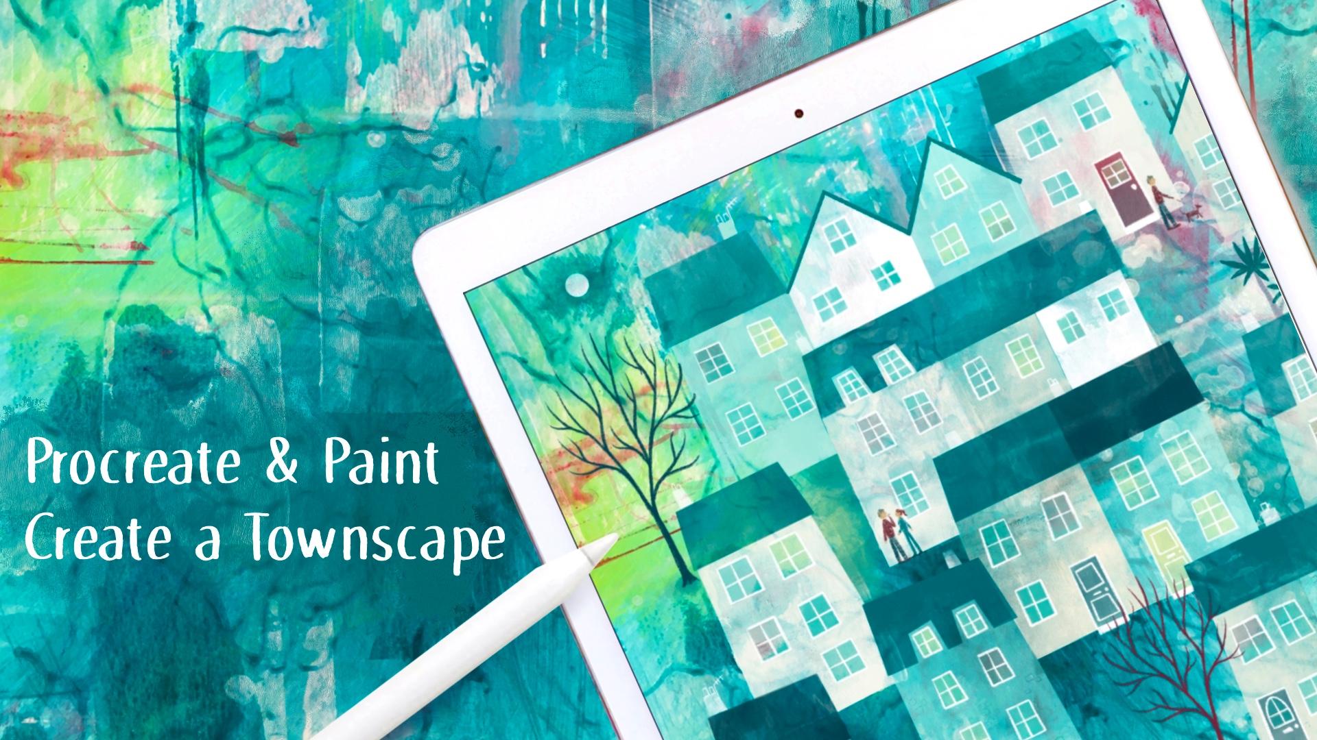
1. Introduction: [MUSIC] Hello, I'm Nick, I'm an artist and illustrator. I make art which sells on
products all around the world. I love painting and I
love drawing on my iPad. Anything which combines these
is really at my street. In this class, we're
going to start messy and fun with paint on paper to make a glorious
textured abstract base. We're going to
create a beautiful, spontaneous and varied
surface using acrylic paint. We are going to
paint, smear, splash, drag, wipe, and generally
make a lovely mess. Then we'll bring
that into Procreate. We'll look closely at
this background and will find ways to
discover and pull out houses and buildings to make a semi-abstract
townscape loosely based on a place
of your choosing. Then we'll add all the
fun little details to really bring up
painting alive. So much fun to combine real
art materials with Procreate. The element of chance and
randomness at the beginning of voice overthinking and
blank page paralysis. It helps to spark creativity
and find new ways of looking and discovering
inspiration which we process. When we finished,
you'll be able to use this method as
a starting point to discover all sorts
of inspiration for your own original and
imaginative artwork. This class is suitable
for all levels. But if you're brand
new to Procreate, you might also like to take
my introductory class first, which is iPad Art to create
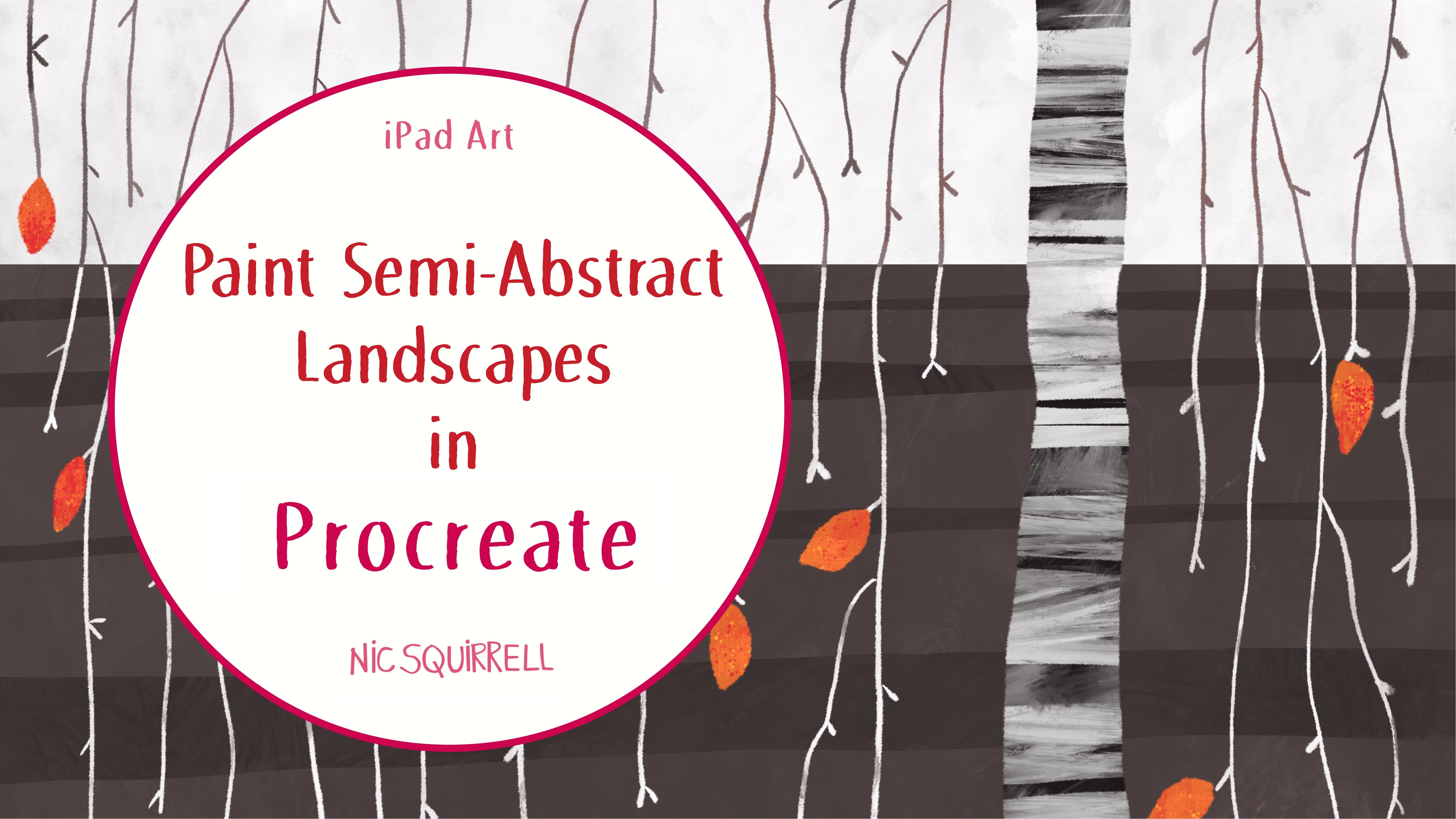
a monster in Procreate. You might also enjoy these related classes,
travel sketching, capture a favorite
place in watercolor, and iPad art paint, semi-abstract landscapes
in Procreate. Enough of that, let's roll up our sleeves and get
painting. [MUSIC]
2. Class Project: [MUSIC] Your project for this class is to
follow along with me and create your own
townscape painting. You can base yours on a
favorite place or on where you live or it can just be completely
from your imagination. Let your own choices
and personality shine through and keep it loose. Remember that the main
thing is to have fun. Please post your painted
background when we get to that stage and then
your finished town. It's so interesting to be able
to see how you develop it. If you'd like to post any
extra status as well just take some screenshots as you go
along and add those in too. I always look at
your projects and I love seeing what you come up with and if you'd like any
specific feedback do just ask. Lastly, just a quick
note to say that I am a working artist and I make my living from selling my designs. Feel free to use
the methods that I show you in the class but if your final artwork looks like mine
please don't sell it. You can still post it on
social media but do tag me and make it clear that it's something you have done
as a result of my class. Thank you. Let's get going.
3. Get Messy with Paint: [MUSIC] We're going to
start with paints on paper. It's hard to get those
truly random elements and happy accidents
using digital brushes. Getting messy at this
stage will give us a much more interesting
base to work with and lots of gorgeous
textures and color mixes too. Gather together some materials and just use what you have. If you've got lovely
artist's brushes, painting knives, etc, of course you can use those, but you don't need to go out
and spend lots of money. I'm just going to use
a few bits and pieces. I'll start with some
watercolor paper which is nice and thick so it
won't buckle too much. This is 300gsm weight, which is equivalent
to 110 pounds. Of course, any thick paper or card will do as it's certainly going to be a background layer and not a finished masterpiece. I've got my trusty and
rather disgusting water jar, some kitchen roll for
dabbing, smearing, and cleaning up, a
decorator's paintbrush, which I painted my
kitchen with recently. It's all scrappy and it's got very worn out splayed bristles, which means it makes
really interesting marks. I've also got regular
inexpensive paint brushes which I might use. The handle is good for
mark-making too to either dab or to
draw into wet paint. I've also got this which
I think is for baking. It's got squishy,
flexible edges, so it's lovely for
spreading paint. One of my favorite things to
use is this old store card. It's nice and
flexible and you can use it to apply or
drag the paint around, or use the edges to
print lines with. It's not important what you use to get the paint
onto the surface, it's more about getting some really interesting and
varied textures and marks. Thinks about using any
of these: a roller, either solid or a sponge. Sponges in general: natural
sponges, makeup sponges, household sponges
to spread or dab paint and print shapes onto
the surface if you want to. A comb or a little
brush to make parallel, straight or wavy lines. Your fingers to dab or
smear the paint around. I've got a bottle
filled with water to spray onto wet paint. I'm also going to
use my hairdryer on a low heat setting to blow the
paint around a little bit. Of course you can use
anything else you can think of to make interesting
marks and textures. I've just got a quick
tip for you for keeping your paint usable between coats. I use one of these
plastic boxes. I think it's either
for fishing tackle or maybe for crafting. I squeeze some paints
into each compartment. It's got a lid so at
the end of the day, I'm going to get a
bit of kitchen paper placed of the whole container and pop the lid over the top, is to stop a skin forming on the paint and
stops it drying. Use 3-5 colors of acrylic paint. You may want to
base your colors on the specific town or even on the way a
place makes you feel. We don't have to be realistic. Just make sure that there are light and dark colors
on your palette. For my first painting, I'm going to use white,
a deep turquoise, pinky red, and lemon yellow, and also a mix of all
the colors together, which is this dark blue color. Let's get started
and make a mess. Don't think about what
you're doing too hard and don't try to control
the surface. We need lots of randomness
and happy accidents, which is the whole
reason that we're using real paint at this point. To start using my scruffy
decorator's brush to get some paint
onto the surface. I'm not rinsing out
between colors. I'm just letting the
paint blend on the paper. You don't have to do it my way. Just experiment and
play with the paint on the surface and work
quickly and intuitively. Have some fun music
on if it helps. Anything that you don't like, it doesn't matter, it
will get covered up. Do be prepared to go
through grotty stage. If you work on a
few pieces at once, which is what I normally do, you'll be less precious about them and they'll turn
out better for it. You can use acrylic paint
thickly like I am here, or you can water it down a lot, which makes it great for letting
it run and drip. [MUSIC]
4. Paint Another Background: [MUSIC] I'm going to
make another one, and I'm going to use
different colors this time. Because I've got some little
bottles of acrylic paint, I can just pop some blob
straight onto the paper. Time to use my dose
scraper I think. What a lovely mess,
psychedelic tartan. I'm going to use the
store card to scrape some bits off and add
some more bits on. I've got no idea how
this will end up. Let's hope it's a nice surprise. Now that's dry. I'm
going to add in some very watery paint
and a few splashes. I'm just going to continue
as before adding layers, adding marks, and
seeing where it goes. [MUSIC] I think that's pretty much done now. I'm going to take a
photo with my iPad. Use either natural light or daylight bulb and keep your
iPad's level as you can. I'm going to the Photos, and I'm going to edit it here. First of all, I'm going
to crop off the edges. You can use preset
to change the look. Or you can just do it
manually as an auto setting, or you can change
everything individually. Have a play around, and then press Done
when you're ready. Don't forget to pop your lovely
textured backgrounds into the Project section of the class as your
first deliverable.
5. Get Set Up in Procreate: [MUSIC] Next thing we
need to do is bring the backgrounds into Procreate. I just want to take a moment
to say that of course, you can continue to
follow along and continue to paint this townscape
using actual paint. The ideas behind
what we're doing here are exactly the
same either way. Open the app and in the
top-right, choose photo, tap on your picture and it will import itself onto a new Canvas. If you nip out to the gallery, you can see the size. If you need a big Canvas, you can use a scanner at 300 DPI to bring in
your background, but bear in mind, you'll need
it to be small enough to have a few layers to
work on in Procreate. At this point, you can do some
further edits if you like. Tap on the adjustments
want and use hue saturation and
brightness sliders. Color balance, or curves to get it looking
how you want to. When you're happy
with how it looks, the next step is to
make a color palette. To use the colors we already
have in the background, we need to save it out
to photos on your iPad. Any reason that
we're doing this is because we might well have
made some adjustments. Obviously, if you're just
using it because you brought it in you don't need
to do this step. If you go to the spanner or
wrench action setting at the top, choose Share, JPEG. Save Image, then it will
save up to the camera roll. Now we can go to the color
chip and choose palettes view, and then tap on the plus on the top right and
choose New from photos. Tap on the photo, and your new color palette will
magically appear at the top. I probably won't
use all of these, but it's such a quick way of
getting your colors ready. Next, we need to
decide on brushes. I'm going to add a new
layer to try some out. I encourage you to go
through all your brushes and find the best ones
for your new style. We need some which
blend in well with the background painting and some that look good for detail. They do need to look natural
against the background. After all, we are trying
to end up with an image which looks like it has
all been hand painted. Changing the size and opacity of the brush will also
give different effects. Whittle it down to just a few. Include at least a big
texture painting brush and a smaller more
opaque brush for detail. I like to make another
layer once I've decided on my
favorites to keep as a permanent reminder of which brushes I've used in a
particular painting. I'll drag this below the
base layer and lock it by sliding the layer towards
the left and tapping Lock. It's always there
to refer back to. The last few brushes I
used they're here at the top of the brush
pallet in recents. But if you want something
more permanent, you can make a new
brush section for them by tapping the
plus sign at the top, rename it, and then
go back into recents. Tap and hold the
first brush and drag it over to your new
section until it opens. Then you can drop in the
brush to new palette. Repeat that until
they're all there. Original brushes
will still be in their own sections and the ones in your new palette are copies, you can tell that by the
little procreates wishes. You can see which
brushes I'm using but please do explore
and choose your own. What works for you
will probably be completely different
to what works for me. We're all set up and
we're ready to get going.
6. Discover Your Town: [MUSIC] Now let's make a
new layer to sketch on. I'm also going to lock the
paint layer to protect it. The next thing we need to do is have a really good stare at the background and see if we can see any obvious
starting points. Right now you can develop this
background into anything, maybe a still on landscape, a jungle, a character. Possibilities are endless. I can see a cat right
here and a dragon. This method is about
finding order out of chaos. If you've ever seen the
shape from a monster in the clouds or spotted castles in cities on a cracked road we'll seem to face shapes on
the random surfaces. This is the thing that
we're looking for here. As this class is about
painting townscapes, I'm looking for bits
that suggest a building. Don't forget that you
can turn your Canvas around if it looks more
promising upside down. Mine definitely does. I'll start drawing
in some ideas. Sketching in some
really simple house shapes to start with. I personally find it easier
to start with the roofs. I'm leaving some gaps between
the buildings where I can add trees and
other details later. I'm looking at the horizontal
and the vertical marks and the areas that are already in the background to suggest walls, roofs, trees and so on. I hope you can see
where I've pulled these houses out from. They mostly started as
part of the surface rather than just drawing
randomly on top of it.
7. Paint the Town: [MUSIC] I'm going to rename
the sketch layer and lock it. Then I'm going to make a
fresh layer to paint on. Using the sketch as a
guide I want to use the brushes I've chosen to
bring out the buildings, some areas I'll bring forward, and some I'll push back. I'll start with the pale
blue and the tamer brush, which I love for this because the opacity varies
depending on how hard I press which means that if I use a light touch it lets all
the textures and variations, and the original paint
layer show through. This brush looks
like it's part of the original painting rather than looking digital and fake. It's got a lovely painty
texture of its own as well. I've gone over the edges here, so I'm going to
use the eraser and the 6B pencil setting to
clean up those edges. Then I'll try
another brush to add some details to the roof to
give the impression of tiles. I really don't want this particular painting
to end up too tight so I'm not going to do
too much cleaning up here. You can see that I've
used this line here from the painted layer to be
the edge of the building. There's also a line here, but it doesn't quite match up
with where I want it to be. I'm going to tap
and hold to select the pale blue color
from the canvas. Then I'm going to
use this brush again to very lightly blend that. These two blobs are
a bit distracting, so let's knock them
back a little. I'll add some more details
later but for now, I'm just looking at the planes
of the buildings and using contrast to define them instead of having to
outline them all. Let's move on to the next house. At the moment, the
color of the roof, the wall, and the
background are the same. I also want to keep the dark red for the other
roof down here. I'm using the same pale blue to lighten up the background
between the buildings. I like to turn off the
sketch layer now and again just to gauge
where I'm at with it. I'm also going to soften
this line at the top. With the sketch layer off
I can see that I've got some good definition in places but the roof
isn't well-defined yet. It's just a faint line
along the roof line here. I don't want to change
the color and texture of the roof because I
think it looks good. But I'm going to define it
with a little bit of detail. I'm going to use the same
pale blue color for now. I'm going to use a pencil to draw in the wavy
beautiful lines. Actually, I'm going to erase
that lower line and use the wavy line instead of
the lower edge of the roof. Next is this roof, and I'm going to
use a darker color. I'll use a different
brush as well. I'll throw in some roof tiles and just zoom out now and
again to check my progress. There wasn't really
enough difference between the wall and the
roof of this house, but I really like the colors
and textures on the wall. I'm just going to lighten up
the top of the wall where it sits next to the roof and
maybe leave the rest. Even though I've only put in those three little roofs so far, you can see that it's
starting to come together. Everything's a little bit wonky, but I like it like that. It gives the painting
a bit of personality. Perfect is boring. Next thing I want to do
is define this roof. There's already a line between the roof and the
building next to it, but the colors are very similar. I need to do
something with that. There's a division between the roof and the
building behind it, but there's not enough
difference at the moment. This left edge of the roof
is a little bit strange, but I really like the
pale blue streaks. I think I'm going
to embrace this as part of the roof texture. I'm lightening up
the top of the roof and down the edge with
a really light touch. The left edge isn't bad, it just needs a
tiny bit of work. That's making it a
little bit more obvious. Now to add detail, I want to replicate these
scratchy blue lines. I'll grab the color by
tapping and holding. Don't think any of my
chosen brushes will work, so I just need to find
something along those lines. This sticks brush
looks quite similar. That's just right. I'm not going to
outline the roof, I'm just going to let
it speak for itself. That sticks brush is great, so I'll drag that into
my painting palette in case I want to use it again. This edge is maybe
a little dark. I need to add a new
layer on top to work on and just lighten
it up a touch. I'm not being particularly
organized with my layers because this is more like
a normal painting process. I don't envisage doing too
many adjustments later. Of course, if you prefer, you can be much more
regimented about it than I am. There's already a natural line along the bottom of this house. I'm going to use that and
just extend it a little bit. This way of painting
is all about using what's already
there and enhancing it and to use the eraser
to take it in a little. Turning on the sketch,
I can see that I've taken it further out
than I wanted to. I think it'll look better
if I remove a bit more. This bit in front of the house
needs to get a bit darker. I'm going to adjust
the edge here too. I'm darkening down this area
in front of the building. I think that's made
it a bit dull so I want to get a bit
of texture back end. I still feel like it needs
a little more texture, but I'll leave it for
now because once I've added some details,
it'll look different. Turning off the sketch, I think I really
need to raise this back to the natural
line on the canvas. I'm just trying
things and adjusting as I go until it looks right. Now I'm going to
look at this roof. There's little bit
of definition here. I can see the edge on the left. I can see a line at the top, but it does need
some more emphasis. I really want to preserve the
texture of the roof though. I'm going to lighten
and darken the areas adjacent to it rather than
change the roof itself. I'm going to sample this
dark raspberry color. I think I need to
work on the lower of my three working layers so that I can draw on top
of it if I want to. This dark color is effectively pushing the background back. Because of that, it
pulls the roof forward. We continue to work around that roof to increase
the contrast. Now I'm going to use my newly found sticks brush
to add a little more detail. Looking at the sketch again, I can see that originally
I wasn't going to take this roof
all the way across. I think I prefer it that way, so I'll knock that back. I can see that the side of
this building, this defining, I'm using the same brush and a darker red from my palette. I want to kick the wall of the big house behind that roof. I also like the wall of this house so I'll
darken the roof. I'm using the lighter red
as well for some variation. A blend of colors definitely
makes it more interesting. Let's turn off the
sketch and zoom out. You can see how the town is
starting to come together. It looks a little
messy and chaotic, but at least the buildings
are starting to emerge. I need to continue
working my way down and starting
this next roof. Definitely need some color in order to make
it stand out from the building behind
it because there's a lot of texture going
on there right now. It always needs reversing and that the part on
the left needs to get darker in order to stand out from the
surrounding areas. The part on the right
needs to get lighter. I'm still using that
same tamer brush because that's what's working for me and it's in keeping with the paint
layer underneath. I'll decide later whether
to use the other brushes I saved or not but because this is really working on the base, I want it to be cohesive, a free marking freehand so far. But if you prefer, you can use a selection to
confine the paint. This will give you
a much harder edge. I think for the
second painting later we're going to make
much more use of this. It's tapping the selection
tool at the top. Then choose free hand. You can either draw
your selection freehand or you can tap on the corners, which will give you
straight edges. You can combine both
in a single selection. Hopefully, you can see
these diagonal lines showing up and this is the area outside the selection which you won't be
able to draw on. I'll pick my brush and I
can merrily paint with a clear area with wild abandon without going onto
the most bits. If you tap on the Selection
Tool at the top again, it will get rid
of the selection. If I turn off the sketch layer, you can see that that's given
me a really sharp edge. It's more interesting
for a painting to have some hard edges to contrast
with the softer areas. I do want to knock back
some of the texture on the roof though because
it's quite dominant. If you tap and hold on
the Selection Tool, it'll reload your
previous selection. I need to tap on the Brush Tool. Otherwise, it's just
adding to the selection. When I'm done, I'll tap
the Selection Tool again to deselect onto the next one. This already has a dark roof. I need to lighten and
darken some areas to enhance the contrast
with the surrounding areas. Now I'm just going
to continue in the same way using
all the methods that I've just shown you to just carry on working my
way around the painting, knocking back the
areas that are too permanent all the areas that I want to be at the back and bringing forward
other areas. [MUSIC]
8. Windows and Doors: [MUSIC] At this stage, we can start adding some more details. This roof needs some tiles, so I'll just do that before
I add the windows and doors. You can draw roof
tiles or shingles in so many ways with stripes and weakly
lines like I've done, or you can do scallops
with diamond shapes, or maybe just pick out
a few square tiles. I'm keeping it loose and I
think I'll stick to stripes. I'm going to add
windows and doors now. Before I start, I'll
add a new layer for the frames and another
for the window panes. If you want to add some layers, you can merge some by
pinching them together. Or if you prefer,
you can save out to the gallery and
duplicate your painting before you merge so that you can still make adjustments
later if needed. I'm going to pick the
lightest color in my palette, and I'm going to use the
6B pencil for the frames. I'm going to draw a rectangle, and then I'm keeping the
pen on the screen until it snaps into a
quadrilateral shape. I can tap at the top
where it says Edit Shape, and then I can
drag the blue dots in the corners to alter it. I don't want these
to be too perfect. You can draw your windows
freehand if you prefer, or you can make
them more even and perfect if that's
more your thing. I've decided to move
these last two, so I'm going to use the
selection tool on free hand to last suit them and then
just move them up a bit. Tap again on the selection
tool to deselect. This is the great thing
about working digitally. Let's add some crossbars
to the windows. This style is typical of where I live in the
Southeast of England. Choose whether to draw
these freehand or to hold at the end of the stroke for a perfect straight line. My door's going to
have a door knob, a letterbox, a window,
and a doorstep. Your details will be
different depending on where your chosen
town is based. On the windowpane layer, I'm going to add the glass in a darker color and use
a more painting brush. I'm adding the color
behind the window bars. You could also think about using a warm yellow to look like the
lights are on if you like. I need to color my door too. Then to finish my house off, I'm going to add a chimney holding like before for
the straight sided shape. I'm going to work my
way around the picture, adding the windows and doors
to all the other buildings. [MUSIC] I've gone round and finished all the windows
and doors and chimneys, and this is where
we're up to so far.
9. Add Details: [MUSIC] Now it's time
to add more details. This is really the fun bit
where you can really make a difference to what your town or city is going to look like. Think about what details
you'd like to add. For example, you might want
to put in some shop fronts, pavement cafes, maybe some
streetlights, people, dogs, cats, cars, bicycles, boats if your town
is by the sea, trees, potted plants, anything else you fancy. It's completely up to you
how much detail you add. Going to start by adding a hazy sun or maybe
it's the moon. I haven't decided yet. I want to put some trees in, so I'll just draw a
rough guide for those. Adding some street lights too. I want to add a bicycle, maybe leaning against the house and just a little table
and chairs here too. They look a bit small. I'll
just select them using the selection tool
and then go to the transform arrow
and choose Freeform, and then stretch them a little. Now I've made the table too big, so I'll do the same again and make that smaller.
That's better. I think I won't put any
people in this one, maybe I'll save that
for the next one. That's my plan so far. The original sketch is locked. I need to unlock it
first by sliding to the left and tapping "Unlock". Then I can squish
both those layers together to merge them and lock the new layer again by sliding left
and tapping "Lock". I'll make another new
layer for my details. I'm starting with the sun and I want to make a round selection. Tap on the selection tool and
the bottom choose Ellipse. If you imagine a square
box around your circle, start dragging from where
the top-left corner would be and if you put a finger on the screen at the same
time as you drag, you'll get a perfect circle. Then I'll switch
the sketch layer off so that I can see better. Using the palest color
and my painting brush, I'll paint over that selection. You can see the brush
shapes showing up here because I've got it
on a really big size. Deselect by tapping the
selection tool again. I need to go down to one of these shading layers
underneath and just darken this area behind the sun so that it
stands out more. I'm going to use the 6B
pencil for the details, but you might prefer
a different look. All of these choices you
make along the way with color, brushes, shapes, details, whether things are
straight or wonky, what placements you use, what you add in and
what you leave out, all of these things give
you your unique voice. I'm adding lampposts next, and I'm just going
to keep them simple. They don't have to be perfectly vertical unless
you want them to. I'm not very happy
with this area. I'd like it to be more
obviously the ground, whereas at the moment it just looks like part of the house. I'm going to use the
selection tool on free hand. Let's draw some little
paving stones squares. You can see at the
bottom of the screen my selections on add, which means I can
just keep adding extra paving stones in. I know it's hard for
you to see on screen, but I've drawn a
few little squares and I'll make them just a little bit lighter than the
background. I like that. Now for the trees, my trees aren't going
to have any leaves on. I'm using the sketch outline as a guide and I'm drawing
in the branches. You might prefer
to add leaves or blossom on your trees or maybe have pine trees or palm
trees or some other tree. I don't think
that's dark enough, so I'm going to select
the tree taking care to avoid the lamppost which
is on the same layer. I'll turn on the Alpha Lock by tapping on the
layer and choosing Alpha Lock so that I can only draw on top of
what's already there. Then I'll tap again on the
layer and choose Fill Layer and turn the Alpha Lock off so that we can keep
drawing on that layer. I'm going to make the
trunk and some of the branches thicker
at the bottom. For the next tree,
I'm going to go for a pale color on another layer behind it to keep it
separate from the first one. Normally, of course I'd pop a layer in the back to do this, but I can't do this time because my original painted layer
covers the whole Canvas. I'll have to draw
them in and then just erase any bits of
stray over the houses. Trees look better if you
do it this way rather than just trying to avoid
the houses as you draw. I'll add the rest of the
trees in the same way, erasing any bits switch
gets where they shouldn't. I've added one or
two extra ones too. Now I've drawn them all in. I've decided to
make some of them lighter by Alpha locking the layer and painting over the ones that
I want to lighten. You can see how many
decisions as I go, which is so much easier when I'm painting digitally of course. I'm going to draw in the bicycle and the table and chairs. I'm nearly done. Now, I'm going to zoom out
and see if anything needs changing or modifying
in any way. I'm going to add some roof tiles and a chimney to this roof. I like the paving
stones I did earlier, so I'm going to add just
a few to this empty area here using the selection
tool to draw the squares. There's no need to
draw all of them in. Just a suggestion is good. I'm using the selection tool
to add an edge to where the two walls of this house meet so that you can see the
difference between them. I've decided to move the sun
using the selection tool and transform tool and I added
some darker paint behind it. I then added some darker
and lighter paint behind the trees to
make them stand out more and blended in some of the areas of the
background in which the paint texture
was too prominent. Here I added paint
to some of the roofs to make them more solid and give more structure to
the composition as I felt that there wasn't enough contrast and everything
looked too much the same. This is something that's easier
to see when you step back from your painting than when
you're looking close up. Last rule, I added some color to the chimneys and some
light to the street lamps, so maybe that sun is
actually the moon. I think that's done now. Join me in the next
video and we'll paint different version on
the green background.
10. Paint Another Town: [MUSIC] Let's have a look
at the green version. I'm going to whiz through
this one because most of the methods are very
similar to what you've done, but there are a few different
things we're doing. I've adjusted the photo of my green background
painting the same way as I did with the
red one by using the photo editing on my iPad. I brought my painting into
Procreate, ready to go. I'll add a new palette from
photos, the slide before. I've checked at the brushes I used last time still look good on this painting and I've
removed any that don't work. I've sketched out
my town by finding starting points on the
painting in the same way. There are a lot less horizontals and verticals in
this background, which means that there aren't
as many of these buildings. I've added extra houses
where it makes sense. While sketching, I held my pen at the end of
each stroke to get straight lines and I'm
very much going to stick to the sketch for
my building shapes. I'm basing this one loosely on villages in Devon in the
southwest of England. The houses are often painted pretty colors and the roofs
are dark slate tiles. I'll bear that in mind. It's like some of the
roofs have windows in too, so I put those into the sketch so that I
can work around them. It's like I will rename and lock the sketch layer and
add a new layer to work on. I'm going to use much
more defined edges for my buildings and give them
more of an opaque look. It's going to be less loose and I want to include
a few people too. Let's start with
the house walls. I'm going to start by tapping on the selection tool on free hand. I'll tap on each corner to make a straight sided selection. Then I'll pick a pale
color and I'll use my painting texture brush to
paint over the selection. I'm using a light
touch so that some of the texture still
shows through. But I'm making it more opaque
than the red painting was and you can see that it's
much more of a blocky look. I'll try to match up the
edges the best I can, but it doesn't really
matter if there are slight gaps or overlaps. I'll go on the canvas
in the same way using just a few colors
for all the houses. On a new layer, I'm going to do exactly the same thing
to add in the roofs. The gable ends, I'm using a more opaque and smaller brush, and I'm holding it at the end of the stroke
to get a straight line. Then I'm going to erase
the extra unwanted bits. On a new layer. I'll add
the window frames using the 6B pencil and I'm
holding at the end of drawing rectangles to get
the editable straight edge shapes exactly the same way
as in the red painting. I'll add all the frames and
the doors on a single layer. On the lighter houses, it's easier to turn off the buildings layer to
be able to see better. Now, I'll add a new layer below the frames for the window panes. I'm using the
selection tool again to select the window glass area. Because my selection
is set on add, which you can see
at the bottom left, I can select a few
windows at the same time. Here we are with all
the windows done. I've used some of the
yellow and the windows partly to balance the
colors out a little because it's good to have colors in more than one place on your painting and partly because it looks a little
bit like the lights are on and I like it. Next, I added colors
to the doors, again using colors taken from the painting to help
balance them out. Here I've added the chimneys
using the selection tool. Then I've added some trees
keeping the contrast high. I sneaked in a tiny
siegel too just for fun. Last [inaudible] I
put a few people in and I also put in the moon.
11. Final Thoughts: [MUSIC] That's it. I hope you enjoyed this way of working, combining real paints with all its quirks and
randomness with Procreate and also the method of discovering and painting from within an abstract background. You can use this method
for any subject, from landscapes to still life, imaginary creatures, and more. It's something that I use
all the time in my work. I'm really excited to see
your projects for this class. Just a quick reminder to post
your work on Instagram with the #nicsquirrellskillshare
for a chance to be featured in my
Instagram stories. Follow me here on
Skillshare to be kept up-to-date with new
classes and discussions. If you've enjoyed the class, it really helps me if
you leave me a review, especially, if it's a nice one. Happy painting and
bye for now. [MUSIC]
 Nic Squirrell, Artist and illustrator