Transcripts
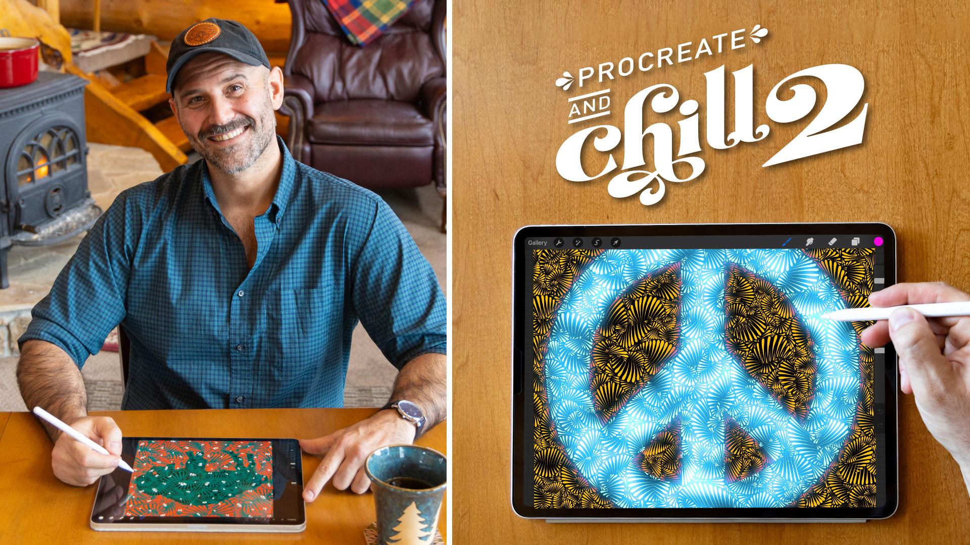
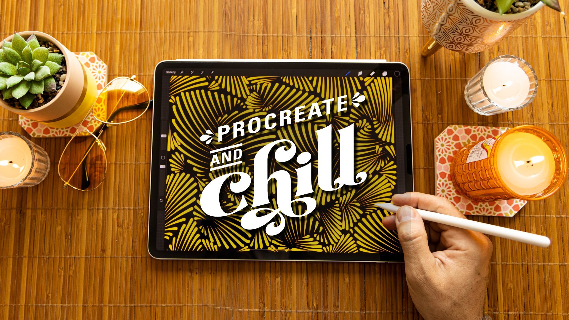
1. Intro: He, hey. Welcome to the cabin. Hey, there. I'm Adam Palmer, and I'd like to invite you to the coziest spot tucked away here in the
Colorado Rockies, one of my favorite
places to chill. One of my best
performing classes, Procreate and chill was enjoyed so much that I
had to bring it back. This time with a
few fun new things to try with you as
we chill together. I've been incorporating
the same style. But this new project
incorporates reference photos to help me form a more structured
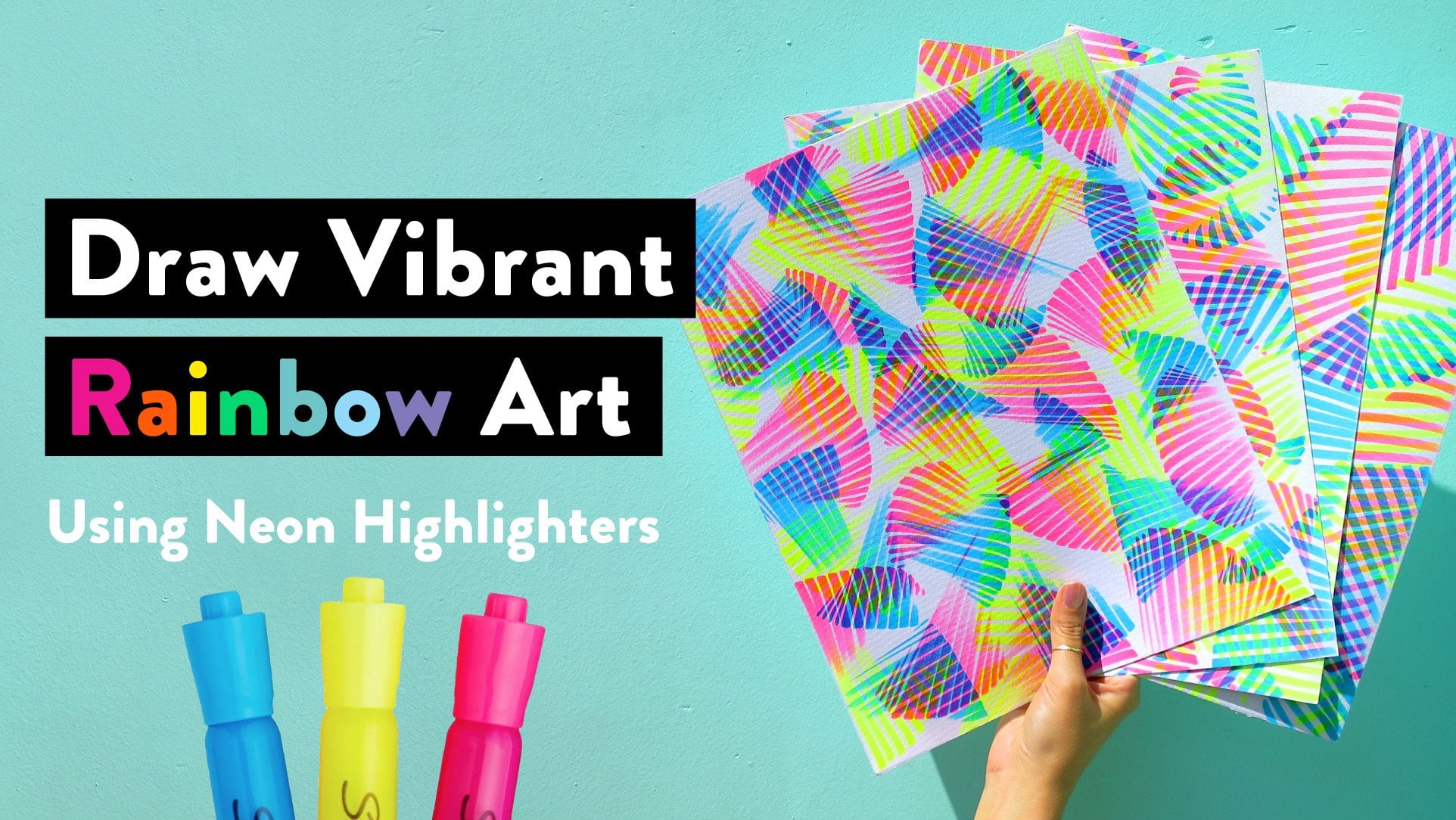
and engaging composition. By using different combinations
of colors and shapes, you can create really fun pieces of funky floral digital artwork. I've even updated a few
techniques from my first class. And today here at the cabin, you're going to make a fresh and trendy piece of artwork that can easily be added to your artists portfolio or
your print on demand shop. Ask any surface designer, funky floral patterns are
very trendy right now. I'm also going to
show you some effects I play with to
really make it pop. I've been busy making
a few examples, and I think you're
going to get the hang of it really quick. We're going to take
our time and set our intentions because this
class is for relaxing and finding a little time
for ourselves and enjoy art for the
sake of making art. But first, make sure you click
that follow button up top. That way, you'll be the first to know when I drop a new class, record a comedy album, or just have something fun
to share with you all. You can also follow me on
Instagram at Adam Palmer. Do you have procreate? Then
you're invited to chill. So the fire is crackling,
and the coffee is hot. So let's try to unwind a bit with a little bit of
procreate and chill.
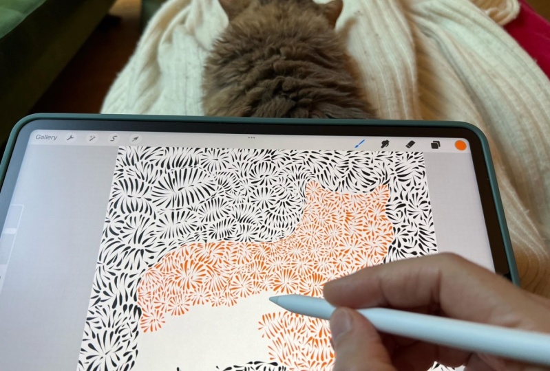
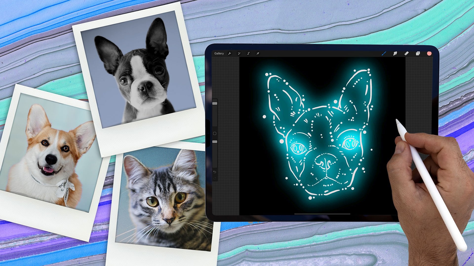
2. Class Project: For this class project, you're going to
be making a piece of digital abstract artwork, and you'll be using
a reference photo of a silhouette
of your choosing. Today, I'm going to
be using a buffalo. But you can follow along using any animal shape or
abstraction you choose. No matter what your motif is, you're going to be able to
follow along just fine. Once you're finished,
you can upload your artwork to the
class projects gallery. That way, we can all see, have a look, and comment
on your artwork. And I'm super excited
to see what you make.
3. Supplies: Let's talk supplies. Today,
you're going to need an iPad, a stylist, and the appropriate. I'm going to be using an
Apple pencil for my stylist. But if you don't have one, you could always just
use your finger. We're also going to
be using a photo to help guide our composition. I'm going to be
using this Buffalo silhouette for today's project. You can use your own photo. Or if you just want
to get started, have a quick look at the assets folder and take one
from there. For free, Yeah, for free. Alright.
Let's talk about what I look for in a photo
to use for this project. I like to keep things simple. So no need to get
complicated, right? Usually, something with clear
lines works best for me, like this Ying yang or this Buffalo outline
I'll be doing. You can always find
something a bit more complex or a bit more
simple, if you like. But in my experience, the more clearly
defined the silhouette and sections of the
photo are, the better. So let's start with an easy
shape or guiding image. Feel free to think of your own. Or go ahead and help yourself
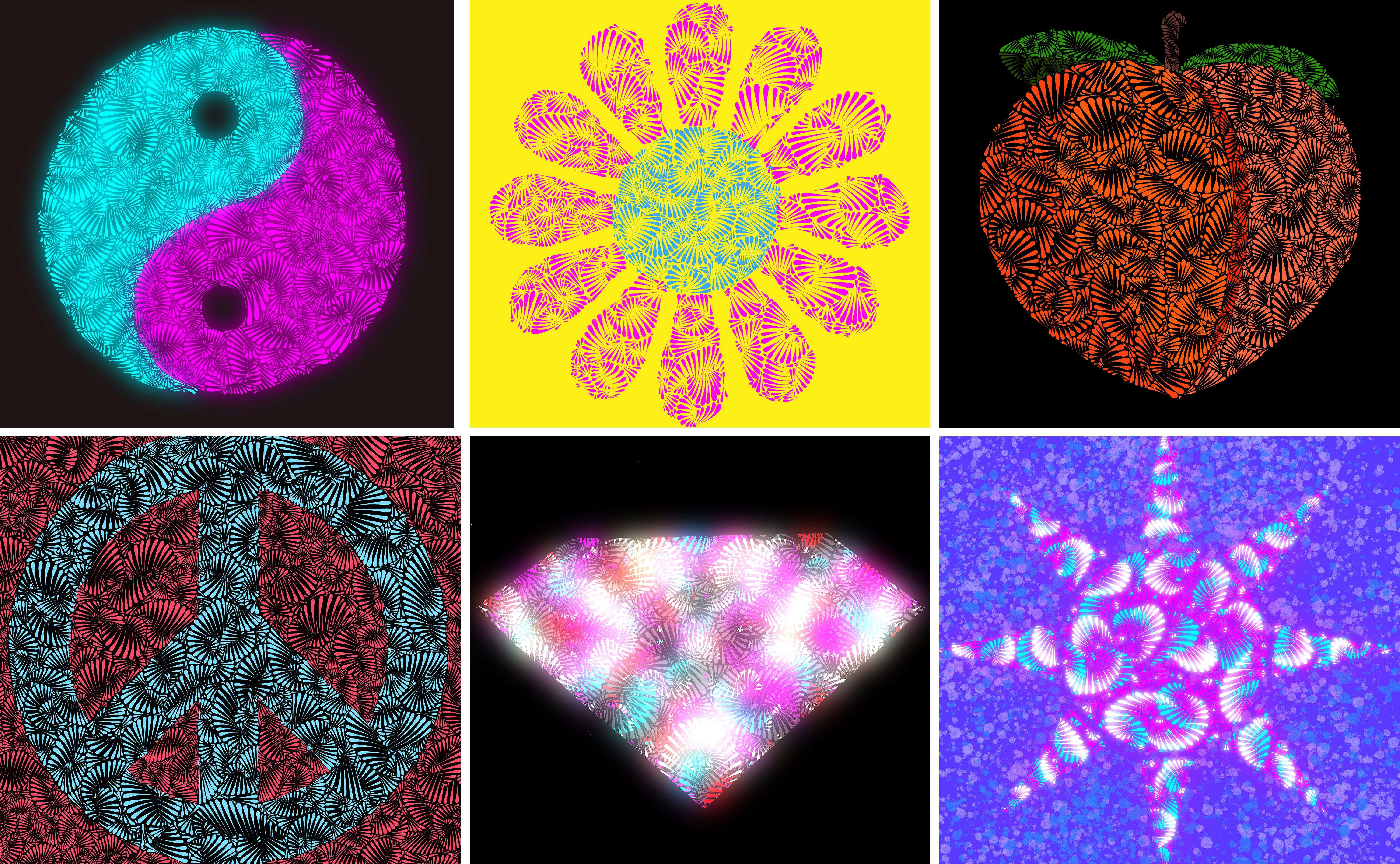
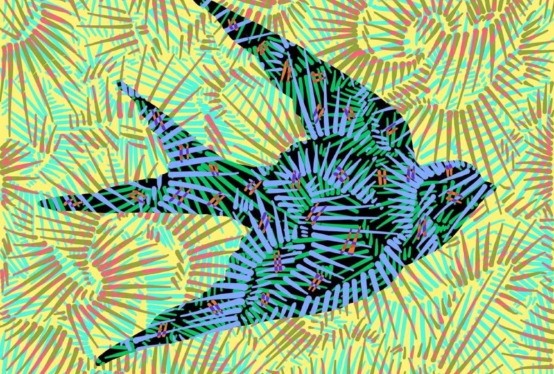
to my personal stash of reference photos that you can find in the class assets folder. Here's a few examples of my recent projects that I've done to get those
creative juices flowing. This can be helpful if you need a reference or a
jumping off point. What you draw today is
your own personal choice. The important thing is that it's recognizable as a silhouette. So if you're doing an
animal, let's say, maybe a side view
is going to be much more recognizable
than a front view. Now that we have our image, let's go ahead and
upload that to our iPad. Then we're going
to bring that onto a canvas in procreate
and get started.
4. Starting Your Canvas: Let's make a canvas. I usually make a
pretty big canvas, depending on the number of layers I'm going to be needing. Remember, the larger
your canvases, the fewer layers
you're going to get. If you're going to be
using this for printing, you're going to make sure that your canvas is large enough, so it will print
in high quality. If you work on a really tiny canvas but want to print big, it's going to come out
blurry and pixelated. But if you're working
on a larger canvas, it won't be an issue. I know that I'm not
going to be printing anything larger than 20 20 ". So that's the size canvas
I'm going to be using today. And it's going to give
me plenty of layers. So this is my gallery
when I open Procreate, and now I'm going to
make a new canvas. I'm going to go
to the plus sign. And right here in the top right, we're going to click
that for a new canvas. It shows our dimensions here, but we're going to be
working in inches. So let's click
inches our width 20. And now our height.
20. This gives us a DPI of 300 and a maximum layers of
14, more than enough. Now, let's create. Boom, hard parts over. We got our canvas. Now, let's get this some fun stuff
and go find some brushes.
5. Brushes: Good news. I have a
free gift for you from me and my friends at True
Grit Texture Supply. True Grit creates Awesome
Procreate brushes, and they're kind enough
to give you for free, my favorite procreate brush, the Little smoothie
Comics Inchor. In my opinion, this is one
of Tru grit's best brushes, and you can get it for
free right there in the class assets folder.
Thanks, True Grit. But if you don't want
to download that, there is a very similar brush
in your default brushes, and it's called syrup, and you can find syrup right in your default
brushes under inking. But for now, I'm going to use a little smoothie comics inker. I prefer to use the comic inker because the points
are very sharp, and I've been using
it for many years now with a lot of my projects. So here's what that
brush looks like. Mine's in the rusty nib folder, but yours will probably show
up in your imported folder. Here's what the
brush looks like. Okay. Pretty cool, huh? Very smooth. When I
draw with this brush, like I said, I love the pointy lines that it
makes right here at the end. It's pressure sensitive. So the harder you push
down on the screen, the thicker the line will be. When you release pressure, the line is quite thin. And when you start heavy
and end very light, you get a nice tapered finish. In my opinion, this brush is as close as it gets
to a real inkor. I just love how easy it is to use the consistency
of the stroke, and it makes a fun little mess. As always with procreate, there are no mistakes. So two fingers will undo. And remember, three fingers
will redo the action. But let's start
with a clean slate. As I mentioned, we're
going to be using a reference photo to trace over and help guide
our composition. To import a reference photo, go ahead and tap your wrench. Click. Insert a photo. And now, touch your photo. Okay. And that'll upload
to the canvas. I want to make this photo fit my canvas a lot better
than it does now. So simply dragging these corners will help you fit your
photo just how you want it. Be careful not to drag
the photo off the canvas. If you do and you set
the transformation, that part of your photo
will be cut off the canvas. But mine is not set yet, so I'm going to make
sure it's nice and centered. That
looks good for me. Now it's press the arrow
to set the transformation. If you want to readjust it, just click that arrow again, and now you can move it around. Remember, selecting that arrow will set the transformation. Now that we got our brush and our photo ready to go,
it's time to chill.
6. Warm Up: It's always a good idea to stretch out before any activity. So let's get our
hands ready with a few easy strokes to warm up. Let's open up a new layer. Tap the layers icon
on the top right. Click the plus sign
to add a layer. And now let's hide our background photo
for the time being. You can turn the
visibility on and off just by clicking
this little box. The most important thing is that our new layer is selected, not our background
photo, our new layer. You can select the layer
just by tapping the name. Now on the new layer,
let's go into our brushes. Make sure we have our little
smoothie comics inker or syrup, if you prefer. And now we're ready to warm up. If you've taken my first
procreate and chill class, then you might already be
familiar with my style. But if you'd like a
quick refresher, great. But for now, I'm going to start with some
practice brushstrokes. Now, my artwork
comes from a lot of the same brush strokes
from different directions. Let me show you. Up. Down. Left right. And the newest
addition for procreate and chill two diagonal. Oh. Essentially, it's all in the smoothness and the speed of the brusttrokes aiming
in the same direction. One, two, three,
four, five, six. You see how these strokes all seem to glide together
at the end here. You get these pointy
needles of color. Again, they're all
aiming in one direction. Now, let's try to batch
these lines together the same way just from different
angles. We've done up. Let's do down, one, two, three, four, five, six. Now from side to side,
starting with left, one, two, three, four, five and six. Now, this class is called
procreate and chill, so don't forget the
most important part and to chill while you do this. Counting and breathing out with each series of breastrokes. Two, three, four, five, six. You can try to align and measure your breath with each series
of these breastrokes. Let's try the diagonal. One, two, three, four,
five, six, seven. The point is, you want to get comfortable batching all
these brush strokes together. Try to get a feel
of the pressure you're using and see
what the difference is. Shorter strokes, longer strokes, even these teeny, tiny
little petals right here. Once you find a
comfortable place, try to do a few groupings
in different directions. Let the pen just
glide off the page. Lifting it as you go. And let the length decrease as you continue down the line. Then come back to the
first side and do the same thing as the strokes
slowly lose momentum. I call these groupings
palms, like a palm tree. Well, I'm finished
with my warm up. If you want to
continue and get more comfortable, take all
the time you need. But right now, I'm
going to get started with that first layer
of our silhouette.
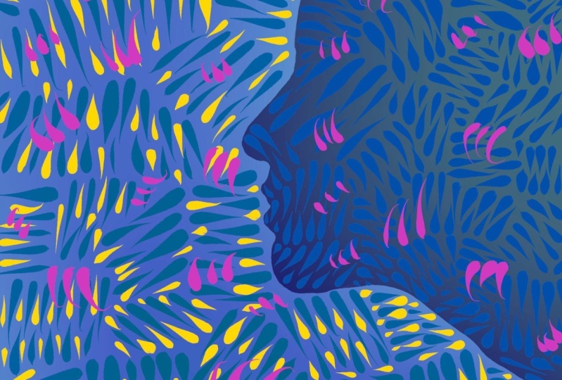
7. First Layer: Palms: Are you ready to
chill? All right. Let's get started. First, let's start by erasing our warm up. Go to your layers. Layer two. Slide to the left.
Click the lead. Now, add a brand new layer. Don't forget, we want to make our background photo visible. So we brought the Buffalo back, but we're still on Layer two, the layer just above
our background photo. Now we can color on top of the photo without actually
coloring on top of the photo. I'll show you what I mean.
I'm on the top layer. Okay. Okay. If I do a
couple lines right here. But if I go into my layers and turn off the
background photo. The marks are still there because they're
on a separate layer. The idea here is
we're going to be using the silhouette
as a reference, but then hiding it
when we're finished. So let's keep that open. Once again, let's clear that
layer. Add a brand new one. If your reference photo
is black or gray, it might be tricky to see all the strokes you
put on top of it. So we're going to use a big, bright bold color to
really get that contrast. The idea here is to get
as much contrast as possible between the colors you're using on
top of your guide, and the colors of
the guide itself, because you want to be able
to see what you're doing. It doesn't matter what
color you're using. You can always change
it at the end. For this first section,
the white section, I'm going to use
black because you can't really get a much
deeper contrast than that. So I have Black highlighted. My brush is all ready to go. Now I'm going to begin putting all these little
brush strokes around the entire white
area surrounding the buffalo. Let's
go ahead and start. I can choose any side
I want and one, two, three, four, five, six, ten. I'm going to go
to the other side and finish out the palm. One, two, three, or. Now, for me, it doesn't
really matter if the brush strokes
go off the page. It just fills out
the whole area. I started with all
these coming down. Now what I want is a contrasting direction
around the palms. Let me show you what I mean. This one started down, right below it, I'll go up. One, two, three, four, B, six, seven,
eight, nine, Okay. See how all the little points
are aiming at each other. I try not to overlap, but it's okay if you do. See? Sometimes I will. Let's
zoom in a little bit. Check out all these
nice little points. Now, let's go ahead and fill
in the whole rest. Okay. Okay. I'm being careful not to
go over the line here of my silhouette because
we're going to put another color inside
there in the next video. You can even zoom in if it's helpful for these smaller areas. Two. Tree two. Sometimes even a
couple single palms will help get in
those little spots. 67. Let's take a quick
look at this corner. As you can see, all
the brush strokes are heading in
different directions. But it kind of creates a
uniformity across the page. I like to think of this as a
puzzle without the picture. You're slowly building
all the pieces to help them fit together. Also, notice how rarely any of these brush strokes
overlap each other. It gives you a really
strong contrast throughout the
whole composition, and it's going to
help your picture really pop at the end. I'm going to go
ahead and fill in all the white area
around my buffalo. You take your time. All right. Now that I've gotten
my main palms all filled out in the white
area of my picture, I want to go through and add
some little individual ones, small little petals just to
fill in the big white spaces. Just go around and see
what fits naturally wear. This is a good opportunity to bring more balance
to everything. You can and you can see
where there's a too white, a little too, and
just try to make it nice and even across
the whole canvas. Alright, that looks
good enough for me. I think I'm finished with
my white section here now, so I'm going to go into the second section
where I'm going to be filling in this
red part of the buffalo. We'll see you in the next video.
8. Second Layer: Silhouette: Okay. Okay, now that we
finish the background, let's go ahead and fill
in our silhouette. I'm going to use a different
color and a new layer. I'm going to go into my layers. Hit that plus sign. I'd like to keep
all the sections of my silhouette separate
and different layers. This way, it's easier for me to change the colors individually. This gives me the
opportunity to create an endless amount of
color combinations. You'll see what I
mean at the end. Now in our new layer,
let's change the color. Now I have this red
background here. I want something that's
going to contrast that. So click up here in
your color wheel. And I'm going to choose
a nice light blue. Let's see how this
light blue looks on that red. Pretty nice. By the time we're finished,
you're going to be deleting your reference
photo silhouette, so it won't even be there. Let's try to stay inside
the lines, though, so we can get that
really nice contrast when we start playing
with colors later on. So same as before, I'm
just going to fill in the silhouette using
the same technique. I invite you to
take a few breaths. Maybe adjust yourself.
Be more comfortable, and let's find the tempo
in our brush strokes. I'm coming right up to the
line of my silhouette. Counting them off and choosing different directions
is a great way to start fine here flow. Now, just like our first layer, we're going to go through our
whole silhouette and fill in those little spots
with individual petals, one, two, maybe three, just to get it nice and even. Let's go ahead and fill
in this section with all the tiny and
large brush strokes we can and complete this layer. Now that we have our whole
silhouette filled out, it's time to add another
layer and add some petals.
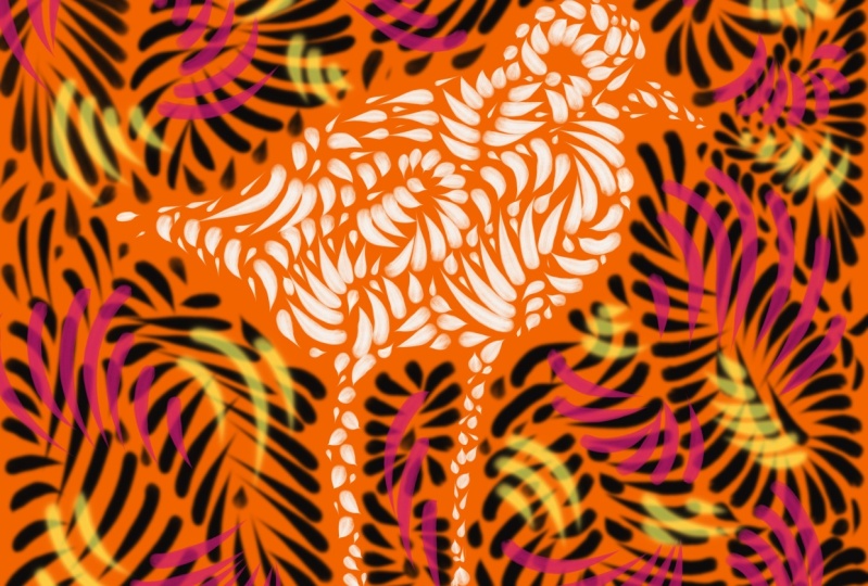
9. Third Layer: Petals: Welcome back. Now, this next
layer is an optional layer. So depending on your design, you may or may not
want to have it. And it'll be easy to compare because when
you're finished, you can just go into the layers and hide it and see
the difference. But this is a good exercise
for the sake of using your artist eye to try to look for balance
in your composition. Now, let's go ahead and get
started with this new layer. We're going to go
into our layers. And we're going to add a brand
new layer. Right on top. Now, let's go ahead and choose another big bold
color that's going to contrast really nicely with the rest of the
things we have here. Remember, the color you choose now is not going to
be your final color. You can always change it later. We're going to make
a whole lot of different color combinations. So let's just choose
something big and bold right now so we
can really see it. And what's better than hot pink? I'm going to choose
a nice, bright pink. Yeah. That looks good. Double check and make sure
we are on the right layer. Now let's take some breaths. And ever so gently drop these dainty little
petals. Across the board. As you can see here. The pink is really good for contrast
with the blue and the red. Just like we make our palms, I'm going to be keeping
them nice and spaced out and also having a contrast
of that direction. One. One, two. Three. You can see here,
I'm doing a good job of overlapping on
my second layer. This is a good
opportunity now to start getting contrast with
overlapping layers. One, two, three, two, For these petals, you notice, we're not doing
those long lines. We're keeping it nice and short. Almost like you were making
an apostrophe or a comma. I like to think of
these as blossoms falling from a tree.
Isn't that shill? Now, you can see
right now is that I'm keeping these petals
inside the silhouette. But we're going to go
outside the silhouette. So we're going to bring these petals all the
way out here as well. For this part of the project, we're not really
thinking in sections. We're thinking about
the entire composition. So go ahead and get those petals just over
these larger brush strokes. Feel free to go off
the page if you like. Let's just try to
get a nice and even spacing across this
entire piece of art. Now, if you want to check
and see your progress, all you have to do is
go into your layers. Let's go ahead and hide
everything except that top layer. Now, look what we
have. You can even finish out the spacing
without the other layers. But if you go back
and put the layers, you'll be able to
see where and how your petals are overlapping
with the long brush strokes. See, I like to get a nice
diversity of direction. So if the brush strokes
are going down, I wouldn't put petals going
down right on top of it. I'd want to get a little bit
of variation of direction. Let's go ahead and
finish out the page. At this point, I'll
go into my layers. I'm going to hide everything, but the top layer And
if you're finished, maybe it should look a
little something like this. Not too far apart. Good variation of direction and size and just nice and
even across the page. Feel free to make adjustments or attempt an other
section again. You take all the time you need. If you're pleased with your
work, congratulations. So am I. Now it's time to have a little fun and play around with some colors
and cool effects. This might just bring your
artwork to the next level. So I'm going to throw
a log on the fire and you come and join
me in the next video.
10. Colors: Now that we have
our work complete, we can use different
color combinations to create some fun palettes. But before we get
there, let's go ahead and unveil our final artwork. Go into your layers. Let's open everything except
for our background. T. We can clearly see different colors,
blue, pink, black. Now we can change them all to create really fun new palettes. So to do that, let's go to
the layer you want to adjust. I'm going to start with our first layer all
the way down here. Remember, just have the
layer name to select it. Let's go ahead and say,
I want to change all of the black brush
strokes to green. Go into our colors.
Turn to green. And then, I'm going to click hold and drag onto
one of the brush strokes, and it turned the
brush stroke green. Now, I'm going to go back because if I want to
change all of the black ones, I'm going to do the same
thing as click, hold, drag without removing the tip, pull it across the screen. So what I did there was
adjust the color threshold. Let me show you
again. To fingers. To go back to black. Once again, I'm going
to click hold and drag the color on
top of the black. And now without lifting my pen, drag it all the way across. Now, all the black is green. Now, let's try and adjust the colors on the second
layer, my buffalo. Go back into layers. Click my Buffalo. And now I'm going to find a bit of a darker green,
so it stands out. From the color wheel, I'm
going to click and drag it down to a nice,
dark aspen green. Same thing, get
back to your board. Click Holding drag. Now on top of the blue. It changes it to green
and pull it across. Bam. Now it's
really popping out. Now for my final
color adjustment, I'm going to show you a slightly different way
to change the colors. And I like this method
because you can see the colors change in real
time. Let me show you how. First, let's make sure
we're on the layer. We are. Now I'm going to go
up to my magic wand. Click. Find hue saturation and brightness right at the top. Now on the huge spectrum
on the bottom left, I can adjust the scrubber and
see changes in real time. This is helpful because
you can see how the colors are going to look
against the other layers. We can also play with the
saturation and the brightness. Let's bring the
saturation way up. Nice and bright and blue, and now the brightness. That really pops. Now, to make this color combination pop
even a little bit more, I'm going to change the
color of the background. Let's go into our layers.
Background color. I like that nice,
dark teal background. It really helps the
bright teal pop, and it's really creating a beautiful analogous
color palette. It's all blues and greens that feel like they come
from a similar family. One thing I'm noticing about this darker
background is that the Aspen green of the Buffalo isn't
exactly standing out. So I'm going to use that
same real time technique and tweak that color just a tad. Let's go back into our layers. Second layer, our buffalo. And now, go to our magic wand, hue saturation and brightness. And I have a feeling
I'm going to have to make this a little darker. Yeah. There we go. It's so dark green.
It's almost black, but you can see how that
really pops off the page. You're getting a lot of
gorgeous depth here. You can see how the line between the Buffalo and the
background is very clear. We didn't cross those
lines as we went. Alright, so I really
like this color palette, and now I'm going
to show you how to make another color palette. So you can make as many as
you want. Let's go to layers. Now we're going to
select all the layers by swiping them to the right. And now we're gonna hit group. So, the background layer is actually permanent
and procreate. You cannot delete it. So I can't bring that layer
into my layer group, but I'm going to show
you a workaround. Go into our layers. We're
gonna hit our plus sign. We're gonna bring these
layers just above it. So, with my new background
layer selected, I'm going to go to
my color sampler, which is this box right here, Plick it, and you see a
little circle arrives here. That's my sampler.
I can click and drag it anywhere on the board, and it picks up that color. So I'm going to land it right
on that background color. And you can see up here in the top that my
color has changed. So now let's go
back to our layers. Our background
layer is selected, and now we're just going to click drop it and drag
it across the layer. It doesn't look like
anything's happened, but when I go back to my layers. Boom. We have that beautiful
dark teal as a background. Now I can toggle off the visibility of the
original background color. And now all of these layers and colors are contained
within this one group. But I want to show
you how to make a second color palette
without erasing the first. So we're going to
select our group. Swipe left. Hit duplicate. And now we have a
brand new group. Now I can make a whole
new color palette in this group while my original group doesn't even get touched. And I'm going to
show you now how I quickly whip up a palette. So for this one, I could do the exact same thing and
just dragon drop colors. But I'm going to show
you a totally new way. And I'm going to pinch the
first three layers together, not the background,
just like that. So now, all my illustration is right here on the top layer, and we didn't lose
our background color. So now, our entire
illustration is on one layer. Now, I'm going to click
that layer and select it, and then go back over to our
favorite little magic wand, and we're going to find
gradient map. Whoa. Now we can browse through
this entire gradient gallery and get a look at some really good color combinations
and effects. You'll notice that the
background color isn't changing, only the illustration color. I think neon is
probably my favorite. But before all is said and done, now I'm going to go change
the background color, so it matches a
little bit better. Go back to our layers. And in our group, click
on that background color. Now, we go back to
our magic wand, hue saturation and brightness, and we can scrub along
the hue spectrum. Think I'm like in
this navy blue. But I'm going to make
it a der in brightness. I love how this is looking. So now, I've shown you some cool ways to create some
alternative color palettes. Now, go forth, chill out, and create as many as you like. You can play around
with all the colors until you find one that
really speaks to you. The colors might say, Hey, good choice. Roll with that. Now, let's go over
a few cool effects that'll help you add a bit
more chill to your artwork.
11. Glow Effects: Alright, I want to share
with you some fun effects that really help make my
artwork pop these days. Now, I love these
two color palettes, so I don't want to erase them. So what I'm going
to do is duplicate our original group.
Click on Group. Swipe to the left and duplicate. Now I can grab this group and bring it all the way to the
top of the layer stack. What we're going to do is
click on the outside layer, this bright green, and I
want to make that glow. So we have that layer. We're going to go up
to our magic wand. Come on down to bloom. And now, just like we did
to change the colors, we're going to put
our stylus against the board and drag it
all the way across. And check that out. Look
at how it's glowing now. You can adjust the glow
with the transition, size, and burn just
by playing around. I like to keep it
maybe in the middle. The size of your glow can come up. Same thing with the burn. If you have too
much, it basically dominates your entire picture. So we're going to
keep that burn down. Maybe around 30%. Size backed down here, transition up a little bit. Feel free to see what
works for you. Cool. I love how this
glow makes it look pretty funky and really
highlights the center. And you can use that
for any of the layers. Feel free to play around. One thing to note, it is hard
to get dark layers to glow. For instance, the center of the Buffalo probably
won't glow that well. But I can apply the glow effect. To these petals, And
let that pop as well. I like the gut position of
the perfectly crisp lines of the Buffalo against the
glowing accents on top of it. It feels like a really
interesting illustration effect and could be the extra
pop you're looking for. And if you're wondering, yes, the glow prints beautifully. I've had it printed on T shirts and more, and it looks awesome. So you can play
around with these effects to your Hutch content. And now it's the
most important time for saving and
exporting your works, so it's the highest quality
available. Let's get started.
12. Save & Share: All right, let's chat
real quick about saving and exporting our work
now that we're finished. I'll show you how to export
at the highest resolution. So your artwork is
the highest quality. First, let's go to our layers. First thing I'm
going to do is hide the visibility of everything except the first thing we did. Our first group
here at the bottom. Now I'll go to my
wrench and click Share. And I'm going to
export this as a JPEG. I'll usually just airdrop
it to my computer. But I can also hit Save image, and it will save to my iPad. Now, when you export a JPEG, you're going to see the
exact same settings that you had in your
original Canvas. It's going to be 300
DPI, RGB color mode, and 20 " by 20 "
because these were all the settings we used when we set up the Canvas
in the first place. JPEGs will be high quality, so you can print
this if you'd like. Okay, now let's talk
about transparent PNGs. PNGs are unique
because they'll let you save a transparent
version of your file. JPEGs don't do this. They include the background. So if you want to have this
printed on, let's say, a T shirt or a kiss cut sticker, You don't want that
background color there. So I'm going to show
you how to save as a PNG so you get that
nice transparency. I'm going to go to my layers, turn off the visibility
of the background, and the main background color all the way down
here at the bottom. So now you can see this
grid in the background. That's procreates way of showing you that that's the
transparent area. Now, I could export this
as a PNG right now. But let's say I just want the Buffalo and none
of the other layers. I'm going to go
ahead and toggle off the petals and the
outside of the Buffalo. I think this is going to
look awesome on a T shirt. So I'm going to go
up to my wrench. I'm going to click PNG. And again, just airdrop it to my computer or just
save it to my iPad. And the same thing is the JPEG. This is going to retain all those original
measurements of the file. 300 DPI, RGB color mode, and a 20 by 20 in square. Cool. So let's go back to our layers. Turn the visibility of
all these guys back on, consolidate the layers
just to make it easier, and let's turn off the
visibility of this layer and turn on the visibility
of the next one up. Same thing. Go to my wrench. Save as a JPEG and
I can either air drop that or just
save it to my iPad. Now, let's go back to
layers. Open up this group. Turn off that background layer, and now this can
be saved as a PNG. Now remember, the most important
thing when you save as a PNG is that transparent
background must be indicated. You can just check for the grid that procreates
provides for you. If it's an all white background, then that transparency
won't be there, and it will show up if printing. So just make sure you see that grid before
you save as a PNG. Now, depending on how many
color combinations you have, you can go through
and save those with JPEGs and PNGs, just
the same as these. If you'd like to
upload a class project here on Skillshare,
please go ahead. I would love to see
what you made today. If the files are too big
to upload to Skillshare, it's probably easier just take a screenshot and
use that to upload. I comment on every class
project that gets uploaded, and I can't wait to
see what you created. All right, I've got
some final wisdom to share in our last video.
13. Final Thoughts: Thank you so much for
joining me here in the Cozy Cabin for another session of
Procreate and Chill. I hope you learned a lot
and enjoyed even more. And please share your artwork. If you enjoyed the class,
please leave a review. These reviews mean a lot to me, and I read each and every
single one of them. So thank you in advance. You. I really appreciate it. If you'd like to be the
first to know when I drop a new class or have
something really fun to share. Go ahead and click
that follow button up top and you'll be the
first to be notified. If you'd like to see where
I'm painting murals, performing standup comedy, publishing a new
children's book, or teaching art classes
around the world, then be sure to follow me on
Instagram at Adam Palmter. Once again, thanks a
lot for stopping by, and I truly hope to
see you again the next time you're ready to
procreate and Chill. I'm Adam Palmter and please have a fantastic day. Bye bye now.
 Adam Palmeter, Artist / Comedian / Teacher / Author