Transcripts
1. Let's Go: Hi, I'm Adam. [LAUGHTER] [NOISE] Hi. I'm artist and Skillshare
top teacher, Adam Palmeter. Today I want to teach
you how to create one of my signature
styles of artwork, the abstract city skyline. For years, I've been painting skylines from around the
world while I travel. This class, I want
to teach you how to create and personalize a city skyline that you love using only a handful
of reference photos, your iPad, and my favorite
illustration app, Procreate. Let's head to NYC, home of the world's most
famous pizza and one of the world's most famous and most recognizable skylines. New York is where
I got my start, selling artwork on the street. At the time, I was
painting almost exclusively New
York City skyline. There's something about New
York that makes you just want to join the hustle right
there out on the street. I painted a lot of skylines. I used to actually hand paint
all of my city skylines. It was a long and
difficult process using oil-based enamels
and chopsticks. It was super messy, stunk up my apartment, and it took forever. I had to hover so
closely over my artwork, on a flat surface, slowly letting that
paint drip which created each and every line
and dot of my skyline. But now, through the
power of Procreate, I have figured out how to create the same artwork digitally right here right my iPad without having to get enamel everywhere. Now that I've simplified
this digitizing process, it's so much easier
to go from photo to drawing with a
reference building, to organizing a skyline the way I want it all in a
New York minute. What you're going to
be focusing on in this class are your
illustration skills. By using reference photos, you have a chance to
explore city architecture through simple illustration and tracing over these references. This is really going
to help you develop your artistic
abstract brushstrokes right here in Procreate. Best part about this class, you can follow along right with me using the exact
same reference photos or you can just apply
the skills you're learning today to the
city of your choice. Just swap out the photos
for your favorite skyline. What you learned today is
applicable to any city so you can create a
personal city skyline. In fact, if maybe London or
Paris is more of your speed, don't worry, governor, I've got your back.
Does that help? If I'm drawing the
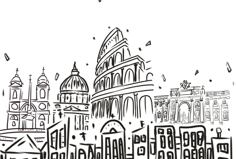
Statue of Liberty, you can follow along just as easily with the Eiffel tower. If I'm drawing the
Empire State Building, you can draw the
Colosseum or the Las Vegas drive-through my
parents got married in. [NOISE] The point is you can use all of these techniques to create and recreate
any city you want. You can upload this to a
print on-demand website and make a gift for
a personal friend. Back when I lived in Brooklyn, my best friend Tommy and I
loved Antonio's pizzeria. I went ahead and
uploaded this image to a print on-demand site and sent
him this cool little gift. Tommy, you had a chance
to check out the artwork. You really enjoy this. Yeah? Yeah. There you have it.
Tommy really liked it. Thank you, Tommy. With simple abstract
brushstrokes and a little artistic flare, you'll learn how to capture the essence of the
city, the way you like. After all, what is art, but life the way you see it. You love a certain
building from your city, make it the center of attention
by using reference photos that you can find online or even just photos you
take on your phone. This class is a great
blend of creativity, composition techniques, a
unique study of architecture, and, of course, all the fun Procreate tips and tricks you're going to learn
right along the way. Think of this class as a personal love
letter to the world, one city at a time. Join me for this easy, breezy Procreate class where the only things you'll need are your iPad and a vision
of the city you love. But before we get started, don't forget to click that
follow button right up top so you can follow me
here on Skillshare. That means you'll be
the first to know as soon as I launch
my next class, have a fun life
update to share with my students, and occasionally I give away a free
Skillshare membership only to my followers. Click the follow button up top and you'll be the first to know. Also, if you want to
see where I'm doing art or performing stand-up comedy, you can follow me on
Instagram at adampalmeter. Without further ado, let's dive right into your
personal city skyline. [MUSIC]
2. Class Project: For this class project, you're going to be designing your own digital personal
city skyline using Procreate. You're going to learn how
to edit it, arrange it, and even play with fun
stuff like colors. All of this right
here on your iPad. This is not your
typical skyline, this is going to be
the way you make it. You can incorporate your
favorite buildings, even buildings you don't really care about,
they're out of there. You can put in your
favorite cafe, restaurant bar, the
place he proposed, all these wonderful places
I'm going to be putting in my favorite pizza shop and we're going to get to that
in a little bit later. I also really want to hear from you about what city you chose. How did you change it?
Why did you change it? What did you add that
was important to you? I want to hear
about how much fun you had in this class too, and you can tell
me why was this the greatest Skillshare
class you've ever taken and how many
of your thousands of friends will be taking
this class as well. Oh man, you have
friends, that's great. The point is this is your customized skyline
and you can make it any way you want
and I'm here to show you just how to do that. Without further ado, let's
jump into supplies and I'm going to talk about what it is that I'm going
to be using today.
3. Supplies: For this class, you're only
going to need two things, an iPad and the app Procreate. I'm also going to be using an
Apple Pencil as my stylus, but if you don't have one, you can just use your finger. I've teamed up with True Grit Texture Supply to give you your next favorite brush. Happens to be my favorite brush. It is the little
smoothie comic anchor. I've included that free brush in the class assets
just down below. Thank you so much
to True Grit for supplying us with such
amazing Procreate brushes, all of my favorite brushes, as well as handing out this free one to all of you
taking this class today. Thank you very much, True Grit. We've got our tablet,
we've got our stylus, we've got our brush, we've
got an amazing attitude. Let's take all of this and concentrate this
wonderful energy into the creative part of this class and start creating our artwork.
4. Reference Photos: For this class, we're going
to be using reference photos to create our personal
city skyline. I love reference photos
because it makes it so much easier when it
comes time to trace. We're literally going
to be tracing over these buildings and adding
our own artistic flair. When I used to paint
these city skylines, I would have to
eyeball it by watching a photo on my computer and then just painting
it freestyle. Now, using Procreate, it's so
much easier just to upload reference photos and digitally trace over the
buildings themselves. In this class, you're
going to be learning the best way to trace over these reference
photos while adding your own artistic flair
to make this city yours. Let's talk about reference
photos and where to get them. I use a website called Unsplash. Now, Unsplash has a huge library of royalty-free photos and
videos for you to use. Because we're doing
New York City, it was really easy to
type in NYC and get a whole slew of skyline photos that really
show off the life of the city. Unsplash has so many photos. If not New York City, go ahead and type in any other city you
want and Unsplash she puts out there and you can figure out what city
you want to draw today. As I mentioned, I'll be
doing New York today. I've already uploaded all of the exact same
photos that I'll be using into the class
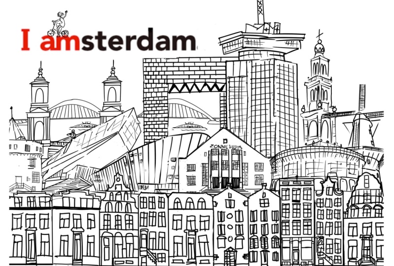
assets folder. As a bonus, I've also included London and Paris
in there as well. If you have another
city in mind, just go ahead and check out Unsplash and see what they got. Maybe you want to paint your
own little neighborhood. If that's the case, take out your phone and
go get some photos. It's very easy if you want
to include your own home, apartment, castle, I don't know where you live, but it's very easy
just to go outside, take your phone out, just get a picture, send it to your iPad, there's your reference photo. As you're compiling
photos for your skyline, it's nice to think about the different components
that make your city special. For New York, we have probably the most recognizable
city skyline in the world. We have the Empire State
Building, World Trade Center, Statue of Liberty, the
Flatiron Building, Brooklyn Bridge, you name it. You can keep on going on. Paris has the Eiffel Tower, The Louvre, other French
buildings, I'm sure. Dublin has the Guinness gates, London has The Eye and Big
Ben. Is there a little Ben? The point is, what
does your city have? What are the real big characters
of your city skyline? Those are going go be the big, iconic hero buildings
of your skyline. Now, let's talk about
the little guys. These are the
secondary heroes or the buildings that are
part of the skyline, but not exactly
stealing the spotlight. In New York, this can mean
the Chrysler Building or the Flatiron Building or the
church I'm going to draw. Now this is the personal
part of your skyline. This can be your
favorite restaurant, your favorite cafe, or that
favorite ice cream shop, where you dropped your ice
cream last week and cried in public. It could be anything. The point is, this
is going to be the personal part of your
personal city skyline. For me, I'm going to be
including Antonio's Pizzeria. Now, this pizza place was directly across
the street from me when I lived on Flatbush
Avenue in Brooklyn years ago. It's still my favorite
pizza to this day. I think it's a special part of New York for me personally. I'm going to drop that
right into my skyline. It may not be iconic
for anyone else, but it has personal
meaning for me. It is easily the most
fattening building I'll be putting into my skyline, but easily the most delicious. Go ahead and download
around 2-3 heroes, 2-3 secondary buildings, and maybe a couple of your own personal photos
to put it in there. Now that we have a collection
of great reference photos, we are ready to get into the best part of the
class, which is drawing.
5. Practice Strokes: We got Procreate open. This is what my
gallery it looks like. It's time to start a new Canvas. Now, I want to start
a brand new Canvas. So I'm going to click this
plus sign up in the top right and let's go ahead and
make a new canvas. Now, let's work with our
dimensions in inches. I'm going to make a
20 by 20 inch Canvas, that gives me 300
DPI and 14 layers. Create. Now, let's find that brand new
brush we've downloaded. We're going to click
into our brushes. I'm going to be using the
little smoothie comics anchor, which you can find for
free in the class assets. Usually, when you
import a brush, it shows up all the way here at the bottom of all your
brushes under imported. Sometimes, it shows
up all the way at the top of your brush library. Either way, find the brush, click it, and here we go. If you don't want to use a
little smooth comic inker, you can also use probably the most comparable brush
I found called syrup. It's a Procreate default brush, and you can find it here
in your inking folder. Where is it? Right there, sure. I just wanted to take
a moment to talk about the brush we're
going to be using today, the little smoothie
comic anchor. Thank you again to True
Grit Texture Supply for giving us this fine brush. I've been using this brush
for almost two years now. It works really well with my style of digital
illustration. Check out these
strokes right here. As you can see,
they bleed out on the sides just like
a real anchor one. But it turns out here
there's really sharp, almost like porcupine quills. So it's got a nice
contrast to it. It's got this really
organic feel at the beginning of
the brushstroke and a really sharp digitized
feel over here at the end. Let's get rid of these
using two fingers. I want to show you
how I use my brush. Now, when I trace, I'm just making lines. You can make lines the
way you make lines. This is the way I make
lines and using this brush, I go really easy, just quick strokes, top to
bottom and then bottom to top. I try to meet right there in the middle and let's do
that again next to it. One, two see it's fat
here on the ends, thin here in the middle, and then let's just put
a little hat on that. Same way. A few quick squares. Boom, we have a nice building. All you need is two fingers
if you want to go back, three fingers if you
want to go forward. This is my style of drawing. You can draw how you want, but my style is a
bit more abstract, a little messy, but
that's how I tend to have fun while I'm creating
my digital artwork. Let's do another building
right next to it. Boom. You can have some fun, you can loosen up. You can take these
few brushstrokes. Play with your brushstrokes. Notice the pressure
that you're using. If you push down
a little harder, it's going to come out a lot
quicker if you push down nice and light it comes
out nice and light. If I push down hard and then
swipe right off of the iPad, it creates these little
sharp edges here. Now essentially, that's
the basis of what I use to create my
abstract city skylines. Thank you again to True
Grit Texture Supply for supplying us with
my favorite new toy. Alright, let's get
rid of all this. I'm going to use my two fingers. Bump. Now for the neighborhood, where I like to do
is start out with a long strip of justice, nondescript urban looking
buildings to give us the front row of what our skyline is going
to end up looking like. You can see here, and
Some of the skylines I've already done
all of them begin with a straight line of these nondescript urban
looking buildings. While we create
the neighborhood, we're also going
to be practicing our drawing skills
here on Procreate. So let's start by putting
up the drawing guide. We're going to click our wrench. Make sure our canvas
here is highlighted. Go to drawing guide. Click that and look at that. It gives you this nice grid. Now, I only use this just for a quick second.
Let me show you. On this layer, this first layer, I'm going to change
the color to, let's say, a nice light
blue or something. Go back to our brush
and I'm going to make one straight line all the way across following
this drawing guide. Now, without removing
the tip from my iPad, you see that it just
straightens out all by itself. Nice and straight. You can move it all along, but we're going to make
one straight line. This is just going to be for
reference to make sure that my buildings stay roughly
within the same line. Let's try that one more time. All the way across without
moving the tip of our brush, straightens out by itself. Pick it right up. There
just one straight line. Now that we have our reference line right here at the bottom, we want to make sure we add another layer on top of
our blue line layers. So we have Layer 1, which is our blue
line, and Layer 2. Now, we're going to take some practice brushstrokes
we are going to be making our little
city buildings. If you mess up, just use two fingers to go back and let's just
have some fun. My style is this, making tiny little brushstrokes, little squares and rectangles to make little city buildings. Look at that. How easy is that? It's literally just a
bunch of lines together. Look how small that is here. I want to make this cool
neighborhood street skyline going all the way across
this line right here. I don't want to make it too big because I wanted to
leave some nice room for perspective when we add our heroes and our
secondary buildings. I want to go across
this skyline, making really small
abstract buildings. Now look how messy that is. That's why this is fun. They don't have to be perfect. Try to get these
lines to connect a bit over here, if not, just go ahead and highlight
your eraser tool, bring the eraser down the
size down quite a bit. Zoom in and you
can just clean up these little building whiskers,
I guess they're called. But yeah, check this out. You see it's
blotchy, it's messy, but that's a 100 percent part
of why this artwork works. We have these little
buildings and now I'm going to play with different windows. So we have these
little circular tops, these rectangular tops. So we have three little
buildings right here, initially, this is going to be most of
the entire neighborhood. But what you can do is start to add little details
to each of them, and that's going to give them each their own unique character, add a little diversity
to your neighborhood. Let me show you. Let's see, for this first one right here, let's throw an antenna
right on top, boom. As you can see, my brush
strokes are very fluid, very organic, I'm not
trying to be too straight. I'm just trying to let
the brush come right off the Canvas to get these little
points going on over here. So I want to get rid of those,
let's use two fingers 1,2. So this one's got
a little antenna. Let's give a little
chimney to this one, again, two lines and
a simple square. Now, how about this
one right here? This one could maybe use a roof. Let's go ahead and put a
small triangle at the top, you fill that in with
two lines and then, hey, how about a little dot
right here, and why not? We'll put a little
antenna up top here. Now, let's not forget about
the windows because we can make those just as
cool as anything else. So for our first
building right here, I'll add two small lines. It's not a huge detail, but when you see all of
them lined up afterwards, all these small details, we'll start to work together. Again, we're going to go
through these windows, and adding these little lines. Cool. Now, our second building, let's try something different. Instead of adding
these little lines, let's do little crosses. So we'll do like
little windowsills like that, there we go. Now, if you want to make
it nice and straight, just like we did
with our blue line, without moving the
tip of your brush, keep it straight, and it will straighten itself out
just like that and you can move it to make it just as imperfectly
perfect as you want. Good. Now, let's go to this one. Instead of adding the two lines, let's just add one,
along the bottom. Cool. We've done
a bunch of lines, let's move on to dots. What I like to do is add
a few abstract dots, just filling out the space. One thing you'll notice here, along the bottom, I don't
put a line on the bottom. I leave it open, I
let it breathe a bit. This way, you can add
things like dots, maybe a small accent
square here and there, a few more dots, but it gives you a chance as
we build our composition, to start adding these
cool little details. But for now, let's go ahead and get rid of these squares, we'll keep the dots. Let's finish creating our little neighborhood
across the bottom. Now, if you mess up, it's not a big problem, just take your two fingers, click and it brings you
back one full step. If you want to bring them back, three fingers, 1,2,3, and we're getting the
whole building back, just about all of it,
and we can continue. I'm going to make
little tiny squares, again, I'm not spending
a whole lot of time. It's the abstract feel, it's having fun, getting your hand moving, getting a little bit of
artistic exercising. Now I'm just going to get going and make some
more buildings. We've got our city here, and as you can see, it's full of all these
deliciously messy little lines. I'm sure you've noticed that this brush loves to bleed out. It helps you get these
little wispy ends, and these big thick beginnings, for all of these
little lines here. I've gone through, and made different windows,
different windowsills. We got antennas,
we have chimneys, I've added a few
dots here and there, and the dots and
the antennas really helped to fill out
this neighborhood. But as you can see, I've left two small spaces right
here on the sides, and we're going to
get to that later on, and we're going to fill
those in with something fun. But if you enjoy your neighborhood now
or you want to take another try at making more
buildings, go right ahead. Now we are ready to
move on to the heroes, but let's take a moment to
appreciate our neighborhood. If you have a look, these are very generic urban
looking buildings. They can generally
fit into most cities, but again, if you want to
change it a little bit to be a little more characteristic
of the city you're making, you make whatever
tweak you need to. Again, these are just
my style of buildings. The point of this, is
not just to warm up, but to create this very generic city looking block,
this neighborhood. It's not very
characteristic of any city, but it's characteristic
of every city. This is really just filler, and so our neighborhood
should look nice, messy and abstract. Now we're ready to move on to the defining characters
of our city, the ones that are going
to make it your city. Let's move on to the heroes. So get those Eiffel Towers or Empire State Buildings ready, and we'll see you
in the next video.
6. Hero Buildings: [MUSIC] Let's talk about heroes. Let's talk about the buildings
that help define a city. For New York heroes, we're talking about the
Empire State Building, World Trade Center I, we're talking about
the Brooklyn Bridge or the Chrysler Building. I'm going to be drawing a
handful of those in this video. Again, if you're following
along with another city, just think about what are the iconic buildings
of that city but now since we're
doing New York, let's start with an easy one, King Kong's favorite, the
Empire State Building. As I mentioned before, we have
reference photos to trace over using our new
fun abstract style. I'm going to make this
really nice and easy. To add that photo
to your artboard, we're going to go up here
to your Wrench under Add, insert a photo. These are the
reference photos that I've pulled offline earlier. Let's find the Empire
State Building. Tap it once, it appears
right on your Canvas. Now let's get a big size. Probably easier, let's
go back into our layers. We're going to hide
the neighborhood, and hide that blue line. We don't need it anymore, is really just for
a reference point. We can go ahead and
erase that whole layer. Swipe left and hit "Delete" but we're going to
keep the neighborhood. It's good to keep
the neighborhood, that's where everyone lives but what I've done is hide that layer just by
clicking this checkmark. We'll turn it back on later. What we need now is another layer on top of
our reference photo. Let's click this plus sign here. We have a layer that
is above our image, and that is the layer that
we're going to be tracing on. I don't want to
trace on the photo itself because when we
delete that photo layer, it'll take my artwork
right with it. Let's make sure that
blank layer is selected. It is, wonderful. Click the brush again
to make sure you're on little smoothie
comics anchor. We are, fabulous. Now, for drawing on top
of our reference photo, let's think of using a nice bright color
that's going to contrast against
the photo itself. This way we can see our
artwork much more clearly. This photo was taken
around sunset. We've got little peach, we've
got this city gray here. I'm going to use something
nice and bright. Let's go ahead and change this color to a
nice bright yellow. Let's test that out and
see if it contrasts. It totally does. It's also super high up there. Bring our brush size
down just a little bit. Now that we're using
a reference photo, what I like to do is trace,
and just get a basic outline. I use those abstract movements to make it more interesting. Let's start right
up here at the top. I'll find the big shapes first. We got here on this side. We can move around the photo to make these brush strokes a
little easier for you. If it's a little more
natural to come from the top versus the
side or vice versa, you can move the
entire composition to make it easier for
you. I'm over here. I'm just getting these
strokes out here, making it a little blotchy. Again, you just go on across. Look at that. I'm
going to add a couple of dots right here. Still continuing to
get the larger shapes. Now we're going to do these
long lines down the side. What you can do is
a couple of things. One, make one big
stroke and try to get the line to the side
of the building as evenly as you can
like this. Let's see. If you didn't like it, go ahead, back up, two fingers. That one lined up pretty well. Then let's see if I can get
it from the other side. Try to connect. Oh,
they did connect, a little bit of a
whisker on that side but look at that, that's a
nice, decently straight line. If you want to
cheat a little bit, what you can do again is make these lines all
the way down hold, and then it straightens
up for you. You can stretch that and make it nice and short, nice and long. Sometimes when you're
creating architecture, it is helpful to get those very, very straight lines
because it'll give it a little bit of structure. It doesn't have to be perfect. Now we've got this
basic structure. Let's get over
here to the spire. Spire is going to
be really easy. Again, you're just letting your pencil float around the shapes a bit to get these fun
abstract fields. Just throw together
a little scribble. Let's see, I don't even
know how to do that. I put a little
scribble at the top, maybe just a couple
of quick lines, maybe a couple of dots. There we go. Now what we can do is move
on to the windows. We're going to start
with some long windows. One, 2, 3. As you can see, there
are three on this side, so three on this side. That's starting to
look pretty good. Now, again, just like
in our neighborhood, I'll add little lines
in the windows to give just a slight bit more detail that really helps fill it out. Sometimes it's a little line, sometimes it's like a little dot but either way, it gives just a little bit more
spice to our work. Now let's finish
this all the way down through the
entire building. You can play with
directions, sizes, also adding details like
those dots we talked about, just to break it up. Each row can be nice, and
as abstract as the last. [MUSIC] Looking pretty good so far. Let's have a look at our artwork now without the reference photo. Go into our layers, find the image here
that we inserted, and let's hide that for a
quick second. Check that out. Now let's go back to layer 3. Let's change this
color to black. Either have it
pre-loaded or you can drag the circle all the
way to the bottom right. Click and hold the color
and drag it across, stop on one of your lines, and without pulling your
stylist tip from the iPad, drag it straight
across and it'll fill up the same as our neighborhood. Now we have our first hero made. One thing with Procreate
is you do have limits and how many
layers you can use. While using these things
like the reference photos, after we're done using them, we don't need them anymore. Let's go ahead and
just get rid of them. We're going to go
into our layers, we're going to find this one. We're not interested
in them anymore, so just like Tinder, let's swipe left and
come to Delete piece. Plenty more efficient to see. At this point, we
have two layers. We have our Empire State
Building, and our neighborhood. We can toggle on or
off for visibility but for now, let's turn these off and upload our next hero, which is going to be
the Chrysler Building. Let's go ahead and go
back to our wrench. Insert a photo and remember, all you have to do
is tap to bring that photo right
into your Canvas. We're going to do the
same thing we did with the Empire State Building,
and we're going to make that nice and big. Now click the arrow to
set the transformation, and just like before, we're going to put in
a new layer just above this building, and we're going to work on this
fresh new blank layer. At this point, I don't need
the drawing guide any more. I'm going to go ahead
and get rid of that by clicking on the wrench, going over to our Canvas, drawing guide off, making sure we're on the
layer above our image. We are. We have our little
smoothie comics anchor. Let's change that
color back to that yellow so we can see our work. Triple-check our layers, we're on the blank layer. We should be wonderful. Guys, you know the drill. I'm going to get to work on
this and make it nice, and beautifully messy. Why
don't you join me? [MUSIC] The Chrysler Building is
looking pretty sharp. I'm pretty happy with it. Let's go ahead and hide
our reference photo. Then we're going to
get change that color again to that black, and see just how crispy this looks. Again, we're going to drag that color over to
one of the lines, and it changed
everything else black. If this happens, no
problem, with two fingers. Boom, we just didn't hit one
of the lines. There we go. Again, slide to the
right real slow, and now we have our
Chrysler Building. I'm going to add just a few
more little dot details. Make sure we're on
the right layer. Just a few dots to even
it out a little bit. Now that we're
finished with this, same thing as last, we're going to go ahead
and get rid of this image. We don't need it anymore, it's just taking up
space, so get out. Gone. Let's turn off the visibility of our
Chrysler Building again. Let's bring our next
hero up to the stage, the World Trade Center I. Let's click our "Wrench," "Add," "Insert a Photo," find the World Trade Center. Boom. Now using our arrow, we can size this again, just about the full page. We want to get nice
big as possible. That looks good, and now we're sized. Let's click back to our brush. Let's go back to our layers, add another layer,
and make sure it's on top of our inserted
image. It is. Let's change that color back
to our favorite yellow. Get our brush going, rinse and repeat [MUSIC] As you can tell, the Trade Center doesn't have as distinctive style
as you would find in the Chrysler Building or
the Empire State Building. It's really a bunch of
just flat glass windows, so for this one,
let's take it easy. Let's just add a few more dots. Finish up the end
here. Here we have it. Same as last time, we're going to go
into our layers. We're going to hide
our image first. Go back up to our color wheel, change the color to black. Drag that color all
the way to one of the lines right across, and there is our
World Trade Center. Right about this time, you
might have one building, you might have two buildings, three, four, five, six, who knows? But you can make as many
heroes as you want. You can make your city
as crowded as you want. I'm going to keep it
simple and only do a few. Now that we have our heroes finished and we're
all happy with them, and now it's time to move on to hero juniors. Let's get started.
7. Junior Heros: [MUSIC] Now it's time to
get to the junior heroes. These are the smaller, iconic buildings that
you'd see in a skyline. We've done the Empire
State Building, the Chrysler Building,
the World Trade Center. These are massive buildings. Now, let's get to
the smaller ones. Let's start out with
Lady Liberty herself, the Statue of Liberty. Let's start by hiding
our World Trade Center, getting rid of that photo. We don't need it, dead weight. Let's add another photo. Let's go with Statue of Liberty. Just as before, we're going
to size it nice and big, filling up that board
so we get good details. Excellent. Now, remember
to add a layer on top. We've got it, Layer 6. Click back to our brush. We're on the right
layer, we are. Let's find that nice and
bright yellow one more time. Now, let's get to work on this beautiful gift from France. Now, because this is a statue, there aren't straight
lines as you'd find in the buildings
we've already drawn. For this style, I like
to get very abstract, a lot of squiggly lines, I like to let my hand
just do its thing, and just get the overall shape. I don't think anyone's
going to mistake the Statue of Liberty for anything else once
it's finished, so trust yourself. I trust you. [MUSIC] We got Lady Liberty
looking good right now. Let's have a look
without the image, tether that off, change our color to black, and make sure we're on
the right layer, we are. Once again, drag that
color over, and boom. Look at that. Well, I
can tell what that is, I hope you can, too. I think that is going to be a fantastic addition to
our personal city skyline. Hero Junior number 1, done. Now, let's move on to, let's say, the
Flatiron Building. We're going to get rid of our image like always,
hide Lady Liberty. Let's go back to our wrench, grab our photos, grab the Flatiron Building, size that up real nice. Now, I'm actually going to use this photo for two
different drawings. I'm going to do the
Flatiron Building, and then this little clock
here in a little bit, but for now, let's
focus on the Flatiron. We're going to add a layer on top and get back to
work with our yellow. [MUSIC] As you can see here, this is an oddly
shaped building, it's got a ton of windows. It's also a weird perspective because the building
itself is so weird. Instead of doing all these
windows on the side, I'm actually just going to
follow along these lines. I'm going to make sure I have
my brush on. There we go. I'm going to follow
along these lines just to get a little continuity. That's also going to show the
structure of the building. It's going to show its angles. Now that we have these
lines coming down, let's go ahead, dance it up with a few details. [MUSIC] Now that I've got this rather futuristic-looking
Flatiron Building, I'm going to change
gears, and I, actually, want to draw this little
clock here to add in. What I can do is
add one more layer. Hide the layer we just did, so we know we're on a
different layer now, and just continue drawing
this fun little clock. We're going to add that
right next to our building. It's got these little
ornate details. Now, for the little circle here, we want to get an actual circle. What we can do is lightly trace around this gold edge here, and just getting
a straight line, once you connect that circle, stop and hold, and a circle will
present itself. We can make it as
small as we want or as big as we want, and here. Now, we just have
a little more of that structure that we
can play off of with our abstractness if you
so will, and I will. This is, obviously,
going to be a clock. Let's just go ahead and make a couple of hands-on that clock, bring that down here, add a few of these
dots for good measure. Now, we have our abstract clock. Two images for the
price of one photo. Now, we have the clock and the building on
separate layers, so we don't need
the image anymore. We can just go ahead and
get rid of that image. Now, both of these layers, let's go ahead, change the
colors as we have been. There we go. We have our
black clock right here. Go back to our Flatiron
Building layer, drag that color there, boom. Now, we have both on
different layers. We can go hide those as we
make our final little junior. We're going to go to our wrench, insert a photo, and let's go ahead and get the New
York Public Library. I love the New York
Public Library ever since
Ghostbusters came out. This is a pretty easy building. We're just going to get
some outlines done, make a new layer, get back to our friend yellow. Let's get to work. [MUSIC] Now, we have the library, just the overall outline of it. Let's have a peek.
Turn off that layer, turn it to black, boom. That looks pretty sketchy. This is the part of the
class where you get to add that personal touch. It could be your favorite cafe, favorite bar, that
restaurant you love, that animal shelter that
keeps telling you you can't keep coming to adopt cats, but I want them. Today, we're going to be doing Antonio's Pizzeria Restaurant. This was a pizza place right across the street from me
in Brooklyn, New York. Still has the best pizza, so I'm going to add
this to my skyline. Very simple neon signs, just a few squares and
a little bit of text, but it's an important
place to me, so I want to add this
into my skyline. Make sure we have a new layer, get to our yellow, and begin. [MUSIC] We've got our little
Antonio's Pizzeria. As always, we're going to
get rid of the picture, change the color to black, drag that all the way across
into one of the lines, and make it nice like that. We've got our heroes, we've got our junior heroes, we've got our pizza place. Now, it's time to move on, arrange them all into
the city that we love.
8. Arranging the Composition: We have all of our
buildings done. Now we go through
to the fun part, which is arranging a
nice city composition. Something you might not
know about procreate, if you shrink something down and then try to blow
it back up again, you're going to lose a
lot of that clarity, it's going to start to pixelate. Before we get into this
arranging and re-sizing, I want to build a
contingency plan. By making a copy of this Canvas, I will always have a backup of all my original elements to go back and resize if I need to. Start by going into our gallery, select our entire Canvas,
duplicate, there. Consider that original
Canvas a safe version of your work before
we start to play around. Let's go into our
gallery and there we go, we have two copies of
our original work. Let's go into our
most recent one, and here we have all of the elements plus a couple of pictures
we can get rid of. Delete and now we can
begin our composition. What I'm going to start with is the neighborhood,
let's open that up. Now the neighborhood
is really roughly just about the parameters of how
wide our city is going to be. But now, let's start
with our heroes, I'm going to drop our Empire State Building
right in the middle. What I want to do,
I'm going to click to make it visible and make
sure we're on that layer, click our arrow to size it. Let's bring this down
maybe right about here, I'm going to place that right in the middle of our composition. Now let that size,
you can see over here there's going to be
a little bit of overlap. That's totally fine, I'm going to show you
in the next video how we go through
and mask that out. For right now, we're
focusing on composition. How do we want this to look? Now we have all of
our elements out, let's just play with
the composition. I think this composition is
looking pretty balanced. We've got our heroes
in the middle, we've got are
juniors on the side. Now I'm going to
show you how I use the eraser tool to clean this up a bit and make it
look a little bit better. Because if you're going to
erase it, it never happened. Let's jump over to
our next video.
9. Erasing: [MUSIC] We have our composition, it's a little bit messy, but we like where
our buildings are. Now it's time to go
through, and erase what we don't want there.
Let me show you how. First things first, let's go into our layers and let's put our neighborhood all
the way at the top. Can do that by clicking on it, holding it, and dragging
it all the way to the top. Now, one-by-one, we're going to go through and see
what we want to keep, what we don't want to keep. Easiest way to do this
is we're going to keep this layer black. That's going to be our
neighborhood layer. Then we're going to go into
the individual elements, change the colors,
and then erase around to make sure we
get nice crisp lines. For example, let's start with the New York Public
Libraries. It's right here. I'm going to go to the
library, it's highlighted. I'm going to find a new color. Yellow is going to
show up a little too light on this white background, so let's go ahead
and find a blue. I want to zoom in a bit right on top of the
public library. Bring that blue. Look at that, we can see
every part where the blue is, that is going to be our library. Now it's overlapping
on top of our city, which means our neighborhood is you go all the way
up here to the top. Now we also have the
World Trade Center and the Statue of Liberty
flanking either side of that. Let's go ahead and hide
that for a second. We're going to hide
that one and that one. Now it should look like this. I like to erase and leave a small white border
between the buildings. What I'm going to do here, I'm going to click
my eraser tool, zoom in a little bit, and I'm going to make, you can adjust the
size of our eraser, this, I'm going to make just a slight line
above the neighborhood. You go through and trace
around the neighborhood. You see what's happening there? There's this white border that's just cutting
out all those blue. There we have it. We
have this clear line separating the neighborhood,
and our public library. Now what we can do is
go through and clean up all the little
bits of blue right behind our neighborhood. That's going to give it a
little bit more of a sense of depth that's going
to show there's clear distinction
between the neighborhood and our public library. Now what you can do is go
back to our color wheel, click on black, drag that over, bring back that black color. There we go. Now let's show our Trade Center and
Lady Liberty once again. Let's do the same thing for these two heroes because I want the public library in front
of these two buildings. So I'm going to make sure on
my board they are in front. This Trade Center is down here. Statue of Liberty is down here. Let's start with
the Trade Center. Click on our blue again, here we on the Trade Center. Let's make sure on
the right layer. I'm going to drag that over. Now let's get our eraser and let's go through and
get rid of that blue. Same way we did before. Keep just a little
bit of a border in a library. There we go. Now let's change
that back to black. Drag it over. There you have it. Again, there's clear distinction between the neighborhood, the library, and
the Trade Center. Now let's do this. Lady Liberty, let's
change her to blue. [MUSIC] We have my
personal New York skyline. However, what's it missing, pizza, of course. We want to add the
final element. This is our Antonio's Pizzeria. We're going to
bring that up here. Now, what I'm going to do is
I'm going to drop it right into the front of
my neighborhood. I like it. It's street-level. It's not a huge building. I want it to be right
there. Let's see. I'm going to size this. I think I want to
drop that. Let's see. How about right here? It's right now and
it's hard to see. What we're going to do,
I'm going to change that color and
give that to blue. Now what I'm going to do is actually move this all the way up to the top in our layers
past the neighborhood. We want to erase around the neighborhood
for our pizzeria. That's how important
pizza really is. We want to highlight
our neighborhood now, not the pizzeria,
our neighborhood. Get our eraser.
Let's go clean up. Again, you can make
this crisp as you want. As you can see, the pizza place is overlapping a couple
of different elements. We're going to have to go
through a few of them. Let's see. Let's get
rid of this first. I'm going to go back
to our pizza layer. Change that back to black. Now let's go clean
up one more thing, the Flatiron Building so we
can read our pizza sign. Look at that. Here we are. We've got all my elements. I've got my pizza place
right down in front. This is a personal
city skyline for me. This is the way I love New York. Now that we have our
composition all filled out, I love this, I want to
add just a few details. I'm going to keep it on
my neighborhood layer. Go back to my brush. I'm going to add a few
little rectangles, a couple more dots maybe, just something that
ties the city together. Of course, you might
think, why is there a window right in the
middle of the sky? Because it's art. But this does do a good job
of adding a touch of energy, I think, to the city. I like to make these dots
flying out into a direction. Get a couple over here. About one more little
thing right there. Then at the end, I put
these little end caps here, just these little slashes
that bookend the entire city. Add a few dots along the bottom. Again, just abstractly
filling it out. Feel free to add as much or
as little as you'd like. I'm feeling pretty good about this composition. How about you? Thank you very much.
It is nice, isn't it? Now we're going to move
on to our final steps, which is playing with
colors and saving.
10. Color Exploration: We have a classic black-and-white
composition here. I love that contrast
like I said before. But now you can have some fun, and play with the colors of
this entire composition. Now, the first thing
you should do is actually merge together all of the layers into one complete
image. How did we do that? Go into our layers, and we're just going to pinch them all
together. Look at that. Boom. Now, we just have
one layer called Layer 4. That's a little underwhelming. But regardless, it's our layer. We're going to take
this image right here, and now we can play with the whole color scheme of the background and all the
things that we've drawn. First things first, let me show you how we
have black right here. Let's turn this
whole thing blue. We can drag blue over here, get on one line. Wow, the whole thing lights
up to the color blue. Now, let's say we want to change this background color to something like how about
this pink right here? We have this beautiful
blue and pink. We can even just change the
background color to black, and our layer could
be something. Drag this over here, fill out our whole city. Now, we have a hot
pink New York City. The combinations are endless. Play around see what you like. Personally, I love having that classic white background
with a black city on top. It's just classic. It's got great contrast. Reminds me of those
little cartoons you'd see in The New Yorker. One thing that could be
cool to play around with, is it now that you
have just one layer, we can add another layer, bring it behind our city, and now you can start to
play around with all stuff. Let's see. I can do these big accent lines
here in the back, or you can change your brushes. How about you can play
with some spray paint. Grab this fat nozzle right here, add a little bit of texture, or a background to your piece. This is a great opportunity
to start playing with those those texture brushes you might not always have
a chance to play with. Now you figured out
your composition, you figured out your colors, let's move on to saving our
images into our next video.
11. Saving: [MUSIC] Now we're all
set, we're all finished. It's time to save and
export our new masterpiece. How do we do this and
why do we do this? Well, that depends on what
you want to use it for. The first thing I like to do
is save my time lapse video. Time lapses make great
social media content and it's really easy.
Let me show you how. In our Canvas, we're going to go all the way up here
to the wrench, click "Video", and here it
says Time-Lapse Replay. First, let's go
ahead and watch it. [MUSIC] Wow, what a journey. By now here's how you
can export this to share this on social media
for all your friends. First, I'm going
to click "Done", go back to my wrench. Under Video, we're going to click Export Time-Lapse Video. Now I always export
at 30 seconds because that's what does
the best on social media. Now at this point, I usually
just AirDrop it to my phone. Next step, let's make a JPEG. JPEGs are essentially
the universal file type. If you want to send
it to a printer or share on social media, JPEG is your answer. To do that, let's
tap that wrench, click "Share", click
"JPEG" exporting. Then once again, I usually
just AirDrop that to my phone. Last but not least, what if you want to print
this say on a t-shirt? The first step is you don't want a big white square
on your t-shirt. Let's go ahead and
remove the background. We're going to go
into our layers, toggle off the background. Now go to our wrench, and we're going to
export this as a PDF. No. Just kidding. We're going
to export this as a PNG. PNG is that one of the
only file types that lets you save with a
transparent background. If you need it to be
a transparent image, turn off that background layer, and then save it as a PNG. Those are the typical files that I'll save to when I
finish my artwork. Speaking of t-shirt, art prints, all the fun stuff
you can make with this. If you want to turn this into a fun gift for yourself
or for a loved one, I've got some killer
bonus tips for you in the last video
of today's class. See you in the video. [LAUGHTER]
12. Next Steps: Let's chat about some
final action steps you can take to really utilize
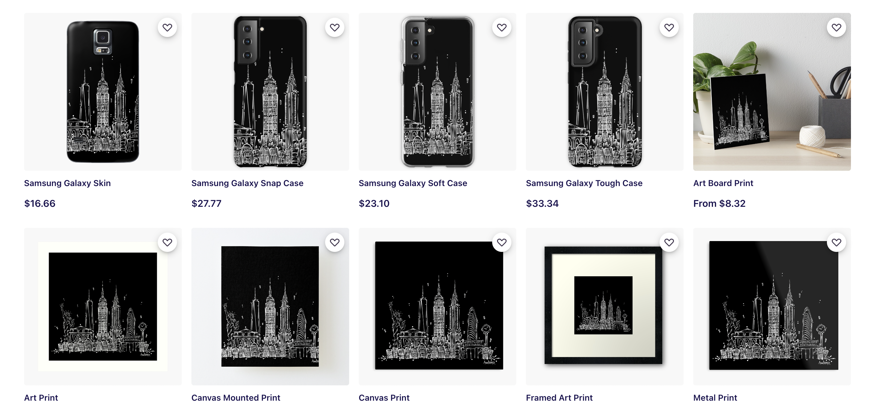
your brand-new artwork. Number 1, you can upload this to a print-on-demand website and make a gift for a
personal friend. I'm going to run through a
few rapid-fire ideas for you. I just mentioned
print on demand, but there's another
huge component to that. You can make that artwork public and other people can
buy it, strangers, family, friends, friends of family, family of friends, strangers
of family of friends. Anything's possible.
The point is, by setting up a POD shop, you're setting yourself
up for potential sales. My two favorites are Redbubble and Society6, go check them out. There you can see what
your artwork is going to look like on thousands
of different products. Or if you don't want to
hassle with online files, just send that JPEG
to a local printer. Have them print it out
to a standard size, buy a standard size frame for your wall and you got your
own birthday present. Congratulations. This makes a fantastic
wedding gift, especially if you can somehow
blend two cities together, the grooms and the brides. Now, in the past, I've been able to do this, let's say, for example, New York and San Francisco, where I would do half the
San Francisco skyline with the Golden Gate Bridge that turned into the Brooklyn Bridge, which led to New York. It was a nice marriage of two cities for two friends
who are no longer together. Just kidding, they're
very happy and have a whole bunch of
kids who owe me money. Last but not least, how about that
MySpace background? It could be time to
really turn it up. Now if you've enjoyed my
positive attitude today, I recommend it two other classes that I have involving Procreate. One, are you obsessed
with your pet? Are you obsessed with
someone else's pet? Have you had a
restraining order put on you because you
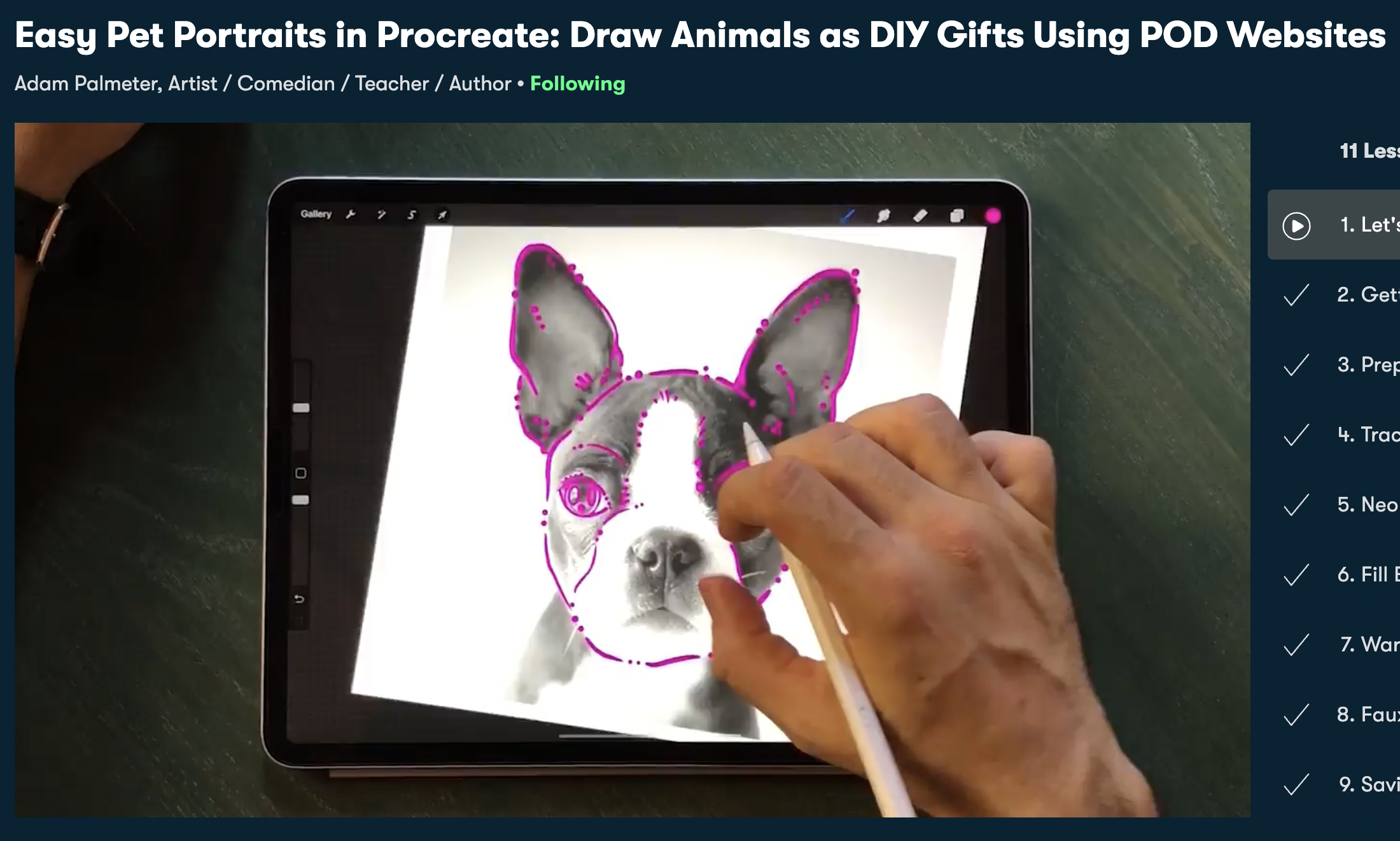
love dogs so much? Well, this class is for you. If this sounds like you, check out my Skillshare class, Easy Pet Portraits
in Procreate: Draw Animals as DIY Gifts
using POD Website. Essentially, you're going
to be using a lot of the same skills you
learned here but just for little
cute little pushes faces. That's enough out of me. If you just want a nice
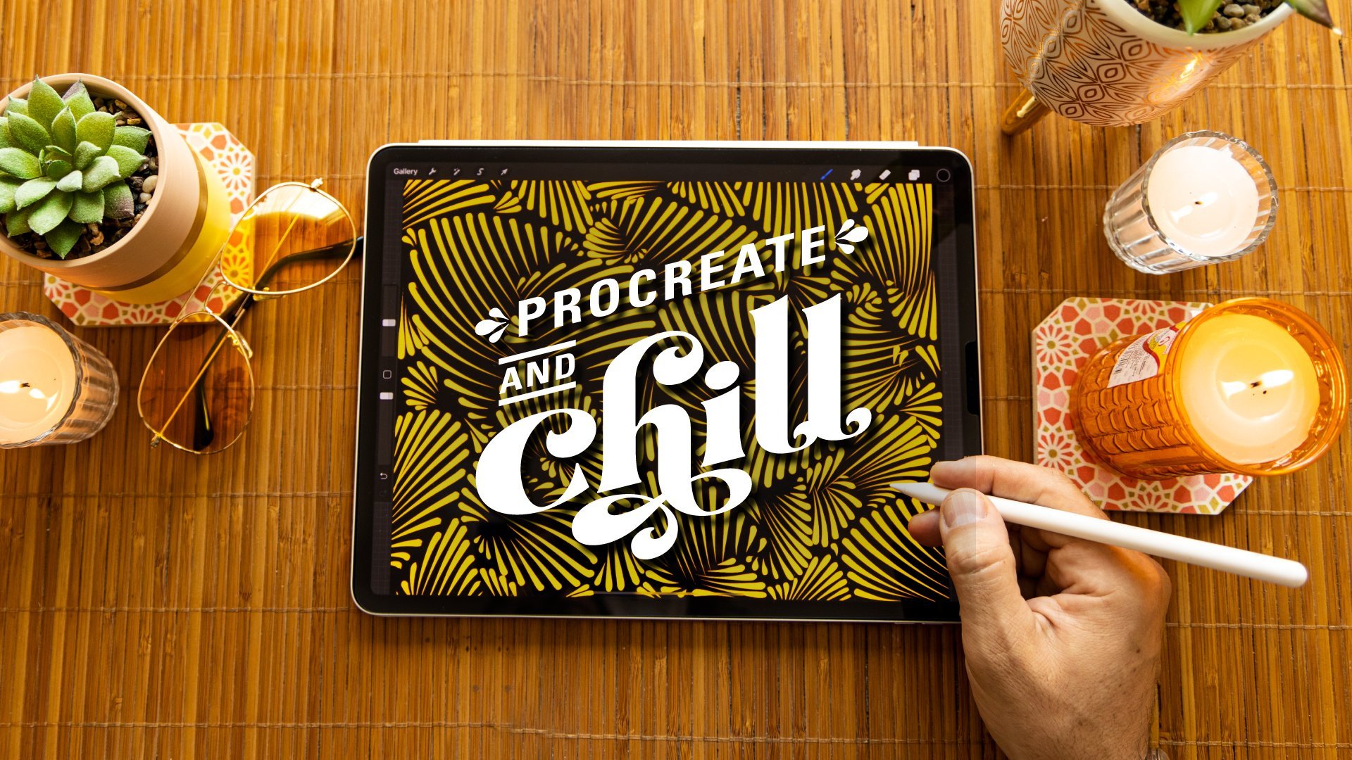
and easy relaxing class on your iPad, you can take my class, Procreate and Chill:
Unwind with Easy, Digital Illustrations
for Self-Care. It's basically meditative
exercises in Procreate. If you like this class, you'll love that one,
it's easy, repetitive, meditative
brushstrokes, a lot of the same ones you
learned in this class. In fact, you might enjoy
it after this class. So why don't you
go ahead and click on that class right
after this class? Guys, before I get out of here, I have two big favors
to ask for you. One, go ahead and click
that follow button up top and follow me
right here on Skillshare. That means you'll be
the first to know the second I launch a new class, have fun perks to share
with my students, and you'll be the first
to know when I give away a free Skillshare membership to one of my lucky followers. I do that a handful of times
a year because I love you. Favor number two, please leave a review on this class even
if it's short and sweet. I'm very grateful for that. These reviews mean a lot to me. One, I read all of them
personally, and two, it helps my class gain traction
right here on Skillshare. You guys are doing me a solid. Guys, we have created
our cities together, we've been through a
wonderful class together. Thank you so much for
taking this class and I'm going to catch you
on the flip side.
 Adam Palmeter, Artist / Comedian / Teacher / Author