Transcripts
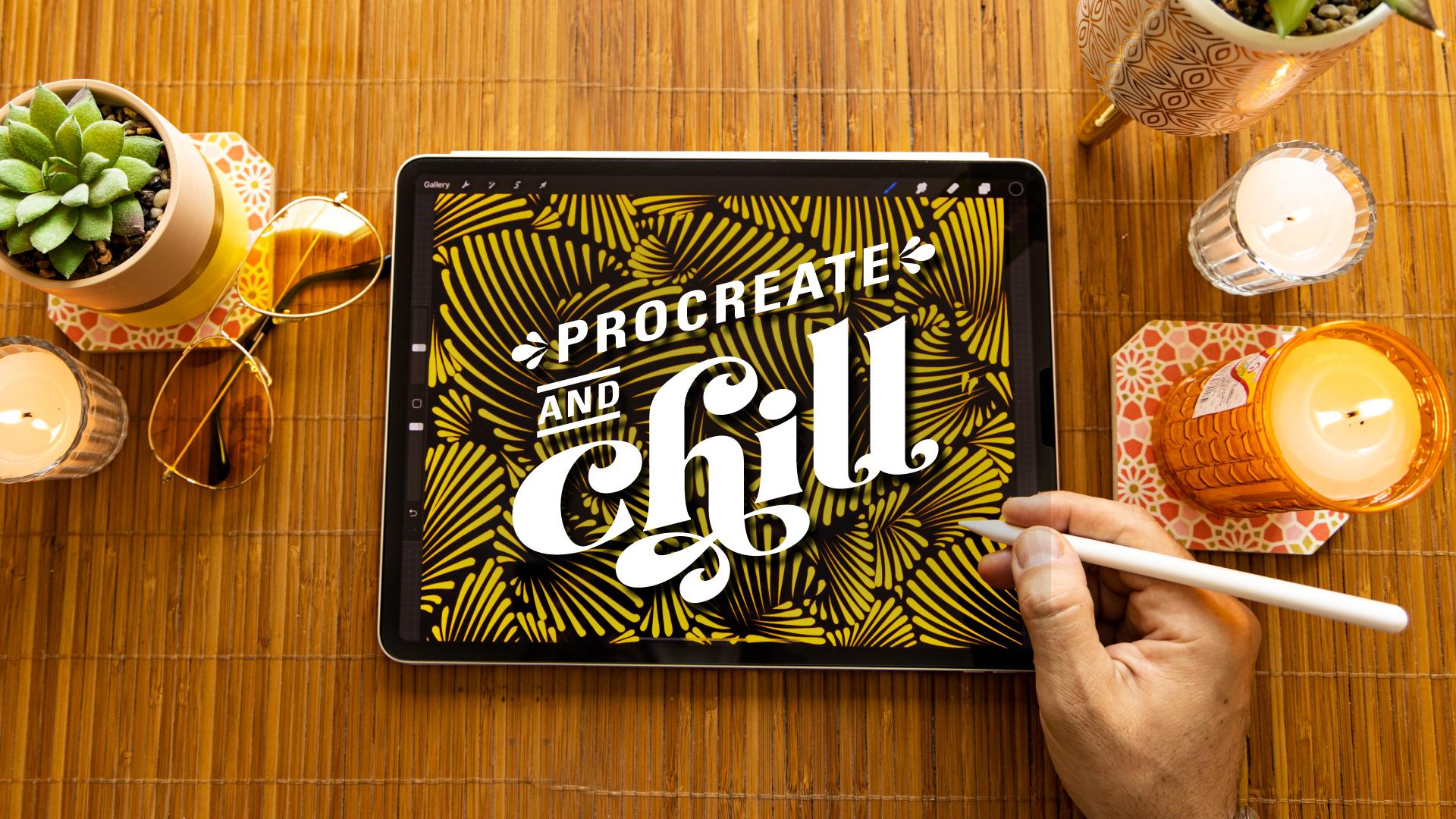
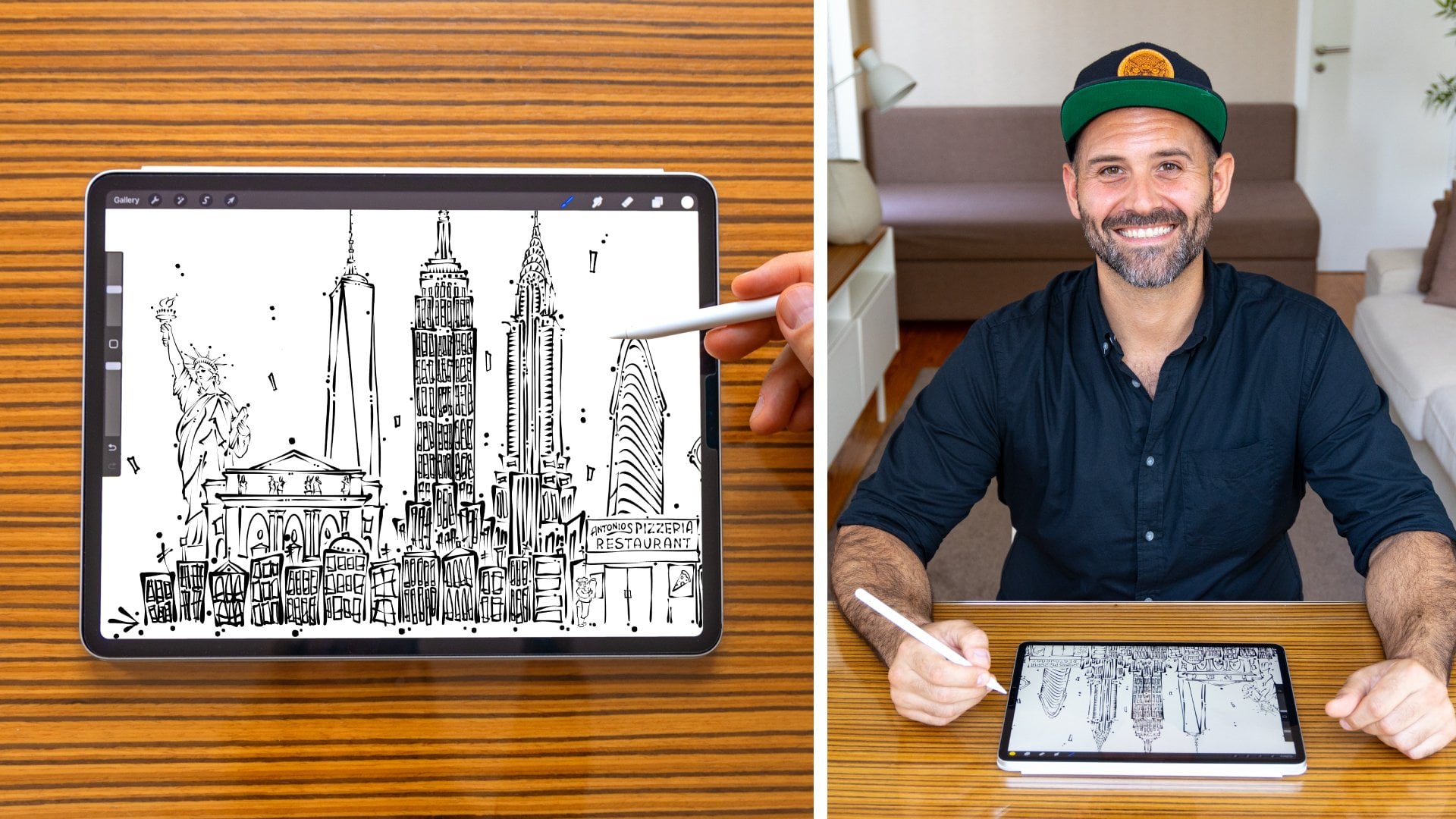
1. Intro: Hi, I'm artist and stand-up comedian Adam Palmeter and I need to chill, maybe you do too, and art is a fantastic way to unwind and relax your mind. Whether you're an artist or not, art can be a very meditative practice. It's also a fantastic way to infuse a little more self-care and creativity into your life. Painting, ceramics, or even whittling a stick, these can be all great forms of meditative artwork. For me, after a long day of painting a mural under the sun or performing a stand-up comedy show, afterwards, I really need to relax. When it's time to unwind and get a little creative, I reach for my iPad, open up Procreate, and chill. This is probably one of the easiest step-by-step Procreate classes you're going to take. Whether you're a total beginner or already familiar with the drawing app, you'll be able to easily follow along. This class is for all levels. We're going to be focusing on creating repetitive, gentle, abstract brushstrokes while allowing our thoughts to flow gently, release anxiety, and remind ourselves it's okay to slow down while making some really cool art. I'm also going to show you how I play with layers, color palettes, and simple tips and skills to help you personalize your artwork. Break out those favorite sweatpants, curl up on the couch with a cup of tea, and let's relax with some Procreate and chill.
2. Supplies: All right, guys. Let's chat about supplies. Now for this class, you're only going to be needing two things; an iPad and the app, Procreate. Now, I'm going to be using an Apple Pencil to draw. But if you don't have one, no worries, you can just use your finger. Now, my Apple Pencil and my iPad are two of the most important pieces in my artistic artillery. I truly believe they are two of the most versatile artist instruments out there. What a time to be alive. Now that we have our iPads in front of us, our Apple Pencil are sharpened, and our Procreate app open, let's size ourselves aboard to illustrate.
3. Setting Up Canvas: Let's go ahead and set up our canvas. Now, sizing a board is super-easy. Let's have a quick rundown of how they get the right size for your project. First things first, let's go ahead and find this plus sign up here at the top and tap it. Now Procreate has put together a lot of default canvas sizes. You can either choose one of these or we can go ahead and start our own. Let me show you how. Let's click this small dark rectangle up here and begin a new canvas. First things first, I always switch to inches. I like to start a canvas with it 10 inches wide. Then we click the height for eight inches high. We're at 300 DPI, which is actually standard print size. With this fairly small canvas, we're going to get 70 layers, which we won't even come close to using. But let's go ahead and tap "Create." Here's our new canvas. Pretty simple. Now that we've got our canvas, we can make it pretty. But first, let's choose a brush.
4. Brush: Now that our board is set up, I'm going to walk you through the Brush Library. Start by clicking up brush icon up here. Now, the brush I like to use is Syrup. They can be found in the Inking section of your Brush Library. If you have Procreate, you have Syrup. It's a default brush, which means everyone has it. Now, you can use any brush you'd like for this project. I'm not here to tell you how to chill, so feel free to toggle through and choose the brush that's right for you. Syrup is selected, so we can tap out anywhere on the canvas. We got our board, we've got our brush. Now, let's warm up with some easy peasy brushstrokes.
5. Warm Up: Now, it's time to warm up. Now, you don't run a race without a little stretching first. For me, it's always a good idea to warm up a bit before I jump into a new art project. Considering that I really only use the same brush strokes over and over again, it's good to get your hands familiar with a meditative movement. I like to think of this as a hand motion mantra, where instead of chanting the same phrase again and again, I use the same brushstrokes again and again. Let me show you my movement mantra. We have our canvas setup, we have our brush selected. Now, let's go through and find a color by clicking the color wheel here at the top right corner, and show these all our different palettes. Your palette might not look the same as mine. However, let's go down to the disk. The disk is where you can pick and create any color. I'm going to choose classic pitch black. I love contrast and using a white background with black on top, is pretty okay. Now, we can click onto our Canvas to get rid of that color menu. Now, we can begin. Now remember this is just practice. We're here to chill and there's no wrong way to make a brushstroke. But I want to show you how I make mine. My first brush strokes go like this. 1, 2, 3, 4, 5, 6, 7, 8, 9, 10. As you can see, the brushes get smaller as I go along. It's a great exercise to learn about the pressure from your Apple pencil or from your finger. When you push harder on the screen, it's a thicker stroke. When you push lighter on the screen, it's a thinner stroke. A good way to practice, is to just do 10 in order. Again, 1, 2, 3, 4, 5, 6, 7, 8, 9, 10. I generally make these groupings of about 10 or so, to fill some of the larger spaces on my canvas. As you can see, they get smaller in descending order. Maybe not this guy, but no one's perfect. One more practice going from top to bottom, 1, 2, 3, 4, 5, 6, 7, 8, 9, 10. Now that you have a better understanding of the pressure we use for the brush, you can see here here the bottom, they get thin as the tip of my brush comes off of the iPad, in simple quick motion, top to bottom. Go ahead and let that tip of your brush come right off the iPad, it gives it these nice little sharp lines here again. Now that we've gone from top to bottom, let's switch it up and go from bottom to top, a little something I like to call the rhythmic. Starting with our brush here, go straight up. Paying attention again to the pressure of the tip and movement in your hand, try to make a nice look. I try to leave the same amount of space between each of the lines, because essentially, I'm making the same line. It could be longer, it could be shorter, it could be fatter or thicker, but really, it's the same line. Now, I want to point out something I do with the spacing between these lines. As you can see, they're all roughly the same size. I like to try to put the same size of a brushstroke between each brushstroke. That spacing produces a contrast that really helps keep everything very visually appealing. Now, feel free to play around with the top to bottom or the remix and get your hand comfortable with the motions. Now that we're warmed up, let's go ahead and begin the first layer of our artwork.
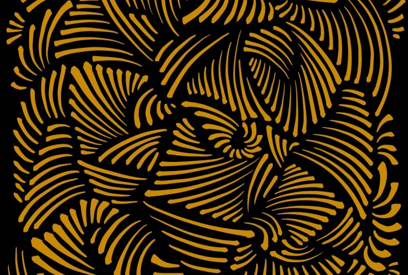
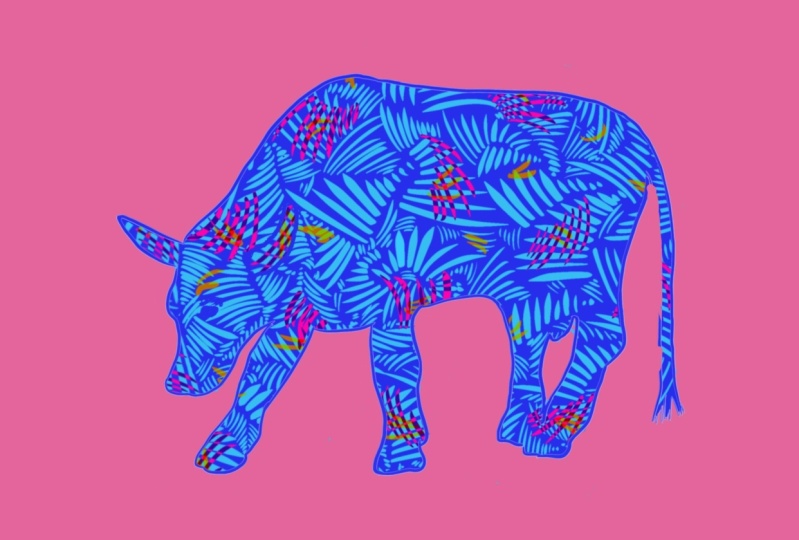
6. Big Palms: Now that we're all warmed up, let's get into our first layer with some big strokes. Now we've done a great job with our practice. Let's go ahead and hide this layer so we can begin our new project. Now, the first thing I want to do is find my layers palette, which is the icon up here. These two overlapping squares shows us our layers. We have a background and layer 1. Let's hide layer 1 by clicking the "Checkbox". Where to go, don't worry. It's safe right here. But for now, let's hide this layer. We're going to start with a brand new fresh layer on top by clicking the plus sign right here in the top. Now we have layer 2. Let's make sure layer 2 is selected and you can tell by its blue highlight right here. Now if you click on our board and begin. Let's make sure our brush is selected. Click the "Brush" icon right there. Click on the "Canvas", and now let's begin. Now, for my first primary layer, I like to fill the entire canvas with the longer larger brush strokes. Same as our practice. We're going to go ahead and focus on groupings of 5-10 of these thick and thin lines and fill the entire canvas. This palm has several. It goes from really long and thin all the way down to very tiny. I like to do one side going from left to right, and then another side going from right to left. This is a good way to explore both sides of your brush and playing with directionalities. You can see how mine has a curved angle here, looking like a bit of a stingray or even a black and white croissant. Now I'd like to fill this entire canvas with the shapes. As you can see, I made this line a little too thick. Now, if I want to back up and correct a mistake, all I need are two fingers. If you ever want to undo your last brush stroke, you can just use two fingers and a quick tap. Backs up one step. If you want to redo, use three singers, one tap. But I'm not a huge fan of that brushstroke. So using two fingers, tap and it's gone. Now let's continue. As you can see, my brushstrokes are all in different directions. I like that diversity because I really think it adds to the composition. Feel free to go right up to the edge or even over it. Sometimes I like to have these palms curve into each other and they meet at the edge, but then turn in direction. If you'd like to play with other directions and maybe it's tough to get up here or over here. Quick tip. Move your entire canvas by using two fingers, rotating it and bringing it to a comfortable size. I have filled in about 3/4 of my board and now I'm going to go ahead and fill in these gaps. One thing every artist needs is a confident brushstroke. Through this exercise, you can help develop a bit more confidence in your hand. You just do the same thing again and again and again. That's the point. Bruce Lee, the famous martial artist said, "I fear not the man who has practiced 10,000 kicks once, but I fear the man who has practiced one kick 10,000 times." Now, we're not kicking but we are drawing. As you can see, the spaces between our original larger palms are getting a little bit smaller and tighter. By zooming in and focusing on the pressure, we can fill in these spots without overlapping. I try my best not to overlap because it's that contrast that really makes the composition what it is. Now we're getting really into these smaller spaces here. If your lines are getting smaller and smaller as mine are, good news. It means we are almost finished with our initial layer. It's got a bit of a zebra or tiger print, pretty organic. Now we're getting into these smaller parts. Sometimes I'll only add a few of these lines to fill in those smaller gaps. I like to pay attention to the direction of the surrounding lines and see if I can't deviate away from that to give even more contrast of directionality. I like to think of this as a jigsaw puzzle. But you're given the shape and you can just fill in the pieces however you'd like. Now we can go through our whole composition and find these tiny areas where there is nothing and add one, two, maybe three palms. Start up here. At this point I'm just filling in these teeny tiny details. Now that I've filled up just about my entire board, I think it's time to move on to the next layer.
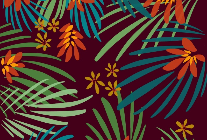
7. Flowers: All right, now that we've filled in all of our big strokes or palm leaves, which is what I like to call them, we're ready to move on to our next layer. For our next layer, I like to think of these smaller palms as flowers. We're going to begin by adding a new layer. Click our layer icon up here in the top, add a layer. Now we have layer 3. Layer 3 is where we're going to put our flowers. Click on the board. Now, let's change colors. We're going to click our color wheel here. I'd like to start with a pink. On this side we'll find the pink color we'd like, and in the center, we're going to drag this circle over to how dark or how light we'd like that pink to be. I'm going to find it right in the middle. Now as you can see, we have hot pink. Now let's double-check we're on the right layer. Click in layers, layer 3, we are. Congratulations. As you can see, this layer is empty. The ones below it are not. Meaning we've already drawn on those layers. Now we're working on a fresh, empty layer. For the flowers, I like to start small. We started pretty big with these palms over here. Let's start pretty small on top of them. You see how these original brushstrokes are going up and down. I'm going to play with the directionality and contrast that with horizontal strokes. The same brushstroke, a different color, and a different direction. It's this cross hatching which is going to give a new contrast between color and direction. Not too big, not too small. I also like to space out these flowers pretty evenly across the canvas. As you can see, these have roughly the same amount of distance between each other, so our composition doesn't get too busy. The first layer was all about cramming things together. The second layer really is about paying attention to the spacing. Sometimes less is more. Now our second layer is pretty evenly dispersed on top of our first layer. We can even check that out by going into our layers icon and hiding the black layers. As you can see, the pink layers, the flowers are spaced out pretty evenly. Let's go back into our layers. Click the box to show our black layer. Here we are. Now, let's add a few flower petals to our last layer.
8. Petals: All right. I hope you're feeling relaxed so far. We've done our first couple of layers and now we're going to move on to our final layer, petals. We're starting a new layer. Let's click our Layers icon. This plus sign will give us another layer right on top. Click the screen. Now let's choose a new color. Color wheel here. I'm thinking maybe a nice teal. I think that will contrast quite well. Make it nice and bright. Let's make sure our third layer is highlighted. It is. Very similar to the layer of our flowers, I want to space out these petals nice and evenly. I don't want to get too many in one area or not enough in another area. Let's try to think about the overall composition. Let's make this nice, and neat, and [inaudible]. For the petals, I only add a few. It helps me to think about blossoms falling from a tree. Isn't that chill? Pull this in so I can show you the nice contrast here. Again, I'm paying attention to the directionality of my brushstrokes. All of these are going this way, and this way, and that way. I thought going this way will be a nice contrast. I love this color palette. Looks like a tiger from the '80s. As you can see so far, I'm spreading out these petals and not overlapping with the pink. Let's see what that looks like. Sometimes it gets a bit too busy. Doesn't look so bad. Now to check out the consistency of the spacing of your petals, again, we can go to our Layers icon, and we can hide these other layers. We can have a better look. Yeah, that looks pretty evenly spread. Let's bring our layers back in. I'll go through and add just a few more petals. Sometimes overlapping all three of the colors really gives a better sense of depth to your work. Sometimes while using paints, it's very difficult to correct a mistake. But luckily, our iPad can do that for us with no problem. Now I'm adding some single petals. Just dance it up a bit. Now my composition is just about done. So let's move on to playing with hue, and saturation, and even transparencies.
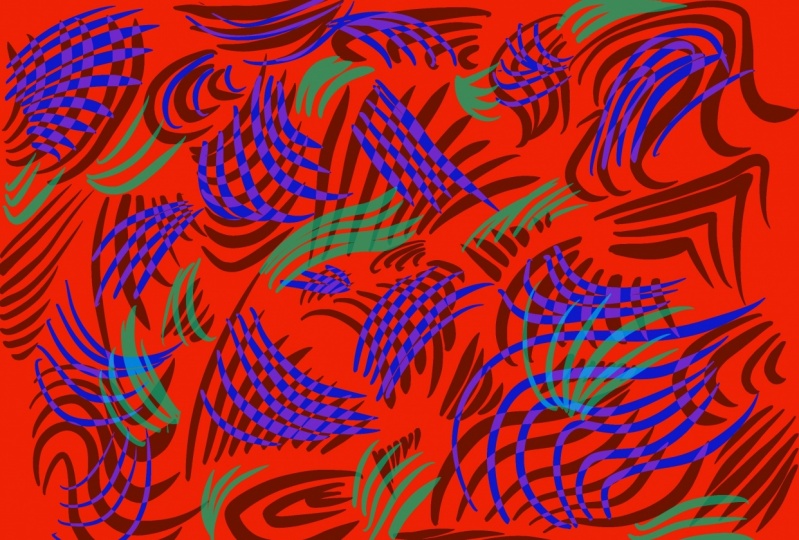
9. Color: Now is one of my favorite parts. We have our composition. Now we can change it into different compositions by playing with color. Let's start with our background. Let's click our Layers icon and go all the way down to Background Color. This is where we change the color to our background. Let's click on the disk. I'm thinking maybe a dark blue would look pretty good. Find that color on the wheel, move the center. Something that's really cool about this is you can play with colors and see them change in real-time. This is how it looks with that nice navy background. Now you can drag it around the outside wheel to watch it change any color you'd like. Wow, pretty trippy. I like it there. Let's go with red. Now that I've changed the background color, I'm noticing my colors from my original palette are clashing a little bit with the new background. Let's go ahead and change the colors on the layers. Now we're done with the background. Let's click our icon one more time to show the layers. Let's start with our original black layers, layer 2. You always want to make sure your layer is selected when it's highlighted blue. Now we're going to change the colors to the layer by using color fill. Let me show you how. Now we're going to get into our palettes. Click the Color icon. Now I want to change these black lines to maybe a orange. I'm going to find orange on my color wheel. What I want to do is quickly grab the color from the top of the color wheel, drag it over to a black line, and stop. Without removing the tip of the pen from the top of the iPad, you're going to drag it across slowly and everything in that layer will change orange. I'm going to go back and show you how to do that again because it can get a little confusing and there's a few steps here. First, let's go back to our original palette. I'm going to keep the tip of my Apple pencil on the screen the entire time until I lift it off when I come back. If you hold the Color icon too long, it will change back to the color you were just using. This is the color of our petals. We don't want that. Hold it again and it'll change back to our new color, orange. You want to grab this quickly and just pull it across and stop on one of the black lines, wait for it to change color. By keeping the tip of your Apple pencil on the screen, drag it slowly across the screen, and the whole layer will change. Pretty cool. That's color fill. That's one way you can change color, but not the only way. Now I'm going to show you how to change color using hue and saturation. I want to change my pink layer, but I'm not exactly sure what color I want to go with yet. By using hue and saturation, we can play around and find a nice color. Let's go and open up our layers and find our pink layers, making sure it's layer 3. You can always click the box. It is. There they are. You can also see it in your layer thumbnail on these little pictures here, show you what you've done. Now that we have our layer selected, we're going to go all the way over here to our magic wand. Adjustments. Let's click "Hue, Saturation, and Brightness" right at the top. Make sure you're choosing Layer. A new menu comes down at the bottom: hue, saturation, and brightness. I want to scrub along the hue section to get some colors in real-time. I like this blue. Now let's see what happens when we bump up the saturation. It gets a bit more bold. Dare I say, saturated. We can go all the way to the bottom, and it becomes a pretty brackish gray. I'm a big fan of bold colors, so I'll bring that all the way up to the top. Now we can play with the brightness. If we slide it all the way down, it becomes a much deeper blue, bringing up almost matching this teal, and even perhaps beyond. It's a bit too much of a color match for my petals, so I'm going to bring the brightness, I'd say, to 40 percent. To set those colors, we're going to click the same magic wand. Now that we've learned how to do some color change and playing with saturation and hue, I want to play with the transparency of these little teal petals here. I'm going to go into my Layers icon, make sure the correct layer is selected. It is. With our petals layer highlighted, I'm going to click this N right here, which stands for normal. As you can see, a lot of these are not normal. Let's scroll through and see what happens. Lighten does exactly that. Screen. We can scroll through and find different effects that make our composition a bit more interesting. Looks like Christmas lights. One of our options is vivid light. Now, this really lightens that color. Let me show you what it's done. It's created a semi-transparency on our teal petals. You can clearly see the overlap it's done with the other layers. Difference is another one that changes the colors where it overlaps, giving a more colorful version of your artwork. Coming back to normal, we can also play with the opacity of the layer. Dragging this down, you can see through the petals and really reducing the saturation of this color. But feel free to play with all of these. Explore, have fun, chill out, and enjoy your artwork. Now I'm going to show you one of my favorite color combinations to create a fake 3D effect. First off, let's change our background to white. Click the background color. Let's switch to classic. You can drag our color wheel all the way to the top-left to get the whitest white we can. Next up, let's change our orange layer to a bright magenta. Let's go to our color wheel. Now, playing on the spectrum, let's get a nice magenta. Now we're going to grab this piece of magenta, bring it all the way over, hovering over one of the orange stripes while keeping our pen on the iPad, and then drag it across the screen. From orange, we now have magenta stripes. Next up, I want to change these blue flowers to a bright yellow. Making sure our layer is selected, we can go into our color wheel. Again, sliding along the hue spectrum, let's get a nice, bright yellow. Grabbing this yellow, holding it just on top of one of these blue stripes, and then again, keeping the tip of your pencil on the screen. Let's slide that over. Perfect. Now, for the last color I'm going to choose, is a cyan blue. But we're in luck because it's already basically a cyan blue. Last but not least, let's go into our layers and change all of them to multiply. Tap the N, bring it all the way up to Multiply. We're going to do that for all of our layers. Now take a look at this. We have our cyan, we have our magenta, we have our yellow, but we also have purple, we have green, a little bit of orange. This is what the multiply effect is. You can have some kind of overlapping rainbow with your stripes. I think it's a pretty cool effect. Now to zoom back out to show you the full composition. Lovely. Feel free to keep exploring these color options on your own. I'm going to move on.
10. Saving: Now that we've got this really cool new Zen design, I want to teach you how to save it, export it, and even show you how to check out your time-lapse. Let's start with the time-lapse. You want to click up here to the "Actions icon". Click "Video", and then time-lapse replay. It'll show us everything we've done from our practice strokes to the beginning of our composition, all the way up to the end. It's actually a pretty cool thing to upload to social media so people can see your artwork process. In fact, for our class project, I would love to see your time-lapse or even a JPEG, which I'll show you how to save coming up next, and voila, here we are. Now, I want to show you how to save this in two different ways, so go ahead and click "Done". Let's go back into "Actions" and by clicking "Export Time-lapse video", we can choose a video length, the full length, which was just about a minute or 30 seconds. Thirty seconds is best for social media. I'm going to click "30 Seconds" and it begins exporting. Now that it's exported, I can go ahead and just airdrop this to my phone and upload it to Instagram for all of you to see. This is awesome because video content does very well on social media and it's a really fun thing to share. Next, I'm going to show you how to save this as a JPEG, which is just a flattened version of all of these layers we've created. JPEGs are great because they're universal. You can send them through social media, or you can attach to an email, or upload to a website, or even print it at home. Anyone can view a JPEG. Here's how to save one. First, we're going to click on to our "Wrench icon" and click "Share". That's going to show us all the different ways to share an image or the layers. We want JPEG. Now, the JPEG is ready to export and you can airdrop at the same way we just did our time-lapse video to your iPhone or computer or anyone else. Now with our time-lapse and JPEG exported and our beautiful new piece of artwork before us, I'm feeling pretty chill. Last but not least, I've got a few final thoughts for you guys, so let's check it out.
11. Final Thoughts: I hope you've enjoyed this class as much as I have. I hope you're feeling a bit more creative and way more chill. I would love to see what you made today. Please show off your class projects by uploading them to the class project gallery. If you'd like to share and discuss what helps you chill as a creative, please post in the class discussions. If you'd like to share your class project on social media, be sure to tag me @adampalmeter and Skillshare, @skillshare. That way we can have a chance to interact with you and your work. If you want to check out where I am teaching, painting or performing in the world, feel free to follow me on Instagram as well. If you'd like to see what other classes I'm teaching as a Skillshare top teacher, make sure to follow me by clicking the "Follow button" above. Well, I'm feeling pretty Zen right about now and I hope you are as well. Enjoy your day, morning, evening or afternoon, doesn't really matter because anytime is the perfect time to chill. All right, guys. Thank you so much for taking this class. I'll see you next time. Peace.
 Adam Palmeter, Artist / Comedian / Teacher / Author