Transcripts
1. Welcome to This Class: If you've ever wanted to
try negative painting, but find it a bit
too intimidating, then you found the right class. When I was a beginner,
I used to avoid negative painting
altogether because I struggled with crooked lines, fast drying paint, and losing
control over my shapes. But through the help of
warm up exercises and breaking down the process
in simple manageable steps, I've completely
transformed my workflow. It took the chess
out of painting, built my confidence,
and helped me create my favorite
floral pieces. Hi, I'm Bianca Lustre, an aspiring watercolor artist
from Btangas Philippines. I have been painting
every single day since 2018 for at least a few minutes, and I'll be your teacher
for today's class. In this beginner
friendly short course, we will apply the divide
and conquer strategy. We'll start with
these simple drills, get to know our colors, create small studies,
and then step by step, complete this floral
artwork together. Once you master
negative painting, you can immediately
elevate your own style, whether you paint landscapes, still life, portrait
or abstract. This class project
can be intimidating, so to reward everyone who
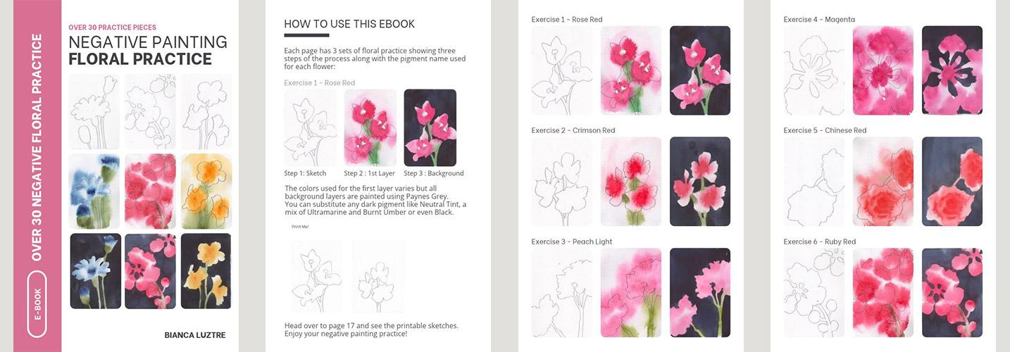
will complete this class, I have prepared a negative
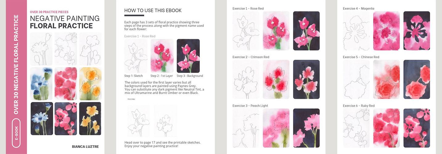
painting flower practice eBook that contains over 30
various floral shapes that you can practice on. Find out how to get your
copy in the next video.
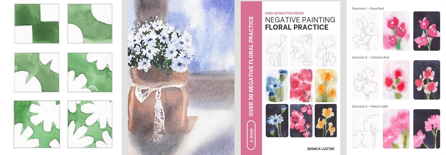
2. Class Project / Claim Your Gift: Our goal for this class is to complete this lovely painting. But before doing it, let's
slowly build our confidence, practice our brush strokes by doing the warm up exercises. I know this is a
challenging artwork. So to reward those
who will upload their class project or leave
an honest class review, I have prepared a negative floral Practice
eBook to help you improve your brush control further and work on
different flower shapes. Copies of the finished project, list of materials
and colors used, warm up exercises,
and the painting in different stages are
found in the Class Guide. Please download that if
you haven't already. For a general idea, here are the materials that
you'll need to prepare. We'll need 100% cotton paper. I love crisp borders. Hence, the masking
tape is a must for me. Please prepare flat brushes, a wide and a narrow one, and a round tip brush. This three brushes will do. You can even just
reduce it to two. You'll also need a pencil, and a bonus lesson
will be included where I show you how to
draw the reference photo. For the colors, I specifically used
permanent yellow deep, hooker's green,
ultramarine blue, carbazle violet, burnt
umber, and paints gray. Basically, you'll
need a yellow, green, blue violet, brown and
dark neutral pigment. Please prepare a palette where
you can mix your colors, a water jar, and
paper towel or rack. I have some scrap papers for the warm up exercises or to simply test out
my color mixes. A regular board paper would be a good substitute
for these drills. Prepare your materials
and let's warm up and practice our brush
strokes in the next video.
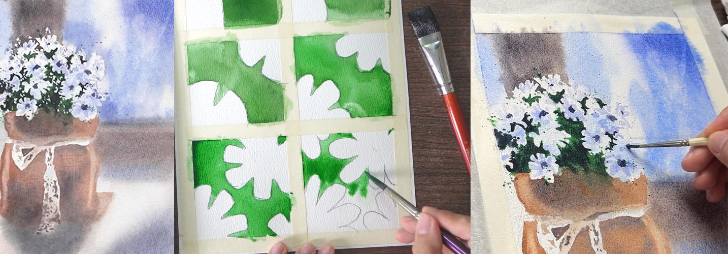
3. Warm Up Exercises: Before we even attempt
creating the project, I highly encourage you to do these warm up exercises first and practice
negative painting. You should see a copy of both the sketch and finish
exercises in the class guide. It's nothing too fancy. Just divide a
watercolor paper in six sections and
draw the outlines. We'll start with basic
shapes, and gradually, those shapes will look more complicated and harder to work on to help us prepare
for the class project. I know you might be
tempted to just give this project a start,
but please don't. A warm up is needed,
especially for beginners. Our goal is to use
these two brushes, a flat brush and a
round tip brush. Obviously, for the first one, you can use only
the flat brush and negatively paint
around these squares, starting from this one, and slowly approach the other one. Proceed with the next shape while keeping in
mind the other one. Moving to the next box, you can still use
a flat brush and negatively paint on
these curvy shapes. Of course, the size of the brush is relative to the
size of the shapes, so feel free to use a smaller one if your
sketch is smaller. But as we get to the third box, that's when we will need
the round tip brush. Begin by taking care of
the bigger area first. You can see that I
went over the line, but that's totally okay. You may lift that paint
with a paper towel if it hasn't dried already
or just let it go. Then you might want to try
continuing with a flat brush or shift to a round brush to navigate through
the smaller shapes. On the fourth box, there are more
challenging shapes. So instead of painting directly, I will prepare the paper
with clean water first. This gives me enough
time to work on the smaller shapes
like these and not worrying that the paint
might dry up before I can finish causing back runs. Start with a flat brush
for the big shapes, then switch to a round brush, and you may rotate the
paper for an easier angle. You may also do this if you
find it more comfortable. But during the demo later, you won't see me
rotate my paper since I'm challenging myself to
work on a specific angle. You don't really
need to copy me. If it's more comfortable
to rotate the paper while negatively painting,
then please do so. I am once again going
over the lines, but that's totally fine. It's very normal when
doing this technique. Next, prepare the area
again with clean water. This is more challenging
than the previous ones, but please keep going. That's the goal of these
warm up exercises. We're building our confidence and we're not really
trying to impress anyone, but we are learning through repeated exercises and failures. So embrace them, learn from
them, and then let go. Our goal is to know which brush is better for a specific area. Take your time and enjoy
the learning process. I know it's tedious, but
it is really effective. And finally, for
this last exercise, I can leave the flat brush since the shaves are
getting even smaller. We are working on four
flowers at the same time. Wet with clean water where
the bigger shapes are. I'd like to commend you for your effort for getting
this far in our exercises. It's a way to avoid
frustration, too. Once warmed up, you
should find the project, especially the
negative painting part easier and more fun to work on. Just as how we do it in
school, doing homework, seat work, and
taking mop up tests before the actual exams,
treat it like that. We warm up to prepare for
our lovely class project. Go ahead and complete
these exercises. You may even share it with us as part of your
class project photo, and I'll see you
in the next video to start on the actual artwork.
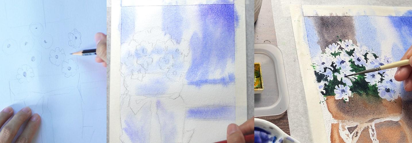
4. Sketching the Guidelines: Right. Let's start by sketching a few guidelines
for our painting. I don't have the rights to the original reference
photo, so to be safe, let's use this finished painting
as our reference image. The first thing that
we'll have to check is if the reference photo and the paper that you will
use have the same size. You can either print
the reference photo bigger than what I
have here or smaller, depending on the paper
available to you. I have an excess here, so I will mark the
side and bottom parts just to make sure that
they are of the same size. Doing this will make
everything easier. Next, start with
the biggest shape. Say the top of the flowers, the bottom of the flowers, and then align those and
draw light guidelines. Add one for the sac, too. Once done with all
the horizontal marks, let's add the
vertical landmarks. Align the reference photo with the paper and start
finding the edges. Say the edge of the flowers, which almost aligns
with the sac. You may also mark where
the window frame is. Do the same for the
horizontal one. Now, we have the
overall guidelines for the size of the flower, the sac, and the placement
of the window frames. This gives us a
general idea where one shape starts and ends. We can also add a
line for the ribbon. Then using hard edges outline the overall
shape of the sac. Our goal here is to place the important elements
of the painting. So leave all the
curviy sketches later. We can also use
simple shapes like a circle to mark where
the flowers will be. I can see a flower over here, so draw a circle
for that one first, add another one to
its upper right, and then there's one near
the edge of the sac. You get the point.
Continue doing this until you've managed to locate where the
bigger flowers are. Don't worry about the smaller
or filler flowers for now. This one at the top, as I compare it with
the reference photo, it is close to the window frame. So I'm confident that
this is accurately drawn. Check and make
adjustments as needed, like what I did with this
flower at the right side. Next, locate the
center of the flowers and keep in mind that they
face different directions. They have different sizes, so do just that. Then it's just a matter of roughly copying the
petals of the flower. Again, this doesn't
have to be perfect. Not all flowers
should look the same. Some of them almost blend with the background
and the leaves, focus on the ones with defined edges and
shapes and draw them. We can also sketch the
secondary flowers next. They are not that defined, but you know that they
are also flowers. Make the marks as
lightly as possible, but also visible enough for you to follow along during
the painting stage. If you want, you can also add light sketches for
the shadow shapes. Now that we have this sketch, let's start painting
in the next video.
5. Painting the Shadows: Once the drawing is done, the next step would
be making the marks lighter with a needed eraser. A regular eraser would do too. You can tap it lightly
or roll it on the paper, and it would pick up
the excess graphite and make the sketch lighter. I'm only doing this because
the flowers are white, and I don't want
to show too much of the pencil marks
on the final project. I want to start
with the shadows, and I love them blue. Remember, not all
shadows are black. Loading my brush with
ultramarine blue and mixing enough water to achieve
this consistency. Test your colors first. You want the first layer
to be light as this, but not too light that it
wouldn't be visible later. We want to color the
shadowed parts of the flower in here
at the bottom, as well as the background. We begin by wetting the
paper with clean water. You can either use
a big brush and wet the whole area or use a spray bottle like
what I'm doing here. But I find it even faster
by combining both methods. Make sure that the
whole paper is wet but not soaking wet, okay? Load your brush with
a light blue mixture and let it spread
on the wet paper. With my flat brush
loaded with blue, let's begin painting
the shadows. Start with the
flowers in the middle and leave the upper
flowers alone. You may also mix a bit of purple and use that for the
background for variation. I can see that this
part has already dried, so I will need tout it
again with clean water. Right now, we are actually negative painting around the
flowers by avoiding them. This would be tricky to control
if the paper is too wet, so learn to observe the shine on your paper
before you do this. But in case the paint gets
into the white shapes, you can always use a paper
towel to lift up the colors, which I will also demo later. Leave some parts
intentionally white. We can even go darker on the upper right corner of the
paper for better framing. If your paint is
spreading too far, then your paper is too wet. It's best to let it dry for
a few minutes and try again. Then paint the shadowed areas of the table and the jut sack. You have to remember
to do this while the paper is still wet
to achieve soft edges. If it starts to dry and you're not yet finished
with the color blue, then it's better to let it dry completely and just
re wet it later. Negatively paint around
the white ribbon, too, but don't overthink
this part, okay? The first step is
all about painting the shadows and we
want soft edges. So using wet-on-wet
technique is our best bet. We're only on the first layer, and adjustments can
always be made later. Splatter with clean water for texture and leave this to dry.
6. Drills for Background: While the first layer is drying, let's practice
negative painting. Let's say that we want to define these flowers using
the s technique. How do we do that and
where do we even begin? Especially for beginners, negative painting could be a
very challenging technique, but it is not impossible to do. Here's a small sketch
of the silhouette of the flour for our
warm up exercise. Prepare a mixture of dark brown by mixing
ultramarine blue and burnt umber until it turns into this
lovely neutral shade. A small swatch to see
if it's dark enough. Yes. What a lovely
mixture indeed. To practice painting around
tight shapes like this, I suggest you start wetting the area far from these shapes. We don't want the
background to start drying before we can even define
those white flowers. We also don't want
to hurry too much that it would compromise
the quality of our piece. So wet the area first farther from the shape that you want to define using
negative painting, and then start
with a flat brush. Switch to a smaller brush, and since the background
is still wet, you'll have enough time to paint carefully around the
petals of the flowers. This way, there's no fear of backgrounds or
cauliflower effect. We can slowly go around and chisel out the shape
of the petals. I hope you find this
technique helpful. This is the same method that we'll do in our class project. With this method, you
won't need to do it too fast and risk
ruining the project. Let's give it a try
in our next video.
7. Glazing the Shadows: Refil your burnt umber and ultramarine blue mixture. An equal mixture
should turn into this lovely shade
of brownish gray. Wet this side of the
background with a flat brush, but do not touch the
flowers at the top. With a dark brown mixture, paint the wooden
frame of the window. As you get closer
to the flowers, switch to a round
brush to make it easier to work on tight
spaces like this. I am not copying the
reference photo 100%, but I am making sure that
it looks like a flower. Carefully chisel out the shape. No need to hurry since
the background is still wet and we won't have
any accidental blooms, except if you're watching
this during summer, or your air conditioning
unit is turned on causing the paper to
dry faster than usual. Otherwise, painting
the background this way should give us enough time needed to finish
this part of the project. For the next step, we're using the same blue
plus brown mixture, but more brown this time, so it's on the warmer side. Something like this shape. Next, prepare this area off the background
with clean water. We're painting the
wooden part again. Make sure to wet not
only the shape itself, but the surrounding area, too, to give room for the
pigments to spread later. Load your flat brush
with color brown and negatively paint the
side of the jute sack. I know it looks a bit crooked, but we will fix it later. Looking at this, I think we can extend that brown
shape further down. So using the same color, paint the shadowed part
under the wooden panel. However, we'll get a
hard edge at the bottom, which wasn't in the plant. So what we can do is
soften the edge with a clean brush and
at the same time, prepare the table with clean
water for another glaze. I love how the blue still
picks through the brown layer. This is the power of glazing a transparent layer of
watercolor over another. The cast shadow
below the sac needs a bit of rework too,
so do the same thing. The shadow colors look more
interesting now, don't they? I have also accidentally
painted the white ribbon, so it's time to use our
eraser, a paper towel. Use it to lift up some paint that got
into the ribbon shape, as we want to give
this ribbon white. This is what I meant
earlier when I said not to worry too much
with the first layer. Now, using a round tip brush, we touch those shapes that we accidentally picked up
using the paper towel. It's a fun cycle, isn't it? One last step. I find the top bit of
this wood too hard, so I will soften it with
a clean, damp brush. Just brush it slightly over the shape and then leave this
to dry for the next step.
8. Drills for Flowers: It's time to work
on the flowers. As always, let's practice
first and prepare our colors. Mix in green and try to
achieve this consistency. Add just enough water to
allow the paint to flow. Do the same for paints gray or grab any dark neutral
pigment that you have. Even black would do, but I suggest that you mix
it with green first. Instead of painting
the negative shapes with dark colors immediately, what we'll do is paint those
shapes with green first, pure green, and then while
still wet, add paints gray. We are mixing the colors on the paper and not
on the palette. It has this lovely effect
where a bit of green picks through the dark color and not all parts are covered
with the same shade. If you're going to apply
that in the class project, paint the shapes surrounding the flowers first with
green or base color, and then carefully go
around the petal shapes, and while still wet,
drop paints gray. The only tricky part here is there are more
than a couple of petal shapes that we have to negatively paint
at the same time. So we have to be careful, but not too slow or the
paint will start drying. This way, it's not too scary painting the background
with dark color outright. You'll have time to lay
down the base color first, followed by the dark neutral. Warm up and do this drill, and I'll see you
on the next video to apply what we practiced.
9. Negative Flowers: Now, let's apply the same
technique on our class project. Going first with Hooker's green loaded in my
round tip brush. I will begin by marking
where the edges of the petals are so I won't
get lost in the process. This part is a bit challenging, but I know you can do it. Remember, divide and conquer. No need to cover a
huge area at once. Let's only paint the part that we know we
can cover without the paint drying
before we can even drop paints gray or any
dark neutral pigment. For the first drawing, I think this shape would do. Moving fast enough, but I am not panicking and I'm just letting the pigments
blend with each other. We don't even need to cover
the whole green area, okay? I'll continue on this side
and do the same approach. We don't have to define all the petals since some of them are
covered with leaves. Again, only paint a portion that you're confident
you can handle. Our goal would be to drop pains gray or any dark neutral pigment while the paper is still wet to achieve the effect that
we practiced earlier. If this is your first time
hearing about this technique, I have a separate class where I demo different ways to mix watercolors and mixing on
paper is one of my favorites. Going back, this shape is
bigger than the first, but I know you'll manage. Once you're satisfied
with the green layer, carefully drop the dark color, and that should be done. You'll also notice
that I'm not even covering the whole green
shape with my dark pigment. It creates this
interesting effect, and we can avoid it looking
too flat or boring. For the bottom bit, we can soften the edges
with a clean flat brush, since we don't need it to have a defined or hard edge for
it's not our focal point. It looks like abstract
art right now, but when we add details later, I swear it will make more sense. Continue painting negatively
and carefully around the shaves and let go if
you make small mistakes. What matters here is
that your painting still looks like a
bunch of flowers, okay? Based on my experience, when you try to correct a
negatively painted shape, the tendency is for
the positive shape or the supposedly white
part that we are preserving to get
smaller and smaller. This happens when we
feel like we have to correct an angle or the
curve of the shape. But I suggest that you let
go of such small mistakes, learn from them and move on. That's why I strongly
encourage you to do the warm up exercises first before going for
the actual project. This way, you're building
your confidence, getting to know what your
brush can and cannot do, and then with more experience, we can handle more
complicated shapes. U or the smaller shapes
here at the left side, you'll also see me
using my finger to tap and spread some parts. This helps create
organic shapes easier. For the smaller gaps
between flowers, you will need to apply an
even lighter pressure on your brush so only the
tip touches the paper, hence painting small shapes. But if you feel like you have to switch to an even smaller
brush for this part, then please do so. Continue separating the flowers by painting in between them. Don't go overboard or overthink. We can add details later to
help establish some shapes. It's looking more like a
bunch of flowers, right? Paint carefully and enjoy
the process. You got this.
10. Negative Elements: It's time to paint the jute sac. Let's prepare two
shades of brown, burnt umber, and for the shadow, burnt umber plus blue. I'm starting with my
flat brush and directly painting on the sack since
this is a small shape. There's no need to pre wet the surrounding
areas like how we did the background earlier. I am doing it carefully
and keeping in mind that the flowers
are overlapping the sac. This part of the tutorial is
being played in a 1.5 speed. So consider doing
it slowly, too. As I reach the right side, I will negatively
paint another flower. Again, if you feel more comfortable using a round tip
brush with this technique, please feel free
to switch brushes. While wet, let's drop the blue and brown mixture on the middle part where the flowers are
casting their shadows. With a clean, damp brush, soften the edges carefully. Gently glide the tip
of your brush along the top and bottom parts of this shape that we just painted. Then continue with
the same approach on the left side of the sack. Just like the upper part, there's no need to re wet the area with clean water first, since it is an easier and
smaller shape to work on. This time, we are trying
to leave the ribbon white. Soften the bottom
part so it blends smoothly with a cast
shadow below it. While this is wet,
load your brush with a darker brown mixture and drop where the shadows
are supposed to be. With a clean damp brush, lift up some highlights
on the left side. You may go darker on the bottom
part by adding more blue in the mixture and reinforce
the shadowed area. Do the same on the right side. This is just a ribbon, so don't worry if
you accidentally painted some parts that
are supposed to be white. We can easily lift that
up with a paper towel. Once again, it might look
like I am doing it so fast, but this part of the
video is ped up. Take your time working
on your project. As long as it doesn't
dry before we can drop the shadows or lift the highlighted parts,
you're doing great. I soften the right side
of the sack and now drop the brown shadow color
while the paper is still wet. Observe the reference painting. Using a clean brush, lift up the parts catching the sunlight like what we
did on the left hand side. Every time I lift
up some pigments, I wipe my brush on a
rag or paper towel. For the ribbon, adding
some abstract shapes will show the effect
of the eyelet texture. Some holes here and
there would give an impression that there
are tiny stitched holes. Again, don't stress out
or overthink this part. Our brain will
automatically fill in the gaps of the
missing information. Don't forget to use the same colors of the
sack for the ribbon hose. Don't make it too
dark or too light. You can also dab with
your brush and tap with your finger for
some organic marks. Continue adding details
as you see fit, but don't get this
part overworked, okay? For the flowers,
we're going to use a light blue violet mixture
for the additional shadows. Test your colors first by
painting a small swatch. This is too dark for the
shade the time after. Add more water, and it would
be the perfect shadow color. If I am going to test
it on this mall study, a shadowed flower
will look like this. Watch the reference closely. One to two strokes per petal will do in
defining the shadows. As long as your project
still looks like a flower, then that's good enough. A reminder that this
part is in fast forward. Carefully paint yours and
if you need to slow down, observe the reference photo and slowly build up the
volume of the flowers, then take all the
time that you need. Or the petals that reflect the sunlight, leave them white. Don't overthink and
enjoy this part. Now, going back to the ribbon. Once the details on
the ribbon are dry, add a light brown glaze on the shadowed
parts of the ribbon. This element is
not purely white, and we want the
viewers to first look at the flowers and
not the ribbon. So let's lightly
brush these areas, but be careful not to lift
up the layers underneath. For the details, I am grabbing
an even smaller brush, loading it with green and will splatter by tapping my
fingers lightly on the brush. Try it first on a scrap paper before doing it on
the actual project, just so you know
how much pressure to apply while
tapping the brush. If you're not producing
any splatters, then you need to load your brush with more of the watery pigment. But make sure to move your
gadgets away from your paper. Just some additional texture here and there,
and that would do. We wouldn't want to overdo this. Next, make a darker
blue violet color, and let's use that for the
centers of the flower. We will define some of the
centers of the flower, not all of them. And most of them aren't
actually perfect circles. It feels more organic and looks more complicated
when we do that. Remember that the flowers are
facing different direction, so it's only normal
that we don't see a perfect circle shape
for the center parts. Some would appear like a
semicircle facing the top, some are like squished ovals, while others are smaller
irregular circle shapes. Take it slowly, and as
always, don't overdo this. Use the same color
to splatter and dab with your fingers
to soften those marks. Just enough splatter marks, so it balanced the green
ones we added earlier. Now grab a white quash and use this to define
the filler flowers. You can also try
using white ink, white watercolor paint, or
even white acrylic paint. Anything that is opaque enough to cover the dark watercolor
pigments would do. This part is another fun part, but don't go overboard. With one stroke, use the tip of the brush to draw
tiny white dots. This makes our piece
look even more alive. Finally, let's add some
marks on the jute sack. With some criss crossed lines, we can add texture to the sack. Do this on some parts only. No need to cover the whole
sack with this pattern. As I mentioned earlier, our brain will
automatically fill in the gaps once we see some
parts with a bit of texture. In the next video, let's review this painting and
add final touches.
11. Final Touches: One final review before we can call it a day. Looking at this, I think this part needs a
bit of a touch up. Using a clean damp brush, I will lift up some pigments
by repeatedly going over it, but doing it carefully. Don't forget to tap
it with a paper towel to absorb the reactivated paint. Going over some parts of the sack that's
supposed to be lighter, scrub with a brush, and then pat dry
with a paper towel. But don't overdo this too. The opposite goes
for the bottom part. I think the shadow is too light, so I will add another layer
of my blue and brown mixture. Soften the upper part
to make sure that it doesn't have hard edges. We want to keep
those shadows soft. Okay, I think this
looks good right now, except that the flowers at
the top are not that defined. So let's re wet the
background area with clean water and add another layer of the
blue violet mixture. This is, again, a combination of wet on wet and
negative painting. Doing it helps define the
whiter flowers at the top. And finally, I will
add another glaze of shadow colors on the
darker parts of the table. Now, let's reveal
the project with its crisp border.
What do you think? If you painted along, please don't forget to share
your project and inspire your fellow artist and
claim your free eBook. I'll see you on the next video, and I'll share with you
what you can do from here.
12. What to Do From Here: Great job on
completing this class. I know how intimidating
negative painting could be, but you showing up for yourself, completing this
class and working on the project is
worth celebrating. We started with
warm up exercises to help build our confidence, practice our brushstrokes
and tested our colors. Before tackling each area
of the class project, we also did a small
study on the side. By doing this, we are applying the divide and conquer strategy. Combine negative painting with other more complicated
watercolor techniques, and you'll have more confidence
in experimenting and exploring rather than
dreading the final output. Once you've completed
the project, I highly encourage
you to share it with your fellow creatives or share your honest review to help others decide if this
class is for them or not. Then send me an email
so you can download your free copy of my
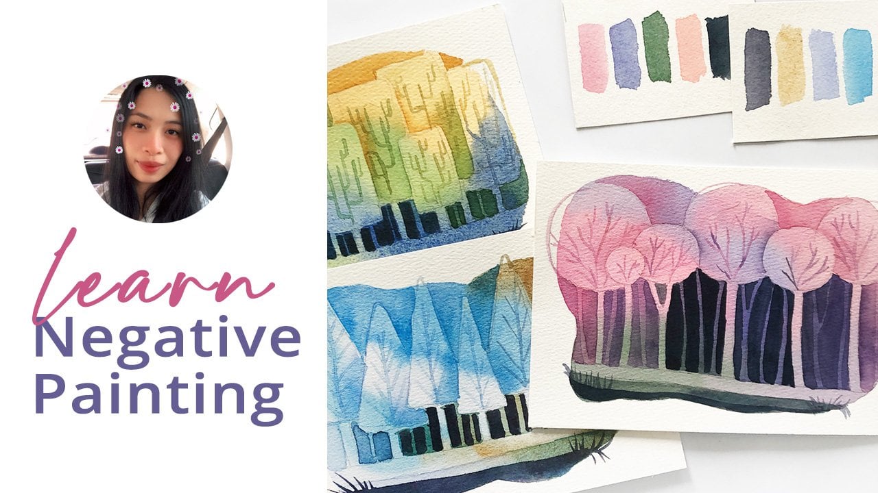
negative painting, Flower Pats eBook. If you want to practice
this technique more, please check out this
enchanted forest class. And together, let's make
this world a little bit more colorful
with our artwork.
 Bianca Luztre, Watercolor, Productivity, Color Mixing