Transcripts
1. Introduction: Hello everyone and welcome to my master PowerPoint presentation course, where you will learn how to design presentations, create templates, be a better presenter and by the end, be a pro at Microsoft PowerPoint. Let me be specific now and show you what will you be able to accomplish after this course and how this course is different than Any other on the market. Instead of just showing you PowerPoint tools one-by-one, I will teach you from start to finish how to design such a presentation and all its slides. Afterwards, we will work on a client project and create a presentation. According to his brief. I will also show you how to present such a presentation and how to shoot fireballs from your fingers. Dude, this is a PowerPoint course, no firewalls, okay? Okay. Within this Skillshare class, you can download resources to follow along, so it's easier for you to listen, watch, and follow my instructions. Let us briefly jump in. Previously, we create together here, the biggest difference between this course and any other on the market is that normally those workshops show you everything you can do. But they don't actually apply this knowledge to real examples, real slides here you will gain experience while working. We will additionally talk about master slides, templates, Zoom feature, more feature vectors, shooting fireballs. No firewalls. Okay, no fireballs, but other relevant PowerPoint topics. Let us see each other inside enroll now and I'm ready and waiting to start working. See you there.
2. 01-02. Why this class?: hello and welcome in the Master Power Point presentation Course, It's a great honor to have a student like you here with me. You enrolled in the master class, so it's a comprehensive course, but the skills gained will be worth your while The game plan is simple. Become an expert in power point, get a better at designing and also hopefully at presenting yourself. At this point, you have this stupid introduction already behind you. So let us go behind the computer and let me introduce you to a few important things about the course right now. No, no, wait. Yeah, Just getting I'm just capturing your attention. This is a presentation. Tip number one. Okay, let's go. Power point basics. I assume that you know a little bit about power point how to at the shape How toe at a new slight. Just the very basics, if you don't. If you, however, are a total newcomer, absolutely do not worry. Especially for that reason, I have set up a completely free power point basics course which will take you through the necessary basics which you need to know in order to understand and enjoy the masterclass in the course, I'll take U boat to the software basics and animation basics, and I have prepared this content specifically to be an introduction to both my master classes. You must also know that I treat this course like a member of my family. At any given point, you can head over to the A Q and A section, and either search for a solution or ask a new question. If you are in trouble, I'm always there to help. If I will know the answer, I'll try to help you. To the best of my knowledge, I'm sure you are aware there are different Power Point versions available board for Windows and for Mac Off course. I recommend to have the newest possible version, and some features will be not available in older versions like Power 0.0.2010. So I recommend having at least power 0.2013 but it would be best if you have 2016 19 or even the Office 3 65 subscription. There is only a bunch of lectures which require the absolute newest versions. If you do not have to version, just watch the lecture, soak the knowledge in maybe you operate in the future and you will already have the knowledge necessary to start working with the new features. Everything I designed and work with here is available in the resource is for download. Something might change here because I operate this course a lot because this is my absolute crown jewel and masterclass. But basically you go to the product in the resource is tap, you take Seymour and somewhere here you should have their resource is for download. You can download and unpack all those files. If you would like to use the resources that I've created for the course. All right, let's take a look at the content. You have different sections here, and the main meet the main beef. The real content is the sliced design section and the next sections Where we go more about design, more about power point and about everything. If you are keen on just designing and diving into power point right away, you can start this section right away. But I recommend you go from the first to the 2nd 1 where I talk about a few important things. Those are things I have to talk about talking about factors about inserting funds about using a color scheme, and I do recommend you watch them. Let me also introduce myself. Hello, everyone. My name is Andre Park, and I would like to call myself a professional, but I also like to have fun with the work I do. In late 2014. I've graduated from college and since then I'm pursuing the things I love doing. By enrolling this course, you probably can figure out that one of those things is working in Power Point. I'm a graphic designer with focus on presentations, video editing and animation. I am a top rated seller on the fiver where I do freelance work. I'm also creating online courses and running a YouTube channel. I want their content to speak for itself. But I will try to ensure you that you made the right decision by enrolling this course. These will some and round up my introduction to the course. Thank you very much for watching. And I can't wait to start the real work with you.
3. 01-03. Your Assignment: Hi, it would be amazing. And you can help
me on Skillshare by starting a product
for this class. Nice. At first, it doesn't have to be the ready product is go to the
Project and Resources tab. Hit on Create Project. And right, You're
welcome message. Later on when you create
slides from the lectures, you can share a
screenshot of that slide. You can do this by going to File Save As Selecting Browse. And you can select to
save as a JPEG there. By saving JPEG, you can select all slides
are just this one. Then you can come
back to the project, select Image and to just add
a slide that you created. I will be really happy to see it and it will also
be very helpful. Please start the
product right now. It will take only a few clicks and helps me a lot
here on Skillshare.
4. 02-01. Must know shortcuts: You're already here.
Hello and welcome. In one of the first
lectures of this course, I'm really excited to start
working and I'd like to teach you something useful in each
lecture of this course. We have to start
somewhere, right? It would be very
useful if you would download the resources
for this course. Within those resources,
there will be a presentation called
Essential Knowledge. If I change lectures,
something will change here. But the resource will be always available for
your information. The reason I'm teaching
you those tips, tricks and shortcuts right at the beginning
of this course is because later on we will create a lot of
Powerpoint slides. We will use most of
the tools we have and you will learn that
gradually over the course. It will be much easier for you to create those slides later on because we will use a lot of tools taught in this section. If you have downloaded
this presentation, let us work together. The first thing I'd
like to show you are the mighty shortcuts. Shift control and old. If this presentation is
open in front of you, please click on
the first object. Click down on the corner of this object and
try to resize it. You can see you
have total freedom when it comes to resizing it. But if you press your Shift key, it will always remain perfect
on constant proportions. That's very important
because no matter what object do we
have, we can always, by clicking the Shift key, make sure that we are
resizing this object, having the same size. The same goes if you
go to Insert Shapes. And insert any shape
into Powerpoint, for example, a circle. If you insert a circle, once you press Shift key, it will be a perfect circle. All right, that would
be the first short cut. The second shortcut
is the control key. The control key allows us to resize an object
from the middle. I'd like you to click on
the middle object again, start to resize it as
you would normally. But this time click
the left control key. Please notice the difference. Instead of just resizing
the object like this, when hitting Control, it is growing outside
of the middle point. What's even more important, you can also press
your shift key. If you press them together, you can see you are remaining on the same side of the circle. And it would be much easier to cover one circle
with another. Moving forward to
the last shortcut, we have the old key or
command if you are on a Mac. As you can see, if I
click and move an object, we have those guidance
lines added by Powerpoint. Those little red lines. The more items on a slide, the more of those guidelines. If I want to position
the circle, for example, here, but I do not want
to use those guidelines. I'll press my left old key. And even though the guidelines
are still displayed here, I have total freedom when
moving this object. Right now. When the old key
is pressed down, I can just drop it and decide
if I've done it right. Then again, of
course I can move it around and the guides
will be still active. But again, if I hold old key
before dragging it around, I can move it completely freely. This is a great right. But another thing is
that you can combine all three of those keys or
any combination of those two. I would like you to
proceed to the next slide. Select the middle circle, start to resize it,
and use all shortcuts. First click shift, you can see we are on
constant proportions. Left control. We are growing
outside the middle point. But we still have
those guidelines. Then the old, and we
have total freedom. No guidelines, just pure
resizing and Powerpoint, this is a very convenient
way to work with objects. And this is just the beginning. We had to start with something. I felt like this is one of the most crucial
elements when it comes to Powerpoint usage.
It shortens your time. It makes you simply
better while designing. This is why we were
going for this. Please open the presentation. Try all shortcuts, and we'll see each other in
the next lecture, because more cool
stuff is coming up.
5. 02-02. Format Shape: all right, we are moving along, and in this lecture, I want to talk about former T. This is a picture, and those are two shapes inserted into PowerPoint. Before you do anything, I would like you to watch. If you click on the picture, then here on the top side, it says picture former. But if you click on this shape, it says shape, format. So, depending on what you actually click and power point if it's a shape, if it's a picture, specific options to that object can be applied. If we talk about pictures as I go to the picture of former, I can change, for example, the color just a tiny bit and correct the image when it comes to its brightness and contrast. Those are not advanced features, but they get some basic things done. Alternatively, if you do not want to use the top bar of Power point, the same features can be found on the right side. If you right click, select former picture or former shape. Depending on what you click, you will get this right panel in this right panel allows you to basically access and a possible tool that can be applied to this object. Meaning outlined car lowers applying effects like giving it a shadow. And also those same specific options which we have here. As you can see, corrections and color and on the right side as well. We have corrections and color. Okay for this lecture, I'd like you to do all three off those things which I display here in the middle of the slight. With help off the right format panel, I want you to click on the picture. And just out of curiosity, we can go to picture former picture border Wait and we can increase the weight. As you can see, we can only go to six point. But if we select more lines, it will automatically take us to the first feature to the line option. We can select solid line. And if we do this by hand, when it comes to the wit, we can go as high as we want. Even for example, 15 points. I would like you to spend one minute and check out those features. You don't have to know everything about them. You just have to check them a tiny bit out. If you already with the outline. Please click on the second object and hear your quest will beat at Ingredient. I want to select the object. I want to use the first bucket, which is Phil and Line and under the fill options, let me close the line options so they don't get in the way. I want you to select Grady and fill when it comes to the Grady Int, you can select Grady in colors here on the right side, you can remove colors. Just make clicking and dragging away, and you can select which color you want here. I would, for example, want to go for something red. You can either click on the first color select already want or goto more colors. Andrews. Freestyle your way around this, or maybe an orange right, this dark red boom, then clicking on the second color, opening the colors again. Either. More colors are using a ready color, maybe more colors, to be a bit more unique and right now, for something darker. Okay, I was able to apply a grade into this shape. This would be the second task. The third task will be to adjust the transparency I want to click on the next object and from the previous object. We already have this panel open. The only thing we need to do if we are on solid feel we can adjust the transparency to about maybe 50% to be more consistent with the previous shape. I would also like to change the color and use a red one. The reason why you want to use the right form and shape options is because here, if I go to shape for months, not every option is available. This is just a quick many. For example, I can change the color here, but they cannot change the transparency. If you want to change the transparency, often object, you have to right click, go to former shape and here on the right side there is transparency. Maybe makers have put this shortcuts to the transparency here in the future. I'm not sure they already did this for pictures. I understand that the firm it shaped up isn't the most user friendly, but we have to get acquainted with it. And later on, as we work on creating slight, you will surely get familiar with all the features and you'll get better at using it. Thank you for listening. I hope you can make the same and then you can continue
6. 02-03. Format Painter, Animation Painter: In this lecture, I can teach you how to play with toddlers. You basically just set up a recording studio. And whenever you try to record, will definitely try to help. But he told me that he wants to record the intro for this lecture, but that's not going in reality. I wanted to talk about two amazing features in the lecture. So let's jump into it. While he's quiet. I want you to open this slide. Then I want to somehow compel you to insert a new shape into PowerPoint. You can do this by going to Insert Shapes and selecting any shape you want. Like this one. Who would use that? Okay? You have this shape and you do not want to waste time like recoloring everything, making it yellow, making it transparent. So there is a very cool and convenient trick for this. I will click on this object. Since this is a group boat with the icon with texts and with the background, I need to click once again to access to the background. Okay, I have the background selected. Once this is selected, I'm going to Home Format Painter. As you can see on my mouse. We have a little paint brush next to it. This paintbrush means whatever we click will take the formatting from the current selected object over which in our case is this one. So if I go and just click on the Smiley face, it got rid of my eyes and my smile. It's barely visible. But what we did here, we painted the format from this object into this object with one click. That's a super convenient way to get a lot of things done quickly. You don't bother, for example, what code that they use here. You don't bother about this. You just insert a shape. You click on it. Format Painter, boom. You have the same color, the same transparency, and the same settings on the object, which is awesome, but that's not everything. Let us proceed to the next slide, where I will show you the animation painter, because there are animations on this slide. How do I notice? Because I was designing this slide? Once you click on the animation tab, those little rectangle boxes will pop up. Once you see those rectangle boxes, they inform you which objects have animations on them. And also, if an icon looks like that with multiple stacked rectangles, it informs you that this object has multiple animations applied to it. To make this more convenient, I'll open the animation pane and click on this object. Clicking on this object will highlight every animation that is applied to it. I know on the Mac it looks a little different and do not worry if you do not know about animations at this stage of the course. We will talk about that later as well. I want you to, again insert shapes and insert any shape you want, just not the Smiley face. Um, let's for example, select a triangle. We have this triangle, and we want the same animations on the triangle as on this object. No problem. We click on it. We go to the Animation tab. And here on the right side we have animation painter, clicking on animation painter and clicking on the triangle. We'll copy over every animation that we did on this object into this new object. This is very convenient, if you like, for example, plan to add some additional elements and want to quickly copy something over. Then, building upon our knowledge, we can go to Home Format Painter and just paint the format over. Boom, we did it. Now you could say, why don't you just duplicate this existing item? You are smart. Yes, I can do this, of course, but there are situations when this is more convenient. And there are situations when painting the format and painting the animations over is also very convenient. This is what I wanted to teach you in this lecture. Both of those tools are amazing and you will be using them most likely very often because they simply save your time. And hopefully with this lecture, you'll become already a tiny bit better at PowerPoint then you were before it. Thank you very much for listening. I do not want to spoil it, but the next lecture will be also very cool. And I will show you something about editing the points of objects. So stay tuned and let's see each other in the next one.
7. 02-04. PowerPoint Versions: there are different power conversions, and I'd like you to not panic if you do not have a feature. What happens when a new major power pin version is released? And what is the difference if you have an office 3 65 subscription versus a normal version ? At first I want to underline that there are differences between the Windows version and there are big differences between the Mac version. But the newer diversion, the closer those programs become together. I sincerely hope that in the future, those versions will be identical. If you do not know which version of PowerPoint you use, you can always go on the left upside to file account and under account here on the top side , it should state which version you use. I off course used the office 3 65 subscription because I need to always have the most current version because I have to teach you all new features that are being released. What is very interesting here is that you can click on the update options and there you have view update. I'd like you to go there. Goto file account. Try clicking on view update, and it will take you to the official Power Point website with information about new releases before we proceed here on the bottom we have. When do I get new features? And this is crucial information because all new features, like little updates that are being revealed once upon a few months, are included for free as a part of you offers 3 65 subscription meaning. If you have Office 3 65 you have always access to the newest little PowerPoint update. If, however, if, however, you have a one thing purchase for example, 2016 to those 19 area that this was 10 4013 then you will not receive feature updates. You will only receive security and performance updates, but no new features. For example, Power 0.2019 has an exclusive update. This exclusive update is the more transition. This transition wasn't available for any older version. Also important as VG vector files is available, since this version, can you live work and complete discourse without having the morph transition or importing as VG vectors? Yes, of course you can. Those features are not mandatory. There are just a nice addition quality off life improvement. Not a necessity. The Office 3 65 Subscribers always get little updates and the ones they gather, a lot of those little updates and think of something really new. Microsoft is releasing a new iteration off the program, mostly every three years. If you agree to the version, you get all the features and the process starts all over again. Remember that the silver lining curious that I'm keeping this course always updated, but I'm leaving no one behind. I'm perfectly aware that some of your work on older versions and I'm trying to create the tutorials at least the major points off the course so everyone can work along. I hope this will be helpful. Please don't hate me for that. I truly wish everyone had the same part when the experience and all versions would get update. But that's not how it works. Microsoft also tries to develop this after and always reward people who have the newest version. Let us not waste any more valuable time on this. Let's get back to work and let's learn a lot of cool apartment features in the upcoming lectures
8. 02-05. Bonus - Quick Access Toolbar: welcome into a little bonus lecture where I will talk about the quick access toolbar. Becoming better at Power Point will eventually require from you to use as many shortcuts as possible. One off. The absolutely best ways to do so is to use quick access toolbar there. Quick access toolbar Is this little something here on the top off Power point. If you press your left old key, as I do now, you can see a bunch off letters popped up and also numbers here at the time of recording this tutorial. This feature, sadly, does not work for the Mac version of Power Point. I'm trying to talk with Microsoft about it, and I hope this will be brought in the future update. I'm also not sure if the Mac versions have two quick access toolbar, but the newest office, through 65 description and the 2019 version should have it. Those letters basically allow you to reach any feature using your keyboard, but it's pretty long. For example, if I want to select insert, I would need to press my old ones. Then they would need to press end to go into insert, for example, if I would like to insert a shape, I would need to press S and h so this would take a long time to get her. But what is amazing? I can basically click on any future we see here, for example, on the textbooks, right click. And I can add it to the quick access toolbar. What is so powerful about the quick access toolbar that right now when I press my old key, I'll no longer have to goto insert taxed Boggs and always click around Al just press old for and the textbooks is inserted for my shapes. I'm currently having it at fault, too. So whenever I need to insert a shape old to boom and already shape is in my power point, this is a very convenient and quick way to work. Note that the quick access toolbar can be adjusted to your liking. You can always open it. You can go more commands and here on the right side you can remove anything you want. For example, character spacing. I don't need this anymore. Elder moovit Intra textbooks remove it. Basically, I am left now with safe and shapes. All right, this is now my quick access toolbar at any given point, I can add any future I want. For example, the former painter. No problem. Right? Click at. As you can see, the former painter has been added here Right now, when I press my old key, the former painter will be under tree. Of course, I need to select something in order for it to be visible. Boom, Old tree Click. Very quick. Way to work on older versions of Mac. This feature wasn't available, but on newer versions 16 4019 you should have access to the quick access to labour as well . Now I will still in the course, say insert shapes and I'll always answered shapes by hand. For the sake of this lecture, I highly recommend that you go into insert you right click on shapes and you add this to your quick access to over. Of course, this is your personal preference. I will not interfere with that. You can have whatever you want here. If you want to have all the safe features, be my guest. This is your copy off the program so you can work with it as you want. I was still in this course. Always go toe insert shapes because I cannot force anyone of you to use those shortcut. But I highly recommend that you add the shapes into the shortcuts right now, if I want to. Other shape, I just press old to boom. I have my shaped open one shape old to another shape boom. Bolt to a circle boom. Very quick, very convened. A super important feature not mandatory to use. But I highly recommend you look into it and in the future want you will be working a bit quicker and PowerPoint and you will understand which features use which not you will often change and switch them around. You'll see.
9. 02-06. Edit Points - Advanced Tip: welcome again in the next lecture, where we are going to customize a real slight. This is more of an advanced tip, but I still want to share it here because you need to get familiar even with those advanced tips. All right, I want you to change the look off this right object because this object looks very boring. We just have a normal shape inserted into PowerPoint. You can right click on an object. If this is a vector object like this created in Power Point, you can select edit points. Edit Point allows you to edit existing points press control Z to revert back and at additional ones. I would like you to add at least three point here to customize the look. And, boy, is this inconvenient? Yes, it's a bit weird to work with them, but you need to get just a tiny bit familiar with this feature, so you'll understand how custom designs are made in power Point. What I will do. Watch me first, Then you will repeat the steps ill at three points. I'll right click Select at point. I'll go into another place at point and maybe cure on the bottom as well, right click at point, you can notice a curve here appeared. Well, that's part of the game. And that's why this feature is so inconvenient. But it's still useful. You can always right click and select the corner point, so this will become a corner point, but you can see it's still around it. This is because of those busier handles. If you want this point to be straight, you need to point this handle to be a straight as possible to the next point. Then you select the next point, and you did the same with its handle. All right. If I would point to the handle straight at this point, it would straighten this line out. I'll make the same here. I was. Straighten this out. Same here. Okay, this is already straight. Maybe those points left right this a little back a bit higher because it went into the slight and boom. There we have it. We have a completely custom design right here in Power Point. What I want from you is to open either this presentation or just open any apartments light at the shape and the shape you want and right click on it and select added points. This will teach you what it's possible to do here in Power Point. Play a bit around with those handles. Just check how this works. It's a bit inconvenient to work with, but it's important again that you know about this feature and that you know that something like that is possible. You very often will click away. Do not worry about it. You can always press control or command Z two reverted the changes. Or you can again click right click at that point and you can be at the same place. Alternatively, if you select the shape and this is a shape, you have a faith format. Here on the left side, you have added shape and you have edit points. You can edit the point that way. Please do so. Please try to create a slight like that with at least three points at it. Play but around with it, and you will notice that something called may come out of it. If not, do not worry. This is just practice. Once you're done, let us proceed forward
10. 02-07. Selecting a Scheme (color): we've came to a very practical aspect off our design journey. On the left side, you see a color scheme. A color scheme is very convenient because at any given point, if you are, for example, inserting a shave, you can go to shape for months. Shape Phil and you have the eyedropper. Only if you have a very old version of Power Point, which is maybe 2010 or 2007. Those didn't have the eyedropper. But since 2013 all newer versions have the eyedropper. If you're using a Mac, you need to sell it more feel colors and the eyedropper will be inside. Here. The eyedropper allows you to simply I drop any color you see on your monitor. So I can I drop one of my colors in the color scheme and I can stay consistent when designing presentation or designing really anything in power point. I want you to import the color scheme into power point. I'll of course, show you how to do this at first. At first I want to very quickly show you a couple of websites which I often use. The links of those websites are also in The resource is off this course, but I'm very often using Call or start CEO, where you can select Explorer and you can select pigs or, for example, best, and you have a variety off awesome color schemes. Then there's another color hunt DOT CEO. It's a bit more like lightweight, and it is also amazing color schemes, which people vote and they are very convenient to use. For example, this one and there is the big and holy adobe's color and obese color. Previously, it'll be cooler allows you to browse thousands upon thousands of color schemes created by many people. All right, what you can do in adobe you can go to explore on the right side. You have color teams, for example, most popular, most used whatever from dismount from the entire time. It all depends on what do you want to use. Once you decide upon the color scheme, you have a multiple ways of bringing this into power point. What's the most convenient way? It's, for example, to click export on cars. You click export, you click PNG. Then you have basically already file. You can write. We can save this file and just drag and drop it into power point. But what's even more convenient if you have the screen opened what I'm usually doing? I'm going to insert screen shot and on the bottom you have a screen clipping screen clipping. It will take a second to load. I can just clipped the screen boom! And this is inside of my power point, and I want you to do the same. There are, of course, or the race off doing this. You can, for example, go again to the website like here in prison print screen on your keyboard. Want to press print screen and you go back to Power Point. You can just press control v Walk, walk, walk. Ah, right. This didn't work, but I maybe made a mistake. I didn't impress Prince Key. Okay, Print screen. Now it should be in my clipboard Contrave yet. Perfect. Okay, so we have a picture on enormous picture because this is an entire screen shit off my screen. But Power Point allows us to go to picture former Krupp and to crop it down. Okay, Crop. And there we have it. I want you to do something similar. I want you to bring at least one color scheme into power Point. Put it under the slide or here in the middle. It doesn't other. I want you just to learn how to do this and get in the habit of doing this. I'm sure he will benefit from this in the long run. Now it's your time toe import. Any color scheme you want into power point. It doesn't matter from which website make a screenshot. Bring that in and get in the habit of doing that, so you will always have pretty and consistent presentations.
11. 02-08. Selecting Fonts (Typography): This will be also very important because we will talk about funds here. Using custom phones will make or break your presentation. It will make your presentation stand out in comparison with other presentations. How to obtain funds were to find them and how to bring them into power. Point, let me show you. You, of course, search for funds on the weapon. There is a couple of websites which are the most popular websites, but of course, you can use any source you want. I very often used 1001 free funds funds squirrel All simply. I goto Google phones. What's amazing about those websites? For example, on 1001 funds, he opened phone categories, and you can select free phones for commercial use. Those would be free phones would you even can use for projects done for clients. That's very important because you wouldn't have to buy a fund. He would just have to install it into your PC, and you would create something completely unique if you maybe are beginner in this, please go to Google phones. What's great about Google phones that right at the beginning here we have a couple off a very popular, very good looking funds that will almost always work well with your presentations. And many people do not use that. And their presentations will be worse compared to yours. Roboto Open Sense. Leto, Monserrat, Ostwald. All those phones will work okay in Power point. And they are simply great. Let's, for example, select open sense. This is an entire fund family, which we can see here And what's great about Google phones, That right on the bottom? Of course, the website can change over time, but at this point, on the bottom left side, we have popular pairings with the fund to give us a brief preview how our presentation would look like with those funds. The problem we face here is that my troll is getting a bit sore. So let me grab another, Okay? There actually is no problem, because we can preview here, for example, a bold fund. All right, this will be a great title fund into a bottle for our text. Yeah, looks right. Looks right. All right. We could of course, change them. Alright, A bit worse. And this way you can preview a couple of phones how they would match together and I assure you, those which you see here, they will always match very nicely because those are very popular phones. How do you get funds and install them on your PC on Google or any other website? You can download zip folders with funds. In this case, I'll click on download Family and I have downloaded this file into my resource. Is hell opened the place where? I don't know that the zip package this package can be either right click and unpacked. It depends on your PC or software. You can download free unzipping software like Seven Zip or if you have Windows eight or 10 or even seven they have built in unzipping software. I believe Mac has them as well. What you will do, you will select all the phones. You're right, click and you will get install. I have this already installed, so I won't do this. Then you disclose an open power point and the front should be available there. If it isn't, try installing an O. T. F fund, not a TT. Have fun like we have here or just skip to another fund. There are instances where some funds do not work in power point. I'm sorry for that. You have to contact the Microsoft employees for that. Why? But the majority off the popular phones, they all work. And for example, this text. If I would be to change it to open sense, this would already look a bit more custom and unique. Not like the regular normal phone which you see on every presentation works great that I have a couple of options. I have open sense. I have extra bold. I have semi bold the text looks already better. And this is the way to go about choosing typography for representation. If you are very new to all this design stuff and choosing typography and schemes, just follow the steps I did for this lecture. I want you to Donald at least one fund. It could be, for example, open sense and applied this fund 21 off your slight you will see the difference. You'll already be more happy about your work and then once you are ready with that, we can proceed with electricity. This step is not mandatory. I know that some of you are working on computers which, for example, have restrictions under system. So you cannot instil funds. But if you work from home and you want instal cool phones on your PC, that's always welcome. So I suggest you go to those fund websites you download one fund, for example, open science. You install it and you'll have it in your system, and that the next time you create a presentation, you can think about using it or not. But it will be already insult on your system and prepared for your project. This is your task. Take a look around, change the text in this light if you want. If not, proceed to the next lecture and we'll see each other there.
12. 02-09. Less is more in PowerPoint: Less text on the slide can actually share a lot more information about a certain topic. I'd like to explain a couple of things about that in this lecture. This lecture is called less, is more. And that's what I want you to safe in your brain and follow each time you design the presentation. Now, how many times did you see a presentation or a slide similar to that here I just took texts from Wikipedia, I pasted it in and I use this ugly, weird looking picture. Maybe you saw presentations when someone did something like that. Does that ring a bell? Does this look familiar? I've certainly seen presentations like that, and I'm really not happy about that. Even if your colleagues at your university, at your work or any other place. Great presentations like that and presented data this way. You should not please remember about this. And it's even better because you're in this course to learn how to better present and how to make better presentations. So you will sweep the competition out of their socks when they're your presentation. Why don't you just take the same text? Let me put this aside and created like that. Tell people what the slide is about and just take the most important words from that text and put them here. Do you see the difference? No one would pay attention to this text. Not to mention that this text would be too small, even if the text would be a tiny bit bigger, could read that no one. So there's very rarely the situation. We're more texts is relevant, valuable, and informative for people. If I would be to present a slide like that, you will gain so much more out of it. I just took those textboxes. I created those for information. And I just gave him a simple fade in animation. This way, I could inform you that this slide will be about information. And then depending on how good of a speaker Ru, you could explain those topics, that information, that information contains data depending on blah, blah, blah. It can also give you answers given the data was resourceful and useful, information also may share a bit of knowledge. And depending on how the information was carried, it can contain a message of some sort. This is it, this is what I wanted to teach you with this lecture. You do not have to do anything in this lecture. You just have to watch what I'm doing. I would like you to remember that even a simple looking flight like that with basically one gradient and a couple of words will be a much more informative for people, then slice like that, please remember, and in the next lecture, I'll share a super ninja trick for presenting, having all these texts here. But people would only see this. So stay tuned and let's proceed to the next lecture.
13. 02-10. Less is more outplayed - Presenter View: In this lecture, I will show you how to work with the presenter view and also have your text in front of you while presenting. Hey again, let me show you a great trick about their presenter view. Depending on how much text you did have in the previous slide, or how much source material that you prefer. You can take all that source material. You can take this slide and you can put it on the bottom to the notes, then you can divide it in, for example, right? If people are still awake. I doubt, I doubted. And you can even give more information is there this will be only for you. Alright? So I've prepared those information. I prepared notes for myself, and I also prepared a simple animations on this slide. Once you've done that, you can go to slideshow. If you are connecting yourself to a bigger screen and you're presenting on a laptop, then you will have a very easy time because you can use the presenter view you can select here in PowerPoint to use the presenter view and tell PowerPoint which monitor should be displaying a presentation, and which monitor should be displayed, the presenter view. The presenter view. It's available since older versions of PowerPoint, even 2007 had a Presenter View, if I remember correctly, you would see something like that. On the bottom side, you're going to click on Show, presenter view. And presenter view is so amazing because it has all the information I just pasted here on the right side. But people who watch this presentation would only see this screen. What's even more amazing? I don't have to remember what happens next, because here on the right side we have next animation. So I'll tell you that this slide will be about information and I will talk something about data. And then I'll right-click and boom, data appears. I knew about that because I was watching here this right side, and I know which animation comes next. So even if you are a turbo speaker and don't remember a lot of information, you can utilize this feature to simply get better. Of course, the situation will be different if you have to be giving a standing presentation and know your topic very well. But if you are this kind of speaker, then most likely you do not need this feature as all. What's also cool here, you can use the pen. For example. Red bandwidth will look a bit weird, but I can change the ink color to a blue color. And on this slide, this most likely would look better. Information gives you blah, blah, blah, I will go forward. It gives you also that I could draw something once I'm ready, I can simply access the presenter view that presented review will also ask me if I want to keep or discard those weird pen marks. I want to discard them. I don't want to ruin my presentation or right? This is how you can out play. The less is more. You can place as little text as you want, but you will still have access to every bit of information you need in order to present an exceptional slide for this lecture, try to grab some text, go to this slide, roll up the node pain, and paste some data here. This is something worth remembering, especially if you have to present a lot in front of your computer, it makes work so much easier and I hope you'll take advantage of that. Thank you very much for listening and see you in the next lecture.
14. 02-11. Adding a Vector File: Hey, this lecture will be a little bonus about vectors later on in discourse, there will be an entire section about vectors because this is a very difficult topic. The key take away here is that older versions of Power Point, like 2010 13 16 only allowed E M F vector files to be used within Power Point on the Mac versions. It was even worse because even those MF files were very problematic to bring into. You couldn't just drag and drop em files. You had to break them in library, office or another software and then import into PowerPoint. Very difficult. But if you are using the newest part one version at least to those 19 or you have to office 3 65 subscription because those version allowed to use boat E M F and S V G vector files. Later in the section, I'll explain everything. But here I want to show you just the main differences. As you can see, I've already dropped in some files here. This is a very low resolution icon, and this is a vector file. Normally in presentations, if you use a small icon, nobody could tell the difference. The problem, however, is if I will make this Aiken bigger. Look at that. We clearly see the bigger this picture the worst the quality gets when you have a vector. However, no matter how big you will make this picture, it'll always remain super crisp because this vector object is made out of points and this bit map picture is made out of pixels. So the bigger you made those pixels, the words they look while on the other hand, the vector in power point, You can right click group on group it, you can click. Okay, this will become a Microsoft drawing object. And now this is like a normal powerful in shape. You can again, right click group on group And I could basically change everything around this guy. I could move objects eco, select shape, former and I could change the color off the objects Within this vector. I could also select edit shape and, as you already know, edit points because every shape within this guy here as a vector is made out of point. OK, Since this is an advanced topic, why am I telling you about this now? A couple of reason if you want to test this yourself, depending on the version of part, when you have there is a folder in the resource is essential knowledge. Example. Vector. Within this folder, I have two icons. This caller I can and another men. Aiken, you can try Dragon. Drop some off them into PowerPoint and see the results. If you have the newest part for inversion, you can use the SPG files. If you have an older Windows version, you can use the E. M F files. Apart from that, somewhere in the resource is there will be a vector icons to use by me. Pack. This is a pack off vector icons, and you can use this for your commercial projects for your private products. This is something that adds value to discourse because you can take any icon you want here . For example, this camera or this key press control or command see going to Power Point and Control or Command V. As you can see, I brought this icon within Power point. This is a vector. I can. It will always have great quality and what you can do. You can go toe shaped former shape Phil or shaped outline hand. You can change the color off this object because days will be a vector. Aiken. Depending on the icon itself, you'll either use shape Phil or shaped outline. I've gathered those sets because it is a difficult to bring icons into PowerPoint. But once they are already in power point like we have here, then you simply just take them control. See you open another power from product and you control v them here. So I made it a little bit easier for you to work. If you will have trouble with vector icons, you can always use the icons I've provided for this course. I hope this is helpful. Please open the presentation. Opened this slide and just click a little bit around with this guy and compare it to this guy. You will see the differences for yourself. Thank you very much for listening. And I hope this is helpful and valuable to you.
15. 02.12. Design Trends & Accessibility 2026: Usually once a year, I've recorded a lecture
about design trends. I think this is no longer
sustainable because design trends change so
quickly over the year. Those are just trends that
lead the design industry. What I want you to do instead, at first, check the
pantone color of the year. Pantone is a color system. Each color has its own
individual number. What color is selected
each year can be seen on their website and
colors that were selected in the previous years. Does it mean that
every design will use this color? Absolutely not. But in my opinion, it's important to know
about this color, no matter what year you are
watching this video in. In previous years, we
had different colors. Number two, I was teaching you about selecting a color
for your presentation. I want you to go
one step further. Right now, we need to make
our presentation accessible. It would be good to
make it accessible for color blind people and
especially well readable. We have now a high
contrast ratio between the yellow color for the text and between
the dark background. But if you make the background lighter and the text,
for example, more green, your presentation
gets a lower contrast because it's harder and
more difficult to read. For small text,
it's even harder. So you want to avoid
low contrast ratios. Adobe's website proposes as automatic solutions for
the colors we selected. We can apply a higher
contrast ratio, and this presentation would be really great in terms
of its readability. Always, make sure that your contrast ratio
stays relatively high. Other websites have the same
feature like going to tools and contrast checker on color
dot c, this works as well. You select your
two colors and you check if the contrast
is high enough. Number three would be
to check design trends. Do we need to follow
design trends? Well, no, but we certainly need to know a
little bit about them. I will not list
the design trends because I would like
you to spend two, 3 minutes on reading a
couple of design trends. In 2022, just look at this
presentation by Adobe. I made my presentation
like four years ago, and they are so similar. This just goes to show
that design and trends in general aren't as important as long as you are comfortable
with what you're doing, and you have an idea
for your presentation. This is all I wanted to
highlight in this lecture. Make sure you check the
Panton color of the year. Make sure when you
select colors that you make it readable
for everyone and make sure that you
know a tiny bit about current design trends to avoid simple mistakes or
to make your designs trendy.
16. 03-01. How to Use this Course: Hello and welcome. In this section, there are many ways to take this course. I'd recommend to watch the video first and then try to replicate this slide. You can, for example, open two instances of PowerPoint, one with the resource and the second one where you will work, you can open another PowerPoint by clicking your scroll wheel, which is the middle mouse button, and it will open another instance of PowerPoint. If not, you can work in the resource file directly. You can create a new slide in-between the existing slides and just work here and try to replicate this previous slide. You can enlarge the thumbnails. Or if you have PowerPoint 365 or at least to those 19, you can even drag and drop this light here and enlarge it to have a little preview on the site. Remember that you can preview animations by going to animations and opening the animation pane. If you click on an item on the slide that is already animated, the according animation will be highlighted here. If you forget some shortcuts, remember that I've added them into the resources. You can open the resources, open the shortcuts files for Windows or Mac, and the most important ones are listed here. The next thing would be setting a default shape and font. I recommend going to Insert Shapes. Inserting any shape. By default, PowerPoint gives you this outline and the blue shape. What we will often do is going to shape old line and selecting no outline. So we don't have an outline here. And we can cut this step down by just maybe I'll change also the color to orange. So we will remember that this file has something changed. You can right-click on this shape and select Set as Default shape. From now on, each time you go to Insert Shapes, insert any shape. It will already have not offline and it will be orange. So you will remember, yes, we changed the default shape within this presentation. The same applies to fonts. You can go to the Design tab, Open It's variant font and select customize fonts. What I want to do, I want to set for the heading, it's not so important, but for the body font. For the body font, I've selected Open Sans, either Open Sans normal or Open Sans Light. Let's leave it at custom one. I press Save. Now each time you go to insert text box and enter the textbox and start to type. It will automatically already have the font selected that we pre-selected on the Design tab. This alone can save you a lot of time when working with presentations. The last step would be the Quick Access Toolbar. I strongly recommend setting up a quick access toolbar. Go to Insert a right-click on shapes and select Add to Quick Access Toolbar. In my quick access toolbar, this is the feature number two. So each time I press old, my shortcuts come up. Now I press two and I can quickly insert a shape to shape two, shape. I know that this feature doesn't fully work when it comes to the shortcuts in the Mac version, maybe it will in the future. A little workaround would be clicking here and using show below the ribbon feature. Andrew, how do your course and Slides compared to YouTube tutorials and template websites, the slides are pretty simple, right? Yes, they are. Because they give you the proper foundation. They did you proper usage of tools, shortcuts, and being efficient, which is very important in today's work. You are building proper habits and design practices right here within this course. This is why I don't go tool, BI tool, but I create slides with you. I hope you are excited for what's to come. I certainly am. Let us start, shall we? In the next lecture, we start the design.
17. 03-02. Slide 1. Title Slide: Here we prepare a title slide together. We will make sure that it is pixel perfect. And I'll show you a lot of shortcuts. At first, I right-clicked selected layout and selected a blank layout. Because if you use a title slide and use the placeholders here, for example, like that. And you insert a shape. They cannot be grouped together. And I don't like that. For example, for animations, I cannot group placeholders which shapes. So I refer to right-click and use a blank layout. This way, I can insert text box in the middle of my slide presentation title. I want to use as much shortcuts as I can. I want to center this text by pressing control and eat. It's centered now. Now I want to resize it with this little feature Change Case, two uppercase, perfect. I want this to be perfectly in the middle of the slide. For this reason, we use the Shape Format and use a feature that we will use plenty of times, which is the aligned feature. Of course, right-click Add to Quick Access Toolbar. It's my tool number one. Align, Align Center. Okay. I want to make this bigger. Which shortcut do we use here? We use a shortcut that is called Control Shift. And this forward bracket. I will make the size 48. This should be completely enough for the presentation title. I want to use a different font. I have pre-selected two fonts for myself, the extra bold and the light, and I'll use the extra bold. Don't worry if the box isn't big enough because you can always click on the box. You can press your left control key or command key, and it will grow both site. Okay, we've created the presentation title. I want a tagline now, so I press Control D. To duplicate this. I put this below. I change the font to the smaller one to the light font. And I start to make this smaller again with my shortcut Control Shift and the left bracket, I will change the text here. And for the color, we will go for an orange that we have here natively in PowerPoint, we will use a simple color. Later on we will talk about templates, about colors, about XML color schemes. So don't worry, you'll learn everything there is about those colors. All right, at first, we will use the simple color. I'll make this a tiny bit smaller so it doesn't get in the way. And to not be so empty, we will add two additional shapes on the left and right side, and I want them to be placed pixel perfect. How do we do this? I will enter the shape that is a rounded rectangle. I'll put it at first here. I want to make it smaller. It is a tiny bit rounded and it's a bit too big. So I will make it smaller just so it covers like this text. Now, I want this to be perfectly in the same place on the left and right side of this slide. What do I do? As you can see, I have something called guides in the middle of the slide. This is enabled by going to View opening the ruler. That is also helpful because when you move your mouse, you can see where the ruler is and the guides. Opening the guides allows you to right-click, add a vertical guide, and I'll add this vertical guide and put it negative 396, okay, at another vertical guide. And positive 3, 96, Okay? This way, I can take this shape. I can Control D to duplicate it. And I can put it on the other side perfectly in the middle of this line. If I come closer, you can see, I can put it pixel perfect in the middle of this line. This way, I make sure that everything that you see on this slide is pixel perfect because the text is centered. This is on the left, this is on the right. Now I want to bring it to the middle of the slide. Take this object, go to Align, align middle, align this as well. Airline middle. Now for the textboxes, I want to briefly, very briefly group them and those are shortcuts you will learn gradually over time. You can also download my resources to have all the shortcuts in front of you. So I will quickly Control G to group them as well. Align middle. Now, Control Shift G to ungroup them. This way, I made sure everything that you see on this slide is pixel perfect for the colors. I will use the second, the second darker black. And for the shapes as well, shaped format, click on this shape and this shape. Shape Fill and use this second darker black as well. This way, we've created our first slide.
18. 03-03. Alignment: In the next lecture, you will be designing a slide like that. But a lot of people have troubles perfectly aligning those circles with icons and making a design like that. So if you run into any trouble with that, I will explain this slowly in this lecture beforehand. So later you have something to reference. Do. So take a look how you can make designs like that perfectly. You go to Insert and start by inserting a shape. So I'll insert a shape. In my case, this is a circle. And when drawing the circle, I'm holding my Shift key to make this a perfect circle. All right, I have the circle. I just quickly fill the shape with a white color so it looks a little bit more consistent with those icons. And I press Control or Command D, D. And again control D. So I have something like that. How do I go from this to this? I'll also use the icons I have in this presentation. I have those icons. So look at it for example, this is smaller than this monitor. And this is a perfect example because when you work on real presentations, it's exactly the same. You work with random icons. So let's say I select for icons. Let's begin select this. So we have something completely different. I press control C. I go back to the initial slide and I press control V. Now, here's where the beauty starts. Normally, PowerPoint tries to help us with those guidance lines. But the more items are on the slide, the more of those guidance lines. And I can't really see when I'm perfectly in the middle. I would be now perfectly in the middle if you see the red lines. But if you are not sure, just click here, select both the circle, enter the icon, make sure only those two are selected. You go to Shape Format. And the aligned tools you select, align center to center this icon vertically. And again, Align, Align Middle to align it horizontally. Now, this icon is perfectly mathematically in the middle of the circle. If you want to make this object a little bigger, you can grab it. And as you can see, it's difficult to resize. So what I usually do, I press my Shift key so I can make it consistently bigger, remaining ON constant proportions. Then while holding the Shift key, I also post my Control key. So it grows out from the middle. And if those lines really annoy you, you can also press the old key. So all three keys will allow me complete freedom. Alright? So I have placed this icon perfectly in the middle. Now, I don't bother with changing the color and changing the outline color because that will be easy for you. I want to focus on alignment. I'll repeat the steps with all the icons. So I placed this Eigen here. I'll try to use just PowerPoint for that. As you can see, those red lines helped me. And this requires practice from you. If you are not sure, if they are perfectly in the middle, click, select both. And again, align, align, center, align, align, middle. Now you can be sure this icon is perfect in the middle. Okay? You can see I have a bit of trouble. Debts PowerPoint. So what I do, align, align, center, align, align, middle. Once you are done with that, you just select icons. Control G, control G, control G. Or you can alternatively red thick group and just group them. This way you would receive for consistent group of elements. You can click down on your slide. You can select everything. Again. As you can probably imagine. I'll go to the align tools. And in the aligned tools, you want to have selected a line selected objects because you can either align to slide, which would distribute on the entire slide, or you can select a line selected objects. This will distribute elements to the item most on the left side and on the right side. In my case, this will be that one and that one. Okay, again, selecting everything. Align. What I will do first, I want to align them horizontally in the same position. So I select Align Middle, perfect. They are perfectly aligned to each other, but the spaces between them are a bit off. You can again click, select everything. Go to Shape, Format, align. And now you don't want to align anymore. You want to distribute, you want to distribute elements and you can simply distributed horizontally. And this will make sure you have even spaces between them. This is not something you can learn like there right away. This requires practice. Go slow about it, and remember about this lecture because you can always reference yourself back to it. Thank you very much for listening. And let's continue on.
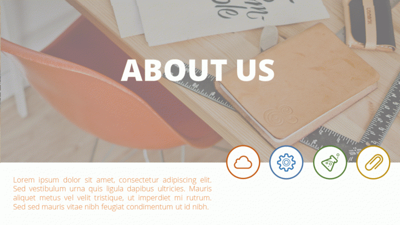
19. 03-04. Slide 2. About Us: Here we will prepare an About Us page, could a picture and an overlay. We will also position icons properly. Let's head over to the design. At first, if you downloaded the resources, we can use the same picture. I'll use this office picture. You can of course use a different one and I'll position it on the top side of this slide. If you want to resize this picture, click on Crop, and you can crop any amount of this picture that you desire. I think that this slide should be a big picture slide. So I'll leave it as is. I want to create an overlay. I've read old to, to create a new rectangle shape. I do start to create a rectangle shape. I put it on the slide and I'll resize it. So it's perfectly covers this picture. Now, what do I want to do with it? I want to right-click, go to Format Shape, open It's fill options and adjust the transparency of this rectangle shape. This way, we will give a nice overlay to the picture and the picture, not so vibrant, so strongly affecting the color of the slide. If you want, you can select a darker orange because this orange is a bit too bright in my opinion, and contrasts to strongly with this chair. Go to more colors. You can always darken the color a little bit. If you want to see it clearly, you can resize it. Okay, I will darken it a bit, pressing. Okay, and beautiful, we have a dark overlay to make it more convenient. We can also select both of those elements. Currently, I've selected both the picture and overlay and press Control G to have one consistent group instead of moving them separately around. Now for the text overlays, for the text overlays, I'll bring in the first text, pressing Shift, and the second text as well. Pressing Control C will allow me to copy it over to my next slide. I simply go to the next slide and I press control V. This way, conveniently, I can copy over elements from previous slides I've created. Be careful though, because if you don't animations and have applied animations on the elements, the animations will carry over as well. All right, positioning it properly. I'll position it perfectly in the middle of this of this picture. And I'll call it an about us. You can just double-click on the text to select it. And this little panel will open. If the panel doesn't open for you, just go to shape format. And you have the text field where you can achieve the same for the second text. I'll put it on the left bottom side. I'll resize it with my shortcut and I'll put different texts here. Since this is far too big, I'll make that smaller and position it properly on the slide. Somewhere here on the left side, between the middle and the left side or right. As for the icons, you know a little bit about positioning them, I will start by selecting a circle. Starting to create a circle with my shift key. I'll position it properly already. Parliament is helping me with that. And shape fill. White shape, old line will be the color of my choice. I will select a couple of colors. I'll open shape, outline, change the weight of it, the way it should be. Maybe two and a quarter. This looks really good. I will stick with two and a quarter. I can duplicate this four times by pressing Control D, D, D. As you can imagine, beautiful, I positioned properly. If I want to be pixel perfect, I'm of course going to the Align tools and distributing them horizontally for the colors, you only have to change the outline, shape, outline, orange, shape, outline, blue. Shape, old line, green. Sorry, I've selected Shape Fill Shape, old Lang, Green and here Shape, Outline. Again. Let's make it yellow. We do the same with the icons. I have my Eigen slide. I select a cloud, I select this one, I select this one. And that the COG Control C. Again, bringing them to this slide Control-V. Before we position and group them, I want to change the color. I'll bring them a bit closer so it's easier for me. And I can do this conveniently by going to Shape Format and using the Shape Fill, but I'll actually use the eyedropper. This is quicker. I've also added the eyedropper to my Quick Access Toolbar. So it's my old tree shortcut. This way. I can hold three boom, all three, boom, boom, all three blue. This is a convenient way to quickly recall elements. Just be aware that we have different kinds of eyedropper. This time I've used the Shape Fill eyedropper. Sometimes you want the Shape, Outline eyedropper. Those are two different tools. So if you want to have both, you need to right-click and select an ad both into the Quick Access Toolbar. I don't have any more space, so I'm using only the Shape Fill eyedropper. Now it's a matter of putting everything together, placing it perfectly in the middle, like that. Selecting both. Align, align, center, align, align, middle. Beautiful. I can click Group, click, Group, click Group, click Group. So it's easier for me to animate. And this way, we created our second slide.
20. 03-05. Slide 3. 6 Features: A lot of cool things in this part because we will design a slide with six features and later on, we will finally animate. To start off the slide, we need a title area for many slides to come. I will again copy everything we have here, since we have no animations yet. It's perfectly to copy it over. And I'll put it on the top side of the slide. I would like this to be a bit different. So I will make this smaller, 240 points a bit lower. The tagline as well. A bit smaller, 220 points. And those shapes, I would rather them to be simple lines. I'll insert a line because lines be really, really tiny, really narrow. I need to change the color. That's obvious. This time we will use Shape, outline. I'll use Shape outline and the second black color again. Shape, old line weight. And for the weight 1.5, it should be perfect enough. If I come closer, let me make this shape smaller as well. You can see we have this cut off shape, but if we click on the shape, go to its format options by right-clicking format shape. In the cap type, we can select round. This way. We will have rounded caps and we can position this here. Okay. I'm looking here at my guide, but let me open the guides. Let me bring them here now. And 3.33. Perfect. I'll take the second guide, 3.33, beautiful Control D. I'll position them perfectly to each other. I press my Shift key so I stay in the same position and I'll just put it on this line. Now I delete the remaining ones and I've created a title. In my opinion, the title is a bit too big. I will use the regular Open Sans font. If I feel that that's not big enough, I can always press Control B, I'll make it even smaller to 36. Okay, this would be perfectly enough guides. This is how we created our title for all our slide. Now to the design part. We have this area to work with because we don't want to crowd this title area anymore. So I will select the shapes. I'll take this rectangle and I will create a perfect rectangle by holding my Shift key. Now, how do I make sure that I have three rectangles? Perfectly here? I can use existing element or I can always open the guide. I will maybe put this on the guide. It depends on how much text do you want? I press Control D. I propulsion at approximately like that. And pressing Control D again, will automatically create another element with the same distance. I think the distance is too big between them. So I want to put this higher, you know, a little bit about distribution already. So I can select all three of those objects. I can go again to my align tools and make sure that Align selected objects is checked. If that is checked, it will align between only those selected object. If I select the distributed vertically, it will distribute this element to make equal gaps between them. That's perfect. This way, I can press Control D. I can position them next to each other. And now I can switch them to the right side. I'll start to move them. I press my Shift key so I cannot move them. I can only move them in a straight line and I'll position it on the far right side. I think we achieved a great result by creating those boxes. I didn't. Text boxes will be no problem for you because you can use existing text boxes like this. Control C, control V. Place it here, make it smaller. Remove part of the text. I will make that smaller. I'll position it properly. I'll duplicate it again and give it a title. I'm using the normal Open Sans font. I'll even press Control V to have it bold. And of course, I should change the text color because I don't like that. It's so orange in the shape format. I can always revert back to my text and use this gray one. Let us a duplicate the text six times. Position is properly. Adjust that to the right side. And in the next slide, I want to show you how to finalize this slide.
21. 03-06. Slide 3. Shape Connectors: Within this lecture, I will teach you how you can work with connectors, changed our datatype, and make overall adjustments to it. Now, let's make this slide a bit nicer. We can do this by going to Insert Shapes and inserting this beautiful line. Inserting a line in the middle of the slide like that. I'm pressing my Shift key so it going straight. Once you have a line, I want you to really dive deep into its options because normal line is pretty ugly. But you can right-click, go to Format, Shape. And this beautiful panel on the right will appear, changing the color to gray or to this darker gray to stay consistent within the presentation. Changing the width, I will come a bit closer. I can zoom in by pressing Control and my mouse wheel, or here on the right bottom side, increasing the width will make this line more visible. And that's a really useful feature. So you can adjust the width here. Keep in mind that using shape, outline, and weight here allows you to only change it to six points. But if you go here, you can change it to more than six points. That's a useful thing to know for the datatype. I would like this to be little circles. For the Cap Type. I want this to be round. This will make those little circles instead of rectangles. Now, this is the base of our design. I'll deselect the guide. They will be a little annoying right now. And I want to show you how to make nice connections between them. We can always reduce the size of this, but let's place this one here. It will connect and this one here. What does it mean that it connects? It means that if I move this, it will move together. But I'm not always a fan of disconnection because it seems they have overlapped perfectly here, but that's not always the case. Not always. You have those circles perfectly in the middle. If you don't have them perfectly in the middle, you can make the line longer. There'll be not connected, but you can make the line longer. And simply what your arrow keys try to align them perfectly so it looks like it would be together. Then you can right-click send to back, and it looks as this line would end here. This is a beautiful way to connect those lines and make everything look seamless. Now you want to repeat the step 2 times by pressing Control D to say in the middle, I'll connect it. So at least see where the middle is. And then I'm extending it again because I see there's some imperfections. In my opinion. It will look better if I move it a couple of frames down with my arrow keys and select right-click send to back. This way, no one will see that it's a bit imperfect to the bottom side. Here. Here it will be perfect. That's far more important to me that it's perfectly here because I really don't like that. They don't overlap. It just makes me uneasy. Okay. I will move it with my arrow keys. Perfect. Now I need to reduce the size of this line. Okay? I have reduced it. Let's say that I did this perfectly. If not arrow keys come into play. And not everything seems perfect. Okay, I've made a mistake. I need to correct that mistake by reducing the size here, by using my arrow keys and perfect, now, everything works seamless and perfect. The last thing we need to do, apart from sending that to back is to grab some icons, copy the icons here, change the color of the icons to white, and change the color of those shapes. You already know how to do is go to Shape, Format, Shape, Fill, and just recolor them as you please. Gray, yellow. And I want to bring the icons now, the map pin and maybe this pencil. I'll see. You can of course select the different icons as you please. I'll put them above the slide so it's easier for me to grab. I'll go to Shape Format to change their color to white. And I will take each one of them and position them in the middle of those shapes. After we are done with that, we will finally move to animation to animate the first three slides before we proceed with the design process again.
22. 03-07. Animation in PowerPoint: Within this lecture,
I'll make you a super crash course
about animations. Sit back and relax. Animations within PowerPoint are applied in the Animations tab. Once you click on an object, the animations become active. A very handy tool is
the animation pane, where all animations that we apply to objects will be listed, can be reordered and can be changed within this
animation panel, we can open it to open
a lot more animations. If you want even more, you can always go to
more, more, more. Most often you will use those
green entrance animations. But we can also apply
emphasis animations and exit animations if you want something to disappear
from your presentation, there are also motion paths, but they are a little
bit more advanced and a little bit less used. Let me click on an object
and apply an animation I will select fly in for
my first animation, you can see we had a brief
preview of what happened. Some of the animations that we apply have their
own effect options. Before we proceed, let us make a brief stop for Mac
users on the Mac version, at least in its current
state of development, we have the same animation pane, but animation options are
laid out a bit of different. Once you open the animation pane and the animation you
apply and select, you have its effect
options, timing options, which determine the
type of the animation, it's duration and delay. Also the triggers and text
animation options can all be found on the
animation pane itself. For example, the fly
in animation has those effects options we
can animate from bottom, from left, from top, depending on what we want to achieve. For example, let's
select from left. We will have a brief
preview that this animation would animate this
blue object from left. A little box has appeared. This box informs you how many
mouse clicks with it take. To start this animation. It will take one most
clicked because there is only one animation
on this slide. But this little box is a very important piece of information about
animations on a slide. This little box is only here. If the animation pane is open or you are on
the animation pane. If I select another pane, you can see it disappears. Only if you are on
the Animations tab. This one will be here. If you however open
the animation pane, it will be always there are
no matter where you go. So always be mindful about when you want the animation
pane to be opened. And when you are on
the animations pane, if you want to get
rid or see this box. If I click on more animations, apply animation
to other objects, you can see it will take 12 and the third click to
play this kind of animation. Every animation we apply
somewhere can be selected here. It's duration can be increased, it can take longer, and the delay can be
increased as well. If you want this
animation to start later. If I play this slide,
the first animation, the first mostly,
we'll take much, much longer than
this and this right now because I've
increased its duration. One more important
thing you need to know, you can apply multiple
animations to an object. I will select the middle object. I'll go to Add Animation. I'll add a pulse. Once again, add
innovation. And the fate. You can see this one object
has three mouse clicks on it. We can reposition
the mouse clicks. For example, this is oval to, I won't bring this
animation above it. This animation above it, I mean above the third
one above this one, mouse-click number one
would animate this. Mouse-click number 234 would
animate this middle object. Less thing you need to
know is animation types. All animations you see here
can be set onto three types, at least at this stage of
PowerPoint development. We have onClick animations with previous and
after previous. It is simple. Onclick of course, is an animation that happens
when you click your mouse. If I right-click with previous, the animation will start
together with the previous ones, unless I give it some delay and we have a
slight change here. You can see mouse-click
number four is applied to this object.
And this object. This means that
mouse-click number four will enable to animations
simultaneously. This is a great way
to read animations. I can add another animation to the object, for
example, a fight. Just so we have something more. And I want to show
you the last option. The last option is
after previous. This means that this
animation will not start unless the previous
animation has finished. This is a double-edged
sword because if I take this previous animation and I increase the duration
in course the delay, you can see the last
animation has delayed itself as well because unless the previous
animation is finished, it will never start. You need to just
keep that in mind. Here. This is represented by this double object because
the double object means that multiple animations
will happen on this object. If I click my mouse
the fourth time, it will look weird because we have two entrance animations, but I want to show you the
results that we created. Mostly number one, will
enable this first object. Most cucumber too was
on the second object, emphasis should know disappear. And the mouseClicked number four was this entrance
and this faith. This is all you need to know at this stage about animations. Just keep in mind
that animation can be reordered, can be delayed, can be increased in duration, and we can add multiple
animations to certain objects. Animation is a very
complex topic. I could talk for hours. It requires a lot of practice. I have dedicated courses
only about animations, but right now I just
wanted to give you the overview of the most
important features.
23. 03-08. Slide 1 and 2 - Animation: Within this lecture, I will try to animate the elements together with you. Alright, let us start with the first slide. The first slide can be simple. If you want to do animations quickly, select everything you see. Go to animations and apply a simple fade. This way, we applied an animation to everything together. Now, open the animation pane to see what's happening. We have four different animations that happen with your mouse-click. I want this to happen automatically without me clicking the mouse. So you can always right-click and select, start with previous. This starts the animation automatically. You have a little 0 here. Then I can click on each animation and I can delay it by a bit, so it doesn't start altogether. I select the last animations that are the elements on the right and the left, and delete them even further. We can always click on the first animation you see and preview what's happening. Okay, everything flows into the slide nicely. To make it a bit more interesting, I take the tagline and give a different animation to it. How to do a different animation? You can open this panel. You can select more entrance effect because the green effects are those that appear on the slide. And let's maybe you can, you can click for a few to preview them. And what looks better? Maybe the strips, yeah, no, the KFC strips look perfectly fine. I'll use okay. And since they change the animation, it's selected it honestly, you need to revert back. I right-click with previous and give it a slight delay. All right, this way, we've animated the first slide. Heading over to the next slide. You can decide if you want to animate everything or animate nothing. You can also copy over animations. I will start simple, maybe with the strips. I kinda like them. With my shift key. I will select all the elements I want to animate. This is why I grouped the circle with the icon so I can animate them together. Let's go to animations and you have a bunch of different animations that would look good. Wipe would look good as well if we stagger the animation, but I wanna keep it consistent. So for this slide, I will use the strips again. More entrance effects scripts. Perfect. I just don't like that. They all go the same way to make everything quicker. Do not waste time with the lane. I'll right-click and select start after previous. What that does. When one animation finishes, the next start, this will speed up my process. I need to make an adjustment because I want this text to animate from left to right. I can use the Effect Options. Not every animation has its effect options, but this one does. I'll go right up. Now for the icons, I want it right down, right up, right down, right up. So I'll select this and this. And select right down. And this and this should be right up. Okay, Perfect. Do we have an animation on the text? Yes, we have because there is a 0, this means that an animation is applied. If you have the Animations tab open, those little elements will appear. And I've animated slight 12. Let's maybe animate slide number three in the next lecture so you can practice the animations a little bit. Let's preview what we created. I wanted to show you a simple way of animating slides. And this is what we achieve currently, a very nice animation. In the next lecture, I will show you how cool can animations be on those type of flights. So really stay tuned and let's head over there.
24. 03-09. Slide 3. 6 Features PowerPoint Animation: Within this slide, we will apply a cool animation to the six steps like we've prepared previously. Okay, animating this slide, I want to animate the title because we will copy over the title to others light. And I want one universal animation. I will select everything I have here. Apart from the tagline. I want to connect the middle part and a left and right line. I'll press Control G to group them together. I'll head over to animations, more entrance effects. And there is a beautiful animation very often used, peaking. And it looks really cool. I would like it to peak in from the top side. Effect options from the top side. And we've applied this little peak. I don't like the onclick. Right-click. Start with previous, so it starts automatically. I want the same animation on the tagline, just a little bit delayed. I reposition this title a bit so I can select the tagline. I press animation painter and I paint the same animation over to it. All right, I can bring it back to stay above it. And we can now animate the connectors. Let me show you a couple of cool tricks here. At first, I want to group all of those elements together. You can do this by just clicking, selecting all of them, make sure everything is selected and making consistent groups. This will speed up our animation process. Now the lines, my first mouseclick should showcase those 2 first steps. So what I want to do, Let's use the connector and use the split animation. The split animation can be beautiful because in the effect options I can use horizontal out. It will nicely grow outside the middle point. After this one finishes, I want this to automatically start after it. So I'll click on this and as well, I'll use the split. I will use vertical out. So it grows outside of the middle point. And I will select after previous simultaneously. I want this and this to fly into this screen. There are a couple of options. We have float in, we have peek in, and we have flying. I'll use fly in. And of course, we need to change the direction. For this. The direction will be from left. And for this, the direction will be from right. I've told you that I want those to happen simultaneously. So I don't need a mouse-click. I want to right-click with previous. Now, before we proceed, watch, I will explain you exactly what happens. When the presentation starts. The title and subtitle will animate automatically Tesla problem. My first mouse-click will showcase this connector. Then this connector. And those two elements will appear on the same first mouseclick. Let me preview that. This is what we currently have. If I click my mouse, this animation happens beautifully. Both of them arrive. There's not much you must do, no, you can click on this conductor. Animation painter, paint this over. Animation painter paint this over. Just make sure that those two will start on mouse-click. We can adjust that later. Here. I want to also print this animation to those two, and this animation to those two below it, animation painter, boom, animation painter, boom. Now the right side, animation painter, boom, animation painter, boom. It'll be good if we named the groups, but if we don't, it's also okay. This connector, right-click on click, straight connector, right-click on click. And these animation should happen together with them. This and this is group 7780. And we'll put this below, connect or number two. Just imagine what needs to happen here. When you click your mouse the second time. This connector needs to appear. Group 77 needs to appear, and group AT needs to appear. Now, everything should be ready and animated and let me preview this slide. My first mouse-click will be enabling the two steps. And this is beautiful for presenting because everyone can anticipate that something will happen here, my next click, add my next gig. Beautiful. You can make this simpler for you. For example, delete this part of the slide and try to animate only this conductor and those two objects on the left and right. This will teach you so much about PowerPoint and about animation, and overall make you more confident as a designer. In the next lecture, we will continue the design process and we will design other slides of this presentation.
25. 03-10. Slide 4. 4 Steps: This slide will be really cool because I will reveal another animation and overall feature within PowerPoint that allows you to grow elements. Let's have Intuit selecting a new slide. I can copy the existing title over. Okay, I've copied the title. Let me show you some interesting features in PowerPoint. I'll copy four steps from the previous slide to make it a bit quicker. Control C and control V. And we are here, I want to ungroup everything. So I have more freedom when I work. Control Shift G to ungroup everything. Now, I want those to be circles. How to speed up the process when you design something different, yet at the same, you can select all the elements. You can go to its shape, format, edit, shape, change shape, and make this a circle. This way with basically one click. We don't have used mu circles. We can change existing shapes within PowerPoint, and this is what we wanted. Now, let's step it up when it comes to the design of this shape, Control D to duplicate the existing shape and put it perfectly as it was. You already know how to make items bigger. Press your Shift and Control key simultaneously. I want to keep it perfectly behind it and I will even send it to back so I see what I'm doing. I'll use Shape Fill, white. I want to give it an outline to make a different design out of it. Shape, outline and use the same blue shape, old line weight. Let's increase the weight two, maybe 3. You can decide if you want a normal line here, but you already know some functions of PowerPoint, you can always form a shape. You can, for example, change the compound type 2 to double, double lines or change the datatype to those little dots. If you want to have dots. Again, if you want to have not kept up round this time around, we made another different design. I want to take this and put it aside. Deselect this group that first. Because I want to position this perfectly within the circle because I think it wasn't perfect. Now, I can shift click on the circle. And before I group it, do I want to group it? How to again, speed up my process? I can Control D and sends two back. I think this would be the quickest way to work here. Control D sends to bag and control the Send to Back. Now, okay, I want to position them perfectly in the middle of those circles, so it will be a bit tedious, but I need to select everything. I need to deselect the circle in the back because it will be difficult to click on the icon, Control G on the icon. Now I can select this, align, center, align, middle, and beautiful. This way, I can just recover the shape all time, Shape, Format, Shape, Outline, and maybe with the eyedropper, I can use the same color. I'll repeat the steps and I will position the circles here in front of me. Powerpoint is helping you with the positioning. Just for a brief moment, I'll press Control G to group them, to align them in the middle so I know that they are perfectly in the middle. Control Shift G to ungroup. Of course, I need to put the text under them. Also, the text could be centered. That's just small adjustments I can make during the creation process. I wanted to show you an amazing animation technique that is clicking on this object. Going to animations. And instead of using the entrance animations, we also have the emphasis animations. Within the emphasis animations, you can use the grow, shrink. This is a beautiful thing to use because you can always double-click on it. Go to effect options. And of course, reduce the size. 150% is too much. Let's make 100, maybe 25. Press Enter. Smooth, starts smooth, and yes, I want 1 second, 1 second, Chris tab. So click away. And this would make a really nice animation when you click your mouse. And I, for this, this step number one, it is, it should be grouped and it could animate together as well. For that, I go to animations. And at this time we again use the peaking. More entrance effects peak in, okay. And from bottom by default, that's beautiful. I don't want a mouse-click. I want them to appear together. Right-click with previous. Extend the duration to have the same duration as the previous animation. And this would finalize our animations. For all the other animations, can just use the animation painter, which is Alt Shift C. Alt Shift C, click, click, click, click, click away. This Alt Shift C, click, click away, click, click, click, click away because it is previewing. Now it's a matter of positioning the groups between the groups. And this will be our result. We have an animation like that, that if you press your mouth, it will grow towards you and the title will appear from below. A really nice way to animate powerpoint slides and a really useful animation technique to know about. We are revealing features, lecture after lecture. So in the next lecture, we will maybe talk a little bit less about animation, but Island to show you another cool design tricks, principles, and effects you can use in your presentations to make them really stand out and make them beautiful.
26. 03-11. Slide 5. Timeline: Let me show you a timeline slide, for example, like this, where you can make a continuous integration between two different PowerPoint slides. They appear as if they were connected. The design process will be simple. You need at least two slides. Before I duplicate it. I will take my title, my animated title, and I'll put it here and call it timeline. Now I will just duplicate it. So I have two slides that will be connected with a transition. The transition that we use will be the Push transition. Normally I recommend to students like fate more of us, a bit more advanced. But the push animation can give you this cool effect if you selected from left from right, depending on where you want the timeline to go. Here, we'll make a push from, right, but that's for later, for the design part, let's not over complicated. Just take three icons, you have your Control-C and place them on the first slide. I will try to position this in the middle, right? Yep, in the middle. This on the left side, and this on the right side, the second element you want to add. You can of course add some text boxes, but I will not waste time for it right now. We want to add connectors between them, connect those. We already prepared some connectors. Be careful if you have animations on them, Control C and Control V them. Into this part of the presentation, I will connect the connectors between them. I'll duplicate it again to connect it from this element to this element. And the last one will be the one that will transition to the next slide. I'll position it here. It should go outside of the slide. And it will be connected like this. Beautiful. To make things simpler for me, I will delete all the existing animations and for the next life, I will take everything I have. Control-c. I'll go to my next Timeline slide. And you can make as many as you want of them, because you could make a towering timeline that goes longer and longer. Over several slides, I press control V, and I just reposition the last connector to be connected to this part of the slide. This way, we prepared the base for our animation. Let me add a couple of text boxes to make it a bit more interesting. To round up the design part, do something different on the list icon, for example. We'll make it bigger. I will put the text below it. I will try to click on the icon. This will be very difficult because like clicking on the icon sometimes in PowerPoint is almost impossible. I've managed to do this and I will change its shape, fill to white. I'll select this object, and now I'll make it a fulfill. This will complete my timeline slide. In the next lecture, I would like to briefly talk about animations that you can apply to this type of flights and the according transition that goes with it to make this a complete, a nice design.
27. 03-12. Transitions in Microsoft PowerPoint: Within this lecture, you can again relaxed because I want to explain transitions to you. Transitions are how we proceed from slide number 1 to slide number 2 and so forth. We can of course have no transition if we prefer so, but we can just as well click on any of the transitions on the transition step, like fade, like push, like split, or any other reselect to transition from the first to the second slide. Let me show you on a preview, we have our animations and we transition into the next slide. Similar to animations, transitions have their effect options. Those are usually pretty simple light from which site that transition should go. For example, within the Push transition, we can select if the push should come in from left, right, top, or simply bottom. This is all the options we have. We can find a couple of transitions here, but not all of them are cool. You can preview a couple of them if you like. It's good to know what you have to work with. What far more important on the transitions tab is the timing section of it. On the timing section, on the left side, you can select how long will the transition take and how long will this actual slide thick? And this is important because for example, we have the Push transition. I've selected that the Push transition should take 1 second to play. Perfect. This is not an animation. This is not the slide. This is only the tradition itself. If I play this light, 1 second is taken to play this transition, then six seconds is how long this light will be presented to us. What's very important, transitions and animations are connected in that way, that animations are more important. I have selected this slide to proceed after six seconds. If I place my mouse here, I can see that the last animation ends at 3.5 seconds. If I reduce this slide to be only displayed for two seconds, powerpoint would first need to play out the animations and then take this into consideration. Since animations in this case are longer than the slight itself, the animations will play out and the slight we'll transition immediately after. Let me explain this in a practical way. We have 1 second of a transition and 3.5 seconds of animations, 1.5123. Go. See, this is because we had 3.5 seconds of animations. If I increase this light duration to six seconds. Now, this duration will be more important because animations will end and the slide, we'll wait PowerPoint, we'll wait until six seconds path. Once I kind of intro, 1, 2, 3, 4, 5, 6 precede. This way you can manipulate how long people will see this slide. Of course, the other option is to just deselect the timing and use on a mouse-click. But sometimes you want to export this to a video file and you want to have exact seconds as you plant them out. What is very important if you select this feature? Even if you have onClick animations, you will not have to click your mouse because animations will play automatically. Selecting this feature means to PowerPoint all know, after six seconds, I have to proceed with the slide. Animations do not matter. Let them play and I'll proceed. As six seconds pass, people ask me why there are slight proceed, even though a mouse-like is here. It's because of this option. If I deselect this option and I select Advanced slide on mouse-click, I have all the time in the world. Powerpoint will wait for my mouse-click. So the animation can happen. I will click my mouse. Right now, animations happen. And once the animations flight through, those 3.5 seconds have passed, PowerPoint is again waiting until I click my mouse because I've selected, proceed to the next slide. Upon mouse-click. This is everything you need to know about transitions. The gist is that transitions are the little animation that happened in between slides that also determine how long you actually see this light and how you proceed to the next one. Do you proceed with a mouse-click or do you proceed after a certain amount of seconds or after animations have played?
28. 03-13. Slide 6. Timeline Animation: Let us try to animate a timeline. So we have one continuous animation between several slides, or the slide gets pushed to the side and the animation continues. On this slide. I wanted this to appear with my first mouse-click. And this is exactly how you proceed with animations. You go to animations. I'll use the simplest one, fate, just to not confuse you. Clicking on fade will initiate my first mouse-click. My second mouse-click should start to animate this line and then also animate this box and the text. We need to click on this connector because this is my second mouse-click. And we want this wipe animation. Wip is a great animation anytime you need to appear something from left to right or from top to bottom. Because in the Effect Options we have from bottom, from left, from right, and from top. I'll select from, I always say from, I will select from left and the next animation will be on those objects. But I did not want any mouse-click. I want this to appear after this wip has finished. So let's again present fade. And you can decide if you want this to be with previous and add some delay or after previous, if you are a bit lazy, okay, you proceed exactly like that. You take this connector, you go to animation painter and you paint this animation over. For that, you can paint it over or simply select the faith. Again. Remember that automatically it will add a mouse-click you want to select after a previous, this light should end. After your last mouse-click. This will be the last mouse-click again animation vendor and paint this animation over at this point with this mouseclick, this slide should N'T currently, we need to use a transition. A transition on the next slide should be the Push transition, but the post-transition should be not from bottom to top, but from right. You can see this is what will happen. Let's preview what we'll have an, Remember the transitions need to be applied to the next slide. We have this animation. First mouse-click, mouse-click, third mouse-click. And the fourth mouse-click will be, We're very important because we are going forward and the slide should proceed like that. Beautiful. You can see I haven't animated anything here. This is why it appeared instantly when the slight moved forward. But you can see this nice continuous timeline here. If you want to animate it, of course, you proceed the same way. You go to the animations. You select a wipe and you select a wire from left. The difference here will be that the first animation should start without any mouse clicking. So this fate animation will be after previous, but this straight connector should be as well after previous instead of clicking your mouse. Why is that? Because I want this to happen. All automatically. Do my timeline and this mouse-click when it proceeds to the next slide. This all should happen automatically. Boom. Of course I'm not counting in the right side because the right side is just a repetition of the previous steps. We took this as a potential way to animate slides that are connected together. Not necessarily only timelines. This remember, you have a couple of different transitions and you can pair animations with transitions later on in the course, we will also talk a bit about the more transition that will reveal other aspects of PowerPoint to you. But that's for later. Let's focus on designing the next slide. I can't wait. Let's move forward.
29. 03-14. PowerPoint Slide 7. World Map: Within this light will work with a vector world map. If you really want. I can also show you how to make a couple of animations like that. So everything makes more sense. There are many ways to get a vector mapping PowerPoint. Let me create a new slide. You can use the map I've added to the resources. Even Microsoft has vector world maps on their website. You can simply take this map. This is a vector, so be careful, this is a pretty large file. It can be a little slow within your PowerPoint. If you don't want callers on the country's go to Shape, Format, Shape, Fill, and just make a unified color. And the shape outline is simply white. All right, I'll make this smaller using my shift key. I'll put this on the left side because it should populate the left side of my slide at any given time. If you want to create pins somewhere on a map or anywhere in PowerPoint, there is a nice shape. It is how it is called the teardrop. It's a teardrop because we can make it like that and we can extend the drop itself. Now after turning it around with my shift key, I'll make it a bit smaller. We can position depends on the countries we want. And we can also, of course, Shape, Fill and recolor them. Let me put a few pins in. We did a couple of them. We can now group everything together with Control G. So we animate this S1 element on the right side. I'd like to share some information or simply add some data, geographical data. We can again use a connector to visually separate the slides. Visual hierarchy is something really important and I really do enjoy. If designs follow simple principles, like dividing elements on the slide, we have already an animation applied to it. If you don't, that's not a problem. This will be our first mouse-click. On our first mouse-click. We should also show the first statistic. This time we will showcase some countries. I'll use a circle. I'll make a small circle. I'll position it in the middle of this connector, and I'll use the According core. Let us, for example, to start with Argentina, Shape Fill, eyedropper, and I drop the same color. Afterwards. I would also like to add some text here. How to add text is something that you already can do and I'll of course, use elements I've already designed previously. I press control V on the slide. I will position them here. This text on the right side. Maybe making the text a tiny bit smaller when it comes to the size of this should be definitely smaller. I'll align it to my left side. I'll reposition it. I recolor it a little bit, and I'll try to duplicate the elements I have. Once I'm ready, I will make sure to control G, this element, because I would like this to animate from the left side to appear on the slide. Let us prove you how that looks. Definitely, this should be a bit smaller. The text should be put to the side. This is not as important. I want to duplicate this five times, so they are evenly distributed. We've copied everything five times to make sure we distributed them properly. Of course, it depends on the data we will use here. But of course, Shape, Format, align, distribute vertically this time and we have perfect distribution between them. If we want to animate them, the straight conductor is click number one. And with each click, I would like a country to appear. The simplest way to achieve this would be selecting all of them, going to animations and using the beautiful animation that is peak in Peking, as you can see, can we used very often because it's one of the nicer looking animation in PowerPoint. Of course, when it comes to the Effect Options, I want it to peak in from left, and each of them should be on mouse-click. This way, you receive an animation like that. You can showcase the world map. Click number one will reveal this connector and click Number 2, 3, 4, 5, 6 will be of course, revealing certain data. The key takeaway here is to use visual hierarchy. You want to separate the left side from the right side. You want to make sure that everything is distributed properly. Colors are also very important to highlight certain features that you want people to pay attention to. Thank you very much for listening to this slide. Let's proceed to the next one and we'll see what we can do.
30. 03-15. PowerPoint Slide 8. Country Map: Let me teach you within this slide how to divide a slight into three equal pieces. And who knows, maybe some interesting animations will follow as well. All right, dividing a slight into three. This is a great week you can use anytime you work in PowerPoint. Let's create a shape. I often do it like this. I have a shape. Every shape and PowerPoint has a width. Now you have perfectly the shape with here. You just open your calculator and 13.33 and you divide it by number you want, for example, this time I want three equal pieces. 4.44. No problem. I can make this exact shape to 4.44, Control D to duplicate. Put it here. Control D to duplicate. Okay, I have now almost perfect equal pieces in this light. In order to divide this light into three, either use the connectors and put them here, or just opened the guides and make the guides here. It depends on how you prefer to work. This time, we will divide our slide with a connector. I can take this conductor and place it roughly here. We are almost pixel-perfect. This is completely fine, and I want to make this equal and put it on the right side. Okay? I can now delete those boxes. I've of course duplicated them. I've divided this into three equal pieces. This will allow me click once again to select a country. Maybe different countries like China as well, Argentina. If I meant to click on it, control C, go to the next slide and Control V. Beautiful. This way, we were able to grab countries, put them now in the appropriate place, of course, resize them. And this way, you can really do Russia is a bit difficult. I could make it a bit narrower, but I don't want to be disrespectful. This electoral map is also not perfect, but, but you get the idea, we can achieve very nice result. On the bottom, I'll put some texts. What's more important? I wanted to do something when it comes to animation and icons. People are very visual when it comes to design an overall presentations for you want to have those little animations and those visual elements. If someone is watching your presentation, if someone would only read the presentation, of course, the situation gets different. Place. Four or five, maybe six light bulbs here. I L a group that and I will put it below the country. I'll duplicate it again and put it below all three countries. Okay? Of course I can adjust where it is. That's not a big problem. The real trick I want to use here is let me call the country's first. The real trick here is to use the bulbs, duplicate this element, and maybe Control Shift G so it isn't duplicated and do an animation with the filling. For example, Russia will have four out of six Shape Format. Shape Fill. Of course, use the same color, press Control G and overlap it. Now, that's the genius trick behind this, because no one will expect an animation like that going to animations using the WIP animation and making sure that the wipe animation is from left. Of course, I need to adjust everything but pay attention. What would happen? You would explain this slide and you would like, I can form the sales of light bulbs within Russia were pretty high this year. And you would make an animation, of course, the connectors first. You would make an animation like that going from left to right. If the green isn't visible enough to you, you can always click on the bulbs itself. Shaped forward. And under Shape Format, we have shape effect. Under shape effect, we can add some shadow if we want, but the shadow is, in my opinion to stroke. We can of course, adjust the shadow by hand. But another way is reflection with the shadow. And going to animations, extending the duration of the animation to 125 seconds, we would achieve something like this. I will talk about Russia and tell you to pay attention to the light bulbs where I explained something about it. This is a beautiful way to achieve good-looking animations and make data more understandable. You can use icons for basically anything you explain. So keep in mind that you can also recolor, duplicate, and overlap and overlap things on top of each other to do those kinds of animations.
31. 03-16. Options: You will not have to do anything in this lecture. So please relax and watch this lecture because I want to show you options specific to certain objects in PowerPoint. What do I mean by that? If I insert a shape, for example, I will right-click on it and go to Format Shape options. Within the Format Shape options. I have options specific to this exact shape. This is a shape, as you can see on the top-right bar, the Shape Format Options have appeared as I click on it. Within the shape options, we have fill options, we have effect, and we have its positioning. We divide those options into shape options, which influenced the shape itself, and into text options. Those options will influence the text we put within this shape. Okay, so far so good, but that's not the thing I wanted to talk about. If you insert specific elements into PowerPoint, for example, I'll go to insert pictures and insert a stock image from the Microsoft library of photographs. Maybe not the vaccine. Let's make those blueberries. If you insert a picture, suddenly you get picture format tools. With that not important, look at the format tab. Within the format tab, a new option has appeared, and this is an option specific to the item you have selected to the object you have selected. This time I have selected a picture, and this picture has its specific options. If I go to the picture tools, we have corrections, color, transparency, it's not important. The feature itself are not important. We can, for example, increase the brightness, increase or decrease the contrast and increase the saturation. Those are options specific to pictures that we do not get if we click on a shape, the same options we see here. We can also use here. That's just a matter of convenience. Which one you prefer to use another step or charts. If you go to Insert Chart and I insert any chart where we want, for example, this pie chart. If I click on this chart, for example, on this element of the chart, you can see a different option has appeared. This is an option specific to charge. If I click on the chart, we can select different options of the chart to edit. This is important because shapes have their own options. Pixels have their own options, and the charts also have their specific options. The options will vary, of course, from charge to charge because some charts utilize more elements, more legends, and this is a pie chart. A pie chart doesn't have a lot of options, but I wanted to show you that different things in PowerPoint can have different options in the format panel. Keep in mind that sometimes one option here at the end will appear if you edit specific object within the next lecture, we should be working with the chart. So you'll see what I mean by that. See you there.
32. 03-17. Slide 9. Chart Design: Within this lecture, I'd like to show you how you can customize a chart a little bit and add additional relevant information that may improve the message you are giving while presenting. If you want to use the same data, click on the chart. Chart design, edit data and simply copy the data to work on the same. If not, you can of course input your data or work on the basic one. This is another problem. I'm going to insert chart. And I'll insert the first basic line chart. We will use a line chart. I press OK for the data. I wanted to adjust the data a little bit. Maybe we will work with Russia here, so we have a different color. And I'll reduce it to the two cold. Alright, let's make it smaller. The first two important things are due. You need that idle and you need the legend right there. It's your choice, but you can change that by pressing on this plus sign. And you can decide which items are displayed and which aren't. In my case, I don't like the title here. It is just crowding the place and I'll have my title probably anyway on top of the chart. And I also want to remove the legend because I'll talk about those countries. I would like to use the same colors that I used previously. And the orange series, Argentina soon as Russia. Okay, This one is Russia. Now, we can of course change the color and change everything about this chart by going to right-click Format Data Series. And we are in the data series options, as I told you, we have different options here. For example, for the major grid lines, but I want to stay on the serious Russia. Currently, we are editing only the series we can go to. It's fill to its color eye dropper. I will click and I'll select the green color from the previous slide. Beautiful. I'll do the same for Argentina. I will click on this series. Now we are editing another series, series Argentina. We can select what we are currently editing here. Or we can simply click on the chart and it will switch automatically. That's really practical and convenient. Okay, I will switch this color to blue, to this Argentina blue, beautiful. I've started to create something. This design looks very basic and for example, we aren't utilizing this space anyway. So what we can do, we can click on this series. We are staying on its Series Options on the axis options, and we can reduce the minimum or rather increased the minimum to one. The legend has changed and we are now starting from the value 1 instead of 0. So we're not wasting any space. We are utilizing this chart to display as much as possible, okay, for the lines, those are just designed things, but there are a couple of design things. You can't change here to make this design a little bit customer, a little bit more unique when it comes to charts. As I click on the bottom series, the bottom axis, I can go again to its options. Within the options, we have the axis options, tick mark, labels and a number. The tick marks are very interesting because we can put the tick marks inside and we will have those little tick marks pointing towards the data. I think this is a pretty nice way to showcase it. I don't see a line. The line is barely visible. So what you can do, there aren't many options for that. But if you go to the filling options and within the line options, we can increase the width just like you would play with a normal line within PowerPoint. We can do the same to charts, and rarely anyone touches all those features because maybe they don't look amazing. But at this point that discharge looks already a tiny bit customized as opposed to the original basic PowerPoint design. I can also influence, of course, this line, that's no problem. You can always go to the filling options. Remember about the fill, I'll just show you what we are working. We are working with that in the filling wouldn't look good. That's why you work with the line. In the line, I'll increase the width to maybe two points. Maybe the tick marks inside as well. Go here. Tick marks, major type, inside. Major type are here. The minor types are in-between those values. Okay, we've added a couple of adjustments to this chart to look different. If you want to influence the middle lines, you can do that as well. By clicking on them, directly clicking on them, or selecting major grid line options. You can see we only have effects on filling options, but this is completely enough. We haven't worked with the gradient extensively yet, but that's no problem. We can always use the gradient even four lines to display to you how that works. I'll briefly increase the width. So we see those lines very, very clearly. You could do that, but I strongly advise against it. When it comes to the gradient. We can work with the gradient tool. By clicking your mouse, you can add new gradient colors. 90% of the time, you will stick to two or three calls. I prefer to work with two colors. And in the direction, of course, I'd prefer to go from left to right. To change this, I go two directions and select this option linear, right? All right, look what we did. We have white color, we have blue color. If this is too bright to you, you can always click on the according color and increase its transparency. Look how interesting this would look. You would have a chart. It's still pretty simple and basic, but it is customized and rarely anyone uses those features. Just keep them in mind when you work with charts. I noticed as a designer which approach, but just keep in mind that those options are vial. Of course, reduce the width. I will make the call to the gray that we used before to make everything very similar. And I'll increase the transparency. On the second one, I want maybe a different color. And I'll increase the transparency as well. I can switch between the colors. That's no problem. You can do that anytime. Okay, increasing the transparency because I don't like the lines to be that visible, decreasing the width. And that is within the next lecture, I'd like to briefly show you animations that you can apply to charts. And then I'll show you a different approach to a chart that you can also utilize to make your presentations better and stand out from the crowd.
33. 03-18. Slide 9. Chart Animation - PowerPoint Animation: Within this lecture, I want to show you how you can possibly animated chart and give additional information for contexts and easier presenting. As you can see, that's just a line.
34. 03-19. Slide 10. Chart Filter: Welcome. In the next lecture, let us duplicate the existing slide. Let us delete irrelevant information. And I want to show you a different approach to chart design, something that you need to keep in mind when doing charts. You can always take a chart. You can, for example, duplicated, make it smaller. And if you plan to present it on a different site, I should decrease the size of this text. Of course, with my shortcut. If you want to showcase specific informations of a chart, remember, by this filter option, you can limit what is visible on the chart. For example, I'd like to limit discharge to only Argentina. I'll deselect Russia and I'll select Apply. You can see only that is left the same way. You can use the features on the top side. If you select this chart, go to chart design options. You can select, select data. This is the same what we did previously. It's just an a and other graphical format. This time we will leave Russia, will deselect Argentina, press OK. And now I will have the same charge but fragmented into smaller segments. People have short attention spans. So you can always take a new slide. You can take this one, you can extend it to the entire screen. And you could be talking for a couple of seconds about this data, then you could create a new slide. Take discharge, put it here, increase the size of it, and talk about discharge. Of course, I would add some labels and informations because currently it's very empty. I'm just showing you the principles that can be used when using the filter option. Clicking on the chart using its filter options will allow you to deselect certain data, certain series. And PowerPoint is nicely highlighting that, for example, if you want to leave this year out, you can apply that and this year will disappear from visibility in the upcoming lectures, we'll slowly finish up this presentation, but that's not the end of the course. There's still plenty to go, and we'll also create other cool slides later on. So please stay tuned and let's move forward.
35. 03-20. Slide 11. Contact Us: Let us make together a simple Contact Us page. In order to insert a map into PowerPoint, we can use a screenshot from Google Maps to enter the screenshot into PowerPoint, you can go to Insert Screenshot and select Screen Clipping. Make sure that in the background you already have the map opened. This way, when the screen turns gray, you can just click select. And a map will be copied over straight to PowerPoint or any other given screenshot that you want. If you want to crop it, That's no problem. Picture format crop. And we can crop this down so it doesn't take as much space. And we can, for example, make a design like this. Perfect. And now we can decide if we want an overlay like we did before. We can even copy the existing overlay if you wanted that. If you want to be consistent with the color scheme in your presentation, you may want to do this. You can of course, adjust the transparency, reduce or increase it, so it's more visible. And we have already learned about inserting a mark, insert shapes. There is this teardrop shape. We can insert a 0, we can make it like this. We can turn it around. And if you would like to cut out this middle point to make it different, I can press two. I can insert a circle. I will make a circle like this. Let me change the color. I'll put it in the middle of the shape. I will select the shape. I will shift, click on the circle. And within the Merge Shape options, I can subtract one from another. This way, we've created a nice icon within PowerPoint, holding my shift key, I will reduce its size. I will place it in the place where my company is. Let's just pretend it's somewhere in Finland and beautiful. I would have it here. Now on the left side, I would probably include some contact information to us. This time we will go for a circle. You can of course do it differently. That's not a problem, but I will this time use a circle to gather all the information. I would only grow up a couple items. I would change their color. And I will also insert a couple of textboxes. If you're lazy, you can always use the existing text boxes. Just press Control D. Make them wide by going to home text color, white. Contact, 1, 2, 3. And we could populate this part of the slide. If you use Microsoft 365, you can go to Insert Icons and use the native PowerPoint icons telephone. Obviously, then I'll use a website. And then I would use email. We have a couple of icons, Not too many, but a couple of interesting ones straight here in PowerPoint, we can use them like that. Where if I hope more will be added, graphics will change the graphic fill to white. And we can just place them in the places we want, of course, in a different order. I will make them smaller. I would position them properly. Control G to group these together. Control G, or Control G. If you've learned something in the previous lectures, I should distribute this properly between them. Aligning options and distribute vertically. Position it on the slide. I'm changing this to bold. And this is how to make a very simple contact page for our client.
36. 03-21. Slide 12. Resources: Before you finish your presentation, it would be good to gather the resources you've used in one place. You should try to be consistent with the presentation you already have since we made the contact page like that in this circle format, I'll just pick this entire circle and I'll position it on My Resources slide. Depending on how much resources are used and what I used, I will just delete certain elements or maybe even delete the phone that's irrelevant. At least the items I've used, for example, pictures, if I use picture websites, icons, definitely articles. If you will get questions from people after the presentation, they will surely ask about the resources that you've gathered in order to create your wonderful presentation, it would be very convenient to have the length here and just click on each of them. A circle might not be the most convenient one. So you can always remember this feature. Click on a circle, shape format, edit shape, change shape, and you can change to any different shape, most likely a rectangle. A rectangle gives you more space to insert text here, I will stick to the circle because I kinda like this design. And I would just duplicate this two times to have my pictures and my links. Links. I would call them links and resources. Resources would be pictures, icons and everything graphical I've used. Length would be of course, website links that I've used for articles that had the information that I published here, or for example, books. If you use books, of course, proper information to those books. This shouldn't be complicated. It can be as simple design like this. In the next lecture, I'd like to show you a cool trick that you can use to round up an exit your presentation.
37. 03-22. Slide 13. Thank You: I'd like to show you a way to end your presentation to release a little bit of tension. You can always sprinkle a little bit of humor, no matter how business-related and how professional your presentation may be. Almost every presentation I did, even on international conferences and within my study group, I've always used a little funny thing at the end. The way you can, for example, do this. I will explain everything in detail. Let's use our title slide to make this composition at the beginning, at the end. Very similar in terms of design. Since we designed something simple in the beginning, I'll copy that over and put it on the very last slide. While you move the tagline for now to the bottom, I'll type something like You help. You hold true. It already creates some healthy distance between the presentation. I think we will all agree that it wouldn't be a big misstep if we use Chuck Norris to end our presentation, of course, you can use something different but cools. And like Chuck Norris, it's a guarantee and that's even more important than Chuck Norris. What's cool about PowerPoint is that you can use GIF files. You can right-click, copy those graphics and you can get back into PowerPoint and press control V, and you'll have a plane within your presentation. It is treated as a picture because we have picture format here and that perfect. We need to animate this in case you feel that your audience doesn't like it, you can quickly go away from it and just thank you for the presentation. I will show you the trick I'm doing here. I'm always having a backup plan, so I will duplicate this object. I will press. Thank you. Simply thank you or thanks for watching. Thanks for listening. Whatever you prefer. I will duplicate this one last time. And I don't like to take this much credit, so I'll make this much smaller. And I'll just type my name and make this much smaller as well. I'll put it on the bottom because for me, that's not as relevant. Now about animation, I want this and Mr. Chuck to be depth-first animations. I will just make the animations from scratch. Let me delete everything. Once again, I'll take this and Mr. Truck into the animations pane and I will simply fade them in. I went Chuck Norris to come in a little bit later. So the audience will have a slight delay between that. You will go to the day and you will give it a couple of seconds of delay. Let's make it two seconds. Now in order to animate the other things, we need to make dose items disappear. Select them once again. Make sure you press Shift and deselect the thank you text. And you can add another animation on top of it, both on the Mac and the Windows version, you can add animations on top of existing animations. And I'll add in fate of animation and Exit animation. What this does, we need to start presenting. I want to show you what the dust mite first mouse-click will be held, true. And after two seconds, Chuck Norris. But the second I decide that I no longer want this to be visible with my second mouseclick, I'm making an Exit animation, so that disappears. When that disappears, that thank you. And my credentials can simply fade in and appear afterwards. They do not have to be on mouse-click. They can appear when it disappears. If that makes sense, you can always watch what's happening within the animation pane. My first mouse-click will insert that. My second mouse-click will delete that and will enable this thank you text. And of course, this presented by let me select this. Those are pretty big boxes. Make them fade as well if you prefer that. Just go after previous, so they have a slight delay. This is how I would present this light. Thank you for the presentation. You would probably use, okay, this is a normal axis light than the mean comes in. And of course, this is situational. You need to feel and know about your audience as you are my viewer. I hope you don't mind this little funny thing. If you wouldn't like it, if it wouldn't be your taste out quickly switched to a very polite Thank you, my credentials, and that this would end my presentation no matter the audience, this never felt bad. And I mean it Thank you so much for holding true this part of the course. In the next lectures, we will learn even more cool PowerPoint tools and designs and features and whatnot. So stay tuned and let's move forward with the content.
38. 04-01. Sections in PowerPoint: Dude, what are you doing? Polishing representations. What does it look like? And you should too. We will start to polishing with explaining what sections are. Sections allow us simply to group slides into separate sections in our presentation. For example, you have three slides. You can group them into one section. You can close and open the section at any given time. And other advantage of sections is that you can click on them and you can move them between the places in the presentation. I'm sure you understand this feature, but if you want to test it out, open the resource file, go into ns light between any slide that doesn't have a section and select right-click Add section. This will enable and add a new section. You can give it a name, I'll give it simply name, and this is it. Later on, on the right bottom corner. If you use a slide sorter, you can very easily sort the sections that way because you can preview or flight. You can close the sections up. You can maneuver the slides between sections. And you can very quickly with the slide sorter, manage all the sections, renamed them, change them, or right-click and simply remove current sections so the slight snap into the previous section. One last thing to note though, about sections. If I open the sections, if you are on a slide and you press down to go to the next slide. At first section is selected. And then pressing the button again, goes to this slide. Pressing ones down, selects the entire section. Pressing the arrow key again, starts to navigate within this section. Now it's your turn. Open the resource file, add a section anywhere you like, and then delete it afterwards.
39. 04-02. Adding Background Music: Adding background music to your presentation is actually one of the better working features in PowerPoint. I mean it, because it is very, very simple to insert music into PowerPoint and set it to play in background. I've attached a resource file called music. Don't ask me. It is a very soft and calming sound. Don't ask me about the sound. It is free, it is very short and it will not wait a lot in the resources. So that's why I included it. Take this song, can call it like that and put it into PowerPoint. You will see this sound icon. What is great that we can click play in background. And from now on, the sound will play across all your slides. You probably want to reduce the volume of this beautiful song. If I press Shift F5, now, this song will loop in the presentation. There's always a slight hiccup in PowerPoint when it comes to looking sort of sounds in the beginning and the end. So it's better if you have longer loops. Here I found this one. So let's stick to it. If I continue my presentation, you can see that the sound still place. Why is that? Because on the sound, if I click on the sound itself, if I go to Playback, there's a couple of options. Play across slides. We'll play it across light loop until stopped. We'll look this music until we stop it manually and hide during show will simply hide this icon. We could also put this icon outside this light and this would yield the same result. If you go to animations and open the animation pane, this is the last thing you must know about adding sound and background music to PowerPoint is playing music is simply an animation. You can click on this sound. You can go to animations and simply give it a play animation. This would make the same result as going to playback and setting play in background. This function, this icon simply is a macro for PowerPoint that does that automatically. For us, it sets a play animation on this object. It sets all those options and it sets start automatically in the animation sequence with this one click, we can achieve all of that. Now, if you've done that, if you drop the sound, clicked plain background, you can play and preview this beautiful music again.
40. 04-03. Embedding Fonts: You can embed fonts in your presentation. So no matter who opens it, will always see the font. You've selected. Two n-bit a font into your presentation file, go to File Options, into the safe options. And on the bottom, you simply have ambit fonts in the file. We have two ways of embedding a font. We can either, um, but only the characters. This will take a bit less space, but the people who will receive the presentation will not be able to edit this text with the font you've selected or all characters, which essentially embeds the entire font in the presentation. Please be careful about this option because if you ended all characters, if you entered an entire font in the presentation and you save it, the presentation will be larger. For example, in this presentation we have Calibri, everyone has this font, but never mind. This presentation originally has 2.3 megabytes after embedding, just Calibri, just this one fund, we have 5.2 megabytes. So be careful if you have more fonts in a presentation. Within this presentation, we have Calibri, we have Comic Sans. If I remember, be careful about this function because the more fonts, the heavier the presentation will be. Also not all fonts allowed to be embedded. Some forms are restricted with their licenses, some have errors with their glyphs. Not every reformed will be possible to embed into a presentation. But this is a feature you need to remember about, especially if you, for example, take your presentation to another computers which probably will not have the funds that you've used. It is always safer to embed the fonts. If you want. You can test this feature out by going to File Options, Save Options. And here on the bottom selecting ambit, I will deselect it. I'll press OK and I'll save my presentation again. And if we click on it, it reverted back to 2.3 megabytes because the fonts aren't embedded anymore.
41. 04-04. 3 Global Changes: Here I want to show you a couple of PowerPoint tricks. You may know already about them. Remember that you can change the colors of presentations globally. If you use PowerPoint colors go to Shape Format, and those two elements, those two shapes are filled with those selected colors. This shape, I went into shape, fill more fill colors, and I gave it a completely custom color. I pressed OK. And now when I go to the Design tab, variant colors, those two on the left will change their color. But the one on the right will not change its color because PowerPoint doesn't know what was its base color. Only those base colors, we changed into different colors. So keep in mind, if you want a globally change colors with the variance. I do not always like to use that because I don't like to be restricted in the shape format to only do these calls. I don't like that. I prefer to have complete freedom when it comes to color choice. So I'm not often using the color themes from PowerPoint. It all depends on the situation and the template I'm working in. Another cool global feature is fonts. You have a presentation, but you don't like Comic Sans for example. And you have a slight like that. In the Home tab. There is a great feature called replace. We can use replaced fonts and we can list and show all the funds we have in our current presentation. I have comic sense, but I wanted to change comic sense to something different. Let it be this Abadi replace. And with one click, I've replaced this Comic Sans font in my entire presentation to a fond of my choice. This is another cool global change you can make. I will revert the changes with Control Z. The very less global adjustment is by using default fonts. If you go to the Design tab. Again, open variants, you have fonts. You can see by default, Office uses the Calibri font. But if you do prefer to change it, of course, set your own font. For example, I like Barlow font. So I have Barlow font selected as a like pre-built for my titles and myText. What's great about changing this? Each time I'll go to Insert Text box, and I'll insert a text box. It will automatically have my font that I selected for my body text. So I will not have to change it again because each time in this presentation when I select a new textbox, this body text will be already selected to the font of my choice. This is a global change. It really doesn't matter. You can, of course, you can click here and just do it manually. That's no problem. I just wanted to show you that there are global changes possible to presentations. And I've put this here within the polishing presentations because this is a way of checking if your presentation perhaps could be better with a different font. Or perhaps you will see, I've made the right choice because selecting different fonts doesn't fit here, what I did was really good. Let's revert back. And this way you can see just differences between one option, another option. I hope this is helpful. You can practice those options, those global changes within this presentation do not worry about this. This is just a resource and we will see each other in the next lecture where I want to show you a couple cool other tricks.
42. 04-05. Reduce Presentation Size: Presentations do get heavy, I'm sure you know with how to reduce the size of representation. So in one lecture I told you to ambit fonts and then I want you to reduce presentation sizes. Yes, I want. The first thing you need to check is go to File Options. If you remember safe and checking if fonts aren't embedded in this presentation, this will save space, but at a cost of not having the font embedded. The second biggest thing which increased the weight of presentations are photographs, period. You need to make them smaller. Here I have a slide where I have very small pictures. If I click on this picture, I go to picture format. I go to crop. You can see this is a enormous, a huge picture, but I only use a part of it. What's more important? I don't even need this to be high-quality because it is simply a small window. The picture is reduced in size anyway, so you don't need high-quality photos, really small objects. You can of course decide on this on the fly. There is a great feature in PowerPoint that is called compressed pictures. If you select the picture, select compressed pictures. You can select if you want to apply only to this picture, I will deselect this because I want to apply this to the pictures of the entire presentation. I want to save time. Delete cropped areas of pictures. Yes, because I'm already done with this presentation. I don't want those cropped areas to be visible anymore. And in the resolution, you can reduce the resolution of your pictures depending on what pictures you have in the presentation. If you have high-quality pictures, you can always reduce them to, for example, print quality or web quality. In this case, I'll reduce it to e-mail quality. Now there will be not a noticeable quality loss. If we come closer, yes, this is now a bad picture. If I press Control Z, you can see the difference in sharpness, but the compression, if you really need the orientation to be really tiny incise, this is the best way to do it. Okay, those pictures are smaller. Now, if I go to picture format and click on the crop, you can see there is no more crop above the crop I did. And if I check the size of this presentation, you know, 2.3 megabytes was what we had. Let me save it, polishing presentation, save it. Currently 500 kilobytes. I've managed to reduce the presentation size 2, just half a megabyte. When I know that this sound file is 0.3 megabyte of this size. The rest is the presentation. Recognize her. So we reduce this presentation to only 200 kilobytes. That's really great. So this is the importance of reducing the size of your pictures. If you plan to send this brings Asian somewhere, please test it out on this presentation had over to this section will reduce presentation size. Click on this slide and try reducing the size of those photographs. And we'll see each other in the next lecture.
43. 04-06. Exporting to PDF: Exporting the presentation to PDF is just a formality file. Either use export or save as if you use export. We have those great features called create PDF or change file type. In the change file type, you can save as presentation files. You can save as JPEG files for preview. But I'll go back to Create PDF. I'll just click Create PDF. And boom, everything is ready. I'm saving the presentation, publish. And a PDF of this presentation is created exactly like that. Please do keep in mind that we need to remove the sound. And from here, if you don't want this icon to be visible, you can put the icon outside of the slide and everything will be ready to publish. If you have any questions for this section, let me know. Lectures, mice, they'll change because I'm still remodeling this. But in general, this is what I wanted you to learn within this section, I do hope everything in this section was crystal clear and we will be able to continue and move forward within the course. I'm already excited, so let's go forward.
44. 05-01. Ways of creating templates: I will be recording the upcoming videos under highly difficult circumstances, so bear in mind for enemies. So if I make any mistakes gold hold a grudge against me, I'll try to keep it as professional as possible. So stay tuned. This section, however, was supposed to be about template files and creating them in the power point, not about a difficult circumstances. So templates and PowerPoint. There is a lot of mystery about this topic, but it's really simple, and you are in this course toe learn those things. So let me explain what we did in this presentation. The slides that we did. This is a PowerPoint template, obviously, because you can send it to someone and someone can change the elements within this. Those slights. And he would use this as a template the same way a template. And this is more when people sell templates. A template can be a empty presentation without anything filled out. Just blank spaces and a bunch off layers created. Those layout. Allow us to insert photos into those placeholders those empty spaces. I'll talk about this later. The presentation that we did is a ready presentation, with photos included because those type of presentations are created for clients that require a ready presentation from you. However, the presentation on the right side the template on the right side. This is most often created for people who sell templates. People who sell templates great a bunch off layout, so they create the possibilities and empty slice for people. So they drag and drop their own photos when they create presentations. Those placeholders As you can see, I can simply drag and drop, and this photo was dropped into a placeholder. I would just right click sense to back, and this would be basically a ready slight, a very similar slight to this, and both PowerPoint files can be treated as templates In this section. I will explain you what masters lights are, what layouts are, what X M L files are, which are color schemes and what T H M X Files are, which are those designed themes in Power point. So we have something ready called the Presentation. We have something with placeholders Coulter template, and you have the design type where a color scheme and layout are bundled and those are called themes. A lot off interesting stuff to cover. So let's go about it one by one, the upcoming topic will be super interesting
45. 05-02. Master Slides: in this lecture, we are going to talk about masters light now. At first I want you to open a power point. Right click, select layout. And what do you see here? You see a bunch off layouts and you see something called office theme. This what is called office theme is the masters. Like you will go to view. You will goto slight master. And here we are opening a completely new like layer off Power point. Within this light. Messer, we have won a vigorous light and those little like child teams under this one, the big one, The boss is the slight master. And what is happening on the slight master is being applied to the entire presentation. What's happening on the separate layout here below is what happens on separate apartments. Lights. In this light, Mr Type, you can insert new slight masters and insert layout. But bear in mind that most often we only use one and big masters light, and we operate on multiple layouts, but just for organization. And if you want to create PowerPoint templates, you can off course. If you want, click here and select. Insert slide, Master as you can see Power Point automatically has added one another big slide master and another layouts under it. You can, of course, freely delete those layouts. Let me show you an example. What will happen. Some layouts cannot be the leader. That's a restriction by PowerPoint, because there has to be one layout. And what do I have now? I have this slight master. I will, right click, and I'll rename this master too, like White Knight. And it is a bottom slight master. I'll right click rename it too Dark, Dark Vader. Okay, rename, and this one I will simply right click format the background, and I will make the background a bit darker, like something re dark. What happens? Everything that is being applied to a master slight is also being brought upon those child teams those layouts under it. We'll talk about layers later, but you just need to bear in mind that everything that you create on a master slight. For example, the title fund home in the funds. Let's select a different phone like macaroni and everything that we place your will be also inherited by those layouts. Insert shapes if I insert as stupid little circle here on the bottom of the musters light. All layout will have this circle. So what you can imagine using investors light has its advantages because you can apply, for example, a company logo on the entire presentation. But it also has disadvantages because we are forcing something upon all off the slights below. Now, let me close the master of you. What does this bring to our presentation? Well, as you can see, it brings a lot because all those flights were created with this layout because we always deleted the middle. So all of those slight inherited what the master slight told them. And as you can see, we have the white knight and we have Dark Vader because I have created two masters. Like So you do not see the master slides here. You do all only see the layout. But by the name you can know that this presentation has now two masters lights. Why would you be using them? Well, because you have a big presentation. You want one part of the presentation to always be bright. One part of the presentation to always re dark. So you quickly set up just to master slights and you inherited all those colors to orders Layout? You can say I do not need to use Master slight. I could just create multiple layout and make some of the layers bright. Some of the layers dark. Yes, off course. I'm just telling this to you For organization purposes, you can create multiple masters lights and as you can see, if you create a master's light, it like, creates this little line and you have a nice distinction between between slide master number one and slight Master number two Those are the basic information about slide Master you at this point, you do not need to know more because 90% of the time as we go back to view slight master 90% of the time you maximal use one or maybe two slight masters in the presentation. Very often you are. It is working on one slight master and I do personally not prefer to have, like, multiple items on the slide because I prefer toe work on layout and just out of curiosity, I want to show you something on the design type when we have those like fancy templates from made by Microsoft as we click. As you can see, this presentation gotten really ugly. But it doesn't matter as you go to view as you go to slight Master. Did you know that those presentations are simply set up here? This is a normal background, and all the layouts just inherited this background. Look at this slight Master has ingredient. So if you make like another color, all those lights will inherit it will inherit the same color. I'll close to Mr View and you can see how quickly I made a change to a presentation. The problem with Mr Sleight is that this doesn't always look cool. All right, this is enough for this lecture in the next lecture I want to talk about, I want to talk it in the next lecture. We'll talk about layouts which are far more interesting and important. And let's each other there
46. 05-03. Layouts: All right. So we're
off to a good start. You already know what
masters lights are. Master slides are those
like big upper slides, which applied to the
entire presentation. But apart from that,
we also have layout. By the way, if you are using the Mac version of PowerPoint, I think you don't
have the layout here, but on the home tab, we have layouts as well here. If you can't find the
feature on the Mac version, you can always google
PowerPoint for Mac layout. And there is actually a
support article for that. If I navigate down a
little click on MacOS, either the older
or newer versions, I can see that in normal
view on the Home tab, we have the layout function. You should be able to
find it as well here. Layout or the more useful
things here in PowerPoint, template creation,
because you can always go to View Slide Master. And you can create as
many layouts as you want. You can, for example,
insert the layout. And what's great about layout. You can decide if you wanted
the title to be included. You can decide if you want
the footer to be included. Because in the footer you could
make the number of slides you could place the
company website, you can place the date.
What's also interesting? As I told you that no matter what you insert
in the master slide, All Layouts, those
little poor layouts always inherited this stuff. But there's a little trick. On each layout. You can select, Hide
background graphics. Those background graphics from the master slides
will be hidden. So if you select this, your layout, we'll have a
little bit of independence. All right, let me delete this and what is being
done on a layout. Layouts. 90% of layout
consists of placeholders. You are using layout mostly for picture and
texts placeholders, all graphics, all designs
like we did here, or icons, background colors. Everything is done
within PowerPoint. Only text and pictures
basically are done with layout. So going back to
View Slide Master, I have this empty layout. I can select,
insert placeholder. And the multiple
choices placeholder is content where you
have like tables, graphs, photos, texts, no matter what
you start doing here, this box will adapt. But more often in
the Slide Master, you are going to
insert placeholder and you want a picture or texts. Those two obviously
our most used. So if I select a
picture placeholder, I will duplicate
it multiple times. And I can set up a couple
of layouts for me. What is a very convenient that you can click
on this layout. You can control deed, and you can make multiple
layout for your presentation. And this is what template
creation is all about. You would normally
put them here. Then you would again
duplicate this slide. Of course, this would
need to look better for me and it's like completely ugly now would, it
doesn't matter. Then you would create
a layout like that. For example, with four pictures. Then you again duplicate this. You again press Control D
to make another layout. Control the width, like six
pictures or eight pictures. Let me be at least a tiny bit professional here and had
me make them smaller. Let me bring them
all into the slide. Shift, deselect, shift click
the Select and shift click. Okay. I've created an a 1234
layout for my presentation. I'm closing the master view
and what is the actual usage? The actual usages. If someone takes this file from me and someone creates a new slide and he
doesn't have an idea. Well, what can I do
here? What can I design? It can always right-click, select layout and preview
what layouts I have created. I can of course also
named with layouts. And he can see, Wow, there's three pictures, three pictures, there's
multiple pictures. I wanted to create a portfolio
slide. This is perfect. I select this. And without any work, of course, you can resize those
elements. Without any work. He has a slide with given
elements on the layout. Right now, you would be so happy because he would just
take multiple pictures. We have eight pictures here. He would just drag and drop those pictures with perfectly aligned to the
placeholders we have. Pretty convenient in the design
ideas from PowerPoint or even helping us to
set them up good. Let's use a placeholder. You most likely to not want
to use the design ideas. Alright? Another very interesting thing is if you have another
presentation like here, I have a presentation
with layouts. Let me delete everything. Let me right-click layout. And I saw another template like, wow, this layout is so great. I'm selecting this layout. I'm taking this slide Control C, and I'm placing it
in my presentation. Control V or Command V. If you're on a Mac, there's a good chance that the
layout copied over because PowerPoint somehow has
to display the same slide. Right-click layout. As you can see,
PowerPoint imported this layout from another presentation
into my presentation. So what do I have now? I have an empty slide, yes, but I imported a
layout very quickly. All right, This is it When it comes to teaching
you about layout. Remember, layout are added
in the View. Slide Master. Just as Mr. slides, you can insert
layout and insular an unlimited amount of
placeholders into those layouts. In a couple of lectures, I will show you advanced
tricks which you can apply to those layouts
and how you can make, for example, this picture
layout to have a custom shape. In the next lecture, we will firstly go about XML files and th MAX files because
you also need to know what this Design
tab is all about.
47. 05-04. XML Files in Microsoft Presentations: At first I want to explain you X ml color schemes and how to import them into power point. If you want to create color schemes, you go to the design type on the right side, where you have variant, you open up this. You have colors and you can create your own custom color sets. Or use the pre defined power point color sets, which we have here, which automatically change off many parts off our presentation. If you on the customise colors, you can click here and you can customize certain accents and elements off a color scheme. But let's say that you've bought a powerful in template, and the PowerPoint template was professional enough to include its own color teams variants here to make everything a bit more unique. So I have a folder like that here. This is from a template I want bought, and this template has plenty off color schemes included. In order to use them in Power Point, we need to copy them over to our system folder, so it's important this is not included in a power upon template. This is not included in a Power Point file. Those are separate files which you need to copy over to your system folder. I'll show you were to copy them. Exactly. You can pause the video here to see where you should copy them to the best. If I information because I'm not a Mac user. This is where you copy them on the Mac. And this is where you copied them on a windows machine. Simply go to your P C C users, your user, and you need to select epic data. If you do not see up data, then you need to go to view options in the view options you need to select the second option show hidden files, folders and drives. Once you have that, you will have access to the appetite. Er f data roaming. Microsoft won't. You are inside our Microsoft. You can go to templates, document themes and here you have or your theme files and your callers in the cars. As you can see, I've just copied over those files. You can delete those files or copy over new files and a new file that you copy here an XML file, and once you reopen power point later on, you'll have a new color scheme to use like that. Those files will be already on your PC and any future like PowerPoint file you create open . You will have those color schemes available so it's very convenient to copy them ones to have a couple of them and just to use those primate regiments on a side note. If you want to create those kind of XML files, you need to simply select customized color. You can customize the color to your liking and then just name it. For example, my caller hashtag one. Once you click safe, you have now created a new XML file for your PC, and it will be located in the folder I shown previously. Then you go to the colors, and, as you can see, not custom one. But maybe here on the bottom, my color hashtag number one. So this is a new XML file. Would you can click on and you could support it with the template you've created. This is a crucial part off information when it comes to template creation, and in the next lecture there will be something even more important, and you will be under an elite few users if you know about this, so stay tuned for the next lecture
48. 05-05. THMX Files in PowerPoint 365: here. I want to explain power point themes to you What our power point themes and those designs, And do we actually use them? As you can see, we have a couple of template here within Power Point. Once we purchase template, they most often come as a normal PowerPoint file. This is one way off making templates. But another way off making templates is to save them as a theme file. Both work well. The advantage off a theme file is that once you install the theme on your computer, you will have it saved. And each time you open power point, you can quickly click on this team, and this team has won embedded color scheme into it, so it makes it very easy to stay consistent. For example, if you are making presentations for a company because right now, since the color scheme is embedded here, if I goto insert, if I go to a shape and I insert the shape you can see, the shape automatically gets a color from the color scheme, and those are the schemes who have. So let's say you are working on a PowerPoint template as I right, click layout and you already know a little bit about a slight master and layouts. So this presentation has plenty off layout and it's really cool, because if you would like to showcase pictures, you just pick one off those layouts like this and I could insert pictures here but about power point themes. Once you already you have created layout. You've established a color scheme by going to design variants collars and you've customized your own color scheme. For example, you've set up a red color scheme. If you want to save this for future use, you can just pick up this drop down and you can save current theme. I will call this my company Theme number one. Okay, I'm saving this and no each person I sent this file to and double clicks on it and import it into his power point. They will have access to this kind of fly out. They will have all the layouts to work with. They will have the egg embedded color scheme artist embedded into this presentation, and they will basically, each time they open the power point, they will have access to this Power point theme file here from the design tap Now, this is a bit convenient, but I do prefer to, like, open separate PowerPoint file with all the layout. What's even more important? And that's really hidden knowledge. Is that this This theme, this T h of X file? This is actually just let me called a zip. Yes, I will change with this Will corrupted this final. But it doesn't matter. I want to show you what's happening behind the scenes behind the scenes. This is just a package folder. And this folder contains information about this theme, which is because all this light layout in separate files we can see we have about 80 slightly out. It has all this light masters. In our case, this is one slight master. It has a few additional theme files. Like this color scheme is also embedded here somewhere. What else do we have? We have some pictures because this year this is a J pic and all that. It's just packaged a theme thumbnail. You can see if you would like you could even change this team someday. I'll press OK. Power Point generated this kind of time. Nail, You could possibly change that. This is what I wanted to teach you within this lecture about power point themes. Themes are simply packaged up folders off items which power point draws information from how to display a given theme. Everything sleight, master slightly out the color scheme will be embedded into this zip folder. In reality, this is just a package. But Power Point is able to read it this package and turn it into a template. So this is the difference between using a designed PowerPoint template and between simply opening a power foreign presentation file, we could open a Power Point presentation file. That's no problem. And this Power point presentation file this is from like, another template. I have this presentation. As you can see, it has its own layouts. But if this would be my company and I want to go to design and I want to work on my company colors and my company layouts, we just click here. We, like, make plenty of changes to this presentation. But as you can see, not everything is changeable because this appears to be a found right click layout. What happened there? We again have access toe our previous layouts. So this is something to remember about when working with themes. I'll not say to you that you should create templates like that, but you need to know what PowerPoint themes are.
49. 05-06. How Colors Schemes Influence Shapes: You don't have to do anything
within this lecture. I just want you to understand the principles where
PowerPoint takes the colors from and how do they actually influence
the shapes we have. Okay, I have inserted
four shapes. As you probably notice, always when you insert a
shape into PowerPoint, it's a blue shape,
but why is that? This is because the
default theme color has the first accent
color set to blue. If I click on a
shape, shape format, Shape fill those are
the theme colors. So we have text colors, and then we have those
colors x and one, x and two, and three, and so on. Below that, we have
shades of the same color. So actually, we only
have those colors, But the colors on the
bottom here are simply lighter and darker shades
of this particular color. Now, the first one is blue. This is why the shapes
always turn into that color. If we go into the design
tab, open the variants, colors, and we
customize the colors, we have access to the
actual accent we have here. And let's say you have
a presentation and you would like to
everything turn green. Then you can change
those accents to, for example, more colors, something like this,
accent number two, I'll do it a more green color, and accent number three. More colors. I will
give it something blue. Okay. So I have three new
accent colors. I perceived. You see everything has changed
to the new color I have set up because if I click
on a shape shape format, the new theme I have used for this presentation has those
three colors I have set. So what happens to shapes if you recolor them to either theme
colors or custom colors? This is what I wanted to show
you within this lecture. Let's say I'll select
color number one here. And for the second shape, I'll select another color
from the theme colors. For example, this
last color here. Okay. But for those shapes, I'll set a completely
different custom color. I take my pick whip. I can go to Shape
Phi eye dropper. I click with the eye dropper, and I pick a color that I've
imported into PowerPoint, a completely different color. So PowerPoint doesn't
know this color. It's a new custom color. It's not on this palette. It's a completely custom color. And for this, as well, I select Shapefil
more fill colors, and I'll select a
completely custom color, which PowerPoint doesn't
have in our basic palette. Now, what will happen if I change the color scheme
of this presentation. Let me show you. I
go again to design. I open the colors. Oh, sorry,
I opened the template. Variance colors, custom colors.
Now watch what happens? If I change the accent one and I believe the
last one was green, so it is accent number six, I change it to a yellow color, and c number six, I change it also
to a yellow color. And per s. You can see
those two changed it, but those two didn't. Only the shape outlines
changed. Why is that? Because here, PowerPoint knows that I'm using from the shape
format, colors I have here. So I only changed the
physically the color, but it's still for PowerPoint, it's accent number one
and accent number six. So PowerPoint knows
that PowerPoint should use this color for this shape, and this color for
this first shape. No matter what color that is. For the items on the right
side, on the other hand, I have selected custom colors, so PowerPoint cannot
change the color of those. There is no right way to
set colors in PowerPoint. It depends if you want to use the basic themes or if you want to change
the colors later on, or you want to go for
something completely custom. In my opinion, it's very convenient to have a
color scheme here, and I just click on a shape
old Tree boom because I have my eye dropper set on
old and a tree shortcut. So I can always very
quickly change the colors. On the other hand, it's convenient that I do not
have to do anything. Only go to design, variants, and depending on how many
color variants you have here, the first two shapes will change because I have
different accents here. Thank you very much
for listening. I hope you understood what I wanted to get across
here, and if not, please ask me some questions
and we'll see each other in other tutorials
very similar to this.
50. 05-07. Creating a Layout #1: Hello. Welcome back. I would like to tackle with you how I would create such a slight with master slides. And what are the difficulties? What are the benefits? Let me show you on an example. So I have a photograph here on the top side and this photograph is covered by such a overlay box. So we will try to create a similar design which will be easy for us to replicate. Let me simply create a new slight and I will try to create layout for it. I will go to view. I will go to slight Master. I will even create new layout. So I have my clean lay out. I didn't need a title. I didn't need footers. But I do definitely need it'll you know a bit difficult because we will have toe jump around. We'll need a place over for the photograph which you can automatically add. We can decide if we want also those icons letting may be copied us over so I don't have to design everything from scratch. Go to view again to slight master And let's continue the design. I'll insert a placeholder boom and I'll inside the picture. I want to insert a placeholder for the picture. It was about off this size boom. Perfect. Now will place control V and I'll place my icons here. And let's say that this slightest set up to have different Aikens, Can't I click them? Okay, I can. So I leave placeholders just for my Aiken. Now, my little problem here is that those items were grouped, so I'll go to group on group and I'll, of course, delete those objects. Okay? It's really goes well. Even better. Even better. Yeah, I'm perfect at that. Well, that's the problem. Group on group. Sorry. I am having so much troubles here. There will be a time where I will be able to click that. Okay, those icons, we are nearly done. This group One group. Okay, so this light is nearly complete. The picture should be to this extension. And on the left bottom side, As you couldn't remember, we had text no problem view slight master. Our crazy slight and insert a placeholder. And this time, a text placeholder. This place holder was too about this size. Now edit Master textiles we can set up manually or we can go to slight master funds, and we can set funds for the entire presentation to be used here. Now I'll try to set it manually. My selecting open sense as we had. Okay, The last thing I remember it was this orange color which was used for the text. I don't think it's the same, but let's do it the same. Okay, so I have my layout ready, and you can notice that I could design that straight in sight of Power Point. Or I can set up this layout if I think that I'll use this layout several times in my presentation. In my case, it's not entirely true because I know that I only have one slight like that. Okay, go to slight master select close master view, and I'll try to create the same slide. I'm adding a new slide, and this is not the layout I want. The layout I want is the custom layout, I said off. Okay, boom. You can see I have the same layout and what's great here. I can drag and drop the image. I can start writing the text and it will immediately look close to that. So I forgot about this title but that's not important. I wanted to show you how I would set this up to have it to use in my presentation. And what are the benefits? The benefits are that I can use any photograph. I just drag and drop it. And boom Power point snaps this photograph here. And this object is an object merged into this very layout. So my only adjustment, which I could do is to delete those objects because the box is perfect. I have text here in the text is orange the pictures also Okay, But then again, this little object this overly had to be placed inside here. I couldn't make that in slight mist because if I would go to view to Slight Master and I would put this overlay here like I put those icons here, let me delete them Close master view. I could not move it, not change it. It would bring me nothing. The disadvantages that everything placed here is non movable. Only those placeholders. So you should use a slight master and set up templates only by using place holders. As you can see in the slight Master, This would not be a way to go. This is okay. And this place holder is perfectly OK and what's cool here? This would be a very clean slight, which could be adapted. So as I close my must review, I have a new slide. I select this custom layout created and this can be changed. And this is how I lay out. Should be Okay, let's say that I wanted this picture to be like this on the left. Maybe I wanted the picture to be like this on the left side. I wanted the text to be bigger. This can be adjustment. And this is perfect. Usage off layout in PowerPoint. In the next lesson, I would like to start to show you advanced power point tricks which can make your templates amazing and how professionals design advanced template inside PowerPoint by using sleight, master and all its features.
51. 05-08. Creating a Layout - Advanced Usage: Hello. I'm so happy that you arrived here. Now comes the real meat. There really advanced content, which professional template creators and powerful interests like you very soon should use. I want to set up an entire template with rounded corners. I have a concept for my entire presentation that it should be a little bit rounded or pictures or items. Everything should be on rounded objects. Let me go to view and select and creed one new layout. This layout will show you all again benefits and problems, which you can have while working in Power Point. I'll insert layout. And on this layout, I want pictures to be shown in a bit of text. I don't want any title or footer because it will only crowd my slide. I want to go toe, insert placeholder and insert to picture placeholders. I'll select my shift and I will select one on the left side. Control C. Control the one on the right side, and I want to show you the troubles which you can face. I wanted rounded corners here. This doesn't look like it, but you can click on this place holder. You can go to edit shape in the form attack, change shape and select any shape you want. So I wanted this rectangle, this rounded corners rectangle to be used here. I can even a click to adjust it a little bit. Okay? And this is what I was Half the little problem I have with PowerPoint is always when I click on it, it shows me the rectangle placeholder. Only if I d selected. It shows me the actual object which will have here. And But I wanted it to be like this. So how could I do that? So I have good and bad news for you. Depending on what PowerPoint version you have, you will or will not be able to do this. So I wrote it is 45 degrees because I wanted everything to be set up in such a style. And as you can see, the picture is now skewed. Now we'll see how this looks in the presentation. The good thing is that you can use subtraction to create any shape you like. And this is the best trick in PowerPoint you can possibly imagine. Let me show you insert shapes and I could insert, for example, the same shape. I agreed the shape like this with my shift key, not control shift. I would make it round it. I would rotate it over. I had put it here. And as I believe, power 0.2010 didn't have subtractions. I'm not entirely sure, but I think that PowerPoint 2013 off course 2016 and all newer versions have this. So if you have powerful in 2013 you are safe. You can simply click on the picture shift, click on the object, and in the former type merch shapes just intersected. Boom! You have this object prepared. And now look how beautiful this light could be set up. I could have several off those here like this, and we have a beautiful, slight set up. I will close my master view and I'm creating my presentation news site. And I know that you want to have pictures on this slide. You just right click your wrist layout and you just select your beautiful layout. Now imagine if an entire presentation would be set up like this. It would be really beautiful and easy to use. So let me know, select any picture and show you this example. Doom. I have the water This water applied here. What happens when I put it here? Boom! And now you see the problem with the skewing The problem curious that I had do rotate this object. And here this object was cropped. So I definitely, definitely definitely recommend cropping objects to the little object you want to have because this is a no go this. However, we can't change the format off this object and we can change the forward here. So again, I want to always show you advantages and benefits and disadvantages and those those bad things which masters lights sometimes help us. And sometimes they limit us in our design. But basically what you want to do You want to create layouts like that where it's super simple. And now I could create several very similar slides by, for example, just selecting new slight and any new site I add Boom, boom, boom. It will always use the last layout used. So if I change my layout, I select a new slight. It'll have the same layout. But since I wanted to set up several slight like that, for example, this would be slight one. This would be slight, too slight to would be entirely made up of images. So I want to make it like that. Like that like that. Since these placeholders can be copied, we only can use as many as we have in this layout because I can't press control. See, Contrave? It doesn't work like that. Sadly, we can only create photographs and duplicate those photographs. Boom, boom, boom! But sadly, we cannot duplicate those objects. We would have to go to view to slight master duplicate this layout and make, for example, a few more boxes which can be used later. Okay, beautiful layout and who you would create. Ah Newsnight. I would write the clay out and I know that to custom layout is the crazy layout with all the images here and I'll to use them, I place them here and this is how you use effectively. Slight Master, how you operate on templates, how you prepare templates, how you create entire presentations with a consistent design. Now, if you have a low, let's say that this is my company logo. I go to view, I go to slight master and I know that this logo has to be everywhere, absolutely everywhere. You just go and paste it onto the slight master. You place it here, you make it small and this little object would be on the entire presentation, no matter what you do. So this is how operating on slight side masters and templates work. I do hope that this tutorial was really beneficial for you. And you learned a lot how to set up custom shapes for your super cool presentations.
52. 05-09. Designing Templates - Multiply Layouts: Okay. I see you are on fire today and you would like to learn even more so how Professional template creators are creating templates. Now I'll show you a real life example how I would set up a slight with the picture, but not adding too much into this light. Okay, so I'll combine working within Power point and working within master slides. So I'll create and you lay out go to view select slight Master, if you would like to create the same thing that I am creating, so I will select new lay out. Okay, I'm inserting it and I want to create text boxes within PowerPoint but the picture placeholder within this master slight This will be also without any title or footers because I really don't like this crowded set up. And I will go to insert placeholder Answer picture and I would insert the picture if you would like to follow, please do so. So we will create together a slight with slight master. Okay, take the picture and resize it to the left side off the screen. You can select the size if you wanted to be big or not too big. Ok, I have the picture. Now I'll go to insert shapes and I'll simply insert a dark shape. Okay, I'll place the shape here. I'll make sure that the shape is the same size as the picture. Okay? It's nearly s. I will go to shape. Old line. No, old line. I will. Not it a bit to the left. I will resize it. Okay. And this is the left side off my slide. Now I'll take this object. I'll select a shape Phil and I would select a color for my design. Let me go to more phone calls and I want something darkish darkish blues like this. Okay. And I have my layout prepared. I close my master of you, And this will allow me to create things within power point without having toe always go to slight Master. Now I'm creating a new slide. This new slight should have my layout, which I preferred right now. Okay, this is the layout and the rest would be created here within power point. So I go within power point to create insert shapes or I mean textbooks and create text boxes here. Here I would select what they cooled. Template. I click on that, I would make the text white. And of course, I wanted to use open sense because I'm using open sense in this presentation. Okay. Selected like that, Control V. Then this will be the main color here. Let's say that it's yellow or something. And I'm adding those text boxes inside the normal PowerPoint Creator because I already have my layout. I want this box to be always here, this picture to be on the left side. But those things can be added separately now can migrate somewhere. Example Text. Yes, I can. I mean, maybe even the entire one. Okay. Argentina. Maybe the text should be white here around. Okay, This actually, it looks really cool. So I'll copy also those here whom Okay, this is making up my slight. And then I want maybe two icons like this and this boom and those icons would be here on this site. Then I would select the main color insert shapes, maybe circles for the icons. Maybe some texts. I don't really know. I would select both. Now you don't have to follow my steps. Exactly. I just wanted to show you how I would set up this template. And I want actually this yellow color boom. Then I would select text off course. The text is, like, now invisible, but I would make it visible by making it black and big. Okay, control C control V and Wola. There you have it. This would be a template which I would create within power. Point off course. This should be grouped. This circle should be smaller because it looks a bit weird with this. I can. Okay. And this is somewhat how I would go about this. Now, if I select this templates to to use, I can also create new slights with the same layout with similar design. And if someone were to receive this presentation for me, if someone would like to change this design, no problem. You can delete that. You can delete that. If you want an image, you just go here. You take me example. Image boom. The mushroom, for example. Boom. I have to image. I can even go to crop and move the image here. Crump, Boom. You are ready with the slight. I see. I wasn't perfectly precise here, but this can be easily adjusted. And this is how I created a template for my part upon presentation and new layout. And if I would follow this color, perhaps all my layouts, which I would create, would have a similar color. Another layout view. Slight master. For example. Copy this existing layout and place the picture on the right side and this object here, you close everything, and you have already to cool out to use quickly in your presentations.
53. 05-10. Custom bulletpoint list in Microsoft PowerPoint: You can change PowerPoint fonts with one-click. This is the nice trick I found out with slight master and layout. The way you can set it up is by going to View opening slight master and creating a new layout below the title slide, for example here. And creating a new text placeholder, I'll right-click, Rename this layout due to tutorial fonts. Then I go to insert placeholder. I will simply insert a text placeholder, which is usually the base of any PowerPoint slide. All right, we have the text place holder, and as you can see, by default, we have these super boring bullet point list. What I'm doing here is selecting all six levels. Taking all six levels here to the beginning. So they are all in one line. And I'll also go one step further. And in the home, I removed the bullet points because I prefer to have a clean look like here. Now, what you want to do, you want to increase the size. Let's say my default size is 84. All the levels, I do not need the next level to be smaller because this is not the style I'm looking for. The last thing I wanna do, I want to adjust the actual font you see here to achieve something like this, where I set up big bulky fonts for myself. And each time I went, I wanna use them. I'll just select this layout. But we are doing this year node. So the first text, it doesn't matter how much text. I can even write text here, it doesn't matter. Powerpoint will recognize this as a separate level. What I'm doing, I'm just selecting big fonts I like and I probably will use in my presentation. Of course, do not go crazy. Just set something you assume you want to use and you want to have it somewhere close. Montserrat luck. Yeah, perfect. This is a great font. I will most likely use an I remember that Monserrat is on my level four. Okay. Once you are ready, go to Slide Master and simply close the master view. Right now, each time I select a new slide, and I remember that I wanna use Montserrat or another big font. I just right-click. I select layout. And I make sure that I select the layout I've created, which is tutorial fonts. Okay, tutorial fonts for there was the first 1, first font. You know what? I don't like the first font. I just go here and I change the level of this font since I have four levels specified, level number three, level number four, we have Montserrat with a couple mouse clicks. No need to change fonts here to search them around. And this is a super convenient way if you want, you can enable bullet points again, because we have specified on this particular slide within this particular text layer that bullet point should look like that should have one of those funds. And they will always stay at the beginning. They will not move with each level because we have specified them to start and be adjusted to the left side. What's even more amazing, you can take this particular layout, this, I will call it tutorial fonts, layout Control C. Take it to another presentation, make sure this line appears control V, and this layout is now in another PowerPoint presentation. This is how you can utilize the slight master even further by using different fonts for different levels specified in your text placeholder, remember, you do not always have to use those default bullet points.
54. 05-11. Summary: you won't have to do anything in his lecture. So just stay a while and volition because I'm going to summarize what we've learned in the previous lectures, starting with slight master and layouts. Yes, we right click. We see layout. The slight master is a parent for all the layout we plan to create everything we want to apply to. The entire presentation could be made on a slide master, but more useful are layout. When creating a slight like this, I would just replace text boxes and photographs with picture placeholders and text placeholders. As you can see, the rest of the icons, the overlay about us text in the middle. Everything is just copied over from the previous light, but they have created a new layout and right click layout. You can see it here. What is the advantage here? That someone could take any photograph. He has, for example, mountains. Drop it in the rec tick on the mountains, send them to back, start typing, and everything would be exactly like I've created here just very quick and convenient. If you want any changes, like change the text or make more text here or a duplicate this textbooks. You still have to do this here within power Point normally. But what is the advantage and when should you use layout? If I would Creed 100 slight each off, those slice would have a picture. This presentation would become very heavy without any or any reason. So using layout makes the presentation quick, lightweight, and everyone can adjust it to its liking. If you are creating a ready presentation for someone, you'll create a slight like that. If you are creating a template, you will use layouts so you would lead this photograph elite any text, and you just put placeholders there, going to the next topic themes and color schemes In Power Point. We were talking about themes, and those are a bit tricky because you need to meet. Remember that any layout you created when you click on a design from here, they'll will be deleted if there are other layout. Within this design, we have one color scheme member that here and a bunch of layout. So if I click on it, I'm changing the presentation. The presentation changes severely as a right click. Click on layout. You see all my previous layout were deleted and I have no those new layouts. Which leads me to the next topic color schemes. Do you want to use it? The unique does XML files And what this actually is here? As you can see, not everything in this presentation is changing. Why are those colors staying the same? Why are those icons still having white backgrounds? What is going on here? Let me explain. Those are two identical objects. Box on the left in the box on the right, the box on the left. When they go to shape former, I will select a color from the existing color range. This is the existing color scheme, and those are just shades which power point creates automatically. If I click on any of those traits or a color from the color scheme, I'm staying within that examine the color file. But if I click on an object, I go to shape Phil and I think, well, I need a unique color. I go to marvel colors and I select a color which is completely different from the normal color scheme. It can be even read, but a different now what? What happens as I go to design variant colors when staying within the color scheme. Partly note. I should change this red color into a green one. I should change this green one into a blue one. But when it comes to the right box, power point doesn't know what to do. This This is why I do prefer toe import The color scheme. Yes, you can say that I can goto colors, customise colors and I could bring those collars here. It will be a ba tedious unless PowerPoint gives me here. Ah, color picker. I have toe place them rgb by hand. And the problem here is I have only color for text for hyperlinks and for a couple of accents which are mostly used in graphs and charts. So, as you can see, the XML color files do have severe disadvantages to sum everything up. It's perfectly fine to create ready presentations or to create presentations with layouts. It depends who will be using that. If someone has only basic part with knowledge and wants to buy a template to not do any work, you have to use layouts because those layers will crop out pictures automatically for you when it goes to the design themes and color variants. It's a matter off if the person knows how themes work, and very many people do not know this, so be cautious when using them. The same goes for XML files. In order to use XML files, someone needs to know where to copy them, how to use them and what they actually do to your presentation so it's safer and easier. I know this will take up more space, but it's safer and easier to duplicate. An existing PowerPoint file created the color scheme yourself and just naming this PowerPoint file this presentation template blue or this presentation complete green. This is how it looks in reality. I hope those were very valuable and useful information, and there's a lot more great power by knowledge coming. Let's continue our apartment journey in other ones, and we'll see each other in the next tutorials
55. 06-01. Introduction: Hello and welcome. In this section, I cannot express how happy I am to see you here. Congratulations on reaching this far. And at this point, you already know a lot about slide design, about PowerPoint, about the template creation. And I'm sure you feel it the previous sections were to raise your technical abilities in PowerPoint, to make you comfortable with the PowerPoint environment, to smoothly travel between the tools and know what and when to do when creating slides. This and the upcoming sections will be to take you to the next level to make you more complete and more mature as a designer, freelance or however you want to call it. It's not important how we call you. It's important how you feel and how comfortable you will be with working in PowerPoint. Let me simply take you to the client, take you to debrief, read it, and then we can discuss what we can do and we will start the creation process. Again. We will work on a couple of slides. We'll create them together side-by-side, one by one. And I'm sure you will enjoy the progression which will make an all the information that you can gain from there. The company we are working for is super workloads. The exact brief is like that. We need a short five to 10 slight information pitch deck for our clothing company superglue. All data information and brand colors will be provided. It'll be a showcase of our tricky product and a couple of charts showing our increase T-Shirt sales. This presentation will be presented life to potential new resellers. So we need a contact page for potential clients and of course, some animations because this will be presented life, it should look clean and professional, knowing all that and having all the information, we will prepare the presentation in the following order. At first, I will prefer all the slides with you teaching you a lot of PowerPoint along the way. Then we follow this up with an animation where I'll animate this slide, the charts, the infographics. So you will learn a lot of valuable tricks how to animate those elements. The third part will be about presenting. I'll show you what happens when the presentation is printed out against a live presentation, which requires more texts, which requires less. I will show you a couple of animation tricks which will make the audience focused and not fall asleep. Then I will show you an example way of presenting. Of course, this is debatable, but I wanted to show you that everything here, what we do is applicable to real life product. I hope you are just as excited to start working like me in the upcoming lectures, we will start the creation process of the actual slides right away to not waste any time. I can't wait to see you there. Let's go.
56. 06-02. How to Design With Me: At first, I want to show you how you can possibly work alongside would mean you can simply open the resource because I will share this resource. You can open PowerPoint like that. You can select new slide and you can try to recreate each slide after each slide. If you run into trouble, you can always revert back to the original slide. You can even copy over existing elements. For example, pressing Shift Control C and copying those objects for here. So you do not have to worry that you make a mistake because you can simply copy over elements from one slide to another to really work on a element per element basis. Method number three is simple because you can open PowerPoint twice. What I can recommend. There is on the bottom of the screen, the slide sorter. The slides are sorted that way. You can simply take PowerPoint, put it to the very side of your screen, to the edge. If you have a big monitor, then you can open PowerPoint a second time by using the middle mouse-click. The middle mouse-click opens another instance of PowerPoint. I was like a new presentation and I can simply create the slides here on the left side, while always having the original presentation opened and checking what is happening on this slide and you can recreate it that way. The last method number four, which I can recommend would be to export those presentation slides to screenshots. Simply File, Save As Browse. I will hit the folder presentation and I will change the extension to J Beck. Okay, by pressing Save, PowerPoint will ask me if I want to save all slides or just this one. Of course I went to all slides. Okay, It informs me that everything has been saved. I can now go over to the presentation folder. Another folder is created, and I have oldest light a screenshot. Those screenshots can be simply imported into your existing presentation. Now do not worry, you can make those screenshots smaller. You can put those screenshots on the side. Even right-click. If you have a newer version of PowerPoint, which is 2019, you can go to picture, picture transparency and you can even make this one a bit more transparent. I could put it here, and I could simply start to recreate this slide. Having this in the background, knowing, for example, what I have to do, okay, I have to do this shape. I simply press to create a new shape. And I've tried to recreate it, something similar. Having that in the background, I hope those methods will help you select the one that is suitable for you. And we'll see each other in the next lecture where we will start to create this light itself.
57. 06-03. Slide 1. Picture Layout: Let us open PowerPoint and start working. Before we do, I want to mention the font, the font I will use for this presentation because I will use very little text, so I can use a white font, will be Montserrat. If you want to use the same font, you can simply go to Font Squirrel.com or Google Montserrat download. Go to this website, download this entire font. Once you have it on your PC, you can extract it to a folder. And from this folder, Double-click on it, select all the font files. Besides this license file, right-click and select install to install that on your PC. If you don't know that the resources, you should also have access to the pictures, to the example pictures we will use here. And I want for the title slide, my company picture in the background. So I have a couple of ways to do this. I can simply drag and drop this picture right here in the PowerPoint. Or I can try to be a bit more professional and use the Slide Master and teach you something from the very first lecture. Go to View and open Slide Master. This opens the PowerPoint slide master, which contains all the layouts or the default layouts, Would you can create slides on. I want to create a new layer. So I'll click here in the empty space and I will simply insert a layout. This will be an empty layout just with the picture in the background. For that, I want to deselect the title, the selected photos because I want a clean flight. Then I will select insert placeholder. And I will insert the picture placeholder. Just drag it across the slide and extended to be to the full size of this slide. At this point, do not worry you thinking about what the Slide Master is. I'll explain you just in a second. This is what we've created. What we created is a new layout with a picture in the background, and this will make it easier to design slides. Later on, I'll show you why. I will make one little adjustment. Right-click. Rename this layout, and let's call it full picture, right? So we will remember that this layout called full picture is simply a picture in the background. Now I will close the master view and in this position, I can explain a little bit more about the Slide Master. You've normally probably use layouts, but you maybe didn't know what they are. Layout. As you right-click and select layout are those basic slight template which allow you to drag and drop elements quickly into PowerPoint. But the basic ones, I, I personally do not like them because they restrict our slice creation process to those layouts. We can of course, resize and reposition them, but they are kind of limiting in what they can do. So I usually need to create a couple of layouts for myself as well. This is why I've created this picture layout, Right-click layout. I've called it full picture. Each time I want a slide with a full picture in the frame, I can use this one. The first lecture, I want you to greet the same, create a new layout with a picture placeholder in it. Once you have that created, you can simply take the company picture and drag and drop it into the slide. It automatically positions itself to fill out the entire slide. If you would do this without the Slide Master, you'd have a new slide. You would simply take this picture and drop it here. You can see it. It is cropped on the left and right side. We could select crop. We could extend this picture. We could extend this picture that way. You would need to select Crop, fill, again crop. And this would the same result. Whichever way you want to take. Both ways are fine. But I think that the slight Mr. way might be a bit more advanced and professional. And if you want to learn PowerPoint, not just drag and drop pictures following me, then this is the way to go. Use the Slide Master. It will expand your PowerPoint knowledge from the very first lecture. I don't want to make this lecture too long. Let's stop at that and let's continue the creation process in the next lecture, where we will populate this slide with content in the middle.
58. 06-04. Slide 1. Welcome: So we have created our picture slide. I will delete the remaining ones, and I want to populate the left side of the slide because this looks very like a very busy, very crowded picture of, let's say, our office. I will start by inserting shapes and inserting a rectangle shape. I'll click here and I will populate, maybe something. I'll go beyond half of the slide. How do I determine that this will be perfectly in the middle. I can go to Shape Format, airline. It's aligning to slide and I will simply align middle. This way, I will know the shape as perfectly in the middle. For the color. I want to use a white color for the outline. Of course, I want no outline. To save time for later. I'll show you another PowerPoint trick. Right-click. And you can set as default shape for this PowerPoint file. Now, each time I will enter the shape into the slide, it'll always be a white shape without any outlines. This will make the accretion process and the development of this, of this presentation quicker. All right, Now I want to learn more element so we have something distinctive here with a strong color. I need to copy over the company colors, which is this fire orange and, and dark blue color. Insert Shapes Another time, a rectangle. Okay? Keep in mind that this rectangle is white. So what do you need to do? Shape Fill eyedropper. You want to click with the eyedropper and select the appropriate color. I will create this orange color and position it somewhere here. Beautiful. Now I need a couple of textboxes. I can start typing right away. Learn more or whatever you want to have typed here. Select the shape, go to Home, and select our Montserrat font, whereas it okay, This one is the original Montserrat. We will also use the bolded version. Once we select this font, we will have it here in the recently used fonts, which will be much more convenient. I will reduce the size so it's a bit smaller and perfect. I'll press Control B, so it's bolded. Now for the main text, welcome to super close. You want to insert another textbox. I'll insert a text box here and I will simply call it out. Welcome to super workloads. And a dot. Okay, I will select this one. Go again to the fonts and select again Montserrat, but this time a boulder one I will select for my secondary font. Maybe the Montserrat extra bold is perfect. You're like We selected there. Okay. Increase, increase, increase, increase, increase. That should be fine. And I'll put it on the bottom. Now you can decide visually for yourself, if this looks okay to you. For me, this box is too wide. We made this box too big because I have only those two informations here. So I will select this box. I will start resizing from the bottom. But another PowerPoint tip, if you press your left Control key, it will reduce its size from the top and bottom. This will make sure that this remains in the middle, but it gets a bit smaller. Alright, smaller like that. Beautiful. I'll reposition this. I'll reposition this. This already looks a tiny bit better. If we take a look at our original presentation, we added a little element on top of it because this count how we'll round up this entire design. Okay, So how do I do this? Insert shapes, and I'll insert another little rectangle. It can be a tiny element like that, make it orange, and this would be perfect. The last thing I did to make this shape a bit more distinct from the background. And the quick way to add a drop shadow, shape effect shadow, and add the simple outer shadow. Now, this would be my finalized welcome slide. If you want more detail on the shadow, right-click Format Shape. In the effect options. You can open up the shadow options in here, you can adjust, for example, increasing the distance a little bit, increasing the blur so the shadow gets bigger. And if you want this shadow to be more visible, you will reduce the transparency. As you can see, it gets darker, it gets more black. This way, you can really intensify the design of the shadow. All right, I think this is completely enough. This shadow makes this box much more distinctive from, from the background. I think we overdid it. So I'll increase the transparency back again a tiny bit. And this is our first welcome slide. It took awhile to create this light. Even though this is such a simple slide, a picture, Just a couple of boxes, but it sets the tone and the design for the entire presentation. So take your time and try to recreate something like this on your own.
59. 06-05. Slide 2. Key Products: Okay, Slide number 2 will be again divided into two lectures. Select new slide to create this new empty slide, I want to create another layout for tricky product we will display. If you remember, to display a couple of pictures, which we can automatically drag-and-drop though to view and open again Slide Master. I want to insert another layout. Insert layout. Right away. I will right-click Rename layout to three pictures. Okay? Again, you can decide if you want the title and folders. I remove the footers because I want to have the bottom of the slide empty. Now go to View. And enable guide. Guide will make it easier for us to make everything perfectly equal. Original guides divide this light into four equal pieces in the middle, which is perfect. So we can be really precise. Now, I want to right-click on one of the guides and add another vertical guide. I want to make this vertical guide and pay attention to the values in the screen. I want to give it this much space, so I will just remember this value, 50, 88. I'll right-click, select another vertical guide, and I will go from the right side as well, 588. Okay, perfect. Now I have equal spaces on the left and right side. I can create the pictures like Mr. Insert placeholder. And again, a picture, a placeholder because I know I want 123 pictures here. How do I do this? I make, sorry, a picture, a placeholder like that. I will make it fairly big. Something like this closer to the middle. And this would be my template. I want it to be just a bit off from the middle. I press Control D and I place it on the same height. I do not bother about the sizes that much right now. Control the powerpoint, automatically puts it in place. Now, I know since I'm touching the left side and the right side, that they are perfectly distributed, distributed between each other. But what if you want them a bit, a bit bigger? You do not want this big gaps between them. Select all three of them. Press Shift, Shift to, to shift and click, Shift and click to select them and make them just a bit bigger. Okay, you can see this now goes over the line. I'll put it back. This one is perfect, but how do I make sure that between this and this, we have equal spaces? Again, shift, select, select. Because I know all three of them are equal. You will have the width and height here. We can even, yeah, you can do it by hand. And you go to Align. Align selected objects must be selected and simply distribute horizontally. This will distribute the elements equally between all selected elements. Since we have those three pictures selected, boom, we've prepared this template for the slight Close Master View right-click layout. And I will select three pictures. Now I have a beautiful slide layout to work with, and this will be your quest for this lecture. I want to go to View and remove the guides. This is perfectly prepared to create a slide with three example pictures in it. You can simply take two pictures of what we have. We will display T-shirts, socks, and hoodies. Dishes is our main products. So make t-shirts first. Hoodies. Second. And sucks. Number 3, Boom, perfectly. They snap equally and perfectly into place and are already cropped. We see each other once your slide looks like this.
60. 06-06. Slide 2. Key Products (Design): This slide looks very incomplete, so I'll revert back to my previous slide. And this is very convenient because once you design something, a couple of elements, you can copy them over to our slides. I'll take this box and of course, the text Control C, go here, control V. Now since this is already my title, I'll remove the existing title template and I'll put it here. Now. You can decide upon the design. I came up with something like that here that we have a key information on the right side. Just to fill out the slide and make everything more understandable, you can decide if you want some taglines or some action titles, which would explain the majority of the information in the slide. I would also like a text place holder, just so we have something to work with just in case I'll Control D, the existing one. And as you remember, we already have Mont throat selected. I'll of course reduce the size. And he here you could put example text. Of course, you can reduce the size even more. It depends on what you need and how much texts do you want here? I'll leave this as an example. Now, I want to add information about our key products. How do I do this? I again, can work with our existing elements and press Control D. I put it on the bottom here, and I reduce it to be smaller. I do not want this to be. So the color so strong, I want this to be transparent. So I right-click Format Shape and I can increase the transparency. Now is the moment to decide if you want this to be orange or black or blue. Since I wanted this text to be navy. Let's copy over this existing color. This I'll open eyedropper. I will click down my eyedropper and other PowerPoint trick. And you can simply grab colors from other presentations. Now this is a little bit more navy and then the black. And I already have this color pre-selected here from the previous colors. I will select the text and the box to have this dark navy color. Okay, Let's say that we did everything. That transparency is about at 40 percent. You can decide, do you want low transparency or high transparency? I'll keep it as 27 should be. Okay. Control D, I'll put it in place. Control D, it snaps already in place. Perfect. Hello text, additional texts. Control D. You can see I'm just duplicating existing elements, which is really amazing. I can make the text white so it's visible. And I will call simply called T-Shirts. I will select this text box, press Control B to be bold and a little bit bigger. Okay, t-shirts on the left side, this looks really OK. Control D. Hoodies or sweatshirts, sweatshirts, fan, socks. This will be the first line. I think this is too big. Control and my left bracket key to make everything smaller. Now additional text. With this additional text, you need to decide what will be put here. I will just I'll just copy what I wrote previously. The bottom of the slide would be populated. There's too much space between here. So I'll extend this and I'll increase the size of the texts for I'll put this lower. You all need to eyeball if this looks visually okay to you. I added some information here and I can again work with existing elements I have, I just press Control D. I change the text to white. And I will, I had a number here with countries 18, smaller, like this. And or new markets I had, I probably had new markets. New markets reached in 2026, let's say this year. There are so many websites with icons. For example, icon finder. I will type in world and I want a completely free Eigen. As you can see, there are plenty of world icons. For example, this globe, this should be perfectly fine. This one, this one, this one, which do I want them? This looks like super interesting. I will simply download the PNG. I can download PNG icon and I will put it in the presentation. I cannot include it, but as you can see, you can download icons like dead, straight into your PowerPoint. You should be able to change the color to white. And it depends what PowerPoint allows, not all colors available, available here in PowerPoint, put white is usually something that we can create and beautiful. We created this right little elements on the slide. I'm adding one text here, uppercase. Much, much smaller. We will decide if we will use this in the actual presentation. You are now sitting down to create this and I'm getting a glass of water.
61. 06-07. Slide 3. Infographic: By the way, if you need to sample text to fill out blank spaces, go to Lipson.com and just copy over some texts. I'll take all these wood, which I have here to make the base of the slide. I'll select a new slide. And you can see by default the previous layout is selected. I wanted this time blank layout. I want a blank layout and I want the text in the middle of the screen. I will select middle. Now you take each individual element, shape, format, align, align center, align center, and align center, beautiful. On the bottom, I want an infographic which we'll show our development process in the upcoming year. I wouldn't align with boxes and each box will display like one information. I want four of those informations. I'll start by Insert Shapes, and I'll insert a rounded rectangle. This rounded rectangle will be the base and our color for this entire element. And you remember, we've selected white for the default color. We may be better off if we selected this orange. It will be a bit simpler to see the elements. But that's not a big hurdle because we can always simply change to it. I'll increase the roundness on it and I will make it smaller. Again, I want to make sure it's in the middle align center. So you can of course, eyeball this and do this by even by just eyeballing the red line, which indicates the center of the slide. But I want to always keep nothing up to chance. And I'm using Align Center and I'm pretty often I have it also as a shortcut, old one in my case, but I know that on the Mac version, the shortcuts do not work like that. So I don't want to force you into making a quick access toolbar, just like mine. Okay. I will move it a little bit to the bottom and I have my two brand colors, the fire red and a fire orange and dark issue, darkish, bluish color. I won't make a gradient, seamless gradient between those colors. I'll right-click Format Shape. To open the formatting options. I'll go to gradient. By default I have for gradients here, so I remove two of those colors. The first color should be the orange from our recent colors, and the second color should be this dark color. Of course, I want this color to go from left to right in the direction. I want to select the right direction. As you can see, beautiful, this looks pretty okay, even though those are very contrasting colors. And don't worry, we'll make everything look seamless. We contrast and go from the orange to the blue. This is a company. They have those two cool colors, so they know that they will work together in the end. And this is what I want to do for the infographic as well. I will divide this lecture once again into two sections. I would like you to finish this part of the lecture. So we'll make this entire preparation to the infographic. And in the next lecture, I'll show you how to finalize a product like that.
62. 06-08. Slide 3. Infographic (Shortcut Magic): The information which we got from the company is to make a four-part infographic. I'll go to Insert Shapes. Powerpoint doesn't have the perfect shapes, but a couple of them are pretty usable. For example, from the block arrows, I'll select this arrow because this would be exactly what we need. Again, color. Let's start with the orange. Let's move it around. You can press Shift key. If you press Shift key, you will move it equally. So it's much, much easier to get it done that way. All right, I want those kind of triangles to be a bit lower. This maybe to be a tiny bit bigger, and to point towards one of the points on this shape, I'll move it to the very left side. So we start from the left and progress to the right side. I want to duplicate this four times or three types. Control D. Put it somewhere where you think it should be. Control D, Control D, I want equal spaces between them and to move it to the center of the screen, how to achieve that. And this is pretty simple because I can extend this. How much I want. I can press Shift to select all three remaining elements. And if you remember, I can go to align. And this time we'll distribute horizontally. You can see it will distribute horizontally perfectly between all those objects. But I want this to be in the middle of the screen. All four of them. What you need to do before beforehand. Press Control G to group. Now, move this entire group to the middle of the screen, align center, and simply Control Shift G to ungroup them back again. You can see this way. I've moved into the middle of the screen and the spaces between them are perfectly equal. So this design isn't as boring. You want to select on each of the elements, Shape, Fill, eyedropper, and you want to, I drop the color below it. This will make a seamless transition from orange to this darker color with help of those objects. Again, eyedropper click, move here, release here. Eyedropper click and release it a bit further away because I want this to be darker than the previous ones. As you can see, maybe this line is a bit too long, but that's no problem. That's no issue. You can select this line. You can come closer. So another dot appears and you can start to make it smaller. If you remember, when you press your control key, it will get smaller from both sides at once. And something like that. Just a tiny bit above them. Beautiful. We have the bottom of the infographic prepared. I will select all four of those objects. I'll press Control D, and I'll put them a bit below. Now, you may think, what kind of weird thing am I doing? I just wanted to use the colors. Now once I have all the shapes selected, go to Shape Format, edit, shape, change shape, and I want those to be circles. And in my case, this is called oval. Alright? Those are so close, but as you can see, they are imperfect in their sizes. No problem. Height, one with one. Now they are perfectly equal circles. I can put them below and I want to make them smaller, but how to make them smaller all at once. And this is impossible, right? No, it isn't because again, we utilize the elements and the shortcuts we have. Resizing with the Shift key. We'll resize all at once. But additionally, pressing the Control key will resize them from their middle points. As you can see, this way, I have created 44 circles with a mother of a couple of clicks, duplicating, changing the shape and resizing them with Control and Shift. And I didn't have to create four circles and recolor them all over again because I could use my shortcuts to make them a bit more distinctive, not just random dots. I'll give it this time. A white outline. Shape, outline weight, increased the weight a little bit to 4.5 points. And this would be the finished design. If you look at the original presentation, I did. We have texts on the bottom and text within the element, but that's not really teaching you anything new because you already know how to add effects and how to maybe add an icon if we decide to use icons in instead of text. The main thing here is to create those elements and those circles with help of the shortcuts, I want you to recreate the bottom side right now this is why I placed it in a separate lecture because we had a lot of information here. Thank you very much for listening. Try to recreate it on your own and we'll see each other in the next lecture. Well, we will slowly progress forward with, with other interesting lectures. I hope I'll be able to show you a couple more PowerPoint tricks like that.
63. 06-09. Slide 4. Chart Design: Okay, now the real knowledge will come in because charts or something that plenty of people I think do wrong in PowerPoint. And what I mean by wrong is using only the chart options, we can add additional elements ourselves. Let's create a new slide. Insert. We will do this right away. Insert Chart. And I'll insert a simple line chart like I have here. If we want. If you want to, you can go to Chart Design, edit data, and you can take a look at the data here. We could even take everything control C from the resource files. You've got. Go to your existing presentation. Remember to close this. Go to your existing presentation. Chart Design, edit data and I'll paste the existing data here. So we have something similar. All right, Now, what did I adjust to? Create a design which will be more consistent with what we already have here. A tours. I want the colors to be in the new slide. So I'll just press Control C and Control V to just include elements with the colors, okay? At first, I adjusted the range from the data displayed. How can you do this? Nearly anything you see on this chart. And we right-clicked and formatted just like you have the normal, regular formatting. And this is something that plenty of people do not do at all. And in my opinion, like, why do we need this empty space on the bottom? We don't really need it. It would be okay if we start with 2000 or 3000. So I decided to start with 2000 units as the minimum. This extended the existing data in the chart to make it more visible. The euros are okay, but you can adjust that as well. You can make the chart smaller. Now, what I also do not like, charts have unnecessary information. Yes, we have the legend here, but why don't you design the legend yourself? Because here it's barely visible. Barely understand what is, what is here. Even if I make this bigger, I simply do not like it. So you can click on the plus sign and you can decide for yourself if you, for example, wants to remove the legend, removed the title because the title, it doesn't have always to be perfectly above this chart. It can be the main information on the slide or it can be an action title. Summarizing this entire slide. This way. It looks already a little bit more clean to me. What's also important, you can click on the existing chart elements and you can change your core and the width. As you can see, we have the series options. We can change the fill, we can go back to the fill options. We have the line and the marker options and markers are those little elements and fill is the entire line, the line. So the line, we can increase the width, so it becomes a bit visible. We can increase the size of the markers. So those dots would be bigger. In which cases, this will look really much better. Now to our colors. You definitely do want to change the colors to your existing branding colors. And for example, I had only two colors. But you can see, since I'm transitioning with a couple of colors between my original color 1 and original color too. I can utilize those existing colors to the other lines as well. Okay, So this one should be, for example, this dark one. I had this, this dark one. Alright, so we have two colors selected. If you are lacking colors, just go within the scope of your existing colors or within the gradient between your colors and you surely will not go wrong. I'm using this brown here, and this brown works perfectly well with dose. Now, since we do not have any legend, we need some information of what is going on here. And I also do not like that. We have no information about the units. Next adjustments I would do on this clean, very clean chart right now. I would take one of the existing elements or have I would Control D to duplicate them. And I will call them units or units sold. Make this smaller and smaller. This will start to become like domain information. And the legend of this, of this chart Control D. I'll put it here. And here I'll simply type in year. This already gives you more information, and I wouldn't want her to be 8000 units, 77 units, 600 units. I just put it on top and this is the result I get. I would like to continue in the next lecture and we'll see what we can come up with later on.
64. 06-10. Slide 4. Chart Design (Part 2): Sometimes problem when designing is that it gets boring and too long. So let's make this simple, let's make this very clean. I want a simple legend here. And if you have PowerPoint 365 subscription, you'll have access to icons, right within PowerPoint. Ultimately go to Insert Icons. And what do we need here? We have some kind of short, this would be perfect. Then for the hoodie or a sweater, do we have something here? We have a sweater icon and I can number three, what do we have? Socks? Like those icons aren't super advanced or, or perfect, but it will get the job done for this kind of presentation. Perfect. I've inserted three icons into this presentation. Okay, T-shirts will be first. You can decide how big they should be. And the sweater over here, and the socks over here. This will make this design much, much easier to understand. Okay, of course, we can Graphics Fill and we can recall are the elements to the color we have used within this slide. I don't like the shirt icon. I could, I could select the second one or I could maybe just the fill no Graphics Outline. So at least I'll increase the width. So this icon is more visible. Graphics Fill orange graphics, old line as well, orange, okay, this icon looks now better. For the information. I will maybe not need text. I will need a title or action title, which will summarize this entire slide. Remember, I had this, I can always make this smaller, but since I haven't grouped those icons, select this, russia, shift, select, Select, select, Control G. Now this is one group. Now they will grow, shrink, and move around together, together like that. Okay, I will extend this because I have plenty of space here to not make it too difficult. I have just put three key informations which will later on be animated. We can use what we have already created, Control-C, Control-V. Here. Learn more. I will maybe add text by hand. And what is great here. You can even take text from other slides, for example, from here, I'll call this info one because I don't want to spend too much time on the information's right now. I can use the existing icons. Control D. I'll duplicate them. Are you will. Okay. I need to control Shift G to ungroup this. I need to group it back again. So I have those icons separated from this design. Graphics fill, white color, graphic outline as well wide. And the last adjustment I need to do, graphics format bring forward because they are hidden behind this element. And for one, the first art t-shirts, and there'll be some information about t-shirts. So this will be box number one. Make it bigger, Shift-click for the t-shirt and just duplicate it. One time, duplicated a second time. Maybe this is too big. This is not for me to decide yet. I'll put the sweater, it's again behind, right-click. Sends it back so the sweater gets visible, beautiful, and the SOC arrange Bring to Front. So make sure that the socks are on the front and beautiful. This is exactly what I needed. Usual charts only utilize the PowerPoint options which is here. And people think that they are limited to that, like this chart doesn't display much. People do not remember that they can delete individual like data, and this would already look a bit cleaner. But what people do, people just leave both data and hope for the best that everyone will understand everything prescribed, something like that on your own. Create a chart to read some information on the site and we will see each other in the next slide when we will work with charts again, I know a lot of charts, but this is what you should learn the PowerPoint to get better both as a designer and as a PowerPoint user.
65. 06-11. Slide 5. Chart Design 2: We can take existing data by going to adequate are just copying that over and creating something completely different. New slide, Insert Chart. And this time, let's go for a comb chart, which has a different kind of informational and usage. We have something very similar here, and I'll put the design on the right side. I want to repeat the steps. I want to delete the legend. I want to delete the chart itself, but the values are perfectly fine this time, what I want to replicate is the way we designed elements here, and we put them on our slide. This time I'll select the left side, make this a bit smaller, and we need to again change the colors. Changing colors is super simple. You can go to Format, Shape, Fill. And again, I dropped the existing column. I have a shortcut, which is old tree, which makes this even easier. If you want to set up a shortcut, at least on the Windows version, for the shape format. For the shape form an eyedropper, you can open the Shape Fill, right-click on the eyedropper and select Add to Quick Access Toolbar. It is added as the third item here because this is the text fill, this is the shape fill. And each time I press old and three, my eyedropper is already selected. So I can select the gray bar three and just copy over this color, which is relevant for the socks. Okay, I make this a bit smaller, and here we have the perfect display of our unit sales. What I want here, I want an information about t-shirts mainly. So I will make those two smaller. And the t-shirts, I'll make much bigger. This will be the main information on the slide. I can put, put the Eigen lower and egg and make something very similar in 227 t-shirts made up 45% of total units sold. Here, I made only two shirts. But for this like I can for example, and give a supplementary texts that sweatshirts where our second bestselling product, I think this doesn't require any bigger legend, maybe a title above your end. I would like you to be consistent. So I would request that if you do those charts, you click on the Chart Elements itself and you also change the font because by default, it will revert back to Calibri or the basic PowerPoint fund. If I select Montserrat, everything will look more in line with each other. Montserrat, we should do this also on the previous slide, here and here. So again, picking Montserrat and hear Montserrat as well, and everything like works better with each other. This chart is very easy to understand. We have unit sales and of course, I, as the presenter, will explain that later. So if someone is explaining the presentation, it doesn't require any more values. Maybe if this is for print out for someone, then you could consider putting more information here because the viewer needs to immediately see what you want to present and what are the key information here.
66. 06-12. Slide 6. Contact Us: I'm really happy because I think we made those slides pretty interesting. Do we have another picture? Yes, we have a company picture, and now this picture is lower quality, but you will barely see it since we already created so many colorful elements. Let's go back to the first slide. Let's copy this. Shift-click this and maybe shift click the text as well, Control C and Control V, this into the slide. Now, it's a matter of playing around with this. I will make this cover up the picture a little bit because I think the picture doesn't need to be displayed. I'll make simply a big box which will contain all their contact information. Beautiful. I want the text right-click to be brought to front. The text of course should say, Contact Us. Page like that will be useful for potential business clients which would like to resell our products. I was asked to add a slight like that, so I'll agreed on exactly liked it. I want to include the address to make everything professional. Of course, the e-mail and the phone. For that, it would be best if you use icons. We could use only text, but since icons are so big and readable and even that we have those in PowerPoint. If you don't have those in PowerPoint, simply go download from, from the Internet. What which e-mail do you want? Maybe this this one looks okay or the simpler one? I want to go for a very clean and simple address. What do we have for the address and address book. Okay. And what was the third phone? Phone. I want do I want an old school phone? Why not? Or maybe this one or this consulting one. Let's go for this consulting one. Since we are those kinds of professionals for the Graphics Fill, I will of course change the filling. Remember that if you don't know PNGs from the internet, you will not be able to recolor them because they won't be vector icons. You need to download the SVG vector icons if you want to be able to recover them within PowerPoint, I'll simply place white and I'll add a couple of textboxes and maybe the phone second address should be first. Now, I do not want to waste it time on this. I will just populate this with a couple of textboxes. Of course, we can use existing textboxes we have within this presentation because we also, why did this change? I want this to be a Montserrat, so we are consistent within the entire presentation. Montserrat text number one, text number 2, liked. Address. White text, bigger, bold. And this is it. This is how I populate the address. And there we have it, the data. I could decide to delete those because everyone knows that this is the address, this is the phone, this will be the email, but in my opinion, this looks a bit better. This is how we rounded up this presentation with an opening and closing slide. Everything which is in-between can be expanded or can be adjusted. I want to show you within the next couple of lectures how to animate a presentation like that. How to prepare the animation to go in line with what we want to present. And once we animated, it will be much quicker than the design process. Then I want to show you how to present it or just an example presentation. My way of presenting it might be just an example and you might learn from it. I think this would be beneficial for the to make this class from start to finish, from creating a presentation to finalizing a presentation. Stay tuned for the animation part, and I hope we see each other very soon.
67. Leave a Review, Please: Hey, it would be extremely helpful for this
class if you go to the Review tab and click on leave a review and
write something there. If you don't see
this button yet, you need to watch a
few more lectures and it will become available. Sculpture now requires that classes have recent
reviews on them. So it would help me greatly. You just click here, you tell if you'd like
to class or not, and you write a simpler
view and click Submit. I would be very obliged if
you can do this right now. Thank you so much
and see you soon.
68. 07-01. Grouping: We finally come to my favorite part, which is animation. We will animate this presentation. But what I really want, I want you to learn a lot about PowerPoint animation, not just animating those specific slides. Before we start, we need to group certain elements which we know we will animate. And how do you know what to group whatnot? It comes with experience, but in general, you want to group similar art objects into one piece. Like, for example, on the first slide, I can imagine we do not need to group this middle element because I can separately animate the white box and the text. So I will leave slide number 1. Going to slide number 2. We have, for example, a picture, text number one, number two, and overlay. And we can decide here, do we want to animate it this at once? Or for example, animate the picture and the bottom part. I will opt for the latter. So I will just group the bottom elements. You can press Control G to group editing. Remember, if you quickly need to ungroup something, Control Shift G will do the trick. Okay, so our group, the bottom part, bottom part, bottom part. Okay. So we have the picture separately and this one separately. It wouldn't really make sense to animate separately the text, text number 2, this box, this would be too much. I want only two animations on those elements. Texts can be left as is, this is okay. But what about the right side? Again, we can decide if you want to animate this at once, or each element separately, since this is a really cool-looking design, I want to animate this separately. So I'll elevated this, this, and this. And I will show you later on how, Alright, moving forward to slide number 3. And this will be pretty simple because we are again not touching the text. What about the elements here? The quickest way to see how many elements there are is to take a big selection. You can see this is a separate element. This, this, this, and the big line. Since I will have four instances I want for animations, I will just group those. Control G, control G, control G or Control G. Okay, so I have now for animations and maybe the last animation will be this line or in reverse order. Moving forward. Here, it is very simple and I'll show you, of course, how there are a couple of tricks how to animate charts, because normally you cannot estimate separate elements of charts. And entire charts appear when you use animations. But of course, I'll show you a couple of workarounds. This is why you are in this course. Okay, here I only want to group those. They are already grouped. Okay, perfect. This slide is basically prepared to work. This as well. This seems to be ready to work. I have grouped that one, that one, that one, and the chart is a separate element. All right, perfect. And the conduct of slight, do we really need animations on the last slide? Well, this will be presented life, okay. We should have some animations, but I don't want to overdo it. I see I have grouped this. I maybe we'll press Control Shift G to ungroup everything. And I will just group the individual elements 123. So you can press, you can either make a selection like that, and that's not always possible because I cannot click here because I would select this object. I have to click away from this slide and I would need to make a selection like that. This is a bit awkward. And other way is pressing on an element, pressing down your shift key and selecting other element which should be selected as well. Control G, 0, 0 I selected one to watch Hunter Shift G, so it's ungrouped. Control G, control G, control G, perfect. Everything is grouped and prepare it for animation. And in the next lecture, we will go slide by slide and animate ones like pre-lecture. So you really can follow along and think along with me, How could this be animated? I'll show you a couple of cool animation tricks. So stay tuned because I'm really happy about this section.
69. 07-02. Slide 1. Welcome: Slide number 1. Normally, we would animate along when we design because we could copy some animations over. But here, I wanted to design the presentation first. Okay, We have everything prepared. Now, what do we want to animate here? Let's start with something simple. The most used animations will fade, fly in, or floating to sort of genes animations, which always work. Okay, Let's start with the floating. You can see this object floats in and we can select the direction. Sadly, we cannot float it from left or right. We can only float up or down. Float up is perfectly fine here. After these objects floats in the screen, I would like everything to appear from top to bottom. So I will pick this orange object. I'll select what do we want? I want a wipe. I want a wipe like that. Maybe from top. Again, Effect Options from top. This is animation number two. At any given point, you can open the animation pane. Do not mind the numbers right now because I will show you what's going on with that. You can always preview this animation. Okay, maybe the wipe from bottom would look better. Effect options from bottom. Perfect. Now for the text, I will show you the coolest trick in the book when it comes to text. We will select fade, which is basically the simplest animation if you look at it that way. But you can double-click on the animation itself. You can go to effect options. And instead of animate text all at once, you can change this value to byword or what even looked better by letter, this will slowly fade in the entire text and almost nobody uses this animation or this, this little change, which I did reduce the percentage because it takes too long when the percentage is set to 10 percent. Press Okay. Yeah. And the text and nicely flows into the screen. I can double-click again and increases. If I think that this is too quick, beautiful. Now, everything starts to make sense. You can look at those animations and I'll explain this animation pane in a second. In the next lecture, I'll explain the animation pane in much detail. Okay, Play from perfect, We have almost everything ready. And the only problem that I did here is that I am using three different animations. Let's use for the last button. One of the animations we've already used, we have fade, wipe and floating. I would select wipe. If you're lazy, you can click on this existing object which already has an animation. You can press on animation painter and simply paint the existing animation over. Here. I prefer this button to go from top or from left. So we can change the WIP two from left. Beautiful. If I would play those animations right now, they would look like that. In the next lecture, I will explain you exactly what is going on here. And then we will follow through with all other slides, exactly like we did with this one, showing you many cool tips.
70. 07-03. Animation Pane: If a presentation is printed out, you don't have to bother with animation as much. But if this is a live presentation, I think animations can give the little extra touch. If you hover over to the animation pane, you can see the name of the object which is animated. You can see the type of the animation on this icon and you have this little mouse with a click. This means that would click number one. Animation number one will appear. Which click number two? Animation number two will appear, and so on. We have three types of animation. On-click. We'd previous after previous, after a previous is interesting because we can right-click select after a previous, after, previous, after previous. If you preview the slide. Oh no, I'm sorry. I need to remove the transition. And with previous for the first one. If we have after previous, each animation will wait until the next start. This has an advantage that this happens automatically. But sometimes I would like this animation to start in the mid point of the previous animation. That way, I have to use the third option. If you want the animation to start in the middle of the first animation, you need to select right-click who had previously, with previous means, boat will start simultaneously. What you can do within the animation, we have two options, the duration of the animation itself and the delay. If I increase the delay, you can see this little animation is moving forward. I don't quite like the timeline because the seconds of the timeline are on the very bottom here of PowerPoints. I think this could be done better, but I'm negotiating with Microsoft to do something about this, but this will take probably a lot of time. Alright, so what is my recommended way to go with those animations? Since we have only four simple animations, we can go either after a previous or with previous, because I assume you don't want to 4 times click, so everything appears. So select the first animation, press Shift and select the last animation. Right-click on them and select, start with previous in order. So everything doesn't appear at once. Which is a bit weird. We need to click on each animation separately and increase the delay. You may think, why am I doing this? You are supposed to be learning PowerPoints, so using the delays by hand and clicking around with them, we'll teach you something new. I increase the delay. I just want a harmonious animation. One of the another, increase the delay and you can always click on the first one and select Play from. I see this appears to quick. This should be delayed. Delayed. So it happens after the first one. Okay. The texts could be delayed as well. And this is basically it. I've just used the delay. It's almost the same as you would use after previous, but using with previous gives you a bit more control because you are the one deciding how much delay you give the animations. And this is usually the way to go. Everything looks interesting and harmonious to me now, I'll preview it one last time with Shift F5, I'm playing. This is the first slide, so I can just press F5. Okay, perfect. This would be a great introduction into the slide. Only this element animate one after another. Beautiful. In the next lecture, it should get quicker because we will already know and understand a little more about animations. I hope you understood what I was talking about. If not, simply click around a little bit with those animations. And later on, you will surely understand onto attenuate the full presentation. Let's go to slide number 2 and we will continue our animation journey.
71. 07-04. Slide 2. Key Products Animation in PowerPoint: Hopefully you a couple of new tricks with each slide here. If this will be a slide with texts, we can animate a several items at once. Let's press on the first text press shift. On the second text press shift on the next textbox. Okay, we have three text boxes and we will animate all of them with the fly in animation. Of course. So it looks unnatural. We go Friday and fly in from left, right now we have three consecutive animations. You can see them right here, because I've selected all three boxes at once. They would animate with one click, but I do not need that. I can right-click start with previous. So the animate automatically. What change do I want in the animations? I want to click on the animation itself. I want to go into its effect options. And once you are here, the fly in animation, not every animation, but the flying animation have a smooth start and end bound. We can give it a slight bounds. So it will move a little bit around, wants it arrives in its position. You can see this was far, far, far too quick. So what you need to do, please increase the duration of the animation. Make this animation 1.5 seconds. This will look much better. As you can see, it progresses nicely into the screen. Maybe 125 would be the optimal length. When it comes to the animations itself, we can give it a quarter of a second of delay and the next animation, 2.5th of a delay. Now, if we preview the three animations, this is how they look like. 123 come into the screen. Now let's work with the pictures. What do we want for the pictures? I would suggest that we do something simple like fade because this looks really good for four pictures. What we could also do, we can open this tab, go more entrance effects, and decide if you want something. Maybe different, maybe zoom. Zoom. Also look very cool on pictures. All right, I like the animation. Now, what is happening? Again? Right-click. Maybe this time after previous, because I want this after the textbook. The second box. What about the second box? The second box, Let's make as well as Zoom. And to not waste any time, I'll click on the previous image. I go to animation painter, and I click on the bottom object. You can see both items have the same animation. We have a click here. So what we can do is maybe I want this with previous, this as well with previous. And of course, I want this much delayed. They can appear together or maybe with a slight delay to each other. Let's preview what we have here now. Okay? I will explain this slide and I want this, this, this and the top element arrive separately. With my mouse-click, I will animate it. This, this t-shirt and the bottom part can be animated together rooted, start with previous and delayed a little bit. All right, and those two animations, I think we can copy those animations over to the other object. Press on the first object. Animation painter, boom. Again, animation painter, boom. On the picture. You can see picture click number two, picture tip number three. The bottom parts as well can be copied over from the first one. Animation painter, boom, animation painter, boom, perfect. What I want, I want the group to move it behind picture number two, Let's preview what we currently have. This is a lot of animations. I will explain them a bit slower to you. Now. We have the textboxes with my first link, the first image appears with my second click, the second one, and with my third click, the third one. We don't have delays here. We should give a little delay behind group 2, group 3. And this one. I wanted to animate everything separately, but since we have so much animations already, I'll just press Control G to group this into one object. And to be lazy, I'll click on the socks or on any of those pictures. Animation painter and I will paint the animation over. This would be the animations I have. I think we could even make the button text first, second, third, but that's not as important right now. It's important that you understand how we did those animations, not the individual changes we can make later on, okay, everything slowly animates. I will explain my tricky products and then I'll give this information beautiful. We've animated slide number 2, and we can move into slight number tweet with the next lecture.
72. 07-05. Slide 3. Infographic in Microsoft PowerPoint: Let me show you how you can utilize existing animations to make everything much faster. We've animated already a couple of textboxes, so I will just take all three of them, Control C and Control V them into this slide. Maybe I could copy on only one, but since I have them so nicely prepared with the delays, I reverse the delay so the bottom one appears first. I'll just duplicate existing animations onto it. I've copied it into the slide. Please do the same. Copy, existing animated element onto this slide. Press on them. Animation bender, Boom. The second one, animation painter, boom. And the big text, animation bender, Boom. Okay. We can now delete everything. And let's preview what we have. Beautiful that texts appears. And if you'd like to fly in the animation, the fly in animation would be perfect as well for those objects. Let's now think about the hierarchy. At first, text appears, then I suppose this line should appear as the base for our infographic. So we will create maybe a wipe and wipe animation looks always very clean and good. I'll select the WIP animation. But of course, it has to be wiped from left. I think it's going to pure just after the text. So like that, everything appears, text appears, and then with my mouse-click, this line appears. Those four could be simply for mouse clicks. So what do we do? We animate once and we duplicate the animation over to other elements. What animation do we want? I would suggest again WIP, because it could wipe from bottom and a nicely flow into the screen. Or simply flying, flying, or even float in would look really nice. I think flying looks a bit better because it's like more seamless. So I will stick with that. Since I have clicked on the animation, group number two is already animated with a mouse-click. The duration could be extended a little bit. I'll double-click on this animation. Go to effect options and smooth the end a little bit. So the animation comes into the screen, and at the end, it slows a little bit down. This is a preview. As you can see, it nicely flows into place. We've animated everything, everything is prepared. So you are one step ahead. So you should use shortcuts now to copy over the animation, since you are more advanced now, you can use shortcut for the animation painter. It's a bit inconvenient because it's old Shift C. I always have to iterate, difficult to press on, but you can see once you press it, once it is active and you can simply click, click, click on different objects. I will just click away to remove it. And I have four animations put onto those elements. Let me read you what I did. I have the text coming into the screen. With my next clicked, I indicate that the, the infographic will start to appear and I will click, click, click, click as I go along with x ln, beautiful animation. And this is exactly what we wanted to achieve. In the next lecture, we will work with charts. This would be super interesting. I'm really looking forward to it because this is something I would call a tiny bit more advanced, but we simply have to work around with what we have.
73. 07-06. Slide 4. Chart 1: Now the big boss animating charge. What's the problem with PowerPoint? I will not show you how to animate text. You already know that and how to animate those boxes. This wouldn't be any problem for you. You can click on the box, press F8. All should see, I've animated this slide. Yeah, you can preview the chart 1, 2, 3. You'd explain the information on the right side, but how to make something better out of it? Well, there are a couple of simple tricks. Remember that you can take an existing slide which looks exactly alike and just press Control D in the presentation. In the transitions. Remember that you can make a simple fade between the previous slide and the current slide. And that's amazing. Why am I doing this? Let me click away. I'm doing this because if I would explain this chart now, let me go to Shape Format on, I want to click on the chart actually Chart Design, edit the data. Let me remove the data and leave only the t-shirt. So I will simply make this smaller. So only the T-Shirts remained on the screen. And this would be trick number 1 because instead of using animations, because charts can be animated, I'm using something completely different. I'm using a transition, a transition between the previous and the current slide. This is why I have duplicated this slide. We can use reveal, we can use split WIP. But I think fate would be really okay. So let's pretend that I am explaining this slide to you right now. And I want to switch your focus to the tissue slide. I will simply on the second slide, delete the remaining information. I'll delete the remaining graphs or maybe leave their graphs, but maintenance make them gray, give them another color. And this is how it would look like. You are watching this slide and I'd like you to switch focus only to the T-Shirts. See, beautiful. I press next. It doesn't matter if I delete those items are not. The main focus here is the chart. This is also something that people simply do not do. You can duplicate existing charts and you can just manipulate the existing data here. Then I duplicate this again. I click on the chart. I go to Chart Design edits data. You can simply switch data to her ISS or for example, two socks like that. Of course the units now get a bit weird. So that's a problem because here we have a 1000 and then we would have to manually change it to a 1000 again. But that's just a minor detail. I wanted to show you the general information I'm using here. Here, this is great. Now let's make this gray again. What have you want to make this gray? Just right-click Format Data Series. And hearing the format, I want to go to the filling options and change the color to gray. Just imagine I'm explaining this slide. I am going forward. Let's look at T-Shirts, blah, blah, blah, blah, blah in compression and blah, blah, blah, blah, blah. They are gray, but they are still in the screen. And I can simply navigate between the existing chart, just duplicating it. This is how you can change an, animate charts. In the next lecture, I want to show you a super advanced trick for chart animation n and chart explanations.
74. 07-07. Bonus - Morph feature: I'll try to make this brief because not everyone will have access to this function, which is the Morph transition edit since PowerPoint 2019 and above, the Morph transition would allow for an interesting effect. Let's say that you have a chart and you would like to focus on just as 226 and to 27 part on this small part. It could be really interesting because you take this at distance light, you duplicate this slide. Again, a duplication. You may delete something out of it, or maybe not delete. It will look better if we just move it outside of the screen because it will fly outside the screen and you can make it the existing chart bigger. Let's take the text and put it again as well outside the screen. And let's do something like that. Something like that. Now, you may think, what the hell am I doing? The t-shirts here? And this would be fine. I want you to focus only on the T-shirt chart within those years because I position them in the middle of the screen in comparison to that one. Now, what happens if I take this slide and a person morph? You can see an interesting animation appears. It's almost like a fight with the elements on the site, will get thrown to the side. And everything comes closer to me. Yes, this is a chart, so it it doesn't animate seamless because I have some changes here, but you can see what happens. I'm enlarging just a part of the slide. What's really cool, since we have those elements outside of the screen here, we can take the previous slide duplicated and put it back again. So what would happen here? We would have this original slide. We would have the animation to this slide, and then everything would revert back to normal. This is a great trick if we use the more function because we have the text coming in from outside the screen, back into the screen. I know this sounds complicated and it is complicated. I just want to show you that you can duplicate a slide, enlarge something on it, and press morph. This is it. Now, what's the result? I will explain this slide, discharge, and I would like you to focus on this T-Shirt part. I will come closer so it's easier to explain. Then with my next mouse-click, my next more, I'll revert back to the original slide. Everything comes back from outside the screen to its position. And we have a really nice seamless animation. And then we can normally continue with the presentation as we did as you do usual. Let us proceed to the next animation, where we will basically round up the animation process of this presentation.
75. 07-08. Animate chart series separately: Before we go any further, I want to show you
something important about animating chart. This chart is actually a group
because we have the unit, the icons here, and we
grouped everything together. But if I ungroup that, and if I ungroup it again
because we have those units, this is now a completely
separate chart. If you have a completely
separate chart and you use an animation, e.g. the fate animation. You can notice it says
no longer a group. It says Chart. If you animate a charged
separately, I double-click here. You may have this chart animation tab
with separate options. If I go to church animation, I can group discharged
as a whole object. So it would animate at once. Or I can animate by
series or by category. If I animate my series, Start Animation by drawing
the chart background. Okay? You can see what happens. Each series is separate. The animated we have
for mouse clicks. If I was go into the slide, I have the icons and units
because I didn't like move, delete, or animate them. Now, most good number one,
mouse-click number two, mouse-click number three will animate everything separately.
Let me close that down. The other way is to
animate it by category. This would simply
enemy by this, this n, by this category, because
our category are yours. In this case, you can do this
with mostly any chart, e.g. if I go to here, depending
on the chart itself, you will have several options to use for those animations. This is if you would
like to animate series separately on charts.
76. 07-09. Slide 6. Contact Us Animation in PowerPoint: Welcome In this lecture here I will not repeat again, like how to work with charts and how to animate those boxes, because this is pretty self-explanatory. You can animate those boxes one by one with normal animations. When it comes to the contact page, I would suggest that we use the same animation like on the first slide. I don't remember which animation exactly we use. So I'll just take this existing element. And this is a great technique. You take certain existing elements which Remember that are similar in design and they are the first unless light is very similar. I just oh, I haven't copied it over. Shift, Shift Control C. I go to the last slide, Control V. I put it on the site, and again, I use my cheating technique to click on this element. All Shift C. This knuckle breaking animation, okay, we had a flowing and when it comes to the text, I select the text control shift C. And for the contact, I wanted to same animation. All right, I'll click away. I delete those because I don't need them anymore. And I go to my animation pane to preview what we actually have. Okay, this from left. And I suggest that we do the same for 123. We take the first one, we make a wipe from left. Beautiful. We've animated the first one. Maybe the duration zeros 75, so it's a bit longer. Do we want the mouse-click? I think we don't want them. Owsley, I want everything to appear consecutively. You can go with previous EGN, add a delay, or simply go after previous. It's your choice. Click on this object. Animation painter, boom, animation painter, boom. This is it. This is how we animated the Contact Us page. Of course, if you wanted, you can even animate the picture and let me do it to make this a bit more interesting, where I wanted to show you one last trick. In the animations we have something like emphasis. I will select, Grow, Shrink. Well, the picture now grows towards me, but this is too strong. I'll right-click select with previous. And I will put it as the first animation. And now the after previous mix some problems here, but let's try work around it. Double-click on the animation effect and select out or reverse. So the animation will go for back and forth, back and forth. A little bit of smooth end, so it isn't so abrupt, so, so static. And for the size, absolutely, 150% is too much. I'll go 110% for now. Nice, very clean animation. I'll go back to timing and I will set, rewind when done playing or maybe repeat. Yeah, I want it to be repeat until end of slide. Okay? And this is it. Now, we can preview what happens. And as you can see, unless the first animation ends after previous will not start, this is the problem when you use after previous. What I should have done here is I plan to do this animation. I should right-click select with previous, and now everything will go together. Just give it a slight delay, delay, delay, delay, delay, delay. Okay, we are ready to preview what happens here. The image in the background will flow nicely to walk back and forth. Maybe it should be a bit longer because in my opinion it like flows too quick, but that's just an example. We can extend this animation at any given point. The main thing is that I want to give some emphasis on the contact us page, and this is what we did here. I can't watch this. Click on this and increase the duration two maybe and a 2.5th. This should now look much better because the image in the background will go slower. We can reduce the percentage amount of the growth. And this is it, this is exactly how you possibly wants to animate a presentation like that. I hope you've learned a ton of valuable element animation tips. Let me know if you'd like to learn something else. And I will maybe try to add some, some electrodes here, which will fill in the gaps in our knowledge. Thank you very much for listening. And in the next section, I will discuss little bit about presenting. And I also tried to show you the differences between a printout presentation and life presented presentation. Like this one.
77. 08-01. Print-out vs Live Presenting: Welcome to the section about life presenting. I feel obliged to talk about this. Our first topic is life presenting versus print out. Obviously, the presentation itself depends on the situation, but sometimes you have a conference room, all a room full of people which only have a print of the other presentation as a summary. So they are looking at the slides and they need to make sense of the slides. For example. If you are printing out a presentation, it would be very beneficial to use action titles. What would be action titles? Action titles are sentences which can summarize this entire slide. Every information this is here with one sentence. I can even do this action title without the actual big title. I could delete this. The key information I want to include here is newly launched T-shirts models allowed increased sales in 2026, 2027, the person having the printout could read this type of title. And we knew immediately what is going on with within this light and what do I want to showcase here? On the contrary, if you are presenting as light the other way around, I would suggest to leave as little text as possible. Let's, for example, look at this slide. If I would be the person explaining this slide, I would possibly delete parts of the texts or even the entire text. What we could change here, we could, for example, deleted the text, maybe living, maybe even delete this one. But you might want to leave some title as I would simply make this bigger. I should of course, ungroup it to make this box bigger. Of course, this information would be in the middle and this information could be hero. Why, why am I doing this? And why am I even going to animations animating this? Because once I will present this slide to you and I will be the one explaining, of course, the animations like showcase the bottom part first. Since I'm explaining everything, I don't need plenty of texts. I would explain to you within this and this year, because of newly launched t-shirts, sweatshirts and socks, we were able to send out products to 18 new countries, which we didn't send in 2024 and 2025. That's just an example. Since I'm explaining everything, there is no need for extensive amounts of texts which no one will read. Anyway. Since you are watching the presentation, I can clearly communicate to you with animations and would give an information. Remember, if you are sitting at the BC, on the left was on site. You have also some presenting tools like a pen, which can really help to highlight something. Of course, on the orange color, depend greatly visible, but I can change the color to yellow. I would explain this right now to you. Keep in mind that action titles are something to consider if you are printing out your presentation and using as little text as possible if you present life is also something very important.
78. 08-02. Adding relevant elements: Topic number 2 is adding relevant elements into the presentation because you know what you will be presenting. Since I have the luxury of preparing the presentation beforehand before presenting and this will be presented life. I can add additional elements which will make the presentation process easier for me. What I mean by that, for example, this is a normal chart, but I have added a rectangle because somewhere along explaining this chart, I would like you to focus on 2026, 2027. I know that you might stop listening or you might get distracted by literally anything. So I want to keep you focused by adding this little element. The next thing, I added an arrow, it will give me the ability to explain you something I want and keep you focused. The red arrow also indicates a clear color. Red means decrease, green means increase. And in presentations where you have a set color scheme, you can still use those universal colors if I would explain this slide. So this is the normal chart, and in this moment, I'd like you to focus on the brown bars, especially on the 2025 bar. Remember that I also have the PowerPoint pen. Please take a look at the Brown elements. And as you've noticed, in 2025, sadly, there was a decrease in sales because of great t-shirt sales in the upcoming years, 2026, 2027, T-Shirt sales are indicated by the orange bar. Even sweatshirt picked slowly up. So blah, blah, blah, blah, blah, blah. Because I want you to focus on to those in 2006 and 2007. I've given it this orange box. Now. We could even duplicate this chart, enlarge discharged, remove other information, and only show 2026, 2027. There are many ways to do this, but here I decided to add a relevant element, in my opinion, a box arrow, some animations on the elements. So not everything is presented at once. So we have a couple of animations, the arrow, the box, than the individual elements on the left side appear, and everything has its hierarchy and everything flows nicely into the slide. Since I have the luxury of preparing this, I can slowly introduce information for you. I hope this is understandable and it makes sense to you because presenting is an art and I can't give you strict guidelines what to do, but I can give you a couple of hints and information which might improve the way you present yourself, your material, your presentation, not only in PowerPoint, but in general, make everything more accessible, more understandable, and communicate visually with colors and with additional elements.
79. 08-03. Example presenting: I'll try to present a little and comment on my presenting. So it will be a bit weird to comment on myself, but welcome to super close. I'm glad to be speaking to you today with our potential partners which would be interested in reselling our clothes, had been introduced you to a couple of our key products which allowed a fast grow in recent years. Superclass is bla bla, bla bla, bla bla bla bla, great company. Our key products, as we've probably already mentioned in the brochures to you, our t-shirts. Apart from T-Shirts, we also sell sweatshirts and socks. Socks are completely not promoted socks or just a supplementary product. The most important information for you and key takeaway would be if you are a market where super workloads isn't there yet, it's a great opportunity for you. In the last year, we've reached 18 new markets. What I mean by reached new markets, by reached, I mean, we started shipping out products to 18 new countries. Since our t-shirts cater more to a younger audience, they have really no problem ordering for from the internet. So this is a great opportunity for you if you would like to be one of the new markets. That's cool. If not, if super clouds are already being sold in your country, that's also good because there's over the, some feedback on it. Following hour development process for the upcoming year. We are focusing on T-shirts, T-shirts, or our stable product. Our development throughout the year will be a couple of new collections and hoodies for spring 2020. Seven want to release that. We don't plan to release more because we want to keep the sale throughout the entire year. So even for quarter 3, you can market the existing products and they will be still relevant for the entire year. For Christmas, for quarter 4, for December, November. Of course, we will we will have some kind of Christmas collection, but still, the core of our sales should be coming from the regular T-shirts. I would like to not bore you too much with graphs with, I would like you to pay attention to the orange part of this graph. Let me grab a pen real quick. The orange part, which indicates how the t-shirt sales went in the recent years, T-Shirt sales allowed for other products to be sold as well. Remember, socks, the third and black one here. They are completely and promoted. They are just a supplementary product. And even the socks cell very, very well each year. So it'll be a great opportunity for you to have a sales funnel for the t-shirts and additionally, potentially another market for the socks. The second chart is only here to confirm the sales which we had in recent years. If you focus yourself on, for example, sweatshirts, in 2025, the sales decreased a little bit since we've launched new collections of T-Shirts, which you can see in years 2026, 2027. It even allows other products to sell better as well. So T-shirts are our main focus and stable product which we want to focus on. And this is also what we want to promote and what we like you to promote. If you decide to pick up with us and get in contact with us to sell t-shirts. T-shirts made up almost half of all our sales. As mentioned, our second best selling product would be the sweatshirt and sucks. No promotion. We'd be happy to get in contact with you if you are a potential reseller or need any information from us, please. You can reach us at the Contact Us page and we will gladly be answering any of your questions. I'm Andrew, I'm working in the marketing department. So this email will go directly to me. If you'd like to ask me anything, just shoot an e-mail on to this address and I'll be sure to answer as quick as possible. Thank you very much for listening. That's basically everything I have for you. I hope all of your information so we're satisfied. I'm open now for questions.
80. 08-04. Sharing via OneDrive: Hey, I'd like to show you a new way of sharing presentations. Now, let's say that you have prepared a presentation. You are ready and you want to share it with your colleagues or with your client, depending on what you work on. You want to make sure that this entire design has as little groups as possible? I would, for sharing purposes, if I want my client to edit it, go to group and ungroup certain elements of it. I'll show you why. Let's say that I have plain text boxes. I'll go to file. And under my share options, I have the possibility if I have a Microsoft account, which most of you surely have if you are using PowerPoint, I can share my presentation by uploading it to OneDrive. This presentation is now being uploaded to OneDrive. Absolutely. Do not worry if you do not have OneDrive, you can simply type in OneDrive in Google, and it will take you to the link. I'm having one OneDrive integrated because I'm using Office 365 subscription. But if you do not, if you have an older version of PowerPoint, you can make a completely free account and have five gigabytes of storage. Why is this good? This is good because with this five gigabytes, maybe you do not get access to the newest PowerPoint versions. But what you get access to if we scroll down, is to free office for the webs applications, which is a PowerPoint for web, which is a smaller version of PowerPoint, which you can use in your browser. And web based axis, you can share access to presentations via the Internet. And that's exactly what I've done. I clicked on uploading it to OneDrive. Now I can copy my link. I will send this link to my client. Now this link, no matter if the client has never, ever opened PowerPoint in their life, He will just enter this link into his browser. It'll take a little while to load, of course, but this is only PowerPoint for web. I do not recommend this version, but if you want to share presentations, It's possible. What you can do, you can select edit in browser, and it will even open this web-based PowerPoint version. Do not get ahead of yourself. I do not. At currently I do not recommend like learning this because that's not real PowerPoint editing because for example, here we have a group of items and I basically can't do anything with that. I can just select it. But here, since I've ungrouped it, the web-based PowerPoint is able to read simple textboxes. So if you would be my client, I would give you this textbox. And what's cool here? I can make edits here on the web. I can change everything and I would say, thank you very much for sending me this presentation. I can now adjust it to my liking because this is what I wanted from you. As you can see, I'm making life edits to these presentations. And those life edits are being applied here in my presentation because it's no longer a presentation on my hard drive. This is now a presentation shared via OneDrive. Always save your presentation somewhere else before you send it to your client. That way, when you're actually logging into your OneDrive, I have it currently in German. You can go to share it. And in the shirt, you'll have this presentation in your shared files. Once you decide that you no longer want to share this presentation because you are making edits, you can simply select it, go to sharing options. And in the sharing options, you have managed sharing options, sorry the disease German now, and this link with they had previously, and you can just delete this link. Here's delete link. And in a matter of a few minutes, this presentation, if it will be closed, it will disappear from my shirt options. Let me go back to my files shirt. And as you can see, the file is no longer here. That's what I wanted to teach you about the newest PowerPoint sharing options. That still a topic that is changing a lot. So I'm not telling you more about this. Let's not focus on this. It's just important that you note the desk exists.
81. 09-01. Creating: Hello, and welcome in
this lecture where we'll talk a little bit about
Microsoft copilot, which is Microsoft's
AI assistant. I'll give you a general
overview and understanding. On the home tab, in case you
have a license for copilot, on the right side
next to designer, you'll have the copilot icon. Since a couple of
months, an icon like that is also available
above the slide. This is called by the
Microsoft team the Skittle. You can open the skittle and there's another way to
create a presentation, create a presentation
from file or ask copilot. On ask copilot, we'll simply
open this right window. In this right window, we have a couple of sample
prompts you can use. We have the area where we
insert our actual prompt, and we also have a library of
prompts which we can open, we can preview, and
we can click on them directly to add
them to our box. Let me now show you
how copilot works. Copilot can help you create a presentation.
Let us type in. Create a presentation about the evolution of smart phones. I'll hit Enter.
Copilot will start generating a presentation from the prompt that we entered. It will be working for a while, and it will create a standard
PowerPoint presentation. Currently, the first
slide is animated. If you go to Animations and
open the animation pane, you see the title and
subtitle are animated. On most of the slides, we have an image, we
have the title, and we have underlying text which explains the topic
that is presented. The presentation
was created with a template that PowerPoint
selected for us. There are a few Microsoft
templates that he automatically uses when we start creating a
new presentation. You can see most of the
slides look similar, so it's a great
starting point for you to start diving
into a topic. Once a presentation is ready, you can right click
layout and see what type of layout from this
presentation was created. It has used the
two content layout for most of the content slides. By going to home
opening designer, you can get variations
of this slide. If I, for example, click
on this variation, I right click layout, you can see it is still on
the two content layout. So this is the same layout. What PowerPoint did, it moved
the picture somewhere else. In this case, it made
the picture full screen. I moved the title
somewhere else, and it moved the
text somewhere else. You have a few different
types of slides that Microsoft designer can help you achieve with the
standard design here. Those are the basics
about Microsoft copilot, its capabilities, and
what it is creating. This is one way
Microsoft Co Pilot can help you to draft or
create a presentation.
82. 09-02. Narrative Builder: In this lecture,
I want to explain the Microsoft narrative
builder to you. A few months ago, Microsoft added the create a
presentation about feature. This is the Microsoft
narrative Builder. It starts with create
a presentation about, and I will continue
with the same topic, evolution of smartphones because I want to show you the
capabilities of this feature. This feature doesn't create
the presentation right away, but it starts with an outline. You can move things around
within this outline. You can delete existing topics or you can add topics
in between them. For example, you think that
for the smartphone history, tell me something
about the displays of phones and how they change. I would like this
topic to be included. Microsoft will
think for a while. I will add an outline, and now I can generate
my presentation. I'll select generate slides, and this presentation
will be a bit different because it will
start with a title slide, and it will have
an agenda slide. Then it will have
different sections. Each single section will start with one title
slide for the section. As you can see, PowerPoint
works really quick with that. So let us preview in a
second what he creates. This is one of the most
important features that have been added. Very soon, Microsoft wants to
add a feature where we can add individual slides and select different
layouts for them. Let us now preview
the presentation. As I said, it has the title. It has the agenda, and it
has titles for each section. All the sections
have three slides to have a standardized
design. And look. You can see we have
slides with pictures. Again, we can either select
a different layout for them. But since this presentation doesn't have a lot of layouts, we basically have only
this two content layout that looks promising. You can always use designer to change the design
a little bit, or you can, of course,
do some work yourself. This depends on the
template you use, but Microsoft is selecting
the template for us. Some of the slides are
created with a Smart art. You can use the Smart
art or I like to do, I like to group group
this smart art, so now I can move
individual objects a little easier because if this is a smart art and you resize this, everything else is
resized as well. Now, how does Microsoft
select which template to use? At first, Microsoft reads your prompt. It
creates the outline. Then it generates content, and at the last step, it selects the
appropriate layout. So if there is a lot of text and PowerPoint
needs a lot of space, he will select a
template that has enough space to fit
everything he wanted to say. There are many more
things you can do with copilot, like, for example, inserting a picture
or insert a slide about Let's say that I want to insert a slide about Sony Ericsson and I have
selected this slide. So PowerPoint will now
quickly create a slide about my desired topic and
insert it into a presentation. This is some basic
editing we are capable of and can do with
Microsoft copilot.
83. 09-03. Contextual Slide Design: In this lecture, I would
like to show you how design suggestions will work
with Microsoft Copilot. If you plan to create your
presentation slide by slide, let me select a template, and those templates work specifically well with
Microsoft Copilot. They are really well designed templates with a lot of layouts, so this is very usable. Let's select the
title Ancient Rome. Like everyone should know about. Okay, I'll now create
the new slide. Usually, the second slide
is some kind of agenda, and Microsoft with its
design suggestions, will suggest me, Hey, I have an agenda slide prepared. If you want, you can have
it here with one click. There are several more slides that Microsoft Co Pilot
is experimenting with, and new will be added. Currently, we have a timeline, a glossary, a numbered list, an information table, and the idea behind this you are
creating a presentation. You are creating the next slide. You are starting to
type your data table. You are clicking away, and
Microsoft automatically takes this context and
tries to showcase you the layout that will
work the best with it. Currently, it's still
early in development, so it doesn't work
perfectly all the time. For example, for the agenda, now we have different
variations, different colors, if you don't like
the previous one, and this would make it so much simpler to
create our slide. Let's call it section header
or some kind of title, and he'll suggest you different section headers
that you could use. Of course, you could use one
like that, one like that. Then I would go to
the actual content and information about
ancient Greece. Ancient Rome, it was. Right. Well, I would need a
different layout here. So he'll suggest a
couple of layouts, either layouts with pictures
or with text on it, but of course, you
can select your own. By selecting layout, because we have such a
beautiful template, I can select maybe title
and content, and that's it. Here I would start
writing the information, adding pictures, and so on. Always having in mind that design suggestions can help
me out a little bit here. This is the direction
that Microsoft is taking to make your creation
process a little quicker, and I really love
the approach here.
84. 09-04. Custom Templates: In this lecture, I want to show you custom templates that can be used for Microsoft copilot
and what is the end result. This is a template I created. I selected a different font. I selected different colors, and I have a couple
of layouts that I know Microsoft copilot
will understand. I have a title slide,
an agenda slide, a section slide, some content slides and
conclusion slides. Now, if I this time
create a presentation, create a presentation about the rise of remote
work, for example. Since I have prepared
this template specifically to work well
with Microsoft copilot, because it has this title slide, it has the agenda slide. It has content slides, I am certain that this
presentation will look well. If you want to use
custom templates, it's a bit complicated
because copilot doesn't always know which layout
to select for which item. But if you name your
layout, specifically, title slide, agenda
Content and section, it will know that
it should start the section with
this type of slide, and it should showcase the
content on this type of slide. As you can see, this
presentation looks a little better than the stardard
basic PowerPoint template. What's even more important
that I can right click, select layout and change
from content to Content two. In one click, I
have the picture on the other side because this is how I designed this content. Microsoft Designer could
help me here as well. Based on the layouts
that I have, it will select one or the other layout and try
to make the best it can. But Microsoft Designer
will be a bit limited because it always takes a look at your layouts and it tries to select a different
layout for your slide. Those are the key and
most important things I wanted you to know about
Microsoft copilot. I will share this file
in the resources. You can use it for
whatever you want.
85. 09-05. Copilot Class: If you would like to know
more about Microsoft copilot, how to edit your presentations, how to use those
custom templates, and what he's capable of, I've created a separate
dedicated course about Microsoft copilot. It's not very long. It
is about 1 hour long, but this is the
place where I can share all the changes
about Microsoft copilot. Just go to this link.
I'll put the link to the course in the resource
file if you need it. Why do I have a separate course? Because I want all users of all my Power
Point courses have one place where they
will learn about Microsoft copilot because there will be updates to
Microsoft copilot. I cannot possibly upload those updates to every single PowerPoint
course that I have. This is while this will be the one master place to show you updates
about Microsoft copilot. The benefit of my course is that I'm on the Microsoft
Creators program, a dedicated program for a select few PowerPoint
users that can directly speak with the
Microsoft team and give direct feedback about co pilots
and PowerPoints features. I can also tell
you that I will be one of the first few people in the world to know about new and upcoming
co pilot features. And the moment
Microsoft allows it, I will be able to share
them within this course. If you need to learn more about Copilot, I
invite you there. For now, let us continue.
86. 10-01. Introduction and Important notice: hello and welcome you today. I've got an amazing question from a student who asked if something like that, it's possible in Power Point. As you might know, another software for presentations for doing them online is president and then president. We have the ability to do animations like this. Zooming animations Anyone's didn't ask me if something like that is possible with Power Point. Well, now, since the version 2019 and since Office 3 65 introduced is yes, it is possible to do those kind of animations in Power Point and I'll explain your boat zoom and the more function in this section. Quick note, however, the zoom and the more functions are Onley, available for power 0.2019 and Office 3 65 subscribers. Because Office 3 65 subscribers get always the newest update of Power Point s off. Today they're more function. It's also available on the Mac version on the Power 0.3 65 Mac version and Power 650.2019 Mac version. But the zoom feature, as I found there, Zoom feature is not available. Even in the newest power point for Mac version, it can only play zoom. Only the Windows version currently can create and play zoom options. So if you have an older version of PowerPoint, you will sadly only be possibly able to play the zoom. But do not use it. But still things is very valuable knowledge, and you will be able in the future to create them. It's very important that you hear me out in this section and just look at that. You will be able in the future. Or now, to create this kind of animations with Power point without any problem or those little zooming animations where you click on elements and they'll fly, just like in this presentation. Let him go now right into the content and show you what I mean by that in the next lecture on the side note. In the resources for download, we have the zoom and morph section and empty and ready file. This ready file will not work for everyone because we have ready zoom animations here. Power 0.2016 will be able to handle it, but the older versions of Power Point there may be some errors. I'm not sure which errors, but you can simply check it out by clicking it yourself and you will see if everything works for your version or not. You can download those resources in this section or at the very beginning off this course.
87. 10-02. ZOOM - Features: no matter if you have to 2019 or the newest version of PowerPoint or you have an older version of PowerPoint. I want to explain in this lecture the zoom feature. The zoom feature allows us to take normal slight like this and just put them into our presentations. Boom! And those are zooms lights. Normally, we insert a slight by going to insert. Here we have zoom, and you have three options. A summer resume, a section zoom and the slides a summer resume. If we click on it and we select, for example, tree slight, it will automatically created this summary slight. And the problem with this is that it automatically create those section for us. For example, I didn't want to have a section here. So the summer resume. Just create this little flight, and then you can click on the slides. And as you see, this is the little president effect. I can click on any slight, and then when I right click by going toe like the next light, it'll automatically zoom out. We can also do this with shift left, so this is the great feature about the summary section. I will delete this. I want to show you what's the better usage of this by going toe Insert and zoom. We have the section and slides you and those are the most amazing features because if we select slide zoom I can, for example, insert we already have slight for So let me insert slight five and six insert. And as you can see, those slight were inserted Later on. We will talk exactly off what that is and how to use it. But here I just wanted to show you that in the newest versions of Power Point, we can simply click on slide drag and drop them into any presentation. And they will create those little zoom effect here. For example, on this light, I created this road map because this road map looks very similar to the example from the question I got here we have some road map and some informations along the road, the same which we have here now. If I would play this presentation shifted five. I can click on any off those slight. If I right click, they will travel to the next light if they are in order or with my shift and left click. I can zoom out Back off this light. This is why this feature is called Zoom. And in my opinion, well, I don't want to say that it is stolen from President, but it's amazing that Microsoft has an answer to this present function, and natively builds that in into power point. This is what I wanted to say you about the basics off zoom feature. Now I want to talk about more of transition, and then I will show you practical examples and we will work together. You will be able to open this file and we'll have some fun in PowerPoint together, and I'll show you what you can create with it.
88. 10-03. MORPH - What is it: Okay. Why am I talking about the more function and the zoom function in one section? Well, the more and zoom function are still relatively very new features. There are some errors, There are some problems, and those teachers are still not perfect. But the more function in comparison with the zoom function works a little differently because in the more function we have, the more function in the transitions time. It will be the first transition we can take on more. And on the right side, we also have its effect options. We have objects, words and characters, and they work exactly as they seem, the more of transition transitions to the next slide and tries to use the objects from the previous light to create the next light. Their best explanation off this feature is if we create a new slight, let me show you I will quickly insert a circle. I will duplicate this slight and I make the circle, for example bigger and I place it somewhere else on the second slide. If I go to transitions and select more, you can see Power Point takes the information from the previous slide and tries to more the new slide to the new object. What if What if, for example, I have two objects here and only one object on this slight Well, Power point has a little shortcut. In that case, this second object will simply fade in. Look at that. We have this slide. We morph to the next light. You see, one object morphs, but the second object just simply appears. Why? Because on the previous light there are no informations about this object. So this is where PowerPoint tries toe. Fill in the gaps later on in. Once I show you the examples, it will come more and more clear to you. In this picture, for example, I used the picture here on the slide and on the next light, I simply took this picture and I just made it bigger. I shifted the picture to another place. So if I used more on this this position Power Point looks at this slide Invite transitioning to the next light. He knows. Okay, we have a picture here and on the next next light. We also have a picture, so I will simply extend the picture to this very place. This is because those are the same pictures on votes light. Do not worry. If this sounds complicated right now, it will all become clear. Want you work with it a bit if you have the newest part conversion. If you do not have the newest PowerPoint version, I still strongly encourage you to watch this section because it will be not only beneficial , but it will open your mind for the future features off power point. And someday you will surely upgrade and you'll already know that something like this exist . Okay, let me go. Finally, to the practical examples, we will start the work and we will see what it's possible to do here.
89. 10-04. ZOOM - Practical Example: Okay, Welcome to practical examples of Zoom. I want you to download this presentation or if you don't, you can simply create something very similar. Just create five for four slight with them in colors and one slight, which will be the zooming slight. Now watch what happens here. I have this slide and I wanted to insert 12 tree for five different like roadmap items here on the slide in order to make this presentation interactive because I'm already finished with my presentation, I'll goto insert Zoom, and I'll insert my slides. Um, you can't look on all three of them to check them out, but I'll encourage you to use the slide. Zoom right now, create the slide soon and I won't slide for slight five. Slight six slight seven. Those are consecutive slides and I'll take one difference light just to show you the problems and differences in the slides. Okay, we have those five objects here now because PowerPoint has added the zoom it elements, we can resize them and what is cool here? We do not have to use the graphic from the slight we have. We can, for example, right click on this object change image and we could use. And the image we want for this little slides. Um, we could, for example, have number one number two number treat. We do not have to use those. Very slight, but in my case, I want to use this light. Okay, we have inserted those five items. Now I want to go to the zoom features clicking here on the dog zoom. You can see this gives me the number. This is very important because I want to see which slight goes after rich light. Okay, let me start it for make it small. Five five will come here. Six, seven and a little different. 1/12. Okay. What would happen if I start this presentation? I have those five zoom slides here. Shift five and I'm making my presentation that were very interactive. I have this road map and I want you to focus on the first light. Since this is a zoom slide, we can zoom by clicking on it. The great feature here is that since those are consecutive slides, I can simply right click, and they will travel to the next light. Right click right click. But what happens Now, after those slight you can see, we have the yellow slide. After the grace light it stopped. We have slight number 12. So this is the problem with the zoom feature. If they're consecutive slight for 567 day travel from one toe other. But once we are on this this grace light instead of going to the next one, it simply followed the presentation along. This is something specific to power point. And as you can see, after seven, it simply went to 89 10 Normal presentation started. How can I solve this? Well, you can solve this by starting the presentation by going to the gray one. And when you talk about the slight, you can press shift left, it will go back. And now I can manually click to this very slight you can. You can debate if this is convenient or inconvenient that this is how currently this works on power point and you can always rest left to go back. It seems that the left button also works, but I saw somewhere on the shortcuts that shift left is also the way to go. So this is how the zoom feature can work in a practical example, and I want you to test it out, create use my file or creed and it random slides. Then go to the road map and either drag and drop those slights here. Or use. Insert, zoom and insert a slide zoom. I know this might be complicated, but for now you only have to learn how to insert those light into a presentation. In the next light, I'll show you a great awesome trick, which makes the zoom feature at really a game changer for power point.
90. 10-05. ZOOM - Why is it a game changer: you already know what the zoom feature can possibly muster But you didn't know that. Look at that. If you want to zoom into any section or slide, let me, for example, MSM today Do I have I have the more for section. All right, let me zoom to the morph section here I would go toe insert zoom I would select section Zoom Power Point will to ask me which section do I want to zoom into? I want to zoom into the morph section I'll just select it and I'll insert this section. Okay, I have it here in my little monitor on this light. And what is a game changer in the my opinion is that in the zoom features, you can click on zoom background. They should name it like removed background or show transparency. But they didn't. If you click on zoom background, you can see power point stops displaying this regular ugly background or any back room that we have. It makes the slight transparent and this makes this feature totally amazing. Because now, once I shifted five. I have a day school slide, and once I click on this, I'm going to a completely different section in Power Point. This is for for the more. For example. Later you can see we can create cool animations like that. And look how cool Aiken jump in my presentation in one click the same example on, for example, this slide. Let me go again. Insert Zoom, and you will do this in the moment. So watch closely go to this slide or any slight that you preferred. Go to slide zoom or section Zoom. This is your call. I will select Slide Zoom and I want three slight here, for example. 55 slide eight and slight 10 insert. So I have those tree crazy slides. I press my shift key. I select all tree of them. I go to zoom and I cannot click the zoom back around the ATM. The problem is, I have to do this separately, but this is not a big issue. Zoom, zoom. Okay, Making it here, I just make this zoom smaller and do not get discouraged that this looks a little weird. It can look a little weird because this is only basic information. I'm placing this on top off those existing elements here. I could make a slight change. Since this is a white background, I may be make the background here to be visible. And look at that. We have beautifully prepared child bored with our slides. I perceived a five and if this would be my presentation or for example, at the very end off my presentation, I would ask people, Do you have any questions to this section or this section or this section? You do not have to travel to your presentation. You simply click here. All right, we are here. I press left me to go back and we can come here. As you can see, it automatically morphs and transitions and to be like to the original size. If I go left, it travels back to its former former self. And this is a very look at this. The camera even turns together with the object. So this is a really game changer for power point. If you have an older version of PowerPoint and do not have the zoom future, for example, you can right click on an object. You can select link insert link, not Corrine folder. Um, here, placed in this document and foreign simple link to slight five. OK, so this would make the same feature like it's not perfect. But I could link clicking on this object on this childbirth, and it would go to slight number five. This isn't perfect, but previously we had to do it like this. But since there zoom feature is available, we can make those cool transitions. This is when it comes to the practical usage off the zoom feature. There are many, many usages that we will explore from now on because this is a very new feature of Power Point. You will not be great. At the beginning, I was also wondering what's really happening here. Slowly, I now understand this feature, and I see great potential for the future usage of this. Thank you very much for watching this letter in the next lecture. I think we will go to the more function because it has also quite impressive features, and I'll show you a few examples of what I did with it. See there and let's stay ahead
91. 10-06. MORPH - Example and usage: all right. We know a little about zoom. And now I want you to know a little about the more for function. I'm telling a little because this future needs practice. I cannot explain it here in 20 minutes and make you an expert in it. Look what happens with the more function you have to think when you use the more function. Well, let me called transition, because this is a simple transition here in the more This is a very simple transition, and it takes information from the previous slide like we see here and tries to transform the next light into it. Okay, let me copy this over. Hear it from scratch. So you see what I'm doing? What I did here I wanted toe and a large this slide. And this this particular object. So I duplicated this light. And now think about it. Why am I shifting those here up instead of just deleting them? Well, because this will look cooler If I would delete them and use the more function. Look at that shift. A five. Those would simply fade off. But if I take them and I put them evolve this light let me do this. You can see they are not above the slight. So you can already imagine what the animation will look like since they are the same object . Once I used a more function on the next light. You see, they nicely flow out of the screen. Now I can enlarge this. Of course, the text would need to be enlarged as well. I'm pressing control in my right bracket. Key control right Bracket key. Bigger. Perfect. Now, by using more from this slide shifted five. Look at that. It will very nicely enlarge this text. You can see in the text the text Still fate Well, this is the little problem with the more function. It takes information as good as it can. So it doesn't always work perfect for all objects we have. So this is the basic what I wanted to teach you. Your quest for this slight or for this particular lesson will be to create a few objects. For example one control de control de. We have three objects. Then I want you to duplicate the slide. Change those objects completely different. You can change their color, shape, form or shape Phil, change their color and look what happens. I have changed their position or delete one on the next light. I want you decreed to slight like that, and on the second slight, I want you to goto transitions. And if you have this feature, if you are using the newest version of PowerPoint 3 65 2019 or any newer than that, click on more and watch what happens. It's a beautiful, beautiful feature. It came fate of objects. It can change the colors. You will get familiar with dysfunction. If you work on a few objects, click around on the more function here on the right side, you also have words and characters, but this will not work unless we have text here. Blank text. You can also insert text, insert a different text on the next flight and see what happens. This is when it comes to the introduction to morph in the next letter. I want to show you an example off what I did with the more function so it will open up. Maybe your imagination about the more feet. Thank you very much for watching this lecture and let's go ahead, create a few objects to train if you are able to have dysfunction and if not, then simply go to the next lecture and I want to show you something.
92. 10-07. MORPH - New !! Feature: Finally, there is something to be excited here in Power Point, PowerPoint is extending the capabilities off the morph transition. Now, how exactly are those capabilities being extended? We had the normal article about more, and right now we have a new article, more transition tips and tricks. The tip intra Curie's that if we have two shapes, photos or anything, if we do two exclamation marks in its name, Power Point will try to smoothly fate between those objects when it's morphing from one slight toe. Another. This will make much more sense if we are working in Power Point. Just a few key takeaways from this article is we can force different shapes to be morphed into each other. We can force to images to morph. So really a lot of cool things we can do. Let me show this another example. I take and a picture I see I just copied the graphic and I go right back into power Point. So let me show you I'm having a picture like that. And on the next light, I'm copping another picture. So we have a picture like that. Normally, if we have those two pictures, we go to transitions, we click on Morph Power Point doesn't know that that I want to smoothly more between those objects. So PowerPoint simply fades in and face off the new object. That's the best he could do until now. But currently we can go to home either to arrange and open the selection pain or just select an open selection pain and watch that we have Picture number four. If we do two exclamation marks and I call it Now pick picture one, for example. Then I go to the next light and they give it the exact same name. This is very important. I have to again go to exclamation marks. Picture one. Watch what happens if we go to transitions and we now more. You see what happens. It tries to similarly more between this object. That's amazing. I made a couple of examples here. For example, I created a blob. It's now hidden away here and a Shapey. So this is Shapey, and this is blob with two exclamation marks and again, blob and Shapey. Those are two different shape. Well, PowerPoint won't be able to like perfectly smoothly more shapes that have two holes in it. but watch the difference without exclamation marks, it simply disappears and appears. But with given exclamation marks, it smoothie transitions from one object to another. So that's perfect. What's even better is if we create like a triangle. Then you go to a new slight and we create another shape. Let's let's do something very difficult. I'm not sure the power point will exactly handle this because we have many edit points here . But if I make exclamation mark exclamation mark and call it, for example, in Mark, I go back here and I do the same with this triangle mark. When using more, it will try to perfectly transform into this new shape and was more important. This is a very difficult shape to transform. Look at that. We have, like, 12 or even more points here or 10 points. We have so many points here and on this triangle. If we rightly consider that point, we have only three points. So Power Point had toe mathematically estimate work to put this point to make this transition and blend perfect. Thank you very much for listening. And I hope you like this little update on the more feature
93. 10-08. Zoom Into Parts of Your Slide Animation: with this tutorial, I'll show you a couple of ways how you can utilize the more feature to make this type of zooming into your slides and enter the elements that you have either designed or you have on your slide, a really simple and the beautiful transition between elements. So it's worth watching and learning. I will show you this on an example J pic file and on an example designed slight in Power Point. For all this to work, you will need at least Power 0.0.2019 or the Microsoft 3 65 subscription, which gives you the newest version because we need them more of transition. If you do happen to have a slight like that and you'd like to zoom into the portions off this light, there is a very simple way of doing so. You will take this light and you will duplicate this light with the existing item on it. I'm just zooming out of the slide, and I'm re sizing this element to take ah, larger portion of my screen because I want to focus on number one. Then again, I click on this slight duplicate and I need to move it. So it focuses a number two. You'll repeat the steps for each item. E one zoom in. For example, if on the next slide I'm control de again you honor, zoom into the five. You would just place that into the middle of the screen. All right. Do not make this any longer. If you want toe end the sequence what I usually do, I take the very first slide where we have, like everything press control. See, I go to the very last portion of the section and I press control v like start and finish with the same type of slight you can see on the left side. How does this look? I'm just selecting the less light shift pressing the first light. So every off those five slides are selected and I'm clicking. Morph, there's knotting more to it. If you go to the first light right now and they press a five, we will have the first orginal slide. Now, as I click to the next slide, it will automatically zoom. I mean morph into this section off the image. Then we had number two. As I pressed the next light, the next light was number five, as you can see here and the next light was returning to the basic option. How cool is that? You can zoom into portions off of your slide and then come back to the original image. The most important thing here is that we have the same object on all of those slides on all of those slight. We had this particular picture. This is why the more function work here perfectly. Now let's go to example Number two. Let's say that you have designed a slight a sliding power point like that, and my little problem here is that I've animated this slide. I've animated this light because this was basically already slight to use like that. But if you want to use the more feature, this might cause some problems. So for that reason, I'll take the slide. I goto animations. I opened the animation pain, and I just removed the existing animations. Right now I can again because I know that I want to focus on step number 21234 on each consecutive slide. So I'm taking my original slight here on the left side. Control D. I need all the elements to remain here. So I'm selecting older lemons. I moved them away off the screen, but I want to keep them. And I'll just enlarge this step Number one. It will be a bit tedious and a difficult to select everything. I'll press my shortcut control and right bracket key to enlarge text. I'm not going into details right now to move the text and to resize it. It doesn't really matter. I just want to show you the morphing technique. Okay, this will be step number one. I'll take this light and I press control d with all the same existing element on this light . But this time I'll move this towards the topside. I'll move this step one away, and I move. Step number two here. Okay, I'll press my shift key to make this equal. All right. And this is how you would go about morphing in a slight like that from the text. Seems to be on a dark color. No problem. I'll just put it here. I should make the text bigger as well, But this doesn't matter. And once I'm ready, since I'm using all the same elements here, I can hover back again. to the original slide. Let me take the original slight control, See and putting it as the last one control V as the last one off this sequence. What is important here? All the elements you see here they are still available on the previous light. They are outside of the screen, but they are still somewhere available. If they will not be available, more will have to simply faded those items. And And this wouldn't look so attractive if you want to use them more transition. You want to keep all the elements on the previous slide because they will nicely flow into the slight. Right, Enough talking. I'll select again. The last light I press my control key, big, big pick and more transition. Alright, How would this look? I had my power plants like preferred. I removed all animations and I'm sorry it is advancing automatically. That's sometimes the problem with power point. I want to select the slight again. I want to go to transitions and I wanna select on mouse click because I won't be in full control over the preceding of this life I removed after Okay. Now Power Point will patiently wait until I expect my mouth or my keyboard. I want to go to step number one. I would explain something to you, and step number one would be the most important right now. As follows. Off course Step number two would be next. Anything beautifully morphs from outside of the screen because the step number two was under the screen. Right now, we will go back to the original slight. Everything will come back. Everything will become smaller again and come from outside the screen. Beautiful. I'll just show you an example if if if this wouldn't be available here, if I delete this, the more function wouldn't know where to take this from, so it would be simply faded in. This doesn't look as attractive. Look at those icons those I can just fade in, so it's a bit boring. But if you press control Z to bring them back into Power point, it looks much, much nicer because everything it's like coming together from difference parts off off the screen. And I have a little bonus example here with a screenshot, if you are like, insecure off what you're doing and you have some troubles with animating different elements in Power point. A little work around would be playing this light. Uh, pressing putting screen Hentges control V this screenshot into power point. Having this screenshot here I can control. See the screenshot. I can select new slides and I can simply enlarge the screenshot. Yes, you will use loose quality and it wouldn't be as professional as we did here. But you know what? It's not as bad. We can move this image like it's a bit difficult. I always have to, like, precise. So I see this light behind it now. Step number four, maybe. And now again duplicating the last slide here. In the last bonus example, I'm using a screen shot. This is simply a screenshot and I, Logan and large to this slide. Then we'll move out and then we go back to the original slight. A couple of examples how you can use the more feature. I know this is difficult, but I just want to show you the potential Sorry for making this tutorial long. I was just excited and wanted to show you everything here. I'm ending it right now. Thank you for listening. Hope you've learned something and see you in other tutorials like this
94. 10-09. Conclusion - What is better: you could ask me. So what is better more or zoom boat are unique and the Morphosis transition. So you need to consider that what school? You can take a picture or anything from your slide. And with the more function you can enlarge a portion off the slight while with the zoom feature, you consume entire slide's. So this is the major difference in the more feature, as you can see, if enlarged the mug, Then I enlarged the phone. Then I brought back the original picture on the fourth slide. This the end result looks very great, because if I would explain you this this one big slide, I would show you. Look at the mark. It seems amazing that it has a white insight. The new goat would go to the right side of the slight, and I don't explain you different and various other things here, and then he could would go back. And this is the entire overview off this slight. I was also creating a course about creating explainer videos, and I do not want to promote this course in this place. I just wanted to show you what I did with the more explainer video. I did a template. Will this be the court file? You know, this is the templates for people to work on. This is the ready file that I greeted. So look at it. I was intimating backwards. I created a full slight with four shops, and then I simply duplicate this light four times, and I made three shops okay here or four shops, three shops. But the one was still on the right side. Two shops, one shop and the end result by the users off the morph transition was like that that the animation started. We had shot number one. Then the second shot came in because it's morphing, it's morphing. It's morphing again, and it's morphing, always to the next stage. So the way to use the more of transition is to create a complete scene and then more to smaller parts off the seat. Then the explainer video continued with other animations, so this wasn't relevant to morph. But the beginning of this animation was completely done using more, and I could, for example, from this this place if I would duplicate it, I could morph again and make these Pizza Palace again. Big Okay, you can see it's lagging because those are big vector files. And what would happen? Can you imagine what would happen if I right? Click. Now, this pizza place will simply get bigger. And this is a completely beautiful animation. In the past and power point, we had to click on objects. We had to use animations. We had toe open animations and we had to use the grow shrink information to grow anything and then use the line information to move objects. This was very inconvenient because we had to do at least two complicated animations the line in the grow shrink in order to create an effect like this. Right now we have this with one click. So do remember about more. You are creating a scene or already slight. And then you are assuming in two portions off the slight with the more feature. This is it. When it comes to explaining the more feature, I will leave. We I cannot say honestly that we covered the topic because I could talk about this for a few hours and show you multiple examples. But this is not the place and the time for it. Many of you will not have to function as off. Yet one year or even two years have passed since the more function was released. So I slowly think more and more people are gaining the access to it and I should talk and inform you about it.
95. 11-01. 3D Basics - Rotation: Welcome in the 3D section of our PowerPoint masterclass, if you do not have this file in your resources, please redownload the resources because they have been updated. Nice. Now, at first, I want to talk about rotation of objects. Those two objects are the same, two rectangles. But the second rectangle, this what you see here on the bottom, has 3D effect applied to it. So still we resize it the same way as the original one above it. But the effects applied immediately switch it back to this 3D object. How to access 3D rotational options? You need to select this object. You need to right-click go to its Format Shape. And in the second tab where you can find effects, there is 3D rotation and three d format. At first, I would like to briefly talk about three D rotation within this lecture. It's pretty self-explanatory because you can rotate each object around under x rotation, y rotation, and z rotation, which will be turning, in this case, left and right. Additionally, there is an option for perspective. Let me show you what they all mean. You have a couple of presets here, and some of those presets are labeled parallel and some of them are labeled perspective. If you select any of the perspective preset, not only will you have those three rotations, but you will also have the perspective rotation. But first things first, you can open PowerPoint and click around with all three of those rotations. You can see the excitations will rotate it that way. The y rotation will rotate it from top to bottom. And a z rotation will tilt this entire object at this point isn't similar to this object, but we will get to this in the next lecture. The last thing you need to know here is the perspective. The perspective is very interesting. I really liked those presets. And overall the perspective, because the perspective gives you the idea that something is closer or further away to you. The best explanation would be a comparison to the Star Wars original series, where the text flew from the bottom away from us. This is exactly what a perspective is. If I select a preset for perspective, I give it even more perspective. Achieving this result where the text would fly away from. Usually, we do not distort text like this. This is why PowerPoint has an option here to keep tax flat. This is when you have a shape, an object where Texas inside of it. And we wrote it this shape. But we still want to keep the text frontal to the viewer. You can always select this option to keep the text flat. Those are the basics about rotation. I would like you to open PowerPoint, click on the first object, go to effect options, 2D rotation options, and click a little bit around with the 3D Options and we see each other within the next lecture.
96. 11-02. 3D Basics - Format: Within this lecture, I want to briefly talk about the 3D format options. As we click on an object, right-click Format, we go to effect options. Not only are there the 2D rotation options, but we have three d format. And this is where it gets interesting because we can adjust the depth, the contour, and the bevel options for objects. And this is exactly what I made here on this object. We went into its options, into the 3D format options. And I gave a depth. So it appears ticker, and I give it a bit contour. So we clearly see its contours in exactly that way. You can mimic making a sphere within PowerPoint. But instead of the depth options, you want to go to the bevel options because the battle options will give you not only the width of the bevel, but you can also raise the height of the bevel. If we do enough of them, we will get the sphere. The trick for creating a sphere is clicking on a normal circle shape, going to it's shaped format and multiplying this value by 36. Since we have two here, two times 362 times 32 times 36 will equal to 72. So this is the amount of width and height level we need to adjust here, 7272. Now I have adjusted only the top level. If I open the rotations, the x or y rotation, it doesn't matter if I wrote it this, you can see that I have only half a sphere. So if I adjust the bottom level as well, 7272. In this case, we will achieve a normal ball within PowerPoint. It is not perfect. It has some distortion here in the middle, but that's completely fine for normal PowerPoint usage. This is still pretty amazing that we are able to achieve something like this. I would like you to try create a bowl, make the size different. Going through the Shape Format and multiply this value by 36.
97. 11-03. 3D Basics - Light and Material: The last thing I want to explain before we dive into any designing is lighting and material options. This is three times the same rectangle with the same color, just with different treaty options. The reason why the colors vary between them is lighting. If you open the 3D options in a 3D format, that toList options we didn't discuss yet is material and lighting. As you can see, the standard lighting is 3.3 different lights, I assume from above shine onto this object. We can change it, for example, to, to light, to point light. And the lighting completely changes and also the color of the object changes. This is something you have to keep in mind when you design anything or into perspective or in 3D. If you, for example, have a color that you like or your logo and you want to keep this color consistent. It will be fairly difficult when using perspective. If I want, for example, in the Shape Format, these to be green. But somehow this green got distorted. You either can play with the lighting or you can of course change the material, but the material options are a little different. The material options. Why do we need the material options? Well, it's not like we need them, but the material options open up a couple of possibilities. For example, for the sphere. Within the material options, we have translucent. If we use a translucent, you see this bowl becomes little bit transparent. It'll get closer to a class poll. We have also different options here. Well, maybe this isn't the perfect example. You can see this also looks very interesting. We can change the material. This one gets a little bit shiny. And remember this is only a bevel and PowerPoint has to calculate the bevel, the lighting, and the material into all this. And this still works pretty fast and pretty fluid. So this is a upside to working with treaty in PowerPoint. That PowerPoint, since this is only an effect, it doesn't affect your computer as much. So it still run very smoothly in other programs like aftereffects, if you do a couple of tricky options onto objects, your entire PC gets slowed down because everything has to be rendered and life previewed all the time. So here, Microsoft did a really good job. Please go into the material and lighting options and click with it around just for a couple minutes. And then we can proceed with the design and we can discuss what we will put into this section later on.
98. 11-04. Chart with Icons: This is a question from Ben on, how can we achieve designs like this within PowerPoint with the 3D options, we've just learned something like this, shouldn't make any problem to you. You can open the product file if you want to work along with me. And if you do not want to design anything here, you have already elements to use an add perspective to create this design right away, if you however, want to learn how to create it, you can follow my steps here. So I've created a circle with a hole in it and edit some rectangles. I will select everything. Shaped, format, merge shapes, and fragment. What fragment does? It splits everything into small elements, so everything is its own shape. I will select the middle, middle triangles, control G, and I'll move them away. Now I also have the outer element. This would be the fastest way control G, And I'll just move it to the side for a brief moment. Please, please please please go to the site and I will delete the remaining elements from the middle of the slide because we will not be needing them. I'll bring this element back into the middle to make sure align center, align middle, and the triangles align center, align middle. Ok. We are basically prepared with the majority of the design because you need to imagine, at first you want to create this entire design in 2D space, and then you just want to rotate it into perspective in order to mimic this design. Okay? The colors, if you want to change the colors, former shape in the fill options either use a gradient or a solid fill. It completely depends on your preference. Do not waste time. I'll use the default basic colors. A blue one here, a grey one here. And okay, we have the foundation of our design. I want to select both objects at one time. You can do this by shift, clicking shift, and selecting the other object, go into its options, 3D rotation options. And I can do this manually with, I wanna perspective as well. So I'll just use the preset. I need to click on one of those presets. We said closest to this design, which gives me the perspective options. I wanna maybe even more perspectively 50 degrees and further rotation. This looks very similar now, okay. As I discussed the lighting, you can see that the lighting affected this gradient, so it's barely visible on this brighter color. What we can do, we can either change the lighting or we can remove the darker color. So we only get the triangles like that. Remember that at any given point, you can select the color and you can add transparency to the color. So we can still manipulate how this color is visible. But the more important things is the blue object. Because on the blue object, we've already adjusted the 3D rotation. But we also want to adjust the three d format. And this is where the entire magic happens. In order to create a design like this, I give a depth. I'm just eyeballing it. And for example, the depth around 20, maybe 20 years, 22 was too much. 20 is perfectly fine. And you can see already, we have a very similar design. The triangles are a little bit different because the distance now makes this little arrow here. But you can either click on this double-click because we cannot move it. This isn't our group which has perspective to it. We can still use our PowerPoint arrow keys to move this a little bit to the side, just so it looks better on this corner. I'm just adjusting it slightly. Now basically, we have prepared this entire design. Of course, we can add the bowl and for the ball, as you can see, I used the material. Material options are used it, the translucent option. Of course, if you do not want this to be as transparent, you can, you can interchange the material, you can play around with the materials. This one wouldn't be as transparent. Unless you of course, go to the colors and make this a little bit transparent. It's completely up to you. How do you want to play with this boy, for example, that the top side of this ball can be a tiny bit transparent. L, The second color, maybe also a tiny little bit. So this is, you can play with transparency, with material options, possibly with lighting options. If you still want to change something here, it will simply change the way this design looks. Alright. The ball, in my opinion is pretty okay. Now I have just taken the icons and I added perspective to the icons as well. The rest would be just putting icons, putting texts, and giving perspective to this shape as well. I hope you found this tutorial both useful in this entire section. Useful, please do let me know if you would like more 2D tutorials within this section. And from time to time, I'll try to incorporate some perspective into the designs we make together here within this PowerPoint course. Thank you. And 36.
99. 12-01. Types of Tables in Presentations: Hello and welcome into this first lecture about Power point tables where I want to show you four ways off inserting a Power Point table. Now we have to start with the basics. The basics are we can insert a Native Power Point table by going toe insert and on the left side in Power Point. We do have table, we can click on it and you can select the size of a table, which will be inserted to Power Point. Don't worry, it can be bigger than that. This is just an example from Microsoft to make it a very quick and easy to use, so we basically click on it. And we have this native Power Point table inserted right away where we can fill out information. Number two will be copying a table from Excell straight away. I have prepared a simple Xel file, and since people very often do work with excel when it comes to data or have larger spreadsheets, sometimes you can quickly grab a table control, see and control V it into power point. This is how the quickest way to import an Excel table more about that later, another way off, inserting a table also from Excel is by going to insert and we do have an object here. Do not worry if you cannot find this Aiken because if your screen a smaller power point, will resize this Aiken to be only this small item, As you can see, it invites items. So what we do, we click on this object we select create from file and we simply give the information about the file. In my case, this is example Table one. I can either link it or not about Axel. We will talk a little bit later. I just want to show you basically a few waves off inserting a table. All right, so this was number tree number one, number two by control C and control V and number three by insert object number four That, like, more appealing way off doing a table is to create and design a table from scratch. And I'll show you all the ways of creating a table in the few upcoming lectures. Let's go to the next lecture, where we slow. We will talk about how to design and how to change those tables and power point. And then we will slowly move towards this little design that which we will complete together. See you soon
100. 12-02. Native Table Design: in this lecture, I went to look with you. At what options do we have when it comes to designing? Now I'll insert table and insert a basic Power point table. Now I don't want to say that this is ugly, but this certainly isn't pretty. What do we have at our disposal to change the design and look off this table at first? Finally, also, the PowerPoint templates seem to be feasible and viable because they look pretty good. I personally especially like the light ones because they do not have overwhelming design and overwhelming colors like, for example, does here. So I will choose a light layout just so it's easier for my eye. Once we click on the table, you can notice that here, as usually in power point, we find table design and layout. Depending on what we select, we always have those specific options. At first I want to quickly talk about the table design. Personally, I do not use those because I prefer to design my backgrounds and coloristic myself. But if you want it to be very, very quick, you can add a total road. At the end, you can make the roads bandit, so every second row will be colored. You can add the first column, the last column and bandit columns also here. But if you do not want to use those options, that's fine. You will get a clean, normal table, and you can always do this by hand. Let's say that I want to color the first horizontal and vertical row. I simply select this. I go to shading and I select my desire, shading my desire. Shading will be, for example, light or darker orange. Now I also celebrities and I just click on the shading if I want additional elements to it . I also give it a border by opening a border and selecting out site borders, as you can see very quickly. Or I can go one by one border border, border, border order Very quickly. You can achieve a design like that without any hassle and much work by default. You can also add effects, but to be honest, the beveling effects on tables This looks very old school, and I do not recommend using this. If you are not 100% certain that you want to highlight one element and you want to bevel this one element. This is all I wanted to talk about in the first lecture. In the next lecture, we will follow up with the layout because it's very important. What can we apply to a table and its layout now? It will be your job. Police, open up our point. Please create a table and please enter table design and click around with all the options you have here. This will not take you much and you will understand better what's at stake here. You can leave out the pen pen tools because I will show you the pencils in a moment. So let us see in the next lecture want to click around a little bit.
101. 12-03. Table Layout - Add and Edit Cells: all right. We have this almost pretty table here in Power Point, and I want to show you what's very important is the layout options. This is very important because if we have a table like that, look at this. We can very easily select an entire row and press delete. Also vertically. We can press the lead, and we will shorten this entire table with ease just by clicking backspace or delete delete . This is very convenient, but what if you want to enter tables and change its design? It's also very simple. You can either go to the late option or want your click it inside a cell. You right click and Power point will give you a shortcut. Here. You can very quickly insert a column to the left to the right, insert a row above or answered a row below another way off. Adding those roads is by pressing tap on your keyboard. Typing, typing, typing. It will automatically add those Roath. What is great here that we can either do this year or go to the layout and simply insert insert, insert weaken split cells if you want. For example, this cell Toby too little cells. We just click here to split it into two Boom. And we have two columns and two cells out of this one. Well, sometimes it's a bit difficult. Well, we rarely will need such a small one. But as you can see, it is possible. We can also click on this and drag it to the left to the right. If there is the possibility in space to change the position and size off any given self, the next very important thing I wanted to show you here is if you have more text, for example, you have some text here and now this would look very, very weird. Luckily, there is another solution for that in power point. If we select this text, we can not only center the text like we do, usually with text, but we can also center the position of the text when it comes to a table so we can center it vertically. And as you can see, it was brought to the middle off this table. This is great because if we design the table, we want everything toe look very clean. We do not want toe always, always everything to be like a line to the left side, and this doesn't look any good. Of course, the data which I inserted now looks also very ugly. But because this is just a string of letters, but you get the idea. It's very important that when you click on something when you are inside the table and inside the layout design, you can change the position off text. All right, The very last thing I want to show you is how to use the pen. So stay tuned until the next lecture and let's head over there together.
102. 12-04. Using the Pen and Eraser: this will not a long, but I had to do this in a separate lecture. Once we do click on the table in the table design, we have the pen. We can change the pen Akal or Or we can change the pen thickness. And what's most important, we can click on draw table. And now look how depend works. Please focus yourself on my mouth. I have selected the pen collar Toby Red. Let's maybe make it yellow, so you see it better. If I click here, you can start to see a selection, and if I drag down the selection, I'll color this entire element with the pen I can very easily recall or a table what you can also do with the pen. You can split cells. Do you see this little mark? So see how versatile a pen can be. We can either change the table we can either recall or a table. And what's great here that you can recall Onley certain elements of a table, and that's absolutely beautiful when it comes to coloring borders. If you want to color those elements, you're using shading, but if you want to color the borders, you are using the pen tal and want to click here on the draw table again. We are de selecting the pen, and it is no longer at use. Now let me move the table a little bit to the site. Another great feature of the pen. If you click on the table, we go to draw table and we can draw absolutely custom tables clicking on this table that miss, like draw table. And it's very important if we are inside here and start to drag, you can see again. This line appears now it's a bit difficult. You need to really watch closely if you are creating a new line because very, very easily you can sometimes create a table over a table over a table. And this is not what I wanted. I wanted to create a new cell within this existent table, so you need to very carefully look. How the hell did little lines appear? It's a matter of training a little bit with it. So if I go to your table and I start inside here in a click and direct, you can see this line will appear. So now I will create a new line. And let's just say that I want only to have this one little cell and then three cells around it. I just used the razor ID lead this. I delete this gate right now. I would have a table like that. The only problem is Power Point doesn't recognize this exactly as being one cell, because it's in a different roads that I can start to type here. I can continue here, and it would appear as this would be one connected table and this will be another connected cell. I mean, Selna table. Please do consider. We do not always have to use the pen because many off the things we want to do can be just done by, for example, selecting those arose on going to table design or layout and just emerging or splitting them. For example, If I want to merge, I do know you have to use the razor. I just select everything and I click on merge. But we can do the same with the pencil and the razor, and it's up to you which tool you want to use with, which is more convenient for yourself. In the next lecture. I want to a very briefly talk about Excel. And what's the difference between an Excel table and the Power point table and why do we often use it? So stay tuned, please get over to the next lecture and then we'll go to the designing section.
103. 12-05. Importing EXCEL data: hello and welcome. Finally in the actual Power Point lecture, how do we import it into power point? Well, the simplest way is to select everything Control C and control V straight into power point now. But watch here. This is something very important. We have the paste options. When you go to home, let me show you. We have the paste options and weaken paste using the power point style we are using currently. But we can also keep the source for mating straight from excel. It's rarely that we have cool design in excel but sometimes the design is pretty good. If I would have a white background, this would look very solid and decent, so I might want to consider keep source for mating. What else? There is embedding the entire from Excell And this is also a great way because as you can see, I cannot edit the element but I can double click and it will open the real life Excel spreadsheet And I can change everything I want here and I just dis elected and it will go away. Other options is to pace it s picture. If you are for a certain that you will not use this anymore. And you only want a picture off the table. Also, we can keep the text only This is if you want to design the table by yourself. You only want the text quickly. Eso No This is like one books with text and we can very quickly like for example, I want to Canada. I just take this in this data. I place it somewhere and I have this plain and simply on a separate text object. It's very, very convenient as you remember the second way off importing in Excel data waas insert object create from file Let me import the example table and you can read the result here if we inserted like that inserts the content off the file as an object into your presentation so that you can activate it using application that credited it So you can activate this table now with this Little Excel spreadsheet. But there is another way. Let me delete everything because it is getting a bit crowded here. Some people do like only the view off real axle, and this is what the Microsoft developers prepared. You can object create from file and just browse the file you were browsing and just browse the file you're preparing and you can link it when you link it. Oh, it it copied some unnecessary elements. What's different here? That you can double click on this element and it will open the actual table. Now let's say that I press 1000 here. You can see it. It Ah, it's corrected now and you can see I have 1000 here. What's also very important. This Xel file would be now Safed. So if if if I close this file I do not want to use this file anymore, I double click on it. It's opening Excel. You can see it has the old data. But I can't. For example, press 101 100. I can save it and they can close it. You can see we have the two values that two new values. I entered the 101 100 values and want you double click on it. Now I have saved this file. So I am really life working on my Excel spreadsheet. So I do not have to consider. Is my spreadsheet changed, is it not? Yes, it will be so remember about the link function when it comes to Excel spreadsheets, all previous tools, common hand. But this is not a table Now. This is a shape because we are linking it. It's not considered to be a native power upon table. So this is maybe the downside, which we want to consider because we have no less options to change it. Of course, we can change the background a little bit, but there's a lot that we cannot do. So consider that when working like that when connecting in linking elements between PowerPoint and Excel. So I prepared a very, very brief conversion. What and when? If you want a table just to be usable and just to give information, use the Native Power Point table or the Excell imported table. It can be even linked. But if you wanted to look a good look really outstanding and original, you might want to consider designing it. We can now head over to the design part and create together a nicer looking table like this
104. 12-06. Live Link Excel data: with this lecture, I'll show you how to life connect data from Excell into power point and how to copy over boat those tables and those graphs into PowerPoint properly. Since everything is connected, this will be life reflected here in Power Point as well. As you can see, the table changed under graphs. It will change once we open up our point the next time. Or if you go to chart design and refresh this data on sheet one. I have three example tables and one graph which represents this first table. No, the mistake that people make is they simply take a table press control. See, go into power Point and press Control V. This simply pastes the table. Even if use those options, for example, tow em bad. This is still a table, but this table is not connected to the Excel file. You need to do something different. You need to go to paste based special, and you need to establish a link between them. If I click on Pace link Microsoft Excel worksheet object. I press OK, you can notice. It appears if this would be the same as this on the left side. But this is embed. And this is linked. For example. Look at Alexis. If I go here into the Excel file 000 if you make changes to this file the next time I opened Power Point, it will ask me if I want to update the data. And unless you moved there, file to another place. PowerPoint will automatically update this data to reflect this connection. You can goto file info. And on the bottom right side. Since we have a link established, there is something like edit links to files. If you click on this, you can notice that we have one existing link in this presentation, which is the table I inserted here on the left side. We have automatic update. You can, of course, be selected and always go here and and updated by hand. But there is no reason you would want to do this. All right. When it comes to graphs, it is a tiny bit easier because you can grab his graph. You can press control. See, you can go into power point. You can press control V to paste it. And from the pasting options, the middle option is used. Destination team and linked data. The most important thing linked data. Now the data is linked as well. Those two on the right side would be no life linked to the Xel file. For example, 56 10. And this is reflected in this table. If I saved this PowerPoint file Piper safe now, for example, I 111222 Tree, tree tree. I have changed the data. I opened this apartment file. Power point is asking me if I want to update everything. I press update links. And this way you have to new data. What if you want to have Sophia and Alexis on separate places now, this is a bit tricky, and I don't know why Powerful in doesn't allow it. But here I would just select the first to help wrest control. See? And I would go into Power Point paste paste, special based ling and boom. This one would be linked. But what about Alexis? For example? It's a real problem in parking, because if I select this and with my control key, I select this snipers control. See? So in theory, only this and this should be selected. But if I go to power point. A pres paste paste, special again paste link. You can see power point. At least in the corn version. It's still copies everything. Until this in this point, my little work around this year I just take the first part off the table Control. See? In control V, Of course. Embedding it so it looks alike. I'm amending the first part. And now I just use Alexis. Nothing else. Alexis, Control. See again. Paste based, special paced link worksheet. Okay, This way. It takes me a few more click, but I can have both separated. This is a very convenient way to do this because right now, if I change this data 444 you can see it is life updating within power point to recap everything. Remember, if you copy tables, you need to go to paste paste special. However, if you want a copy, graphs control C control V and here you can use the middle function linked data. What is interesting about the graph is that if you click on a graph goto chart design, you can refresh the data if something would go wrong. So let me count. I have one to 345 links to this Excel file in my two parliaments light. I'll just to confirm that GOTO file in folks edit links to files. And, as you can see, five connections between the Excel File and the PowerPoint file, this is how you can connect everything, and they will update automatically every time you make changes to your Excel spreadsheet.
105. 12-07. Designing a table Pt. 1: Finally, now comes the design part. How did I design a table like that? With the exact same later I showed you previously. The only thing I had to search prior was a picture. Since we already have this color, I just stick to it. I went to the Web and I used on slash dot com and I simply type in data. Some pictures appeared. I selected this picture and I was even too lazy to download this picture. So I just right click copy graphics. I went into Power Point. I moved away because he wasn't sure that if I will use this and oppressed control V once I had a picture in Power Point, I went toe picture format and to crop. I knew that I want the picture toe fill my entire screen no matter what happens later because I wanted to have a nice background. So I resize the crop I went to crop and I selected filled perfectly. Power point has filled my entire object. Now I was thinking about the table and I wasn't sure if it will take the entire slide or just half of it. But usually you do not want such a big table. So I took this text and I simply turned it around. It snapped in with 90 degrees. The picture needs to be right click and sent to back To make everything a little nicer. I pressed insert shapes and I started to create some shapes. At first I wanted direct angle on the left side. Okay, Perfect. Let's create it for the text again. It gets in the way off the text, but we can adjust this later for the shape. Phil, with the eyedropper I clicked and I select the color from the previous slight. So this was the color for the shape outline. I, of course selected no outline. Let me bring the text back because I want to see it right Click on the text, bring to front. Now I can take the element and I can position it into the proper place we had here something like table title or it can be anything. All right now, Actually, I wanted to create like, the main element for the table and this was super simple. I went to insert shapes and I chose a rounded rectangle. You can do the same. Please do around the direct angle. Create around to direct angle for approximately the amount you want, the table toe be filling the screen. And with this little yellow up, we can adjust the roundness off this rounded rectangle. This is the entire beauty off this design shape. Old find again. No hotline shape, Phil. I went for one of the standard. I believe it was this bluish darkish one or a dark one. You can decide for yourself. Let me go for this bluish one like this. It's called Blue Grave. My greeting. This made this entire design to flat. It's like nothing is going on here. So I clicked on this object once again in its shape effects. I went to shadow and since I do not always like the basic shadow I went toe shadow options . Farpoint opened for me the form and shape. And in the second option in the shadow, I had first selected a simple preset And then I adjusted the Blur to be bigger. As you can see, the Blur is starting to race in this entire shadow. I made the Blur to about 30 or 40. And then I worked with the transparency, the less transparency, the more the shadow is visible. I wanted a strong shadow, so I just stayed with, like, 30 or 40% of transparency. And the blur about this size should be right now. I was convinced this is a very, very nice background for my table content so I could finally bring the table content itself . So this will be the base for this design, which I want you to create a swell. And in the next lecture, we will slowly, like, finish up this design by populating it with the actual content and by following up with some minor adjustments to make everything look a little bit better. So stay tuned. Let's it over to the next lecture want you have created that use any picture for the background and create a big, solid object to be like the main beef off the slight
106. 12-08. Designing a table Pt. 2: This is a beautiful moment in this design because we are almost ready with everything and it will go very smooth Right now. I go to excel and I copy my table control C Control V. Now, as you can see, it doesn't look much appealing. A. To this point, I want to delete the absolutely crazy road you can see. It's not easy. I go to lay out the lead delete roast boom! It has gone away. How we don't want this color. We can either make it transparent or make it the same color as this one Cyprus shading. And because I'm lazy, I just take the same color and I am close to being done. We have this native table and we are still like, not satisfied with what's going on here for the text I want to select White, and now I do really see what's going on. What's happening? What needs to be changed. And as you can see, I can very easily precise everything. What I've done is what we've learned previously. Well, I select everything. Layout center center. Okay, it starts to look a bit better. I want to give it a bit more space. And I want to use the same fund that we used here. In my case, this was Gilroy Extra Ball and Gilroy Lite. Sorry to select I Goto Gilroy. Hello. Gilroy again. Hello. Gilroy and I make it slightly bigger. So I really see what's going on here. As I made, the bigger it started to, like look like a normal design. Maybe this first line was a bit too big. Okay, Perfect. Also there. The rest of the text should be selected and changed. In my case, this is Gilroy right now. So I know those two phones complement each other. We have the majority off the design done, but we have still those bar odors. I do not like those borders. So I go to table design borders, and I simply select no borders because I do not want them. We can, of course, decide to have them. But actually, do we need them? If we use those nice colors, maybe make those a little bit bigger. I know a shortcut which is control and right bracket key to make everything bigger, and it instantly looks a bit better. This has made this entire design possible now it's very simple. If you, for example, would like to highlight those, you can select them. You can go to table design and two shading. You can do any color you want, for example, even black and what's important here you can go to form and shape, so right click former shape and you could work a little bit with the transparency. So right now it's very black. I can select all those rows by clicking and dragging down, and I can make them a bit transparent. So now what? This black wouldn't be s strong as apparent and it would blend better together with the design. Basically, I will leave this design just in the next lecture. I want to show you what I've adjusted to like give it the last little tick to the last little design to make it light more consistent and give it the last little flare. Let's head over to the next lecture and we'll finalize this design
107. 12-09. Final adjustments: What I did now is just a design adjustment which I felt will complement this entire design . So I went toe insert shapes and I inserted eight rectangle shape. I wanted to give this some kind of flowy background like here. So what I did, it's again. Shape, bold line. No old line shape Phil radiant and give it an ingredient. It will make it a bit quicker, right? Like former shape toe. Open the right panel with form and shape. And once you see the Grady int, I made eight to color. Radiant. One color was, of course, the red and the second color. Well, since we used this this kind of color, that's just use this one. You can see where I'm going with this. I selected the first color and I used a bit of transparency, and I selected the next color and gave it another part off transparence. Of course, I do not like the angle. I want the angle to be straight from top to bottom. So I just went to the direction and selected top to bottom. Right now I need toe right click sent back and on the picture as well. Right? Click sent to back because if we sent something to back it sent entirely as the last object . As you can see, it's like the matter off a personal preference. We can adjust the transparency levels and we can, like, tinker with the entire design. We can also move. How much off one color do we have in compression with the second color? The second thing I adjusted. I gave it a small like overly. Here I take this existing object control de because I owned those objects to be the same. I am aligning them over each other. Ingredient Phil and I am adding to white collars The first color transparency like 70% the second color, 100%. And we can no play with the angle and give it a very unique overly. If you'd not exactly like this overlay may be able to change the direction to like going from the corner. You can always direct click on this element edit points and I can delete a few points. Maybe like this, I can delete this point who I wanted to be like this like a more straight oven edge boom. So I created this very original overlay. This overly doesn't have to be so strong. I can give it plenty of transparency. It can be like 90 92%. It is just here to give it like that last little touch and basically we have now to off the same designs with a bunch of different colors. I only added this little element to, like separate the title from the actual table. But if you do not want this, you can also delete this element you can. I can select this and I can place this table. For example. Here I have two completely different designs. Both look great and both would be easy to replicate. And this is how I go and approach about designing a custom table. I designed the custom table, and I add some little flowy elements to it to enhance the initial design. I do hope this entire section is very helpful to you. No matter if you use tables or not, it's something worse, knowing when it comes to apartment and overall presenting skills
108. 13-01. Introduction (Large Data): let us talk about a large data and content heavy presentations. This class is not on how to create such presentations, but how to present them and how to make them a bit more enjoyable to preview for your audience. I'll take an existing example content, have representation and show you tips and tricks, how to manage it and simply how to make it more enjoyable for your audience. Those will be no golden rules, which you have exactly to follow. Those will be self proclaimed tips and tricks invented by me during my career, which I would like to share here in this course exclusively with you. So let us make together even this introduction informative. The biggest problem here is that when we do content, have representations. So we at one day second data more later a table, and it's getting crowded in there. But we still, as creators know what we're doing. But when he presented to an audience or someone outside ceases, he can get very easily confused and lost in the amount of data and information that's being thrown at them. This is simply why I do want to give you a couple off recommendations and tricks. How to chop up slights and make them visually more appealing. Let's not waste time. Let's start, electors. See you soon.
109. 13-02. Switch Attention in your Presentations: Hello and welcome in this lecture. If you have a crowded slide with this lecture, I'd like to show you how you can split the viewers attention by, for example, setting items on two new separate slides. Let us assume that this chart and this text is connected. I'm not going into the details. I'm not a reading exactly what you're is. Let's just assume that when you give a presentation, you give all the informations on one slide. There are possibilities to split it up. Let me show you what I would do here. I would create a new slight or I will even take this existing slide. I would duplicate it. I would delete everything besides the actual text I want to have in the next slide. Let me delete those items. I am just taking this text, making it bigger with my control and right bracket key like this. And I'm putting that in the middle now from the previous light, I would just delete it. Once I've done that, I would just take this existing slight and I would again duplicated and put it below this information. So now let's see how that would work in practice. I have a still a content heavy presentation. But I'm not talking about the right side right now. I want you to focus on the left side. I would explain to you this graph one by one. And then as a confirmation, I'll go to the next light to explain you what I've just said. And this would be a little summary off the left side of this light. Once I would be done with the summary. I could then go back again to this slight because I duplicated it. And now we could switch our focus, our attention onto the right side. This will be kind of a attention switch. And possibly the interests of your audience would be reignited by just moving this little object onto a completely separate slight, making it bigger, Making it easier to understand. I hope this is a meaningful tipping trick for you and I. I recommend you use that in content. Heavy presentations toe split up the focus as much as we can
110. 13-03. Organize Layout - presentation design tip: Hello and welcome. In the next lecture here, I'd like to show you how you can take a crowded slight like that. Organize it a little up so it will, at least visually look more understandable to you. All right, consider very minor redesign. I'm not talking about a redesigning the slight right now, but it would be also useful. I'm talking about making some split changes to the slide. This is the original scope of this light. And look how many colors we do have here. We do not have to redesign everything. But for example, this slight is using a theme that he moved it away. And as you can see, this ingredient start here on the left side is like limiting the area where we can put the content. But since we have this used and the original presentation creator used that, let's just follow this. I would take the stable and at least aligned it here to this star because previously it was said here, this is unacceptable. In my opinion, as a designer, this would be unacceptable. Then on the right side, we have those two boxes and you can see one off those boxes covers up the box behind it. This is also, in my opinion, unacceptable. I would need to move this box a little bit to the bottom here, who have no spacing on the right side. In my opinion, again, as a designer, this is again unacceptable. I know this might be a pictures might be a table or something that we need to give some space on the edges off. A slight you, you like, never want to fill up the entire slide off course. There are certain situations where this can be plausible. But here, I wouldn't think so. So I would align those top boxes with this top design here with this top graph. All right. We kind of refocused it a little bit, redesigned it a tiny bit. I still do not like the bottom box. I would be forced to make it smaller. I would maybe consider to make this entire graft a bit wider and a bit a bit smaller in that department. Now, I could place it here. I could make this box bigger. Maybe also this text books a little bit bigger. The text inside can be bigger but discreet. Another problem. This problem here is that this is a text box and we cannot easily change the size of the shape. Now you understand why I always use normal boxes instead of just text boxes. At this point, this slight I wouldn't call it redesigned. I just refocused also the title. Why not make the title in one line? I made the title in one line right now here and look at that. With a few clicks and changes, we at least organized the slide. We have some higher king now, now, as a viewer, as if you are now on the left side. I see that there is some data. Probably the presenter will present this data to me Then since these books on the right side is so big, probably this is something important and the de presenter will switch his focus After he explained this graph to me, he'll switch the focus to this box. I would still off course change the colors because I do not like that. There are so many colors on this light yellow, green, blue, dark blue, red, um, another blue in the background. But that's redesigning, and that's for something completely different. And other parts of this course are about that Here. I wanted to give you information that even content heavy and large data slight can be arranged in a way that the visuals are more set into place. We'll see each other in the next lecture because I want to show you a few more tricks like that.
111. 13-04. Make data cohesive and understandable: Perhaps I already introduced what? I will talk in this lecture in the previous lectures because I am going not towards a redesign, but towards simplifying slight this slide right now, it looks kind of okay, but why don't we make such a slight out of it? I don't mean the colors. I mean the simplifying off things. The most striking thing here is, in my opinion, that we have completely different colors for this chart. And for this, which probably is like, also very important information that this has completely different colors and values as this on the left side. What I did what I recommended here is to delete those informations, put them summer separate or make the presenter just safe. But perhaps they're so important, they should be visualized. I'm not judging that. I'm just judging from a viewer point here, I would at least consider putting those two boxes what I personally would do. I would just quickly go to insert shapes. I would insert another shape, and I would at least try to make boat boxes similar and size. Let me quickly bring that to back. So I will make this one a bit bigger. because this is a native PowerPoint chart. I have complete freedom off its redesign, and I can resize it at any given point. Then I only this book's a smaller so it matches this box. But we also have here some credits, and maybe this credits should be also considered, So I'm making that bigger now. What about the textbooks? Since this is a textbooks, I can go to shape format shaped Phil and give it no Phil. Also old line, no line. Now I can adjust the text a little bit, at least in its with. Maybe not in the height, and I could put this text on this box. Now those two boxes already look a tiny bit more consistent with each other. Off course, we have different colors, but that's not a big issue. The colors could stay the same way they are, or I could consider to make it a white background. It's nice that this year this team, which is used in the background the blue theme, has its own colors. But I'm not a fan off this design because the layout itself is very limiting. But we are working with that. What we have I would just take this outburst control G. I will goto animations and I would give it any information, even fate. It doesn't matter. Then I would present this slide and I would probably explain to you those data, no matter what they would be. Then with my next mouse click, I would just fate that second books in Then I would talk about this second box. This will be my approach for this light if it would have to stay like that. If it doesn't require any redesigning what will be the take away off the selector, consider simplifying slight splitting later and making boxes on a slight at least visually consistent towards each other. Well, if this information is less relevant off course, we can make it smaller. This now would indicate to the viewer that this is more important than this. Thank you for listening to this lecture. I know this might be like not very pretty to listen to its It's a complicated topic and not eat. Presentation will be treated the same way here. I just wanted to show you what I possibly would do. And this is more off a tip entry personally from me, then a golden rule guidance which I want to give
112. 13-05. Expressing Large Data on Tables: hello and welcome. In this lecture, I found this beautiful table and I'd like to show you a couple of tricks which you could do to make them a bit easier to understand and watch for the viewer. When it comes the tables and large data, this presentation is just something amazing. Look at all those tables. Oldest later. And each of them isn't difficult to present to anyone. For example, this one is an absolute thing of beauty. Not only is the content interesting, but it's a great example for us to talk about watching this slight right away. What is coming to my attention? I'll just press control de to duplicate this slide. There is absolutely plenty off unnecessary information here. The table in itself is already difficult. So why do not we just delete this first part? Also this on the left side top markets, All of those are top markets. Why do we need this year? We don't. So I'm simply deleting it. What else do we have on the slide? This slide is about users off Excel spreadsheets and what I like about this light is that we have low, medium and high with low medium and high. All high values are highlighted with the red color. This is something I really like about this table because we instantly see where the like crucial and the high usage off Excell is present in which categories. And this is a something very positive about this table. What? I also notice that this table, if we go to the top site, you can see table design. So this is a native Power point table and this is for us, absolutely amazing, because we can take any information from here. We can change the text. We can change, the color, decides the borders everything. So this is an amazing information for me. What I would personally do if I would be maybe not to redesign. But if I would be to help this person to make this a bit more visual, I would place the table in the middle of the screen. I would take the legend off this table and I would present it on a completely different slide. Simply news, light, delete everything and just put the legend here and let me show you the trickier. Since this is a native Power point table, I can take any data from here. Control See and control V and make it bigger. And my left control and right racket to make the text bigger. Do not do this now. I just want to show you my personal tricks for it. So we have low, medium and high. Before presenting this table, I would as a presenter softer, new down and tell you Hey, On the next light, we will face a very big and content heavy table. But do not be afraid. I'll break the data The most important data for you down. And we will discuss about what we found here. Our key observations before we do before we proceed to the table, I just want to give you a quick heads up. You will see a lot of letters in the stable. The letters will be L M H. And right now I would explain the legend. All those letters are low, medium and high usage Off excel spreadsheets in countries in different categories. Blah, blah, blah. OK, now, since you are a bit soft and down, I can present you the table itself. But do not get afraid. I'll tell you which informations you should look at OK, at this point I have a big an overwhelming table in front of me. But since this is a power point table, you can take here the left slide, just a duplicated. And do not be afraid of duplicating slides because no matter how much slice you have in the presentation, you can always right click select at section and overwhelming people. Now you can always break it down into sections. So this section will be my overwhelming table. OK, what I would do, I would go to my freshly duplicated slight. And let's say that I want to explain Canada. No problem. I'm selecting it. Control right bracket key to make the text a bit bigger because I can. And because I have a very little text here, I can make it bigger. Then I go to a table design borders outside borders. Okay, I have a big outside border. I selected an orange in because here on the right side, you can select the size off a border. I selected three with pen colorize like orange. And now click on Borders. Okay. No, it's a explain Canada to my viewers. I know that later on For some reason, I will explain Japan and I just duplicate the stable. I do the same. Please do not do that. Now I just want to show you what My usual recommendation for people who present would be eso. I have now two additional slight showcasing this information so worried I was showing you this overwhelming table and I want to switch your focus to Canada. Now now held would explain Canada in those categories and so on and so on. After I would be done I know that I have prepared to Japan now I would like you to compare Canada to Japan. And why is that? Why is that? And I would explain all the informations here. You see my reasoning behind it. Watching at such a table in about 10 or 15 seconds. No one knows where to look at. Yes, I can say Canada. But who really sees that? And who will interpret those informations? It's of course, up to the presenter. This is my key. Take away for you for this lecture. I hope this is a very useful knowledge
113. 13-06. Working with Inserted Picture Data: with this lecture, I'd like to present you a couple of tricks that you can do to a table. If the table is an image, you can, for example, give them borders or do some custom animations, which will really enhance the viewer's experience. In the previous light, we had the luxury that this was a native Power point table. What if I have a new slide and this table is here, pasted just as a picture, so I wouldn't have any control over it? I would just have a picture here. Well, we can do some things. One thing we can do is to duplicate this light as usual. And, for example, you can go to picture format Krupp, and you can crop it to the place you want. For example, I was talking about Canada. I would crop Canada. Either I presented on a separate slight, or I bring it to the original slide here, and I make it a tiny bit bigger. If I give it animations. If I give it a fight animation, you can see on this slight I would like you to focus on Canada, and it's a tiny bit highlighted another way to highlight is to go to insult shapes and insert arrows. Remember, you can always insert a narrow. What's also a very cool trick from me personally is Goto animations. Select any animation. It can be fate. It doesn't really matter. You can always open the animation pain. You can double click and you have sounds here. And those sounds are pretty horrible. Let's face it. But at least one off those sounds. I like the click sound. It's a simple click sound, okay, and you will notice that once I have Canada and I have this little click, it's like always sweating the attention off people a little bit so you can do multiple off those off those animated into the presentation. You can highlight certain sections. And remember, since this is a picture, you can also click on it because right now it's a very little visible I goto picture format . We can always go to corrections toe, brighten or darken it down. Brightness isn't helping care much, or we can recall. We can only recall aerate in the scope which PowerPoint allows us here. What I would do. I would either lower the temperature so the white collars will become blue and cannot there would be better visible. The last week I want to show you here is to simply take a rectangle, place a rectangle around the object you want to explain shape filled. No Phil shape, old line. A big outline. I would even consider going to more lines. Selecting a solid line and giving the wit really like 20 points. It doesn't matter, and again so right now we have this big rectangle shape around it. I will goto animations. I would fade to this shape in, and I just need to remember that I want toe all three items I've selected here. I want to add animation disappear because after I am done explaining with the fourth mouse click, I want all this to disappear. So let's face it, we have this table. I want to switch your focus to Canada. I was able to separate Canada. I was able to give it in this little arrow. I was able to give it this really big outline. If I wanted to remember, you can animate all things off with my next click, and we are back to the basic table. This is a more animation oriented trick, but still I think it is very valuable
114. 13-07. Utilizing Office 365 ZOOM Feature: with this Lecter, I'd like to show you a cool, powerful in future, which is called Zoom. This Fisher is brought in office 3 65 subscription and available since power 650.2019. But if you have an older version of PowerPoint, I'll show you a little work around what you can do to achieve a very similar result to the zoom feature. We have everything said here on one big slide. Why not chop it up into four smaller slights? If you are using at least power point to those 19 or the office 3 65 subscription, you will have access to the zoom future. Let me show you what I mean by using the zoom feature in this particular slide. Let's take this information control X to cut it down new slight, and I'll bring this exact information to a new slide. The problem here is I would need to take everything I would need to make it bigger and resize it. But let me do it in a few seconds. All right, I have this light a bit bigger, so this information is now on a separate slide. If you have the zoom feature you can simply click on this slide. You can drag it into this part of the presentation, for example, make it a bit bigger. What is a very interesting here that when I played the presentation this is now alive? Slight. This is what was added to power point. And not only can I read this a conflict, this slight and power point will automatically zoom into this slight. What's important with my shift and left click? At least this is the current shortcut. If I have a keyboard, I can just shift and left click so I can go back to the original slide. This is a very interesting way off doing this. I could separate all this into separate slides and then I could just drag and drop and portal slight here, and they would all be zoo mobile with this one slight. The little downside is that our presentation would have more slight. But if you want to continue this presentation, you can always go straight to the last slide. For example, put it here on the very bottom. And if you want to continue the presentation and not click on any off this, just go to the right side. Click on this and this would bring you to the end off this section. It doesn't have to look like that. You can put anything here. You can just write, take, change, image. You can change the image. You can even use an icon. For example, this would be next. This is one of PowerPoint icons insert. And now, if I would just want to continue this presentation I wouldn't want to explain you all those slights because this will take me too long. I'll just click on next. It'll bring me to the end of the section. If you do not have the zoom feature, you can always impress. Shift A five to play a slide breast print screen on your keyboard. And once you arrived back in Power Point, just press control V. This will paste a screenshot off this slide, and you could place this screenshot anywhere you want. For example, on another slide like I did here. This screenshot is a normal image, so you can always go to picture format. You're gonna crop it. You can make it bigger, smaller, But the trick here is that you can right click. You can select link. Want to sell it link instead of current folder, You can simply select place in this document so you can link this print screen to another slide in your presentation. For example, here we have Flight number 30. Let's make this as an example. Okay, now I will play this slide, and I know that when I take my mouth and I click here, this is a life link. This will take me immediately to this next slight. This is a little way to overcome. If you are not having the zoom feature, I hope this is also a very valuable tip. It's not for every user, and it's not always usable, but I just want you to know that something like that exists.
115. 13-08. Summary: We were talking about large data and content heavy presentations, not how to do them. But what can we do to make them a little bit easier to read? And easier to understand s a summary. I created this slide and I will start with mind your audience. Just because you understand complicated tables and data doesn't mean that the audience will exactly know what you are talking about, especially since you're the one creating it in the next lecture. I was talking about switching your attention, and that's exactly what I did here. I am not presenting you this entire slide because I thought this will be like, hard to understand what I'm talking about. I'm switching your attention toe one consistent topic at the time, and then I am proceeding forward. So while telling about moving forward as the next, this lecture was connected with other electors. Because here I was talking about organizing your layout. We were trying to make at least the slight visually a little bit more organized, making the tables to the same sizes and making everything perhaps to the same color similar to the next lecture where again I was talking about consistently and cohesiveness. If you do remember, this was the lecture where I was trying to position everything properly and get rid off unnecessary information. Okay, moving along forward. Later on, we were working with tables. Now this was a very cool topic. But remember when you present tables in heavy data and large data presentations, if they are created right there in power point, remember you can duplicate and plenty of times you can split information into separate slides and you can even highlight informations for example, by the leading existing data and focusing yourself just on the one data you want to highlight on this slight. Then on the next light, another data can be presented within the same table after the tables. I was telling you about pictures and for the pictures it will be the same story with pictures you can make screenshots. You can goto picture former crop. You can crop down tables to just the essentials hitting crop, and you can always give them some outline or do additional things like adding pointers. And this brought me to the last topic. This is more often additional topic where I laid out a slight like that multiple informations accumulated over one slide but separated into several orders. This way, I hear utilized the zoom feature to create this kind of nice, slight thank you for your attention and let's each other in other lectures like that.
116. 14-01 - Vector vs Bitmap: from the perspective of a power point user. What does this matter to us? And what are the differences? Well, the most simple and basic differences A bit map is made out off pixels and a vector. It's made off vectors a bit map. Let's say that we have this bit map file. We direct and dropped it into Power point. This is a PNG, and as we make it larger, we see more and more how low quality to file is. Most often we do get away with it, and we are fine to use PNG and day pick images because most of the time we did use small icons, and if they are small, they look okay. The problem is, if we want to do some animations are some tricks and we want to enlarge it. We can clearly see their loss on quality, but when it comes to a vector, if we import a vector file, which is a bit harder, but I will talk about that later. No matter how big this vector will be, it will always remain super sharp and crisp. Why is that? Because this file is always made up off point and those points are always mathematically calculated. A circle will always become a circle if it is made out of four points, like for example Here I pick group on group I un group this factor and you can see this is a vector circle and native Power point shape right now. And I can even right click edit points I can edit points like that. If I would like to add the head, I can go to shape for mood and even change the core. And just to give you a very brief overview, the most common vector four months R E p s off course Adobe Illustrator has a I We have those as VG images e m f images and those two formats work quite ok with power point. And also, if you didn't know pdf files can but do not have toe can also contain vector information When it comes to bit maps. The most common off course J pick and PNG. This is a PNG. This is a J pick and this would be our vector object. Now what difference does it make for our power point journey? Most off the time we are fine using PNG images. The problem is, if you want to change the color because a PNG image and I can, for example, is considered a picture by a power point so you can you can recall, er it to some degree. You can give it some corrections, and you can give it some artistic effects. As you can see, those would would rather be unusable by us. But when it comes to the vector icon, a vector Aiken vector shape, when converted, is considered by PowerPoint, a shape so the native Power Point shape can, of course, be reshaped. It can be recalled, and you can do basically everything with the native PowerPoint tools with it. This is enough when it comes to information about what vectors and bit maps are. What are the differences and what role does it play for power porn usage? I know this may seem like a complicated topic, but do not break your head about this. This is only a basic explanation about the differences. In the next lecture, I'd like to show you how to actually import vectors into PowerPoint. For that reason, I am sending you over to the next lesson, and I hope you've learned a lot in this one
117. 14-02. Using Vector Files in PowerPoint - WOW!: No. Maybe you wouldn't believe it. But you can take vector files drag and drop them into Power Point right click group. Just one group those vectors and you'd have a perfect vector shape here in power point to use right away. You could even take the shape former and change its color. How cool is that? So I went over to some websites and I, Donald it and svg icon and most websites with icons use the SVG for mint. But some websites with the more advanced vectors have e p s former. I don't know that one of boat, so we have a few files for testing when it comes to our beloved power point. In order to bring a vector insight inside of the program, we need to convert it to the E M F format. If you have some newer versions of PowerPoint, it is available since 2016 19. And of course, if you are an office 3 65 subscriber, you can simply drag and drop as VG vector files and they will be usable in parking. But if you have an older version, sadly, you have toe always converted to E. M. f Just to be sure, I'll show you how to convert a file to MF. You have basically two ways you can either use Adobe Illustrator, but it's a paid program and not everyone has it. If not, there is a free alternative solution, which is escape sadly escape. Since this is a free software, it isn't capable off reading and opening the CPS files escape can open pdf files. From there, we can simply save them as well. S e M f. When it comes to illustrator, it's super straight forward. You just drag and drop the SPD or AM file or any other file. You have file export. You select in hand mata file, and you simply saved this STM f and you're ready to import this file into power point. When it comes to escape, you do basically the same. You just file open. You can open the SVG file, but there is a problem with the IMF, so you need to convert the EMF to Pdf. I know it's a bit complicated, and not everyone has to do this all the time. I recommend using Doku Pop to convert the files, but let's test if this will work properly so I'll open this file. I press OK. And as you can see in escape has opened this colorful file this colorful vector file from my pdf I just goto file safe s I changed the file former to e m f. And it seems that inks cape can save as GPS but cannot open those files. So I am saving as e m f. So I'm sure that is a work in power point. Thanks, Cape safe. I unchecked everything and I just press okay, replace because I done it for testing. I take this newly converted file and I drag and drop it here on the right side. As you can see, it seems to work right Click group on group I confirm it. Yes, this isn't a mistake because this is a converted file and power point. Can't handle those those layering and those masking group once again on group you can see we nearly have everything now once again group on group because this is a complicated file And look at that now I could take those elements I could, For example, there are so many elements here. I want only those even press control G to make a new group off them. And I delete the rest because I do not want my power point to get slope. As you can see, we would have beautiful vector icons. Now import it into power point just to test it out. I in track and drop this e m f file. I make it of course, have been bigger, right? Click group on group? Yes. And you can see I already have Here shape former I can click on in the shape I can change the Phil and the color s I want I can, right click edit points and I can edit the head off this guy. Remember that I have added a bunch off icons to the resource is when you can simply open and control C and control the entire your power point. So if you don't want to do all this crap with transforming those files, just use the vector icons I've provided in this course completely for free to you. And you are basically good to go. Thank you for listening. And let us move to other lectures
118. 14-03. MAC Users - If You can use the 365 version: this is more of a disclaimer than a actual lecture. If you use the Mac version of PowerPoint, I strongly, strongly strongly recommend to use the newest or at least current newest, from the Microsoft 3 65 subscription version. On the older versions off the Mac version, which is 11 4016 you need to make a tremendous effort toe import any type of E m f file into your PowerPoint Do, for example, need to use open office. You need to bring a file into open office. You need to break the file, and then you need to save the file as a power point presentation. Then you need to open that presentation in your power point so so many steps just to get one vector file into your presentation, it would be really like overkill. Save yourself the trouble. And if you plan to use vectors in Power point for Mac, you can use as V G files in the newest versions. So what I recommend, I know that's not really a solution, but I strongly recommend using the newest possible version, which will give you the possibility to use as VG vector images inside your power point. Please don't be mad at me. I'm trying to teach you as much as I know about the dispersion off this after s well and I'm trying to be fair to all my students, no matter diversion they use. But sometimes it's not up to me. Powerful inversions differ, and very I have toe also work around with this. And I hope we can find together solutions to make, like everyone's work a little easier.
119. 14-04. Converting with Illustrator: we know a tiny bit about vectors, but vectors are still difficult to bring in the power point. To test this out, I've went toe flat Aiken to download an SVG vector file as an example. And I also went into free pick to download an example Infographic a bit more complicated E p s file probably if you are searching for such files and the websites will look different . But it doesn't matter. I just want to show you the principles. I will show you how to import with Illustrator with Escape Evident online converter and we will see the differences, as I've already told you and which is very important if you plan to use vectors now or in the future. I strongly recommend that you will be using version 2019 or the Microsoft 3 65 subscription because the older versions of PowerPoint only are capable off important and e m vector file , which is a bit limited format when it comes to vectors. The newer versions can handle as VG vector files, which is a bit better. The same goes if you're on a Mac. If you're on a Mac, a strong argument and if you plan to use vectors that used it to those 19 version which can handle the SVG images. If you happen to have illustrator, this will be the best way to bring Victor files into Power Point because any other solution isn't as complete as robust as Adobe illustrator. If I go to illustrator and I simply opened the CPS file, let me do everything from the beginning. I drag and drop the E. P s file into illustrator Illustrator finds an error because something is wrong with the open sense found It doesn't matter. I'm not concerned about the text here. I'm just concerned about the vector as a whole. In Illustrator, you can press on file export. And there you have enhanced meta file. So I'll call this file testing Yarmuth. All right, I have the testing PMF now the same file with all the layers, shadows and masks. I'll go to file safe s And this this time I will save it. Two s v g. We're okay as video. Okay. Testing as e G. This is a pretty complicated file, so we'll see in a moment. What are the result? The upside here is that illustrator is capable off creating boat formats. Now I will go back to Power Point and on the first I will test the E m f the MF the older format. This file seems a bit too difficult for the IMF. I already see some like difficulties way with those lines. The lines weren't present in the file itself. And when I hit right click group and and group, if I plant Owen group it, you can see a lot of problems, distortions and wrong shadows and wrong masks are occurring. There is nothing I can do about it. This is the e M f forward. We should be glad that we somehow brought this factor into PowerPoint and I should use a vector which I did not plan to change. So this would be fine if I would leave. This vector s is I would just enlarge it. I would put it in the middle and I would not touch this when they go to the next light and I'll show you the SVG vector file. SG STG is the newer form of a bit more advanced, so it should handle this group on grouping a little better as we see. Also, the file looks different. Also, the shadows are a bit like changed, but at least it unglued properly we can move everything. We can take the elements and everything seems to work. Maybe not perfect. Maybe not exactly as the original file, if you compare it is. But we were able to one group and bring that into PowerPoint and we could basically work with this. And this is a very extreme example. Because if I would be to use this as we did the simple laptop file, this would be so much easier because this left off filed. This is a much simpler file. I'm sure this would convert properly. I can even show you, so I'll take this svg I opened a new copy hearing Illustrator file export again. MF testing simpler. I m f I'll delete everything So we see everything testing this left of icon. And this is no problem because this is a very simple file. No advanced shadows here, a group on group. Okay, No mistakes. Everything is perfect. I could move this icon. So just for your information, the file life selected was difficult on purpose because I wanted to show you that importing vectors into Power Point it's possible, but it will be always difficult. Even though I used Illustrator, it's still will cost errors because simply off the file limitation that MF hires MF as a former isn't capable off rendering everything that an E p s or SVG is. And as you can see, the SVG is a tiny bit better. The SPD did a better job than the MF Sorry for all those shortcuts and file extensions, this is an advanced topic. But I wanted to show you the possibilities and definitely if you use simple icons, you will be able to convert them in the next lecture. I'd like to show you how to convert this with a completely free software and we will see what is possible there.
120. 14-05. Converting with InkScape: the next day off. Importing vector files into PowerPoint is completely free. And this is a program called In Escape in Cape. Sadly isn't capable off importing E p s vector files. So GPS are out of the question When it comes to using escape, you can see I can dragons up, but it will not allow me to read this file. But this program is capable off reading as V g vector files. So if you have power point the older versions of Power point, like 2007 10 13 16 you can use an SPG. I can. You can bring that icon into escape. It will be simply placed. And then you can press file safe s and there should be a way to saving this S e m f enhanced meta file. All right. Testing in escape. The basic features can be left checked. You can also unchecked. Um, I press OK, it's saved on my desktop, so I'll quickly bring this here and testing escape should be ready to go. I'm going to power point. I'm creating another new blank slight. I'm inserting this file and again there isn't any trouble with importing. And as we defile group on group. Yes, you can see this is a common problem. Sometimes, like outlines are being added to the to the entire icon. You can get rid of this on a few ways. For example, you click on this, I can you go to shape former shape, old line, and you select no old line. I don't know why. This is also a matter of converting conversions and something that escaped. Does you just un select us and you're again basically ready to go? So as you can see with escape, which is a completely free software, you can convert as V G files into Iemma files. If you used the older version of PowerPoint, you will be able to import those type of Eichel's. Sadly, sadly, escape isn't capable off importing E. P s files. Another solution. But this is also like a very complicated. You can take this GPS. You can convert this E p s to a pdf and then you can import this. Pdf into escape Escape is capable off opening pdf vector files. And you could simply take this pdf and then exported as e m f again still be able to import it into PowerPoint. I know this is one step more around, so it's a bit difficult and you need another software to, like convert GPS do PdF. So a lot of troubles, but I want to say that technically, this should also be possible.
121. 14-06. Converting with Cloudconvert: a couple of years ago, E P s was still possible to import into into Microsoft office programs, but they told that there is a possible vulnerability. I hope I spelt is properly to malicious attacks in those typos files, so this is no longer possible. And even the official support website tells if you plan to use GPS files in your office programs, you can possibly use cloud convert or convert eo, and this in theory should work. But as I said, this is a very complicated file, so let's test it out. I'll bring this file in the cloud convert Convert. What do we have? We have an E p s, so I'll just select GPS, too. E m f. Let's see the results. Let's see what happens when we convert this type of file. I have this file here example. Files GPS and let's elect a GPS. Alright, converting it. It will take a second. Of course, it needs to upload Convert. It didn't work perfectly with Illustrator. Just imagine what an online converter will do. But let's test it out. This is now an e m f. I'll import it. Okay, Some problems are already visible like, of course, where the shadows shadows are very difficult to like. Convert. Yes. And of course, there are some problems. But technically we were able to import a vector file off an informant basically the same way that illustrated it with an online converter and online converter will not work 100% of cases, but in some cases, in most cases it should work fine again. With this left of icon, there should be no problem. Let me change GPS to svg spg because at more files and I remember that this laptop file wasn't sug AL Test is now with this leper file, I pick on convert again. It will upload process and very quickly I can download it. I can save the laptop and it'll again appear on my screen. I'm opening Power Point. Let me select a new slight for the lay out, a select blank left up and a laptop. There should be no problem group on group. As you can see, we are able toe on group this icon. We again have those problems or I wouldn't even call this a problem with those outlines. Off course Illustrator made everything perfect and no outlines were here, but that's not really a problem. We take this icon shape former no outline, and we are ready to work. We have a completely custom imported vector file into an inversion off your power point using an online converter this time who used Cloud convert? Com. This website seems to work very well, so I can clearly recommended I was able to use an SVG converted into E M F and bring that seamlessly into power point without any problems. I am still telling you this is a very difficult and advanced topic. There are so many power point versions and different circumstances where this can go wrong . I cannot answer for those technical issues. You would have to ask Microsoft why it doesn't this work. Why doesn't this vector file work on my PC? Why does this work here? Why this isn't converting properly. I'm just showing what's possible on a real life example. I hope you drawn new knowledge from this and moving forward. You will be a bit more confident using vectors and you'll slowly like understand this topic more and have no problems with it in the future.
122. 15-01. The n1 Place for inspiration and ideas: in this lesson, I would like to show you a few informations about slight sure dot net and how together some design ideas and inspiration from it. If you want to learn overall informations about presentations, how people do presentations, what are the current design trends and how people simply do presentations, which other people like in, for example, for your audience, you can head over to slighter dot net. It's simply the biggest and greatest resource to check out various presentations on any possible topic. As you see we have about Oscar nominations. We have some marketing tapes. So lets us, for example, say we are working in education and we would like to find something out about presentations on this topic. This catches immediately my attention, but this is more marketing oriented because it's red. It's a catchy and I might not want to give such presentations to people around me. If you want to capture someone's attention on the website, this is a perfect approach because slight Scher also deals as a traffic website. You simply can drive traffic to your website because if you post bigger presentation, you can insert links attend. But this is some off topic. Let's go straight in tow. What we need. I see here some very nice presentation. I, for example, love this design. It has a nice iconic designed in the background and great usage off typography. We can save this for later. And remember about this, whether you're ill designed the presentation. This is also a great fascination. Let's click on it. It's actually not a presentation. It's a infographic, but it's great. Designed as we see flat design, there is some tax, but in this case, it's all fine. We can check out the color scheme. Maybe we want to use this background because, as we see, a creamy, white ish background works always perfect. With colors like that, you can overlay some lighter blacks somewhere at some colorful, and this will work. Here We have some pros and count. This could be an entire slight in our presentation, and as we see, we already are gathering some information. And what's more important, some inspiration about the current design friends. This may be a better idea than the basic power point bullets, so let me head to the next presentation. I don't like this. I don't like this well, images are OK, but this image is making the stakes in invisible, and it's a little bit too small. Maybe it's OK when it's presented, but I don't like it at all. This should be a great presentation. I see this immediately because it has custom funds. Let me click on it treating So you students need to succeed a research by cheat cheat. So this is probably company. We have a logo. It has a nice contrast between the text and the background. And as we see, they use images and typography entirely to present their content. This is an example off a really great presentation. While we will be going for another approach, we can, for example, every few slides in our presentation make a slight like this use a big image in the background, and you some mice, real typography. So great this someone did a really nice job on this presentation, and it's simply only use. It goes off typography. Yeah, we can. We can scroll along and we'll find only amazing slight stir. So this is a nice step to remember here. A subdued sleeve, Another great presentation. Let's see if the follow up is also that great, and it definitely is. Well, this is a completely custom made illustration presentation, so this is a really high class presentation, and probably someone paid much for it, but yeah, okay, we know what the trends are. We see that they use contrast. There's some types, and they also overlay the background with some patterns, subtle patterns, grandeur, ones which rain forces. They mashed up mood, they washed up a bit. Presentations need to be captivating, and this presentation captures my attention. Totally. I would love to see such presentations. I don't want to make this lesson too long. As we see we have some great inspiration. We already captured some nice lights we could use later on when well designed our presentation. We just need to remember the look of the presentation will depend on what audience you want to bring it for. If you are a teacher in the class, you want to make it more professional and more business oriented, or if you are presenting it in your company. If you want to catch the viewers attention and put it on the website lights lecture, it has to have strong colors. A people need to be grabbed immediately because else they won't click at the presentation at all. You can also see what which presentations I did click on. I hope this was a useful lesson. Please take a few minutes and do some research on your own because slighter is a really massive resource off. Great presentations with will inspire you for years to come. Thank you for your attention and burn with me. And let's head over to the next lesson to learn more about good presentation practices.
123. 15-02. Try not to use the basic templates: The basic templates are ugly, but don't have anyone only a few words in this lesson. I have a little suggestion to make, and the suggestion will include not using the basic templates off power point you have seen probably 1000 times, all off them people are abusing them. People are using them non stop. They don't even know that the color can be changed. This appears somewhat as unprofessional. People have seen those presentations so many times that they are not representative. If you want to appear as professional and unique, you should simply avoid those types of presentations. All of them are very nice. But as you see, this template, for example, is already outdated. And this is part 0.2013. So it's the latest version and immediately at looking at this presentation, it's already not intact. With the current design trends s we have discussed before. So my tape here is simply abandoned of standard templates from PowerPoint and create your own. So no arcane knowledge here, but definitely a useful tip. We have so many resource is now we can use in our presentations so we won't need those temples anyway. And this course is all about the right mindset, the skills and the right angle and point of view, which will allow you to create amazing PowerPoint presentations without using those outdated templates.
124. 16-01. Copy Between PowerPoints: This is an amazing opportunity to show you something interesting about Power Point and teach you how to use the vector. Aikens. I've supported for this course So two birds with one stone from the resource is I've clicked on the first file, which is the photos vector icons and so on. I have downloaded it. I'll just quickly extract this entire folder. I'll double click on this folder. The resources may change over time, but currently I have the vector icons like this set up here. I'll double click on this file and this is opening the PowerPoint file with all the icons I've prepared. I'm enabling editing, and I will set it to the left side of my screen. Now let's say that on the right side you are working on the actual presentation. You are creating some slides, and at some point you think the icons I'm using are not sufficient, or I would like to use something else. So I'm going to The resource is icons. What you can do between PowerPoint files, you can either just click on an icon, press control, see or command. See if you're on a Mac, go to your actual presentation and press control V Right now this Aiken is important with. Since this icon is white, I simply click here I go to shape former and I quickly change its color. Beautiful This way we brought a completely new icon. I'll press my shift key so it remains on constant proportions. This way. I brought this very new interesting taken from this presentation over to another presentation. What's important in Power Point is that you can click on any given slide in the presentation. For example, slight number two, you confess control. See, by having this slight selected, then you can go to this presentation and press control V. This entire slight will be imported into this presentation. As you can see, it has no background. Why is that? Because when we copy over files between two PowerPoint files by default, it gives it the white background. The only change you need to do here is when pasting the file. We have the paste options. I can paste it, using the destination tame or keeping this worse former thing. If I click, keep the source formatting. It will keep the entire formatting from this original presentation. Since here on this original presentation. I had the background blue. So when I paste it and I pasted as keep the source for mating it, remember that it should keep the blue background. Another solution is if you if you simply want this light to be white, this click dragon, select every icon Dory's go to shape former and just give it any color you want. Remember that this is also a shape. I've added this as a title you want on only to select the icons. But look at that. How beautiful is that now? Every time you want to use a Nikon, you just go to the slide control C control V boom. It's brought in. You can go to shape for months and you can change the color to your liking. This is why I provided vector icons for this course. But what I actually wanted to teach you in this lecture is that you can take slights from one presentation. You can press control, see, you can go to your other presentation and just press control V and it will import this lights between those files. This is something great and that works very well in power point just for clarification. Normally, PNG icons are also very good to use in presentation if they are, for example, of the dimensions off 500 per 500 pixels. This is big and good enough to use for nearly any presentation. Please check that out. Open to power point fires no matter which ones and you can copy over element from one to another and important tip to remember.
125. 16-02. Insert a Screenshot Properly: So you may think there's nothing simpler than inserting a screenshot, and you would be right. In order to insert properly a screenshot into Power Point, you go to the insert tab and you can use the screenshot function clicking on the screenshot function. It will try to capture all available windows, which you have opened. As you can see, I have several programs opened like Power Point my browsers and additionally, you can select a screen clipping. Let me know, show you why would you want to use this? Let's, for example, say that I have a picture. I would like this guy to be in my power point. OK, he's looking kind of scary and angry at me. So let's go for something softer like this duck and going back to Power Point. I can pick screenshot screen clipping, and it will show you parts of my face and show you everything that it's currently on the screen. Once the screen goes so milky, you can click and clip only that frame. You would like to be inserted into apartment. Why is that great? I do not have to download the photograph. I do not have to do extra work to resize it, repair it. I just clip my screen right in front of me, and it's automatically put in Power point. Another way of doing this would be pressing print screen on your keyboard pressing print screen going back to Power Point. Let me opening new slide and just right clicking and pasting this screenshot you might. Now this is a screenshot off my entire monitor. I could could then go to picture format crop, and I could again crop this down to this tiny picture. I would have to click crop again, and I was have basically the same result as previously. But as you can see using the insert screenshot and either selecting an active window or the screen clipping option, it makes it very easy, convenient and quick.
126. 16-03. How to Even Out Pictures: hater, Welcome or PowerPoint users. My name is Andrea, and today I want to show you how to properly work with images in PowerPoint. You certainly know that things often go messy. If you copy some images from over the Internet, you want to place them into the A presentation and they look something like this. You make it smaller. You make it bigger, but they never, ever fit the screen. How they should. I want to show you a few tricks how you can master something like that with those images, So let's get into it. At first, you need to arrange all those three images to be off the same size. How to do this With one click, you can use something you probably don't use. Empire Point. I don't use it myself very often, but this time it's really used. It's called picture layout, and we are working here with the smart arts. Want to go to picture tools, select the picture layout and select any layer T would like. For example, I will use the turtle one because we will change everything anyway, Now what smart are does It makes the pictures even, and it creates a group around him, a group with some text boxes. Now you have two options off unwrapping it. Interview, right click on it, Select group and on group, or you go to the reset step. You click on convert and convert to shapes. What we have now is three images and three textbooks is under it. So I am left with three equally sized images, and we are potentially already prepared to work with those images. I simply unde group them once again. Okay, the text boxes are here. Let's delete them and you have three equal sized images in PowerPoint. Now you would say that this image is displaced and you wanted to change how it appears. You select this image, you go toe format, and you select from the size options the crop toe. The crop tool allows you to change up this image, for example, only select the first to bubbles. The same goes for the ape. I wanted to only show her face, so let's resize it with 50 and I have only a face. All right, I have those images. I select all tree and let's say I wanted to have a triangle. Not such an object like this. It is also very simple to change. You select all the images you want to change. You go to drawing towards this time at its shape, change shape and select the shape you want to use. If it's something like that, that's no problem. You just selected. But this doesn't quite look professional. I will use the triangles as I showed you before on this slide I have three perfect triangles and as I see now, it looks even better than this one I created. So sorry for that. I moved them with the shift key. I select old tree. Even the white border is okay. I go to drink tools, shape, outline. I make the weight maybe 23 points. And I already have a nice looking presentation with a few image. This looks definitely better than images just thrown into a presentation. Soto quickly recap what we've done. I selected the images. I went to picture tools. I selected a layout for them. I then unde group them and changed their shape. This is really all you have to know when working with pictures apartment because once you know those few tricks you can really do everything possible with those images and create good looking slides. Thank you for your attention in this lesson and here in the next one.
127. 16-04. Add a Playing Video to the Background: like hell older. Let's learn something interesting in Power Point In this tutorial, I would like to show you how to place a playing video in the background while you have a presentation. So let's at the first slide, I click on the presentation ID, lead everything, and I have a video file prepared. Now this file. It's a book, a style file. It's seven seconds long and it plays seamlessly. So once it end and it starts from the beginning, it looks is it wouldn't stop. So I just drop it into PowerPoint. Okay, I have the video. I place it in the right position, and I resize it to cover up the screen. This is a little downside, because this is an object and we will often click on it. But if you want to achieve such a nice effect, you have to roll with it now. Goto animations. They opened up the animation pain, and you need to delete the trigger animation because we want this to be our background and play automatically. I click on the video in the video tools I goto playback. I hit loop under stop and play automatically. It has to start automatically. I want to gonna have to get rid. I don't know why. The trigger always enters its a little mistake from from the Microsoft creators and let's hit the preview button. I hit the five, and as you see, we already have the video inside. Now I can place additional elements like for a simple shapes. Let's make a really simple, simple design. Maybe go to drawing tools. You don't have to do this. I just would like to show you a simple design. I insert some text boxes, two text boxes. OK, I make a quick logo here and let's now animate those elements. I select poultry and I go to animations, and I just want something simple, maybe simply well into the design. I have three animations here. I go with previous, and I shift those animations so the entire video takes longer than the 1st 1 The video will play for seven seconds, but as you remember, as I click on the video, I hit on play, but you have to make it loop until stopped. If you would select relying after playing, the video would play and then it would rewind and it would stop but we want to achieve a video background here, so I d select the remind option and I select loop under stop. Now I can even have new slides. And since on the transition type, I have the transition on mouth click. The video will play as long as I tell to. So let's now preview the effect. Behalf. The video is playing. The animations I made are going, and already seven seconds has passed. But as you see, I can wait for each animation until it's finished. But until you press the mouse button and the animations don't finish, the slight will not proceed. PowerPoint is not exactly suitable to edit videos inside of it, but as you see, you can achieve a video background. This is useful. For example, if you would like to show you logo and then present a YouTube video or a promotional video to the audience. Also, much depends on the video, which is playing in the background. This is a perfect example because this one has only seven seconds, and it's a box style or video, so it fits perfectly into the design. And if you want to edit it on the new slight, it is copied over. It will already have the same animations and the same options. The only downside here is if you added something in Power Point, you often miss click and you click on the video. Well, you only have to be aware of this. I've tried. Toe adds this video to the slight masters, but this didn't quite work. So this is the only option. If you want to have a presentation and a video background, I really hope this is some useful information for you, and you can play with it around, select a video, move it in the PowerPoint and you can go on with the presentation and a video background could be playing alongside with the presentation.
128. 16-05. Advanced Shadow Options: Hello. I hope you are having a wonderful day in this short tutorial. I wanted to talk about shadows. Now I've created an example Slide like that. I have a few elements here, but what I wanted to talk about is those shadows. Now, something that people overlook or don't do is to work with custom shadows. Let's say that I entered the shape a very normal circle shape. I give it no old line and I make the shape feel white. Okay, this will be the editing part. Now, many people, if they use power point and they used shape, effect, they go into the shape effect they go into shadow and eventually they use one of those simple pre defined shadows. Those are great. They are, however, not perfect and definitely not unique. Very often you do see such a shadow. However, this is far from perfect. What I usually do. I also work with the Blur. So I click on this element. I right click and I form of this shape and not in the fill options. But here on the second options. Those are the affect options in the effect options. We've already used the shadow options, and you can see this is the pre defined, like I have the preset. This is the first preset what I usually do. I work with the transparency. At first, I make the transparency lower, so I see the shadow better. Then I work a bit with this size and what's most important. I work the blur and look how beautiful this can look. I would like a small blur, but a very strong one. So for that I need to make it smaller. Something like this can eventually work with the angle to make it more aligned and about the distance. Usually, you want to go to zero if you want to shadow to be around this object. But if you wanted further away, you can off course work the distance. As you can see, the angle should be like that. And when my neighbors finally stop using the drills, well, it appears they won't. Maybe I tell a joke. In the meantime, what did a claustrophobic astronaut meat? He just needed a little space. It's a super joke, but the drilling still hasn't gone away, so I will just have to wait a little longer. Okay? Finally, this is rounding up okay regarding the shadows, the most important thing that is usually not used is the blur and the blur at this strong exposure. You can also do this for rectangles and for other important elements regarding the size. The size can be close to 100% because the last adjustment should be with the transparency. You could make a small 80% transparency If you want it like that. If you want the shadow toe really be strongly visible, you make the transparency less. And now look how cool you can duplicate this object, for example, then you can go to home. Then you can go to its former edit shape, change shape and make a rectangle out off this. Now, with a few mouse clicks, I'm using again the's great shallow that we had here on another object. Let's say, for example, I would put some some boxes here like this would be the concept of my slide here. I made an example markup I downloaded from the Web. I inserted an image, and this is how I used those shadows here. And those shadows can be used on and the object. Just remember that you do not only go here shape, effect shadow and you just click here always go way bottom shadow options and work a bit with the blur with the transparency. Of course, with this ice and distance with the most important option here, which is often overlooked and it looks absolutely beautiful is the blur and the strength of the transparency. I hope this little tutorial was really great for you, that drilling didn't get in our way, and the joke wasn't even funny. So it all doesn't matter because the tutorial is finished. And I hope we've completed this task for today. CIA in other tutorials.
129. 17-01. How to design a powerpoint template: in this tutorial, I'll show you how you can approach creating a template in power point by being consistent, using the same elements and brainstorming on how you can change the design toe make a consistent and cohesive template, which will be working together in a few minutes. I've created three slides which are consistent, and they could be produced towards a ready and finished template. Hello, everyone. A student suggested that it will be useful to have a lesson about how to create, actually template and power point, how to approach them, how to think of some designs. And I'll show you right now how you can, for example, do this. Now let me get a clean slide because I want to do something completely custom. Please head over to insert shapes and select the triangle. They're very simple. Triangle. Okay, Once you have it, I'll press my left shift key to make the triangle equal. And I will make a triangle like that. You can do the same one now. Once you have the triangle, please goto edit shape and select edit points. At first you want toe right click on each point and select smooth point smooth point smooth point. This is only to get us going now. I'll make the triangle a bit smaller. You should make the same. So we have a nice rounded object now. Won't you finish that Change Old points. Two straight points. Because if smooth point is selected and I pull this, handle it growth in vote ways. I want to customize this shirt to be unnatural and not so equal. So we need to change it to straight point straight point straight point. Okay, now I can think, or just a little bit around with this. Let's say I'll make the shape like IHS or maybe a bit smaller in a place this a bit here. This will come a bit closer, a bit stronger. Our story. You you can do this. You need to manipulate the handles separately. Okay, who pulled this back a little bit to the left and the right side should stay like this. I'll click away and this is my power point template. How complicated. Now let's rotate it with the shift key to an equal amount, and I'll simply wrote it it to the side a little bit. It's a bit too large. Sorry, I make it smaller. And let's say this is the basics for the entire template and the entire power points like you want to create. At first I want a different color. I want it to be great, so I'll goto shape outline, no hotline shape. Phil and I want to select the great color. Let's elect more for the colores Goto black and select a darkest great core. Something like this. Okay, this is my example shape. Now I've prepared an icon. I've Donald it it from free big. It's a great icon, a really online store free icon, and I'll credit this icon by showcasing it because I think it's a really beautiful. But let me show you an example. Now I want this online store, for example, to be in my slide. It doesn't have to fit perfectly into this object because I want this template to to really give me freedom of designing. And I want this icon to showcase like this. So in the background you see that something is going on, but it doesn't have to be always the same way. Now I'll copy this object. Let me make it smaller, and maybe you want to explain three points on this slight. No problem. 123 You have three objects. Select all of the objects. Go to former and in the Align panel, select two options a line center and distribute vertically. Now you have prepared your object. If you would like to change the colors, you can change the colors. My trick on doing this to simply finish the colors is also right. Clicking former shaping, opening to fill and working with transparency. Let's make it 20%. 21 is okay. Transparency number 2 35 Okay. And this is dark grey lighter, great and even lighter. Great. So this would be essentially my template. Now I want to add a simple title. L simply insert textbooks and insert next books like that flight title. Let me select a different phone because the calibri original is too plain and too simple. I feel like a lot of fun. Should be okay, let's go to latte. Oh, little black for the title off course. This is this like stifle baker to decide Boom! It slowly gets better. OK, now, the last thing would be to fill out the point, I would go to insert textbooks and I would create three equal textbooks is let me select some Lauren Ipsum text. Okay, I've pasted the text now again since I'm running with Leto. Let me go to Latell. Good this time not black. I won't do. I want her line. Why? We won't light. Yes, I think I won't light. I wanted to be smaller and I want to justify it. So justify smaller and this is it. Now take this text box Control v Contrave. And this is exactly how I would approach a custom slight design like this. Now what? On the left side and here in the middle. This looks really, really amazing and beautiful. Now you can argue about the slight distribution which I write, but I've kept the right side simple. And let's say I have another slight boom boom this on the other side like that Rotate this around places like this the only I can hear or a different I can. If you have, you can leave the title here or place the title on the other side. Boom, boom! My approach on doing templates is toe have a consistent designed by consistent design. I'll mean I'll use the same fund over and over again and the same objects over and over again. Let's say a copy. This object new slight control V. Now I have this object I can duplicate. I can rotate it by an equal amount. And let's say that you would insert the picture here. This would be also very cool because these are not lungs. Let me say I'll use a different picture from a previous tutorial, so I would use the picture. Let me send it to back now what I would do, I select the image, select the shape I would go to for about options. And the older versions didn't have this. But power 0.2013 and 2016 has the murder options, so I would simply intersect it. You see, I've intercepted the image and since I will be inserting images in this template, I want to make sure that I'm using the same object in the background. I could even do something like this. Let me get back to it. How waas it rotated. Was it like that? Okay, let me make this bigger. Sent to back then I would copy some text copy some objects. Boom on this site. Maybe this will be deleted. This text would be in the middle. It would be bigger. And as you can see, I am being consistent within this template. Now, I don't think this quite looks as good as I promised it to be. But you get the idea. You would need to do some additional changes in order to make it really, really cool and appealing. But this is how you can approach custom templates. And you see, we created three slides in the matter a few minutes. I don't quite like this. Let's approach it like that. Okay? And you can always watch in the preview. If those slight go well along with each other, I would make this image bigger. I believe so. The entire slight in the end would look like that. This looks really interesting and we always use the same shape. And we are going towards a template
130. 17-02. Minimal Icon Template: stay tuned because in this tutorial, I'll show you how toe brainstorm in power point on different designs. We'll use a cool fault. Release an icon, and we'll use our creativity and imagination to go along and try to create several slight hello to you on this beautiful day, where we'll try to create a very minimalistic slight. Now, why do I want to record straight tutorial? Because I wanted to show you the Montserrat Fund. This fund. It's often used by designers. It's a popular fund. You most likely already know it, but if you don't, I would recommend you to download it. Just look at this. It's a beautiful, fun family. You have not only normal phones, you have also alternative versions for this fund. And if you want to be and become better as a designer, start using good phones. A good fund alone can make a great design a huge impact, and it really distinguishes your design from different designs Now, as I said, Montero is often used, but it's a free fund. Just look at this license as you hover over here. Commercial desk abuse you can use this commercially is free. License allows you to create commercial graphics and documents. So I don't know the Despont. And just to tell you, found information often compared to Proxima Nover. Proximate over. If you would like to buy another professional fund, which is similar to this free one, it would cost you around 700 bucks. Yes, it's true. 700 bucks. It's a entire fund family, and it's also great. But if you can have similar funds for free, then why not use them? OK, so I would arrive in Power Point and I would use this fund either on the normal version or in the obit changes altered version and how easy it would be to create minimalistic slight with this cool fund. Now, let me delete us. Let's say that you have April for your slight or something like this, and you would like to introduce that now you will show your images and portfolio. I would go to insert. I would insert a text box, a text just like that, and I would write my images or let's just write my images. It is okay now. I'll go to my front selection and s explained. I'll use the Monserrate where I have it. I should see it immediately. Okay. Here I have the Monserrat, and for minimalistic slides, I'll use big, bulky phones. So I most likely you go for a concert. Black extra bolt or alternates extra bold. I see the blackest giving burger. So I will select the black my images, and I'll make this really big. Okay, I would have a slight like this on the right side. And this already looks interesting. Now I've selected one. Aiken, I have selected a picture. I can like this, and I could maybe a justice. Aiken, Since this is a PNG icon and it is transparent of the background, let me bring it to front. You see, it's transparent with I would like to show you a neat little trick what you can do with icons overall. So I select insert shapes and I'll select a around the direct angle because I want to cover up this cycle. Now I'll make this round that object like this. I would try toe perfectly cover this Aiken, and this should be no problem. I just adjust the corners. I had just this under. Let me select No old like, ok, I will adjust it on the left side by holding my left. Bulky as I see, I do it into it If Okay, that's it. Well, maybe on the right side, here in the bottom, it's It's not so clean. Okay? And that's all that I need for this trick now. Shape filled, white right click sent to back. I select this icon on the front door. I have it. Okay, I have it. Control C Control V. And why did I do the white background? Because I want a white background. I want right click on the new one, Send it to back. I want to make it smaller. Oh, sorry. I want to rotate it a little bit. And just so the Eiken doesn't look so plain, I un put another icon off this behind it. Okay, Bagel rotated. Perfect. I want something like that. And if you want one more, then you should group this control G and control C control V. Right click sent to back. Rotate all sorry with shifty, smaller rotation. Okay. Perfect Control. C control V. Right click sent to back. Mm. Rotation smaller. Okay. I think we are done. I don't need anything more. I just wanted to give it some flavor because it was a bit too simple. Okay, let me justice. You see now the image I'll even control G. So it's one big group. Now this icon looks a tiny bit better, and it isn't so playing anymore. But since this was a minimalistic slight, I would maybe I would maybe underline it like here. Or choose a divider for here. I'd go to infant shapes and I would select another rectangle shape and I would select it like this. Okay, let me make the corners more around it. I would make it. Of course, Smaller tener can be as well I have placed it around here. Okay? And I would select a secondary color. Well, maybe not again. Black. No, really. I think I would select a great one here if I would like to go as minimalistic justice. Okay. Or if you want one tone for the entire presentation, you could select the tone now. But I think I will stick to the great one. Okay. A simple, great like this. And this is perfect. I think my slight would be somehow ready. I can, for example, copy this slight like control C control V and explore a little bit. What if What if we did something like this and this would be completely up to you? You could do some underlines you could use. You could do some designs like days, for example of my images More on the left side, more together in the center of the slide. OK, then you can copy the site again over and you could select this element. You could place it on the left side, sent to back. Or maybe like this For the Eiken, this looks like a logo, but it also sets the right tone and I can explore my possibilities to create a template. I could have a slight like this, like this, like this. And the possibilities are endless. You could you can use all elements you have. You can use the text and let's say I will set for months home. And I would just I drop her the text. I would rotate the texts. I would make the text bigger to make it to the site. Maybe I made it to be sorry, and I'll place it here. I would delete this background on bond and It's too strong. No. So I would need to adjust the grey. I would adjust a great color, are sorry, not shape. Full text, Phil. I would select a brighter color. Okay, so my composition gets a bit smaller, so I would need to select both icons and place them a bit to the right side. Okay. And this is how I approach will making template and making different slights and look on the left side. I think these are pretty good designs. And we used like what? Like a few minutes for it. And we have four different slides, different styles we could follow. We could use those elements over and over again. Then if you have such a slight you control V. And now we have a normal slight, let's say a normal slide. And this would be just your topic icon. This could be the divider. And this could be the title. So I would have to title in a different phone. I would make this smaller boom and hero come to content off the slide. You could also skip this That make very empty slight. Now, look on the left side. It really looks all consistent it looks equal. I do hope that you like to explore design like that. You like to experiment a little bit. And tutorials like that not only designed to Total's but like brainstorming to Torre's. If you like them, please let me know. Thank you for much for your attention in this one. My name is Andrew Park, and this was a brainstorming tutorial in Power Point.
131. 18-01. Slide 1. Sliced Image Composition: Hello and welcome to this exciting new slight design lesson. I will teach you how to properly work with images, how to use our shape tools to chop up images and place them into our slight composition. Hello and welcome to the update for the course I've planned for 2016. Now, at this point, you should be able to create such an presentation. You should be able to work with colors, do interesting designs. Over the time I've learned new things, nutrients appeared. I want to show you new designs, new things to work in power point and how to brainstorm on other designs. Let us start. I go to power pain. I have a new presentation opened and I have three text boxes. This will be the core for our slight now for the fund. This time I've used the latter fund plateau is a really great formed. Once you install it, you should have here in power point several funds with the little to select. For example, hairline light, heavy and letter found can be downloaded from www. Let off on dot com, the re simple website, which allows you to download a current version off this front. So at first I want to select a dark background. I was thinking something Blue grey, something like over Dolph course. So I'll try to select an interesting color. Something may be a bit darker. I can go here, noted a bit, and I think this would be a good base, a good color for our break room, something Graves Blue Navy like this. Now I'll select those to fund and make them white so they are better visible. Or, to be honest, if I see it now, this perhaps should be a bit more grace. So, like, the title stands a little bit more out. Now, this color should set the tone off our contrast color. I'll select a green corps or a blue collar. It all depends what you want to achieve. But since I am very often going for blue, let me take a different approach and maybe even go yellow or or this green one, this should be fine. Maybe of a darker or something more always like this. Yep, I like this color. Well, maybe it doesn't look as good now, but we'll see in a moment now how to work properly with some interesting designs and pictures. I'll go to insert. I go to shapes and I select the shape, too. I was like my rounded rectangle and place the first object here. Now I want to make their corners very round so you can take this yellow dot and just click on it and go to the right side. So it gets more around it. You can adjust it like this. Now, this is my first object. I'll rotate it. If you don't know how to rotate. You can click on this one and rotate it around. Or you can go to the shape options. I believe these options position or no, they are in the size and we have that rotation in degrees if you want to be 100% precise. Okay, I have my first object. Maybe I make it a bit smaller, bigger here And this object, the first object should have the same color as the text because those two objects will set the tone and the coloristic off the entire slide. Now, I already see I don't like this green as much. So let me try to select something else. So I go again to custom I go to the green colors and I try to select more washed out color Something maybe closer to gray like this. I'll try how this looks now I see I'm perfect. Instead of making text Will I made shape? Full control Z But I have this color already. Here I click on it. I click on it here. Well, perhaps this will work now. I can work on other objects. I want to copy the first object. Place it that I want here. I will try to make equal spaces Next object. This will be bigger, maybe even longer. I can simply extended. This is no problem like this. A bit to the top. I see They should be more rotated. But that's OK. I copy one more object. I make it even. Why there? I see. This goes too far. I tried to place them right? No, I select all of them and I'll try somehow to align them. I tried to make equal spaces and I believe this is all right. I select the 1st 3 object. I right click on them group and I group him. It's very important to have them grouped. Other show you. Why? In a moment now I goto picture or text or feel. I select file and from my new product files, I select city photo. Now this photograph felt out those objects. If they would be ungroomed, each one would be filled with this image. And this want to look horrible. But if they are grouped, this looks like that. Now I see This will look better if I will maybe have even more objects like this not let me preview the slide. Now, once previewing, I see the rotation should be stronger. Now I see. I need to make a few adjustments before I'm ready. So bear with me. I'll try to resize into shape everything to make it look a bit better. Okay, I have it prepared. I select all four of these group group. I have my current group. I write like former picture. I select the bucket, picture or texture. Feel it will fill automatically. This is how I would leave this slight. If you want to be a little bit more fancy, I go to shapes. I place a new shape. No hold line. I dropped her and I make this feeling to make it exactly like the background. And I'll try toe cut out this place and this place to make it even more appealing. Control. See, road it. Hold the shift key. Now, watch what happens when I played this light. It'll look at tiny, but this is the end result. And it all depends on what picture you select. But we created a nice border. We entered the picture and you have some small text on the left side. Maybe the picture should be a bit more colorful. Well, this is but this is one way of approaching a nice light design.
132. 18-02. Slide 2. Four Steps Color Change: Sometimes you want to transition from one color to another color in your presentation. In this light, I will teach you how to do this by adding a custom shape and also how to design a nice light like this. The next light will be a bit simpler, but you'll still earn a ton of great tricks. Let's say that the next lights you will make will be white. If you don't want to make the change so abruptly going from dark toe bright, then I'll show you a nice trick. How you can easily transition between two colors. Let me delete everything and start designing this slide. I go to inferred shapes and we'll select the right rectangle. Not the wrong run the right one. I'll make it to cover the entire slight, but we anyway need to rotate it. So I start rotating. I hit this button, and by holding the shift key, I rotated 90 degrees. Now I played it perfectly on the left side. It will snap automatically. I make it smaller and I widen it so it covers the entire slide. We could stay like that, but this would be a bit too boring. So I will click on the object, go to edit shape and added the points right about in the middle. I right click and select at point. This will create a new vector point. And now I'll try to make a curve here, like an s shape. So I'll pulled left. Handle the left. Does your handle to go about like this just slightly. And I pulled the left handle to go about this. You notice in the corner it goes around. Well, this is because this point also has this handles. So I need to select this point and make it a bit more slight like this? Just a bit. Well, I've gone too far. I'm sorry. This can be easily adjusted by placing it like this. Now, this point, I just it just a little bit and I'm ready. I have a nice little Estrich. Well, it's a bit incorrect here, but this doesn't matter. It doesn't have to be perfect. I just want to do transition between the dark or and the bright color with a useful slide. Now, by having the selected, I go to Schaffel Eyedropper. I click and I select the background color from previous Now I go back and select some text boxes like this and I copy them over. This will be my first step. This will be my second step and I copied also here, one on the bottom and one on the right side. Let's say these colors. Let's say those titles will be with this color. This is look really interesting. It will have a nice contrast eyedropper like this. Maybe not face. I will call it here. Step three. Now we are close to being done and in the middle I would like to place some icons. So I'll go to insert shapes and I'll make some circles. I click by holding left shifty, I make perfect circles. Now those circles will be filled with a white color and their outline will be off course the color from our background. Now you can decide how big it is for example, two or three points and they copied for each step one to three. And for now it's a matter off placing everything in the right. Positions like this step tree will be in this place, and the last step for will be here down bottom, depending on how many steps you want, you'll copy them over now. I would just need to play some iPhones here, and this slight will be ready. You can download some. I comes from the Internet, colorized them. For example. If you would place a red icon here, you could select this text, click on this textbooks and make the text as well read or selecting the text eyedropper and selecting the same color as the icon. For now, this is enough. I have my slight prepared to go along from one color to another, and if I select a new slight, it will be white. The transition will be much more smoother and softer between the dark color and the bright color, and we used boat colors to create something interesting in the mother of minutes.
133. 18-03. Slide 3. Custom Colorful Icons and Border: on this light. I want to show you how to quickly make custom icons and how to make images like that placed in custom shapes and with custom, colorful borders. Hello. Welcome. In the next slide design will prepare. You can notice I have some textbooks is prepared here, and I'll show you several techniques how you can upgrade them Now I go to insert shapes and I used a circle. I want to play small circles here. I would also like to draw an arrow out of it. But if I go to insert shapes and use the original shape from PowerPoint, this arrow is really edgy. You can't really make the edges around it. It almost never looks good. So another thing you can do, you can goto insert shapes and use different shapes. For example, if I will use this shape, I make the corners just a bit more rounded. I copy two times now I rotated on the tree. 123 one Too much. Okay. And I kind of created an arrow out of it. I'll delete this arrow. I take the circle. I make the circle bigger by holding the shift key. Okay, Like this now to cut them out. I can subtract it. Select the last 112 merch shapes and go to subtract This way I created a really unique icon with an arrow towards the right side. Now I make it smaller. No, old line. And I had a few colors. Now welcome the interesting part where I will show you how to make a slight, completely unique I goto insert shapes and I used a simple rectangle shape. I make several shapes, so it will look custom, not regular. I copy it over. I extended a little bit. Maybe Like this I copy it once again, I make it a bit longer. Just so, I achieved a really custom shape which you can't normally find in power point. Maybe this bigger so the edges are not as big to the right. All right, now this will cover this portion off the screen. I select all three of them by shift clicking on them merch, shapes and I union. Now this is one completely new, unique shape inside of power point I go right click former shape. I'll use my picture or texture feel and I'll ask you toe fill this object out with an image goto file. Select an image and fill it out with an image. Now I can select shape outline not old line to get rid off the basic outline. Now what? What you need can you do? Instead of only working with the Phil options, you can work with the line options by going to the line options. You can select radiant line, and this will create a nice Grady in color. Now, what is so unique here? What? What can you prepare here? I'll have only three cars. The first radiant I drop her clique, maybe the first color. The next color. I drop her. Click the yellow one. Next color, I drop her click towards the red one. Now you can shift those colors around and in the with options. I make it march much wider, for example, to five points now watch how unique this already looks. Maybe it's a bit to take, so I go four points and I see there's too much of green, so shifty yellow, and then I can work with the angle. If something is not right and you have too much of green, go to the bucket and work with the angle. The angle will allow you to adjust the coloristic. Now the green is on the right side and the red is here on the top. Maybe I want to even have more. Right? So you shifted here and it works better with this photograph. Now, can you notice How unique does this look? We have a custom shape and we additionally have a custom outline around it. Thank you very much for listening to me in this lesson. I hope this was informative and see you in the next one.
134. 18-04. Slide 4. Proper Bulletpoint Usage: if you make those simple bullet points light, I want to show you how to make them a bit more interesting by editing the bullets itself and adding some animation that when you go to the next point, the previous point is dimming a little bit. Now what? What can you do with your bullet point list and how can you properly animate it? I have a new slight and let me quickly create a bullet point list. I listen to the left side. Let's say this is my list and I want to make it more interesting. At first I copied the title to have something on my slide. All right, now I can go to the bullet list. I'll have to tears off bullet points. So I pressed tap here, tap here and tap here. Now I can start editing it. I select the 1st 3 lines 12 and three like this. Then I go to my bullet point and I go bullet a numbering on the bottom side. I have my size and my color. You can also add a picture to use something completely custom, but I will stay with the bullet points, but I will make them a bit more interesting. At first, I'll use my two colors, the light blue on and the dark blue on. Maybe the bigger runs. We'll have the darker blue, and they will have about 160% off scale. The smaller ones. I will have the lighter blue collar. So I once again go to the bullet point bullet and numbering. I select my color and I select light blue and maybe make it 130%. All right, so now it looks at a tiny bit more interesting. I still should adjust the spacing between them so you can adjust the spacing either by pressing. Enter Oreos, select the entire text or the box. Go to the home tab and under home type. You have the spacing options. Once you hit the spacing, you can make it for example, 1.5 or 2.0, or go to line spacing and make it a custom. A month. I will go with 1.5. This looks really okay now. It was meant to be a simple bullet point list, but what else adjustments could I do? Animations are really important when it comes to bullet points, go to animation and select a simple animation like fate or wipe. For example, I will select fate. Normally, they would fate one after another. I go toe animation pain and you see, I have an animation which is cumulated off three animations the first, the second and deterred when each of second point disappearing I want to change is a little bit because when I'm talking about the second point, I want the first point. Tow them a little bit to disappear so you can go toe text animation and select that the first level paragraphs are animated or the second level if you want those to be animated. But I will stay with the first paragraphs. Then I go to effect and select after animation and select a core by default and power point it selected to don't them. But if you dim it, for example, to a great color like this animate text all at once is OK. Now I select. Okay, Now watch what happens when you preview this light I press shift and the five to preview this light. I started explaining you the first bullet point, and as I click my mouse the second time to go to the second point. The first point is dimming out. So you remember that I was talking about something here, but it's less visible, so it doesn't bother you as you are watching the presentation, and you're completely focused on the next point. As you click once again, it's again dimmed, and the last point appears. So Remember, if you do presentations like that with bullet points with simple bullet points, double click on the animation, go to effect and select after animation to be dumped. You can also hide them completely or hide them on the next mouse click. Let me select the second level paragraph. This would change the animation, so each time looked like the mouse. Something is appearing and disappearing. This is if you want to explain those secondary points more in detail. But if you want them to be together, you only animate the first level paragraph. This is how you can edit paragraphs and work with bullet points in Power Point. You can customize them with colors with size or even with custom images. And this all Witten one text box. Thank you very much for your attention. In this lesson. I hope you learned something about presenting with bullet points
135. 18-05. Slide 5. Example Organigramme: In this tutorial,
I will show you how you can work with
an organic gram, how you can create it, how you can use critical
files you already have, and how you can present it in a very nice fashion with the Morph transition or
other useful animations. So at first, we would need
the organogram itself. So when organic Graham is a
graphical interpretation of an organization or a
company or anything else. And it should show the connections between
different cells. So this is an
example organogram. I don't want to
infringe copyright, but I'll use this as a
example and then deleted. Let me simply
download this picture and show it to you
in PowerPoint. And if you'd like, you could go to Insert. You could use shapes
and greet many shapes. You could copy
them. You can make different colors and then
insert another shape, like to make the
connections between them. This would be one way of
designing and organic growth. Another way would be
using Insert SmartArt. And in this chart we have
something like hierarchy. And here we can make something kind of
like an organic gram. If you do like them,
you could use them. This would be no problem. You could also change
the colors and you would have so
many work saved. But I want to show you how you could approach
it if you design it somewhere else or you use a picture like I will do here. So I would have to
picture and I would need to explain this
to my audience. So how would I approach this? Definitely, I would
like to take it part by part and PowerPoint
since version 2016 has something great, which is called the
morphing transition. What I would do, I would create, even duplicate this slide. I would press Control C and V to have this light like that. On the second slide here, I will take out only the part which I would like to explain. For example, this left side. And maybe those red ones
because they are still connected to each other and they are relevant to each other. So I'll take this photograph. I would need to go to format
and I need to go to crop. I will crop it like this. I would crop it like this. And there are many ways of
how you could crop the rest. You could, for example, just insert shapes, insert
a white shape here. It's not as white, but
I could just make it white to make it the same
color as the background, then Shape, Outline,
know all fine. Positioning a little bit better and okay, this would be ready. And let's say that
this is done properly. I will place it in the
middle of the screen. Of course, it could be bigger, but what I want to show you here on the second slide here, go to transition and press more. You know what
happens, you see it. So this, this first slide, more into the second
slide and it's beautiful. Look at that. If I preview this slide and I
will press the next button, it will automatically corrupt
entirety to this position. Then what I will do, I will copy the first
light and place it here. So we again have the
entire overview. Then I will take this slide and review a different portion. Let me maybe place this here
and I would need to go to Crop and crop a different part may be this green one this time. Okay? The green
connections like this, crop, this to plus here,
place it in the middle. Of course this should
be a bit bigger, so I'll press Control G and
I'll make everything bigger. Okay, What I do have now, if someone is watching
this presentation, I would prefer
this presentation. I would tell you that. Let me go over to the left
side where I'll explain the connections
between the direction compatible and the sheath. Okay. I would go towards that. I would explain it to you. Then I oh, sorry. I don't have the morph here. Just remember transitions,
morph transitions more. Okay? After this slide,
I could go back to the entire object and higher organic Graham and
I've still explained. Now, we will go over the
green area where I have to explain other order connections between other parties
of this organization. So I'd go forward. So after again
talking about this, I will go forward to this slide. Now, the morphing didn't
work here. And why is that? This is because
morphing tries to morph from one object it has into
the same object it has, and the same object is
in a different shape. But this time it's not the same object because I've grouped it, I shouldn't do that. I should write it. Group, Ungroup. Now, this image, again, more into this image separately. Okay, so going
forward from here, if I play forward, it would go again
to the green part. If you do not have
PowerPoint 2016, Do not worry about that. Just use the fade
transition or transition. It could be explained
the same way. You only wouldn't have the nice morphing
between the slides. So I hope this answers the question about
the organic Graham. Thank you very much
for listening and see you in the next tutorials.
136. Congratulations: Stop it. Stop it for you. You are at the end
of the course. You tolerated me for so long and you wanted
to learn PowerPoint, big respect to u, and a big congratulations
for reaching the end. You should be granted
nowadays certificate. And with my firm handshake. Once again, congratulations. If you'd like to continue learning anything
about PowerPoint. There are plenty of
other courses you could take from me
or you can wait for updates that will
come to this very course. If it's not a problem to you, I would really appreciate a
good review for the course. This will help me on the
platform from here again. Thank you. And as always, see you in another lecture. Goodbye.
 Andrew Pach ⭐, PowerPoint, Animation & Video Expert