Transcripts
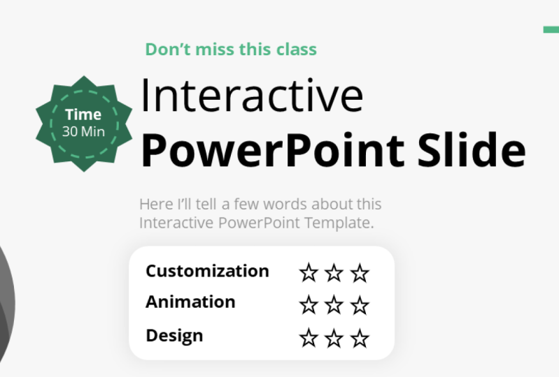
1. Introduction: What? It's again time
to learn PowerPoint. Hello and welcome to this class, where we will
prepare and animate an interactive five slide
PowerPoint presentation. It will teach you how to spread information across
a different slide, but they will be all linked together with actions
and hyperlinks. I will teach you how to have an efficient workflow
while doing so by using the Slide Master and
many different shortcuts, the templates will
be included so you can start working right away. Careful now, many
words by the end, you will have a ready
and functioning interactive PowerPoint
presentation template, ready? If you are interested, how to do something like that? Let's see each other in the next lecture and we
will start the work.
2. Start a project!: Hi, it would be amazing. And you can help
me on Skillshare by starting a product
for this class. Nice. At first, it doesn't have to be the ready product is go to the
Project and Resources tab. Hit on Create Project. And right, You're
welcome message. Later on when you create
slides from the lectures, you can share a
screenshot of that slide. You can do this by going to File Save As Selecting Browse. And you can select to
save as a JPEG there. By saving JPEG, you can select all slides
are just this one. Then you can come
back to the project, select Image and to just add
a slide that you created. I will be really happy to see it and it will also
be very helpful. Please start the
product right now. It will take only a few clicks and helps me a lot
here on Skillshare.
3. Slide 1 - Background, colors, and font: Welcome. In the first
lecture where we establish the background color
used colors and fonts. I've prepared a template
slide you can use right away, or you can select your own
colors if you prefer that way. If you want to work
on the same colors, just take one of the
color schemes, Control C, go into the new slide
and Control V. I'm putting this here next to my
slide just for convenience. For this slide, at first, I want to use this
gray background. For all backgrounds to come. I don't want to go back and always change the
background of my slide. How to do this? We can use the Slide Master for
that Right-click layout. At first, I'm selecting a blank layout to
have an empty screen. Now I go to View. Let me actually copy
this controversy. View Slide Master. And right now I'm in
the Slide Master, the place where you establish a template for your PowerPoint. Okay, I press Control V to
have the colors here again. And I want to select this gray
color for the background, for the entire presentation. For that, I need to go
to the very first slide. This is the master slide. And under it we have layout
on the master slide. I go right-click
Format background. I need to zoom out a little bit. Color, eyedropper, and I wanted to eyedrop
this gray color. You can see it's
barely visible but all the layout half now,
this gray color, I will still be able to change the background
color, don't worry, but the default color is
no longer write it gray. Now, I've done everything. I will delete that. I'll close my master view and I'm ready
to continue my design. If I select a new slide, you can see it already
has this gray. Of course, you can
go to Color and select any color you
want for the background. But if you revert
back to automatic, it will automatically
switch to water. The template says, and the
template currently says, please use a gray color. This is a nice way to make
our work more efficient because we won't have to
change the background anymore. For the font. As you see, I use Open Sans. The font is embedded into
this PowerPoint file. So if you work, the font is embedded into
this PowerPoint file. So if you are working
on this very file, you will have open
stance as well. It will be also good if you install this font
on your system, but it's not necessary
if you use this file. Thank you for listening
to the beginning lecture. I hope you've set up the background and
we can continue with some custom elements we will place on our slide
in the next lecture. See you there.
4. Slide 1 - Custom Shapes: This is the slide
we are creating. Let's create custom
shapes like this. This will instantly make your presentation a
little bit more unique. I am going to insert
shapes and please insert a triangle like
that, a right triangle. I'll press my shift key
and I'll start creating, Okay, I have this triangle. Obviously, I need
to turn it around by pressing the Shift
key again while turning. And I will place it in the
corner. For the colors. You can see we have
the colors prepared. So I will go Shape, Outline, no, outline,
shape, fill. And with the eyedropper, I just click on one
of those colors. Okay, perfectly almost worked. Alright, I have my color and how to make a shape
like that unique. You can right-click and
select Edit Points. You can see three
points appeared. I can add additional points, for example, here and here. And I can manipulate
how that looks. I want a curvy line here. You can see it's very
blocky right now. It has a almost sharp corner. If you are precise, you can
right-click on the point and you can select it to
be a smooth point. Instead of this corner point. You can see it overlaps
here a little bit. So you need to click
on the previous point and just change the
curve a little. Change it like that. Beautiful on this point as well. Right-click smooth point. And we will be basically ready. It now depends on
our imagination. How big of a curvy want. I don't want to overdo it. I'll make something
like that and perfect. Okay, it wasn't sufficient
in terms of design. So I decided to click on that, press Control D, put it back in the same place and make
it a tiny bit smaller. We cannot see it because
it's the same color. That's where we go to Shape
Fill eyedropper again, and we select the darker green. Now, we have the darker green. And I want to differentiate somehow between those two so
they don't look so uniform. We can right-click
Edit Points again. Now, just do a slightly different curve,
for example, like that. And you already have
a custom design. I know it's not perfect. Powerpoint isn't the
best vector software, but at least you have
a custom design. Rarely anybody makes
something like that. We would be basically ready. I put it on the left corner. If you want, you can
duplicate one of those objects and put it on
the right bottom corner, just to round up the
design a little bit. I'll put it here. I'll make it smaller. If you want to be a
little bit more fancy, you can again edit
points and just slightly turned up
points up and down. Maybe change this to be
a little bit more curvy, this a little bit higher. So we have this nice
lag here, beautiful, and we've prepared somewhat of a customer base for
our presentation. This would be a really nice way to continue our slides and use this over and over again
as a guide for our slides. I hope you've learned
something new about PowerPoint within
this short lecture. And in the next lecture, we will try to finalize the design and the main
part of the slide.
5. Slide 1 - Text: Now the font. For the font, I also
went to design. I opened a variant and fonts. Under the font options, you can go to customize fonts. And here you can input
the font you want to use for the titles from layout and the body from the body font is each time
you insert a text box, it will capture the body font. I've set it up to be Open Sans. And this way I don't have to
change the font because if I go to insert textbox and
I insert a new textbox, it already has opened
some selected. You can see I'm making
those shortcuts for myself to make
everything simpler. Text number one, and let's
see what we prepared. I prepared text in
our theme color, the title text, and the subtitle or action
tidal, if you will. So our food list, pick your poison and
this little description. I'll try to replicate that here. We are using Open Sans at first, uppercase text one,
text, one, text, one. I will change that text soon. For the text, I want to make
sure it's in the middle. And I want to enlarge
this box holding Control. I'll enlarge it both ways. This will make sure that
if I increase the text, it will still remain
in the middle. Now, this text is
placed awkwardly. How do we handle that? We can just drag it
into the middle. Powerpoint will help us with a guideline or you
go to shape format. That is the option of
the quick shape airline and simply align center. Okay, We will have
text number one. Now we would need the main text. This is the main text. I will change the
text in a second. This, in my opinion,
should be bold. Open Sans allows to use
the Bolding option. And it should be
much, much bigger, like 50 or 52,
something like that. This is the main text. This text could be
bigger as well. Maybe 24 is too much, 20 should be plenty fine. And now for the last text, I will just do some tagline. The tagline just have
a different color. I'll use the colors and I'll
use one of the gray ones. This is a perfect way to change. I will second to last grey. Perfect. And I don't want to spend
time on writing texts, so I will just make equal
sign lorem one sentence, please enter and powerpoint automatically or any
Microsoft Office software, we'll add you template
dummy text so you have something to work with as least in the beginning. And you can see if
this works fine, okay. I will just leave it at one
sentence. I will make it. So the sentence is
split into two. And basically we have
the texts ready. Of course there should
be a bit higher. We can distribute, we
can select everything, we can distribute it a little
bit higher on the slide. The first text, I
don't like the color. I want the color, one of the
greens we already selected. I have it in the recent ones. Okay, now I've copied
the actual texts, outputted a little
bit higher again, and we are completely
done with the text part.
6. Slide 1 - Boxes: Now comes the part
with the shapes. This is why we created
a gray background. So new white shapes
can look that cool. Go to Insert Shapes and
insert a rounded rectangle, a rounded rectangle
to about this size. You need to fit at
least four of them. I will reduce the roundness
and I'll start to color them. Shape, fill, white, shape, outline, outline,
barely visible. But remember, you can
right-click on it, go to its former shape. And in the format shape
on the right side, you should have these options. You want to achieve a nice
even shadow around this shape. So you go to the shadow options. We can start with a preset. I usually start with
the middle preset, but you can see the shadow
isn't very interesting. I'll click again on the
effects and forth shadow, I want the size to
be or not the size, the blur, blur to be increased. The size can be actually
reduced to 100%, Let's see. And the transparency needs
to be increased because I want the shadow to
be barely visible. If you want the shadow to
be closer to the object, you just reduce the blur. By reducing the blur, you put this shadow a little bit
closer to the object. With the transparency, you influence how visible
it actually is, okay, I think something
like that is just enough. You can see the parameters. What I did, transparency about seventy-five percent
and blur amount 20. Now I will just duplicate
this four times 1234. I want to put it in the
middle of the slide. How to do this? I'll show you a cool trick. I'm selecting all four boxes. I want to make one shape
out of it, Control G. Now, I can place it in the
middle by going to Shape, Format, Align, Align, Center. And now Control Shift G to
ungroup them back again. Because when there are
grouped, this wouldn't work. I think that shadow
is a bit too much. I will select all four of them, go to its shadow
options and I'll increase the
transparency to A25. Now it's a little
bit more washed out. Now I want you to
select the meals. I will select one. I'll press my shift key 234 and Control C, 1234. Control C. Go to this slide, Control V. Now the size is
obviously too much. We can resize it like that, just dragging and dropping
or here in the size options, for example, you
pick two or one. This should be fine, okay? I'll place it accordingly. Now, how to place
it accordingly? You can see PowerPoint
helps us with those guidelines and it's pretty easy to set
this up properly. What was the last item we added? We added some pricing. This could be a bit bigger. If you want this to be bigger, Shift-click all of them. Start to resize them, but press your Shift key and press your
control key as well. This way, you can
resize them from the middle outwards, a
little bit bigger. And on the bottom,
just add some pricing. I'll use the existing
text control D. Okay, not this one. Here. I want to make this smaller. Pressing my control key
smaller from both sides. And here I had like $1.6. I can again use the shortcut to make the text a
little bit smaller, but actually the text
looks pretty fine. Control D to
duplicate the prices, they are put in the middle. Boom, boom. Our point is almost
precise here. Well, it's not perfect, but you can adjust this easily. If you cannot adjust this,
like I have problems here, I can select the shape
in the background. I can shift it on the price. And now they are
connected to each other. When we click on Shape,
Format, Align, Align, Center. It will perfectly
centered is okay. I had like 1733 and 12th, just so we have
different prices. You can see I really need to
go to Shape, Format, align, align center, align,
align center. This way, we
completed this slide, we can now take a
look at the spacing. I can see the space here is a little bit too big
between the text. So I can select all
three textboxes, shape, format a line, and by having
a line selected objects, I'll distribute them vertically. This will make sure
that this text is perfectly in-between. The other text boxes. I can take all the textboxes and place them a little higher. I can take and move
those textboxes as well. But in general, I think
we made a good job. I'll put this a little bit
lower before we proceed. I want to group items, select all three items
here, Control G. Control G or Control G
and control G, perfect. We have separate
boxes. We can animate. We have the textboxes as well. And by that, I'm finishing this slide and
in the next lecture, I'd like to show you some cool animation
techniques you can apply to it to make a really
quick and smooth animation.
7. Slide 1 - Animation: One thing I often face is that
animation is so beautiful, but it requires so much time. Let's make things simpler. You want to group elements the way you plan to animate
them with experience, you will know what I mean. Like here. We could animate
the plate separately, the deck separately,
but you want to group this to
make this quicker. I'll group all three
text boxes as well. I will select all of
them and Control G. Now I can go to animations. I will select everything I
want to animate at once. And I'll select flying. Boom. I'm almost ready
for the top text. I want it to fly in
from the top side, effect options from top. Beautiful. Now it is a little bit
slow to enter the screen. So I want to open
the animation pane. In the animation pane, I'll right-click
select width previous. So it starts automatically. And I'll Shift click here to select all animations at once. I'll just double-click
on the animations. I'm going to the Effect
Options and I'll increase the smooth end. On the Mac version is
a little different. But continuing, we need
to make some space here. So the group number one, the text group is the first one. But those objects should
be delayed a little bit. I can increase the
delay, increased by two, increased by three,
increase by four. Beautiful. This way, we finished
animation for this slide. I didn't do delay
on the last one. This is why it went
together with the previous. If I play the animation, you can see everything enters the screen and the
boxes enter one by one. In the next lecture, we'll
finally go to the next slide. That will be our base
for the entire menu.
8. Leave a Review, Please: Hey, it would be extremely helpful for this
class if you go to the Review tab and click on leave a review and
write something there. If you don't see
this button yet, you need to watch a
few more lectures and it will become available. Sculpture now requires that classes have recent
reviews on them. So it would help me greatly. You just click here, you tell if you'd like
to class or not, and you write a simpler
view and click Submit. I would be very obliged if
you can do this right now. Thank you so much
and see you soon.
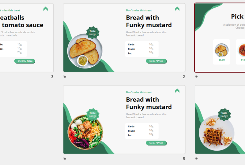
9. Slide 2 - Shapes and Taste Badge: I'm really excited because
now comes the second slide. The second slide, Let's
make things easy for us. This is why I designed
this custom element. I'll select both of them. I press even control G, So they are one
object, Control C. Go to the next slide, Control V. Beautiful. This is a vector item that
we designed and we can put it in the corner
as our little base, especially that we have rounded plates that showcase
different meals, beautiful and go to
the previous slide. And even though this is a group, you can click on a group. And you can click on a group again to click on an
individual object. I press Control C and Control V to bring
that object here. Don't guess the size. Try to be consistent
with the size, going to picture format with the height and
width, I press F5. Let's see how it looks. Okay, five should be enough. You can see here we
prepared a taste bad. Let's do something
similar on this slide. This kind of edge can be done
by going to Insert Shapes. And we have those
usually ugly shapes, but here they will
work perfectly. Stars and banners. You can
select how many corners 81012, look really, really good. Let's select ten at ten star. And if you draw it down,
it becomes a star. But I don't want to start, I want this to remain a
badge for the outline, no, outline for the shape. Fill one of our green colors. Maybe the lighter one would be looking a bit
better for the text. Nothing easier. Just go to the previous slide, select any text
you want it here, even the big one,
It doesn't matter. I'll just place it here. Taste batch. What I did, I did Control B on
the bottom one, just so it isn't bolded up. Now, our shortcut to make the text smaller
or clicking here, this will automatically
make the text smaller, making dislike that and putting
it almost on the batch. Beautiful. Now, something isn't right. For me, it's not enough. So this is why I added a
little circle around it. You can skip that,
but I think it will improve the
design in general. You want to click on the circle. You want to make sure you
press your Shift key. So it's a perfect circle. And you want the
circle to go around the text or in the
middle of the bed. Shape Fill. No Fill. Shape, Outline. White or one of
the greens, white. We'll also look really nice. And again, Shape, Outline. Wait, maybe a bit
thicker, like 21 quarter. Again, shape outline. We always have to go here. Dashes. You can decide if
you want dashes, choose whatever you like and
whatever looks best to you, maybe the dots, the
dots look also cool. Now how to make this smaller? You remember, you can start
making it smaller by pressing the Shift key and
the control key. This way, it grows
outwards with the old key. You also gain
complete freedom and PowerPoint doesn't show you
the guidelines anymore. I think this looks really cool, but I'll place it just
like that and beautiful. I have my taste bad and
I'll press control G. If at any point don't like
the color of the dots, you can select it,
Shape, Format, Shape, Outline, and
select the green one. In the next lecture, I'd like to finish the design
on the right side. And then we are completely
ready to link everything and make a custom interactive
presentation out of it.
10. Slide 2 - Text Part: You now know that I am not
trying to reinvent the wheel. This is why we are going to create the right
side with elements. We already have. What do we have? We have
those beautiful textboxes. I'll pick this entire textbox. It even has an animation
already on it, and I'll just press Control V. Okay, I want to justify
it to the left side, and I want to make
sure that they are aligned in one place. Powerpoint will help
me a little with that. The alignment is fine and
the alignment is fine. I need less text because
here I want it to be just a brief
explanation of the of the dish like that
and like that. Okay. Placing it higher or lower, we can adjust that
later as well. Now some nutrient information. I can again use
one of the boxes. We already have, Control
C and Control V. Here. We could place it
without the shape, but I think the shape is
a nice little addition. Again, you want to use the existing text you
have for the main texts. I'll press Control
C and Control V. I duplicate it a textbox. I want to make sure that
I make this text smaller. And what did we have? Carbs protein, fat. Carbs. Make that smaller. Position it properly. Carbs, protein and fat. Do we get this right? It doesn't really matter. It's just an example. Now, the nutrients, the information should be
maybe in the gray color, control D, or Control D, Control C and Control
V separately. So it isn't added to the
group and like ten g. And this time you
want to justify it to the right side because if
you have just one letter, you want it to stay in the same position and just
place it properly again, you can see PowerPoint helps
me with that boom, protein. Okay. And boom, we are
ready with the information. If you think this
is too, too large, you can put it closer to
them and make that smaller. Make this box smaller as well. And this would be okay. Now, for the price, again, don't reinvent the
wheel with Control D. Put it on the bottom, place it here, maybe give
it more around this. It is completely up to you. Shape, Format, Shape, Fill, and a different color for that. I thought it is a
little bit boring, so I duplicated this shape and I gave it the
second color as well. Now I can put one
either in front of each other or send to back. So it's kind of a shadow. This will be perfect. Now for the price, I
just duplicate items. I already have like $1.6 price. I can see that I need only one, maybe this bolt or maybe
let's make the price. The price is in bold. It's a very cheap meal and
put it more in the middle. This time justify again to the middle point
and beautiful. Before we proceed, I
want to group that, group that, and we're ready
to animate this slide. Try to prepare the right side, and we will meet in
the next lecture.
11. Link back to menu: In this lecture, I want
to show you how to make a link back to the first slide. When we click on this link, it will always bring us
back to the original menu. You need any kind of
icon or shape put here, you can do an arrow, for
example, Insert Shapes. World powerpoint doesn't give us much of much arrows here, I've selected this one. You could also select
something like that. It really doesn't matter
as long as this is some kind of indicator that
you can go back to the menu. I wrote it this around. Obviously shape, outline,
one of those old lines, shape fill one of those fields. And this could be a, go
back to the original menu. I want to do anything
more in this lecture. I want to go to insert
and insert either a link, a link to the first
slide, or an action. And action is
something that happens when you hover or
click your mouse. In this case, both will work. And I will maybe
insert an action. And when you click on this hyperlink to
slide number seven, in my case this is seven,
this will be the menu, not next slide,
slide number seven. Okay? And okay. Now later I will duplicate
this very slight. So at any given point, I can click on this arrow
to go back to the menu. I wanted to do this beforehand, and I want to show
you that this way you can make link in places
in your presentation. Just make sure that it takes
you back to a certain slide. So if this would be slide number 100 and this is slide
number one hundred, one hundred fifty than this would take you 50 slides back. Just keep that in mind when doing those interactive
presentations.
12. Slide 2 - Animation: Now we will animate this slide. Let us predict what
we animated 12345. Perfect, in big chunks, not each text separately
because it would create too much elements
animated on one slide. So you want to again
select everything at once. For example, this, this, this, this, this five elements,
five animations. Again, animations, simply
the fly and animation. I've flew in everything at once. I'll right-click
select width previous. Again, on Mac, it's a
little bit different. And double-click to enter
its options effects. And I'll increase
the smooth end. So the animation flows into the slide and slows little
bit down at the very end. You can increase the duration if that was too fast for you. Now I just need to make 12345. Taste batch should be first. Picture, bread should be second. Give it a slight delay. Texts should be third, give it a delay delay. This should be Ford delay,
delay, delay delay. And this should be the last one. Delay, delay, delay, delay. Alright, let's preview
the animation. Boom, boom, boom, boom. Okay, I see my mistake. This should come in
from the left side, and this should come in from the right side.
That's no problem. Select the batch, Shift-click the bread effect
options from left. The texts as well. Select this group, this group, this group, effect
options from right. Boom, boom, boom, perfect. Everything flows nicely
into this slide. One less preview, boom, boom, boom, boom, boom. We could have a brief
pause between them, but why waste time? The animations are
just a tiny addition to this entire composition. Now, before we proceed, I want this bread to link
to the seventh slide. In the next lecture,
I'll show you how to efficiently duplicate this entire presentation
so everything is connected together
and works properly.
13. Slide 3,4,5 Duplication: Let me show you how to
duplicate everything properly. You have this slide, Control D, Control D, Control D. Everything
is already animated and everything is already linked
to slide number seven. This is perfect. You
just want to take the different meals and put
them on the according slides. I'll go back here and
double-clicking, clicking, double-clicking, clicking all the items are of the same size so
I can click on it. I can go to picture
format and I can see, okay, I have a size of five. Beautiful. The last thing you lack
is the animation itself, but we can overcome
this very quickly. Because I have the
animation of the bread. I go to the Animation options, animation painter and I just
click on the new object. You can see it
painted the animation over in the same spot. Just for clarity, if you want, you can put it here so
it's visually better, but it was still with the
correct amount of delay. So you don't have to do this, just delete that and
bring that here. If you want, you can right-click the taste batch and
bring it to front. I'll replicate the step. It won't take long because I will just
change the size to five. I'll go to the Animation, Animation painted over
and nothing else. I'll put that here. Taste batch. Do we
want it in front? Yes, we probably do
this bread as well. Animations. Paint over the animation
from the bread. Make this dude, okay, Picture Format, bigger and
just delete the bread. I have now four dishes for different dishes on
four different slides. Of course, I should
change the texts. I'll revert back to
the first slide. And I want to make this
entire thing interactive. I want it to link to
according dishes. What do you need to do? Because if you click on a
group, you go to insert. You see I cannot link, I cannot put an action
on an entire group. You need to click
on something again, for example, on displayed. And now I can do a link or an action is
completely up to you. I will link it to
slide number 891011. I'll maybe do action. I think they are a
bit more efficient. Hyperlink to slide number eight. Okay? And just replicate the process. Double-click action, hyperlink
to slide number nine. Why can't I remember
just those few numbers? Now, it will be slight
numbered ten, correct? Correct. And this one, action, hyperlink to slide number 11, the last one, Beautiful. This way, we've made
our presentation interactive the first time
it will play the animation. Right now I'll go to the bread. You can see this is ready to order and at any given point
on the right top site, I can go back to the original menu and it
doesn't animate anymore. It only animates. Once. Beautiful. I can jump between
dishes just by clicking onto individual dishes. Okay, I've clicked on the slide by mistake, beautiful here, going back and we have a fully
interactive presentation. Now, replicate the steps and we see each other
on the summary.
14. Thank You: Very brief, but a big thank
you for finishing the class. If you finished all the steps we've taken together
during this class, you should have a
fully interactive, animated presentation
that showcases different elements
on one menu slides. It could be used
not only for food, you can use it for any
kind of presentation. And I hope that custom designs
are something that you will strive to achieve
as well in your designs. If you want, you can continue learning PowerPoint with me, all my profile, you will find countless
PowerPoint classes. Hopefully you've
enjoyed this one. Thank you very much. I really appreciate if you
give me a positive review, this will motivate me to
make more content like this. Thank you very much and
see you in the next one.
 Andrew Pach ⭐, PowerPoint, Animation & Video Expert