Transcripts
1. Introduction: Hello, everybody.
This is Wiley. Okay. Yes, this is my assistant Wiley. Hi, everybody. This is Lucy. And I'm talking to you from my studio in Victoria,
British Columbia. I'm a graphic designer, mixed media artist, and top
teacher here on Skillshare, and I want to welcome
you to my brand new My brand new class on Skillshare and it's called monochromatic stripes and Type, basically using strips of
paper of the same color, but in different values and tone and adding type
as a design element. So I think as a
graphic designer, I've always been fascinated by typography as a design element. You look through magazines and old catalogs or children's book or calendars for big numbers, and you're going to
find a whole bunch of material that you can
use in your postcards. I'm also going to
show you how to paint some book pages in
different colors. You can use that too.
Are you ready to create postcards in all
the colors of the rainbow? What's your favorite color? I hope to see you in class. Bye. Look
2. Class Project: Your class project is to create
a postcard in one color. You pick one color
any color you want, and then collect some paper, collage paper in different
values and tones and patterns and solids and then use typography as a design
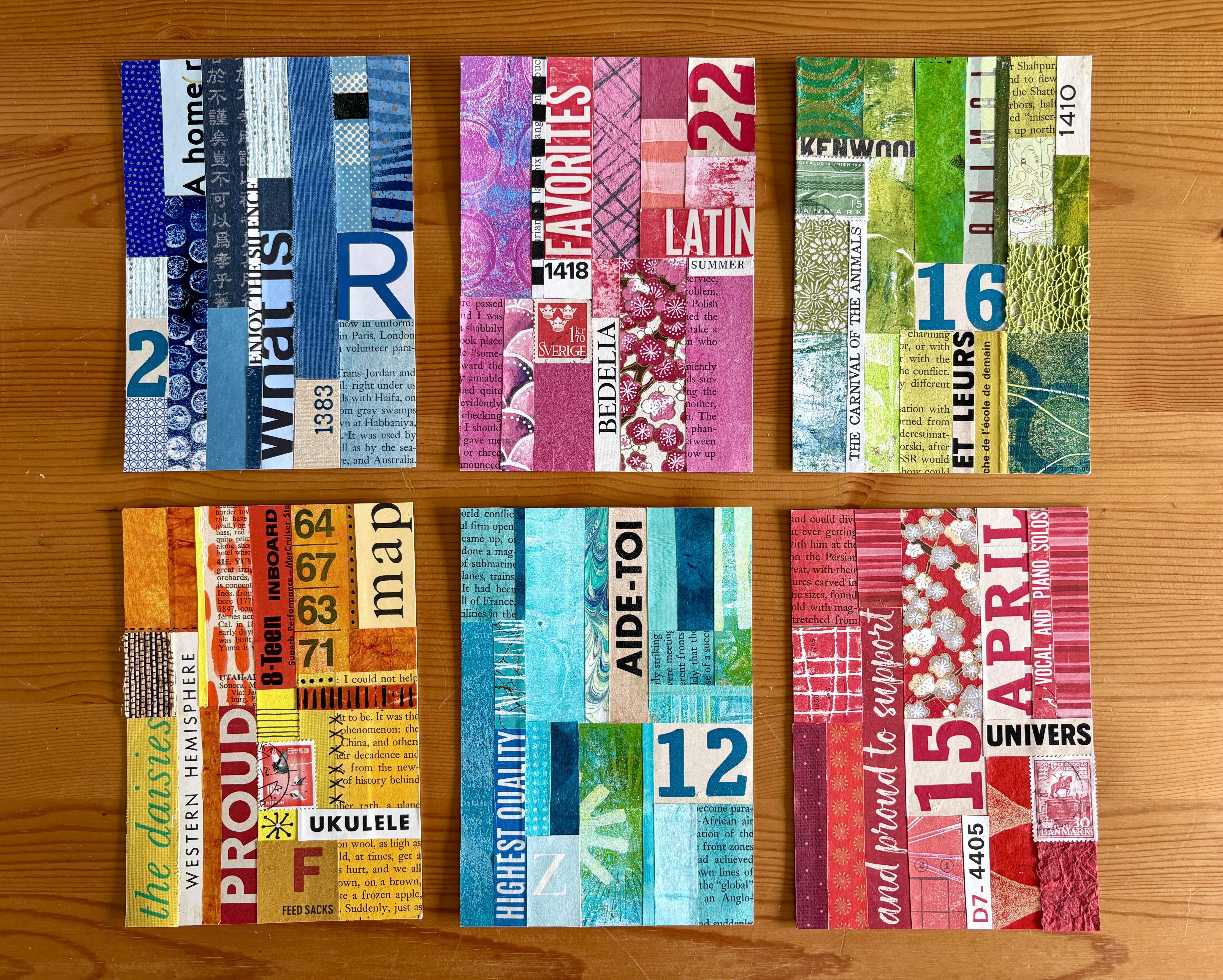
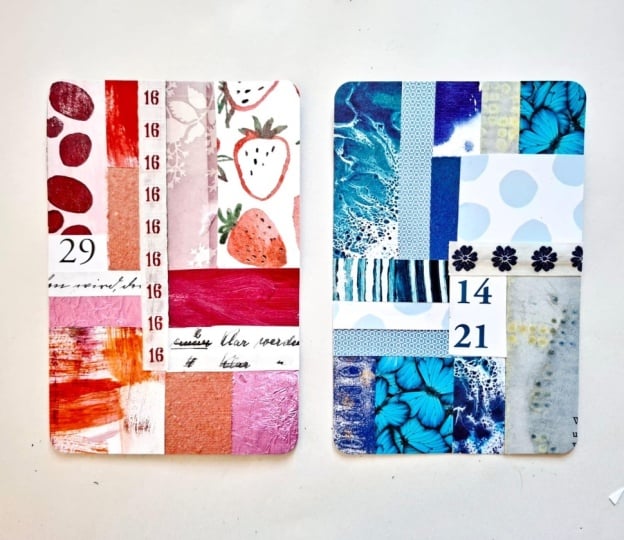
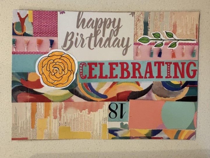
element in your postcard. In this one, I use pink tones. This one is in the teals
and this one in the orange, yellow family, this
one in the blues, and this one in the greens. The one we're going
to do today is this one and I'm
picking the color red. I'm going to show
you how to do it.
3. Materials: So what we're going to do is make a monochromatic collage. I went through all
my collage paper and separated by color, which is actually kind
of fun thing to do. But I decided to I'm going to
do a red one for this demo. But I have trays in
different colors. This one is pink
and teal and green. So as I, you know, work on other projects, I keep separating
my collage paper in different colors and it's
kind of really, I don't know, it's kind of a it's it feels
a little nerdy thing to do, but it's actually really fun way to organize
your collage papers. For the type part,
what you want to look for is large headlines. I mean, you need all sizes, but it's really nice
to have bigger type. Book covers are fun for that. And this is I think it's a flash cards can
be cool book cloth. This is a spine of a book, and this is a front
of a dictionary. But you can see where you
can take a book apart and take some of the copy
from there, the type. Also, if you use sheet music, you can find some
really cool headlines. They always have headlines there and they're
usually larger. This is from a from a
book, from a kids book, I think that kids books are great because usually
the type is larger, so this one is fun. I think I might want to use
that or it's also by color, that would be a fun one to use. Packaging, old
packaging.This is for soap, I I'm not sure. Cow milk, soap. Then you can use these
big letters here. I mean, this is a brochure
that I got for a festival. Again, this can look
really good on a postcard. So yes, look at magazines, advertisement, anything, and then just cut
out some headlines, some big type, small type maps. And then you need some numbers. You're going to need to get
some big numbers somewhere. So bingo cards. If you have some, I don't
know why I have those. I have no clue where I got them, but I collect all
kinds of funny things. Again, bingo cards, wait. But calendars are great. Old calendars. This one is
1935, that's really old. Old advertisement like this in newspapers and stuff.
They have big numbers there. This is a great one, this really old calendar. Collect some numbers and type. The other things
we're going to use is a book page that
we're going to paint in the color that we pick. So I am going to use a
watercolor and a flat brush and then a container where you can
actually mix it with water to paint our little book page. So you can have it in a book. I like to do it in a
book like that so I can have access to all
these great colors. But you're going
to use the color that you going to use on your postcard to paint a page that you can
use as collage paper. Then you'll need your postcard, which is the usual four
and a quarter by six, and you can use
recycle cardboard. You can use any kind of
card stock that you want. Then we're going to need
scissors, we need a pen, a ruler, and os stick, and we're ready to go.
4. Watercolour: We're going to grab our book
and we're going to paint a page in watercolor to
use on our postcard. I usually paint a full page in whatever color palette I decided to use on my postcard because
it's really fun to use. So we're going to do
red for this one, and I'm going to use this watercolor is
called I think it's PyalRd I'm going to use a
fair amount of water with it. But it's really up to you if you want to
have it more dark, Um, there you go. It's a pretty color. You can put the water, right? On your page, doesn't
really matter. So there you have it.
It's that simple. We have one more piece
of collage paper to use on our postcard and we can let it dry and
go to the next step.
5. Guidelines: Before we start
collaging our postcard, we're going to add
some guidelines to help us out a little
bit to get started. I'm going to split
my postcard in two this is six by
four and a quarter, so I'm going to do my first
line for my guideline at 3 ". Then I'm going to
do another line here and you can split it right in the
middle if you want, but I'm just going
to put it like this. Just in the middle,
but not really. Then I'm going to do another
line at the bottom here. And that's going
to help us line up our paper stripes
on our postcards.
6. Collage: Let's start with maybe the piece of paper that we
use watercolor on. And the way that I The
way that I do this, and you can do it
another way if you want, you can put a glue on the back or you can just put
it straight on your card. That's what I'm
going to do for now. I'm just going to line it with the first line here like that. Then I'm going to
cut it. Because I want to know what
I'm doing here. So the first piece of paper. And I'm going to go and
do this piece here. Again, you don't have to be
so tied to this line here. You know, it's just a guideline. So it just helps to decide where you're
going to put something, but you can cheat because I don't want
to cut my type here. Now, let's see what
else do you have? I usually mix patterns. I do a nice mix of different patterns
and then solid color. Now I'm going to go
to this line here. This middle line here. I just really helps to
organize it somehow. But again, it's
just a guideline. You don't have to
follow any of it, and I'm going to
cut it. What else? What else do you have? I want to put maybe
a solid color here, may be some stripes here here. If I want to put something here, What you can do, you want to know how wide
it's going to be, so you could mark
it if you want. That's helpful. It's
like a puzzle, really. You're going to go and see
what works in what spot. Yeah, this is cool. I like that. Okay. All right. Yeah. And then I can take this piece and
put it somewhere else. You know, I can bring it back
here somewhere, you know. I'm going to keep that on the side, and then I'm
going to keep going. And let's see what
else do I have here? Oh, I can add more
of this paper. I can put a big
number somewhere. Where are my numbers? 15. Mm. Like this. No,
it'd be like that. Right here. Yeah, that
works pretty well. Let's do that. So when you think about the
type part of it, it's really more like a design element that
you're adding. But it's type. I probably
use that somewhere. I do like this here. But I feel like I have too
much too many patterns. Hm. It's cool. This one I made in my
class on Skillshare, that's print stab and roll. This is pretty good. See, I want something that's going
to go all the way down here. I'm going to look
for something else. This one has a
little gold on it. That's cool. I think
this is a gel print. Pretty sure that's what it is. M. Okay, so if you want to have something in a specific
place like I want this here. I want to know where
this one stops, then I'm just going to fold it. Like this, and then
either tear it or cut it.
7. Final Touches: So I'm almost done here. I think I'm just going
to put this like that but I feel like
I need some black. So let's see if I can
add some black type. Maybe this here. Again, you can really if you want to go up here and do it like
that, you can do that. But I'm going to stick
to my grid here. Usually, I already don't
follow the grid that closely, but this time, for some
reason, it worked. I could totally stick to
your grid if you want to. Now I want to put some
black copy somewhere. Maybe I can put this here. That Niv let's see. Or I can put it here. I think I'm going to put it here and I'm just going to mark it so I can just
cut it right here. That'll be that. I'm probably not going to go straight on my Postcard because I don't want to put
glue everywhere. What do you think?
I think we're done. I mean, the other thing you
can add is if you want to add a little postage
stamp. You really can. If you wanted to.
That could be fun. You know, I don't know
that it needs it on this particular
postcard, but I might. What do you think? Yes.
Yes. I hear a yes. When I teach a class on Zoom, I usually ask people
what they think, so I can get an answer
if it works or not, but I have to answer for you for this
particular situation. But I think you would agree
with me that it looks good. La you did it. I did it. Now it's your turn and once you're done, try
a different color. Or try a multicolor one. I really like this concept of using typography
as a design element, maybe because it's from my
graphic design background, but I've been doing a lot
of these postcards before. You can see where you can
do it with multicolor and how much it adds to the
graphic style of a postcard. The other thing that I think is fun is to use just strips. Stripes are really
a great way to do a background or a postcard
and these are honestly, it's just leftover pieces, but it looks really cool. Then you can also
take all your strips and weave them together
and stitch them together. Not a
thing you can do. You can also, this is
an exercise that I did in my book, collage joule, but it's basically using
rectangles and you know, type and making a
little library. And this is it. It's
just rectangles. And you can create something
more figurative if you want. There's so many
things you can do. I hope that you have
fun and that you do one in all the
colors of the rainbow, and I will see you soon. Wow.
8. Thank You!: Thank you so much
for taking my class. I can't wait to
see your postcards and make sure you upload your postcards in
the project section below and follow me
here on Skillshare. You'll be the first
one to find out about my next postcard
class or audio class. So Avito.
 Lucie Duclos, Design + Mixed Media