Transcripts
1. Introduction: Hello and welcome to my class, Posca pastors. Four beginners. My name is Imran, and I'm a graphic designer
and illustrator, and I'm totally obsessed with
traditional art mediums. So it comes to no
surprise that when I saw these fantastic pastels
in my local art store, I just couldn't help myself, and I went ahead and ended up purchasing this
lovely set over here. And because it was on offer, I ended up getting two. So I've got two sets of
these lovely pos capastols. So I know what you're thinking. What are these pos
capastols all about? Are they just glorified Crayola crayons? Well,
let me tell you this. They are not glorified
crayola crayons, and you'll come to see why
when you start the class. This class is an introduction
to post capastols, and it's aimed at all levels
of skill from beginners, all the way to
professional artists and everybody in between. We will start off the
class by going through the ins and outs of
these post capastls, and then we'll quickly run through the class
supplies that you're going to need to continue and
follow along in this class. We will then delve into
the application methods of these postcapastols and see how they work on different
paper surfaces. We will then look at three different techniques,
focusing on layering, tonal values, and blending, and we will practice
each technique by completing a
quick mini sketch. We will then look at how other mediums
such as ink, markers, and a range of colored
pencils work with this medium to see how they interact with these
post capastls. Then we will commence
the exciting part of completing a full
step by step sketch, following the lessons
that we learned and implementing those
lovely techniques that we went through. All the materials
required for this class, along with each exercise, from all the lessons will be illustrated in the
class resource sheet, including a few of my own
lovely little sketches that I've done using
these post capastors for you to be inspired from. After completing your
lessons and the full sketch, you will be ready to unleash that Posca pastel magic onto your very own artwork
for your class project. And remember, once you've completed all of the
steps of the lessons, done the full sketch, and completed your
class project, take a few pictures of them and upload them to the
class project gallery, and don't forget to leave a
lovely review on the class of your experience so that
other fantastic students, like yourself, can find
the class and learn from your wonderful experience
of Posca pastors. So what are you waiting for,
grab yourself a iced drink, get yourself a nice cake, get comfy and relax, and grab hold of
your posca pastors. And let's get started
with the class.
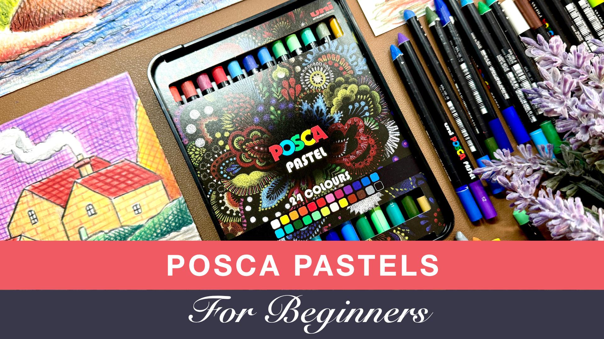
2. POSCA Pastels: Let's now start off the class
by going through some of the basic features
and the ins and outs of what Posca
pastors are all about. Poscpastls are made up of
wax, oil, and pigment. They have a smooth color
application and finish. They leave a gorgeous
matt dry appearance once you've used them, and there's no waiting
time for them to dry, and they are just
fantastic compared to cheaper alternatives
like crayola crayons. So no, these are not just like crayola crayons,
they're far superior. They have superior
materials inside them, and their finish is
just immaculate. These pastls are robust
and easy to sharpen, which is a huge advantage. They're easy to hold
like a pencil or a pen or a normal
drawing instrument, so you don't need to spend ages trying to figure
out how to hold them. They are very natural
and easy to use. And therefore, because you
can have a sharp point, they are good for detailed work, and that is a huge advantage. These pastls can be applied as they are dry on
different surfaces. They can also be
diluted with solvents, and they can also be
pliable under heat. But we're not going to
be diluting them with solvents or heating them up. That's for another adventure. We're just going to stick
to the standard application using them dry as they are
on different surfaces. In terms of color options, they have 24 colors
in the main set, and that's the set
that I've got. They can also be purchased separately from
different vendors, and they can also,
in some places, be available as smaller subsets that have a specific type of color variation or
color matching code or just a special selection
for a certain purpose. A nice thing about the colors with these are that they are nicely labeled with the color
name and the color code. So if you run out of
a particular color, you can easily replace
it by just purchasing that individual
exact color again to continue that color
journey in your set. However, some of the names of these colors can be a little
bit dodgy in my opinion, but that's all good. These are very unique pastors. They have a unique
formula generally. When you think of pastors
that contain wax in them, you tend to go towards
the crayola idea. You think that these are
just crayola wax crayons, but they're far
from being crayola. They have more wax
in them than oil and they are more vibrant
in terms of color, and they have very
little sediment in them, and the field and application of these actual pastors is
way superior to Creola, but there's nothing
wrong with Creola. And because they have more
wax than oil in them, I tend to refer to
these as wax pastels. So you'll hear me saying, Oh, look at these lovely
wax pastors over here, we're going to be using
these wax pastors. And sometimes I might just say these pastors,
pasta pastors. You'll hear me say wax
pastors throughout the class. These pastels can be used
on any paper surface. They can be used on plastic
and wood. Yes, they can. They can be used even
on glass and metal. So look at that.
Totally versatile. However, in this class, we're going to be concentrating
on the paper surfaces, and we're going to leave the
plastic wood and glass and metal for another day and
for another adventure, if that's what you really want. These past stores
are quite expensive, especially if you go ahead
and buy the full set of 24. But again, you do have seasonal offers
throughout the year. So if you really want to
get that full 24 set, then what I'd do
is just wait until the offers are on and
keep checking the prices, and then maybe get them then. I personally bought mine
when they were on offer, especially toward
the Christmas time, when the art stores usually put quite a lot of the
materials on offer, and I found myself
an absolute bargain. So I didn't just get
one. End up getting two. So I got two sets for myself, and they've been fine. The wear down of them is very, very slow, so they
do last a long time. And again, you can buy
them individually. So if you just
want to maybe have a black and a white and
maybe three primary colors just to start off with to see whether you
like them or not, that would be a good idea. And that would work out a lot less expensive than buying
the whole set of 24. But again, it's an
absolute fantastic medium, and I personally think
they're well worth the price, but do look out for
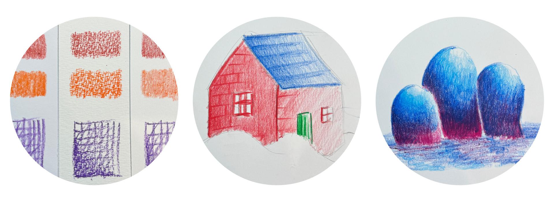
those seasonal offers. It's always a good idea with whichever colors you have to do a color swatch of the colors
along with the color codes, because they come with
the color number codes and the color names on them. And that way, you'll
be able to keep track of which
pastor you've got. And maybe if you haven't
got all of them, it's a good idea just to
build up a beautiful, little chart, color swatch, so you have something
to refer back to. Now the names of
these colors can be dodgy on some of them.
They do make me laugh. Because they just have their
own version of their names, whereas I personally think
a color might be a yellow, but they've labeled it as
an orange or vice versa. But yeah, they will make you laugh on some of
them how they've actually gone ahead and done the color naming
of these colors. But again, it makes
no difference. They're 24 colors, and they're all gorgeous. And
that's all it is. Nice and easy posca
pastors in a nutshell. Now we can move on to what you need for your class supplies.
3. Class Supplies: Okay. So for this class, the essential supplies
that you will need in order to follow
along are number one, the posca pastors themselves, regardless of how many you have, even if you have five, three, ten, or the full size of 24, you can still do the class
with the colors that you have. But if you do have
the full set of 24, then that would be
absolutely fantastic. Then number two, you need any pencil to do sketching
with because we're going to be doing a little
bit of sketching that we start off initially with
and then use the pastors. Number three, you need
some smooth paper. Again, we're going to go through the types of paper surfaces
that these work on. So maybe have a look at that lesson before you go ahead and buy
yourself some paper. But most likely
you're going to have a decent smooth paper lying around somewhere, and they even on printer paper because
they're so versatile. You don't need to really go
out and buy a beautiful, expensive, really high value cartridge paper with
beautiful texture on it. You can even use your
printer paper for it. I've done loads of
little sketches on printer paper with
these pastels. So number four, you
definitely need a sharpener. So I would suggest have a sharpener that's
decent because you will need to sharpen these to do detailed work like we're
going to do in the class. So they were the essential
supplies that you need to go through and
follow along in this class. Again, if you don't have all of the essential supplies,
that's absolutely fine. You can still watch the class and then go get those supplies, or if you want to get
the supplies first, then watch the class
that's entirely up to you. And now we can move on
to the exciting stuff.
4. Application Methods: Okay, Dokey, Welcome back. Let's now start off by
going through some of the simple application methods of our wonderful post pastels. So let's get our attention
back to the screen, and we have our beautiful
set of 24 colors. So I'm just going
to pop these open. I was just doing a little bit of sketching
with these before, so they're going to be
randomly placed in the tin. You can see we've got our
lovely set of 24 over here, all mixed up and jumbled up. But that's all good. So let's now maybe select
a blue shade over here. And then maybe a nice
kind of magenta shade, this kind of like purply
pink shade over here. Now, if you want to
follow this step by step by using the same
colors that I'm using, then I'll mention the numbers of those colors just for reference, and then we've got
the same colors for the exercises that
we do in the class. So for the blue,
it's the number ten, and for this magenta color, oh, I've gone ahead and I've
gone ripped off that number. So that's not good, is it, but it's that magenta color. Again, you don't need to use the exact same colors
that I've got. Just use whichever colors
you want from your set, and we're good to go. So we've got this magenta color, and we've got this bluish shade. Preferably use darker colors for these exercises
so that they can show up a little bit better on the paper and surface
that you use. So let's now grab
hold of these two and move the rest out of the
way. Fantastic stuff. So what we're just going to do now is we're just going to get a sheet of paper more on the surfaces and the
types of surfaces to use with these pastors
in the next lesson. But for now, I'm just
going to be using this standard
bristle board paper, which I will go through
in the next lesson. So just grab hold of any
sheet of paper that you have, just to practice these
application methods, it's super simple and easy. So let's start off
with our blue color. And as I mentioned in
the previous lesson, you can sharpen these. So what I've done is I've got this sharpen point over here, if you can see on the camera
that we've got this nice, kind of like Crayola crayon star held sharpen bit on one end. On the other end,
I've actually not even taken off that
piece of paper, but with the purple one, with this kind of magenta shade, you can see on one side. We've got this kind of like the normal shape of the
crayon or the pastor, should I say, and then we've
got the sharpened side. It's always a good idea, in my opinion to actually
have a sharpened side and an unsharpened side because it just gives us
a nice variance. So grab hold of your blue color or whatever
color that you want, and we're going to
effectively just hold this like a pencil. So I can hold a normal pencil, just like this in your hand, rest it in the most
comfortable position. We're just going to go
ahead and start using this upward and
downward motion like this to create a nice
swatch of color, and it's as simple as that, like you would do with
any other dry medium. We're just going up
and down using this sharpened part of our
pastel. So just like adding in that swatch, going in that up
and down direction. And you can see it's just so easily applicable to the
surface that we use. Now, as I mentioned in
the previous lesson, these can be used on
multiple surfaces, on wood, on glass, even on plastics, but we're going to focus more on sketching on
paper in this class. I will let you experiment
at your own leisure. So just finishing off
this first swatch, using the sharpened part. And then what I'm going
to do is, I'm going to go this direction. So we've got this diagonal direction here. So again, just up and down,
nothing too complicated, just showing you how to apply these as you
would normally do using your other dry mediums or even wet mediums in
some circumstances. So just up and down, nice and easy in a
diagonal motion. And then what I'm
going to do is, I'm going to go ahead and
do a circular motion. So just like this,
create these nice, little circular patterns
going round and round. Filling up that area, and you can see that the
texture just looks fantastic. So just like that
circular motion. And then for the final one,
what we're going to do is, we're going to go ahead and do exactly what we did on
the first one here, so just a quick little
swatch of up and down. With medium pressure, again, the pressure that you
use will depend on how quickly the lay down
of color will be. So you can see now that
I'm getting quite a lot of this kind of
breakdown of the tip, you get this kind
of like, you know, that kind of dust if you like. So you will get that because
this is a wax material, but it will be a lot
less than when you would use a normal
standard crayola crayon. So, again, that's one of the huge advantages
of using this, that the breakdown or kind of like the kind of
dusting off of it, the wear down of the
actual pastoral is very minimal compared to pure
wax crayons. So again, Just finished off this swatch like we did on the
first one over here. And then what I'm
going to do is, I'm going to go in over it again by using the
diagonal swatch. So just like this, going to use that diagonal swatch to
just fill in the area, and this is just effectively
a layering technique. But again, we're going
to go more on to layering and blending
in the coming lessons. This is just backward and forward in that diagonal motion. And then I'm going to finish off by doing that circular
motion on top. Won't be able to see
the exact results. But what this does
is it just gives you a complete swatch of color. So you can see if we
take a look back now, we've got four lovely
little swatchy swatches with our blue lovely
posca pastol, and you can see that the application was
so quick and easy. Fantastic, isn't it? So what we can do is we can just compare this
and contrast it to what it would be like if
we use unsharpened part. So with my magenta color here, I've got the unsharpened
part over here, and then I've got the sharpened. So let's switch to
the unsharpened part. So we've got the
unsharpened part like this. And again, you can see that
the lay down is really easy. What I would suggest
is that if you've got a lot of lay down of color
to do in a big area, then you're probably better
off using the unsharpened, more natural crayon
tip like this. And then when you've
got details to do, then go ahead and use
the sharpened part rather than using the
thicker unsharpened area. And that's just to save yourself from having too
much of a wear down. So you can see that I've
laid down some color, and I don't have any of
that kind of like wear down dust that's falling off like I did with the
sharpened parts. So that's something
to bear in mind. If you don't want too much of that dusty kind of like
thing falling off, all those kind of, like, like, little clouds of
fluff falling off of that pigment Then use the
thicker point because that way, the laydown will be
a lot more smoother, and it can be less
kind of wasteful. But again, there's a lot of
advantage of using this tip. So again, I'm just
going to go ahead and I'm going to
quickly do this with the unsharpened bit
so that we can have a complete picture and we can
see what results we have. Okay, Dokey, now
you can see that we've got a nice swatch, and if you actually have a
look at the side by side, you wouldn't even be
able to tell which way we actually laid the
application down. So whether you did it
with the tip sharp tip that we sharpened or
the unsharpened tip, it creates a fantastic lay
down of that beautiful pig. We can also do is, I can
quickly go through maybe just showing you a little
bit of a detailed swatch. So if we look at another color. Okay. So for this one, I've got this number 15 color over here. This is effectively
like a really nice, bright, reddish orange shade. So with this, what I'm
going to show you is, I'm going to just show you
using that sharpened tip. We can go in and create a
detailed cross hatching effect. So just like this, just like you would lay down using
colored pencils. You can see it produces this
beautiful hatching lines. And then what you can
do is go in diagonally. Like this, and you can vary the thickness
of those lines that you create and create this
wonderful cross hatching, effectively colored
pencil effect. So again, we've got the three different
angles over here with the single
lines of hatching, and then we can go
ahead and start doing the cross
hatching overlay. So just go ahead like this. Apply that beautiful pigment
so smooth and velvety, it's effectively just like using a colored pencil without
the wood casing, isn't it? So you've got all that
wonderful pigment. Love a bit of pigment.
So just the cross lines going across to create that
cross hatching effect, and you can see how
beautiful that is, how fast and easy it is to produce wonderful,
wonderful, little effect. And then, again, with the circular motions, just going in, just for completeness
to create this kind of lovely little swatch,
of textured color. Looking back at all
three now, you can see, we've got some gorgeous results with the application method, and that's it for the application
method for this class. We'll be using all three of these application methods
in the coming lessons. So let's start moving on to
the more exciting stuff.
5. Surfaces: Oh, these plants. So, I need to give them a
good dusting them. Look at that.
Covered in all dust. That's not good for me
class. No, it isn't. Oh, might as well
have a couple of sips of this gorgeous coffee. Oh, that's a good one. That
is such a good coffee. That beautiful stuff. Okay, welcome back. Let's
now continue with the class. I put me coffee on the side. Otherwise, I'm
gonna get it spilt all over the place. By the way. That was a gorgeous
cup of beautiful, aromatic, lovely chocolate
bean coffee soper. Hit me right on the spot. So let's now continue
with the class. And if I can bring your
attention back to the screen, we've got some nice
looking columns of different papers.
Yes, we have. So this is all about the different surfaces that we can use our postcapastls on. And as I said, in the
previous lessons, I'm only going to
be concentrating on the paper type surfaces. I'm not going to go
ahead and experiment on different hard materials, porous materials or any type of those funky materials
that they say that these crayon
pastors can work on, I'm going to let you
do that by yourself. But again, let's concentrate on the standard
paper for sketching. So over here on the screen, I've got four lovely
little columns with the names of the papers and their paper weights on top. And I'm just going to quickly go through the four of these. So we have a nice little
example illustrated to see how these pastels work on different
paper surfaces. So Generally speaking,
we want to be using these on a
nice smooth surface, and that is the first column. This first column is the
Bristol board smooth paper, and the weight of it is 240 GSM. This is the one that I actually did the previous lesson in. So if we have a quick look
at the sheet that we did, so this sheet that we did, it was this way
round, wasn't it? Yes, get it the right way round. So this sheet was the bristle
board, that first column. And I think personally, I really like the feel of
the pastors on this sheet. It works really nice. But again, you may have
a different preference. You may like surfaces that have a little bit
of texture on them, and we will explore that
on these other columns. So let's just put this one
back so it's out of the way. Okay, fantastic. Let's now
have a look at our colors. So I've got three
colors over here. Again, I'm going to
go ahead and put the numbers on the screen of
the colors as I use them. But just to quickly
run through the m, I've got the number 14 here, which is a kind of
brownish orange shade. Then I've got a number three, which is just an orange shade. And then I've got this one,
I think it's a number 12. I've got that back paper
ripped off the number, and that's just a purple shade. Should all come
up on the screen. And again, you want to
have a look at this after, just watch the video, and then follow along after,
that's absolutely fine. Everything will be listed in the class resource
step by step as we go through the
lessons for you to follow along later
on at your own pace. So let's have a
look at the screen, and let's maybe start off
with our first color, and that one is the number 14. Move them to the side. And
all I'm going to do here is, I'm going to go ahead and
create a nice swatch. Using those application methods that we did in the
previous lesson. So I'm just going to go
ahead and I'm going to do the up and down method one
application that we did. So just over here like this, I'm just going to
go ahead and create a swatch by moving
it up and down. And as expected, this is very similar to the
one that we produced in the previous lesson
because we used this lovely bristle
board smooth paper. Fantastic paper,
this, the lay down, and the texture is super smooth, and it works really well. So just like this up
and down on this one, can see nice bit of lay down. Really nice and smooth
and velvety over there. Now let's move on to
the second paper, and this one is the
mixed media paper. Now, this paper has a kind of slight bit
of texture on it. This paper is good to use maybe on light wet work
and dry mediums. But again, it's just
a kind of grade higher in terms of texture
from the bristle board. If we go ahead and
do this on here, can see immediately, I mean, I can feel it while
I'm doing this, you won't be able to
feel what I'm feeling, but you'll be able to
see what I'm doing. But when you go ahead and
test different papers, you'll be able to feel how
that beautiful pigment comes off and attaches in its application
onto the surface, and every surface is different. You can see just going
backward and forward in that same motion like we
did on the first one, we have a very different result. It's subtle, but it's different. So it all depends on your preference of what type of results you want to achieve. Now move on to the next one, and this one is my
lovely watercolor paper. This is a cold pressed
watercolor paper, so we're going to have a
nice bit of texture on this, and this one is slightly
heavier at 300 GSM. So let's go into this one. Oh, and you can
see, look at that. We've got that beautiful kind of gaps coming and appearing. Effectively looks like
more of a crayola crayon, so you wouldn't know
whether you've used these lovely, fancy pastels, or whether you've just
gone ahead and used a crayola crayon when
you do this application, cause there's so much gap
in between that surface, the tooth of the surface, it produces a beautiful
texture just like that. We've got our third texture
on our third paper, again, very different
from the previous two. And then finally,
I've got a kind of special type of paper
called acrylic paper, and this is a mix between
watercolor and the mixed media. It has a kind of canvas
texture on the surface, so it will give
different results. Again, you may not have
these papers at home. I'm only illustrating this to
you so that you can see how these pastores look on different surfaces that are fairly different
from each other. So you have a bit of an idea
when you come to doing them, and this will kind of guide your preference
into what you like. So this is the acrylic paper that has a canvas texture on it, and you can see, look at that. Beautiful. That, isn't
it? Look at that. Stops gorgeous. I love how this turns out. I mean, this is a 240 GSM paper, so it's thinner than
the watercolor paper. But just look at that pattern. You've got these lines
of that canvas going up. I think that looks
absolutely fantastic. Beautiful. It's like an
etched look, isn't it? Lovely stuff. So I'm just going to move a
bit of that dust off. We've got some dust on there. Let's just get rid of that dust. And you can see, we've got our four different
papers over here, so same swatch, using
the same color, and we've got four
beautiful results. So what I'm going
to do next is I'm going to use the other color, so let's maybe use the orange, so we have a brighter color so that we can just compare it, and I'm going to do
the same across there. So let's quickly
do that one now. Okay, so you can
see now we've got that similar swatch
in a different color, and you can see it just
looks absolutely fantastic. Have a play around
with this with the colors that you
have in your set, and with the different
surfaces that you have, you may only have two or
three different surfaces. That's absolutely fine. Just give this an
experiment and have a look. It will just get
you more familiar with this lovely lovely medium. So, what I'm going to do
on the next one here is, I'm going to use
that purple color, and I'm going to go
ahead and do a bit of a cross hatch and then repeat
that across all three. So let's just concentrate
on the first one now. So I'm just going to
go in and maybe just do some cross hatching
lines like this, so coming down like we did in method three in
the previous lesson. And then I'm just
going to do some lines going across to produce
that cross hatch. Then maybe just do some more lines in a
diagonal way like this, just to add on to that pattern
of the hatching lines, and then maybe just with
my lovely pastoral, just use a circular
motion like this, just to darken up the
bottom left hand side, and then just sharpen
it out a little bit. And then just like that, you can see we've got this lovely, effectively kind of swatch of texture cross hatching going
on over there just to make it visually different from the previous swatches to see how they compare on the
different surfaces. So again, all I'm
going to do is, I'm just going to go ahead and do that for the other three, and then we can have a look and analyze and see what
results we get. Okay, ok, now you can
see that we've got the four lovely swatches of
our cross hatch pattern. And you can see that the
results are quite different. We've got the more
smooth papers on the left hand side where the
lines are more prominent, and then we've got
the more highly textured surfaces where you can't really see much of that cross hatch
overlay that we did. So again, these
are the effects of the surfaces that we use
with these lovely mediums, and you can see the results. Y. And it will be
your preference which type of surface
you prefer to use. So that was the surfaces part, but I do have a bonus surface, which is probably one of my
favorite types of surfaces, and I think I'm going to
move on to that one next.
6. Special Surface: Okay, let's now talk
about the final surface, and this is the one that
I get most excited about, especially with this medium, and that is the lovely
toned gray surface. Yes, it is. So I've
got a sheet of beautiful toned gray
paper over here. And what I'm going to do is,
I'm going to actually go ahead and shift the
other one down. That we have more room
to actually see this, you've got the toned gray paper, and this is a fantastic
paper to work with, especially with these pastors, and you'll see when I come to demonstrate this
later on in a class. But what I'm going to
do is I'm just going to create some swatches
over here so we can compare and contrast
it to what it looks like with the
normal white color paper. Now, this paper is 180 GSN thickness, and it's called Tone gray and it's
by Strathmore. It's a very thin paper. It's very compressed and smooth. It has a nice grain to it, but it doesn't show through on the actual material
and medium itself. Let's demonstrate this enough talking and more demonstrating. If we just have a look at
what we did previously, we used our normal swatches. If I just do a normal
swatch over here, and then maybe use
the orange that we used before to just
do another swatch. You can just see that the look of that
swatch looks very different compared
to when you have it with white paper or
off white paper, this gray tone just brings out an absolute fantastic result. And it actually comes in very handy when you
want to do highlights. And again, we're going
to be doing that in the coming lessons where we
actually use highlights, and you can add
white color to this, and it just gives it that pop. So let's actually go ahead and do that after I've
done this purple swatch. Let's just go find me white. So I've got me
white pastel here, so if we just add
the white onto this, you can see, look at that. Beautiful. That isn't
it? Gorgeous stuff. Now you can imagine when we add white to do highlights
or do blending, we can get some
fantastic results. Now, if you use this white on the white paper or on
an off white paper, you're not going to
really be able to see it. It's going to be very difficult
to see that advantage of having this gray tone
or a kind of a muted slightly darker shade
tone just gives you a more range
of colors to use. So, for example, if we
get a light gray color, so we've got this
light gray color, this will look really
nice on here as well. So if I just move
this to the side, and we can just do a
nice swatchi swatches. So you've got your light
gray color over here, and you can see so easily that gets applied onto the surface. And then we've got this really
nice kind of peach color. Look at that fantastic that against that beautiful
toned gray background, that just looks
absolutely beautiful. And again, as I mentioned, in the earlier lessons, that it's always a good
idea to do a swatch. And if you have
this toned paper, I would suggest doing a nice swatch in addition to
your normal paper as well, because that'll just give
you a nice range of colors to view with your beautiful,
beautiful posca pastor. So maybe we're just adding
a couple more colors here. I'll see which other
light shades we have. I've got this green,
this line green, really like that lime green. It's a bit It's a bit
of one of them colors. It's like, Maite isn't it, either you love it or you don't. So it's not one of
my favorite colors, but it is a useful color
when it comes to blending, and you'll come to see
that in the next lessons. So let's just maybe just add this lovely pinky
pink color over here, just to complete
our swatchy swatch. On this great own paper. And again, if we move
this slightly higher, and we go ahead and do
this crosshatche hatch, we can have a little
bit of a contrast. We could actually do the
crosshatche hatch on this side. I think that'll be good enough. So I'll just get that
same purple that I did, and I'm just going to follow
that pattern over here, so just going to do
some lines coming down. And you can see because
it's a smooth paper, the pastel runs really
nicely on that paper. There's no issues of it stopping or blotching
or or gathering up It's absolutely fantastic.
So just like that, a nice little bit of
a cross hatch swatch, and maybe just a
couple more lines there to neaten it off. Look at that beautiful stuff. So you can see that on
the gray one paper, it works really well. We've got no issues at all, and it's one of my
favorite papers to use, especially
when producing So, that's it for the surfaces. We quickly went through five different surfaces that
we use these pastors on. Try out the surfaces
that you have, do these little exercises,
these swatches, a few cross hatching to test out these beautiful pastors and see what results
you can achieve. So now let's move on.
Say the next one.
7. Techniques: Oh, I do need to read
this one. This series. It's such a good series that. Oh, what do we have here?
Oh, do you know what? I think I could actually
improve on this artwork. I don't think I've used
the techniques very well. But I think this one looks
rather nice. Yes, it does. Well, I think I might explore a little bit about the techniques that
I've used on this one. I think that's a great idea. That's a great idea.
Okay, welcome back. Let's now get back to the class and start the exciting
stuff of delving in to the techniques
that we're going to use with our
beautiful postcapac. So, if I can bring
your attention back to the screen,
let's have a look. We've got a nice sheet of
lovely bristle board paper. I'm going to be using
this same paper now throughout the class. I may change it a
little bit and bring in my special paper, and
you remember which one? That was, yes, but
I'm going to leave that as a surprise at the end. So let's just continue. So, as I said, we're going to be looking at three techniques. The first technique
that we're going to look at is layering, and it's just going to be a basic exercise that
you can follow. And we're going to do a quick
little sketch demonstrating that layering technique. The second technique
that we're going to look at is tonal values. We're going to look
at how to build tonal values with
these lovely pastors, and then we're going
to do a little sketch, again, demonstrate
that lovely technique. And finally, we're
going to be doing a blending exercise
to show you how we blend with two colors and how we add dark and light
using these pastors. And again, we're going to do
a little sketch at the end. So after you've done all
the three techniques, you'll have three lovely
little sketches that you can use as a reference for when
you do your class project. So exciting stuff.
Let's get back to it. So over here again,
we're going to start off with
technique number one, and that is the
layering technique.
8. Layering: Get back to it. So
over here again, we're going to start off
with technique number one, and that is the
layering technique. So for this one, I've
got two colors here. So these two colors, the numbers will come
up on the screen. And if you've got similar colors like this and you
want to follow along, then go ahead. Absolutely fine. If you want to use
different colors, go ahead and do that. I'm going to leave that
entirely up to you. So what we're talking about
here in layering is basically just an advancement of the application method that we went through in the
earlier lessons. So I'm going to get
my orange here, this orange shade, and I'm going to use the sharpened
part for this. All I'm going to do is I'm
just going to lay down a nice little swatch of orange in a decent
amount of size, so maybe a nice, big rectangle like this. I'm going to apply this
with just medium pressure. So I'm not pressing
down too hard. Again, the pressure
will depend on how much of that
beautiful pigment comes onto your surface. So just like this, just
going ahead and just adding this lovely little
swatch backward and forward using that method one from our
application methods by just using medium pressure in this upward and
downward direction. So that's enough for that. Now what I want to do is, I want to go ahead, and I want to add another
layer to this. So I'm going to
add another layer, and I'm going to start off in
the bottom area over here. So where we've got the
pigment in this bottom area, I'm going to start here,
and I'm just going to add in a another layer. And I'm going to bring
it down a little bit just so that we have
a bit of a stretch. So just like this, using
medium pressure again, just to add in that second layer of pigment on top of that first, and then I'm going
to go back again so we have a strip of
that second layer, and it looks
absolutely fantastic. Okay, ok, so again, I'm going to just add in a third layer onto that strip that I've just added in to make it a bit
more prominent. Now you can see if we
look back at this, you can see that we've got this lovely layered effect where we've got the first
initial layer there, which is lighter
and more coarse. Then we've got this
more smooth layer, which is two to
three layers on top. That's all it is with
layering technique. It's just applying your medium
pastoral onto the paper, using method one or
whichever method you prefer, going in one direction, and then just going over again. Another layer in
the same direction. Now, what we can do is we
can change the direction, and that will fill in more of the area like we did in
the previous lessons. If we go ahead and
maybe just use the diagonal direction like this and start off
on the first layer, and then using that
same medium pressure, just keep continuing all
the way down to the end, where the second and
third layers are. So you can see
what this does is, it effectively blends into that darker layer that
we've got of color, and it looks a bit
more complete. You don't have this kind of division line
showing up too much. And again, if we start doing it again from the
bottom left hand side, from where the
heavier layers are, just like this in a
diagonal fashion, going all the way to the top. To complete it. You can
see we've just basically layered four different
layers of that same color. And look how rich and
saturated that looks. It's absolutely fantastic. So what we're going to do now is we're going to do
the same again with another color just so that we can have a nice
little comparison, and I've got this
lovely shade over here. And then again, all I'm going to do is I'm
going to go in, just like I did
with the first one, do a complete swatch,
similar size. And then once I've done that, we can have a look and
see how they turn out. Oh kiki. Now you can see we've
created this second swatch, and it looks
absolutely fantastic. Four layers on that, lighter layer on top, and then we've got the
darker layers at the bottom. So that was the first technique. Now, what you can also
do is once you've got a light layer
down, so for example, you've got this light
layer over here, you can go in with your color and start doing
some outlining work. And that's what we're
going to do when we do our little sketch over
here to demonstrate this. So what we're going
to do now is, let's move on to the sketch. Let's just grab
ourself a nice pencil, just grab yourself,
any little pencil, just to create a small sketch. And what I'm going to do is, I'm just going to
exactly do what I do in every lesson and use a
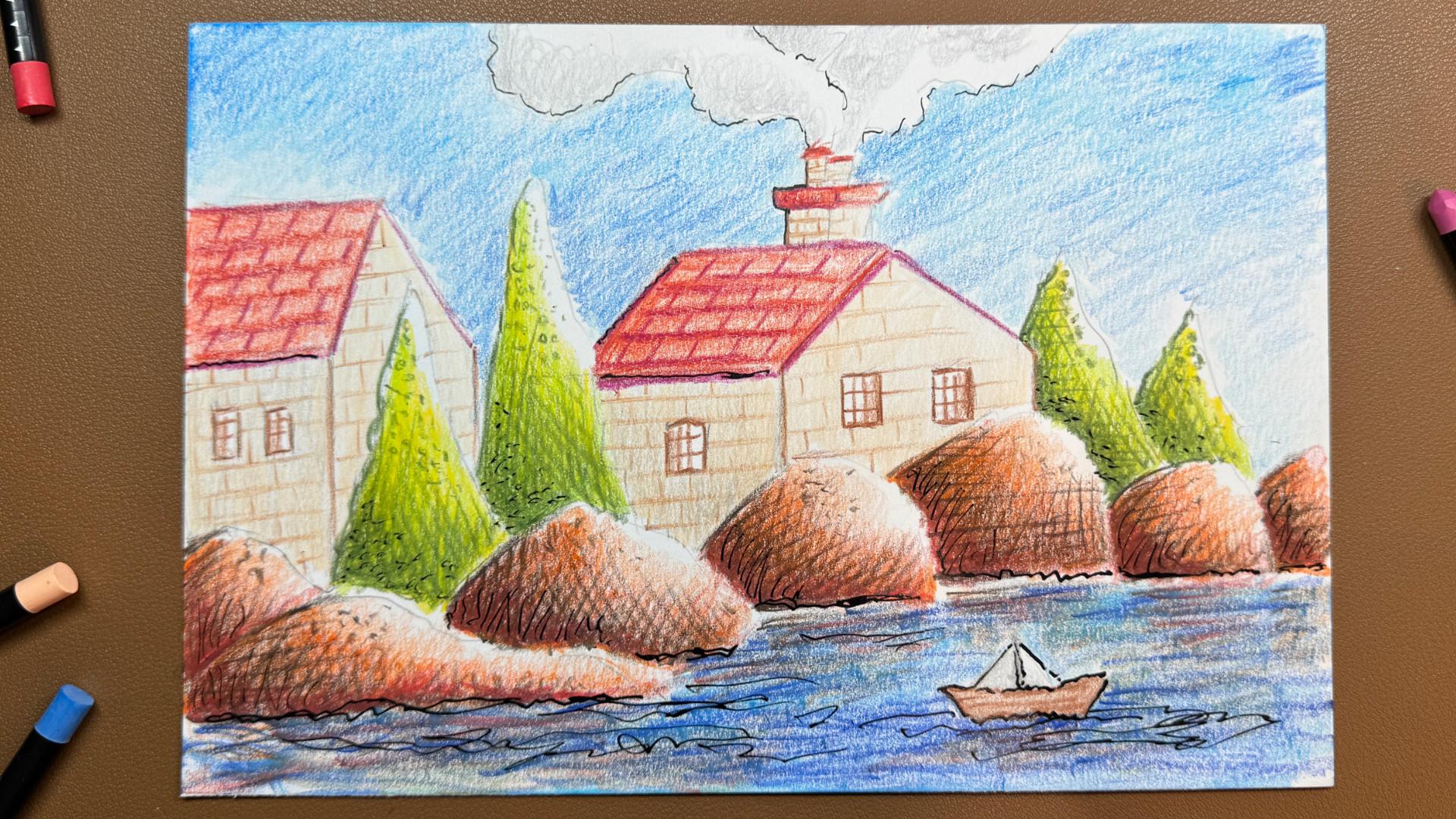
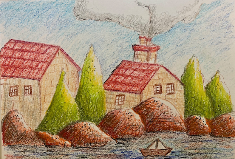
simple house as an example. So just like this,
simple house shape, quick and easy doesn't
have to be complicated, just the outline part. We don't need details
or anything like that, and maybe a little base on where that house is sitting,
just like this. And then maybe throw in a little window just to see
what details look like, and just a little teeny
nie door over here. Lovely stuff. So if you just do a simple
sketch like that, it can be similar
like what I've done, or you can do something
completely different. Just keep it really
simple so we can demonstrate our
layering technique. Firstly, what I'm
going to do is, I'm going to grab hold of
that orange color that I had. Now I'm going to go in
into this roof area, and I'm going to do a nice
layering of that swat. So I'm going to
basically start off by just going in like this at the angle that I'm
holding the line and the direction of the
actual pastel itself, just going in and adding
in that first layer, so you can see All I'm doing is just applying it just
like I did over here, and then just filling in that shape, nothing
too complicated. So that's our first layer done. Now what I'm going to do is I'm going to go across this way. So just like this, I'm going to go across
with the pastal, so that we have
our second layer. And this is building up
that beautiful pigment, and you can see how lovely
and smooth and rich and saturated it looks just by adding that second
pigment layer. So you can see that these
pastors are highly pigmented, and just with a
little bit of effort, you can get so much of
that beautiful color down. So there's that second layer. What I'm going to do
now is, I'm going to go in and add a third layer, but I'm going to
add the third layer at this area down here, so I want this area to be dark. So in a diagonal way. So I'm going in this direction. I'm just going to go in,
and I'm going to add in this third layer like this. So we're not doing
anything else. All we're doing is
just adding our layer, and then I'm going to maybe
take it up to this corner, using the same amount of pressure going
backward and forward, medium pressure, not hard. We don't want to burnish this, because if we go ahead
and burnish this, then we can't get much on So just like this
straight like that. Now you can see
there's a division. We've got this nice,
more layers over here, so it makes it a bit more
darker and more saturated, and there's a variance
to the lighter shade. So that's the layering
technique done on the roof. So what I'm going to do next is, I'm just going to
quickly go ahead, and I'm just going to fill
in these areas of the house, the front panel and
the side panel, and I'm just going to add in a flat layer just
to complete it. So I'm going to
quickly do that now. Okay, so that's the
first layer done. What I'm going to do
now is, I'm going to add in the second layer, and I'm going to go in
a diagonal direction. I'm going to do the same
for this one and this one. And then we'll see how far we want to take it. So
let's do that next. Okay, Dog, now, what
I'm going to do is, I'm going to add in a
darker area down here by adding the third layer
so that we have a nice, kind of like a shadow dark area on this side like
we did on the roof. So let's go ahead and
just quickly do that. I'm going to go in the upward
and downward direction. Again, medium pressure. I'm not pressing any
harder than I did before. And you can see that
that pigment just comes off so using this
layering technique. So just like that,
I'm just going to darken maybe up to
this point or really towards the tip over
here so that it looks a little bit more in
sync with the roof. So just like that, just going
in with that third layer, and I'm going to
leave it like that. So what I'm going to do next
is I'm going to go ahead and use the actual pastal itself
to just outline the areas. And that's what I was
talking about before when I was talking
about outlining, I'm just going to outline
it with the same color. So just like this,
if we go over here and we use a little
bit more pressure, just outline those edges. So we're effectively
creating a nice clean look, and it looks like we've basically done this
intentionally by doing light on the inside and then a nice dark clean edge on the outside,
so it's all good. So again, just outlining, like you would normally
outline, using ink. I'm just using the same color. Lovely, beautiful pastel to outline and to go ahead and
effectively just color it in. So again, these work so well. They're so versatile,
and they can be used in so many layers to produce
beautiful, beautiful results. So, again, I'm going to go in and start outlining this window, just like this, little
bit more pressure than before, but not too hard. We don't want to press too hard, that the pastel breaks on. We don't want any breakages, so just like that there, and then maybe a little
door outline over here and maybe throw
in a couple of them lines, those
hatching lines. And then maybe with the roof, we could actually use the
same color for the roof. It doesn't matter if you want to use the orange, you
can use the orange. But for the outline, I
want to use this kind of darker purple shade
and look at that. Look how nice that looks
so quick and so easy. We've just gone ahead and done a nice little sketch with
the layering technique. So what I'm going to do is
just to complete this off. I'm going to use the
orange just to add in some lines on that roof, so you can see how nice those lines look
like on the roof. Of that beautiful
layered pigment. So just like that, a couple
of lines going across, and maybe if you want to add
in some lines coming down, just to add a bit of a pattern, just to see what it looks like on the actual
layering technique. And I think we're going to leave it there, but you
know what I'm like? I don't like to leave things,
I like to complete them, so I'm going to jump in with that purple again and
maybe throw in a couple of brick lines here just to give the overall picture
a nice complete look. And if you want to
add in some color on this kind of base that we're on, you can go
ahead and do that. I mean if you really
want to do it, do it, I'm going to leave
it at that because I just want to demonstrate
the layering technique. Otherwise, I'm going to spend nearly two or 3 hours
just perfecting this, and we don't want to do that. We just want to move
on to the next one. So let's move on to
technique number two.
9. Tonal Values: Okay, Welcome back. Let's now continue with
technique number two. So let's have our attention
back on the screen, and we've got our regular
bristle board paper as we had before. And yes, you guessed it. Technique number two is
all about tonal values. So what I'm going
to do is I've got two colors for this
lovely exercise, and the names of the
colors are going to come up on the
screen like before. So what I'm going to do
is I'm going to grab hold of my this bluish color, and I'm going to focus on the top left hand
side of this page. So just like before, we'll do some of the swatch
examples on the left, and then we'll do a nice, lovely sketch demonstrating the swatch technique exercise. Okay, so bi tonal values, what we're talking about is from dark values to light values
using the same color. And all it is is
a differentiation in the pressure levels. So we're going to start
off with our first swatch. And all I'm going to do is, I'm just going to
hold it like this. So it's a good idea to actually hold your crayon or your pastel. Should I say like
this rather than pressing down like a
normal pencil or a pen. That's so you don't
get too much of a harsh line or harsh
marks initially. So what I'm going to do
is, I'm just going to hold it like this using
that sharp tip, and I'm going to go in,
and I'm just going to create this lovely swatch. Just like this using that
side edge of my tips. You can see it's
just laying down a nice little bit of
a swatch over there. And then gently, what
I'm going to do is, I'm going to release
that pressure so that it becomes a lot
lighter like this. You can see, I've got a bit of dark and I've got
a bit of light, and that's just the
total variance. And then I'm going to switch in, and I'm going to do the
same by using the tip. So this was just using the
side part of our lovely tip, and then that created this kind of rough
textured look from dark light. What I'm going to do now is
I'm going to do the same, but I'm going to use a
sharp part of the tip. So now I'm going to be holding
it like a normal pencil. I'm going to start in with
medium pressure again, not going in hard, not going in too light. So just medium pressure over here to create
this first swatch, and then I'm going
to drag it along, and I'm going to release
the pressure now. So very light pressure. I'm just releasing that pressure and moving my hand this way, so we have this beautiful swatch of tonal variants from dark. Light. That's how easy it is. So again, number one, we
did it with the side. So we had this kind
of rough texture here, so using the side. And then we lightly removed the pressure that we
had to bring it across, and we created this really nice rough texture
tonal variance, and then we did the same
with the sharper parts. So that was two little examples
of using the same color. Let's do another color, and I'm going to grab
hold of my red now. And then what I'm going
to do this time is, I'm going to go in, and I'm going to
use the sharp part to do similar one like this just so that you can see a difference in both.
So just like that, from dark medium pressure, and then slowly releasing it. Again, if you notice,
I'm doing this upward and downward motion just like we did in
application method one. So we're using that same
application method up and down with medium pressure to
create this tonal variance. Now what we can do is
we can add onto this. Remember this is still the
first layer, if you remember, the previous part where we
went through different layers. This is just the first layer. If we want to intensify this, we can go in again and
add in that second layer. So again, medium pressure again, we're not adding more pressure, it's the same
amount of pressure, and then releasing that pressure so that we have more coverage, and it looks fantastic. Look at that. Absolutely
beautiful stuff. So what I'm going to
do is just get rid of that dust that's come
off the lovely pastel, and then I'm going to move
on to the bottom part. And with this one,
I might actually go ahead and use another color. So I think I might
use maybe this green. Yeah, this is a nice
green over here again. The number of the green and this particular color will
be coming up on the screen. With this one, what
I'm going to do is, I'm going to vary it. I'm going to start off this
time by using light pressure, so really light
pressure by using the tip and a little bit
of the side of the pastor, whichever way is comfortable for you to hold it,
just do it like that. So I'm starting off light, and now I'm going to add
in a bit more pressure. Just like this, you
can see that it's creating a darker
area down here. And then I'm going to
add in more pressure. I'm going to press in
quite hard with this one. Just like that, and you can see, it's added in an
even darker tone. So we've got this beautiful
from light, medium to dark. And then to intensify
it even more, I'm going to use the sharper tip to go in over that light, not go over it too much or
with too much pressure, same light pressure there, and then increase
that pressure a little bit for that middle part. And then a nice bit
of hard pressure over here to create this
beautiful, lovely variance, and then
I'm going to go back just to blend it in nicely, medium pressure there and
just a bit of light pressure, using a few more
circular motions this time to apply that
beautiful pigment. You can see we've
got a gorgeous, dark medium, light, and
then again from beginning, light, medium, and dark total variance. And that's
all it is for this technique. We're creating these
beautiful total variances by alternating the pressure, starting off with
maybe hard pressure, then easing off towards the end, or we might be adding in low pressure at the
beginning and then adding more pressure towards the end to get a darker tone. So that's it for
the exercise part. Let's now do a quick
little sketch and apply this lovely technique so we can see what
results we can get.
10. Small Sketch: Okay, Dk, let's now do
a quick little sketch. So with my pencil, I'm
just going to go in and do a quick little sketch, and I'm sure you've guessed what I'm going to sketch. Yes, I am. I'm going to sketch a
little Huss house, again, very similar, like with
the first technique, just to keep things simple. We don't need to
complicate anything here. We don't need to
create beautiful, complex, lovely pieces of art. We can do that in
our class project. I'm sure you can't
wait to do that. But again, let's just
go through some of these techniques just to outline and implement
what we've learned. So again, just maybe
a little window here. And maybe have a door here and possibly another little
teeny weeny window there, and that's about it. So what I'm going to
do is I'm going to use those same colors
that I used before. Okay, so I'm going to
grab hold of my blue, and I'm just going
to go straight into the roof area over here. And what I want here is I actually want this to be
dark, so I'm going to go with a nice bit of
medium pressure, and I'm just going to
use the tip this time. I'm not going to
use the side part, just sticking to the tip. We have a nice layer of color. Just like that, I'm going to maintain that medium pressure and go in this direction using that application
method one, and then I'm going to slowly release that pressure so
that we have a lighter tone. So just like this, as I'm
going towards the end, I'm just going to go in
and release that pressure, so we have a nice light
tone. So look at that. Fantastic, that isn't it? We've just gone in
and quickly filled in that beautiful roof with a nice tonal
variance by reducing the pressure that we started
off with fantastic stuff. So what I'm going to
do now is I'm going to add in another layer
and do the same, so we intensify it. So again, I'm going to go in
nice medium pressure here. You can see that pigment is
looking absolutely fantastic, comes off so easily. Then now I'm going to slowly start releasing
that pressure now, and I don't want to press
down at all too hard. Otherwise, it's going to
ruin that tonal variance, and that's about it. Just like this, what
I'm going to do now is, I'm going to go in
with my lovely blue, and I'm going to start drawing in some of these detailed
lines and you can see how fantastic that is. So again, just going
across like this, not pressing too hard, just keeping everything
nice and medium, and the end part there, I'm going to leave it as it is. I don't want to enclose
it with a dark line. Otherwise, it kind of takes away from the effect of
light hitting it. So I'm actually
imagining that we've got our light source
coming in this direction, so this area should
be nice and light, this area should be nice
and saturated and dark. So let's now maybe add in
some more lines over here. So we don't have
to do them later. So just a couple of
these lovely tile lines. They're going to look good just to give a bit of an impression. And then maybe just
a little bit of a shady shade underneath
them just like that. So that they pop out, so
they look quite nice. But again, we don't need to add details at this
stage, and we're going to leave the details
for my full sketch. So I think I better
leave it at that, and let's move on
to the red color. So with the red color, again, what I'm going to do is,
I'm just going to go in. I want it to be nice and dark, on this kind of face
of it down here. And then on this
panel side over here, I want it to start off dark, but then I want it to
get nice and light where that sunlight or that artificial
light is coming in from. So I'm just going to quickly
do this on this side, just like this, left and
right or up and down, whichever direction you're in. So just like that, keeping
that medium pressure. I don't want a total variance on this side because I don't want everything to have a
tonal variance on it. It needs to have a
bit of a change. Otherwise, everything
looks the same, and we don't want
everything to look same and boring. No, we don't. Okay. So let's continue. And again, just using
medium pressure I'm using this part of the
actual lovely pastoral. I'm not going in with the tip. I'm just using kind of this edge that's attached to the tip
and kind of the side part. I find that that gives it
the nicest kind of result, and it's just easier. And you can actually feel the paper's lovely texture
while you're doing this. Again, you won't be able
to feel what I'm feeling. All you can do is
see what I'm doing. But when you come to do this, depending on the
paper that you use, you'll know exactly
what I'm talking about. So let's now maybe
just add another layer and just kind of intensify that, so we don't have
too many gaps here. We don't want it to look
like a crayon, do we? We want it to be one of these fancy pastoral
kind of things. We don't want anyone to say, Oh, you've just done that
with a crayola crayon. But then again, there's nothing wrong with creole crayons. You can go ahead and use them as well for this
class if you want, but you won't get
the most out of them because they are limited, as we mentioned, in the
earlier part of the class. So again, let's maximize the results that we can with
our lovely, lovely pastoral. So, again, I think I'm going
to just leave that as it is. Nice kind of single tone
going on over there. And then I'm going
to continue now with that same level of tone
on this edge over here. But what we'll do
is we'll add in a bit more towards the door, and then we're going to start
releasing the pressure. So we're going in light now. So I'm going in
really light now. I'm hardly touching the
surface of the paper, but I'm trying to keep
the motion of my hand in that same direction so that we don't have lines going
all over the place. And just like this, you can see very gently, very
nice and light, that pigment just touches that texture of the
paper, and look at that. We've got this beautiful, lovely little variance from dark medium, all
the way to light. And what we can do now is we can intensify it even
more to make it pop. So we've got the darkest area
that's going to be here. Let's go in this direction. And again, this is
that layering method that we went through where we're adding in layers and
creating this beautiful, complete look where it
doesn't look too blotchy, it looks nicely filled in
and smooth and velvety. So again, what we're
doing is we're mixing part of the
application method, technique one, and combining it with technique two
that we're going through to really
enhance the look. And that's what it's
really all about. We want to not really think about these techniques
in isolation. We want to be using them
together to produce the best results we can
that we really enjoy doing. So you can see there now I've intensified that lovely red, and I think I'm going
to leave it at that. Let's add in a bit
of detailed details, so I'm just going to go in, and I'm just going to go in add a bit of an edge to this like
I did in the previous one. So again, nice little
edgy edge there, maybe for the window,
a little edge and on these window bars. Nice bit of edge. You don't have to
be perfect here. Just go with the flow and
see how it turns out. We're not doing perfect art. We're just enjoying ourselves and learning some
new techniques. So again, with the
door over here, actually, what we'll do is
we'll do it on the window. So with the window,
what I'm going to do is I'm going to do a
nice dark frame. On the left hand
side, and I'm just going to do a little
bit on the inside, and I'm going to
leave that edge. So it gives it the impression that the light is
touching the whole thing, and it will look rather nice. So what we could do is we could actually change the
color up and let's maybe do that green that we
did here and do the door. So what I'm going to do is I'm
going to outline that door in the green like
this and then go in, maybe a little bit darker
on the left hand side, and then just release it so we have a nice bit of a
tonal variance within the door itself, so just that
again on the second layer. Just let it be nice and light
on the right hand side. And then you can just
go in and throw in a couple of lines
just for details, and we've got ourselves
a nice little sketch. And I'm going to leave
that base out again. Otherwise, I'm going
to end up spending too much time doing the details, but what is kind of itching me right now is that
I need to put in a couple of lines here just to complete the overall
look of the picture, so I am going to do that. I just can't help meself, can I. So again, a couple of
these brick lines here, and just a few over here, we don't want to go into the
light area just like that, and maybe throw in some
vertical ones just to add in a little bit
of lovely details. So there we go.
There we have it. We've just done
technique number two, and now all we've got to do now is technique number three. So let's move on
to that one. Next.
11. Blending: D doke. Welcome back. Let's now go through our
final technique technique, number three, which is
all about blending. So let's get our attention
back onto the screen. So what I'm going to do
is, I'm going to grab hold of my lovely color over here. I've got these two colors. Again, the numbers will come up on the screens if you
want to follow along. And what I'm going
to do here basically is just go ahead with
the yellow shade. I'm going to go in, and I'm
going to go and start adding a lovely swatch of color
using application method one, just like we've been
doing all this time. And I'm using medium pressure, and I'm going to stretch it along right to about this point. And then I'm going
to go back again and ensure that I've got a
nice, even coverage. I'm not looking for any
tonal variances here. All I'm doing is a
beautiful little swatch in one direction. And once that is done, this will enable me to show you the first type of blending that you can do
with these pastors. So that's the yellow
part out of the way. Let's now get the red. So with the red, what
I'm going to do is, I'm going to start
by adding in a layer on the corner edge of the yellow using similar
amount of pressure. Now what I'm going to
do is I'm going to let go of that pressure
and release it, so there's just a little
bit of that pigment coming, and I'm going to stop at
that midpoint over there. Then what I'm going to do is
I'm going to grab hold of my yellow again and
then with the yellow, I'm going to go over
that middle area with medium pressure in
circular motions now. I'm using circular
motions to get this overlap blending
that's going on, and I'm going to take it
all the way to the edge. Again, circular motions,
all the way to the edge. We've got effectively a two layer blend
going on over there. Then I'm going to
switch back to the red and I'm going to go in
again, from the left side, where I started off from using circular motions and
medium pressure. If you notice I'm using the tip. I'm not using the
side over here, so I'm maintaining
a nice sharp lay down of color with the tip, just like this medium pressure
in this circular motion, taking it to that middle part, and now slowly releasing that
pressure so that we have less pressure here and we have
more pigment on that side. This is all we're going
to do. We're just going to keep going backward and forward with the colors
now with the yellow. I'm going to start
off in that middle, and I'm just going to blend by pressing down with
medium pressure using this circular motion, and then switching it to the up and down application
method like this, then bringing it all the way back up to the edge
of that yellow, and you can see we're getting a really nice blend
going on over there. Now, you can do this in as
many stages as you like. You can go in three
or four times or even five or six depending on
what paper you're using. Or what type of
result you're after. But this is just
one way of doing the blend where you lay
out the first color, preferably the lighter shade, and then go over with the darker shade from whichever side you want
the blend to start with, and then you gradually
merge it in, effectively using
the layers method, and then just go in
a circular motion, start off on one end, and then just use medium
pressure to bring in that color so that it melts and joins with the other color seamlessly. And then we've got this
beautiful blend going on now. Final stage of this is
to really go in heavy, so use as much
pressure as you can to effectively burnish
the remainder, so we don't have too
many harsh lines. So I'm happy with the
red part over there. We've got a nice bit
of red going there, I'm going to use my
yellow to burnish. I'm going to use the
lighter shade to burnish. For this, I'm going to start off at the end of
the yellow here. I'm going to go in
nice and hard again, using those circular
motions. As we start affecting this area here, where we've got the melting
of colors together. You can see it's melting
away those harsh lines, and I'm just going to carry on using this circular motion with nice firm pressure and taking
it all the way to the edge. Look at that fantastic stuff, isn't it beautiful blend
of gorgeous color now. You can go in with your red, so you can go in
with your red as well and go in as
dark as you want, so a bit more pressure, firm pressure, circular
motions. And then again, releasing that
pressure as I'm going towards that mixing area
where the colors are mixing together and maybe
bringing it on the edge so that we
have more red on top. But again, this is
just an illustration, an example of some of
these blending techniques. Again, just letting
a bit more of that pigment attach
itself to the yellow, and that's about it for that. And then finally, just
giving it a little dust off, going in with the
yellow nice and hard to get rid of those
harsh lines up and down. Rounds in circular motions, whatever way you feel
comfortable with will work. And again, just making sure that we don't
have too many of these harsh areas and we get a nice smooth blend
going on over there. And I think that's
looking rather fantastic. So just finishing
off this area here. Again, pressing nice and
firm so that it blends in, so it doesn't look
too separated, just going in these
round circular motions. And it's looking great. So I'm going to leave it at
that so you can see we've got this beautiful
little blend of color. So that was the first
method of blending. The second method of blending, let's use two other colors. So I've got these
two colors here. They'll come up on the screen. Again. What I'm going
to do is, this time, I'm going to go in with this
purple shade over here, and I'm going to just add in a nice medium swatch of purple up to that
halfway point line. So we've got a nice, beautiful medium swatch of
purple going there. Fantastic. Then I'm going to go in with my blue, and
I'm going to this time. Instead of going over it, I'm just going to add the swatch in on the right hand side. Effectively, we've
got two swatches of color that are right
next to each other, literally touching each other on the edge before
we do the blend. And then we're going to swap and go back to
the purple color. And then we're going to
start doing the blend in this middle section with
these circular motions. You can see, I started creating this beautiful third
color in the middle, circular motions up and down, and then I'm going to bring
them back this way into that purple with medium pressure and look at that fantastic. So we're going to finish
it off with the blue. With the blue in
the middle area, I'm just going to bring it in, add a little bit
more pressure on this side so that we
have a complete look, bring it back in, take it over, where we've got the blend and look at that fantastic
result there. We've got this gorgeous blend
of color using our wax pad. So next, I'm just going to
use a couple more colors. So I'm going to find
some colors from my set, and I quite like these two
colors. They're quite odd. They don't tend to look
very nice together, but it's just a nice way of
testing out your pastors and having a look firsthand
to see how your colors blend. So I'm going to start off with this odd looking kind of
misty bage color over here. Again, the numbers
will come up on the screen so you
can test this out. So just like this,
I'm going to go in, and I'm going to go and add
in that first layer of color. And then this time what I'm
going to do is I'm going to bring less pressure onto
this right hand side, about up to this point. So we have less
pressure and more, so effectively, we've
got this total variance. And then I'm going to
bring in that green color, and I'm going to start in from the right side with
medium pressure. And then I'm just going to use these circular motion lines. And lighten up that pressure, and you can see it's merging
in really, really nicely. So again, I'm going to go
back to the start of it, maybe add in some more pressure to give it more saturation, and then release the pressure when we reach this middle part, then bring in that
first color again. And then again, go in dark
and heavy on the edge. And then we can go in medium
to heavy in the middle. To start doing this
beautiful burnish. You can see circular motions. They look absolutely fantastic, and the colors just
blend beautifully. Look at that, melting into
each other, aren't they? So we've got a bit
more of the green. Maybe just finish
it off over here. And I think that
one is a good one. So just like that, just
blending in those colors, and I think that's
looking rather nice. So I'm just going to finish off by selecting a few
more of colors. Let's see what we've
got in our lovely set. Oh, I've got these nice pink
and purple colors here. I think these look rather nice, so maybe start off with
the purple on this side. And I'm going to go
in light this time. I'm not going to
press down too hard. I'm going to keep the
blending very nice and light, just to show you that you
don't have to go in too hard. So just like this, circular motions up to the middle point, nice and light, and then we're going to
continue with the pink. Really, really nice and light. Again, this is just
to give you an idea of the different
types of blending we can do to produce different
types of results. And then you can see everything
is nice, area and light. We're not going in with
too much harsh color. All I'm going to do
is with the pink, same amount of pressure,
same circular motion. Go over that. Purple area. So we have an overlap,
and then again, bring it back to the end so that it looks a little
bit more complete, not pressing hard
at all on this one, very light to medium pressure. And then I'm just
going to go in with that purple from that side
going round and round, and it works fantastic. So just in the middle,
very nice and light. Keeping it nice and
airy and light. Look at that fantastic stuff. We've done no burnishing there. We've not pressed down hard. We've just blended
the colors and overlap them in a single tone, and look how nice
and airy that looks. There we go, we've got
four different kind of swatches of blending, and that's all it is. We've just got to mix and
match however we like and prefer our colors
to look on the sheet. So, what we're going
to do next is, we're going to go
ahead and do a small, little sketch to demonstrate
how easy it is to create these beautiful blends
in our lovely artwork.
12. Blending Sketch: Okay, OK, welcome back. Let's now continue and do our nice little sketch demonstrating our
blending methods. So for this one, I've
got three colors here, I've got two blues, and I've got this purply shade. The numbers will
be on your screen. Let's now start off by doing a quick sketch using the
actual pastel itself. And no, I know what
you're thinking. He's going to do another
little Husey house, but no, not for this example, I'm just going to do
some little elements that you can have around
your Husey house. So let's go ahead and
quickly sketch these in. So I'm just going to go ahead
and draw in these nice, little curvy roundy
shapes like this. They don't have to be perfect. These are just kind of
like wonky roundish shapes that form some elements to go in the foreground or in the background of your
house the house scene. So just like that,
nice and simple, maybe just finish
them off over here. These could be little rocks, or they could be
little jelly beans that are waiting to be eaten, whatever you want them to be. So there we go
three little things that are kind of
next to each other. So what I'm going to
do is I'm going to move on to my purple color. So with the purple color and
what I'm going to do is, I'm going to go in on
the bottom area here, You can see I'm just
going to add in a nice layer of that color
bottom left hand side. Again, just follow along as
you can best, otherwise, just have a look
at what I'm doing, and then go ahead and
try it out for yourself. All the outlines for all these sketches will be available in the resource packs, so do check that out if you're struggling to come up
with little sketches, and then that'll just make it easy for you to follow along. I'm just going to keep adding in more purple on this bottom
left hand side over here. I'm going to drag it on maybe
one third of the way up. Then I'm going to move
on to my second shape here and I'm going
to do the same. Just going to keep adding
on that purple just on this kind of one third way
down on this particular shape, this funny looking
shape, just like that, using circular motions, very
light to medium pressure. Don't need to press
hard at this stage, creating this effective kind
of shape building it out, fleshing it out with our colors. So the last one now, just taking it from the top just to create a little bit of a distance between each
one of these shapes so that they look like they
are just resting on an ice, a little island, enjoying
the lovely sunshine, and we can create whatever we like that
comes into our head. So let's just continue. So I've done the purple part. So let's just move
that on the side. Next, what I'm going to do is, I'm going to go in with
my darker blue shade. So with the darker
blue shade now, I'm going to start
at this level. So I'm going to
effectively create the blend that we
created in this one over here with light medium pressure and not doing any
hard burnishing. So just like this over here, I'm just going to go
ahead and I'm going to overlap it on the edge
of that purple and then take it a little
bit higher so that we have effectively
two layers of color. And just like this in
that circular motion, you can see that we're getting a nice feel of beautiful blue. So just like You can
see we have overlap, and then we've got the blue. So again, I'm just going
to continue doing that on the next one in this
circular motion here. So you can see it's
looking really good. So just bring it in over here and then bring it
a little bit down. And that way, we've got this lovely light blend going on on the bottom
half of this shape. And I'm just leaving that
top part white for now. And then I'm just going to
repeat that on the third one, so let's quickly go do that now. Okay, now you can see we've
got our two colors laid down with this overlap area between the two on
all three elements. Now, what I'm going to do is, I'm going to go ahead
and I'm going to use my lighter blue now to add effectively another
layer of color on top, just like I did with
the previous one. So just like this,
just going to add that lighter blue on
top of that area, leaving the top end of it white. We're not going to
cover it all the way. And then I'm just going
to bring in that blue on the edge just to create that overlap blend
on the darker blue. And I'm just going to repeat
this now for the other two, so let's quickly do that now. Okey doke, now, we've got this lovely first layer effect of these overlapping colors, three of them that forms
the basis of our blending. So what we're going to do now is have a little bit of fun. Let's now grab hold
of the purple. And now with the purple, I'm going to start on the
left hand side here. I'm going to go in,
and I'm going to press with medium pressure. In a light circular motion going up and down and keeping it circular to effectively add
this second burnishing layer. I'm going to take it about
up to this area here. And then I'm going to go in where the actual blue
meets the purple and go ahead and do my lovely blend in
a circular fashion. Now I'm going backward
and forward to make sure all of the areas
are nice and covered. And just like this, I'm going to build the second layer with a nice layer of saturated color in
circular motion like this. And up to that point, I
think that's looking great. You can see now we're getting that beautiful blend
of color going on. Next, we're going to go ahead and do the same
now with the blue. With that darker blue color, I'm going to start adding in more pigment, bit more pressure, taking it in like this
circular motions, and then I'm just going to leave this edge over here light. I don't want it to
be flat all the way. So I'm just going to leave
that end a bit light there, and then I'm going
to go back again, and then take it into that
light blue a little bit. So we've got a bit more of an interesting colored blend
and variance going on. So just like that, and I'm
going to bring it a bit more down into the purple
so that you can see, we have a nice merging of colors together.
So look at that. Fantastic, that isn't it? So what I'm going to do next is, I'm just going to go ahead and do the same with a light blue. Gonna press down with some
nice amount of pressure. I'm going to blend in
that light blue now. Into the darker blue area, and you can see that just by pressing a little bit
harder and just using these circular motions to effectively blend and
smooth out the color, it just looks fantastic. So I'm just going to go into this kind of white area
now with the blue, the light blue, and just with
a light amount of pressure, just fill it in, keep
it nice and air. So that it looks complete and just leave maybe the
tip of it white. So just like that, we've
just created a gorgeous, lovely little blend,
and it looks fantastic. So what I'm gonna do
now is, I'm just going to go ahead and repeat
that for the other two, and we'll have a look and
see what it looks like. Okay, Dk, now, you
can see that we've got some beautiful blending
going on over there. It just completely transforms the shape of the outline into something
super interesting, and it looks quite nice. So what I can do here is, I can just go ahead and just
maybe with a dark blue, just adding a little bit
of an outline to the edge. But again, you don't need to
do this if you don't want. It's just nice to have a
complete kind of mini sketch, if you like, just to make
it look a bit neater. Again, I'm not going to outline this area because it's
where the light is coming. Again, maybe I want
to darken some of the areas over here
where we might have a cast shadow from one object onto the other and
maybe fill in this gap. But again, it's
entirely up to you. We're not creating perfect
perspective or brilliant, perfect shadows or
realism at all. All we're doing is
having a bit of fun with our pastors and this
blending method, and you can go ahead
and explore as much as you want when you
do your class project. So That's it for this kind
of blending exercise. What I might do is, I might
just throw in a little bit of a kind of shadow on the base here. You
know what I'm like. I like to always add
in a few details wherever I can to just using
the side of that blue, just add in a little
bit more detail, so it may be that
these things are on maybe on a kind of like
a river somewhere, and that could be like water. Floating around on the floor, just relaxing and maybe
adding a little bit of blue for reflection
of our shapes. Again, you don't
need to do this, and you know I'm going to
start getting carried away. So I think I'll just do a little bit more
just with the purple. So again, just adding a little
bit more of that purple, just to make this look
a little bit realistic in this weird and wonderful kind of world that I've
just put together, like that, I think we're
going to leave it at that. So let's just give this a
little wipe away of the dust. And look back at tea,
and it's fantastic. So that was the third
technique, and yes, we've completed all three techniques that we
were talking about. So you know what that means? It actually means we need
to go for a little break. I do quite fancy a
nice dandelion tea. Yes, tea. That's what you
heard. You heard me write. I've started drinking
teas these days, but I haven't forgotten about
my coffee. No I haven't. So let's broaden our horizon and go ahead and have a nice, refreshing drink, and I'll
see you on the next one.
13. Other Mediums: Oh, that's so good that is that Dandelion goodness
absolutely fantastic. I don't want it to end. No, I don't want it to end. Okay, let's get
back to the class. I was just enjoying my Dandelion
beautiful infused tea. It's just so good that
I don't want it to end. And what I'm going
to do is going to actually put it on the side, and I'm going to have it while I do the class. So there we go. Lovely bit of Dandelion,
to give me that boost, to continue the awesomeness of these fantastic
pastors. Right? Let's get our attention
back to the screen. What we're going to do
on this section now is, we're going to go
through The other types of mediums that you can use that interact with this
lovely wax pastor well, whether it interacts or not, that's what we're going
to find out because sometimes you just want
to use a little bit of multimedia mediums
and different types of materials together just to give an extra dimension to your So let's now have
a look at the screen. We've got three
columns over here. I've got ink on the first ones, markers on the second, and colored pencils
on the third. And that's what I'm
going to be focusing on. So before we start, let's just grab hold of a color. I've got this lovely blue here. The color will be coming up on the screen if you want
to use the same color. But it doesn't really
matter what color you use for this little
exercise because it's just a kind of testing exercise of the
different mediums that you have. Now, I'm going to be using
quite a few different mediums within these three categories, whichever mediums you
have at your disposal, give them a try and follow
along with this exercise, and let's see what
results we get. So what I'm going to
do is, I'm going to firstly in each one
of these columns. I'm just going to do a simple little swatch that
we can work with. So I'll quickly go
ahead and do that. Now, Oh O kiki, we've got nine beautiful
little swatches that I just did with the same color
using medium pressure, just using the up
and down method, like we did in
application number one. So just go ahead
and do a couple of swatches with your color
that you want to use. And let's now start off by
looking at the ink column. So for the ink column, let's maybe start off with
just using a normal biro pen, so I've just got a normal
bi biro pen over here. And what I'm going to do is,
I'm just going to go in and do a little cross hatch over that swatch to see whether it actually applies and works
over the swatch of wax, and you can see it
works fantastic. So just like that,
it comes on really well and maybe do
a little kind of scribble or a small
swatch over it just to see whether we have any
gaps or adhering issues, and you can see
Biro is brilliant. So if you want to
use Biro to maybe do some outlining work or just
build in some details, you can absolutely go
ahead and do that. So let's move on
to the second one. And for the second
one, I'm going to go ahead and use my fountain pen, so I've just got my
normal fountain pen here. You can use any fountain
pen that you have. And with this, I've got my
waterproof ink inside here. So let's go ahead
and do the same. Can see there, we've got a
beautiful flow of that ink that works lovely over
our beautiful wax pastel. So again, a little switchy
swatch over here of that ink, and you can see the ink flows
really nicely on there. But do be aware that
if you've got a nice, broad nib like I have, the flowing ink is going
to come out pretty fast, and you're going to
get this puddle of ink on top of your wax because the wax doesn't have much friction with the
nib of a metal pen. So it kind of glides
on really easily. So do bear that in mind that
you're going to have to let your dry before you start
using other mediums. Otherwise, you're going to get
smudgy smudges everywhere, and we don't want to do that. No, we don't. Okay, so that's the
fountain pen done. And now the final one, I've just got my fine
liner over here. So just with this fine
liner, this is a u 0.8. Let's just do a crizy
cross hatch over here, so the lines coming
down. And look at that. It works fantastically well. Little bit of a switchy
swatch over there, and I expected it to work. And it worked. So let's just move away from
this and have a look. You can see we've got three beautiful
results with our ink. Now we can move on to
the second column, and this is the column
where we're going to be focusing on markers. So with the markers, let's see what shall we go for? Should we maybe do a nice
alcohol marker over here. So an alcohol marker just like this, doing
the same thing. This is a brush marker tip, so just going in like that. And you can see the alcohol
marker works brilliantly. And if I just want to put in a little swatch over it,
go ahead and do that. So with the alcohol marker, we've got no issues at all. Then maybe use a
water based market. So I've got a water based
brush pen over here. You're just going to
open this one up, see how this works, and you can see the water based brush pen. You can see it's coming on, but it's kind of leaving a slight gradation and
creating a bit of a texture. So let's just continue. There you go, you can
see it's working fine. Again, with these markers, you do need to make sure that you've got enough ink in them or paint in them or whichever
type of medium is inside them. So let's just do a nice
little swatch over there. You can see the flow of that lovely water based
ink is coming out, and it looks rather
nice actually. I love that textured
look that you get over the wax pastal, compared to the
one where we have the alcohol marker where
it's just completely flat, you get a bit more of a texture
with watercolor markers. So that's a bonus as
far as I'm concerned. Let's move on to the final one. We can't do any test if we're
not going to use Poscas, cause these posca pastors, we're going to be using
a Posca pen over it. So give it a shaky shake. So there we go, Posca pastors, so it's befitting that we use a Posca pastal paint marker, just like this over there. So it's going to
work brilliantly. So again, that paint just
goes on straightaway a heres, dries up really fast. So these are absolutely
fantastic and brilliant to use with
pastor counterparts. So let's just move
that one to the side. And finally, we're on
to our colored pencils. And I've got to tell
you colored pencils are my kind of go to where I work with mixed media with these pastors because
they just work fantastic, and you'll come to
see this right now. So let's move on
to the first one. This is the prisma color, so this is a wax based
colored pencils. So this should work brilliantly
over our pastor work, and you can see, Oh,
it feels so good. It just glides on, and that lovely color just appears beautifully.
Look at that. Look at that detail over wax pastel with a wax pencil crayon, so it looks fantastic. So just like this.
Little bit of pressure, you can see it adheres
on, bit more pressure. We can darken. And that's
why I think these are just brilliant to use
with our wax pastels. Moving on to the second one now, I've got my polychromos,
by Fabricstel. Now, these are oil
based colored pencils. So let's see how
these work on this, and you can see they
work fantastic. So I've got this beautiful. Cross hatch with this gorgeous turquoise color
that I've got here. And I'm just going to
do a swatchy swatch. And you can see it adheres
lovely on top of that wax, and it's going to
just work fantastic. So that one worked really well. And then finally, I've got my lovely premium arndash
luminous pencil here, and this one is
mainly wax based. So there is a bit of
a kind of discussion, whether it's all wax or
there's a little bit of oil, but I'm kind of edging towards that this is a wax based pencil. It just has premium
pigment in it. So let's just test and
see how this works, and as expected,
wax working on wax, wax on, wax on. So that looks great. So wax on another bit of wax will create lovely
colors and effect. So just like this, giving it a switchy swatch over
here, fantastic stuff. So if we stand back and
have a look at this, we can see that inks, markers, and colored pencils
work really well on top of these beautiful,
beautiful post capasto. So you can do some lovely, mixed media art, and maybe that's what you want to
do in your class project. But again, I'll leave
that adventure in your hands and you can
produce whatever wonderful, marvelous pieces of mixed media
artwork that you want so. That's it for this little
section over here. I think I'm going to take
a few more sips of my lovely lovely T. I've got a
little bit left in there, so I'm going to enjoy a
few sips of this Sit back, have a look at this exercise, give it to go, and let's now
move on to the next one.
14. Full Sketch: You welcome back. Let's
now start our full sketch. Yep, it's time to apply all those lovely techniques
that we learnt in the previous lessons and create a nice step by
step, full sketch. Okay, so on the
screen now I've got my lovely A five
bristle board paper, so just grab hold of any
paper that you like. And I've got myself a pencil. What I'm going to do
is, I'm going to do a quick little outline of
a sketch really lightly. So we'll quickly do that
for the first step. And then once it's done, we can start building our lovely pastor
work on top of it. So sit back and watch me
do a quick little sketch. Okay, fantastic stuff. We've got our lovely
little sketch of our house house and a few elements at the
front, little boati boat. Of course, can't
forget the bote boat, and a few little
elements on the side, bit of a chimney and some
smoky smoke coming out of it. So have a look at the resource sheet to see
a quick outline version of this for you to
just so that you can follow step by
step in this sketch, or alternatively, just pause
the video where you can see this outline and just do a quick little
rendering of it, so you're ready to move on
to the main parts of getting those pastors laid onto this
gorgeous little sketch. So let's move on to
selecting our pastors. Okay, so the first stage
now is to actually lay down the first layer of color using that very light
technique that we did in the blending
part of the class. So if you remember, over
here on the screen, we had these four
blending methods. What I'm going to do
is, I'm going to use this technique and this
method just to lay down few of those colors in a
very light fashion using very light to medium pressure and just basically
coloring the shapes, flat, not doing any
hard blending or anything like that in
a single layer form, and I'll do this step by step. So I'm going to go and focus
on this technique over here, and then we can carry on
and build as we go along. So firstly, I'm
going to grab hold of maybe that line colors. So the colors again,
the ones that I use are going to
come up on the screen, the color codes,
if you want to use the same colors as myself. So again, if you
want to just watch me do this until it's
completely done, and then give it a go yourself, you can go ahead and do that, or if you want to follow along
step by step as I do this, then that's entirely up to you. So I'm starting off with
this light green color, and all I'm going
to do is fill in these kind of triangular
shapes that I've got here. So I'm just going
to basically add in this lovely light color, which I don't really
like, but it works very useful to add
as a base color. And again, just adding in light pressure
there, as you can see, up and down motion, and I'm
going to leave the top of it white to that
right hand side, that kind of pointy bit. I'm going to leave that
and not color that in. So just going to do it up to this point over here,
just like that. A nice light layer of color. And then what I'm going to
do is, I'm going to go in, and I'm going to use
this wonderful green. One of my favorite
greens, this one. Again, the number will
come up at this one. I can see here it says
number 18. Beautiful color. What it's called? It's
called dark olive. What a fantastic color that. So again, that color now, I'm going to use to
overlap very lightly and gently to create that
two tone blend color. Using that fourth
method that we did in our blending technique,
just like this, just to build these
color values to give me a bit of an idea
of what I want to achieve. It's just as easy as that. So you can see here, I've just gone ahead and added in that color very
nice and lightly. Now I'm just using
circular motions to make sure that pigment
actually goes on. Again, it looks fantastic. So just that much amounts, I'm going to repeat
for this, this, and this, and I'll see
you when that's done. Okay, ok, now that's done. All four of them are done. We can move on to these
elements over here. So for these elements, I think the color that
I'm going to use is probably a nice kind
of brownish gray tone. So let's go for a nice
dark brown color, so I've got a brown here, and then maybe for the
lighter tone of it, might use bit of this
reddish brown color. So again, both these colors, the numbers will come
up on the screen. Let's now start off with
a lighter tone first. And again, I'm just
going to do these k Elements that I've
got these kind of roundy bumpy elements
at the front. So start off maybe
with this one, so you can see
this a bit easier. So just that kind of
reddish brown shade, just like I did with that one. I'm going to go in,
and I'm going to go and get it done into kind of the three quarters way
down of that shape, and it's just following the angles that I've
got the drawing in. So just do that for this first sketch that
we're doing together. And it looks fantastic. Look at that beautifully smooth, beautiful pastel colors,
gorgeous stuff, right? So that's the first layer done. Now I'm going to move on to
that darker brown shade. And again, I'm just
going to use that to overlap very gently here. We're not pressing down hard. It's not even medium pressure. It's very, very light pressure just to get that pigment off on this initial layer on this first part of getting
that color lay down. So like this, I've got this
down here, and that's it. I'm going to leave the
top part of it white. And again, I'm going
to repeat this now for all of these
elements over here, and then I'll see you
once that's done. Kiki. Now, these
elements are done, and you can see, they're
looking very nice and uniform. So, again, just
this first layer. Let's now maybe move
on to the House house, and both of these
little house houses. Let's probably just use
a single color on them. And the color that I've chosen to use is this one over here. Again, the number will
come up on the screen, a nice light color. So with this one, all
I'm going to do is, I'm just going to go in into
the house panels over here, just like this up
and down motion, just like we did in
application method number one. Nice and easy, just laying down that first layer of color, just making sure that it
covers up most of the kind of gaps of that panel house part that we've got right here. And then again, just bringing it forward over here like this. And I think that's
looking great. So just following the lines of the house just
to make it easier, using circular motions, to keep a nice smooth lay down of color. And then just filling it up
really nicely over here. And maybe this chimney
area over here, where we've got the kind
of the flat parts of the chimney area and these little chutes that
come out from the top, they can have that same color. I'm just going to
repeat the same on these two panels
of this part of this house. Ky D key. Now, that's all done,
looking fantastic. I'm just going to keep
that color to the side. And then what I'm going to do
is with my gray color here, so I've got this gray
color over here. I'm just going to add
in a little bit of dark on the left hand
side of the house. So just like this, I'm
just going to overlap it with a little bit
of this light gray. Just to give it a bit
of a variance to show that this part of the house
is in kind of shadow, kind of like a
cast shadow really of that element that
we've got there, and maybe this side as well, just a bit of gray on there, just to show a visual interest so that it doesn't look flat. So just like that there. And then again, very
lightly over here, just not pressing
down hard at all. Just remember, these
first layers that we're doing are just
very light layers, very light very, very light tone color on
top of the layers, the pressing down and
the burning shing part will come at the end. So just like that, I've
just added this gray, maybe a bit more over here to make it a bit more prominent just on this kind of bottom
half area, just like that. And I think that's looking good. Okay, so let's now move on to maybe the roof
parts of the house. So for the roof, I want to have a nice bright kind
of orangish color, so maybe this color over here. The reddy orange
color down here. I think this will look nice. So again, just going
to add in that color, follow the lines of that roof, and that's all we need to do. So just like this, just adding in that one
layer like this, and then going across like this, just to add that second
layer like we did in the application methods
to have a more saturated, more even distributed form of color onto our house
element there, and it's looking
fantastic again, only pressing very gently and
lightly up and down motion. Like that, just to
fill in all the gaps, and then just a little
bit of color on this kind of edge part of the chimney
here so that it looks great. So I'm just going to do the same now onto this roof
on this house, and then we'll have a look at what we need to look at next.
15. Smoke & Sky: Now add a bit of gray to this kind of smoky
smoke area over here. So just with that gray
color that I had before, I'm just going to add in
a little bit of light a smoky smoke color and just kind of have it
just in this bottom area of the edge of this kind of indication of kind
of smoke that we have leaving the top white and then on this kind
of puff of smoke, this cloudy smoke that
we get down here, just onto this side, just to give it a
bit more dimension. Can see that looks quite nice not to fill the whole
thing up, otherwise again. We don't want it to
look flat and boring. We just want it to
look a little bit more interesting now, don't we? That's what it's all about
creating some visual interest. So I think that's enough
for the smoky smoke. Maybe just have a
little bit more here, just that we have a bit of
a separation from the white of the paper to the color
of that smoky smoke. Okay, doke. So that's done now. Let's now do maybe the sky area, and for the sky area, I think I'm going to do
a nice light blue color. So I've got this nice
light blue color here. And what I'm going to
do is I'm going to try using the side part of the tip so that I can have a nice kind of like
uneven distribution, which will make it look
a bit more interesting. So let's just go ahead and
maybe start off in this area. So just like that, nice
bit of side part there. I don't want it to be perfect. Again, we're not here
creating perfect artwork. If you make a little
mistake or if a bit of the color spills over
into another element. Don't worry about it,
don't stress, relax, enjoy the experience of using
these wonderful pastors. That's what it's all about. Yes, it is. Okay.
So let's continue. So what I'm going to do
is, I'm just going to use that side part to quickly
cover in this area. And you can see what
I'm doing now is, I'm just going to
release some of that pressure so that we have a lighter kind
of tone over here. So we effectively get
this total variance, just a lighter tone on
the bottom part here, and then maybe going a
little bit hard on the top, just to create that
total visual interest. And you can see I'm
getting this bit of a patch over here and do you know what the
reason for that is? I wonder if you can
guess, but I've got a little bit of blue tack
stuck underneath here, which is holding the page so that it doesn't go
all over the place. I'll remove that.
Otherwise, we're going to get this big
horrible little mark. That's just going to
stay on that paper. So I'm just going to carry on now a little bit more dark on the top corner and
where the kind of edgelne of the smoke is a bit
more dark with that blue, and then slowly release
it to keep it nice, light and airy at the bottom to create that beautiful
tonal variance, and it just looks so nice, that doesn't it all created with the side of that
lovely lovely pastor. So, again, we're going to go in, maybe a bit more over here, just to really highlight that we have this
edge of this smoke. And again, it's looking great. So maybe just press down a
little bit more hard here. And I think I'm going
to leave it at that. So I'm just going to repeat the same pattern of
movement over here, so darker on the top area, and then lighter on the bottom, and I'll see you
when that's done. Okay, Dokey, that's about
it for that first layer. You can see we've
got a nice bit of coverage of pastal work
all over the sketch. We've only got this
remainder part to do, and the boating boat. So let's move on
to them one next.
16. Boaty Boat: K, welcome back. Let's
now continue and start adding in a little bit of blue
for this water area here. So for this one, I'm
going to probably use maybe this nice dark type blue color that
I've got over here. Again, the numbers will
come up on the screen. And all I'm going
to do for this is, I'm going to again
use that side part just like I did
for the sky area, just to start laying
down that color. So just like this,
I'm just going to use a side part of that
pastoral just to lay down a nice light kind of layer of pigment so that we
have a nice bit of coverage, making sure that I don't cover
up that little boaty boat, so just going around it nicely. No need to be perfect again. Maybe leave a few of these
white gaps in between the elements in the
foreground that we have here, and again, just wavy wavy kind of lines going
all the way across. Doesn't have to be perfect. This can represent
movement of water, and it looks quite nice. It's quite effective.
So just like this, left and right with
my lovely pastal. And I think that's
great for this part, and let's leave it at that So what we're going to do
is we're just going to go ahead and
do the boti boat. For the boati boat, I've got
this nice little color here. I think this color
is quite nice. For the boati boat, I'm actually going to
go in and just do a flat layer of color using the sharp tip
of the actual pastor, just like this,
backward and forward, I'm just going to do like a
solid fill in color for that. I'm not going to do
any tonal variances or any of main blending or
layering at this stage. Going to fill it
in so that we know we have the boati
boat over here. And I think we'll just leave the sails white of the paper. That's fine as it is. Maybe just use the
gray to just give it a bit of an outline
and maybe just a little bit of a shadow
on the front part here so that it looks a
little bit more distinct. Dak, now, we can
have some fun and start adding in our kind of second layer of color to bring in some nice bit of saturation. Let's start off maybe with what we started
off initially with, and that was these green little triangular shapes
that we've got here. For this one, what
I'm going to do is, I'm going to use my
lovely yellow color that I've got over here,
this lovely yellow. And let's focus on this
one on the left hand side. What I'm going to do is,
I'm just going to go in from the top part here, and I'm just going
to add in with medium pressure using these up and down motions
and then making them into circular motions as I
come down to effectively just blend all that green that's underneath it and
merge it all up, so we've got this
beautiful, lovely, vibrant color that's kind of occupying this beautiful
shape that we have here. And just like that, medium
pressure, remember. So we're just doing
medium pressure, going backward and forward. Adding in this kind of
effective gloss layer to bring out that lovely
vibrancy and saturation. And look at that, just a
little bit of pressure, bit of medium pressure
with the yellow, and it's just
completely enhanced the look of that
beautiful little shape. Okay, Doke, I'm going
to go ahead now and repeat that for
the other shapes, so let's come back to
it when that's done. Okay, Dk, that's now done. Let's now move on
to these elements. And for this, what
I'm going to do is, I'm going to go ahead and use this lovely orange
color that I've got. So again, using
this orange color to just do exactly
what we did before, and just going over that
color that we've got down as kind of the
underpainting color and just using light circular
motions just to create this beautiful blend that
covers up that undertone. And look at that. It's
just merging together, just like watercolor merges
together, doesn't it? So it's just using this beautiful blending
technique and using layers and a little bit more
pressure to bring it all together and
make it look lovely. So just like that, I'm going
in round circular motions, and then maybe up and down a bit more with medium pressure
this time, remember, just a bit more
pressure than we had before because these are so vibrant and saturated
and highly pigmented. You don't have to
work too hard with them to receive
beautiful results. So just like that, you can see how that's transformed to what it
looked like before. So what I'm going to do is, I'm just going to make
sure that I've got a little bit of that orange
that's going into the white. And the best way to do this without having too
many harsh lines is just use the side of it like we did with the tonal variances. So we're just going to lightly Use the side of it and just
touch that p. So just touch the very gently so we get
a little bit of pigment, just basically giving it a light light every
feel and look, and you can see it just blends seamlessly into the white
edge of that shape. So let's now continue and do this for the rest of them
and see what it looks like. Okay, k, we're done, and you can see how
beautiful that looks. So give that a try. And we can move on now
to maybe adding in a little bit more reflections
in the water area. So using that same orange
that I had before. All I'm going to use is the side of the actual pastor
like I did before. And then just in a
few lines and kind of little shapes and contours here just to represent a
bit of a reflection, and that just gives
it another dimension. It makes it look a
little bit more real, but not real in this fantasy
world that we've got, so just like that it enhances the overall look of the actual image itself,
this little illustration. And I think it
looks rather nice. So again, I'm just
going to go in like this and really just add in that extra layer of detail right at this stage rather than doing it at the end, it just makes it so much easier. What we can also do is we can go in and use the
green color that we had for these elements to add in a little bit of a
reflection as well. Just using that
dark olive green. Just a little bit of a kind
of reflection going in here. Doesn't have to be accurate. These are just
little impressions that we have so that
you can kind of have an idea that we are floating around in this little
world on water, and we have some
elements that are just reflecting into this
beautiful sunset day, and we can all enjoy ourselves. So let's just move on And I think we should now focus
maybe onto the Husey houses. So let's grab hold of
maybe a nice dark red. So I've got this lovely
dark red color over here. And what I'm going to do is, I want a nice sharp point now. So to get a sharp point, like we said, earlier on, right at the beginning
part of the class, we need to do a bit
of a sharp and sharp. So I'm just going to sharpen
my pastol and give this a nice little sharpen now to make sure that I've
got a good point. And remember, you want to
sharpen these really carefully because they will
break if you press too hard while you're
sharpening them, to just keep it nice
and smooth rotate that as the direction just goes within the
sharpener that you're using, and you should have a
nice, sharpie sharp point. So that's looking good, but that point is rather sharp. So I think it's just
going to break off as soon as they use
it. But we'll see. So what we're going to do is
we're going to go in into this roof area over here and start doing some outlining work. So what I'm gonna do is I'm just gonna go in. And
if, there you go. You see? I said it was
gonna break, and it broke. Predicted perfectly Again,
I'm just going to go in. I'm just going to do a bit
of outlining work here so that we can make this shape
a little bit more neater, and it can be a
bit more prominent within the overall
look of the picture. And just like that, a
little bit of line work. But again, you don't
need to do this. If you don't want
to, you can use a different color or you
can outline if you like, I am going to use a few of my other mediums right
towards the end, and I might end up
doing some outlining. But it's just nice to
actually use the pastor itself to produce some details. So just like this,
I'm going to go in, and I'm going to add these
lovely lines that go across. If you remember, we
did something similar with the exercises in
the previous lesson, and we're just repeating that here so that
you can see what it's like when you implement
it in a full drawing. So just like this, a bit of a line over there,
that's looking good. And then maybe with the side
part of the tip over here, I'm just going to go in with these circular motions to
add a bit of a shadow. It's very, very subtle. You might be thinking,
what's the point? It doesn't even
make a difference, but it's these subtle
little things that you do in art that just give
it that next level, that step of enhancement, and it just makes it
look nice, doesn't it? You don't want
everything to look flat. Otherwise, it just
looks like a cartoon. But then again, that's what
these worlds are all about. It's just about creating whatever comes in
your imagination, and then really just
laying down the color of whatever medium you're using
in however way you like. So there's no right and wrong. There's only joy. So just enjoy the
process and you can see I've added in those
lovely lines of detail, and it's just lifted
it up, hasn't it? So I'm going to do that same one now on this one over here, and then we'll have a look
and see what we're going to work on next. Oh.
17. Details: Okay, okay. So with
that same color now, what I'm going to do is, maybe just throw in a little bit of reflection lines here, where I think that the
reflection might hit. So just like this, just a
bit of a reflection line, you don't need to do
this if you don't want, I'm just doing this
for completeness. And I think that's
looking rather nice. So with that red again, I might just go in and just add a bit more detail
onto this end here, and then maybe onto
the shots over here, where the smoke's
coming out from, just a little bit
of an indication that we've got
some red up there. And I think I'm going
to leave it at that. What we're going to do
next is we're going to do some outlining work with
the actual pastel itself. So I've got that nice
dark brown color that I had before where I used
on these elements. And I'm going to start outlining a little bit of detail
within each element. So I've made sure that meat
tip is nice and sharp. So what we're going
to do here is we're just going to use that tip effectively like
a colored pencil just to do some outlining work. So just like this, I'm
just going to throw in some of these lines and then just create this kind
of direction that's all going towards the
center part over here. Letting it go in
nicely free form, and then that's just giving a little bit more
interest to the shape. And then I'm going
to use kind of like a cross hatch pattern within it just like this
from left to right, just so it indicates that we have something else going on. And then I'm just going to drop in maybe a few little dots with this brown just to
give it a bit more texture, and I think we'll
leave it at that. And you can see
that's just added that extra depth of interest. So I'm going to repeat this
now on all of these shapes, and then we'll have a look back and see what it looks like. O, you can see now it's
really brought out that extra dimension
and another layer of interest to the overall
shape by just adding this beautiful cross
hatch pattern on top of the blending and
the layers that we've got. So give that on the elements that you've
got of your sketch, adding a couple of
dots here and there. Maybe just adding
a couple of lines underneath them for
the reflection part. Again, just have a
play around with it. You don't need to follow
the steps perfectly. Have an experiment while
you're doing this that you might be able to see
other things in your drawing. You may have different elements here and there.
Just give it a go. That's what it's all
about. That's what this k step by step
sketch really is. It's kind of open
up the doors to all the different elements using this beautiful,
lovely pastor. Now, you can see we've not used any other medium apart from
the pencil for the outline. We've just done all of
this with the pastor, and you can see that it produces
some fantastic results. You can get so much detail work in this that you
don't even have to use a fine liner or ink or
anything else to add onto it. But again, that's
entirely up to you. So let's move on to these elements here and
do something similar. Okay, so for this
one, I'm going to use that lovely dark olivey
green color now, and I'm just going
to go ahead and do exactly what I did for
this using this green, so it looks a lot more neater, and it kind of combines well
with each other and doesn't look too distinct or separate from all
the other elements. So let's work on this
one here, so again, with that green, keeping
that tip nice and sharp, just going in and just
outlining the edge, and then just
throwing in some of these hatching lines
just like this, going upwards in the
direction of that shape. Then maybe just add a
couple of dots over here, just add a bit more texture, a few light dots in the white area on that
point over there, and then maybe go the
other direction to create the hatching lines and then this cross hatching
pattern emerges, and then maybe just darkening up just with the actual
pastoral itself in circular motions here in the
bottom left hand corner to create a bit of a separation
between the elements. So that will give it
another kind of level of detail just into this bottom left hand
corner over here. So you can see that it
merges together really nice, and then just by finishing it off by just adding
in maybe some of these dots in areas where
you don't see some texture. And I think that's it. That's all we need
to do for that, and that looks great,
that, doesn't it? So I'm just going to repeat
that now for the other four, and then we can move on to the next element. So
let's do that now. Okay, that's now done, you can see that the illustration
is looking really nice. It's got this kind of storybook illustration
feel to it, hasn't it? I love that style. So Another tip for you
is that if you're doing this detail work and you find that the tip
is wearing down, just stop and just do a little sharpen of
your past door just to maintain a nice clean line instead of just carrying
on with a blunt line, because the blunter the line, the more thicker
and less details it's going to be
able to produce. So do bear that in mind. As you're building
your class project or following this
sketch step by step, keep the tips nice and sharp. Throughout the process right. Let's now move on to maybe
adding in some nice, finer details onto
the Husey houses.
18. Housey House: Okay, okay, now, what
we're going to do is, we're going to use this nice little light brown
color over here to start working in some details
on the panels of the house. So what we can start off with is actually doing the window so that it kind of establishes where we want the
other details to go. So what I'm going to do is,
I'm just going to start off by just outlining
this window first. Just like this, keeping
it nice and uniform. And then maybe just throwing in a couple of
those window bars, going up like this,
maybe one on top, and maybe one at the bottoms, we have a nice
criss cross design, and then maybe just
adding in a little bit of a shadow with that same color
on the right hand side. And I think that's it
for the actual window. Don't need to do
too much with that, so what I'm going
to do is repeat that process for all
of the other windows, and then we'll continue
with the detail work. Kido ki, that's the windows done with a little bit
of a kind of tone on the right hand side on here and on the left hand
side on the other side. So just give that to go, quick, little detail
work for the windows. And then what I'm
going to do is, I'm going to actually
start off on the chimney. With the chimney, I'm just
going to go ahead and outline this edge on the left hand side. I'm
not going to do the right. I'm just going to do the left, and then I'm just going to
add in a few brick lines. So just like this
from left to right, and then few on this side, but not all the way to the end. And then on these little
shot things on the top, from left to right on that one, and maybe a few
light ones on there. And then maybe do the pattern of the bricks on this one
here and on the shot, and just a few light ones
going in over there. So that's it for
the chimney work. Let's now maybe start doing the brick lines for the
face of the actual house. So just like this, nice and
light, from left to right, don't want them to
be too prominent because then it'll
take away from the kind of attention
that you want the viewer for looking
at your actual artwork. You don't want them
to just stare at the brickwork lines and get
all confused and dizzy, you want them to look
at the overall picture, and that's the
psychology of artwork. But that's for another
class and another lesson. So let's just carry on and
do left to right over here. And I think that's
looking nice and subtle. So again, just dropping in some of these brick
lines like this. Go to continue doing them. I'm not going to do them
all the way to the end. I'm just going to have them
mainly on the left hand side. So just like this, just throw in a few of them just
for an impression. And then maybe just
outline this edge here. And that's it for that. So what I'm going to do is,
I'm going to go ahead and repeat that now on
all the other panels, and then see what we're
going to work on next. Kiki, so we've put
in a nice bit of subtle details on that house to make it look a
little bit nicer. So what I'm going to do is
I'm actually going to use this same color and focus on the boati boat quickly
to finish that off, then we can do a bit
more work on the roofs. So let's just go using
that same color, do a nice little outline
over here of the boat boat, just to make sure
that it doesn't get lot in that colorful river
that we've just designed, and then maybe just
throw few lines that go across just to indicate that it's made of
some wood panels. And then what I'm
going to do is, I'm going to just grab
hold of my gray color, and I'm just going to go
ahead and just add in a little bit more
color in the middle where we've got the
sail part here, and then maybe just
a little bit more distinct color on
the left hand side. And I think that's enough
for the impression. And then I'm going back to
that brown color again, that light brown color
that I did for this, and then just throwing
in a few kind of like lines here just to add the
effect of a reflection. And I think that's
looking quite nice. So what should we do next? Let's now maybe adding some
more details on the roof. So for that, I'm going to go in with maybe a darker color. Let's find a nice dark
color that we can use. I think we can
actually go ahead and maybe use a nice purplish shade. So I've got this purplish
shade over here. This is that one kind of purple plum type
color that we've got. And with this, what I'm going
to do is I'm actually going to sharpen this because I
want a nice sharp point. And because this is
a different color, we want to make sure that
we don't go in too hard, otherwise it will take away from the red of the actual roof. This is just to vary
it a little bit. So it depends on how many
colors you have in your set, whichever colors you have,
just work with them. Again, this is just to
illustrate to you that we can use colors
together in cohesion. So just do a little
clean off on that. And now I've got this
plum purplish shade. All I'm going to do is,
I'm just going to go in, and I'm just going
to drop in a couple of these kind of roof tiles. So just like this,
using that sharp point, throwing in a couple
of them roof tiles, making them go the
opposite direction. And you can see that that other color just blends in
so nicely with the red, and it makes it a little
bit more distinct. So just like that adding in beautiful details with
this beautiful color. Look at that.
Beautiful, isn't it? So I'm going to do a
bit more over here. Maybe just adding a nice kind of like line over here
to separate it, and then on the edge, maybe
just another outline line. So it looks a bit more separated from the rest of
the details, give it a wipe, and then I'm just going
to repeat that over here on that chimney part, just like that, maybe give it a little bit of a color
on this side here. And then maybe do
the lines that go across just to enhance that
detail of those tires. You can see by just
adding that extra line, it's just bringing out a
little bit more detail. You can see now the wear
down is going quite heavily on this because I'm pressing with medium pressure. All I'm doing to counter it
is I'm turning the pastor. I'm just turning it so it turns onto the sharper end,
and that's another tip. If you don't want
to keep sharpening, or you don't have
enough time to sharpen, then just keep twisting your actual crayon or
should I say pastor, and it'll keep going towards the sharpest part of the tip. You can only do that
for a certain amount of time before you've got
to take the sharpener out. So do bear that in mind. So I'm just given it a
little twisted twist, and I can still use
it just like that. So look at this beautiful
stuff that isn't it. It just glides on and
attaches to the paper. Fantastic stuff. I'm
really happy with that. What I'm going to do is, I'm
going to go ahead and do the outline of this part
just with that color so that it blends in nicely and shows the impression that
we have the roof edge here. And again, on this side, just adding in this color just to make it a bit
more interesting. So let's repeat that
now onto this one, and then we can have a look and see what we're
going to do next. Okay, ok, we're done on that. I just added some
extra lines with the brown on the edge of that house because
I forgot to do it, and then maybe on this one, just adding the edge
lines of the house. And I think we're nearly
done on this one. So all we're going to do now is we're going to
just have a look and see where else we can
add in some more details, and then we can actually move on to the burnishing part where we need to do
some burnishing. So what I'm going to do now is, I'm just going to grab hold of maybe this blue color over here. So with this blue color, I'm going to focus
on the water areas. I'm just going to drop in
these lines like this. Just to give more of
an impression that we have this movement
of water area, just dropping in these
lines from left to right, just using the blunt tip
that we have over here. So just like this, just adding
in these lines randomly, just following the flow of
where that water is going, just to complete the kind
of overall look of this. And you can see it's
looking really nice. So just like that, Just going to keep
adding in these lines, and then just under the boat, just going to
intensify that color a bit so that it looks a bit more real in terms of improving
the overall look of it, not realistic, of course, we're not doing realism because that's not what
this class is all about. We're just doing lovely
whimsical fantasy worlds, because that's what do. But then again, if you
want to do realism, then give it to go in
your class project with these pastors. I personally, I am not into
the whole realism stuff. It never has been kind of one of the things that
I enjoy doing, but you may like to do realism. So go for it. I'll support you in it as long as you're happy. So let's just continue
just like this, just dropping in these lines, adding in this lovely
kind of pattern effect, and it's looking fantastic. So what we're going to
do now is we're going to maybe do a little
bit of burnishing.
19. Light Burnishing: Feel that it's
missing something, so I might end up adding a little bit of red.
Let's go for red. So with the corners over here,
what I'm going to do is, I'm just going to add in a
little bit of pressure and just add this kind
of like shadow that we did on this kind
of green element here. So just with the red, I'm just going to do
this, just very, very lightly on this edge, but again, with medium pressure, not doing it too much. And then just like this,
going to continue. I think that's just going to add a little bit more depth to it. So let's just continue
doing that on all of them, and I'll see you
when we're done. Okay, Dk, I think
that's it for now. And then what I'm
going to do is, I'm just going to basically
just throw in a little bit of those kind of reflection lines that just go at the
bottom over here, just like this, just to add a bit more interest
into that water area, and maybe a few under the boat, just like that n and
lovely and beautiful. Okay, so the final step of this, I'm actually happy with the
laydown of color on this one. I might go ahead and maybe adding another layer on the sky. Actually, let's go
ahead and do that. So I think I might add
in maybe this blue, so we've got this
blue over here, this lovely blue.
It's number 33. What I might do is I
might intensify this sky. So using the side, I might go ahead and just
on the left hand side, do that overlapping method where I've got this
color just coming in. And it's just really to add a
little bit more interest to the sky because I
think it flus a little bit flat for my liking. But again, I could go on
and on and on for hours, just keep fine tuning it and adding more
and more details. I'm going to leave that for your class project
and my class project. Can't wait to do my own
class project on this, and then I can go in as
much detail as I want. Spend as many hours
on it as I want. So again, I'm just
going to keep adding a little bit of this darker
blue all on top of this. And I think that
might just give it a little bit of an
interesting kind of angle. Just to kind of mix it
up a little bit, really. It's not about finding the perfect, kind
of, like, you know, color or, you know, whatever you try to intend
to draw and you can't draw. It's not about getting
it perfect or right. It's about what
just makes you feel content and happy with the
artwork that you produce. But just make sure
that you don't stress. It's about distressing and relaxing. We don't
want to stress. There's 1 million
things that we stress about in this world,
in this life. Art should not be one of them. Art should be a solution. So let's just carry on before I get too philosophical
on you all. So just carrying on with this, just adding in that blue really. And I'm actually
going to go in a little bit more deeper
with this blue. So just like that,
just varying it, it could be that there might
be kind of a back light to this scene or image
that we're drawing. There may be some kind of like party going on at the back, and we've got this blue kind of glare coming
in from the back, and maybe from the front. And I think I'm going
to leave it nice and raw. Just like that. So I think I'm going
to leave it at that. I don't want to do too much
burnishing at this point. So what I'm going to do next is I'm just going to
do some outlining, basic bit of outlining with
maybe ink or colored pencil. But I think I'm going
to take a break. Have another tea
or maybe a coffee, might get myself a cake, and ice cream cake. So after I have my
little break and treat, I'm going to come back to this, and we're going to do a
little bit of the finer outlines with maybe
ink or colored pencil. So I'll see you once
I've had my break.
20. Final Details: Oh, look at that. The
last quarter left of my lovely Oreo filled
cream batched donut. Oh. Do you think I
should have it all? It's actually not even
mine. That's my daughter's. She's not known, but
I've just sneaked it away from the dining table
without her noticing, Shall I do it? Shall I do it? Oh, I better not. I better not. Otherwise, I'm going
to get in trouble. So let's put that dout away. I've had mine, and I'm
just being greedy. So let's not be greedy, and let's just get
back to the class. Clean me fingers. I've got all the evidence all over
me now, that beautiful beautiful aio donut. Okay. Let's now have a look at our lovely little
illustration. And you know what, I'm not going to take this any further. All I'm going to
do is two things. I'm just going to grab hold
of my light blue color. I'm going to do a slight
burnish over this water area, just like this using the side. I just want to add a bit more of that vibrant color over it. So it kind of blends
in nicely altogether. So it doesn't look
too raw or rough. So just like this, I'm going to just
use this to add a nice bit of layer of color. So just like this, I'm
just going to go in, and I'm just going
to lightly with medium pressure just covering
those kind of white areas. I don't want any of the kind
of rough paper part to show. I just want to
blend it together, so it looks quite
nice and smooth. And I think that's about it. So finally, I'm just going
to use my fountain pen now, just to add in some
little details to the boati boat over here, just to make it pop a little
bit, so just like this. Just going to add in a couple of these beautiful
fountain pen lines. So remember with
fountain pens and flowy It's going to have quite
a lot of a flow on it. So do be careful if
you decide to use your own fountain pens on this stage of this illustration. So just like that, a nice
little outline in black. And then maybe just the
bottom areas of this with that ink so that we have a bit of a mixed
media look over here. And then just here, just
on the bottom edges. I'm just going to do a
little outline like this, just to make them look a
little bit more distinct. And then, again, just like this, just with the ink, and then maybe just
throw in a couple of those inlines that just
go over the water area. Nice little scribbles
just to kind of add to the texture and the completeness of the style of the
sketch, just like that. And then I think I might
just leave it at that, or I might just add
in maybe a couple of kind of lines here where
we've got the smoky smoke, just to give it a bit
of an inky effect. So just like this on the edge, just maybe go in
with the ink and just to outline these
areas very randomly. They don't need to be perfect. We don't want to make
perfect line art. That's not what we're doing. So maybe on the edge
over here and over here and just on this kind
of like left hand side, might just add in some black, really rough scribbling it in, and then maybe a little bit here on this edge of this roof, and then I might
have a little bit on the edge of this part
of the roof as well. And maybe a couple of
lines that are just going in random directions,
just like that. It just adds a little
bit more interest and texture to the
overall effect. And again, you don't
have to do this. You can just keep it
purely to the pastor It's entirely up to you. I just like to add a little bit of mixed mediums to my artwork, just to have a bit
more fun, really. So just have a bit
more fun with ink. And then maybe just a couple of black little stipples
on these areas here, just to add a bit
more of depth and color to the kind of overall
effect of the drawing. And then just like that, a little bit more there. And a little bit more there, and let's call it
a day on that one. Otherwise, I'm just going
to keep going on and on, and I'm just going
to make it into a criss cross detailed
work of imagination. So let's leave it at that. I hope you followed
it step by step, and I hope that you learned a few of those techniques
that we did in the previous lessons
and applied them to this little step by step class that just merges it together, and now you're going to be
ready for your class project. So here comes the real fun. But before we do the class
project, let's just have a at some of the different
styles of drawings and illustrations that
you can do with these techniques and with
these brilliant pastols, and with mixed media
to inspire you for your own artwork and get you all geared up for
your class project. So let's have a look
at a few samples next.
21. Inspiration: Ki Dk, welcome back.
Let's now have a look at a few samples of artworks
and little sketches that I've done with these lovely
Posca pastls so that you can get inspired and see what type of
results you can get, and all of them use the techniques that we've
gone through in this class. Let's have a look
at the first piece over here on the main screen, so you can see on this one, I've got a nice little sketch, very similar to the one that we did in the previous lesson. But all I've done
here is I've added more cross hatching
with those pastors, and I've gone in with
colored pencils. So colored pencil work, and I've got ink outlining, and it's using that same
style of sketching. You can see over here, we've got a nice bit of blending going on. And then we've got
cross hatching with colored pencils on top
of the pastor work. And then we've got
that similar kind of whimsically scene that, you know, I love to do. So that was one example. And then let's move
on to the next one. So over here, we've got
a similar scene again. You know, what the
theme is with me. It's always house houses with a little river and some
lovely little colors, and maybe a boati bat here and there, but
not on this one. So again, similar kind of textured effect with cross
hatching on the element, a little bit of line work, and it just looks so good. And then let's move on
to this one over here. This one's a little bit more in your face, a bit more vibrant. So I kind of added in details
with a white marker pen, with some dots over here. The kind of overall look is the same as the
previous ones. I've just gone for very
vibrant saturated colors, so you can see You can have a look at all
of these kind of lines and details and then
be inspired by them. So remember, a lot of these images are
going to be available in the class resource
sheet for you to get inspired on and you can try
doing them if you want. It's entirely up to you. But it just gives you a kind of different kind of look and perspective into what you can actually achieve by using these So let's move on
to the next one. And I think the next
one I've got over here, this one is quite
a loose sketch. So if you have a look
here on the screen, this was one that I
did really quickly. So again, you don't have to spend a lot of time
with these pastors, if you've just got maybe a five, 10 minutes where
you just want to relax and just not want
to think about anything. Just grab hold of your pastors, do a quick little sketch, color it in effectively, and the entire method and approach of coloring in
using this kind of very tile medium. It's just a very
nice and relaxing feeling. It's just so therapeutic
and art in general. You know, I'm an absolute
advocate of using art as a therapeutic exercise
for mindfulness and to relax and just escape away
and enjoy the actual medium, the tactile feel of
it. So, you know, I love to use this
type of medium, and I want you to try really exploring with it so
that it really becomes part of your daily
sketching habit and using these beautiful tactile
real traditional mediums. So let's move on
to the next one. This was again, very rough, very quick and easy. And then maybe this
one over here, so you can see this one's a
little bit more different. We've got a white background. A lot of kind of focus is on the details within the elements. And it actually
looks quite nice. We've got just a
few colors here, not too many colors. So again, whatever color
palette that you have, how many other colors
you have in your set, just use them the
best you can and put a couple of sketches
together, just like this. This didn't take me more
than 10 minutes to do. It was just a quick
little sketch. Jotted it down. I don't even think I used
pencil for this one, so I just went straight
in with the pastors, and you can see you can achieve a beautiful,
beautiful result. And then I've got this one, which there is a lot of
texture work on this. You can see lows of
little texture lines, lows of little details going
on all over the place. But again, it's
just that kind of process of using the pastor, using the sharp tip of it, and then maybe using kind of the blunt part of it
or the other side. Just to flow it onto
that beautiful paper, and it just looks great. So that's another example. And then I've got
this example here. This one is very
symmetrical, very linear. So you've got a lot
of straight lines, and I've got these little
circle circle lines here on these elements here. I've even got lines, hatching lines on
the background. So maybe try this
type of a style out. You can try whatever you want. And then on the middle
for these windows, all I've done is I've just
done the little marks with the pastel in that lovely
blue, whatever work. Go for that and whatever
you enjoy doing, just go and stick to that style. So I've got another sketch here. I've got a nice big
one over here, again, similar style in this
one, on the bricks, I've got a little bit of layering work going
on over here. You can see with the brown. I've done the lines first, and then I've just added
that kind of layering of the second and third
layers of color on top. And then I've got the
Cris cross, again, similar techniques that
we did in the class, but just spent a bit
more time on the Lot more free flowing
marks over here on these elements at the front
rather than straight lines, to just random lines, to just give it a bit of a
nice pattern and kind of like a contrast between
straight and random lines. It just looks fantastic, and it's so much fun. So this Oh, this one was a
quick little sketch of my car. So I decided to just sit down and do a quick
little doodle of my car, just using those pastors. And I really enjoyed
the process. It's not perfect.
It's not accurate. I didn't come out to sketch a perfect version of
the car that I've got. I just went ahead, grabbed
hold of those pastors, open up my sketchbook, and then I just went
ahead and sketched it. So do that, try it. Just whatever you want to draw, what it may be your car, it might be like your
dinner or your breakfast, or even maybe your living
room. It could be anything. Just sketch it out
with the pastors and see what type
of results you get. I promise you it's a lot of fun. So Let's move on to maybe the last few pieces
here. I've got so many. You could take me all
day going through them. So this one, again, over here, we've got
the House house look, and we've got a lot of
houses all clustered, using a lot of the
texture of the pastor and then just adding
in a few more details. And then on this one, I've got a bit more ink work on
this one, so you can see. I've got a lot of kind of like texture detail
work with the ink. And that looks
quite nice as well, if that's what you want to
focus on, the other medium. Use the pastel to lay
down the base color, get a nice bit of
blend going on, and then go over with maybe a
marker or a black marker or a fine liner to just bring out that kind of distinct
artwork style. So that was that example there. And then a couple more examples left, just this one over here, again, very similar
to the previous one, just pure pastel work, not using any other medium here, just pastel work, Cris
cross cross hatching, lots of different
textures and layers, bit of blending, and
then some random lines. It's all Good. So let's have a look at this. Oh, and this is my
favorite paper. One of my favorite papers. Anyway, let's maybe get a
zoom back on this if we can. This is done on my
favorite great own papers. You can see with the
great own paper. It just adds a different
look to the entire artwork. So I've got a little bit
of this white smoke. You can add in white
crayon pastel work over here for highlights. It gives you that advantage. And it's just a
different feel from the traditional bristle board or cartridge paper that you use. If you have great own paper, use it and try these pastels
on it. It works great. So let's have a look at this kind of last piece
that I've got here. So for this piece, let's get a zoom back again. So this piece was very
loose, very scribbly, kind of light minded without
thinking about anything, just going ahead and just
doing a quick little scribble. And I just liked how it
turned out because it was just a quick laydown of the
pastel on the background, few little elements,
a few little kind of round circle
lines, squiggly lines. And I just liked how it looked. It took less than
five, 6 minutes to do. It's such a great stress relief, just getting that beautiful x crayon pigment onto the paper. And then after that,
you have a cup of tea, and you're like, Oh, that just felt so good. Okay? Let's see
what else I've got. I don't think I've
got anything else. I think I've got one
on the wall, actually. So this one over here, I'm pointing to that one, that middle one over there. I'll actually take it off. Shall I take it
off and show you? I think I'll do that.
Let's take it off. Show you lovely students,
what I did on this one. You can see, I'll bring this
over now and look at that A, spent a long time on this one. I actually really
enjoyed ding this one. Let's get a Zoom me Zoom back on this. I'll move
me light back. Look at that A, Beautiful stuff. I really enjoyed
diming this one. I did the drawing
out in pencil first. And then on each one
of these elements, I did the lay down of color, a bit of blending, a little bit of tonal
values over there. And then I went in heavily
with the cross hatching, and I just really liked
how this turned out. And so put it on the walls. So I think we better put
this one back before I lose it or drop something on it because there's no
glass covering on it. It's just raw pastel
work on this. Let's quickly put this one back. Oh, we've got to
put things back, A. If you take something off, you
should always put it back. Don't just leave it there. You can't have an empty wall. So again, let's get that
one back on the wall. Make sure that it's in
line with the other ones, give it a little whack. Good stuff. Okay, that
one's back on the wall. I've got this one
here. Let's just have a look at our previous one. I've actually got one
that I'm working on. I think I'll show you
that right now, actually. Let's go find it. Where is it? Where's it gone?
Where's it gone? Oh, and I've just and me frames
just fallen on the floor. Look at that me frame's
fallen on the floor. I'm going to have to
sort it out later, but I don't want
it to get damaged. I'm going to pick it up. Oh,
I've got a bad back as well. Oh, dear. There we go.
Good stuff, right? Let's put this one on the side, and I'll have to get
it framed up later on. And we can concentrate on
this one that I'm working on. So you can see on the screen, I've got my favorite paper, my lovely great owned paper
sketchbook over here. Great stuff, that one. Let's
just get a Zoom back to see. And let's just open it up on what I'm
working on currently. So let's get that one opened up. And there we have it.
You can see I'm working in that total variance that
we did in our technique. It was a second technique of the kind of technique lessons
that we went through. So I've got total variance
going on over here. You can see the entire
sketch using just one color, and I intend to complete the
sketch just using one color, and I might just do that for
my class project, actually. I might go ahead
and complete this, and then I'll post it
on the class project where we can all have a look and be inspired from each other. So that was it for this quick little kind of like inspiration
kind of lesson where you inspired by looking at
the type of things that I do with these pastors
and the techniques, coupling it up and really getting you geared up
for your class project. So let's now talk about
your class project.
22. Class Project: Kiki, welcome back. Let's now talk about
your class project. So for your class project, all you need to do
is just go through the lessons that we went
through in the class. Remember, if you have
a look on the screen, we went through testing out our lovely pastors on
different pieces of paper. Whatever paper you have, give it a little test
and have a go at it just to see how the pastors work.
And then we went through little application
techniques about using the direction of
the flow of the pastors, going up and down, using the sharp
points and coming up with these lines
and hatching lines. So give that a go.
And then we did the lovely exercises where we had different
application methods. And then we looked at total values and
total variances, and did a little sketch, and then we looked at blending
technique of blending different colors in
four different methods to produce lovely
results like this. And then we went ahead and just tested mediums onto
our colored pastors, these beautiful wax
pastels that we've got, and had a look at the
results that we got, so it gives us a bit
of an indication on what we can and can't use. And then finally, we
did the step by step So it would be great
if you can complete all those lessons and then
do the step by step sketch. And then once you've
done all that, you'll then be ready to
delve into the world and adventure of creating
your own beautiful artwork, from inspiration, from
the type of things that you've learned in the class
for using the techniques, and also the type of
work that I've done that you saw falling off
my wall over there. So T ever inspires you from your own personal life
or other artists, se that as inspiration
to come up with a beautiful piece of artwork that you can go ahead
and implement what you've learned in this
class, and once you've done, once you've done all
the lesson work, the little exercises,
once you've done the step by step sketch, and then once you've completed your own personal artwork
using these posca pastors, then all you need to do is
upload your beautiful artwork onto the class gallery. Make sure you do
that once you've completed so that we
can all see the journey that you've been on and be inspired by your
beautiful artwork. So Ensure you've done
all those steps. Click on the class project
and upload your gallery. Take as many pictures as you want of all the exercises
that you've done, the step by step sketch, and your own personal
sketch and share the enjoyment of this
wonderful medium. That's all it is, four steps
for your class project. And you're all done, and then you can
reward yourself with a beautiful warm drink
and a little treat, maybe even a donut. So I'm going to let
you enjoy the lessons, go back to them if
there's parts of them that you want to recap on, and I can't wait to see the
results that you produce. Remember, ask me any
questions you want in the class discussion about
anything about this class. Do check out the resource
sheet as well because all the information and
the steps are going to be available in
the resource sheet, including all the materials
that I've used for the class. It'll just be a nice
little reference for you to have a look at. And I'll hopefully see some beautiful work
that you produce, and I can't wait. So let's move on now to some final thoughts and
finish up this class.
23. Final Thoughts: Okay, that's it now. So just a couple of final
thoughts on the class. I really enjoyed
this experience with these beautiful postcapastors
doing my little artworks, and especially when
my frame fell down. That was a funny one. Wasn't it? I watched it back
and I actually ended up laughing myself,
laughing at myself. That's what I do all the time. So I really enjoyed the steps. I hope you enjoyed the
steps and the process. It's a little adventure, isn't it into a new
type of medium. So, I hope you went
through the lessons and did the lovely little
step by step sketch. Remember, it's not about
creating perfect art. It's about relaxing
and just enjoying that process and really
gaining that tactile, beautiful kind of
experience so that you can start using it on a daily basis in maybe your sketch book. Or just on random
pieces of paper. And it just helps
with well being, and it kind of generally
just gives good vibes, so that's what it's all about. So do check out
my other classes. I've done a whole
range of classes. I think this class may
be number 22 or even 23, I've lost count of how
many classes have done, and they're all on
traditional media. Most of them, some of
them are on digital art, and some are just some
DIY, craft style classes. So do check them out,
see what you like, and do post the work
that you do and make sure that you leave
a review on the class. So other fantastic
students like yourself, can see your experience and
learn from your experience, and we can all enjoy
this journey together. So do follow me also on
my social media channels, especially on Instagram
where I post daily. You'll see what I'll be
doing on my day to day life as a graphic
designer and illustrator. I sketch every single day. And there's always something on there that I post throughout the day so that you can keep
in tune with what I'm doing, and then maybe leave
me a little message or send me a little
thumbs up if you like, just that we can maintain this lovely connection and communication in
this world of art. So I think I'm gonna
leave it at that. I think I might end up finishing
the day now by tidying up and having a nice cup
of coffee this time. I'm a fancy a nice
coffee and a nice cake, but I think I'm gonna go out. Let's go to the local cafe and enjoy a nice
coffee and a cake and maybe do a
little sketch with our pasta pastels
in our sketch book. So I'm after that. I hope you had a good one. Take care of yourself. Don't stress, enjoy your life, and I will see you
on the next one.
 Imran Mughal, Graphic Designer & Illustrator