Transcripts
1. Introduction: Hello, everyone, and
welcome to my news class. My name is Terran Zlocafo, and I'm excited to
guide you through this crash course on portrait
drawing on tone paper. Let's about me. I'm a
professional visual artist specializing in realistic
portrait drawing and painting, and I've had the privilege
of teaching here at Scotia now the better
part of three years. This course will start
with the essentials, the materials you need, how to set up your
drawing space, and how to select strong
reference photographs. From there, we'll dive into the fundamentals
of shape design, how to shade on toned paper, and the simplification of form. Once you build this foundation,
you'll be ready to bring your skills together in a
fully rendered portrait. Along the way, I'll
share practical tips and techniques that will not only
make the process smoother, but accelerate your
development as an artist. This class is going to be one
part of a two part series on ton paper portrait drawing. So once you've
completed this course, be sure to look out
for the next one. With that said, let's jump
right in and start drawing.
2. Class materials: Alright, I'm gonna keep
this lesson concise because you truly don't need much in the way of materials
for drawing. Chances are, you already have everything
you need at home. Whether that's a
simple sketchpad or a collection of pencils. This class focuses on creating a polished, frameworthy drawing, but a lot of that has
to do with how you use your tools more so than
the tools themselves. So make use of what you have already and enjoy the process. If you're starting fresh,
all you need is a sketchpad, an eraser, and a pencil set, as well as something to
sharpen set pencils. However, there are a few tools I highly recommend if you
don't already on them, but one is a sharpening
block or sandpaper. This material really
makes sharpening your pencils quite a bit easier
relative to a sharpener. Number two is an exacto knife. Its function is to remove the wood surrounding
the graphites and your pencils so you can sharpen it to the aforementioned
chopping block. Number three is a knee eraser. It's a soft, it's
amultable eraser, that leaves no residue. You can shape it
into fine points or edges for precise lifting of graphites and even use it to creatively draw
by erasing tones. I especially love this for creating
interesting highlights. Next, we have the mechanical
eraser or pencil eraser. It's useful because of
the added precision. Some are shaped like a
pencil, others a cylinder. And it's perfect for erasing
small areas or details. Last but not least is a
white collared pencil. Giving up the drawings in
this class on to on paper, we need a way to
create highlights. Personally, I like the
white colored pencil from the Fabric Castle polychroms
colored pencil set, and also the Devin drawing
Chinese white pencil. The format is better
for more subtle lights and the latter for more
pronounced highlights. When it comes to
graphie pencils, the brands I like are
Stetler Mas limograph and the Fabric Castle, 9,000 series. But of course, you
can experiment with different brands to find
the one you prefer. Bending stumps or bristle
brush are optional. I use them sparingly, but they do have an important
ancillary role. Well, that's all for
now. Let's get to it.
3. How to Pick a Good Reference: Welcome back. And this lesson, I'll be teaching you
everything you need to know about picking the
perfect reference. Before I delve into the
qualities of a good reference, let's start with what a bad
reference photo looks like. One quick caveat, bad
and good in this context is only relevant to our
goals, which is realism. This is art after all, and a bad reference can still
be valuable for some. NumeraUo. Avoid blurry
slash out of focus Images. Pictures like this make
finding of proportions, shading and adding details ten times harder
than it needs to be. Your eyes see in
high resolution, so you should probably draw from photos in high
resolution as well. Number two, are over or
under exposed images. If your reference is washed
out or it looks like you took it in an
underground tunnel, you might have a problem. Some images can be
corrected after the fact, but I advise you to take or select photos that
are properly exposed. If you have a pro camera, work
with the raw files to give yourself the most leeway
possible in post processing. Number three, I would say avoid
flat slash even lighting. This is not a hard
and fast rule, but I find that it's
more challenging to achieve great depth and realism in these situations
working in monochrome. Fok are unnatural
poses or expressions. These can make it
more difficult to depict the subject in
a lifelike manner. A more natural countenance or expression will lead
to a more realistic. Alongside these, avoid photos
that are naturally cropped, I E, parts of head, hand, or face cut off. It tends to disrupt the
overall composition and reduce the
elegance of the piece. So now that we know
what to avoid, we can drill deeper
into what we do want. To put simply, we want a well lit high
resolution photo with good contrast and a
balanced composition. You can find photos that fit
this criteria on websites like pixels and
onspah.com to name a few. Class separation
between your lights and shadow shapes and easily
identifiable focal points, good dynamic range, and once
again, high resolution. You will learn as
this class progresses that as great as some
of these images are, it is still up to you to manipulate them to
maximize their potential. Photos from cameras
have their drawbacks. But through practice,
we can elevate these images into works of arts. That's all for now, and I'll see you in the next one. Bye bye.
4. Drawing preparation: In this video, I walk you
through my process for setting up before I started
drawing of any kind. Firstly, I like to
get on my paper and tape it to my
drawing surface. In this case, there's a
clipboard glue to my easel. I generally use
masking or altis tape, and I do not tape any part of the paper that will overlap
with the drawing itself. Reason being,
sometimes you take up the tape and it damages the
paper ever so slightly. Ergo endeavor to draw in dimensions smaller
than the paper itself. For example, make
an 11 by 14 inch drawing on a 12 by 17
inch piece of paper. After that, I grab all
the tools I need to draw and put them within
arm's reach of my easel. It is fairly obvious,
but sometimes you might leave one
or two things in a pencil case or in a
drawer somewhere and have to get up and grab it when it really should be right there. Beyond this, I like to pre
sharpen my pencils before every drawing session to save me some time once
I get down to business. It's not necessary, but
it definitely helps me get in the flow state
quicker at a given session. I sharpen them with an exacting knife and my sharpening block. The technique is
straightforward. You remove the wood bits around the graphites
with a knife. Once it's sufficiently exposed, you then roll the graphites
left to right over the sharpening block whilst
rotating it as you do so. You repeat that
process until you have a pencil lead that
is long and sharp. Sometimes I do this
for the erasers, too, if I need them to
have a particular shape. At this juncture, we're
almost ready to start. If I'm drawing from a pn outt, I will typically tape that
print to a surface near me. That could be a table,
an adjacent wall or right above the
drawing on my eso. This case, I'm drawing
from a digital image, so I'll pull up the
image on my computer, make any changes I
see fit on lightroom, and set it to full screen. With that completed,
I'll set up my lights. I use a combination of
a portable table lamp in conjunction with
the bigger NED light. Having your work fully
illuminated is very important. So if you don't have access
to good natural light, invest in some quality
artificial lights. With that said, we're good to go. I can start making some.
5. Lines and Shapes: Alright. In this video, we're going to go through a
couple of warm up exercises designed to teach you how to better utilize negative shapes, see proportions, and
maintain symmetry. First in the agenda,
we have a store. I find objects like
this to be more challenging than more
organic material. However, there is a path to
accuracy, even with this. I start off with a
Rhombus at the top. A four sides are equal and
parallel to the opposite side. You could conceptualize it as a horizontal kite to make the task of drawing
it a bit easier. Utilize your plumb lines to
verify your alignments and a ruler if you need to to help
keep those lines straight. Beyond that, I sketch out
the legs of the table, which all connect in
a triangular pattern. I notice also that
the three lines on each leg converge towards
a vanishing point. Understanding the importance of keeping these lines straight, I'm using my ruler more
often and cross checking my angles to make
sure this stool doesn't look like
it's falling over. Now I shift my focus to
the inside of the stool, wherein I can draw using
the negative shapes around the structure to
nail the proportions. Sometimes drawing in
this way taps into the more abstract aspects
of your visual processing, allowing you to see the same
thing with a different eye. Up next is drawing please. A chair. Depending
on your perspective, this is a slightly more
challenging warm up, but the idea is the same, which is testing on hand
eye coordination. I'm pretty sure I didn't
use a ruler for this one, but looking back, I
probably should have. A quick glance at the chair, and we see numerous
basic shapes coming together to form
something quite complex. I like to start with an
envelope shape and then begin to carve into that
large shape like a sculptor, wood, a mass cl. Naturally, I want to start
with the biggest angles and foundational angle breaks. With each mark I make, I'm scanning my eyes through
the other parts of the drawing to make
sure that they line up through the horizontal
and vertical plane. When I draw a line, I try
to draw it all the way through and imagine it's going through the
object and its path. This is useful because
it prevents awkward, discrete line segments, when you should have
one continuous one. Other than utilizing
negative shapes to your full advantage, you should also mimic
whatever you do on one side, on the other to ensure
how many you design. Hopefully, these sketches were
able to get you news and excited about
the journey ahead. Thank you for watching.
I'll see you soon. Bye bye.
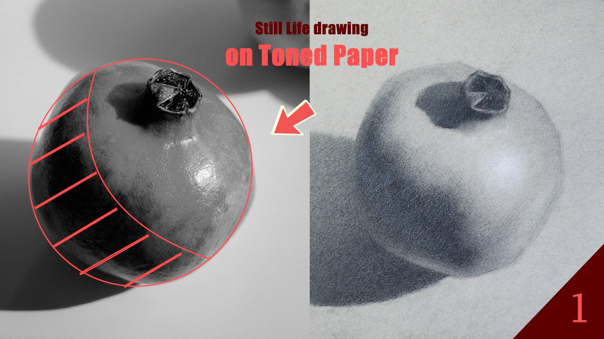
6. Understanding Values : In this video, you're going to develop a better understanding of how to transition between
values on tone paper. We'll do this through the use of a triangle, rectangle
and sphere. The idea is to create
gradients from dark to light and blend it smoothly in such a way that
it looks natural. This exercise will
train your hands and eyes to render values realistically and
ultimately create a portrait that looks
three dimensional. My approach with
the triangle is to start from the darkest
band of values, which will be at the
bottom of the pyramid. I will go in with my three
B pencil and fully express the value here
before moving on to the next band of value
and connecting the two. Breaking the values
into distinct segments allows me to better track how
my tones are transitioning. How you apply your values contribute significantly
to how it looks. Thus, I exhort you to be consistent with
your mark making. I tend to cross hatch
initially and then go in scribbling with lighter pencils to fill in the light
spots in the values. Time is your best
friend. Don't be fooled, but at the speed of this video. Values and graphite require several layers to
reach full saturation. You cannot stroke out the process by applying
more pressure. All you can do is focus on me deliberate with every stroke. Intermittently, I will
use my knee erasa to remove dark spots
in my tone and fill in said dark spots
with graphite from a lighter pencil than the
average value of that region. I'm not taking a brief detour to add my lightest light
to my white pencil. Since we are getting closer
to the top of this pyramid, I want to make sure I
key my values properly. Our darkest value has
been established. It only makes sense we do
the same for the lights. Very likely, I'll
build up the value, soften some of it
with my fingertips or a tissue paper preferably, and then add the
strongest highlights at the top of the pyramid. Now that that's done, using my two each and forge pencils, I begin to transition from the mid tones to
the lightest value, I can create my pencils. Ideally, I want the value
of the paper itself to be an intermediary between my
graphite and the white pencil. This approach is
somewhat stylistic. You could mix graphite with the white pencil and still
get a result that is good. However, you do run the risk
of getting the white muddy. So through the framework
of a triangle, you can see that
with the technique, you can achieve
good gradations in value without any special tools. If you can do it here, you
can certainly do it in the face or in a torso
with some more practice. Moving on to the sphere, you
can free at it if you want, but for the sake of efficiency, I will use this
cover that I found laying around in the
house somewhere. The idea is much the
same as in the triangle. Albeit to a slightly
different execution. Here, the lightest values
would be at the center, and from that center, we will
get progressively darker. Remember, even in this region, there are differences
in lightness. You can think of it as a
very bright circle inside a less bright circle that fades into the tone
of the paper itself. Do your best to keep your
pencil sharp and create as many layers as necessary
to achieve full saturation. Next, I'll move on to
the darkest values, which will be around the
border of the contours. I'm going to slowly go
around with my B pencils, creating a band just
like we did previously. The level of difficulty
is higher here because the shape is less linear and I can't utilize
cross hatching as easily, but it
still can be done. Once the first band of
darkest halftone is built, I progress to the next
band with lighter pencils and connect the two by using
an intermediate value. Even though this is a circle, I still use linear strokes
and build them up almost like a hexagon before rounding
off the sharp corners. If you're struggling to get your values to
transition smoothly, it's probably because one, the bands of value
are too discrete. In other words, there
is too much contrast because you're not adding the value in between the values. It could also be
you're putting too much pressure as you're drawing, and as such, the values are not smooth or contain too
much incidental value. Also, your value segments may not be loyal to
the lights efect. So if you're going from light on the inside to dark
on the outside, where you have values that
are darker on the inside than on the outside, it's
not going to look right. I advise you to periodically
scrint your eyes and check to see that the
values blend optically. If you're on the right track, it will look like there
is a spotlight at the center with everything getting progressively
darker from there. Precision is everything
with exercises like this, and it does take a
lot of practice to even be able to see what it
is that needs to be fixed. Hard edges are your worst enemy. The only hard edge on this
sphere is the outside border. Everything else is
soft. So if you see a line or a class separation between one value and another, you have found something
that needs to be corrected. You might have to use your
eraser to lighten a part of it or your pencil to
darken a particular area. Thus far, we've created ingredients in a
horizontal plane, spherical plane, and now we will do so vertically
with this rectangle. This drawing would also double
as a kind of value scale, giving you an idea of
the range of tones you will have to work with
in the final drawing. The first step is to draw out the rectangle with your ruler. After that, key the lightest values
with your white pencil. Put the base first, soften that base into the
value of the paper, and then adding the brighter
whites on top of it. With the white established, let's move on to the opposite
side of the value scale. The technique is
exactly the same. Creating band of value. Layer
with your dark pencil until that value shape is
as dark as you can get and as even as you
can possibly make it. Only then do you create the
next band and do the same? The most important thing is connecting these
bands seamlessly. In order to do that,
there has to be overlap in the
pencils that you use. So for the darkest band, I'm using my three B
pencil primarily, but also going over
to my B pencil to get into the nooks and cranies of the
tooth of the paper. For the next band, I will draw it using my B pencil primarily, but going over it in the parts close to
the last band with my three B pencil so they
both can merge visually. I will continue to
do this band by band with progressively
lighter pencil. Sometimes going over
the whole thing with my three H and two H pencils to really smooth
out the rough edges and obfuscate the light spots. Whenever you're drawn
in graph fights, you're going to get a certain
amount of visual noise. So prepare yourself to remove those inconsistencies and
tone with your near eraser. Mold it into a fine point, squint your eyes and gently dab at the areas that
appear too dark. This value scale is a continuum composed of several discrete
segments blended together. Of the core elements separating
a lifelike portrait from a not to lifelike portrait is how well the values in
the form transition. Your ability to
create a smoky effect or as the Italian says, formato, not all parts of the portraits are
handled the same. And there are, in fact, some hard and medium
edges in the face. However, those edges are not
as difficult to render as the soft and lost edges we are training
ourselves to handle. At this juncture,
I'm going back to touch up the values
all around the shape, darkening some areas,
lightning others, and unifying the tone. From this exercise,
we now understand how to manipulate our values on tone paper to create even tone across the spectrum
from shadow to light. Thank you for watching, and
I'll see you in the next one. Bye bye.
7. 3D sphere: So far, we've been working
exclusively in two dimensions, training our hands
and eyes to draw effectively on this new surface. But the time has come to add
form to this world of flats. First off, we have a sphere, a basic three D object and one that parallels features
of the human face. A good grasp of how to
shade a sphere will enable you to render
aspects of the portraits, such as the forehead,
below the nose, chin, eyeballs, and even
the zygomatic arch. Before we add value
to the sphere, we need to create an outline. You can do this with
a foreign object, as I demonstrated in
the previous lesson. However, for
instructional purposes, I am free handing the shape to show you how to approach it. I like to define the heights, find its midpoint and mark it. Then along that midpoint, I establish the width, ensuring it matches the
heights, and mark that as well. After that, I connect
the dots with erblinear lines, and
we're good to go. With that completed, the
next step is to create the shapes that define the
core and cache shadow. You can think of
the case shadow as a narrow ellipse sitting
just beneath the sphere. It's crucial to take the
time to get these shapes correct as they form the foundation for the
shading to come. If you need to erase
and redraw it 20 times, it's worth the efforts. No amount of shading
can compensate for a poorly executed line drawing. When adding value
to any drawing, I almost always start
with the darkest areas. In this case, that
is the case shadow. This approach helps
me better estimate intermediate values once I've established the lower
limits of my value scale. Accurate values do not
exist in isolation. They are only
correct in relation to what's already
present in the picture. In the case shadow, the
darkness isn't uniform. It's darkest where
the sphere blocks the most light and gradually
lightens towards the tail. Additionally, the
shadow edge is sharper, closer to the sphere and
softens as it moves outward. This is a subtle change, but it's one worth recognizing. For the form shadow, my
approach is to first create a base layer of value
with an HB pencil. I then smooth this tone with a brush to fill in the
tooth of the paper. Next, I shade the core shadow, the darkest part of
the form shadow. I aim to match its darkness to the darker parts
of the cash shadow. Building up this value
requires several layers, but once I'm satisfied with it, I move on to the areas
of reflected lights. Here actuate a gradient
transitioning from dark to lighter tones while
maintaining soft edges. A light hand and consistent
pencil strokes are essential to minimize
roughness on hard edges. Regardless, you will
likely need to refine with an erasa to achieve
a posh finished, but careful planning can make
this process much easier. Here are some common mistakes to avoid when rendering shadows. Number one, over blending them. Denting shadows
excessively will result in a muddy or overly
smooth appearance that lacks any texture. No good. Number two, outlining shadows
too harshly, drawing hard, dark outlines around
the shadow shapes instead of blading
them smoothly into the surrounding
areas will create problems down the line
that you cannot rectify. Number three, lack
of edge variation, using only soft or
only hard edges worse yet for shadows
instead of combining both. And lastly, using too much
pressure with your pencil, applying excessive
pressure can create even shading and make it harder
to erase or adjust later on. I'll leave the
shadows for now and begin shading along
the bed book line. For those of you that
are not familiar, this is the line separating
light from shadow. This area is very crucial for
the realism of the piece. The band of value I will create here will be my
darkest halftone, half tones, which however, dark, still belong in the
Light family and must necessarily be lighter than
my lightest shadow value. To ensure a successful
transition, start with an even band of value free from scattered
dark or light specs. Then use B pencils
to methodically shade back and forth
between shadow and light, softing the transition and
enhancing the spare roundness. Since we're working
on tone paper, our mid tones are
partially established. The highlights, however,
must be created. With an H pencil, light D
establish an intermediate value that connects the
darkest half tones to the tone of the paper. Subtlety is key if
you feel uncertain. Squint your eyes to check if any light areas are competing in darkness
with the shadows. At this stage, I introduce the white pencil to carefully
create the center lite. After I applying the tone, I use tissue paper to smooth out any rough edges before
refining the lights areas. This process is repetitive. I cycle through these steps
as many times as I need to so I achieve softness
and clarity in the tones. For the highlight, I apply slightly more
pressure than usual with the white pencil and then softens edges to ensure it integrates seamlessly
in that region. Finally, I take a
step back to assess the overall drawing and refine any transitions
that need improvement. For me, those are
the transitions along the bedbug line and around the darkest halftones
connecting to the centats. With those adjustments complete, the sphere is finished. I'll see you on the
next lesson. Take care.
8. 3D Cylinder: In this lesson, I'm going to
be covering the cylinder. Having drawn and
shaded a sphere, you 80% of the way
there to representing this object in three
dimensions accurately. At the end of this,
you experience drawing a cylinder will give
you more confidence when tackling areas
of the portraits like the bridge of the
nose and the neck. To start, draw ellipse
to represent the top of the cylinder much like the
cash shadow in the sphere. Once that's completed,
create two parallel lines at both extremes and another
ellipse at the bottom. You're just getting a scrap
piece of paper and practicing a handful of ellipses before
tackling this drawing. It's a simple but oddly
changing shape to create, so don't be discouraged if you don't get it
right the first time. I commence outlining
the cast shadow, which will fade to the left as the light source is
coming from the right. I built up the values
progressively, starting with my HB pencil to create a base and shifting to my two B and four B pencils to get the desired
level of darkness. Closer the shadow is to the
object that's casting it, the darker it will
be and vice versa. So make sure that the
gradient you see in the drawing on screen is
also reflected in your work. As you render these values, you must maintain an attitude of continuous improvement as it relates to the proportions
of the drawing itself. It's easy to get so caught up
in getting accurate values, but your shapes start
to look discordant. In the form shadow, the
procedure is not much different. However, in here, we
have a core shadow that must be clearly defined. Is shape is rectangular and its value similar to that
of the cast shadow. Careful wearing, the
right amount of pressure, and some patience is what
it will take to create an even band of value that
is free from visual noise. Always keep near eraser handy to minimize necessary
variation in your values. Once you're happy with the
finish of your coarse shadow, you can progress to
create the parts of the shadow that is receiving
the most bounced light, a, the reflected light. This area will be
lighter than the core, but not so light that you're mistaking it for a
non shadow value. Its tone is also not uniform. It's darker at the top and
lighter at the bottom. Know you've got the values
when you can squint and both the core shadow and reflected
light merge optically. Appropriate pencil selection will lead to better outcomes. I four B is your workhorse
pencil for the core shadow, and perhaps the two B pencil should be that for
your reflected light. No At this juncture, my shadow values
look as they should, and the logical next
step is to build the values in the life family
closest to the shadows. Those would be our
darkest half tones. As I begin this
layering process, I sporadically glance at my
reflected light to make sure I stay just below that level of darkness in these half tones. If I fail to do that, I will likely have a
finished drawing that looks flat and is missing any real
sense of dimensia. Slowly, but surely, I create a value shape here that is even, but still containing
too hard edge with the core
shadow on the left. Here's where I get on
my B pencil and blend very carefully the
shadow with the lights. Already, our cylinder
is beginning to take shape and
hatch in volume. In my two H and forage pencils, I'll connect this band of
half tones with the value of the tone paper and showing a smooth transition
between the books. Remember to darken the edges of the cylinder on the right as the form of the object
turns away from the area of most direct light. Finally, we have gotten
to my favorite part, which is bringing out
the centilite and giving this cylinder
a radiant glow. Lightly shade the middle
portion of the cylinder. In doing so, avoid
going directly over the graphite you
have already laid down. If you get the whites
on a little bit of the graphite,
it's not a big deal. Just try to keep them separate, at least until you blend
with the tissue paper. Bending with the tissue is
simple, get a piece of it, fold it into two, gently rub in a circular motion across the
pigment you've laid down. Do so until the edges of
the white pigment are soft and are fully integrated with the
rest of the drawing. At which point you can create
the specular highlights right along the center line. This highlight should
be elongated as opposed to spherical like
we had in the sphere. Is edges must also be soft, but need not be lost like
with the centerltes. Congrats to you for making
it through this video, and I'll see you in
the next one. Bye bye.
9. 3D Cube: To the of the three D objects
you've studied thus far, the cube will be the simplest. Begin by constructing a
precise square using lines, focus on proportional accuracy and ensure the
angles are correct. This will be the anchor for
the structure of the cube. Draw a second square slightly offset to the left of the first, insurance proportions
and angles match. Using confidence shred lines, join the corresponding
corners of the two squares. Repeat these same steps for the square on the top of the
cube, and you're all set. Once you're done
sketching the cube, erase any unwanted lines before beginning to draw the
case shadow shape. There is no formula per se
for this because it changes depending on the direction
and intensity of the lights. However, it's more
angular than the case shadows you've
hitherto worked on, and a tail is typically
in the shape of a triang. Once you've drawn it out,
begin to add value to HB pencil until that area is
fully saturated with tone. After that, you can deepen
the tone by blending with your brush to give
it a softer appearance. Now I can get out my
four B pencil and darken the occlusion
shadow within the cast. From that occlusion,
our shadow will get progressively lighter as more bounced light hits the shadow. Do yourself a favor and
keep those pencils sharp. I know it's a pain to have to continuously sharpen
your pencil. Believe me, I get
tired of it myself. But to achieve a softer gradient like the
one we're after, we need precise pencil strokes. Before you leave
the case shadow, go around the edges of the
tail, to your two inch pencil, and soften it ever
so slightly to differentiate it
from the parts of the shadow closer
to the objects. The case shadow,
but you guessed it, we are on to the form shadow. Form shadows occur on the
objects where light diminishes, revealing its volume in
soft gradual transitions. On the whole, the local value of this region is lighter
than the case shadow, and the flow of
value is darker on the outside and
lighter on the inside. Think of it as a
radial gradients. I'm using my two B
and B pencils mostly, but they touch at the four B to soften the edges between
the cast and the core. The top part of the tube is facing the light more directly, and as such, contains
no shadow values. However, it's not getting
much direct light, so it's half tones
will be fairly dark. Just like on this face, you
create a beast of value first before darkening the edges to create that
circular gradient. Your choice of pencil
should reflect your transition to
the lie family, and you must remember
to check that you're half tones are encroaching
on shadow territory. I know I sound like a broken
record by this point, but the key to realistic values does lie in how you
create set values. Pay close attention to how
lightly I hold a pencil, how uniform my
pencil strokes are, how often I go in with my eraser to light in
areas that are too dark. This is a process of
constant refinement until true harmony is
achieved in your tones. The last phase of the cube is receiving the most
direct light with the tone moving from light to very light in this direction. I have to be very subtle
in this area when using the two inch pencil to
avoid getting too dark. I really just want the
valleys on the left border to be one step darker than
the tone of the paper. After which I can use
my white pencil on the right border to bring out
that center light for me. I'll apply the white pigment in a few layers before blending
it with the tissue paper. Once it's blended, I proceed
to add the highlight on top, smooth it out, and touch
up any areas I see fit. Crisp pot edges on the outside, soft smooth edges on the inside. And finally, I think I can
call it a day with this one. That wraps up our exercise on drawing through the
objects and to paper. I hope you're able to get
something out of this. Thank you for watching,
and I'll see you in the next one. Bye bye. No
10. Block-In: Alright, so the first stage of this portrait will consist
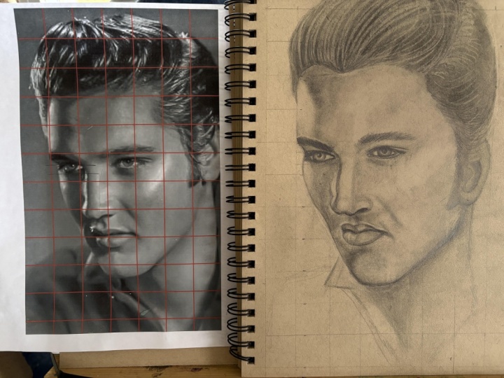
of a straight line blocking. Before that, I'll
create a square grid. The purpose of this
grid is to make finding our proportions easier. And given that this is a
beginner portrait drawing, I think it's appropriate. It's only a ruler, a sharp
pencil and your sheet before you decide on the
size of each square. Smaller ones will offer
greater precision, but they will take
more time to layout. Starting from one
edge of the paper, use the ruler to draw
a series of straight, evenly spaced vertical lines, keeping a touch light so
they can be erased later. Once these are in place, turn the paper slightly or simply shift your ruler
to draw horizontal lines at the same intervals. The crossing of these
lines will form a neat pattern of squares, each one serving as a small
frame through which you can translate details from
your reference image. Starting from the bottom left, I'll utilize straight lines and they connect
the dots fashion, simplifying the curves I see and focusing on the major angle
breaks and portraits. I'll occasionally use my divider to cross check my marks in relation to the grid and make a correction if something
looks off to me. Slowly but surely, I'll work
my way around the outside of the head until that envelope
shape is fully established. Now is a good time to pause and compare what is on your paper to what is in your reference. If you've done a good
job, the similarities between the two
should be apparent. At this juncture, I'm ready
to start on the inside. Beginning with the
shape of the hair, avoid the temptation,
be too precise. A handful of well
placed straight lines is all you need for
the right impression. With the grid, we have built in plumb lines to help
us cross check vertical and
horizontal alignment as we move through
the portraits. However, you should still trust your eyes if the measurement
says it's accurate, but it clearly
isn't, then perhaps your grid lines are not as
accurate as they need to be. The large shapes before
the medium shapes and the medium shapes
before the small shapes. I tend to make discrete
marks versus continuous ones because it's easier to do and
limits perceptual errors. Our model has a rather borbous nose with
the right wing of the nostril in full view and the left wing
partially obfuscated. The bridge blends seamlessly into the ball of the nose before rounding off into the wings
as the form turns downward. The shape of the
lef have simplified significantly with the
overlay so you can understand that the
impression is all you need at this point
to get the likeness. As long as the
features are placed correctly in relation
to each other, one does not need to have
perfect contours for the portrait to
start to look alive. A couple of V shapes on
some straight lines, and we're good to go. Next, I'll define some
of the muscles in the neck around
the shadow there, sharpen the jaw line, and
now I will begin to turn the straight line blocking into a closer representation
of our reference photo. The main difference is the
incorporation of C curves and S curves and just more
precise shapes overall. Lightly, erase the
initial marks and go over them with
more specific shapes. Take your time as you
do this and reflect on each mark you make as
it relates to the home. That's it for this lesson, and I'll see you in the
next one. Bye bye.
11. Refining the forms Pt.1: Like we started in
the previous lesson, I will continue to wipe down
the initial blocking with my new eraser and replace it
with more accurate contours. I want to erase those marks
till they are just very visible and use them as a guide to realize and
complete accuracy. By the way, I'm using
an HB pencil for this stage of the drawing
and the previous one. Don't want to use a pencil
that is too light or too dark. The former because you want to see your marks clearly and the latter because it will affect some of your shading later on. Attention to detail is of
utmost importance here. Find ways to simplify the
shapes that you see and compare them with the
marks you've already made to verify their accuracy. There are no shortcuts
to getting good at drawing, strain your eyes, to make comparisons, and make the necessary adjustments to areas that are in
need of fixing. Step back often, dot your eyes between your
work and the reference, and ask yourself,
what is different? Is the nose too
wide or too short? Are the eyes equally spaced? Are the lips angled correctly relative to the nose and eyes? The more questions you
can ask and answer, the better your work will be. Once I'm done with the
line work, I'll erase all my grid lines and start building up the
value in the hair. Notice, I see building
because it will take many layers to get the level of darkness I'm looking
for in that region. Unfortunately, we can just push harder with a pencil
and get quicker. The hair I would simplify
as a dark mass with some highlights and flyaway
hair surrounding it. When building up the layers, I'll leave some of the grid up the paper showing through
for the highlighted areas, and I will try to
follow the form slash direction of the
hair as I draw it. H. My first day of
value established, I'll use this round
bristle brush to push the pigment deeper into the tooth of the paper and create a darker,
smoother finish. Alternatively, you can
use a blending stump, cotton bud, or a tissue paper. It's the same process
for the next layer. Only now I'll begin to use
my needed eraser to pull out some highlights in the hair to create that
illusion of volume. Part of why you keep a
light hand when you're layering value so you
can do things like this. If you really burnish the
pencil into the paper, the eraser will be
ineffective in this capacity. Some of the highlighted
areas I will go over with a two inch
pencil to darken the bits. The lighter areas
of the hair should not have uniform value. So parts should be darker
and lighter than others. In addition to this, I will go around the borders of
the hair to create soft edges with my
lighted pencils and add some flyaway hairs
in different directions. You don't want to get
carried away with this and make her look like
she was electrocuted, suggestions here and
there will suffice. Your hair may not look
good, you fast ituration, but you can continue to modify it until it gives
a good impression. Less is more, minimize
value variation, indicate your highlights clearly
and soften your pinches. Do this and you'll be much closer to a compelling
representation. The fast facial feature
we will draw is the ear, shadows first in the fossa and concha to key in the lower
limits of our value scale, focusing on crisp,
dark shapes with soft, smooth transitions into
the darkest halftones. I'll leave the ear
briefly to integrate the shadows on the spin
of the head, the ear. In this region, we
have two main values, all of which are lighter
than the local value of the hair as well
as the local value of the shadows in the ear. Layer until the values are even, I use the appropriate
intermediate values to connect the two. Under the under the de We turning back to the ear, I'll add a couch,
which is essentially just a base layer value close to the average
values of the lights here. Then beginning at the
tragus and helix, I'll start sheating in the
darkest half tones and softening the edges between them and the existing
shadow shapes. Slowly, but surely, I'll make my way around
the entire ear, building up my midtones and
softening the transitions. Let's see for now. I'll
see you the next one. O.
12. Refining the forms Pt.2: In this lesson, I'll
begin by adding value to the eyes to give them a strong sense of three dimensionality. As always, I'll start
with the darkest areas, treating the pupil, tear duct, and eyelid before moving
into the iris and sclera. A few things to avoid at
this stage are number one, waiting sharp edges between the different parts of the eye. Number two, introducing
too much contrast to the pupil and iris. Number three, allowing the
values to become uneven. Take your time as you
gild up your layers, keeping in mind that drawing is a process of continuous finance. When shading the sclera, K white in the eye, remember that it is
never pure white, but rather a subtle
shade of gray. Treat it as a spare, lighter in the
center, and gradually darker towards edges. Similar to vignette. Once
the bodies are in place, I'll add a few carefully
placed marks and so just eyelashes before moving
on to the eyebrows. When drawn eyebrows, I
approach them first as a mask of form rather
than individual hairs, almost like sculpting
the shape of a brown. After establishing
the underlying form, I'll then introduce texture by suggesting individual hairs
with a pencil and eraser. This is not the only
way to render brows, but it's a method that
works consistently well. The The process for the left eye similar, working from dark to light, establishing dies first, and then softening the transitions. Since this side of the
head receives more lights, average value here will be
lighter than the right eye. Be mindful of the proportional relationship between both eyes, ensuring they aligned
properly along the vertical and
horizontal axis. Once the eyes are complete, I'll move on to the forehead. Because this area is among the brightest regions
of the portraits, I primarily use
harder penso such as TH NHP before
beginning to develop half tones along the
sides of the forehead and connecting them seamlessly to the lighter tones in the center. Think of this stage as shaping, soft controlled half tone transitions that blend into
the gray of the paper. Avoiding hard edges,
the roundness of the head is clearly
communicated. Be sure to connect
the forehead value smoothly into the hairline, the downward facing plane of the pabellaPabllla being the
area between the eyebrows. Adding a few flyaway
hairs will help cus realism before moving
on to the highlights. For highlights, I'll use
a white colored pencil. Yeah, I'm working with Darren
Drawing Chinese whites, T I sometimes also use the favor castle
polychromas whites. Apply with the light
hand, gradually building up the saturation. As you leyer vignette the highlights by
easing pressure so it transitions naturally from white light gray to the
tone of the paper. You can also bend gently
with tissue paper to integrate the highlights
smoothly into the portrait. Next, I'm ready for the nose. I'll begin by establishing
the highlights in the ball of the
nose and defining the shadows around Notice the combination of form shadows and cast shadows in this area. They should flow seamlessly
into each other or remaining dark enough not to compete with the half tings elsewhere
in the portrait. Cav reflected lights
in the shadow areas, but on the right wing, it should remain subtle and
never two lights. I also deepen the value along the middle portion
of the nose bridge, about two steps to talk on the paper tone before working
back into the bedbug line. The bug line being
the transitional edge will lighten the shadow. This helps to complete the
turning of the form of bridge. I have the natural paper
tone, several degrees value. Add a small specular highlights, such as dimension, soften
the transition lab. With a few final refinements, nose will be complete. Finally, I'll move
on to the mouth. Because the lips
are a convex form, their values move from light to dark as they curve outwards. As with the nose, I'll first
identify the highlights, slap the shadows, finally build halftones with smooth
transitions between them. The upper lip is generally
much darker overall, so avoid allowing
any values yet to approach the birdness
we see in the forehead. As you shade, follow
the natural curvature of the lips to the
cancer strokes, this will enhance
the sense of volume, but be mindful not to lay out graphite directly with
the white tensile, this can muddy the highlights
and reduce its luminosity. Once the lips are
complete, we'll return to the larger
planes of the head, continue developing
the framework established in the
previous lesson. That concludes this tutorial. Thank you for falling long and I'll see you next week. What?
13. Refining the forms Pt.3: In this lesson, I'll
begin by adding value to the eyes to give them a strong sense of three
dimensionality. As always, I'll start
with the darkest areas, hitting the pupil, tear duct, and eyelid before moving
into the iris and Sclar. A few things I v at this
stage are number one, waiting sharp edges in the
different parts of the eye. Number two, introducing to what contrast would
be build on iris. Number three, allowing
the values to become uneven take your time as
you guild up your layers, keeping in mind that drawing
is a process tuous finance. When shading the sclera,
decay white in the eye, remember that it is never pure white or rather a
subtle sheaded gray. Heated as a sphere, lighter in the center, and
gradually darker, what edged. Similar to a vignette. What's
the body sign, please. I'll add a few carefully
place mark to suggest eyelashes before moving
on to the eyebrow. When drawn on brows, I
approach them first as a mask of form rather
than individual hairs, almost like sculpting
the shape of a brown. After establishing
the underlying form, I'll then introduce texture by suggesting individual hairs, both a pencil and eraser. This is not the only
way to run the browns but method that works to locks. The Bosses for left eye similar. Working from dark to light, establishing bodies first, and then softening transitions. Says this side of the head
receives more lights, average value here will be
light than the right time. Be mindful of the proportional
relationship between eyes, ensuring they aligned properly on the vertical,
horizontal live. Once the eyes are complete, I'll move on to the forehead. Because this area is among the brightest regions
of the porpts. I primarily use
harder pentil such as THNHB before
beginning to develop patterns along the sides
of the forehead and connecting the obstinac
lighter tones in the center. Think of this stage of shaping soft controlled pathn
conditions that blend into the grow
avoiding hard edges, the roundness of the head,
clearly communicated. Be sure to connect
the forehead value smoothly into the hairline, the downward facing
plane of bella, developing the area
between the eyebrows. I a few flyaway hairs will help csialism or moving on
to the highlights. Highlights, I'll use a
white colored pencil. Yeah, I'm working with pair
on drawing Chinese whites, I sometimes also use the
paper Castle polycas whites. Apply with the light
hand gradually building up the saturation. As you layer net the
highlights by easing pressure. You transitions from white light gray to the
tone of the paper. You can also bench and with tissue paper to integrate
the highlights. Moving into the pot. Next, I'm ready for the nose. I'll begin by establishing
the highlights in the ball of the
nose and deciding the shadows around Notice the combination of form shadows and cash shadows in this area. They should foresee nothing
to each other or remaining dark of what's piece of the
half homes. All forward. Careful reflected lights
and shadow areas, par on the right wing. I should remain subtle
and never two lines. I also deepen the value along the little
portion of the nose bit about two steps do on the pap toon before working
back into bedbug line. The bug line a traditional
edge with lightning shadow. This helps to complete
the turning of the form of bridge out of the
natural peptone, so as the pace value. That is small
specular highlights, such as dimension, softening
is transition into a lab. A few final requirements, those will be complete. Finally, I'll move to the mouth. Because the lips
are a convex form, their values move from light to dark as they curve outwards. As with the nose, If
identify the highlights, slab Shadows finally
build halftones. It's more transition them. The upper lip is generally
much darker overall, so avoid allowing any values yet hardness we see
in the forehead. And you shed, follow
the natural curvature of the lip to the cancer stroke. This will enhance
the sense of volume, but be mindful not to lay graphite directly with
the white pencil, this muddy the highlights
and reduce its huminosity. Once the ellips are complete, we'll return to the
larger planes overhead, continue developing
the framework established in the precessing. That concludes. Its tutorial. Thank you for flying along. I'll see you next week. Bye bye.
14. Class Project: This video, we're
going to be talking all about the class project. Now that you completed
the first part of this course on
ton paper drawing, it's time for you
to put your newly acquired skills to action. Using the reference photos provided in the project
and resources section, your task will be to create a fully rendered
portrait from one, two, three, if not all
of the images provided. The more reps you
can get in with different faces on the
different lighting conditions, the more well
rounded you will be. I suggest before diving into the portrait directly
that you continue to work on those
preliminary exercises such as shading the cube, the spare, the cylinder,
or just practicing creating ingredients from
dark to light on tone paper. Once you've completed
your drawings, or put them here for feedback, and don't hesitate
to ask questions. I'm more than happy to
give your feedback and advice to get better as
you continue to improve. Remember that I'm here to help, and I'm truly excited to watch your progress and see the beautiful portrait
you all create. Thank you so much for
watching, and I'll see you on the
next one. Bye bye.
 Terence Zulu, Fine Artist & Teacher