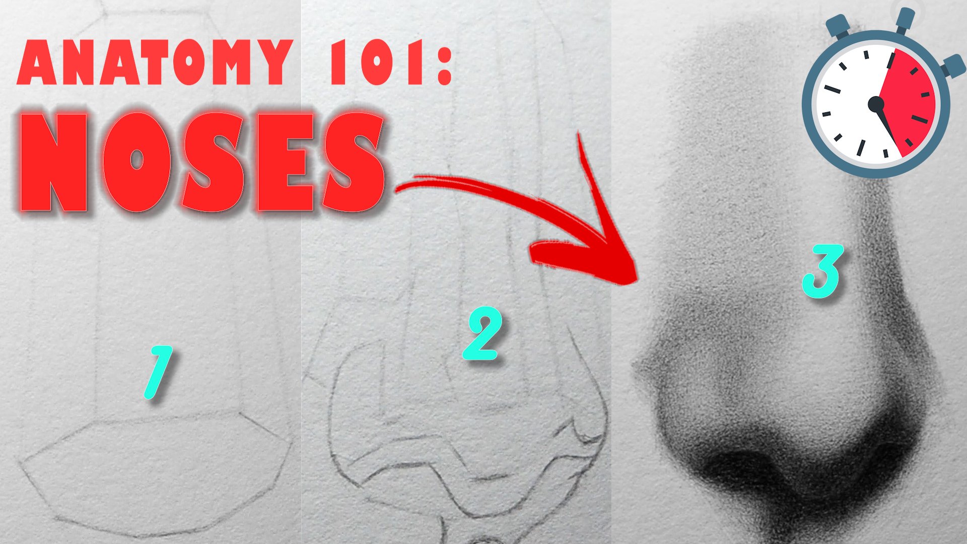
Transcripts
1. Welcome: Everyone welcome to
my newest class on still life drawing.
My name is Bube. I'm an artist and
educator in on Scotia. I've been teaching
painting and drawing in real life and online
for the past years. This will be the
first of a series of classes on to paper drawing, and the goal here is to teach
you how you can achieve a high degree of realism working from your
midtones outward. I'll go over the tools you
need to get the job done before diving into my process for constructing the drawing, bringing up the values, and finally, adding
the finishing touches. Along the way, I'll
doing useful tips and tricks for a
ton paper drawing, shows how you can avoid
some common mistakes while working on
this new surface. I guarantee by the end of this, you'll have a much deeper
understanding of how to create a compelling representation of any still live on tone paper. So if you're ready,
a schedule on.
2. Materials & Class project: Right. So for this
class, the materials you need are a
graphite pencil set, a couple of different ***, a needed one and a
pencil one, preferably, a sharpener, a tone sketch pad, and a white colored pencil. If you don't have a
white colored pencil, you can use a white
pastel pencil, the result should
be pretty similar. Basically the tools you need are the same tools
you would need for a graphite pencil drawing with the addition of
the white color pencil. Just about all of
these, you can find at your local art store or shopping online in
places like Amazon, errs, Atarama,
Dilick, et cetera. I have the brands that I use for the different materials
listed on screen, but feel free to use
a different brand if you find that it
works better for you. Before I let you go, I'll talk briefly about your
class projects. Luckily for you, this
one is pretty simple. Your task will be to draw
and shade a spare on tone paper drawn upon the instructions in
the video lessons. Like the food that you drawing, imagine your light
source is coming from the per right hand
porn and strive for your class separation between your light and shadow values. Addition, the ling
of your forms, that is to say how you
gradate your values from light to dark
is very important. Subtlety, patience and
attention to detail will be necessary for you to achieve the results
that you are after. If you can successfully
share this fare, you'll have a much easier time drawing the fruits when you decide to in spite of the
increased level of complexity. However, understand going in that you might have
to try more than once more than twice before you get a drawing that
you're happy with. But if you stick with it, eventually, the
hard work will kay. That's all for now, I see
the next one. Bye bye.
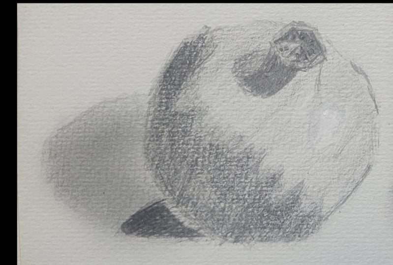
3. The Outline : Hello, guys, in this video, we're going to be drawing this pomegranates
on gray tone paper. For this drawn,
you're going to need a set of graphite pencils, an eraser, a sharpening tool, and a white colored pencil. This tutorial will be the
first part of a series of classes on realistic
drawing on Tone paper. We will start it from the
simple to the complex, and build up our
skills as we go. So the first task will be to create an envelope
shape for the foots. Using straight lines,
you want to make a best guess of the overall
gesture of the shape. This parmigant is rectangular with some curves
rounding it out, a reality that must be considered as you
create your outline. Be wary of overthinking
your marks at this stage, you want to trust your eyes
and draw what you see before using a divider or anything else to cross check
your accuracy. You have to have
something on paper first before you can judge
whether or not it is exact. Oh. Right now, I have a
base shape established. I will still make little
tweaks to it as we go along, but it is enough for me
to move forward with. It's helpful to
draw a center line down the middle of the fruits, particularly because
it's tilted at an angle, and we want to maintain symmetry
throughout the drawing. At this point, I can begin to define the smaller
shapes within the foots, beginning with the calyx
of the pomegranates, which is circular overall, or it's on straight lines, creating key angle breaks. Use as few lines as possible, generate some 7-9 to define the shape and ignore
any details that you see. The same advice applies the
shadow being cast at Calix. The form shadow on the
foot is downward sloping. It's also irregular
in the pattern it creates along
the bed pug line. Also, pay attention to the
fact that this pomegraate is about one third shadow
and two thirds lights, so we don't want to exaggerate the size of the shadow shape. Else it's going to
look inaccurate. A As I'm sketching in the Badg line, my goal is not to
mimic exactly what I see in my reference, but to capture the essence of the pattern to create
something that looks natural. The key to that
aural aesthetic is irregularity in the
shapes and cons. If you find that you're
struggling with this parts, you might want to try and
copy the reference because our instincts as human beings
is to repeating patterns. If it's too uniform,
it will look weird. Wout approaching the
end of this stage, feel free to erase any
construction lines, add the smaller
shapes in the calyx, and make any other tweaks
to the drawing that will better set you up
for the valley block in. That's all for now. I'll see you in the next one. Bye bye.
4. Value blockin: With the outline behind us, we are now ready for
the value blocking. In this stage, we
will be mapping out the larger
forms of the fruit, creating our shadow
and light values without fully expressing
the entire value scale. Starting in the
shadow, we want to create one even tone
across the board. Use a B or two B pencil preferably and be consistent with the direction of
the marks you make. How you apply the tone, a
fix how the tone looks, so fight the urge to zigzag or push hard your
pencil on the paper. Put the pencil close to edge and draw with your arm more
so than your wrist. Eventually, we will add more variation
within the shadows, but for now, we don't need them. For the cash shadow, think of it as an incomplete ellipse. You don't want to make
it too round like a circle or too
elongated either. Once you draw that out,
build up the value in the shape to match the rest of the shadows in the
form of the fit. If you want you going to cross
had like I'm doing here, as long as there's
consistency to the hatching, the results will be just fine. Our basic light and
shadow dichotomy that has now been created. Now is the time to return to the shadow and begin
to develop the values. You can break the form
shadow into two basic parts. The core shadow and an
area of reflected lights. The core shadow is the
part of the shadow where light is the most
included or absent, and consequently it is the darkest parts
of the form shadow. It does not benefit
from direct lights or reflected light
for that matter. Start defining the
core shadow with your two B and four B pencils, layering them one
step at a time, and gradually building up a value to near full saturation. Pay calls attention
to the surface area of the core shadow and make sure to leave room at the
bottom for where the reflected lights
will have its influence. Now, I'm going to go with a lighter pencil and darken
the reflected light, making sure the section
which is receiving less light is a little
darker than the rest. In the shadow cast by the calyx, we have two distinct values with soft edges connecting them both. While we're on the
topic of edges, most of the edges on the inside of the form will be soft or lost with a few hard edges in areas where the form
turned abruptly. We'll get into your
details of this later on. But do keep in mind
that to soften edge, you have to use an
intermediate value between the areas
you're trying to blend. The next step will be
to use your HP and each pencils to
create half tones around the bedbug line, AK, the point at which
shadow mets lights, Mt up those values
one layer at a time and keep the variations in
the values to a minimum. Because you're drawing
on to on paper, the value of the paper will be the bridge between the
half tones we create now, and the lights will create
that white pencil later on. Before I go any further
up the drawing, I'll soften the tone we have in the cast shadow of the tissue, just e create some variation in the aesthetic quality
of the drawing. This step is optional, but maybe beneficial if your
values appear too rough. Under. Now it's time to pull out your white color pencil
to create the highlights. We waited until the
end to do this because the highlight is
not really a part of the form of the pomegranate, but it's still unimportant
elements nonetheless. Think of it as
icing on the cake. Icing is great, but
useless if the cake sucks. Using our reference
photo as a guide, we will start with
the brightest part of the highlight and move outwards from that center with slightly darker versions of it. The highlight is giving
the same attention as any other parts
of the drawing. Layer carefully, soften the
edges between the values of control pressure and create the soft but specific
shapes that you see. Before I wrap up this
stage, I'll go back to the bedrock line
with my B pencil and increase the sense
of reform turning by darkening the half pones
closest to the shadows. We don't want to overdo this and make the hafnes too dark, just a minor
modification to get us closer to a sense of
three dimensionality.
5. Shading the shadows: From now on in this
drawing, we're going to be making marks with the end
result fully in mind. Beginning in the
shadows, we're going to establish the lower limits of our value scale and develop the tones to the
maximum darkness. I'll start with the core shadow because it's the darkest
part of the shadow, and patiently build it up
one layer at a time until I'm happy with both
the surface area covers and the value. If you notice, I'm
consistent with the direction of
my pencil strokes, and I'm not jumping around
all over the picture. As a beginner, you
can make your life easier by ticking things
one section at a time, so you don't get overwhelmed by the complexity of
your reference image. Another thing to keep in
mind is that pencils, especially the darker ones, get blunts really fast. So you want to develop
the habit of constantly sharpening them so you
can get even tone. Along those lines, you needed
esa is your best friend. Use it to pick out the
inconsistencies in the tone and go over those areas
with a lighter pencil if you got two lights. The same methodology applies
with the reflected light. Stop by building up your
values in the darkest areas and move outwards to the
parts catching more lights. A common mistake here is to
make the reflected light too bright as though it is
a part of the light family. The lightest part of the
shadow, either reflected light, still needs to be darker than any value in the light family. The second most common
mistake is to create hard edges between
the core shadow and the reflected lights. They should blend seamlessly and merge optically when
you squint your eyes. So make the efforts to blend
the edges, not by smudging, but by sheeting the appropriate intermediate value
between the two. If I go a bit too
dark in an area, I just take up some of the
excess grab bite with my sa, and then go over the area again till I achieve my desired value. With my shadows, I try to err on the side of
being too dark, and then dally back
light if I go too far. In the shadow cast by the calyx, we have the occlusion
shadow and the cast shadow. The pipe light is
the most ocluded, and the rest of it but we might be getting some bound slights. The specific names
don't matter too much. What we care about
is that there is a darker section
and light section, and the values here
should be in harmony with the values we have
hilto established. So make sure that as you work, you dart your eyes back to the form shadow and make
any necessary adjustments. On the inside of the calyx, we see some complexity
we have to simplify. My strategy is to get
the values figured, ignore the details
in the form of the specular highlights and create a base that I
can work out from. Then get my ersa to
start adding details and go over those areas still with my pencil to blend them
in with the environments. You don't want all
the highlights to be the exact same value if you care about natural
looking fruits. We can also soften the edges around the right
side of the Calyx, to merge them with the dark half tones in that region before returning to the calyx to harden some edges
and add more detail. And the next video will render
the cash of the fruits, applying the same
principles and striving for a realistic looking fish. Thank you, and
I'll see you soon. Bye bye. D.
6. Refining the forms/Finishing touches: With our shadows
firmly established, what remains is to give life to the lights in our picture. We will start at the
bedbug line using our HB and B pencils primarily to gradate the valley
from shadow to half toe. As always be consistent with
the marks that you make. You can cross hatch
hatch stiple, whatever, just make marks
all over the place. In the reference, you can see
this band of value growing across the fruits representing
the darkest hac tones. This is our primary focus, approximating the shape values and the edges surrounding it. As you're just focusing on
getting the shape rights, then the value, and
finally the edges. Breaking it down this way, we
allow your brain to process the information more easily and hopefully lead to
a better result. For the shape, all that
matter is that you come close to what you
see in your reference, and you remember that
this is a value shape, so it should be soft and
not easily identifiable. This is realism
after all, and when you see pomegranate
in real life, you're not going to
see the shapes in the part of form
with hard edges. As for the values
in this section, they can only be correct in relation to what is
already present. So given that the halftones
are in the life family, we cannot allow them to get darker than our
existing shadows. And this is just going
to take practice. You have to routinely check
backing with your shadows as your halftones darken to make sure you're not encroaching
on that territory. Now, this is a real thumb and
something we should follow. However, there are
exceptions to the rule, and even in this
reference image, they are parts of the
reflected lights that are actually lighter than
our darker halftones. For the sake of simplicity
and avoid confusion, keep the lights and shadow values separate
from each other. Moving on to the edges, the
ones we have where lights in shadow are on the whole soft
and in some areas lost. No hard edges in sides. This is because the
degree of turn or the curvature of the
foot as it moves from shadow to wide is gradual as opposed to the
sharp change in direction, you would have any staircase or the example I have on screen. The sharper the change in angle relative to the light source, the more likely you are
to have a hard edge. If you're unsure about whether
the edge is soft enough, ask yourself if you
can clearly see the demarcation between the
two values in question. If the answer is, yes, the
edges need to be softer. After this set of
half tones will progress to the lighter
values in the fruits, switching to our H
and two pencils, and merging the gap between these values here and
the values of our paper. While I do this, you notice
I bounce around the picture, softening some edges
around the ca shadow and hardening others on the outside
contours of the fruits. Because we are drawn
on tone paper, we don't have as much work
as we ordinarily would. You can let the value of
the paper do its job as a midtone and then go in
and fill in the holes. Revising the highlight, I'm
not trying to do a whole lot. However, I do feel the
edges can be softened a bit and the intensity of the
highlight improved upon. After this point,
my goal is to re fine tune the value
transitions of the drawing. Identifying areas inside of the form with edges that
are too hard or soft, values that are in line with
the overall light effects, and parts of the outline
that can be enhanced. A value should move from light
to dark in this direction. When you step back
from your drawing, the values and edges should
all harmonize well together. Oh Oh. The last elements of
this drawing will be the shadow cast by
the fruit itself. If you remember from
previous lessons, the shadow is made
up of two parts, the occlusion and the
rest of the can shadow. The form of being darker with sharper edges and the latter
lighter with soft edges. I'm going to start by creating a shape for the occlusion and layering until I get to
the appropriate level of darkness for that area. Once I'm there, I'll begin to fine tune the
edges surrounding it. Understanding that
everything around it will become lighter because
of how our eyes work. An object is dark or light in relation to
what's around it. On screen currently, we
have the exact same value, but it appears differently
when we put it in a white square versus
the black square. The point of this
illustration is to see that all the values right here
are going to get lighter, so you need to go
back in and darken them as you develop
this gas shadow. This part of the
drawing actually take a long time despite it
being a non complex area. I attribute this mostly
to the largeness of the surface area and the fact that the values are really dark. At this point, you understand that you have to lay patiently, that how you apply your tone matters and you should
never get in the zone where you aren't
cross referencing what you're doing with
the rest of the drawing. Once you're done
with the eclion, we can move onto the
rest of the shadow, you can break this
part down into two major value groups with soft are
disconnecting the two. As you layer your values, you notice there will be
some areas of visual noise, wherein the tone
will be too dark or too light relative
to what's around it. To resolve this, you can
use your need ray set to pick up a dark sportive
precision and go over lighter areas with the
darker pencil to create the evenness that we need for
a realistic looking finish. Beyond that point, I
suggest taking a step back, looking at your drawing
from a distance, and going in at
fixing issues that arise on mistakes that you
see that call your attention. With that said, it's
been a pleasure spending this time
with you guys. I hope you're able
to take a thing or two out of these video lessons, and I look forward to
seeing you in the next one. Bye bye. And take care.
 Terence Zulu, Fine Artist & Teacher