Transcripts
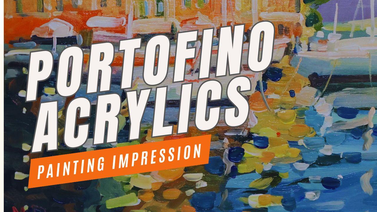
1. Introduction: Have you often admired the beautiful scenes
around Portofino in Italy, the water, the old buildings, the yachts. It's fantastic. And we're going to paint
that subject in this lesson. Now, this links up with the acrylic painting
for beginners course. If you've done that course, this is going to be just
the thing for you to use all those techniques and
bring the scene to life. If you haven't done acrylic
painting for beginners, you'll find a link in the class project and also
in the description, you'll find the tips
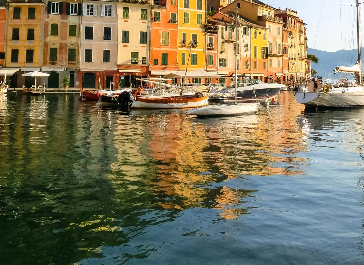
there invaluable. Now in this scene,
we're going to take the complex and simplify it, emphasizing the reflections
in the water, vibrant color, really punchy colors to get that energy going.
It's about the mood. Of the scene. It's
not about painting it in ultra realist fashion. We're going to use those colors, the reflections and just try to get atmospheric scene
that's full of energy. Well, if that sounds good, let's begin the lesson. And when you're finished,
download the reference, have a go with the
painting itself, add your version into
the discussions. And I'd love to
see your painting now, if you haven't done
one of my courses before, I'm Malcolm Dewey,
a full time artist, and I'm painting in an impressionist style using
acrylics, oils and gosh. And you'll find many of
my other courses and tutorials right here as
well. I hope you enjoy it.
2. Materials: Before we jump
into the tutorial, let's have a look at the
materials I'm using. In this case, I'm going to be
using golden open acrylics. I've been experimenting
with them for a while, but it doesn't matter
what acrylics you use. Just use the basic
simple palette of warm and cool primaries, couple of convenience
colors like burnt sienna and
obviously titanium white. I'm keeping it
very, very simple. Be painting on a small
ten by 12 panel, which I have gessoed and toned with a warmish,
reddish tone. And the tone is there to
sort of unify the scene, get some color down,
get rid of the white. And some of those
undertone colors might come through
in the painting. Maybe, maybe not.
But if they do, they'll add something different
to the scene as well. But I like to get the
white gessod color out of the way because
it's very cold. And these warm undertones
you use, you can use reds. You could use an orange,
ochre, burn sienna. These sort of warm earthy
tones help boost a painting. You might go over it with some transparent acrylic, as well, and it will influence
how that acrylic looks. So to the panel, let the tone dry, and then start the painting. For the rest, I'm using
simple acrylic brushes, and you need a pencil
for a little bit of a sketch to help the
simplification process. But we'll get into that
in the next lesson.
3. Simplifying Shapes: All right, let's
begin the painting. I'm going to start
with a quick sketch. It's part of the simplification
process, a very quick, rough sketch to get a basic composition and to really start looking for shapes. Forget the details. There are 1 million
details in this scene, and if you start painting them, start trying to draw each one, you're going to end
up with a very, very tight illustration and a lot of frustration when
you get into the paint. Thinking about where
to place shapes, just getting an idea of where the buildings
go and how I'm going to compose the scene where the focal point
is going to be, which boat perhaps,
which large yacht is going to create a nice
and light focal area. The basic rule of
thirds, as you know, is a good place to work
out your composition. So I'll be sticking
to that idea. And I also want
to leave space in the foreground for some lots of beautiful reflections in
the water. So that's it. Let's get started. First thing would be draw the horizon line. So by relating all the other
shapes to the horizon line, I can get the proportions in the painting pretty well
set up quite accurately. So now putting in the boat on the extreme right and just
getting a rough placement. This isn't a detailed drawing because I'm going to be
painting with the brush. Now the focal point, so this boat extends basically the focal point is going to be more or
less round about them, the mast or the
front of the boat. So it all comes down
to breaking the scene down into large
manageable shapes. All of those buildings
simplif into shapes. The boats once again shapes the area where I'm going to put the shadows or just a big shape. And then start blocking in. I'm using the 1 " brush. Flat brush just to block
in big building shapes. And I'm using these beautiful, deep yellow and red colors to create these strong orange or deep yellow colors that make these buildings so attractive and
picking up the light, these colors are going to
influence the entire painting. And you'll notice
from the reference, you've got these sort
of greenish blues reflecting in the water, which had a perfect
complimentary color relationship with these orange reds
and deep yellows. Switching over to a number
four long flat brush. I'm just making a cool gray
for the distant hillside. But also, that sort
of cool violet is a complimentary color
to the deep yellows. And then the sky titanium
white with a bit of yellow to get warmth
into the white, and we get a bright warm sky. Very simple shapes,
very geometric. Blocking some of the
greenish blues in the shadow side where most
of the reflections are. I call it the shadow
side because it's darker and there's going to be
lightish water on the left. Comparatively light, so a bit more cerulean
and a touch of white and we start getting
these very attractive colors. Keep white paint to a minimum so your colors remain
vibrant and strong. The white can diminish
the saturation very, very quickly with acrylic paint. Just testing out the
reflections, there are a bit. Reflections are always going to be basically the opposite
or the positive shape, so the bright sunny
buildings will reflect as a much darker
and duller color. So we're getting
a quick block in, and that's the objective. Try to work quickly as well. And now I'm going to
work on the boat shapes. Now, as I said, I don't know much
about boats at all. I treat them as shapes and attractive colors that will
reflect a lot of light. But you'll notice a large part of the boat is not
actually white. If it's in sunlight,
it's going to be a warmish, yellow, white, and if it's in shadow, it's a grayish blue or a gray violet. So more or less, yeah, in the front of the boat, I want the highlight that
I'm going to put in, more or less picking
up the focal area. And you'll see how simply I'm putting these
blocking in shapes. We'll refine the shapes later, perhaps cutting in with
some background color. So don't get too caught up
in painting a perfect boat. That's not what you're after. We're painting a scene and boats just happen
to form part of it, but it's not the objective. There's also a few lights in the awnings or the buildings, and I will start
suggesting those. More or less just figuring
the placement of shapes, and I'll start getting
an idea of what I want.
4. Buildings Suggested: I'm going to press on
with the painting and start getting suggestions of the reflections in the water. And it's about also just making sure that the
colors are harmonizing. So I'm using similar
colors all over the scene. I don't focus on one area and complete
that then move on to the next paint all over
the panel or your canvas. Repeat your colors. The use of a small color
palette is going to really help you make sure that your colors
are harmonizing. And by that, it simply means
that all your color mixes are coming from a small
selection of primary colors, warm and cool, but the
mixes are going to be from the same starting point. And therefore, we'll
dread an overall harmony, there won't be any
jarring colors coming up in the painting. Okay, the main objective with
this segment is to continue to simplify the buildings
into warm color blocks. It may become a little
bit tedious as you work through giving some
information for the buildings. But as you'll see,
I'm going to try to do it as simply as possible. And there's so much going
on with the buildings, the windows and the different
segments of the buildings. I've got to just try to
get the essence of that. And yes, it's going to
be somewhat stylized, but it will be sufficient. Now with this, the rigor brush is quite useful because it's
relatively small shape. So the windows for
this building, which is kind of at the end, and I want to just push
it back a little further. I'm going to have the
window details and the roof details
fairly light in value. And then the final building on the extreme left will
have darker value shape, so that'll be coming closer towards us and for
the buildings will sort of move away from us as they head off to
the right hand side. There'll also be
sight adjustments to the colors of the buildings. As you can see in the reference, some are light, some are sort of pinkish, some
are more orange. So I'll get those differences in first and then suggest the
details of the windows, roof lines, all the
other little bits and pieces that go with
the facade of a building, whether it's the gutters
or even shadows as well. You're just adding
little bits of foliage and matching that up and harmonizing
it with the windows. Now, to get a bit
more structure, I'm putting these
simple dividing lines, suggesting the different
floors of the buildings, really fascinating
structures, these sort of old apartment
blocks as it were. So very, very simple. I'm really not even trying
to count the windows, but you can do that, of course. All of this is
going to add up to creating a loose
looking painting, something that's an impression. Clean up the palette
quite often. When it starts
getting a bit busy, that's when you can start getting a muddy
color very quickly. So here's a few
bright reddish colors which I'm going to use
to develop the sort of ground level of the little road and cafes and all of those
things right at the front. And then when that's
done in the next video, I'm going to go onto the boats and give them a little bit
more information as well, and we'll develop those
a little further.
5. Boats Simplified: That all the blocking is done, and we've got the basic
foundations in place, I'm going to start refining shapes and getting
a bit more detail, but it's still very, very loose. When you, for example, doing a mast on the yacht, it's simply a quick stroke
with the rigor brush. You don't need to carefully place all the lines
and little details. That's the theme of
the painting anymore. We got to try to remain
consistent with that and not get drawn into trying to
recreate an accurate yacht. I really don't know anything about boats or
yachts, to be honest, but I love them as shapes because they've got the
horizontal boat itself. You've got this
beautiful vertical mast, and you can repeat some of
that in the reflections, so you get these beautiful
horizontals and verticals intersecting and joining the
shapes up in a painting. So that's how I look at it, and I'm going to show
you how I go about getting the final touches or at least the refining of the shapes and some of
those simple details. In this segment, our objective is to start
simplifying the boats, start adding basic suggestions of details that's
going to bring out the light and also help describe
them in a loose fashion. Now, there's so much
detail in boats like this. The trick is to try and
see smaller shapes. We've got the big outlined
shape of the boat. Now we're going to try to
figure out smaller shapes, and a good way to do that
is just to close your eyes sort of halfway and look
for light and shadow. Where I see a light shape, I put down a bit of
white mixed with a little bit of yellow to get
that sun light appearance. And where I see shadows, I apply a shadow color. It could be some type of gray, could be blue with a touch
of alizarin and white. Basically, it's simply going to look like a shadow
against the light. I'm also going to add
a few details here to the awnings and just those
suggestions of shop items. Adding a touch of light here or there could be to those trees. And just hints of
things going on along the harbor wall of the town. Little dots of light. You're just taking the rigor
and doing very loose mask. Now, you notice the mask will go right out the
top of the panel. So don't make your
mask too short. Otherwise, it's going
to look less elegant, I think is the word. Obviously, these
in the distance, the mass will be shorter. But do you see how that light
breaks up the hillside? I'm adding some of
the window treatment, and each of these windows has a what's probably a plaster border or
something like that, and adds just a bit
of white paint to suggest that reestablishing
the shutters, adding a little bit
of color to them. And that's just lines
just a little too strong and just go
over it slightly. I'm just trying to create
a strong edge there to define the end of the
building from the hill, but it's just a little too dark. So make it thinner
or soften it up and just keep the edges over
here just a bit softer. I've made those trees larger
than in the reference, but I feel it's just
a bit of greenery to complement the reds. And some of those colors
will come across in the water as I get
to that later on. So these shapes could be the sails of the boats or yachts that have
been rolled up. Also, trying to connect
the yachts to the water, so there'll be a dark line under or at the meeting point between
the boat and the water. And it's quite an
important little detail because if you
don't add that in, it could look like the boat is floating above the water,
and you don't want that. If you're not sure, just pause, have a close look at the
reference and let that guide you because the truth is
always in the scene itself. And once you've spotted the detail that you're
struggling with, you can then loosely portray that in your painting
with a few brush strokes. I'm suggesting a few details under those awnings back there, windows of shops, et cetera, but keeping it nice and loose. Well, once we've
finished with the boats, we'll start getting
into the water.
6. Water and Reflections: The final stage of the painting, it's a case of simply pushing ahead with
any refining shapes, trying to make things
just to clean up a few shapes and also any
extra little sparkles, accents, details that can be suggested with a few strokes. Stand back, assess
your painting, if there's anything that's
really distracting. Maybe in a corner the edge
that is pulling the eye away from the focal area and staying within
the picture plane, then get rid of
those distractions. Make sure you want the viewer to enjoy what's in the scene
and not immediately get sent out because of
some unfortunate diagonal leading the eye out of the painting or a
distracting color. So it's the overall harmony
of values, colors and shapes. And if it's looking
like it's all unified, pulled together, and there's
nothing too disturbing, then it looks good. So let's finish up the painting and then we'll
assess the final result. This is one of my favorite parts of paintings involving
scenes like this, and that is painting the
reflections into the water. It's really the hidden sparkle
that you're bringing out, and that's going to make
this painting stand out. There's a few basic
foundations to remember. At this point, I'm painting the sky reflecting in the water. That's going to create the lightest reflections
in the water. Even though it is very light, I'm still keeping
the lights colorful, so it's not all
white, for instance, to create a cold washed
out surface of color. I'm using quite a lot
of cerulean blue, a little bit of ultramarine to darken the foreground,
as I'm doing. And it'll get a little
lighter closer to the boats. You can see that
in the reference. But as I say, just be
careful not to wash out the color and make it too light with too
much white paint. There are also some dark accents that appear because of
ripples in the water. Use those to break
up the light areas, and it just adds visual
interest to have these dark accents here
and there in your lights. Of course, the same
will apply when you do the darker areas, you're going to want to add a
few little sparks of light. So I'm setting things up step by step here by moving from
the right over to the left, and we'll start adding
some of the darker colors. And this means the buildings, the reflections of the buildings
are darker than the sky. As these buildings
reflect into the water, generally, they are
going to be darker. For instance, here,
I'm putting in sort of an orangey
yellow and assuming it's reflecting a light yellow h so that's basically
the principle. Now, you will
probably depart from that a little bit because this
is a very loose painting, and I'm not trying
to capture each individual building accurately
in the reflections. What I'm more concerned
about is creating a lively, colorful surface
in the foreground with lots of contrasts
between the orange and blue, for instance, as you can see, there'll be some
contrast between deep greens and cool reds. All of these things add visual excitement for the eye and something interesting
for the viewer to look at. So it's certainly not
a reality situation. Yeah, as you can see,
I'm dragging the brush, creating these sort of S shapes and then small
horizontal strokes, then some vertical strokes. And that variety of
shape once again also creates a surface that is
interesting to look at. Broken color is what
I'm up to here, breaking up shapes
with other shapes, contrasting a bit
of light and dark. You can see that
in the reflections as well in the reference. So I'm always guided
by the reference, but I'm certainly not
going to be limited by it. Here I'm putting a
nice deep, cool red. I'm going to bring in
some orange over here to add some visual excitement
closer to the focal area. Catching some of those reds from the awnings and shop fronts. And then the lights of the boats and the awnings
must also show up as well as some of the
masts from the yachts. They'll create a
nice vertical line of color, just like that, but break it up, keep it looking like the
water is moving. And now in fairly quick time, we can create a lively
and interesting surface. The reflection of the
yachts will be a sort of a bluish violet in the water. Now I'm using the
rigor to just create a few little layers of color just to make sure the colors are looking nice and strong where
I want them to. Acrylics do dry fairly quickly, and you may want to go over certain colors
that might have dried a little duller
than you'd hoped for. That is sometimes
how acrylics work. So here, the rigging
is done very loosely, just suggesting a
few of the lines. And I'm going to add a flag or two from the mast just
to break up the sky, for instance, on that one. And we'll get into the
final highlights and little details in
the next segment as we approach the
conclusion of the painting.
7. Highlights and Accents: Well the painting
is almost finished. We have a few lasting
things to do, highlights, accents, and a
few final details to add. Let's have a look at
how it turns out, and I'll describe all these
little finishing touches which can make such a big
difference to your painting. Right, so now it's just a case of finishing the
painting of fra. Get those highlights and accents in Highlights,
of course, light paint going down, sort of little bright touches, and accents are darks. Slime adding sort of in between touches of color
just to neatn up shapes. And you go to stand
back quite often and have a look and just
see what you're happy with. Here a few highlights to pick up the boats and a few sparkles from sunlight and
things like that. Just those little
dots and sparks that create the impression
of shimmering light. Sometimes we overdo
the highlights, and it's probably
a lot of the time. Here, you can see I'm putting in some lemon yellow lights. And that's just to vary
the highlights so they're not dominated by
white dots of paint, but many other colors that are harmonizing with
the rest of the painting. And as you note, as well, I don't put down pure white. I will mix it with
a bit of yellow because everything
is influenced by the light of the sun that, of course, is yellow. Getting in a bit more
light year and color, really emphasizing
that yellow orange around that focal area, and then breaking up the dark on the left hand side
with smaller highlights. There's no real rule to this
except not to overdo it. In which case, you need to get rid of some of the
highlights you put in. It's pretty much by gut
feel and experience. You'll overdo it at times, and then you'll look
at the painting the next day and realize you need to just push
things back a little more, get more of the original
base colors in. And that's perfectly
fine as well. You just cut in with
some of the blues or the shadows like
I'm doing here. Because some of those dark, transparent, mysterious colors
are very pleasing as well. It's all about setting
one off against the other colors against darks and lights against darks
and warms against cools. Always think in those
terms of how can I make this color look better
and very often, it's putting another
color next to it that makes all
the difference. These dark blues
that are going in make the light
blues look better. So once again, you'll step back, you'll assess and decide
what is necessary, heightening some of those reds, adding some flags, picking it up again in the water with
a dart here or there. Just observe, if
you're not sure, you can leave the painting
the following day, you'll probably see
what needs to be done. By lightening these
window shutters, I make the windows actually look like this brighter light. I just feel the darks
a touch too dark, and now they harmonize with
the reflections in the water. A few lost and found
little details, ropes, connecting the
boats to the water, leading the eye as well. Everything has a role to play.
Well, I think that's it. I'm going to sign it off, and then I'll take
a final look at it, and we'll conclude
with an assessment.
8. Concluding Thoughts: I well, there we are. I must say I enjoyed
painting this scene. At the beginning, I
did have my concerns. There was so much to fit
in in such a small space. But by keeping an eye on simplification and just
focusing on one thing, getting some vibrant
color, simple shapes, and reflections in the water, I was able to contain some of the masses of information and
simplify it into what is, I think, a bright, fun and cheerful painting. Now, don't forget there's
a photo reference in this class project
and PDF as well, you can download with some tips. And don't forget the acrylic painting
for beginners course. If you're not sure of
some of the techniques I'm using and the
basics of acrylics, make sure to check
out that course as well and get your fundamentals, and then come back
to this lesson. Try it again if you want
to upload your work, and I'd love to have
a look at that. Finally, if you've
enjoyed this course, please give it a review. It helps other students as
well with taking the lesson. And I'd love to know how
experience the course, as well. So leave a review, and I'll see you in the next painting
lesson coming soon.
 Malcolm Dewey, Artist and Author