Transcripts
1. Intro: Welcome to Class!: Hello. I'm Stephanie. At Demico dt, if you know me from Instagram. We're going to paint
together this piece. Yours is probably going to look a little different,
and that's cool. You're going to choose
your own color. We're going to have
fun. We're going to test many different textures, and we're going to
play and experiment. And this is really what I
want to share with you, my love for play for
experimentation, for trying out new
things and see what happens on the
paper on the page. And just have fun, relax, paint and
have a nice moment. During the whole
class, we'll paint together different
watercolor textures. So we learn and document how the watercolor paint
behaves with these textures, and even going to try us ku. And pain. Because why not? We're
also going to practice our brush strokes
so that we have a better control of
brushes and that we can make some nice little lines between the layers
of this pattern. When I say practice, I just mean we're
going to practice by making different lines and such so that you
can get the result that you expect or that you're
looking for in your work. We're going to take a few
moments to play around with a color palette or two so that you get a feeling of
these color palettes to know if they're
right for your piece or if you want to try
something tolling you. So this is going to be
another lesson in the class. At the end of the class, there's also a lesson
bonus lesson on o paper. So playing around with
textures on Uo paper and on watercolor paper gives
for very different results. So we're going to take a few
minutes to look into this.
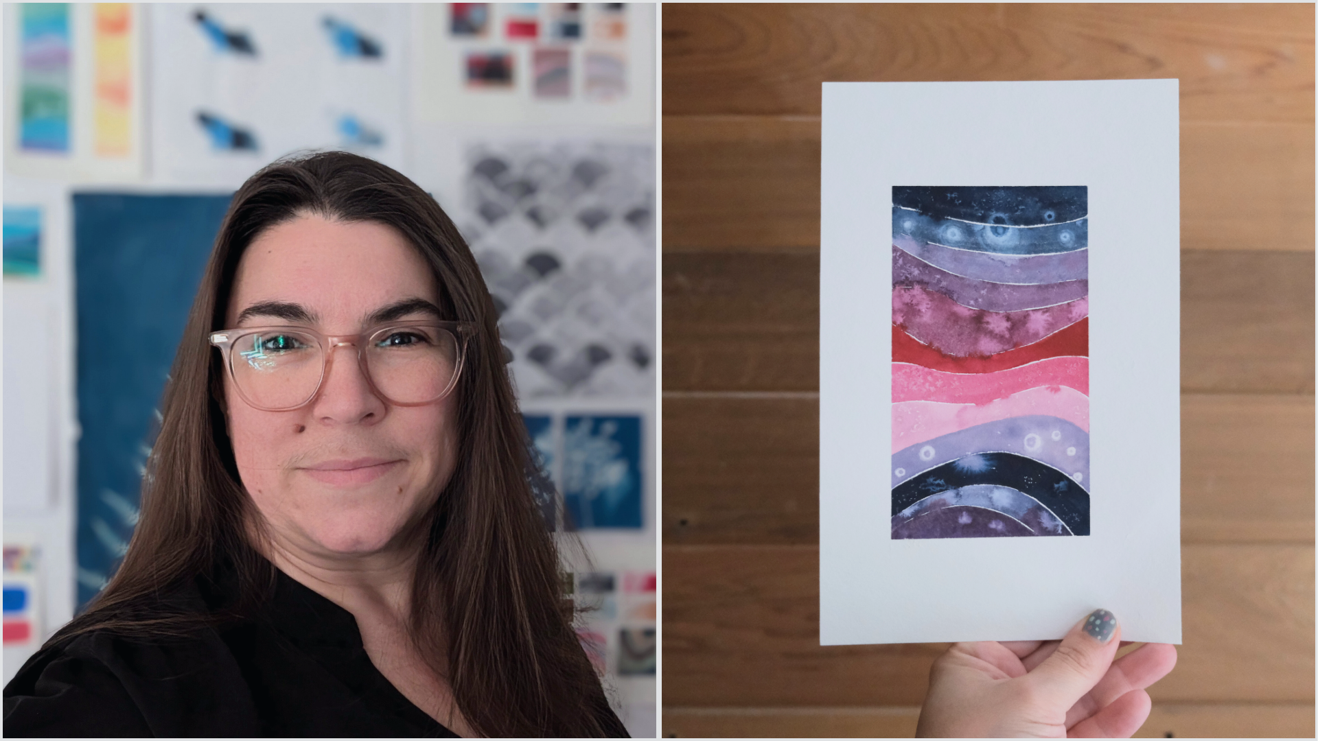
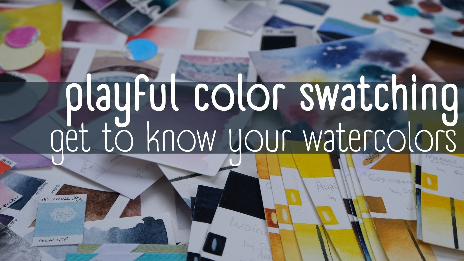
2. The Class Project: A Watercolor Wavy Pattern: In this class,
we're going to make beautiful wavy pattern
such as this one. In the project video. We'll paint this one
together with three colors. You can choose whichever
colors you want and we'll add beautiful textures
with alcohol, salt, dropping in
water like here, and dropping in other
colors in the ras. As you can see, these
little wavy patterns are a fun way to get to
know your water colors. You can also document
color palettes, swatch your color palettes, learn to make mixes and see how these colors
play together. They're also a great
way to practice your brush skills as you want to have nice little lines in between the different layers, and they're a great way to get
to know your paper better. In this class, I'm going
to work on bamboo paper. I had made these tests
on different papers, cold press, and hot press paper from the Jackson
Brand studio line. And as you can see,
different papers don't produce the same result. So this is the project
you're going to make today, and here are a few
other examples of things that you can
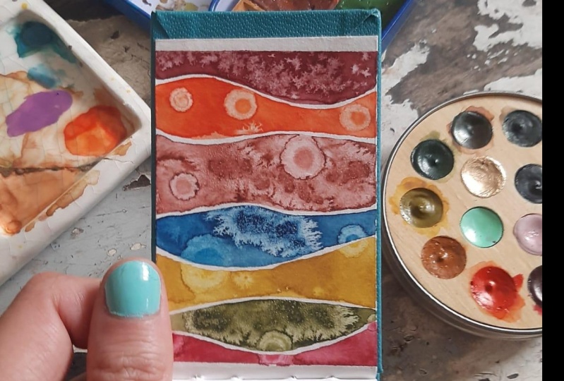
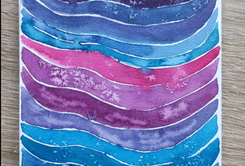
make on different paper. So this is a very, a much thinner paper, and more diluted colors. This is the same bamboo paper. You can go monochromes or have all your colors from a certain family
on the same thing, or you can go for
a color palette. That brings in different colors. You could as I did
in this example, use a color palette that you
just bought and you want to document how
they play together, or you can go for tiny art
pieces or larger ones. Though I have small ones
to show you in this video. I hope you have as much
fun as I do painting these because they're a true
part of my art practice. Also, I would love it if you
share your project with us, whether you use the
same colors I'm using or another color choice. I would love to see what
you decided to make. You can see down below. In the project
section of the class, please share it with us, and I will make sure to go and see each and every
one of them and give you uh or tips and ask away
any questions that you want. I'll see you in
the first lesson.
3. How to Upload a Project to the Gallery: To share a project
with other students. You can see below the class below the videos,
Below project section. You can click here. You can
also find the resources. The templates I shared with you, click on Create a Project. Add a project description
Watercolor swatches. You can add a
project description. And I'll make the description
a bit better later. You can upload the cover image. I'll put this one
as the cover image. Make sure it's under
eight Mg. Submit. And you can add images and I'd love to see
all of your swatches, so you can drop them on, drop them in and click Publish. The class will be launched in this section in
the project section, you will be able
to see the project of your fellow students
and comment on them. I will personally go look into each project and leave you a
little feedback if you need. Ask your questions away and I'm really excited to see
your projects come in.
4. Materials needed for the Class: Materials. In this class, we're going to use
a few materials. Of course, we're going
to use watercolor paper. So I'm going to use
for most of the class, the Hanmul bamboo paper, not a watercolor paper per se, but a pretty decent
mixed media paper, as you can see from
this reference page. I like the textures that
I get on this paper. I'm quite used to
working with it, but you're welcome to try
your favorite paper as well. Do note that different papers will produce different results, so go ahead and experiment. We're also going to take a moment at the end
of the class to try some textures on pole
paper because you get very, very different textures and
they are very interesting. As you can see around the table, these are all the materials you're going to
need for the class. Of course, some water colors, either in pans or in tubes,
some watercolor brushes. So in watercolor brushes, I prefer imitation
sable brushes. The more bouncy. They it's easier for me to
make great lines with these. Was the imitation
squirrel brushes, as you can see, the
tips are more flexible. They're great brushes,
but for this For this, I prefer the sable
imitation ones. Two containers of water. If you're familiar
with water colors, one to rinse your brush out, one to keep water clean
in case you need it, and we're going to make
textures with clean water, so a little important to
try and keep one clean. Little dishes to
use as palettes. They can be ceramic dishes. The metal parts of a
watercolor palette, or tiny palette,
ceramic palette. Is this one that a friend
gifted me a little while ago. You might also
want little dishes to put in the things that we're
going to use for texture. What are we going to use? In this class, we're
going to use some salt, coarse salt, finer salt. These are both table salt kosher or pickling salt,
as you can see. These have color in them. I've used them previously
for these projects, or are not going
back in my cooking. Also, I read about trying out
Koko and rice for texture. I don't use food a
lot in our project, but this was lying for a
while in my cupboards. Another supply you're
going to need if you want beautiful straight
line at the edges of your wavy pattern masking tape. Artist masking tape or some
washi tape and we'll see a couple of tips to have
it not tear or drawing. And finally, some alcohol. Rubbing alcohol
alcohol that you can buy at the art store
or art supply store. Do be careful or not. My s warnings to have, make sure you have a
well ventilated space. Also a little
bottle like this to spray it on your water
colors to activate them. You can also use alcohol in
this to create a nice effect, and tiny color ppts, or you could use a pencil or a toothpick to drop
water or alcohol. Finally, pencils are ruler and an eraser for
tracing out models. That's about it, mostly
you in the first lesson.
5. Texture Play - Salt: For this lesson, we're
going to test out salt, and I'm going to show you
two different colors. So we're going to
start with the digo, which is a nice dark color, and the texture of the salt
will show most on this color. I'm going to put a
carmen color in this one and above titanium
because this is the combo, I would like to
in my last piece. I think they look nice together and make
for beautiful mixes. For this, I know I said
I prefer sable brushes, but as these are our exercises to get
to know the textures. So I'm putting water a bit because these colors
are directly out of the tube, and we can play
with them as well. This is pretty pale. We're going to go with a
dark color. There you go. You don't have to pre with the paper when you
put the colors. Let's try to remember dirty
water jar, clean water jar. I rinse my brush for no reason. We're going to do two of these because we're going to
put the small salt, the table salt, and we're going to add the
cher salt as well. We're going to see
the differences. Now when you put the salt in, you don't want the paint to be too runny because then the
salt will dissolve in there. U. If you see here, hard to see on camera, but there's no puddle. In this one. This one
is still very wet, so we're going to
wait for a second, but we're going to put the
small salt on this here. And it's still a bit wet. You can blow on it a little. It'll make texture. It will simply be a
little less visible. This is pretty good. When you see that the salt
is already turning blue, it's because it's
drinking up the pigment. If it stays totally white, then the pain is too. Now we're seeing a bit here and now we're seeing the color moving
and the texture. How much salt you put in there? It's really up to your taste, and we're going to do
the kosher salt next to it or the pickling salt. The grains are larger, as you can see, so they make
for a different texture. We're going to test out
the carbon color as well. Here we're looking for
very saturated washes. It's all right to
take from the tube just add water to get
the consistency right. But if you would want something
a little more subtle, you can add just
slots of water to your brush and have very
diluted color on the side. This car color is very
very strong color as well. I'll test them on these
diluted versions. O a diluted dico as well. L two diluted. As you can see in the water and these two together
make a beautiful purple. It's starting to
dry a bit too much. Quickly add the salt. And we're going to combine them. Those two might have
dried a bit too much. Before we take it off, we're going to need to the
or the color will come off. We're going to simply identify our p and set it aside
to come back to a.
6. Texture Play - Alcohol: This is going to be fun.
The first thing is, this is a pretty
large container. It stinks a little bit, we're going to just put a
little bit in this dish. Now, be careful not to dip your brushes into this because it's not great
for your brushes. We're going to keep
building up our reference. We're going to go with
the Indigo again. Now with rubbing alcohol, you can either drop it in while the paint
is still very wet. No puttly, but wet, or you can put it in when
it's starting to dry. The effects won't be the same. Be careful if you're
working in a sketchbook as well because it might go through your
page and on to the next. Note this. And My P pet is not working anymore. It won't hold the alcohol. You want to drop tiny
drops very large ones. But you can see the facts
are quite spectacular. If you don't have one of these little things or
one that doesn't work, I should have
brought one in, but I don't have one with me. You could use the
tip of your brush. Don't put it in your
mouth afterwards. Not a good idea. And you
can drop some in there. As you see, the alcohol pushes away the
pigment in the water. If you're wondering would
water do the same thing? You see here, I'm
getting weird effects. It's probably the alcohol that when it dropped
at the beginning. It probably dropped
here as well. If you were to some
water in there, You would see that it pushes
away the pig minutes, but you don't get a
very round effect as you do with alcohol. Now if we try this with the red. The reason I'm not trying
with the buff titanium is because it's pretty much
the same color as the page. We wouldn't see of an effect. I really put it on
the palette for the mixing we're
going to do later. An see when it drops. The see this is why each
color has its own reaction. Maybe here it's because
I had it was d, we're going to try
to re wetness, if you will of the color swatch. We're going to add more color
and more water to the page. I'll show you
after. We'll finish this part. There you go. If you add more water, you get a different effect. Was here you almost
get an eclipse thing, which is cool actually, here it was very wet, it pushed the water away. I want to I want to make a purple version purply a purple version and
see what happens. If you have a color mix, Remember, depending on
the effect you want to get you might see
that whatever is going on on your page might
not be exactly what's going on on my page because the paper you're using
might be different, the colors, the alcohol, the salt and the
previous lesson. Maybe you're getting
different effects, which is why it's
important to try them on before you make your final to gather knowledge about what's probably
going to happen. That's pretty cool.
This really seems to be happening because the
color was almost dry. Might be a bit of dark blue. We're going to try
to recreate this. Mind you, it's been like five, 6 minutes, and I'm already
sick of the alcohol smell. While this dries a bit, we're going to just
add here water. And try not to put your
hand in what pain? Haul A always writing it wrong because it's not
quite the same in french. Here here we. It's important if
you want to things, If you want to recreate
things to take notes, so you can remember how
you achieve them go home. Almost try. See, this is a paper
I'd like to use because also things relatively quickly. Which can be good or bad depending on the effect
you want to achieve. Here, drier. That's a drier. It's okay. D when alcohols. And there you have
it. So have fun. Try a few things, and
don't forget to keep notes to write notes
on your page so you can remember
later what you made.
7. Texture Play - Water: Water is water at
texture in watercolor. It can be. If you're familiar
with watercolor, you might know the term olfloer. If not, I'll explain it to you. It's one we're painting we're
trying to make usually. We're trying to make
a nice even wash. When I say usually, I mean, there's the technique and then there's whatever you
want to make with it. But you might come across
this term of cauliflower. This is a very even wash. Now, it's starting to
dry and on my paper, it's starting to dry a
bit quicker than if I were to use 100% paper. If you add some water to the to the parts of the painting
that are starting to dry. You're going to
see this this even wash starting to get
uneven, I guess. You're going to start to see
the shapes appear that will be that will still be there
when the painting is dry. If your goal is to
have a very even wash, then you will have
failed because the added water will have
disturbed that even wash. But if your goal
is to add texture, then water can be your friend. The way to do this is to find the set spot when the
paint is starting to dry, but is not 100% or
you're going to have simply you're going
to lift the color, but it's not going to
make the same texture. So the fun thing to see, which is hard to catch on camera when you're filming is
you see no more puo, but the paper is so it's a bit
hard to see on the camera. So you see this one was too. This one is perfect. And this one well, it's still dry because it's still very wet because we added
some water earlier. If I add water to this one, which is dry, I'm going
to lift the color here, but it's not going to
make these caflowers. They're called Cliflowers,
because when you add water to something that's
almost dry but not totally dry, the pigment will not the water will explode and away as the word
I was looking for. It will push away the
pigment and you will have this beautiful beautiful
cauliflower shape. Beautiful if that's what
you're looking for. Again, if you're looking
for an even wash, you're not going to
be happy about that. Once again, this paper is fun
because it dries quickly, but you have to be careful. As I talk too much,
this is dry as well. I won't be able to make a water a cauliflower.
Here you go. If when you put your water, it's just wet and you're not
getting the shape you want, let it Let it dry up a bit. When it does, you can try again. Now, not all pigments
and once again, the effect will not be the same on every paper with
every pigment. The only way to know is
to test these things and embrace the unpredictable
nature of the medium. Let's not forget to
identify our tests.
8. Texture Play - Colors touching: Something similar to
water that we just saw in the previous lesson is
color, which means what? It means having two colors, painting next to each other. And then they lightly touch. You'll see some colors. I'm not sure about this one, but you'll see that some colors
can overpower the other. And it gets quite interesting. The goal is to have the colors really lightly
touch each other. We'll see how we use this in the wavy pattern a little later. You see the subtle variation. In this one, it's the red that's going into the blue color. We'll see if we paint the
red, what will happen. I'm going to find out at the same time as you
because I did not test this before hand. We put the red color down. You're going to add.
You see as I do this, the goal is to paint
the whole thing first and then have them touch because if they touch
while they're too wet, they'll just The two puddles will mix and you'll end up with a purple thing in the middle, which can be very beautiful. But it's not quite what
we're looking for right now. Just trying to see if they touch slightly,
what will happen. You see it's interesting
whichever way I put the blue. The red is the one
where the pigment travels from one
side to the next. We'll see how we use this when
we make our wave patterns. This is going to be interesting. We're going to bring
in the buff titanium. Which, for instance, if we make a layer of buff titanium
in the middle, of course, you can't really
see it because I would say this is a buff
titanium colored paper. We're going to put
some blue on the side. Again, we're testing, everything doesn't have
to be perfect, right? You can see once again, it is the buff titanium that's
traveling and Dan digo. What happens? Well, I
just made a French flag. If we put the red next, and we'll see it's
the red that travels. Of course, if you make these and the pain is totally
dry on both side, nothing will happen and we'll
practice more in a lesson with we're going to try to make lines and
have things touch. You don't have to have them
touch for the whole thing. When we're going to
make our lines later, we're going to try
to leave low gap and sometimes we're going
to touch like this. Let the colors touch a tiny bit. Se and sometimes little
bit goes a long way. See it's time. It's the pigment, but it's also the water. In these ones, I put
more water in the white. That's why the blue travel
indeed both colors. I really love these
little color explosions. This is something
I really enjoy. And that is a texture.
Let's forget. I was going to forget
colors touching.
9. Texture Play - Couscous: For this lesson, we're going to try something I've
never tried before, adding cocos on we paint. I've read about
using Cocos or rice. As I said in the
materials video, I'm not too fond of
using food in order to make art because I think
food should be eaten, sorry, instead of wasted
as an art supply. On the other hand, I go back and forth on this, but anyways, this ccs was hidden in the on the far end of my cupboard and was probably way past expiring. Anyhow, we'll try to see
what happens in here. I think this was fine
grain and medium green mix that I had We'll test this out. I'll try it. Not much
seems to be happening. We'll try with a bit
of a wetter version. I can't remember if I said it. Anyways, I had read
about rice as well. I'm guessing pasta or whatnot, dropping stuff into what paint. I've seen an artist
do beautiful things, dropping flowers
or dried flowers in paint as well
on you pop paper. Truly listen to your creative Truly listen to what your creativity wants
to try and go for it. You may find out something very cool you want to do
more of in your practice. We'll see what
happens with this. Maybe it's very whelming and the experiment
will sit there. But. Let's try.
10. Removing Salt and Couscous Once Dry: Now, these pages
are somewhat dry. The k not so much, but it's really falling
off the page very quickly, even though I just made
it a few minutes ago. We're going to leave
this here for a sec. These other ones sticking to the page, so we'll see after. But see, this is
the page with salt. This is pretty dry, and you
can see lots of texture. Now, you're going
to want to rub off the salt because it's not
going to stay in your piece. But you want to do so gently. Even though it's dry, if you rub it off too
much or too fiercely, you might end up for one having lots of
color on your fingers, which is not so much an issue, but actually damaging some of the texture that you
got from the salt. I've seen people use
an eraser for this. I find it damages the
texture if you're too harsh. So one thing to
pay attention to, you see that the salt is
color has color in it now. I put it all back
in my container of salt that I use
for art purposes. You can see there's
color in there. If you use that salt
in a very light color, the little bits that are blue might transfer the
color to another piece, but the way I work, I
don't mind so much. So it's really up to you
how you deal with that. You can leave if there are tiny bits that are
really stuck on there, you can leave them
in, they might add a little shine to the piece. I don't think it's an
issue, but be mindful, if you rub too harshly
to take it away, you might damage the
underlying paint. But you can see how
the salt shows more in the very saturated washes because it sucks up more pigment and
there's more contrast. But you can still see very interesting effects
in the lighter washes, but you can see here that the
effect is very, very light. But it's interesting
nonetheless. That's for the salt and
for our little friends. I'm not sure that's
the right word in English, but I like it. So Let see here, it wasn't totally dry. That's okay. But you can see in
there that some of the color was picking
up by little grains. I'm thinking maybe that to have an interesting
effect on this, you might need to drop a
lot of it on the piece. There we have our two pages
with the salt and effects.
11. Warm Up and Line Practice: In this lesson, we're
going to practice making mines in the pieces that
we're going to make today. Piece or pieces. There's different lines, and it's nice to have
a little warm up. Try to see which one we enjoy making the most and which
ones we don't at all. So and this is where the
sable brushes come into play. I have more difficulty
with the squirrel woods. This is a Princeton Aqua
number four. It's quite tiny. I I would make a whole piece, I would probably go for
a bit of a larger one. But let's play with this one. In the wavy pieces, our goal is to
leave a tiny bit of space in between the different
layers, if you will. We're going to
practice this here. We're going to make one layer, and then you can take the
same color or switch. It's not really
important for this. But we're going to practice
following the first line. Very gently. I touched
here. That's all right. This is why you
want to practice. I haven't practiced much before doing this
here with you today. But this is why it's nice
to have a little warm up. And we rewet everything to keep the piece
wet for texture. One way to do this is to leave a larger gap
and then you come in. We've got to make sure
everything is wet. You come in, and then you close that gap making
it smaller as you go. Rather than trying
to make the gap very small and then
getting frustrated. The beginning, you leave a larger gap and then
you close it afterwards. You see where the
colors touched. If that's what you
want, it's perfect. If you wanted to leave a gap, well, it didn't
happen this time. If you don't want the
colors to touch at all, you might want to let every
layer. Thing on the brush. There you go. Here,
it's almost dry. If I touch with my brush, the colors touch, it's
not going to be so bad. But really take this lesson
as a practice session, you simply practice
making these lines. You see, I've been using
a very small brush. If I use the larger one, I'll cover more ground. But it is perhaps easier to I tend to forget to finish my sentences. It might be easier
to make a mistake. Here I'm warmed up a bit, so I already feel looser in
my hand and my gestures. There you go. So you might want to
finish your page, or you want you might want
to try something else, or you've been warming up already, and you're ready to go. One last thing. I want that
would be fun to practice. Is finding the angle at which it's easier for you to
paint. I'm right handed. When I make the waves, I often turn my paper so
that I paint vertically. If you're left handed, it might be easier for you
to do it on this side. This is very unnatural for me. I wouldn't paint like this. At some points, you might
prefer to paint on this side, make the wave in a
horizontal fashion. Which is much harder for me, but that's a very
personal thing. Perhaps take see. It's something like
this happened. Well, here it's a practice. It's really okay. That's
why we do these things. But if it's in your final piece that something
happens like this, you could just say, it's
part of the design. I wanted to layer so you can have Previous layer
isn't quite dry, so it's not going
to layer perfectly, but you could say, I
want to glaze over it. Sometimes it did happen
to me in a final piece. I said, Well, what the heck? I'll just layer the whole
thing. There you go. Yeah. Another thing is, instead of free
handing the things, I've added a template
so you can trace it. So if this is a
black wing pencil, I would suggest that you use
something like a H pencil, something that's very light, and then erase it a bit so you can see if
I do this on camera, you're not going
to see anything, so I'm using this darker pencil. Yeah, either you're tracing
or you want to draw it first No firsthand, but you might want to draw
the pattern beforehand. One thing you need
to know that if you paint over something like this, watercolor is very
transparent colors. Either you find an opaque
paint to go over it. Or if you want to erase
them after you're done, you need to not paint the lines, not paint over the lines. This could be you could try to paint I could help you
what am I trying to say? Drawing lines before
hand might help you out because you can
concentrate on the in between, and then you go near
the lines afterwards. But remember, if you
paint over them, you won't be able to erase them. If I were to feel
this is good for me, I would be able to go with an eraser such as
this or a tiny one. I'd be able to go in
between and erase them. Practice a bit to warm up and to gather skills and
get better at these things.
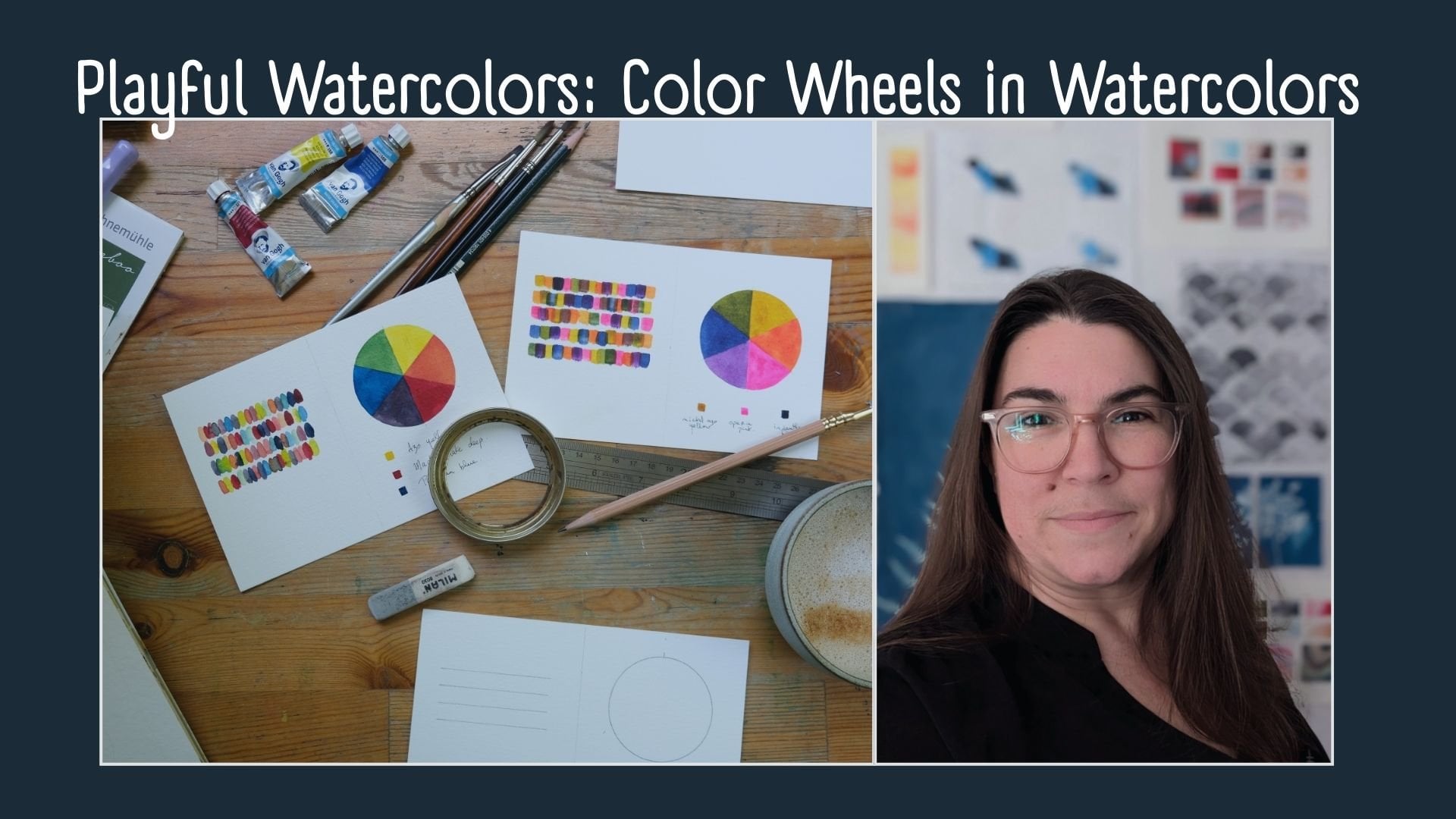
12. Choosing a Color Palette: When choosing a color palette
for your final piece, there are a few ways
you can do this. You could want to document mixes that you can achieve
with a given color palette. This is what I'm
going to be doing with these three colors. There's different ways
to choose color palette. Analogous complementary to find, for instance, if you want to a gray or black with
red and and green. You could go from green to red with all the shades
of gray in between. One of my favorite
ways, however, is to try and try different
random color palettes. We're going to have fun. Trying out what this means with these three
colors that I have. I've chosen these colors because I know I will get
interesting mixes. But how can you see what you
can make with these colors? You take them in
your palette and you start mixing
them a bit randomly. We've seen the purples
that we can have, but we've not played
with the white yet. We're going to add this in. And you can make low
squares like this. I have a whole color
swatch in class, so you can go in
there if you want more info or more exercises
in finding color palettes, but this is a nice way to
see the range that you can expect from playing with these three colors
and a wavy piece. By adding a little bit of this
and a little bit of that, I really enjoy making little
pieces like this because it's it's an interesting and
fun way to document well, not all of them
because that would be a very scientific
way to look at it and require lots of rigor
that I'm not using here. Making tiny squares like this with the different hues that you can find by
mixing only three colors is a very fun way to
give yourself an idea of what you can expect in mixing these colors during the
wavy pattern experience. Of course, when they
try they give you a whole other area as well. For fun, we're going to
try three other colors. Something I love to do is
to go for random colors and not necessarily colors that you think might
look good together. And I forget what
these colors are. Because I've put them in these old containers
a while back. But I think this is a mi color, and this is a ultramarine blue. This is a color
called Lunar Earth. This one I know because
it's written on the I think someone
had given this to me. Sorry for the noise. We'll use a tiny
palette for this. In a similar fashion, I'm going to play
with this here. Up to now, we've played with very out of
the two wet colors. If at home, Of course, if you've played with
watercolors before, I don't need to
tell you this, but if you're new to watercolors, if you're if you're using pan watercolors or
tubes that you put in pans. They might take a bit a few
minutes to fully activate. Keep this in mind. Yeah, we're going to just mix
them and see what happens. We're not making a
color chart here. We're just having fun
with different colors. Often we mix two colors, but we don't think of
adding that third one. Really embrace embrace color
mixing and have fun with it. That's interesting. That
blue and orange give a color when they're put together very similar
to that brown that I. I had not
thought of that. It's an interesting find. You see when this happens, it's not wrong or anything. It just means that here you have perhaps more
of you might have more different hues than mixing these three
colors because two of them make something very similar
to that middle color. That's why it's fun to take
a few minutes to swatch your color before project because you might
find that your combo is not as interesting as
you saw in the beginning. It all makes brown.
That's very interesting. I was expecting that blue and orange to make more
of a burgundy type of color because it's a very
very warm red orange color. But I guess that
this blue is also quite quite a warmer blue
than I expected it to be. It's an interesting combo. Don't forget write
down these things because you might
want to come back later and find that it
beautifully and then not remember what they were. There you go.
13. Let's Paint our Project: We are going to make
our wavy pattern. On this paper, it
rips when I use tape. We good tip is to put the tape
on your pants beforehand. Be careful if you
have some pets, you might pick up pit
hair and whatnot. If you want a perfect margins, you might want to
measure them out. I'm more of a Let's hope
it looks good thing. If you want your margins
to be perfectly square, perfectly equal, you might
want to measure them out. But I'd like to just put the tape on as best
as I can. Like this. Take a look at the end, looks not too bad. This one is perhaps
a bit crooked, so should have
looked beforehand. So before putting
the other layers of tape on There you go. Just be careful.
If you layer tape, make sure that the
layer very well, or color will get
between those layers. Also, when working with alcohol, I took a syringe to put it in so I don't deal
with the smell. Know that if you work
close to the tape, it might actually
get under the tape. We're going to start with
layer of blue, dark blue. I say the colors, but I mean, you can definitely work with
the same colors as I do, but you can definitely use the ones that
you have on hand. The second layer, I'll
go with the blue still, but a bit of a lighter version. Keep in mind to try and keep your whole section
wet because if it dries, you will see marks
when you go over them. S here, I touch the two
colors, which is fine. We're going for a
intuitive piece rather than a perfect thing. I put the alcohol as I
said, in this syringe. Just dip it and have it draw. I think says that you can't have two textures in one layer. It's really a taste thing. When I work, I like
to go I like to do randomness in the colors
in the order of the colors. This is what I'm trying to say. But it's also nice to go sometimes from one
color to the next. I'll try this one here. I'll go from blue to purple blue to purple
with a bit more red. And to now, I've been really
using that same curve, but we'll try to invert
it on this side. You see a little bit of the purple run off
to the other side. We'll deal with
that in a second. If we make a bigger belly to this and then we round it up, see the color is touched. They were a bit closer. We have a curve
that goes like this and and we have a different
shape at the bottom. We played in the texture videos, we played with having
the colors touch, but you could also drop
some color as you go. Since there was an accident here, we're going to embrace it. We're going to add more here. I did put small salt there. We're going to go for larger
salt here. The difficulty. I tend to work a bit quickly because you want to put the salt and
stuff before dries. If you have co co press paper, you might not have the you
might have a bit more time. Before it dries totally, you might be able to move a
little slower than I here. I was going to go
for a random color, but then I remembered I said
I would go from blue to red. Added some red on my palette. And we've not not added a water texture.
We'll do that next. This will have to dry
a bit because there's more water in that layer, which is not to say
it's right or anything. You see here the color was. When they touch, They
won't bleed in together. We'll add we'll add some
water in this in a sec, but I think we have time
to make the last layer. I say last because
we're at the red, so we're going to design in
the sec where we go after. We're going to switch up the
curve again, just for fun. The idea of these pieces
is really try to do what you feel like the piece
needs as you go along. As I said, I work
quickly because my paper dries a bit quicker, but we can pause in
between layers and stuff. I take a smaller brush to
make the textures here. You see where the paint
was a bit more wet. The effect isn't quite the same. Even if the goal of this class
is to play with texture, it doesn't mean you have to have texture in every single layer. Here we could skip it and say we'll keep it red
just like this. Where to go next. We'll
make a red layer. I guess there's a
touch of blue in there with a bit more water
just to have a different hue. Remember water colors,
if you put more water, you will get a paler color. And here I did end up
putting a bit of blue. For the sake of it,
I'll add more red. If you're not happy
with a color, before it's or even after though it might leave a few
traces, you can go over it. There we go. Here, right beside it, we're going to put
a very white layer just for the contrast. That red is very staining, unfortunately. Well,
not unfortunately, Here. I was last paying
attention to the curves. The shape is not as interesting, so we're going to go back
and change it up a bit. I feel like that pink
one needs texture, I'll put in some salt. It's okay if it goes on the red, the red is almost dry, so it won't do much and I'll put coarse salt here.
I think it's pretty. I don't like when
there's too together, but if you move it,
when you move it, it'll make movement
in the piece. And we're going to do
a blue buff titanium. I almost looks like
lavender. It's interesting. Take a moment to see to notice
the colors that happen. Yeah. Like here, I'm not
totally joining this, so I'll put more I'll add
another code of buff. Messed up the white
space in here. Cover the whole thing up. As buff titanium is very opaque. Looks like it was meant to be. I really want to put some
dark indigo next to that. That plead is beautiful. I think we'll try the alcohol
on this piece because the of titanium we put mix too well more than I
expected in there. We're not seeing texture. But we're going to this
is really beautiful. No, there's not go a bit
lighter and more water. Just for the color, have some contrast with
the layer above it. My pieces tend to end up in
these very round shapes. I really like them at the end. Digo was a bit more
dry than I thought. Even when they touch, there's no traveling
of the pigment. Which is fine. Put some salt. And perhaps a bit
of water in here. To mimic the a bit of touching here to mimic the nice beautiful
bloom I was here. And Let's finish
with a nice purple. You know what we'll do, we'll drop some titanium in there. That could be texture.
14. Removing Tape (Tips Included!): I let these dry overnight to
be sure that all the salt, all the colors are really dry. The first thing we're
going to do is over perhaps another paper if you don't want salt to
go all over your disk. Gently rub the salt off, wherever it is, and you
see in these little spots. You get to see that the pigment. The pigment was
absorbed by the salt, as you can see, on
the white page, you see all the colors. There you go. And
this one was a test that I made as I first
started to film the class, I didn't like where
it was going. So I set it aside and made the other one
that you saw in the video. But I came back to
it and finished it. None. So it's less colorful. I ended up being
very nice as well. Don't a bend in too
quickly. Now, the tape. I'll try this one first in
case something goes wrong. Depending on your paper, if you know that its, one of the things
you can do to help is to make sure that
when you remove thee, you do so at an angle and very close to
the paper as opposed to, like this, there's
a higher chance that the paper will rip. Gently, and there you go. If you're like me, I'll
going to work in this. But I tend to stick tape pieces all over my desk to reuse them
in other pieces. If you use them, just make sure to wash this as you put them on your
next piece because I've had some instances where the tape actually transferred
color on another piece. There you go. If you've ever worked
with this paper, you know that it sometimes rips. So the combo of peeling it slowly and tipping it to your pants or your
shirt beforehand helps it. See, as I say this. Rips. So we're just going
to start on the other side. Slowly. Now tiny rip here. It doesn't show much
in the end piece. Another tip would be to
take your blow dryer. The dryer for your hair, put it on heat and reheat the
te before you take it off. It will soften the glue underneath and make
it easier to remove. There you have Here the margins
aren't quite symmetrical. If it bothers you in
the end or if you feel that you left
too much space, well, you could just cut
it off to finish the page. We're going to do this one now. I'll try removing both. I can't because it's actually underneath the other ones so. I'll speed this. Oh. See, I went too fast here. I got carried away because
it was going so well. Do not get carried
away. Take your time. I'm not a very patient
person for these things. So not all papers will
behave like this. Some will be a little more
forgiving on the tape. Also try not to let
them for too long. I probably should have
removed it at night, a couple of hours of drying
sign, would have been enough. And there you have it. I.
15. Bonus Lesson: Yupo Paper: In this lesson, we're going
to play with some po paper. Up paper is a very fun paper. It's not plant based. It's a synthetic paper, you'll see that the UPO paper
reacts very differently from the samples we made
with the bamboo paper. We'll put those
aside for a sack. Also, I want to tell you experiment with all your
papers because all of the results will be
different and it's very fun to know what they are beforehand before
starting in piece, and it's quite fun
to play with them. Those were two little
blocks from Jackson, so it's not cotton, but it's a studio line with
Hot Press and C press. And as you can see in these
little tests that I made, the results that you get
are quite different, especially with the alcohol as this texture is much smoother than here
on the cold press. So you see the circles
are not perfect, but they're more round
than on the cold press, and the salt as well has
very different results. You can see here, they have a bit more sparkle
or snowflake effect, whereas on the hot press, it's much more grains
of salt that you see. It's not the same colors, but you can see a bit of
the difference that you have on this paper. So yeah. It's going to be fun on the UP. It's a totally different story. So first up, we're
going to divide our sections into two spaces. And I want to do this because you'll see on UP paper,
the watercolor paint. The watercolor
paint doesn't dry. Well, it dries. But I mean, it takes a long time to dry. So we're going to make
these two sections. I'm using UPO paper because that's what I
have on hand right now, but there's all sorts of different brands that
have up consistencies. Sometimes you'll see them
listed as mineral paper. UPO, I think is plastic. But yeah, so there's
different alternatives depending on what you want. For this one, I'm going to use this little dude that I
bought at the pharmacy. The drugstore, as a sprayer, and we're able to open it up. And use this prayer thing
to drop alcohol on there. So we're going to rewet our paints they
have dried overnight. For this example,
we're going to go with a quite saturated color because that's when the
effects are more dramatic. As you see when I apply
the paint on the Up paper. It doesn't spread as much. The water stays on top. On top of the paper, it doesn't go in because
it's non absorbent. We're going to cover
both of these sections. We're going to go with blue
at the top red at the bottom. Carmon to be exact. We'll try to keep if
you're doing this as well. Try to keep your washes at wet. I go to drop a few We're
going to drop a few drops. Drop a few drops. We're going to
drop some titanium in there as well, just
for the fun of it. Though it doesn't seem to cool right much. Well, there you go. First off on the
right, and you can see how the carmen
overpowers the move. So we're going to
drop some salt here. I'm not sure I've I worked
with alcohol and you lot, but not salt, so we'll see
what happens when it dries. And this is the fun part. Dropping you can see
how the colors move. You could also work with
the dropper for a more precise here if I had a dropper, it would be a little
more precise. You could also use the prier. But on input, it would
be less interesting. I feel that too much
of the color has gone so we can play here to
add some color back in. You can do this for hours. As I said before, be careful with your
brushes and alcohol, they're not necessarily
the best of friends. So make sure you wash them with the brush self afterwards just
to be on the careful sign. And there you go. If you
feel that for instance, this was too much,
we just cover it up. We'll see how it tries. It's really the fun
in this paper is that you can play with
it a number of times, let's say you don't
like this section. Add color again, and
then, I add it too much. F S. You can definitely come back and add alcohol in there and
see the rounds move. You can see here it's
starting to dry, you see the beautiful
salt texture. There's a lot of water here, but we're going to add a b's
go crazy with the texture. C shouldn't say that. Let's go. I'll go overboard with a
texture and see what happens. I'll see you when I tries.
16. A Few Words Before You Leave (+ bloopers!): I hope you had as much
fun as I did during the class that you
experimented with all the different textures
that maybe you did even more behind the scenes
after watching the lessons. I would love it if you shared your project in the project
section down below. It would be so cool for me
to see all of your projects. Don't hesitate if you
have any questions, thoughts, things you
want to share with us. Please share them in
the project section, and I will be very
happy to read them. If you're on Instagram, please share your creation
over there and tag me, Stephanie Ad Digo Dev. I will be very happy
to see them over there. Yeah, that's it. I hope you had a lot of
fun during this class. I hope you keep on
playing and exploring with your watercolors
and other art materials. And I'll see you
in another class. By Man is Enix.
 Stephanie Rault, Abstract artist, favorite medium: color