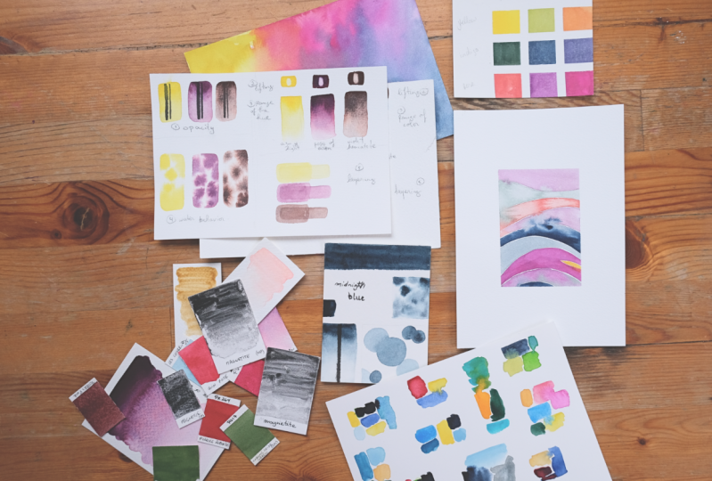
Transcripts
1. Introduction to the Class (Welcome!): Hi, I'm Stephanie. I'm an artist and of colors, color palettes, and I
love to explore them, play with colors, mix them
together and see what happens. If I drop brown and yellow. What happens when, when I started painting
five years ago, I really dove deep
into pigments, trying to understand them all, trying to catalog all
the pigments I had, all the paints I had, so I really made a
lot of swatches. I ended up liking
swatching colors a lot. And after a while, I
decided to start making these reference pages for pink
palates to document them, to see how the color
is playing together. And they ended up being very
beautiful. Quite a few. In this class, I wanted
to teach you to design your own reference
page for color palette and decide which elements
you're going to put in them. In this class,
we're going to see a number of different
color swatches. And you're gonna be
able to pick and choose your favorites and incorporate them in your design at the end. We're also going to paint
together a few of them. So you get the hang of it. We're going to paint
together all the swatches. We're going to have lots of fun. And I'm going to share with
you all the tips I have, all the insights I gotten by
thanking lots of mistakes. So you don't make them. So if you make them,
it's quite alright. You're going to learn a lot.
So go grab a coffee or tea, your favorite hot
beverage or cold if it's summer, winter here. So grab a beverage of choice, and I'll see you
in the next lesson and we'll start watching.
2. Project Video : The project for this
class is to make your own version of these
beautiful palette swatch pages. We're going to paint
one or two together. And I'm going to tell
you how to design them. You are going to have a template to make the
beautiful swatch page. I'm going to show you how
to trace it on paper. I am going to show you how
to make all the swatches. Of course. The wavy patterns. Color chart. We're going to look at
watercolor paint properties. You're going to have
some outlines to use. And they're all
going to tie him to the swatch pinch that we are going to paint together
and designed to get them. And I really hope you enjoy to share project
with their schooling's. You can see below the class, below the videos, hello
projects section. You can click here. You can
also find the resources. So the templates I
shared with you, click on Create a project and a project description called
full watercolor swatches. You can add a
project description. And I'll make the description
of the better leader. You can upload a cover image. This one has the cover image. Make sure it's
under eight months. And you can add images. I'd love to see all of your swatches so you
can chop them off, drop them, and then click, Publish, a class
solely launched. In this section. In
the project section, you will be able to
see the project or your fellow students and comment on them and
comment on them. I will personally go look into each project and review a
little feedback if you need. So ask your questions away and I'm really excited to see
your projects coming. Before we start, I wanted
to say a quick word. All the lessons in the
class are on slow speed. That's meant for you to
paint along with me. I don't speak particularly fast. So please, if the tempo
is not quick enough, don't hesitate to find the little button that makes the video go faster.
It might be better. But if you want to
paint at the same time, these videos should be at
the right pace for you. Let me know if you have
any issues with the class and and happy he's watching.
3. Materials Used in the Class: In this lesson, we're
gonna talk about the materials needed
for this class. Coffee. Important material.
In this lesson, we're going to talk
about the materials needed for this class, showing up on your
screen right now. So you're going to
need some water, some colors, of course, a little dishes for
if you're using two colors to put the colors
in some pallets, watercolor, paper, paint brushes, the templates we're going to use for the different lessons, and some writing tools. So pencils, erasers, brush, pen, five minor tape. We are going to take our time to view each material separately. If you're very familiar
with all of these, you can skip the lesson and we'll see you
in the next one. Let's start with
what's on the table. So jars of water, one clean. Let's try to keep this
one queen wants to N12 rinse your brush off and
catch all the excess pigment. I'm not perfect with keeping water jars
clean, as you can see. But as we're swatching colors or might be nice
for you to try and keep one water dish cleans the second important materials
of this class, the paint. You can definitely use
some tube watercolors. Van Gogh is one of
my favorite brands. You can use artisan
handmade watercolors. They're very cool to use. There's good a store
brand and there's a lovely human making them. You can use brand
watercolor pens, which I don't have
much of, or at all, actually, those pretty much
all handmade watercolors. If you use tube watercolors, you're going to need
some little dishes or your palette to
drop a bit of color. And if you don't have pallets
are tiny ceramic dishes. Bottle caps work
well in corn caps, so we really use
whatever you have on hand to carry the paint. And remember if you
don't use it all as you can see in this one, if
you don't use it all, you can come back to it because they're watercolors so you can reactivate them later. Let's put on the sign. As long as we're on the subject. If pallets, there are different
palettes so you can use, those are tiny ceramic
dishes I made. They were supposed
to be something else but an accident happen. So it's now a
watercolor palette. You can also use
the top of jars. They work very well because you can see this is
the dark came from. So handmade pallets
or a white plate. White is probably best
because as you use color, you'll want to see which
colors are on there. So it's always easier to do on white ceramic or whitish tops. But truly go with what works for you and what
you have on hand. As you can see, you
can use tons of paper for these templates that I made. Those are watercolor,
Studio, Watercolor paper. So there are several of
those spaced a bit cheaper and they don't behave the
same as cotton paper. So this is the cotton
paper I'll be using most for the class type
of piano, artistically, paper in tiny blocks and in Whole sheets
here than I've cut. Because Whole sheets
are very large and that will manage
watercolor paper that I also love to use. Another favorite is Hannah
Mueller, bamboo paper. So this is not
watercolor paper per se, but mixed media paper. I really love the way it
feels and you can use it. It's very smooth as well. So you can use it with
pencils and whatnot. So you're gonna be cutting out some of the paper
to make small swatches. So you can either
go for tiny blocks, might be a bit more expensive, or large sheets, and you
cut them up as you go. Watercolor paint brushes. There are two main types of brushes for
watercolor painting. One is based on squirrel hair or imitation
of squirrel hair, and the other is stable here, or imitation of will
see them in details. I'll show you examples
of both brushes. Let's get to it. I work with almost exclusively
sympathetic. Fiber brushes. The main difference is in here, that's very soft, similar to scroll here,
that's used a lot. They have very fine points, but the hair are very, very subtle. As you see. I tend to favor brushes with hair that are a bit more bouncy. Imitation stable here. Most of the time, I like
this brand. Art brushes. My favorite brushes that
are there, so pretty. We're gonna be tracing a lot. You don't have to use tape, but sometimes you want
a real nice crisp line, one you want that
you're going to want to be using either painting tape, masking tape, or a
small washi tapes. Those are a bit more
expensive, but they're nice. They add a nice little touch when you make your paintings. These are a bit less expensive and they come
in a variety of width. So you can get, the
larger sizes are tiny ones in the
resource section. So let's try this
underneath here. Somewhere. You're going
to have some templates. So of course they're not
going to be cut out for you have to do that part. But you're going to
have some templates for the wavy swatch, for the technical swatch and
for the swatch page itself. So you're gonna be able
to use these if you want to trace to
cut out like this, and just need to use your
pencil and draw the outlines. But even when we
do the outlines, maybe we use some tickets. Final supply, you're going
to need a few drawing tool. I usually use my six H
pencil, my favorite, because it truly doesn't show much underneath the painting. If you leave it there, you
can hardly see on camera now. For that reason, I might be using an HB pencil
from time-to-time. But as we're doing swatches, most often it's not. It's okay if we leave the trace of the pencil underneath it. So the wider for which the
lighter pencil you have, the easiest it goes to. Notice too much. For testing
the opacity of the paint. You're going to want an
option of a waterproof ink. So it can be in a
fountain pen like this one with some watercolor. Not want to put some
waterproof ink. Or my, one of my favorite tools, the brush pen or a
simple black liner, simply makes sure,
make sure it's certain permanent waterproof
ink somewhere on there. Or you might get
the bad surprise of your paint mixing
it with the paper. Not with the paper,
but it was the right. And in the end, an eraser. And that's it for the
materials lesson. I will see you in
the next lesson. Very short one about
watercolor paper to see the difference of the sink color used on four different
watercolor papers.
4. Watercolor Papers Comparison: In this lesson,
we're going to test one color on four different papers
just for the fun of it. Just to see if there
really is a difference. So normally when
you pick up water, when you pick up color, you drop it in your
palette after you make sure the paint is the
pigment is well distributed. We're going to start
with the studio paper. I really like this paper is very affordable from
my local art shop. So I can always try out ideas and not worry about
the price so much. But as you'll see, colors tend to be less, a bit less saturated. So we're gonna do a very
simple swatch here, just adding a bit
of water as we go. I have gradient of sorts. We can drop in a bit
of car straight from the pan as well just to
have a pump with color. And we're going to do the
same with the other papers. And you can see they go on
the paper bit differently. The cold press paper
will absorb more water, so it stays long, it stays wet longer. You can work on your
pieces a bit longer, requires more water to work. As you can see, the color
channels a bit more. Especially this this color
is and then thrown blue. So it's a bit of
a staining color. Dried a bit too
much before I added more color. There you go. That's for the cold
pressed paper. Now you'll see on
the hot press paper, color dries much faster. So we're going to have to be
a bit quicker with painting. Again, this is just to show you the differences
between the papers. So we're not looking for perfect
cubes, perfect swatches. But you can see how fast. Hot press paper dries. Finally, I don't know.
I'm rinsing my brush, but I'm using the same colors, so it's not very useful. Here. The bamboo paper, I like
it a lot because it's, it's a mixed media
paper, but it handle, it handles watercolor
is very well. You can see it
absorbs water a bit less than the cotton paper, but a little more
than the studio one. There we go. So we'll leave this to dry. Again, bamboo, hot press, cold press and studio. Paper hall with the same pen
up and down through loop.
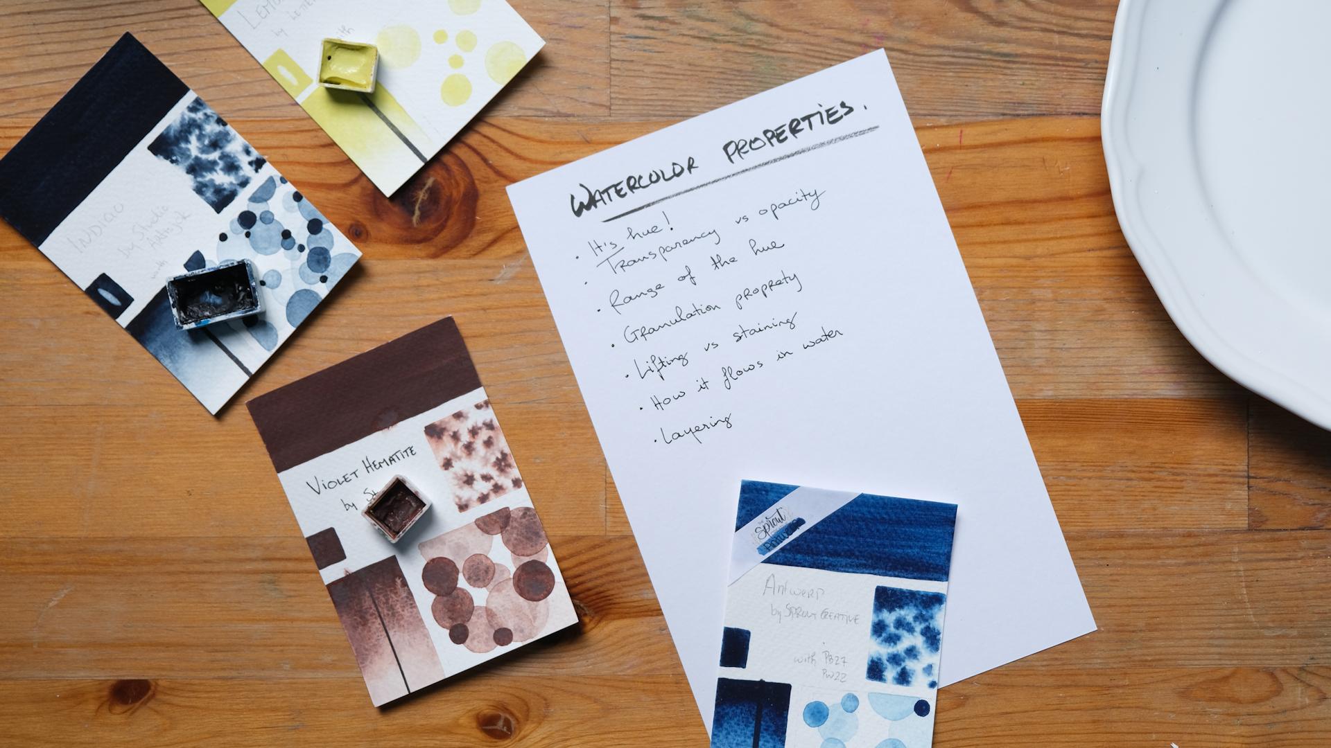
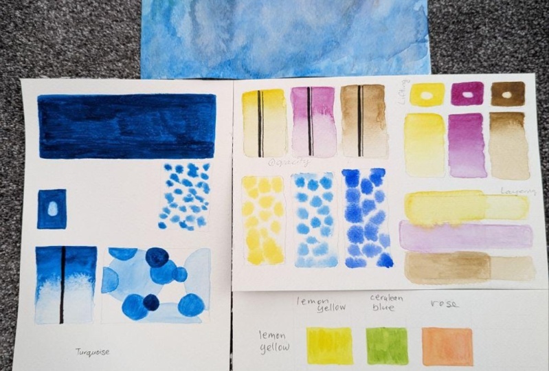
5. Paint Properties - Prep + Start: So for this watercolor
paint properties section, if this is something
that's not interesting to you, you can skip it. I won't know. It's alright. I learned a lot doing this when I started
with watercolors. A quick word also, in the technical swatch lesson, we will see and talk about these properties a bit so
you won't miss anything. Enjoy the rest of your class. In this lesson,
we're going to talk about watercolor
pink properties. And we are going to paint the reference sheet
with three colors. And we're going to look
into fine paint properties. Opacity, water behavior, range of hue,
layering and lifting. You can either follow
this lesson as a demo or you can follow along. We're going to make a
little sheet like this. I'm gonna be using for this one. Hello block of Fabriano
artistic cold press paper, as we said earlier, use your most expensive
papers, especially, especially at least once, to learn watercolor properties because the paints will react differently on this paper in
a studio or a cheaper paper. We're going to use three
colors that I chose because they're a bit
different to or in pounds, one isn't a tube. So for the ones in
pounds are a bit old and well loved
as you can see. We're going to put
some water on them. Wow, we prepare our sheet. And the two, I'm going to put some inner
loop pattern like this. And you go, don't
need that much. And if you put too much
in the dish on a plate, on a pallet, It's okay. You can just reuse them
later on this paper. I'm not sure if you can see. I made some marks with
the six H pencil. It won't show as much
in the end product. It's hard to see on the screen, but they're just
there to guide us. So the first thing we're
gonna do is make some lines, as you can see on this one. Because they need
to dry quite well. So we're going to make
the lines you can use. I'm using a brush pen with
waterproof ink in it. You can use a Sharpie. You can use another type of
pen that has waterproof ink. Simply make sure you
let it dry in a. This is the number
one thing we're going to test is opacity. So we're going to see
if the pink covers the black line or if
it's fully transparent. And you can see the black line
without anything over it. We can see on this
one that I did, you can see the
lemon yellow here. You can see traces of
paint over the black line, whereas the other two, the brown one is quite dark, but you can still, on the indigo see the
black line very well. So those paints
aren't very opaque. The first painting we're
gonna do here is to test a number to the
property of lifting. So we're gonna start with that because here the
paint has to dry. So we're gonna go
with yellow first. So here we're going to be
making these little squares. They don't need perfect. We're gonna do the
second one right underneath at the
same time as you have your full color
on here and you're going to start pick up
a bit more color here. You're going to put
the full color here. And as we go down, a wash your brush a little more. And adding water at the bottom. You can just let the
color flow a bit. What you're going to get. The nice gradient colors you can get all the different values
of that color you can get. Okay. So we're gonna fast-forward
for this next part, and we're gonna do the same
thing for other two colors. Here I put a bit too much
water. Not a problem. Can rinse your brush, dab it on a tissue paper. And then you have
a thirsty brush and you can pick up some water. And finally, our brown hematite. You can see this car
is a bit more intense. So it's a bit or difficult, was a larger range of hues. You can get a larger range of
values to get on this one. But you can see here, I didn't add enough water
and I put too much pigment. And we're going to
see you in a sec. That's where lifting
becomes interest. We're going to make. Now this one, you really want
to have your clean water. So I always push my clean water jar way because I want to make
sure it stays clean. And we're going to
put water in these. We're gonna do them one by one. So put water in that
first rectangle. And if you didn't draw
them first, it's okay. Let's put the water over there. There's a sweet spot for this. You want the paper to be wet. You don't want a puddle. And this is hard to
show on camera as well. You have to hit. You have
to look at your paper. See here, There's a bit of
a puddle at the edge here. So I want to do is
pick up the petal. You can also study the effects of dropping
pigment and a puddle. So you want, the goal is
to have your paper like this shine with a puddles. And once you have that, you want to pick up some color here with a bit of
water but not too much. And you wanted to just drop, drop the color and see
how the paint flows. Some pigments Uranus see some pigments will
bloom in the water. And others like this one. So this one is azo,
yellow medium. Yeah, So please
see in this page, this one, this one blue more. And this one which was
a yellow, lemon yellow. This one doesn't travel
as much in the water. So let's do the other ones. So that's why we want to use the palette here is because I dropped
a lot of pigment. It's very thick. Don't want all of that here. And let's drop this one
in water and you see how this one travels much
more than the yellow. So it's interesting to
see what happens with these colors because
when you are going to paint with some techniques, you're going to want to see. You're going to
want to know this. So if you have a technique
that calls for flowy colors, you're going to
want, you're going to prefer this color to this color because this one is not going to travel as much. But if you want a color that you can use with a
lot of water. Oh, I did. I rinse my brush in clean water. You L0. And you're going to see this
one as it dries as well, the color is going to separate. That's another quality or
property, I should say, because it can be
a good thing or bad thing depending on the
effect of trying to achieve. So once again, this one is a very dark and
intense pigments, so it's always best to put
it in the palette first. See what I did. I forgot
to put the water. Okay, So back to it. Now we can get and
grammar pigment. And let's drop it. And you see this one as well. Travels much more, much
more similar to this one, but more than the yellow. And you can try as well. The idea is to get to
know your paints, right? So you can try what
happens if you drop a super concentrated
pigment in there? Does it travel more or less? When you add a bit more
water, what happens? You see the more watery
your pigment is, the more it will
travel in water. Might not be true, probably true for every color, but maybe not many
things to test. Just have fun with it. Directly char. And now we don't mean
the clean jar anymore. By the way, this
is not very dirty. If you clean your brush
correctly, you wipe it. Even though the water
doesn't look very clean.
6. Paint Properties - Opacity + Layering: Five is going to be layering. We're going to take
a bit of color and we're going to
make a longest shape. Again. If you want to try with some other shape,
please go ahead. Just like that. A very thin in water down a bit and we're
going to let it dry. Now what we're gonna do
after it's come back once it's dry and later another diluted wash of
color over it and see if you can still see
the wash underneath. Or in some cases, the paint will reactivate. What's under. The
washes will combine. And you're not going to see that layering effect.
That's what work. But this has to be quite dry. So we're going to let it dry. This is pretty dry. The ideal thing is to prepare
it in advance and comeback to make sure this is dry also for the layering and
for the lifting. If you can let it dry
a couple of hours, it really has to be
totally dry to the touch. The paper has to be the same
temperature as around it. If it's still cold, it probably
means it's not dry yet. So really let it
dry and come back. So what we're gonna do,
You can either color the whole thing with
a pretty strong wash for or you can do as
here, bit watered down. So as you can see, this one is not totally transparent,
not totally opaque. But you can still see the
color quite well over, over the line down here. So why do we test opacity? When would you need to
know that your paint? The thing is, if you
wanna do some line art, if you want to draw
underneath your pain. That's gonna be nice to know
how your paint behaves. So if you make a drawing
underneath with this paint, we're going to see it
once it dries as well. But you see on this
page, here or here, if you draw underneath and you put some lemon
yellow or some azo yellow pigments dinner that leave a trace over the drawing. The drawing isn't
going to pop as much. So you might consider drawing over the color instead
of underneath. Whereas with this one, with indigo from this
brand, There's no problem. The paint will not show over
the line on this one though, you might be better
drawing over. So that's one of the
reasons you want to know whether the
pink covers lines. And it's not again, it's not a bad paint. If it covers dependent. If it covers the line, as just means that this pigment, it'll pick darker colors. It's nice to see the rain, the different hues,
the different values. I always confuse these two. The different values because maybe it's quite opaque
when you use at full force. And maybe once you
water it down. And it's quite alright
for what the drawing, for the effects
you're looking for. So that's why color
swatching as fun and useful. Especially useful. Because you get to know your
colors and you get to know. You're trying to make something, an art piece, whatnot. You get to know
which colors to use. I'm trying to make
a particular thing. And also keep in mind, it's not all yellows. These two are like that, but it's not all yellows
that will be opaque. So if you have several yellows, you might want to
test them out to know which one to use
when you're drawing underneath or when you're using them in journal
entries or whatnot. Not all Brown's will be opaque and not all brands
will be transparent. And that's why interesting
to swatch of color. When you get a new one. So now we're gonna
do this second layer of these little things. Pretty dry. But again, if I was doing this either with
smart colors or not, I might give it a bit more time, but I want to go a bit over. Then you get to see might
not have lot of space to do. Keep in mind that Crayola
colors right there. And you want to do the
same for the other colors. You don't want to
cover the whole thing because you want to be able to see where you
went with the layer, where you stopped
with the layer. In this demo we're
going to stop back to. But you can make several errors. You can make as
many as you want. And you can spot where, where you stop having an effect. Stops being noticeable.
You can see in, we're going to see
it better. Here. I'm just a bit, but that's okay. So you can see the difference, the layers, this one
layer is much better. You can very well
see the difference. Maybe here it was in trying to, and here you can see the yellow. Once you layer them, you can't really see
that second layer. You can see the difference in
hue between the two layers, but you can't quite see the
second layer underneath. The final thing we're gonna
do this is the lifting. So here we made
these little squares are very solid color and
what we're gonna do. So you put a bit
of clean water on there and then you
dry your brush again. Rinse it off, dry it, not draw the brush. You dry your brush
on your paper. And then with your
thirsty brush, you come and pick up the water. And you see all the
car on the paper. You see on the paper. That's called lifting the color. So it's nice to test this
on your good paper because different papers will react differently to
different pigments. And there's only one
way to test them. And to know for sure. Actually, there's only one way to know for sure is
what I meant to say. So as you can see, you
can pretty much lift all the color and you're back to the white of the
paper with this one. So ideally, you want to make sure that the color is totally dry when you
do this, and why? The water on both of them. Why do you want to test this? Well, if you make a mistake, if the color is like this, if you can lift pretty easily. Well, you know that
if you add water, too much color, you
can lift the color. However, some colors, especially some reds
and yellows as well. There's some colors that
don't lift as easily. Rows of Helen color
doesn't seem to be lifting as much as she can lift a good quantity
of the color. I might not be able to
get to go back to white. Again, it's important to do this once the color
is totally dry, because once it too, if it's still a bit wet, might be easier to lift. If you make a mistake, don't, don't wait until you're
done with your piece. Tried to lift it as
soon as possible. Then. Well, maybe there's times where in your process of making
art and find a use for that. And you can decide that
you make a large wash, large wash of color
and you go in and remove color, nice
orange washes. If you wanted to do
that, you have to make sure the color is liftable. Don't think I'm gonna
be able to go back to the one of the
paper and told me. One important thing
when you test these things is to actually write the names of the
color before you forget, because yes, we always think
we're going to remember. The next lesson. We're going to start
small swatches.
7. The Simple Swatch: In this lesson,
we're going to take a look at the simple
color swatch. This is truly a way to simply try out new colors
or document them, have a reference of them. And also you can play with them after to choose a
color palette for project to see how they work
together. She's this one. The yellow was nice though
they're very versatile. They don't take much time, and they can be as simple or
as complicated as you want. So we'll try a few. Before we start. I wanted to show you
these four are different. Indigo, though it's
trying to compare. So sometimes the larger
size works best. But it's not always necessary on these types of colors as
well when they separate. Sometimes you want a larger
swatch to take the time and the space to look at
these properties. And sometimes the small
ones, quite enough. So I prepared a number of
small papers like this. These are all artistic
Fabriano papers. And one, we work
with tiny papers. You want to grab another
page, mixed media paper, printer paper or
something just to put it underneath so you don t table. We're going to try a few
colors. In this lesson. I'm going to show you
a few ways you can achieve the same
effect from one. If you want really, really
straight lines like these. You can use some tape. The tape at the bottom, the top, Chavez at
top and the bottom. You have nice little spaces like this that will be
preserved from the color. So these are two pieces of tape will enable you to
write the name of the, of the color and the name
of the pigment up top. If you don't wanna
do this like this, we can make a
simple color swatch with only the bottom,
just the name. So when we do these, we'll take a few
colors from here. Let's palate. I said earlier. It's better to use a
color on account first. When you have the tape, it's
pretty straightforward. There's no need to be mindful of the edges and
you can just color away. So we'll let this one dry. Also, you're able to do like
a solid color such as these. And you could also do if
you want adding water, as we did in the watercolor
paint properties video, where you gradually
add more water to see the full effect of the swatch. So there's many ways to do this. We'll do another one. So we'll use the
violet hematite. See, even if there's
colors on your palette, you can always reuse
it out a bit of water, not too much or
it's gonna be a bit watered down my pants. Just because I like
having a solid this. So if we don't want
to use the tape, you can just make the line. Here. Let's your brush
and go right away. And make the rest
the color swatch. So as long as you have a brush
that has a nice tip to it, you should be able
to get a nice line. You can draw it first. Let's make it red. Another way to do this is to have a bit of an
effect on my papers. So we can have the nice fact. You actually go for
perfect branch here. Oops. Wrote to put the paint here to make sure
you have a uniform, wash them. There you go. Named to be straight edges. You can make little mountains. And the last way to do
this, we'll take this one. Rows of Helen, as
we saw earlier, was a separating color. It's nice. Bit of water
in there. Some color. We could go full strength here. Adding a bit of water
here. Clean jar. Britain, just water
at the bottom. You see how it flows
over the round bit. Not too much. Let's
grab the paper towel. There's too much water,
you can just soak it up. So those are for ways
to make tiny swatches. And now for the water in this
one grabbed this one after. So for colors that
are separating, like violet hematite
or the rows of Helen? I'm sure there's not, I'm sure, but I know there's
a lot of colors and those you can grab
a larger swatch. You could grab a
larger brush as well. I'll just stick
with this one here. So if you grab a larger
paper might be a bit longer and go for a
straight edge here. Now, pigment and watercolors
travel in water. Long as your whole paper is wet. We can add pigment. And then you'll get a larger, a larger version of this swatch. Since we added a bit
more water and we created an uneven wash. I'll get to see as it dries
on the separate and colors, what all is separating the two, separating pigments in this car and should settle bit
differently on the page. Now for the last color, this is a magnetite paint. Pigment is actually
the magnetic, which is kinda awesome. Song. Just wanted to show you
the importance of paper. So we'll make tiny swatch of this on the cold press paper. And we'll make
another swatch here. So these aren't dried and might stay in the back of my
paper. I don't mind so much. If you want to keep them clean, make sure to have a
larger under paper. We're just moving
this one around because as I was drawing, all the pigment,
pigment was going. You can see here
maybe a little arc. The pigment was gathering
at the bottom here. Back to the magnetite paint
and the hot press paper. So on the hot press paper, you'll see that the
pigments separates more subtracts with one. Once again, I want to make very solid color. Part of it. Not so water can see
how that settles. Long as there's water. You can also move it around it. What happens like Oh, pigment around for me. Interesting things. Now, while you still have
your parents in front of you, and you still remember
which colors you used. So now they've mostly
dried, not all of them, but before we forget, we're going to add both. Cold press paper,
hot press paper. This little one. Too much
water or too much pigment. Either way. Pigment went all the
way to the bottom. Didn't. That's okay. That's it. For the simple swatch.
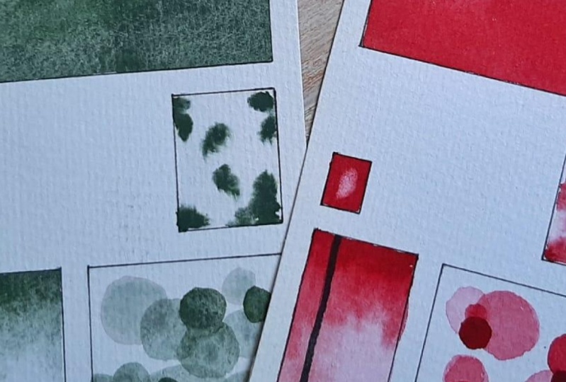
8. The Technical Swatch - Part 1: In this lesson, we are going
to make a technical swatch. There are beautiful
way to document the watercolor properties for each pigment that you may have learned so
much during those. So I'm gonna teach you how
to make them in this lesson. First things first,
we're going to trace our little swatch. I'm gonna be using bamboo
paper from Honolulu. These are quite
the perfect size. So this is the template or the outline I have in
the resources section. I'm in a little cut out of
this on watercolor paper, on Studio Watercolor paper. And then when you're
ready to make a swatch, It's as simple as putting
your paper underneath. Some reason it's easier
on this side and simply trace the ones I'm using, again, my H pencil so that you can leave
the lines underneath. They won't show so much, especially on a swatch. You simply trace these
rectangles and we're done. So the other thing we need to prepare is with a
waterproof ink pen. You want to make a line. This is a brush pen with
some waterproof ink. And you make a
line through here. And we need to let
this dry very well. Now we're ready to paint. Because we're going to go over
the edges here like this. I'm going to put it on
another piece of paper. So I don t think on my desk, we had a rush or
water and our color. For this lesson,
we're going to use Kelvin color from Van Gogh. So we're going to
put, we're going to put a bit of this
color on the palette. So now we're ready to paint. I'm going to paint
with you in the order that you would do
it at home as well. So that the layers that have to drive will have ample time to dry as we do this. So the first section here, what we want to
test is layering. So how well can the color be layered on
top of another layer? And we still see the
different layers within it. This is a strong color. I'm going to water
it down a bit. There you go. We could go pillar. That's it, we're good. And then this lesson,
I'm making circles. Because when I
started making these, I really wanted to get
better at drawing circles. And it's kind of a habit now. But you could go for any, any shape you want. So while this dries, we're going to paint
this little corner and so on previous ones, on previous swatches, I made
this section much larger, but in the end you
only need a bit, only a small section
for this test. So if you prefer
monetary swatch, It's totally up to you. You can make it
however you want. This. We need for it to dry thoroughly before we
actually test the lifting. It doesn't have to be perfect. You can work on that. Better. I feel better now. The third thing we're
going to do is to make a full strength swatch here. So this is a space to showcase the color.
It's full strength. Talking and painting,
difficult thing. So one way to make it
your own, if you prefer. So you could have the full
strength color here and you can have a much lighter
version of it here. Or you can do the full
strength version. As I did. You're welcome to see
which you prefer. This is not if you
do this at home, you can do several cars at once. And this will give you more
time for your layers to dry. But I think we're good
for a second layer. The second layer is a bit
darker than the first. I find it fun to have the lighter layers
with larger forms or shapes and to have smaller shapes with the
layers that are a bit dark. Again, you can customize this. You can try different things for different colors as well. You don't need to make
them all to all the same. And the different layers could be different
shapes as well. You don't need to
have all circles. You can make rectangles for the second layer
and my triangles. The last one, I think
I went too dark here. But that's okay. Now we're gonna go
for the opacity. So this is our black line
that we made earlier. So we're gonna do two things. First of all, we're going to put the color full
strength up top here. And then we're going
to make a gradient so that the color is much
paler at the bottom. And we'll see how to do this. And then we'll see at what point the color becomes transparent. Or if it stays transparent. All the way through. Now you want to put water
on your brush and want, and just water at the bottom. And this color is very staining and it will travel
quickly in the water. So you see, I didn't even need to add color to my
brush after the water. Maybe we want to add a
bit more color to that even gradient. There you go. You can tilt the page a bit. And maybe there's a tab
much water on this. So just go in a bit of water away
on my fingers. So as you can see here, my fingers in the paint and I put my fingers
on the paper. And that's a reason why we want to test for lifting purposes.
9. The Technical Swatch - Part 2: This section, this section
is about water behavior. So how this pigment
will travel in water. We had 0 preview when
we made the gradient. Remember we want the paper
to be wet with no puddles. Seems about right. Maybe a bit freshwater. So I'm just tilted a bit
from the one at the bottom. There we have it. So you want
to pick up some pigment. You can test how it
flows. As you can see. I was watching, I thought it does travel, but too much. You can add a bit more
water in her painting. And you can see that the pigment travels
much faster, much quicker. If you have more
water on your brush. Let's add another layer
to our bottom section. So you want, at this point,
quick concentrated pigment. I think, I think my second
layer was a bit dark. So one way to test this, instead of going on and saying, oops, I went too far. When you begin, have a scrap sheet of paper
sign next to you. And ideally of the same paper you're using for your swatch. Then when you pick up the
color before dropping in here, you can make a
swatch next to it. And then you have a better
idea of where you're at. Because I think not I think
I know I went too dark here. You can see that there
can be many layers, many hues in-between
these 21 way to correct this is two. This is not an easy
pigment to play with. So you can add another layer just here. If this happens to you as well. So it's not you
don't have to bend. If you make the same
mistake as I did, you can just come back and
add layers afterwards. And, you know, body wall. And the swatch will make work. And you'll have the
information you need where nobody knows. Well, you know, but we're going to add full strength. This is a two
watercolor as well. So sometimes it's easier
to grab too much color. Whereas when you
work with parents, you have to work for
the color and tubes. Well, if you dip your brush in the color layer
at full strength already. So there you go. You can make as many
layers as you can. And there we go. The last thing we
want to test is the lifting to the
bonus lifting here. So you want to come here
and just drop some water. Some clean water
would be better. Let's use clean paper towel. And you want to pick
up the water after. You can do it with a paper towel or you can do with your brush. You dry your brush very well. And then you pick up the water. And when there's no water left, we add some more. Drying your brush again
and pick up the water. You see with this color. We're not gonna go
back to the white of the paper because it
is a staining color. So it means that means
that even though you try and you add lots of water and you pick
it up the number of times. You're not gonna be able to
pick up all of the color. That's nice to know
because if an accident happens like it happened to
me earlier, Well, you know, you have to act quickly
because if you let it dry, chances are you're
not gonna be able to pick up the color. I think that's it for
this one. Last thing. And don't skip this step. Either with your
pencil or with a pen, or with your pencil first and you do with the panelists later. Write the name of the color. Make sure your pen works before. And then you can look
for the pigment info. So this is PR 176, which is a red pigment. And underneath, if this is
something important for you, you could write
the light fastness and whichever information like the transparency or opacity and the staying
power of the color. You can write everything
that you need on there. I'm personally, I have
the pigment info, the brand, and the name
of the color on there.
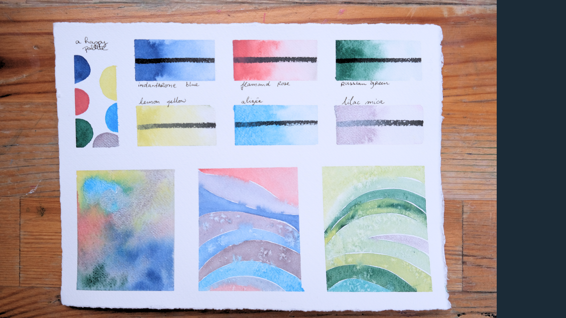
10. The Color Chart: In this lesson, we
are going to look at color chart swatches. Color charts are
basically little squares. Usually they're squares
where you mix each color with each color in your square. So you get to see every
mix you can make. Almost every mix you can make with the colors of
your chosen palate. They can be quite small
with three or four colors, or they can be larger. Such as these that are
made with a colors. The more colors you add, the more you will
have to be patient. For this lesson, we're
going to practice with it three
color, color chart. That's enough to get the
idea of the process here, I chose three primary colors. Yellow, light,
indigo, rose, pink. So we're going to use, again my little block
of handmade paper. So you basically
need three squares. You can use tape to
make the squares, or you can use your ruler and a pencil to simply
make the squares. We're going to just
eyeball it because they don't mean to be commutated. Don't forget to take the time
and don't skip this step, especially if you're
working with more colors, actually write down your colors. So here I'm using a to H pencil, and later I'll finish it off with my fountain pen
to make it look nice. Yellow. And go yellow. Rose. My lines could be a
bit more straight, but roll with it. So the first thing we wanna do, this woman was
putting yesterday, so I have to reactivate
it and actually fill in the squares where
it's the color. With the color. That
sounds weird, right? So the yellow with the yellow. That's the idea
of a color chart, is to have on the horizontal line of a
mixes with more of that comp. So right now I'm finishing up the indigo color on that line. We would have indigo mixed with a bit of yellow
with a bit of rows. And on this side
we'll have the indigo mixed with lots of yellow in the indigo mix
with lots of rows. You get an idea. These charts will
give you an idea of the range of colors you can mix together using
these three colors. So now you need a palette. Just make sure your
brushes very clean. Corals are going to contaminate
your pen source of car. So we're going to drop a lot of yellow because it
takes more yellow. And the other color. Only two-ninths. Puddles. I'm working with tubes because it's easier to get more color. But this one has dried. So two big puddles. And what we're gonna do is
add the lightest touch ever. Indigo will put it on the side. She wants something. We'll
put it on the side here. And you're going to mix it in a nice greenish yellow color. When you mix watercolors. I have to make
sure pay attention to the quantity of water
and put my finger in pink. So make sure you don't
add too much water or your course will be very pale. This is why for these charts, it's fun to play
with tube colors. And the next one, I'm going to grab more color. I was forgetting my Paper and a bit more color. I could add more indigo. See how different those two
yellow those two rings are. But they're made with
the same two cars. And there's an infinite, well maybe not infinite, but there's a huge range
of mixes you can make. These two cars. Of course, those are the two only options will see you in the next lesson, we'll see a fun way
to play with this. Make sure your brush
is quite clean. So now we're gonna go for, I'm going to put some
more yellow as we saw. First one was a bit pale. We're going to grab that pink. That's what we use it after. What keeps them for the indigo. Here, a tiny bit of them
might be not enough. Tiny bit more. Now we have an orangey
yellow. Orangey yellow. Yeah. I'll put it here. And here. So that's where having
the names is good. So you can double-check
where you're at. I can't tell you the
number of times that I made an error when
putting down the color, dropping more pink and
they're more girls, actually *******
than an English. More rows here, and
we'll put it here. So you can actually see the road rose color
with a touch of yellow. So we dropped a bit too much. Pink here, two rows. Go grab us ourselves. Some indigo. Now since my brush is
already filled with indigo, I'll go here. And that'll be that will
be our indigo rose. Indigo with Martha Rose minute. And I'll wash it off. Graham. Pink. Touch more thing. That is, or pink was lots are pink with
a touch of indigo. And we're done. We don't
actually put my finger in it. I felt it didn't
show as it dries. It dries, kinda shrunk. So I'm just going to
cover it up here. This is a big green
for my taste. I want it to be a
bit more indigo. So we're just going
to use that indigo. Require that means more. Indigo. Just hold that on
top. M. Now we're done. So as I said in another lesson, the tape on the bamboo pit paper tends to terror
of left too long. You can see it a
bit. So a nice tip that I did not do here is before you lay the
tape on the paper, tape it to your clothing
first and then to your paper. So it has a bit less
sticking quality to it. And there you have it. A nice little car, truck. Three crops.
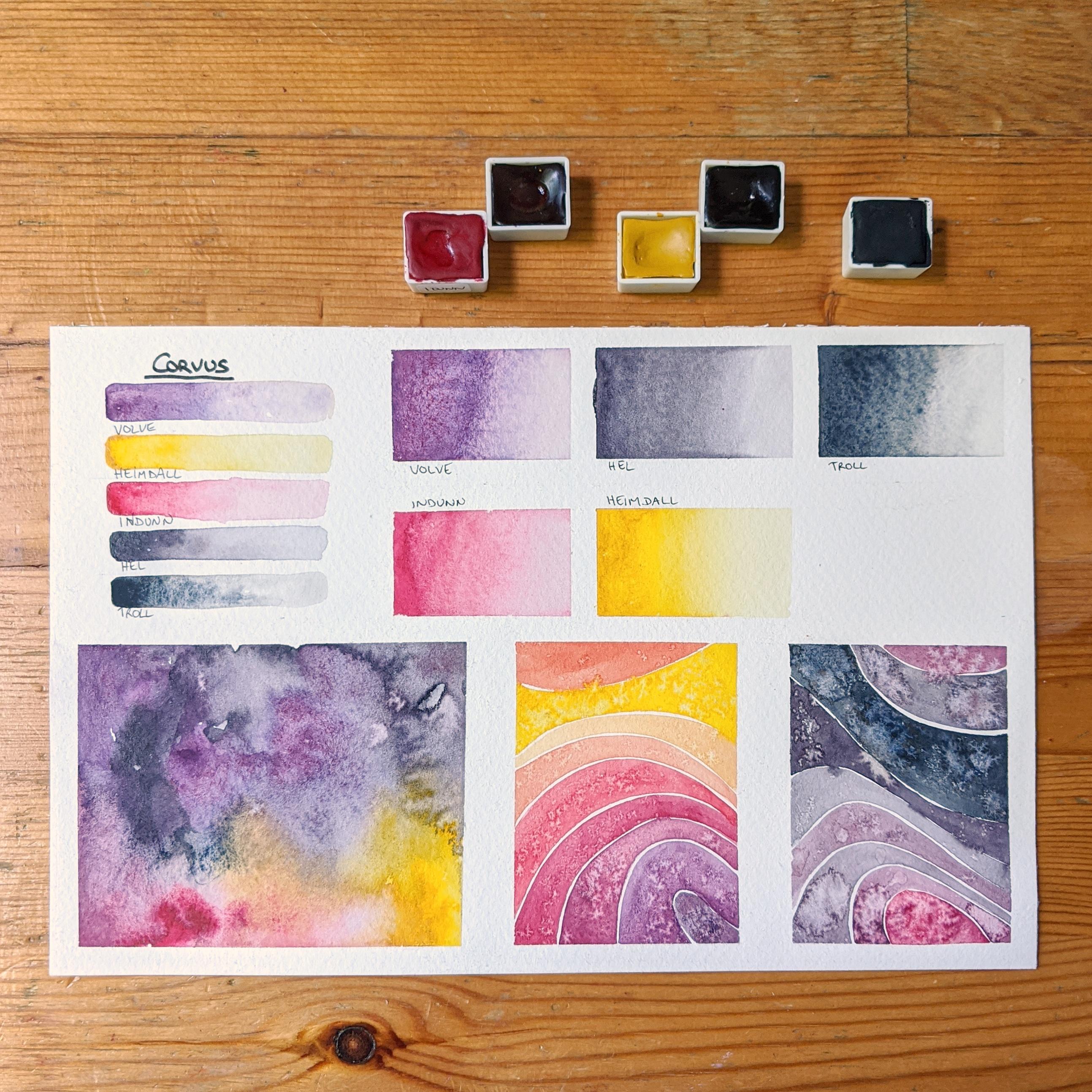
11. The Palette Mixing Swatch: In this lesson, we're
going to go for the palette color swatch. The color chart is something
that's very organized. These types of mixes, they're a bit less organized
for documentation, but they have all you can see
all the nuances in there. So for this one, we're
going to actually use the Fabriano artistic
go watercolor pad. Because it's more fun. You can put more water and you can have a bit more
depth in your colors. These I usually do
with four colors, but we're going to use these
three. See how it goes. So first of all, make sure your callers are well activated. If you have old Mr. like this, you can just add water on the page depending on the
size you're working with. And here I'm working
with some tiny brush. So you might actually want
to use a larger brush. We're going to
make it work here, but it's fun to adapt the size of your brush
to the size of your paper. What we're gonna do
is basically pick up the colors on each corner, will. That's why we do them
with four colors, but It's going to work. On each corner you start with
one color. Which I'll draw. Here is we have only three. There's gonna be a bit
more space for each color. Play with the saturation doesn't have to be full
strength on the way. And we're going to let the
colors touch on the page. Next. You see magic
happen on the page. And in the middle. That's the fun part about it. Make sure to perhaps
use the palette. That's right. In the middle, we're going to have
all three colors meet your right and put
the endergonic bottom. Let's see, this is where
larger brush would be. Better because I thought the picture would
stay wet longer, but common tries more
quickly than I expected it. Depending on the weather. On the temperature of
your house that day. The humidity level,
the paper will dry more or less quickly. Those you can see
in the middle as these are kind of
primary colors. I'm going to start seeing a neutral color start to appear. And then you get to see
all these beautiful colors in between various scientific formal way to mix your cards
so you just go in. I could actually
do this for hours. He's drunk, color on
the page and smooth. And it's quite fun to do on cotton paper because
That's where you see. The paper is still wet the longest and can
definitely playful. Long time. The car is if it
starts to dry and just pick up some color, add more color to blend in the
bits that are wet and dry. It's important to go over all the parts or
you might leave marks. And even if you
leave some marks, undergo is taking
over quite a bit. But if you know me a little
bit and we all know, that's not a problem. I love. Maybe we're missing
a bit of yellow. Some drop in some yellow. Almost a second lane. Bring him there, you have it. That's another way to
play with a palette of colors and see what happens when you mix
them together on a page, bring back the car trunk. Will see here you only have nine different cues
on your paper. Whereas here you have many more. And you can see all
the range of greens. You can get all the arranger, orange-ish colors,
and all the purples. And of course, like
all those neutrals, you can get the mix
all three together.
12. The Chaotic and Playful Swatch: In this lesson, we're
going to take a look at chaotic and
playful color swatch. So this is a way to make low palettes and just have fun swatching your colors
in different ways. And as you can see
in these pages, there is no color names,
no documentations. We're just randomly
choosing colors. I'm playing with them
and see what happens and train your eyes
to look at color. In this lesson, we're gonna
be using artistic owe, 100% cotton paper,
but hard-pressed. Just for the fun of
switching it up. You can take a larger
page to do this, or you can take the smaller one. You could even do it on the little pages. It
doesn't all walks. Activity here. Sorry, I'm just gonna
go pick some colors. Then I dropped
them on the pitch. I'm not sure you go for those squares and see
what is fun to make here. Green. And what can
you ask herself? Well, I think this will
make a nice combo. Actually does, and I think
this will not be as nice. But it's not that bad. It's something to go
with that yellow, green with some more
lemon yellow dots a convoy don't like as much. But it's interesting
to have non page. So that's really just the
plain colored groupings. Most one way to go burn it. The corners touch
into how the mix. I can. Newton put them
next to each other. Touching. And there's
no pressure sensor, sons well, there shouldn't be any pressure when it
comes to do as you want. But especially in this exercise, the goal is not to
darken and just the claim and see which
colors you feel like picking up and
putting them next. And you get to film. And there you have it. A nice page of colors that are
all bleeding into another. And you can take a moment to look at which ones you liked. Or you can flip the page
and make a new one.
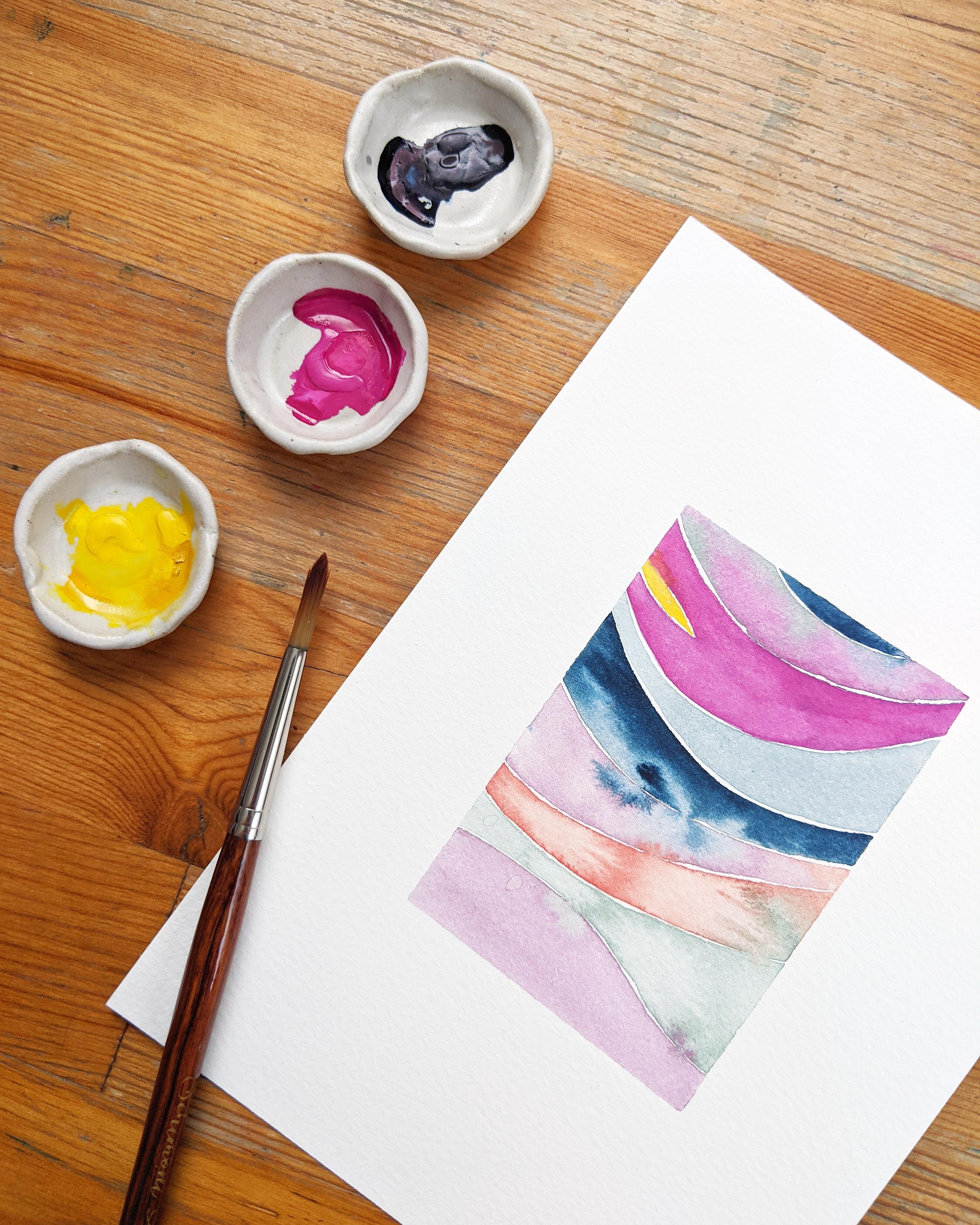
13. The Wavy Pattern: In this lesson, we're
gonna learn how to make these wonderful
color swatch. And the resource sections. I'm giving you a drawing, the line work based
on this piece. If you would like to use it for your project,
you're welcome to try it. There are three
different ways to make the wave patterns and won't
go through them one by one. The first way is to trace the outline from the resource
section onto your paper. The second way is to
draw on your paper, freehand your own lines. And finally, you don't
have to draw any lines. You can simply paint the
shapes as you go along. And we'll see this
during this lesson. Depending on the margins
that you want on your piece, you're going to use the
proper size of tape. This is quite a large paper and we'll make large
margins using this. I'm using Fabriano compress and Brianna artistic
cold press for this one. I'm going to try something
and not go for equal margins. So small piece,
pretty much centered. So small piece was the
large white frame. That's what we're going to,
if you want to trace it or if you want to use a pencil
to freehand trace lines. If I suggest again, my favorite six H pencil, you can simply just make
a couple of lines here. And the rest were gonna
do just freehand. So here you can see the
lines there are very, very light, but
that's what we want, so it doesn't show too much. So depending on
what you are doing, if you're just doing
it as an art piece, I suggest three to four colors. And we can mix them
together as well. But if you're
documenting a palette, like we're gonna do
in the swatch pages. You're going to use
the colors themselves. So for this one, I'm going
to clean my palette. I'm like doing this. Just add water to what's
left in your palate. And we're going to try to
keep a few different colors. So on the first line, what you wanna do,
what you wanna do, you do you write? But the way I work is I
do the line first because that's the part of the design where you need
to be paying attention. And we're maybe I shouldn't
be talking too much. So I do the line first to get the shape the
way you want it. Then you simply have to make sure that all of it stays with. So on a cotton paper, it's not quite an issue. But if you're working
on Syllabus paper, you're going to see
it dries faster. And you want, you want the color to be equal
on the whole length. So you want to try
to work quickly. And then we're going to take
another color here to green. Now it's the same thing
we're going to go. We're going to do
the line first. Courts quit piano. That's okay. We're gonna
do the wine first. And since we drew this, we can do both wines,
which is worrying. We know where they stop right? There you go. I
might add some color later. Experiments I thought. So again, we want to follow
the line first. Touched much. That's okay. And you follow the
line underneath. So if you're working
with from the outline, so if you trace
this on your paper, get something like this. You're just going to keep
doing these sections. So it's the same process
over and over again. Simply need to choose
a color every time. Now, this one bled a lot. Okay, it looks good. Now gets a bit different. Here. I don't have any more lines, so how do I decide
where to go next? So here, this line is
not a question, right? You have to follow this one. So the only question you have to answer is where is the bottom
line we're going to meet? I usually paint that first. Paint the bottom line. Makes sure I like the shape. Then I'll go and
make the top line is now when it's drying, the colors start to dry. This is when you
want to add some of. This might be another
class one day. But if you haven't salt
on hand or I can just drop a bit of water
to create some fact. See this one is to drive. So I don't have any effects. Depending on when you
put the water in there, gonna get different effects. And you don't need to. Some of these are made with
no facts. Really liked them. Somehow, very few, somehow more, more saturated your color is, the more the effects are
going to show on the page. So if you saw in the previous
image with the indigo, you can see the effect of the water much more
than working at sea. Same thing for the
bottom shape first. And then you fill up the rest. Now I'm thinking
these colors are starting to become very pale. So that's the power we used
a bit in an earlier lesson. We're just going to go pick up some color and drop it in here. Just going to draw a
bit more color here because we entered untrue
grayish territory. While it's okay. I want it a bit more color. So that's another effect
actually you can make. We can go grab some color
and drop it in there. Just let it go. And that's why we spent time
at the beginning looking at watercolor properties
because this is going to inform you when you
decide to do this effect, or you want this effect, or you want a color that really, really blooms into the water. While you're gonna know
which one to choose. This is starting to become a very interesting
looking piece. So now we have a very
pale green and now let's say the one shape I don't like so much is to have a
big belly in round one. But it's really a
question of taste. So here, one thing I like to do, let's don't actually
make them shorter. Rainbow effect. So I'll show you in a sec. Long as greener than this one. Here at the bottom, we end
up with a rainbow effect n with making the arc of
your circle like this. So more pronounced
and then smaller. And then you get a rainbow. Whereas in these pieces you have more rounded
shapes in the middle. And they're a bit more abstract. So it's really, you can, from here you can
go one way or the other for the sake of it, because if you use the outline, you're going to end up
with a rainbow we want. So for the fun of it, we're going to try
something else here. We're going to actually
make a split one. What is the split one? So these are very technical. So you make a larger
shape, right? Then you decide to
leave some space here. Another column, C, you haven't
filled the whole thing. See this one I loved Dr. It got to be careful. Work fast. Or more water when
water, non cotton paper. No problem. The top layer is this one because I was
talking is too dry to make an effect like
kissing the colors. So we're just going
to leave them with a nice white
space into two. So this here I could have I
could have made a bit larger, but I'm going to put
some yellow in here. And then you just fill shape. Now, you might want
to change brushes. If you don't have quite
a very consciously, as I was saying, since
that she is very narrow. If you want a very
clean what you might want to change your
brush to a smaller one, which I could have
done, but I didn't. That's okay. Let's see. Do we do one last one? We're going to keep
a little space here. Oh, interesting too. So welcome. Bit of car that's
not quite mixed in. Here. This ended up beautiful, even better than I expected. So once drop some pink
and this one and see, drives go down, Let's finish
with a nice touch of blue. So as you can see, this is a very
intuitive process. What does that mean? Means that you don't mean
to have a very set plan. You can just go with what
feels right in the moment. And I've done a lot of these. So if that's not something that's easy for
you, That's quite alright. You can practice
that will make it for you. And there you have it. Anyway, Me pattern.
14. Designing Your Swatch Page: In this lesson, we are going to be designing our
own swatch page. Your swatch page doesn't need
to be exactly like mine. I'm going to accompany you in deciding what you want
on your own swatch page. In the resources section, you can download this and then trace it onto watercolor paper. You don't use a cotton for that, but you do V0 paper or
cardboard or something. Just cut out the squares, the different squares in this. Be mindful of your
fingers while doing this. And I speak from experience. Once you have this, it will be easy to trace. We're gonna do that
in the next section, six color palette of space to put your colors
as paste to mix them. And two spaces for
wavy swatches. Maybe you've had a lot of fun trying to make
something like this. Maybe you had more fun
making a mixed pallet. Are you really want to have the opacity information
on your card. And perhaps you want
to do a color chart or some random palettes with
whatever mixes you can get. Or you want to make
little rounds like these. On your reference page. The choice is really
up to you and I invite you to customize
this template. The page, I've done pages
on nine by 12 " pages, which is a bit larger than
A4 or letter size in the US. And I've done them on half sheets of these
blocks, nine by 12 ". So as you can see, this one is nine by six. You can also cut down
sheets of paper. If you use a large sheets, which is a size,
these are one-eighth. This is one 16th of a sheet. And as you can see, it is a bit smaller
than my nine per 6 ". And this is roughly a letter size and a
bit larger than this. So if you want to cut
down sheets, the fun is, you can decide yourself what is going to be the size
of your swatch page. So what you wanna do if you want to use this
template, go right ahead. For this, the only six colors, or you can just
not put the sixth. And if you want to use a
bit more colors, well, you can still use the template, but you just separate
the colors here. You get to decide which
feature you would like. So here are two wavy patterns. You could decide to use. One wavy pattern. And then here I have a big chunk of the
palette mixing swatch. You could decide to add
some little pellets, some little combos of the different colors in your palette in one
of the squares. You could also decide, I don't want to use that. I want to make a
small color chart. And that's a very
cool idea as well. And perhaps you use a lot
of water in your work and you really drop
some colors and water and you're
like, okay, well, I want the middle one
to be just a square where I'll drop water and
see how the colors behave. You can decide here, instead of making small
gradients of the colors, you are going to
paint six rectangles, a water, and then just
drop the colors in. That's truly up to you. And then the space
here in the template is meant for a simple
swatch of each color. Once again, you
can customize it. You can make larger
swatches, smaller swatches. You can even make little
circles of colors if you want. This palette was
only four colors. So of course, there's
no need to go for six. The choice is really up to you. If you do the, if you still decide to
make two wavy patterns, you can think one
on the other side. You can add texture in
one, not on the other. You can have some colors on this one and the
other colors on that. Possibilities are truly endless. So I'm gonna be using
a larger version to show you how to trace and
how to perhaps center it. So we're gonna put
tape over the edges. Not because it's very necessary, but because it's going to
help us Center the template. One thing that's
fun when using tape is that as you can see, it's the same width
all around, right? So it becomes much
easier to center stuff. So I'm gonna be using
the same template. And I'm gonna be
tracing my squares. You can do this with me. I'm not going to be
speeding this product. So how the time
to do it with me? Or you can speed me up. You're just watching. So remember, if you're not using a six H pencil like I am, please make sure to
press down super heavy. The top line there, something went wrong
when I cut the shapes, It's not quite straight. I kinda bothers me a bit. But as I noticed
when I did this one, when I made these, I
made tape all around. I didn't draw a shape. I just taped everything. I don't feel like
doing that so much. But for these squares of
these rectangles squares, I'm going to actually
add some tape because I found it very difficult
to keep straight edges. So I'm gonna be using this tiny, tiny bit, larger tape, tape than the previous one. Quick tip, if
you're taping over. If you've traced underneath
and you want to use tape. If you tape just over
the pencil line, right? We taped over the pencil line. Well, it's not gonna be
painted over, right? When you're going
to remove the tape. You're gonna be able to erase the little lines you may
ask to keep in mind. Now if we want here, okay? And now we have one over, might have to adjust a bit. We'll get there. When
we paint. There you go. And in this one, what I'm gonna do is I want to check the opacity
of the paint. So I'm going to make lines through these here so that I get a reference of
how opaque these paints are. Just for the fun
of it. You don't have to make a straight line. You can draw a little something here, mountain or something. Let's have fun with
it. Or you could draw circles in the paint, right? You make a pattern. So all oxygens that you
can do for the rest. So you've seen this one. But for the rest, I'm gonna
do my classical swatch page.
15. Project Paint Along - Beginning: I've decided little
palette, Carmen, some Chrome oxide,
violent hematite, indigo, Copper, blue, glassy. Yeah, so 123456 colors. As I'm preparing to paint, I realize these top
squares aren't very, even. Some of it too fast. To make sure everything
is straight. I'm going to put
down bearing, go. Okay. Now we're ready. First thing to do. You can paint them in
the order you want. Great. It's nice if
you go from left to right so that you don't
put your hand over. That is, if you're right-handed,
if you're left-handed, maybe you wanna go the
other side around, the other way around or you want to turn your
paper, something. I do a lot. So both for the sake of this, we're going to
paint these lines. Just remember to leave a bit of space for the
name of the color. Same thing here. We're gonna be putting down the
colors themselves. The reason why I do
these before is here, I tend to mix all
the colors together. So you want to get a nice bit of each color without any
mixes in before you start, before you start having fun. Let's do this. And because I'm terrible
at just wait for this. So we have six colors, right? Briana first split it in half, and then in three sections. This is to remind myself of the space
phase colors shifting. And then we just
have fun painting. So we're gonna start
with that Chrome oxide. So I'd like to start with
a color full strength. Oh, I forgot my paper. And then just bring it along
with some clean water. That's why you want
to have your water clean to be the
cleanest possible. So speaking to myself here, remember to rinse or
brushes dirty water. Next up, the violet hematite. Queen Morgan. So this is
gonna be a real-time video. I might not be
talking all the time. And you can see some pigments travel much quicker than others. Whereas when we put some
water down for the green, you saw that the green didn't
go all the way through. But for the violet hematite, the pigment traveled to
the inferior quickly. Next up, indigo. This is my favorite color. I use it everywhere. It's often the base
color of my paintings. And then I decide what
goes with indigo secret. Everything goes with indigo. S1 or almost everything else. Let's see where do we go next? I will put the
glacier Bu, Jesse. Let's see, That's
where you have to be. I didn't leave enough space between the two
colors. That's okay. You can trace it out. Maybe I tried to lift, Let's see, as easy. But as we tested the lifting
capacity of the colors, that's still be
very difficult to. With the color, like in a straight line
for the whole thing. So just pay attention. Pay attention when you're
putting the colors. The calamine color. As you can see on the paper, this is a very staining color. Very quick, takes
over quite rapidly. Chosen the water. Gouache. And that's why it's good to know your colors or
to get to know them. Because the small, smallest, smallest dash of color of
this one goes very far. And you have to wash your
brush very well with this one. So it's good to know once you played with it
a bit, you know, I don't get surprised
with some leftover pink. And you didn't expect
it to me. The copper. I don't use many shiny colors, but copper's goals, implement italics are
pretty cool in my opinion, and that goes for everyone
to decide for themselves. Here. I might have put a bit
too much pigment on. That's okay. It doesn't need to be perfect. The goal is to have fun. And take a moment to notice what happens to your colors
as you lay them down. And that's how you
get to know them. The more you work with them, the more you'll know them, the better you'll be able to use them in the way you want them. So if you remember, in the original one, I put more color here and let
it go with more water here. It's quite similar to this one. Then this other page, what I did was put some
water but just dropped bits and see how they
traveled in water, salt. I'm gonna do this again
because I find it interesting. And here we already
did the water part. What we're gonna do, I find it easier
to do it the other way to leave the water
on this side first. So when you have the tape, it makes painting much easier. Because you don't have to worry. They're going over doo doo me. Mindful though that if
you're told me Well crest, the paint will go under and don't overdo
it with the water. But yeah, we're going
you're recovering this. And as you can see, this
color is quite opaque. We don't see the black
line anymore at all. And that's a quality
of the water quality. If you're looking for
transparent paint, it's not a color for you. It's not a, it's opacity
is not the quality. But if you're looking
for covering pain, green oxide is the color free. So we did a bit of this here and then we're going to
pick up some color again. And just here. And as you can see, you saw here that it
didn't travel much. You can see here
how much it doesn't show bit more ordered
to add more water. Well, and here I
don't like this. Maybe she can see the
paint went over here. So what I'm gonna do is I'm going to dry my
brush on my paper. I'm good to go
pick up some color because I feel like
dropped a bit too much. You put some water on your brush and then go in
and pick up the water and pigment and see what happens if you think I have
a tapes doing all their job. Of course, when you do this, be talking doesn't want
that at the same time. So there you have it. Just short. It's true right? There you go. Better. Alright, so it's not perfect. Perfect is boring right? There you go. But
as you can see, you would leave this
out because the idea is to show that the paint
doesn't travel well. Here, we're gonna
do the same thing. We're going to put the I'm gonna go with
the pilot hematite. Kind of it on my palette
or any one thing was ceramic palettes that you put on them dries
pretty quickly. That's alright. Just means that the if you just add water
to reactivate your pigment, then you might end up with a wash down version
of your color. Make sure to add more
pigment as well. Unless you don't
want the paint to be very, very pigmented. Soft ones shown. Again, this pigment
is a bit of headache. The sense that we don't see the black line as much as much as what as
emotions with another color. And not be quite a lot of water. As you can see. It doesn't travel too much when
there's not water, but you'll see when it dries. Travel quite a bit. And again, rinse
your brushes off. The dirty water jar.
16. Project Paint Along - Middle: Oh, I forgot to this. When you just look brush, you forgot to add color. The water. You can just grab another brush instead
of linked rinsing off the pigment of the water
first, this brush. And you can start again with
your pigment loaded brush. We're going to drop color here. Also. It's interesting to note how car travels and
then how it dries because maybe it looks
like nothing like you see the green starting to dry and they stay
like very compact. But then once they try, they expand a bit. So take note of the
shifts that happen. Once we try and see
I did it again. I loaded up my brush
with the next color. Am I totally forgot
to add the water. Maybe I should've said, Make this lesson
with two brushes. Kinda fun to add. Two brushes are more
playing around. Always ready for
when you need them. Maybe my brain just
mute. There you go. I'd like to start these link. Lot of watercolor
teachers will tell you, don't take the paint directly from the pan and put it
on your sheet of paper. Because you want to make sure you don't put
too much pigment. I like my colors to be, especially during
the washing process, to be quite quiet pigment. So I tend to do this often. You just have to try it and
see what works best for you. And now we're gonna
take some pigment and we're going to drop it in. I think apart from the red one. Seat. Not to traveling. Again, it depends on the color, the amount of color you put, the amount of water you put
on your brush with pigment. So all these things I think
I might have not properly, properly rinse my brush. Won't do the Carmine color you see on the palette even
though it hadn't totally dry. But you can see how rich
and how much it spreads. I might need to
reduce some girls, I'm having a strict time. But as much as you see how it
takes over the whole space, if I would just tilted, the color would just run away. You can see how transparent
and still is because you can see that very well. The reason most of
these things are lines is because
if you put water, you get to see at which point it becomes
very transparent. So if you put round like this, you only have like
two or three yeah. Dots. And that's okay. Here. Now we're going to drop some and you should see it slowly take over. As you see this one. Part of it stayed in place
and part of it everywhere. Every last car put
the water various. So it's a good exercise as well. If you do this a few times. See, my brush was totally ruins. There's a bit of an annoying
part of if you can see it. But there's a slight slight pinkish
tint. That's okay. But if there were no serious
swatch, What's a series? I'm printings launch
or something. It's not too bad,
but good practice. For water. You can see this one doesn't show much pigment, then you would have
struck them here. And we will see once. What do we do with
the bottom left? In this one, we're gonna do this version since
there are six colors, you can't have 1234
and the corners. So we're gonna just links
them up and see what happens. I'm going to put a bit
of water all around. Maybe it's the water
over there that's starting to be a bit pink. I'm going to end up pink anyway, so I'm not going to
go and change it now. I'm just going to grab
some colors. How fun? And it goes. You can see my
pen is pretty entertaining. It's okay. I have indigo patterns
are the only ones. Oh, and by the hematite, I've never, never, I have
not emptied a lot of colors. But these two, I've
emptied over and over. So the goal here is just to
have fun mixing the paints. Mixing the colors, shapes and shapes. This water is not
clean at all anymore. But that's okay. The goal in these is I
often try and to have the middle with all the
colors now the brown, violet hematite over parent
everything with them. That's fine. We're going to add
more colors after. Because one, when you
work with cotton paper, good quality cotton paper, you can actually put many, many layers of paint and water. And it will, the
pitons of paper will. What do I want to say? And the paper will keep doing its job and not
buckled too much. Ground hematite, violet
hematite and that Carmen color are really
beautiful Mexican. Way over here. A bit more to see. Blends a bit much, but the glacier blue
and indigo is a comma. So I'm strapped a bit
more green in the middle. That's another thing with these colors that
are quite opaque, they tend to add a bit more. They don't blend as much. They like, sit on top of everyone else and
say hello, I'm here. That's okay. More in blue here. Now I'm going to drop
some more red because I feel it's interesting to
see how the red pushes. Let's not forget our copper. So when I have a metallic
paint, these mixes, I like to put it
over everything and then now might be a bit
too much red. My liking. More indigo because
when I was there too. Now there's a bit more water. So your brush just kept
some water at the edge. And see we're finding
a nice purples here. The reason I like to make
these is because you just blend all the
colors in a way maybe you hadn't thought of
is he just dropped cars in a huge puddle. But now we're seeing a blue
light purple with the Karman, the indigo and the
glacier color. This is quiet, a fun discovery. So before everything dries, you want to pick up
some of that copper, drop it in where things have been trying
that corn who were there first in the
green as well as dry. And that's why that's the reason why you want
to work in your palate. And then as you start putting color in here and you want to go
back for more coppery, don't wanna put all these
colors in your copper pan. That's one reason to, That's one reason to
work in your palette instead of picking
up color directly. But if it's happened, it's not the end of
the world either. There he go. Overdo them
and add them as accidents. Yeah. There you go. I think. One is it
done when you decide?
17. Project Paint Along - Finishing touches: Here we're gonna be making
our two wavy patterns. For this one, you can either mix all six colors or you can
have two versions of it. I'm going to use what's
in my two pallets. So on this first one we're
going to do the glassy, Let's see color and the pink. And on the other, we'll
do this three others. Because I think it's fun to
have two different ones. Do you remember? It's just fun. This is where the sable brush than this much more difficult to do with the brush where the
hairs are much simpler. And the goal here, what I kinda tried to
do is to have like each layer has a very
different color. I tried. Since then, I try not to repeat
the same hue too much. Especially in a small
drawing painting. Like this. Big coupling. I was going to pick
up, pick up some blue. Because as we saw earlier, that pink color is
really overpowering. It, overpowers that
blue very rapidly. We're gonna go for small. So go rapidly, design quickly. We want this pattern
to go on, this one. That's not forget,
it's nice to have a metallic because
accent in there. So for this pattern, I decided to not leave. It's harder to talk
while making these. So in this pattern, I
decided not to have lots of wine and to let
the colors touch a lot. It's one way to do it. Wants to turn to pick up more
saturated version of it. And what makes it up here? Another way to use
different colors. Another way to change the
colors to add more water? Or should we go
next? So more blue. So this one is very blue. See how quickly it changes. So most lavender Kubernetes, maybe a way to red line. See, I'll quickly at this, this little button
in the beginning. That's what let's
finish with this. So we're going to
do the other one. Here. I put my paper upside
down when I make these. Um, so we're gonna
start from the bottom. Switch up my palettes. Indigo. This one goes like this. We're going to make
the other one go. We're going to
invert this circle. So because, why not? There's no reason other than, let's try it and
see what happens. So now we're working
with three colors. So we're gonna do
bit more mixing. And perhaps try to keep the
layers. Remember, smart. You see how quickly adding a bit of green links
the indigo quite opaque. Take lunch. So if you
want these layers too, it is whose senseless? If you want the layers to gently touch and
bloom like this, you're gonna be wanting to
use some water in there. One more of these wavy patterns
when they're smaller. Easier to go with just one
curve instead of what I mean. When there are small, it's
easier to have one curve, but it's still possible
to have them go wild. So I'll try this. Here. Might have been well, try it on another
one because frankly, I've committed a bit to the to the ring Louis kind
of effect on this one. Let's remember if we want to. And some effects with
dropping a longer and this one is to charm. They do. This is to try as well. If you want to drop
in or drop water, don't forget to do it as you go because if you
wait till the end, then everything is dry. So this one, I think
we're going to drop some. This poem becomes very neutral. Can become vein. Depending how you mix these
three colors together. I always find them. Here you go. Charles Coulomb
using rich neutral. Touching. Too much. Maybe now is the time
for some copper. Before we forget, right? Going interesting direction. Now, one thing you don't
want to do is actually take your brush full of a sparkly paint or metallic
paint and drop it into my pink than the pink
of the sparkles. And that can sometimes
be difficult to clearly. So Omega pure indigo here, safe space for one
more week, under-used. So violent hematite. Now I'll tell you
a secret as well. Let's see, there's a layer
you don't like as much. You can paint over it. This one I'm not liking so much. Um, so I'm gonna go over it
was more violet hematite. It's your watercolor sheet. It's your swatch page. You do with it as you wish. 3,000. Last thing to do is to remove all the
tape, right? Right. The car names.
18. Thank You for Joining!: Congratulations. Congratulations for
finishing the class. I hope you had fun. I had a blast showing you
all the different swatches. I hope you made a wonderful reference page
that you really enjoy. I would love to see it. Share them in the
project section, I will be happy to see
them and comment on them and ask away any
questions that you have. Oh, I'll try to answer them. I hope now that you have
a wonderful collection of swatches that you'll
find somewhere in this studio to put them in, in a binder on the wall. Wherever you want. Share your creations with me. I'd love to see them. I'm Stephanie at the knee. Good depth here on Instagram. And I hope to see you
in another class.
 Stephanie Rault, Abstract artist, favorite medium: color