Transcripts
1. Introduction to Creative Exercises: U Hi, I'm Polina AK Bokor. I'm a fine artist
and an illustrator, and I'm a teacher here on
Skillshare, of course. I've been drawing
for many years, and I'm still drawing and
drawing every single day. I'd say Gratuts my best friend, and we walked hand in
hand my whole life, and sometimes we have
some misunderstandings. Every now and then, something doesn't go right in
drawing or painting, and all I seem to
get is rubbish. But at the end of the
day, all I really want to is to immerse myself
in the world of color. That's why in this class, we'll try out a variety of fun, colorful
exercises together. We'll draw simple things, we'll draw and create
designs using a ruler. We'll make color swatches, then we'll finish
with a glorious, amazing composition that
might leave you thinking, Wow, I can do that. Sometimes you want to immerse yourself in the creative process
like you did as a child, and then probably present
your scribbles to the world. And be pleased with yourself
for the rest of the day. So let's try to return to
that feeling to get there. I have a special place in my heart for gouache
and colored pencils. With these materials, you can create bright and
most importantly, quick and simple drawings
without any hassle. So grab your paper
and your paints, get comfortable, and
let's start creating. See you in the next video.
2. Class Project: Your class project. Thank you so much for
joining this class. I'm really happy to
see everyone here, those who already follow
my creative adventures, and those who are meeting
me for the first time. Hello. Let's get coffee
and start trying. In this class, you'll get to try out different
creative exercises. They'll get progressively more complicated
and challenging, so we'll move through them
like levels in a game. We'll start with simple
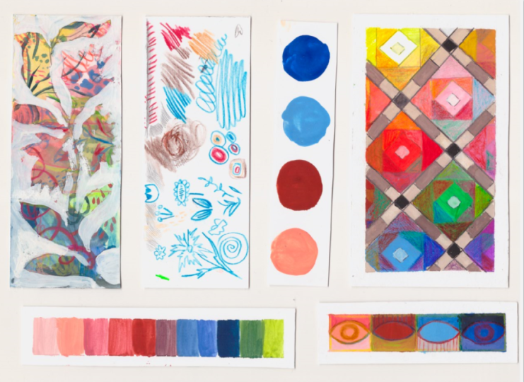
gouache swatches. We'll also make layout
of swatches in a row. Then we'll do a small
creative exercise using gouache and color pencils. After that, we'll be ready for more complex composition
inspired by Victorian tiles. I'll show you how to creatively use your leftover
paint on your palette. And finally, we'll complete
our biggest exercise. We'll draw fields with
different textures, both using gouache
and colored pencils. You don't have to complete
every single exercise. You can choose just one if something in
particular speaks to you. The most important thing is
that you're already here, you're ready to grade, and you're open to trying
something new. In the next video, I'll talk a bit more about
the materials I'll be using and then we'll
start drawing and painting. I hope you're excited,
so let's get started. H
3. Materials & Supplies: Materials and supplies. Let's talk about materials. As is often the case
in creative classes, it's not so much about
which materials you use, but about showing up and
developing your skills. I'll demonstrate the materials I personally enjoy working with, but feel free to use whatever
you have on hand and love. You don't need to use or
have the same exact applies. For materials you'll
need some kind of paper. And in this class, I'll be using two kinds of paper
first sketchbook. There's nothing special
about this sketchbook. The only notice
we'll think about it is that it has a thicker paper. It will be more beneficial for painting with watercolors or with gouache, you
know, with paint. So for paint textures,
it's much better. But another thing you'll need is this gouache paper or some
kind of thicker paper as well. And the paper that I use has
this 300 grams/square meter. So it works really
well with all sorts of different paints and textures. It has really smooth surface without any bumps and
texture, like for watercolor. So that's the biggest
difference between the gouache paper and
watercolor paper. And this gouache paper, as you can see, it
works pretty well. This is acrylic paint, and here is some will paint, and it works pretty well,
even for will paint. So, that's good. That's
something you'll need. Don't feel like you have to
have exactly this paper, this thickness of paper. It's fine if you have a
smaller thinner paper, sketchbook. It's okay. It will work out for
gouache, as well. Just be more careful with water. Yeah, you can give it a try. And the size of my
paper is a four, so it's 297 millimeters
by 210 millimeters. I'll write down the size
and interest on a screen. But yeah, I don't feel
like you have to have this particular thickness
and particular size as well. The next most important real is, of course, our beloved gouache, and I have this hii
Mi gouache set and a palette that comes with
this gouache set as well. And if you don't have this particular gouache set,
that's absolutely fine. You can use either some
kind of different brands of oil paints or acrylic paints like whatever
paints you have on hand, or just different kind of
gouache paint altogether. And that will be fine. You see, I have different kinds
of brands of gauche here. And you can use whatever
brand you have on hand. My favorite gouache is. He made me a gouache. So that's why I'll be using this set. I think it has so
many interesting, unique colors that I want
to play around with. So that's why I'm choosing
this particular set. Next, you'll need some
water, of course. I have some sea glass
inside my just empty jar. And these little
stones help me to wash off the paint from the brushes more easily. I can do that. And it just washes
off the paint faster. You don't have to have
these little fees stones in your water jar container. It's okay if you
don't have them. And the next important
thing brushes, right? I have a bunch of different
kinds of brushes, but I think mostly you'll
be using some smaller, softer, soft bristle brushes. I think you'll need
maybe some bigger size. This is like a medium sized,
synthetic bristle brush. And I have just a set of small little brushes and maybe some even smaller
ones for lin art. But, yeah, you don't need
to have lots of brushes, just a couple, maybe, like, three sizes would be enough. I would choose these
three brushes. Like, some maybe bigger sized, medium sized, and
some smaller size. Next, you'll need, of
course, a pencil, right? And I have this needed eraser, but you can use just a normal eraser that
will be completely fine. But if you have a need
of eraser, you know, surely you can use this cool eraser that I use sometimes like a sticky pads or something like that. And to stick something,
for example, it works nicely for sticking
your paper to the table. But another thing that's really good at
sticking your paper to the table is this tape
and we taping down. Some of these sheets of paper. I cannot recommend
your specific brand. It's just some kind
of off brand tape that I don't really like because it sticks to
my paper too much, and then sometimes
it drips my paper. So I don't recommend
particularly this brand. If you have a better
one, use that. And another thing that
you'll need is some kind of small clot just to wash your brushes and clean
them up afterwards. That's what we'll need as well. And another thing
that you'll need is a ruler because you'll be
drawing some straight lines. It doesn't have
to be wooden or a particular size and some
kind of scissors as well. These are really cool
metallic scissors, but yeah, you can use just your
stationary scissors that would look much smaller probably and would
be probably as good. For some cool details, you'll probably need a set of watercolor pencils or
just colored pencils. These are water soluble pencils. I would not recommend this
particular set as well. It's a bit of harder pencils. So they are not professional, but this set is just good
enough for our creative task. So that's why maybe if you have en a few pencils,
that would be enough. You can choose just
your favorite colors, and maybe you don't need
a whole set of pencils, but it's just good to
have it on hands, right? But that's it, so I'll see
you in the next video. So now we're ready to create
and nothing can stop us, so I'll see you in
the next video.
4. Mixing a Gouache Color Chart (level 1): Let's start mixing gash and get swept up in a wave
of inspiration. To begin, prepare your ah, and a sheet of paper. So let's start by exploring
and experimenting and having fun at first and then
moving on to some exercises. But to be honest, maybe this is the most important exercise
to just start to just sit down and explore new ways of painting,
explore new colors. So you'll need for
this exercise, just a half of your standard print paper and already mark down the
half of the sheet of paper. So let me cut it in half. You'll need another half for
the rest of the exercises. But if it's not perfectly
cut, that's fine. You can just fold it in half and then cut it without marking the precise inches or
centimeters. That will be fine. Don't worry. So
now let's begin by choosing your preferred
four colors for today. Don't overthink it, choose
based on your mood today. You know, it's fine if these colors are not your favorite or choose
your favorite colors, you know. It's absolutely fine. And I have 24 colors here, but my color palette gonna include all colors
except white and black. So for today, I'm
feeling like I'm going to use this nude color, then I would like
to experiment with this kind of darker ochre, reddish brown ochre color. I think it's really interesting. And now that I have these
two warm toned colors, I would like to choose
at least one cool toned. So from the side, you know, either one of the greens or
one of the blues or purple. At least one cool toned
shade because we'll be using this color palette later
on in our next exercises. But yeah, still
don't overthink it. So I would like to use this
kind of bluish sky blue. And I really like
this cobalt blue. I rarely use it. So let's
choose this color as well. Yeah, you can
choose, for example, these three colors and then add at least one cool toned or choose three greens
and then choose at least one warm
tone color, right. Otherwise, I think the
color palette would become too boring in the process in
the rest of the exercises. So now that I have these four
colors, let's experiment. At first, we need to just
put paint onto the paper. That's our main
exercise right now. Sometimes the demo
was difficult. You know, we need to
get our ball rolling, and just without overthinking, I'm making these circles. That's it. At first, nothing difficult,
nothing complicated. And the soccer color. I think I sooner we start with painting without overthinking,
without, you know, being in fear of ruining
this piece of paper because maybe it's
expensive because maybe it costs money and
we paint as well, and how precious
are those things. It doesn't serve as good. That's not how art
practice works, right? Otherwise, you'll not be here, you'll not be painting at all. No place for f here. Oops. As you can see already we're in
this piece of paper. It's not perfect. That's
exactly what I need today. Now, let's use some white, and we're gonna make
these colors watches, and we're gonna mix these
four colors together. So we'll start, for example, with placing this color here. And here, right. Don't try to make
it too perfect. It's okay if it's a bit dirty, if it's a bit wonky. If there's too much water, if there's too little water, don't worry about it,
at least at first. Otherwise, nothing's
gonna be done, right? Your exercise right
now is to just have a feel for this paint for water, for your paint brush. Even if you paint every day, it's great to start with
some kind of exercise to just have a hang just have a feel of what
you're working with. Of how the paint behaving today. And then you'll need
to start mixing. Let's start by just putting by just placing
this paint here first, and we're going to add
white to this paint. It's a bit too watery right now, so I'm going to leave it to
dry for a few maybe minutes. Maybe seconds. Depends. And I'll bring my
palette right here, and next we're going
to mix some colors. So let's start by mixing it
with does brownish color. And I think it's a bit too too
brownish, but that's okay. And maybe maybe even more. Try to mix these colors
like half and half. But again, you know, maybe just experiment with
different amounts of paint, and your guide today is
to find something new, something you haven't
explored yet. For example, I never use
these brownish tones. I usually usually I am guided by a very
strict color palette, and I never use these
kind of ochre tones. They look almost
like breakdowns. I never use these
does because they just don't feel like
my color palette. Usually, for this exercise, I'm trying to bring
out the child and me back back to the top
from the depth of soul. So I'll be able to
relax and just play. And as you can see, that's
where I added this kind of brown color just without
mixing anything new to it. But then let's use next color. It's going to be sky blue
mixed with this nude color. I'm mixing this Mute colo
together with sky blue. And I kind of get
this gray dome. I usually never never make my grace by using
these two colors, but it's but it's actually a pretty darn
beautiful, gray dome. You see, now we're
getting somewhere. I want to add a
little bit more of this kind of bluish done
to it and see maybe. Actually, I like
the one even more. Almost like Jean's color, washed out Jean's color. Yeah, I'm pretty
sure it's accurate. Washed out Jean toe. Again, I never never before used in my artworks combination
of these two colors. And starting from now, I actually want to try using it and look at me and go
trying out new colors, even though I paint
with guar so often. But yeah, you can actually choose your color palette based, for example, on colors
that you never use. As you can see, based on this little container
of paint, it's full. It's full because I
never used this paint, and I could actually include
it in my color palette, maybe later next time, but you can choose
exactly example the colors that you
don't ever use and maybe add one of your favorite
colors and see how your most disliked colors mix together with
your favorite colors. And I'm absolutely
sure you'll find out something something you've never tried before, at least, right? No, right now, I am
mixing sky blue, ochre, and I can get
this almost wallet tone. Not quiet, but some
really pleasant color. I really like these
muted colors. So that's why I get so happy
by seeing just gray color. Usually artists like to see
bright and exciting colors, and I'm really happy with gray, and I'm really comfortable
with this color. So the next maybe I'm going to try to add more blue again just to
see how it looks like. Just to get a bit of
a different tone. And as you can see, it's really beneficial to limit
your color palette to just a few colors. And this time, we're
using four colors, but it's great to have
limited color palette. Otherwise, you
get, first of all, just overwhelmed with the amount of colors you can
mix, you can use. And second of all, I think
it's not as productive because look at this go by mixing
new and expected tones, we come up with new ideas. And you don't need 100 new
colors to make something new. It's enough just in this case, we just 44 different colors. So last last color that
I need to fill in. And then we'll add
white just to see. It maybe you could add
some darker though, like black or burn tambor or ultramarine blue
and burn tamber. That's my favorite
combination of dark colors. So let's mix the nude color. Let's mix this color
together with cobalt blue, and I expect it to be blue. On paper, it looks more grayish. Interesting. To be honest, you could just add
the same color here because that's how this
kind of chart works. But I think it's working. I think it's more fun to
experiment in such ways. So that's why I'm either adding more color or more blue color. Let's see. It's a really
nice, neutral tone. So next would be mixing this ochre color
together with blue. This is an amazing
color, to be honest. I really, really
like this color. Now I get more of
like an indigo color. Or maybe darker jeans color. That's the theme for today. Different shades of jeans. Last two colors, I
don't expect anything revolutionary by mixing
sky blue and cobalt blue, but, you know, actually, we got quite bright blue color. It's really beautiful,
satisfying color. Okay. So far, it
looks like this. And now I want to add maybe
some white to these tones. Kind of transparent white. Let's see. Let's
just experiment. I want to add white
in the circle, kind of mix it together. I want to use my finger for that just to see how
the tone changes, how it looks like,
if I like it or not. I want to do the same process with all the rest of the colors. And by using my finger, I'm kind of trying to mix in these colors together to
see how the tone changes. And I expect white color
to make all the tones, maybe even more grayish looking. So maybe that's not
going to be as exciting, but I think it's a
valuable exercise. And please try to not be too perfect with your color palette, with your colos watches
because otherwise, perfection gonna
take the whole day. It's going to eat up your time. And in this case, it's not
going to bring anything valuable because many more
exciting things await you. But nevertheless, it's important to just explore your
colors once in a while, even if you use them every day, even if you're familiar with
your paints with your toes, if you made color swatches, maybe you haven't
noticed some of the dons maybe there are more ways of how you
could use these colors, new ways, new ways
how to make swatches. There's always something
new to find and figure out. And if you don't like my
technique of adding a dot, a white with a little bit
of water in the center, then you can make
a different shape. Maybe you could just add
a little line of white here on the bottom or at the
top of this color swatch, but I really like these kind of almost styles like swatches. I think it makes a
really cool pattern. And especially what I like
about this exercise that there's nothing nothing
difficult, nothing complicated. So this is my beautiful
beautiful color palette. It's really simple, but it actually looks
really inspiring. I really want to draw something
on top of my pencils. So maybe I can allow
myself to do that. As for the pencils, choose maybe different
color palette. Maybe very similar color
palette. Doesn't really matter. Just choose another
four colors of pencils to experiment
and be familiar with your materials as much
as possible before committing to big pieces before working for hours
with your materials. Now with your four
favorite colors, let's play around with
some lines, some shapes. Then just start by pssing
your pencil on paper and just do some lines and maybe come up with
some kind of pattern. All right. So right now I want to experiment
a bit and I want to add this kind of border around each color darker pencil to just have a feel of how these pencils
interact with paper. As you can see, these are not
the most quality pencils, so these are a bit hard and they don't
leave as much pigment. But when they're working
on gas and gouaches, a bit textured. It's made. They leave more color on
garage than on paper. So that's something
interesting to play with. And that's exactly
what I'm doing just to see maybe what
colors I could use, what colors I could
experiment with. Don't be afraid to
make any mistakes. Because even if you
make a few mistakes, you can either redo
those exercise or at least you'll be able to learn something
from your mistakes, right? And I'm not using black. I'm using dark brown
because I'm interested how dark brown would interact
with this color palette. I usually never use black. It's just not color
that brings me joy. But maybe it's because of
my academic background. Teachers never allowed
us to use black because you never see
real black in nature. I don't know how it
draws this information, but that's why I
never use black. And I think these kind of little paint studies are really
inspirational on its own, because it already looks
like a great piece. You could maybe cut out
these rectangles and you could use them as cash for your bullet journal
or something like that. We're just in your paintings. I think that would look
absolutely interesting. I'm not trying to be really careful to my lines or anything. And just good to
know. Let's continue trying out different
shades of pencils, learn more about your pencils
and different colors. But right now I want
to do some a motifs. For example, I want
to explore maybe some flower motifs and
create these doodles, different shapes of flowers, maybe different
shapes of leaves, just to see what
options are there. Maybe some circles and
different circles inside them, maybe repeating this pattern. Just over and over again. Just play around with something that always intrigued you, maybe make some lines
and different shapes, maybe make some squiggles or different shapes sample rectangle inside, rectangle
inside, rectangle. Just to see what your
mind can come up with. There's nothing to lose trying
to draw here Sea Holly. So yes, use it as
your Creative dump. That's what I would name this exercise our
little creative dump. Okay, I'm pretty happy. With how these colors look like, and I feel pretty confident
with my drawing skills, so I'm ready to move on. Great job for not being
afraid to mix unusual colors. And for finishing
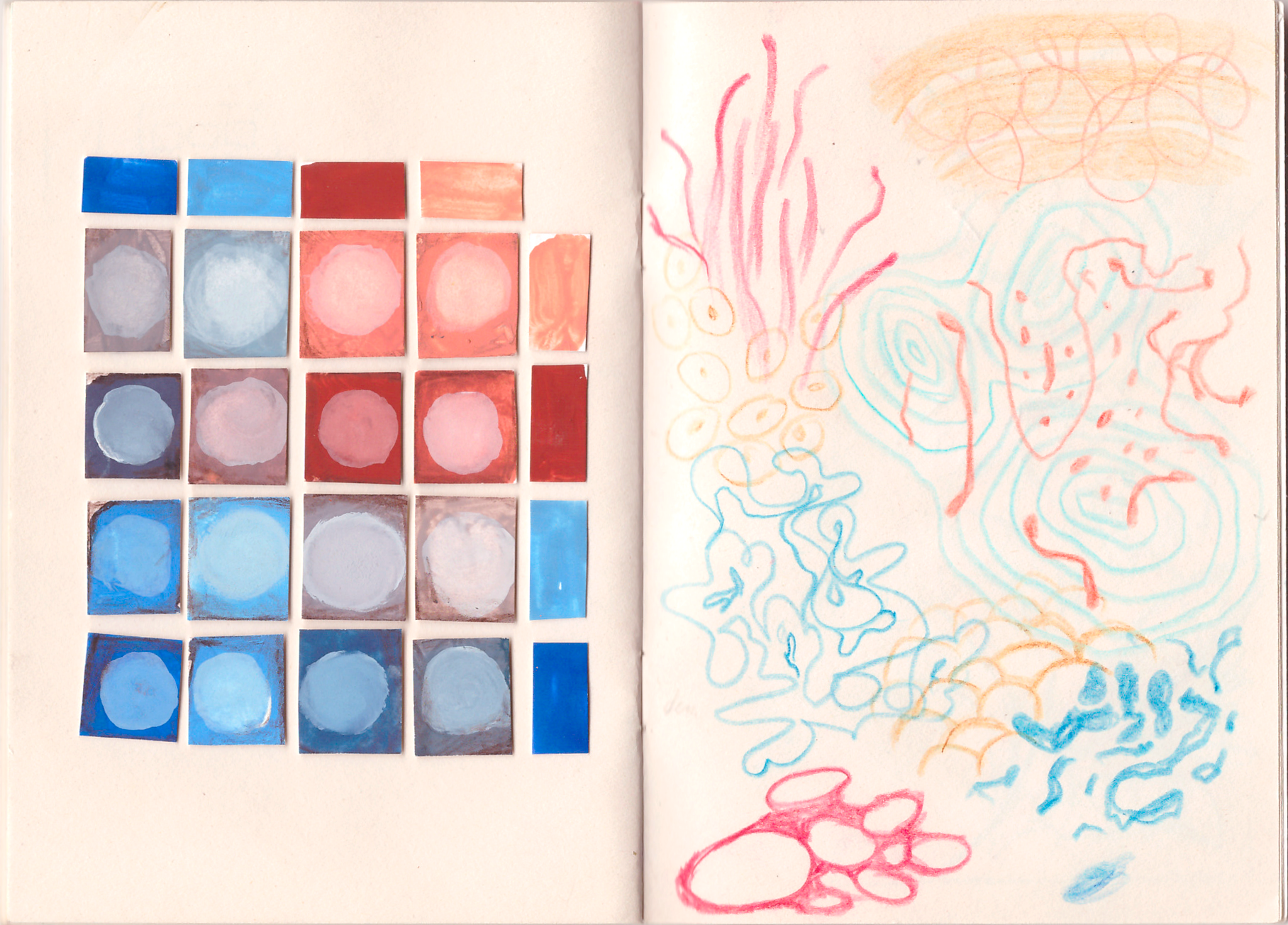
your first exercise, y. I'll admit I couldn't resist putting all of my swatches
into my sketchbook, and this is how it looks like. I cut each piece separately and glue
them in the same order, so I could easily refer back to them later by simply
opening my sketchbook. Honestly, it looks more aesthetically pleasing and
just need her this way. If you'd like, you
can also arrange these watches in
this beautiful way. But I'll see you
in the next video.
5. Gouache+Colored pencils: Sketching the Composition (level 2): Let's try drawing something a bit more interesting and fun. This time, we'll add another
layer of complexity by drawing over the paint
layer with colored pencils. Ready? Then let's get started. Let's start with our
first grade of task. And for this little exercise, we'll need some kind of
small pieces of paper. And I have here, like, bigger pieces of
sheets of paper and I have here just a half
of this sheet of paper, and that's what
I'm going to use. So usually in my art, I'm guided by my
strict color palette. And usually that's
kind of the same. Dull color palette, and I feel really stagnant in
my art at the moment. So I want to bring that
childish enthusiasm back, and that's why I would like
to make some colorful, unique and fun colours watches. And that's an easy
exercise to start with. So let's do that. First of all, let's divide
this piece of paper into smaller kind of chunks into smaller pieces of
sheets of paper. So I want to make just
small and long yeah, maybe around three
or 4 centimeters. This will be 3.5 centimeters
wide, piece of paper. And I'm going to cut
it. Maybe even smaller. We'll see. Let's
start with that. Then I want to repeat the same step and just
make a second line. Going to make two smaller
kind of swatches. So let's cut a piece of paper. Amazing. That's really easy, and I want to prepare the
third sheet of paper, and I want to make
it a bit bigger, maybe around the size. And I'm improvising,
to be honest. So let's measure the wood. It's gonna be 8.5
centimeters and wood. Let's cut this paper as warm. I find it much easier to work with smaller pieces
of paper at first, and I really like
to divide them. And you can do these kind of small little studies with
these pieces of paper, and I like to paint them in some kind of color and
then choose a design. And sometimes you'll like something similar to
this little piece. And this is my favorite
artwork that I created from these kind
of small sheets of paper. You know, you just
got random sizes, then you paint them in
random background color, and then you just try to come up with
something creative or probably test your materials or something like that,
test new techniques. That's how you can
come up with something absolutely unique and
unexpected, right? And don't expect a lot from
these pieces of paper. It doesn't have to
be in the museum, right? So don't worry. You can ruin these
pieces of paper, and you'll still be
alive, you know. I'm trying to say, so let's ruin it by Catina. Now I want to tape the
smaller piece of paper. To the table, take your time. Don't be in a rush. Since you're already here,
and I'm really happy that you decided to take a risk
and try out something new, try out new techniques, new materials, new
lessons to learn. I'm really happy that
you're here and you can pat yourself on the back and say, Great job for trying
out something new. This is how I tape this little
paper down to my table. I want to have this
little border around. I think it just looks pretty, and then it doesn't
wobble around table. You know, it's just
easier to work with. And we'll do the same steps with vegetable or
papers as well. But that's later. And our
next step is to divide this little piece
into rectangles, dividing it into a half. And then maybe another half, like cutting a piece
of cake, right? And now we will start
with just four. Let's choose some kind
of shape in the center, maybe, like, kind
of an eye shape or fish shape, almond shape. Right? You can choose
star shape, circle shape. You can choose rectangle, circle, whatever shape that
calls your soul today. And let's start with filling in this little shape with
different colors.
6. Gouache+Colored pencils: Adding Color (level 2): It's great to see you
still going strong. You can lightly spray
the gouache with water, because now we're going to start painting over our
small mini drawing. Let's start with choosing
our color palette, and I think that's
really exciting. I have this big set of colors, and it's difficult to choose only a few
colors that we need. And actually, I don't
really like using just colors straight from
the like these jars, these containers, and straight
putting them on paper. I like mixing my unique own
colors, and that takes time. And another thing that
I want to agree on with you that this little piece is not going to be in
the museum, right? So don't be afraid to rent it. Just start with the first
color that calls your name. For me, this is a nude
color right here. For this exercise,
I decided to use the same four colors as in the
previous painting warm up. Even though I mentioned
that I don't like using paint straight
from the cup, this time, I'm going to paint each
square with one of the four colors as a base tone, and then we'll mix
additional tones to layer on top of
that background. For each base tone, I'll mix in another color
to spice it up a bit while still keeping all
of these squares cohesive. So the first square I
painted with nude color, the second one with a
brownish ochre color. And don't worry about painting
these squares perfectly. As you can see, my brush strokes spilled over the
border of the square, and that's completely fine. Later we'll mix
additional shades and cover these areas as well. Next I'm painting one
square with cobalt blue, and the last one with sky blue. As you can see, I accidentally chose a complementary
color palette. It's perfectly okay
if your palette looks different from mine
on the contrary. I think it would be
very interesting to see and analyze all of the
students' color palettes, share it in the project gallery. We can almost be
like scientists, study how different
colors mix together and then share our
discoveries with each other. Now let's choose some
additional colors. For the nude base, I'm choosing a deep red and mixing the two colors together
on my palette. Then I'm painting around
the almond shape, focusing only on
the bottom part. For the top part, I
decided to make it later by adding white and
a bit of pale purple. For the brown ochre square, I'm choosing rose as the additional color and
mixing them together. You don't have to
choose the same colors, feel free to experiment
with your own combinations. The top part, I painted with a yellow green, mix with ochre. If you don't like the
color of a shape, you can wait until it dries and simply cover it
with another layer. It's that easy. I
decided to add more white to the top part because
it wasn't bake enough. For the bottom part, I repainted
it with a bit of purple, and I adjusted the top
again by adding more green. It looks really interesting.
Actually, you know what? I want to add more of this green shade to the
top piece, as well. I think it looks more
interesting this way. So let's choose the
rest of the colors, and I want to make
another lighter color for the sky blue. And I have a feeling maybe adding some
of this nude color. I'm mixing here,
some of this color. And I'm using a smaller
brush this time. Oops, let's add Sky blue
paint on my palette. We adds a little bit of water. It looks a bit dull at the moment and boring.
But you know what? We're going to use our childish enthusiasm
and maybe let's use some watercolor
pencils later on to add some detail to these
swatches, these color swatches. And right here, I used some of my cobalt blue together
with the sky blue, and I'm painting
this bottom shape. So for this one, I want to
use maybe some burned tumber. Let's use some burned tumber
and the sobalblue together. It's almost black now. You know, that's okay if it's too dark, if it's not perfect. The most important thing
today was just sitting down and trying
out something new. And for this upward shape, I want to use some
of this rose color, together with white
and some cobalt blue. Let's see. A bit too dark, so let's add more white. Now it's like this
sky blue color. I'm not particularly
happy about that, let's add even more rose color. Looks good enough. Now, let's bring out our colored pencils. Let's choose some cool
colors to add some details. I have some specs and
lines to accentuate. And I'm just choosing whatever colors that
big to me right now. And right now, it's like
lemon yellow color. This color as well looks cool. To look at this together
with this blue color. It looks really interesting.
So let's use that. And maybe this blue color, together with this darker
ochre would look cool. So let's choose this
pencil as well. Let's choose more colors
like around five. So here are all of
my chosen pencils. Altogether, there are like
six colors right now. Now we'll move on to
something simple. The first thing that
comes to my mind is outlining these
almond shapes. You can fill either the top or the bottom part with
vertical lines, and it's completely up to you which section you
want to draw over. First square, I'm choosing
a different colored pencil. Since I was inspired by
the complimentary palette, I'm continuing that team
with the pencils as well. This time I added lines
to the top section. At this stage, you can
either continue with a simple line pattern or choose something a
bit more bunkers. Since we're here to have fun, I decided to do something
unexpected and draw an IRS in the center
of the almond shape. I'm repeating the
same process with different colors on
the last square. As one of the final steps, I wanted to separate the
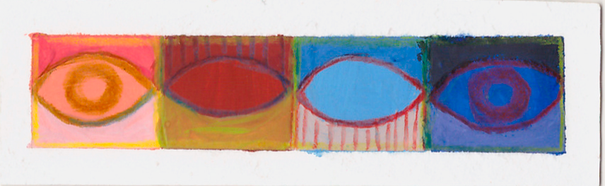
squares visually and add a frame around the whole piece using this bright lemon shade. Now that everything is finished, let's carefully
remove the tape by slowly pulling it
in one direction. And here's our final result. I am absolutely delighted with
how this piece turned out. Wow, I think it turned out
really cool and stylish, and it looks a bit like a
bookmark. You're doing great. Let's keep painting
and don't rush to wash your palette and
wash the paint of your palette just yet because we'll need it in the next video, and I'll see you there.
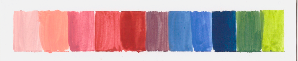
7. Creating a Color Palette Swatch Layout (level 3): I often find that I have quite a bit of paint
left on my palette, and instead washing it, I like to come up with
greater ways to use it. So let's make a few more
swatches. Let's get started. We'll start by repeating
the same steps as before and taping the
paper to the table. I'm using the second
long piece of paper that we cut out
in the previous video. Now you probably
still have some paint left on your palette
from the last exercise. If not, that's perfectly fine. You can come up with a new
color palette of your choice. This time, I'll be using all of the leftover colors on my palette to create
a swatch layout. Our task is simply to choose
the order of the colors. Right now, I'm starting with the lightest warm tone and making a free hand
swatch with no plan, no sketch, just applying the
color directly to the paper. I'm moving from the lightest
to the darkest shade. This is a great warm up
exercise to help you feel more confident about putting paint
straight onto the paper. It's a good way to let go of fear since there's
no risk involved. I'm trying to use
up as much paint from my palette as possible, but it's okay if
some is still left. I'm arranging these watches from warm toned colors
to cool toned ones. The task is very simple, but sometimes that's
exactly what we need, something that reminds us how fun and satisfying
painting can be. It helps build momentum
so we can move on to something bigger and
something cooler afterward. And I realized I
could have added one transitional shade
between the green and the dark blue color to make the layout feel more
intentional and curated. So I mix this color
on my palette. This exercise only took
a couple of minutes, but look how great
the result is. Now all that remains is to remove the tape,
and that's it. Look at how clean and beautiful the edges when you
remove the tape. It looks very professional. If you'd like, you can add
some pencil details on top, but I'll leave mine as it is. It's a very simple exercise, and the result looks
very stylish and cool, which is something
to be happy about. I hope you're ready to increase the level of difficulty
a little bit, because next we're
going to paint a geometric composition with
many different colours. For that, you'll need both
gouache and colored pencils. So I'll see you in
the next video.
8. Drawing a Geometric Pattern (level 4): I'm very happy to see you
here because we are going to experiment and try something
new in this exercise. We'll practice mixing
different colors and see how gouache works
together with color pencils, and we'll create
a pattern that's visually interesting and
not worrying to look at. I hope you're ready,
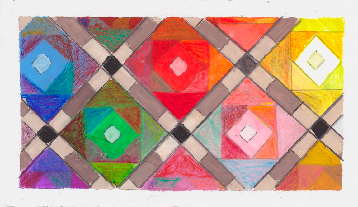
so let's start drying. Let's continue with our
next one Lle exercise, Blue painting exercise. And this time, it's
gonna be Victorian. Victorian tiles, Victorian
floor tiles, actually, and I'm really inspired by
all sorts of different tiles, but particularly
Victorian tiles have such unique patterns that
really enticte me to, you know, create
something similar. But first, let's
tape down a paper. As you can see, and we're using a few pieces of tape
because why not? And this time we'll copy the
style pattern right here. I have a sketch of it already. So let's start with that. And for this exercise, we'll need a ruler
and a pencil again, and we're not going to
do precise measurements. So no mats and
wolf to be honest. Don't be worried about that. I completely understand that. Mats can definitely
frighten sometimes. Your task right now is to
make these parallel lines, the angle of the line
it's not that important. Just keep them
parallel and try to do the same distance between each
line, something like that. So next, we need
to add more lines, but don't panic, don't panic. Just make sure your ruler right here is at
90 degrees angle. Let me show you
right here so you can see it should
be at 90 degrees, and then you draw the line. Like so, and then just continue these parallel lines and try
to make them into squares. Like similar squares. Since I already
shared my manifesto, I'm not aiming for perfection. And right now you
can see me adding a second parallel line close
to the first lines we drew. Nothing too complicated,
which is good. Like so. Then at a 90 degree angle, add another set of double lines. I know it's not looking perfect, but that's completely
okay. No worries. If you'd like, you
can absolutely measure and calculate
everything. But I don't think
that's necessary for these exercises,
to be honest. Now I'm marking with small dots where another
set of rectangles will go. Ideally, these would
be perfect queers. But since I'm not
measuring anything, they're more like rectangles,
and I'm fine with that. I'm placing these dots in the middle of each
side of the rhombus. Then I draw parallel lines
and connect them one by one. This pattern looks
really complicated, but at its core, it's just lines either at 90
degrees angle or parallel. And that's basically it. You know, don't be afraid. If something looks a
bit wonky. Let it be. Let it be wonky? Why not, right? Let it live its own life. And by it, I mean, let
your piece, your artwork. Let explore the world as a once. Sometimes we try to plan
everything in advance, but the piece you're working on and life in general
can surprise you. You might accidentally
spill paint or tear the paper without
meaning to to me, that's part of the
creative process. It can feel
frustrating at first, but eventually you'll
figure it out, right? And these little accidents push you to experiment and
try something new. And I think that's
truly beautiful. We only learn something
new when we are not afraid to experiment and
gently push ourselves, but just a little bit, not
too much. Look at this. It already looks amazing, at least to my eye.
It looks so fun. And you know what next
thing we could do at another set of
rectangles inside. And by that, I mean mapping out where the smaller
rectangle could go, those should be squares, again, since my measurements
are all over the place. Those are not squares,
but rectangles, and that's okay to me. Since these are not gonna
be it's not green flooring. So there's nothing
to worry about. Continue filling in
these squares with another squares and
another squares. And like so almost then. As I said, it looks very
complicated, very difficult. But when you start to put
these lines together, there's nothing
difficult. It turns out. It's really simple.
Just make sure maybe that your lines are at least
a little bit parallel. So now, I'd say, we're done. So let's fill these
shapes with color. Yeah, it seems we've figured out all of these different
lines and geometry. As usual, I want to remind you to stretch a little to drink some water and look
into the distance for a moment so
your eyes can rest. And when you're
ready, let's start coloring in these
geometric shapes.
9. Painting the Geometric Pattern (level 4): You might look at the length of this video and think, Wow, this is going to be difficult and maybe even boring,
but don't worry. It's going to be
very meditative. We'll color in each shape
of the pattern one by one, and I'm sure you'll
enjoy the process. Let's approach it the
way we did as kids and jump in in all of
these different colors. I think it would be fun to
make it into a little Rainbow. So we could paint this square with white
or yellow colors, then next with, like, pinkish colors, this
one with red colors, then with green colors, blue and maybe some darker
and some additional tones. Somewhere here on the side. So let's start with putting down first
color on the paper, and I'm starting with yellow. For now, we're going
to leave it at that. Then I mentioned
some pink colors, and I want to start with kind of lighter pink color and then build towards darker
colors on top. I think it'd be easier.
So let's do that. Next, let's use some red colors. I think this is Panza red. It's a really bright color. Carefully fill it and it's
okay if it goes over the line. There's no need
for panic at all. Everything is fixable. Nobody's looking if
something goes wrong, so I don't think anybody
gonna judge you. I think every mistake
I can teach something. So let's continue
with green colors, and I would choose those
kind of transitional green. I think this is a
pale green shade. It looks much brighter
on the paper than in the In this container,
that's okay. I think it would be
easier to fill it in not with round brushes
as I'm doing right now, but with brushes that have
this kind of straight, maybe even rectangle
shape to them. If your gouache is a bit dry, you can absolutely use just
a bit of water and spray it. And I had any problems
with mold on my paint set, but I know some people have
these problems with mold. I think for precaution reasons, you could spray
just a little bit of alcohol spray, you know, just a little bit of preventative measure spray
with hand sanitizer maybe. So next would be this
blue right here, and I'll use sky blue. Right now, to be honest,
I'm not gonna lie. I absolutely hate
the combination of these colors
because I usually never use colorful
bright palettes. So to me, it's
definitely a challenge. I'm more used to beige colors to great colors and that's
something unexpected for me. But let's add maybe some
transitional tones. Maybe, example we don't
really have purple color. So let's add some
purple right here. Some of these shades are completely
transparent as you see, and those sky blue completely covered up the sketch,
but that's okay. As it dries, we can draw
another sketch on top. So I would like to use this
ok color probably right here the yellow or yellow color and a bit of orange color. Looks nice and a bit
of this ochre color. I think right here would be nice place for this ochre color. And I'm leaving these lines
right now not colored, like so, and this
right here could be maybe maybe rose colored. So these are all of
our base colors. Right now, it's your time
to experiment, right? To speed up the process, you can use your
watercolor pencils and just color some of these spaces. I just gonna be a bit faster. And maybe you could just
experiment and see how it would look like together
with different colors. For example, here,
I'm adding blue. Here, I'm adding a bit
of ochre, a bit of red. Alright. Let's do
that right now. And you can just choose different kinds of
shades of tones. Mix and experiment with
different pencils. Don't be afraid to ruin the space because it's
a practice piece. And our task is to experiment. A new idea came up into my head. What if we mix this yellow color together with this pink, right? What if we mix this kind
of purplish color together with kind of reddish
color right here? This aqua colour is
already really ogre. Colored like that. And this red together with this blue And we could color in these little
triangles as well, and we could mix this
green shade right here, together with the pink. Let's experiment. All right, it looks quite fun. Let's choose an orange color.
Continue this process. It's difficult to step over
our perfectionist brains. It's difficult to try out something new and not be
afraid of messing up. But to be honest, most of the times we
try to paint something. It looks it looks bad, and we need to be
okay with that. We need to brush it off. And continue with experimenting, continue with curiosity of maybe drying out some
new art supplies, maybe making some
unexpected moves. For example, right here, I don't have any particular
color to dry out, and I'm thinking, what if I'll use this blue
color right here. Nobody will get hurt, right? If it looks bad, I can
cover it up with gouache, but maybe maybe it'll look good. I want to add maybe darker kind of shapes right here
later on in the process. Right now, I'm going
to leave it as it is right now and move on to
covering the rest of the shapes. So for this one, let's
cover it up with yellow, wallom, easy, peasy,
lemon squeezy, and with green right here. It's like piecing together
a puzzle, to be honest. And here it's pink, so let's try some
kind of pink shade. Shirt. With darker colors, it could be more difficult. As I said, these pencils
are not the best. These are not really
soft pencils. So for example, lighter
shades, as you can see, they don't leave any color
behind. That's okay. These shapes gonna look bad, we can cover them up
with more gouache. That's my solution
to all the problems. Just keep going. Just
keep experimenting. The sun should be blue. And we need some purple. So I would really like to use
this golden golden pencil. Looks fun. Maybe let's use some unique and fun
colors. Why not? Just don't overthink it. There's no need
for that. No need for perfection. Just having fun. If you're struggling, if
you're mentally feeling like, Oh, maybe maybe this
is the wrong color, maybe it's gonna
ruin this piece, you could ask yourself
these questions, for example, how to make it, how to make it easier,
how to make it 20%, at least, easier for you. And for me, for this task, 20% easier was
painting this piece, the rest of these kind
of squares food pencils. It's just easier
because with gouache, it would take much more time, but we're going to
return to Guache. So no worries. We're
going to return to it. You can just always
ask yourself how to make this task easy,
easier for me. How to not overcomplicate it. But yeah, Truth be thud, most of our pieces gonna
look like some trash, and we as an artist, we need to be okay with
that and somehow even be happy with lots of pieces
being worthless and useless. We need to find the
bride in our practice. We're going to create
something that never existed before I go to try
out something new. So how exciting I am still trying to fill
in all these shapes. Look at how many pencils
there are in my hand. I'm just continuing to fill
in all these triangles. Some of these colors
are not decided. The outside, the
sun could be gray. Why not? And this one
could be dark brown, right? Dark brown color. So let's use dark brown. Here, I would really
like to use yellow. I don't really know why. I
just think it looks exciting. It's okay to mix
different shades of pencils together really fun. So let's continue painting
all these shapes. So green right here. Some brown right here. I barely see this rectangle underneath the square
underneath, but it's okay. So we're almost d to be honest. I hope it's a pleasant and nice activity that
you're enjoying. I hope you are having
fun with your colors. There are like millions probably of ways how to make
color swatches. And I think this one
is a really unique, unique way of making experimenting with paint and color and coming up with
something completely new. I'm going over with
this blue shade right here because I
don't like the tone. So these these pencils, especially this green
looks really good. So this is a nice pencil. And then blue here. Orange, a little bit
of lighter blue. Like, so now let's fill in
this yellow right here. What the pink? With the rent, very meditative exercise. Like some maybe a little
bit of silver right here. And some stil on the
other side right here. Los definitely unique. Just a different
shade of yellow. So would be a bit
yellow and a bit pink. And a bit purple. A little bit pink. Coloring this little
square right here. Don't forget to drink water, to hydrate yourself, right? Don't forget to stand up
every, like, 20 minutes. I know I don't want to be
annoying, but that's important. That's important, guys. Please listen to your body. So almost almost done. And you'll see where I have a few steps up my sleeve that may be
going to surprise you. Let's finish all these
shapes at first, and then I'll tell
you the next steps. The soon as well. Forgot
to color the sun. Kind of brownish color. And maybe even the sun as well. Little bit of brown color
right here.'s add some blue. Let's add some green. That's a really bright green. Let's add some pink. And let's add some brown. Yeah, sure. And let's add some purple just to
tone down these colors. Otherwise I don't really
like how they look like. Tone down those colors. Well, brilliant. Now it's fully done.
As you can see, there's just a
highlight from my late. So next step is to cover
up these white lines. You can leave them empty if you really like
how it looks like. I think something
is missing here. I want to make it
like not a gradient, but I want to make
it like beige, white, beige, gray color, something like we have here
on our palette on my palette. I'm using a little bit of ochre right here. I'm adding it. Here, I'm using
some burnt umber. And I'll be using
some otramarne blue. No, it's not ultramarine.
It's brushian blue, the darkest blue you have. And it gives us this kind
of neutral, neutral color, but we need more white and maybe more earth yellow or
ochre yellow ochre color. I think a bit earth yellow, maybe even a bit of nude color as well to make
it warmer, more pleasant. Looks like that. Wait.
So now let's let's see. If it looks bad, that's fine. Feels like grouting
the mosaic tiles actually really appropriate
since this is a floor mosaic. So grouting could be
very appropriate. And just take your
time with this step. I'm just dragging my
arm on the table, and it gives me
this straight line. Maybe let's add a
little bit more water. But you need to keep in mind
that one of the problems so gouache is that it dries
down to a darker shade. So as you can see on my palette, it's a little bit lighter
than it dries down. If it doesn't look good or
if you don't like the color, you can take out the color from paper by just
adding some water and then by using cloth or a napkin and just trying
to take out the color and this is a result, maybe it's too gray now. I decided to remove some of the paint to make these lines a bit lighter because they were
starting to look too heavy. I carefully lifted the wet
paint with a clean clot. You can do the same by adding
a little water first and then gently dabbing the paint with a clean clot or a napkin. Now I'm going to add even
more parallel lines on these edges that follow the line of these
rectangles right here. Then I'm just continuing
the wine down here. Okay, let's do the
90 degree switch and add these lines as well. Penlor lines right here. There's no purpose in making
this perfect looking great. Another thing I
decided to do was add an additional square
in the center that I wanted to paint
in a lighter color. All these small
details are optional. So if you skip a few lines or shapes, that's
completely fine. But all of these little
additions can make the composition feel more
unique and interesting and fun. But don't feel any pressure
to add more details. For this, I'm using
white paint and a small brush to fill
in these tiny square. This time I'm using the
white straight from the cup, and I know these shapes and
colors won't look perfect, and that's okay because
I'm here for the process, and I'm simply filling in all the centers with
a lighter color. If you'd like, you
could even add a darker.in the center of
each square, but again, that's totally optional,
and in this case, I'm not even doing
this addition. Now the last shapes
I want to fill are the lines that I divided
into smaller sections. I'm binding these spaces
with a dark brown tone. For this shade, I used some burn tamber and just the leftover
paint on my palette. For this step, I switched to a larger bush to make
the process faster, and I'm just repeating
the same steps until all the shapes are filled. Just color these in
a swiftly manner. That looks very interesting. If you're not happy
with the chosen color, just use a napkin. Make sure I surface is clean, so don't use the same kind
of side of the napkin twice for taking away the
paint from your paper. E I'm just repeating the process until all these
shapes are filled in. Just like that.
We're almost done, and actually we're done. Now that I'm stepping back and looking at the
whole composition, I can see that it needs
a bit more contrast. I wasn't sure whether
white or black would work better for
the empty squares. So I tested white first, but it didn't add much, so I wiped it off with the clot. You could paint these
areas directly with black, but I personally don't like
the tone of pure black here. Instead, I mix burnt dump and push in blue to
create a very dark, almost black shade, with
a more natural tone. With this make sure I filled
in the remaining squares. But to be honest, at the end, I didn't see much
difference between black and this more
neutral, darker tone. So you'll be fine with
painting just with pure black. No, currently with
a small brush fill in these little squares. And it's done. Let
me remove the tape, and let's see how it looks like. As a final step, I decided to add some additional
pencil lines on top to make the contrast even
stronger and more visible. Like so. And here we go. And it looks absolutely
unique and interesting. One of a kind kind of pattern. And those are just
watches, can you imagine? And we've came from
this to this to this. You've done such an amazing
job painting all of this. I'm sure your work looks
colorful and inspiring. And since we still have some
paint left on the palette, I'll show you another
creative way to use it instead of washing
it down the drain. I hope you're curious and I'll
see you in the next video.
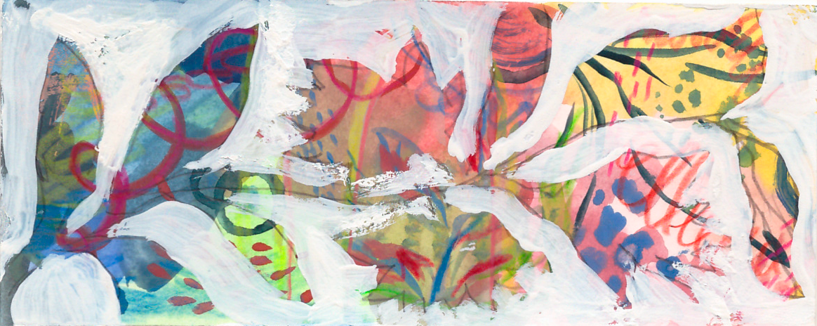
10. Say NO to Wasted Paint! Painting with Leftover Color (level 5): And we've already painted
so many different things, but I'll show you something else interesting you can do
with leftover paint. I think this exercise
will inspire you, and then whenever you have leftover paint
on your palette, you can create small
studies just like this. So let me show you what to do. So let's use up our
leftover piece of paper. And there's a lot of paint
left on the palette. Sometimes I leave
this paint for, like, another practice session, but most of the times I'm
just washing my palette, right, to create a new
color palette to use it up. You could just take your
brush and just take some of these colors like one by one
without thinking too long, without you can just add some water with
some clean water. Maybe it's going to be faster
and just add these kind of splotches of color from
our palette to paper. And don't be afraid
to make any mistakes. This is completely
experimental piece. So no mistakes. And that's why no fears, right? There we go. And as you can see,
another kind of con of not using the tape that the paper kind of bends in
an arch form. It's okay. And this time, I just
wanted to fill in the whole shape without
leaving any white spaces. But if you like
how it looks like, you absolutely can use your tape and tape that
down to the table. But sometimes, you
know, it's beneficial to to not be guided by any rules and then
maybe understand why these rules were
there in the first place. So I'm just adding more color. I'm taking smaller brush, and I want to just add some kind of doodles
with the leftover paint. And what would you like to
do with your leftover paint? You know, I want to
draw wiggly lines, kind of spiral
wiggly lines, right? And maybe maybe some dots. Maybe some smaller dots. And some bigger dots and just add as many dots as you'd
like. What else you could do? You could do some
lines like that. You could do some
like brush strokes, cross brush strokes, right? You could do more shorter
kind of lines or drops. I could do maybe some leaves
or something like that, and I would like to use maybe
a darker color right here and add some leaves like that. Just re hand fun little drawing. How often we do that, right? How often we allow ourselves to just fully experiment without
expecting any result, some kind of an
abstract painting, maybe some arches, like that. Experiment as much as you can. And I'm just painting
some weird shapes, adding just blobs of color
with no particular shape. Just some kind of
blobs. All right. And maybe here, you could
draw some kind of flowers or more leaves maybe some circles. Maybe another circle here. Like half of the circle. Like so. Just continuing
to draw circles. Paint circles and to
paint maybe More circles. Just adding some wines
to my little flowers. Maybe some more dots. Maybe more circles.
If you're asking, What's the plan or
what's going on? Why does it look like
that? No worries. I'm gonna explain really soon. Just adding a few more colors. Right here. The leaves. Looks like that. Let's see if there's any empty
space that we could use. And now let's wait
for it to dry. So I'll give it a minute.
And while it's drying, actually, let's
sketch a little bit. So here's my little
sketchbook that I have, and you can do that on
any kind of paper like, and you could just
race around the shape, like, roughly, it doesn't
need to be Perfect. And then let's put this little
piece aside for it to dry. Let's try to figure out
maybe there's shaka flower that comes to your mind
that you would like to draw or paint. And to me, what comes to
my mind is to lip shape. And we're drawing a sketch here. Not sure about this
particular flower shape. So that's why we are practicing. That's why I have this
little drawing right here. I can try it out with a different color on top to see maybe other
shapes other than this one, maybe some other
kind of creative, you know, shapes that
would look great. Maybe it could be like
a multiple head flower. Something like that with the swine going from
one side to kind of another side and just a
few leaves here and there, let your creativity guide you, whatever feels interesting,
whatever feels unique. You can look up some
references if you find this task a bit difficult
and kind of complicated. Absolutely understandable. So you can take a
little bit extra time with planning these shapes. Maybe instead the spiral. It's gonna be just
another flower So I took a little bit of time and finished this
composition right here. I traced it with blue and a little bit of added on
top, some red colored. So I would be able to see, and I'll be able to show you the flower heads that I created
and then some leaves, additional leaves and the stem. This little piece
is almost dry now, but I'm not really
satisfied with it. I'll get it dry down to
kind of a dull color, and it doesn't excite
me as much anymore. So I want to, uh make these colors come
back a little bit more, and I want to add brighter
shades, brighter colors, and maybe just add more
doodles with pencils, just to play around. Don't think about it too
much, maybe some yellow, like adding pink right here, adding pink right here as well. It's just there for you
to play around to create something interesting
and unique. So don't be afraid to ruin
it. That's kind of the point. Don't do as much as
you'd like, you know, let your and our
kid just have fun. Just do crazy shapes,
crazy crazy designs. The last almost last
step is left is tracing this composition to
this little kind of bookmark. To be honest, take your
time to kind of transfer your composition of flowers or one flower to this
little paper right here. It's okay if it's not perfect. Remember that? It's not
going to be in the museum. This is my composition, as you can see
lines on my paper. And now, can you imagine that? We can use a white
paint and cover up all of the
background details, for example, here, and just with the thick white gauche layer, maybe add a little
bit of water to it with thick gouache layer, cover up any background
areas, unwanted areas. It's almost like you're
carving out of wood. It's like the
opposite of collage. To be honest, you could just use your scissors and just
get it out and then glue. Okay. Don't be afraid to
cover up anything special. That was the plan all along
to do something unexpected. To do something unique
and fun one of a kind. Kind of artwork. I think the key here is to not be too
extremely perfect. I like how there
are empty spots, empty places around the
flowers around the leaves. Like, it's not perfect. And the white paint is
not perfectly opaque. So let's finish covering
these empty spaces. Like so. And here. Like so. Kind of like how one whole leaf looks like here like that. I think it looks
absolutely cool, very creative. Very unique. Very, very fun. At least that's my definition
of having fun. I hope you enjoyed
this creative task and will take a note of it and use it occasionally when you have extra
paint on your palette. It's not necessary to draw on
a separate piece of paper. You can create
these illustrations in your sketchbook directly. That way you won't
waste any paint, and you will fill in the pages of your sketchbook
with something experimental, unusual and most
importantly, very beautiful. I hope you're feeling
warmed up and ready to draw something even bigger. If so, join me in
the next video.
11. Sketchbook Layout: Drawing the Composition (level 6): Can you imagine how
many creative exercises we already completed? You're ready for a
small challenge, like a final test,
and I'm sure you are. Then now we'll create a full sketchbook layout and fill it in with
something beautiful. I hope you're ready.
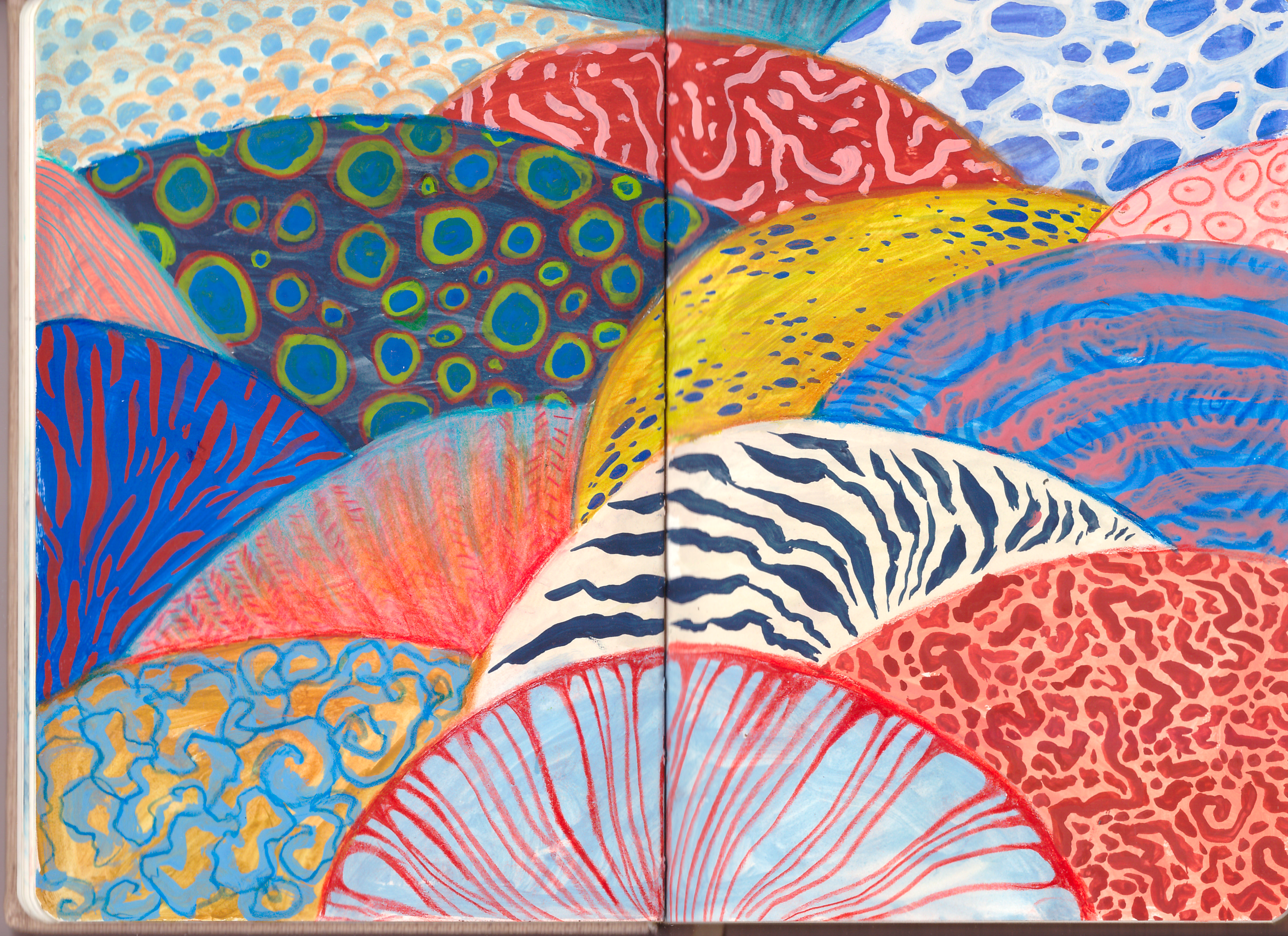
So let's begin. Now let's move on to
the last exercise. Our sketchbook, you can paint
that on a piece of paper. You don't really have to have a sketchbook to do any
of these exercises, as you can see on the contrary, you could do every exercise in a sketchbook and just fill in your pages as
you do these exercises. And I think it would look fun or you can glue them to your pages. And right now, we're going
to do these kinds of fields with textures, with
different patterns. Let's begin by just marking
down some of these hills. Like so. And they don't have
to be perfect as always. That's my favorite phrase. Just experiment with
different sizes. Don't really like
this line right here. Let's see if we can change
it to something else. Maybe something like
this. Look good. So now let's start by mixing some colour thinking maybe adding something here. Yes, I think it looks
better that way. Now we have all these
different kinds of textures and swatches, and you can choose your
favorite color palette from these exercises, and you can choose either
these four colors or maybe you'd like to choose these five colors or maybe
just these four colors. I think my favorite colors from this whole exercise were
these kind of four colors, but with added different tones, I'm thinking about just coloring these heels with some of these colors
that I have here. But don't try to
make them perfect. As always, just
continue experimenting with different colors
with different textures. I'm going to add
here some clips too. Just hold pages. And I'm gonna mix some
of these colors and then come back to you with
or the premix colors. The same thrones
that I have here on my little little
paper with swatches. The first step is done, and all that's left is
to paint, and that's it. But first, on a clean palette, I mix all the same
colors we used in the previous exercise
to save you time. I did this off camera. And remember, you can
choose any colors you like. So prepare your
paints and colors, and I'll see you
in the next video.
12. Sketchbook Layout: Painting the Base Colors (level 6): Now, I mix all these
colors on my palette, as you can see all
these same tones from this little study. Now, you need to fill in these spaces with
different colors, right? So I'm going to start by just adding random
colors in random order. And then on top of that, we're going to add some texture. Oh I really like these textured brush strokes on the surface of these
colored fields. I think it adds an
interesting detail. Looks like that. Next, I used a mustard color to paint
the second section. I chose the one next
to the dark blue because these colors look
good together, in my opinion. I almost never use actually, I never used p color in
my painting practice. Next, I'd like to
make this right here the sun kind
of boring color, but I think we could
add fun texture to it later on in the process. And I would suggest
using colors with different levels of
lightness and darkness, so you'll have more
variety later on. Next, I would like to add
this blue tone right here. Next this purple
color right here. Actually not sure it looks good, so I want to remove it. I want to add the
different kind of shade, maybe even the pinkish one. I think it looks much
better this way. Making a little mess
right here. That's okay. So this kind of brick, ochre color could be here. N light blue color
could be down here at the bottom. Looks good. I really like it already. Next purplish color could
be actually maybe here. I really like this
technique by just holding my palette with the same color close to the other
colors on paper. And then it's much easier to see if it's
right fit or not. I already looks very unique. So the remaining
color you add here. The pinkish stone there. Amazing. Now. Just a few more. Go love to fill in, maybe darker and there. Maybe another blue color here. And I want to
combination between these two colors
and applies here. And then this I'm going a
slighter kind of blue shade. And then the one should be maybe kind of color between
ochre and those nude. Y. Like so. Now that everything
is colored in, wait a few minutes
for the pages to dry. And as usual, don't forget to stretch and grab
something to drink. And when you're ready,
let's start filling in these areas with
different patterns.
13. Sketchbook Layout: Adding Patterns (level 6): Reach the final part of
this class, our last task. Now all that remains
is to fill in our colorful section with bright and interesting patterns. You can make them
as detailed and as interesting as your
time and energy allows. That's why this video
is a bit longer, we'll be focusing on adding
detail. But don't worry. I'm sure you'll find the process both
captivating and rewarding. So let's finish our
final illustration. For a couple of minutes
until these pages, we're dry, completely
dry, as you can see, and right now I want to
experiment a bit more and I want to add another layer
of details using gouache. And only then we could move
on to pencil drawing on top. I want to add some
of these textures, some of these, you know, studies that I've
done here and use it. As you can see, you
could use, for example, this kind of texture right
here I think would look cool. And these kind of little blobs would look
cool here, you know, and maybe these kind of lines could look really interesting here or these
kind of drop shapes. And yeah, the creativity
just goes on and goes on. And before I put my
paint brush to paper, I want to explore some
of these textures, some of these patterns on
the other side of our kind of exploratory color and
texture a little page. I want to grab a
different kind of brush, maybe smaller brush,
and I have idea of making maybe lines
with darker color here. So let's at first experiment
on this little paper here, and then you could decide
if it looks good or not. And how could you
maybe make it better? I need to have more
paint my palette. That's what I learned
to make it happen. So let's do that. Okay, let's test it
with another brush. Maybe it'll look better. Kind of like it better
with this brush. Well, let's try it out. Try out different brushes, different patterns,
different techniques. And if you're afraid, try
it out on a piece of paper. And then the side of it
looks good, it looks bad. If there's anything you can
change to make it better. Now, I'm taking my time and just exploring the front lines, making some lines shorter,
some some thicker. And just exploring the
front bush strokes. And I think it looks
really nice now. Such an interesting
pattern to look at. Yeah, looks very, very creative,
very interesting, like, some kind of pattern of
an animal or the shell. Great. That's exactly
what we want. Next, I would like to maybe
make some blobs over here. I'm going to mix more of this green shade
add water to it. And I want to maybe make it into a circle pattern
or a blob pattern. I like this pattern right here. So that's what I'm
exploring here. I think these two colors
look really good together. And let's try out different
sizes as well. Why not? I always have this fear
of ruining this piece, and it doesn't help right. So we need to fight
with the sphere. Just put this paint on the paper and however it
goes, just let it be. Even if it looks bad,
at the end, let it be, let it live its unique life. Now it looks like some sort
of alley and mushroom. And I really like this pattern
right here that I created. So maybe this one could have
this interesting pattern. So let's do that. It's kind of knit pattern. Maybe you'll add
more colors on top. Either way, if
something goes wrong, you can always coord off
with more gouache paint and fix everything just
in a few brush strokes. So there's definitely
no risk here, right. And that's actually the paradox of, you know, having fear. It makes us feel like we will create a better piece if
we have the sphere inside, but to be honest, when we do things without fear, maybe we mess up
sometimes, but one piece, you make something
revolutionary just because you did these pieces
without any fear. It's not only in
painting as well, just how life works,
and fear works. So I really, really, really like this tone
together with this one. So I'm thinking of how I could play with these two
kind of shapes. This time, I would like to use the small brush and I would like to do something
more creative. Let's see. I don't really have any
idea what else I could do. So actually, I could do
these little drop shapes. Here we go. That was fast. Maybe I could do them in different sizes and
different patterns. Like so. I think it
looks really unique and interesting. Looks so fun. Now, the key here is
to not overwork it. Los looks very interesting.
I really like it. You don't have to paint some
texture on all of them. You can just leave some empty. Or you could, you know, draw on top with some
pencil later on, and maybe you could add even
different kinds of layers of pencils and the inspiration from these little squares
and just have absolute fun. I really like the combination of this and red color
together with this blue. So I think that's
what I'm going to do right now or those blue. I'm going to use this red
pencil to add a line here. Like so, and then I could just draw these lines right here. Experiment with different
kinds of wines. Maybe maybe you don't
make them straight, maybe make them
different thicknesses. Just making sure all these
lines connect together. I think it looks cool. The
ticker tops right here. Yeah, that looks even better. You see, that's how
creativity works. I think your mind being lost in this vast field of different
kinds of textures, different kinds of patterns, and maybe even being
afraid a little bit of making the bad choice, but at the end of the day, there'll be something
new you'll learn about yourself and your art practice and your art pieces as well. Making some of these lines decker just to make this
piece more interesting. They looks so good. I'm really happy how
those turned out. Then I return to the
previous dark blue section that we filled with
green circles. It had dried while we were
painting the other one. So now I can add
a second layer by painting another blue circle
inside, each green one. I use a small brush
for this task and carefully filled in
each circle one by one. And you can also change the
colors of these circles. I think that's a fun idea. So they would look more
colorful and unique. But this time, I'm making all of them the same color just
in different sizes. And we will come
back to the circles once they are dry once again. Then I decided to switch it up a bit and draw with pencil first. Chose a darker blue
pencil for a blue field. And now it sounds unbelievably boring, but this
is just step one. I started with small bean like shapes and then
drew around them, adding as many lines
as I could fit. I kept circling around the
first shape, then the second, then the third until there
was no free space left. And I added a few additional
sources, if you can say so, or centers for these
ripple like lines. Then I chose nude
gouache to paint over this section
as the next layer. I painted strips,
and I discovered that because my pencils
were quite hard, they didn't fully absorb
the water down gouache, which created this kind
of unique texture. This turned out to be
such a pleasant surprise, and because of that, this
became my favorite pattern. Then I continued with brown ochre on top of
the new colored section. With a small brush, I filled
it in with random blobs, lines and dots until
everything was covered. These patterns started to
remind me of underwater life, like the front fish,
corals, octopuses. So I tried to continue
that them by creating similar patterns for other
kind of fields or shapes. But this pattern
is quite simple. It just takes more time
since we're adding lots of details until there's
no empty space left. Go here is to draw regular, longer lines and then fill the gaps in between with
smaller lines or dots. Then I return to the blue field. Now that it's dry, we can add more details, which is exciting. I chose a red pencil to draw another circle around
the green ones. I filled in the gaps
with more green circles, and then I repeated the
process until I was happy with the pattern until all
the gaps were filled. Next, I continued painting
with brown ochre, mixed with a bit of rose on
top of the blue section. And I painted these kind of vertical lines of
different sizes, and they remind me a
bit of worms, maybe. It's really simple, but it
looks quite interesting, and that makes me happy. One of the later sections I
decided to fill with scales. I chose ochre pencil to fill the whole field with fish scales without
leaving any gaps, and then I wasn't happy
with how boring it looked. So I tried to make the sizes of the lines varied and
thickness and then tried creating a gradient by filling in each
individual scale. For now, I left it like that, but I will come back
to this section later. Some of the smaller fields I filled with simpler patterns. For this one, I'm just drawing horizontal lines on top of
the nude colored background. Using the same method, I filled another
very small section with vertical lines this time. I didn't even change the
colored pencils for this one. Then I decided to fill the right blue field with
ovals of different sizes, and I painted with a
small, soft bristle brush. I didn't try to make them
perfect on the contrary. Some of them look
more like blobs. I started with the larger ones and then filled the
gaps with smaller ones. After that, I filled
in the remaining gaps either with more ovals or
painted them with white. And don't focus on
making these patterns perfect or the paint
layer completely opaque, or the lines perfectly smooth. These and perfections
make the work more playful and more
unique, of course. Then I fill the
brown ochre field with regular lines as well. As you can see, we have
a common theme here, this time inspired by fish. Here I'm not trying to
fill every empty spot. I'm leaving larger gaps
between the lines and dots. One of the smaller sections I filled with simple
ovals and a dot inside each one using red
pencil, and that's it. But it looks quite good.
The last empty section, I filled with a swirl pattern that reminded me of coral reefs. I used a small brush and sky blue gouache and
painted spirals and swirls. Next, I came back to the knit pattern because it looked too simple,
in my opinion, I decided to add
more pencil lines on top and create a gradient, first with the red colored
pencil at the bottom, then with the sky blue
colored pencil at the top. I tried to draw between the
gaps of the previous pattern. Then I thought another color
wouldn't hurt anybody, so I added nude colored
pencil marks in the center. Now, almost at the end, I returned to the
previous field. Once it was dry, I
made these pearls more prominent with the
darker blue pencil, and that's almost done. As a final step, I went back to the
scale pattern. Since it still
looked a bit boring, I added another color, sky blue, and I'm placing small
dots at the bottom of each scale until the whole
pattern was filled in. I didn't want this section
to stand out by how boring it looked and
because it lacked contrast. M. And that's finally it. This is how the whole
sketchbook layout looks like. It brings so much
joy to my heart. It looks incredibly
colorful and fun. And I learned so
many new patterns. How exciting. You did
such a great job. I'm so happy you stayed
with me through all this. We worked hard and created
so many beautiful things. How could we not
brace ourselves? Thank you for being
here with me. Before I say goodbye. I'll see you once more
in the final video. Oh
14. Class Wrap Up! Yay!: It's so wonderful to see you here at the
end of the class. We've created so many
new things together. We played with colors and
made several swatch layouts. We experimented with gouache
and colored pencils, first and small compositions, and then larger geometric ones. Then we discovered creative
ways to use leftover paint, and most importantly, we filled an entire sketchbook layout
with beautiful patterns. I'm very happy with the results, and I'm truly proud of you. It was a lot of work. Now creating illustrations
or paintings with gouache and colored
pencils will feel much easier because you're more
familiar with these materials now and don't forget to upload your project to
the project gallery. And if you'd like more
detailed feedback, don't forget to mention that
in your project description. Also, if you are interested
in working with me one on one and completing more
detailed assignments, more personal assignments, I offer individual sessions
you can sign up to. Thanks to your
support and comments, I'm able to create new classes. If you enjoyed this one, I'd be very grateful
if you left a review, and don't forget to
follow me here on Skillshare so you don't miss any future
classes and updates. Let's stay in touch. Until next time I am so happy we shared this
creative journey together. But for now, that's it. So I'll see you and maybe one
of my other classes. Bye.
 Policorne, Illustrator & Fine Artist