Transcripts
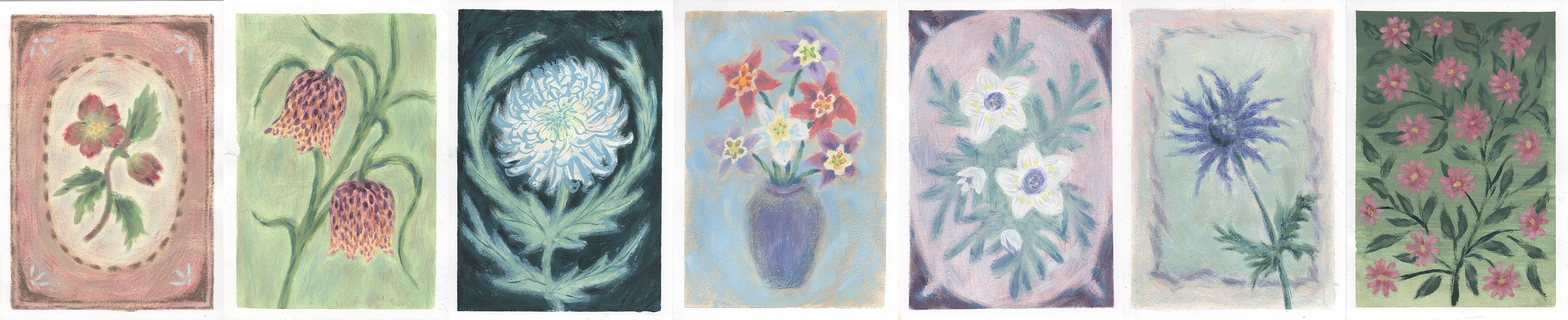
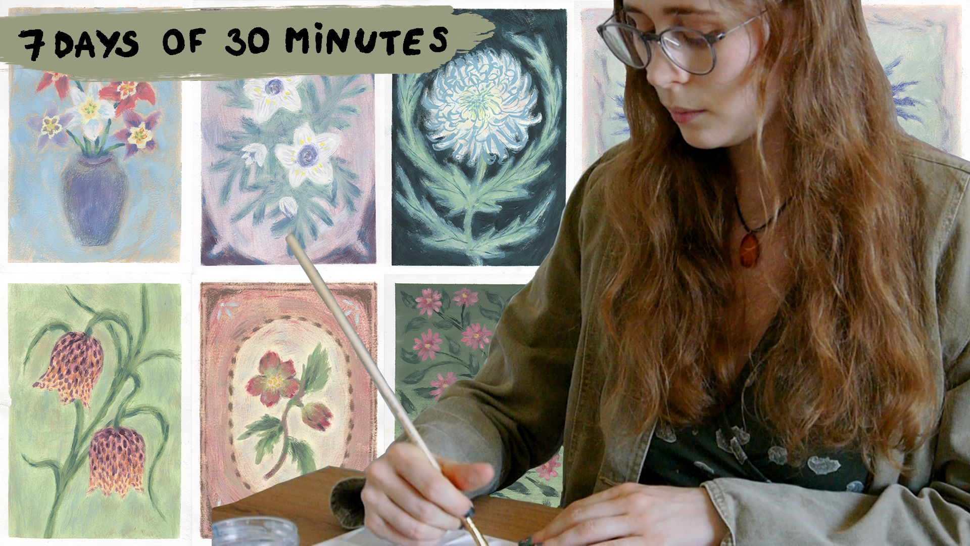
1. Intro to the 7-Day Flower Painting Challenge: I am ready to try out a
new technique and paint seven beautiful vintage
style gouache paintings, each featuring a unique
and different flower. In this class, I'll guide you to creating a collection
of small artworks, each taking around 30 minutes to complete using one of
my favorite techniques, the dry brush painting method. The simple yet
expressive approach gives each painting a
beautiful aged look, full of character. Hi, France. My name is Paulina,
and I'm an artist with a background in fine
arts and printmaking. I started painting with gouache when I was just 6-years-old, and ever since it remained as my favorite painting medium. For many years, I found gouache paintings a bit
too flat and boring, and that's what led
me to experiment and eventually develop
my own method using dry hog bristle brushes with
very little paint applied in soft sweeping motions to
create a texture surface. Completely transform how
I work with gouache. In this class, I'll walk
you through seven of my favorite flower paintings
using this technique. I developed many sketches from which I eventually
chose my top seven, and I'll explain the process
behind each painting. Before we begin, make sure you have the following supply list. A few soft bristle brushes, a few hog Bristle brushes,
and the gouache set. I'll be using Kimi Mia Gua set, and I will tell you exact
color names that I use, but feel free to substitute
or match with what you have, but I still suggest you to
use ime Mia gouache set. This class is designed as a gentle seven day
painting challenge. Whether you're begin or
more experienced Artist, this is your chance to
try out something new and create a beautiful series
of floral paintings. If you're ready,
check the supply list and the description below, and I'll see you
in the next video, we'll prepare for your
first painting session. So let's get started.
See you there.
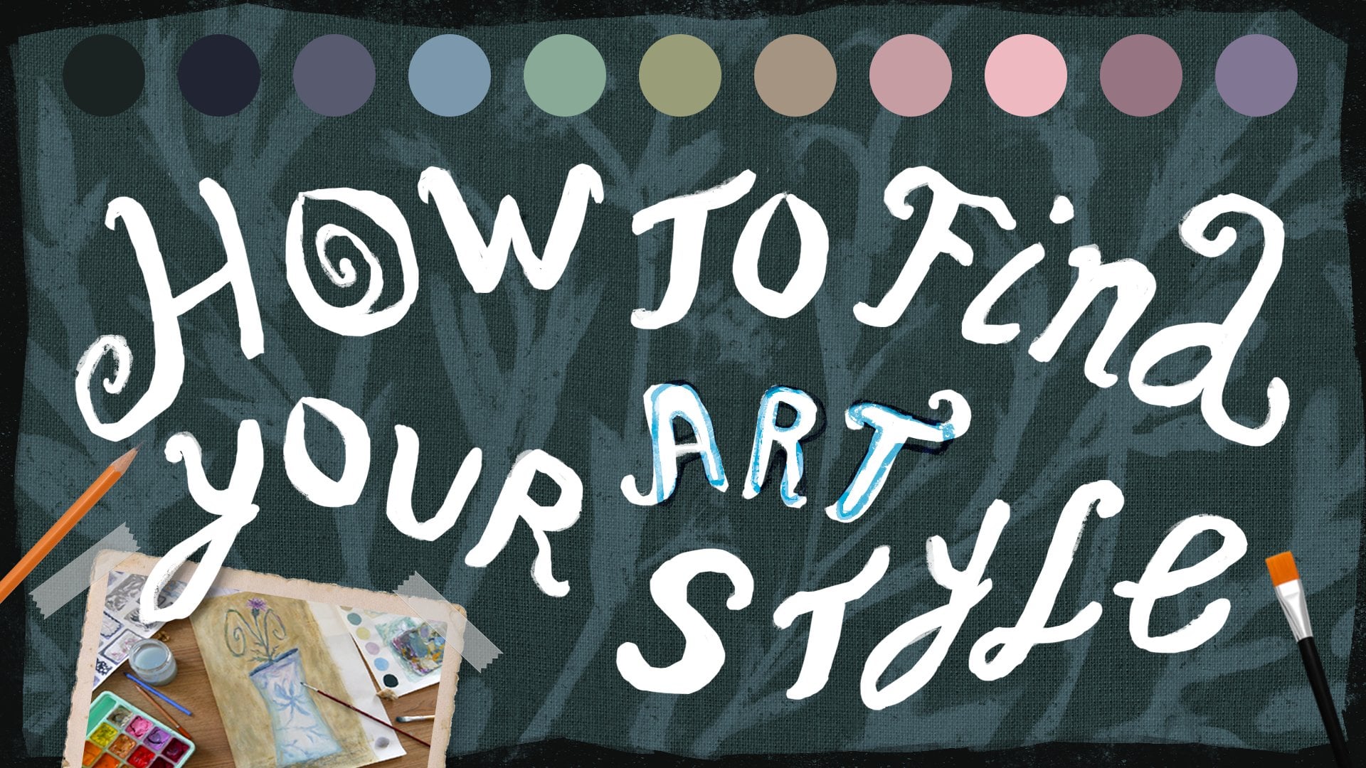
2. Before We Start: Overview & Materials: We start painting,
let me walk you through the materials
and process. First, you'll need
gouache paper. It has a smooth surface, which works beautifully for
this gouache medium. You don't need to use
this exact type of paper. Just look for paper
with similar qualities. The main thing is
that it should be thick around 30
grams/square meter. My sheets are A four size, and that's the standard
European size. And in US sizing, that would
be roughly 8.3 by 11.7 ". For this class, I've
cut my sheets in half, so we'll be working
on smaller pieces, and that will be just
perfect for our practice. Also need a pencil and eraser. I'll be using an HB pencil, which stands for hard black. But you can use whatever
pencil you'd like. Now, let's talk about brushes. In the video, I'll be using a few soft bristle brushes
in medium to small sizes, and you'll definitely need at least one thin
soft brush with long bristles for finer details. Our main brushes for this class will be hog bristle brushes. I'll be using three different
sizes, 26, and one. Size one brush has
seen better days, but hopefully yours is
in much better shape. I also keep an extra
size six brush on hand just in case you don't need
these exact sizes or brushes, but you'll definitely
need one large, one medium, and one small brush. You'll also want some napkins or a cloth to dry your brushes, plus a container for water. I'm using an jar with
glass stones inside, and these stones help to clean the brushes more effectively. But you don't need
them, by the way. Next, you'll need a
palette for mixing colors, and I'll be using the
one that comes with the JimiaGuach
speaking of which, let's talk about guache paints. I'm using a 24
piece gouache set, and I'll go over each color so you can see how
I arrange them. Feel free to use
any brand you like. Just choose a Guache paint
set you enjoy working with. I divided all of these colors into warm tones and cold tones, so here are all the names. First, white, then purple, but I think it's light
pink, pale purple, rose, deep red, Banza
red, nude, lemon yellow. Medium, yellow,
orange, earth yellow, ochre, jade green, pale green, grass green, yellow green, sky blue, acid blue, cobbled blue, ultramarine,
the side black, then Prussian blue, burnt
tamber, and violet. And here are all the colors. We also need tape to secure
the paper to your surface. Helps keep the paper
from moving and gives you those
nice clean edges. My tape is about 1.8
centimeters wide, which is roughly three
quarters of an inch. Here's how I tape my paper. I place it, so one half of
the tape is on the paper, and the other half of the tape
is on the table. Like so. Once the painting is
dry to the touch, I carefully remove
the tape and to avoid tearing the paper because it's
definitely a possibility. Pull the tape back at an
angle, not straight up. But keeping just a
little bit of tension, and it helps prevent damage. And the little tap, if
your tape is stubborn, gently warm it with
the hair dryer and it'll peel off easily. Just know that some tapes might leave a bit of a sticky residue, and that was the
problem in my case. So I don't like using
the hair dryer on the tape that I have because definitely the paper
becomes sticky. So I'm trying to do the trick with the channel as
you can see on the screen, and it works for me, but
there still could be some moments when a little
bit of paper lifts off. It definitely
happened sometimes. And it happened with
my drawings as well. It's not going to be perfect. And I think one of the problems is the type of the
tape you'll be using. And if your tape is
ruining the paper, try to use a different
and in my case, I struggle with my tape as well. And that's okay. I don't think each and every
painting should be absolutely
perfect. It's okay. It's a process with learning
and peeling of the tape from the painting is a
learning process as well. It's a learning curve, for sure. Alright, that's
everything you need. Now, let's get started
and begin painting. And I'll see you
in the next video.
3. Day 1: Winter Aconite (Setsubun-So) Flower: Welcome back. And in this video, we're working on satubnson. It's a flower that
is endemic to Japan. But let's get started. Like, always, I prepared my
paper and taped it down, and I'm starting with
the slide sketch. First things first, I am drawing these arched shape in the
corners of our sheet of paper, and then do round
circles in the middle of the paper kind of
outlining the composition. And then when I'm happy
with these two circles, I'm adding leaves
according to my liking. Next, when the rough
sketch is done, we are adding some details. And as I usually like to do, I'm adding some spiky
shapes to the leaves. This time, it's kind of like a curve line with some wiggles, nothing particularly complicated,
Just some wiggly lines. And once these
details are outlined, then I am finishing
the flower shapes. In this case, we are
drying five petal flowers. So I'm outlining
these five petals. And these flowers have kind of spiky ends and curve lines
in the center of a flower. Nothing too difficult,
a simple flower shape. And, of course, let's mark the center of the flower as well. And next I'm once again
using a clean brush that I am washing constantly and drying it out and
placing the colors in the palette so
that we can control the mix of the colors
that we need to make as precisely as possible. And in my case, I just don't want to make my
palette too dirty. We're putting my brush from one color to
another into another, and I don't want
to make it a mess. So I'm using this brush that
I'm just using to place the color in my
palette and then mix the color and then I'm washing it and drying it carefully. So I'm not adding any extra
water droplets to this paint. And I'm mixing three colors, pale purple, ear yellow,
and burnt amber. And that's for all the
colors that I use, I add some white. And that's usually
for the base layer, I'm keeping the colors
light and loose. And in this case, I'm mixing a neutral beige kind of tone. Even though this sketch was
kind of a lighter sketch, I did not go with the hard hand. I decided that we need to remove as much pencil
lines as possible, so I use the eraser to remove
any lines that are really, really visible
because these flowers that we're painting
are white color, are really light in order
for the pencil drawings do not show up in
again, uh, painting. I would suggest to erase
as many lines as possible. And with the big
war Bristle brush and big movements and strokes, I am applying the paint that
we mixed on our palette. And this time, as you can see, I tried with the dried
brush technique at first, but I decided that it's
going to leave too many kind of white spots that
I don't really like. So instead, I decided to add water to the paint
mix and cover up the whole background
with this neutral tone except flower shapes because these flowers are
going to be white, and to keep them as
white as possible, I'm not adding any background, any base tone to these flowers. Since it's the underpainting, you don't have to
worry about details yet it's okay if you covered
up the flowers as well. Any mistakes can be
covered up with more pain, but in order to keep, you know, the colors the brightest, I am keeping these flowers not covered up with
the base tone. Next time, mixing
the darker color, adding more pale purple color, a little bit of art yellow, and burn tumber that
I have on my palette, and I'm continuing to use this big B bristle brush to cover up the
background with texture. Since I didn't like
the white background with this dry brush technique, kind of texture, I am using a darker color and covering
up the tone down background. And this time again,
I'm not covering up the flower shapes that
we're going to paint different lighter
color later on. Then I'm adding
more white paint to this mix and I'm
adding a little bit of ultramarine blue
and mixing it with the previously mixed color to make this color
more cohesive, adding more pale
purple to this mix, and a little bit of burned
tamber to make it darker, but still keep it neutral. I'm never adding
black color because I think it makes colour dull. And I feel like the
vintage leans to more of a brown color than black,
but it's optional. You, of course, can use
black if you want to. And again, with the
big Barbsil brush, keep in mind that
it's completely dry and really light strokes
with really light hand, layering and layering
the background, except that you can see
these kind of corners, triangle shape and the corners
of the paper because I'm going to cover it up with
the different color anyways. If you want to cover them
with this purplish color, that's totally
fine, totally okay. I'm just saving
up some paint for the background and not
using it in the corners. And next I'm just adding more tones to this
kind of background. If we had some of
the darker tones, now I decided to
add a little bit of a lighter tone on top of this
layered kind of texture. So I added more white to
the previously mixed color, especially because I made one stroke with the hard
hand and it's really, really visible, so I
decided to cover it up with the lighter paint. On top. And I am slightly covering the edges in case
some of the color peaks, and I just don't
want them be too different from the background. So next I'm mixing some
ultramarine blue and deep red, as well as adding
some burnt umber. And we get this dark
kind of purplish color. And as you can see, I'm mixing this color on top of the
previously mixed color. And the idea behind
that it keeps the tone, the color a bit more cohesive to the
previously mixed color. So all of the palette would
be cohesive in the end. Nothing would be too saturated or completely in
a different kind of tone. Why. But the big warble brush, I am taking just a
little bit amount of the paint just using the tip of the brush
for more control. And I'm kind of slightly
tapping it and dragging it, leaving this kind
of gap in between. I like this look because it makes it a bit
more interesting. It's not as boring as just coing up with one
stroke of brush. It adds a little bit of detail
on the edges of the paper. And I'm not adding any water, so the brush is really dry, and we have this texture, and we have these kind
of visible strokes, and I'm using a really
light hand to blend a little bit the color that we added to the
sheet of the paper. I'm just lightly,
kind of smudging it down and tapping to blend
as much as possible. But not to ruin the kind of those stroke effects that
we added as the base layer. And it already looks pretty
interesting, pretty cool. I really like how the
texture looks like and how these little kind of corner details look
like, as well. I think it's really interesting to look at even
without any flowers. And for all of these kind
of dry brush textures, I like to use kind of, like, these soft feathery motions and let the brush do the work. Next I'm mixing the color for the leave, starting from white
paint on my palette. I'm adding a little
bit of pale green, a little bit of earth yellow, and just a tiny bit
of burnt umber. And to make this color darker, I'm adding Prussian blue. This is my favorite combo
to make the color darker. Mixing the Prussian
blue and burnt umber. And it helps me to control the amount of paint
as much as possible, especially because my base
kind of color is white, and the color itself is really, really pastel kind of color. I like to kind of minimize the risk of using
too much color, too much paint and starting mixing with white and then just adding tiny drops of colors
until I'm happy with the mix. And then with medium
where bristle brush, I'm applying this green pastel
color to the leaf shapes. As you can see, we cover
the drying underneath. I don't really see
the lines anymore, but I don't think
I need to anymore. I'm just using these
kind of motions of dragging my brush and
dust kind of leaf shape. And since we're using
really, really light color, it's okay if you make any
mistakes because it's really easy to cover it up with the color that we
have on our palette. So don't be afraid to use
your paint straight on the sheet of paper
without sketching it first or seeing the
drawing underneath. And I'm adding these
leaves until I'm happy. I'm kind of trying to cover all the oval shape that we have here with leaves of the empty spots that are not
covered with the flower. I'm trying to cover them
up with the leaf shapes. Oh. But once I'm happy with all the leaf shapes that I can suggest it with
the pastel green color, I'm adding darker tones to the ends of the leaves using
some ultramarine blue, and I'm mixing it with the
pre mixed pastel green color. And I'm just placing it with feathery motions on the
tips of the leaves. Take your time.
There is no rush. Don't add any excess
water, of course, and we're just
suggesting form here, not outlining everything, and it's really
looking pretty good. Next, let's make the
paint for the flowers, and I'm adding some
lemon yellow to the pastel green and a little
bit of art yellow as well. And I'm placing white colour
to the side and mixing in some kind of yellow
color into the white color. And using the slighter color, I'm just adding some
details here and there. Because I did not like
that some of the leaves kind of looked too
bright in my opinion. But next I'm adding
a little bit of sky blue to the palette and a
little bit of acid blue, and, of course, a
little bit of white. And as you can see,
I'm never adding the white color just straight to the center
of the mixed color. I'm usually placing
it to the side to control the color as
much as possible, again, because you kind of can add all of the pre
mixed color that you have and add white or
how much blue color. In this case I want to add
and mix it to the side. And to this blue mix, I added some bird amber. And I started to kind
of suggest maybe some shadows or darker
tones to the leaves. And with the lighter
color previously, we just added some details, but I was not sure that I really liked how these
details looked like, like too busy so some
of these places, I'm going up with this
darker color once again. And yeah, we're going
kind of back and forth between whiter
and darker tones, but it makes all the leaves
of this background and all the details more
interesting if we add more tones and if we add
more shades so green, it just looks more
interesting to look at. Yeah. Next using some white
just straight from the can and maybe adding just a slight
amount of lemon yellow, I'm outlining the flower shapes. And as you can see, the white paint that
we add to the flowers to the sheet of paper is not as white as the sheet
of paper itself, because the sheet of
paper is dark white, and I think my white
has a little bit of yellowish tone right now because it's almost
completely gone. So I think I've mixed in some amount maybe of
yellowish tone to it, but you still need
to keep in mind that your white gouache not going to be as white as
the sheet of paper. It will always have some kind
of yellowish tone to it. So that is the
reason why we love these flower shapes without
the background tone. We love them completely white. And when I outlined
these flower shapes, with the white paint. I'm using soft small
brush and water, and I'm just kind of doing
these light motions to blend this white outline
with the rest of the white in the center of the flowers to
make the gradient. I want to make these flowers
as light as possible, but at the same time, I don't want them to be too stark white. I want to blend them a little bit more with
the background. That's why I outline them
with the white paint. For So next time I'm taking the small
Burbisal brush and I'm mixing some pale purple with acid blue on the previously
light purple color that we mix on the palette. And again, I'm doing it
because I want to keep all the colors cohesive
in one kind of tone. And that's kind
of the reason for this using really small brush, and it should be
really dry as well. And with light and
small motions, I'm kind of making outline for the circles for the
centers of the flowers. And with the dry brush, I can get those nice,
streaky textures. And this blue color adds
a nice bob of color. Then I decided to add
more pale purple to this blue mix and just slightly tapping the brush in
the centers of the flowers, I'm adding this
darker tone to it. Because I'm adding more
lemon yellow to the palate, and I'm mixing it with the previously combined pastel white and pastel yellow colors. And I'm just adding two little dots closer
to the center of the flower where the petals are and doing the same with
the other flour as well. And I feel like
these little details really pull it together. Now, using the colors
on my palette, I'm just adding a
little bit of water because they are really
dried up right now. And I am trying to
cover up all of the maybe spots where the
background is visible, and I'm trying to
make the shapes of the flowers kind of more beautiful and
more outlined as well. And I'm just using pastele
green color around the edges of the flowers and blending the colors slightly. Okay. And using this light
pastel yellow, kind of greenish color, I'm tapping my brush
really slightly on these darker centers of the flowers just to blend them a little bit more with
the rest of the flowers. And now I'm adding
just a little bit of sky blue to the previously mixed blue
color on the palette. And with the small
borbsal brush, I'm using it to kind of add a little more dimension
to the borders to the frame that we
have kind of adding additional layer of color to make it more interesting
and dynamic. I feel like this kind of
bluish color ties all of this composition
together because we use the blue color
for the leaves, and we use this blue color for the centers of the flowers. And now when I'm using it to blend it with the background, I'm using it to blend the
frame with the background, it kind of ties
it up together in the one style with the
same color I'm going over the tips of the leaves
one more just to add a bit more texture and a little pop of color and
make them more interesting, of course, to add a little
bit more contrast, as well. So it wouldn't look
all tootle in the end. And I'm using really, really dry paint on the palette, so it almost doesn't
transfer to the paper, but that's exactly the
texture that I'm looking for. Really dry using the
small hog bristle brush, I'm aiming for as much
control as I can. It's actually really good that this paint dried up already. To revive it just a little bit, I've added just a drop of water. Now I'm just slightly shading the tips of
the leaves as well as around the flowers to suggest the shadow underneath
the flower heads. And this is how the
painting turned out. Now I can offer you two
options either to continue painting and adding detail
or stop at this point. As always, my artist's brain wanted to add more
to this painting. So if you're on board with me, let's level up this painting. I'll be using only these
four colors this time, white, bell green, yellow,
and ultramarine blue. The first thing I decided to add is an additional
flower hat that is small and close just to
fill in some empty spots. This time, I'm working without the sketch,
but that's okay. We'll be applying paint straight to the paper. It's totally fine. Don't be afraid to ruin anything because in the worst
case scenario, you'll be able to cover
it up, and that's it. That's a simple fix.
So don't be afraid. So I'm taking the small
hog bristle brush and dipping it into
the white paint. I'm starting to apply some small strokes in the empty spot between
the main flowers, and I'm trying to
build this shape of a small flower head with
almost open four petals. You can choose whatever amount of petals you would like to see. But it looks a bit like the
half of a broken heart. I don't know if
you agree with me, but in my opinion, looks
like half of a heart. I don't know if this
description helps you or not. But next, below all
of the flowers, there was a potential for
another additional flower head. And this time, I'm making an
even smaller flower head. Like it just emerged, and it's in the simple
shape of a water drop. Now for our shadow color
mix ultramarine and white, you can also
experiment by adding just a bit of yellow
and pale green. You don't need a
lot of this color. It will be our shadow color. I'm using this muted
blue color to split the drop shaped flower
head into two parts, suggesting that there
are two petals. Next, I added much more white to this blue
mixed paint on the brush. And I'm taking the small but
long soft bristle brush, and using this
light blue colour, I'm adding lines at the
bottom of the flower head. When the flower is done, we are moving on to the previous
one to add some shadows. This time with the
hog Brittle brush, I'm adding a shadow
almost in the center of the flower head to separate
all four flower petals. And next, I'm taking the soft
brush once again and adding these small lines and
filling in all of the white spaces in the
centers of the flowers, like around the centers of the
flowers, using light blue. Here you can see that
I'm making really, really small movements with
a soft and light hand. These lines add even more
texture to the flowers. In my opinion,
they look way more interesting that
way and less plain, and I like it this is not a
necessary step to accomplish. It's definitely optional because this kind of detailed
work takes a lot of time. So that's why I'm speeding up this process a bit because it's the same movement
repeat it again and again until you're
happy with the result. So if you're not in
the mood of adding lots of small lines,
you don't have to. I think these
flowers look great, even without these little lines, but these little lines add
just a bit more texture, and you know me already. I'm absolutely
obsessed with texture, so I'm adding as much
texture as possible. And I'm adding some of the lines to the smaller flower heads. And at this point,
we are finally done. I think this painting
looks absolutely charming. I hope you enjoy this process of creating
these unique flowers. Don't forget to
share your paintings in the project gallery, so I'll be able to see
your amazing creations. Even if there are
still in progress, I would definitely be happy
to see all of your works. But for now, that's it, and I'll see you in
the next video. Bye.
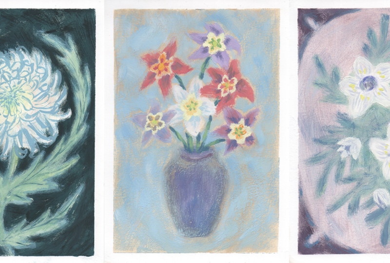
4. Day 2: Eryngium (Sea Holly): Come back. In this video, we're working on sea
holly or ringum. So let's get started
straight away. As I normally do, I tape the paper to the
table before starting. So I'm straightaway starting
with the light sketch. This time, I'm drawing,
like, a rectangle, leaving some space
around the edges, and later on, this
will become a border. But right now, I'm not going to add more details
to this border, and I'm drawing the
slightly curved line and a big kind of
circle or an oval, as well on the bottom
right hand side. I'm adding a few leaves. At first, I'm starting with the slight shapes that
guide decomposition, and then I'm adding
more and more kind of lines to guide me to
more details leaves. I'm adding spikes and adding more shapes to make it more
complex and interesting. Well, I'm adding a slight
sketch of the center of the flower and marking where the flower petals
are going to go. And those don't
need to be perfect. You can just roughly draw these shapes to see the
composition overall. And as the last step, I'm always erasing my sketch, so it wouldn't interfere
with the paint layer. It's not a necessary step, but it's just something
that I'm used to doing to make these lines
really, really light. I definitely see these lines. They may not show on camera, but that's enough for me to start with the underpainting
or first layer of paint. I'm starting painting with
a big, big coarse brush. This is a board Brazil brush. And I definitely think
it's better way to start your painting with a big
brush with big strokes so you can move your process of painting faster and especially don't spend a lot of time on the underpainting or on the
first background layer. And as you can see, I'm
mixing a lot of white paint. I'm adding some ochre. I'm adding burnt umber. And as you can see, I'm
starting with some white paint. And as well I'm
adding some ERTello. This time, I'm using
additional brush, so my colors wouldn't be dirty, and I would not need to wash them after each and
every painting. But it's not necessarily
for you to do it. And then I'm adding burnt umber. As well as some
ultramarine blue. Those are like my classic
choice of colors, to be honest, and a tiny bit of lemon yellow wouldn't hurt
anybody, as well. And this time, I'm adding
some nude color, as well. As you can see this time, I added all these
colors to the palette, so it would be
easier for me to mix this background color that
I want and just control the amount of colors or paint I'm adding to
the white paint. And I'm starting
really slowly to mix one by one these colors, starting with the lightest
ones, like art yellow, lemon yellow, and nude, and then adding some burnt
umber and a little bit of ultramarine blue
until I'm happy with this neutral kind of
ochre background. This is my favorite
color to start with because it tones
down the paper. It's not as bright and colorful
because white is really, really, like, dark, white, and it's difficult to start with white background,
at least for me. And especially vintage
style vintage mood is never kind of crispy, white color, at least in
my kind of imagination, it's not perfect white. It's always like aged or some
kind of moody brown color. So that's why I tone down
the paper with just really, really light ochre color. And then I'm mixing
the next color. I'm adding some white
to the palette, a little bit of grass green, a little bit of pale green, and a little bit of sky blue, and as well some nude color. And I'm taking the middle
kind of sized brush, bore bristle brush, and mixing all of these
three colors together, starting with the white color. And this will be our
background color that we will paint this rectangle
that we sketched before. I'm not really trying to
make this layer perfect, as I always do, to be honest. I'm gradually building
this background with just to be honest chaotic, brush strokes, they don't
need to be perfect. I trying to add as much
texture as possible. I'm trying to not add
any water to this paint. But this time, I
noticed that some of my paints dried up on the
palette a little bit, so I added a little
bit of water as well. But as you can see, I'm
trying to dry my brush pretty well before applying
this water down paint, and I added a little
bit more white paint the mix of paint that we
made on the palette to this blue mix that we created just because there was not
enough paint on my palette. And I'm continuing layering and layering with
really fast strokes. Next, I'm adding more
pale green on my palette, and obviously, as well, some white and
some lemon yellow, plus a little bit of burnt
umper and brush and blue. And this time, I'm taking the smallest wbrisle
brush that I have, and I'm mixing this
light green color. I'm mixing it, starting
with the white and then adding pale green and a little bit of burnt tamber and Persian blue until
I like the color. And I always add a little
bit of burn temper and either ultramarine or
Prussian blue to make this color more muted down
and add adept to this color, so it's not too bright, and it would be cohesive with
the other colors as well. And this color I'm
using to paint the stem of the flower
and the leaves as well. This time, I'm using small brush strokes to
define the edges of the leaves and to add more
kind of strokes and details. These kind of small strokes help suggest the
spikes on the leaves, and they make the
composition more interesting to look at as well. Next, I'm mixing the next color, and I'm adding some white
paint on the palette, of course, and a little bit
of pale purple this time, as well as Persian blue. And I'm mixing these
three colors until I get kind of pastel purple color. And, of course, I'm not forgetting to add a
little bit of earth yellow to make the
color more cohesive with the other colors that
I have on my palette. These muted tones help
create a more take feel. So that's why I'm even using previously mixed colors to help keep the palette cohesive, and I'm mixing this purple
color until I like the tone. So I'm adding more pale purple. I don't want these
colors to be too bright. I think this piece will
be a bit more pastel. And tone down. And
I'm not really happy with the color that I mixed. So I am continuing to
add either brushian blue or pale purple or white until
I'm happy with the tone. And for the center
of the flower, I painted it with kind of like a darker color,
darker purple color. And the petals, I decided to
make a little bit lighter. And that's why I added more
white to the mixed color. And then with these quick
and light brush strokes, I help suggest where the
petals are going to be. The shape that I'm creating kind of looks
like a sun shape. So if it helps you to imagine
how sun would look like, then you could use the shape and translate it to the
flower shape as well. And when I'm finished
with the petals, I'm adding small, small, small strokes to suggest
the spikes on the petals, and you can add them as many
or as little as you want. You just repeat this process
until you're happy with the amount of spikes or petals. If you make any
mistake, don't worry. You can just cover it up with paint you previously
mixed on your palette. So don't afraid to
make any mistakes. Otherwise, you will stumble upon enough procrastination
of thinking if you're doing the
right move or if you're placing the right
color or right stroke, don't worry about these
little things, do it. And then if any mistake emerges, covered up with more paint
and you've got to go, the painting still should
look beautiful and cohesive, and we will try to make
it more interesting. So to make it more interesting, right now, I am
mixing another color. As you can see, I'm using
previously mixed color, and I'm adding kind of
more darker tones to it. And with this color, we
are painting the border. Since we don't have
lots and lots of time, I'm just kind of
suggesting the border, and I'm just using small tiny
strokes, really light hand. I'm placing these small strokes, and that's why we use the
previously mixed color. So it wouldn't pop too much
and wouldn't be too bright. To saturate it for
this little painting. And for this kind of frame, you don't need to paint it
with thick and big lines, like, really, really
light strokes, that would be enough
for this border. I'm kind of trying
to make it textured, add spikes to it. So it looks kind of detailed, but at the same time, it's not. So you're kind of adding lots
of strokes, lots of spikes. And it looks like there's
a lot of detail in that frame, but in reality, those are just little
strokes that we created, that we added, and
I'm really lightly tapping this color
without overworking it. I am mixing another color. I'm adding nude and I'm adding some pink color and white,
of course, of course. So white. Next, I am mixing
the previously, like, nude color and adding more kind of pink and
nude color to it. And with this a little bit of a brighter ochre color
and with really, really, really light strokes, I'm adding kind of
this texture or, like, little tone to the frame. This color, I'm trying
to blend it together with both of the other colors
that are already applied, like the lighter blue and the ochre background
that we have. And it just makes the frame
look more interesting. But don't overwork it. And as you can see, I'm
using, like, really, really light strokes,
extremely light strokes, so you don't see the lots
amount of paint on the brush. Next, using small
warbizle brush, I'm adding some pale
purple and mixing it with brushian blue and a little
bit of burnt umber. And I'm mixing this darker color to suggest the
center of the flour. And I'm kind of starting
with one side of the center, and I'm not and coloring it
fully with a darker color, just defining the edge of
the center of the flower. And I'm adding a bit
more pale purple, as well as some Russian blue. And with this color,
we are kind of suggesting the shadow
on the petals. Just defining them a little bit more so so they wouldn't be that light because right now these petals are blending a bit too much with
the background, and I want the flour
to pop a little more and make it brighter and
a little bit more colorful. So I'm using different
kinds of shade. As you can see, I'm
mixing a little bit of pink with the previously
mixed colors that I have in the palette
and kind of using all of the different shade to add
a little bit more texture, a little bit more depth, so the flower would
look more realistic and more interesting
to look and I'm placing this color
closer to the center of the flower because that's where the shade probably would be. As well, I decided to
make the center of the flower a little
bit darker, as well. And because I made the
center a little bit darker, now we need even
darker color to define the edge of the center
of the flower again. So I'm adding pale purple
and burnt umber and brush in blue and using small strokes to define the edge of the
center of the flower. I'm adding this darker color to kind of one of the sides of the center of the flower
because it will suggests that there is some
kind of shadow. So now we're at the stage where we can add some
smaller details. Basically, the composition
and the flour is done. And now we can add some
dimension to the stomach, flower or the petals. So I'm using the previously
mixed green colour on the palette and adding some dark colors like
brushian blue or burnt umber and mixing a little bit of
darker green colour. As you can see, I'm still
using the small bristle brush and mixing this tone of
color until I like it, adding different colors that I already have on my palette
and mixing them with green. So the color again would look more cohesive and interesting. And just with light strokes, I'm tapping the brush with
this darker green color. I'm not trying to cover these leaves fully with
this darker green color, but just lightly
tapping the brush here and there to
suggest the shadow. And next I decided to add
small details to the center of the flower using some kind of light purple color that
we have on the palette. And with this light color, I'm kind of adding some
small dots here and there. Maybe suggest pollen. I don't know if this flower has pollen in the
center of flower. But anyway, I'm adding just
a few dots here and there. And as you can see, I added a little bit too
much of these dots, a little bit too much
of the lighter color. So I'm just wiping the color that I don't
like with my fingers. And it blends with the previously applied
color perfectly. So you can't even notice if you made any mistake and you don't need even to cover it up because if the paint still is wet, you kind of can just
blend it together with the previously added color
that you have on the paper. And nobody would even notice
that something went wrong. And in this stage, you can just look at
decomposition if you like how the flower looks like and just add small
details here and there, maybe some spikes, if you missed some spots or some
kind of darker tones, if you feel like your
flower is too light. And this flower really
looks like purple sun, to be honest, now that
I'm looking at it. And again, I'm at the stage where I'm adding
more and more details. But probably nobody
would notice if I just stopped at this
stage right now and wouldn't add
any more details. At all. So if you're happy with your flower and how
your painting looks like, you can stop at this moment. You don't have to add any more kind of
strokes or details. As well, the other
thing that you could do is to step back
from your painting a little bit and see it from the distance and decide if you like how the
colors look like. If it misses some
details or it's perfectly looking and it's done. Look at this painting with
fresh set of eyes, kind of. Not really, but it
definitely helps to see any mistakes that you may
be made during the process. But I'm continuing to add some little details and some more tones to
until I'm happy, for example, with the border, I decided to add a little bit
more of a darker shades to the frame only on the bottom
side of the painting. So it kind of make
maybe, like, a gradient. And at this stage, the
painting looks complete. Now you can choose
if you want to leave this painting as it is, or if you'd like to work
on it a little more. My artist's brain often doesn't want to stop working
on paintings, so find ways to upgrade them. Let me show you some steps on how to develop this painting. I will only be using
these six colors. A yellow, Persian blue, pale purple, rose,
pale green, and white. And these are the
color combinations. I was able to create from them. Next, with a mix of white, Persian blue and pale purple, I'm adding some pops of
color to the flower petals. I wanted to add more
contrast to the flour, and using a dry
hog bristle brush with just smaller strokes, I applied this paint
to the flower. This instantly made the flower more colorful and
interesting to look at. Be a bit tedious to go over the same painting
again and again. But that's just a part
of the painting process. And I, to be honest,
really enjoyed it. And as you can see, I didn't add any water to the brush
while painting because I wanted this beautiful texture that this brush is creating. And you actually won't get
this result with a soft brush. When I was just starting out, I remember wondering why on
earth anyone would paint with these weird coarse brushes that weren't pleasant to touch. But look at me now. I definitely enjoy experimenting with
different textures, and these brushes
allow me to do that. Next, using the combination of Persian blue, pale,
green, white, and art yellow, I added some darker tones
to the flower stem. As you can see, I tried
to add this darker tone only to one side of the stem to give it
a little dimension. With soft strokes, I apply just bits of color here
and there to the leaves. For one of the last steps, I decided to add more texture to the background using a
medium hog Britle brush. And now around this border, I'm adding a bit of
light purple color, which is a mix of white, pale purple and rose. And just lightly
dabbing the color, I'm buffing this new
more vibrant color in to add more texture. And please be careful to not
add any additional water to the paint or the brush as it needs to be completely dry. I even went over the frame
itself, but don't worry. We'll add more highlights and contrast to
that later as well. This time, I used a mix
of white and sky blue. Then I decided to go over
the blue background with a slightly more kind of greenish and darker blue color to make it more interesting. And as you can see, I am mixing pale green,
sky blue, yellow, and a lot of white, and I'm adding this
color wherever I feel it would add nice texture
and interesting dimension. Using the same pink light
purple color on my palette, I'm adding more pale green or a bit of Persian
blue to the mix, and I'm back to
painting the frame. With the smallest
hog, bristle brush, I'm adding this
darker color here and there over the frame that we
created around the flower. And this is the final result. As you can see, I've added more vibrancy and
contrast to the flower, and now it looks more
alive, I would say. What I like most about
it is that this painting is layered with different
tones and textures, and don't forget to add your
painting to the gallery, so I could see that, and I will be really happy
to see your painting there, and thank you for
following along, and I will see you
in the next video.
5. Day 3: Chrysanthemum: Hi, welcome back. In this video, we're working on Chrysanthemum. It's a really beautiful flower, and we're going to paint it in a white color with
a dark background. I already prepared my
paper and taped it down, and straightaway, I'm
starting with a vast sketch. So this time, I'm drawing a big, big circle almost in the
middle of the paper, and that will be our flower. And then I'm kind of drawing
a second circle around it, but that's actually going to
be leaves of this flower. Then I'm drawing a curved
line and additional kind of lines that suggest
that there will be some other
leaves on the stem. And that's it basically for
our sketch, really simple. Next time, just
adding a wiggly line, a quick kind of sketch where the flower petals
are going to go. And as well for the leaves, I'm adding additional spikes, just outlining where they
could go if there is enough space or not between
the flower and these leaves. I'm speeding up
this part because I'm adding tiny details. It's a really
repetitive process. And that's quite
straightforward. I'm just adding more
and more spikes until I'm happy with how
the leaves look like. And basically, that's it. And now our composition is done, and I'm erasing any heavy
lines that I drawn on the sheet of paper just so it doesn't show up under
the layer of paint, especially because we going to paint this
Chrysanthemum in white. And I want as light of a background as I
possibly can get. So I'm especially erasing
any lines that I see, for example, in the
middle of the flower. Still, as you can see,
some lines remain, and that's enough for
me to guide me through this process later
when I'm going to paint the background
or leaves and extra. And I'm starting
mixing the colors, starting with the white paint, and then adding some pale green, as well as some lemon yellow and some nude
color and sky blue. I'm adding a little
bit more white, and with a clean, dry and
middle sized warble brush, I am mixing some white with
lemon yellow and nude, and with light feathery strokes, I'm adding kind of
this really pastel, yellowish nude color and painting the flour
with this color. Time, I'm starting with
the lightest colors, and then we can finish with the darkest colors and
paint the background last. But I don't want to make
this Chrysanthemum wearing and just white as a
color of the paper. So I decided to mix additional kind of shade
to the white paint. And especially looking at
the reference pictures, none of the
Chrysanthemum are kind of perfect, crisp white color. So I'm adding a little bit of pale green to white color
and mixing it up together. And I'm adding this really light pastel green color to the
center of the flower. And I'm thinking more
white and a little bit of guy blue to mix a really
light pastel blue color. And this color I'm adding
to the edges of the flower. And again, using really light
strokes with light hand, kind of softly blending all the colors together on
the edge of the flowers. And with this bluish color, I kind of drag my
brush a little bit in some directions to kind of
suggest that there are petals. As you can see, I'm using
those sharp little movements that going to create
beautiful strokes of paint. Even if it's light paint
that you can't really see, it will have a nice texture. Next, I'm mixing up some
color for the petals. I'm using sky blue and pale
green and a little bit of lemon yellow and mixing it up together with
the white paint. And again, with
light small strokes, I'm applying this color to
the leaves of the flower, as well as the stem. And take your time
with these leaves, there's definitely no rush, and it doesn't need to be
perfect to be beautiful, especially in this case, you don't need to
perfect the leaves or the flower because
as the next step, we're going to paint the
background in the darker color. So everything that
you maybe don't like, maybe you overdrawn
the flower or the leaves and made them too
long, that's totally okay. And the next step,
you'll be able to cover it up with
a darker color. And just additionally,
I decided to draw with the pencil on top
of the dried kind of layer, base layer of paint on the flower because
I wanted to see how could I paint around the leaves because I want to create
interesting shape. I don't want to make this
Chrysanthemum like a circle. I want to add little kind of spikes and interesting shapes. I'm looking at the pictures
of encurved chrysanthemums. They have really
interesting silhouettes and interesting shapes, and the petals make
interesting shapes as well. So right now I'm mixing the darkest shade
for the background, and I'm using Persian blue, burnt umber, and mixing
these two colors together. As well, I'm adding a
little bit of lemon yellow to the mix
and nude color, and it makes the darker
color straight away a little bit more muted
down and lighter. And I'm adding just a
drop of white color, and I added a little bit
more burnt umber as well as nude color and lemon yellow until I'm happy with this shape. So I'm just going between lighter colors or darker colors. And in this case, I'm adding
a little bit more white. If you're not happy
with your color, just try to paint at least a little section
of the background, and then you'll see if it's
too light or too dark. If it's too light, it's okay. You can add additional layer. Darker color on top and actually using light strokes and to actually look
pretty beautiful. If it's too dark, you can do the opposite thing and add
a lighter layer on top, and that's going to look
really beautiful as well. Using the boy bristle brush, I am going through the background with this
darker color that we mix. And I'm really carefully
placing it with the brush around all
the flowers around all of the spikes and edges
that I created and just take your time while painting this background, it's
really satisfying. In my opinion, there is no rush. And as well, don't overthink it, play with the paint, with the brush and just let the brush
do the work as well. But I really enjoy this process outlining all the
petals, all the leaves. I'm still not adding any
water to this mix of paint. Do not make it too
watery because I really like the texture
that the brush creates, even if the background is not perfect layer of color or paint. That's so what I'm going for. And this is a really
meditative process. I'm going over all the
background with one color. If you accidentally
covered something with paint with the darker
paint, that's okay. First of all, you can try to
take away the darker color with a clean brush and
water and the napkin. And then you can cover it
up with just more paint. And basically, that's it. And you can be more careful
around the flour and just suggest some
spikes and some petals. Again, you don't have
to make them perfect. You can just go and
do however you feel, smear the paint here and there, because as one of
the next steps, we can use a small brush
and kind of outline these petals a little
bit more carefully. So next I'm mixing some sky
blue with white, and as well, I'm kind of mixing it with the darker color on a pal and the color that
we use for our background so that all the colors
look more cohesive and using this small
but long bristle brush, and it's a soft brush. And I'm just slightly outlining
the shapes of the petals, starting from the
center of the flowers. And in the center,
you will need to create these tiny
lines, these tiny, tiny wiggly lines
that will suggest like tiny also on the flower, and then you're going to
paint away from the center, closer to the edges, and you'll create those curved
shapes, curved lines. And the closer to the
edge of the flower, the bigger the shape going
to be. Basically, that's it. And in this case, because
the brush is soft, I'm not doing the
dry brush technique. So you can add more water to
this paint on the palette. And on the top of the
flower above the center, I'm kind of trying to
make these petals curved. And at this stage, it's quite straightforward
process as well. So take your time. Don't rush, meditate while you're painting, and you can draw as many little petals as you would like or have
patience to be honest. Because this is the step that
takes the most of the time. And you don't have to overthink this step and just
add some curves here, some lines there, keep in
mind that in the center, the lines should be shorter
and closer to the edges. The lines would be longer
and curves would be larger. As well using this brush, you don't have to make
these lines perfect. Some of these lines
could be thicker, some of them could be thinner. I think the best look
you'll achieve if the center petals will
have the thinnest lines, kind of lightest
and shorter lines, and the lines closer to the edge would be thicker and
larger and longer. And that's basically the logic behind the perspective, as well. And above the center
of the flower, I tried to make as
many curved petals as I possibly could. So it would look a little
bit more in the perspective. Then you could take the
small burbsle brush, and using the same blue color now in a dry brush technique, outline the edges of
the leaves this time. And by doing this, I'm trying to tie all this picture
together and as well, blend these leaves a little bit more with the darker
background color. And as I always
like to do to make something more
interesting to look at. I think adding additional color, especially color
from the palette, from the colors that are
already used and kind of using them as colors to blend together with the other
shapes of the composition, I just ties all these details together into one cohesive,
beautiful picture. And I'm just doing it
with the right hand. And this step doesn't have to be as perfect as the
petals for the flour. You can add just a
few strokes here, a few there, and it
will look beautiful. And it actually will look
even more beautiful if you will not try to make
it perfect, to be honest. And I just mix a little
bit of the green color with this lighter blue color. And I'm just using this color to cover up some mistakes
or add a little bit of a darker green color to
some spots or cover up some white spots where
I miss to cover up the white background
of the paper. Now, for additional
little detail, I decided to mix blue paint, brighter blue paint
on my palette and just take this soft small brush. And using this brush, I'm trying to draw these
light light lines, and I'm trying to suggest
the veins of the leaves. But you have to draw
these lines with the lightest hand and just
almost not touching the paper, to be honest, really,
really lightly. Draw these lines. And I think
just without these lines, these leaves looked
a little sad, especially in comparison
to the detailed flower. So I decided to add some
additional interesting details. And this blue colour is
just slightly lighter than the background color
that we used previously. And now using a small
bore bristle brush, I decided to take just
a little bit of water and add to the green
pastel color on the palette and just
slightly cover up the lines that we drew
with the small brush. I know it's kind of
counterintuitive, but you can really
skip this step if you think it's
unnecessary, but personally, I think that it adds more depth to the flowers
because in some spots, you'll be able to see
this line on the leaves, and in some spots
you kind of see more texture of the paint
and strokes of the brush, and I like to do this additional
layer of paint to make everything
look more cohesive. And as well, I kind of try to add from one side more details to make the painting
more interesting, but from the other side, the main character
in this story in this painting is
the flower itself. And I'm trying kind of tone
down the leaves a little bit. But now we'll add a little
bit more contrast by mixing some burnt umber
and Brushian blue, together with the pre
mixed background kind of blue color that we already
have on the palette, and small brush is a bit
too small for this job. So I'm taking the
middle sized brush. And I tried this color just a little bit in the corner
of the background, and I decided that this
color is a bit too dark. So I added more
white to this color. And with the light strokes, I'm trying to add more
depth to the background. I'm trying to add
an additional layer that will make the painting more interesting and it'll add just a little bit more contrast, just because I like
the contrast between the lighter shades
and darker shades, and I think it will make
the flower glow even more. It is right now. And
using this darker color, I'm just blending
maybe some spots that I missed and that I don't
like how they look like. And especially, I'm
trying kind of to blend the edges of the
paper a little bit more. So they'll be sharp after
I'll take away the tape. And I'm just blending some of the spots that I
don't really like. And basically, that's it. This is one of my
favorite paintings, one of my favorite
flowers as well. But that's it for this video, I hope you enjoyed this interesting process going from the lightest colors
to the darkest ones. And when you're ready,
move on to the next video, and I'll see you there. Don't forget to
share your paintings in the project gallery, so I'll be able to see
your amazing creations. Even if there are
still in progress, I will definitely be happy
to see all of your works. But for now, that's it. And I'll see you in
the next video. Bye.
6. Day 4: Hellebores: This time we'll be
painting Helbers. These are early
blooming flowers. They're really diverse in
colors and really beautiful. And this painting will be
painting in pinkish tones. We'll start with the
light pencil sketch. What we basically need to
do is to draw an oval, leaving some space from
the sides of the paper. Then inside the oval, I'm drawing a curved line
for the stem of the flower. Next I'm painting two sizes of circles and adding some
leaves along the stem. It should look like
something like this. And once the sketch is done, I'm adding some details to these shapes like adding
some spikes and leaves and dividing the circle into almost five equal shapes
and five equal petals. For the other
flower, I'll go with the closed tulip shape
to give us some variety. Now I'll lighten the sketch
by erasing some lines. I don't want the pencil to
show up under the paint layer, but I'll leave enough
trace lines to guide me. On camera, it might look
like this sketch is gone, but believe me, I
can still see it. Now we're ready to
start painting, and let's start with toning the paper with the
natural ochre wash. So the paper
wouldn't be too dark or too bright in
terms of values. That way you could later add
lighter and darker tones, and everything
would be balanced. I'm using white and
earth yellow tinted with water to create light wash. As you can see, I'm adding
quite a lot of water. So the gouache turns in
something like watercolor paint. Continuing to add
more and more water to cover the entire
sheet of paper. At this stage, we don't need
a perfect layer of paint for the base layer because we will be covering up with
more paint later on. So I'm smearing the paint with big and fast movements and let it sit for a couple
of minutes to dry. Next, I'll take a medium
sized hog bristle brush and mix white paint with a tiny bit of pencil red to get a light pink color and make
this color more interesting. I'm taking a tiny amount of
burnt amber brown color, and as you can see,
I'm not adding this color directly into our
pink colour on the palette, but mixing it to the side of this paint mix because these
darker colors are really, really strong and I
say that helps to control the amount of
paint as much as possible. And it gives us this ability to use the amount
of paint we need and not accidentally
make the color too dark or too light because if you'll
make your color too dark, it'll be much more difficult
to make it lighter because white paint is not as strong and you'll add
lots of white paint, and it will still be dark. So I would say,
use it cautiously, place darker and brighter colors to the side of
your paint mix and just add just a tiny bit little by little
to your color mix. And now using the
dry brush technique, I'm covering up the area around the o that we drew
with our pencil, and I'm making light strokes
with this pink color. I'm building up this
background and layering it. And in this case, by
dry brush technique, I mean that we're not adding any extra water to our paint, and we w it a bit dry. So the brush strokes
appear streaky. And to make this background a little bit more
interesting to look at, I'm taking just a tiny bit of ultramarine blue
and placing it to the side of our calmix only then mixing
it with deep pink, and I'm adding more
and more strokes and continuing to
layer this background. And again, you don't need to create a perfect layer of paint, but rather achieve an
interesting texture with these bars strokes. So next, I decided to add another color to a
pink background, and I took some white paint. I added it to our
pink on our palette, and I took a little bit of nude color and a little
bit of earth yellow. And since I made the color
too dark in this case, now I have to take
more white paint. And that was the thing I was mentioning before. Be careful. Don't add the color straightaway to your paint mix
on your palette, put it somewhere near, and then just drop by drop
added to your colo mix. And I just added a tiny bit of blue and more white
because I wanted to have the same color value
as our previous pink color. I'm still adding more blue
and brown from the side of this colomx and just a
bit of red and rose. Now I'm just continuing
to layer and layer these strokes until
I'm happy with the result. And I'm trying to accomplish the right texture
and color and what I mean by right texture and right color is just your
preference, to be honest. You can add as many
strokes as you wish and adjust things according
to your preference. Then I'm adding a
bit more white color and a tiny bit of mansard. And I'm adding to this previous
nude color beige color on our palettes that I mixed, and I'm adding a tiny bit of ultramarine blue and as
well some burnt tumber. And this time, I'm
making just really, really light strokes just
to add a bit more texture. The more colors you add, the more dimension in the
background you'll get. And now to get a
bit more diversity to our background and colors, I'm taking some white, and I mix this white with the leftover paint
on my palette. Basically, it's just
the lighter value of the previous color. Now I'm just adding
breast strokes until I'm happy until I'm satisfied
with this texture. Yeah, don't add any extra
water if you don't need it. Then I'm taking another clean, medium sized hog bristle brush. You don't need an extra brush, you can just clean up
your previous brush, but if you have another
one, that's great. You can use a new brush. And in my case, I just
have additional one. But if you don't
have another brush, just be careful to dry and especially wash and then dry carefully your previous brush. And you can dry it by using
some napkins or cloth, but dry it really carefully. As I said before, dry brush technique is
a technique where you don't add any additional
water if you don't need it. So now we'll paint the flour,
starting from the stem. I'm taking just a
little bit of grade green and a little
bit of pale green, plus a tiny bit of grass green. So basically, all the green colors and mixing them together. Now I want to make the
color much lighter. So I'm taking more
wet and placing it to the side and then mixing it on the palette
as you can see, and I mix it with the
green paint on my palette. And I added just a little
bit of earth yellow, and as well, I added
some lemon yellow. Now, when I'm happy
with the color, I'll paint the leaves first as they cover the largest
areas of green colour. I think we can add some
diversity to this green color. So I'm adding more white
paint to the side, and I'm adding more art yellow. Just a little bit
of burnt tumber as well some ultramarine blue. And I'm adding these
additional colors to make our green color
a bit more neutral. As you can see, I'm never using black color because this is
how I was taught in school, and it's actually
well known technique that impressionists used
in their paintings. They almost never use black
paint straight from the can, and they explain that by
telling that you'll never find the pure black
color in nature, so you don't use black
paint, basically. That's how it works. So I learned how to replace
this black color by mixing some either ultramarine
blue or Bussian blue. I prefer Brussian blue because it's darker with burnt temper, and it creates this
natural dark tone that is not dark
because that is not black because black mixing
any color with black makes the color dull and
kind of flat and boring. In my opinion, it also gives this vintage effect and
vintage look to the painting. Now that the largest
areas are covered, I'm taking the smallest hog
bristle bars that I have, and I'm creating these kind of spiky shapes around the leaves. And to create this green color, I added a little bit of lemon
yellow and a little bit of ochre color to
warm the green color. And with this brush,
I'm starting to add small details like
spikes on the leaves. Next with the same green color, I'm painting the curved stem of the flower with the
same green color. And when the stem is done, we are moving on to
the flower finally. I'm placing the
leftover green paint from my brush to the palette, and I'm taking more white, as well as a bit of lemon
yellow and earth yellow. And with this lighter
warmon color, I'm painting the
middle of the flower, and I'm leaving some space
for the flower at center. And I decided to paint this flower just a little
bit like a greenish color, but I decided to make
it as a gradient between green and rose
and this yellowish color. So in this case, I'm
using just small strokes and really carefully placing
the paint. The flour. So next, I'm taking just a left hour green paint
on the palette and adding this color just above the lighter yellow color
to create a gradient. And I'm continuing to fill in
the petals with this color. And let's not forget the
other flour, as well. With the same two colors, the greenish color
and the yellow color, I'm filling in the
other flower head. Next, we'll have to
make a new color. So, this time, I'm
washing the brush, and as you can see, I'm really carefully trying to dry it out. Make sure it's completely dry or at least as dry as possible. To avoid any excess water, of course, it will not be
100% dry, but that's okay. Make sure it's not dripping with drops of water because
you don't want to add extra water to this paint
because it definitely ruin the effect of dryers technique of the strokes you're creating. And then I'm mixing
on my palette, penso red and deep red. And, of course,
making it lighter by adding some white
and making it a little bit more neutral
and darker by adding some ultrain blue
and burnt timber. And a little bit of RTL and I'm combining these colors
until I'm happy with the mix. And now will add this color
to the tips of the petals. And as you can see,
I'm not adding any extra water to the paint. Then when I'm happy
with the color tone, I'm just lightly tapping the brush on the
tips of the petals, and I'm just filling
in these petals. And I'm doing the same for the second flower head as well. And since the previous
green color is already dry, then I'm trying to
make traditional shade between this rose color
and between green color. So I'm taking just a little
bit of dried up green colour in my paint and mixing it with this rose color on my palette, just to make it a
traditional shade and to make it a perfect
maybe not a perfect, but just a gradient. And I'm adding this new shade in between rose and green
color. Just be careful. Don't apply too
much of this paint. I think in my case, I apply it a bit too
much, but that's okay. We'll fix that
later. Try to make it a smoother transition
between these two shades. Next, we need to
clean our brush. Once again. Don't
forget to dry it out. It's really important.
And now I'm mixing the light yellow shade that will be in the
center of the flour, using just white
and lemon yellow, and I'm using this color to paint the center of the flour, and to make the flower
center more interesting. I'm adding more lemon yellow
and a bit of earth yellow, and now I'm adding
just a few dots with the brush just here and there in the center
of the flower. I wasn't really happy
with the pink color, so I decided to
add a bit more of the brighter pink on my palette
to the tips of the petal. As you can see, it adds
a bit more contrast and gives the painting
a nice pop of color. Next, I decided to make
leaves more interesting. So I'm mixing dry colors by using ultramarine blue
and burnt tamber. And I'm adding a bit
of this color to previously mixed green
color on my palette. And I'm checking if
this color is too dark, by painting just a
little section of the flower with this color to see if it's too
dark or too light. But I'm pretty happy
with this color, so I'm using it to paint
the centers of the leaves. It adds a bit of gradient
to our painting. It just makes the leaves
more interesting. Next, I'm cleaning
up my brush and taking a pink color
from my palette, and I'm adding to the stem to make it visually interesting. Usually, I recommend
not adding any paint to your colors,
but in this case, if your paint definitely fully dried up and there is no
way to use this paint, you can add just a bit of water to your paint on your
palette. Be careful. Don't add too much. Especially with the small paint
brush, I think it's okay. Now I'm mixing the dark color on my palette with the
bright pink color to refine the patel edges and add more detail
with this dark color. To be honest, some of the
details I'm adding right here, I then decided to change
because I do not like them. But that's the magic of gouache. If you make some mistake, if there's something
you don't like, if something turned out not how you expect it,
it should look like. Then you could
easily cover it up with the paint on your palette. And that's the reason why I
like working with gouache. And a pallet dries really fast. And with gouache, you can
get really diverse results from watercolor washes to
thick strokes of paint, and that looks so cool. And that's why it's awesome
to work with gouache. And as you can see, I'm adding
bit more cuises and kind of trying to shape these petals a bit more
with a darker color. And next I'm wearing the original tallo wash
on my palette to use it as traditional
shade around the oval because I thought
that the background looked a little bit unfinished. And I'm using this
RTLlo wash to make the transition between
the background and this oval shape, a bit softer. I'm not going. This is the step you can skip, but I really like how it looks with this
traditional shade. And as well now, I see that the stem looks
a bit too dark, so I'm adding lighter colors
for my palette to the stem. And I'm adding just a
little bit of, like, light or green to the
stem or a little bit of, like, light or pink
colors to the stem. I'm trying to make this stem
a bit more interesting, more brighter and make
it more beautiful. Just to make it stand out a
little bit more I'm adding just a bit more green color to the flower leaves as
well to make them pop. Now I'm speeding up this part a little bit because I'm adding such minor details that nobody in their right
mind would notice. I think it's one of the
curses of being an artist, becoming obsessed
with small details that no one else sees. And if you're happy with
the painting right now, you can skip this
additional stage of adding just smallest details. I decided to make another
new color to add to the petals using nude and most vibrant
pink on my palette. Now at this stage, you have a choice
between two paths. As you can see, we already have a completely beautiful
painting of flowers, and you could stop here, and it would still be complete. But I can also offer
you an upgrade. If you'd like to
make your flower painting even more interesting,
I'll show you the steps. We'll do this using only
five colors, white, sky blue, earth yellow, deep red, and burn tumber. For the next step, I'll
mix white and sky blue, and with a dry brush, I'm picking up just
a little bit of paint on the very
tips of the bristles. Using this color, I'll add some texture over the earth
yellow background wash, giving it a more antique look. I'll keep adding paint until all the empty
spots are filled. Next, I'm using a mix
of white, sky blue, yellow, a tiny drop
of burnt amber, and just a touch of deep bread. With this mix, I'll
repeat the same steps, layering more
texture and creating a better effect in the background until
I'm happy with it. Don't add too much and be careful with the
water, of course. Now, I'll switch to the
smallest hog bristle brush. This time, I'm using a mix
of burnt umber, white, a drop of earth yellow, and the tiniest
touch of the bread. I'm adding more
water to the brush, but still being careful
with any access. If you see that your brush has too much water simply
white it on a clot. With this mix, I'm painting border around the
edge of the painting using the lightest hand possible so I don't
go beyond the edge. Then I'm painting a second line, about 5 millimeters away
from the first one. This creates a double frame. Now, I'm softening and rounding the edges
of that inner frame, building up little arches, and filling them in so that it resembles an old vintage frame. And I'm repeating
the same process for all four edges
of the painting. One of the final steps is
to add a border around the central oval shape
to make the line more interesting and painting it
with small broken strokes. And step by step, using the same brown color, I am building this
line around the oval. And now for the last detail with the mix of sky blue and white, I'm adding three little
strokes near the rounded edge, forming a tiny flower
with a.in the center. And I think this gives the
painting an extra charm. And this is our final result, and I'm really,
really happy with it. It definitely has the
old vintage card kind of aesthetic I was aiming for. Pretty much, that's it. I'm really happy
with the result. And this is what this flower, this painting looks
like, close up. I'm hoping that you're
happy with your painting, as well, and don't forget to share it in the project section. I would really like to
see your result, as well. And don't be afraid
and don't be shy. That's totally fine.
If it's not finished, if it's not perfect,
I'm not gonna judge it. But if you want me to
judge your paintings, then write in the comments what you'd like
me to comment on. And thank you for being with me and spending your
precious time with me. And I'll meet you
in the next video.
7. Day 5: Snake's head fritillary: Hello. Welcome back. This time, we're going to paint
snake's head flower, and we'll start with
light sketch as usual. So I already tape
down the paper, and my gouache is ready, my water is ready.
Everything is set. And I'm starting using just a pencil and I
have razor right here. So we're going to start
with diagonal line, starting from here and finishing
somewhere around here. And it's going to
be somewhat like a curved line like that. Then let's mark where the
flower position is going to be flower heads and one
flower is going to be here and we're going to
paint the second one here. And then this is going to
be kind of like a stem, but it's going to turn
into a leaf right here. But the stem, I want to curve. So it connects to the
flower somewhat like this. And I'm going to
paint another stem, another curved line
right here. Okay. And then let's fill in the
gaps with leaves, like so. And there's a lot of
empty space right here. So I'm thinking of making
a leaf right here. Just like that. There's a lot of
space right here. So let's fill it in with the leaf and a lot of
empty space right here. So let's add another
leaf right here. And the last leaf I
want to add right here. Now, what's left is to add
a little more details, but basically, the sketch is
almost done, to be honest. That's kind of it. But to
make it more detailed, I will draw some
spikes down here. More of like a tulip
shape for this flower, you can draw additional
petals if you'd like. But I think we'll keep this
flower kind of minimalistic. Those kind of triangle shapes. Like, so I think
this looks adorable. So now let's erase any
unnecessary lines that I have. Actually, I want to
correct the shape. So what I'm thinking maybe
maybe three not four. Uh oh, someone's overthinking. Let's see. Maybe to
make it more diverse, let's make it three
petals, three petals here. So, let's erase
unnecessary lines. Especially around
the flower heads, just because they're going
to be lighter color. Like, so, almost done. Just leave enough lines so you still can
see your drawing, but it would not be too dark, so you wouldn't see this
drawing and the need. And for the painting, I'm going to use a
big hog Bsel brush, and we need to mix really
light green color. So I'm going to use white. Let's put it straight
to the palette. And I'm going to use
additional soft little brush to place the other colors
that we need to mix. So for the green color, I want to be really light, I'm going to use art
yellow and pale green. Just a little bit. And I'm going to use maybe
some lemon yellow, as well. Let's see. Let's mix up this
paint the slight green. And it's going to be a wash
to tone down the paper. I want to make it a
little bit brighter, so I'm adding more green and more art yellow with a
bit of lemon yellow. And I'm mixing it until
I like the shade. I think this method
works pretty well to place the colors that you
need to mix to the side, so you can take a slight amount of the color
and add it to your mix. So now let's see if it's
a good color or not. I'm adding more water
just because it's going to be wash. Yeah, I think it's a beautiful color. I'm adding more more
and more green, and I want to leave these
flower heads fainted. Just in case I'm not sure I want them to have a green shade
just because they need to be kind of yellowish, pinkish shade, in my opinion. So maybe I'm going to make another wash just for
these flower heads. It's a beautiful
pale green color. You don't need to be perfect. Just because it's a background
and it's the first layer, it's a base layer. Nobody will really see it. So let's do it pretty
quickly and move on. Now, I would like for
the background to dry, but in the meantime, we could mix up the color
for the flower head. And to do that, I'm
going to use some white. I'm going to use some lemon
yellow and some nude. Let's mix those colors
and see what we got. Mm hmm. Pretty nice. And using this small soft brush, it doesn't need to be angled. It's just the brush
that I have on my hand, but it doesn't really
matter, to be honest. I'm going to add the
lighter color right here. And I'm thinking about
making a gradient. What do you think, Grace? I think it's a good idea. I really like how
the gradients look like just because
they're more dynamic, more interesting to look at. And I want to add more Bonso red or the
deeper red or rose color. Let's try and add just
a dot of rose color. Rose color is
really, really cold. But I think it's just perfect. Let's blend it together, starting from the top
of the flower head. Moving with slight strokes towards the bottom
of the flower head. It doesn't need to be
perfect once again because this is a base layer. I'm using more
water in this case just because I'm not using the dryber technique just yet because I don't think for the base
layer, it's necessary. And with additional water just helps to blending
these colors together. Again, it doesn't
need to be perfect, and I think it's good enough. So it's good enough, let's
move on to the next next task, and the next task would be to mix up the color for the
leaves and the stem. And the base layer actually is almost
dry, so that's good. Let's use our time wisely and make another color while
we're waiting for it to dry. And I'm thinking of using
some pale pale green. Let's use that. We're going to place it here. And I'm thinking of using
kind of the same colors. Let's use the leftover
or yellow and the leftover lemon
yellow and mix them together with the pale green. And then let's see if I
like this color or not. And I definitely think
that we'll have to add some white.
So let's do that. I'm going to wash my paintbrush. Here we go. So one more time. And let's add some white. I'm thinking of placing
the white to the side of the green legs just
in case just in case. I'll be on this just in case. And hm, I think this color
is missing something. And to be honest, we can just add a swap here. Use some palo blue. And burnt umber. Just to dot, but
be really careful. As you can see, I'm not placing this color straight
into the mix, I'm going to move this water
so you can see better. Let's see how it looks like. It just became a bit
more neutral, I think. But I want to add a
little bit more white. Actually, you know, let's
just jump into the process, and let's use a medium
hog bristle brush, and this brush is dry. So let's take a
little bit of paint. Let's continue
painting this flower. And let's see. I'm kind of trying to fill in these these stems and leaves. And I'm trying to do, like, a streaky, streaky line, so it wouldn't be perfect. And I still can see the
pencil drawing underneath. To be honest, I think
this brush could be too big for the task. Uh, but that's okay. I can take the smaller
brush, actually. But, um, I think we're
going to do this later. We're gonna use
smaller brush later. Now with the fast movements, let's mark where the
leaves should be. I'm almost done. And
the last three leaves. Fortunately, I ran out
of the green paint that I mixed that I
previously mixed. It's okay. And then I'm going to
show you a close up, and let's continue
with the flower heads. I want to continue painting these flower heads using
some rose or purple shade. So let's mix this color. I'm going to use the
light lilac shade. Place it right here. Let's play some white paint on the palette. And let's add some rose color, but just a drop because it's really, really strong pigment. And now, starting
from the white, let's add a bit of
lilac or a purple, light purple shade
and a bit of rose. And just add these colors
until they are saturated. How you like just carefully
adding one color, then next color. Let's see. I think this color lacks a bit of blue and a bit
of burn dumper. As I like to add these colors
to every mix that we make. So let's add a little
bit of fallo blue, but I'm not going to place
this color straight to the mix because it's a
strong pigment again. Look at this. Transformed
the whole shade and just a dot of burnt umber. Again, let's place
it to the side, and let's add more rose color. And let's add more
blue and rose. So let's see now if I
like this color or not. It could be too
dark. That's okay. I'm going to use this time, the small hog Basil brush. It's almost gone to be honest. But it's still holding, so let's start with
the flower head. And I'm going to zoom in. Okay, let's start from the first flower head from
the upper flower head. And what are you going
to do? We're going to separate the petals with
the really light hand. Don't do big and strong lines. And I'm going to paint these
four lines right here. And I don't think I want to
add any lines down here. But next what we going to do, I'm adding a bit more rose color to our color mix and
a bit more white. But next we're
going to paint like a checkerboard pattern
using small strokes. So let's start from the top
and and closer to the top, the stroke should be bigger, and then down here, they should be smaller. And I'm making this
checkered pattern. Here I'm going to add small
strokes top of the flour. And these strokes don't have to be perfect just
because in nature, nothing really is perfect. So down here down the
bottom of the flower head, I'm trying to make
smaller and smaller and smaller strokes until I'm done. And that looks great. Let's continue. This is
really meditative process. So I'm going to speed it up a little bit because
it's a bit repetitive. Actually, that doesn't
take that much time, so let's move on to the
second flower head. And it's basically
the same process. At first, I'm drawing some
lines to separate the petals. These lines didn't
have to be perfect. Actually, it looks better
when they're not perfect. There you go. This really easy. And now let's do
the same pattern, same checkerboard
pattern starting from the top of the flower head. Let's draw let's paint some checker boards
and some strokes. So let's continue. What I want to do next is to take some of the
leftover green paint right here on the palette and cour up some of the
white spots that I have. Right here around the
edges of the flower. Because next we're going to work on the background to
make it more interesting. So I want to cover any unnecessary white
spots that I have just in case so that they wouldn't show up because I don't really
like how they look like. That's it. Now I want to work on the background and
make it interesting. It's really boring right now. I want to add more strokes. I want to add more texture. So what are you going
to do? I'm thinking of mixing some neutral color, maybe some kind of, like, a really light ochre color. So I'm taking some white. I'm going to place
it right here. And yellow, of course, I think it's my favorite color. In this series, I'm
using it a lot. And we're going to
use some burnt umber. And it's already
pretty good color, really great neutral color. It's not too bright. It's not too warm or too cold. But I'm afraid that it's
not going to blend in well. So what I'm thinking of doing
is to take this mix that I made right here and to place it right here on
the green color. Let's see if it's
gonna help to blend in this color a bit more to
make it more cohesive with the green color and with
the rest of the palette. So I'm just mixing it in with the green paint on my palette. Let's see. Let's take the
medium hog bristle brush. And with just the lightest hand, add some strokes here and
there, whatever you like. I'm using really dry brush, and there's not a lot of paint
on my palette so I'm not getting lots of
strokes, to be honest. But actually, I think it
plays out pretty well for the situation because I just want to make the
background interesting, interesting to look at. So the e has something
to figure out. So it wouldn't look
too plain, too boring. So I'm adding these
strokes here and there. I'm just kind of
dragging the brush a bit filling these empty
these empty places. Just play around
with your brush. I think this first
layer is done. I think we could add something
some additional colors. Maybe because this
yellowish kind of nude color was more
leaning into the warm color. Now I'm thinking maybe
we could make some of the maybe blue colour,
light blue color. So let's take the sky blue. You don't see it, but I'm
taking some sky blue. To be honest, let's
place it right here. Right in the center
of the gros lmxclor. First of all, I don't have
much paint left on my palette. And next, I'm taking some
white paint, as well. Let's mix those two
colors together and see what we could
do with this color. I'm always mixing using more
white than the other color. So it's not one, two and ratio. I'm thinking maybe
we could use some of the green color that's
left on the palette. Again, just to make the
background more cohesive. But still, there should be something
interesting to look at. Let's see how it looks like. So now it looks more greenish. Take the same
medium sized brush. And I did not wash this brush, so let's see how it plays out. And again, with the
really, really light hand, you can see I'm not holding it right here right
beside the bristles. I'm holding it kind
of on a big distance. I kind of doesn't allow you to do a lot of the damage to
your painting, to be honest. And you lose some control
if you hold brush. The furthest you're holding
your brush from the bristles, kind of the less
control you have. But sometimes just
need to let things go. You just can fly around. You don't have to
make everything perfect and control everything. Because who said it should
be should be perfect. Who said the background should be one color should be unified, should be I don't know, without any streaks,
without any imperfection. Who said that, right? I think I may be
overdoing the blue color. I'm thinking that that I'll have to cover it up a little bit with
the green color. But it's totally okay. What I'm happy about
is that the background is at least a little bit
more interesting right now. But I want to mix a little
bit of green paint, and I'm going to use this
leftover white paint on my palette and a little bit of leftover yellow on my palette, and a little bit of pale
green on my palette, not wasting any paint. Let's see. Let's add a little
bit of earth yellow. There we go. Let's try it out,
and I want to cover just a few strokes that I
don't particularly like, for example, right here. Let's try and cover
it up a little bit. You can play around with
other shades as well. You could add more pinkish
color, more purplish color. And maybe if I look at the
distance at this painting, I'll notice that
maybe the background lacks a bit of pink color, it's all the process and kind of play with different shades with
different strokes. Let's move on to the leaves. I'm thinking of adding additional color just because
this one is a bit boring. I don't like when
paintings look boring. So let's make it more
fun. How can we do that? I'm thinking of adding
more palo blue and, of course, some burn
tumber my favorite color. Placing it to the side,
of course, not straight. The color to the paint. I think it looks
already pretty good. Let's add more weight. Let's see. It's a bit too late
right now. I don't know. Let's mix until something
beautiful happens. Actually, I let's
add more white. And let's add some art yellow. There we go. I think I
really like this color, and I'm taking my
small hog Brito brush, the smallest one I have. It's really watery color I have right here,
as you can see. That's totally okay. Let's start with
adding some shade. Like that with some
light strokes. Adding an additional
line darker line. Be careful right here because the stem and
the leaf overlaps, and you can choose whatever
you'd like to be on top. There you go. Almost done
with the leaves and the stem, just a few more strokes. Let's connect this
flower to the stem. This darker color kind
of adds like a shadow. I actually prefer when the
strokes are not unified. No, sometimes it's just
enough with one stroke, for example, right here. The last few strokes
for the leave, trying to make these
strokes kind of feathery. That's it. The leaves are done. Now, the last part. Going to be flower heads. Let's make them more interesting and how we can make them more interesting is by adding
more more colors. I'm thinking to doing a
brighter gradient and adding more pinkish color right here on the top of
the flower head. And I'm going to
use rose color for that mix those colors with
the nude on the palette. Now using small brush, let's paint these flowers, starting from the top
flour and just add a few strokes here
and there Again, you don't have to fill in all the empty squares
or rectangles. And don't forget that that
should be a gradient. I'm painting only the
top half of the flour, and I'm doing the same thing
with this flour right here. That's it. We could add more color to the
bottom side as well. Can use some nude color and mix in with the pink color
and the palette. And this is the tonahalf. And here I'm mixing
this additional color. I'm thinking of adding
more lemon yellow. There we go, Just a bit
of a brighter color. Let's see if it's a
good color or not. Yeah, why not? Let's add add a few strokes
here and there. I'm just kind of tapping
at this point the brush. Let's add additional color
right here. Looks great. Now, I think what it lacks is a bit of a darker
shade, to be honest. To mix those darker shade, we're going to use some rose
color and some palo blue. Now we have this really
dark purple shade. But I'm thinking of adding a
little bit of burned tumber, of course, a little
bit of burnt tumber. And as you can see, I'm
mixing it on top of the previously previous
purple shade that we created. Now I am accentuating
these lines that we previously painted just because now we can really
see these lines. So I think it's looking
more interesting. And I'm adding I'm just slightly tapping on top of the purple
rectangle purple strokes, actually, but only at the
top part of the flower head. And I'm trying to
make these strokes really messy, to be honest. And now the last flower head, let's accentuate these lines. Let's smart these lines. Since I'm using the
smallest brush, I'm holding this brush much, much closer to the
breast les than the previous brushes because we need more control,
as you can see, we need to control this
brush pretty well, so we can tap the purple
strokes that we placed before. So, the more control you need, the closer to the bristles
you hold the brush, slightly tapping the brush. And I think I'm done. Let's see. And if you would like, you
can write your name right here or at the top
corner right here, and we are done. I hope you enjoyed painting. These snakes had flowers. They look really interesting. That's really interesting
pattern and texture. And I'm pretty pleased
with this painting, and I hope you are pleased
with your painting as well. Don't forget to
share your painting in the project gallery. I would really like to see it. And when you're ready to move
on to the next painting, just click the next video. But see you in the
next lesson. Bye bye.
8. Day 6: Aquilegia: Hi, thanks for joining me again, ready to paint something new? Because in this video, we're working on Aquilegia. Anyways. So let's pick up
our brushes and get started. I already prepared my
paper and taped it down, so we're ready to begin. And I'm starting with the simple pencil sketch
as I always do. And don't forget that this is your precious moment to slow down and make something
beautiful. So let's start. This painting will be a little
bit unusual because I want to paint these
flowers in a vase, as I mentioned before. So let's start with
an oval that kind of represent the vase right here closer to the
bottom of the paper. And now I'm just
painting more circles, and these will be our
future flower heads. And I want to paint
more than one flower. So let's map out
the composition. Let's see. And maybe
the last one here. Think it looks nice, can just map out some
flower stakes and maybe let's draw more
beautiful vase than this one. And you can draw whatever shape you like, whatever
waste you like. And I like this
classical, simple shape. To be honest, that's
basically for the sketch. Yeah, that's kind of it. Just make sure that
empty space right here is not too big
and right here. They kind of need to be equal. And from the sides, as well. That's the main task
of this composition. And the vase doesn't look
too perfect right now. I see that, but that's okay. We can fix that later. But right now, we could just
erase some of these lines. There we go. Now we
can begin painting. Let's clean up the space. And as you can see,
is the sketch and you can still see
all of the lines, and that's totally enough. And that'll be easy
to cover up as well, because they're lighter now. Okay, let's begin with
mixing up some shades. So I want to start by
painting the flowers first. Bit unexpected. Usually, I
start with the background, but this time, I'm kind of interested in exploring
painting some flowers. But before that, I'm thinking
of toning down the paper, the sheet of paper again. So let's do that because
I think it's too white. It's too stark white. It's difficult to
concentrate, to be honest. And that's why I'm
mixing here Malate, some earth yellow
and burnt tumber. Those are my two
favorite colors for toning down the paper and, of course, some white because otherwise it would be too dark. And lots of water. Just with the big brush strokes, we can, in a fast manner, cover up the whole
sheet of paper. It doesn't really
matter what brush, what paintbrush do you
use for this task. You can take the biggest
brush that you own and with the big movements cover
up the whole sheet of paper. And don't forget that you
don't have to make it perfect because it's
the base layer, and I think nobody
will see it anyways. But it's just easier to work
with the tone down paper, neutral with the utual color, neutral tone, the
usual underpainting, because it will be easier to
see contrast, saturation. And I just prefer
to work like that. So now let's mix the different shades for
the flowers and the vase. And flowers, I want to make four different shades of
the Aquilegia flower. I hope I'm pronouncing
it correctly. I'm not sure, to be honest. And I want to make one
flower kind of white color. But let's start with the kind of light purple shade, lilac shade. And I'm using some
light purple colour, some white, and some
ultramarine blue. Now let's take hog
bristle brush, medium hog bristle brush. And let's mix all
these three colors and that palette together. And I'm not mixing all these colors straight
with the white paint, the white color, just
because I want to control the shade as
much as possible. But I'm pretty happy with
this purple color right here. So let's start painting flowers. I want to make kind of two
flower heads, purplish color. There'll be this
one and this one. So let's start with five petals. These petals are kind of spiky. So let's map out with
hand all the five petals. This is how my shape turned out. I'm pretty happy with this
shape on the flower head. So now let's move on
to the next flower. It'll be this one right here. And this flower, I want to kind of mix both of the colors, the violet one and the rose color that
we're gonna mix next. And again, let's map out where all the five
petals gonna go. I'm just kind of playing
with my paintbrush. I'm trying to paint
these flowers at least with some kind of angle so they would not be looking straight at
that at the camera. I hope you understand what
I'm trying to explain here, but they're kind of
placed on the angle. They're looking a bit like this side and the other flowers looking a bit kind of up and
not straight to the camera. It makes the picture more
dynamic and interesting. So let's mix the next color. And so for the next color, I'll be using some rose color. It's really, really bright and strong has a strong pigment. So be careful with this color. Some white, and maybe a little
bit of nude. Let's see. Let's mix these three colors and see if it looks good or not. I think it looks quite pretty. So let's use that color. Paint our next flowers. And let's wash our paint
brush in the water. Make sure that the brush is as dry as possible after
you clean it up. It's a bit difficult to clean
up the hog soil brushes, but it's okay if it's not perfectly clean from
the last paint. That's totally okay. So let's use this new color, kind of light pink color. Let's paint this
flower right here. And using this pink color, let's start just but a few paint strokes and then
we'll see where it lands us. Looks pretty good.
And as always, we'll just have to
paint 55 petals. I don't like to make these
petals look perfect. I like them to go to
different kind of directions, and I love the rough
look around the edges. So I'm not trying to
make anything perfect. And the last pink flower
will be over here. The same process,
painting five petals. Pretty much that's it
for the pink colour. I would like to add a
little bit of pink to this flower d here to
make it more interesting. Mm hmm. I'm pretty happy with this
flower head, as well. And for the next flower head, let's use some light blue. I'm using white
and the sky blue. Color. Just mixing both of these colors on my palette
and adding a little bit of light purple from my palette to this
light blue colour. So let's see how it looks like. The blue petals will be over here. Actually,
you know what? I don't want to make
this flour to blue, but we'll add another
kind of color on top just because I want
to make background blue. But let's try it out, at least. So let's start by
adding some petals. No, pretty simple,
pretty straight forward, five petals, and that's it. But I want to add other shades to this little flower head. I want to add some light
pepper for my palate. And do it some light pink. Why not, right? Just
with the lightlss hand, tap a little bit these petals and maybe we could them and add a little bit of blue to
this flower right here. Just tiny bit. Why not? I'm using my finger to
remove any accessory lines. I want to add a little
bit more ultramarine blue and sky blue
to these petals. Maybe even more
ultramarine blue to the base of these petals closer to the center
of the flower. I think it looks pretty good. And now the last flower, at least last five petals. And this flower, to be honest, we'll be using just white. And let's see. How good it looks or
how bad it looks. And maybe let's make it so
that this flower is kind of behind behind other flowers. I like that. And this one is the
biggest one of them all. And I'm adding just
a little bit of white blue to the
base of the petals. There we go. It really
looks pretty cute. I really like how it looks like, but now the next step
is to paint this vase. And I want to use probably the same two colors
on my palette, and that will be
ultramarine blue and light, kind of purple shade
but make them darker. Maybe even some rose
from my palette. Well, the rose color is really, really strong. Let's see. Let's paint just a little bit. It's a bit too purplish, but, let's just add a bit
more ultramarine blue. Looks pretty good. And
I want to make kind of maybe a gradient with the lighter shade closer
to the bottom device. Why not, right?
Maybe even let's add some some of the
different shades of blue and mix
them in my palate. It looks pretty interesting. Maybe let's add a
little bit of rose. Right here. It's a bit too much. It's okay. Let's cover
it up a little bit. Add a little bit of weight. That's a bit too much, as well. Let's fix a little bit. The upper part of the base
and darker color there. I still don't really
like how the vase looks at this point, but that's okay. I can work on it more. So they can do add more strokes. And I would like
to use this color right here on my palette and just add a little bit of water. I use it to add around the
edges to make them softer and to melt the color
a little bit with the background just because it looks like a
kindergarten and root. Not sure, not sure. Let's
add a little bit of white to this beige color right here. I'm not sure. Still, it's okay. It's totally okay. I'm just using the
dry brush technique right now without
adding any water, the leftover paint on my brush. I'm trying to spread around the paint to make the vase a
little bit more interesting. Right now, I don't like
how the vase looks like. We could add a little
bit more mute color and a little bit of white, and a little bit of
yellow. Let's see. Let's use this color to make the edges softer and
lighter more interesting. But do it with the softest and
lightest hand as possible. Otherwise, you'll add
really big thick strokes that will cover up the whole
haze in the background. I like. So I just want to blend, like, the background color
with the vase a little bit. I still not sure about
how this vase looks like. So at this point, I'm thinking of
leaving as it is. And then I'll come back to the space a little bit later in the process and I'll be done
with the background layer. So maybe then we'll
be able to see what's missing and
what we could add. But the next step would be
adding the center soda flour. I'll be using right here, you'll see I'll be
using some white, some white and
some lemon yellow. Just these two colors but make
them really, really late. Bit more weight. Like so. It's basically almost white, to be honest at this point. And with this color, I want to add the centers of the flowers. Let's start with
this flower right here and just add five petals, again, five smaller petals, like so kind of in between of the previous five
petals that we painted. I should look
something like that. Kind of painting another flower
inside the bigger flower. And the petal should
be more rounded and kind of like circles. So let's just repeat
the same process with all the rest of
the flower heads. And for this flower,
I would like to make kind of two petals bigger
and the other smaller. I don't know if you can
see the difference. I just kind of shows maybe more of a angle
position on the flower. Let's do the same for
this flower as well. And now just repeat the same process for the
rest of the flower heads. You can just do one stroke
with the brush for each petal. And we're done, but not so fast. And now using the smallest
hog bristle brush, let's add a bit more texture and dynamic to all these
kind of flower centers. And what I want to do is I want to make this flower
center like orange color. So to make it orange, I'll use newt color and white and maybe some of this kind of lighter
lighter orange color. Yeah, now I just can
paint the center with this orange color on top on top of the lighter color. Maybe we could add even
more orange color, especially closer to
the center as well some lemon yellow right here. For the rest of the flowers with darker
lemon yellow color. And we can add a bit of orange
to this color right here. Like so. And using this small paintbrush, I'm just placing a few strokes closer to the center in a circle shape,
it looks like that. And I'll repeat the
same process with all these kind of
purple flowers as well. You can just place like five brush strokes in the
center of the flower, and that will be perfectly
enough. There go. I'm done with this
part. Now let's add this light light green onto the valet and
mix it with white. Mix it with white and a
little bit of this kind of white yellow color. Like so. Now using this color, let's add it to the centers
of the flowers. Like so. Do it looks pretty cute. And maybe one of
the last steps with these centers of the flowers, I'm adding a little
bit of rose color mixed with white to the
center of the skin flower. And I'm just kind of
placing five dots, not directly in the
center, but close. Looks like that. I
would like to add more of these kind of five petals
to this flower right here. I think it looks a bit boring. So let's add these
darker dots right here. And we're trying to make each
and every flower unique, and you can change the color of the flowers or color of the
centers of the flowers. I think it looks
really interesting and cute. Just like that. And I think we can finish
at least with this stage. If something's missing or the contrast is not good or maybe we're
missing some details, we can always come back to this stage of painting
flower centers. But right now I'm suggesting
that we will move on to painting the background
kind of bluish tone. So let's mix this bluish
tone using white, of course, some white
and some sky blue. Let's mix these two
colors. More white. And I want to add
a little bit of red yellow from the palette. Let's see how it looks like. Let's kind of fill
in the background. As you can see, I'm not
trying to cover it perfectly. I really like this
texture background look. So I'm trying to leave as many textured
strokes as possible. For example, right here, I think it looks pretty cool. And I'm trying to paint
around the flowers. But I decided to
paint in this order, usually will paint
background first and then paint flowers on top. But I wanted to leave the
background underneath visible. So that's why you see that
I'm leaving some gaps. And now we're kind of back at this meditative
stage of painting where you just don't need to think just fully
faint background. And you can even paint over the gaps if you
don't like this look, but I think it looks
cool and interesting. On this point, it
looks like this. I'm just adding a few strokes with this lighter
blue to the vase. And using this dry
brush technique, I'm kind of getting this age look just because it
adds so much texture. Trying to bond bondage just a bit the background
and make them later. So it looks like that. I think
it's already looking like 100% better than it
previously looked like. There are still a
few steps left, for example, the
stems of the flowers. But I want to mix a little
bit more of this blue color. So I'm taking some more of the white and some more
of the sky blue, mixing these colors together and using these the mix
of these two colors. I'm adding more strokes until I'm happy with
the background. But more of the sky blue. I'm pretty happy with the
background and the vase now. So no, now I just need to stop. Okay. It looks pretty good. Looks pretty good.
And the next step we need to finish is
the flower stems. But we're doing so good. Look at this composition. I think it looks pretty
cute and beautiful. I really like how these
flowers turned out already, and we even haven't
finished yet. Maybe I'll add some more details to the centers of the flower. They'll just pop a bit more. But for now, let's move
on to the flower stemps. And for this, we'll mix
pale green with some white. And to make this paint kind of cohesive with the
rest of the palette, I'm mixing it with this kind of earth yellow
nude color on my palette. Adding a bit more pale green, even more pale green. So let's see how it looks like. And I want to add, it needs to be darker, so let's add more pale green. And let's maybe add a bit of this ultramarine kind of
purplish mix on my palette. See it looks like. Yeah, now it's pretty saturated. Now I can paint a
few stemps using the smallest hog bristle brush. The straightforward
process looks like that. So let's add a bit the lighter color to some of the stems just to
make them more interesting. And I'm adding this kind of greenish center color to the stems and a bit of
the darker color as well. So I'm adding the
sultramarne kind of color to some of the stems. I hope you're enjoying this
process because I'm certainly enjoying the meditative part of this kind of process
when we almost finished, and I'm pretty
happy with result. Now what's left is to add a
bit more interesting kind of textures and
just something more interesting to the
flowers themselves. Could add some
more kind of color and texture to some
of these flowers, and I want to start with the
lightest color right here. And I'm mixing a bit of white with this kind of
background color. And using this color, just place it around the center Now, let's do the similar
process with the flowers. But using the darker
colors like here, I'm taking the darker color from my pal and and I'm adding some water to the dried
up paint on my palette. Using this color, I'm adding
some darker spots here closer to the edges of the
center flower center part. Let's do the same these
red flowers as well. No, it looks like that.
Maybe it's too dark, then we can cover up the
left paint on our palette. Trying to blend it a
little bit better. And I think the last
detail is missing. I think we could
kind of accentuate the centers of the
flowers using a bit of a darker green kind of color
and the small soft brush. Just adding a bit of water and the green to this color and a bit of ultramarine
blue, as well. So now let's see. I just
kind of want to draw a circle around some of these flowers to kind of
add even more petals. I would say, it looks like that. I think it looks pretty cool, so let's do the same with
this flower right here. I'm kind of adding five dots around the center of the flower. And for this last one, I want to add darker rose color
around. So let's do that. And that will be the
last detail to let's add a few dots right
here around the center. And it looks like that. I'm
pretty happy with the result. I think it looks quite magical. These flowers look
like fairy flowers. But that's a wrap
on this painting, and I hope this little
painting brought you some quiet joy. And if you're ready,
the next lesson is really waiting for you, and I'll see you there. Bye.
9. Day 7: Red campion: Hello. Welcome back. I'm
happy to see you joining me. Were the last video
in this series. And because of that, because
this is the last painting, it's going to be a little
bit more detailed. I'm planning to paint
really small flowers. So let's begin straightaway. And I am going to start with the simple
sketch, as I always do. And I want to map
out the flowers, and we're going to paint a
lot of small flower heads. It's a bit difficult to start, but just draw the first flower, and then you'll see how to
fill in the empty spaces. I don't want all of
them to be perfect, and I don't like the
size of this flower. I want them to be some
of them may be smaller, some of them bigger, but just with the
slightest difference. So I'm drawing these kind
of oval shapes or circles to map out the flower heads, and we're doing this for the composition
purposes so that we can arrange them in a beautiful way before
we start painting. So let's see what we have here. Let's fill in the empty spot
right here. I don't know. Should we paint any flowers
here, here, or here? You know, let's leave it as it is right now
without these flowers. At any point of our
painting process, we can change the composition. So it's totally okay, we'll leave it as
it is right now. And the last kind of step
in the sketch process, you can draw stems, and I would like to draw
this big stem at the bottom, that kind of grows upwards and connects
all of the flowers. Don't try to make it perfect. But you can definitely at
this stage of the process, drawing and sketching process, you could try to
make it your own. You can place flower heads or the stems wherever
you'd like them too. I think one flower
head is missing here, so it's added to
the composition, and then we can fill it in with more stems and more leaves. And I'm just mapping where
the leaves could go. There's enough space for them. Should I draw maybe
smaller or bigger? And this composition is a bit more complicated.
I'm not gonna lie. As you can see, it's
kind of a puzzle. You need to figure out where you'd like to place
all of these elements. So it would look pretty. And let me speed up this
process just a little bit because I'm silently trying to figure it out like
a puzzle where to place these leaves and flower
heads, the stems. So, okay, this is the
gadget that I arrived at, and I'm pretty happy with it. I can see that maybe some of the places I can change
at the painting stage, but that's gonna be later. For now, it's totally
good, totally okay. Doesn't need to be perfect. That's what I'm
always aiming for. If it's kind of 80%
done, let's move on. It kind of a little bit looks
like a tree with oranges. And this time, I'm thinking that we're not going to
make these flowers more detailed just because
we're going to waste our time doing that drawing the petals,
each individual petal. I suggest that we move on to the next stage to
painting process. But before that, let's
erase the sketch. And as you can see,
all this time, I had my flower
sketches right here. And let's erase the sketch. And remember to leave at least a few lines so that
you can see the composition. Maybe not fully, not clearly, but just leave enough, so you can see at
least a little bit. And I want to make a
grading this time. It's a base layer.
I want to make it from the darkest color
to the lightest color. And for that, I'm going to
use a big hog bristle brush. The biggest that you own, you can use even bigger
brushes like this one, but because it's
going to be easier to cover up the area,
the background. But this time, I'm going
to use this brush, and it's in the size 20. As usual, I'm going to use the soft bristle brush to just place the
color on my palette, and I'm starting with
the lightest color, and that's going to be white. So I'm taking a
little bit of white. Actually, it's We need quite a lot of the paint for the background
to cover it up. And we will mix
the green colour. And this time we'll mix
our own green colour. I don't want to use
any of these colors. I want to use pale blue, the darkest blue that we
have in our colour palette. And to mix green, I'll probably need lemon
yellow and art yellow. So let's place these
colors on the palette. And a little bit of
burned tumber as well. So now let's mix
all these colors together and see what
color we're going to get. Just a little bit of yellow, blue with white, and a
little bit of lemon yellow, and a little bit
of earth yellow, more yellow, more art yellow. More blue. A little
bit of burned tumber. It's add a little bit more red yellow and more burnt timber to make it more neutral. And I'm pretty happy with
this color right now. It's going to be
the lightest color, and it's going to be
placed at the bottom. And I will use lots
of water this time. So I'm taking some
water and just tapping the excess water on
the paper towel. And I'm mixing this
color with water, just a little more water. And let's see. Yeah,
it looks really good. So let's cover the whole sheet of paper with the
lightest color. And why are we doing this? The reason for that is that the darkest color can layer
on top of the lightest color, but the lightest
color cannot do that. I want to add a little bit
more color right here, as you can see, the pigment
kind of dissolved too much. This is the same color that I previously mixed
on my palette. It looks really dark when it's straight applied without
using any water. But let's add more of
this color down here. And don't try to
make it perfect. Okay, I'm pretty happy with
this green color right now. Let's move on to the
darkest side right here. To make darker green color, we just need the
same four colors, just in different proportions. And I'm using just more
blue and more burnt amber. I want to add a bit
more burned tamber. Let's add some more white. Let's add some more
yellow and burned tamber. Okay, I'm adding more more blue. If I'm adding more blue, then I need more white and more yellow and
more burned tamber. Let's see. Earth yellow and burned tumber and
a little bit of white. And I'm mixing these colors until I'm happy with the tone. Of course, it doesn't
need to be perfect, but I just have a vision of this green color
being more neutral. And still, I want to add
a bit more burnt tumber, a bit more white and a
bit more earth yellow. Let's test it out. Pretty good. Yeah, I like this color more. I think it looks beautiful, but as you can see,
it's really dark, and to make it lighter, we're actually going to
mix it with water. This first line can be dark, but then let's add even more water until
it's just a tone. Still too much. If the color and the
pigment is too much, just tap your brush on a paper towel or
cloth, add more water. And just going from one side
to the other with the hand, especially towards the bottom, gradually make it darker
and darker and darker. Okay, and I think I'm
finished with the background, please, the base layer. The only problem right now just because we added
a lot of water. Now I would suggest to wait until the base layer
is completely dry. But in the meantime, we can mix next colors that we're going
to need for the stems, for the leaves, for the flowers. So let's do that. For the leaves, I
think we can actually use this area right here where the previous
green color was mixed. I'm just going to add
more yellow, blue, more art yellow, and mix
those two colors together. They make pretty beautiful
neutral green color. It's not as bright as
these three green colors. It looks more vintage, so that's why I'm mixing
my own green color and not taking it straight from
the jar from the palette, from the gouache palette. But to make it
even more neutral, I'm adding just a
bit of burnt umber. Actually, I add a lot, added a lot, so I'm
adding more blue. And this color
definitely needs to be darker than the
background in some areas, but still not too dark. Don't make it black. Because
allo blue and burned tamber, actually, they create kind
of a black black color. It's not too cold. It's kind of a
neutral black tone, and I really, really like it. So you need to go easy
on these pigments, especially adding them
to the lightest colors. I'm just adding a
little bit more white to this paint to this
color mix right here. And for now, it's good. Next, I would like to
mix the pink color. We're going to use
let's use this pink. It's a really
beautiful pink color, but I would like to add color, just a little bit of rose, at. Just a bit. It makes
the color richer. I think it looks better
this way, just as it does. It's too bright. It's not
cohesive with the other colors. So one of the options, how to make it more
cohesive is to take a little bit of this green color that we have on our palettes, add it a little bit to the pink. It kind of made it a
bit colder and darker, and that's why we're going
to add a bit of art yellow. Yellow is a really
neutral color as well, and I added definitely
too much to be honest. So let's add more more pink. Now, the next problem
that I see that I raise probably too much of
the drying of the sketch, and I don't really see
the sketch anymore. That's okay. I still
see some lines, and I'm going to
use these lines. The other problem that
I see is because of the large amounts of water
that we added to the paper. Now, the paper is
really curvy because of the additional water
and how to fix it. Basically, you need
to wait or dry out your sheet of paper
until it's completely dry. So when it gets completely dry, it actually evens out, especially if you tape
it down to the table, then it will even out as
the water evaporates. Do not wait until this sheet of paper is
fully, fully, fully dry. I would like to move on. I would like to start
painting the next layer, starting from flower heads. So I'll take the smallest
hog bristle brush. And using this brush, I will kind of fill
in these circles, but not in the shape
of the circle. So what do you need to do is by using these small strokes, you're kind of
painting hard shapes. This looks like this. And you need to paint around
five of these hearts. So it's gonna be one, two, three, four, five. I think it looks really cute. Let's paint the next flower. Just using these hearts. B one, two, three, four, five. As you can see, I'm not trying
to make them perfect just because flowers are
definitely not perfect. Um, The less perfect it is, the better it will look
like, in my opinion. And this is the technique
that we're going to use for all of the flowers. So now with the same technique, let's paint all the
rest of the flowers, and I mark the centers where
the flower head should go. And just with a
few strokes, one, two, using heart shapes. Let's finish all of
these flower heads. And I'm going to speed
up this process. And for the flowers like
right here on the edge, I would like to try
a little bit of different technique
where I'll paint the one heart kind of like here. The second one would be here. But the last three petals, I would like to
make them smaller. As if this flower is
turned to one side. I'm not sure if I was able
to achieve this right here, but we'll place the center
closer to this edge. I think you'll kind of see that this flower is not fully
turned to our point of view, but a little bit to the side. And now I'll speed
up this process just because it's really repetitive, but at the same time,
it's quite meditative. There's just not much to
say about this technique. It's pretty much the same. Five petals and the heart shape. And some flower heads could
be bigger and smaller. And at this stage, you don't have to worry
about the flower centers. This is something you're
going to paint later. So now, as you can see, I'm finished with all
of the flower heads. So the next step is to paint the stem right here
and the leaves. So let's do exactly that. Now I'm going to take and
use this dark green color. And this time, I'm
going to start with the bottom part of the stem just because it kind of grows from
the bottom to the top and it'll be easier to paint
it because at the bottom, the stem is going to be thicker. And I'm still using the
small hog bristle brush. And now I'm just trying to
connect all these flowers. And I'm going just the
flow, to be honest. This time, I'm not even following any of the
pencil drawings. Now we can check if
the flower heads are located in a good positions if we should add any
more flower heads. And in this case, I
think we could add maybe one flower
head right here on the edge of the paper.
So let's do that. Maybe a smaller one. Looks great. And we can add maybe another
one here or here. Maybe let's add
another one here. Looks like that. Now let's
finish with this time. I'm trying to make these
lines a bit curvy. I'm not trying to make
them super straight. And I'm not trying to
make them perfect either. I like the streaky line. It looks more natural. So now let's paint some leaves. But I think this color is
a bit too dark for leaves. So I'm going to add just a
little bit of art yellow. Let's see how it looks like. It looks too dark, so let's add white. Mid. Let's see. Okay. Let's stick
with this color. Now with the leaves, let's fill in all
of the empty spots. And I'm still using the
small hog bristle brush just because we're making
this painting so detailed. All the flowers, all the leaves and
petals are so small that I don't think the bigger brush will help in this
situation right here. And you can paint some of the
leaves behind the flowers. You can add more stems and
just paint leaves like that. And now we're back at
the meditative process, and just takes some
time to fill in all the empty spots
of the empty places. Don't forget to make
this painting your own. You can change the
color of the flowers. You can change the
color of the leaves. You can make them lighter color. You can make them blue. You can make them all
sorts of different shades, especially flowers. You
can make them white. I think the white color would look beautiful on
the dark background. And especially with
the position with the composition you can play
around with your brush. Just fill in the empty spots. Don't try to make the leaves. Perfect. But maybe what you could try to do is to
make different kinds of shapes so they don't
look all like triangles. Then we're going to add some
centers to these flowers. As you can see, I'm not
even trying to fill them imperfectly because I think that they look more
interesting like that. They look more alive. Take your time. There
is now to rush. Don't be afraid to
make any mistakes. Mistakes actually could
add something interesting, something unique
to your painting. As Barbara said, mistakes
are the happy incidents. I think I'm done
with all the leaves and stems and it looks amazing. In my opinion. I really really
like how it looks like. Now, what's left is to add some centers to the flowers and maybe to make some
of them brighter, some of them more colorful
because right here they lose their brightness a bit because of the
darker background, and we can add either white or brighter pink
to these flowers. And for the flower centers, I'm going to use white. I'm going to mix it right here. White, a little bit
of lemon yellow. A little bit of nude. Let's see how it looks like. It could be too bright. And to fix this, I could just add it to the pink
colour on our palette, makes a little bit of
the pink colour with this lighter yellows
dressed it out. Maybe even more. But
the problem with the gouache often comes down to it dries down to
different shades. It looks much lighter when
you're mixing the color, but it's all dry when
it's all dry down, it could look a
little bit darker. But it's really easy to fix. I think this color
looks pretty good. Look at this, I think
it looks pretty cute. And now we could add maybe even brighter yellow,
a bit more nude. So the centers would
look even more colorful, more interesting and add the color like a.in the center. It's okay if it's not
perfectly in the center. I think it looks amazing
already at this stage, and to make these
flowers look better, let's make them more
colorful, brighter. Let's add more pink
and more rose color. I'm using both of these colors. Let's just add a few
strokes here and there. Just maybe whiting
up some spots. Now, we could mix this
color with the white. Like sell and add it again here and there,
just to brighten up. Just to brighten up the flowers. But don't overdo it. I think it looks the best when just a few strokes on one
flower, a few on the other. Looks beautiful. And it makes these flowers more
interesting to look at. That's I think my croteriaO pretty flowers that they're interesting
to look at. Or not. Now, these flowers
look like this. I think the next step could be adding lighter colors to
the leaves and you can use the green colour in our palette and just add more white to it and more actually the yellow color that we previously mixed. Why not? Mix it. Let's see how it looks like. I think it looks pretty good. And now I can just add a few strokes again
here and there. You can just play
around with your brush. Don't try to make any of the flowers or any
of the leaves perfect. And now I think the
last step what we can do is to add a little bit of rose color that is previously mixed pink right here to
make a dark pink colour. I think we could add
just a little bit of darker color around the
flowers so they could pop. You can use your finger
to fix some mistakes. I think it looks pretty good. So just repeat this process. Some flowers can have more
of the darker colors. So less or you could skip the step altogether
if you like how your flowers look like
how they turned out. That's definitely
an option as well. If you add it a little bit too much darker color right here, you can fix it by covering it
up with the lighter color. Now, as you can see, I'm
getting obsessed with these smaller details
that nobody really sees. So I think this is the moment. This is the time we should
stop painting these flowers. I think it turned out
pretty cute, beautiful. I really like this painting. If we would like to work
more on this painting, I could suggest maybe adding more strokes
to the background, but that would be a really
time consuming process just because you now
need to work around all these flowers and mix
different tones of the green shades just to make
it more interesting. But it's definitely an
option if you would like to work a little bit
more on this painting. But I'm not going to do this for this particular painting, and I'm going to
stop at this moment, and I'm really happy how
this painting turned out. And thank you so much for
being with me through all of these seven painting in seven
days if you painted them. I hope you enjoyed this
process and you learned a little bit more about
Hug Brazil brushes. I hope that you enjoy the painting with these brushes and you learn something new. Please don't forget to share your paintings in the gallery. I would really like to
see your paintings. And if you have any questions, write them in the
project section, I would happily answer
any of your questions. But this is it. Thank you. Thank you for spending
time with me, and bye bye.
 Policorne, Illustrator & Fine Artist