Transcripts
1. Introduction: You love the fluidity and patterns that watercolor
painting can create, but find yourself intimidated by the thought of painting
without a tutorial. Have you ever started
a watercolor painting? Only to realize halfway through, they should have taken
a different approach. You've come to the right class. Hello, My name is
Lindsay Newton, and I'm a watercolor painter specializing in
animal paintings. In this class, I'll share with you the important questions
you should ask before starting a watercolor
painting and how you can plan for
painting success. As a former Zookeeper, animals have always been
a big part of my life, and I love incorporating them
into my creative endeavors. My passion for watercolors stems from their translucent
and flowing nature, which creates
unique patterns and textures that I find lovely. In this class, you'll
learn how to approach watercolor painting
with greater confidence and make fewer mistakes, thereby making the entire
process more enjoyable. For masking questions. To testing your ideas. I'll cover what you
need to consider before creating a
watercolor painting. Whether you're looking to
reach beyond tutorials or simply lack confidence
when starting a painting. This class is perfect for you. You'll learn techniques that you can apply to any painting, even if there isn't a
tutorial to follow. If you're ready to take
your watercolor painting to the next level,
Let's get started.
2. Class Project: In this class, your project
will be in two parts. The first is to develop a plan for your
watercolor painting. And the second is to create your painting using the
plan that you made. To develop your plan will cover some questions that will help you make your
creative choices. The questions will
revolve around white, colors, textures, and order. We'll also cover other
preparations focused on your outline,
paints and mixes. And finally, we'll put
that together into a plan. If you still aren't sure
about some of your decisions. There are a few types of
practice paintings you can try before
finalizing your plan. Encourage you to pick a
reference photo of your own and create a completely
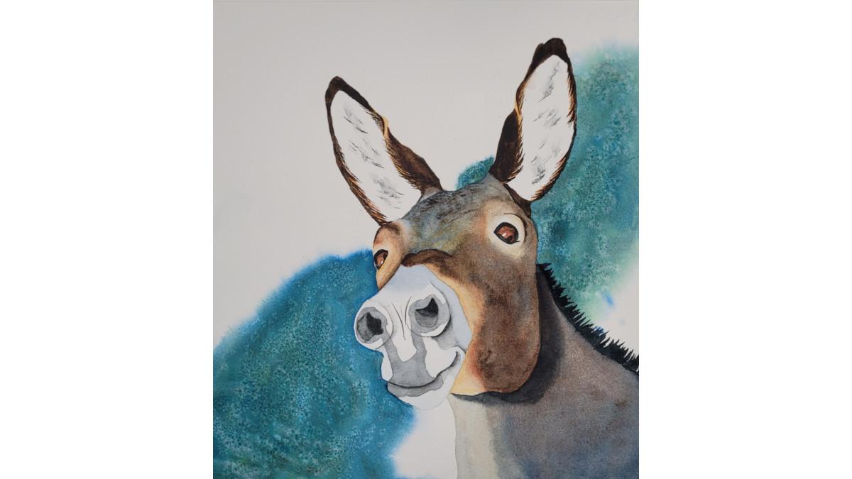
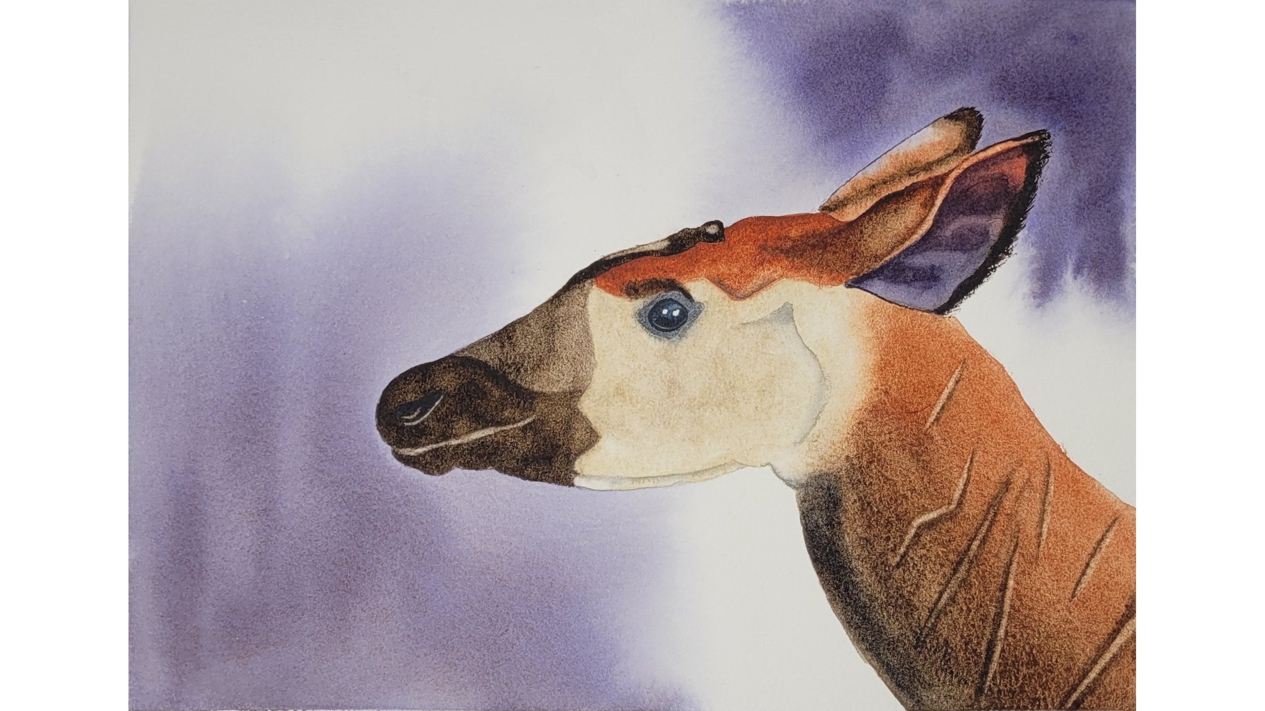
personalized plan. I am providing a reference
photo of a donkey. If you prefer to use that. This donkey has
limited for textures, opportunities for color mixing, and can produce an outline as simple or as complicated
as you like. If you aren't confident in your ability to
create an outline, you can use my outline as is or as a basis for producing the outline you want
for your painting. Whatever you make, please be sure to post it to
your project in the project gallery along with the plan you followed
to create your artwork. I'm excited to see
your thought process and your beautiful painting. If you like. I'm happy to provide feedback to help you in your
journey as an artist. With that, come join me in the next lesson
where we'll cover the materials you'll need for this class. I'll see you there.
3. Supplies: Let's talk supplies. If you have supplies for
watercolor painting, you should have everything
you need for this class. First step, paint. I prefer to watercolors. And we'll be using
Daniel Smith and M. Graham paints. You don't need to use the same brands
are colors that I use, but I highly recommend
professional paint. Next, you'll need some paper. I recommend that you
get at least two pieces of paper that are the same type, brand and wait for your project. It's important to
note that even though one piece will be
used for practice, your techniques may behave differently on various
types of paper. If you practice on a
different brand of paper, you may end up liking a
technique that doesn't work as well on the paper you intend to use for your final artwork. It's best to practice on
the same type and brand of paper you plan to use
for your final piece. I will be using 140
pound cold press, Winsor and Newton professional. I also like arche paper. Both are 100% cotton. If you use tubes or pans, I highly recommend using
100% cotton paper. Even though it can be pricey, it will make a huge difference in how well you can
work with your paints. And it will make
watercolor painting so much more enjoyable. If you use liquid watercolors, you will probably be fine
with cellulose paper. I personally haven't
used liquid watercolors, but I've heard from many
other artists that it works better with cellulose
papers like Canson XL. The last of the big three watercolors supplies is brushes. I'm a fan of squirrel brushes, so I enjoy silver brush, black velvet, which is a synthetic and natural
squirrel hair blend. As well as Princeton Neptune, which is entirely
synthetic squirrel. Squirrel brushes are softer
but hold a lot of water. If you prefer a stiffer brush, you may prefer sable
or Kolinsky sable. And there are several
decently priced options for synthetic hair
versions of these brushes. Whatever brush you choose, make sure it is made
for watercolors. To round out the basics, you'll need a few more things, starting with cups
for holding water. I prefer to so I can
clean my brushes in one cup and use the
other for freshwater. You'll also need a pallet for
holding and mixing paints. I prefer to mix on porcelain, a pencil for
drawing, an outline, and a kneaded eraser for softening the outline
on your paper. A method for transferring
your outline onto your paper, such as a light box or graphite paper and a rag for wiping off excess
paint and water. Own reference photo. And
I encourage you to do so. That'll be all that you need. However, if you are using the reference photo
I'm providing, you will find that in the
resources section under projects and resources
on the right-hand side. I'm also providing an
outline of the donkey, a list of the
supplies I'm using. A picture of my final painting. An example painting plants. Feel free to use as many or as few of these
resources as you like. With that, let's move on to the next lesson where we'll get started with our first
planning questions. I'll see you there. Yes.
4. White: Watercolors are unique in
their approach to white. For this reason, it's
important to know from the beginning where you see
white in your painting. Keep in mind, white. Isn't always white. Yeah, that's confusing. What I mean is that
something that your brain knows is white, isn't purely white the
way our eyes see it. Take a look at this soccer ball. Soccer ball is white and black. But as you can see, the
only real white spot on the soccer ball is
where the highlight is. The rest of the white part of
the ball is actually gray, starting with a light gray
near the highlight and fading to a darker gray as you move away from
the light source. In this case, the only
white that you need to preserve is where
that highlight is. Similarly, the white and the highlight of this
isn't actually white. Instead, it's a
warm golden color. As an artist, I can
make the choice to match the photo as
accurately as possible, or to make the highlight pop by leaving it white
in a painting. Instead of trying to paint
a perfect color match. With this in mind, ask
yourself your first question. Where do I see white
in my painting? Once you know where
your whites are, you have to plan them
into your painting. In watercolor painting, we generally don't
use white paint. Instead, we often
use the white of the paper for the
whites in our artwork. In this case, we must
avoid getting paint on these areas either by
painting with great care, by adding masking fluid to
protect our white areas. However, the paper isn't
the only thing we can use. Some artists will use opaque white watercolor
or other options such as gouache or bleed proof ink to add white
back into their painting. What you as an
artist choose to use is completely
personal preference. Your next question is, how will I preserve or
replace these whites? Remember, you preserve whites by avoiding the areas are
protecting with masking fluid. You replace the whites by adding something like
opaque watercolor, gouache, or ink at the
end of your painting. Next, I'm going to share
with you my answers to these questions with the
reference photo I've provided. If you're also using
the reference photo, I encourage you to
pause the lesson, answer the questions
for yourself, then see how I
interpreted the photo. That way, my interpretation
doesn't influence yours. If you are working with a
different reference photo, feel free to see how I approach these questions before you
tackle them with your photo. Onto the example. Where do I see white
in my painting? I see white in this
donkey, in two areas. In the eyes, there are
some highlights that are almost white that I will
include in my whites. There is also a large white
highlight on the nose. Note that there are several highlights in the
I on the right. I'm going to take
some artistic liberty and not worry about those. I think one small
highlight will be enough. How will I preserve or
replace these Whites? My preference is to
preserve whites. So I will avoid
painting these areas. I have to be careful with the
nose as I want to preserve the highlight without forming a hard edge around the white. I'll discuss edges more in
the lesson on textures. Once you've answered these
questions for your project, it's time to move to the
next set of questions. Colors. I'll see you in the next lesson.
5. Colors: A painting is nothing
without its colors. Let's take a look at
what we should know about the colors or lack thereof that we'll
use in our painting. Our main killer question is similar to our first
White question. A chest is weird. You're going to look for
colors in your painting. As before, the colors, you know, are in your photo might
be different from the colors that
are in your photo. Take a look at this horse. It's a brown horse with
a black mane, right? But really think about the light reflecting off of this horse. The brown at the top of the head is really
more of a dark blue. The way the light
reflects off of it's, for much of the
main is also blue. And the lightest highlights
are almost a baby blue color. While the brown to the right of the eye is a rich, earthy red. Below the eye. It looks like a hint of blue is
neutralizing that red. Now ask yourself,
what colors do I see? Just like we asked ourselves how we were going to get
white in our painting. We need to ask ourselves how will get colors in our painting? If you see a color that
matches the paint in your collection perfectly,
It's not a big deal. But if not, you'll
want to create colors through either
mixing or layers. We'll talk more about
mixing colors later. For creating colors
through layers. You'll lay down one
color of paint. And then after it's dry, put down another layer
of a different color. You may have also
heard this technique referred to as glazing. Choosing between
lettering and mixing colors is a personal preference. I tend to go with
glazing if I need a more subtle change
in color or if I'm not looking for a specific color and I'm happy to let the
paints do what they may. If I want a little more
control over my colors, I lean towards mixing
on the palette. Your other color question is, do I see any areas where I will want to create colors
through layers? It's time for me to share my
answers to these questions. If you'd like to pause
the video first, now is the time to do that. What colors do I see? I see an earthy yellow, earth red, and dark brown. I also see blue
highlights in the for most notably
on the forehead. Gray and black, round
out the colors I see. Do I see any areas where I will want to create colors
through layers? I want to build up
the pattern and shadows on the nose
through layers. Also like to build
up the earth colors in the firm by layering. With our color
questions answered. It's time to move on
to the next lesson, where we'll look at
textures in our photo. I'll see you there.
6. Textures: It's time to think
about textures. What textures do we
see in our painting? And how do we want
to represent them? Let's get started. Edges will be our first
topic on textures. In watercolor. We can create a few different
types of edges. Hard edges are the
easiest to create. If you can paint a
brushstroke on paper, you can make a hard edge. A hard edge where the edge of the paint is a single
clearly-defined line. You create it by
painting wet on dry. Soft edges are another type. One way of making a soft edge is by laying down
paint wet on dry, just as you did
for the hard edge. Then you come back
with a damp brush and gently run the brush along
the edge, you want to soften. If you've never made soft
edges this way before, you may need to
practice a few times to learn how damper brush should be and how damp your paint
should be to get it right. When I refer to
making a soft edge, I'm usually referring
to this method. Another way of making a soft
edge is painting wet on wet. The first step is to
lay down an area of water larger than the
area you want to paint. Next, you can place paint
down in the wet area. The paint will flow
through the water. As long as the paint doesn't
reach the edge of the water, you will end up
with a soft edge. Note that this way of making
a soft edge doesn't leave you with a lot of control
over how the edge will look. It can be a wonderful way
of creating soft edges and backgrounds where you may not care exactly where the edge is. Your question about edges is, what types of edges do I
want to use? And where? Be an overwhelming
question if you were to answer it for every single edge. Even most type a personalities
would hate to do that. Instead, look for edges that don't immediately
call out to you as being hard or
soft or wet on wet. Those are the edges where
you need to make a choice. Think about which option
makes the most sense to you, and write it down so you remember it when
it's time to paint. When painting animals,
we can have fur, feathers, scales, shells, and
other textures to convey. However, unless
you're trying to make your painting look
exactly like a photo, you're not going to paint
every single firm or feather. When it comes to textures, there are three
questions to ask. Where am I going to represent detailed texture in my painting? How am I going to
represent these textures? How will I represent textures in the other areas
of the painting? If you'd like to pause
the video before seeing my answers
to these questions. Now is the time to do that. What types of edges do I
want to use and where? For my project, I'm going
to focus on where I have hard edges inside the
boundaries of the donkey. I default to soft
edges in this area. So I want to make a note of
where I want to change that. I'm going to put
a hard edge where the nose meets the
rest of the face. I do see a soft edge on the
right side of the nose, but I'm still going
to stick with a hard edge as an
artistic choice. I'm also going to put a
hard edge on the area of the forehead that is
reflecting blue the strongest. There's a clear, hard edge at the bottom and up by the ears. I'm going to see
how it looks if I extend the hard edge
around that whole area. Where am I going to represent detailed texture in my painting? I want more detailed
textures inside the ears, on top of the forehead
where you can see the foregoing in two
different directions. And the hair on the
back of the neck. How am I going to represent
these textures? In the ears? I'll use the earth
colors in the donkey to paint lines on the edges
for, for textures. In the middle, I'll use
some black paint too sparsely add some texture
to the center of the ears. But I will also soften some of those lines so they aren't too stark against
the White Paper. On the forehead. I'll add
lines with earth yellow and dark brown and soften some
of those lines as well. On the back of the neck. I'll add firm black lines
without any softening. How will I represent textures in the other
areas of the painting? There appear to be a lot of blended colors on the
donkeys chicken neck. After putting down my
first layers of paint, I'll use wet on wet to dab in the top layers so they can blend randomly to create texture. Once you've answered these four questions for your project, meet me in the next
lesson where we'll tackle our final questions.
I'll see you there. Yes.
7. Order: Let's wrap up our questions with a quick consideration of order. The first thing we
need to think about is the order in which we
will lay down our paint. As a general rule, you'll want to paint
from light to dark. There are a couple
of reasons for this. Because watercolors
are translucent. Light colors cannot
cover up darker colors. Next, some watercolors can be picked up and moved around
when water is added, even after the paint
has dried on the paper. If you are painting
where light meets dark and your light brush slips
into the dark paint, it might cause the dark pink
to smear into the light. But if you paint light to dark, you won't even have
the dark paint down and you won't
have that issue. First question for order is, how will I paint
from light to dark? As what the question
on types of edges? It can be very easy to get overly detailed in your answer. Just consider the major areas of light and be sure to plan
to paint those first. The second question might
be the easiest one for you. It concerns backgrounds. Not every painting
needs a background. Having a painting with a
subject and no background, just the white of the paper
can be absolutely gorgeous. On the other hand,
a background can add beauty and interest
to your painting. It's really a matter of
personal preference. So don't feel like one choice
is better than the other. You should decide before you paint whether or not you
will have a background. I've heard many artists
paint their subject, then decide they should
add a background, and then regret it. Make that decision early. Knowing whether or
not you will have a background will also give you the opportunity to
paint it at the right time. In my experience, it's generally good to paint
the background first. But there are always
exceptions to the rule. Especially if painting
the background first might conflict with painting
from light to dark. Your other question
about order is, if I choose to
paint a background, when will I add it? Once again? It's time to pause the lesson
if you'd like to answer the questions before
hearing my answers. How will I paint
from light to dark? I want to start with the nose, as that is the lightest
part of the donkey. I also decided later in my process to not paint the
railing and the picture. Instead, I'm going
to imagine that the throat of the donkey is lighter than the
rest of the neck. So that will also
need to be early. Beyond that, I will
need to lay in my earthy colors from light
to dark on the floor. If I choose to
paint a background, when will I add it? I will paint a
background and I will plan to paint it after
the nose is done. We've finished our questions, but we're not ready
to paint quite yet. Come join me in the next
lesson where we talk about some other preparations
will make before getting started.
I'll see you there.
8. Preparations: Great job. You've answered the important questions about the photo you'd like to paint. Now let's move on to
some other preparations you will need to complete
before you start painting. Let's consider the
outline first. You'll want to
make an outline of your subject on your
watercolor paper. It's easier to draw the outline
on regular paper first, then transfer it to your paper. When deciding what to
put in your outline, you'll need to decide how
much detail you, what. If you want to make any
changes from the original? I'm going to discuss
my outline now. You can pause the lesson if
you'd like to think about your outline before
hearing my choices. As I mentioned, I'm going
to leave out the larger, fainter highlights in the eyes. Originally, I did
include the railing, but later decided to remove it. I'm also going to add
a pupil to the I. On the left. You can see a pupil in the eye and the
right, but not the other. I am also going to add a bit of a curve to the mouth so that I can have a
smiling donkey. Finally, I'm going to make the color pattern
on the nose more simple rather than try to
recreate it perfectly. Once you decide what you want, your outline, you
have to make it. My drawing skills
are not that great, but I still want
to practice them. So I'll put a grid on my photo, then draw the image on a paper
with a similar size grid. If you're really
uncomfortable drawing, you can always trace the image. And if you love to draw, you can draw it freehand. Once you have a pencil
outline you like, you can trace that with ink. And that way you have a darker, clear outline to follow. Then you can use a
lightbox graphite paper or other method to transfer the outline to your
watercolor paper. Next, onto paints. You'll need to decide what
paints you want to use. The paints that you pick will need to either match
the colors you see or be used as a mixed
to create those colors. A little exception here. You can choose to use
fantasy colors rather than matching the realistic colors
you saw in lesson four. If so, you'll be
matching your paints to your creative vision
rather than to your photo. From less than four, I saw Earth yellow, earth red, dark brown, blue,
gray, and black. To match those colors. I will use yellow, ocher, burnt sienna, sepia,
and cerulean blue deep. This cerulean blue deep doesn't exactly match the blue
I see in the photo. But it's still a
perfect choice due to its ability to mix neutral
colors with earth tones. If I add a little
bit of burnt sienna, it tones down the blue to
match the photo wonderfully. Add more burnt sienna. And I get a cool gray. And then a warm gray just calls for a little more burnt sienna. I also decided to try
mixing cerulean blue deep with sepia if I
could get a black color. And it was perfect. If you'd like to know more about mixing black and neutral colors, you can check out my
class on the subject for more details. Just for fun. I'm going to mix
cerulean blue deep with green apatite genuine
for the background. This cerulean blue will keep the background colors
consistent with the piece. And the green apatite genuine is a heavily granulating paint, which will add some texture. I'm going to mix my background
colors on my paper, but I'm going to mix most of my grays and blacks
on the palate. If you decide to mix your colors on the palette in advance, you'll want to test them out to see if they look like
the right match. Finally, I will use the same colors where
I want to layer. Make sure you are
considering your colors for layering when you're
choosing your paints. The best one, test your
color mixes is with a bit of discard paper of the same
type as you're painting. Keep in mind that if you test your colors on a
bright white paper, but paint your subject on an off-white paper like that
found in watercolor pads, your colors might not come
out exactly as you want. If you have, oops, paintings, that is, paintings
you're not happy with. You can use them
for testing colors. If they're on the
same brand of paper that you'll be using for
your final painting. You can flip them over and paint your color
mixes on them. Since the paper color
will be the same, you will get a true look at how the colors
will turn out on your painting. Oh my gosh. Have we made it already? It is time to put
together a plan. When creating a plan, you'll want to consider
the answers to the questions we've
covered previously. You don't need to
include every answer. Just the points
where you found it difficult to make a decision. Or where do you think you'll
forget what you decided? Other than that, the amount of detail is completely up to you. Type B, artists may find
that they only need a few general reminders about the questions they
found most important. Other questions may
be more open to change as these artists
progress in their painting. Type, a Artists may have
a detailed plan with several lines covering each
step of the painting process. While there is no right or
wrong amount of detail, keep in mind that
adding too many small details may make it difficult to find the
most important points when you're in the
thick of painting. If you're a detail
oriented person, you may find it helpful to organize your plant
into segments so you can review each segment before you tackle
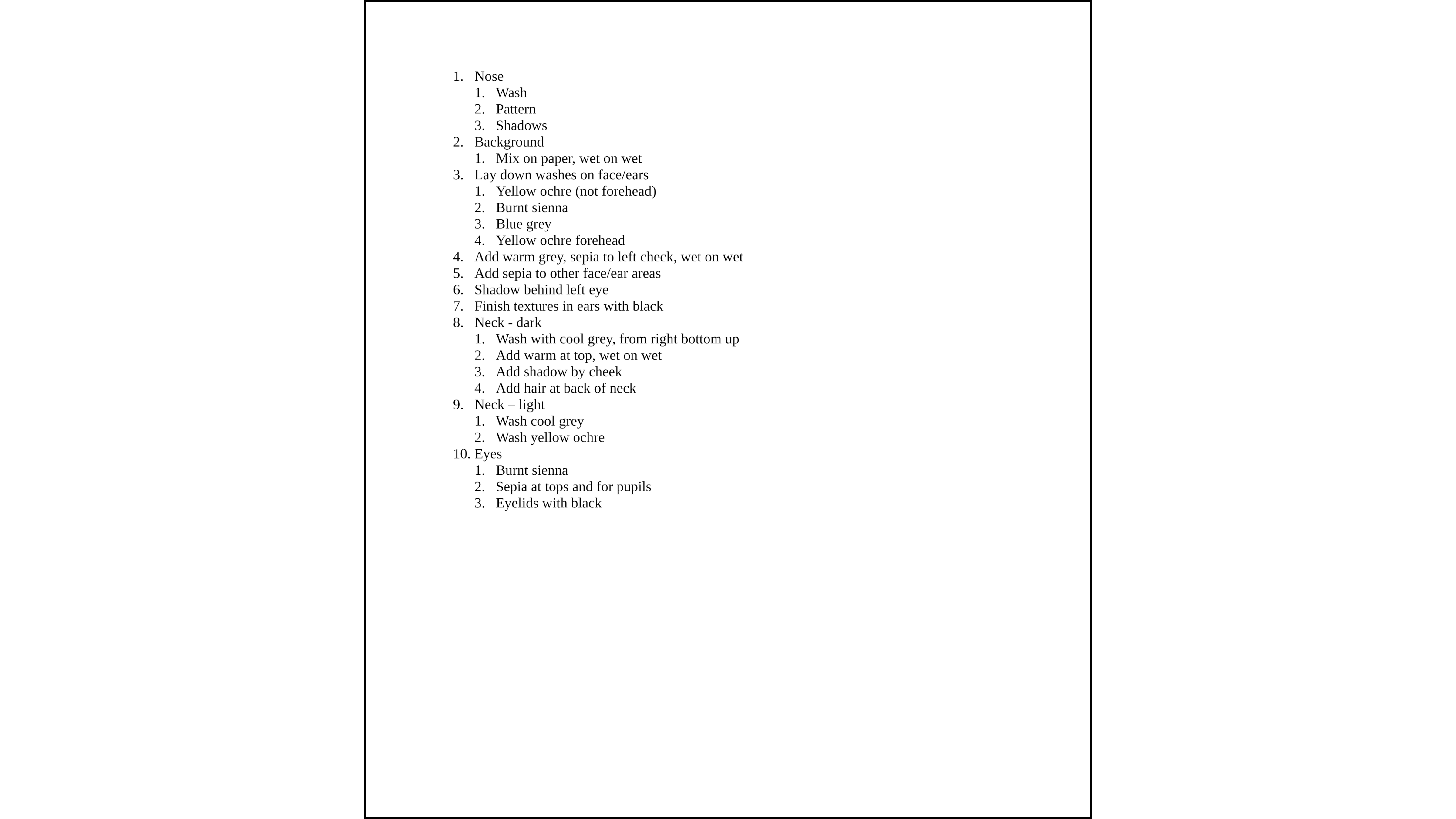
it on the paper. I am more of a type a person. So the plan I initially
wrote has a lot of detail. As I go through this plan. There are some
areas where I have more than one idea about how
to tackle this painting. You may feel the same
way, and that's fine. We're going to talk about how to handle this in the next lesson. So come join me there.
9. Final Adjustments: You've answered the questions, you've made the preparations, and you formed a plan. But you're still not
quite confident. You might be unsure if the
technique you want to use. We'll look the way
you want it to. Or you might have two different creative choices
for one question. And you aren't sure
which you like better. It's time to do some
test paintings. Test paintings are no
pressure, mistakes. Welcome way of testing
out your ideas. There are three
different forms of test paintings that you can try. The first is thumbnails. By sketching a smaller
version of your painting, you can try out a few
different ideas very quickly. Thumbnails won't have a
lot of detail in them. So they're better
for broad questions. You can test out different
styles of backgrounds. You want to use
different techniques for adding interest or texture, or see how your colors
look together if you've chosen to paint your
subject in fantasy colors. Next is partial paintings. Maybe you feel confident
with most of your painting, but you just wanted to
get the eyes right or you aren't sure how much detail
you want to add to the nose. You can draw a detailed copy of a small area of your painting
and practice your ideas. If your first choice
doesn't work, you can try again without using an entire paper for painting. Finally, if you have several questions where you're
debating between choices, you can do a full
practice painting. You can draw your outline on
a smaller piece of paper, as long as it's big
enough for you to get the detail you need
to test your ideas. Go into this painting with
the intent to make mistakes. You can even try
multiple techniques in different areas
of the painting. If a technique you thought was going to be fine,
turns out wrong. Laugh it off. Test painting
is a time to be bold. Have fun. And most importantly, be
proud of your mistakes. Mistakes mean that you
are brave enough to try and bold enough
to be creative. When you're done
with your painting. Review what went wrong
and what went right. This will guide you in making any adjustments to your plan. Before you move on to
your final painting. You may find that you need to change the level of
detail that you want in your plan based on what you learned during your
practice paintings. In my test painting, I found that having a hard edge all the way around the forehead, not a good decision. I decided to soften
most of the edges but keep the hard
edge at the bottom where I see it in the photo. With the ears. I decided I added too
much black in the middle. But I also like the
faint yellow ocher and burnt sienna at the bottom
edge of the ear on the left. I decided to use
that in both ears, even though I don't
see it on the right. Well, I included the railing
and my test painting. I decided to remove it before creating the
final painting. I added these decisions
to my plan and whittled it down
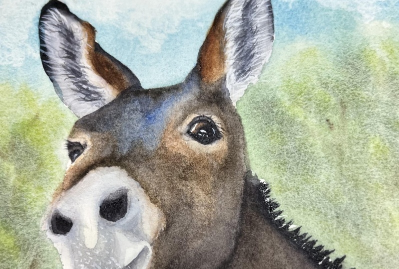
to the parts where I needed the most reminders. With that, I was ready to
tackle my final painting. And so are you. Once you've reviewed
your test paintings and finalize your plan, come join me in the next lesson where we'll put our
plants to work, creating our final painting.
I'll see you there.
10. Plan Painting 10 Project Time!: Well done. You've put so much effort into the previous lessons
in this class. You've asked the
important questions. You've made your
preparations and you've tested your ideas and
finalized a plan. Now, it's time to grab your paints and put
brush to paper. Once you're painting is done, don't forget to upload
your final painting, your plans, and any test paintings you would like to
share to the project gallery. I can't wait to see
your amazing artwork. With that. I'll see you in the next lesson
where we will wrap up our class on
planning your painting.
11. Wrap Up: Congratulations. You've created a plan, painted your subject, and
completed this class. You've put in so
much hard work and you should be proud of yourself
and your accomplishments. I sincerely appreciate
each and every one of you for joining me on
this artistic journey. It was my pleasure to share my knowledge and
experience with you. And I hope you enjoyed this
class as much as I did. As you continue on
your creative path. I hope you continue to utilize what you've
learned in this class. Remember to ask
questions about white, colors, textures, and order. Plan your outline
and your paints. Then create an initial plan. Try out your ideas
with test paintings, and then finalize your plant. In the end, you can paint any subject you want with
a little preparation. After you've shared
your plans and painting in the project gallery, take a look at what
other students in this class I've created. We all have our unique
perspectives and ideas. And it's so much fun to see how others bring their
artistry to life. Finally, I hope you'll take the time to leave an honest
review of this class. Hearing your thoughts will
help me improve and develop better classes for
the benefit of you and all of my students. Thank you for joining me
and I look forward to creating with you again in
another Skillshare class.
 Lyndsay Newton, Wildlife Artist in Watercolors and Felt