Transcripts
1. Intro: Hello, my name is
and stuff and Asara, engineer, artist from Toronto, Canada and unnecessary
create videos about the creative process
and investment. Part of my artist's journey was stumbling upon so many
different genres. And lately I've been diving
deep into pixel art. I've been making digital art for more than 17 years and generated thousands and
thousands of images. From making static
images to creating a full-on animation
to help you tell your story in a
more visual manner. And in this course, I'm gonna go through my experience and take you step-by-step on how to
create your own images. Step one, we're going to go
through all of my influences and what drives me to create
pixel art on a daily basis. Step two, we're gonna go
through the tools and everything you need to
create from start to finish. Step three, we're gonna go
through character sizes. Step four, we'll dive into line theory and how to
make pixel art Pop. Step five, setting up your
software to be pixel ready. Step six, we're gonna go through character creation
and everything I'll go through from
start to finish. Step seven, gonna go through the background and making
everything tied together. Step eight, exported
image and enjoy. I hope you enjoyed this course as much as I enjoyed making it. If you have any questions,
just reach out to me or leave me a comment below. I have my youtube and Twitter
connected to this profile, and I would love to
connect with you.
2. Tools used: In this module, we're
gonna go through some of the tools that are used
to create pixel art. And first of all, if
you have a mouse, you pretty much are ready to go. But if you wanted to take
it one step further, I recommend getting a
tablet or a stylus. It will really
help you with some of those lines that
you're trying to create and get you into the
rhythm of being an artist. So I personally used
awake on medium tablet. Pretty much any medium
tablet will work, which is like eight by six. And it's, I think this is a
really good size to start. Anything smaller is very
small. Anything big? It just gets too
vague, in my opinion. It doesn't matter
which iteration of it. I still use my older ones, but I just like how
the new design look, especially now it's Bluetooth, so it's wireless and you can get a lot of stuff down with it with no wires hanging around. Next, let's talk
about the software. So there are so many
softwares out there right now that can help
you create the pixel art. I personally use to right now, which is Photoshop and pixel. So let's go through some of the pros and cons
of using pixel. So one of the biggest
pro of pixel is that it's affordable
and it's very, very small and lightweight. This program is specifically
made to create pixel art, and it has a really intuitive
way to animate your art. Another PRO that it has a
very intuitive color palettes and the way you can
go ahead and select between light and shadows. I think it's superior to anything I've seen
in the industry. Now let's go through
some of the cons. One of the thing I've noticed
that even though it has a layering system,
It's very laggy. Once you go over
like ten layers, it becomes very slow. And based on my workflow, I have usually I have like
a lot more than that for one of my projects that had almost 200 layers because I
had like different ideas, different mouth's, the shirts. And I tried to do that with
pixel that I found out that it just doesn't behave
as well as Photoshop. To the point that every time I try and press a
different shortcut, it just doesn't register
and it becomes a nuisance. And a second thing is like they don't have updates regularly. It's currently, I would say in the limbo that it's workable. But all of the bugs that
we found right now, they're not being worked on. And I are all know when there began to be worked
on in the future, even though I would
recommend it, because if you compare
it to Photoshop, e.g. you still need to
do a monthly fee. This one is a onetime fee and
you get a lot to work with. And it's a really
good entry point for anyone who wants
to try pixel art. Now let's go through Photoshop. One of the things is why I like Photoshop and it's
a little bit biased because I've been using
Photoshop for past 17 years. So basically one of the things is like
if you already know a program language or if you're already
comfortable with the tool, it doesn't make sense
to switch up because it's just you already
have your workflow. So that's probably one of my pros for me is I've
already know the tool, I know where the shortcuts
are and it just speeds up my workflow so much that I don't need to
double-check anything, it just comes in naturally. A second thing is the
layering system is very good. It doesn't lag. Everything
flows naturally. And they have an
extensive brushes that if you decided to
go outside of pixel, you can use it for
anything else. So that's basically why
I'm using Photoshop because a side of pixel, I use it for all of
my other projects that for photography,
for digital art. And it just, it works
for my workflow. And it just opens
up a lot of doors. And the third thing
is the way you handle the effect
is so powerful. And the fourth thing,
there's a lot of tutorials online for Photoshop. It's pretty much been
around since forever. Every question is probably
been answered by someone. So now let's go through
some of the cons. I think Photoshop
is very expensive, just based on having a monthly fee to just keep
on using the program. It's just I think it just too
much for a lot of people. But if you can
afford it and it's something that you use
on a regular basis. It will open up a
lot of doors for us. And the third
software is a Sprite. I personally haven't used it, but I've seen a lot of
people recommend it for me. So if that's something
that you've using and you want to just
try and convert me, let me know in the comments. I'm definitely open to try
it sometime this year. So fingers crossed. And now that we've gone through some of the pros and cons, Let's go ahead and set
up Photoshop for pixel.
3. Influences: So I wanted to go
through some of my influences are my favorite
video games out there. The first one is
hyper Light Drifter. I find Hyper Light
Drifter to be like one of the best games
I've ever played. From art direction
to game mechanics. Everything flows in a
very beautiful manner. And one thing you noticed from their style is that
they don't really use any outlines and
your drawings is very straight lines
and they only use outlines for very
specific details like this one, e.g. where you actually need
to go and interact. Let's just say e.g. this one. Everything is so sharp and diagonal and it draws
your eye into the center. And that's just one of
their brilliant stuff. They're designed,
it looks very good, and it works very well. Next is Scott Pilgrim. So Scott Pilgrim is a comic
book and also a movie. So they created a game
a few years back, and I find a style very good. Honestly, it looks amazing. But they tend to use a lot of sharper lines and they
have like an outline, like a dark outline
behind everything. It looks really good. I mean, you can tell if there are so many
characters on there. There is a stage. There's a small
detail that tells you that this has actually
made out of wood. Everything looks
great for the game, even though it
looks a little bit busy because of the outline. But when you play the game, everything flows very nicely and the character stand
out very much. Next time I want to cover
is entered the dungeon. And this is a top-down
shooter that is kinda like a darker color with a
little bit of a survival. So I find this one also
has a very darker tone. Compare it to the
Scott Pilgrim, e.g. and everything
looks a little bit contrasty and they don't
use a lot of outlines. You can see in here that the outline is just
for the character. It's very, very simple, but it just works very well. And lastly, one of my absolute
favorite is metal slug, and this one is just
amazing to look at. They use every pixel possible on the screen to make sure that you are into their experience. That even if you look
at the background, there's a lot of
dithering to show you that this one is a lot more darker than in here.
On their ears. A lot of textures. You see so much
textures and they've using like they probably have
big team working on this. But they have succeeded
because even the textures on the rocks looks phenomenal. And this is the holy grail of how pixel art
should look like. You notice in here
that they have a very sharp outlines for
each of the character, the dark to make sure that there's a contrast
between one on the other. And they also make sure
to emphasize the colors. So they use very bright
and vibrant colors. And there's so much
care to the detail, even the leaves and
everything else. So these are my top four favorite pixel
games of all time. And I'm curious to
know about yours.
4. Character Size: In this module, we'll want
to go through some of the pixel art and
how the artists make a decision on what is the size they need
for their game. We're going to go
through some examples of different sprites
for different games. And we're going to try and
go through some of their decision-making on why
they chose that size. Compared to, let's just
say they can go bigger. And you can see like the
smaller the sprite sizes, the less detail you can put in, the higher, you can get a
lot of different textures. And you can just go crazy
with how big you can. So e.g. these are at 64, this is at 32, this is 16, 24. Let's just zoom in into Mario Brothers and see
what's going on here. Basically, Mario Brothers
is 16 by 16 character. And then you can see they
had a lot of detail, but done with very
minimalistic style, meaning that they can tell right away that
this is a face, this is an I, that's the mouth and even have
buttons for his outfit. So they pretty much used
every real estate that they have to make sure that you get all this information.
So let's just say e.g. if you decided to
remove the mustache, you can't really tell
where the mouse starts. And that's basically
the beauty of how the designers and
artists make decisions. So for this, they decided to add a mustache to
tell the player to, oh, by the way, this is a mouth
and this will be the eye. And basically what I'm
trying to say is like sometimes less is
more with pixel art. And you keep a lot of the details up to
the imagination of the player moving to make a man. Same thing in here, however, they give it a little
bit more pixels. So this one is like
eight more pixels. But one thing that you
want to see is actually they use 13 pixels for the face. And four here they use
seven pixel for the face. So they gave it a lot more. They wanted to emphasize
a lot more on the eyes. That's why they gave the eyes almost four pixels to play
with compared to Mario, which has only two pixels. So it all depends
on your decision. And you see like they didn't really put too
much detail except for just a line that separates
the torso from the legs. Similarly, if you decided to blend it all in, it will work, but it just, it
doesn't look as good. So that's one thing that the designers have to
do is have to separate. You can tell that this is
an ear, this is the center. And when they move
left and right, you can get to see that
character is actually moving. You get to see in
Hyper Light Drifter. They also did very
minimalistic design where you get to see that that's the
hat, this is the eyes. And basically they use like
11 pixels for the head. And if you wanted
to compare here, they used 13 pixels. So it's very, very similar. Moving to Mega Man on
the Gameboy Advance. You can see that
there's a lot of detail and you're trying to put a lot of texture in there. And what you can see with every time that you
move up in the pixels, there's a lot more work
and a lot more detail. And obviously it's going to
be a lot more to animate. So if you're doing
animation for this, you have to make
sure that all the animations match.
Same with that. And it's just, it gets
really out of hand once you decide to go up higher. But one thing to
notice is that most of the designs that they
keep everything similar. So for Mega Man, a 12th pixels in here, they also kept it very close, which is like 13 pixels. And then here they
also kept it around 13 pixels, so it's very similar. And then they added the hair. And basically artists try and
keep everything consistent. So this is 13 pixels. And then if you go
from here to there, so 13 pixels from here to
here is like 13 pixels. So it's very, very
similar across the board. Basically the Mega Man haven't changed much from
the Nintendo time. And they use all of
this extra pixels to give it a little bit
more detail, making taller, and give you a depth of field basically from
their characters, you can see that they
have shadow in here and a lot more detail on
the arm and the legs. Similarity in here. They started to do some shading. And basically there'll be
something that's very common. As soon as you go up,
you get to play around with the shading and have, I would say more room for
shadings moving next to 64. And now you get to see
different designs. So e.g. in Scott Pilgrim, they give a lot of real
estate for the eyes, which they wanted to
make it very prominent. So they actually
give it an eyebrow. So see that's a seven
pixels, a lot more. So there's around seven pixels that they want to play with. And similarly in here. So they wanted to give
a lot more to the head so that just based
on the designs. But also you can see the
difference in shading. It's just up to
the artists again. So they wanted to
keep everything clean to emphasize that this is, this is the character, right? With my character, I just
wanted to make sure that I have a lot more real
estate to work with, especially with the robe and the cape and the literal
octopus in here. So how does the artists
make a decision on what is the pixel size of
their spreadsheet and how far they want
to push the graphics. Well, let's just take
a step back and take a look at the progression
of the consoles and see how that influenced the artist
were making their games. E.g. if you're looking
at the Super Nintendo, Super Nintendo was
basically to 56 by 240. And that would be
like the screen. So it makes sense for them to
have a character does big, or maybe that big
to play around. This big, this character
might still work, but it's just a lot more detail to push into that
small pixel size. If you want it to go
into the ten to 64, which was a huge bump into that. It pretty much almost
tripled your pixel size. Now you get to see the 3D and you can actually push it all the way to 64 if you wanted to. And from thereon,
pretty much pixel art and pixel games have had the upper hand because
you can scale up your design however you see
fit because you're not, you're no longer restricted to decimal pixel size of
the screen anymore. If we wanted to look e.g. at the PS2, we're looking
at like 12, 80 by 1024. And then lastly is
basically we're looking at the current modern
till PS5 P is for, they're pretty much again
for k. And you can barely see the characters here
because it's very, very small compared
to modern gaming. But with upscaling,
you can upscale any character to
whatever you want. And it's, it's something that most game engines
can accommodate for. Now. It's really, you
have all of this. I would say, playgrounds
and stylistic choice. However you want to create your character
wherever you see fit. And I think that's also a little bit liberating because not only are you limited by the
screen size of your console, now you're limited by the skill and how much
time you want to sink in. So let's just say e.g.
with Mario and make a man, you can create like a walking animation with only four frames. You don't need to
push the boundary so much because there's not
much detail we play with. However, when you
look into metal slug and Mega Man form
the Gameboy Advance, you might need like maybe
eight because there's so much detail to go with and it will look a little bit jarring. If the animation is very slow. This also means double the work because now you're
doubling the pixels. So you have to draw a lot
more than what you want it. Basically with that,
you get a lot of, let's just say if you
wanted to do a crouch, now you have the option
because you have, you can see a lot more
legs if you want it to do, the jump, can give it a
little bit more animation. So this one opens
up another field where you can go a little bit
nuts with your animations, but also it's a
lot of times sinc. And when you look
at 64 and above, it's pretty much
like an open field for how you want to do
with your animation. And it gets really
out of hand when you have multiple characters on the screen, Let's just say e.g. four, Scott Pilgrim, they have a lot of different
animations for attacking, kicking, doing special
moves, and all of that. And it gets really out of hand. So you have to dedicate a lot of time and a
lot of care for you, the character, because you
can do so much with that. Now that you have the
options to even have eyes. So you can move the eyes
around if you wanted to. You wanted to do
an idle animation, then he's looking up
and closing his eyes. You can go with
that, but in here, you don't have to
do that. Obviously. You can just create
something simple. Just say like, Okay, so now he closed
his eyes in Blink. So let's just take e.g. if I wanted to create
something here. So I wanted to do like
a blinking animation. Now he's like blinking, right? But that's just the beauty of having something that's very small to work with
compared to having this, which is a lot more complicated. But it's, at the end of the day. It's a stylistic choice and you can do whatever you see
fit with your project.
5. Setting up Photoshop: So we're gonna go
ahead and start a new file on Photoshop. Press File and New. And we're going to create
180 pixels by 80 pixels. Create. And you can press
here to zoom or Prezi. And you can go ahead
and we're good to go. If you wanted to zoom out, you can go ahead
and press in here or press Alt and pressing with the mouse
button to zoom out. First thing you want
to cover is how to use the layering system. So the layer is basically
on the right-hand corner. And you can create a layer
by pressing that button. Now let's just say if you
wanted to draw something on that layer, it's on there. And then you can click on that visibility to
trigger it on and off. So let me show an example of why or how we can use this
in so many different ways. So let's just say I have
two different layers, which is layer one
and layer two. And I'm going to
create another layer and call it layer three. And I'm going to
make it into a blue. So I have layer one, red there too is yellow and
there are three is blue. So if I dragged layer
three down to layer two, you can see that layer two
is above the blue one. And if I put this one
all the way down to one, that gets gonna be
behind the bread layer. So let's just put
it here. E.g. if I drag it all the way back
up, now it's up here. Similarity, if I do
the same thing with layer one and if I drag it
all the way to the top, is going to be on
top of both layers. And that's how you can
make really cool effects if you have a lot of
different objects. And it's something that you're
going to use very often, but this is something
that you will always come in handy if you want it to do something a little
bit more advanced. Or if you are experimenting
with wearables, e.g. if you have different layers for different characters and have some characters
have I would say, different eyes and different
mouth, sunglasses, etc. You can always move those layers around to create very
different effects. Let's just say e.g. if you're drawing a character, you want to make, let's say the skin
as the bottom layer. And then you want to
layer it up with close so you can add the pants,
you add the shirt, then add the accessories,
the glasses, etc, then the facial hair,
all that kinda stuff. So he can always add that in so many different layers
and change it around. First, I wanted to cover the very basic things
about Photoshop. Out-of-the-box. It's not pixel friendly, so you have to enable the pixel format in Photoshop.
Let's just say e.g. when you start Photoshop
and start using the brush tool and start
drawing, no matter what you do, even if you go to size one, if you zoom in, you're
going to notice that the lines are not
really pixelated. It's deterring a
lot is not sharp. One way to make it pixelated is to Fuego on the brush tool, right-click and select
the pencil tool. The pencil tool will enable the very sharp edges
of the pixel form. Similarly, the eraser tool
going to be the same. So you want it to go in the
brush mode of the eraser, but clicking here or pressing E and go into the mode
and selecting pencil. Now when you erase, is going to behave very
similar to your pencil mode. Next, let's say e.g. you wanted
to draw a straight line. What you do normally is just to press on the button and drag. But there is a better way. You just select your
beginning point, press Shift, and go to your
endpoint and click again. And if you want to
keep pressing Shift, you can create like a lot of different objects
using this technique. If, say, if I wanted
to do a triangle, I can just go click once, press Shift, and click again. Keep holding Shift. Click one more
time. Keep holding Shift and close your object. That's one of the fastest
way to draw a line in Photoshop and similarly
in any other program. The next tool is the Paint tool. The paint bucket is over
here, or by pressing G. And you can just
fill in the colors. Let's just say you want it to
fill in a different color. So let's just go in here. And you can fill
up those colors. You have to be careful
because the paint tool doesn't want behave very well. If you have, let's just say e.g. you are drawing your object
and you forgot to fill in. Let's just say you
have a one pixel That's didn't close
off your object. If you go into the paint
tool and try and fill, it will fill up the whole page because you pretty
much have a leak. So you have to close that. Go back to your paint tool. Will work. Perfect. Let's
just erase everything. Next, I wanted to cover
something about opacity. So there's just say
you're drawing a line and you wanted to do another line
but with different opacity. So on here you can go ahead and change the opacity of the line. So to just say if
we do it at 50%, if you draw another line
is going to be 50%. That means that this line
is almost see-through. So if you draw that, just say if I create
a layer underneath and have a different color, I'm going to set it
up back at 100%. If you zoom in, you can see that this line is acting as
a see-through line. Similarly, you can do that
with the eraser tool. If you delete, you just
put it back at one. So a shortcut to change the size is by pressing on here or
pressing the right-click. Right-click is going to bring this as a shortcut and you can change the size of your brush. And it works both with the
eraser and the pencil tool. Let's just say if you
wanted to erase something with the eraser and
if it's set at 100%, you will do just that. But if you set it,
let's say 50 per cent and try to erase this line. You will act exactly how
you expect it to be. And if you press 50, 50, 50, you can keep on removing. It can create a
really cool effect. Next I wanted to cover this
is draw an object real quick. One of the very important tools is called the Rectangle
Marquee Tool. This one allows you to select a rectangle and cut parts
of the objects out. And doing that you need to
Chris, control and drag. And that will enable you
to drive some parts out. So we'll just say if you want it to cut this down into half. So I can click and
drag. Hold control. And credit. Same thing in here.
Hold control and cut. And I can create so
many different mosaics. With this technique. You can
use the lasso tool as well. You can press Control and drag another shortcut if you want it to move around
an object within a layer. So let's just say e.g. I. Have these layers. So they are 123 and layer four. And I just want it to move
layer 11 way is to be, I can just go use the select tool and then
click control and move it. Or I can just press the
Control button and move it. I don't need to use this tool. I can be using any tool. And this was just a
universal shortcut to move an object on the layer. So if I wanted to just
move layer three, press Control, move it
there to control move. If you want it to move around
the Canvas, press Space. And you can drag. These are pretty much 99% of the tools that I use for
drawing my pixel art. And we're gonna
be using those to create our own characters
in the next module.
6. Line Theory: One of the first thing
that's very important is how you draw your
lines for the pixel art. One of the methods used called
the pixel-perfect method. What it means is you gotta clean all of your pixels
to remove any noise. Let me show you an
example. So e.g. I'm trying to draw this line. You see how it's a little
jacket in here and down there. This inconsistent, it
makes the lines look very bad when you zoom out. So let's just show
you an example. I'm going to draw one like this. So I'm gonna do like almost
like a roof of the house. So let's do it this way. I'm gonna do one that is pixel perfect to show you how normally would look like. Okay? So here we go. So we can see from here
that this looks very appealing and this one
looks a little bit off. And this is why pixel-perfect
is very popular among pretty much 99%
of pixel artists. Because sometimes
you want to do this, but it's very stylistic choice. Here's an example
of how you can draw curves within the
pixel-perfect method. So all of these are
90 degree angles and they have different
kinds of curves. We'll try to keep the
pixel-perfect, very, very clean. So e.g. if you're trying
to draw a circle, usually you can do this. It just looks very, very weird. So the best, the
best way to do it is to draw a rectangle. Just to go ahead
and clean up around it to give it a
little bit of curves. So something like this would be the start to create a circle. Similarly, if you wanted
to draw a slanted line, is the same technique. So let's just say if you wanted
to do a 45-degree angle, you do one on each diagonal. If you want it to do
something that's a little bit more than 45-degree, let's say 30 degree. You do like to if you want it to do
something that's a little bit more like a ten, yeah, like three or
four and so forth. This technique
might look a little bit troublesome, but trust me, when you start drawing, it will come out
naturally and will make your pictures
look way better. Here are more examples
of how you can use them for rectangle, e.g. this is how it would look
like if you want it to do little different curves
on a rectangle, e.g.
7. Character Creation: Alright, so then this module
we're gonna go through in character creation and we're just gonna go and
start a new project. So go into canvas and
let's just do 18180. And now, first thing I always do is to change the
background color because the white is very, it's just too much for me. So I usually go something
that's a little bit off white. So I basically just create, go with the paint bucket and
then pick something and go. Now, I want to make sure that my character is 64 by 64 pixels. So I'm going to go into the
rectangle and start drawing. If you notice that it's
not showing in pixels, we need to go into
the Edit menu. Preferences. Units on there. Make sure that your unit
on the ruler is set to pixels. Press Okay. And now you can have, everything will show us pixels. So let's just say e.g. I just wanted this one, which is I already have
drawn from before. Can you just go from up here? Just make sure I
just go 64 by 64. And I want to add a black
stroke and set it at one pixel. So basically this will show me the boundaries where I
want my character to be. And I want to make sure that
my character is centered. So what I'm gonna do is
I'm synset the rectangle, hold Control and drag. And you see that
control the center. So now I want to
make sure that I want to show the guides. So I'm going to do a guide and press 50 per cent vertical. And I'm going to go again, another guy From View, Guides and then New Guide
then do 50% horizontal. And now I know where my, I can just nudge it in. This will show me exactly. That is 50%. Now we can just go back
to the view in clear. And we're just going to keep
this as a reference for now. Second thing is we want
to make sure that we draw our character in
within those boundaries. And one, the best way to explore character creation
is by drawing silhouettes. Silhouettes will
give you a clear, I will say like clear flow of how you want your
character to be. So e.g. if you wanted to draw, just do a, you should go to
pixels and start drawing. So I'm going to draw a lot of different
silhouettes until I find something that kinda makes
sense to where I want it. I'm more leaning towards
like a monster creation. But sometimes like your first, your first drawing is
not always the best, so you can just
keep on improving. So maybe I can draw something that's a
little bit relaxed. Okay. Something like this maybe. Okay. Case. It's just exaggerate the
movement a little bit. Holding one sword.
Holding another sword. Okay. I think something like
this we could work with, so you just need to
clean up those lines. Okay? So let's just
clean this up. Then I switch back to one pixel. So sometimes when you work
on a picture for so long, it will look good to you, but in actuality it's not. So one of the best ways to
trick our eye is to go to Image and then go to Image Rotation, Flip
Canvas Horizontally. And that way you can flip it. And then I have a fresh new perspective right away where you can
just take a look. I was like, Oh, I
didn't see this before. You can just go ahead
and start cleaning it up and see like I
just noticed this. The whole the whole
thing is moving back. So I want to move, make it, make it look like this. Just like at this two here. Maybe it's just the neck
that needs to be moved. So let's just do that. Here we go. I think this looks way better. Now that I have this done, let's just start working
on the picture itself. Or rather just start
working on the design. And I want to go
with warmer colors. So e.g. let's go with red. Okay. So I'm gonna go with
a red warrior tints. And that was kinda
exaggerate that my, both of my complimentary colors are the green and the cyan. Unless you want to
do like, completely complimentary like this. But I kinda like to go a
little bit and get myself, I'll let more room
with different colors. So we're going to just go with
this color for the start. I'm just going to put it in here and get me some of those complimentary colors
to work with. They don't have to be exact. But at least you need to
know what your shades that you're working with so
you can play around four. However you see fit. I think
this color is way too much, but as long as it's in, within the shades,
you'll be fine. So now we're going to start
with creating a new layer. And I want to keep this one
Nick as master and just play around with how I
wanted this to look like. This is one of the
hardest parts, is picking your colors is very crucial because it sets the tone for
the whole piece. Do you want it to be dark? Do want it to be bright. Something is going to carry
over for the whole piece. Take your time
with it, have fun, and don't worry too much
because all of this could be changed in pretty
much like a whole layer. You can change it
whenever you feel like. So I kind of want to make
sure that this has kind of a reading and we don't need to go and
just keep it this way. This is make it like that. It's already too
bright so we can see, we can play with this later. Why? When we established a
character a little bit more. Now I want to work
on the background.
8. Adding Background: Start. I want to get something
a little bit bluish. So just gonna go
ahead with that and change that to bluish. And do that again. Go a little bit bluish. I'm going to show you a really
good way to add shadows. So this is one way to
add shadows to draw on, which is really inefficient
because you can go over it or you can just create a new layer and then just goes,
just say two e.g. and just to draw your thing, then you can just change
it to darker colors. So it will always blend in
with your, your picture. And you see all these pixels, they call them the
orphan pixels. If you live in, it makes the picture it looks
like very noisy. So make sure that you remove
those pixels from your, from your drawing
whenever you can see him. If he wanted to do something
contrasty with this, I would go back with
these colors, right? So if I do something that's bluish and have it show
up in the portal behind. So let's just play
around with that. Okay. So this could be a portal. Now that this area doesn't
look very interesting. So let's just retrace
everything now. Now we're just merging
everything together. So it's all in one. And this is the
light and shadow. Now we have the
background separate. Does that feel like this could be done a
little bit better? So what I wanna do is, what if we do
something like this? Right now? I have, instead of
having this area. So it, can this have
something like this? And now I directed your eye directly straight to this thing. So something like that. It's got to make sure
that these lines are consistent and everything flows. Obviously, it cannot be
perfect all the time, but do your best to
clean up some of these. Inconsistencies like this one. I try and do something here. Just clean up my thinking. Here are some to make
sure that I have. So this is the final character, right? And this is the light. Just remove this out because
there is nothing here. And the final thing is if we
just take off everything. So now we have the character, we have the light, and we
have the background, right? So everything kind
of comes together. You can spend a lot
more time to try and put a lot more details.
Let's say e.g. if you wanted to
go and just give, give a little bit
more details to here. So this will look a little
bit more like an attire. And some of these effects
like really go a long way. So you want to just refine
some of this because they say you have the light
coming from the back. Usually is doing
something like this. Alright? So you want to do
something like that. And we're going to
show you how it was going to look before and after. Actually this supposed
to be all like this. So they just fix that. If we're looking at the
light, that light source. So we're going to try
and give it some kind of fixed that light slightly. The next step we're
gonna go through how to export your picture
out of Photoshop.
9. Exporting: Now the final step is to export
the picture and save it. I'm going to show
you a couple of ways you can save your picture. First off, you can
save it as PSD. So let's just call this
one is from metal. And this is saved as PSD. Basically this will save
everything with all the layers, all the grouping, and
everything in between. Next step is to
save it as a PNG. So we can go to File
and Export, Export As. And from here, you can
set up your scaling. So let's just say if it
was just the original, it's at 180, 180 and
basically it's too small. So let's just say if I
wanted to do it at 500%, so it'll be 900 by 900. You have to make sure that the resampling is set
to nearest neighbor. Otherwise, if you set it up, as they say by cubic
or anything else, everything will
look very blurry. So having it as nearest neighbor will make sure that it preserves its crispness
and sharpness. And it's just the perfect
setup for exporting pixel art. Now, you can just export
it into your folder. Click Save. Now when you open it, everything looks very
sharp and good to go.
10. Outro: If you made it this
far, congratulations, you have successfully
finished a pixel course. Now it's time to
use everything you learned and use them to
create your own pixel art. If you have any questions, you can reach me out in
any of my social media or you can subscribe to my newsletter to keep up
with everything I'm doing. I'd get notified with any new courses that
were working on. Thanks again for tuning in and I'll see you
in the next one.
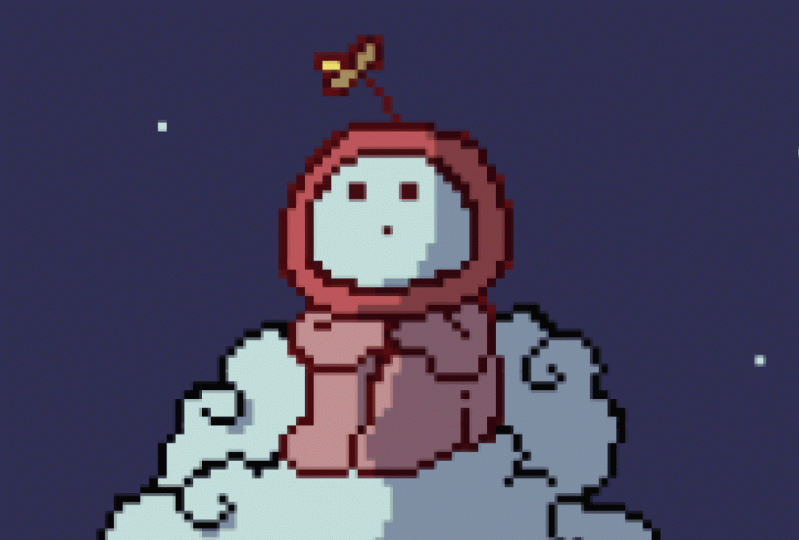
11. Another Example with narration: So I started a
18180 Canvas and I wanted the characters
will be 64 pixel by 64. I start, always start with
doing like silhouettes. But for this one, I wanted to
experiment a little bit and say that I don't want it to do something that
resembles a poster. So going with that, wanted to have something
that's very strong character looking straight at the
camera and doing a Heracles. But that was something
I wanted to go with. And also I want to experiment in a little bit
with like a richer colors. So I wanted to get
very rich magenta. Now, just playing around
with how I want my life to be can always flip the canvas like we've done
in the previous module. And it will help you
make better decisions. In for this part,
who is looking at? What if I just wanted to
create a close-up shot off the character in the background just to resemble that
poster I was talking about. But as you can see them later on and that was kinda scrapped. But it's always good to keep everything on Canvas
and experiment because oftentimes it's okay
not to know what you're doing now or just going
through the character, wanted to polish that
look a little bit, making sure that I know
where the eyes are, where the hips and all that. And wanted to play around
with the attire and costume. So my first thought was, well, this looks
more like a cape. So I wanted to
lean more on that. And I wanted to
do something that make it look more
relatable Cyberpunk key. So I gave up that little core in the
center by this chest. Now we're just cleaning
up the character polls. I'm still not too happy
with it, but that's, it just comes with the
process just going to keep, keep adding an improvement. Now I'm just adding a
little bit more detail to the cape and wanted
to play around with, I would say like the material. So that's more like a mesh. Moving on to the sort wanted
to do something very simple. And it looks alright.
Next is the colors. So since we have a magenta, when we look at the color wheel, we're pretty much going
to play with like greens. That this is a
complimentary color. So I put it in some colors
up top as a reference. And we went to play
around with that. I wanted to make
the cake stand out. So adding that in and
following the line theory, we wanted to keep
everything consistent. So it's kinda flows
well with the eye. One of the best
practices that works for me is blocking shapes. So I can block a
whole shape and I can see something that is different. Now I notice, well, yeah, that looks exactly
like a capes and Iowa, I can add the hands. Next. I worked on the lighting, so I wanted to have a backlight. Fourth moment there.
I was like, okay, so I'm just going to keep keep that consistency with the color. So I wanted to keep everything
kind of very deep magenta. One thing also with the
front is I want it to, I would think about
adding details, but I didn't want it to take
away from the character. And that way I just added
some lines to give the viewer a little bit of
imagination that hey, this is a rock and
by doing that, it kinda takes
away your eye from the bottom part and it leads it back down to the character. So all these lines
are leading in. Next is the backdrop. So the blood moon is something that I
am a very big fan of. And I think it works well with how we wanted the light to come, because the light is coming
from in front, the back. And it will also
give a very good emphasize on the
character itself. So now that we added the
moon in the backdrop. So next is to try and fix up
the light and get that K2. Just pop a little bit more. But I just added a
little bit more greens and outlined everything
with the magenta color. Next, I wanted to
work on the octopus. If looked like it was
looking out on the camera, I wanted to keep everything looking directly at the camera. And by doing that now, I wanted to kind of get a lot more leading lines
towards the center. So I worked on some more clouds. And these clouds
are going to lead your eye back into
the focal point. And kept all the
colors very cohesive. So as soon as you go
closer to the camera, the colors are brighter
and as Sue go away, they're a little bit more
tone tone down. So it's. It's darker, they
lose saturation. Next is also more lines. So I thought that the moon would be like look very boring. Adding more lines to
lead towards that, the hero character, also
helpful decomposition. Lastly, I wanted to work on the actual background,
the sky box. So I thought this
octopus kind of like could look a
little bit different. I wanted to make it
look more like Astro. So I thought, well, why don't I do an outline around the octopus as well and
see how that would look. And I actually liked
that look a lot. However, the shape
of the octopus was kind of it was just
to round for me. So I wanted to do something
that's a little bit more blocky and resembles like
that, more retro look. So just played with so many
different variations of it. See which one looks better. And it just, I, actually, I like all of them, but I octave with the
one that looks a little pointy because it looks
almost like a spaceship. And lastly I thought, well, let's expand the
whole canvas instead of having it look like you're
looking through a cave. So just remove that. And I was just
experimenting quite a bit with how I wanted the
background to look. And initially I wanted to add a little bit more
to make it more Astro, but it just didn't
flow well with the, with the composition is
just seems so random. I just removed all of
that and I thought again, what if I do something
more with leading lines, like creating lightening was I thought it would
look really cool, almost like energy beams. So I started to add those. And you can just put
any color for now. And with Photoshop, you can
adjust the colors later. And that's exactly what it is. I just wanted to
block my shapes. Make sure that if the
composition works, I can play with the colors
and have fun with it. So initially, we're
thinking what if I do orange, yellowish? I thought this
looks really cool. Look like more like
a poster effects. And that was the final look. Lastly, we're just wanted
to polish the picture. Makes sure that I
have everything in the center and fix that leg a little bit and
the hand looks really good. So this is it.
 Mostafa Nassar, One step at a time