Transcripts
1. Introduction: Hello, my name is Mustafa Nasar. I'm an engineer artist based in Toronto. On the side, I make videos regarding the creative process, art, and investment. I've been editing pictures for more than 15 years and that allowed me to create a system where I can churn out repeatable and easy process to edit my pictures. With this class, you'll be able to take what I have learned and apply your own twist and put your creative spin on it. In this course, I'm going to show you step-by-step on how I edit my own pictures. Step one, importing the pictures from the camera to a lightroom. Step two, we're going to go through all the pictures, sort them, and categorize them to however we see fit. Step three, we're going to start editing the pictures following the system. Step four, we are going to make our own presets rather than buying it from an outside source. Step five, export, enjoy, and share it on your socials. I really hope you enjoy this course as much as I enjoyed making it. This course has been on my list for quite some time, and I finally got the chance to make it. So I'm very, very happy that you are taking this first step to join me. If you have any questions, leave me a comment or contact me directly on the email and I would love to hear from you.
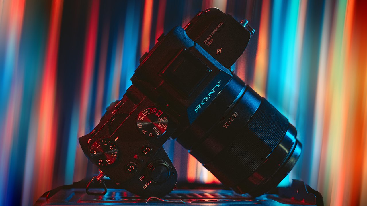
2. Why Lightroom ?: Hello and welcome to my Lightroom course. Today, I'm going to be going through my workflow of how I edit my photos and I'm going to show you all my tips and tricks and techniques of how I take the photo from the camera and putting it into my computer and posting it on my socials. But before we start, why Lightroom? Well, Lightroom is one of the leading standards in photo editing and it's been used by 32 percent of editors, which makes it a very essential tool to know about and to use especially if you're sharing work with other people. But this course is not just about Lightroom, this course is more about the whole workflow. So if you're using any other alternatives, you can still find something useful from watching how I go up about taking the raw image and adjusting its exposure, manipulating the colors, and making it into the final product. Without further ado, let's get started.
3. Importing Your Pictures to Lightroom: It's time to import pictures from your camera to your Lightroom. To start with, we're going to go to the Library, click "Import". On the left side you're going to get your sources. I already have the folder that I want. Select all the images and "Import". Once this process is done, you pretty much have it in your library and you can start editing your photos.
4. Sorting and Catagorizing: Now that you imported them, you can sort them by having the star system, or you can sort them by metadata. You can sort it by what lens you shot with or attribute, if it's edited or not edited, if you want to flag it. Let's say I want to select this, I'm going to put this as five-star and make this as one star, and this one as three star. I can do that by selecting the numbers from the keyboard. If I only want to select the images with one star, I can go to my filter either from the attribute and go up here, or you can go to the shortcut menu at the bottom. Let's say I wanted to select three stars, and that's where it goes. You can select that if you want it for greater or higher, so it gets you whatever star system that you used. Or let's say if you decided just to not use any of the star systems, and let's just say, for example, I decided to edit this picture. I'm just going to do like a really simple edit. Now, I can just go back to the library and just select this one filtered based on edit and it will just show you all the pictures that you edited. This is very helpful if you have 1,000 images and you just don't have the time to go through each one of them. You can just go ahead and select based on your star system. Usually what I do with my workflow is five-star is the stuff that I'm definitely sending to the client, four stars are the stuff that it's still good, but it's not going to take over the client five-star ratings. This three-star is the stuff that I'm still in between, and if I see if I can do a good edit with, I'll send it, if not, then I just not going to send it. Two and one is just based on how you want to sort them. Usually if I sort, if I have a big file, let's say if I have different projects, and I shot him in the same day, I just put everything if I don't have time to go through it and put everything in one folder or separating them in different folders. I can just do that in Lightroom by just going through the pictures and doing the star system. It really gets the job done for me. It's so easy to go in and select the pictures in here rather than going into Explorer, because when you go in Explorer or if you're using a MacBook, it gets so hard to go in and view the pictures in windows. Because sometimes your program, you can't get to see the pictures in there. I downloaded an extra plug-in to be able for me to see it, but most other people don't have that plug-in, and it's an extra friction that I don't want to have, but at least for myself, it's good to have that you can just go and see the pictures beforehand. But having it in Lightroom, it definitely is the better option. Just import, see your pictures, sort them with the star system and start working.
5. Compounding Effects: Let's talk about compounding effects. If you're familiar with Photoshop, Photoshop has the layer system which enables you to add effects on top of effect and give you this capability of changing layer to layer so you can put one effect on top or underneath, or put something in between. This one gives it a very high editing capabilities. With Lightroom, the compounding effect is there, but it's not as powerful as Photoshop because the way Lightroom works is, it's already preset layer system. The way everything works is almost like in a train, so when you do one, it's always on top of the other. That way, it's always repeatable when you compare notes with another editor or another artist. This one is very systematic, so it's very repeatable. That's why it's very, very common to share presets because Lightroom always expects the layers to be in the same order. That way, when you edit your picture, it's always going to look the same when you share that preset with someone else. Let me give you an example. Let's say you have this image that is a little bit overexposed and you wanted to go down on the exposure. Your first impression would go into Exposure and just crank it down. But when you do that, you lose a lot of detail in the shadows. But if you go and reduce the highlights and increase a little bit of the shadows and then reduce the exposure slightly, now you don't lose a lot of the shadows effects or the details, and you bring back some of those highlights and bring back some of the detail, like before and after. Also, if you use the tone curves, you can actually manipulate that even further. Let's say if I wanted to bring back some of that shadows and bring this in here now I have an image that looks better. Now with this contrast, I can go in and bring back a lot of detail in the picture. That's why compounding is very, very important. If you rely on only using just one dial, you can get some of the effects to look okay, but if you utilize everything in the program, you'll push your image to something even further than anybody else. So I really recommend that you use everything that you can to try and bring the image to the look that you want and experiment, because when you experiment with the image, you might get a lucky accident and learn something new.
6. The Edit Tab: Here comes my favorite part, editing. But before we go through the editing process, we're just going to through each one of these panel and see what each one does. You have the histogram panel at the top, which controls the blacks, shadows, exposure, highlights, and the white. Basically, if you see, everything is moving there. It's highlighting something in this section because it is exactly the same, except for the contrast. The contrast has a separate dial that you can manipulate by itself. Everything that you change in here is going to change in the other panel, as you can see. This is the color temperatures, which controls your blue and yellow. This is your tint, which is green and magenta. The presence basically controls your texture and clarity. The clarity and the texture they both work hand in hand. They give the picture a little bit of more sharpness, somewhat a little bit extra contrast, which I find it very good when it comes to shooting landscape and architecture, and sometimes with portraits. It just depends on the subject. The dehaze is one of the coolest features that they have. Let's say if you go into a foggy and if you have a foggy picture, if you go into the dehaze, it just brings back a lot of that detail. It's very cool and it has a lot of different uses, especially if you're doing some neons, it's always good to go and play around with it and see how that effects. But we're going to cover that in the course. The vibrance and saturation work hand in hand. The vibrance increase the color intensity, and the saturation increase the color saturation. This one is really based on your preference as well and how the picture looks. But for this picture, we're just going to go through everything. The tone curve is one of the most advanced and most important tool to have in editing software. The way it works is you have a line in the center and you can just manipulate it up and down, and you can add more dots to manipulate your curves however you see fit. The way it works is, you have your highlights in 1/3, mid-tones, and shadows. By moving that line, you can control your saturation for the contrast based on colors and you can control your exposures in key locations on your image. It's very, very cool once you get to know how it works. It almost feels like you have a superpower to control how the image behaves. But this one we're going to go extensively every time we added a picture. The HSL colors is basically it manipulates the colors in the image. You can control your hues, your saturation, and the luminance, and everything plays onto each other. This is a very powerful tool to go in and if you wanted to change, let's say, for example, I have the greens and I wanted to change it into, let's make it look like it's fall foliage. Now I changed it from green into yellow. I can just increase the saturation and just make it look a little bit like fall colors. The same thing with this. See, I control the blue. I can make it completely green or I can just make it a little bit magentas. Everything compound on each other. So if you change all of that, you can go nuts and create something completely crazy. This is one of my second favorite tools on Lightroom. This split toning is a little bit tricky. You only get to choose special colors for highlights and shadows. This one works very well if you have some images that you wanted to portray, like a little bit of mood into it. If you wanted to get some, let's say warms, you can add orange in the highlights, and you can play a little bit with the shadow to make it a little bit like a Blade Runner looks if you want. But definitely this one, it takes a little bit of finesse. You don't want to go too crazy because it overpower most of the colors. I find it very good to play a little bit with it on very low saturation. It just gives it a little bit of touch to just change the overall tone of the image and gives it a little bit more life. For the detail, I don't really play much with it. I haven't found a lot of uses to it much, because when you do that, it amplifies the green, especially if you're shooting with higher ISOs. I find that it looks very distracting. But you can find something useful for it. It has its uses if there is no green. Definitely, for me, it adds a lot more noise than I want, so I don't really play much with the sharpening. For the noise reduction, this one is very useful if you have a lot of noise. Let's say, for example, I just zoomed in in this. If I completely turned this off, you can see that the greens have a little bit different, a lot of chromatic aberrations. This one really helps control some of that green, even if it's at zero percent, it already does a lot. If you add that by 10 percent, you can see a huge improvement to your image. But I try and steer away from that. I try and get my exposures right in the camera. Because once you start doing that and if you're taking pictures or portraits, it kind of gives this unnatural look to skin and it makes it look very plastically. So I tend not to play around with this one too much unless it's a picture of inanimate objects or something in that regard. The lens correction, I leave it on auto because it takes all of your metadata from your camera and adjust it to your model and lens. This is not too important but it's good to have it on because it just does its own algorithm and corrects the picture from your camera to Lightroom. This transform is very, very cool feature. Let me show you one more picture. Let's say, for example, this picture. You can see that it's a little bit skewed, so I can just click on this, and let's say I just want to get these two to be upright, and it automatically gets them to be straight up. You can just do constrain crop and it just moves the image. But this is a little bit extreme. We are going to go and I'll show you a good way to do this one. Usually, when you do constrain crop, it does it by the algorithm. I find it a lot easier or better if you do it by yourself because when you do that, it already ruined the picture and I don't want to do that. Let's say if I do it for this picture and I just want to crop it this way, see now the picture looks a lot better. I would say try and refrain a lot from going to constrain crop because sometimes it crops it to what it thinks the picture looks good, but definitely not 100 percent accurate. So just be careful with that. For the effects, this is more for vignetting. I hardly used that. It's not really something that I like to use in my pictures, but this is something if you want to add a little bit of vignetting to your images, you can go ahead and do it in here. Same thing with that, so you can just add some green to it, but I typically don't use that often. The calibration is probably one of the coolest ones because you get to manipulate the colors even further and use the compounding of the colors to make the image look very cool. For this one, it only adds color tones to the shadows. You can add a little bit of magenta or greens. For the reds, you can just change the overall hues for the red and it gives it a really cool colors, and same thing with everything. If I go all the way there, it remind me of Miami vibes, and you can do a lot of cool tricks with that. But yeah, this is pretty much everything in Lightroom that I'll be using in this course. Let's go on to the next one.
7. Creating a Preset: In this segment, I'll show you how you can create your own presets, and doing it is very, very simple. Basically, if you made any changes to the histogram or anything on this side of the panel, you're pretty much adjusting the image. Let's just say we're just going to do a very simple adjustment. You have two ways to create a preset. First one is you can add create a preset if you press on that Plus button, or you can go to develop and press "New Preset" or press "Control+ Shift + N". Simply you can create it in a new group and then write your preset name, and then hit "Create".
8. Importing a Preset: In this section, I'm going to show you how you can import a preset in Lightroom. Starting, you can go to develop, and in your presets, you have to scroll all the way up and select this plus button, and simply just click import presets. From there, if you downloaded the preset, or someone gave you a preset, just select it and click import, and when it says complete, it should show up on this side.
9. Building Your System : Next, I have a picture of a dog. It looks very cute. So let's just get started with that. Repeat the same workflow. The best thing is to build yourself a system, that way when you edit the pictures, you always kind of repeat the same things that you do. So if you start from top to bottom, you can do that. If you jump ahead like myself and just go from top and then bottom, then go to the center, do that. That way when you edit your pictures, every time, you're going to have a repeatable process and it won't deviate too much from the looks that you have. It's very, very important for this, that you keep everything repeatable because when you edit the picture, if you have a lucky accident, you want to keep those lucky accidents happening. This is one of the best ways to just train your brain to repeat the same steps, and if something happens, then you know that you can repeat it in the future. We're just going to do the same thing. This one was taken during midday so it definitely looks good. I just want to go a little bit on the exposure. So I didn't manipulate much, I just added a little bit extra highlights, shadows, and black just to bring some of the details because I really like that look. I'm not sure if I can try and get this one to look a little bit more pink, but we're going to try. The one thing I found with pet pictures, if you go a little bit back in the dehaze, it makes them look fluffy. If you go a little bit more, it kind of makes them a little bit more gritty. So I like to go a little bit back in the dehaze. Same thing with the textures. So if you go further, if you zoom in, see like the textures, now they look very fluffy. So it's definitely up to your preference, how you want it. I like to see more detail in my pictures, so I crank up these. You notice that I have done this one beforehand. I just wanted to show you how it's looking before I jump in. I just got too excited seeing the dog. We're going to leave this last and just going to go to the colors. I actually like how the colors look. I don't want to change too much. But I just want to give this dog a little bit of orange, and the color of this yellow, because it it's too yellow, it stands out. So I want to give it a little bit of orange to blend in. With the greens, I like to get my greens a little bit of orange to give that whole synergy in the picture. Just going to go ahead. It's always good to go into each dial and move it, and see how it manipulates the whole image. Then decide where you want it to stay. That way you don't miss anything. So I'm going to give it a little bit of saturation for the orange. For the reds, I'm just going to go a little bit back because I don't want it to overtake my picture. So I'm just going to do that, just slightly not much. For the yellows, I'm just going to give it a little bit more saturation to get him pop. For the luminous just slightly. There we go. That's not bad. If you want to see how this whole effect looks, you can just go on this button, turn it on and off, and you can see right away that the picture looks way better than before. For the split toning for the daylight, I kind of want to give it a little bit more of a moody sunset fields. So I'm just going to go with that. If you want to see how the color looks you can just go high on the saturation and select the color. This is red, I'm just going to go a little bit into the orange territory. Let's see where's the orange. I think the orange is right here. I don't want much, I'm just going to give it just 10%. You see it only changed slightly the colors. This is why I like the compounding effect of this. When it comes to the shadows, it really behoove you to go through kind of like the color wheel opposite. So if I'm going orange, let's just go with teal and not much. If you're doing 10, just do four or five. That way it gives it slight in the shadows. It just makes it a little bit contrast and it looks really cool. Now we'll go down to the tint. I want to give it a little bit of warmth. So now we're going to give a little bit of magentas for that. Look at how much you can manipulate that with just one dial. 28, I'm just going to keep the saturation the same when it comes to that, see. I'm going to give it a little bit more red. For the blues, if I move this one back, this one manipulates the blue and teal. I kind of love how this dog looks in this color. So I'm just going to give it minus 10. Saturation, just going to give it a little bit more saturation. I'm just going to go jump back up to my tones. So I'm just going to adjust this one. See, I started with an S, but I saw that the S kind of adds a little bit of contrast. So I'm just going to go up slightly and see the more you go up in here, the blacks kind of look gray. That's not the look I'm looking for, but that's definitely how people get the faded look. They just go on here and crank this up slightly higher. I do like that look, but for this one, I don't want it to be a little bit too faded. I definitely want to change some of these colors. But just keep in mind you don't have to go and change everything. Sometimes when you edit less it's more. But for the sake of this course, I'm just going to go through and show you that if I over edit the picture and how I would do it if I don't. But definitely if I don't, I wouldn't touch anything else in here. I'm just going to go back and put it back where it is and change the textures. Go a little bit down in the exposure. That's how I would go from before and after. But I just want to see for demonstration and that's what I usually do anyways, if let's say I'm already liking how this one looks. What if I start playing around and maybe I'll get a happy accident. So that's something that I usually do. Even if I already finished the image, I can just go ahead and export it, and I'll call it a day. But if I have extra bit of time, I can just go ahead and see, what if I add a little bit of green to the highlights and crush the shadows to magentas, like so and see how that looks. I don't like it too much. So I'm just going to go and hit Control Z multiple times to go back and just maybe put these back. That's pretty much where I would end with this picture.
10. Tone Curve Oriented Edit: To start with, we're going to go through probably the most difficult pictures to edit. If you have something that is being taken in low light, just like this picture, basically, what you want to do is you want to first try and expose it correctly in the camera. But sometimes, even if you try and expose it correctly, because of the lights in the background, and the neons, and all of that, even though the camera would tell you that, hey, this image is exposed properly and everything is down to the T, the image still might look a little bit darker. So that's where the Raw capability comes in handy. We can go and adjust your exposures a little bit and have it look its best. Basically, what we're going to start with, we're just going to go ahead and play with exposures, try and get the pictures to where we want, before we go and adjust the colors. Usually, I try and get, let's say if I have something that's blown up in the back, let's say this is white, what I want to do, go in the highlights and go down. When you go do that, it brings some of these details back. Try and adjust it a little bit, and sometimes some of the details are unrecoverable. But that's something that you have to be careful with when you're shooting. Not all the details can be recovered, even if you're shooting in Raw, so just keep that in mind. There's just one thing I noticed that this image is not horizontal. One thing that you probably have to keep in mind, just keep your horizontal levels always in check. There's two ways, you can click in here and click "Auto", and most of the time it will do a good job. But if you really want to take it a step further, you can move it yourself. Or you can go in and select this straightening tool, and go through where you want your horizontals to be. In this case, I want it to be this one and I press done. Now the image looks horizontal. Let's just go into the exposure because I accidentally pressed "Reset". I'm just going to go down the highlights, and I want to bring some of those shadow. The shadow is really good for low light because you can bring a lot of the details that you're more likely you can't get if you just go up on the exposure. So just try and play around with that and get it to somewhere where you're really pleased with, and you can move on to the next. The second thing is your temperatures. It's really up to how your vibe want to be. This one was taken in Hong Kong, so I wanted to give it a little bit of this neon, cyber-punky vibe. So I'm just going to go a little bit blue and give it a slight green tint. For the contrast, we're just going to keep it this way and the tone curves, we're going to play with last. Because this one can manipulate all your colors and you want this one to be your last thing because this is the most advanced one. You just want to make sure that you got all your colors to where you want to them. Moving on to the next, we're just going to go and play with the hues. I want it to be more like cherry red. I'm going with the yellows. I like the orange instead of the yellow, so I am going to make it more orange. For the greens, as you can see, it's controlling this one and that one. So we're just going to see which one looks better. I definitely don't want the green, so I'm just going to go complete to make it yellow. For the aquas, can leave it neutral. The blues, I wanted to give it a little bit more blue. Purple, magentas, they don't change much, so we're going to keep them the same. For the saturation, I definitely want more red, a little bit more yellows. For the greens, and pretty much nothing because we haven't changed much in those. The luminance plays something really cool. Let's say I have this red car, and I wanted just to control how the red is going to look, or how light it's going to be. So I can go in there and you can just brighten up specific colors and you can dim down specific colors. Let's say I don't want the green, so now it looks a little bit more like a lemon color, but I don't want to do that, so I'm going to go a little bit in the yellows and I think this one looks adequate. For the split toning, since this one is a night picture and I already changed my color balance to a little bit blue, so I'm going to change my highlight to a little bit blue, just to give it a tiny bit of color. When it came to the shadows, I'm just going to add a little bit of red. But you can just go around and play and see which one looks cool. I think having blue and blue overall kind of gives it a really cool look. For this one, you can either keep it and leave it by sub because this one looks already okay, or you can just do an auto and adjust it to where you think it looks good. So this is before and after. It actually even got it to be centered more and fixed my horizontal, so I think I like how this one looked. Now, forward to shadows. I like how this one looks so much. When you put the tint down to green, it gives it a really cool look. Now this one, I'm going to change the primary red to over 40 percent and the saturation to 25. If I change it all the way to the left, makes it a little bit, or it makes it a little bit more yellow, but if I change it to the right, now, it's more blue. But for the time being, I don't want to play too much with it, I'm just going to keep it in here. For the blue primary, you can either change it to yellow when you add, crank it up all to 100 or you can just change it to orange still, but this is way too over-exaggerated, so we just going to change it slightly to here and play with the saturation. If you press the back-slash, you can see before and after and it's already have a very big improvement. Now, time to go and play in the tone curves. Usually when you do the tone curves, I like to start doing an s1, up-high, and one down-low. I find it a lot easier to start with something; otherwise, if you start moving something by itself, you can get overwhelmed and something gets clicked, so I usually just do a very minor edit and then try and move it slightly. You don't want to go too crazy with this because even the smallest change can manipulate the colors and your contrast, so you just want to change it enough to make it look good. The one thing about the tone curves, if you adjust, I just reset it, if you adjust this by itself, you can see that it's already increasing the highlights and if you do that, is going to decrease the highlights. If you do that, is going to increase the shadows and reduce your shadows. This is very cool when you want to just manipulate colors in very absolute. You notice in here you have the red, green, and blue. If you click the red, you can just control the red colors, the green and blues. If you change that, it can only change the shadows of that specific color, which makes it very powerful, especially if you want to manipulate the picture, really manipulate it hard and get some unique look to the pictures. This works very well with compounding. If I have the temperature, let's say I've changed it to blue and I change the blue in here, or I change it to a little bit yellow and then I go down and manipulate the split toning and add blue in here and then change the shadows; all of these colors when they add up together, they compound on each other and they create a new color. It's a compounded adjustment. You get this advancement with layers, special theory familiar with Photoshop. When you put a lot of colors on top of each other in photoshop, you get a very unique look that you cannot just get by having a simple color. But when you add a blue and then add a little bit of yellow, it turns green, but this green is not 100 percent green, it's a little bit more lemony, or maybe it could be a little bit blue and it gives you this chance to get a really, what we call it lucky streak. Now, we're just going to go in here and edit it, I just want to do a small s and I just want to remove a little bit of contrast from here, so I'm going to move this. When it comes to the red, I think that the picture looks too blue, so I'm just going to add a tiny bit of red in the highlights. To neutralize it, I'm just going to go down to the center and I'm just going to keep this one like that for the green. If I do this, it looks a little bit orange, I don't want to do that. I want to give a slight tint to the highlight and I am just going to neutralize it right away in here just to get that highlight a little bit of amph. For the shadows, I can give it a slight orange and I'm going to add a little bit of contrast to the magentas in there. Now, moving to the blue: I'm just going to give it a little bit of yellows, go back to the neutral because I don't want to affect the shadows and mittens and now this one down there. Now, let's go back to the presence. The presence, we can add deliberate texture and clarity and if I crank up the [inaudible] , you can see it's already making it darker, but I don't want to get it darker. I can get it a little bit of haze, so I'm just going to go to minus 10 or maybe minus five and you can just click in here and punch in your numbers. For the vibrance and saturation, I'm just going to go a little bit plus five in the vibrance and plus five in saturation. Lastly, this is just a small dial, don't use this one much often, but you can just manipulate your final image and see if you want to; yes, this looks pretty good. Now, if we press the back-slash, this is before and after, huge improvement, and definitely looks nice. Now, just before we end things, I just want to go ahead and adjust a little bit of exposure and I think this one looks about right. Now, if you want to save that preset, you can click, ''develop new preset'' and I want to call it "taxi." Now, you can have it in their, your own taxi.
11. Adjusting Skin Tones: This picture is of a Toronto singer named [inaudible] , and this is in a concert. So it's very low-light. It's been taken at F1.8 at 200 seconds and very low ISO. You can see that there's a lot of backlight coming on and a lot of haze. This one is a little bit tricky to work with. We're going to go ahead and show you how I manipulate this. To start with, just going to try and get the horizontal levels, so I'm looking over here to see if I can get that. Also, I'm trying to get decomposition because this was a very crowded place and I didn't get the privilege to choose where I'm at. You're usually just between people. I'm trying to get into a spot where I can work with. Let just see how this one looks. If I can get something like this, I'm trying to get my center levels. This one looks already better. What I'm trying to do, I want her face to be in the center. Now that being done, let's go ahead with the changes. I am not going to go too crazy because the colors already looked beautiful. I just want to try and bring some highlights or some detail in her in there. I'm going to play a little bit with the temperature because she had a very strong orange light coming in the back. I just want to try and bring some of that skin tone to a more natural, something around here. I'm just going to play with that. It's already at minus 14. I'm going to bring it just enough to bring some of that colors. You can tell, when you move slightly from minus 10 to minus five, the whole color changes. When you manipulate the colors, you have to be careful. You don't want to mess up your skin tones too much. Otherwise, the picture might look really unrealistic. For this one, I'm just going to go to minus eight. I'm going to go see before and after. I've kind of neutralized that orange color that has been very prominent. We're just going to take it further and try and manipulate that. We're just going to try and zoom in. I want to try and get some red in the cheeks. Now that I got the reds, dial down. I can just play around these on a very macro level. You can tell that there is no changes done because the whole thing is not daylight. This was done with LEDs, and when you play with colors, the colors are very flat, so it's either like red, a little bit of compounded color, but not much that you can manipulate. It's really good to know what colors are coming so you can play around with them. So that, I'm just going to give it slightly saturation to bring her skin tone. With the luminance, I'm just going to bring it up slightly, not much. For the split toning, this one is a little bit tricky because I already have orange. If I look in my color wheels, I will try and do a little bit of green just to neutralize that color, and for the shadows, you can just play around. If I do a little bit of green in the shadows, you can see it's already dialed down that color so much and give it very, very deep shadows, which I like actually. But I'm not going to go too crazy with that because I want to preserve some of the aesthetic of this shot. So I'm just going to keep it both at 12 for the saturation. Now when we go to the Calibration section, I actually want to enhance her skin tones further. So I'm just going to give it a little bit of magentas, and this is how it looks before and after. You can see her skin coming back to life. Now, with the primary reds, you can go crazy if you want to make it very pink. But when you do that, you compromise all of the work that you've done earlier. That being said, I'm very careful playing with the red because her skin tones has so much work, and with the compounding, I'm trying to be very, very careful in this one. So just going to be a very, very slight move. That being said, I might not even play with the greens, and with this one, it gives it a very, very red background, which I think improves the whole scene. So we're just going to play it that way. I'm very happy with this one. It's just going to go up. Now with the tone curves. The reason why I wanted to keep this one last, because most people might not even use it and get beautiful images, and I wanted this course to introduce a lot more people to Lightroom. So you can get really beautiful images without playing with the tone curve. It's not a necessity to know how to use the tone curves, but it's always a bonus to know how to use it. But now I just wanted to bring some of the highlights down from here. This is before and after, but this is overall. I still want to put a little bit of reds into her skin tone, so I'm just going to go a little bit high. You can see, now when I go down, I get a lot more blue in the shadows, which is something I don't want to add too much. If I go up, the shadows turn red. So I'm going to be very careful not to manipulate that too much. I want to crush down some of these. Now with this one, now we're playing with the green. I'm just going to give it a slight move to the highlight, and for the shadows, I'm just going to go up in here to give it a little bit of less contrast. Finally, with the blues, I want to keep it a little bit warm, so I'm just going to go down in here and go up in the mid-tones. I want to crush the blues because I want that orange to be prominent. Lastly, we're just going to play a little bit with the texture because she has a little bit of freckles and it looks cool. So I'm just going to get that. When it comes to dehaze, you can go that, but it gives it a little bit of a halo, so I don't want to have that. What I can do is I can go a little bit of a dehaze to improve how this halo looks from the fog that was in the scene. Let's just go to minus 10. This is how the final image looks like. So before and after. Basically, in this one, I just wanted to show you that you can try and improve the color tones of any image, even if it was under a very, very harsh light, just like this one.
12. Editing Day Light Picture: Now let's go through this picture. This one was taken in a very harsh sunlight. You can notice that it's a little bit underexposed in some areas. The main reason is because I wanted to preserve the details in the sky. That was the whole reasoning behind it. Let's just adjust our horizontal levels. Now that this is complete, we can just go ahead and play with the exposures. Because I know I underexposed, I'm just going to bring up some of the shadows and try and adjust it to where I want it. All I did I just increased the shadows very high up, close to 76 percent. Exposure's almost the same. The black value was exposed just to try and bring up some of this detail. Let me just show you how it looks before and after. That's what you can try and do when you shoot these images. Just keep that in mind that when you try and shoot it, don't try and shoot stuff that's very, very underexposed. Otherwise, you will lose a lot of detail. Now that being done, I think this image already looked beautiful. But I just want to manipulate the colors a little bit further. You just want to give it a little bit of orange in here and slightly deeper orange. For this one, I want to try and get some complimentary colors. This one looks too green, so I'm going to give it a little bit yellow. The aqua and blue are just going to manipulate the colors of the sky. I'm just going to go a little bit slightly on the blue. This one just changes very minimal colors, so I'm just not going to move it so much. If you click here, you can see before and after. I haven't changed the colors much, just slightly. For the saturation, I'm just going to go a little bit for the roof. For the yellows and the greens, slightly. They're all around 10 percent. For the blues, I wanted to just give it a little bit character. I'm just going to go crank it up to 60. When it comes to the luminance, just going to give it a little bit, especially in the blues. There we go. It's a little bit brighter. Now when you go and see before and after, you can see like a huge shift. Here's one of the coolest part. For the highlights, I can just move it to the orange and give it a slight tint. I'm going to do same thing with the shadows, but I'm just going to go into [inaudible] territory and give it some shadows. Not much, just a 10. I do like 10-5, usually. Just to give it a little bit of the compounding. Now we're going to go down to the tint. Just little bit of magentas. For the hues, I actually love the red hues to be similar, just going to give it a little bit of saturation. For the greens, I like how the hat looks. The color is a little bit more prominent. So I'm just going to add to 30 percent and give it a little bit of saturation there, around 25. For the blues, so if you move it all the way down, it looks like it's in the desert, but the color of the sky looks very unrealistic. I don't want to play too much with that. I'm just going to go 2 minus 20, let's just do that. When it comes to the saturation, just going give it 2 plus 10 percent. This image by itself, I think it already looks okay. I don't need to do too much with the toner curves, but just for out of curiosity, I'm just going to play a slight bit and see if I can get some cool look with it. You see if I move this up, I get a little bit too contrasted which is something I don't want. The main reason it's contrasted because the curves are touching on the top, that is the main reason. If I just decide to put this one down, look, the spikes are happening in the highlight. So if you move this one down, you can control a lot. Let's just see before and after. It did bring up some of the detail in there, which is nice. I'm just going to keep it this way and I don't want to really just too much to be honest. The only thing I want to do is I want to add a little bit texture and clarity. Let me just this a little bit. I'm going to go minus five in the dehaze. This is how it looks before and after.
13. Using Transform Tool & Ps Integration: The next image, this was taken in Cuba. This one is a little bit tricky because the ground was a little bit skewed. I was shooting in 26 millimeters, so there was a little bit of a distortion in the image. I want to show you how you can fix a distortion in an image. We'll start with this. Here's one thing, if you already have a preset, you can use a preset that you have already used. I like the Thai Beauty that we've done before. But the thing is with presets, if you already have a preset and use it, most of the time the colors don't match. It's always good to apply the preset and go in and adjust it. But now that you know the knowledge of what each dial does, you can go back and trace and see which dial that you want to enhance or fix. That way you can have more power over all of the presets that you get from the web. That being said, I like the set that we've done before, so I'm just going to use that. You can just turn on and off. This one doesn't have a lot of views. This one overall looks pretty good for this image. Now I'm going to show you how to use the guided transformation. If you do an auto, it already does a good job. You can ought for that or you can ought for this. For the sake of that, I'm just going to leave it as auto or I can just go full. I think auto looks better. This one is just adjust for level. It doesn't do much. It just almost just rotates it. We don't want to do that. The one thing I have to say is because of the distortion, the whole thing is skewed up. We're just going to do auto. Now we're just going to click and crop the way we want it. I want to crop it this way. If you notice the levels from here is not matching over there, and this is a problem. How do you fix that image? One way is you can try and use these tools. You can go into the Lens Correction and go to Manual. You can try and do some distortion in there. But most of the time that's not going to work because you can already see that the line is there. But sometimes you can do some distortion and it would help. But for the sake of this image, I've tried it before, no matter what I do with all of these setups, I cannot get it done. The one way you can do it, if you have the Adobe Suite already, you can go right-click on the image and go to Edit and Edit in Photoshop. What that will do is it will just post it. Post that image on Polar Photoshop, and it will give you more tools to go in and manipulate it. I know this is not a Photoshop course, but I think this extra tip will really help you adjust your images correctly. Because sometimes Lightroom has a lot of limitations and one of them is full manipulation of the picture and how to manipulate some elements. That's where the Photoshop comes in handy to fill in that gap. One thing we're going to do is, it's going to be a very, very simple edit, we're going to duplicate the layer. What we're going to do is I'm going to press "Control" and click in here and do a guide. I want to get this to be my top of this cross. I want to get this cross to match. What I'm going to do is I'm going to go to Control T to transform. I'm going to deselect this because what happens with this when you try and move something, it locks your width and height. I don't want to do that. I just want to select my height. What I'm going to do, I'm going to press "Control" and select this side. I'm just going to manipulate this side to here and press "Okay". You can see when it's done it's already got that distortion corrected. But if you can see in here, there is a little bit of a very sharp line. What you can do is you can get your eraser or you can press "E". You can right-click, or you can click in here and select the soft round brush. Go down to what's appropriate size, and go to the opacity and put it up to like 30 percent, and move, and just delete the top. This one works in here because this is a Sky. This one worked very well. This is good. From here, you can actually save the image to your computer. Now that the image is saved, you can close Photoshop. What that does, it actually brings an extra image from Photoshop. You can see that you have two different images. One that's already manipulated and one that's not. That's why it's very good integration to have with Lightroom and Photoshop, because whatever you do in Photoshop, it doesn't actually override or overwrite what you have done in Lightroom. It creates an edit of your picture, and that way when you go in and export it, you can see all the edits before Photoshop and after.
14. Editing Backlit Picture: This one is a silhouette and this one, you can manipulate it differently, because no matter what you do, if you try and bring up, you can definitely bring up some of the details, but when you do that, you bring so much noise. When issued silhouettes, you have to keep that in mind that you shouldn't for any intention that you don't want to bring up the shadows. You can do a little bit, which looks cool. We're going to do this image two ways. I'm going to show you how you can edit it in here, and then I'm going to show you how we can apply a preset on it. Let's just get started. I'm going to bring up the shadows slightly, a little bit of the blacks, just to try and get a little bit of that detail in here. I'm going to break down the highlights to give it a little bit of a moody feel. The exposure, I'm just going to keep it the same, and now we're playing in this territory with the reds and the hues. I want to give it a very red color. Here we go. I'm just going to go to minus 35 in here, and just like we experiment, we're just going to go through each of the dial. This one manipulates this and I don't want that to stand out. I'm just going to keep it either neutral or give it a purple color. I'm just going to give it like a 50-50 change. I don't want to be too much. For this one, if I go down to the purples, I get a little bit of a clipping, which something I don't want. I just want it to be a very smooth transition. I'm going to give it also a 50-50. For the magentas, it prays with the whole color of the sets, so I'm just going to give it a little bit magenta in here, so 22. When it comes to the saturation, I want to give this the feel as if it was a night city or something in a Sci-Fi movie. I'm just going to play a little bit with the saturation. Add a slight saturation there, and you see if you add a little more to the blue, it manipulates that, something I don't want. Just give it 225 and we'll keep those the same. Now, go to the luminance. I'm going to play a little bit with that, just give it a little bit of light, so just go plus 18 on both. When it comes to the split toning, now you have the red color. What complements the red colors, is usually green, so we're just going to go ahead in the green and add, and you see how that adds a very, very cool looking aesthetic. It looks like it's out of an '80s movies. I'm just going to play around with that, and when it comes to the shadows, I want to give it a little bit of a blue, so I'm just going to go ahead in that. Now we have this retro looking scene. Now, that being done, we're just going to go down to the calibration. This is really up to your preference if you wanted to be moody like this, but I want to give it a little bit of green shadows because it looks a little bit brighter. Now, with the calibration, you can change that back to where you want it. You always have control. When we're talking about compounding, I want to give it a slightly blue and orange color and leaning towards red in very key areas. We're just going to play with that in here for the green primary. Just going to go to plus 12. For the blue primary, I'm just going to go to minus 20. You can see that the change of tone is very, very slight. Let me just change it to minus 20. Now when we go up to the tone curves, you can pretty much call it a good picture here. You can just play a little bit with the textures if you want and the clarity. But be careful because this is a very dark image when you play around with the clarity, you get a lot of artifacts. You don't want to crank that up too much. I probably wouldn't even touch it. I'm not going to play with that when it comes to the DAs, and this is something that's very cool. When you do the DAs, you see how much it brings back. For the sake of this image, I'm just going to go to minus 10, and I'm going to try and compensate that in here. I'm just going to go slightly down because I'm trying to get rid of some of the artifacts. I could just go up here. There we go. You can see before and after. I just give it a little bit of dark tones. I can slightly see what's on his back, and if you go, you press backslash before and after. I did manipulate the colors quite a bit. I brought back some of the details that I wanted from here, and through everybody, and I even have some skin tones to get some shapes. The one thing you can do is you can play around with those as well, and now you can actually manipulate the colors even more. Especially now we're playing in the red territory, this is very, very cool. I can just add a little bit of red tint, and it makes it a little bit foggy, so go back and forth. There we go. Now we'll go into the greens because this is red. If I add a little bit of green to the top, it looks very nice. But if you want to go down into the magentas, now you can play into really moody vibe from a disco. I want to keep it neutral for the time being. I'm just going to slightly change the shadows in here. I want to give it a little bit of faded look, and then I'm going to crush that fade in the blue section. Let's just go ahead with that and just going to give it a little bit of warmth and bring that back up in here and then crush that, and see how much you can do with that. Now with that being done I can increase the contrast if I want or I can play it back with contrast, and now we give it this Polaroid look. I'm just going to go back toward it. Now that we edited this one, I'm just going to create a new preset. I'm going to call it underground club, and create, because I already created it before. I'm just going to replace. It's right here. Then we can go around in other of the presets that we've done. This is the preset that we've done with the young lady in the back and you can see that it's a little bit dark in the back. But this still looks very cool cause you get some of the detail, but if you want to manipulate it further, you can just go back in the shadows and change up some of the aesthetic of the image. But just keep in mind that you probably have to go back and change some of the looks and the calibration and see if that's something that you want. I want to give it this green retro look, and now if you go back and see how it looks like from before, it's a little bit darker, very stronger colors. Then if you really like this one, you can just develop a new preset. We can call it underground, let's say underground club V2. Let's say strong colors.
15. Editing Indoor Side Window Light: In this example, we're going to go through changing this picture, and we're just going to go through the process. We're going to start with the exposure, reduce a little bit of highlights, and for this one, it was very, very sunny, and I want to try and get some of the details. So I'm going to go up really high on the shadows and slightly on the black. I might go 35 and maybe go a little bit down on exposure. Now I'm going to go into the crop, get my horizontals and now I'm just going to go through my hues. I want it to look a little bit more brown and give it a little bit of earthy feeling. I'm just going to try and adjust the background because if I go into this, the colors don't match, so if I try and get it a little bit to match the light that's coming, it will look more appealing, and there we go. Very, very minor adjustments to the saturation, and for the split toning, since this is a daylight I want to give it a little bit of warmth, so I'm just going to go into the orange, crank up the saturation of the 10 and do my shadows. Going to give it a little bit of blue, so I'm going to go do 10,10, so this is before and after. You can see there is a very, very slight change, and I might actually go half on the shadows. Now that this is done, I can go down to the calibration, and I wanted a little warmer, so I'm going to go a little bit of a magentas, I'm going to go plus 15, and for the red primaries, if I go all the way to the left, I lose the brown color, so I'm going to go a little bit, crank it up, up to 40 percent and for the saturation, I'm just going to keep it at zero. Moving on to the greens, I'm also going to crank this up to 40 percent, and I'm going to add a little bit of saturation because this one adds a little bit of a warmer tones, so I'm going to go to 20. For the blues, since going this way gives it a really, really red overtones, and going this way gives it a kind of greenish overtones. So you have the option either to keep it at zero, or we can crank it up tiny bit to give it a little bit of red. I'm just going to go to minus 10. Now I'm going to go all the way up to the temperatures, just slightly towards a warmer, and when it comes to the tint, I'm just going to keep it as a default, and now the image already looks pretty good, but if you wanted to try and fix some of that, we can go into the highlights, and go down slightly. To fix the shadows, we're going to bring the shadows up, a little bit, and for the mid-tones, you can bring that up a little bit. You can see you brought some of the details back in here, but because this was way over-exposed, it's very hard to bring some of these details back. But this one looks pretty good by itself. I can do some changes to this, but I'm already happy with how this one looks. Next, we can add a little bit of texture, or if you wanted a little bit of fluff, so you can just go back down on the texture slightly, and with the clarity, you can add that slightly, and then it's really up to your preference if you want to make it look dreamy or crank up a little bit of dehaze to get some of that detail in the back, so I'm going to make it 10 percent, and now that this is done, he's going to make a preset, and we're going to call this one Goat Day.
16. Night Street Photo: We're going to edit this picture. This one was taken in low light, so we're going to treat it the same way. We're going to try and recover as much detail from the background and our subject. I'm just going to go down in the highlights to try and recover some of this. I want to get some details on the rim and on the bumper. There we go. Just be careful because when you bring a lot of that highlight you lose a little bit of contrast, but we're going to build that contrast later on with the tone curves, so we can target the ones that we need. Since this is a night picture, I'm just going to go a little bit of blue and slightly in the green. For this one, I just want to make sure that I have my calibration targeted. I just want to make sure. Now, let's go to the hues. I'm now controlling the background, I don't want it to stand out too much. The orange, we'll give it a little bit orange for the yellows. It'll go a little bit orange in there. The green actually is a reflection from all these neons. I don't want it to distract too much from the car, so I'm just going to go crazy with the green, bring it back to yellow. For the aquas, we're going to leave it at zero. The blues, and this one is the one that controls everything. It's really up to your look. Some people like to give it a little bit of cyan color, so we're going to give it to minus 20. The purples and magentas, they don't have any effect on this image, so we'll just move on. The saturation for the red only affects the back and this one, so it's not much. We're just going to give it to minus 33 because I don't want it to be distracting. For the orange, it's just going to be plus 10. The yellows, I'm going to also make it plus 10. The green, let's keep it the same. For the Aquas and blues, I'm just going to go to minus 40 because I don't want it to be too distracting. When it comes to the luminance, I want the yellow to, I don't want it to look matte, so I'm just going to go and give it to plus 20. Same thing with the orange. The luminous for the red, you just keep it all the same so you don't distract. For the blues and the aquas, they're already bright enough, so I'm not going to play with that. The split toning, since this is a night picture, I want to give it a little bit of blue highlight, so I'm going to do that. Or you can go a little bit of green, I'm just going to go something in between. I'm going to do plus 15 on this one. For the shadows, also going to keep it the same, but this time I'm going to only give it to plus 8. You can see that this one looks a little bit strong, we might come back and fix that later. Now for the calibration, which is going to be the most important part. It seems when you put a lot of magentas, you bring a lot of detail, so I'm just going to go to plus 40 in the shadows. For the red primaries, actually this one brings the colors up, so I'm going to make it plus 30. When it comes to the saturation, I'm just going to make 10. The green primaries, I'm going to keep it zero because if I go down to the left, it makes it look very unrealistic. So I'm just going to keep it there, but I'm going to increase the saturation to 10. For the blue primary, this one we're just going to make it to minus 10, and a little bit of saturation to 10. Now, if you want to see before and after, it already brought a lot of colors back in. Because this is a car shot, I'm going to add a little bit of texture and some clarity. We'll see if that dehaze can fix some of the issues that we have. We're going to do plus 25 for both texture and clarity, and a dehaze, I'm still debating how this one would look. We're going to keep this one last. Let's jump into the tone curves and see if we can control some of the background in this image. I accidentally started with a blue, so let me start again. There we go. Now we're fixing all of this contrast by doing a very harsh S. It makes it look like a Need for Speed screenshot. The fading gives it a little bit of fog, so I'm just going to make it slightly faded. I can control how harsh I want that to look. By moving this and keeping this in the center, you only control the shadows and mid-tones, by keeping the highlights very slightly affected. I'm just going to move it over here. When it comes to the reds, I'm already happy with how the red and the blue look. I'm just going to experiment slightly with that and see if I can maybe enhance the highlights. What if I bring the shadows up? It actually looks very good. You can see if you turn it off and on, you get instantly a lot of detail. We're going to keep this like that. Now for the greens and magentas. When you give the floor a little bit of magentas, it looks very rich, and when you give the shadows a little bit of green, it brings up all the background to life. I'm just going to add slightly and crush all of that darks into a magenta color. You instantly get these rich tones in the back. Lastly, with the blue tones, we're going to give it a little bit of warms. Give this here, and probably a little bit of warmer shadows because if I go up, it looks very bad, so here we go. For the shadows, I have the option either to crush the shadows, to make it yellow, or to go up. But when you go up, the blue doesn't look really good, so I'm just going to crush those shadows. Lastly, we'll just fix how the horizontals look because of this. Let's see. I actually don't want to have that in the shot, so I'm just going to close that, and I want my rule of thirds to highlight the vehicle. There we go. That looks very good. Now I'm going to make it a preset called the black sunshine.
17. Exporting Images: Now that you edited the pictures that you wanted to export, you can just go into filter based on edit status and it will show you all the pictures that were edited. Right-click, and then I can right-click and go to export. So you have two different options: you have export and export with previous. So what I'm going do is I'm just going select the first six pictures and select export. I'm going to show you how export with previous works. So I'm just going to go and export and I'm just going to choose my thing. I'm going create a new folder; I'm going to call it processed pictures and select folder. From there you have a bunch of different options. When you export them, you have the option to export it as JPEG, PNG, original, TFT, PSD, whatever. You have the option to control the quality of the image, but I find this one a little bit tricky because you don't really know how much is a 100 percent. There is nothing that you can compare it to. Where the file size is like sometimes where I export two megabytes is the maximum per image. So I've just set it up to 2,000 kilobytes. It's really up to your preference what you want it. You can say you don't want a limit and it will have the export a quality 100 percent, which is the best image quality. But if you're posting it to social media you can limit that to keep your image size to minimal, especially on your hard drive. I usually keep mine between 2-3 megabytes because I know that I still have my raw files if I wanted to get a bigger image, if I wanted to go and print it out. So I always know in the back of my head that I have the original images if I wanted to get a better quality one. The next thing is the image sizing. You can resize to fit by percentage, or height, or dimensions, and you can select the resolution. Usually I try and keep it to 300 pixels per inches. It's just the best resolution you can get and that way you don't compromise exporting your picture to your hard drive. Usually, if I know that I'm low on size and I want to post it to Instagram anyways, I'm just going to resize to fit and this one saves me a little bit of hard drive. But for the most part, if I have a targeted picture that I want to post on Instagram, I usually go and open it in Photoshop and do my modifications there anyway, and change the sizing to the exact fit that I want based on that. This one is good to have if you're on the go and you don't want to have an extra step in your workflow, so keep that in mind. Everything else I pretty much don't do much. This one is watermark, if you want to watermark your pictures so this is also something to consider if you want. Now that you have this done, you can just press export and it will export those files to your hard drive and where you selected the folder. Now that you exported these images, for the last one we decided that we're going to go and select export with previous. What that means it's going export to everything that was selected in here. It's going to pretty much copy everything that you have from your left export and use the same parameters. That way you don't have to have an extra step when you export and this one definitely speed up your exporting process. That's it; you just press and it does it and it goes to the same folder as the others.
18. Outro: If you made it this far then congratulations, you actually completed the course. If you have any questions, please leave me a comment, and I will also link all of my pictures that I used in the course as part of a package, then you can use and try it yourself. All of these presets that I created are actually available for everyone who attended the course for free. Just simply follow the links below, sign up to my newsletter, and I'll send you all of that for free. Again, if you have any questions just send me a quick note and I'll get back to you. Until then, I'll see you on the other side.
 Mostafa Nassar, One step at a time