Transcripts
1. Class Intro: Hi. Welcome to the
Skillshare course all about how to present your
brand concepts to clients. My name is Marlene
and I worked as a brand designer for
the last eight years. Presenting your work
is maybe even more important than the actual
quality of your work. Because it's what's going to
help your clients take on this new concept and implement it and embrace
it into their business. Even if we have an
amazing concept, if we can't explain
it to our clients, we might have to make
lots of iterations and do a lot of work that takes
away from the concept itself. This class is for any designer who is working with
branding and would like to build a bit
more trust with their clients and make sure that their hard work
is showing off. I will show you how to create a beautiful pitch deck to
show your different concepts, how to explain those concepts to your client, and how to ask
really good questions and meet any feedback
that you get to make sure that the end result
is as good as it can be. The goal is to show the value of the work that you've
created but also to make sure that there's a
clear path moving forward after the meeting
to a finished brand. I will be showing my own
presentation templates and your class project
for this class is to create your
very own template. This is something that
will save you tons of time in your business
because you can reuse it for every project and
it will also help you get more comfortable with the whole branding
process in general. I hope that watching
this class will help make you a more
confident and happy designer that enjoys pitching
work to clients instead of seeing it as something
intimidating or tricky. I can't wait to see what you create in your class projects. I really look forward to
seeing you in the class, so I'll see you in
the next chapter.
2. Before You Start: Making sure that you have a really successful
presentation with your client actually starts way before you actually
show them any work. This is where we want
to make sure we have the right circumstances
for this meeting. The first thing that I think is really important is to make sure you and your client have
enough time for this meeting. A lot of times when you're
presenting brand work, you're meeting with the CEOs or the head of marketing
and things like that, and that means that they
have really busy schedules, so when you're sending
them a meeting invite, you make sure to put the allocated time that you
think would be appropriate. For me, it's usually
at least two hours. Sometimes it doesn't
take that long, but it's just to make
sure you have time for discussions and you don't feel like you have
to rush through any stages of pitching the work. Another super important
part of how you present the work is actually the
medium that you do it in. I say, always do it live. Now, that doesn't
have to be in person, but I would really stay
away from, let's say, sending an email with a PDF that your client will look through
in their own time. Because it's really difficult
to explain your reasoning, your concepts, and really
have your client look at things from the perspective
of your expertise. You can either, let's say, meet in person and present
on your computer in front of them where
you can control the flow of the slides, or you can say share your screen and guide them through the
presentation that way. It might seem like
that takes more time, but it really will save
you so much work on iterations and updating
concepts in the end. Before you start
showing the work you also want to make sure that you are setting expectations for what they will experience
in this meeting. People are usually
really excited to see the work and that's great and we won't take
too long on this part. But basically what we
want to do is to explain, "Okay, today we're going
to look at concepts." A concept is not
the finished work, it's showing the direction of the work that we think
would be appropriate. We're going to be showing you
three different concepts, for example, or I'm going
to show you one concept. Just set expectations
of what they can expect in this meeting. I think it can also be
a good idea to bring up what type of deliverables that you're
going to be showing, so explaining that
you're going to show the logo and
logo applications, you're going to show
how it works on their social media
and how it's going to work with colors and
type for example. We'll look at all of
those different sections together in one of
the later chapters. But stating this to your client before you get into
it is a way for them to set expectations of
what they're going to see, to see the breadth of the brand; that they're
not just expecting to see a logo and then
they'll give feedback. At the same time, you can also restate the goals
of the project. Maybe it was to reach
a new audience or to maybe be a little bit more
clear in their messaging, so this is something
that you always want to have as a measuring stick when you're
presenting your work, that you can refer back to make sure that the designs
you're presenting, are fulfilling that brief. You can also choose if you like to show a little bit
about your process. I personally don't
really like to share, let's say logo
sketches that I didn't pick because I feel like showing those options to clients when you can't sit down and give them all the information about why those specific
ideas didn't work, it opens you up to the possibility of them
pointing to one and saying, I really like that one. What I'd like to do instead is to take them through
the process of, we have discovery, and then we did
research and we came to the conclusion that our
customers really will like this, and so that's what we have taken into the concepts
when we're designing. That's a way to
show your process, and the whole goal here is to build trust and
show your expertise and that we're not
pulling something from the air that is
just going to look good, but won't be effective. When our clients understand our process and how we come
to different conclusions, it takes away a lot of that difference in
how we see work. As designers, we see
something as a strategic well-fitting designed for
that specific company. But when people who
are not used to that design process
look at design, it can often be easy to say, "Well I don't like that color, or I don't like that logo." It's difficult to
separate yourself. When you have this
reasoning and you show your process a
little bit this way, we can help make that process a little bit easier when your
clients give feedback.
3. Getting Good Feedback: [MUSIC] Giving good feedback
is really not that easy, and maybe you've been a creative
for a long time and you can start to find ways to make feedback very
helpful and constructive. But most people, when they
give feedback on design, which is something they
probably don't do every day, it becomes very difficult, which is why we get
a lot of these, make it pop or make
it more designy, which is what we want
to avoid because it's not very
helpful or detailed. I think the best way to get
really good feedback is to ask specifically for the type
of feedback that you want. When I'm pitching
different design concepts, I always tell my clients we're going to be going
through the concepts and we can either have feedback at the
end of each concept. If you feel very
strongly that you have a thought that you
would like to bring up. Or ideally, we can have the concept feedback at the very end after we've seen
all the different concepts. Because sometimes it's very clear that one concept doesn't fit and we can take that one out of the race and
discuss the other two. But that's difficult before
you've seen all the work. I think, especially
important is to not let your client
give feedback after every single
image that you share. Not only does it
take really long, but it's also very
difficult to judge. Like how is this logo going
to work when you've only seen a logo in black
and white and you haven't seen all the
other applications. I think it's a good idea to tell your client ahead of time, just this is how I would
like to feed back. This is how it's most
useful to me to make sure I can take it in and give
you the best experience. I also really like
to give my clients some parameters to look at something and know
how to judge it. For example, I always
have a slide talking about what makes a good logo. I talk about how, let's say it has to be
appropriate for your industry. It has to be able to take on meaning rather than be symbolic. Factors like this, they help the client go
back to those things, or you can help bring them
back to those points and say, looking at this logo, does it fit this criteria? Is it appropriate
for your industry? Is it able to take on meaning? Rather than being very objective about looking at a design
from your own perspective. The last thing I think is really important in helping
your clients give good feedback is ultimately
knowing the kind of decision-making structure of the group of people that
you're meeting with. If it's only one person and they are the person who makes
all the decisions, that is the ideal scenario, I think it makes
it so much easier. But many times you
actually end up having different people on maybe
the board of a company, or maybe the
marketing person and the CEO and someone else who all have
influenced together. But if those people don't agree, we can end up in a tricky
situation where you have to try to help those people come to a joint conclusion so
that after the meeting, you can actually move forward
on a really clear root. Knowing if one person has the ultimate decision is really helpful in the situation, and if not, we have to, I think put on our negotiation hat and help our clients
to see things from the perspective of we are
the expert and we can help guide them if
they are not sure. We're not going to tell
them exactly what to do, but we can advise them on which direction we think
seems most suitable, and at the same time, addressing their concerns and
their different thoughts.
4. Presentation Formats: Before we go into
each section that I think is good to include
in your pitch deck, I want to talk a little
bit about formats first. Although you could, let's say, have any format that you like, I think of benefit is to have
a format that you can have screen-sized slides that you
can easily switch between. My suggested format
is to create an either in PowerPoint or Keynote, or to create it in a program like InDesign and
just make sure that the art board size is
exactly one screen size. This means that when you are actually exporting it as a PDF, or if you're working in Keynote, for example, you're
able to just use the arrows on your keyboard to go between different slides. We're not accidentally showing partly of the next slide
while we're viewing something because it can
be really distracting for a client to take in the information that
you're talking about. If they're starting to see other things that
could be interesting, a little bit lower down or maybe talking about something that
was further up as well. This is also where I think it's actually really helpful to add a little bit of text
to your presentations. Now, this is a balancing act
because on the one hand, you'll want a little bit
of text that helps explain your thinking process
and motivations for your design
choices on each slide. This is because a
lot of times we pitch work to clients
and then they get so many different
impressions that they have to process that many of them often ask to look at it after the meeting
in their own time. Now, that's, I think
something that in an ideal world we would avoid, but it's something
that happens all the time. I think it's better to be
realistic about that and add enough explanation that when your client is reviewing things, they're actually remembering why you made those design choices. At the same time, we don't want to
put so much text that it becomes something your client is trying to read
as you're presenting work. We don't want to have
a whole long written out explanation, because
that can be really distracting and makes it difficult for them to listen to what you're actually saying. One way to make this a little
bit easier is to always have that concept
overview text page at the beginning
of each concept. This is one of those
things where you're giving a really good idea of the whole overarching
idea behind each concept. I think it really
helps us to put everything else into
context and perspective.
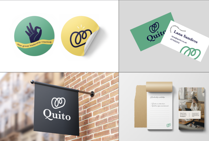
5. What Sections to Include: What sections to do actually include in your pitch deck? I think most of us include some combination of
showing the logo, showing typography,
showing colors. But I thought I would
take you through what my pitch deck looks like as a way for you to understand the sections
that I include and why, and that can help reflect what you would like to put in
your own presentation. I think for me the
goal is to really show how the brand is going
to practically work. It's really nice
to have this idea how everything belongs
together with a concept and having the beautiful colors and topography is great. But actually the section of those very basic
functional things, should be the smallest section. If we show the logo in black
and white, that's great. But we also want to show how is it practically
going to be used if, let's say it's a responsive logo where can change
to different sizes or different configurations
for different formats. We need to show
examples of that. How is that practically
going to be applied? We also need to show, let's say how it's going
to work on social media, or how it's going to work in their merchandise or on a truck. Here, it's really
important to choose examples that are relevant to your specific clients business. Just to take you through
all the different sections. My sections are showing the
logo and black and whites. Here we're really
just presenting what the logo will look like, how it looks in
different configurations and making sure that it
looks really good on both black and white. Next up I showed those
logo variations. Do you have an icon? Does it look good
on social media? How is it going to be used in
these different use cases? Next up, I'd like to show colors and I quite like to do
this in action as well. You can show all the
different colors and you can put the hex code or Pantone codes or
whatever is going to work best for your client. But I also like to show examples and especially showing
color combinations because most of the time when you're presenting
colors to clients, if we just show here
are five colors and you don't give any
hierarchy to them. You don't explain how to use those colors becomes
really difficult. In a lot of the
brands that I design, I have one main
brand color that is usually a little bit
more colorful or bright. Then I have one
complimentary color that's usually a lighter color, that can work as backgrounds, that can work as accents. Then I have a darker color that can be used as, let's say, footers on a website or when you need it to be a
little bit more toned down. Then for some brands
that need more color, I add other accent colors
that can be used for text or for textboxes or
something interesting like that. Showing your client not
only what the colors are, but how they actually work in context is really important. Next up is topography. Here we're trying to again
show an understanding of these are the
different typefaces and we chose them
for this reason. But also how they're being
used in different contexts. Let's say we're using one
typeface for the titles. How's it work for subtitles? What difference and
point size do we need to have to have that
contrast be really clear? Everything we're showing in this brand presentation is helping us implement
this brand later, create the brand guide and
making sure that we're really showing your clients
the work that's gone into your thinking process, and to help them understand
how this brand is going to actually
be very functional. Next up, I really
like to include photography style and
here's somewhere. For most brands,
I like to include photography style for people and photography style
for other things like maybe their products
or something where, let's say you have
notebooks and coffee cups or other situational photography
that isn't of people. You're really trying to
create a cohesive feeling. Of course, if your client has a budget to take
their own photos, they can use this
mood board of photos as a way to reference those
and create that style or when they're taking
their own pictures. But if they're not, then these could be
pictures that you're suggesting they would
use on their website, for example that you use
from stock photo sites. Next up, I like to include, I would call this category like illustrations slash
icon slash patterns. This can be definitely
more than one pages and they're really
depends on the client. Sometimes we create
custom icon sets and we want to show that and how that style
is going to work with the rest of the brand. Sometimes it's just
little accents or patterns or
things like create a more interesting look
for the brand overall and really contributes to the
visual language as a whole. My next category in my presentation is
digital applications. Again, this can be
however many slides you feel is appropriate
depending on the brand. It's a very digital brand
you might want to show, let's say how their Instagram
profile is going to work, how their YouTube channel
is going to work, how website applications work. Or maybe they have
an app that you need to show how the icon is going to stand out against other icons on people's phones, for example. Here you're really
trying to just showcase how the brand is going
to work practically. That takes us to
the next section, which is the more physical
or merchandise section. How much you intrude here again, really depends on
this type of brands. If, let's say there's a
food delivery company, you might want to
put t-shirts or outfits that their
servers would have. You might want to have
a delivery box design or you might want
to put on a truck and even if your client
hasn't asked for this, of course, we have
to think about how much work we put into this. We don't want to
overextend ourselves so that we have scope creep, or don't actually get
paid for the work we do. But it can also be a really
good way for you to show the extensive work
that you could do. A bit of a way to
upset and show. Actually, we could work on a really cold truck design or we could work on
t-shirt design even if that wasn't in
the original brief, because it's something
you can encourage them to hire you for after this. The last step is to just repeat this whole exact structure
where the exact same markups, the exact same examples
of structures. But just put this
for each concept. However, many
concepts you choose to have is really up to you. Some people really like
to just have one concept. You put all your effort into it. This can be a really
great way to avoid your client creating
Franken concepts. If you've ever had
a presentation where you pitch things and then your client really loved
things from two concepts and they tried to
put them together. That can be really tricky, especially if the concepts
are vastly different. This can be a really great way. If you've done a lot of
discovery, a lot of research, you really narrow down the exact type of brand
that your clients need before you start
concepting process. I like to present three concepts because I like my clients to be able to say no to something without saying yes
to another one. Here, having three concepts usually means that they
can pick one that is just not right for them and then we can
start getting into looking at what's most appropriate
between the other two. I prefer to have three. Some people like to have one, some people have way more. This is something where
you have to balance, again, how much work you put in and seeing what feedback
you get when you present one concept versus
multiple concepts.
6. Finding Mockups: As you probably
noticed at this time, having really good mockups that really represent
your client's business, is going to help you pitch your concepts in a
more compelling way. I wanted to just
share a few places that I like to go for
really good mockups. The main place I go, because I have a
yearly subscription, which I think is a
really good choice, is Envato Elements. Here you have all
stock photography that you can use for
your running projects. You also have assets like icon
sets and things like that. But their mockup
templates are really good and so you can find things
like business card mockups, you can find food truck mockups. Basically anything
that you would need, you can find here, and you can edit them
yourself in Photoshop. Another really great place
is Creative Markets, and they tend to have
really beautiful mockups that you can pay for each one. Or you can also have
a membership there where you get a discount
on each purchase. Another one I want to
bring up is Yellow Images. Yellow Images they have
everything from 3D P and Ds where you
can use, let's say, a tomato that you
can rotate in 3D or find different angles from, two really beautiful mockups
that you can custom make. The really great thing
with Yellow Images is that you can actually request
specific mockups. Let's say your client has
a very specific packaging, so like a bottle that you don't find as a traditional mockup, you can send a picture
of that bottle with specifications to Yellow Images, and they can create a specific custom mockup
just for your products. The last place I want to
mention is Graphic Pear, and this is a place where
you get a one-off license, and then you have access
to their whole libraries. This is one where I
joined a long time ago, but I can always go back and find new products
that they added, and new mockups to choose from.
7. Explaining Your Work: Now that we have all of
the preparation work done and we have a pitch deck that we're
going to be presenting, it's time to think about how to explain the
work that you've done. Now the structure of the template does help
a little bit because we have a clear step-by-step
presentation to go through. It's nice to have that to
hang your thoughts up on. I think the really
important thing here is not to show a slide and
let it hang there. What we want to do is to, in a very calm manner where
we're not trying to talk over our client or not
give them space to think, but because they're waiting with their feedback until the end, we can present a
slide and we can calmly explain our thinking
process behind it. Let's say we want to present the logo and we want to talk
about how it's this path that is taken that is really flexible and how that fits with the brand of inclusion and having different
experiences at work. Now all we have to do is
explain a little bit, again, I'm going back to the brief and saying this
is the audience, this is our thinking
process, and this is why this logo will be flexible and
work in different formats. You could say this
logo is going to work horizontally
in this manner, which is great for applications on
letterheads, for example. While this application
where it's stacked works really well in smaller formats where you still need the name. Then you have the icon which
can be used for social media or other applications where you just need that little thumbnail. Little explanations like
this where you have a motivation that
you connect back to the concept of the brand is going to be really powerful for helping your clients
see that through line of the concept and how
it all belongs together. My suggestion is to have maybe 2-5 sentences that you've prepared that you're
going to be saying roughly. Of course, you don't need to
read these off of a paper, but just having an idea of what you're going to be saying
for each slide so that you're telling the
story of the brand through the presentation and the experience to your client.
8. Avoiding Revisions: [MUSIC] You're
presenting your work and you want to make sure that it's easy for
your clients to make the right
decision for them. Now, there's a couple of
things I think we can do to help make this process easier for our
clients and make sure we avoid a lot of revisions. The very first thing is, as we mentioned before, to just have the exact
team structure and the exact same mock-ups
for each concept. This makes it so much easier to compare for your clients, and you're probably going to have to go back
and forth through the presentation
a couple of times because as you've shown all
the different examples, they're going to need to go
back and refer to things to see how they feel
about it now that they've seen the whole picture. That takes us to the next step, which is to have a
comparison slide at the end. You can either just put, let's say you're
presenting three concepts. You can put three
different logos, and that way they
can refer back, and remember right
that concept was the first one where we looked
at this style of logo, then we have this
one and so forth. Or, you could put one mock-up that really represents that
whole brand style. Maybe you can see the
colors and the layout and the logo altogether
in one mock-up, and that can be a really great
way of doing it as well. Let's talk about how
to address feedback. The very first thing we want do is to start talking
about the positives. Ask your client which direction they thought felt the
most right to them. This is one of those situations
where we're really trying to guide our customers and
our clients through this. They might start picking
up individual things that they're really liking
about different concepts. Especially if you have more
than one person in the room, it might sound something like, I really like the
logo of Concept 2, I felt like the colors
were better in Concept 3, and you can start
to look for trends. Your job right now is
to help listen and compile that into some
direction or conclusion. Let's say you're listening in, and you're hearing that overall they like
Direction 2 the best. But there are a few
things about Concept 3 that they just really
are in love with. Now, we want to try to get to the bottom of why they
really love those things in Concept 3 and find a
way to incorporate or address that in Concept 2
which is the main direction. What you can say is, I'm listening to you and
I'm hearing that Concept 2 feels like the most
right direction for you. But I'm also hearing that these things in Concept
3 are interesting. How about we try to address them in this way in Concept 2. This is a way to show
that you've heard them, you've understood
their feedback, and you're making a suggestion. Now sometimes they say, oh, that wasn't why I
liked Concept 3, I liked it for this reason, which is great because
then you're getting valuable information
that you can use to create a new strategy for how to bake those
things into Concept 2. We really do need to ask
about very specific things, so if they don't like something, try to get to the bottom of why sometimes a client really
dislikes a whole mock-up, for example, maybe because
they just don't use hats or maybe because they
don't like the blue color, and so there could be so
many other things that they like about that picture
with that example, but we have to get to the bottom of why it's not appropriate. I also want to say that as much as we are
experts in what we do, clients are also experts at their business and what's
going to work for them. We really do want
to listen and take concerns that a client
has very seriously. We want to make sure
that we're showing them, that we've heard them
and that we find a way to address those things
before we move forward.
9. If You Miss the Mark: [MUSIC] Let's say you
completely missed the mark. They really didn't like
any of the concepts fully, none of them felt
completely right, and you're feeling really disheartened and a bit nervous
about what to say next. This can happen, but
it's very seldom, so I wouldn't stress
too much about it. If you have done
discovery with a client, if you have done
research and you talked about mood boards
and different directions, very rarely do concepts
all completely fail. I would just say it's
good to be prepared, so that you know how
to move forward. If you get a complete
like this isn't working, we're not feeling it, then what we want to do is to really start getting specific. We want to talk about
each concept and say, was there something
that you did like, even though you might not
approve of the full concept. Maybe you've really liked
the photography style, or maybe actually the direction of the layout is
really interesting. We can start to get these
things that are positives that both get our clients more interested in
the project again, but also a way for us to start
seeing how their mind is working around it and why they might say
it's not a good fit. That's the first step to look
at the different positives and figure out what it is that
we can use moving forward. The next step is to figure out the main reasons that
they don't think it works. Maybe they feel like
it's too young. Maybe they feel like it's
going to be impractical, something like that
or maybe we've missed something in our discovery that is actually really crucial. Let's say they actually can't re-brand the restaurant color, so they actually
need the color to be the original
color to save money. That is something that if you miss that in your discovery, it's going to greatly impact
how they see the concepts. Getting to the bottom
of these things of what's working
and what's not, it's going to help us make a clear path forward
for our clients and show them that we have an idea of what to do next
in the concepting phase.
10. Wrapping Up the Meeting: It's time to wrap
up the meeting. Now, our clients are
probably a little bit tired and they've taken
in a lot of information. They might be super
excited about the work and they might just feel they need a moment to take it all in. Our job as creatives who
are presenting this work is now to give a quick summary
of what we have decided. Let's say our summary is, this was super exciting, thank you guys for coming, we have decided we're
going to move on with Concept 2 over all. We're going to make changes to the typography and we're
going to create a little bit of a more pastel color palette just to work a little bit more
with your younger audience. On top of suggesting
the path forward, we also want to
suggest a timeline. Let's say your client wants to go home and have to think about the concepts and see if they
have any further feedback, make sure you give them
a timeline for when they need to come back
with that feedback to you. In the same way, if you are making changes to the concepts, give them a timeline for when
to expect your new version. For this new version, when you're just
making tiny tweaks, I think it's totally
enough to actually send that presentation as a PDF because you've already
agreed on all of the overarching themes and that can save you a bit of time. I think it's also a good idea to explain all of the different
steps that come after this. Let's say your work is to make a few iterations and
then after that you're going to be putting together
the brand guidelines, export all of the files, and share it with them so that
they can start using them. This is a good
thing to explain to your clients so that
they are really clear on exactly when they're
going to have their finished brand and how they're going to
be able to use it. It also helps them
prepare to make your payment and anything else that they need to
wrap up the project.
11. Thank You & Class Project: [MUSIC] I really hope you
thought this was helpful. Presenting work to clients is one of those things
that you just get, more and more comfortable
with and especially with branding projects because you always have the same
sections more or less, you start getting really good at knowing what questions
that are going to pop up, and how to address them
both in your text, your images, and the way
that you present the work. I have added a PDF with my own presentation
template down in the description so you can go and have a look at that, and use it as a reference. Then you want to create
your own branded one that reflects your brand, and the sections
that you'd like to include in your own
branding process. Don't forget to share
your class project so we can help each other, and give each other feedback, and you can both show
the finished work or in-progress pictures
or questions that you have along the way. You can also join
the discussions to see how we can help
each other out, and make sure that we're
feeling really comfortable, and excited about
presenting work to clients. Thank you again for watching, I'm so excited to see
everything you create. Super good luck
with your projects.
 Malin Lernhammar, Designer and teacher