Transcripts
1. Class intro - welcome!: Hi and welcome to the Skillshare class on how to create your very own custom wordmark using kinda. A wordmark is a logo for your business that only contains the name of your company. This is really common for lots of big brands, and it's a great way to build personality without having to create an icon for your brand. The style of typeface that you use, the way that you customize your wordmark is all going to give a different impression. So that's what we're going to be looking at. So you can create something that is really customer and really unique for your business. And that evokes the feeling that you want to create. The purpose of a logo is to work as identification. So rather than trying to communicate a lot through your logo itself, you want it to just create that right feeling and emotional attachment with your customers so that they can right away realize and understand exactly what industry you're in, the kind of brand and values that you stand for. And it's like a shorthand for your business. A really nice custom wordmark is also going to be a great way to be more memorable. So when people see your wordmark, there'll be able to associate it with your brand and able to connect it with your marketing and help you sell more in the future. In this class, we're gonna go through three different stages. The first one is we're going to be picking the right typeface and looking at the types of typefaces that create different emotional connections. Second up, we're going to look at how to customize that word mark to create that exact emotion that you want to look. And thirdly, we're going to add your slogan or other details that make your mark even more custom and that makes it more flexible for your business. At the end of the course, you're going to have your very own custom wordmark. This course is for beginners who are looking to use Canva to create their wordmark. Or for designers who want to polish up a little bit on their basics of creating really beautiful and functional word marks.
2. Gathering inspiration: The first thing we wanna do before we actually start designing anything is to think about the emotion that we want over and mark to evoke. And this is essentially trying to think about your brand's personality. And thinking about how we can translate that into an actual wordmark and a design for your business. And to do this, we're going to be using sliding scales that have two opposite words on each end. You can download this sliding scale document and mark for yourself where your businesses on each of the sliding scales. And this is going to help us when we go into the next step, which is inspiration. If you feel like some of the word couples are not quite working for you, you can just jot down notes and think about stuff that you would write instead. So if you feel like, you know, let's say friendly and professional, like, oh, we want to be both of those, that's totally fine. And you can write that down as a note that you want to keep in mind. So these sliding scales are purely a sense of inspiration and getting started. But we really want to think about the personality. So if you have other ideas, that's just really good. So the next thing we wanna do is think about inspiration and finding inspiration from outside of ourselves. And so this can mean visiting websites, looking at books, taking a walk and taking pictures of, Let's say, signage or logo types that you see around you. And the goal here is to find examples of word marks from, let's say, your competition. Businesses that have the same target audience, the same type of customers, and things that I'll generally just feel inspiring to you. And once you have a couple of different pictures that you like, I would say maybe at least five and maybe maximum 20. That's like a good range for you to get inspiration, but don't get overwhelmed with too much stuff to analyze. And then for each of these pictures, write down why you pick the picture. What was it that attracted you to it? What inspired you? And what way did the logo type communicate a specific feeling? And there's no right and wrong answers, just whatever you felt from seeing this picture. And then if this logo type gave you any specific inspiration that you want to bring with you when you're designing your own wordmark. Once we have all this inspiration and this foundation made, then we're gonna move into picking a typeface for our business logo. So that's going to be the next step.
3. Picking your typeface: The next step to creating your custom wordmark is to pick the right typeface. And this is a very important step that we want to take our time with. A typeface is just another word to say it, the style of the letters. So some of them can invoke a very nostalgic feeling, a very traditional feeling. And some of them might be very modern or very energetic and very high-end or very fun and playful. So let's have a look at some examples so that it'll be easier for you to pick one that's right for you. So just to get started and see the different types of typefaces that exists, I wanted to show you some different examples. So if you go here to the menu, you have text and we're just going to phase. Okay? So the first thing I want to show you is the difference between something called a serif font and a Sans Serif font. So if we go, we can have, for example, this one. And then we can do, Let's go for Baskerville. It's always a good choice. Okay, so let's zoom in a little bit here. So this one at the top is called a sans-serif, and the one at the bottom is called a serif. And the only difference here of these two categories of typefaces is that the serif one halfs the little endings. So you see that there's almost like a little bit of a extra flourish at the end of the letters. And if you compare that to the top one, it does not have that. So the sans-serif typefaces are typically used by more modern feeling companies and some who wants to feel very friendly and sort of up to date. If you're looking at the serif fonts, it usually shows a little bit more heritage, history, maybe more of a kind of curated feeling. And so dependent on what type of typeface that you're looking for and the kind of feeling that you want to create. These are the two categories that you want to be having a look at. And they can have so much personality just between different ones as well. So I wanted to show you some so we can keep these ones here. They can also be really, really characteristically different ones, like let's say this one. So here the typeface already comes with so much personality. And this feels a little bit seventies. It has a historic vibe to it. It's not like a traditional vibe. So the type of typeface that you pick is going to have a really big impact on the feeling that you created with your logo. A key thing that we want to keep in mind when we're picking our typeface is that we want something that will not only communicate the emotions of our business, but we also wanted to feel quite timeless. So if we pick something that has very, very out there characteristics or let's say like this one that has a very sort of either a specific sugar to it. Unless you're like a seventies clothing shop at it might not be the best choice. So what we wanna do is have a look at sort of tried and tested options to make it a little bit easier to pick. You can of course, just go crazy and explore the ones that you feel are absolutely Westfield business. But I'm gonna give you some options of ones that designers tend to gravitate towards because we have seen that they stand the test of time and we've seen that they're super flexible. They are readable at small sizes, which is super important. They are easy to convert into, let's say, how they work with other texts that you might be having on your websites. And they work well in different settings, both print and online. And they are easy to feel like we mentioned. So I'm gonna give you a list of the ones that are my opposite of top favorites. And if you want to pick from those for that, otherwise, go explore. All you have to do to check out the different type physics and Canva is just to select them those type. Click the type itself, and then up here you'll have all the different options. So move my selection. You can see that you have different options for Xavier and how something more handwriting it you creating something that wants to feel very personal. And you've got headings, paragraphs that are more neutral fonts. And you've got these categories, san-serif and says. So you can start exploring a little bit here to see the types of fonts that you think will work best. And honestly the best solution to this. And this is why there's a joke that designers spent half of that time looking at fonts. We really spend a lot of time picking the right feeling of typeface. So don't feel like you'd have to rush into picking the first one that you see. Write out your business name and try it in a minimal style, dry it in a more ornate form and see what works best for you. There's so many options and even in the same category, like you see, these are both classified as minimalist. They still have so much different character. So you kinda have to find the one that really resonates with you for the type of emotion that you want to communicate. So to make it a little bit easier for you to find a typeface that's going to work really well. And that's going to fulfill those criteria that we're looking for. And I've put together a list of my absolute go to Options. And I've tried to include as many different types of typefaces as possible. So you've got serifs, sans serifs. You've got some scripts in there. Everything from Montserrat being this very friendly modern typeface, to Bodoni moda being more of a high-end fashion typeface. And so there's lots of different options in there to create the right feeling for you. My suggestion is that you start off by testing out these ones and get an idea for which type of typeface is going to work best. And what we're gonna do in the next video is going to be customizing it. So we're going to do lots of different treatments to create slightly different emotions with the typeface as well. So you don't have to find something that is the absolute perfect, but something that's a good starting point. And if you feel like the ones that you have here on the list aren't working perfectly and see which one of them works the best and use that as a starting point to try to find something similar that is going to work really well.
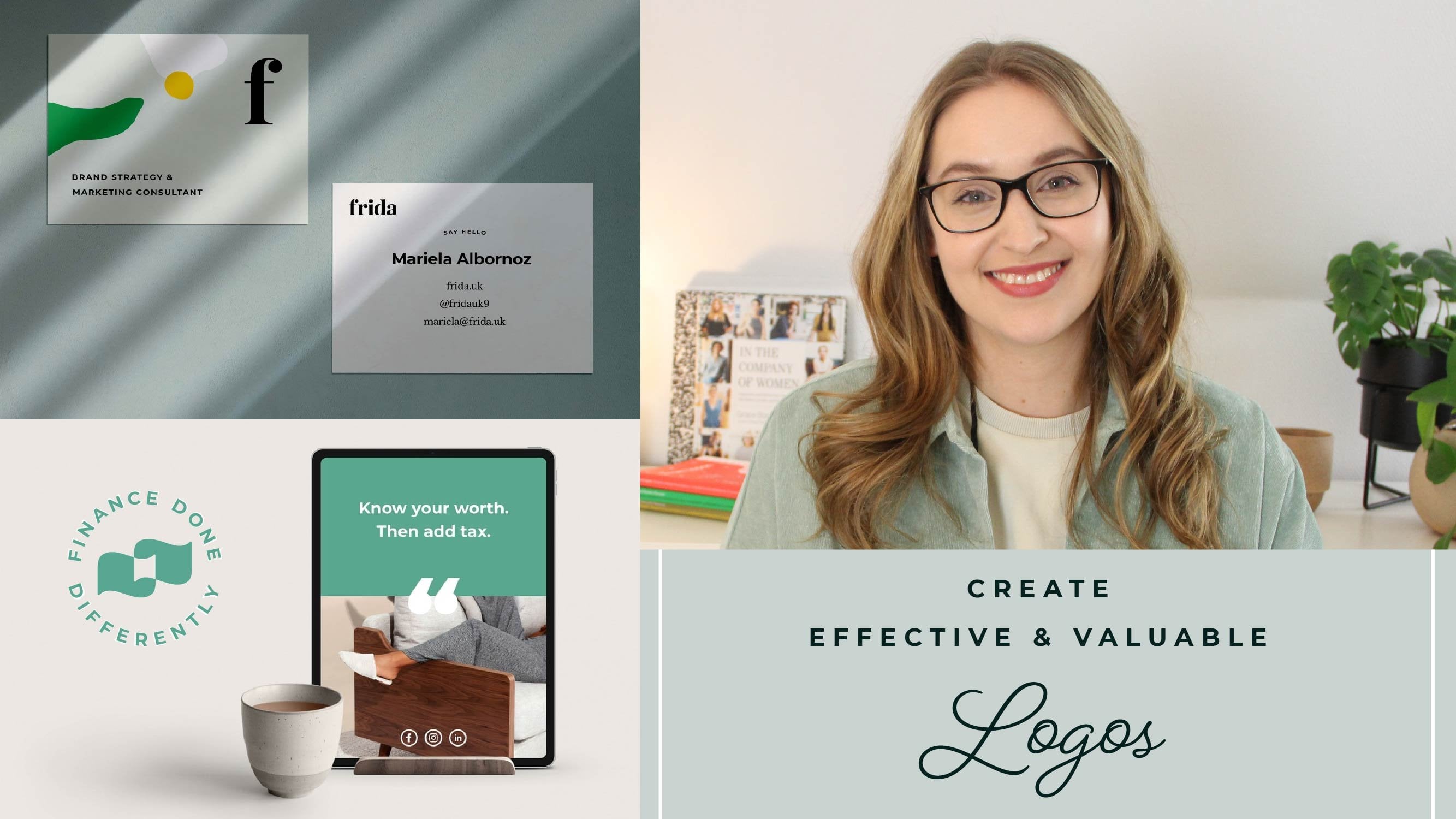
4. Customise your wordmark: Great, So now that we've picked our typeface, the next thing we wanna do is to customize it so that it goes from being a standard typeface to our actual wordmark. And does a couple of different ways that you can do that. And I'll show you all of them in Canva. So let's type out our business name. So here we have a typeface. I'm going to pick. Playfair is a nice one. Great. So here we have our typeface. So the first way that you can customize the typeface to fit your own needs is to make it either all caps, lowercase, or mixed case like we have right now. So an easy way to do that in Canvas is you can go to these three little dots here. And if you click this one here, it will make it uppercase. So you can have a look at how your wordmark works in uppercase and mixed case and all lowercase. And see if it creates a different feeling. Sometimes having all uppercase can make something feel a little bit more formal. So if you're feeling like you've found a typeface that you really like, but you want to make it a little bit more formal. That's something that I usually use as a bit of a trick. And the next thing we can do so we can undo, undo that one, is to have a look at the spacing between the letters. And this is called tracking. And the way to do that is you can click this little area here called the spacing. And you're interested in this one, the letter one. So if you tried this one, you'll see that the letters will be further apart. And sometimes creating a little bit of emptiness in our design can make it feel a little bit more high-end. So if you're doing something that feels a little bit more, perhaps on a higher end field, you want to create that sense of luxury than having a little bit more tracking and little bit more space between letters is a really good way to try to do that. I'm going to show you because I think this font, this type face, sorry, is actually a little bit difficult to see it with. But if we see, for example, this one, if we would be having a very, very narrow tracking compared to a very, very space stop tracking. And we get quite a different feeling. And if we would then make this all caps to create both a little bit more and a little bit more of that high-end feeling. I think you'll see that it looks really different from what we started with. So this is something that we can see in a lot of equity, high-end fashion brands. They have open all caps and lots of spacing between letters. And it's also something you can do if you want to add in more personality into other pieces of type and your brand. So if you don't want to use it for your word mark, you can always use it for titles or little sort of descriptions for packaging and stuff like that. But we can see that the amount of space we have between letters really. Big difference. And the next thing we want to look at is using a curve for our logo. And this is something that you can try to see if you'd like it, if you want to add a little bit more personality to your logo. And so all we have to do is connect the effects panel and then click. And it'll give you a very serious curve, which might be a little bit difficult to read. So I'm just going to take that down a little, maybe like that. And to make it a little bit less long, put together a little. Maybe make it bold. Okay, So you can try this out, see how it works. See if you feel like you want something that is going to have a little bit more playfulness to it, then I think a curve is somebody that can work pretty well. The last thing we wanna do in terms of customizing the actual wordmark is we can add bits or we can remove parts of the letters to create and maybe a little bit of shape inside of it. Or you can create something that adds more personality and a more custom field. So I'm going to get rid of these for now. So let's say, for example, that we are having a business called a honey. Okay? We would like to add a little drop inside of here. I'll be pretty fun, right? So I'm gonna make this, I'm sorry, I think I might make it a little bit thicker and go. Okay. There's actually lots of shapes that you can use from Canvas so you don't have to create your own. And if you click here and you just searched for drop, for example, there we go. And we have one. Great. So what I'm gonna do is I'm going to block out this bit here first so that the actual drop can be in white. And so what I'm gonna do is I'm just going to search for certain clot. And that's a little bit to pick k. And then I'm going to make that the same color as my text. And if we go like this, you'll see that the drop is behind everything now. And so you can either right-click and sometimes you can bring it forward, but if that doesn't work, then just pick them to the other elements and send them to the back. In a position is as good as we can. See. A little bit fidgety, sometimes. I'm going to change the color down. You'll see this is very iterative. You have to just try and feel your way through it. So that could be one way of customizing this wordmark to create a really sort of feeling that you've really thought about connecting the word mark with the mission and the purpose of the brand. And other way we could do it is by, let's say, removing or customizing letters. So if I'm copying this one, all you do is holding down Shift or Option on the Mac and dragging to duplicate of the good tip. So let's say I want to have the e here. And as three lines to kind of show the note, these are called like the one that you have, the Honeywell when you pick it up. And I don't think I'm going to attempt to well, that's called. So what I'm gonna do is I'm going to remove the e actually and the y because I want to control the spacing. And this is a good tip sometimes encounter while because you don't have control over individual spacing between letters when you're doing the method that we use to here, this is changing and for all the letters, sometimes you just have to make them as individual letters just to create exactly that impression that you want. And now we're going to create our three lines, museum rectangle. Okay? So let's make a little rectangle. And I'm going to use this each year as a reference so that we're getting, we have seen in a level that's better so that we're getting a roughly the same little fidgety. We'll get there. Okay. Something like that. It's not letting me quite do what I want. There we go. A little bit smaller. There we go. Okay. And I'm gonna, I know that on the E, If we see here this metal bars a little bit shorter. So I'll see if I want to do that or if I just want to make them all the same. So we could do this. And that's a way to create the customized wordmark. We're going to have a look at what it looks like. Yes, I think I would have to do it this way then. Maybe make all of it a little bit wider. Not agree. See, I think it's probably better if they're all the same lines. So we're going to try to go for that. We need to move that down and zoom out, see if it looks good. Great, okay, think of my map. So here too is that you can customize things so you can, like we mentioned, you can block things out, you can add details. You can, for example, if we wanted to take, we want to spin. This can have a look at the degrees there to make life a little easier phrase up, you can extend other letters. So let's say you would like this n to go up a little. I'm going to go a little bit closer. To do that. You just have to make sure that they're really matching. Okay? So there's so much stuff that you can do to customize your word mark. And it really is up to the feeling that you want to create. And I think my best advice would be to think about one concept and not over complicating things. So thinking about one way that you can bring personality and a little bit of character to your wordmark. There's nothing wrong with keeping it really classic because you can use other elements in your brand like colors or photography, or shapes or patterns to bring a lot more playfulness or character. So if you want your wordmark to be super clean and super classic, That's something that works really well and loss of brands do that as well. So thinking about if we're going to standardize a little bit using it in all caps and were mixed case and lowercase, the spacing between the letters, creating a curve in your wordmark or blocking out or adding bits to your logo that will make it a little bit more custom. So before we start adding the slow good and these other details, I wanted to share some examples of different word marks that I've designed to give you a bit more of an idea of the different things you can do and how you can apply these different customizing techniques that we've just looked at. So the first one that I'm going to talk about is 14, a brand called social foodies. It's a marketing agency that works with plant-based food brands. And the idea behind the brand was to create this feeling of being almost out of food festival. And it's very vibrant, it's healthy, it's energetic, but it still needs to be professional. So we picked a font that has a lot of energy, it has a lot of personality. But then we made some customizations. And so what we did was the first thing you can notice is the eyes. And so on top of the eye, we made a little bit of a slant by blocking out the top of the eye. We also place the dots with like a diamond shape to match more of the slab that we created in different areas. And lastly, we wanted the word social and foodies to be a little bit more integrated. So we cut off part of the top of the D and then we moved down the social. So that way it feels a lot more like they're integrating. And you have the opportunity of the eye and the D having the same thickness going through the line. So when you are designing your logo and you're looking at how to maybe integrate different words. Look for where there's a lot of open space and how you can sometimes close that gap and play with the space and the layout of the logo. The second example I want to show you is for a company called hidden tracks. This is a company that does podcast tours. And basically you can take a podcast tour and you can walk at your very own pace around the city. You can discover new parts of the areas of the city that you would have missed if you took typical like touristy tour. What we did here was we wanted this freedom of being able to play and pause and take the tours on your own time. So we actually used the idea of the play button to create the word hidden and tracks laid out together. I wanted to show you this one because it's one where actually the layout of the wordmark is doing basically everything in terms of creating this unique design. We haven't really customized much in the type itself, except a little bit of the spacing here and there to make sure that the hidden and tracks are matching up in the same kind of length. We were then also able to play with this concept. Create both the forward and backwards button, where you have Forward button and the backwards button, slightly differently customized word marks. I hope these examples are helpful and that it can help you see a little bit more the different opportunities that you can do for your own wordmark.
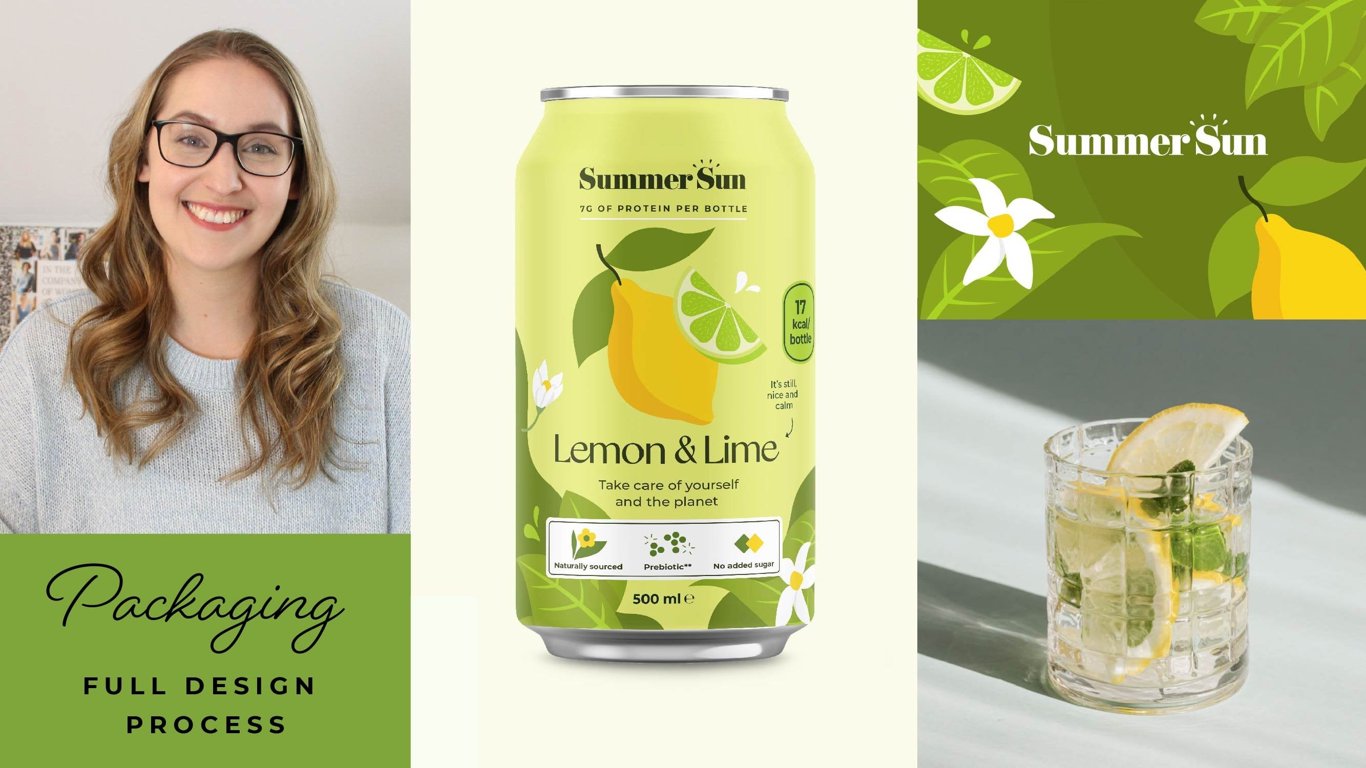
5. Adding slogans & details: Okay, so the last thing we wanna do is to add other details, like, let's say your slogan or maybe when you are established. And these details are going to make your logo a lot more flexible. So in some situations you might want to communicate, let's say the type of work that you do. So besides your business name, especially if it's not a super descriptive business name, it can be good to add something like a slogan or a tagline that describes or gives the reader or viewer or customer a good idea of exactly what it is that you offer. So to do that, we're going to have a look at some different types of layouts and tips and tricks that I like to use. So first we're just going to type out our logo. So we're gonna do a company that is a pop some plants type of shop. And as I'm going to pick the font for this, like Playfair for this, it's always a nice option. Okay, and we're gonna go a little bit bigger just so we see what we're working with. So like I mentioned, this is a company that SAS, Paltz and planters, things like that. And so we want to add that as a descriptive tagline. And so we can do it in a couple of different ways. The first thing we wanna do is to look at the word mark and see kind of opportunities spatially. And I'm going to show you what I mean by that. So let's add our tagline. So let's write out the terms. Okay, so I'm gonna make this in Montserrat. And we're going to make it a little bit smaller. And then we're going to make it all apps. We're going to use this spacing that we used before. Okay, I think we need to go a little bit smaller. So this brings us to our very first, which is you want to have hierarchy. So a very big contrast in difference between your slogan and your wordmark. You want to make sure that they're not competing for attention. So your word mark should be the main thing that people see. And therefore, and therefore, the Paulson planters in this case, your slogan should be much smaller. You can do this in lots of different ways. You know, if you have a very long slogan, you might want to put it on two lines, for example, and to have a little bit smaller. So now that we have our tagline or we can have a look at opportunities. So one option would be for me to put it in the space between the little P going down here and the end of the sentence. So that could look something like this, could even make it a little bigger. Maybe. Don't be afraid to experiment. Something like that. That's one option. So looking for opportunities and the same way we could do something similar in the space up here. So we have the space of the S coming up a little bit higher so we could make it up there. I personally think it makes more sense from a reading logic perspective to have it underneath the wordmark. So you're reading spruce and then Paulson planters. But it totally works either way because we have this rate of k hierarchy and that's Bruce is the core. And the thing that you want to read and pay attention to the most. Another way we can do it is to just put a little bit more space between our different design elements here. So we have the word mark and we have this slogan here. So if make this a little smaller, and then we put the a little bit further down like that. We could have it as simple as just stacking them. And I think in this case, because we have the P going down is a little bit more awkward. But if, let's say this would have been a different one. So let's say we had an OH, that's a little bit of an interesting name, but there you go. And you can see now that because we don't have this P going down competing and this type of layout works really nicely. So we can put this here, make a little bit of space for some more options. So, so far we've just been working with a type and I'm going to show you one way to do the type. One more wave, and then we're gonna go into some other details. So what we can do as well is we can use this effect that we had previously and the effects panel called curve. And I really liked this one because it's a way to get a little bit more copy in a smaller space and also brings a little bit of visual interests. So this way we can create something that feels a little bit interesting, something that feels a little bit custom and unique. Something that you want to pay attention to is the difference between something being like perfectly geometrically aligned and something being visually aligned or visually perfect. So in this case, you can see that I've put this right in the center of the wordmark. But because we have got this S going up here. To me visually, it looks like it's a little bit too much to the left. So you can test your way through here and see, for me it looks a little bit better like this. But you know, it's up to you to have a look and be the designer and pick what is going to work best. So I'm gonna put it here. I think I'm going to combine it and say something like custom. Add that in here. It's pretty nice. Okay? You can obviously add other elements. So if we want to add something like, you know, we had a drop before or we want to create something else that reminds us. So we can have this lots of illustrations. We can try that. Maybe there is one of the labs. Can try something. This is something where you, this is not going to be your core logo. But if you have something that you want to add as a decorative elements to your logo, what do you have specific use cases that something that you can test it out. So maybe something like this bug can twist it a little bit. And this way you're also sort of upsetting the the s a little bit hidden, changed the color of this if we wanted to make it, for example, and little bit of a lighter green, Let's just say, gee, color, maybe blue. Okay, so that's one way that you can work with adding details. Another option is to keep it super simple. Let's say it work the way we did it up here. But you can also add little lines or something else. If you feel like it's important that it's adding value somehow. The core here is not to add a lot of things, but to add things that give extra personality, extra information, or something that you feel is adding values. So let's say you were established 2020. Maybe you want to put that underneath here. And to fill up this space here, we can put a line. So this one is very large. You can make it a little bit smaller. And this is quite thick. So we can make this a little bit smaller. So let's say we want to have it maybe too. So that's another way of adding in some detail to adding lions or thinking about. The core thing that we want to think about is basically a shape that are wordmark is creating and looking for opportunities to make things more balanced with the elements that we're adding in. So if I would only be adding this for example, and I will be adding it. Okay, what's a random place? Maybe they're, perhaps this feels a little bit random. It doesn't really feel like you have a layout in mind or like a balanced geometry. I don't know what the right expression would be. But you want to think about the way that it appears and creating something that feels balanced and thoughtful. And so think about using shapes, lines, type in interesting ways. You can combine topography and lines, different options that you can combine to make your logo a little bit more custom.
6. Class project: Well done. Now it's your time to create your very own wordmark. I'm super excited to see what you create. And if you have any questions at all or if you just want to share your designs, you can go in the discussion tab, which is if you look underneath the video right down here, there'll be a little section called discussion, and you can ask your questions, share your designs, and we can all help out as a community to create some really nice custom word marks. Good luck with the project and I look forward to seeing your work.
 Malin Lernhammar, Designer and teacher