Transcripts
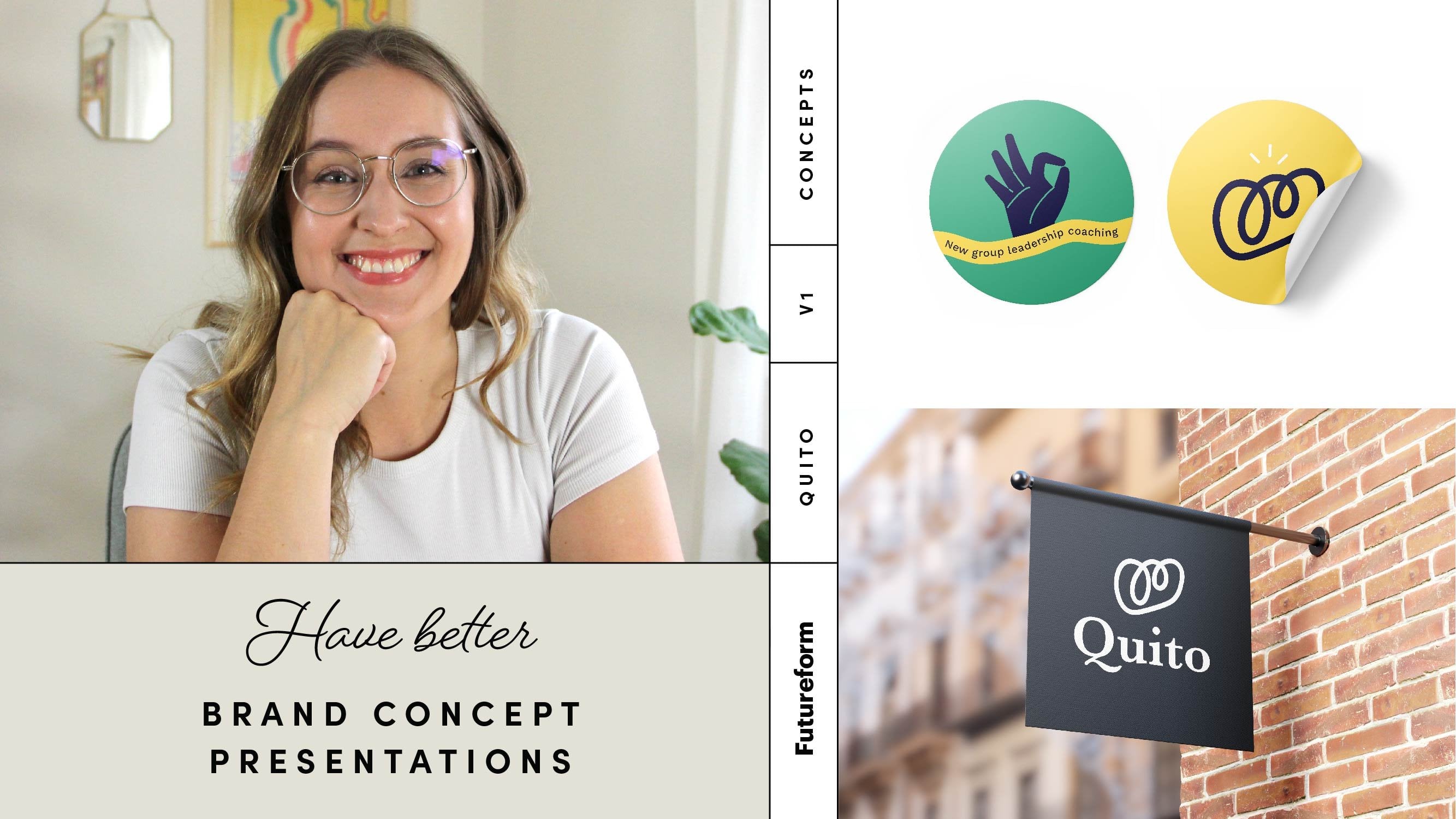
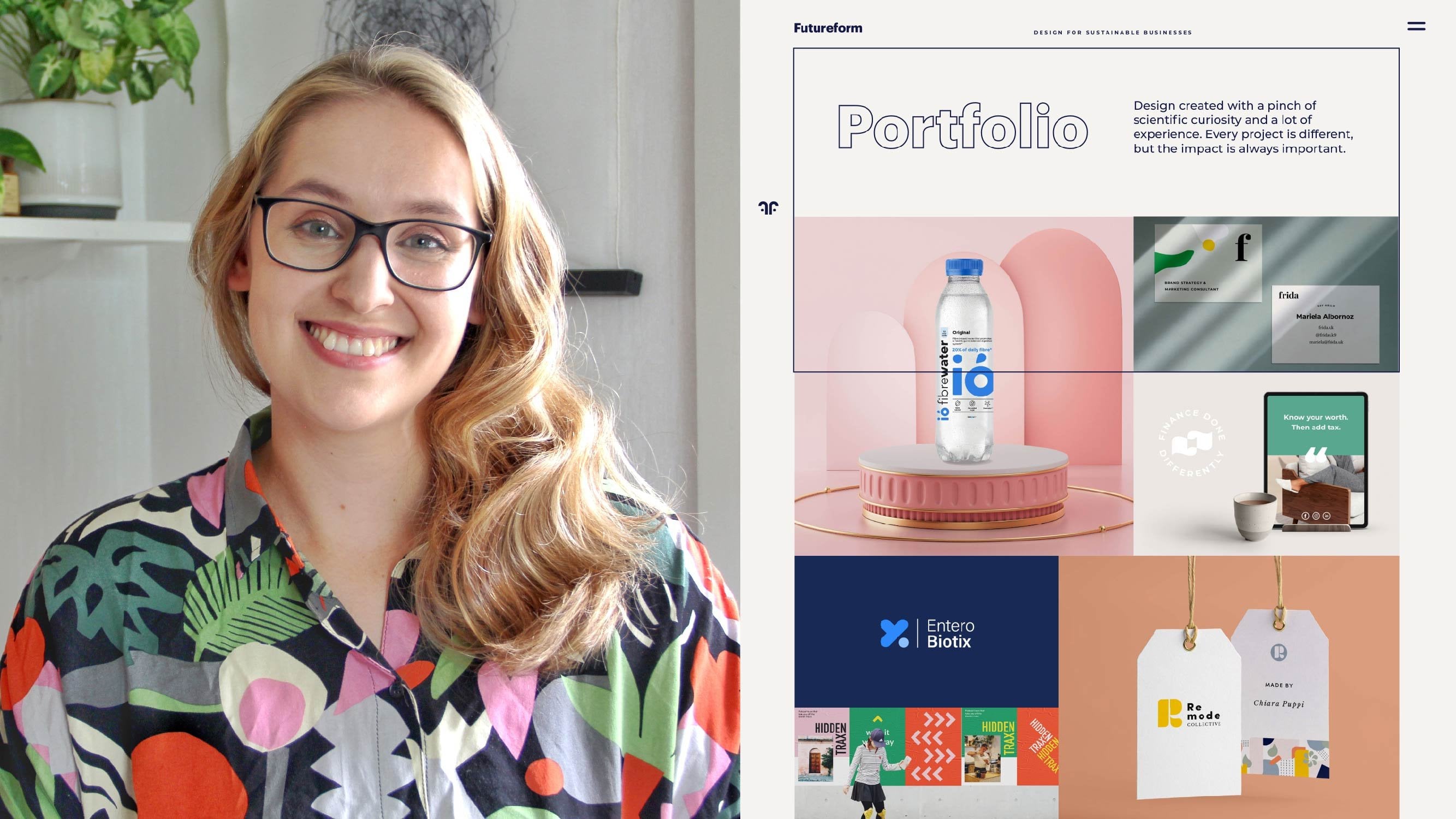
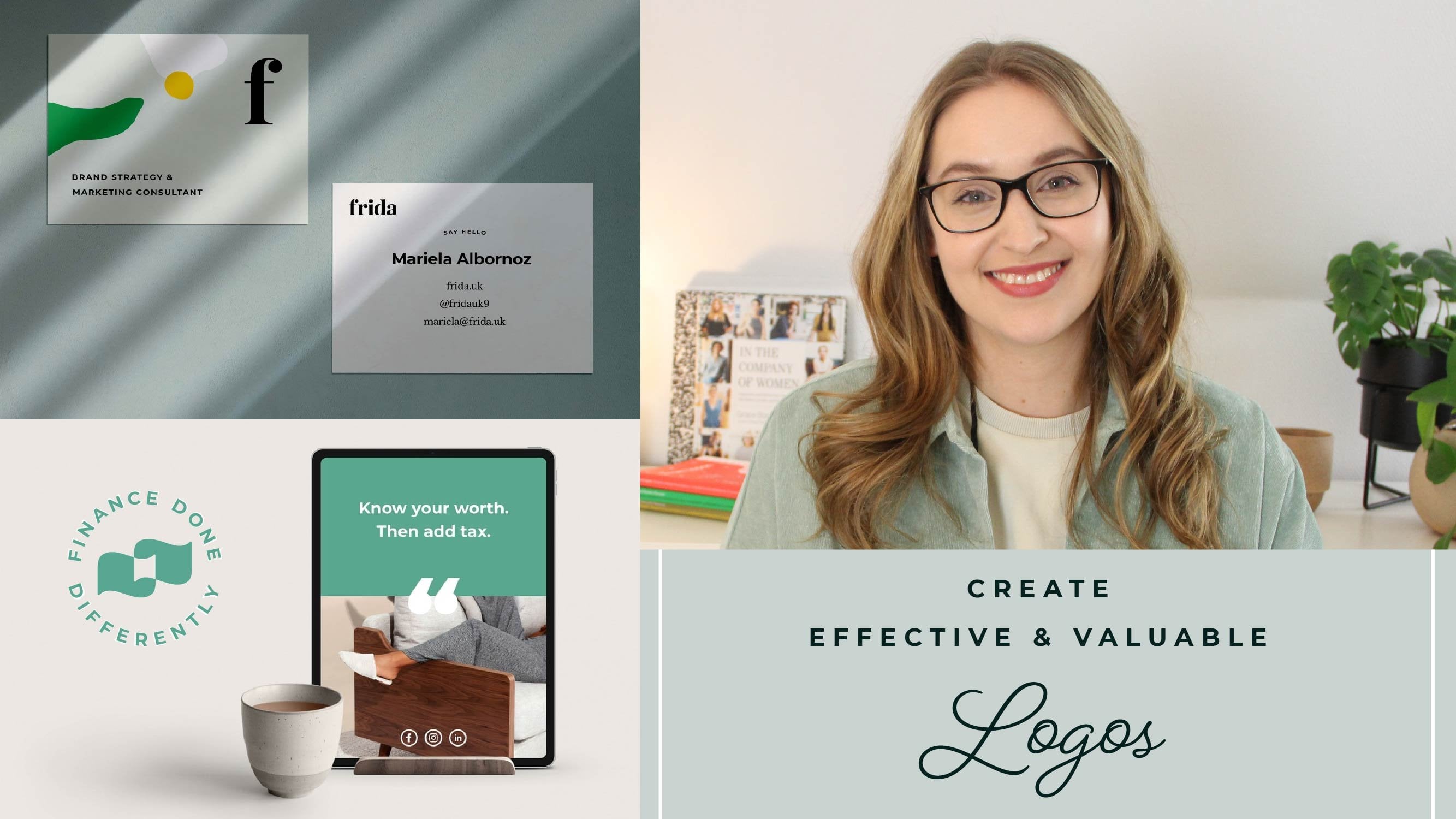
1. Class intro: Hi, I'm all in and I run a branding agency called Future for. I work with companies of all different sizes charities, universities, social enterprises. And one thing I noticed is that a lot of companies and startups they really care about creating a quality brand that will help them connect with their customers and have a really , really solid future. But they don't really have the money or the time to invest working with an agency. So that's why I decided to create this skill share course. When you're creating a brand, there are so many different things that you can consider. So I have distill it down so that we can focus on only the most important things that will move your brand forward and help you connect with your customers. All of the lessons, a structure to be very actionable on. We've even got a workbook that you can go down old. We can follow along and build your brand asked me go through the course. Throughout this process, we're gonna make sure that you get to know your customers, create your logo on visual language and also maybe, most importantly, that you learn how to use your brand once it's all finalized, This will help you build up ground awareness and really build that relationship with your customers over time. The class project for this course is to create a style guide, and a style guide is essentially a summary of your brand. Sudden comes really easy to use, and you can send it to anyone else who is, for example, building your websites or who was helping you build up around over time. I am here to help you and coach you through this cats. So please leave your comments and cast projects and ask any questions that you want and I will help you build your brown from scratch. In just seven days, I look forward to seeing in the chest.
2. Day 1: How are you helping your customers?: welcome to the skill share course where we're gonna be talking about creating your brand in just seven days. So before we start getting into all of the visual and designing your logo on visual language, really want to make sure that we create a strategy for your brand that's going to make sure that that design that you're creating in the end is actually gonna be appropriate and super effective over time. So when you think about branding, it's actually all about solving a problem for your customer and being able to communicate how your business does that to the different potential buyers or customers. When we think about solving that problem, it's actually, you know, it's not that practical. Most of the time it's usually actually something quite emotional. And so if we take an example, if you're buying a service from a personal trainer, you might think that the goal is to get fit and part of it is true. But most of the time it has more to do with the way that you want to see yourself. Maybe you want to feel more empowered, and so that's what we want to communicate to customers that they get as part of working with you. So the first thing that we want to do before we do anything else is to figure out, what is this problem that we're solving for our customers, and how are we going to explain to them how we're solving it? This will also create a really good benchmark to know if our Brown is successful or not. Because we can ask ourselves at the end of this process. Isn't solving the problem for our customers and our be communicating that effective? So the way they were going to identify this problem is by using sticky notes. So for 15 minutes, sit down and come up with this many problems. As you can think of for your business. These air open the reason that you decided to create the brand. But don't limit yourself to one answer just yet. Try to think about anything that's currently holding your business back, but keeping customer focused right each idea on a sticky note and put it on a table or on a white board. After the 15 minutes, take a look at all the notes and start to look for common threats. See if you can put the different notes into categories is totally okay to have some milk that don't quite fit into a category. The point of organizing the notes is to help you see if one type of problem keeps coming up . Once you've done this, I suggest you take a break. Go grab a drink or make sure your brain gets and rest before we continue. When you come back, take a look at all the notes. See which of the problems would have the biggest impact if it was solved. A really important thing to think about is that this gold over setting this big problem that we're solving it's not gonna be something that is a vanity metric. And a vanity metric is something that makes you feel better. So you want to solve it like I want to get a big social media following. But that might not necessarily help your business. So if you have proof that a big social media following has been leading to sales for you in the past, then you can put that as you go. But if it's just something that will make you feel better, we want put those aside and focus on things that really move the needle for your business. If you find it really difficult to know which of these things to focus on and which one is the best one, I just really just starting by removing the obvious ducts. So which one will probably not be most important and then work your way to words the most important one, because the goal now is to pick one goal that we want the brand to solve, and that is going to be our guiding light for the rest of the process.
3. Day 1: Set your business goals: So now that we've set a goal for what you want your brand to solve as a problem for your customers, we want to make sure that the brand that you create can also last over time because really want this process to be creating something that can become a legacy for you. Something that you can build up awareness over time and people will start to know you by your brat. And in order to do that, we need to know what your goals are. So we're going to start by just deciding what we want our business to look like in something like five years from now. I say something about five years because if you do like one year from now, it feels really close and really, really scared because we kind of know what we can accomplish in one year. But if you say in 20 years and anything is possible and so you become a little bit, it's too abstract. So think about five years from now, what do you want your business to accomplish? And I really suggest not making this up your financial goal because really want this to be that driving motivator that every time you come into the office, every time you sit down while your computer to work on something, regardless of how it's going, that's going to be that driving force, the motivator that gets you to keep working on your business, to make it a little bit easier to follow along in the school share course, I'm going to be creating a brand for a cafe called Borough. This is a completely fictional project, but it will go alongside all of the classes that were doing so that you can see an example . Project Burrows mission is to bring on open cafes in underserved areas of a city so that they can bring people money, energy into those underserved areas. And the other goal is to be able to offer free classes and training to people who need to re enter the job market or who have just arrived to the country. So in five years, their goal is to have three locations and be able to offer these free classes, and so that's just one example. But it's very concrete. Think it's something that they feel strongly about, and so you want to create something similar so what's your mission and what is a big audacious goal that you want to reach in five years? Write this down in a 1 to 2 sentences and this is going to be your mission statement. So this will essentially be the guiding light that we want to think about reflected in your whole brand and the whole communication strategy.
4. Day 2: Creating a persona and user journey: simper. So now that we know the goals of your business and the goals of your brand, we're going to be starting by really trying to understand our customers. And so what we want to do is it's really easy to think that you already know lots of things about your customers, and you kind of take those assumptions and you run with it. But what we really want to do is based this on fact. So you might have heard about something called a persona or an archetype or an avatar. So this is just a way to distill down the things that your customer cares about and create this kind of persona, this kind of template for what they care about so that you could always go back to it, refer to it and see if the choices that you're making in your business are serving your customers. The first step in this is to create the user journey, and the user journey is kind of like a superhero. Backstory is talking about struggles that your customers are going through, how the attempt to fix it, and eventually how they get to a solution have the ending in the end. And so we want to think about this from all the different ways that your customer could be interacting with your brand. And what we want to do is we want to map out how they're already trying to solve this problem. Because if we truly understand how they're already trying to fix it, then we'll be able to speak directly to them and offer them a better solution. And that is a great way to connect directly with your customers and show that your brand is a good fit for them to create a user journey. We're going to start by doing a little bit off brand research, and this is where we're gathering actual information and data rather than guessing. So we're gonna be looking at things like if you already have customers in a brand, we're gonna be looking at analytics from your websites. You're gonna want to look at your social media testimonials, comments. What are people already saying that they like, or that they don't like so much about the experience of working view or purchasing your product or service? If you're completely new, then you can just do this process for your competitors, so you can look at how your competitors describe their, their offer and how they're solving the problem. And if you have customers from before, you should still do it for your competitors, because understanding what your competitors are doing right and wrong, it will help you get sharper and better and even more appropriate for your customers. When you're doing your research and you're looking at websites, you're looking at social media and you're looking at feedback forums and things like review science for testimonials. You want to find out answers to four questions. The 1st 1 is what is the problem that they're trying to solve and how are they currently trying to salt? The 2nd 1 is, Why did they pick you or your competitors? So, for example, was it because the service was fast was because of price wasn't because they really, really liked you? Mission. All of these things are super important to understand because they can help us connect with customers. The next thing you want to do is you want to look at what they life and what they didn't like. So both the positive and the negative reviews and the last thing that you want to look at is things like demographics, and this is where most people focus all of their efforts. And so demographics is things like age or gender or location. So which country are they from? These things are important. But I think, and I would argue that understanding the emotional motivation for purchasing is much more important than knowing that someone is 24 to 35 for example, so it can begin to know, because you'll be able to, For example, pick which social Media platform is most effective if you know a bit more about their demographic, because we can find out where people of different demographic groups hang out online. But try to really focus your effort on this emotional problem solving aspect of things right? Everything that you find out down so that you have a little document with all of your different research and make sure that you can always refer back to it when you want to see if the choice is the right or the wrong decision for your company. That I said we're going to do is to actually spy a little bit on her competitors, and you can also use this for your own website to find out more about why people come to Europe outside. There's a lot of tools, like most, for example, and they help you put in any websites. And then you can just find out what cures their ranking for and what kind of different sites are linking to that website. Understanding what keywords people use to land on these different competitors websites for on your website, its exact reflection of how people are trying to solve the problem and what they care about . So if they're searching, for example, for hair dresser Ediborah, you know that it's a very practical decision and there may be just trying to find somewhere new. They're not super loyal to the exact one that they have. If they're finding someone who is like professional hairdresser, then you know that there's someone who's looking for high quality, for example, so looking at these different keywords is I mean, I will really help expose what people care about. Now that we have all this information, we're gonna put it all together in the user dirty, and this is so that people will feel really cared for each step of the way and feel like really creating a custom solution for them. So start by reading down all different ways that your customers could be finding out about you or interacting with your brand. So this could be, for example, on social media, on a website, hearing from a friend about your company or seeing an ad, for example. The next thing we're gonna do is we're gonna divide all these different ways people can interact with your brand into four stages. The 1st 1 is awareness. This is when they're just hearing about your company. They don't really have any understanding or what you do or what you offer, and it's just the first contact when they start to become aware of your business. The 2nd 1 is research. This is when they're really trying to find out if you're a good fit for them. The next one is saying so this is when they're trying to make that decision and they're actually buying something. They're actually giving you their email interacting with you in a meaningful way that adds value to your business, and the last one is relationship. So after someone has bought something that's not where it ends. You know, you probably want to sell them something different from to come back or for them to tell their friends, right? And so this is where we can build up that relationship. And it could be things like email nurturing through, you know, email blast. Or it can even be something like writing them personal messages, sending them a birthday message or offering them discounts at different seasons. In the worksheet, you'll find these different categories so you can fill out all the different ways people interact with your brand in those four different categories.
5. Day 3: Getting inspired - creating a mood board: amazing. Now you've created a whole strategy for your brand when we have a really clear vision moving forward. So now we're going to get into some really fun stuff, wishes, inspiration. And this is gonna for the kind of groundwork to get us inspired and get us to sketch ideas for our logo and visual language. And so we're going to do in this video is to create a mood board. And a mood board is just a collection of photos that you find in different places. They can have colors that you think are appropriate logo examples, photography styles that can be typography. So the style of text that you like and they can come from competitors and it can come from inspiration sites, and we're gonna be collecting all of it in one place. You could create humored board by printing images and create a really life board. But to make things easier for ourselves so we can always go back and have a look at our board, we will be using envisioned to create our mood board. Envision has a free plan. So once you've created your account, you can set up a new board by clicking the plus button select board. And now you can upload any images that you find directly from your computer. So you have everything in one place, we're gonna collect them in two different ways. The first way is we're gonna be finding a search term based on your specific business and is a super easy is just two words. The 1st 1 is a descriptor of the type of vibe and the type of feeling that you want you brown to convey. So for the caffeine over creating the brand for together borough, it might be cozy. For example, they might want to create a cozy vibe in the cafe, and the 2nd 1 is just simply your industry. So cozy Cafe could be Burrows example. But when you create this for yourself, free own brand and for the chest project of the Brown Style Guide, you want to think about what kind of words came up in your research, what to customers care about. Do the care body being professional about it being fun about it being friendly, and then just put that word together with your industry and so great places to go look for images are places like interest dribble. You can go look at social media platforms or competitors websites, for example, and you're just gonna save all those images in a full German computer. Or if you're using something that pinches, for example, you could just save them in a PIN board. The second way we want to find inspiration is a little bit more free form. And this is just to get your kind of creative juices flowing and thinking about things that excite you. And so and that, of course, excite your customers. So think about it from you could go to museums. You can look in design books you can look and you know, just different places on the Web that you think all this is a really cool photo or I love this logo. This is something I've been inspired by. Maybe it's a brand you've grown up word that you have a connection to so you can take your own photos out in the world. You can go take photos of, you know, a beautiful nature scene. If that is something that's gonna fit into your brand, anything where you want to create some sort of vibe and you just take a photo or collect the picture of it, and you put that into that same folder. So this is a way more freeform way of doing it. But both of them are important. Next up, we're gonna gather all of these photos together and organize them into an envisioned board , and that's gonna be our way of doing the mood. But once you have images that you think represent what you want your business to look like , Adam alter your envision board. I like to create different categories and my board, so you know that you have examples of logos, photography and any other categories that you think will be helpful. I suggest finding about 5 to 10 images for each category. That gives you enough to start seeing trends, but not enough to start feeling like it's overwhelming.
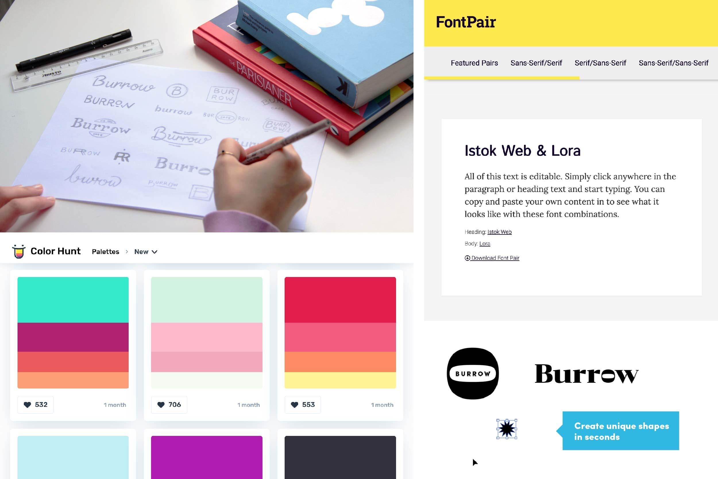
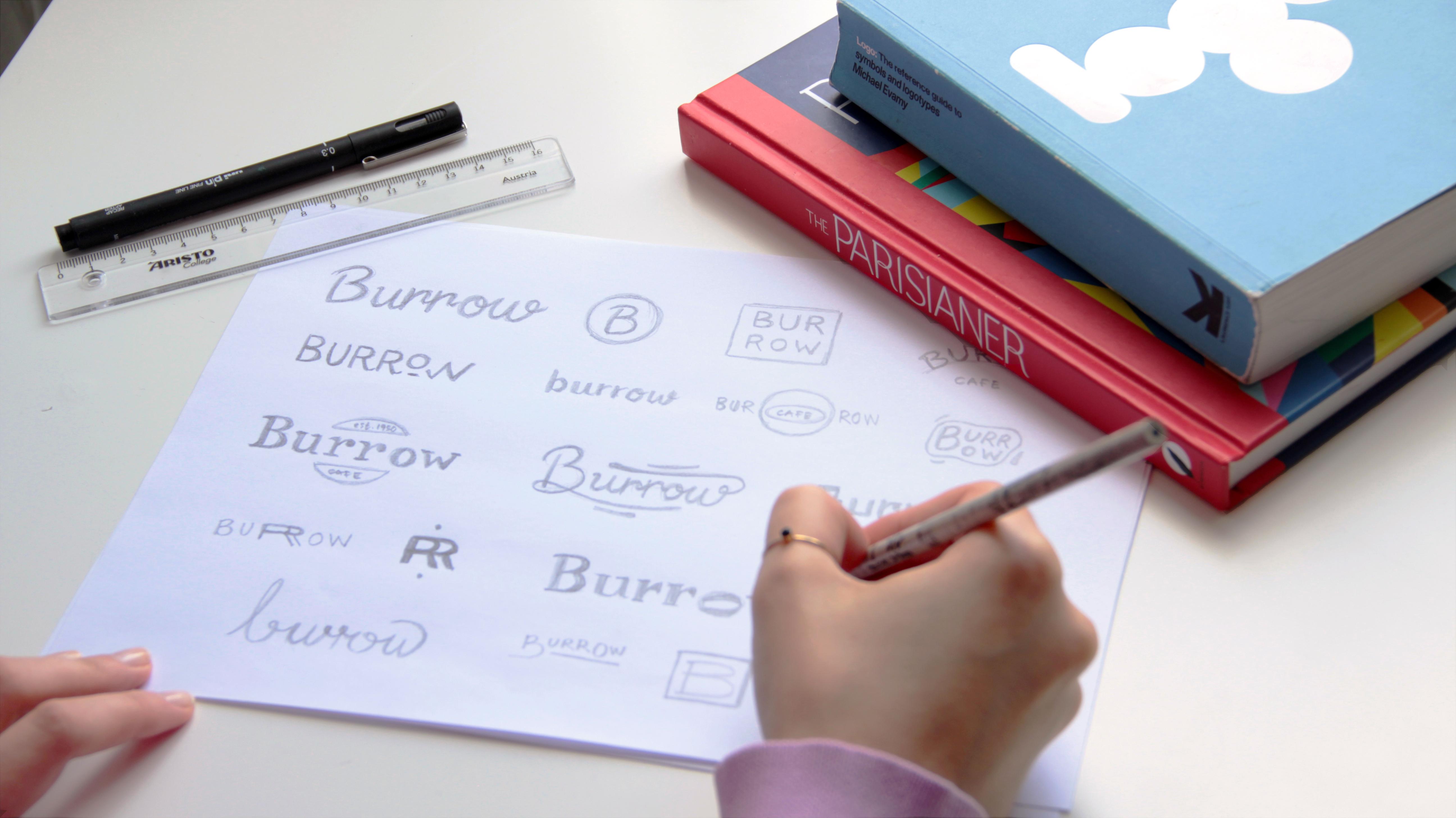
6. Day 4: Sketching your logo: Now that we have all this inspiration and are really clear Mood board, what we're going to be doing is creating sketches for our logo. So we're actually gonna be starting to design your own company logo. And the first thing we want to do is we want to keep in mind again the research and the things that our customers care about. So we're trying to put aside personal preference as and really think about what is going to do my business the most good keeping this in mind, open up your mood board and start to look through all of these different images that you collected. And don't you look for trends, for example, are all of them a little bit more ornate and detailed? Or maybe they're all very modern. Maybe you find that all of them have a blue color scheme or that, for example, you like things that feel very friendly. So try Just look for these trends and see how that fits in with your goal and your customers problem solving and desires. The first thing that you want to think about this if you're gonna be creating a word mark, which means your name your company names stylist. And if you're gonna want to create an icon to go with that So a Nikon is that little symbol that you often see brands use. And if you have a very long company name than having a symbol can be a really good solution . But it definitely is not something that you have to have. If you have a really short, iconic name that's really memorable, it can sometimes be stronger to just have your company name be the logo, what we're still going to be sketching, thinking about the styling of it and how you're going to be putting across the type of business that you have through your local. But we always want to start in black and whites, because if you're thinking about all the different ways that you logo could appear, you know it could be printed by someone else. It could be on a legal document. You want to make sure that it's going to work in black and whites, and the color isn't an integral part that you know, if you put in front of black and white, it will no longer work. So always start in black and white, and that's what we're going to start with. Pencil sketches. So start by just taking pen and paper and sketch some ideas. These can be writing at your company name, drawing ideas for icons or writing down words that describe what you want the local to look like. Try to create at least 20 different local sketches on Don't worry too much about the idea being good or making it perfect. This is all about helping our brains have more ideas. So once you have those initial sketches, take a break. It's so easy to get stuck in, and I can tell you how many times I've been staring at the same icon and the same, you know, tweaking little versions of it for so long. So make sure that once you create a bunch of sketches that you like, take a break, step away from them, if you can for no half a day a day, just to give them some space to breathe and for your mind to relax and see them in a new lights once you come back, look at all the different sketches that you made and start to look for things that are working, and things are perhaps not working things like, Do they work in a really small scale? Is it something that is giving off the rights vibe of your company isn't appropriate for your industry and start to pick out your favorites among your different sketches. Once you pick maybe 3 to 5 different options that you really like, try to make it orations to them, try to make little changes that could make them better. Like, could you put, you know different sizes of things? Or do you need to refine some of the letters? Do you need to make some of the shapes a little bit more prominent? Or do you need to make sure that the shape looks better out of smaller size? So trying to make those different changes and see how it could improve your design When you're finally happy with your read your sketches, pick the one that you like the best and make any final tweaks to it. Once we have this final sketch, that is the sketch of your logo. But of course, a sketch on the paper is not going to work digitally. So in the next video we're going to be looking at how to take your sketch and putting it into a laptop computer and creating a digital version.
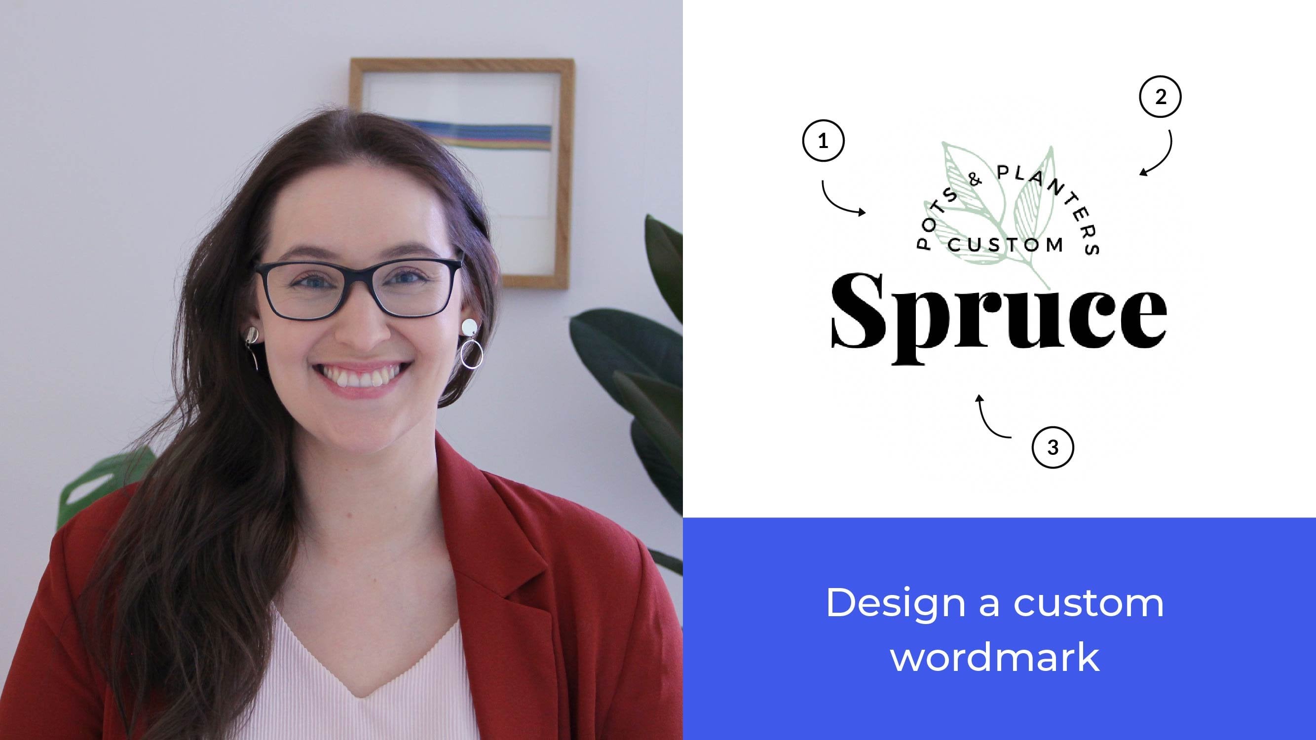
7. Day 5: Using Canva to create a digital version of your logo: Okay, so let's start to look at how we can create a digital version off the logo that you sketched in camera. So Camba is a free design tool online and has lots of great different ways that you can design your logo. So what we're gonna do is we're going to start by just going to their websites, and we're gonna just start looking for a preset logo file. Now, they have lots of different pre settings, and it will give you lots of suggestions. So you can see here will give me lots of things. The problem with just selecting one of these is, of course, that it's temperance. So lots of people will already be using the same style. So that's why we are going to use the sketch that we created to create your original design . Now, what we want to start by doing here? Yes. We want to start by just uploading the sketch that you've already created. So we have that ass like a reference image. So the way you can do it is just take a photo of your sketch and then saving onto your computer. Then you can click this little button here called uploads. Okay, We can create upload an image, and that will take us to be able to select our image from our computers. I'm gonna grab the sketch. Okay, so it's uploading it here. The different things that we can get familiar with in Canada because we have some really great options. Here is we've got photos, we got elements, and we got text. Now, the text on the elements of the two key things that we're gonna be using the most to recreate the logo that you designed. So here we have the sketch, so I'm gonna just click on that, and they will add it to my board. Now, I want to use this as a way to see it as my reference. Instead of looking at on the side of my table, I have it straight in here. So the first thing I want to do is I don't want it to be quite as strong like this because I just wanted to be a guide. So I'm gonna click this transparency icon. I'm gonna draw that down to about 40. Okay, so now we can see that this is nice and faint. We can still see what's happening, but it's not kind of overpowering the design. So the next thing we're gonna do is we're going to start by creating the word mark. So the name borough now that we're gonna do this is by selecting text Kate and we can create at hitting. Now, this will just give us a generic style of phone, which is fine. So I'm just gonna click here and just write our company name, so borough. Okay, now, this doesn't look terrible. Looks OK, And I'm gonna assume in a little bit, so we're just gonna make it 125. They would go. Okay, So if we compare this to the one that we have up here, we can see that is not quite what I like for the ours. I think the the W is pretty good, and the B is pretty good, but I think I would still like to explore some different phones. So what you can do is then you can go into this here, which is the different options for the phones. And what you notice is if you try to click a different one, it will then transform your formed here so that you will see the appearance change so you can kind of preview it as you're going along, which is really helpful. So you can then trace test a couple different words, something I think is really helpful. It is essentially to create different versions of them so that you see them next to each other. So if you hold down Ault on your computer and you click and drag, though, you'll get a copy so I can keep this original so that I can compare back to it. And then I can use this one to see what a different option would look like. So I know that I want a Sarah font. A surf front has diesel flourishes at the end. So a sans serif like this one, for example, does not have those little flourishes. So I don't look for a sailor front key so I can go through the list and have a look at the options that they have. There's always lots of options, so just look for something that looks similar to your sketch. Now I'm gonna look for this one. It's a Google phones. They go because I have seen this one before and I think you might be a good fit so we can see that if we compare this up here, I think this is a pretty good fit. Assuming a little bit more right. We can see that the bees pretty good. The u and the r zehr pretty good. This but here already like and then we have quite a lot of space between the W on the old and the R and O while the space between the U and the R is not a big So even though this phone looks right, I don't think that the actual configuration of it looks perfect yet, so I assume back out a little bit. Okay, so I think this is the right option for our phone. So I'm just gonna put this one hold down shift, make it a little bit smaller. It's gonna put it over here so we can remember it. We can compare back to it, so I like this Now there is an option here to look at spacing. The problem with camera is that the spacing that you have here? It applies to each letter in the same way. And what I want to do is to work with the spacing just between these letters here. So what I'm gonna do is actually this is a little bit of a trick, so I'm going to just keep each of the letters separately. So I am going to essentially go and write each of the letters to moving them roughly to where we want them to be. Okay. And then w Okay, so now I can actually go and move them individually, which is what I wanted to do in the first place. If I select thes and then use my arrow keys just to go in and start to tweak it around. So we want to be able to just move things around, make it so that we can kind of create the spacing that we want. So it feels comfortable because now, if we compare these two, this is the original. That's the pre setting from this phone. And then this is the one that we worked with at the bottom. This feels a little bit more balanced, this bottom one, because the spacing is the same. So rather than being very narrow here and very kind of extensive here, then we have a little bit more of balanced feeling, and you could keep tweaking this as much as you want. So if we look at the concept behind this logo, it's great to keep your concept pretty simple. As we've been talking about before, we want it to be nice and subtle. I can transform with you as you evolve your business. We still want to be something interesting. So I chose to use the oh and flip it around as a way to create more of a borough shape. So what I want to do is then flip this around. Now you can use this little shaped tool here, and so you could just create it like flip it. It would be 90 degrees, and it's actually indicating to me on the screen that it has just reached 90 degrees, so that's very helpful, King. So I'm gonna just drag this down now. The guy it's might make it a little bit tricky to make it actually be where you are. So if you see if you drag it around, it's trying to essentially match it up with where it should be going. It's not quite agreeing with what I want. So I'm just gonna use my arrow keys instead. And that's a little bit more specific. Now, you can see here if we suman that this is now much taller because it's meant to be facing this way. So what I want to do is I want to change the size of this a little bit. So I'm going to go into the size of the text here. No, just gonna try. What happens if I make it a tiny bit smaller? Strange. Look, a little better. I'm going to keep going. I'm going to make it 39 que looking a little better, can keep moving the w with it. It's looking pretty good. Think that's getting close? I'm going to just make it one lower. So everything is very sedative, so you can keep just testing and tweaking and making sure that it looks good too. So much of what design is is actually just what looks good to the eye so we can make all these rules about, you know, perfect circles and making everything a line. But in the end, it's just important that it looks balanced to the I. Okay, so now we have the actual word mark that we want to do. So I think that's pretty good. We can again, we can put this one away so we can keep it and know that that's something that we did. So we can compare it back to it is gonna put that over here. So here we've got our word, Mark Now, like we were talking about before in some scenarios, you actually want to have something that works in a very small scale. So I want to make sure that this logo is going to look good when it's very small. By the way I'm gonna do this is just by storming out, make it very small. There we go. And I want to do a essentially allege ability test. So can we still see that this says borough, I think it looks pretty good. I think we can see what it says. I think that it looks like they're always still a little bit too tall, so I'm actually gonna go back in and just reduce the size just a little bit more. I'm going to make it 36 see if that works better, actually does look way better have a look. Let's try to sue Monegan's. Now we can see that it looks a little bit more balanced. So we're pretty happy with the word mark now, as a concept here, I thought it would be nice to use the old that's been flipped over as the borough concept and create that as an icon. So I still want there to be the name Borough in there. But if we would be using this one, it's a little bit more of a ornate fault. And I think when it's gonna be very small, like on social media, it has to be very tiny. I think it would be quite difficult to read, so I'm actually decided to use a different front in here. And that's gonna be a stands there. So it's not gonna have these little flourishes here. So what I'm gonna do is I'm going to create a new page que and I'm gonna grab this one. Can you copy only this one? Okay, we're gonna move it down here, and I'm gonna make it very big, so I'm gonna make it. Let's see what happens. No, no, I'm being very modest. Apparently. Let's try to make it like That's See, that is a little bit bigger. He'd be a little bit too big. OK, I'm sorry. Let's try 500. That's better. OK, so now we want to place the name Borough in here so that we're kind of getting that name as well. So what I want to do is I'm gonna go over to the soon Lew gonna go over to the text and I'm going to create a subheading Now. Minute. Just write the bro here, so I'm gonna just drag this up a little bit first, just center it so these guys are super helpful. So you will be able to see these will pink lines that are showing that I'm centered both horizontally and vertically, So that's right again, King. So we're just gonna go on right the road. I'm gonna write in all caps for this one just because of visibility purposes. So I'm going to go in here and a minister select this font that I know is is a really good phoned for a sound serif. Okay, now that it's good, but I do think that the spacing is a little bit too narrow, So if you compare it to our sketch up here, it has a little bit more airiness. Just a little bit more space. So gonna go into the spacing option. And I'm just going to try to see what happens if I make it like that. That's pretty good. Okay, now, I think this is a bit too small, so I'm just gonna hold down shift and drag this to make it a little bit bigger. See, I think that looks pretty good. So again, we can use the different guys to help it online. But this is a perfect example off that I to actual guide rules. So if you look now, even though the guide is telling me that it's perfectly centered when you take away, you'll see that there's lots of space here because the B is actually not starting until a little bit into the shape, and the W is a little bit more narrow. So when you look at it, sorry when you look at it, you have a lot more space here than you have here. So we're gonna go for what looks good for the I. We're going to move this a little bit this way just to make it more balanced. Now, this was a local that was created mainly from text, and then we tweaked it a little bit. But sometimes your shape might be a little bit more complex, and then you might want to create it from shapes. So what we could do then is we can use thes elements here to build up the shape that you're creating. So if you go into shapes here, you might want to create a shape that has, for example, a couple of different elements to it. So let's say we want to use this shape here, and then we would like it to have a little cut of circle. So then we can just make a circle, and then we can change that shape to have the color of the background. Now, this way, we can create whatever shape that we want, just by the action of creating different shapes and essentially minus ing them from each other. So it's very easy this way to the start, building up shapes and start building up your logo in a way that starts creating essentially what you were after. Without it being a shape that existed originally, so this is a great way to kind of start playing around with it. You've got essentially the basic options. He got things like lions on squares and triangles and circles, but you can also just search for a shape. So if you want to search for star, for example, then there are definitely options where you can click to start using a star. So it's being white amigo. So it's great to start exploring things. And if you're creating something that definitely has a name as a shaped like a star, I suggest just searching for it first. And if you don't, then you can always build it up with the pre existing shapes. Now, once we have created the logo that we want, then we can get rid of these things that we don't need so we can get rid of this, these old ones here and actually we don't need to. This art board also can throw that way. So we've got this, and I'm not going to export it as an image we're gonna be using for social media or for a website just yet, because we're going to do that in the very last chapter. So all I want to do now is I just want to save this so it's automatically saved, like you can see up here. So it will be on your account that you've created with Camba so you don't actually do anything. If you want to download it, then you can click this little here, and we'll give you suggestions to either just download it or you can share it or email it, or pretty much, do whatever you need. This is how you use come about to recreate your lover. So for the next chapter, we're going to go into the visual language. So then we're starting building everything together to complement your local on create that cohesive Brent.
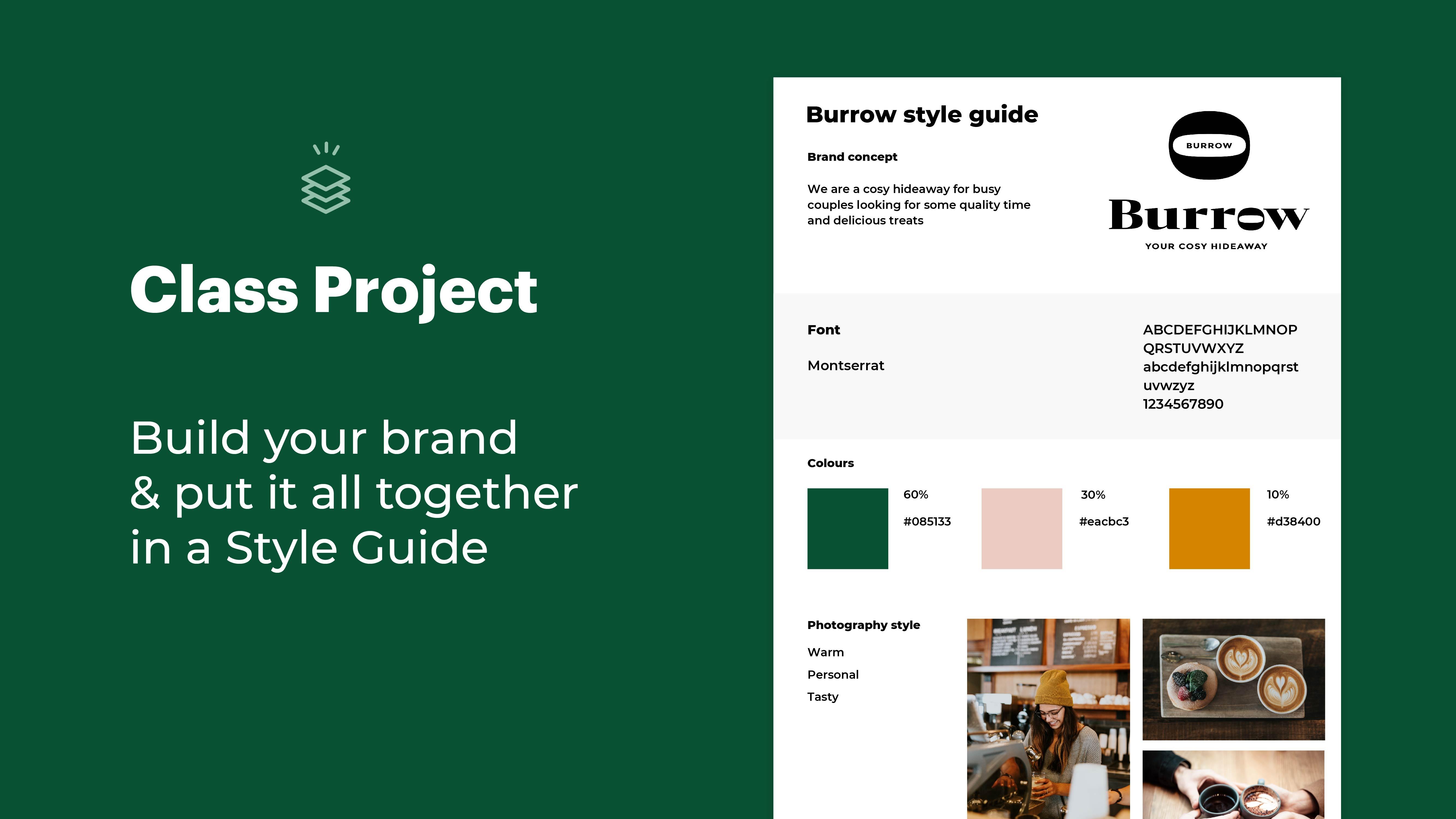
8. Day 6: Picking colours, fonts and photography: great. So now you have your local and we're gonna be moving onto visual language and visual language is essentially everything design that doesn't include the logo. So it's things like the colors of your brand, the phone. So the style of text that you're using the photography like, Are you depicting people as very sort of personal, genuine? Or is it more of a professional vibe? You know, is it something that feels very pink and fluffy? Or is it something that feels very stark and honest? For example, it can also be things like the nail that you're using. So you're consistently using a similar visual language that helps people recognize that this is your brunt. And if you think about iconic brands like National Geographic, for example, they have their logo. So this yellow frame that's working with all of their different branding assets. But the logo is only part of it. The style off, clear, honest photography and the layout that they're using their magazine is justice much part of the visual language and the color theory of everything never building up. We want to create that consistency so that people instantly can recognize that it's you even if they don't see your local in the paper. So we're going to go through each of these different things one at a time. We're gonna pick out the right options for your business, and then we're gonna put it all together in the style guide in the past projects. So we're gonna be starting with colors and colors is something that's really interesting because you over think about the icon or the local you've created and the color that's often how people can recognize other brands. So even just seeing that red and yellow might make you think about McDonald's, for example, so picking the right colors is an important step of your brat. When you're picking colors, I suggest picking one round color. That's your main color, and we use something called a 60 30 10 role, because in some places you might need complementary colors. So think places like, ah, button on your website or if you want to draw attention to different things, so the 60% of the color is the one that you're gonna be using the most 60% of the time. That's your main brown color. The 2nd 1 is a 30% so that might be like back home color or one that you want to appear in a lot of your photography. And the 10 is that little dot of the I, the one that's going to draw attention to things maybe the color of your links on your website. Or maybe that little stamp that you have that you put as the finishing touch of things, something else. We want to keep in mind this. We want to make sure that these colors working you all together, and the easiest way to do that is to think about it from a warm and a cool color perspective. So cool colors. I think green and blue, for example, and warm colors are oranges and reds. And so, if you pick, for example, all green and blue shades, you might start to get kind of like an aqua. You know, Aquarian five versus If you pick all red and orange is, um, I feel very aggressive or, you know, a little bit too warm and a little bit too angry. So try to pick at least one warm and one cool color out of those three that you're picking for your brand cups. So now that we want to pick your browned colors, what we're gonna do is we're gonna go back into the mood board were created, So this is the one for the Borough Brat, and then we're going to start to have a look at the different pictures that we selected. So if we start to look through the images that we have here, we're seeing a lot of warm colors. We're seeing a lot of earth tones. We keep seeing this kind of a version of this warm green color, and we also keep seeing a little bit of this okra where this really warm red and then four highlights. I'm cream, seeing like this yellow a little bit of this pop of almost like autumn colors, and I think that the green one would be a really good grounding color. But the great thing what you could do with envision is that you can go in. So, for example, was picked this photo and you'll be able to see the different colors that are in this picture now was even more helpful is that you can actually go and hover over one of these colors and you'll get this little hex code. It's called. So that's essentially this little hashtag and then a number and letters together. And that's the exact color name, so we'll be able to replicate the exact same color. So I'm going to take notes of this color here, says the local we created before. So then you could do the same thing. You just select a shape so it could be your letters or a box. Just go up to this other thing here for color and again. Here you'll see the hashtag ski so you can just right in whatever you hot. So three a 4844 and they will find that exact color. And now again, we think it looks great. So then you can just go and click again. And if you please, thistle plus here you'll get up with same sliding scale so you can go and explore what the different colors will look like. So, once you phoned the color that you like movie, this is the right one. Then write down this one. So this is not going to be your universal name for your color for your brunt and then you do the same thing for your 30% and your 10% color. If you're finding a little bit difficult to find inspiration for your colors, a really great place to go is color hunt. Now this is a website just where they put together different suggestions for color palettes , so you don't have to adopt them as they are. But it's a great way to just start finding inspiration, so you'll see that there's lots of different interesting combinations. And once you find something that you like, you can just click on the one and you will be able to see the different hex codes again. So the exact name of the color that you're using on you can find similar things. You can find other options, and I think it's just a great starting point. If you ever feel stuck next time, we're gonna be picking faults and fonts are just the style of text that you're going to be using. So the first thing that you want to do when you're thinking about phones and an easy way to start narrowing down your selection because there's so many out there is to think about if you should pick a cell phone or a sense their fault. A surf funk just means that it has these little extra flourishes at the end of the letters . And this is how a lot of older type faces were designed. So Sarah phones are often used by, for example, legacy brand more expensive brands. Things that have a bit more history or things are a little bit more expensive, like a high end fashion brand san serves often used by more modern companies, tech companies, purity online or brands that want to be a little bit more friendly and approachable. So that's an easy way to start making a distinction which direction would be appropriate for your business. If you want to find great phones that work well together, then I think Font Pair is one of the absolute best websites, all of phones that they're suggesting here are actually Google phone, so you can access them for free. On Dhere. You confined different parents so you'll see things like the title being one fault and then the main text being a different phone, and you can pick things like San Serif South Sarah, so these air to sound serves together both for the title and for the main text. Or you can mix them up so you can suggest different options and we'll give you lots of different suggestions. I'll tell you what the fund is on. The thing that I like the best is you can actually go in and start changing the text so you can see what it would look like. And this means that if you're looking for forms for a specific type of purpose, then you can actually start getting a lot of information about what it will look like in the end. So maybe you will use it for all caps like this, and then you can see what it will look like. So I think this is a great tool. It's perfectly free on. It only uses Google thoughts. So the last thing we want to think about in your visual language is your photography style , because this is a great way to express your personality. And people really connect with the right type of photography because they can put themselves in these different situations. So think about the type of vibe and type of values that you wanna communicates. Do you want it to be feeling fun and exciting and like people should join in. Do you want it to feel professional and calm and assuring? And those different search words can be great when you're looking for photography? And, of course, there's different options you can hire of Tora for and create custom photography. And then having a couple examples that you found a line from stock sites can be a great way for that photographer toe. Understand the style that you're looking for. If you don't want to hire a photographer, you can also look at stock sites like Bon Slash, where they have royalty free photos that you can use. Try to think about how the photography incorporates the brand colors that you've picked, so because you're gonna be using the photography and the colors and the typography. So the style of font, though you picked altogether, is one vision. You want to make sure that when you see them all of the page together, it works. It feels harmonious. Feels like it all belongs to the same story. So if you can look for photographs that have some of those brand colors in them, that is a great way to make sure that the photography feels on Brand. And in the worksheet you have a swell some examples where I show the 30 60 and 10 rule and where I also show how that works with photography. Example. So I suggest you go check that up. Once you have your colors, fonts and photography still selected, it's time to put them and your logo together in a style guide. And that's your chest project. This is what the borough style guide looks like. It's just a one page document that will help you make sure that the brand is always presented in the same way. The worksheet has a template that shows you the different sections, and you can create your own documents in some way that it's easy to edit and where you can save it in a place where you always find it. Once you completed your style guide, make sure to upload it to the class project and ask for any feedback that you would like
9. Day 7: Launch your brand and marketing: So now we have arrived at the very last chapter of this skill share Course. I am so excited that you made it all the way here and you've actually created your whole brand. Congratulations. That is really exciting. So one of the things that I think a lot of people who do you think about branding forget is that actually implementation and that consistency and building awareness with your audience is probably one of the most important steps. But it's one that people open forgets. So in this last video, we're gonna be talking about how to use your brand to actually build it up from something that you're excited about to something that your customers are excited about. People need to see an ad or something from your brand, a piece of communication or talk to you something that's six different times before they're ready to buy something. And this is statistics that we've seen an advertising over and over again. You know, you see that jingle? You see that ad on TV and you know, you take note, but you forget about it. Then you see it again, and every time that you see it, do you kind of build up that relationship with this brand over time. So what we want to do is we want to make sure that we can be completely consistent, the same set of values and the same benefits over and over. In a clear and helpful wait our customers. You creating that style get us the first step because now you actually have a place to always refer back to. And you know that your brand is always gonna be represented by its the consistent style of photography with the same great logo on with the colors and typography that you've created . But besides the visuals, there's actually two all the things that really want to think about when we're thinking communication and building brand awareness. The 1st 1 is messaging, so the way that you're actually speaking to customers and this is essentially where copyrighting comes in. So this can be your slogan. This can be the way that you describe your benefits. And if this feels a little intimidating, just go back to that mission statement that year olds and to your user journey Think about how were we solving those problems for customers and just write that out in a clear, honest way that people can understand. The next one is customer service because you can have the most beautiful brand. But if every time someone calls you about something that they need fixed or if they comment on you know, your instagram post and they rude response, your brand image is ruined anyway. So visuals only go so far. You need to create a consistent way that people have a great experience with your brand. This could be anything from the packaging that they received their product in to the way that they get, you know, talk to buy a person on the phone. So think about the whole user experience that you created before every way someone can interact with your brand and how you can make that experience as positive and consistent as possible. So now we're gonna be digging into using your brand online Andi to actually market and do sales for your business. And the first thing I want to talk about a social media because I think it's a very obvious first place to start when you're thinking about social media platforms. I know I can feel really overwhelming, especially if you haven't been doing a lot of social media marketing before. One mistake that I see a lot of companies do is that they feel like they have to be on every platform. And that's just not a sustainable saying to keep up over time unless you have a Olympic team. So I suggest pick up one or two platforms that you feel most comfortable using, but most importantly, where your customers actually are and the great re to find that out is to look at the data reports of where the different demographic groups decided to spend their time, and we want to find out. Both were there, spend their time on where they spend their money. So there's a really great link in the worksheets for to a company called Spread Fast, which have done a analytical report looking at what different each groups and what different demographics are on each social media platform. So I suggest you go check that out and see from your persona and user journey, which ones of these tough firms is the best fit for your audience, and that's what you should focus your efforts once you have your logo added to your profile . The next thing we want to do is think about the description and the way that we were explaining our business to potential followers. And this is because, you know, if you just write what your business does, it doesn't actually compel someone to follow you. Instead, try to focus on what type of content that you post what kind of value that you're adding to your followers. So, for example, if you have a restaurant, you might want to talk about how you publish ideas for recipes. They should follow you to get inspiration for new dishes or to be first, to know when you have a new offer products. You'll also want to have a really clear schedule and a clear plan for the type of content that you posting and when you're posting it. And there's lots of automation tools where you can actually create your your post in bulk. So, for example, taking one day out of every two weeks creating all your posts, scheduling them in an app and lots of free options out there like a buffer or later, for example, and you can then take that and put it all in schedule it over time and it will posting for you. So having that consistency will create a beautiful feed for people to follow. But it will also make it predictable, so people will see. Oh, I can understand the type of content that this company is posting, so I'm gonna be following them. So the next we're gonna be talking about implementing your brand on your website, and your website is kind of like your company's home. In many ways, you control it. You can make sure that you add most important content and that you really guide your your potential customers and users through, you know, from the page that they land on to the action that you want them to take. So that might be signing up for an email list, making a purchase, making an appointment, anything. So you want to think about that first? What do you want people to do when they land on your websites on where do you want them to end up and then try to make that experience as easy as possible? And the first thing that we want to think about is again the problem that we're solving and putting that front and center. Don't talk too much about you know your company history or you know what your business is all about. You want to talk about how you're helping people, the land on your website? What problem are you solving and how are you solving it for them? One great tip is to instead of trying to cram everything valuable into your home page, create separate landing pages for different services you might offer or different problems that you're solving in your business. So this is a great way to tailor the type of content to the exact location that someone might be feeling or having when they land on your upset. Of course, when you're creating your website, make sure to refer back to your style guide and out the colors and topography and photography styles that you've created for your brand to make everything consistent. So before we end this course, I just wanted to say a little bit something about templates because now you've created your style guide. You have this really clear direction for your Brandt, and you're gonna be doing so much work in your business day today. You don't have time to keep creating all new assets for your social media or proposals of whatever it ISS. So I really suggest that you create templates and if you have Adobe Illustrator now or if you have a candle that you want to be using set up templates for the things that you're creating all the time. So if it's instagram posts, if it's a proposal, if its contract, for example, create a template that's branded and has all of the visuals on its and then you can just replace the text, replace the photos and it will save you a ton of time. Make sure you have that template to a place where your whole team confined it. And that way you know everything will be consistent and makes your life a ton easier. So I really hope you found this course helpful. I would love to see your class projects of peace, Adam, and then ask me anything that you find confusing. Difficult if you get stuck anywhere or if you just love feedback. I'm here to help you. So please just asking questions. And I'm so excited that you took this course. Thank you so much for joining me and good luck with your brat
 Malin Lernhammar, Designer and teacher