Transcripts
1. Pitch Perfect Introduction: You have a brilliant product, service or idea, but struggle to present it clearly
and captivatingly. Welcome to Pitch Perfect. Design visual presentations
that sell your project. Hi. I'm Pamela Calero. I'm a creative director, brand strategist, and
visual storyteller. I help countries
people and brands communicate with clarity,
creativity, and soul. I've mentored over 20 startups, worked with doctors
without Borges, Germany, and ID Barcelon. My work has been featured in Mary Claire Spain,
Women of Type, Blank Fest, and I have
exhibited museums and universities across Europe,
North and South America. If you believe ideas deserve
to be shared with emotional, clarity and impact, you're
in the right place. This class is ideal for
creatives, freelancers, and small brands who want to pitch their
work with confidence. No design experience needed, your idea and the will
to bring them to life. Whether you're
applying for a grant? Launching a service or
sticking collaborators, your pitch deck is
your story stage. It's a short strategic
presentation that shows what you do, why it matters, and
what you're asking for. Just in a few slides. I created this class
because you only get one shot at making
a first impression, and the well crafted deck
helps you make count. This is not about being perfect. Even though the class
name is Ditch Perfect, no one expects your first
version to be flawless. We'll go step by step
and iterate as needed. We'll start by mapping
your message in Mural, design the slides
in Kava and use hagipt to support your
visuals and words. As your live guise study,
we'll use LaenaRsidencia, an artist residency I introduced in my other class,
the Art of branding. There we built its
brand identity. In this class will shape its pitch deck to communicate
its story to the world. By the end of this class,
you'll have a clear, emotionally resonant pitch deck that reflects your
voice and vision. Ready to sell your idea without
selling out your voice? Join me in Pitch Perfect. Can't wait to see you in class.
2. Class Orientation & Project Overview: And in this lesson, we'll go over the class project. Remember, your class
project is to craft a five to seven
slight pitch deck for a real or fictional
project of your choice. It could be the pitch deck
for your brand or business, a real idea or project
you want to launch, or a fictional project to practice your
storytelling skills. You can take inspiration from your favorite shows or movies. Let's craft its pitch deck to
see what makes it special. For the class project
and case study, I'll guide you step by step, showing my own process as I create the pitch deck
for Laana Residency, a real artist residence project based in Columbia's Mountains. How to structure
message for impact? How to organize information
with emotional flow, how to bring it all
to life visually, harmonizing the design
with colors, fonts, shapes, hierarchies, layout and template selection
that work together. What you'll need a
computer with Internet, pen on paper, sketchbook, a free mural account
for mapping your story, a free Canva account, a chat GPT account to
refine your messaging, spark ideas, and create
tailored images. Ready? Let's look at your
class resources next.
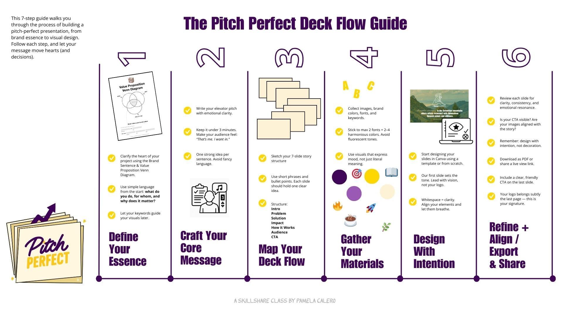
3. Class Resources & Materials: In this lesson, we'll
gather our tools from the class resources before
building our deck story. Remember, creating
a pitch deck or any creation for that
matter, is a process. You're here to practice your
visual storytelling skills. So be kind and patient
with yourself. John is better than perfect, and you can always refine
and iterate later. When I started my creative
business journey, I had no idea what
a pitch deck was. Learning how to build one
completely changed my practice. It gave me a clear way to
present my services and ideas. And today, I help my
clients do the same. That's what I want for you, too. I give you a structure you can come back to, shape
into your own, and use whenever
you need to share a project with clarity
and confidence. Before we open any
design software, we're going to sketch the
structure of your pitch. Why? Because ideas
come before aesthetic, and story flow is what
gives a deck true power. You'll find all
the resources you need in the class
resources folder. Let me walk you
through what's inside. A mirror pitch
deck map template. This is the backbone
of your presentation, a visual map with seven
suggested slides. Here's the structure
we'll be working with as a suggested slide flow. Introduction or vision. What is this project about? The problem or contact? What challenge
does it respond to the solution for your
offer? How do you solve it? The impact or benefit? What difference does it make? How it works, process,
timeline, or structure. Who is it for? Your audience or community? Call to action. What are you asking for?
Funding, support, partnership? Feel free to tweak or reorder this according
to your project. This framework is a starting
point, not a rulebook. You will also find an example
of a class's case study. Filled out with content from Laana residencia so you can
see how it works in action. You'll also find a
checklist and Flom. Think of this as your compass. It breaks down each section of your deck and helps you stay focused on what each slide needs to communicate
and what it doesn't. Use it as you build,
refine and polish. A Notion project prompt guide. This guide offers
examples, prompts, and questions to help you
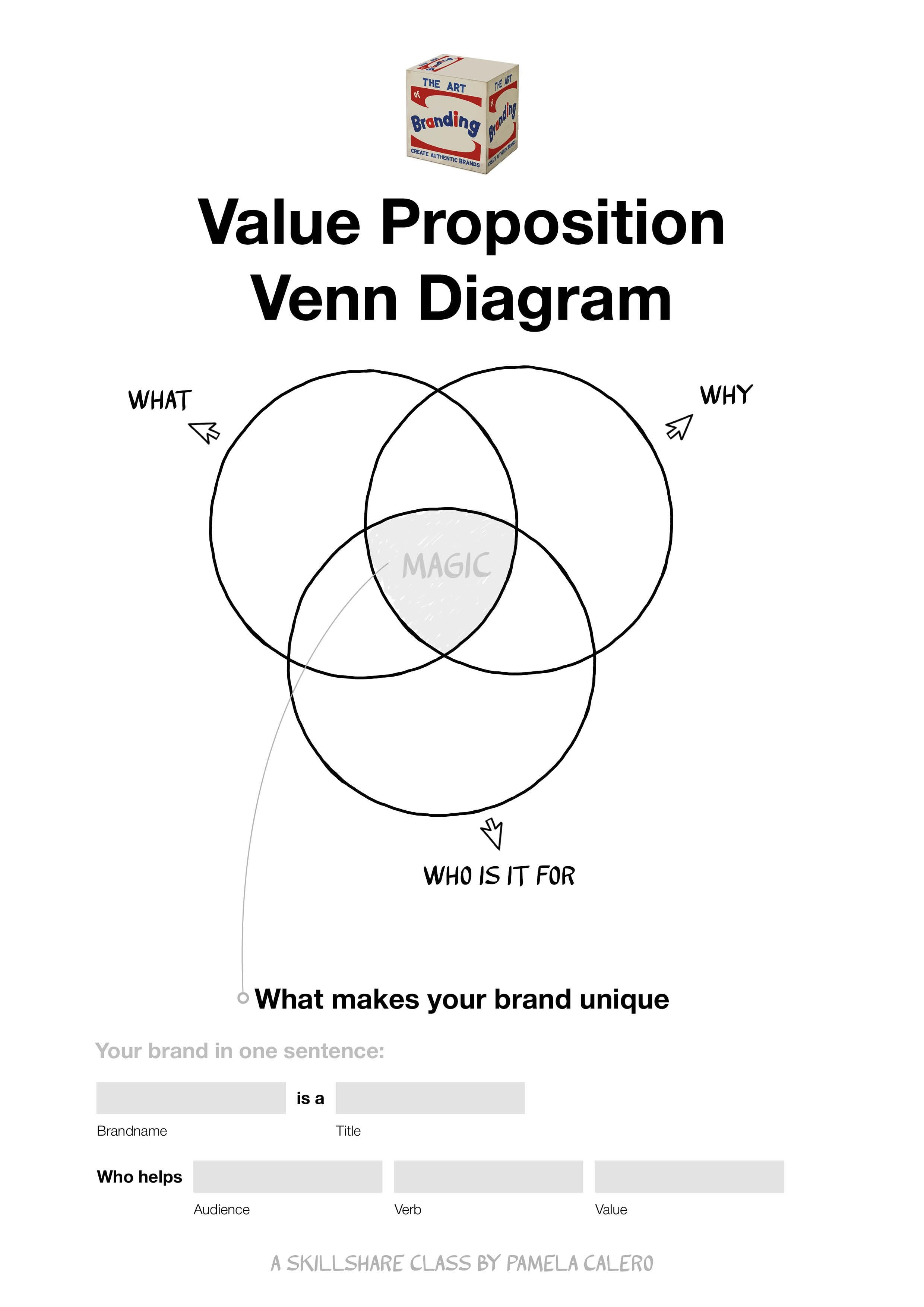
get clear on your idea. A VN diagram value proposition
chart to fill out. This is a chart we used in my other class, the
Art of branding. So if you have taken
that class and have this from there ready,
go ahead and grab it. A blank template in Canva, as well as a Canva pitch
deck of LaenaRsidencia, the classes Ks study to use
as a template if you so wish. As we move on through
the next lessons, you'll see me filling
out the same forms and templates with Laana
Residencies information. So you'll always have a clear example to follow along with. If at any point
you feel inspired or a sentence just
clicks, write it down. Keep pen and paper closed. Good ideas often arrive
when we least expect them. Take a moment now to
download the files, set up your free
Mirror Canva and check GPT accounts if
you haven't already. Once you're ready,
we'll move on to pen and paper to get
our ideas rolling. Then we'll be sketching the structure of
your Dak and Mirror, to later design it in Canva.
See you in the next lesson.
4. What is a pitch deck? : In this lesson and
before diving in, let's take a moment to ground ourselves and look into
what a pitch deck really is because going deep really helps us understand the
needs of a project. And when we start
from this place, we can build something solid,
meaningful, and impact. These days, you hear the
word pitch everywhere. I pitched my idea last week. Here's my pitch deck. We
should pitch this to the team. What really is a pitch deck? And what can it actually
do for your projects, your ideas or your brand? The word pitch originally
comes from the sales world. To pitch is to
present, to propose, to put your idea
out into the world in hopes that it lands
with the right person. Over time, especially in creative and
entrepreneurial spaces, the term evolved into what we
now call an elevator pitch. The idea behind it, you find yourself in an elevator
with an important person, maybe an investor, a potential
client or collaborator. And you have just the time
it takes for the elevator, approximately 3
minutes to explain your project with
clarity and purpose. A pitch is a concise
way of telling your project story with clarity,
emotion, and direction. It helps connect your
ideas to the right people, whether that's a
funder, a collaborator or a future partner or client. In short, someone who can
help your project grow. And today, most pitches
happen in presentations, conversations, or emails, or
in the case of this class, a pitch deck, which
is a short, sharp, visual presentation
that lands straight to the eyes or the inbox of the
person you want to reach. A pitch deck shows what
you do why it matters and what you're asking for all in a few clear impactful slides. In this class, we're just not stagging information
into slides. We're crafting a visual story that simplifies your message, connects emotionally and invites people to believe in your
project and take action. Sounds good. Let's get
started in the next lesson.
5. Deciding & developing the topic and the concept of your deck: In this lesson, we're
going to decide and develop the topic and the
concept of your deck. When we take time to really understand the foundation
of our project, its purpose, its
story, its needs, we are able to communicate
it with more clarity, connect more authentically
and create a bigger impact, making sure that we
become unforgettable. Perhaps you already
know which project you'll be creating
the pitch deck for. But if you don't,
take a few minutes to select which project you'll be creating the pitch deck for. It can be your brand,
your business, idea for a project you're developing or a real or
fictional brand you like. For example, lush, a Krusty Krab or your
favorite local cafe. For the purpose of practicing
your storytelling skills. Remember, for the
classes as study, we'll be using Lena residencia. An artist's residency, I introduced in my other
class, the Art of branding. Create authentic brands
using Adobe Express. There we build its
brand identity. Now we'll take it
a step further and create its pitch tech to share
its story with the world. If you have taken that class, go ahead and grab your Venn Diagram value proposition form. If you haven't taken it yet, I recommend you do so if you wish to polish
your brand message. The sake of rolling
with our pitch tech, I have included this form in the class resources for you to complete and get a
better perspective of the value proposition
you are creating. This form helps you connect
with your brands or projects. Why? It's very
valuable to remember your brands Ys so that
you can create from here. Creating from your why
will give you lots of ideas because you
will be responding to the reason your project, brand or business exists. Remember, LaenaRsidencia
is an art residency I am creating in the
mountains of Columba. It is the case study for this
class's pitch deck project. Let's have a look at
Lauena Residencia's Vn Diagram Value
Proposition form. I filled out in my other
class, the Art of Brand. You can see in the why I wrote, because slowlife has a
positive impact on creativity. Designated time and space for
creating is very desirable. This project aims to support
the living expenses of the adopted cats and dogs with the fees paid
by the residents, bringing people to
Lauena Residencia who show them a
slow way of living. Residents will create art aligned with the values
of Laine residencia. AwenaRsidencia will be part of an art ecosystem honoring the beauty and quiet of
its remote location. In the W section. Artistic
residents to art studios, a small community, a project with social and artistic impact. What is it for
artists and creators, people with a
project that want to dedicate time to develop a
project they are working on. In the middle of the
what the why and the for who is your
unique vision, what makes your brand unique. Drawing from this, we're going
to go ahead and fill out the bottom part of the form to sum up your brand
in one sentence. Lena residencia is an
art residence that helps artists reconnect with nature to connect to
the creative power. What's your brand sentence? Did you get any clarity
from this process? From the sentence
of Lena residencia. I know that nature connection, creativity, and creative power. Are important
concepts in my brand, and I want them to be
reflected in my pitch deck. This matters because
developing and transmitting these concepts in my pitch deck will keep my
communication authentic, as well as make a
connection with my audience or ideal clients
for the residents. Pro tip. People feel engaged
and call to what makes them feel a me too moment
and that I want in. So by establishing and honing
into a creative, calm, bold look, I know I'll be talking directly
to my audience, and ideally, keep them reading
my deck until the end. Before going on to
the next lesson, make sure you have completed your van diagram
Valley proposition and highlighted a
few power words or concepts for your
brand's sentence. Note that in this
case, brand can be interchangeable for
project, idea, business. I'll see you in the next lesson.
6. The parts of a pitch deck & crafting your story: In this lesson, we'll go over
the parts of a pitch deck. Remember, the pitch
deck is about you, but we want our audience, our prospect to feel like
they are the protagonists. This presentation is for them. In other words, what
can you do for them? Or how what you do is
relevant for them. We want to create
It's a match filling and invite people to take
action on your last slide, where we have our
ask or what's next. Traditionally, the
recommended flow for a pitchtick is introduction. What is your project? The
problem? What are you solving? The solution. How does
your project solve it? The impact, emotional
or practical benefit, how it works, process, timeline, details,
call to action. What's next? This is
not an exact science, so you can alter
according to your needs. What I will say, though is
we want to make our reader, viewer or audience feel
emotionally connected. How can we make them
experience what we're talking about through
our presentation? How does the problem
affect them? How can they be part
of that solution? When we emotionally
connect with them, we guarantee they will read our presentation
till the end. Once you have a clear
story structure, Design becomes easy. And you design
tailored slides for your pitch instead of using random shapes that don't
add to your story, running the risk of distracting
or losing your reader. What we can all learn
from pitch text is that simplification goes a long way and that less is more. You might be so used to seeing what you're working
on that you lose perspective and forget
that your project is new for someone who is first
coming into contact with it. A great starting point is
to lose any fancy language. Use metaphors to say
things in term of another and build that
bridge between what someone knows and what
they don't know yet. So, how do we
simplify our story? Let's go back to
your brand sentence. With your one sentence at hand, let's quickly rework
your pitch deck in form of an elevator pitch, which lasts 3 minutes. So we can start mapping out the unique value proposition your brand brings to the table. This is a great
synthesis exercise. Feel free to grab your. Grab my personal professional elevator pitch with
the following prompts, add it to chat GPT
and edit as needed. I will do the same adaptation
for Laana residencia. Here's my elevator pitch. You know that feeling when
something just doesn't fit? Like wearing a jacket
that's not your size, too tight, too loose. That's exactly how a brand feels when its visual
identity is generic, uninspired and misaligned
with who you truly are. I get it. You don't want to be just another
name in the crowd. You want a brand
that stands out, resonates, and leaves
a lasting impact, a brand that's magnetic, bold, and undeniably you.
And Pamela Calero. Creative directors specializing
in visual storytelling, branding, illustration,
and graphic art. I collaborate with brands
that refuse to blend in, brands that think
differently and aim to create impact
beyond profit. That's why I developed
the poetry method, a three step process
of introspection, conceptualization,
and visual metaphor that transforms brands into powerful
authentic experience. This isn't about chasing trends. It's about creating a visual identity that feels like home. Aligned, intentional
and unforgettable. If your brand doesn't feel
like you, let's change that. Find me at Pamela caldo.com
right here in your DMs. Thank you. This is
the prompt to edit in Chat GPT to get your own
version of that elevator pitch. Help me create the elevator
pitch for, in my case, Lena Residencia is an
art residence that helps artists reconnect with nature to reconnect to
their creative power. You can insert your
brand sentence from the value
preposition Vn diagram. Based on the following example, copy and paste my example here. Result, feel free to pause
the lesson and read over it. How does your version
look and feel like? Not that you will have to edit it to hit the right
tone of voice. Feel free to pause over
the versions of my edit. To summarize my first round
of edits, I asked it, too. Make the intro more unique to what we're
talking about here. Here's my second round of edits. I'm happy with this
version that has all the important parts of my project, and we'll
share with you. You know that feeling
when your creativity just doesn't flow? Staring at a blank
page, mind spinning, nothing landing,
it's frustrating and more common than
we like to admit. It's exhausting when your
ideas feel disconnected, uninspired, drained
by routine. I get it. You're craving space
to breathe, reconnect, and reignite your
creative power, a kind that feels raw, untamed and true to you. That's why we created
LaenaRsidencia, an art residency that helps
artists reconnect with nature so they can reconnect
with themselves because creativity
doesn't thrive in noise. It thrives in stillness in roots in the quiet
power of the land. Lana residencia means the
good residence in Spanish. And we want you to come
call this your home, a place where your creative
practice can live well, grow strong, and feel nurtured. Here, you'll step
away from the Rush, immerse yourself in nature, and rediscover the flow
that feels your art. It's not just a residence. It's a return to your essence,
and it's more than that. By being here, you help sustain your creative vitality
and the lives of 20 rescued cats and dogs who call this Mountain
Sanctuary Columbia home. If your creativity
feels distant, maybe it's time to
come home to it. Find us at laenarsidencia.com, apply to our program, or let's chat and see
if it's a match. How do you feel about
your edited version? Keep this at hand and we'll
use it in the next lesson.
7. Sketching the Flow in Miro: In this lesson, we'll sketch the flow of your
presentation in Mirror. Before we dive into
any design software, we want to make sure we have
the shape of your story. Every great pitch deck
begins with flow. The emotional and logical
rhythm that guides your audience from
curiosity to connection. First, open the Mirror
template I created for you. It's linked in the
class resources. If you don't have
an account yet, you can set one for free in just a minute using your email. Once you're in, duplicate
the template to your own workspace so
you can start editing. Mirror is a collaborative
digital whiteboard. Kind of like Google
maps for your idea. You can scroll
around, zoom in or out and expand your
canvas endlessly. That's why it's perfect for planning visual presentations. It lets your ideas breathe. Inside the board, you'll find seven empty pages or frames each labeled
with a slide title. To edit text, just
double click on it. To add new text, press T on your keyboard, to create sticky notes, which are great for
jotting quick ideas. Just click the sticky note
icon on the left toolbar. Want more inspiration later. Miro has tons of free templates. Just click on the Templates icon on the left panel and Explore. Now, stick to the
custom structure I've made for this class. A gentle reminder. Don't
worry about aesthetics here. This is all about
shaping your message. The goal is to lay out
your pitch in a way that's so clear that even your
mom could understand it. This means using
simple language, short phrases, and one
strong idea per slide. Let's walk through the seven slide structure
we're working with. One. Intro vision. Catch attention in one
powerful sentence. What's your project?
Problem or context. What challenge does your
project respond to? Make it human and relatable. Solution. Your offer.
What are you offering, and how does it solve
that challenge? Impact. What difference
will it make? Think emotional, practical
and or social benefit. Five, how it works. The process, timeline, format, steps, make it tangible. Six, audience community. Who is this for? Who benefits? Describe them clearly. Seven, call to action.
What do you want? Is it support, funding,
participation? Be specific. Let's see my example
of a una residencia, which we will rework in a bit. For now, I will fill this out as simple direct placeholders. Intro. Artists residency
in Columbias Mountains. Problem. Creatives lack
intentional space to reflect. Solution, a slow living retreat, supporting artists
and rescued animal. Impact, revitalizes
creativity and helps fund animal
care. How it works. Two studios, mountain sanctuary, immersive residence,
audience, artists, makers and people
seeking sanctuary. Call to Action. Join,
support, collaborate. Tips to keep in mind, keep it
simple. One idea per slide. Use bullet points or
keywords. No paragraphs. Focus on clarity over polish. You're not building a website. You're building a short
strategic story. Bonus tip. If you get stuck, try using hat GPT to brainstorm or
refine your language. Ask things like, can you rewrite this sentence
to be clear? What's a punchy
way to describe X? What's a more poetic
version of this sentence? Now, make sure you're bringing your elevator
pitch from earlier, and we'll rework our slide
sentences in at GPT with this. This is my example
built around it. Help me write this copy paste
your Mirror slide sentence, keeping my preferred
structure of the green points while
making the flow tighter, more compelling and
consistent with the tone of the following
elevator pitch. Copy and paste your
elevator pitch. What we're doing here
is give a twist to the short sentences of our slides with our
elevator pitch. This helps us get closer to talking about our project
from its uniqueness. This is what Chat GPT
said, Intro vision. LauenaRsidencia is a
creative sanctuary in the Colombian mountains
that helps artists reconnect with their inner
flow through stillness, nature, and intension
problem context. You know that feeling when your creativity
just doesn't flow? Burnout, disconnection, noise. Artists need space to
breathe and reconnect. Solution, your offer. DuenaRsidenc is a slow
living art residence that offers artists time, nature, and intentional space to reignite their creativity. Impact. Artists leave
reconnected and inspired, and their stay helps support 20 rescued animals
who live on the land. How it works to studios, mounts and sanctuary,
residences 2-12 weeks. You bring your creative
process, we hold a space. Audience, community
for artists, writers, and makers who feel
stuck, overwhelmed, or simply ready for something
slower, all to action. Ready to come home
to your creativity. Apply now at lainaresidencia.com or reach out to see
if it's a match. Once you feel good
about your story flow, you're ready to turn your
structure into a visual story. Remember, this is just a layout. We can continue fine tuning
when we're designing in Cava. In the next lesson,
we'll go step by step, turning ideas into slides.
8. Creating the style of your deck: Now that your story
is mapped out, it's time to bring
your pitch tick to life visually. Slide by slide. This is where content meets
emotion through layout, typography, imagery, and
visual rhythm. Don't worry. You don't need to be
a designer to make something beautiful
and effective. It's time to start
designing your pitch tick. Let's bring your story to
life in Kava with clarity, creativity, and
harming. Why Kava? Canva is built for everyone. You don't need to have
a design background. It's intuitive, flexible, and filled with free
templates and designers. Step one, open Canva. Go ahead and login to
your Canva account. If you don't have by signing up with your email
or Google account. It takes just a minute.
The free version is very robust and more than
enough for our class. Pro tip. Keep it simple. Animations might seem fun, but they can be distracting
and most pitch decks are shared as PDFs and PDFs
don't support animation. Let your story do the moving. Step two, use the
class template. Once you've logged into
your Canva account, go to the class resources
where you'll find a Canva template I created
just for this project. Select Use Template
at the top right. This duplicates the file into your account so you can edit it. You can see it propagated
into your account because a copy of will appear at the
beginning of the name. Feel free to edit the name. This will give you
a jumping start to my blank seven
slide template, Intro problem
solution, et cetera, already structured
for your deck. You can also use my
final pitch deck as a template for your deck and edit colors, fonts, and content. Whether you're using
the class project as a template or
creating from scratch, bear in mind that most
screens nowadays use 920 times 1080 aspect ratio. I recommend using this size for optimal display on
screens and presentation. Step three, keep your
mirror board open. Make sure you have
your mirror map handy. We'll be referring to it often to transfer the story flow into the visual form and also the GPT conversation where
we rework this content. Let's quickly revisit the
concept from Lesson five. In Lesson five, we clarified our project's folly proposition
in the VN diagram chart, where we wrote a one
sentence brand statement. For Lain residencia, I landed on key concepts like
nature connection, creative power, and slow living. This guide the mood and visual
tone of the presentation. A pitch deck should make your audience feel
that sounds like me. I went in. To do that, your visuals should
reflect your project soul. I want my pitch deck
to reflect nature, creativity, calmness, and
be a little bit bold. Before we begin, I
want to share with you some design tips
for visual harmony. Stick to one to two fonts, Max. Use a cohesive
color palette that supports your message,
concept, and mood. Avoid cliche stock images. Go for visuals that convey mood not just content. Keep spacing clean and align your
elements properly. White space is your friend. Your logo should only appear on the first and last
slide and only as a small accent,
not as a main visual. In the intro, we want to focus on transmitting the
vision of the project. In the final slide, the goal is to reinforce the
call to action, and your logo can live there as a mark, Brand consistency. If you took my other class, the Art of branding, you
already have a short brand guy. Feel free to use those
colors and fonts here to maintain visual coherence
across all your communications. Let me show you mine. I'm using
the same greens and sands seri font that I used for
LaenaRsidencis brand identity. Choosing colors if you don't
have a color palette yet. If you're starting fresh,
try using colordtadobe.com, a free tool to create beautiful
balanced color palettes. Make sure your colors
have good contrast and avoid overly fluorescent tones.
They can be hard to read. Stick to two to four colors Max for clarity
and accessibility. Adding fonts and colors in Cava. You can change
fonts by selecting your text and clicking the
font dropdown at the top. To insert custom brand colors, click on a color square, then add your hex color
under the new color. For example, Hashtag A
7c4a0 for my soft green. I recommend using legible fonts and avoiding overly
decorated one. A San Serif and a Serif
combo is never amiss. How to add a new page in Canta. Click the plus button of your presentation
to add a new slide. You can also duplicate
a slide by clicking the three dots in the corner
and choosing duplicate. We're aiming for connection. Trust your process. You
can always refine later.
9. Design Walkthrough: La Buena Residencia: And now I'll show you how I'm building LaenaRsidenc pitch
deck one slide at a time. Let's go over step by step
over how we can turn a story into from slide layout to color choice and
image selection. Slide one, setting the tone. Welcome to our first slide. This one sets the vision and works as the cover
of our pitch deep. The goal here, say
everything in one clear, powerful sentence
that really sets the tone for what's
to come. Pro tip. Choose a full blit image
for your background. Instantly gives your slide a
polished professional feel. Drag and Drop your image and resize by dragging on a corner. I'm using a photo I took with my phone from Lauena Residencia, the case study for this class. Quality isn't perfect, but
here's a workaround I love. I drop that image into
Cha Gi Pitt and ask it. We interpret the
attached image as an illustration with natural
lightning and bright color. Use colors hashtag,
A seven C four, a zero and hashtag d9b7, A two. The result Gorgeous. I add my main text, something we crafted in Miro
and refined in Chat TBT. Stick to two fonts Max.
It keeps things clean. I'm using impact for headers
and open sans for body text. Always go for legibility
over trends when select. But for this slide, I want the phrase a creative
sanctuary to really stand out, so I'm adding a script font. Canva only lets you use
one font per textbox, so I'll duplicate
the text box and adjust the spacing so
both lines feel seamless. I went with Pinion
script Looks great. I'm also using a soft
yellowish white tone to keep things on brand. Quick tip, if you have a brand book or
your color palette, just drop a screenshot
into your design. Canva will auto pick the colors. Make sure your line
spacing is just right. Letters shouldn't touch, but also shouldn't feel
too far apart. It's all about balance. Now, let's drop in the logo. Mine looks a little like a mountain, which
fits beautifully. There's no strict rule
for logo placement here. Just make sure it feels balanced and doesn't
overpower the design. Remember, your logo
is your signature, but this deck is
about your audience. Lastly, I'm adding the website, smaller and below the main text, so the hierarchy is clear. This tells the viewer
where to go without shout. Slide two. Slide two is all
about naming the problem, the human challenge your
project responds to. And pasting the refined
text we created earlier and keeping the font and size
consistent with slide one. Since this one has
more elements, I'm going with a flat
color background. This helps keep things legible and gives your reader
some breathing room. I'm using olive green
from my brand book. It's calm and
grounded. Design tip. A good presentation
feels cohesive. Every single slide should look like it belongs
in the same family. Here I'm listing
three challenges, burnout, disconnection,
and noise. That gives me a cue to structure the content
in three columns, easy to scan and
visually organized. To support the message,
I'm adding icon. Real photos or
custom illustrations aren't always necessary. Sometimes a simple
emoji does the trick. Here's how to open
the emoji keyboard on Mac Control plus command
plus space on Windows, Windows key plus period. Pick symbols that
match the feeling you want to convey. They
can go a long way. I'll also bring in the
final part of my text and separate it with a
stylized line. Here's how. Go to elements, then
shape, then line, increase the stroke weight at rounded corners, seven
to seven weight. Right click Send backward so
it sits behind your text. Double check your spacing, especially when
everything's centered. Slide three, presenting
the solution. This is where we show
how your project offers a solution to
the previous problem. I'll past the text be refined. And since my logo already
includes the project's name, I'm removing its repetition and replacing it with
the logo itself. To improve readability,
I'll break the sentence into two lines and make sure
they are similar in length. And both the words nature,
intentional and creativity. Those are key values. This mirrors the structure of the previous line where
we named free blockers, so I'll keep that in mind
when choosing visuals. I'd love a full blit
image here that evokes slow living and creativity in nature, but I don't have it yet, so I'm leaving it empty now
and will rework it with Cha ti Bit'simage tool in the next lesson.
Let's get moving. Slide four, highlighting
the benefits. Time to show the benefits, emotional, social,
and practical. The sentence we
crafted is close, but I want to refine it a
little further to really speak directly to my audience,
the potential residents. Also, I want to wave in a bonus. They'll be spending time
with rescued animals, and their stay
helps support them. Here's my final version.
Reconnect with yourself, your practice and nature. Our land is also home to 20 adorable rescued
dogs and cats. Your stay helps keep
their little paradise full of love and treat. To support this, I'm
dropping in a real photo. Have a slide of the
image, half for the text. This balance works really well. To make things a
little more playful, I'll add a few more images, arrange them along
a visual ladder, and tweak the angles for rhythm. Send one back, rotate another, play with it until
it feels right. To complete the effect, I'll add my word mark logo
in the bottom right corner. Crop it just right,
and we're done. Slide five, explaining
the process. Now we get to the
logistics, how it works. I'll paste the text and keep the same style as
previous slide. Then I'll add a quick intro. Reset your creative flow
in felila Columbia. Now I'll reorder the rest
of the content and drop in images of each studio,
labeling them clearly. To make key Infopop, I'll use colored boxes. I'll bold the text in the top box to guide the
eye quick Canva tip. You can round corners on any shape by clicking
the corner icon. Use the same value across the
document for consistency. Since this slide talks about a physical place want to add two more images
that show the land. I'll align them, crop
them to equal width, and use a rectangle outline to highlight where
the residence is. Then connect the outline to each of the studios using lines. If the line overlaps
the image too much, just right click and
send it backward. Slide six, Wits for. Let's talk audience who
this is really for. Before adding text, I'll head to Canva and search for a
photo collage layout. There are lots of clean,
well designed options. Pro tip choose by layout, not colors nor fonts. We'll update those later. To add a slide from a template, click on the
template you like on the page you want and
add it to your document. Change your mind. Hit the trash. Some templates may
have animations. If you don't need them, select the element, click Animate. It turns purple if it's
active and remove it. Now I'll switch the
templates colors to match my palette and swap out
the placeholder photos. If you don't have
specific images yet, you can use images
from On Splash, Pexels or Pixel A. They're all great
websites that provide a vast collection of free
high resolution stock photos. I'm using Osplash and
searching for artist, maker, creative, writer,
and downloading them then uploading
them to my slide. To insert, just track
them into the frame. Double click to
reposition and crop. Now, I'll add this final
sentence in bold for Impact. Let your inspiration flow
intertwined with nature, ancestral knowledge,
and silent life. Slide seven, call to action. We made it to the last slide. Now it's time to inspire action. Here's where you had your
call to action. You CTA. This could be a button,
a link or contact. I'm using a full blit image
of the dogs at the residency, calm and contempt in nature. On top of that, I'll paste our final message using the same font size as
the previous slide. By contrast, I'm using
my line grain. Pops. Now, I'll copy the
website from slide one and duplicate the
textbox to at the email to. Quick heads up in CVA. The progress bar at the
bottom can hide info. So move your lower margin
text or elements a bit higher so they're visible
during live presentation. Now, I'll paste my
logo in the center, letting it become part
of the image again. To finish, I'll bring over the button style line from slide two and update the CtA two. Apply now at ww dot ena residencia.com or reach out to see if it's a
map. Don't forget. You can hyperlink any
text by selecting it, clicking Link and
pasting your URL. Lastly, I'll grab a screenshot of my website and insert it as a preview and rounding
the corners with the same value I use for rounded
corners in other slides. To make it more dynamic, I'll split the image in two, placing each half on the side. This creates a feeling of the website opening into
the real nature. Remember, in Canva or any
design software of your choice, design with intention. Avoid overloading slides. White space is powerful. Let your story breathe. Focus on clarity and
connection. Keep it consistent. Fonts, margins,
alignment, colors. Use a consistent color palette. No more than four colors, make sure to check for contrast. Use imagery that supports your
message and avoid cliches. Notice how all of our
design decisions are taken from a strategic approach to convey what we're
talking about. You can always iterate as you go along. We're almost done. In the next lesson, we'll
finalize your pitch deck and go over how to export it
to share it with the world.
10. Custom Images, Final Touches & Export: You're almost done.
Here's a quick checklist to go over before exporting. Does each slide express
one clear, unique idea? Are the text and visuals
emotionally aligned? Is your call to action or CtA clear, visible and inviting? Take a you moments
now to review. Spacing, imagery, fonts, colors. The small twigs make
a big difference in how your story
flows and feels. If you're using custom images, now is the time to add them. If you're still unsure
about final images, you can always leave
it blank or put a square as a placeholder
and come back to it later. Whether you're working
with your own images, stock images or AI
generated images, make sure they enhance the feeling you're trying to evoke. Images are great for
setting the mood. Just give it your
hex color codes or keywords to match your
brand style and message. Let's go back to slide three to create the image we had
pending for this page. Here are two prompts I love. Prompt one. Create an image of a calm artist studio in nature, using muted green and
terracotta palette. It should feel slow,
grounded and inspiring. Make it 1920 times 1080
aspect ratio. I love it. I'll download it and insert
it to my slide and send it to the back by clicking on right click, then send to back. Another style or
prompt for images I like is adding the
actual color codes. An example of this
could be generate a cozy art retreat setting
with minimalist design, warm light, and focus
on creative stillness. Use colors a seven C four, a zero, D 9b7a2. You'll find this and the
rest of the prompts in the class resources in
the notion dashboard. For the purpose of this class, our Notion dashboard is where
our prompts and links live. If you want to learn more
about using this software, I highly recommend checking out my class Notion for creatives. Now that we're done and
everything feels aligned, time to export our deck. Export your deck,
first go to Canva, and click on share at
the top right corner, then select download,
format, PDF, standard or in Export, click on view only, then copy a live
presentation link and share the link with anyone or give
access by email invitation. Make sure you go over
the final version of LauenaRsidencs pitch deck, so you can see how
everything comes together, layout rhythm and
emotional resonance. Take your time, let your story simmer and refine
itself over time. The more you pitch, the
more natural it becomes.
11. Conclusion: Share Your Work!: Congratulations. You've
created a concise, visually aligned pitch deck. One that communicates with
clarity, emotion, and soul. This method works great for grant proposals, collaborations,
client services, and anytime your
ideas need to be seen, understood, and supported. I'd love to see
what you've made. Upload your final pitch deck or screenshots of the process
wherever you're at, to the class project gallery. Use the hashtag,
pitch perfect deck, if you're sharing
on social media. If this class
resonated with you, Please leave a review and
follow me on Skillshare. It helps others discover
this class and helps me keep creating content
for you. Last reminder. A pitch deck isn't
a business plan. It's shorter, sharper and
designed to land directly in the inbox or eyes of the person you're
trying to reach. A pitch deck is more
than just slides. It shows what you do, why it matters, and
what you're asking for. And it does that in just a
few powerful, clear slides. It's your story simplified
into visuals that connect, convince, and move
people to act. Done is better than perfect. Your first pitch deck
doesn't need to be perfect. In fact, I don't think
perfection exists. It's just the act of pitching
that becomes second nature. Over time, it doesn't
have to be flawless. It has to be yours. Whether you decide to share it publicly or keep it for
future opportunities, you've taken the time
to clarify your idea and turn it into something
real and usable. The best part, this
process is repeatable. Use it for new projects,
funding proposals, client work, event ideas,
even personal initiatives. It's a flexible system you can
return to again and again. Thank you for joining
me in Pitch Perfect. I can't wait to see how
your pitch text help bring your fabulous ideas into the
world. See you next time.
 Pamela Calero, Creative Director and Visual Artist