Transcripts
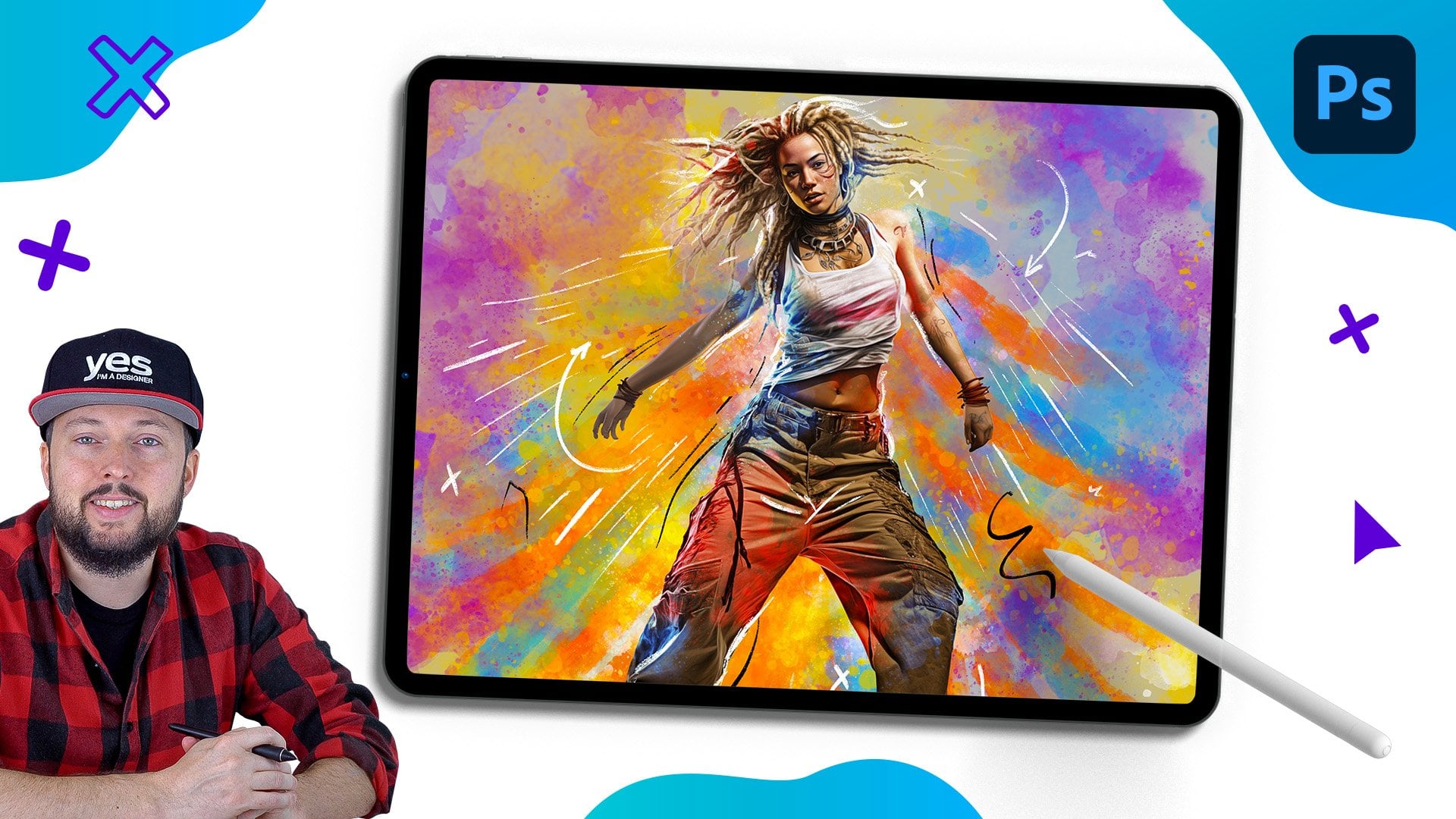
1. Introduction Movie poster: Welcome to the most hands on photoshop course
you've ever seen. This isn't your
typical feature tour. We are diving straight into
exciting creative projects, and you are encouraged to create completely
unique designs. You will love this project
if you are a fan of movies. And honestly, who doesn't like
looking at movie posters? This particular project, I decided to do a
dark fantasy movie. It's completely fictional. I came up with the title. I came up with the general
characters as well. But like always, what's most important is the work for
itself and the techniques that we cover because
these can be applied to any type of style and theme
that you wish to create. Whether you are an
aspiring graphic designer, photographer, marketer, or simply an individual with a passion for visual
storytelling, mastering photoshop provides you with the tools to bring
your visions to life. This course is perfect for you if you are new to
photoshop or if you are self told and in to get more confident and
effective using it. I am Martin Pahina, a certified ado
expert and instructor with a design background
spanning over two decades. Throughout my career,
I collaborated with renowned clients
such as Disney, Mattel, Cartoon Network,
Nickelodeon, and BBC. Learn to use photoshops
latest features together with the
fundamental building blocks, like layers,
adjustments, selections, transformations, masking, smart objects brushes,
and so much more. You can also future proof
your skills by mastering Photoshop's amazing
generative AI features. I am not just
teaching photoshop. I am empowering you
to express yourself, tell your story,
and create designs that resonate with
your unique style. This is your chance to
create work that is truly personal and worthy of your professional
creative portfolio. You can follow along
with each project and replicate my designs, or you can use the workflows
and techniques I show you and create something completely
different and unique. So are you ready to revolutionize the way
you learn photoshop? Your creative adventure with
Photoshop starts right here. Oh.
2. Setting up the document: Project, I would
recommend to work with a standard movie poster size, which would be 27 by 40 ". This is going to be a
portray movie poster and 300 PPI or pixel
pringe resolution. Now this is going to
guarantee that this will be a very high
resolution image. When it's printed out,
it's going to work nicely for that standard size. It's like an industry
standard resolution. But if your computer is
struggling to handle this, you can always reduce this
down to maybe 72 or 150. But just to show you if I
switch to pixels, currently, it's a very high
number of pixels, 8,000 by 12,000 pixels. But if we switch back to inches
and reduce this down to, let's just say 72 PPI. Now if I check the pixel size, you can see it's
radically reduced. It's still enough to work
with for this tutorial, but it's going to be easier for the computer to handle
this type of file. Worth mentioning that
if you are changing the resolution while you
have the pixels selected, it's not going to affect
the document size. So it's just simply setting the resolution to
a higher number, but it's not going to
change the pixels. So in case you want to go back to the higher pixel amount, make sure to first switch 2 ", then type in 300. And now when we go
back to pixels, you can see it's set to the higher resolution
numbers again. If you're not familiar with how pixels and resolution work, make sure to watch the video
in the introduction chapter, but I explain this in a
little bit more detail. But now that we have
everything set up, we can create this new document, and I am going to bring in all the images that I
would like to work with.
3. Placing assets in composition: I've selected only
seven of the images, which we prepared for
this tutorial for you. So I have six actors and one image for the backdrop,
which is this mountain. So I'm going to bring
these into Photoshop. And the easiest way to do
that is to simply drag them all into that
empty new document. So I'm going to grab them from my finder and then drop them
here in the background. Now, you can, of course, use windows Explorer if
you are on a PC. And when you do this,
all the selected images will be placed in one by one. You just have to press enter
each time when one appears, press enter, then
press enter again. And the good thing about this
method is that this way, each of these images will be automatically placed
in as smart objects. And I think this
is the last one. You can see here in
the layer thumbnails, all of them has
that little icon, which means that they
are smart objects, which makes it easier to work with them non
destructively. Now, let me move this mountain a little bit lower
using the move tool. It should be here at the
bottom of the composition. And then I'm going to select
all the actors and drag them to the top and also move
them a little bit higher. Now, we will have to make
them smaller as well. So having all of them selected, I'm using the commando Control T shortcut for using
the free transform. And then dragging one
of the corner points. I can make them a
little bit smaller, something around that size. I am planning to create a
triangular composition here. I'm going to use this character as the main holding device, and then all the other actors will be around this
central figure. As you can see in
the background, this mountain is also like
a triangle or pyramid. That's going to work
well and it will make it easier to align
things to each other. Now, I am going to start separating these images from
their white background. I will turn off all of them. And let's start with
this character here. I have the layer selected. And then from the
contextual task bar, I always try to start with
the select subject option. So that usually does a good job, and in this case, I feel like
it did a good job already. We can just turn this into
a mask with this icon. Okay, now, there are
some small details that I can see are not
completely sked out, like these bits here. But I'm going to come
back to that later. For now, I am happy
with this selection. I always like to refine my selections once I have
the composition in place. So let's just turn
off this layer, turn on the next layer. I like to keep these images on top of the background instead of having them on the whit
background just so I can see how the selections
and masks turn out. So again, select subject. Let's see what happens. We should get a
fairly good result. Yeah. I feel like it's good apart from maybe this part here, but let's turn this into a mask, and then we can zoom
a little bit closer. If you notice any
details like this, you can easily fix them by
having the mask selected. And using the brush tool, just set your brush
opacity up to 100%, make sure that the white color is set as your foreground color. And then you can
adjust the size and hardness of your brush either
from the menus up here, size and hardness, or you can access these from
the keyboard shortcuts. Control Option, click and drag
left and right on the Mc, or control old right
click and drag on a PC. So once you have
your brush set up, you can just paint
over these details. In this case, these were
very bright highlights. That's why it folded
the selection method. But now it looks good. Of course, again, we have some minor details that we could refine if I use black as
my color on the brush. I could mass these details
out and refine it. But once again, I'm
not going to spend time on these small
details at this stage. I'm happy with the
selection on the hair. I feel like that looks
quite good and realistic. And yeah, I think we can
move on to the next layer. So let's turn this one off. Turn on the next one. Once again, select subject. I feel like it's
going to be able to pick up most of the details yet. It did a fairly good job. Will just have to
fix this part here. But we can turn
this into a mask. Okay. Let's just have a look. Here again, I'm using the
brush tool around the hair. We just have to use Vite. On the mask of this layer
to fix those parts. And let's just move it up a bit. Yeah, I feel like the
rest of the hair is fine. We just have to
fix this bit here. For this, I am going to double
click on the layer mask. So this thumbnail here. Let's just double click on it. That takes us into the
select and mask workspace. And here, all you
have to do is to select the second tool, which is to refine the mask. And with that, just
paint over this area. And as long as you
don't go too close to the fur code
that he's wearing, it should be able to create a good selection there,
something like this. Then we can switch back
to the first tool with which we can remove some
parts of this selection, holding down the
older option key. We can just paint over some
of these particles here, which we don't actually
need in the final image. Something like that. I
feel like that works well. Now, if we want to refine
the hair maybe on the beard, we can use, again, the second tool, the
refine edge tool. And with that, just paint
around the edges of the beard. I feel like that
improved it a bit, and maybe around the
moustache as well. I think that is going
to work nicely now. So let's click, Okay, this
should update the layer mask. And I feel like that
looks really good. So we can move on
to the next image. Here, we have to again, try to use the select
subject first. Let's see how that works. Again, did a fairly good job
apart from these parts here. Another way to quickly
fix this would be to switch to the object selection
tool from the toolbar. Hold down the shift
key and click on the veil that should fix the
edge there on that side. And yeah, we can see that
it fixed the selection. So now we can just turn this
into a mask like before. I am happy with that. Maybe this little detail
here needs to be removed. And here I'm going to use another method which
can be very useful. So this is something that I would normally use
when there are these hard edges like
skin or clothes, anything that is not hair. So here, especially, we
will need these curves. So the best tool for
this is the pen tool. Make sure you set
it to path mode, and then you can start
drawing with it. Here at the bottom, we just
create a straight line. So I place down
two anchor points. So click once and
then click again. And then I'm going to click
and drag to create a curve. Now, while you are
still dragging this, if you hold down the space bar, you can even reposition the
point that you created and try to fit this curve along
that shape that we need. So something like that. You can go over it a bit, and you can use the
commando control key to drag existing points around
as well if you need to. Then you can continue drawing. Again, I'm going to click and
drag to create this curve, click and drag to
create the next one. And here because I will
have to change direction. I'm going to hold down
the Alter option key to click on that
last anchor point. That way, I can click and drag
and create the next curve, completely independent to
how the previous curve was. So it changed
direction like that. And then here once again, I pressed alter option
key and clicked on that last point and then
just create another curve. And now we just
have to close it. And then to turn this
path into a selection. I'm going to use a shortcut. It's command or Control enter. And once you have
your selection, you can fill this in with black, which is going to
hide these details. Remember in the mask, anything that's black is
going to get hidden. So I can just press
command or control back space because I had the black as my
background color. Or if it was set
to the foreground, the same feature can be accessed with old or option back space. So that's for filling in with the foreground or the
background colors. But if you want, you can
also use the brush tool, make sure you have the
black color selected and just paint over the
area that you selected. So you can see when
you have a selection, anything that you do will
be restricted to that area. And once you are done
with your selection, you can press command
or Control D, and we can zoom back a bit, and we can see it's a
beautiful selection there. So now this layer
is ready as well, so we can move on
to the next one, and we don't have much left. So this is another
character I want to use. I'm going to choose
select subject again. Let's just see how
that turns out. I feel like it's quite good. And I'm not really concerned about these
details missing here at the bottom because they won't be necessary for
decomposition anyway. So I'm going to turn
this into a mask, and I can see some details
around the face got lost, so I'm going to use
the brush tool paint over these with white.
Bring them back. Again, it was the highlights on the face that fooled
the subject selection. But now it works, so we can move on
to the next layer. And here, once again, we will choose
subject selection. And let's see how that works. I feel like it did
a brilliant job, so we can already mask this out. There we go. Yeah. It
looks good as a mask. And then here, I have a little bit of missing
detail at the end. But once again, because once we put these layers together, this is going to be hidden v, I am not too concerned
about visible edge there. We just have to keep in mind
of trying to hide it or blend it in once we have all
the characters put together. So now I am going to line them up here on
top of each other, and I'm going to make
them smaller again, just so we can see them all using the free
transform tool, I'm going to also make
this one smaller. Each time I'm switching
between the layers, I'm using the commando control key to quickly be able
to move them around. So that's all the images
ready to get started.
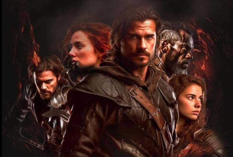
4. Compositing assets: So it's time to create
the composition, for which I would like to use this character
here on the top. And I would like this
to be the biggest one. This is the main
villain of our story. So she is going to be
somewhere here on the top, and I'm going to make sure she is blending into the background, but we can do that later. For now, what we need
to concentrate on is to make sure that we have a good
read of all the characters, and they don't feel like
they're floating in space. That's the worst thing that can happen with a movie poster. So you want to keep
them nicely fit together and make sure that you get a good read of
all the characters. But also, it's important to
play with the scale of them, especially the main actor, which is the main
hero of the story, should be the largest one. So I'm going to
make him quite big. I decided to have him
as my main actor. So I will have him there. And then let's select
this other layer here. I'm going to make him
smaller. Something like that. It's a very good pose, and especially it highlights
the swords and daggers, which helps sell this as a
fantasy or medieval story. I'm going to move this layer on top of all the other ones, so we can have him somewhere
around here, maybe. That's a good
alignment I feel like. He pose nicely follows on the cape that this
character is wearing, but still we have a good
visibility on the weapons. So I'm quite happy with
that placement there. Our main protagonist is also quite good
here on the right. Now, let's move the other
characters in place. I would like this
supporting character to be on the right side here. So I'm going to use the edit transform flip
horizontal feature. We can turn him to the other side and using the
free transform tool again, I'm going to make him
smaller, something like that. Let's align them to each other. I feel like something
like that works. Then I would like to have this character on top
of the layers as well. So I will put him
somewhere around here, actually put him all the way on the top and make him smaller. Again, we don't want to
compete with the hero. So I will have him
somewhere around There. Actually, the main actor
can be on top of everyone. So he really stands out. And last but not least, we want this red
lady, the centres. Again, we will need to flip her around so she looks
to the left side. So let's go to the transform
flip horizontal option. And then let's
bring her a little bit higher in the
layer structure. Maybe even in front of
these two characters. I think that's good. We can make her smaller, something like that,
and we can move her a little bit
closer this way. Okay. I feel like that is
a good composition, so everyone is
featured quite well. Maybe we can move everyone
a little bit to the left. Like that. And now I'm
going to select all of these layers together
and put them into a group. So selecting the
layer at the bottom, shift clicking on the
layer on the top. I'm going to press
commando Control G, so that creates a group, and I'm going to call it actors, and then let's move this whole set or group
a little bit down. We want to align it
to that mountain. So the shape of the mountain
should continue here. I will just make them
all smaller a bit. Again, using the
free transform tool, something like that. I feel like that
works quite well. Okay. So yeah, I think
this looks good. Now, before we move any further, I am going to extend the
backdrop of this image. And for this, I'm going to use the generative feel feature. So I have only the
mountain layer visible. I temporarily turned
off all the actors. And I'm going to use the
rectangular market tool and make a selection up here. I overlap a bit the original image or the
existing image at the bottom. And then from the
contextual task bar, I'm going to choose
generative feel. And type in something
like dramatic, dark clouds. I think
that's going to work. So here we have the
three variations. That's the first one.
That's the second one and that's the third one. I actually like the
second one the most. The third one was a
little bit too dark. I feel like this is
looking quite nice. Let's just zoom out a bit. Yeah, I think we
can work with this. But if you are not
happy with the results, you can always create some more, so just press generate and then it's going to give
you some more options. So let's just see one more
set, and what we get. Okay? So again, we got some
more options to choose from. I still feel like this
was the best one. It creates a nice frame or
vignette for the composition. So we have dark corners, which is always a good thing. It helps to focus the attention to the center of the image. Now we can put the actors back.
5. Adjustments and masking: And the next thing we will
have to do is to match the colors of them
to the background. Because at the moment
they are not in sync, they look completely
different in both hues, tones, and values. So we have to fix all that. And one of the fastest
way to do this would be to turn this group that we
created into a smart object. Now, they are already smart
objects individually, but we can turn them again
into a combined smart object. So when we do this,
we will be able to use smart filters on
all of them together. The good thing about a
smart subject is that you can always go into it
and make adjustments. So if you change your
mind and you want to move some of the
characters around. All you have to do is to double click on the thumbnail
of this layer, and that opens up
the group itself, where you can still
find all these layers, and you can move them around. So maybe if we want to move him a little bit to the
right, we can do that, or maybe if we want to move
this guy a bit further in, we can do it, and
then just go to the file menu and
save these changes. And that way, it's going to show up in the actual composition. So now we moved that character in and turn this whole
thing into a smart object. It's time to use one
of the adjustments. This, you can either use from the image menu and find
the color balance here, or you can create this
as an adjustment layer. But this time, since we
already have a smart object, I find this one easier to use. This is going to end
up as a smart filter. And this is a really useful
way of matching colors. And since I can see that there's quite a lot of science and
blues in the background, I just want to increase
the intensity of those. Maybe also add a
little bit of green. So we want to have all the tones cooler,
something like that. And notice that you can also adjust the values of the
shadows and the highlights. So you can do this not
only for the mid tones, but for the shadows as well. Again, I'm trying to be careful of how much each of
these values I'm using. So something like that. And for the highlights as well, maybe a little bit
more towards the sen, more towards the blue as well. And we can see before and after. I feel like that's
already quite good. Probably we can
accept these changes. And next, I'm going
to use probably the most advanced filter that
you can apply to images. And that's the camer filter. Once again, this will be
addit non destructively. So we will be able to go back
and make changes easily. The only disadvantage that
whenever you use this, you won't see the background. So I like to keep the original
image here on the side, and then I like
to zoom in closer to the image so we can
see what we are doing. Just keeping an eye
on the background. It will help me to align
it to that, the colors. So what I want to
do here is to go to the color first and
reduce the vibrance. So this way we can
just desaturate the image a bit because it
was very vibrant before. I feel like now it's
already much better. It's that dark gritty
look that we are after. And we could even adjust
the temperature slightly, again, that helps to make it
cool down all the colors. I feel like that's
much better already. And in the light section, we can probably play a little
bit with these values. I can reduce the whites
ever so slightly. We can increase the intensity of the blacks by dragging
them to the left, that adds more
contrast in the image. And I feel like overall, this is a good result. Maybe we can just drag the shadows ever so
slightly to the right. So we can see the changes
here. They are very subtle. If I press and
hold on this icon, you can see before and
after before and after. Very subtle again
with the color, it's a little bit
more obvious if I press and hold on the
i that was before, and this is after. So now that we are ready, we can hit k at the bottom, and then we should
be able to see this updating in the main
composition as well. Now if we want to see
without the adjustments, we can turn off this i icon
and then turn it back on, or we can also individually turn on and off the adjustments
that we added. So the color balance,
which we use first. Let's bring that back, and then camera rule filter
again without and wd. So, I am quite happy with
how this turned out. I feel like the colors match much better the
composition that we have here. Now we just have to blend
them together because currently we have a very sharp
edge here at the bottom. For this, I'm going
to add the layer mask with this icon here
in the layer spanel, and switch to the brush tool. And I'm going to use
a soft edge brush and start painting at
the bottom here with black as my
foreground color. Remember, you can press X on the keyboard to switch your foreground and
background colors. So using black, I can
paint over these details. And I'm trying to create
a fairly uneven edge, so revealing more of the
mountain as I go along. And here, I'm trying to create an interesting bland between the background and
the foreground. I feel like his armor plate
should still be visible. But around here
where the arm is, we can hide a little bit more. Really making it look like they just appear out
of this mountain. So there's like a nice
transition between them. You can feature the
rock a bit more here. I feel like that is
a quite nice way of making it look like. There is more integration
between the two images. So he almost appears
behind that rock. I'm just switching
back and forth between black and white and
drawing with black and drawing with white
until I'm happy with the transition,
something like that. That's quite good.
And then here we can hide a little bit more
details of this lady. And I feel like that is
already looking good. Maybe we can hide some
more details here as well. Yes. Something like that. Let's see without the
mask and with the mask. Now, always, if you want to
bring back some more details, you can just switch
to hit by pressing x, and then you can have maybe
the arm visible a bit more. If you wanted to do that, I'm not 100% sure whether
that's necessary or not. I guess it's good to see a
little bit more of that, so we can hide back at. Again, just ever so slightly, we want to hint at that there is an arm there and
not just the armor. So once again, without the
mask and with the mask. And once again, if you want
to hide the mask temporarily, just to see how it was before, press and hold shift and
click on the mask icon. So that way you can quickly
test before and after, and we can even zoom out
and check it like that. As a overall composition, I think that works really well. I still feel like
we need to increase the contrast of this
composition a bit. So I'm going to use another
adjustment for this. I go to image adjustments
and choose levels. Just make sure
before you do this, that it's not the
mask that's selected, but the image thumbnail. So you want to apply
the adjustment there. So let's just go to
levels, and then here, all you have to do is to drag the black point up to
increase the contrast, and the white point
down, you can also do. So let's just drag
this a little bit even higher,
something like that. So let's see before, and after. So we really increased
the contrast. And now it's time to go back
to the mask of this layer and make this villain
disappear into the background. So for this, I'm going to
use the black color again. And this time I'm going
to reduce the opacity of my brush to something
around 25 30%, make the brush quite big and start painting over
the character. So I want her to vanish
into the background, but still be visible
at the same time. Now, I don't want that mountain
to start showing up here, so I will have to make
sure that is hidden away. And focus on these
parts here on the top. So I don't want also this
character to disappear. So I'm going again
back and forth between painting with
black and white. With black, I'm hiding details. And then when I
switch back to white, I can show them or
reveal them again. So I'm going to create
something like this. I actually want the eyes
to be most prominent, so I will reveal those
a little bit more, maybe with 10% opacity, just adding a little bit
more emphasis on the eyes, and the rest of the face
can be more hidden away. Yeah, something like that. Cape can be hidden as well here on the right side,
a little bit more. We don't need to
feature that as much. And then the top of the cape can disappear
a bit more as well. Okay? I feel like that is a quite good effect
again, without the mask. And with the mask, now we have both the
top and the bottom quite nicely blended
into the composition.
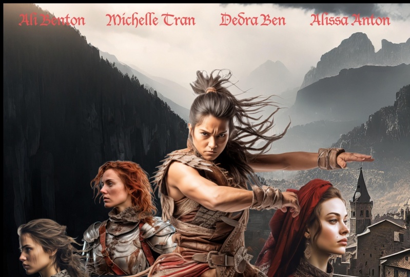
6. Adding text elements: Now it's time to
add all the text. So the movie title, the actors names, and the
credits at the bottom. Let's start with
the movie title. I decided that the title is
going to be descent of Doom. I'm just going to use
the Type tool and click somewhere here in the center
and start typing it in. Descent of Dom. Now, for the font choice, it's completely up to you
what you want to work with, but I feel like Gander Nu is a great black letter
font that also feels still modern or current, and I can make
this a bit bigger. Probably try to fill in the area from the
left to right where we have this transition between the people
and the background. And I actually like to have
the word of a bit smaller. So what we can do is to put
that on a separate layer. It's always easier
to do it that way. So I will delete
that, maybe keep a little bit more space between the two words,
something like that. Let's increase the size
a little bit even more. We can use free
transform on the text. I always find that the
easiest way to do this. Yeah, I feel like that
looks really good. And then I am going to
use again, the type tool, click somewhere in an empty
area and type in off. And we can put this
here in the middle. Now, we can make this
slightly bigger. Just want to make
sure it's not as prominent as the
rest of the text. Using the arrow keys on the keyboard to adjust
the positioning of it, and then let's zoom out a bit. Now, I feel like
that looks great. We could always make the text all capitals if we wanted to. But I quite like
the way this looks, so it has a bit of
more variety with only the first letters
set to capitals. And then after this,
it's completely up to you whether you want
to add more text or not. But in case you want to make it look like a real movie poster. You probably would want to
add some names on the top, so I'm just going to
copy that last layer, and I'm going to start
typing in names. I will use some fictional names. And we want this to be
smaller up here on the top. And maybe we could actually
sample a color from the sky, be something like this and
apply that color on the text. I don't want these names to
be as prominent as the title. So it's still a bright text, but it's using a
color from here. So what I'm doing here
is using the brush tool. I old or option click on
the color of the sky. And then having that
text layer selected, I press old or option backspace
to quickly fill it in. If I want to make it brighter, I can do that, and that's probably going
to work quite well. So now, if we wanted to, we could just continue
typing into the same layer. But what I normally find
is that it's easier to create a duplicate
layer using the move tool, old or Option click
and drag to make sure that it's also not moving up and down, just to the right. I can hold down the
shift key as well, so that just restricts
the movement. And then once it's in place, we can use the type tool, double click, and
then change the name. I will have another
fictional name here. Let's just add one more. Then using the commando
control, click and drag. We can move these layers around until we are
happy with them. I feel like this needs to come
a little bit to the left, that can go to the left as well. In general, I think the names
can be slightly smaller. Let's select all four layers, and then drag them down a bit. Holding down the
alter option key while dragging a corner point, you can resize things
towards the center point. Let's take a look
from a distance. Yeah, I feel like that
works quite nicely. And last but not least, a movie poster won't look authentic without the
credits at the bottom. And I intentionally kept enough space here where
we could put the credits. Now, for this, on
the mill Node board, you can find the
credits template file. It's a photoshop file, and there's also a font that you can download and install
if you want to use this. You can also find this
credits photoshop file in the exercise files folder. So when you open that, just make sure you first
install the font for it. Otherwise, it's going to
give you a warning here that it won't be able to
adjust or edit the text. Once you install the steel
tongs font on your computer, you will be able to double click on the thumbnail of
this text layer, and you can change things
like the alignment. I normally like to have the
text aligned to the center. So that's something you can
do from the Options bar. That's again, left
aligned, center aligned, and then you can start
changing the text here easily. But you have to make
sure whenever you type in this font is that
you are using CPS. While typing or hold
down the Shift key. Because if you are using
lower case characters, they are actually going to
add these special details. So for instance, if I press A, that will add written by S is going to do
special effects by. D is costume designer,
and so on and so forth. So it's a special phone
specifically for movie credits. I'm just going to press
capslog and type in descent of Dom and then accept these changes and then copy this layer by
pressing command or Control C. Back to the other document and command or Control
V to paste it in. We can increase the size of this to something around this. We can place it down here, and by default, the
opacity is set to 65%. We can increase this if it's
a little bit hard to read. We can even set it all
the way up to 100%. I feel like that's going to
be easier to read because of the effects that we have here at the bottom, something like that. Let's zoom out, see together, and we can maybe move this
a little bit to the right. I feel like that
is centered now. But in case you want to make sure that it's
perfectly centered, you can just have this layer selected and the
background layer, the original background layer. So hold on commando Control
click to select these two. And then from the Options bar, this icon is going to help you to center it
exactly in the middle. So this way, you can be certain that
it's set to the center. And of course, you
could do this with the movie title and the
actors names as well. But for now, I am just
going to do that manually. Feel like these names can
be a little bit smaller. We could spread them out
a bit more if we wanted to just using the move tool. And I feel like that
just balances things out a little bit better in
the overall composition. Now, one last thing that
we could try is to snack the actors layer and make
it a little bit larger, just to fill in that
space on the top, we're so slightly bigger and also a bit higher
in the composition. So this was before this is after feel like that fills in a bit more of this
negative space on the top. We could just adjust
the edges here, just use the mask again, and hide a bit more of these
details until it disappears and blends into the environment there and probably do a little bit here on
the right as well. So overall, I feel like
that helps the balance, and maybe we can
make the title also slightly bigger just to
fill in that space better, maybe move it slightly higher. Actually, I just realized
that we have a typo. I meant to write for the
title, descent, not decent. So let's just make that a
little bit smaller like that. We can move it up
a bit and we can move this text here
in the middle. That still looks
good. It still works. Luckily, this font
is quite narrow, the characters in
it, so we can fit more characters in without
making it too small. And since we are looking
at the text layers, it's good to put them
all in a group just to make sure we can find
them easier later on. So I'm going to call it type, and we can turn those
on and off much faster. And it's always worth
double checking your layers and make sure
that everything is named. To make it easier
in case you have to come back later
and make changes. I can see we have this
layer that's not named, which we used here
in the middle. I'm just going to check
that lights on the cave. I feel like now the
layers all make sense and everything
is nicely structured. Keeping all your layers
named and organized into groups is always going to make it easier to
work with the file, whether it will be
you who's going to make changes to
them or someone else. Forget that in some cases, you will have to provide
the actual working file, the PSD document to your client. And of course, they
would expect to see something that is neatly
organized and structured. But I think I'm going
to stop now because I could still spend hours
refining details, but I'm going to
let you do that. So I hope you will have
fun with this project, and don't forget to create your own compositions after you practiced repeating
everything that I've done here, because it's always more
fun and exciting to create your own compositions and come up with something
completely unique.
7. Conclusion: Well done for
finishing this course. I hope you had just as much fun going through it as
I had recording it. And of course, don't forget
about the class project. Because remember,
practice makes perfect. I can't wait to see your work, so make sure to submit it. And in case you
like this course, and you would like to
learn more from me, then there's plenty of other courses that
you can find here. Go ahead check them out now. I can't wait to meet
you in the next one.
 Martin Perhiniak, Graphic Designer, Illustrator & Educator