Transcripts
1. Introduction Editorial design: Welcome to the most hands on photoshop course
you've ever seen. This isn't your
typical feature tour. We are diving straight into
exciting creative projects, and you are encouraged to create completely
unique designs. This time, we will be working on an editorial design project, specifically, creating
some visual assets for a magazine spread. First, we will be working on this exciting composition
for the drop cap, the letter N, combining
multiple images together. Then we will create the
smaller composition, which we will use as an additional image on the
other side of the spread. And finally, we
will put everything together using Adobe in design. Whether you are an
aspiring graphic designer, photographer, marketer, or simply an individual with a passion for visual
storytelling, mastering photoshop provides you with the tools to bring
your visions to life. This course is perfect for you if you are new to photoshop, or if you are self
told and any to get more confident and
effective using it. I am Martin Purina, a certified Adobe
expert and instructor, with a design background
spanning over two decades. Throughout my career,
I collaborated with renowned clients
such as Disney, Mattel, Cartoon Network,
Nickelodeon, and BBC. Learn to use photoshops
latest features together with the
fundamental building blocks, like layers,
adjustments, selections, transformations, masking, smart objects brushes,
and so much more. You can also future proof
your skills by mastering photoshops amazing
generative AI features. I am not just
teaching photoshop. I am empowering you
to express yourself, tell your story,
and create designs that resonate with
your unique style. This is your chance to
create work that is truly personal and worthy of your professional
creative portfolio. You can follow along
with each project and replicate my designs, or you can use the workflows
and techniques I show you and create something completely
different and unique. So are you ready to revolutionize the way
you learn photoshop? Your creative adventure
with Photoshop starts right here. Oh.
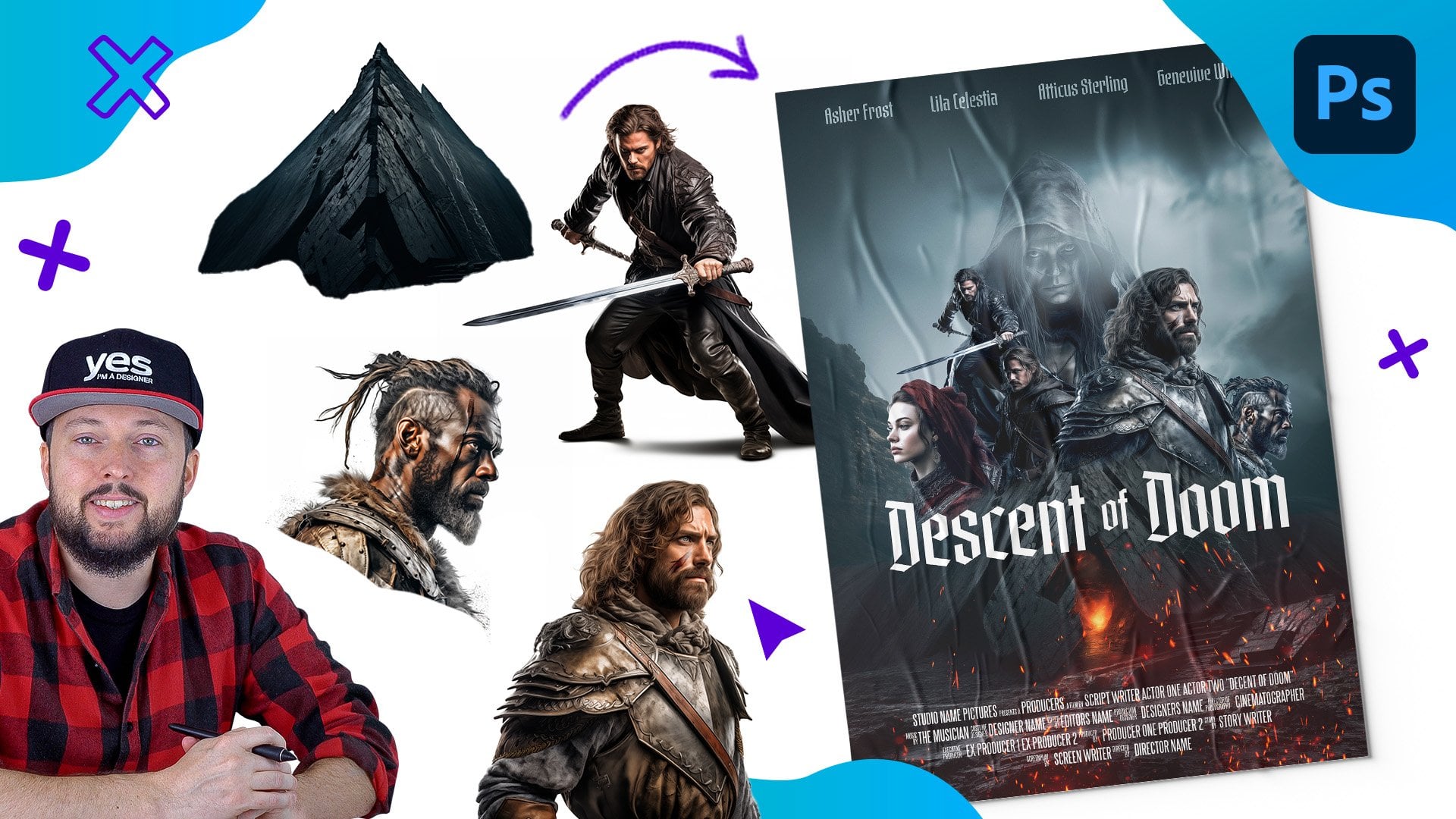
2. Adding the main character for the Drop Cap composition: The first design that we
will create is the Drop cap, which is going to
be the main feature on the magazine spread. And for this, I'm
going to create a blank new document
in Photoshop. 2,500 by 2,500 pixels should
be high resolution enough. Resolution I set to 72 PPI, and I set this to
RGB color mode. And then let's create
this new blank document. So we will be working
from scratch here, and we will place
in all the images. But the main component or container for this
composition is a character. And in my case, because of the title
of the magazine, is going to start
with the word nature, the first letter is
going to be n. Now, I'm using the Havits font, which you can find in the Mill Note board and you can download it.
It's a free font. But of course, you can choose any other fonts that you prefer. The reason I like to
work with this one is because it's really
thick and bulky, but I also like these
nice rounded corners. So it makes it a bit
more approachable, even though it's quite
dense and heavy. And of course, it's
a sunsey font, so there are no serifs
on it, which again, makes it easier to create
these type of compositions. Now, if this is the first time that you are using
the type tool, you can find it here
in the toolbar, and you just simply have
to press anywhere on the canvas and then
type in what you need. In this case, I type in n. And then from the control bar, which you can find
here on the top. In case you don't see
it, make sure you go to the window menu and
choose options. So from here, you can choose the phones that's currently
installed on your computer. And in case you are
using a font often, you can even mark
it as a favorite. And that way, you can filter
your favorites much faster, so you can find them quicker. Once you choose your font and
you typed in what you need, you can accept these changes
with this icon here, or press Commando Control Enter. And that way, this text
layer is created for you. You can see it here
on the right side. With the move tool, you
can move the layer around. And with the free
transform tool, which is commando Control T, you can very quickly
resize your text layers. Whenever you are done
with the transformation, just press Enter to
accept the changes. Let me jump back to
my larger layer, which I prepared here. And I'm actually going to
change the color of this soon, but for now, I'm going to
keep it this darker green. We will actually keep
it completely white eventually once we have enough elements inside
it and around it.
3. Creating a Clipping Mask - Portrait: The first element
I would like to bring in is the main image, which is this portray of a man. I am going to drag
this into Photoshop, drop it in here, and then press enter to accept
the placement. Whenever you drag and drop
an image into photoshop, it automatically
becomes a smart object. The first thing I would
like to do is to use the contextual Tis bar and
choose select subject. This bar, by the way,
most likely will appear under the
image by default, but I like to move
it out of the way, and you can even pin this tis bar wherever
you want it to appear. So I'm going to keep it up here. So I'm going to choose
select subject, and that is going to create
a very good selection, maybe apart from these very
fine hair details here, but that is not going to be necessary for this
composition anyway. I am going to click
on the mask icon now. Turn this selection
into a layer mask. And then we are ready to place
this into our composition. I am going to drag it
here on the right, and I would like
his head to come out of the character slightly,
something like that. I think that works
actually quite nicely, so I will leave it here, but now I'm going to use a very useful feature
called clipping mask. Notice how we have these two
layers on top of each other. So we have the text layer, and then on top of
it, there's the man. And what you need to
do is to hold down the alar option key and click directly between
these two layers. So imagine there
is an edge there. You have to make sure
your cursor is there. And while you are holding
down the altar option key, the cursor will change. And this special cursor indicates that we
are creating a clip. So what happened here is
that the image on top will only be visible inside
the layer underneath, which is the text layer. So the boundaries of the text layer became a
temporary special mask, which we call clipping mask. The great thing about this is
that I can move this image above around and I can
reposition it easily. But I could even change
the text itself. If I double click on the
thumbnail of that text layer, I could select it and maybe
change it to R, for instance. So it's a completely non
destructive workflow. What I would like to do here is even though I would
like to constrain some parts of this
portray inside the text, there should still be
some important details extending beyond
the texts outline. And to be able to do that, I am going to
duplicate the image, so that's command or Control J. Now we have two instances
of the same image, and this duplicate that
we created is by default, not clipped onto the text layer. As you can see, there is a little arrow
indicating here that this one is being clipped while this other one is
just completely free. Now, make sure you don't move
this around because then you will end up having
placement issue. So make sure that it's kept exactly where the
other layer is. But now what we will do is to select the layer
mask for this one. And using the brush tool with
a large hard edge brush. I am going to paint
over using black as my foreground color on
all of those areas, which I don't want to extend
beyond the original outline. So I feel like that looks great. However, I don't want to conceal too much of the
original outline. And I feel like we
could easily remove this section here as well and still have a good
visibility of the portray. But now we can also see the
character itself much better. Maybe one thing that
we can do is to have this feather be more visible and extend
beyond the outline. And to be able to do that, I will stick to
using the brush tool and the layer mask for
this t uplicate layer. But this time I'm going
to paint with white. For this, I'm going to
press x on the keyboard, and I will change
the brush size, either with the
square brackets on the keyboard or the
control option, click and drag technique. That we used in other
projects already, which is control all right
click and drag on PC. So once you have the white color as your foreground color set up, you can start
painting and reveal any details that we hid
in the original mask. So I would like this feather
to be visible again. I am going to extend it out. And it actually cuts off here, so we will have to be
clever about this. I'm going to press X again on the keyboard and
paint over the edges, and I will paint over
these details here. This I am using my stylus, which makes it a little
bit easier to create these more natural organic
lines or outlines. Painting over the edges
a little bit more here. And then I'll do the same
thing on the left side. When you use a stylus, you can create selections almost like the way you
would draw or shade. When you have a
pencil and a paper. This makes it much easier to create these organic outlines, and make your selections
more realistic, much faster with less effort. And like I said, to
be able to get rid of this harsh edge that we
have here at the bottom, I'm going to create an outline, make it feel like the feather was ending
here, something like that. Maybe make my brush a
little bit smaller. Add a little bit more
visual interest in it here. So no one knows what the exact feather was
in the original image. So we can be more creative creating some
imperfections on it like. If I feel like I
took too much away, I can press x on the
keyboard and draw it back. Feel like that looks
very realistic now. Maybe we can just paint
away a little bit more in some sections
here around the edges. Again, just adding a few
imperfections on both sides. As long as the
general shape works, we can have these
little details added. I think that looks great. Maybe here a little bit more, we can remove from the
strong edge. All right. Let's zoom back and
see how that looks. I think that looks great. And maybe now it's time to
change the color of our text. So first of all, I'm going to delete the background layer, select it, and then
press back space, and then click on the
adjustments icon at the bottom of the layer spanel and
choose solid color. This is going to create
a blank new layer. And this layer I'm going to
set up to be maybe gray, like a midtone gray value, neutral color, and drag it
all the way at the bottom. Now we can double click on the text layers thumbnail
and change the color of this from the
control bar here on the top to white and click Okay. Also accept these changes by clicking on the commit
icon here on the top.
4. Adding more assets - Stone and fox: Okay, now we can move on to
add some additional details. Let's bring in another image. This time, I am going
to bring in the rock. So let's drop that in here. And I don't want
this to be clipped, so I am going to drag
this all the way to the top of the composition
and drag it down here. Now, this sometimes can happen that depending on which
layer was selected, You might end up
losing your clipping, which was created between
these two layers. So we just have to go back and hold down Alter Option key, click there again to
create that once more. So that was an easy fix. We can select the rock image. And like before, we need to separate this from
its original background. You can either use
remove background or select subject from the
contextual task bar. Let's just try
remove background, thing that worked really nicely. And the good thing
about this is that it automatically also
adds this as a mask. So it saves you one step compared to the select
subject feature. Zoom a little bit closer. And while the layer
mask is selected, I'm going to use
the brush tool and just paint over a
little bit around here. I feel like these details
are not necessary. Just tidy up around
the edge a bit. There's a few additional
details there, maybe this one
here on the right, and I feel like that
is looking good. Here, I can see a
bit of a soft edge, and that for a rock
is not the best. So I'm going to use again
the brush tool and create a shape that I prefer for this
rock. Something like that. That's much better,
much neater edge. And for the soft edges that
we have here at the bottom, we can actually use the
refined mask option. So double click on
the mask thumbnail. And here we can change the view to be on
black, for instance. And with the refine
edge brush tool, we can just paint over
this section here. Maybe anywhere else,
we see the moth, maybe there as well a bit. I feel like that's enough. Maybe a little bit of a
detail here on the right. We can refine, and then
we can click Okay. Now we can move the rock here at the bottom of the left
side of the character. And I'm going to use the
free transform tool on this commando Control T and drag it down and set it up
somewhere around here, right at the bottom. So I try to align the bottom to the original baseline
of this character, and I think I can make it
maybe slightly bigger. Let's just increase the size a bit. And then can move it down. I can use the arrow keys on the keyboard to align it better. Yes, I think there is
going to work nicely. I can move it to the
left a little bit. And then let's accept
this transformation. That looks good. It doesn't interfere too much into the
outline of the character, so it's still recognizable. And now we can bring
in another image. This time, I'm going
to use this fox. So let's just drop that in here. And this fox is
going on the rock. So I will make it smaller. And then use again, the remove background option
from the contextual Taz bar. And I think that did a
brilliant job. It looks great. I just tested here on
the gray background, even on the softer
edges like the tail. I think it did a brilliant job. So now we can use the free transform tool
and make it smaller. Now, one thing worth mentioning, when you are resizing up
and down quite a lot, so radically making
something smaller or bigger while using
a smart object. You should also pay
attention to the mask, whether it's inside the
smart object or outside. Just to show you what happens, I I have my original mask
created with this size, when we look at the
quality of the masque or the outline by alter Option clicking on the
masque thumbnail, we can see that it's
fairly detailed, and it looks quite good. But then if I resize this layer with the
free transform tool and make it much much smaller, something like that,
then I resize it again, so scale it up with the
free transform tool. Notice what happens
around the edges. The layer mask itself wasn't preserved within
the smart object. So when I accept this change, the edge detail is
going to be really bad. So if I alter option, click on the mask again, you can see what happened here. So while the image itself
was a smart object, the layer mask was
outside the smart object, meaning that it couldn't
preserve the quality of it while I was changing the size back and forth with the
free transform tool. So to avoid this happening, I'm going to undo a few steps. So what we need to do
here is to right click on this layer and choose
convert to smart object. Even though it's
already a smart object, this is going to preserve the quality of the mask as well. So you can see that the thumbnail of this layer
is now showing transparency, which means that now the mask is also going to work perfectly, even when I do this, resizing down and then
increasing the scale again. You can see that
the edge details are just as good as
it was originally. This is an important
technique worth remembering. And in case I need to change
anything on the mask, I can just double click
on the layer thumbnail, and then I can still
access the mask inside. So I will just
close this document now and move the fox down here. Let's make it smaller, probably something
around that size, can make it a little
bit even smaller. Yeah, something like that. I feel like that
looks quite good. So I created the detail
again that comes out of the original silhouette
of the character, the N, but I feel like it's not
distracting too much from it. So it's still legible
or recognizable.
5. Using Select & Mask workspace - Tree: Now, I am going to bring in another bigger
element. This time. This is going to
be the pine tree. So let's just drag and
drop that in here. And this one is a
little bit more trickier to separate
from its background. Because if I just choose
remove background, you will see that
there's quite a lot of white details still kept inside. Now, in case you want
to make this perfect, you can go through a couple
of additional steps, but I like to always
keep things more in a draft state until I'm 100%, I'm going to use something. So in this case, I'm
going to drag this here and see whether
it's going to look good. I will move it down in the layer structure
below the FC and maybe use the free transform
tool to make it slightly bigger.
Something like that. Let's place it here. I actually want this to be aligned to the original edge of the character n,
somewhere around there. And for this, I'm
going to select the boulder and make it
a little bit bigger just so it can connect better to the tree and maybe move
it down at the same time. Yes, I think that
works quite nicely. Now I can see some of
these wide details coming outside here. And of course, if we were to use a different
color on the character, it would also show up there. So let's just fix
the edges a bit. By double clicking on the
layer masks thumbnail, we can go back into the
select and mask work area. The view I still
keep on on black and the opacity I
have it set to 50%. This way, I can really nicely preview what is happening here. And using the refine edge tool, I can paint over the
edges very quickly. So I will try to eliminate
all these white details. We have soft edges
all around here, so I want to make sure that
I go over all of them. On the left side as well. I avoid painting over the trunk of the tree
that should stay solid. And I feel like this is
looking already much better. But there is one additional
thing I'm going to do here, and that is the
decontaminate colors option. When I turn that
on, it's going to help to maintain that nice, rich, green color that
we originally had here. And maybe just one
additional thing. I'm going to use the selection
tool within the toolbar. And just to make sure we are not losing any details of the trunk, I just paint over
a bit that part. Also here at the bottom, just to make sure that stays solid and also here
in the middle. I want that to be solid. Okay? I feel like that looks great already. So let's click. And by the way,
whenever you have the decoontaminate
colors turned on, you can adjust the
amount of that. Sometimes maybe a little bit
less than 100% is enough. 60 70% is already
good in this case, and the result that is
going to be generated should be set up as a new
layer with a layer mask. And once you click, you will
see this new layer here. So we can actually delete the original layer in this case. I'm not going to work
with that anymore. However, don't forget to
turn your new layer that was created into a smart object because now that is
just a normal layer. So I right click on this and
convert to smart object. This way, I can move
this around easily. I can see that the
selection is beautiful, but I actually like
to keep it here where I wanted to set
it up originally. Now, I feel like the tree
can be a little bit smaller, so I'm going to use the
free transform tool. Something like
that, and maybe we can move it up a bit and also the fox can go higher just
to get everything in place. Yeah, I feel like
that looks good.
6. Refining layer masks - Feather and owl: Now I'm going to bring
in another feather. I actually would like
to have another detail coming out of the frame
here at the bottom. For this, I have another image. I am going to double click
on this to open it as a separate document because I only need one of
these feathers. I actually like
this feather a lot. So I will use the rectangular
marquee tool and make a big selection on this
feather right there, and then press Commando
Control C to copy it, then close this document. And then in our composition, I use Commando Control V
to paste this image in. Now, we can do the usual remove background
option on this. And let's see how that
turns out. It's quite good. I can just fix some
details on here. By double clicking
on the layer mask. We can use our
refined edge tool, paint over the edges a bit, where we have the soft details, and I think we will have
a much better result, especially here at the bottom. There was a lot of
detail missing. And I feel like that is
looking much better already. Can have some soft details
here on the top as well. And then we can click to
accept these changes. And if we alter option, click on the layer mask, the only thing I
notice is that some of these white dots disappeared
or became see through, and that something
that I'm going to fix quickly with the brush tool, just painting over them with white is one quick
way of fixing it. And if you want to avoid any transparency within
the feather itself, there is a very
useful tool for this, the Doug tool, you can
find in the toolbar. And if you set the
range to highlights. So out of the three options, you want to use highlights and the exposure to be around 30%, you can paint over
your selection and very quickly refine it. So inside, there shouldn't be any gray details because
white shows black heights. That's a much better
result already. And similarly, if
you see a bit of a halo outside of the feather, that shouldn't be there. That can be eliminated by using the opposite
version of this tool, which is called burn tool. That should be set to
shadows for the range. Exposure again, can
be set to around 30%. And then just click a
couple of times around the edge where you see most of that halo that I mentioned, maybe a little bit more
here on the right as well. Now we have a much neater
edge for the selection. And maybe I'm going to use the Dodge tool a little
bit more here on the top. Now alter option click
on the layer mask. We can jump back to seeing
the actual image itself. So let's move this over here and just testing how this works. I feel like the edge
looks good now. So it's time to turn this
into a smart object, right click and choose
convert to Smart object. And we can turn it around with the free transform tool and align it here to
the other feather. Maybe something like that. We can may make it a little bit smaller than
the other feather. And feel like we can make it
look like it's aligned here. Maybe rotate it a little
bit more line there. I feel like that looks good, and even from a
distance, it looks good. It doesn't distract from
the outline of the letter. Now maybe we can bring
in another animal, just to make things
more interesting. I will bring in this owl, drag and drop it into photoshop, place it all the way to the
top of the composition, and then use the removed background option
to separate it. I noticed that although
the selection looks good, we have some issues here
with these feathers, and in some cases, it's just easiest to fix this
with the brush tool. So I'm going to
quickly paint over them using white as
my four grand color, making sure that I'm working on the layer mask and just paint
over these details quickly. So there we have this
feather, another feather. Another one, and then maybe
these whit details here, we can remove it painting
over with black. I'm not going to spend
too much time on this because it's going to
be such a small detail. I don't think
anyone will notice. Of course, if you
are perfectionist, you can really be pixel
perfect with your selection. I am actually happy with
the way this looks already, so I'm going to turn this
into a smart object. Again, remember,
because we want to maintain the quality
of the mask. So I right click on this and choose convert to smart object. And then let's resize it. Drag it all the way down here. I want this to be
here in the corner, b even smaller,
something like that. Align it to the edge can be slightly in
front of the tree. And to make things
more interesting, we can actually clip this also to the outline
of the character. So I drag it all the
way down here and notice as soon as I placed
it above the text layer, because there is already a
clipping mask created there, this automatically also becomes part of that clipping group. So the l now is only visible inside the outline
of that text layer. But I will duplicate
this once again, alter option, drag it all
the way up to the top. Then add a layer mask on it. This is an additional
layer mask, not the one that we use
for the selection itself. And now I will just
zoom a bit closer and paint over the
tail feathers. Which will help us
create the illusion that the owl is coming
outside of the frame. So the tails that are further away are still
inside that frame, but the wings are now
spreading outside of it. So it's a nice out
of bounds effect, a bit similar to what we
created here with the portrait, but on a smaller scale. Last, but not least, I
would like to also have some watercolor details as a backdrop for this text layer. So I'm going to bring
in one of these. I quite like this green one, so I drag and drop this in here and drag it all the way at
the bottom below the layer. And just like before, this automatically becomes part
of that clipping group. So I can move this around and
you can see how it appears only inside the text
layers boundaries. So I want a detail here, which is going to be stronger. I just use the free
transform tool, make this a little bit bigger. Something like that. Then
I'm going to hold down the alter option key and
drag this here on the right, just to create another
version of this. And to avoid overlapping
between the two layers, I will change the blend mode
of this one to multiply. I didn't even bother
creating a selection here. Since these details are only
appearing in the background. I think this is
enough to work with. Yeah, just a little bit of blue green detail
there at the bottom. And then I'm going to
create another copy, drag it up to the top, and again, find a good
placement for it here. Maybe something like that
that looks quite nice. Can also have some additional
color here on the top left. Again, I'm using the
free transform tool on this additional
duplicate layer. And again, I would like
to highlight those edges, because what I'm going
to do now is to change the background color of
this composition to white. And here, I rely on a design
principle called closure, which means that even when something is not
completely continuous, our mind will close those gaps and be able to recognize something
as a unified shape. So in this case,
even though we have some visible gaps
here in some parts, so the outline is
not continuous. As long as we've
done a good job, not interrupting
the shape too much, the viewer will be able to recognize what they
are looking at. I feel like it
works really well, so we can turn off the background layer
and save it like this because this is the
way we will need it in the in design
document at the end. So let's save our work
as a photoshop file, and now we can move on creating the other smaller compositions that we will need
for our spread.
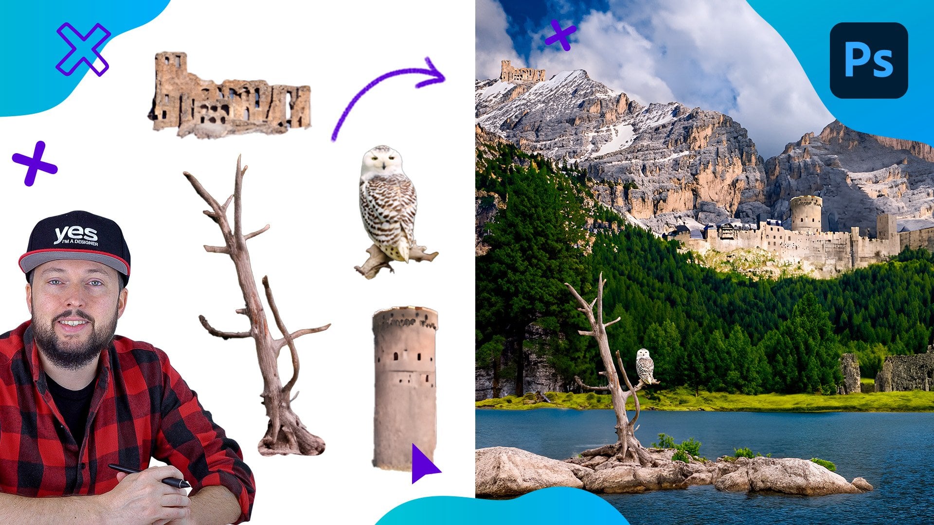
7. Creating additional compositions: I'm going to start with
another blank document exactly with the same
values as before. It can be slightly
smaller if you want, but there is no harm having
a higher resolution format. So I will create this, again, a square format. And first, I am going to use the ellipse tool out
of the shape tools, and I make sure
that it is set to shape mode here in
the control bar. Then we can hold
down the shift key and draw a perfect circle. This is going to be
filled in with a color, which we can easily change by double clicking on the
thumbnail in the layer span. I'm just going to change it to something more neutral for now. I feel like that looks good. And now I'm going
to drag and drop this landscape image
on top of this circle. Holding down the
alter option key, I increase its size a bit. And then I will create a clipping mask just like in
the previous composition, by holding down
alter option key, click between the two layers. Now, this image is placed
inside the circle. I actually want it to
be almost symmetrical, and that's why I like this image because we have the mountain
here in the middle, and then we have this
deep in the forest, which looks quite good,
so almost symmetrical. But I don't want the sky details and that mountain
in the background. So I will try to hide those. Having this layer selected, we can try to go
to the select menu and choose sky selection. Which most of the time will do a good job selecting the sky. And we can extend this selection by using the Quick Selection
tool, which is like a brush. We can increase the
brush size and just paint over a bit more
these mountains here. Maybe tap one more time there, and I feel like we got
a really good edge now. We can actually leave
these details here or maybe select those as
well and remove them. I think that's a good
selection there. But before we turn
this into a mask, I am going to click on the invert selection icon here in the contextual task bar, and then click on the mask. Because remember, whenever
you use the mask option, whatever is inside the
selection will be kept visible, and everything else
will be hidden away. So in this case, we were
selecting the sky at first. But then we inverted the
selection because we wanted to keep the mountain
and the forest visible. The good news is that even if
you forget that last step, you can always invert
the colors of the mask, select the layer mask thumbnail and press commando Control I. So that does the same thing, and you can go back and forth
flipping the colors around. Now I'm going to change the
color of the circle to white. So I double click
on the thumbnail. And set it to white
then click Okay. Now we just need one
additional image. I'm going to double click
on the Bird's image, and I'm going to make
a quick selection with the eso tool around this bird. I believe it's an eagle or
some kind of birds of prey. So there's the selection there, and I press Command or Control C to copy this
and close this document, and here I'm going
to paste it in, but before I do that, I make sure that the layer
on top is highlighted. This way, when this new
layer is pasted in, it's not going to end up
inside that clipping mask. So now we just have to separate
this from its background. So I will click on
Remove Background, and we can see that
it's done a good job apart from some
minor details here, which we can fix very
quickly with the brush tool. I just have to make
sure I have white as my foreground color so
that way I can reveal these details again that were hidden by the moss was created. And when you have details that
are along a straight edge, you can also use this technique, just click once with the mouse, and then hold down
the shift key and click again on the other side. This way you can create these straight shapes very easily. That essentially connects the
two points that you create. So now we have a much
better selection there, and we can turn this layer into a smart object to preserve
the quality of the mask. So right click on the layer, convert to smart object, and then reduce the size with
the free transform tool. I would like to have this
somewhere around here. And again, I love this
image because it just reinforces the symmetry
in this composition. So we have almost
like a V shape with the wings and accept
the transformation. And actually, I think that's
all we needed to do here. So we can just delete
the background layer and save this as
another photoshop file. I'm going to call
it circular comp. And last but not least. I am going to open this
second landscape image. Which I will use at the bottom
of the magazine spread. And here, all we
have to do is to use the sky selection option. So go up to the select menu, choose Sky, which should create a really good
selection already. We don't even have to
do anything about it. Just simply invert
the selection, and then turn it into a mask. And save this also
as a photoshop file. So just go to File menu, save S, and from the format, make sure that you have
photoshop selected. And I'm just going to
call this Mountains. So now we have all
of them ready. It's time to bring
them into in design.
8. Putting everything together in Adobe InDesign: Now, for this part of
the project in case, you don't have a DBN design, you can just use the
exported JPEG and actually put the composition
together within Photoshop. And the end result
will look very similar to what I'm
going to do here. Maybe apart from
some of the text wrap features that
we will utilize. But first of all, I'm
going to make sure I'm working on the images layer. So I have that already
prepared here. In case you don't
see your layers, just go to the window
menu and choose layers, and then go to the Pi
menu and choose play, so press commando
Control D. First, I'm going to select
the main composition. Let's drop that in
here on the top left. And I'm going to drop into this, so we just have a little bit less empty space around it, something like that. Maybe a little bit more. Simply just dragging the
edges. I can do that. And the holding
then command shift, the control shift
on the keyboard. I can increase the size of this until it fits
the composition. And let's just zoom
a little bit closer. I already have a ruler here
so I can align to that. So the baseline of
this text is aligned to the baseline of
that intro paragraph. I feel like that is
looking good already. Maybe we can just
move it slightly to the left.
Something like that. Now, it's important
that we need to remove this first character because we don't want it to be repeated. Since this is supposed to
function as a drop cap, so it's like a large
initial of the title. So now it reads as nature, having the first letter
here on the left. Nature's prescription
is the main title. I feel like that
works quite nicely. Maybe we can make this a
little bit even bigger. There is space here for
it to be bigger and then just align it a bit more
at the bottom, like that. And maybe it can come a little bit closer as
well on the right. So let's take a
closer look. Okay. I feel like slightly to
the left will work better. And now we can drop in our
other composition we created, so we go to the
place command again, and then we choose
the circular comp, which I will click and drag to place here on the right
side of the spread. Again, I'm going to
make this bigger command or control shift drag to enlarge it, maybe a little bit even
more, something like that. And now what we can do is
to go to the window menu, choose text wrap, And
within this panel, I will use the third option, the wrap around object
shape, and the type, I'm going to choose
Alpha channel, which relies on the transparency
in the composition. And we can just increase the offset to make the
legibility better. Something around 7 millimeters,
I think will work well. So we can see how the copy is
being pushed to the right. I probably will move this a little bit further to the left, so it doesn't interrupt the
flow of the text too much. Now, whenever you use
this type of feature, you want to make
sure that you apply it on the side of the text where it's aligned to
because that's when you get these nice even edges, which follows the shape
of the image better. Just to show you, if I were to put this image here
on the left side, where the text has
a ragged edge. So again, it's aligned to
the left, on the right. We don't have that even edge. It's not going to
be as effective or it's not going to be that interesting compared to what we could create
here on the right. Last but not least, let's
place in the mountains, which again is saved as a
separate photoshop file. I will click and drag
here at the bottom. And then I'm going to
just move it a little bit higher. Like that. And from the transform controls
in the property s panel, I reveal the flip
horizontal option with which I can have
it set up like this. I feel like it feels in the bottom part of the
composition much better. And there we have all
of the three details we created placed
into in design, and it's just time to add
the finishing touches. Some additional little images, similar elements that we used in our composition will tie
everything nicely together.
9. Creating a mockup with the final spread design: Now to really be
able to showcase our hard work that we
put into this project, let's turn the final design
into a beautiful mockup. For this, I have the
perfect template here already in Photoshop. You can find this file in
the Exercise five folder, magazine mock up
template PSD file, which will have
two smart objects, one for the right side of
the magazine that's on top, and the other one is
for the left side. So we will need two
separate J packs to be able to bring in our final
composition from in design. In case you put them
together in photoshop, you can just copy them
directly from there. But I'm going to jump
back into in design and go to the Fi menu,
choose Export, or Press commando Control E. And then here I will
choose Format JPEG, choose Save, and then
make sure that I have the export set
to all end pages. The quality should
be 300 PPI already, which will give us good
high resolution output. Now we can jump back
into photoshop and double click on the first
smart objects thumbnail. So this is the right
side of the magazine. We open this up. Now we can find those JPEGs
on our computer. So let's choose the right side and drag and drop it in here. And notice that
the SPEC ratio is slightly different,
but no problem. We can just hold down the
shift key and drag this down to the bottom and then perhaps enter to accept
the transformation. Because the mockup
is in perspective, this distortion is not
going to be noticeable. Don't worry about
it. Let's just go to the file menu save
these changes and then close the Smart object to see it already in
the mocap itself. Let's repeat these steps
on the other Smart object. Double click on the thumbnail, open that up, and then drop
the other image in here. Again, holding down
the shift key, we can drag the top
and then the bottom out and press enter to
accept the changes, file, save, and then close to have the final
composition put together. And it's ready to go directly into your
creative portfolio. I hope you had fun
with this project, and in case you followed
everything exactly the same way that I created or what you can see right
now on the screen. Then in that case, I would recommend to go back
to the beginning of this project and
try to work with different images, create
different elements, different composition,
and even in in design, come up with a slightly
different layout, if you want to, to
create something completely unique using the same techniques
that we covered. Just remember to
experiment, have fun, and create something
amazing in photoshop.
10. Conclusion: Well done for
finishing this course. I hope you had just as much fun going through it as
I had recording it. And of course, don't forget
about the class project. Because remember,
practice makes perfect. I can't wait to see your work, so make sure to submit it. And in case you
like this course, and you would like to
learn more from me, then there's plenty of other courses that
you can find here. Go ahead check them out now. I can't wait to meet
you in the next one.
 Martin Perhiniak, Graphic Designer, Illustrator & Educator