Transcripts
1. introduction : Hello, my name is Joseph Adam. I have been a graphic designer
for over ten years and I have worked with more than
600 companies and clients. And the more than 130,000 students have subscribed
to my courses. In this class, you
will learn to create professional designs from
scratch without the need for any prior experience in the design field or with the
Adobe Photoshop software. This class is divided
into two parts, the basic spots and
the advanced part. The basics parts
contains 14 sections. At the start you will learn the basics of the
Photoshop and how to use the layer system to create your first design
with the software, I will explain to you how to use crop and transform tools, how to work with smart objects, and all the different selection
tools that we use to grab the background from images and replace it with our
own backgrounds. You will also learn to
use the retouching tools that allows you to hide
any flow and images, clear the skin, and delete
any unwanted objects. Then we will move to the
adjustment layers and we will see how to edit and
change colors and images, and also how to edit and
enhance images lighting, and how to turn all the images into normal and colored images. The next section,
we will learn to write texts in the software and create special texts by adding effects to them using
the layer style. Then we will take a look at geometric shapes and see how to use them to create
a full design. After that, we will move to the filter menu and learn how to use multiple filters to enhance the images and make them better. Filters like the wave filter, the lens flare filter, and a lot more. In the next section, we will take a look
at the Brush tool. We will learn to create our
own brush from scratch, and we will see how to create effects using the
brush and helps create a hair brush that we use to fill blank spots and add more
details to the images. In the Tips and Tricks section, we will learn a bunch
of techniques that will make working with
the software easier, like how to hide
characters and change the sky color and images
in a single click. In the final section
of this part, you will learn to create multiple effects like
the coordinates effect, the glow effect,
the light effects, and a lot more effects. By the end of this part, you will have enough
experience to work with the software and use it to
create your own designs. Which leads us to the
second part of this class, the advanced part in which
you will learn to create professional designs using the photo
manipulation technique, a technique that
you can use to turn simple images to
professional ones. This part is divided
into two sections. In the first section, I will explain to you the
basics of photo manipulation, like merging images, choosing
the correct measurements, setting the colors, editing
the lighting and shadows. Also, I will provide you
with multiple sources to get ideas and to get the proper
images for your projects. After that, we will move to
the best parts of the class. For me, we will learn to
create professional designs. In this section, we will work
on 15 different projects. Is I will explain to
you how to create each project from
scratch until the end. In each project, we will learn new and different
techniques that will help you understand how to create your own future projects. We will learn to create ads and posters in creative
ways that allows you to bring your
ideas into life and transform them
into artistic reality. At the end of the
class, you will turn into a
professional designer. You will be able to work as a graphic designer or
use what you learn to create your own business or create your artwork
and publish it online.
2. Download files : Hello and welcome to this video. In this video, I will
show you how to download the class media
files so that you can use them to go
with me step-by-step. In the class videos. We start by clicking on
projects and resources. We see here download
class files. We click on it. It takes
us to a Google Drive link. Now we collect, download,
then download anyway. Here we are. The resources
are being downloaded. When the download is over, we get this compressed file. Double-click on
it to extract it. Here we are. We have here
the Resources folder. We open it. We have here
the whole class folders. Each folder correspond
to a lesson. If we use any resources
in the lesson, you will find a folder here with the same name
as that lesson. Folder will contain the
resources used in that lesson. So this is the Resources
folder containing all the resources that we
would use in this class. That's it for this video.
Thanks for watching, and I'll see you
in the next video.
3. Create a new project: Hello and welcome to this video. When you open the Photoshop
software for the first time, you will get this
interface here. Now we will see how to
create our first project. It's creates a new project. We click on new file, or we go to the File
menu and we select New. Then we get this window here. We have here the recent
sizes that we used. If it's your first time
with the Photoshop, this page will be blanked. Now we go to the photo page. We have here some page
sizes. This we can use. Next we have the prince page. Here we have the page
sizes that we use for printed designs like
flyers and more. Next we have the art and
illustration page here, multiple sizes that we can use. Next we have the web
page to design webpages. And next we have
the mobile page to design our pages for
mobiles and smartwatches. Then finally, we have
the film and video page. We use these page sizes
for films and videos. We will select any
page size and we will set it manually, e.g. this one. We start by naming our project. We name it first project. Now we change the measure
in units, pixels. We use the pixels for
designs that we display online and social media
platforms, websites, etc. Next, we set the width of
the design to 1920 pixels, and we set the height
to 1080 pixels. Next we have orientation. We can select Artboard or portray dependent
on what we want. Next, we have the resolution. If we want to display
our design online, we set the resolution to 72. And if we want to
print our design, we set the resolution to 300. Next we have the color mode. For online designs.
We select RGB color, and for printed designs, we select CMYK color. And we'll leave the rest
of the options untouched. Then we click Create. Let's create a project
with these options. And here we are. This
is our design page. We have here the
properties window. We use it, edit the size
of our design page. You can change it to portray
and change its size, etc. All the options that we had on the previous window or here. So this is how we can create new projects in the
Photoshop software. That's it for this video.
Thanks for watching, and I'll see you
in the next video.
4. Workspace: Hello and welcome to this video. In this video we'll
take a look at the softwares main interface. The Photoshop software offers multiple interfaces that
we can choose from. We go to Window Workspace and we find here
multiple interfaces. We have 3D, motion, painting, photography, and
finally, graphics and web. E.g. if we select the 3D
interface, it looks like this. Let's take a look at
the painting interface. Here it is. But the one that we will use
is the essentials interface. Firstly, we have here on the
right, multiple windows. We have color gradients, etc. If we want to hide any
of these windows, e.g. the color window, we go to the Window menu and we
uncheck the color option. Here it is, It's gone. Same thing for the
properties window. We uncheck it and it's gone. Now to show it back, all
we have to do is check it. Here it is. In case you had a problem
with the interface and you want to bring
it back to default. You go to Window Workspace and you select Reset Essentials. And here it is. You can put these windows
anywhere you like. You just click on the window and drag it to wherever you want. Just click on it and drag the window to where
you want to put it. Same thing for the
gradients window. And of course you can
always put it back easily. You can change the windows
are there if you like? You can put the windows in any order and anywhere you want. Like I said, you can always reset the essentials
interface from here. And to use a window, all you
have to do is to select it. Like I said, you can put the windows in any
order you like. Same thing here. We use the Layers
window very often. That's why it's preferable to set it at the first
position here. Next we have the tools
bar. On the left. We use these tools to move grabbed paints and
a lot of things. These are the most important
tools in the software. We can click here to
set the tools bar to one column or two columns. And we can put it
anywhere we like. And of course we can
always put it back easily. Select a tool, you
just click on it. Now some tools have
multiple versions. We right-click on
the tool to get the list of all it's versions. And it will that has
this little arrow has multiple versions. So right-click on it to get this menu and we
select the right tool. We will take a look
at all the tools in the coming videos. So that's it for this video. Thanks for watching and I'll
see you in the next video.
5. Import media to the software: Hello and welcome to this video. In this video we'll see how to import photos to the
Photoshop software. It's very simple. We go to File and let's open. We get this window and we
select on your computer. Now we locate the photos
that we want to use. I already showed you how to download the photos
that we will use in each video we selected
and we click Open. This is how we can import photos to the
Photoshop software. But as you can see, the image
is edit in a separate page. Design page is empty here. To add image to the design page, we click on it and we drag it to the design page like this. It will add the image is
added to the design page. We can add our images
in a different way. We locate the folder
where we have our images. We select the image and we drag it directly to the design page. Then we can adjust the
image size like this. And we click on the check
mark to apply the changes. So this is how we can import
images to the Photoshop. We can add images in a separate page and we
can add them directly to the design page. So
that's it for this video. Thanks for watching, and I'll
see you in the next video.
6. How to use the move tool and the zoom tool: Hello and welcome to this video. In this video, we'll
take a look at two of the most important
tools in the software. The first tool is the Move tool. The move tool is the first
tool in the tools bar. We use it to move photos. E.g. we use it to move
this photo like this. In case you try to move the
image and it did not move. Make sure to check
the auto select. Next we have the Zoom tool. We use it to zoom
in and zoom out. Zoom in, we click and drag up. And to zoom out, we
click and drag down. Even if we only select
the zooming tool, we can click and drag up to zoom in and click and drag
down to zoom out. Zoom in and zoom out are
basically the same tool. And when we use the
zoom tool only, again, we click and drag up to zoom in, and we click and drag
down to zoom out. So no matter which
Zoom tool you use, you can zoom in and out. The zoom tool is very useful because when we want
to crop an object, we need to zoom in on it to make sure that we crop it
in a professional way. So these are the Move
tool and the zoom tool. That's it for this video.
Thanks for watching, and I'll see you
in the next video.
7. How and why we use Layers: Hello and welcome to this video. In this video we'll
talk about the layers, which is one of the most
important things into Photoshop, if not the most important. For us to close this project. Now we add this
background image. It's located in the
resources folder. Now if we want to add multiple
images at the same time, all we have to do is hold
Shift and select the images. Then we click Open and here
are the images are added, each in its own page. Now we add this image
to the design page. We put it here. Now
as you can see, this image here covers
the other one behind it. We have here the Layers menu
and we have two layers, the background
image layer and the layer of the image
that we just added. Now we click here to unlock
the background layer. And if I pulled the
background layer to the top, it will cover the
other image layer. The other image
layer is in there. It's just covered with
the background image. If I click here to hide
the background layer, we can see the other image. So basically the top layer
is always in France, which means we always set the background layer
to the bottom. Now we add this image
to the design page. We put it here. You can
see it's layer is on top. If we put it below the
wood floor image layer, it will look like this. Now the wooden floor
covers the spray bottle. If we pulled its layer
below the background layer, it will disappear
behind the background. And when we put
its layer on top, it will be in France
of the design. Each object in the design
will have a layer. And if we want to put
an object in front, we put its layer on top. So that's it for this video. Thanks for watching, and I'll
see you in the next video.
8. How to scale layers: Hello and welcome to this video. We are still talking
about the layers. And in this video we
will see how to edit an object using the layers
we have here, our layers. You start by naming our layers. Double-click on the bottom
layer name to change it. We name it background. We named this layer floor. And we named the
last one bottle. Now if we want to adjust
the size of any object, we select its layer and
we select the move tool. Then we check Show
Transform Controls. And we get this line
around the object. Now if we select
the floor layer, we will get the line
around the floor image. Same thing for the
background image. So we select the Object
layer and we get this line around it to
use it at a D object. E.g. we select the bud layer. We click on the line
and we drag up. As you can see, we increase
the size of the bottle. And if we click on the
line and drag down, we decrease the
size of the bubble. So this is how we
can increase or decrease the size
of the objects. After we adjust the
size of the objects, we click on the check
mark or we click on enter from the keyboard
to apply the change. Now we select the floor layer. Same thing. We use this line to adjust its size to cancel the change before saving
it, we click here. Same thing for the
background image. We select its layer and we adjusted using the
line around it. We can adjust the
objects without having just let it
Slayer every time. All we have to do is to
check the auto select. And we click on the object
to select its layer. E.g. we select the floor
image and as you can see, we automatically
selected it's layer. Same thing for the background
image and the bottle. And what's even better
is that when we use the auto select and we
adjust object size, we adjust its size in an
even way and from all sides. Now to make the
bottle of wider e.g. we hold the shift button, then we select the
line around this from the right or the left side. And we drag to the side. And if we want to make the
bottle taller or shorter, we hold the Shift button and we select the line from
the top or the bottom, then we drag up or down. This is how we can
adjust the size of the objects in
different ways. We use the History window to backtrack our steps and
all that we have done. If you can find the
History window here, make sure to check it
in the Window menu. Then it appears here. Now we can go back
one move, like this. Tool moves and so on. Until we go back to
the Move that we want. Now let's say that
we want to adjust the size of two objects
in the same time. It's very easy. We select the layer
of the first object. We hold shift, and we select the layer of
the second object. Now both layers are
selected and we can see that we have
a new icon here. It's the link button. So we click on it to link the
two layers together. Now as we can see, the line is around the bottle and the floor. Now we can adjust the size of both objects at the same time. Same thing if we want
just the background layer at the same time as well, We hold shift and we select
the background layer. We clicked on the link button. Now the line is around
Pol three objects. And we can adjust the size of all three objects
at the same time. After we are done, we click on the check mark to
apply the changes. Now to cancel the link, we select the first layer, we hold shift, and we select
the other two layers. Then we click on the link
button to unlink them. Now we can adjust each
layer separately. So this is how we
can adjust the size of objects using the layers. That's it for this video. Thanks for watching, and I'll
see you in the next video.
9. duplicate layers : Hello and welcome to this video. In this video we'll see
how to duplicate objects. E.g. we have this spray
bottle and we want to duplicate it. It's very simple. We select its layer, right-click on it, and we
select Duplicate Layer. We get this window. We named
the second layer from here. I will leave it as it is. Then we click, Okay.
And here we are. We have a new layer.
We select it. We uncheck the auto select, and we'll grab the bottle
and put it anywhere we want. Now we have to spray bottles. We can duplicate it
again in the same way. Now we have three spray bottles. If we want to delete
one of the bottles, we select its layer and we
click on the Delete icon. We get this window
and we select yes. Or we can just
select the bud layer and we collected lead
from the keyboard. Now we duplicate
the floor layer, right-click on it and we
select Duplicate layer, rename it, and we click Okay. We put it here and here we are. And of course we can
delete it pretty easily. We have another way
to duplicate objects. We selected the bud layer, then we drag it to
the plus icon here. When we release it, we get a new layer. Same thing. We uncheck the auto select and we drag it anywhere we want. We can duplicate an object
as many times as we want. So these are two ways
to duplicate objects. Selected the way you like. The second way is a bit faster, so it's more practical. This is how we can duplicate
objects into Photoshop. That's it for this
video. Thanks for watching and I'll see
you in the next video.
10. blending mode and opacity: Hello and welcome to this video. In this video we will
take a look at some of the effects that we can
create using the layers. We start by selecting
the floor layer. Then we go to the
blending mode menu. As you can see, we have
here multiple options. We hover over each mode to see its results on the floor image. Each mode gives us a
different effects. Same thing, we select
the bud layer and we see the results of
each mode on the bottle. We can apply these modes
to any layer we have. Next we have the
opacity setting. We click here to access
the opacity setting. And we use the cursor to adjust the opacity of the
selected object. We decrease the opacity of an object to make
it transparent. If we set the opacity to zero, the object will disappear. Then we set it to
100. To show it back. We set the opacity based
on the results we want. We can apply it in
a layer we have. Next we have the field setting. On the first look,
it may look the same as the opacity
setting, but it's not. And we will talk about it in details in the coming videos. We have here the
Blending Mode menu and the opacity setting, which we can use to create
some cool and simple effects. That's it for this video.
Thanks for watching, and I'll see you
in the next video.
11. clipping mask: Hello and welcome to this video. In this video we'll talk
about the clipping mask. We start by creating a new
page with 19 2010, 80 size. We click Create. And of course you can use any size you want for this page. Now we go to the
Resources folder and we add the
brush image first. Next we add this image and
we put it over the brush. So we have this image
over the brush image. And we want to add
this image inside the brush. It's very simple. We right-click on
this image layer and we select Create
Clipping Mask. Right after we created
the clipping mask, we got this arrow
indicating that this image is edited
image below it. And as you can see, the image is now in the shape of
the brush image. Now to remove it, we
right-click on it and we select Release
Clipping Mask. Now we add this image here, and we add the second
image over it. It's an image of a background. We increase its size like this. Now we will add this image
inside the character image. So let's click on the image
layer and we select Create, Clipping Mask, or
the background image is inside the character. Now we go to the blend mode menu and we can select animal that we want dependent on the
result we'd like to have. So we can use the blend mode and the clipping mask to
create this effect here. Use the clipping mask to add an image inside another image. Then we use the Blend Mode menu to get the effect that we like. As you can see we have
here multiple modes. You can select the one that you like and you can set
its opacity as well. So that's it for this
video. Thanks for watching, and I'll see you
in the next video.
12. first homework : Hello and welcome to this video. It's time for your
first homework. After we saw how to use the layers into
Photoshop software, I would like you to
create your first design. This is the design that I
would like you to create. The image is used to create this design are in
the resources folder. So go ahead, give it a
try and I will see you in the next video to create
this design together.
13. create first homework: Hello and welcome to this video. In the former video, I have asked you to create a homework. So in this video we will
create it together. We start by adding the
images that we will use. So we go to File
and we select Open. We locate our images folder and we add the
background image first. Here it is. We go back and we
add the next image. We put it here, we click
on the check mark. We go back and we
add the moon image. We put it here. You can
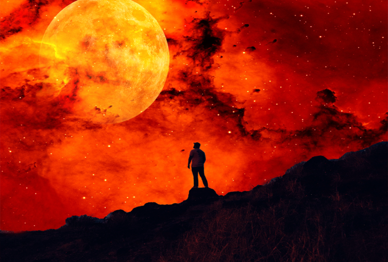
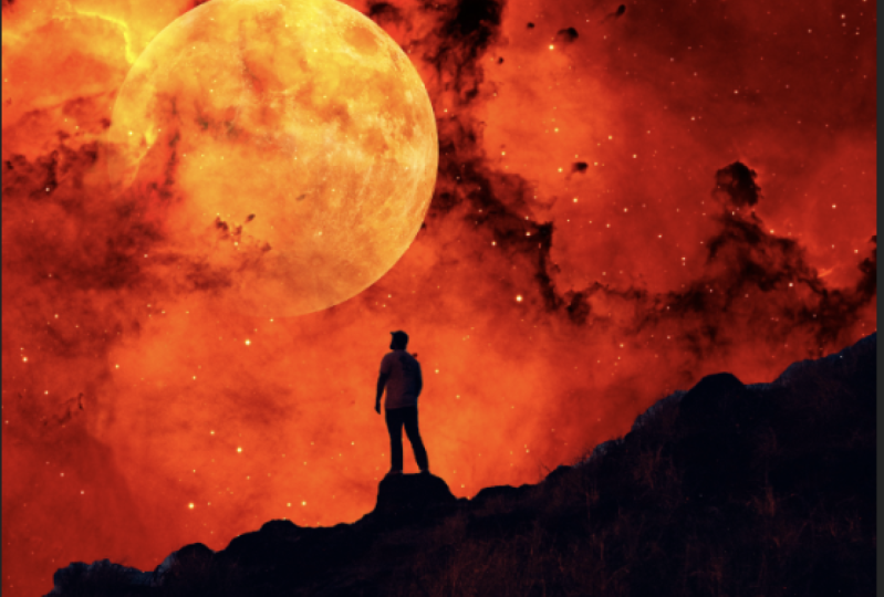
put it anywhere you like. We click on the check mark. Now we select the
moon image layer and we select the
Screen blend mode. Of course, you can select
any color you like. For me, I will go with the
screen mode. And here we are. This is the final look of our first design with
the Adobe Photoshop. It's very nice, simple
and easy design. So that's it for this
video. Thanks for watching, and I'll see you
in the next video.
14. Transform Menu: Hello and welcome to this video. In this video we'll see
how to transform images. We start by creating a new
project. I already did. Then we go to the
Resources folder and we add the following image. Now to transform this image, we need to check, Show
Transform Controls. And to show transform
controls setting, we have just let them
move tool selected, any other tool we will
not be able to see this show transform
controls setting here we check show
transform controls. And we get this line
around the image, which we will use to
transform the image. Now if we select the
background layer, we can see the lines
around the background. And that's because the
background is locked. So we unlock it to see
the line around it. So in case you selected
the background and you can see the lines, make sure that it's
unlocked first. Now we select the image layer. We click on the line
here and we dropped down to decrease the
size of the image. And we click and drag up
to increase its size. Same thing from the side. We click and drag to the
left to decrease its size. And we drag to the right,
increase its size. Now when I adjust the
size of the image, the size changes from all sides. And if I want to adjust
its size from one side, I hold Shift and I adjust
it from that side. E.g. from the top side here. Same thing from the right side, we hold shift and drag. So this is how we can
adjust the size of images from all sides
or just one side. And we click on the check
mark to apply the changes. If we want to undo anything
we did and go back, we use the History window. We have here all the moves
that we did in order. E.g. we go back and
the layer is locked. Now it's unlocked. So we can go back and forth. We can go all the way to
the first move we made. The design page is cell blank. Now we'll go back to
the less move we made. I will go back one move to undo this transform I just made. In case you can see the
History Window here. Make sure to check it
in the Window menu. Now click on the line around the image to get
these lines here. And then we right-click
on the image. We have here a menu with
multiple transform options. We have the scale option. This is the option that
we just talked about. We use it to scale the image. We increase or
decrease its size. Next we have the rotate option. We select it. And when we hover over the line here we get a curved arrow icon. We click indirect age
recite to rotate the image. We go back to the History Window and we undo our last move. Undo the last move very quickly. We can use the keyboard shortcut Command plus z in Mac and
Control plus z in Windows. Next we have this Q option. We use it to skew
the image like this. We can skew it from each corner to get the results we like. Next we have the
Perspective option. We use it to skew the image from two corners at the same time. Next we have here
the distort option. We use it to skew the image
in a more practical way. Undo the last move. We go
back to the Transform menu. We have here the rotate
180 degrees option. We use it to rotate the
image for 180 degrees. We flip the image upside down. Next we have the rotate 90
degrees clockwise option. We have the rotate 90 degrees
counterclockwise option. And down here we have the
Flip Horizontal option. We use it to flip the image
from the right to the left. Finally, we have the
flip vertical option. We use it to flip the
image from top to bottom. Now we will see how to use these settings in
a practical way. We go to the Resources folder
and we add this image. Now we will add image
we have here to the tablet to look like a screen wallpaper on the tablets. We use the History Window
to go back to this move. Then we add image to this page. Now we click on the line around the image to be these
lines crossed image. Then right-click on the
image and we select distort. Then we put the image on
the tablet like this. We use the distort
option because it allows us to edit and
skewed image in a freeway. After we are done, we click
on the check mark to apply the change. Here we are. This is the tablets before and after we added
the image to it. This is an example of what we can do using the Transform menu. So that's it for this video. Thanks for watching, and I'll
see you in the next video.
15. free transform: Hello and welcome to this video. In this video we'll
take a look at the free transform already added the first image in
the resources folder. So go ahead and add it. Then we add the second image. We click on the check mark or an integer from the keyboard
applied to image. Now we want to remove the
black background in the image. We select the image layer, then we select Screen
from the Blend Mode menu. The black background is gone. You put the image here. Now, just the image we check
Show Transform Controls. We get the line
around the image. We click on it to get these
two lines on the image. Now we click on this icon. We get this grid here, and we use it to transform
the image freely. We use the dots to
edit the image. We can edit it any way we like. This right here is
the Free Transform. As usual, after we are done, we click on the check mark or we click Enter to
apply the changes. So this is how we can
transform our images freely. That's it for this video. Thanks for watching, and I'll
see you in the next video.
16. Warp tool: Hello and welcome to this video. In this video we'll take
a look at the rat option. I already added the
background image. Go ahead and edit as well. Now add the second image. We drag it to the design page. We put it here. Now we click on the line
around the image, then right-click on the image and we select the wrap option. Now we go to direct menu here. We have here multiple options. E.g. we select arc. And here we are. We use this dot here to
adjust the image. Next we select flag
e.g. here we are. Like I said, we use the
data to adjust the arrow. As you can see, we have here multiple
options that we can use. Go ahead and take
a look at them. The Wrap option is one of the Transform options
that are very useful. As always, after we are done, we click on the check mark or
Enter to apply the change. So that's it for this
video. Thanks for watching, and I'll see you
in the next video.
17. Crop tool: Hello and welcome to this video. In this video we will
see how to crop images. We have here this image as an example and we will crop it. So we select the crop tool. We automatically get these
lines around the image. We want to crop the
image from the left. We drag the line from the left. Same thing from the right. The parts of the image that are outside the lines
will be grabbed. We click on the check
mark to apply the change. Here we are. Now we click Command
plus z in Mac or Control plus z in
Windows To Go back. Same thing if we want
to crop the image from the top and
from the bottom, we click on the check
mark. And here we are. We can crop the image
from the corners as well. And if we hover over the
crop line on the side, we get this curved arrow here. We use it to rotate the image. Then we grab it. This is how we can crop our
images in different ways. We go back. Now let's say this. We
want to crop this part of the image, the parts
with the plant. We click and drag over. The path is selected. When we release the mouse, you can see the
path is selected. So we click on the
check mark to grab it. And here we are. That's it for this video. Thanks for watching, and I'll
see you in the next video.
18. Second homework: Hello and welcome to this video. After we took a close look on the Transform menu and all that we have learned in
the form of videos. I have a small homework for you. I would like you to apply
this image to this phone. This is the original
look of the phone. And this is how it should
look like after you are done, both images are included for you in the resources folder to use. So go ahead, give it a try, and I will see you in the next video to create
the homework together.
19. Create Second homework: Hello and welcome to this video. In the former video, I have asked you to create
simple homework. Now in this video we
will create it together. I already added the first image. Now we add the second image. We decrease its size slightly. Right-click on the image
and we select distort. Then we add image on
the mobile screen. We click on the check
mark applied to change n. Here we are. We zoom in here. We need to fix this place here. We select the Move tool, which actually transform controls. We click on the line
around the image, right-click on the image
and we select distort. Then we fix this
place like this. Same thing on this corner. And here we are. Like I said, it's very easy and simple and it does not
take a lot of time. So this is how we can
change the screen of a mobile TV, tablets, etc. That's it for this video.
Thanks for watching, and I'll see you
in the next video.
20. Smart objects: Hello and welcome to this video. In this video we'll talk
about smart objects. We will see how to convert
images to Smart Objects. And we will see
what's the difference between smart layer
and the normal one. So this image here
is a normal layer. We duplicate it and we hide the top layer.
Unlock this layer. We checked show
transform controls. We decrease the
size of the image. We click Enter to
apply the change. Then we increase its size back. Again. We click Enter
to apply the change. Now if you take a close look, you will see that the
image lost its resolution. This is the original image,
and this is the image. After we decrease its size
and increase this back, we decrease its size again. We click Insert
applied to change, and we increase it back. Again. We click Enter
to apply the change. As you can see, the image lost its resolution and we
can see its details. Now we showed the replica. Let's click on it and we
convert it to Smart Object. After we converted the
layer to a smart object, we get this icon here
on the layer thumbnail. This icon indicates that the
layer is a smart object. Now we decrease the
size of this image. We click Enter to
apply the change. Then we increase its
size back into, as well. As you can see the image
maintained its resolution. We decrease its size again. We increase it back. Here we are. As you can see, when we decrease
the normal image, it loses its resolution. When we decrease the size
of the smart object, It's resolution remains intact. So smart objects maintain the resolution even
when you adjust that. Unlike normal layers. Because sometimes we
decrease the size of an image and we want
to increase it later. This comes in handy
in that situation. One more thing to talk about. We have this image here. Now we go to File
and we select Open. We add these two images. We drag this image here. Now we want to
replace the image on the ad board with the
one we just added. So we convert the image
layer to a smart object, which actually have
Transform Controls. Click on the line
around the image, then right-click on the
image and we select the distorts the image
on the ad board. Click on the check
mark, and here we are. Now, what if we
changed our minds and we want to replace this
image with another one, we don't have to do the
same thing all over again. All we have to do is double-click
on the image thumbnail. The image is opened
in separate page. Now we add the new
image to that page. We put it over the
existing image. Then we go to file
and we click Save. Now we go back to the airport
image, and here it is. The image is replaced
very easily. This is another
way to make things easier with smart objects. Let's most objects have
their disadvantages as well. E.g. if we want to delete
this part of the image, we will get this
message here because we can't make certain
adjustments to Smart Objects. So we have to turn it
back into a normal layer. To do so, we right-click on the smart object layer and
we select rasterize layer. Now the layer is normal again and we can make our adjustments. So that's it for this
video. Thanks for watching and I'll see
you in the next video.
21. Third homework: Hello and welcome to this video. It's homework time. I would like you to
create this design here. This is the original
look of the cup, and I would like you
to turn it into this. The images used are included
in the resources folder. So that's it for this video. See you in the next video to create the homework together.
22. Create Third homework: Hello and welcome to this video. In this video, we will create
the homework together. We add the cup
image already did. Now at the second image. Here it is. We edited the
design page. We put it here. Then right-click on
its layer and we convert it to smart object, which actual transform controls. You click on the line
around the image, then right-click on the
image and we select skewed. And we adjust the image
to fit it on the cup. Good. Now let's collect
and we slept grep. Then we select arch from here. And we adjust the
image like this. We click on the check
mark to buy the change. Now we go to the
blending mode menu and we select Linear Burn. Of course you can select
anymore, do you like? So here we are. This is our cup. You can change the image by double-clicking on
its layer thumbnail. The image is opened
in a separate page. We go to file open. We select the other image. We click Open, here it is. We set it. Then we save it. And here we are. The new
image is applied to the cup. So that's it for this video. Thanks for watching, and I'll
see you in the next video.
23. Object Selection tool: Hello and welcome to this video. In this video we'll talk about
the Object Selection tool. We use the object
selection tool to select objects and to
remove the background. We have this image
here as an example. We will remove the background, leaving only the character. The object selection tool is a new addition to the software, and the object selection tool removes the background
automatically. The only problem with
this tool is sometimes the background and the
objects have the same colors. So we can remove the background
in a precise manner. Other than that,
it's very useful. Now It's like the object
selection tool and we click and drag to
select the character. We add character is selected. But if we zoom in,
you can see that the character was
not fully selected. There are some parts
of the character that were left out of the selection. To select these parts, we will use the quick selection tool. We select the Quick
Selection Tool and we get two folds here. The Add to Selection tool, we can add more parts to the selection and we have the subtract from
selection tool. We use it to these left
parts of this lecture. Now we set the
size of the brush. We click on the
Edge Selection Tool and we select this
part here to edit to this lecture. Same thing here. We add this part
to the selection. Here we are Now the
character is fully selected. Now to remove the background, we click on the Mask button, or the background is removed. Now we will replace
the background. We select this image. We
added here, just its size. And we put the character layer on top of the background layer. In here we are, The
background is replaced. Now we add in your image. Here it is. Same thing. We select the Object
Selection tool. We select the headphones. This part was left
out of the selection. Same thing. We select the Quick
Selection tool. We click on the Add
to Selection tool and select this part. Now we'll click on
the Mask button to remove the background. We add a new background. Here it is. We added to the main
page. We put it here. We increase its size and opened the background layer and the bottom are the background
is replaced easily. So this is how we use the
object selection tool to select objects and to remove
backgrounds and replace them. This is an automatic
selection tool. And in the coming videos we will see some manual
selection tool. So that's it for this
video. Thanks for watching, and I'll see you
in the next video.
24. Quick selection tool: Hello and welcome to this video. In this video we'll take a look at the quick selection tool. This is the quick
selection tool right here. We use the quick selection
tool to select objects and duplicate them and to remove
the background as well. We have two tools in the
Quick Selection Tool, the Add to Selection Tool
and subtract from selection to the Edge Selection tool
to add to the selection. And the subtract from
selection tool to remove any parts from
this lecture, e.g. we want to select
all these roots here without selecting
the background. We start by selecting
this orange with the Quick Selection Tool. And to add another
object to the selection, we hold Shift and select it. Hold shift, and we add
the rest of the fruits. Now let's say that we no
longer want to select an object and we
want to deselect it. It's very simple. We select the subtract
from selection tool and we hover over the
object to dyslexia. E.g. if we select this object and selected an
unwanted parts with it, same thing we use to subtract selection tool to deselect
that unwanted parts. After we are done
with this lecture, we click on the Mask button
to remove the background, leaving only the parts
that we selected. We can replace the background
like we saw before. Now we add a new
image. Same thing. We use the quick selection
tool to select this table. Then we click mask, it will add the
background is gone. We add a new background image. We put the table
layer on top and we adjust the size of
the background image to fit the whole page. Here we are, the background is replaced. So that's
it for this video. Thanks for watching, and I'll
see you in the next video.
25. Lasso tool: Hello and welcome to this video. In this video we'll take
a look at the Lasso tool. We use Lasso tool to
select objects manually. Here is the lesser tool. We selected. The Lasso
tool is a free tool. It's very tricky to use
it to select objects. We use it to select objects with single color backgrounds
like this image here. We use the Lasso tool to select these donuts here. Like this. Then right-click on the
selected parts and we select Layer via Copy
to duplicate it, or layer via cut to
cut the selected part. Now we'll just duplicate it. We use the move tool to
put the object here. If we hide the background,
we can see the objects. We duplicate it like this. The selection is not precise, but it does not show because we have a single
colored background. If we have a multi-colored
background, it will show. We can select one of the
doughnuts like this. Right-click and
select layer via cut. And here we are. This is how we use Lasso Tool. That's it for this video.
Thanks for watching, and I'll see you
in the next video.
26. Polygonal lasso tool: Hello and welcome to this video. In this video we'll take a look at the polygonal lasso tool. We use the Polygonal Lasso
Tool to crop objects manually. This here is the
polygonal lasso tool. We have this image
here and we will use the polygonal lasso tool
to grab this tool here. So we zoom in on this tool
to crop it in a precise way. We click here to
add the first dot. Now the line is
connected to the dots. We click here to
add the next dot. So we place multiple dots
that's connected the line we put around the object to
select it and then crop it. We keep going until we select
the whole object and we have to connect the dots with
the first one we create. Now we click on the first dot
to connect the whole line. You can see when we hover
over the first data, we get this icon here, then we click on it to select
the whole object. We can click on the mask
to remove the background. We still have this part
of the background here. We selected using the
Polygonal Lasso Tool. Then we select the
image layer and we click Delete to remove this
part of the background. Same thing for this part here. We selected and we click
Delete to remove it. Same thing for the rest. Always zoom in on the object to crop it in a
professional manner. Here are the background
is fully deleted now. Now we can replace
the background or drag this tool to edit
to another design. We use the polygonal
lasso tool to grab any object or character. We have another image with
this character in it, and we will grab it using
the Polygonal Lasso Tool. We zoom in on it with the first dot here
and we keep going until we select the
whole character. I will fast forward the
process to save time. We're almost done. Now in case we made a
mistake and select it apart that we
don't want to select, we just click on the lead to remove the last dot we created. In case we want to delete multiple dots, we
can keep clicking, Delete until we go back to the
dots we want to return to. As you can see when we hover over the first that we created, we get this icon here. So we click on the
first step to connect the line around the
character to selected. The character is selected. So we zoom out and we click on Mask to remove
the background. So this is how we grab
objects manually. And we only use this way when the automatic
selection is not effective in case the object selection
tool is not effective. Because selecting the object automatically saves us a
lot of time and effort. And selecting an object manually takes us a lot of
time and efforts. So this is how we use the
Polygonal Lasso tool to select objects manually.
That's it for this video. Thanks for watching, and I'll
see you in the next video.
27. Change hair backgrounds: Hello and welcome to this video. In this video we will see
how to cut character's hair. So we select the lesser tool. When we select the Lasso tool, we get the Select and
Mask option here. We click on it and we
get this window here. The window may not look exactly like this for you,
but that's okay. Now we click on Select Subject. As you can see, the character
is selected automatically, but we have some
noise in the hair. This we need to fix. We have
here multiple view options. You may have the onions can
option as the default one. Anyway, we can select
any of your option here. I will select the
overlay options so I can take a good look at the hair and you can set the opacity to
any level you like. Now we zoom in on the hair. As you can see, we
have some leftovers of the background on the hair. To remove it, we use the
Refine Edge brush tool. We have the plus brush
and the minus brush. We select the brush
and we set its size. Then we collect and drag
over the hair. Here we are. The background
leftover is argon. We remove all the leftovers
from the background on there. Okay, So we made the mistake. We can always click
on Command Z. To undo our last move, we click Command plus z for Mac and Control z for windows. Are all the background
leftovers are gone. Now we go down here and we
select the image outputs. We select New Layer
and we click Okay. Here we are. We have our image without a background
in a new layer. This is the original
image and this is our image after we
deleted the background. Now we add a new background. We adjust its size. Here we are. The background is
replaced and we no longer have the former background
leftovers on the hair. So this is how we can crop
characters with hair. That's it for this video.
Thanks for watching, and I'll see you
in the next video.
28. Fourth homework: Hello and welcome to this video. It's homework time. I would like you to create
this design here. You will find the
images used to create this design in the
resources folder. So go ahead and give it a try. And I will see you
in the next video to create the homework together.
29. Create Fourth homework: Hello and welcome to this video. In this video we will create
the homework together. So we start by adding
the two images in the resources folder. We will select the character
and remove the background. So we select the
Object Selection tool. And we select the
character like this. Some parts of the character
will not selected. So we zoom in and
we use the Add to Selection tool to add
them to the selection. Here. And here. Now it's like the subtract from selection tool and we
deselect this part here. And here as well. Now we click on Mask to
remove the background. Then we drag the character to this page. And we put it here. We zoom in here and we remove the spotlight of the
former background. We use the magic
wand tool to select this part since it's
a single color. And we click Delete
to remove it. So here we are. This is how to create the simple homework. That's it for this video.
Thanks for watching, and I'll see you
in the next video.
30. Spot healing brush tool: Hello and welcome to this video. In this video we'll take a
look at the retouching tools. We use the retouching tools to remove any object
from the image. Right-click here to get
the retouching tools list. We have the spot
healing brush tool, the healing brush tool, etc. We will start with the
Spot Healing Brush Tool. We selected and the mouse icon
changes to the Brush icon. We set the brush size from here. It's hardness, spacing,
angle, and roundness. We set the brush size and we can right-click
on the image using the Spot Healing Brush tool
to get the same window here. Now let's say that we want to
remove this character here. We click and drag like this over the character to select it. After we release the mouse,
the character disappears. So this is how we use the
Spot Healing Brush tool to remove any object or
character from our images. We take a look at another image. We have this painting on
the wall and we want to remove it. Same thing. We use the Spot Healing
Brush tool to remove it. We keep going until we
remove the whole shape. I will fast-forward the
video slightly to save time. Here we are. The painting on
the wall is gone. We use the History Window to go back and see the image before. This is the image after we remove the painting on the wall. This is how we use the
Spot Healing Brush tool to remove any object
from our images. That's it for this
video. Thanks for watching and I'll see
you in the next video.
31. Healing brush tool: Hello and welcome to this video. In this video we'll take a look at the Healing Brush Tool. Right-click here and we select
the Healing Brush Tool. Here we are. We have the brush
icon and we can adjust the brush
settings from here like we saw in the former video. Now this tool is different from the Spot Healing
Brush Tool, e.g. as you can see, we
have this pimple on the character's face here. We use the healing brush
tool to copy this part of the character's face and use
it to cover the pimples. But first we set the brush
size, we set the hardness. We lower the hardness so it does not look like
the spot is copied. And I will talk more about the brush hardness in details
in the coming videos. So we copy a clear
parts of the skin and it needs to be similar to
the part that we will cover. E.g. here, we hold Alt and we click with the left mouse button to copy this part. Here we are, the
parts is copied. If we increase the
brush hardness, you will see that the brush
edges will be too sharp. So we need to decrease the hardness to soften
the brush edges. Now we paste that part over
the pimple to cover it. Here we are, the pimple is gone. We decrease the
brush size slightly. We hold Alt and we click here with the left mouse
button to copy this part. Then we paste it over
this temple to cover it. So this is how we can cover unwanted objects in our images using the Healing Brush Tool.
That's it for this video. Thanks for watching and I'll
see you in the next video.
32. Patch tool: Hello and welcome to this video. And this video we'll talk
about the patch tool. We select it. We use the Patch Tools to remove objects from images, e.g. we will use it to remove this tattoo on the
characters neck. The patch tool is similar to the healing brush
tool because we copied a part of
the image and use it to cover the
unwanted objects. The only difference
is how we do that. We select the tattoo
using the patch tool. After we selected the Jeju, we get this icon on the tool. Now we click on the tattoo
and drag to the left. Here we are. The tattoo is gone. It was covered with the parts on the left. You zoom in here. We select the spot and
we drag to cover it. We can direct any direction
to cover the selected part. Now we move to the next image. We select the car
using the patch tool. We click and drag like this. Here we are, the car is
gone. Let's go back. We can use the Batch Tools, duplicate objects as well. We select this part here. We click and drag to the
left, and here we are. The car is duplicated. We can select this part as well. We click and drag to the right. And here we are. So we can use the patch tool to hide
objects and to duplicate them. That's it for this video.
Thanks for watching, and I'll see you
in the next video.
33. Content aware move tool: Hello and welcome to this video. In this video we'll
take a look at the Content Aware Move tool. We use this tool to move any objects from one
place to another. We have this image
here as an example. We select the eagle. Now we click on it and we drag it to wherever
we want to put it. We can adjust its size.
Well, we move it. After we are done, we click on the check mark,
and here we are. The eagle is moved
from here to here. We can select again
and move it to here, and we can rotate it. Let's take a look
at another image. We select these two
characters and the camera. We decrease their size. And we put them right here. We click on checkmark,
and here we are. Removed them from here to here. This is how we use the
Content Aware Move Tool to move any object
in a place we want. That's it for this video. Thanks for watching and I'll
see you in the next video.
34. Clone stamp tool: Hello and welcome to this video. In this video we'll take a
look at the clone stamp tool. Right-click here, and
we get these two tools. We select the Clone Stamp tool. The clone stamp tool is
similar to the patch tool. We use it to remove an
unwanted parts or objects by covering it with another
parts of the image. We zoom in here. We select
the Clone Stamp tool. We set its size. We hold Alt and we click with the left mouse button
to copy this part here. Then we click and drag over
this graph here to cover it. Now we copy this part. We hold Alt and we click
using the left mouse button. Then we click and drag
to cover this part here. When we reach this spot,
the color changes. So we need to copy apart
part with the same color. Right here, hold Alt
and copy the part. Then we covered this spot here. Now we've got up here. We copy this part and we cover the
rest of the graph like this. Here we are. The plants part looks perfect. So this is how we use
the clone stamp tool to cover unwanted parts
of our images. That's it for this video tends watching and I'll see
you in the next video.
35. Fifth homework: Hello and welcome to this video. It's homework time. After we saw how to use the retouching tools
in the former videos, I would like you to remove this crack on the wall
in this image here. You can do that using any of the retouching tools
that we talked about. So go ahead and
give it a try and I will see you in
the next video.
36. Create Fifth homework: Hello and welcome to this video. In the former video,
I have asked you to remove this crack
on the wall here. Now there are multiple
ways and tools to do that. And we will start with the
Spot Healing Brush Tool. We selected. We set its size and we click and drag over
the craft room of it. Here we are, it's gone. We use the History
Window to go back. Now we will use the clone
stamp tool selected. Now we hold Alt and we select
this path here to clone it. Then we collect and Greg over the grip to cover
it with that part. The color changed so we clone another part to
this seminar color. Here it is. And we
covered this part. Again. We clone another part
and we covered the rest. Perfect. We can fix this
spot here as well. That's better. Like I said, we
had multiple ways and tools to complete
the objective. It does not matter
which tool you use as long as you did manage to
cover the crack on the wall. So that's it for this video. Thanks for watching and I'll
see you in the next video.
37. Adjustment Layer: Hello and welcome to this video. In this video we'll talk
about the adjustment layers. We already talked
about normal layers. Now we take a look at
the adjustment layers, which are different types
of players that we use, just colors, lighting,
and a lot more. To go to the adjustment layers. We click on the
adjustments window. Here we have all the
adjustment layers in case you can see the
adjustments window here. Make sure to check it
in the Window menu. Now we select a hue saturation. When we select an adjustments, we get its settings in
the Properties window. And we have here a new layer. This layer is not like
the other layers. And you can see it's named after the adjustments, hue saturation. Now we use this adjustment, just the colors of our image. Adjustments we just made to the colors is applied
to this layer here. If we hide the layer,
the adjustments we just made disappears. We showed the layer back
and the just man reappears. So we use the
adjustment layers to my adjustments to our images. As you can see,
the adjustment is applied to both images
that we have here, the background image
and the plane image. Now let's say that
we want to apply the adjustment to the
plain image only. It's very simple. We put the adjustment
layer right on top of the plane image layer and
we click on the mask. But this way we mask the adjustment layer
to the plain image layer. And any adjustments we make now will be applied
to the plain image. Only. Same thing if we want to
apply the adjustment to the background image
adjustment layer on top of the background layer. Now the adjustment will be applied to the
background image only. The blame image is
not affected now. But if we have multiple layers
below the selected layer, we have to mask the
adjustment layer to that layer to
apply the change to. It's only if we want to
apply the adjustments, all the layers, we
just leave it on top and make our adjustments. These are the adjustment layers
and what we use them for. And we will take a look at all the adjustment layers
in the coming videos. So that's it for this video. Thanks for watching, and I'll
see you in the next video.
38. Levels: Hello and welcome to this video. In this video we'll take a look at the levels adjustment layer. Here it is. We selected and we get its settings in the
Properties window, and we get the
adjustment layer here. We use the levels
adjustment layer to adjust the light and
shadow in the image. We have here precursors. The one on the right to
adjust the highlights, the bright spots of the image. The one on the middle to
adjust the mid tones. The spots that are
between bright and dark. And the one on the left
to adjust the shadows, the dark spots of the image. You can see the colors
on the cursor's. The right cursor is white, so it's just the light. The middle one is gray, so it's just the spot between the
light and the shadow. And the left one is black. So we adjust the shadows. You can see this image
here does not look good. So we adjust the shadows a bit. Here we are. This is before and
after the adjustments. We can adjust the mid tones.
The highlights as well. If we increase the
highlights too much, this guy will get
a bit distorted. So always make sure to adjust
the levels reasonably. Now we'll take a look
at another image. We go to the levels adjustment. Just the shadow slightly
and highlights. Then the mid tone slightly. That's better. This is the image before
and after the adjustments. This is what we use the
levels adjustment for, and this is how we adjust the lights and
shadows and images. That's it for this video. Thanks for watching, and I'll
see you in the next video.
39. vibrance: Hello and welcome to this video. And this video,
we'll take a look at the vibrance adjustment. We select the vibrance
adjustment and we get its settings in
the Properties window, and we get the
adjustment layer here. We use the vibrance
adjustment to adjust the vibrance and
saturation of the image, we can increase them
or decrease them. E.g. increase the vibrance. And you can see the
effects on the image here. This is the image
before and after. If we decrease the vibrance, the image will look like this. To put the setting to default, we double-click on his name. Same thing for the
saturation here. We increase it or decrease it. Same thing, double-click
on its name to bring it back to default. Now some of you
might wonder what is difference between the
vibrance and saturation. If we increase the vibrance, it will increase the saturation only in places with
low saturation. But if we increase
the saturation, it increases it in
all of the image. And if we increase the
saturation too much, the image will not
look very good. So this is the
difference between the vibrant setting and
the saturation setting. That's why the vibrant
setting is better, because we increase the
saturation moderately. And if that is not enough, we can increase the
saturation setting then only makes sure to do that moderately to maintain the colors
of the image. Increasing or decreasing
the saturation too much, we'll row in the image, the saturation back
to the vibrance. Vibrance is not enough, then we use the saturation
to get the results we want. So this is the
vibrance adjustment and what it's used for. That's it for this video. Thanks for watching, and I'll
see you in the next video.
40. Hue sturation: Hello and welcome to this video. In this video we'll
take a look at the hue saturation
adjustments. We selected. We get its settings in
the Properties window, and we get the
adjustment layer here. We talks about the use
saturation adjustments before, but this time we will
talk about it in details. As you can see, we have here
three settings. The heel. We use it to change the
colors of the image. Next we have the saturation. We use it to
increase or decrease the saturation of the
colors in the image. And we have the lightness. We use it to adjust the
light level and the image. Now we'll take a look
at another image. This image has multiple colors. Now, if we use the hue, we will change all the
colors in the image. Now let's say that we want to change one color in the image, e.g. the color red. We go to this menu
here and we select the reds. We get the scale here. And any color degree
that is located between these two
brackets will be changed. Now when we use the hue, we will change the
color red, like this. Same thing for the color yellow. We slept yellows from here. You can see the
brackets move to here. And we can change the
color yellow easily. Same thing for the color blue. We select blues and we change
it using the blue setting. Same thing for the color blue. We select the Blues and we change it using the hue setting. We can adjust the
color saturation increases or decreases, and we can adjust the light
level of the color as well. So this is how we can adjust
one color in our image. Now, take a look at
another image, e.g. we want to widen this
character's teeth. We select the Hue
Saturation Adjustment. Now, we don't have to select the yellows option from here. We use the color picker tool and we click on the
color we want to select. Here we'll add the color
is selected automatically. Now we decrease its saturation
to turn it into white. Here we are, and we increase
its lightness as well. Here we are. This is
before and after. But take a look at
this area here. The color has changed
here as well. That's because we have the
same color in these two areas. And when we select a
color and change it, it will be changed
in the whole image. Same thing in this area here. How to fix this? First would
lead the adjustment layer. And we use the Lasso
tool to select the area that we want
to change its color. In this example, it's the teeth. So we select the teeth,
then right-click on it, and we select Layer via Copy
to duplicate this area. Now we select the hue
saturation adjustment, creates a clipping mask to apply the adjustment
to this layer only. Then we use the color picker
tool to select the color. And we decrease the saturation. We increase the
lightness as well. Here we are. These are the
tsetse before and after. And the rest of the
image is intact. So this is how we use Hue Saturation Adjustment
to change the color in a certain area of the image without affecting the
rest of the image. Thanks for watching and I'll
see you in the next video.
41. Black and white styles: Hello and welcome to this video. In this video we'll
take a look at the black and
whites adjustments. We select the black
and white adjustment and the image turns into
black and whites automatic. And we get these settings
in the Properties window. We have many with multiple presets that we can choose from. Take a look at them
to see each one. Now we'll take a look
at these settings here. So we hide the adjustment layer. As you can see, we have the
color red in this area. We showed the
adjustment layer back. Now, just the reds setting the area in the image
that's painted in red, will it change like this? We can adjust it to be
in black or in whites. Same thing for this color here. Just the science setting. We can turn it into
white or black. We see the color of
the area we want to adjust and we just
have color setting. Same thing for this image here. We select black and
whites adjustments. We can select a preset
from this menu, or we can adjust it manually
using the color setting. So this is black and
whites adjustments and what we use it for this video. Thanks for watching, and I'll
see you in the next video.
42. Change white to colors: Hello and welcome to this video. In this video we'll
see how to change the color whites in our
images to any other color. We have this image
here as an example. And we will change this white
t-shirt to any other color. First, we have to
select the color white. So we use the Quick
Selection Tool. We increase its size slightly. Then we select the
white T-shirts. Are now we will select
the adjustments, but not using the
adjustments window. We select our adjustment layers using the Adjustment
Layers menu. As you can see, we have here
all the adjustments here. And this menu contains more adjustments than
the adjustments window. We select solid color. We get the color picker window. Now we select the
color that we want, e.g. the color red. Then we click, Okay,
but as you can see, the t-shirt lost all its
details and it looks flat. So we go to the
blending mode menu and we select Color Burn. Now we can see the
t-shirt details. And to change the color again, we double-click on the
adjustment layer thumbnail, and we select the new color. So this is how we can change a white shirt to
any other color. That's it for this video. Thanks for watching and I'll
see you in the next video.
43. Colorize images: Hello and welcome to this video. In this video we'll see how to colorize black and white images. We have this immaterial.
As an example. We will use a filter
to colorize our image. And this filter
is only available in the recent version
of the Photoshop. If you are using an older
version of the software, You will not find this filter. So we go to Filter and we
select Neural Filters. We have here multiple filters. We will select the
colorize filter. If you are using the
filter for the first time, you will have to
download it first. So click Download and we wait
for it to be downloaded. Either download is completed
and the filter is activated. We have here the
filter settings. And the image is colorized, automatically, replicated to see the image before and
after it was colorized. We use the saturation setting, just this iteration
of the image. And we use the colors settings to adjust the colors
of the image. We adjust them to
get the result. We want. Double-click on the setting name to set
it back to default. E.g. we can change the
ground color here. We click on the
ground in this image. We could the color
picker window. We select this color, e.g. here we are. This part
of the grant that we selected is painted with
the color we selected. And we got this data here. We can duplicate the data
and put it anywhere. We want to apply the
same color to displace. As you can see, the whole
background is painted in brown. Now, we can select the car hood and we select the color we
want to paint his weight. We need to add more dots
to cover the whole hood. We can change the color of any object or any
parts in the image. To delete any data we selected
and we click on Remove. So this is how we can colorize
black and white images. After we are done, we click
on Okay to apply the change. Let's try another image. This one here. Same thing. We go to Filter and we
select Neural Filters. We activate the
polarized filter. Or the image is colorized. Then we can adjust the
image colors if we want. E.g. we changed the color
of the characters object. We paint the jacket
in this color. We changed the color
and the rest of the jacket. And here we are. We can increase the saturation
as well if we want. So this is how we can colorize
black and white photos. That's it for this
video. Thanks for watching and I'll see
you in the next video.
44. Sixth Homework: Hello and welcome to this video. It's homework time. The homework is very simple. I would like you to change
the color of this car here. So that's it for this video. See you in the next video to create the homework together.
45. create Sixth Homework: Hello and welcome to this video. In this video we will
create the homework I asked you to do in
the former video, we will change the
color of this car here. We start by selecting the
hue saturation adjustment. Since the car color is red, we slept grades from here. And we use the hue
to change the color. As you can see, when we
change the car color, we changed the color
of this hill here. Now there are two
ways to fix this. One is by decreasing
the color range here. Now when we change the color
or the **** is not affected. The second way is by selecting the car using the
object selection tool. Right-click on it and
we select Layer via Copy to copy dyslexic part. We go to the hue
saturation adjustments. Then we mask it to
the object layer. Now we select reds from here, and we change the car
color using the hue. So this is how we create
our simple homework. That's it for this video.
Thanks for watching, and I'll see you
in the next video.
46. How to type text: Hello and welcome to this video. In this video we
will see how to type the text in the
Photoshop software. We started by creating a new project with the
following settings. Just type any texts, we select
the horizontal type tool. We click anywhere in the page and we get this random text. Now we type whatever we want. E.g. Adobe Photoshop. We select the text. We get this menu here and we can adjust the text
size from here. We select the size we want. We can click on the
Settings icon and drag to the right and left to
adjust the text size menu. We centered the text
and we selected. To make any adjustment to the text we have
just let it first. We change the text
font from here. We can select any
fonts we liked. From here. We can select the first word
only and change its font. Then we select the second word and we change its font as well. We can customize the
texts anyway, we like. We can change the
font type from here, and each fonts have
different types. We change the text
color from here. We get the color picker and we can select any color we like. We click Okay to
apply the color. And we can paint each part of the text in different colors. E.g. we paint the word for
the sharp in this color. We've been the sharp
part in green. After we are done, we
click on the check mark. So this is how we
can adjust our text. So that's it for this
video. Thanks for watching and I'll see
you in the next video.
47. Warp text: Hello and welcome to this video. In this video we will see
how to wrap our text. First of all, select
the Type Tool and we select the text. We get this icon
here, we click on it. And we get this window. We can wrap our texts from here. We have different GREP styles. We can select any one we like. And then we can
adjust its spend, its horizontal distortion and
it's Vertical Distortion. Like I said, we
have here multiple wrappings styles we
can choose from. Then we adjust the
blend and distortion. After we are done,
we click Okay. And we click on
the check mark by the change. Here we are. This is the text. We can always select
the text and adjusted. Again. This is how we can apply any one of these
revenue styles on the text. That's it for this video. Thanks for watching and I'll
see you in the next video.
48. How to type a paragraph: Hello and welcome to this video. In this video we
will see how to type paragraph in the Adobe
Photoshop software. We have this paragraph
here as an example. We select it and we copy it. This paragraph is
included for you. You can use it or you can use any other paragraph you want. Now we select the type tool. And type in a
paragraph is different from typing a word or sentence. Because if we based the
paragraph here like this, the texts will look like this. It's one single
long line of text. We have to click and
drag like this to create a box or rectangle
using the type tool. When we release the mouse, we get random paragraph here. Now right-click and do we
based our own paragraph? Then we can adjust the shape. We double-click on the
text to select all of it. Then we can change its size. And we can change its
font type and its color. We can align the text from here. We align it to the left, to the middle, or to the right. Now we click on this icon here, and we get this window. Click on paragraph. And from here, we can align our paragraph in different ways. We can align it
perfectly like this. We can leave space at the
end of the line here, or we can fill that
space with the text. We can add a space
from the left here. We can add a space from the
left on the first line, only. Like we see at the stats
of novels and books, we can adjust the space at
the right side of the text. We can adjust our
paragraph any way we like. Now we'd go to the
character of section. We select the text. We can set the space between
the lines from here. We can set the size of
the text. From here. We sit the space between
the letters. From here. We set the font style from here. We can click here to make
the selected text in gaps. And we can change the
text color from here. After we are done, we click on the check mark to
apply to change. So this is how to add paragraphs
and how to adjust them. That's it for this video. Thanks for watching and I'll
see you in the next video.
49. Add images inside the text: Hello and welcome to this video. In this video we will see
how to mask the text. We start by typing
a text in here. E.g. we type the word mask. We increase its size. We changed the font type. That's better. Now we add this image. We increase its size
and put it right here. Now right-click on
the image layer and we select Create,
clipping mask. The mask is added.
And here we are. Take a look at the text. We can select the mask layer and just the image
position like this. We can delete this text
and type another one. We can check, Show,
Transform Controls and adjust the image
any way we like. So this is how we mask our text. That's it for this video.
Thanks for watching, and I'll see you
in the next video.
50. Layer style menu : Hello and welcome to this video. In this video we'll take a
look at the lifestyle window. The Layer Style window contains multiple effects that we
can apply two layers, whether it's a text
or an image layer. I have typed this text here, so go ahead and type it. And of course you can
type whatever you like. Now, double-click
on the text layer to access the layer
style window. As you can see, we have
here multiple effects. I will drag the text
to the left slightly so that we can see the
effects of light on it. The first effect here
is the Bevel and Emboss activated. We check it. You can see it's
applied to the text. When we select the bevel
and emboss effect, we get its settings here. We have this time setting. We have multiple styles here
that we can choose from. Next we have the depth setting. We use it to adjust the
depth of the effect. Next we have the size setting. Next we have the Salton
setting to soften defects. Next we have the angle setting. We have the Gloss Contour. We have multiple
options to choose from. Next we have the highlights mode and the opacity settings. Within the bevel and emboss, we have the contour, we
check it to activate it. We have its settings here. We can adjust its
range and it's type. Next we have the texture. We check it to activate it. We changed the texture pattern. And from here, we have multiple
patterns to choose from. And we can download
more textures online and add them
to the software. We have here, the scale of
the texture and its depth. Removing effects. We uncheck it. Next we have the stroke effect. We check it to add a
stroke to the text. We have its settings here. You can see the stroke
around the text. And we have here
the stroke size. If we increase the stroke size, you can see the stroke
is inside the text. We use the position
setting to set it to the outside
to look like this. Next we have the blending
mode and opacity settings. We can change the
stroke color from here. Next we have the
inner shadow effect. We can set its opacity, its distance, and its chalk. We select the effect and we use it's selling to adjust it. Next we have the
inner glow effect, its opacity, and the
rest of the settings. Next we have the sudden effect. Same thing. We just its distance, its size, its color, etc. Next we have the color
of light effects. We use it to change
the text color. And we just basically from here. Next we have the
gradient overlay effect. We use it to paint the
texts into gradients color. We click on the
gradient setting. We have here multiple presets
that we can choose from. Select the one that you like. And we can adjust the
gradients color manually. From here. You can set
the space of each color. And we can remove any color by clicking on its cursor
and dragging it down. And you can click here
to add another color. We click on the color cursor to select it and we
change it from here. After we are done, click Okay. We can adjust the color
scale and its angle, and we can change its style. From here. We have
multiple options. We have linear, radial and
go reflected and diamond. Next we have the
pattern overlay. We have multiple patterns here. We can select anyone we like, and we can download
more patterns and add them to the software. We can adjust its
opacity from here, angle, it scale, etc. Next we have the outer glow. This is the outer glow here. It does not show around the text because we need to set
the blend mode to normal. Here it is. We can adjust
its opacity. It's noisy. It's spread, its
size and its color. We can adjust the settings
to get the results we want. Finally, we have the
drop shadow effect. We use it to add shadow
to the selected object. We increase the shadow
opacity to get a look at it. We can adjust its distance, it spread, its size, its angle, its capacity, its noise, and its control. We have multiple options
here to choose from. Like I said, we adjust the settings to get
the result we want. As you can see, some effects
here have this plus icon. We use it to double defects. E.g. we click on
the plus icon in the drop shadow effect
to add another one. And we changed the color
of this one to read. We increase its size to
get a good look at it. Here it is. Now we have to share those
one in red and one in black. To remove it, we selected and we click on the
Delete icon here. Now we apply some of the
effects and we click Okay. And you can see we have the
effects under the text layer. Just any of the effects.
We double-click on it. We get the Layer Style window and we make our adjustments. Or we can click on effects here and we make
our adjustments. And to disable any effects, we right-click on
it and we select Disable layer effects
to bring it back, we right-click and select
Enable layer effects. So this is the Layer Style
window and all its effects. That's it for this video.
Thanks for watching, and I'll see you
in the next video.
51. Vintage effect: Hello and welcome to this video. In this video we will
see how to create this effect using
the latest style. So we started by
creating a new page. These are the page settings. You can use these settings
or any settings you like. Now we click Create. We want to change the
background color. So we unlock the
background layer. Double-click on the layer to
get the Layer Style window. We check color overlay
to activate it. Now, we paint the
background with this color. You can select any
color you like. If you want to use
this exact color, this is the colorCode. We select the Text tool
and we select the font. This is the font I'm using. Type this word in the fonts
bucks, and you will find it. Of course we have
here a lot of fonts and you can use any one of them. Now we set the text size to 72. We click here and we type
the first letter in capital. I would change the text color to black so that we can
get a good look at it. The rest of the world
will be in small letters. We type the word vintage. Now it's like the
word. We increase its size and we
center it like this. Now, double-click
on the text layer to get the Layer Style window. We check color overlay and we paint the
text in this color. Now we check the drop shadow. We select normal in the
Blending Mode menu. We paint the shadow
in this color. We set the distance to 27. We can use the cursor
or just type 27 here. We set display to 27 as well, and we set the size to zero. We keep the noise
at zero as well. Then we click on
the plus icon and the drop shadow effect
to duplicate it. We select the second drop
shadow and we change its color. Then we set the distance to 50. We duplicate the
drop shadow again. We select the third one and
we painted in this color. We set the distance to 75. You can set the distance
anyway you like. Now we duplicate the
drop shadow effects. Again. We increase the distance to 102. We said the spread to zero, and we set the size to
46. To get this effect. Here, we click Okay,
and here we are. These are all defects we added. We can always click here to
edit it later if we want. Now we hide the effects,
and here we are. Now we can change the text
and type whatever we like. E.g. the word design. And that's it. So that's it for this
video. Thanks for watching, and I'll see you
in the next video.
52. Ho to install fonts in ios devices: Hello and welcome to this video. In this video we will see how to download fonts and add
them to the Photoshop. In the coming videos,
we will apply multiple effects like this to the text using the layer style. But we will see how to
download the fonts because you don't have some of the
fonts that we will use. You copy the link and you paste it in your browser search box. Now if I click on
Download family and after the download
is completed, here is the folder
we downloaded. Double-click on it to open it. These are the fonts. Now we go to the
search bar and we type fonts book. Now we click here. We look at the fonts folder. We select the fonts,
and we click Open. We wait a bit. And the fonts are added to the software.
This is the font name. Now we go back to the software. We type the font name here. And here it is. This is the
font we just downloaded. This is how we can add fonts
to the Photoshop software. Like I said, if you don't
want to download new fonts, you can use any one
of these fonts here. So that's it for this
video. Thanks for watching, and I'll see you
in the next video.
53. How to install fonts in Windows devices: Hello and welcome to this video. In this video we will see
how to download the font that we use and how
to edit our computer. When you access the
resources folder, you will find a text
document named font link. Go ahead and open it. This is the font link. Select it and copy it. Then go to your browser
and paste the link into the URL box, then access it. This is the font name. It's called chisel decorative. Now to download it, click
on Download family. Here we are. The
font is downloaded. Now you look at it
in your computer and you extract it. Had the R, These are the
fonts. You copy them. You go to Search and type run, select the Run app, and then type fonts. This folder here contains all
the fonts in your computer. Now you base the fonts who
downloaded in this folder. And that's it.
Thanks for watching, and I'll see you
in the next video.
54. How to create patterns: Hello and welcome to this video. In this video we will
see how to create a pattern uses for this text. First we add this pattern image. Now we go to Edit and we select Define Pattern. This
is our pattern. We can name it whatever we want. Then we click, Okay. Now
we create a new page. We type an example text. Double-click on the text layer. We select Pattern
Overlay and we will find the pattern we just
created at the button. We set the blend mode to normal. So this we can see it. Here it is. We can adjust
it any way we like. Now we will use this pattern
to create our text design. So this is how we
can create patterns. That's it for this video.
Thanks for watching, and I'll see you
in the next video.
55. Castle text effect: Hello and welcome to this video. In this video we will see how
to create this design here, we already seen how
to add this font of the software and helps
create a pattern. Now, we start working
on our design. We start by adding
the background image. We select the Text tool. We select the font. In case
you can find the fonts, you can type the following in the fonts bucks and
you will get the font. Now select this
version of the font. We said it's exercise to 72
and we type the word castle. We set the text size and
we put it at the center. Now I'll double-click
on the text layer to get the Layer Style window. We check bevel and emboss. We set the style to inner bevel. We set the technique
to chisel hard. We set the depth
to 1,000 per cent. We set the size to 250 pixels. We said the substance is zero. We set the angle to 130 degrees, the altitude to 20. And we select the
following Gloss Contour. And we select the
screen highlights mode. Then we select the
multiply shadow mode. We said the highlights
Mode opacity to 15%. We select the color black. With the shadow mode
opacity to 35%. Now we select Color Overlay. We select this color.
Now select drop shadow. We select the
multiply blend mode. Now we add a light shadow. We said the spread
and the size to 15. And we set the distance to zero. Now we click Okay to apply
the changes defects. We duplicate the text layer. Double-click on
the new text layer to get the layer style window. And we go to the
bevel and emboss. We change the highlights
mode to Hard Mix. We've painted in white. We said the shadow
mode to Linear Burn. We said the highlights
Mode opacity to 60%, and the shadow mode
opacity to 20 per cent. We select the inner shadow. We set its blend mode to multiply its propensity
to 50 per cent. The distance to one pixel, the chalk to zero, and
the size to one pixel. Now let's look at
the sudden effect. We painted in white. We set its blend mode
to Linear Dodge. We set its opacity
to ten per cent, the distance between the pixel
and decides to 13 pixel. And we select this control type. Now we uncheck the color
overlay and the drop shadow. We select the pattern overlay. Select the pattern
we created before. We set the scale
to 100 per cent. We set the opacity
to 70 per cent. And we select the
overlay blend mode. Now we click Okay. We select the top texts layer and
we set its fell to zero. And here we are. This is the final look of
our texts design. That's it for this video. Thanks for watching and I'll
see you in the next video.
56. Glass text effect: Hello and welcome to this video. In this video we will create
this glass texts design. We start by creating a new page with the following settings. Now we unlock the
background layer. Double-click on it to get
the Layer Style window. We will set the background now. So we select Gradient Overlay. We select radial. And we paint the background
with these colors. Now we type our text, we select the Text tool, and we type whatever we want. I will type the word
hello as an example. This is the font I'm using. Now we increase the text size. We put the word at the
center of the page. Double-click on
the text layer to access the lifestyle window. We put the text here
so this we can see the changes applied
to what's clearly, we select the gradient
overlay effect. And we painted texts
with these colors. We select the linear
gradient style. We set the angle to 90 degrees. We set the scale to 33 per cent, and we keep the rest of
the settings as they are. Now we check the sudden effect. We selected the
following contour type. We set the blend
mode to multiply. And we've painted in black. We set the angle to 84 degrees. Instead. We set the
distance to 40 pixels. And we set the
size to 131 pixel. Then we set the opacity
to 75 per cent. Now we check Inner Shadow. We paint it in this color. We set its opacity
to 100 per cent. We set the choke to zero pixels
and decides to 18 pixels. We set the range to 75 per cent. Now click Okay to apply the
changes. We hide defects. We duplicate the text layer. Now double-click on
the new text layer to get the Layer Style window. Check the sudden. We
select the Inner Glow. And we've painted in this color. We select the Screen blend mode. Now we'll check the
bevel and emboss effect. We set the depth
to 820 per cent. We set the size to three pixels. We set the angle to 132 degrees. We said the altitude to 20. And we select this
glass controlled type. We've been the highlights
mode to black. We set its opacity to 15%. We said the shadow mode
opacity to 35 per cent. We go to the Inner Glow and we set its size to six pixels. Now we click Okay to
apply the changes. Now we select the Move tool. And we put this text layer here to make the text
look like it's 3D. Now we will create
the glass effect. We duplicate the text layer. Again. We click on the Effects icon to access
the layer style window. We uncheck bevel and emboss. We uncheck the Inner Glow. We activate this joke. We set its size to two pixels. And we painted in white. Then we set its
position to the inside. Now it's less Gradient Overlay. We set its angle to 49 degrees. We select the Screen blend mode. And we set the scale
to 150 per cent. Now we click on gradient. And we select the
third option in the Basics folder from
the presets menu. Now we add seven colors here. We paint the third color, black, the force in white. The fifth in black, and we
keep going, black and white. Click OK. It's like the change. Now we decrease the
latest fill to zero. We select the layer and we
drag it here like this. And here we are. This
is our glass text. If you want to change
the text color, you can go to the adjustments
and select Hue Saturation. Then you can select any color you like to paint
the text width. You can even adjust
the color saturation, increases or decreases to
get the results you like. So that's it for this
video. Thanks for watching and I'll see
you in the next video.
57. Seventh Homework: Hello and welcome to this
video. It's homework time. After all that we have
learned in the former videos, you should be able to create
the following design. So go ahead and give it a try, and I will see you
in the next video to create this
designed together.
58. Create Seventh Homework: Hello and welcome to this video. In the former video, I asked you to create this design here. So in this video we will
create it together. We start by creating a new page with the following settings. We unlock the
background layer and we paint the background
with this color. Of course, you can select
any color you like. Now we select the Text tool. We said it's exercise. And we type the word
photo in capital letters. We increase the word size and we put it at the
center of the page. We click on the Wrap Text
icon and select the style. We decrease the bend slightly. We click Okay to
apply the change. Now, double-click
on the text layer to access the layer
style window. We select Gradient Overlay. We set the blend mode to normal. Click on gradient. We go to the blues folder
and we select this color. You can select any one you like. We set the angle to 90 degrees. Now we select stroke. We increase its size. We set it to the inside. Now we select drop shadow. I have here the shadow we
created in the former video, so I will delete them. We set the size to zero. We paint the shadow
in this color. And we increase the
distance to 35 pixels. We set the blend mode to normal. We changed the color
to a lighter one. Increase the spread to 27%. We click Okay to apply
changes. And here we are. This is our design. Of course, you can change the text and type whatever you
would like in here. So that's it for this
video. Thanks for watching and I'll see
you in the next video.
59. How to create shapes with Photoshop: Hello and welcome to this video. In this video we'll take a
look at the shapes tool. We use the shapes tool to draw geometrical shapes that
we use in our designs. Let's click on the
Shapes tool to get this list of shapes
we have here, the rectangle shape, the
labs, the triangle, etc. We select the rectangle tool. Then we collect and drag like
this to draw a rectangle. After we select the
size of the shape, we release the mouse to draw it. And we have here the
shape properties. To draw a box with equal sides, we hold shift and withdraw it. We have the shape's size
in the Properties window. We can click on the size and drag to adjust the
size of the shape. As you can see, the size of
the whole shape changes. But if we want to adjust
its size from one side, we unlink these settings here, and then we adjust the
size of any size we want. And we can always click here to cancel the changes we made. We can link the settings back, and then we can adjust the
size of the whole box. Next we have the
rotation setting. We use it to rotate our shape. We can even click and drag on the rotation setting to
rotate the shape manually. And Whistler zero to get the shape back to
its original angle. We have here the flip setting. We use it to flip the
shape from one side to the other and from top to bottom. You can see this
saying, in effect because the shape is
in a single color. Next we have the field setting, which represents the
internal color of the shape. We can click here to
remove the color. And we can paint the shape in any color we want. From here. We have here the
gradient setting. We use it to paint the
shape in a gradient color. We have here multiple presets
and options to choose from. And we can set the gradient
color manually from here. We can add more colors or
remove any if we want. We have here the gradient
style, radial, linear, etc. You can set the gradient
angled from here. Next we have the
pattern setting. We use it at patterns
to the shape. We have here multiple
patterns to choose from. Next, we have here
the stoke setting. The stock is the frame or
line around the shape. I will increase its size
so that you can take a good look at it. Here it is. We can set its size from here. And we set its color from here. We can select solid
color or gradients one, we can even add a pattern to it. Next we have the stroke style. We can set it to a straight line or a series of dots or dashes. And we can adjust the size of the dots and
dashes. From here. We set the stroke
back to default. As you can see, we have multiple
dots on the stroke line. We have a dot on each corner. If we click on one of them and drag it to the
inside of the shape, the shapes, edges become curved. We can even grab all the way to the inside to turn the
shape into circle. We said the shapes, edges. Anyway, we like when we click on any of the
edges and brackets, it's applied to all the edges. And if we want to adjust
each one individually, we double-click on the edge dot, then we drag it to adjust
the selected edge. We can adjust this
any way we like. We double-click on the
dot and we adjust it. We double-click on the
dots and this edge as well and adjusted
like this, e.g. this way we can
create new shapes for our designs and we can always put it back to
its original form. We can even add
images to the shapes. E.g. we add this image, we put it over the shape. Then right-click
on its layer and we select Create Clipping Mask. Here we add the image
is inside the shape. Now we delete both the
image and the shape. Like I said, we have here
multiple shape tools. We have the Ellipse
Tool to draw circles. And two don't even circle. We hold shift and
we draw the circle. Same as the rectangle and
the box we have here, the shapes settings in
the Properties window. Same thing for the triangle here. So that's it
for this video. Thanks for watching, and I'll
see you in the next video.
60. Custom shape tool: Hello and welcome to this video. We are still talking
about shapes. And this time we will take a look at the custom shape tool, right-click on the
Shapes tool and we find the custom shape tool at
the bottom of the list. We selected, and we
get this icon here. We click on it and we have here multiple custom shapes
that we can choose from. We increase the
size of this window to get a good look
at the shapes. As you can see, we have
here wild animals, beef trees, boats, and flowers. E.g. we select this tree shape. We hold shift and we
draw it like this. And as you can see, we have the shape settings in
the Properties window. We can change the shapes color. We can add a stroke to it, etc. Let's take a look
at another shape. E.g. this boat shape here. Same thing. We hold shift and
we draw it here like this. Same thing, we can
change its color, etc. We have here flower shapes. We draw the shape and
we just its settings to get the results we like. E.g. we painted
ingredients purple. So that's it for this video. Thanks for watching, and I'll
see you in the next video.
61. Pen tool: Hello and welcome to this video. In this video we'll take
a look at the pen tool. We use the pencil to
draw a few shapes. We already saw how to
draw geometric shapes. Now we will see how to use the pen tool to
draw a few shapes. We can draw any shape
we want in here. After we select the pencil, you can see the mouse
icon turned into a bank. So we'll click
here to add a dot. We add another dots in here. You can see we automatically got a line connecting both ducts. We add another here. And we go back to
the first dot and add another one over
it to close the shape. And here we are, We
have a triangle, we can change its
color from here. We painted in a solid
color or gradient color, or even remove the
color altogether. Like we saw before
with the other shapes we have here, the Shape stroke. We can adjust it
like we saw before. We can adjust its
size, style, etc. Now we'll move this shape. We can use the pencil to draw
other geometrical shapes. Now we said the first dot. We add the second dot here, but instead of just clicking, we click and drag to
create a curved line. Now we add another dot here. We've clicked and
dragged as well. Then we go back
to the first dot. We click and drag as well
to create this shape. And we can adjust this shape. We select the Add
Anchor Point tool. We select the dots and we adjust their positions,
just the shape. After we click on the dots, we get this line here and we use it just the
shape as well. Like this. We can adjust as any way we like to get the result we want. This is how we can
draw curve shapes. We go back to the pen tool and we can always change
the shapes color. Now with lead the shape, we select the Freeform Pen Tool. And we draw this free
shape like this. We can use this tool to draw
any shape we want, e.g. these shapes here. Now when you use in a version
of the pen tool, make sure to select
shape from here. Not bad shape. This is to put each shape we
create in a separate layer. So this is how we can
draw a few shapes. That's it for this video. Thanks for watching and I'll
see you in the next video.
62. Eighth homework: Hello and welcome to this video. It's homework time. This is the design that I would like you to
create this time, all the resources used
to create this design are included for you in
the resources folder. So go ahead and give it a try, and I will see you
in the next video to create this design together.
63. Create Eighth homework: Hello and welcome to this video. In the former
video, I have asked you to create this design here. Now, in this video we
will create it together. We start by adding
the background image. Now we add a folder here to make sure that everything
is organized. We name the folder shape one. We select the ellipse tool, hold shift and withdrawn
even circle in here. We put it here. We increase its stroke size. Now we add the first image. We drag it to the design page and we put it over the circle. Then right-click
on its layer and we select Create clipping mask to add image inside the shape. To paint this token white. In case you don't have the
color wise in this list, you can use the color
picker to select it. Now we add another circle
here over the image layer. You hold Shift and withdrawn even circle will move its fill. We paint its job
in whites as well. Increase the stroke
size slightly. Un-check auto select. And we put the shape here. All the layers we
created are in the shape one folder except the
background layer. Now we close the
shape one holder. We duplicate it. We named
the replica shape tool. We put a bullet, the
shape one folder. We uncheck the auto select, and we put the
second shape here, which show transform controls
and we decrease its size. Like this. We pulled the ship one up a bit. And we decrease its size slightly to leave some
space for the text. We pulled the second
shape up a bit as well, and we decrease
its size slightly to open the shape to a folder. And it would lead
the image layer. Then we replace it
with another image. We add image, drag it
to the design page. You put it over the shape and
right-click on its layer. Then we select
Create clipping mask to add it's inside the shape. We close the shape tool folder. We duplicate it and rename
the new folder shaped tree. We put it down here. And we
put the third shape here. Perfect. Now we
open the shape to the folder and with
lead the image layer. The third image. Drag
it to the desired page. We put it over the shape. Then right-click
on its layer and we select Create, Clipping Mask. We are all the
images are in place. Now we will add the text. We have this text document
in the resources folder. We open it and we copy
this part of the text. You select the Text tool. And we paste the text in here, increase its size n. We put it right here. We select the word marketing
and we make it bold. Now it's like the word business. And we've painted in this color. We copy the remaining
parts of the text. We draw rectangle here using the text tool to paste
the text inside of it. We decrease the
size of the text. Then we based our text.
We select the text. We can select the text
manually using the mouse, or we can click Command a to select the whole text
inside the rectangle. Then we painted in white. We click here to apply
the change. Here we are. This is the final
look of our design. I hope that you have enjoyed
creating this design. That's it for this
video. Thanks for watching and I'll see
you in the next video.
64. Filter Gallery: Hello and welcome to this video. In this video we
will see how to add filters to images using
the filter gallery. As you can see we have
here the filter menu. It's contains multiple
filters that we can use. We start by selecting
the filter gallery. We get this window here with multiple filters to work with. We can zoom in or out
on the image from here. And we have here
multiple folders. Each folder contains
multiple filters. We select the filter to
apply it to the image. And we can click here
to hide the filter and see the original
look of the image. To see the image before and
after we applied the filter. Like I said, you can see that we have multiple filters
to choose from. Each filter have its own
settings in the window here. We can adjust them to
get the results we like. E.g. here we adjust the
size and the brightness. And we can change the
glow color from here. Now it's left's another filter. We have here, the brush details. Share the intensity
and the texture. Like I said, we adjust the settings to get
the results we want. We have it in multiple
filters to choose from, and we can apply more than
one filter to the same image. We add the filter,
then we click on the plus icon and
add the next filter. We can add multiple
filters to the same image, then adjust the settings of each filter to get
the results we want. We want to replace the
filter with another filter. We select its name
from the list, then we click on the filter. We want to replace its width. And to remove the filter
we selected from the list, then click on the
Delete icon here. After we are done, we
click Okay to apply the changes. And here we are. The filters are
applied to the image. So this is how we
can add filters to images using the filter gallery. That's it for this
video. Thanks for watching and I'll see
you in the next video.
65. Blur filters : Hello and welcome to this video. In this video we will see how
to add blur to our images. We have this image
here as an example. Unlocked the image layer. We duplicate it. And we select the top layer. Now we want to select
this character, so we use the object selection tool to select the character. Then we mask it from here. Now we select the
second image layer. We go to Filter and we select
the Blur, Gaussian Blur. We get this window here and we set the blur
radius from here. We adjust it to make
the background blurry. And after we are done, we click Okay to apply the changes. Now we'll take a look
at another image. We will add a blur
effect to make it look like the
horse is speeding. Same thing. We unlocked
the image layer. We duplicate it. We select the horse
and the jockey using the object selection tool. Some parts were not selected, so we use the quick
selection tool to select the manually. Some unwanted parts
were selected as well, so we use the subtract from
selection to deselect them. Perfect, Here we are. Now we mask the horse and the jockey. We select the lower layer. We go to Filter blur, and this time we
select Motion Blur. We get this window here. We set the blur angle from here, and we set the blur
distance from here. If we increase the blur
distance like this, the horse will look
like it's speeding. You can see some parts
of the horse were not selected perfectly since the main point of this video is how to add the blur effect, I did not focus on selecting
the subject perfectly. But when you want to create
the motion blur effects, make sure to select the subject perfectly to make your
design look professional. This is how we add
the motion blur and Gaussian blur effects. I'll show you how to remove
these unwanted parts here. So we zoom in on the horse, we select the mask we added. We select the brush tool. We will talk about
the Brush tool in details in the coming videos. Now we set the brush size. We select the soft round brush. We set the color black as
the primary color here. We select the mask.
Then when you move these unwanted parts
here like this. This is a more advanced
technique and we will talk about it in details
in the coming videos. But I wanted to show
it to you very quickly since it's relevant to what
we are doing in this video. This way helps us to remove any leftovers of the
background from our subject. That's it for this video. Thanks for watching and I'll
see you in the next video.
66. Wave filter: Hello and welcome to this video. In this video we will see
how to add a reflection on water surfaces in our
images, like this one here. We have this image
here as an example. You will find it in
the resources folder. So go ahead and edit. Then we use the object selection tool to select the building. After it selected, right-click on it and we select
Layer via Copy. Now we go to edit
transform and we select Flip Vertical to flip
the building like this. Then we put it right here. Now we go to Filter Distort
and we select wave. We set the number of
generators to tree. We said the wavelength
minimum to 20, and it's next to 52. When we make any change,
we can see it right here. Now we'll set the
amplitude minimum to 50. And the next 175. We said the scale
at 60% horizontally and four per cent vertically. We select Repeat Edge
Pixels and we click Okay to apply changes.
And here we are. This is our reflection. We can delete this part here. We select the Eraser tool. We set its size. And with lead this part here
to make sure that the effect is applied to
the water surface only. Perfect, we can
decrease the opacity of the reflection to make
it more realistic. This is how we add
a reflection to water surfaces in our images. That's it for this
video. Thanks for watching and I'll see
you in the next video.
67. pixlate mosaic: Hello and welcome to this video. In this video we'll see how
to pixelate our images. We have this image
here as an example. Now we'll go to Filter
Pixelate and we select mosaic. This is the filter that we
used to pixelate our images. We can zoom in and out
on the image here. And we set the cell
size from here. We increase the cell size to pixelate our image like this. And after we are
done, we click Okay. So this is how we pick
slate, our images. That's it for this video.
Thanks for watching, and I'll see you
in the next video.
68. Lens flare filter: Hello and welcome to this video. And this video we'll take a look at the lens flare effect. So we go to Filter render
and we slept lens flare. We have here
multiple lens types, the 5,300 mm zoom lens, the 35-millimeter prime lens, the 105 millimeter prime lens, and the movie prime lens. We select the 5,300
mm zoom lens. We can put the filter
lens anywhere we want. And we set its
brightness from here. Then we click Okay to
apply the changes. Here we are. This is
the lens flare effect. This is the image before and
after we added the effect. We can select another lens, set it where we want it to be. We click Okay, and here we are. But the problem with this
way is that after we set the lens flare effects,
we can not move it. So we will see another way
to add the lens flare effect that enables us to change its position
afterwards if we want. So we remove this effect. We add a new layer. We
select the color black. Right-click here and we'll
select the paint bucket tool. Then we click here to
paint the layer in black. Now we select the
Screen blend mode. We go to Filter render
and we select lens flare. We select our lens type. We set its brightness. We put the lens flare here. We click Okay, and here we are. The effect is added and
we can select the layer, then put the lens effects
anywhere we want. We can even hide it if we want. So this is a better way to
add the lens flare effect. That's it for this video.
Thanks for watching, and I'll see you
in the next video.
69. Ninth homework: Hello and welcome to this
video. It's homework time. Using what we learned
in the former videos, I would like you to add these
effects to this image here. We have a light effect
and a blur effects. So go ahead, give it
a try and I will see you in the next video to
create this design together.
70. Create Ninth homework: Hello and welcome to this video. In this video we will create
this design together. I already added
the design image, so go ahead and add it. Now we will add the blur effect. So we unlock the image layer. We duplicate it. Then we use the object selection
tool to select the car. The car is selected.
Now we mask it. We select the lower layer. We go to Filter blur and
we select Motion Blur. We set the blur angle based
on the card direction. We set the blurred distance
to 65. Then we click Okay. Now we select the top layer. We add a new layer on top of it to add the lens flare effect. We select the paint bucket tool. We select the color black, and we paint the image in black. Then we select the
Screen blend mode. Now we go to Filter, render
and select lens flare. We select the 105
millimeter prime lens. We set its brightness to 75
per cent and we click, Okay. We select the Move
tool and we put the current layer over
the car's headlights. Now we duplicate the flower
effects and we add it to the other headlights.
Here we are. We use the lens flare
effect to the car lights, and we use the blur effect
to give the impression that the car is speeding. So
that's it for this video. Thanks for watching and I'll
see you in the next video.
71. how to use the brush tool: Hello and welcome to this video. In this video we'll talk
about the Brush tool. This is the brush
tool right here. We use it to draw and paint. We have here the brush settings. We can increase the size
of this window like this. This way we get a better
view of all the settings. We can check the brush
tip from here to get an icon beside each
brush on its tip. Multiple brushes to choose from. And you can download
more of them and even create our own brushes. Now we go to the
general brushes folder. We have here multiple brushes. You can select any of them. I will select the
soft round brush. Now when I paint in here, you can see that
the brush is soft. Now I select the hard round
brush. I paint this shape. You can see that
the brush is hard. As you can see we have here
softer brushes and hard ones. We use each of them dependent
on the results we want. We can select the color we
want to paint with from here and paint whatever we want. Now after I drew
these shapes here, I cannot delete them
or edit them because I painted them on the
background layer. So I go back and I
add a new layer. Now I paint wherever I want. And when I hide the layer, I can delete all the
shapes I drew here. Before you draw any shape. Makes sure to add a new
layer so that if you wanted to delete what you
do, you select the layer. Then you select the Eraser tool, set its size, and you can
delete any parts you want. You can do this if you drew directly over the
background layer. Now we delete all this. Like I said, we set the
brush size from here. Now let's select the brush, e.g. we paint with it. And this is how it looks. Now, if we decrease its hardness,
it will look like this. Let's increase it even more.
It will look like this. So we can edit the
brush hardness to get the result we want. I
will delete all this. To access the Brush
Settings window. We can right-click
anywhere using the brush. Let's increase the brush size, slightly, increase
the hardness as well. Now when we paint,
the brush shape is fully around a circle. But we can adjust the
brush roundedness to make it look like this. And we can even edit
the brush angle. We can adjust our brush any way we like to paint
whatever we want. These are all the brush settings and how we can adjust them. That's it for this
video. Thanks for watching and I'll see
you in the next video.
72. Save brush presets: Hello and welcome to this video. In the former video, we talked
about the brush settings. Now we select the
soft round brush and just its settings like this. We add a new layer. And
we paint this shape here. We can select any color we want, e.g. the color green. Now, let's say this
way like this brush and we will be using it a lot. So we need to save it
to use it for later. We click here, get this window. This is our brush right here. We named the brush. Now we have selected the color
green for the brush. We want to save it in this
color we check include color. If we want to save
the brush without the color we live,
it's unchecked. Then we click,
Okay, here we are. This is the brush. The
one we just created. It's called New brush. Now we can select it directly and quickly instead of having to adjust the brush
settings every time we want to paint
using this shape. So that's it for this
video. Thanks for watching, and I'll see you
in the next video.
73. Create your own brush: Hello and welcome to this video. In this video we'll see how
to create our own brush. We have this cheery image here, and we will create a brush
in the shape of this cherry. So we start by selecting
the charity using the object selection
tool. Select it. Now we mask it. We use the crop tool to
crop the image like this. That's better. Double-click on
the mask layer to access the layer style window. We select Color Overlay
and we painted in black. Now we go to Edit and we
select, Define Brush Presets. We get this window. We
named our brush, e.g. we call it brush too. Then we click Okay, here we are. The mouse icon is in the
shape of the cherry. And here we are. The
brush we created is added to the list here
and it's selected. You can set its size and adjust all its
settings from here. Now we create a new page. We selected the color, we want. Example purple. We click here and here we are. We can paint our shape
anywhere we want. We can change the
color to green. We can change the brush angle, and we paint this shape here. Like I said, we can adjust its
settings in a way we want. Let's select another color. So this is how we can create our own brush in the shape
of any object we want. We take the object and
we turn it into a brush. That's it for this video.
Thanks for watching and I'll see you
in the next video.
74. how to mask images using brush: Hello and welcome to this video. In this video we'll see
how to use the brushes to help remove the
background from images. We have this image
here to work on. Now we select the character using the object selection tool. The character is selected, so we must get to
remove the background. If we zoomed in on
the character here, we can see some leftovers
from the background. So we will use the
brush to remove them. Now we select the mask. And if you take a good look
at the mask layer thumbnail, you will see that the
remote background is in black and we have dyslexic
character in whites there. So to remove the rest
of the background, we select the color black. We select the soft round brush. We set its size, then we'd
leave the background. Leftovers. Can even use the brush to clear the
edge of the character to make sure that it's
selected perfectly. Now let's say this while removing the rest
of the background, I slept or I made a
mistake and I deleted part of the character. Like this. As you can see, this
whole part is gone. So to bring it back
and fix my mistake, I change the brush
color to white, which represents the
character in the mask. I'm Brenda deleted
but back like this. So we use the color black
to remove any object, and we use the color
white to bring this back. And I can even bring back
any parts of the background. So this is how we use
the brush to remove leftovers that remains after
we delete the background. And to make sure that
the selected character or objects are
selected perfectly. That's it for this video.
Thanks for watching, and I'll see you
in the next video.
75. Create hair brush : Hello and welcome to this video. In this video we'll see how to create a hair brush
and how to use it. We start by creating a new page. Let's inner brush from
the general brushes, e.g. the hard round brush. We set its size to six pixels. We selected the color black, and we draw a curved
line like this. Now we crop the space to
select the line only. And we turn this into a brush. We go to Edit and we select,
Define Brush Presets. We named here are the mouse is now a brush in
the shape of a hairline. We go back to the cat
image and we will see how to use the hair
brush. Now let's say this. We want to remove the
background of this image. We use the quick selection
tool to select the cat. Now we collect one mask
to remove the background. If you take a good look
at the edges of the cat, you can tell that
this cat image was grabbed and it does
not look authentic. I will add a new
layer and paint it in black so that we can
get a good look here. Now you can see what
I'm talking about. We will see how to fix this and make the image
look professional. First of all, select the mask. Select the color black.
We zoom in on the cat. You can see the mask
is in black and white. Black represents the
background and the white represents the
selected character. So we select the black color to soften the edges
of the character. We select a soft round brush. We set its size, and we soften the edges
of the cut like this. I would fast-forward the
process to save time. Perfect. We have soften the edges. Now let's look at
the color white. We select the brush, we
created the hair brush. Then we go to Window and we check birth settings
to show it here. Which is shaped dynamics. Increase the Size Jitter. We increase the angle
jitter as well. To make the brush
look like this. We decrease the brush size. We set the size to 78 pixels. We zoom in on the cat. I'll decrease the
brush size even more. I will set it to 40 pixels. Now we add the hair to the gut. You can increase the heresies a bit to make it more clear. And you'll keep adding the
hair to the cat like this. We need to change the hair
angle at certain places, dependent on the cat's position. Keep going until we
covered the whole cats. Here we are, this
is our cat now. Now we can change the
background and cat will look like real
and authentic. With all the details
that we have here. Earlier, it looked
like it was kept, but now it looks more real. This is the cat before, and this is the cat now. It looks way better. So when we remove the background from an image with the
character with hair, we use this way to
add the hair to the character to
make it look better. That's it for this video. Thanks for watching and I'll
see you in the next video.
76. Tenth homework: Hello and welcome to this video. It's homework time. I would like you to create
this design here. All the resources used to create this design are included
in the resources folder. So go ahead, give it a
try and I will see you in the next video to create
this design together.
77. Create Tenth homework: Hello and welcome to this video. In this video we will create the homework designed together. We started by adding
these images. Now we will turn this
shape here into a brush. Grab the image slightly. Perfect. Now we go to Edit, Undo, select, Define, Brush Preset. We name the brush. I will
name It's brush tool. You can name it
whatever you like. Here we are. This shape is now a brush. We add a new page.
We add a new layer. Now if click here to
paint this shape. Next we drag the other
image to the design page. We put it here.
Then right-click on this layer and we'll select
Create, Clipping Mask. Add the image is
inside this shape, which show transform controls. And just the image like this to select which parts of
the image we want to show. So this is our homework. I hope that you
enjoyed creating it. That's it for this video.
Thanks for watching, and I'll see you
in the next video.
78. replace Sky in images: Hello and welcome to this video. In this video we'll
see how to change or replace the sky in our images. We will replace this
guy in this image. Then we go to Edit and we select Sky Replacement. We
get this window. And as you can see, this
guy is replaced directly. And we have multiple skies
to choose from in here. We can select the one we want. As soon as we select the sky, the software replaces
the original one way that this is a very cool feature and it saves us a lot
of time and efforts. We don't have to replace
this guy manually. So after we select the sky, we want, we have these
settings here to adjust it. We have this shift
edges settings. We use it to adjust the edges of the sky along the character. Next we have the
Fade Edge Setting. Next we have the
sky adjustments. We can adjust its brightness, its temperature, and its scale. We check the flip setting to
flip this guy horizontally. We select the layer
outputs from here. We can select new layers
or duplicate layers. Then we click Okay
to apply the change. Here we are. We have a folder here named sky
adjustments group. It has all the adjustments
that we apply, each adjustments
in its own layer. As you can see, the
software did all the work, which makes this a very cool
and easy to use feature. So this is how we change
this guy in our images. That's it for this video. Thanks for watching and I'll
see you in the next video.
79. Content aware tool: Hello and welcome to this video. And this video we will see a
very cool and simple feature to hide objects in our images. We will hide this boat here. We selected using the Lasso tool or any other selection tool. Then we go to Edit and we
select Content Aware Fill. We get this window here and the boat is hidden
automatically. We have the color
adaptation setting here, we have three options, Default, high and very high. We select the setting and
we see the results here. I'll keep it at default. We select the outputs from
here to the current layer, to a new layer, or to
duplicate that layer, I'll keep it to a new layer. We click Okay. We click anywhere
in the image to hide the selection.
And here we are. The boats is gone. We have a new layer here. And if we hide it, we can
see the original image. The software replace the boat
with this background here. So this is how we can
remove objects from our images in an
easy and simple way. That's it for this video. Thanks for watching, and I'll
see you in the next video.
80. Content aware scale tool: Hello and welcome to this video. In this video we will see a cool feature in the
Photoshop software. We have this image here in
a portrait orientation, and we will turn it into
landscape orientation. We start by unlocking
the image layer and we use the crop tool to widen the image from both sides. Now if we try to do this manually and widen
the image this way, the character scale increases and image quality decreases. Even if you hold Shift and widen the image, it
will look like this. As you can see, the
image is distorted. So instead, we use the object selection tool
to select the character. Then we go to the Select menu
and we save this selection. We get this window. We named this selection. We name is object e.g. and
we click Okay. Then we click on
Command plus D or Control plus D for Windows
to select the character. Now we go to Edit, Undo
Select Content Aware Scale. We get this line
around the image and we use it to
white in the image. As you can see when
we widen the image, dyslexic characters stays the same and it's not
affected by the change. This is the image before. This is after. This way we can turn a poor
grade image to landscape one without affecting its
quality or anything else. So that's it for this video. Thanks for watching, and I'll
see you in the next video.
81. Perspective warp tool: Hello and welcome to this video. In this video we'll take a look at the perspective warp tool. We have this image here
and we want to take the train in this image and
edit to this image here. So we start by
selecting the train using the object selection tool. Or the train is selected, right-click on it
and we'll select Layer via Copy to duplicate it. Now we drove the drain
to the other image. You can see the train is not in the same direction
as the railroad. It's very easy to fix this. We go to Edit and we
select Transform, then flip horizontal.
And here we are. Increase the size of the train. Now if we take a good
look at the train, we will see that it does
not fit on the top of the railroad because the trains endl in the image which
we copied it from is different than the angle of
the railroads in this image. So we need to fix that. And this is where we use
the prospective warp tool. So we select the drain layer. We go to Edit and select
perspective warp. This is a tutorial for
the tool, so we skip it. We click on the train
to get this grade here and we use the greatest
lack this side of the tray. Perfect. We click on the train
against add another grid. We drag it to the first grid
to merge them together, and we use it to select the
front side of the brain. Next, we click on warp. And now we can adjust the drain
to fit with the railroad. Like this. We lowered
the drain slightly. Perfect. Now the drain is
placed perfectly. This is how we use the
perspective warp and how we use it to place the train perfectly and look like the
parts of the image. Now we put the drain here. We duplicate it. We
select the lower layer. We un-check auto select. And we do have this
train back here, which show transform controls
and we adjust its size. We put it here and now it looks like lone crane with
multiple wagons. This is how we use the
prospective warp tool, just any shape we have. That's it for this video. Thanks for watching, and I'll
see you in the next video.
82. How to create objects reflection: Hello and welcome to this video. In this video we
will see how to add a reflection to our images. We have this image
here as an example. So go ahead and add it. Now we start by selecting this mandarin orange with
the object selection tool. Here it is. Now
right-click on it and select Layer via
Copy to duplicate it. We go to edit transform and
we select Flip Vertical. We put the second
membrane down here. Now we will add a gradient
effect to it to look like a reflection starts
by masking its layer. Then we'll select
the gradient tool. And we select the middle
option in the Basics folder. Now we'll click here
and drag up like this to add the
gradients effect. And here we are. We
got our reflection. You can even decrease
its opacity slightly. You can adjust the
opacity anyway you like. Now we'll take a look
at another example. This image here, we select this box using the
object selection tool. We zoom in on the box
and we need to deselect this path here manually using the subtract from
selection tool. Then right-click and
select Layer via Copy. Now we go to edit transform
and we select Flip Vertical. We zoom out and we put
the object down here. But as you can see, the edges of the two boxes are not aligned. So to fix that, we go
to Edit and we slept perspective warp
leakage at this grid. And we use it to select
this side of the box. Now we add another grid. We link it with the first one. Then we use it to select
this side of the object. Next we click on warp and we align the two
boxes like this. Here we are, the
boxes are aligned. Now we mask the box layer. We select the gradient tool. Then we click here and drag up to add the gradients effect. Here we are, we got our
reflection effects. So this is how we can add a reflection effects
two objects. That's it for this video.
Thanks for watching, and I'll see you
in the next video.
83. Puppet warp tool: Hello and welcome to this video. In this video we
will see how to use the Puppet Warp tool to
just the shape of objects. We have this image
here to work on. Now we select the building using the object selection tool. Right-click on it and we select Layer via Copy to duplicate it. We hide this layer and we
select the image layer. Now we want to remove the
building from the image. So we select it using
the lasso tool. Then we go to Edit and Select
Let's Content Aware Fill. We add the building is
removed automatically. Click Okay. Click here to this little spot. Then we bring this layer
back, the objects layer. Now it's like the
building layer. We go to Edit and
dislikes Puppet Warp. We get this grid
here over the shape. Now we can locate at adult. Then here. And finally here. Now we can drag this
dot to the right or to the left to tilt
the building like this. We can tell that
the building from the other two dots as well. Now we lowered the
building slightly and which tells it to the right. This is how we use
the Puppet Warp tool to adjust the shape of objects. Now we go to the other image. This image is without
a background, so we go directly to edit
and we select Puppet Warp. And we add these dots here. Now we can use these dots to
adjust the shape in a way we like e.g. like this. Perfect. This is the objects
before and after. That's it for this
video. Thanks for watching and I'll see
you in the next video.
84. How to keep objects original shadow: Hello and welcome to this video. In this video we
will see how to add the original shadow of the
object after replacing the image background or after removing the object
itself to another image, we zoom in on the object. We use the object selection
tool to select the objects. As you can see,
the shadow is not selected with the object. Now right-click on the object and we select Layer via Copy. Then we drag it to this
image. We put it here. As you can see, it's
obvious that the object is cropped and not
parts of this image. So we go back to the other image with lead the object layer
because we no longer need it. We select the image layer and we use Lasso tool to
select this shadow. It does not matter that we selected parts of
the objects with it. We will fix it. Now right-click and select Layer via Copy. This is the part we selected. Now we drag it to
the other image and we put it right here. We fit it with the
object like this. Perfect. Then we select the
multiply blend mode. Everything is fixed and
we have this shadow left. But we still need to
adjust the shadows slightly to make
it more realistic. So go to adjustments
and we select Levels. We mask the adjustment to the layer and the shadow
to look like this. Now we hold command and we
select all three layers, which show transform controls. And we increase the size of
the object and its shadow. Take a look at the objects
with and without the shadow. By adding the shadow, the
image looks more realistic. This is how we can copy
the object alongside its original shadow and
add it to another image. That's it for this video.
Thanks for watching, and I'll see you
in the next video.
85. Create Human shadows: Hello and welcome to this video. In this video we will see how to add shadow to characters. We have this image
of a little girl and we will give her
shadow into ways. Now it's like the girl using
the object selection tool. Then right-click on
it and we select Layer via Copy to duplicate it. Duplicate it one more time, and we hide this one. Now
we select the other one. We select the Move tool, which show transform controls. We click on the line
around the image, then right-click and
select the stores. Then we adjust it like this. Now double-click on the layer to access the layer style window. We select Color Overlay
and we painted in black. Then we decrease its opacity. Now you may wonder why did we
keep the other layer here? If you take a close look here, you'll see that the shadow
looks above the character. Here. We showed
the layer to cover the shadow. And here we are. This is the first way
to add the shadow. Now we go back again with the girl using the
object selection tool. Then right-click
and select Layer via Copy to duplicate it. Duplicate it one more
time. We hide it. Double-click on this layer and loose, Let's color overlay. Then we'll paint this in black. Then we go to Edit and those
legs Perspective Warp. We click on the image
to activate the grid. And we use it to
select the girl. We select the girls feet
with a separate grid. Now we click on warp and we
adjust the shadow like this. Now we decrease its
opacity and we showed the top layer back to
cover the shadow. In here. We can select the shadow
layer and we go to Filter Blur, Gaussian Blur. And we add a blur
effect to the shadow. We decrease its opacity
slightly. Here we are. This is how we add shadow to characters into different ways. That's it for this video.
Thanks for watching, and I'll see you
in the next video.
86. Create floating objects shadows: Hello and welcome to this video. In this video we will see how to add another type of shadow. Shadow for objects that appear
hovering in the air and not placed on the surface
like this camera here. This type of shadow is not
like the former one we saw. It does not look like
the shape of the object. So we start by
adding a new layer. We select the brush tool. We select the soft round brush. We adjust its roundness like
this. We said its size. We select the color black. And we add the
shadow effect here. We can even double-click here
to make the shadow clearer. And we can adjust its
opacity if we want. And we put it below the object. So this is how we
add shadow effects, objects that appear
hovering in the air. That's it for this video. Thanks for watching and I'll
see you in the next video.
87. How to mask text: Hello and welcome to this video. And this video we will see how to create this effect here. We started by adding this image. We select the Text tool. We set the text size, size. We click and type the word mask. You can type whatever
you want in here. Increase exercise.
And we put it here. We select the text and
we painted in red. Now we hide the text. We select the character,
then right-click on it, and select Layer via
Copy to duplicate it. We hide the layer for now. We select the
background image layer and we select the
character again. But this time using
the Lasso tool. We go to Edit, Undo,
Select Content, Aware, Fill. We click. Okay. And here are the
character is gone. We showed the character layer
and the text layer back. We put the character layer over the text layer and we mask it. Now we select the brush tool. We set the color black as the primary color
and the color white as the secondary color.
We set its size. We zoom in. We decrease the opacity so that we
can see the background. We select the mask and would lead the parts
of the character that are over the text. We decrease the brush size and we increase its
hardness slightly. Zoom in a bit more. We decrease the brush slightly. In case you made a
mistake and deleted. By mistake, you can select the color white and restore it. Like we saw before. Now
we move to this part. We go to the other side. Perfect. Now we zoom out. We put the characters Opacity
back to 100 per cent. And here are the character
and the textbook intertwined. Like I said, to restore
the parts that we deleted, we select the color white and we restore them using the brush. That's it for this
video. Thanks for watching and I'll see
you in the next video.
88. Coordinates effect: Hello and welcome to this video. In this video we'll
see how to create the polar coordinates
effect like this. We have this image
that we will use. It's included in the
resources folder, so go ahead and add it. Now we don't need the whole
image, just parts of it. So we select this part using the rectangular marquee tool. Then right-click and
select Layer via Copy. Unlock the first image
layer and we delete it because we no longer need it. So we go to edit
transform and we select Flip Vertical to flip
the image like this. Now we go to Filter, Distort and with less polar
coordinates effects. We get this window here. We zoom out to see the results
of the effects. We click Okay to
apply the effects. We zoom in on the effect. As you can see, we
have a problem here. There is a clear difference
between the two sides here. And I left this on purpose
so that I can show you how to fix this problem
in case you face it. First thing we do, we
undo our last move. Undo the effect. We select
the rectangular marquee tool. We select this part here, right-click on it and
select Layer via Copy. We put it on the other side. We go to edit, transform and
we select Flip Horizontal. Flip it like this. Now
when the two sides meet, they will have the same color and there won't be
any difference. But we need to fix the
difference in here. We select the Eraser tool. We select the soft round brush. We set its size. Then we erase this
area here like this. Now we need to merge the
two layers together. So we hold Command or
Control for Windows. And we select both layers. Then right-click on them
and we select Merge layers. Now we go to Filter, Distort and dislikes polar
coordinates effect. We click Okay, and here we are. The difference that we
had here is now gone. We select Show Transform
Controls. We zoom out. And to increase the
image size like this. Perfect, Here we are. This is our filter applied. Now we add this image,
drag it to the main page. We put it here. You can add this image format. It's up to you. Now select the eraser
tool and we soften the edges of the new image
to look parts of the design. Perfect. Here we are. This is the
final look of our design. So that's it for this
video. Thanks for watching, and I'll see you
in the next video.
89. Window light effect: Hello and welcome to this video. In this video we will see how to create this window
lights effect. This is the image we will use. Now we select the
rectangle tool. We select shape from here, and we add a rectangle here to cover this part
of the window. We click on this dot
and we drag it to the inside to grab
the rectangle edges. Then we put the rectangle here. Now we will duplicate
the rectangle. We can click on the
rectangle layer and drag it here
to duplicate it. Then we drag the rectangle here. Or we can hold option, then we simply drag the
rectangle here to duplicate it. We add four more shapes here. Now we will merge all
the shapes layers together to get
one single shape. We hold Shift, then we select the first shape layer and the last shape layer to
select all shapes layers. Then right-click and select
Convert to Smart Object. Now we have a single shape
instead of Sex Shapes. We decrease the size
of the shapes lightly. We duplicate it. And we hide one for now because we
won't need it until later. We decrease the shapes opacity. Uncheck Show Transform Controls. We go to Filter blur
and Gaussian blur. We set the blur radius
to about 39 pixels. We click Okay, and this
is our effect so far. We need to add the light beams. Now. We showed the
shape we had before. We put it here. We check Show
Transform Controls. Right-click on the
line around the shape. Then right-click and
select this dot. Then we adjust the shape
here to fit with the window. Perfect. The shape is set here to make it look like
it's right in the outside. Now we go to Filter blur
and we select Motion Blur. We set the blur angle like this. Because light will be coming from the outside to the inside. We set the blur
distance from 996, then we drag the effect here. Now we go to Filter
blur and Gaussian blur. We set the blur
radius to around 124. We click Okay, and here we are. This is our lights effect. So that's it for this
video. Thanks for watching, and I'll see you
in the next video.
90. Glass reflection effect: Hello and welcome to this video. In this video we'll see how
to create this glass effect. Here are the editor first image. So go ahead and edit. Now we add the second image. We set its size to fit
with the design page. We go to Filter blur and
we select Gaussian Blur. We want to add a blur effect, so we set the blur
radius so 19 pixels. Next, we select the
Screen blend mode. We have our effect,
but we still need to adjust it slightly.
We close the effect. We go to Adjustments Levels. We mask the adjustments applied
to the image layer, only. Just the mid-tones slightly. Here we are. The kid looks
like he is behind a glass. So this is the image before and after we added the effect. That's it for this video.
Thanks for watching, and I'll see you
in the next video.
91. Black and white effect: Hello and welcome to this video. In this video we'll see how to add this effect to this image. We start by adding the first
image that already did. Now we add the second image will shift and we adjust the size of the shape
from the right side. We rotate it like this. We put it here. Then
we duplicate it. We put the second shape here. We go to adjustments and
we select black and white. The image is in black and white. Now we select the
adjustment layer thumbnail. We select the brush tool, selected the color black. And we'll remove the
black and whites adjustments from this
part of the image. Same thing here. This is how we create this effect here. That's it for this video. Thanks for watching, and I'll
see you in the next video.
92. Glow effect: Hello and welcome to this video. And this video we
will see how to create this glow effect. We started by adding this image. It's included for you in
the resources folder. So go ahead and edit. Now we zoom in on the image. We select the pen
tool. Make sure it's this lecture from here. Then we select this shape here. We connect the last dot with the first one to close the shape. Remove the fill so that we
can adjust the shape easily. Now select the Add
Anchor Point tool and we adjust the
shape like this. Perfect. We select the pen tool again. We activate the fill
and we'll remove the stroke, shape and sky blue. Now we go to the other
sneaker. Same thing. We select the Pen tool
and select the shape. We already saw how to use the
pen tool to select shapes. So this shouldn't be
a problem for you. Now we remove the shapes fill, and we use the Add Anchor
Point tool to adjust it. Perfect. Now we select the Pen tool and we paint this shape and the
same color as the other one. Now we zoom out, double-click on the shapes layer to access
the Layer Style window. We check the outer glow
effect to activate it. We decrease the noise to zero. We increase the spread
slightly and the size. We decrease the opacity
to around 30 per cent. Then we click Okay to
apply the effects. Now right-click on
the shape layer, we select Copy Layer Style. Then right-click on
the other shape layer, and let's paste layer style to apply the same
effect to this shape. Now, we will add a
reflection effects in here. We add a new layer. We select the brush tool, we set its size and roundness. We decrease the hardness to zero and do click here
to add this shape. We edit here as well. Now double-click on
the shapes layer to access the layer
style window, which a color overlay. And we select the sky blue color that we used for
the upper shape. Then we decrease its opacity. Here we are. This is our effect. This is the final
look of our design. That's it for this video. Thanks for watching, and I'll
see you in the next video.
93. How to download images for your designs: Hello and welcome to this video. In this part, we
will take a look at the basics of the
photo manipulation. The first thing we will see
is how to get our images. We will see how to get free
images and paid images. The first website to get free images is
called pixels.com. This website offers us a lot of great images and I use it to get images for
my own designs. We have some images here. And if you want to search
for something specific, you type it in the search box. E.g. we type businessman. Here we are, we have here in multiple images of businessmen. To download. An image is selected, and you can see here that
the Free Download tab, the tab has a small
arrow on the site. We click on it to select
the size that we want. And we have the custom option. You said the height and
width of the image yourself. Then you click on
Download selected size. Here we are. The image is being downloaded. Now we move to the next website. It's called unsplash.com. Same thing. You type what you are searching
for in the search box. We have here some
categories that you can choose from, e.g. animals. You use the search box or the categories
menu is selected. The image you like,
and you click on Download free to
download the image. The last few websites
is called pixabay.com. Same thing. You select the image
that you like. Then you click on Free Download. You select the size you want. The bigger the size, the
better the quality would be. And of course, you have to take your computer performance
into consideration. The images will test your
computer performance. You may want to
select the 1920s, 1080 pixel or higher. If you have a good device, It's totally up to, you know, take a look at the
bait websites. The first website is
called shutterstock.com. You select the
subscription plan that suits you and your download
the images that you want. Same thing. You have a search box to
search for what you want. E.g. we type here food. Here we are. We have multiple food images
that we can choose from. And of course, after
subscribing to the website and the website
offers a free trial. The second website is
called ice target.com. Same thing. You subscribe and download the images
that you want. The last website is
called feedback.com. Now this website offers
free and paid images, but the free images here
have some copyright terms. So before you use the free
images and free pic.com, make sure to read the website
copyright terms first. And of course for
the paid images, you can use them anywhere you like because you are
paying for them. Now you may ask, what
is the difference between free and paid websites? We can say that debate websites offer more and better images. Personally, it takes
me a lot of time and effort to find the images
I want in free websites. But with big websites, it's very fast, easy and simple. Because like I said,
Beta websites have a lot more images with better
quality than free websites. So this is the main difference between free and paid websites. You can use any of them. It's totally up to you. So that's it for this video. Thanks for watching, and I'll
see you in the next video.
94. Ideas and inspiration websites: Hello and welcome to this video. In this video we'll take a
look at a few websites that can inspire you to
create your own designs. The first website
is pinterest.com. I'm sure that most of you are
familiar with this website. E.g. we want to take a look at some photo manipulation designs. So we type photo manipulation
in the search box. Here we are, we have
here multiple designs. We can get inspired
from these designs and get some ideas
for our own designs. And if you are a beginner, you can try to copy these
designs in your own way. After you get some experience, you can then create
your own designs. Like I said, been crest is a very good place
to get inspired. The next website is behance.net. It's also a famous website that designers use
to show their work. Same thing. We search for photo manipulation designs in the search box. Here we are even have here
a lot of designs that you can learn from and
that can inspire you. There's hundreds of
designs in here. I always take a look at
these two websites to get ideas and get inspired by all the designs
that they offer. So like I said, go ahead
and take a look at them. That's it for this video.
Thanks for watching, and I'll see you
in the next video.
95. Set the right object size: Hello and welcome to this video. In this video we'll
talk about one of the basics of
photo manipulation. The size, how to set the size
of objects in your design. We have this car here,
and we want to add a character to the design
in front of the car. So we add the character image. It's included for you in
the resources folder. We put the character image here. As you can see, the
character does not look like it belongs
to the design. Plus, it's not logical that the character is way
bigger than the car. The car roof is at the level
of the characters waste. So we need to set the
size of the character. And to do that, we need to
take a look at a real example. We have this image here.
This is a real image. You can see this is the size of the character
compared to the car. Of course, the character
can be taller or shorter, and it also depends
on the car height. E.g. a, four-by-four power
is higher than other cars, but as you can see, the
character is way too big. So we checked Show
Transform Controls and we decrease the
characters size. Like this. That's better. The characters size is logical. Now, we can have a gigantic character and we can't have a very
small character. E.g. we decrease the size
of the character like this. Same thing. We can set the size of
the character like this. Now the car, it looks too big. So we need to set the size
of objects perfectly. Like a said, to set
the right size, you have to take a look
at a real image to get a notion of the real-life
measurements, e.g. like the image we
have right here. So always make sure
to set the sizes and measurements as
real as possible. E.g. if we have a
building in our design, we can have a character at the
same size of the building. The character needs to be way
smaller than the building. So like I said, if you
have an idea for a design and you are not sure of the
right sizes and measurements, look for a real image to get a notion of the real-life sizes, we need to pay attention
to the sizes in your design to have a
professional design. It's one of the basics
of photo manipulation. The object size needs to match the general look of the
image or the design. So that's it for this video. Thanks for watching, and I'll
see you in the next video.
96. the Focal length: Hello and welcome to this video. In this video we will talk about the focal length and its
connection to the sizes. So e.g. we have this image here and we want to add
some trees, do it. To do so, we add
this three image and we put it on the
side of the street here. This is not a
professional design. We assault learning
the basics here. So this is our query. Now we want to add
another three. We hold Alt and would grab the
tree here to duplicate it. Now this image does not look normal because the secondary looks bigger than the first one. Although we just duplicate it and we did not change its size. This is here is
the focal length. The further the thing
is from the eye, the smaller it looks. E.g. we have this image here. The three in front looks big. The next is smaller than next
is even smaller, and so on. Until we reach a level where
the trees look very small. This is what we apply
in our designs. The further objects
smaller they will be. Always keep this in mind. We decrease the
size of the screen. Perfect. Now we
duplicate it again. We hold Alt and drag it here. We put it here. Same thing. We decrease the size of
this tree. Like this. One more thing,
which is the layers. I will hide this layer. This tree is far from the eye. So we put its layer behind the layer of the
first three image. I bring back the third
tree image and we put its layer behind the
layers of the two first quiz. So that if we move it here, it looks behind the first three. The closer objects blocks the view of the
objects behind it. The closer objects
covers the further ones. And always remember the
further the object is, the smaller it looks. So that's it for this video. Thanks for watching, and I'll
see you in the next video.
97. Resolution: Hello and welcome to this video. In this video we will talk about image resolution or quality. The quality of the images
that we use in our designs is one of the most things that we need to pay attention to. You can use an image
with low resolution, with another that has a high resolution because
the difference will be obvious and your design
will look very unprofessional. I will show you an example. We add the first image here
from the Resources folder. It's an image of an elephant. We put it here. The image is clear. Now
we add the second image. It's the same elephant. But you can see the difference. The one on the
right is not clear. While the one on the left
looks better and clearer. Even if we switched
them like this, you can still see which
one has better resolution. So the clear image will look
better with the design, unlike the image
with low resolution. So always try to acquire
images with higher resolution, even if you have to
create them yourself, because low-resolution images
will affect your design. And I have seen
some students use them and it's a big mistake. So always use high
resolution images. And some people use low
resolution images and try to enhance their quality by
increasing their sharpness, but that does not work. E.g. we selected this image. We go to Filter and we
select Camera Raw Filter. We go to the detail menu
and we increase the image sharpening to the max. Take a look here. Even with the
maximum sharpening, the image resolution is too low. But if we increase
the sharpening of the high resolution
image, it will look bad. Let's try it. We go to Filter, we
select Camera Raw Filter. And to increase the image
sharpening slightly. Like this. You can see the
image looks better. Unlike the low resolution image. Even with the
maximum sharpening, it does not look good. Like I said, always use high resolution images to
get a professional design. That's it for this video.
Thanks for watching, and I'll see you
in the next video.
98. How to add shadow: Hello and welcome to this video. In this video we will
talk about the shadow. The shadow is a very
important detail to make your design
more realistic. We have this image
here as a background, and we will add this
image of player to it. So this is the blur image
without any shadow. Now beginners would
add this image here, and that's all thinking
that it looks good, but we will add a shadow and
you will see the difference. Already saw how to add the
shadow in the basic spots, but we will take another
look at how to do it. We start by duplicating
the image layer. We select the second layer. We checked Show
Transform Controls. We click on the line around the image and we get
these two lines here. We right-click on the image
and we select this torts. Now we're just image like this. We need to connect
the two images because the shadow is
connected to the person. We can't leave space
between the person and its shadow. Perfect. Now we're collecting
the checkmark. We uncheck Show
Transform Controls. Now we've been this
image in black, double-click on its layer, we get the lifestyle window. We go to color overlay and
we select the color black. We click Okay, then, okay, Here we are. This is our shadows so far. It's still not look realistic. So we go to Filter blur
and Gaussian blur. Increase the blur
radius slightly. That's better. We click Okay. We are close to the final look. The shadow is a bit too dark, so we decrease its opacity. That's better. This is the
final look of our shadow. And as you can see, the
image looks more realistic. Now. This is the image
without the shadow. And this is the image
with the shadow. Because whenever a person or an object is in a bright place, it has to have a shadow. Now we duplicate our character. We put both of them
here like this. Since the two characters
are identical, they can't have different
shadows. E.g. I. Will edit the shadow of the
right character like this. The shadow looks like this. Now. This is impossible.
Shadows needs to be in the same direction because the light shining on the
two players is the same. So if you have multiple
characters in your design, make sure to set the shadows in the same direction
from whatever site. It depends on the
lighting in your design. Of course, it's very important. So always remember that
this is how we add shadows to our designs to
make it look more realistic. The shadow is one of the
most important basics of photo manipulation. And like I said, we use it to make our designs look more real. So that's it for this video. Thanks for watching, and I'll
see you in the next video.
99. Color matching: Hello and welcome to this video. We are still talking about the
photo manipulation basics. And in this video we will
see how to merge images and match their colors to make them look like a single image. We have this immaterial
as the background. Now we add the character image. We said it's size. And we put it here. Zoom in a bit on the character. You can see the colors of
the character image does not match with the colors
of the background image. The character image
has more red and yellow and the background
image has more blue in it. It's very important to fix this, to make your designs
look professional. Now there are two
ways to fix this. We will see an automatic way. And Emmanuel one. To fix this automatically, we select the character image, then we go to Filter and
we select neural filters. In the neural filters menu, we have filter called
harmonization. It needs to be downloaded first. If you still haven't downloaded it yet, click on download. Now we activate it. In here we need to
select the image that we want to
harmonize its width. We click here and we select
the background image. We wait for a bit. And here
are the two images are matched with the activate
the filter to see the image before we
activate it again. And this is the image after
applying the filter to it. And you can make adjustments manually if you want from here. So this is automatic way to
match images colors together. After you are done, you click
Okay to apply the changes. I'll click Cancel because now I will show you the manual way. It's very important
that you'll learn the manual way because
you will be able to match the colors yourself without relying on the AI
or the software. Because if you want to be
a professional designer, you need to be familiar with
how to do things yourself. Sometimes if you are in a
hurry or on a deadline, you might need to use
the AI or the software. But all in all, you need to
know how to do it yourself. So we'd go to adjustments. The first thing we
adjust the color. So we select Color Balance. Create a clipping mask to apply the changes to the
character image only. We have here the color settings. Like I said, the
background is a bit blue. So we increased the blue color
and the character image. We increase the cyan
and the blue colors. Perfect. This is the image before and after the
adjustments we just made. The character image now is closer to the background image. One more thing, the lighting
in the background image is a bit dark while the character
image is brighter. So we go back to adjustments
and we select Levels. Same thing, create
clipping mask. And we adjust the
shadows like this. We adjust the mid tones as well. Perfect. The character's face is still bright and the
background is a bit dark. So we go back to adjustments. And we select Hue Saturation. Again. We create a clipping mask and
we decrease the saturation. Or the saturation on this
area here is decreased. And here we are. The character image is
matched to the background. This is the image before
and after our adjustments. The character image is
matched to the background. And with adding a shadow to the character like
we saw before, the design will look more
professional and people will not know if this is a
merged image or real one. So this is how we merge images
and match their colors, both automatically and manually. That's it for this video. Thanks for watching, and I'll
see you in the next video.
100. How to set Light and Shadow: Hello and welcome to this video. In this video we will
see how to merge images together using the
shadows and the light. This time, we will take a
different look at the shadows, unlike what we saw before. This is the background image. Now we will add image that
we want to merge it with. It is, it's an image of
a Halloween pumpkin. We adjust its size and
we put it right here. Now as you can see, the
images are very different. We have a shadow
on the background, right side and left side. And we have a bright
lights at the middle. While the whole pumpkin
image is bright, the pumpkin image is
taken a daylight. So to merge this image
with the background, we need to apply
the same properties of the background image on it. The sides of the pumpkin
image needs to be done and it's middle
needs to be bright. We start by adding a new layer. We will add the shadow beneath the pumpkin to make
it look more real. We selected the brush tool. We select the soft round brush. We adjust its
roundness like this. We set its size and we
add some shadow here. Perfect. Now it's just
the pumpkin image. We add a new layer, rename
it shadow one, e.g. then right-click on it and we select Create clipping mask. To apply the adjustments
to this layer only. We put the brush around
this back to default. We selected the color black. And we paint the left side of the pumpkin to match the
left side of the background. Same thing to the right
side of the pumpkin. Perfect. Now we decrease the opacity to match the dark
parts with the background. Take a look at the
image before and after. The design looks more real now, because the pumpkin
image now has the same properties as
the background image. The sites are dark and
the middle is bright. The pumpkin looks parts of
the image and not just added. Now we add a new layer, rename it shadow to
right-click on it, and we select Create,
Clipping Mask. The shadow needs
to be ingredients. We add some more shadow
in these areas here. On both sides. Decrease its opacity
slightly as well. Now, it looks better. Image is more real
now because we applied the same properties
of the background to it. This is the image before and
after the pumpkin image, it looks part of the background. Now we need to adjust the light or the bright spot in the image. The light in the background
has something in it, while the brightest parts of the bumped game has
more orange in it. I am not talking about the orange color of
the pumpkin itself. I'm talking about the
orange color shade in images taken at daylight
with the sun shining. We need to adjust it. We go to adjustments. We select Color Balance. You create a clipping mask. And to increase the Magnolia to add more pink shade
to the image. That's better. The pumpkin image is in the
same color as the background. This way we have merged the pumpkin image
with the background. We applied the same properties
of the background on the pumpkin image with
the shadow and the light. All what we saw here can be applied to all types of images, whether it's an image of a person or an
object or whatever. So this is how we adjust the
shadows and the lights and images to match them
with background images. That's it for this video.
Thanks for watching, and I'll see you
in the next video.
101. How to select images with the proper angle: Hello and welcome to this video. In this video we'll
talk about one of the most important basics,
photo manipulation. We will talk about how to select the proper images
for your design, because not all images
will suit your design. E.g. we have this box here and we want to add
a background to it that will make it look like the box is put on
a table or a desk. In the resources folder, we have two background images. We add the first
background image. We adjust its size to
cover the whole page. We put its layer below
the Bucks image layer. Now we put the box here. Do you think that the
design look normal now? Of course not because
the angle where the background image
was taken from is different than that
of the bugs image. So when we put the box here, it's very obvious that it's not part of the
background image. Now at the second
background image, we adjust its size, its layer below the box layer. And then we put the box here. Now the bugs looks better with this background and it looks
like it belongs there. The background
image is not taken from the same angle
as the Bucks image, but it's close enough. So always make sure to select images taken from
the proper angles. As you can see, this background image
here is not working. But the second one
here is better. Now some people do not pay
attention to this detail, which makes their designs
look unprofessional. So always pay attention
to use the rubber images. The two images does
not have to be taken from the exact angle. They just need to
be close enough. So always keep in mind, just select Close
and proper images to make your design as
professional as possible. So that's it for this
video. Thanks for watching, and I'll see you
in the next video.
102. Create the design you imagine : Hello and welcome to this video. We have here one of
the designs that we will work on in
the coming videos. I like to call this lesson
not all you see Israel, e.g. take a closer look at the
character setting here. It looks like
characters setting. I wanted to use a real image
of characters sitting here, but sadly, I couldn't find
the proper image to use. So I will show you
the solution I found. I have here the character
image in a different page. I said it looks like a character
is sitting on a chair. And since I couldn't
find the proper image, I had to create
this image myself. I'll separate the
layers and you will see the design with the chair here. And as you can see, we have the top part of a
character and only its legs. While the chair covers
the missing parts. It looks like a character
sitting on a chair, but it's not really the point of the design is what
the viewer sees. Sometimes you will face
difficulty in finding the exact image that you
want to use in your designs, especially if you are
looking for your websites. So you will have to
create your own objects, character, or whatever that you want to use in your design. E.g. here, the viewer sees sitting character and
that's what we want. So it does not matter how
you create your image. The most important thing
is how the viewer sees it. There are several ways to
get the same end result. You can use an existing image
or create one yourself. So that's it for this video. Thanks for watching, and I'll
see you in the next video.
103. Light reflection color: Hello and welcome to this video. In this video we will talk about the light-colored reflection
on characters or objects. We have this image
here as a background. Now we will add a
character image to it. We adjust the
character image size and we put it right here. As you can see, the
character image colors are different than those
of the background image. We have a yellow lights
in the background and disliked has to have a
reflection on the character. We need to have a
lighter reflection from both sides here, so that the character
looks parts of the design. So we add a new layer, right-click on it and select
Create Clipping Mask. We select the brush tool. We adjust its size like this. We either hold Control
Alt and drag up to increase the brush size
or we increase it from here. Since the light is yellow, we select the yellow color. Now we paint the side of
the character like this. Because the
light-colored should be reflected on this whole
side of the character. Now we go to the blend mode
menu and we select overlay. Here we are. The reflection is
still a bit strong, so we decrease its best. Perfect. Now we do the same
to the characters other side, we select the same
color as light. And we paint the side like this. Perfect. Decrease the opacity slightly. Now it's better. This is the character after we added the light
reflection to it. And this is the
character before. The light color needs to have a reflection on the character. This way the character looks
parts of the background. The light reflection is
an important detail in photo manipulation and you
need to pay attention to it. And you will see
that we applied in our designs in the
advanced part. So that's it for this video. Thanks for watching, and I'll
see you in the next video.
104. how to adjust objects using the distort tool: Hello and welcome to this video. In this video we will talk
about the distort feature and how to use it to match
images to our designs. We have this card here, and we will add a number to it. We have the number image here. Now, if we take the image
and simply put it here, it does not make any sense. This is not the way to put
the number on the car. So to put the number
on the card properly, we select the Move tool and we check Show
Transform Controls. Then we click on the line
around the number image. We get these crossed
lines over the image, then right-click on the
image and we select distort. Now we adjust the number
and put it on the car hood. Like this. Perfect. Now we click on the check mark. Now, the number looks like
it's printed on the car hub. So this is how we used
it, distorts feature. We can even select the
vivid Light blend mode to light the current
lighting on the number. This way you can add a number or a sticker or
whatever to the car. Just always try to match
the number of image or the sticker to the surface of the object that you
want to edit too, so that it looks professional and not just being put there. So that's it for this video. Thanks for watching and I'll
see you in the next video.
105. Strawberry advertising: Hello and welcome to this video. We have this new
design to work on. So we start by
adding a new page. This is the size that
I will be using. Of course, you can use
any size you want. Just pay attention
to your computer. It may not work well with larger sizes because it
requires more power. You can use the 1920s
per 1080 pixels. It's convenient and you can decrease the resolution 300-70 to make sure things run
smoothly. Now click Create. We add a new folder and we
will call it background. We unlock this layer and we add it to the background folder. We name it background as well. And now we will paint
our background. So double-click on
the background layer. Go to gradient, overlay. Looks radial from here. And we'll select the
colors from here. I will go with these colors. We set the scale
at 150 per cent. Then we click Okay,
and here we are. This is our background. Now we close this folder and we'll assign it to
any color we like. I would assign it to red colors since our background is red. And that's it for this video. Thanks for watching, and I'll
see you in the next video.
106. Adding bottle and splah effect: Hello and welcome to this video. We continue our work. So we add a new folder, we call it juice bottle. Go to the images folder and
we add this modal image. We just its size a bit and
we center it like this. You go to image adjustments levels to adjust the
light levels like this. We call the image
layer juice bottle. Would edit to the
Jews Model folder. Now we will add the effects. So we add the splash image here. We need to remove the
black background. So go here and we select Screen. We put the splash
over the puddle here. We call this layer slash one. We pull it below the
juice bottle layer. To put it behind the
bundle ended design. We will make it a
splash brighter. So we go to image
adjustments levels and we adjust the light
levels like this. Now it's better. We add
the second splash image was left screen from here. We put it right here. Then we go to Edit Transform, Flip Vertical to
flip the splash like this. We just its size. And we put it at the bottom
of the bottle like this. We call its layer splashed too. And we pull it down here. We go to image adjustments
levels to make it brighter like we did
with the first blush. Perfect. Gloves this layer. Now we add ice cubes image. We just its size screen from here to remove
the black background, which says it like this
to match the bottle. We bought this
layer down here to put it behind the
bundle into design. We name the layer ice cubes. We go to Image Adjustments,
Black and white. We select default from here to make the eyes in the same
color as the splash. We go to image adjustments
levels and we adjust the light levels
like this to make the ice bright like we
did with the splash. Now we duplicate this
flesh one layer. We named a new
layer slash greet. We put it over the bottle here to put it in front of
the bottle. In the design. We will remove this part here. Let's click on the
Splash tree layer and we select rasterize layer. Then we select the eraser tool and we delete this
part here like this. Perfect. We close this folder. And
that's it for this video. Thanks for watching, and I'll
see you in the next video.
107. Branches effect: Hello and welcome to this video. And we add a new folder. We will call it
strawberry leaves. We add this image of
a strawberry leafs. We name it one because we
will duplicate it later. We put it in the
strawberry leaves folder. We just its size. We put it in the lower left corner. We hold the Alt button and drag it like this.
To duplicate it. We put this one in
the top-left corner. We duplicate it again. And this one we will put it
in the top right corner. We name this layer two
and this one tree. You can make the leap
blurry like this. Or we can go to filter blur, motion blur, and we make
it blurry like this. We will do the same for
the rest of the lease. We just change the orientation of the blur dependent
on the angle, position of the leaf. We assign a color to this
folder as well. Perfect. So that's it for this video. Thanks for watching, and I'll
see you in the next video.
108. Strawberry effect: Hello and welcome to this video. We add a new folder. We call it strawberry effects. We add this image
of a strawberry. We just had size. Right-click on its layer and we'll
select rasterize layer. Now it just the
size of the image. Then we put it right here. We go to image adjustments levels to make it
brighter like this. We select the Dodge
Tool to remove the black color
on the edge here. Now we add this layer to the
strawberry effect folder. We call it one. We add the
next strawberry image. We just its size. Then
we put it right here. As you can see, all
the things we add are pointed towards
the bottle to give the impression
that the bottle is the most important
thing in the design. We named this layer to go to image adjustments levels to
make it brighter as well. Now we add the next image. Here it is. I'll make this
image look like it's 3D. So we select the
layer beneath it. We select the Pen tool and we draw this shape here like this. We remove the stroke. We use the Add Anchor Point tool
to fix the shape like this. We paint the shape
in the scholar. That's better. Select the shape we added
and the strawberry image, the nucleic control plus
E to merge them together. We just the size of the image. And we put it right here. Close this folder.
And I will pull this folder down
here to make the splashed appear over
the strawberry image. Now, it looks better. We cite any color
to this folder. And that'll be it
for this video. Thanks for watching, and I'll
see you in the next video.
109. Adding leafs effect: Hello and welcome to this video. We add a new folder, we call it leaves two. We add this image. We adjust its size and we put it at
the bottom of the bottle. We edit to the leaves to folder. We name it leave too. And we pull this folder down here to put it behind the
bottle in the design, we select the splash to layer. Then we go to edit,
transform, flip horizontal. We just did like
this. That's better. We close this folder and we assign any color to
the leaves to folder. We add a new folder, we call it leaves effect. We add this image here. We adjust its size. We go to image adjustments levels
to make it brighter. Then we select the Dodge Tool. Right-click on the leaf layer, and we select rasterize layer. Then we make it brighter using
the dodge tool like this. Take a look at how
it was and how it became after we use
the Dodge tool. We just its size a
little bit more. Perfect. We add this layer to the
leafs effect folder. We named one. We just did like this. And we put it here. We took the data. We just its size
and we put it right here. We duplicate it again. This time we'll
put it right here. We duplicate it one more
time. We put it right here. Perfect. We name this
one to this one. And this one for you
close this folder. And here we are. So
that's it for this video. Thanks for watching, and I'll
see you in the next video.
110. Adding strawberry slices: Hello and welcome to this video. We start by adding a new folder. We call it strawberry
effects too. Next we add this image here. Just its size. We put it here. We go to Image
Adjustments Levels. We just the light
levels like this. Which of the image like this? And we put it on the
top right corner. We add it to the strawberry
effects to folder. We call it one. Then we will duplicate it
multiple times and put it all over the
design like this. We put the strawberries
in different sizes. Perfect. Now we name these
layers, 123,456,789.10. We select this layer. Then we go to Filter Blur,
Gaussian Blur. Make it blurry like this. Same thing for this one. And this one. Then this one. I'll adjust the color of
the background slightly. So we close this folder. We go to the background folder, double-click on the
background layer. Then we go to gradient overlay
and we adjust the color of the background like this. Perfect. And here we are. We
finished our design. I hope you liked this design. Thanks for watching, and I hope to see you in the next design.
111. astronaut design: Hello and welcome to this video. In this video and in
the coming videos, we will create this
design right here. Now we start by creating
our design page. This is the size we will use. So we click Create. This
is our images folder. It will be included so that you work with me step-by-step. Now we add this image. We just its size. We add a new folder and we
name it background. We named this layer
background one. And we add it to the
background folder. Then we go to Filter Distort. And we slept well.
We just the angle. We keep it like this
and we click, Okay. We just the size of the
image a little bit. Now we adjust the colors. So we'll go to image
adjustments, color balance. And we set the
columns like this. We add the next image. We name its background too. We go here and we select Linear Dodge to merge it
to background images. Now we will add an
effect at the edges of the design. We add a new layer. Select the Rectangle tool. We add a rectangle in here. We painted in black. Decrease its opacity. We select the Eraser tool. We click in the center, we get this window.
So we click Okay. We set the size of the brush and we delete the
center like this, leaving the edges darker. We need to fix this image here. So we click on Show
Transform Controls. We hold the Shift button and
we set the image like this. Same thing from the site. Now, it's better. We
close this folder, we assign it to a
corner. And here we are. So our background is set.
That's it for this video. Thanks for watching, and I'll
see you in the next video.
112. adding the moon: Hello and welcome to this video. In the former video, we finished
setting the background. Now we start with
adding a new folder. We name its planets one. We add this image. We adjust its size and we put it writing. We add this image
to the planets one folder and rename
its planets as well. Now we need to just blend its color to fit
with the design. We select solid color from
here. We select this color. Then right-click here and
select Create Clipping Mask. Now we need to merge the
color with the planets here. So we select Soft
Light from here. Now we add a new layer, right-click on it and we
select Create Clipping Mask. We name it shadow effect. We selected the brush.
We set its size. Then we paint this
spot here in black. Select the Eraser tool. We set its size, and we
delete this part here. Now it's good. Double-click
on this layer, we go to color overlay
and we select this color. We add a new layer, rename it, lights effect. Let's click on it and we
select Create Clipping Mask. We select the color white. We select the brush.
We set its size. Then we paint this part in white gloves, this folder. We assign it a color. Perfect. So that's
it for this video. Thanks for watching and I'll
see you in the next video.
113. adding satellite: Hello and welcome to this video. This is where we left our design at the end of the former video. Now we will duplicate
this planet folder. We named the new one-planet two. We put the second planet here. We decrease its size. We add a new folder. We name it satellites. We add the satellite
image. We just its size. And we put it right here. We name it satellites and we edit to the satellite folder. Now we slept solid color from
here. We select this color. Right-click here and we'll
select Create Clipping Mask. Now I need to make
sure that it's the same color we
selected before. So I will copy the
color code from here. I go here and I base it to
make sure it's the same color. You select Soft Light from here. We add a new layer,
rename it shadow effect. Right-click on it and we
select Create Clipping Mask. We slipped the brush,
we set its size. And we paint this area in black. Perfect. Same color
to this folder. That's it for this
video. Thanks for watching and I'll see
you in the next video.
114. Adding character: Hello and welcome to this video. We'll continue working
on our design. We add a new folder, we name this character. We add this image. We adjust its size. And we put it here. We add the image layer
to the character folder. Now, we will adjust the color
of the character image. We go to image adjustments,
color balance. And we adjust the
colors like this. You go to image adjustments, hue saturation, and we increase
the saturation like this. We duplicate this layer. We named the second
one blur effect. We pull it below the
character image layer. Go to Filter blur, motion blur. We set the blur and the like this and we increase
the distance. Now we close this folder, we assign it a color. That's it for this video.
Thanks for watching. See you in the next video.
115. adding meteor brushes: Hello and welcome to this video. We start by adding a new
folder. We name it Meteor. Now we will need to
add a set of brushes. In the Images folder.
You will find this file. You open it and define
the link so that you can download the brushes we
will use in this video. So pause the video
and go ahead and download them and add
them to the software. I already have them
added to the software. So we add a new layer,
rename it to one. Then we select the
brush. Scroll down here. This is the folder of the
brushes we downloaded. Here they are. This is
the brush we will use. We selected, we set its size. We select the color white. We click here multiple
times to Edit right here. We adjust its size a bit. And we'll put it right here. Now we will duplicate
it multiple times and scattered all around the design. We just decided
that the second one and put it right here. We duplicate it again. We
put the third one here. We name it greed. We
duplicate it again. You can right-click and
select Duplicate Layer, or you can hold the Alt button and drag it like this
to duplicate it. Select any way you like. Now I put this one here. We just its size a bit. We duplicate it again. You put it here. We named this 15 and
this one is six. Close this folder, and
that's it for this video. Thanks for watching, and I'll
see you in the next video.
116. planet effect: Hello and welcome to this video. We add a new folder. Name, it's planted three. We add this image of
the planet Earth. We just its size. And we put
it in the lower left corner. We add it to the planet three folder and we name it Planet. We select solid color from here. We select the scanner,
then right-click and select Create Clipping Mask, and then paste it here to select the same color
for the whole design. Then we select
Overlay from here. We need to decrease the
saturation in this image. So we go to image adjustments, hue saturation, and we decrease
the saturation like this. We just the position
of this planet a bit. We will make it blurry as well. So we selected, then we go to
Filter Blur, Gaussian Blur. We set the distance like this. Perfect. We decrease
the overlay a bit. We add a new layer, rename it shadow effect. Let's click on it and we
select Create Clipping Mask. We select this color. We
slipped the soft round brush. We just had size. And do
we paint this part here? Then we decrease
the opacity a bit. We select the color
black from here. To make this planet darker. We close this folder.
Cyanotype color, and that's it for this
video. Thanks for watching. See you in the next video.
117. adding Astronaut tether: Hello and welcome to this video. We add a new folder. We name It's cable. We
select the Pen tool. And we drove this shape here. We remove the fill and
we activate this drug. Synthesized at 20 points. Use the Add Anchor Point tool to adjust the shape like this. Bent shape and white. Now let's click on
the Shape Layer and we select Convert
to Smart Object. We add a new layer.
Right-click on it and we select
Create Clipping Mask. We named this layer stroke. We zoom in. Select the scanner, select the brush,
we set its size. Then we paint the
edges of the shape. I'll use the pens, paints
both sides of the shape. Here we are, we are done. Now we pulled this
folder of them here. We add a new layer, we
name its color effect. Select this color.
Right-click on this layer, we select Create Clipping Mask. We selected the brush and we set its size. We've been disbarred. Select a darker color, and I will paint
this part like this. And now we'll make
it even darker. A DH, decrease its opacity. In case this window does not
appear at your interface. You show it from here. Now we adjust the
levels like this. This is the final
look of our design. So that's it for this video. I hope you have enjoyed
creating this design. Thanks for watching. See you in the next video to work
on the next design.
118. Motorcycle race design: Hello and welcome to a new
video and a new design. In this video and in
the coming videos, we will create this
design together. So we start by
adding a new page. This is the size of the
page that I'm using. This is the images folder. I will include it
so that you can use the images and work
with me step-by-step. First, we will work
on the background. So we add this image here. We put it right here.
Now we add a new folder. We name it sky. We add this image to the sky folder
and rename it Sky one. You can see this
is a great image, but it's not really the
background that we want. So we would adjust this
image and merge it with other images to get the
background that we need. Now we add the next
image. We put it here. You can see that
the first image has big clouds in it where I need clear sky like we
have in the second image. That is why I will merge
these two images together. We named this image sky
too. Then I click here. I select the gradient tool. I set the colors like this, no color on the right and
black color on the left. Then we click on the top here
and drag down like this. You can see that there is a clear difference in
the colors here. So we need to fix that. We go to image adjustments, hue saturation, and we adjust
the saturation like this. We need this guy to be in
that golden sunsets color. So we add this image here. We name it Skype three. Then we select
color from here to merge it with the other
images like this. Now we will create an effect to make the sky look
like it's moving. We hide the Skype to
Skype three images, leaving only sky one. Then we go to Filter blur, motion blur, and we adjust
the blur angle like this. Perfect to click. Okay. We bring sky to entry back,
and here we are. Now we will add this
moon image right here. Grabbed the ammonia using
the magic wand tool. We select the Magic Wand Tool, then we click on Select Subject to select the mode
automatically. Then right-click on it and
we'll select Layer via Copy. And we add it to the
design page like this. We need to adjust its size
and put it right here. Then we select screen from here. Here we are. Our
design looks very good so far. So that's
it for this video. Thanks for watching
and I'll see you in the next video to
continue our work.
119. Setting design background: Hello and welcome to this video. This is where we left our design at the end of the former video. Now we will add the next image. I already grabbed this
image to save time. So we will use the
cropped image. It will be included
for you to use it. We add it to the Photoshop and we'll put it right
here like this. We add in your folder.
We add this image to it. We named a new folder, desert. The desert as well. We close the sky folder. This image has low saturation, so we need to increase it. So we go to image adjustments, hue saturation, and we increase
the saturation like this. We just its color to match it with the general
color of our design. Next we go to image adjustments levels to adjust the light
levels in the design. Perfect. We will add some blur
to this part of the image. So we select it using the
Polygonal Lasso Tool. Right-click on it and we'll
select Layer via Copy. You go to filter
blur, motion blur. And we adjust the
blur angle like this. We will add some blur
to this part as well. So good to Filter
Blur, Gaussian Blur. And just the blur
angle like this. We need to lighten this dark
color in this spot here. So we select the Dodge Tool
and we lighten it like this. We named this
image, it is a two. Perfect. Now we close this folder. Next we will add a
center crack in here. We add this image here. We
only need this part here, so we crop it like this. We ended to the design page. We need to adjust its size
as you see, it's too large. Then we flip it. We adjust its size and position like this. We remove this part here
using the eraser tool. Next we adjust its color. Perfect. We add this image
to the desert folder. We named the desert Greek. We add a new layer, we
name it color effect. We will add this color
effect to make sure the image is in
one single color. Let's click on the Color
effect layer and we select Create Clipping Mask.
We select this color. And we paint this part
using the brush like this. Then we select Soft
lights from here. We adjust the opacity a
little bit like this. We delete this part here. Perfect. We will add some blur
in here as well. So we go to Filter blur, motion blur, and we adjust
the blur like this. Perfect. Close this folder,
and here we are. So that's it for this video. Thanks for watching, and I'll
see you in the next video.
120. Adding side objects: Hello and welcome to this video. We start by adding
this image here. We just its size. And
we put it right here. We add a new folder. We name it mountain. We add this image to it, and we name it mountain as well. I named each folder
and each layer to make sure that
everything is organized. We can also assign a different
color to each folder. We opened the mountain folder. We select the eraser tool. You can see we get this icon
here that tells us that we can edit this layer
until we rasterize it. To do so we can right-click
on it and select rasterize layer or click on it like this to
get this window. And we click Okay to
rasterize it like this. We set the size of
the eraser tool. This is the eraser tool
that I selected soft round. Then I delete this
part here, like this. We add a new layer,
rename its effect. We will add some
sand here to make the mountain look
like it's parts of the image. Select this color. We zoom in and we paint this part using
the brush like this. We adjust the Betsy Elizabeth. We need to lighten the
mountain color a bit. So we go to Image Adjustments, Hue Saturation, and we adjust
the lightness like this. We will add some blur to it. So we go to Filter Blur, Gaussian Blur, and we add
the blur effect like this. We close the mountain folder. We add a new folder, we
name It's motorcycle one. We add this motorcycle image. The image still needs more work, but that won't be necessary because we will
put it right here. So most of it won't be
visible, which is its size. We name It's a motorcycle. We add a new layer,
rename its color effect. We need to change the
color of this image to match the general
color of our design. So we select this color and
we paint the image like this. Right-click on the image
layer and select Create, Clipping Mask so
that the color does not spill to the
rest of the design. Then we will select
Soft lights from here. Now we duplicate the
motorcycle one folder. We named a new one
motorcycle to. And we put it right
here. We just its size. We can look here and
we select the stored so that we can edit
the image like this. You can see the
tire is not false, so we build the image
down here to cover that. Recover the image with the
color effects like this. And we add some
blur to the image. At some blur to
this image as well. Perfect. Close all the folders. We assign any color we
want to these folders. Here we are. So that's it for this video. Thanks for watching, and I'll
see you in the next video.
121. Add motorcycle and fire effect: Hello and welcome to this video. We will add the main
image in our design. So we add a new folder, we name It's motorcycle Greek. Sign that the scholar. You
go to the images folder. Now we add image. We
put it right here. In the middle or in the
center of our design. We just its size a little bit. We edit to the
motorcycle tree folder. We name It's motorcycle. You can see the driver
is looking down, but we need it to be
looking to the right. Salt. We will replace
the driver's head. We have this image here.
I crops the head from it. Here it is. We add it to the
Photoshop. We flip it. You put it right here. We need to adjust its size, its size, and we
put it right here. Radical here with
restaurants the layer. And we cropped this
spot here, like this. We click Delete on the
keyboard to remove it. Here we are. The new head fits perfectly. Now we add a new layer. Select this color, and we add some shadow
in here like this. Now we will merge these
green layers together, select them all and
recollecting droplets E. Now the whole image
is in a single layer. We add a new layer,
rename it affects one. We will add some fire effect to the wheel. We
select the scanner. We set the size of the brush. Let's click on this layer and select Create clipping mask. Then we paint this part
of the wheel like this. And we select Overlay. From here. We add a new folder inside
the motorcycle one folder, we name it's five effect. And we add this image
here is just its size. We add it to the
fire effects folder. We name is fire one. And we will remove
this black background by selecting screen from here. Then we just, it's
positioned like this. Perfect. We duplicate it. We call it the new 152. We put it here. We need to cover the whole week. We duplicate it again, and
we put it here. And again. We adjust its size. Then
we put it right here. You duplicate it again. I need
to delete this part here. And I put this one right here. As I said, we need to
cover the whole way. We close the fire
effects folder. Now we duplicate the
fire effect folder. Right-click on it and we select
Convert to Smart Object. We select screen from here. We go to Filter
blur, radial blur. We just had like this. And here we are. We close these folders. And that's it for this
video. Thanks for watching, and I'll see you
in the next video.
122. last touch: Hello and welcome to this video. We'll continue working on
our design. We zoom in. We need to crop this
part here because the image background
is still visible. First, we named this
layer motorcycle. Select the Polygonal Lasso Tool, and we cropped this
part like this. Here as well. Use the software eraser tool
to delete this part here. Perfect. Now we do the same
in the back here. We use the eraser tool to delete the edges to make sure
that everything is smooth. We close this folder. We add a new folder,
rename its effect. We duplicate these two layers and add them to the
Effects folder. We delete this part
using the eraser tool. Just the light levels
in here like this. We add a new layer.
We select this color. We paint this spot using
the brush like this. You just the opacity
a little bit. Decrease the size
of the eraser tool and we delete this
part here like this. Next we go to Filter blur, motion blur, and we adjust
the blur like this. I would change this
color slightly. I will delete this part here. That's better. Now we add a new layer. We select the paint bucket tool. We select the color black, and we paint the
whole page like this. Then we go to Filter,
Render Lens Flare. And we select movie Brian. And we select screen from here. Then we put the flare
in here like this. Here we are. We have
completed our design. I hope that you
liked our design. Thanks for watching, and
I look forward to see you in the next video to
work on the next design.
123. orange cup design: Hello and welcome to a
video and a new design. This is the design that
we will be working on in this video and in
the coming videos. These are the
images that we will use to create this design. There will be included
so that you can use them to work with
me step-by-step. Now we add the first image. It's a drawing of a cup. We add a new layer. We pull it down here. We
name this layer drawing. And we name this
layer background. We paint the
background in black. Let's click on the
background layer. We select Blending Options. We go to gradient overlay. We select Radial from here. Then double-click on the
color here to change. It will leave only
two colors in here. Now we changed the colors. I have here an exact code for the color of
this we will use. You can use it or you can
use any color you want. We change this color as well. Here's the code for
the second color. Just the color a bit like this. We keep all the
settings like this. We only change the
scale to 126 per cent. We click, Okay, and here we are. The background is ready. So that's it for this
video. Thanks for watching and I'll see
you in the next video.
124. creating the cup: Hello and welcome to this video. We start by adding a new folder. We name it's orange. We add the drawing layer
to the orange folder. Next we will add this
image right here. We cropped this part. We edited the design page. Right-click on it
and we select Create clipping mask. We just its size. We put it right here.
We duplicate it. We put the replica here. Then we select the eraser tool and we delete this part here. Now we add the next image. We just its size will be put in this orange right
here on top of the cup. Now we adjust the opacity. We will pull this
orange on the cup here. So we put it up here. We named this layer
orange part one. And this one orange part two. And this one by three. We click here. Then right-click, and we select this torts. We adjust the orange like this. We zoom in to make sure
everything is perfect. We put the opacity back to 100. Select these two layers
and we merge them. Right-click on this
layer and we'll select Create Clipping Mask. You need to fix the
colors a little bit. So we go to Filter, camera, Raw Filter, go to Basic. And we adjust the exposure
a little bit like this. Just the temperature. We just the clarity as well. Then we go to the detail
and we adjust the sharpening like this. Perfect. So that's it for this video. Thanks for watching, and I'll
see you in the next video.
125. adding light and shadow: Hello and welcome to this video. Now we add a new layer, rename it lights effect. Right-click on it and we
select Create Clipping Mask. We select this
color. We zoom in. Select this brush.
You just its size. And we paint this
area here like this. We select the Eraser tool.
With lead, this part. We adjust the opacity slightly. Now we add a new layer, rename it, shadow effect. Right-click on it and we
select Create, Clipping Mask. Select the scanner. We set
the size of the brush. And we paint this area here, which is the opacity. A bit like this, is oh man. We have just the size
of the eraser tool. And we delete this part here. We just the size of
the eraser tool again. And we delete this
part here as well. We add a new layer,
rename it shadow effect to right-click on it. And we select Create,
Clipping Mask. Select the brush, and we
add some shadow down here. We add the shadow right here. We just the opacity a bit
like this. Close this folder. We duplicate it. We named
the replica reflection. Let's click on it and we select
Convert to Smart Object. You go to edit transform and
we select Flip Vertical. It's layered down here. And we put the shape here. We adjust the opacity. We click here, and we
select the gradient tool. Click and drag up like this. To make it look like this. Or we can use the eraser tool
to create this reflection. We just decided that
the eraser tool, and we just said like this. Then we go to Filter
Blur, Gaussian Blur. And we adjust the
blur like this. Increase the opacity a bit. Now we add a new layer on top. We name it shadow effects three. We select the ellipse tool. We add this shape here. We remove the stroke and we
paint the shape in black. We put it here. Then we go to
Filter Blur, Gaussian Blur. We click Okay to convert to
smart object right here. And just the blur like this. We hold the Shift button and we adjust the shape
slightly like this. We add a new layer. We zoom in. We slept the brush,
we adjust its size. And we paint this
area here in black. We go to Filter Blur, Gaussian Blur, and we
adjust the blur like this. We just the shape
slightly like this. We name this layer
of shadow effects for. And that's it
for this video. Thanks for watching, and I'll
see you in the next video.
126. adding straw and water drops: Hello and welcome to this video. First, I need to adjust
this part of the design. I will adjust its
color a bit like this. So I go to Filter
camera Raw Filter, go to Basic and adjust the
temperature a little bit, little bit of the
exposure as well. Clarity as well. Then I go to detail and I will adjust
the sharpening like this. Perfect. Now I close this
folder and add a new one. I name its effect. I add a new folder inside
the effects folder. I have this image here. I will add it again, zoom in and I will crop the
straw from the image. Let's collect a Select
Layer via Copy. I edited the design page. I adjust its size. And I put it right here. I zoom in. I select the
Eraser tool. I just did size. And I believe this part here, I select the
Polygonal Lasso Tool and I delete this
part here like this. And then this layer stroke. I wouldn't change this stroke. So I will add this straw
image. This one looks better. I selected then right-click
and select Layer via Copy. Delete this layer. I named this layer style to. Then upper distro
here like this, I need to tilt it
to make sure that it's in the perfect position, its size to match
the other store. To make sure that everything
is perfectly set. I duplicate it to cover
the rest of the stroke. I put it here. Use the eraser tool to fix this part here to make sure that it looks
like the single straw. I duplicate it again, and I put it here covering
the rest of the stroke. Select the eraser tool, and I said its size. Then I will delete
this part here. Perfect. I close this folder. Next, I will add this
image, adjust its size. I zoom in, I click here, then right-click, and
I select distort. And adjusted like this. I select Vivid Light from here. I select the eraser tool and I would rasterize
this layer. Then I will delete these water
drops in the middle ear. Perfect. Now I close this folder and that's
it for this video. Thanks for watching, and I'll
see you in the next video.
127. adding half orange: Hello and welcome to this video. We start by assigning a
color to this folder. You can select any
color you want. Now we add a new folder, name, it's half orange.
We add this image. We adjust its size.
Put it right here. We add it to the
half orange folder and we name itself
orange as well. You need to adjust
it. So we go to Filter camera Raw Filter, go to detail and we
adjust the sharpening. Then we go to Basic. And we adjust the blacks. Just to clarity as well. We click Okay, perfect. We add a new layer, rename it, shadow effect. Right-click on it and lists. Let's create a clipping mask. We select the brush
and we set its size. You paint this area in black. And we adjust the
opacity like this. We delete this part here. The shadow will be
down here since the light is coming
from the top. Now we select the ellipse tool. We add this shape. Here.
We remove the stroke, we activate the fill. We zoom in. Then we go to
Filter Blur, Gaussian Blur. We convert it to smart object and we adjust the
blur like this. We hold the Shift button
and we just did like this. We add a new layer. We named this one shadow effect to this one shadow effect green. We select the brush.
We set its size, and we paint this area in black. We go to Filter
Blur, Gaussian Blur. And we adjust the blur. We select the Eraser tool. We just its size. And we
delete this part here. We just did plastic slightly. Perfect. Now we select the shadow
effects. One layer. We set the size of the brush. We just EBSD a bit and we
paint this area in black. We delete this part. We zoom in to make sure
everything is perfect. Now it's good. We close this folder and assign
any color we want to it. That's it for this
video. Thanks for watching and I'll see
you in the next video.
128. adding quarter orange: Hello and welcome to this video. We start by adding a new folder. Name, It's piece of orange. We add this image.
We adjust its size. You put it here for now. We add it to the piece
of orange folder and rename it piece
of orange as well. We go to Filter,
camera Raw Filter. We just exposure like
this. Then the clarity. We go to detail and we
increase the sharpening like this. That's better. We add a new layer, rename
it shadow effect one. Right-click on it and we
select Create, Clipping Mask. Select the brush. And we
paint this area in black. We adjust the opacity a bit. We select the Razor Tool
and we set its size. Then we delete this part here. We add a new layer, rename it shadow effect to
select the ellipse tool. And we add this shape here. We zoom in, we put
the shape here. You just its width a little bit. Then we go to Filter
blur and Gaussian blur. We convert the layer
to a smart object and we adjust the
blur like this. We drag it here, Elizabeth. Then we adjust its opacity. We named this layer
of shadow effect to we add a new layer, rename it shadow effect,
greet me, zoom in. We said the size of the brush. And we'll paint
this area in black. We go to Filter
Blur, Gaussian Blur. We adjust the blur like this. We set the size of
the eraser tool and we delete this part here. We tried to make the shadow
look as real as possible. Now we add this image. We've dropped the spots with
the Polygonal Lasso Tool. Right-click and
select layer via cut. Drag it to the design page. We just its size. We name it leaf. We bought. It's layered down here. And
we put the leaf right here. We go to image adjustments,
color balance. And we just, it's
kinda like this. We close this folder and
assign it to any color. So that's it for this
video. Thanks for watching and I'll see
you in the next video.
129. adding ice cubs: Hello and welcome to this video. We'll continue working
on our design. We add a new folder, we name it's ice cubes. Then we add this image. We adjust its size. We zoom in and
delete this part of the image using the
Polygonal Lasso Tool. Rasterize this layer. Then we click Delete to remove
this part of the image. We add this layer to
the ice cubes folder. We name it ice cubes. Now we will remove
this black background. So we select screen from here. You put the ice cubes here and we adjust their
size like this. We select this cube, then
right-click and select copy. We drag it here. We
named this layer one. And this one to close this folder and assign
any color to it. And here we are. This is the
final look of our design. I hope that you
liked it. Thanks for watching and I hope to see
you in the next design.
130. Burger ad design: Hello and welcome to this video. In this video, we will start working on this new
design right here. We have here all the images that we will use to
create this design. The images are crops
and ready to use. And these are the original
photos that I took myself. If you love photography, I advise you to take
your own photos so that you can create your
own design from scratch. Plus, it's really fun if
you're into photography. Or of course, you can use these
images that we have here. It's all up to you. Now we start by setting
our design page. This is the size I'm using
for this page. Here we are. We add a new folder, rename its Background. Unlock this layer. And we add it to the
background folder. Name this layer
background as well. Now we will paint
the background. Double-click on the layer to get to the Blending Options window. We go to color overlay. I have the background
settings saved here, but I will show you
how we got this. First we select
Radial from here. Then we select the
colors from here. We need a light color on the left and dark
color on the right. Double-click here and
select the colors. And you can change the
radial center position like this and put it
anywhere you want. We close this folder,
sign that this color. Then we add a new folder
and we name It's burger. Now we add the first image, the image of the lower
one of the burger. We put it down here. We
adjust its size a little bit. Tilted slightly like this. We named this image bread. We add it to the burger folder. We add a new folder inside
of the burger folder. We name it spread, and
we add the image to it. Now we will adjust the
color of the button, making it a little bit darker. So we go to image
adjustments, hue saturation. And we increase the
saturation like this. Then we go to Image
Adjustments Levels. We adjust the levels like this. And you can see the
difference now. Now we would add some
shadow below the button. So we add a new layer. We put it below the bread
layer, we name it shadow. We select the brush, and
we select this color. Then we paint this
part here like this. We just decided that the brush and paint this area like this. We just do your
best to little bit. We will add an effect here to make the Bund look
like it's crispy. So we add a new layer,
rename its effect. Right-click on it and select
Create Clipping Mask. And we paint this part here. You paint this part in black. Then we select
Overlay from here. To make the bundle
look like this. We close this folder and
that's it for this video. Thanks for watching, and I'll
see you in the next video.
131. Adding lettuce: Hello and welcome to this video. We'll continue working
on our design. We add a new folder inside of the burger folder,
we name it letters. We add this image
of a lettuce peas. We put it here and
we adjust its size. We add the image to
the letters folder, we name it, let's us. Now we increase the saturation
of the lettuce image, just like we did with
the bunny image. Of course, we increase
the saturation moderately so that things
don't lose their normal color. Like if we increase the
saturation too much, the image will look like this. Which is not a natural color. Next to it, just the light
levels in the image like this. Then we go to image adjustments, color balance, and we adjust
the colors like this. Take a look at the difference. Now we add a new layer. We pull it Beloved lets
us layer and rename it shadow. You zoom in. And we add some shadow in here. We set the size of the brush and paint this part
here in black. Just the opacity like this. Now we need to adjust
the color of the cheese. Here. We select the
Polygonal Lasso tool. Zoom in and we slept
the cheese like this. We already adjusted the
color of the letters, but we need to adjust the
cheese color as well. Now right-click and
select Layer via Copy. Increase the saturation
of the image like this. Now, it looks good. So
that's it for this video. Thanks for watching, and I'll
see you in the next video.
132. Adding meat: Hello and welcome to this video. We continue working
on our design. Now we need to make the
shapes we have here vertical. So we showed the
rulers from here. Then we put the first ruler here and the second
one right here. We center our design like this. Now we add the next image. This image of an uninterrupted. We adjust its size. And we'll put it right here. We need to make
it look like it's sitting on top of
the cheese slice. So let's click on it and
we select the storage. Then we adjust its
position like this. We named this layer on in one. We add the mean image. We put it here. We add a new folder and
we name it's meat. We named the image meet as well, and we put it inside
the meat folder. We pull it down
here. Right-click on the mid layer and we'll
select rasterize layer. We select the
Polygonal Lasso Tool. And we crop the
spots with the meat. Right-click and
select layer via cut. Then we pull it up a
little bit like this. To make it the Meets
Beast a bit thinner. We select the Eraser
tool. We zoom in. We select the soft
round eraser tool. And we delete these
parts here like this. We delete this part
in here as well. We select both layers, right-click and
select Merge layers to merge them like this. We named this layer meet. Now we go to image
adjustments levels and we adjust the light levels
of the meat image like this. Now since the meat is hovering
over the cheese here, it needs to have a
shadow right here. So we need to add
a shadow effect. We duplicate this layer. We select the lower
meet image layer and pull it down here like this. Right-click on it and we
select Blending Options. We go to color overlay. We painted in black like this. We adjust the opacity a bit. Then we go to Filter Blur, Gaussian Blur, and we add
a blur effect like this. Then we delete this
part here like this. Increase the opacity slightly. Then we put the shadow
effect right here. Now when we remove the
rest of this part here, now we name this
layer of shadow. And here we are. That's it for this video. Thanks for watching, and I'll
see you in the next video.
133. Adding toppings: Hello and welcome to this video. We continue our work. We will add another
uninterrupted image in here. We just its size and
we put it right here. We name it's unintuitive. We add another
uninterrupted image. Here it is. We just its size. Then
we put it right here. We name It's an inquiry to make sure that everything is organized and in
the right place. Now it just the light
levels in the onion images. So we go to image
adjustments levels and we adjust the light
levels like this. Same thing for this onion image. Now add cheese image. We put it here. We flip it. We need to adjust
it a little bit. We just had like this. You decrease its size a bit. And we'll put it right here. Now we go to image
adjustments, hue saturation. And we need to make this
cheese color more yellow. So we increase the
saturation a little bit. Now, it's perfect. We named
this layer of cheese. Then we add the next image. We add this little image,
we adjust its size. We tilt it. And we
put it right here. We go to Image Adjustments, Hue Saturation to increase the saturation to make
the letters more green. Then we go to image adjustments levels to adjust the
light levels slightly. Next we go to image
adjustments, color balance, and we adjust the colors
a little bit like this. Like I said, to make the
letters look more green, to make it look more natural. Now, at this tomato
slides image, we just had size.
You put it here. We'll name it tomato
one. We duplicate it. We name it tomato to and
we put it right here. We need to put the tomato
behind the letters. We named this layer lets us and we pulled the tomato
to layer down here. We duplicate it again. We name it tomato tree. We put it here. And
we adjust its size. Then we put it right here. So that's it for this
video. Thanks for watching, and I'll see you
in the next video.
134. Setting light and shadow: Hello and welcome to this video. This is where we left our design at the end of the former video. Now we need to adjust the
saturation of these tomatoes. We select this layer, then
we go to image adjustments, hue saturation, and we increase
the saturation like this. Copy this number because we will do the same to
the other tomatoes. You paste the number right here to make sure that they're
all at the exact color. Now we need another meet image. So we will just duplicate
the one we have here. We duplicate the
main folder name, It's me to pull it up. Here. You flip it
vertically like this. Pull it up little bit. We flip it horizontally as well. We put it right here. You delete the shadow layer. Now since we flipped
the meat and it still holds the settings
of the former image, we need to adjust it to
have the shadow down here, just like the original one. So we add a new layer, rename it shadow effect. Right-click on it and we
select Create Clipping Mask. Select the brush. And we paint this part in black. Then we just do your best
to slightly like this. We need to lighten up this part. We selected like this. Copy it. We pulpits layer up here. Then we go to image
adjustments levels and do it just the
light levels like this. We select the eraser tool and we adjust the
edges like this. We add a new layer,
rename it lights effect. Right-click on it and we
select Create clipping mask. Then we paint this
part here in white. We select Overlay from here. And we adjust the opacity
a little bit like this. Now, at the top one
image, we flip it. We put it here. Now we need to bolt it's layer
below the mean two layer to make the meat in front
of the bond like this. Now we add a new folder, rename it to breath two. We add this image to it and
we name it spread as well. We just the position
of these images. You zoom in. Then we adjust their
position like this. Just the image a
little bit like this. Now we go to image
adjustments, hue saturation, and we increase the saturation to make the image
look like this. We selected the burn tool. We click here, we get
this window click Okay, and we paint this
part here like this. You just the size of the brush. And we keep painting like this. You select the Dodge Tool and we paint the edges like this. We add a new layer,
we name its effect. Right-click on it and we
select Create Clipping Mask. And we paint this part in black. We select Overlay from here. And we adjust the opacity
a little bit like this. Perfect. So that's
it for this video. Thanks for watching, and I'll
see you in the next video.
135. Sesame effect: Hello and welcome to this video. This is our design so far. Now we close this folder, we assign it the scanner. We add a new folder, rename it Sesame one. We pull it down here. And we add this image of a sesame seed. You zoom in. We just the size of the seed. We don't need the rulers
anymore, so we remove them. We put the seed here and we
duplicate it multiple times. And we adjust the
orientation of each one. Like I said, we duplicate
it multiple times. Now we put all these
layers into Sesame folder. We just the size of
the seeds like this. Now we duplicate this folder. We name it sesame two. And we pull the seats up here. Rearrange the position of
these seeds like this. We close this
folder, we assign it this color, this one as well. And here we are. That's
it for this video. Thanks for watching, and I'll
see you in the next video.
136. Lettuce effect: Hello and welcome to this video. We continue working
on our design. So we add a new folder on top
of the background folder. We name it, lets us effect. Then we add the next image, some pieces of lettuce, and we will take each
piece on its own. We take each piece on its own so that each piece to
have its own layer. Now we add this piece
to the design page. Zoom in and adjust the
size of the piece. Then we'll put it right here. Now we add the next one, just its size as well. Then we add the next
and you'll keep going until we add all pieces Onto the next piece. Basically, we scattered the
pieces all around the design. This piece will put it here, just its size. And we'll
put it right here. Each piece will be
in a different size. I will adjust the
color of each piece. We go to image adjustments,
hue saturation, and we increase the saturation to make the pieces
look more green. Next we go to image
adjustments levels and we adjust the light levels
a little bit like this. Like I said, I would do
that to all the pieces. Perfect. Now we have placed all the lettuce pieces and
we adjusted their color. We assign any color
to this folder. Now we zoom in and we need to add a shadow to these pieces. So let's click on them and
we go to Blending Options. We go to Drop Shadow and we
add the shadow like this. We duplicate this effect and
apply it to these pieces. Then we go to image adjustments, hue saturation, and we adjust
the saturation like this. And we do the same to
the rest of the pieces. Perfect, and here we are. So that's it for this video. Thanks for watching, and I'll
see you in the next video.
137. Fire effect: Hello and welcome to this video. Now we add a new folder on
top of the background folder. We name it's fire effect. Then we add this image here. We rotate it. We put it here. We named this layer
fire effects one, and we add it to the
fire effects folder. Then we select screen from here. The background is still visible. So we set the size of the eraser tool and we delete
this part here like this. We duplicate this layer, rename its fire effect to. We flip it. And we
put it right here. Perfect. So that's it for this
video. Thanks for watching.
138. Car racing design: Hello and welcome to this video. We have a new design to create, the one you see right here. So we start by creating
our design page. This is the size we will use and feel free to use a
different one if you like. Now we'll click Create. This is our images folder. It's included so
that you can use the images to work
with me step-by-step. We add the first image. You put it on the top. We add a new folder. We name it stadium. We add this image to it and we named
the image stadium as well. We add the next image. You just its size.
We tilted like this. And we put it right here. Now we need to merge these
two images together. To do so, we select
Linear Dodge from here. We named this layer
stadium stands. We need to soften this edge. So we just arise this layer. And we use the eraser tool to
soften the edge like this. You zoom in a little bit
and we go like this. Just the size of the brush. And we keep going like this. Perfect. Now we'll close this folder and
we add a new one. We name it racetrack. We assign a color
to this folder. You put this image
up a little bit. Now we select this folder and
we'll select the pen tool. We drove this shape here. Activate the film. We
remove the stroke. We named this layer
racetrack shape. Next we add this image. We just its size. And
we'll put it right here. Let's click on its layer and we select Create Clipping Mask. Now we go to Filter
blur, motion blur. We set the blur like this. You go to image adjustments, color balance, and we
just kind of like this. Then it would go to image
adjustments levels, and we adjust the
levels as well. We close this folder. And that's it for this video. Thanks for watching, and I'll
see you in the next video.
139. Adding the roundabout: Hello and welcome to this video. This is our design so far. Now we assign a color
to this folder. We add a new folder, we name it roundabout. Then we go to the images
folder to add the next image. We put it right here. We need to fix this part here. We select this layer. Then we use the Add Anchor Point
tool to fix this shape. We need to fix this
empty space here. So we select the
Clone Stamp tool. We rasterize this layer, this part of the grass to cover
this part here like this. We named this layer curves and we add it to the
roundabout older. We want to replace
this grass here. So we add this image. You put it here.
Then right-click on its layer and we select
Create clipping mask, which is positioned
a little bit. Decrease its opacity. Then we select the
soft round brush size. Right-click on this layer and we'll select rasterize layer. Then we delete this bonds here. Perfect. Now we've done, we
named this layer grass, close this folder and
we assign it a color. And that's it for this
video. Thanks for watching. See you in the next video.
140. Adding the ad banners: Hello and welcome to this video. In this video we will add
the site barriers here. So we add a new folder. We named barriers. We assign it a color. We zoom in, select
the rectangle tool, and we draw this shape here. We activate the fill. You can do that from here
or from the top view. Now we've painted in white. We don't know if the stroke I need to just shift a little bit. That's better. It's tilted like this.
I put it right here. Now we duplicate it
in a middle one. And we named the second one too. So like I said, we duplicate
it. We need to send in 12. You put it right here. And
we've painted in black. Now we duplicate both
cheeks. I put them here. Now we'll duplicate
all four of them. Put them right here. One more time to cover
the rest of the space. Perfect, the barriers
are in place. Now we'll close this folder and that's it for this
video. Thanks for watching. See you in the next video.
141. the finish line: Hello and welcome to this video. We start by adding a new folder, rename its finished line. We add the next image. I created this
image from scratch. It's very easy. You just merge a bunch of boxes together. Now we put it here. We click on Show
Transform Controls. Then we click on this line, then right-click here, and
we select the storage. Then we adjust the
image like this. We add this layer to
the finish line folder and rename it finish line. You can see that the
finish line covers this part here, so
we need to fix it. And we do that by pulling this folder beneath
the roundabout folder. Here we are. Now we select the
finished line layer. Go to Filter blur, motion blur. We said the blur like this. Next we go to image adjustments, color balance, and just
the colors like this. Gloves the folders. And
that's it for this video. Thanks for watching. See
you in the next video.
142. Tires effect: Hello and welcome to this video. We started by adding
a new folder. Name its wheels one. We add this image.
We just had size. And we'll put it right here. At this level to
do is one folder. We duplicate it. We
named a new layer, shadow. The bullet down here. We flip it. I hide this one so that
you can see the replica. We pull it down here. Then
I bring the former one vec. Now right-click on its layer and then we go to Blending Options, Color Overlay, and
we painted in black. We decrease its opacity. Then we go to Filter Blur, Gaussian Blur, and we
set the blur like this. That's it, 23.5 pixels. Just the shadow a little bit. We add a new layer here. We name it, shed
them to zoom in. Select the brush and we
paint this area in black. He slipped the soft round brush and we paint this
area like this. Perfect. Now we go to
Filter, camera, Raw Filter. You zoom in on the tires
and do it just like this. We decrease the temperature, increase the exposure,
the contrast as well. We degrees the shadows. Just a little bit.
Increase the clarity. Then we go to the
details section and we increase the sharpening. Here's the difference
now, and we click Okay. Now we'll close this folder.
We'll assign it to a color. We add the new folder
and rename its wheels. Do. We add the next image? We adjust its size and
we'll put it right here. Edit to this folder. We
duplicate this layer. We named the second one, shadow. We pull it down here. We flip it the top layer, and we pull this one down here with Brenda top layer back. We talked a little bit
and we put it right here. We zoom in. We need to
adjust the image a bit. Perfect. Then we painted in black. We decrease its opacity. Then we go to Filter Blur, Gaussian Blur, and we
set the blur like this. Now we go to Filter
camera Raw Filter and we adjust the image as well. You got your basic and we
adjust the temperature. We increase the exposure, contrast, increase the
highlights, a bit. Shadows as well. Increase the clarity. Go down here and we go to
Details section, and we increase the sharpening. Then we click, Okay, perfect. We need to remove this
white color here. So we add a new layer, rename it shadow effect. Let's click on it and we
select Create Clipping Mask. We select the soft round brush. And we will paint this
area in black. Like this. That's better. As I said before, we need to pay attention to the details. Now we'll close this
folder and we need to fix this bottle as well. We zoom in. We add a new layer here, we name it shadow effect. Right-click on it and we
select Create Clipping Mask. We set the brush size and we paint this area
in black as well. Perfect. Close this folder. We assign a color
to this folder. Perfect. So that's
it for this video. Thanks for watching, and I'll
see you in the next video.
143. Racing cars: Hello and welcome to this video. You start by adding
a new folder. We name is Carlos. Then we
add the first car image. We add a new folder inside the current folder and
rename its current one. Name this layer
current one as well. And we add it to
the car one folder. Now we need to adjust the color. So we'd go to image adjustments, hue saturation, which is the U. From here. We just declare size. You put it right
here, tells us a bit. And we put it at the back. Which is more. That's better. Right? You put it here. Now, we will add a light
effect to the car. We will add a flower in here. So we add a new layer. You painted in black. Then we go to Filter, render
and select lens flare. We select the 105
millimeter Brian option. Click Okay, and with
less screen from here, we just the size of this layer. And put it right here. We zoom in. We delete this part here. We named this layer lights one. We duplicate it. We named
the second one light too. And we put the second
flower right here. Delete this part as well. Perfect. Now we close this
folder. You zoom out. We add a new folder.
We name is CO2. We add the second car image. We just its size. It tells us a bit and we
put it right here. We pulled the other
car down a little bit. And we need to increase the
space between the two cars. So we pulled this one here. That's better. We add this layer
to the card folder and rename it cultural as well. We zoom in on the car. We use the polygonal lasso
tool to delete this part here. You select the part,
then we rasterize the layer and click
the lead term of it. We select the Eraser tool. We select the soft round
brush, and we delete. This part is below the car here. Perfect. Now it looks good. It just the light levels. So go to image
adjustments levels. And we just said like this gloves, this folder. We add a new one, we
name It's cart tree. We add the third car image. Just its size. We name
it's called octree, and we add it to
the coffee folder. Then we flip it. We tilt it a bit. We just it says a little bit more
and we put it right here. Now we changed this car color because the main
car will be yellow, so we need to change this color. Perfect. Now we adjust
its light levels. We close this folder. And now we will
add the next car, the main car, and we will
do that in the next video. So that's it for this
video. Thanks for watching, and I'll see you
in the next video.
144. Adding the main car: Hello and welcome to this video. In this video, we will
add the main car. This is the main car image, so we add it to the design bait. We just its size. With lipids. We click on Show
Transform Controls and we tilt it a
little bit like this. Just a bit more. We add a new folder,
rename its car. We add this layer to it. And we add a new folder
inside the card folder, rename its car as well. Then we named this
layer car as well. And we add this layer
to this folder. Right-click on this layer
and click Rasterize Layer. Now we add this image.
We just its size. We put it here. And we
just did like this. We bolt this layer below
the current layer. And just as even more, we edited this folder, then
right-click on it and twist. Let's Blending Options. And just this option like this. To make it look like this. Click Okay, we select
the eraser tool. And we delete this
part here like this. You zoom in and we use
the soft round brush. We slept hard light from here. Perfect. Now we will
paint this bars in black. You set the size of the brush. And like I said, we paint
this part in black. Resuming to delete
these parts here. Now we will add a wind
into the main car, like the one we have
on the red car. So we go to the images
folder and we add the wind image right
here. We put it here. We go to image adjustments levels to just it's like levels. Zooming on the wane. We
select the Pen tool. Then we select this part here. We remove the stroke and
we activate the fill. We painted in yellow. We select the wind layer. We name its car when we
named this layer color, when right-click on it and we select Create
Clipping Mask. Just doing color. So we go to image adjustments, color balance, and do
it just like this. Perfect. Then reaches
its light levels. Now we need to work
on the car hood and we need to add the
car number and logos. We will do that in
the next video. So that's it for this
video. Thanks for watching and I'll see
you in the next video.
145. Changing car color: Hello and welcome to this video. We'll keep working
on the main car. We start by making these
parts here darker. So we add a new layer,
rename it shadow effect. We select this color, set
the size of the brush. And we paint this
area here like this. We select the Eraser tool, we set its size, and we delete these parts
here like this. Perfect. Now we will add a number on the door and on the
hood right here. Zoom in on the door. We use the Polygonal Lasso tool
to select the door. Right-click on the door and
we select Layer via Copy. We named this layer door. Then we go to Image
Adjustments, Black and White. We have multiple options
to choose from here. We want to paint the door, but if we select black from here, it will be so dark. So instead, we will select
gray and we adjusted. So we select the option darker. Just like this. No, it's good. Next we go to image
adjustments levels and just the light
levels like this. Then we go to image adjustments, color balance, and adjust
the color a bit like this. Now we select the car layer. Then we will select the car hood using the Polygonal Lasso Tool. Zoom in. You don't have to use the Polygonal
Lasso tool to select the hood. I only use this tool
because I'm used to it. Feel free to use any tool
you like to select that. Here we are. Let's click on the hood and
we'll select Layer via Copy. We named this layer hood. Then we go to Image Adjustments, Black and White. You
select a darker. And we just had like this just
like we did with the door. Next to go to image
adjustments levels and we adjust the light
levels like this. Then we go to image adjustments, color balance, and we
just kind of like this. Like I said, we do
this because we don't want the color
to be so duck. Perfect. Here we are. So that's
it for this video. Thanks for watching, and I'll
see you in the next video.
146. Changing cars windshield: Hello and welcome to this video. In this video we will work on the windshield that this car. We will replace it. We select the current layer. We zoom in on the windshield. Then we use the Polygonal
Lasso tool to select it. Let's click on it and we
select Layer via Copy. We add a new folder, we name It's windshield. We add this layer to
the windshield folder and rename the layer
windshield as well. Now we go to the images folder to add this windshield image. It is. We put it right here. Let's click on its layer and select Create, clipping mask. Then we just said like this, you click on Show
Transform Controls. And we just had like this. Now the current looks
better than before. Now we go to image adjustments, color balance, and
we adjust its color. Next we go to Image
Adjustments, Hue Saturation. We decrease the
saturation. Perfect. Now we will add a banner to discard the ones in these cars. So we zoom in. We
select the pen tool, we draw this shape here. We use the Add Anchor Point
tool to adjust the shape. We've painted in black
will move the stroke. We need to adjust the
shape a little bit more. So we select the Add
Anchor Point tool. And we just said like this. We named this layer banner. Now we add the slogan in here. So we add this image.
We adjust its size. We put it here. We duplicate it. We put the second one here. And we duplicate this multiple times to cover the whole space. You zoom in here. You
put this one here. We just did like this. We put this one here. We just had size. Then
we put it right here. We filled the space
with another one. We just did size just the size of this one as well. We just the space between them. The first one like this. Perfect. The windshield is done. So that's it for this
video. Thanks for watching, and I'll see you
in the next video.
147. Changing car grill and numbers plate: Hello and welcome to this
video gloves, this folder. We select the current layer. We zoom in on the calculator, and we select it using
the Polygonal Lasso Tool. Right-click and we
select Layer via Copy. We named this folder or grill. We add this layer to it and we name the layer
of Cargill as well. Now the new car grill image. We adjust its size. Then we put it right here. Resuming, right-click and we slept distorts and we
just did like this. You can see that the
new grill is better. Now right-click on this
layer and we select Create, clipping mask,
gloves, this folder. Now we move to work
on the numbers plate. We selected the current layer. We use the Polygonal Lasso tool to select the numbers late. Right-click on it and we
select Layer via Copy. We add a new folder. We name its current plate. We add this layer to it. And we named this layer
current plate as well. Let's click on this layer and we'll select Blending Options. We go to color overlay and we paint the
plate in this color. Now we type racing in here. You can type whatever you want. Let's click on it. Then we
go to Blending Options. Go to color overlay, and
we painted in white. We just had size. We
put it right here. We need to adjust the text. Elizabeth born. We select the text. Then we click here and
select the arc style. You just did like this. Perfect. Now we add
shadow to the text, double-click on its
depth on this layer, double-click on this
layer and we slept drop shadow. Just the opacity. We just did distance, the spread just a little bit. And the size. And just the invalid like this. Now, it's perfect.
Close these folders. And that's it for this
video. Thanks for watching, and I'll see you
in the next video.
148. Adding car number: Hello and welcome to this video. Now we will add the car number. So we add a new folder.
We name it numbers. You type tree. You can
type any number you want. For me, I will type three. The paint number in white. Right-click on this
layer and we'll select Convert to Smart Object. Then we'll put it right
here, we zoom in. Of course, you can set
any size you want. Now we put the number here. Let's click and was
like distorts and we adjusted like this
to make it look like it's painted on the car. Now it's better. So we duplicated the
seventh one on the door. We zoom in metabolic and
who slept the stores. And we just had like this, like I said before, to make it look like it's
painted on the door. We decrease the number
of sides a bit. Perfect. Now we
close this folder, and that's it for this video. Thanks for watching, and I'll
see you in the next video.
149. Adding car stickers: Hello and welcome to this video. We start by adding a new
folder. We name it logos. Then we add the
first logo image. We just had size. We painted in the scanner. We flip it. You zoom in and do what you
just did like this, like we did with
the number before. So it looks like it's
painted on the road. We named this layer Logo one. We add it to the Logos folder. Then we add the next logo image. We adjust its size. You put it here, is a man. Then what you just said, like
we did with the former one, we name it Slayer logo to the newly painted
in the scanner. We have one more local to add. So we add this image. It is just its size. We zoom in and we'll
put it right here. We just sit as well. Perfect. We named this layer Logo, tree, gloves, this folder.
And that's it for this video. Thanks for watching. See
you in the next video.
150. Adding car headlights: Hello and welcome to this video. Now we will add a flare in here. So we add a new folder.
We name it lights. We add a new layer.
You painted in black. Then we go to Filter render
and we select lens flare. Select the 105
millimeter prime option. You can adjust the
brightness from here. Then we select screen from here. You put the flag here. We
named this layer lights one. Just to flare size.
We put it here. We duplicate it. We named the second one lights to put it right here and
we adjust its size. We use the eraser tool to
delete this part here. Perfect. We close these folders. We assign a color
to this folder. And that's it for this
video. Thanks for watching. See you in the next video.
151. Adding flag man: Hello and welcome to this video. We add a new folder. We name it thrice flag men. We add this image here. We add it to the rest
lead men folder. We named this layer men. We tilt the image and we
put it right here. Its size a bit. Now we zoom in on the flag. Rasterize this layer. Zoom in a bit more and we use the Polygonal Lasso tool
to select the flag. Let's click on it and we
select layer via cut. We have the flag separately. So we named this layer flag. With lipids. We just hit Save. And we put it here. We just a flat color. So go to image adjustments,
color balance. And we just, it's
kinda like this. Perfect. So that's
it for this video. Thanks for watching. See
you in the next video.
152. Color grading: Hello and welcome to this video. Now we will adjust
the flag holder. Same color to this folder. We selected the main layer. It's like levels. Close this folder. Then we go to the restaurant. Older. You select this
layer and we will add lights effect in here. So we add a new layer here. We name it lights effect. We select the color white. You set the size of the brush. And we add the
effects right here. Decrease its opacity a bit. You can add the effect to the car or to the track
I prefer to trap. So I add another one here
and another one right here. We decrease its opacity. Now close this folder. And now we will adjust
the size of this car, will decrease it a little bit. So we go to the gun's folder. We select the Copy folder, select the country layer, and we adjust its
size like this. Right here, which is a bit close this
folder and this one. Let's look at the cardholder. Then we go to light to layer. We selected it just
the size of the brush, and we delete this part here, but the light effect
is too much in here. Close these folders. We select the main current layer because we will adjust its colors a bit. We select its layer.
Then we go to Filter, camera Raw Filter, and
we adjusted like this. It just the sharpening
and noise reduction. And we adjust the exposure
just to contrast as well. The whites as well. To make these places white
even brighter. We just clarity. Increase the exposure a bit. Then we click, Okay. As you see, the
difference is notable. Perfect. So this is the final look of our design. I hope
that you liked it. Thanks for watching,
and I'll see you in the next video to work
on the next design.
153. Adventure design: Hello and welcome to a new
video. And in your design. In this video and in
the coming videos, we will create the design
you see right here. Now I always draw
my designs before I create them using the
Photoshop software. And this is my idea of the
design for creating it. And we have here the results. And I will show you how I got from a drawing to this
result right here. As always, the images
folder will be included so that you work
with me step-by-step. You will find normal images and PNG ones without background to make things easier for you. Now we add this
image in Photoshop. Next we add the
background image. We just its size and
we place it here. We add a new folder,
rename its background. We named this image forest, and we add it to the
background folder. Now we need to adjust
the color of this image. So we go to image adjustments, color balance, and we set
the image color like this. We need to make the
image a bit brighter. So we'd go to image
adjustments levels. We said the light
levels like this. Now the image is ready. So we add the next image. So we add this image. We adjust its size and we place it here. We named this layer grass. We select the Eraser tool. We need to rasterize
this layer first. So double-click here. We get this window
and we click Okay, select the soft round brush. We set its size and we
delete this part here, the tough parts of the image. We select the spot,
then right-click on it and we select
layer via cut. We select the Show
Transform Controls. We select this layer here, then right-click and select
distort the image like this. Now, the ground looks better. How it was and how we made it. We decrease the opacity
and let me zoom in. You need to delete
this part here. So we select the Eraser tool, we set its size, and we
delete this part like this. Now I put the
opacity back to 100. We need to adjust the
grass color to fit with the genital
color of the image. We go to image adjustments, color balance. It's,
it's kind of like this. We delete these parts here. Increase the size of
the brush a little bit, and we delete these Party. Now the background is ready. We just need to make
this plot here brighter. We add a new layer. We
named this one grass. Now right-click
on this layer and we select Create Clipping Mask. We named this layer lights
effect. We select the scanner. We set the size of the brush, and we paint this area here. We select Overlay from here. And we decrease its
opacity a little bit. Perfect. Now, the background is
that close this folder, and that's it for this video. Thanks for watching, and I'll
see you in the next video.
154. Add and edit mushrooms: Hello and welcome to this video. You start by adding a new
folder. Name, It's mushroom. We add the next image. We add its layer to
the mushroom folder and we name it mushroom as well. Activate the navigator
window I'm using here. You just go to Windows
and select navigator. Now we zoom in, right-click on a sled and was
that Rasterize Layer. Then we use the
Polygonal Lasso tool to select this part here. Then click Delete on the
keyboard to remove it. Now we add the next image. We just its size. And
we'll put it right here. Zooming in just the
position of this image. Let's bit, then we hide it. We use the Polygonal Lasso
tool to select this part here. You bring the image back, then right-click on this layer. We select rasterize layer and you click Delete from
the keyboard to remove this place so that we merge these two images together and
look like one single image. Now we'll go to image
adjustments, color balance. We just, it's kinda like this. To give it the same
color as the mushroom. You zoom in. And we
delete this part here. We need to make this tree
look like it's really, they're not just
edit with Photoshop. You delete these
green parts here. Now what's left? It
took images, layers. Let's click and
select Convert to Smart Object to
merge them together. Now we need to remove
these green parts here. We select the Clone Stamp Tool. Then we rasterize this layer. And we were blown
displaced and put it here. We hold the Alt button. Then we click here
to clone this part. And we place it over the parts
we want to hide or remove. We keep going like this. Now it looks better. But do we need to soften it up a bit? We select the mixer brush tool, we set its size and we
substantively image like this. We add a new layer. We named this one mushroom. And we named this
one lights effect. Let's click on it
and who's, Let's create a clipping mask. Select the scanner.
We select the brush, and we paint this part. We select Overlay from
here. It's so bright. So we need to decrease
its opacity a bit. Now we will add
some shadow here. We add a new layer and
rename it shadow effect. Let's click on it and we
select Create Clipping Mask. Selected the color black. And we've been in
this area like this, decrease the opacity
a little bit. We add a new layer,
rename it lights effect to right-click on it. And we select Create
clipping mask. Like this color, the same yellow color
that we used before. And we've been in
this area like this. We select Overlay from here. We decrease its opacity. We selected the Razor
Tool. It says its size. And we delete this
part here to make a gradient for the light effect. We add the next image. We just did sizable put it here. Then we select screen to remove the background
from the image. We slept the razor
tool set its size. Now, when the layer
is considered smart object and you
click using the tool, you get this window here. So you click Okay to
rasterize the layer, then you are able to adjust it. Now we delete this part here, which is the burst size,
and we delete it like this. Now it's perfect. We named this layer effect.
We add a new layer. I have a brush here already downloaded and edit
to the software. If you go to the images folder, you will find this file here that contains a
link where you can download the brush and add it to the software so that
you can use it. So pause the video and
download the brush so that you can keep working
with me step-by-step. We scroll down to select
the brush. Here it is. We select the yellow color
and we paint this part here. We named this layer
brush lights. And we pull it down here. Now the mushroom is done. We zoom in here. And we use the polygonal lasso tool
to delete these parts here. Perfect, close this folder. And that's it for this
video. Thanks for watching, and I'll see you
in the next video.
155. Spreading mushrooms: Hello and welcome to this video. In the former video,
we've finished creating this mushroom image. Now we adjust its
size a little bit. We duplicate the
mushroom folder. We named the second
one mushroom too. The second mushroom here. Now we need to
make this mushroom appear behind this tree. So we will crop this part here. We select the mushroom layer. Then we hide this folder. We zoom in. We select the
Polygonal Lasso Tool, and we select this
part of the tree. You bring the
mushroom folder back. Then we delete this layer. We delete this one as well. To remove the lights effect. We still have
sunlight's effect in here, so we need to delete it. You have some more in here. Perfect. Now, the mushroom
appears behind the tree. We need to add the shadow
in this area here. We add a new layer here. We name it shadow effect too. Selected the color black. We selected the soft
round brush size. And we've been in
this area in black. We decrease its opacity. We select the Eraser
tool, we set its size, and we delete this part
here. Gloves this folder. Now we will duplicate
this mushroom multiple times and scatter it in the background. We
select this folder. We duplicate it. We put it up here.
We add a new folder. And we add the
replica to which we named the new folder
mushroom background. This is the mushroom
replica we added. Now we remove this effect
layer from its folder. We remove the brush
light layer as well. We remove these effects because if we have too many effects, the design won't look good. Now we select this folder, right-click on it, and we
select Convert to Smart Object. We decrease the size
of this mushroom. And we put it back here. We decrease its size because the further the object is,
the smaller dialogue. Now, we need to put this
mushroom behind these trees, like we did with the former. So we zoom in. We'll hide the mushroom layer. We select this part of the tree. You bring the mushroom back
with a revised its layer. Then we click Delete to remove
this box. Same thing here. We hide the mushroom, select
this part of the tree. You bring the mushroom back. Then we click the Delete
to remove this part. Now, the mushroom appears
behind the trees. We named this layer
mushroom one. We duplicate this mushroom. We added to this folder. And we remove these effects. We convert it to smart object. We knaves, we name
It's mushroom. To duplicate this mushroom, we
hide the first one. We decrease the
size of this one. You put it here, you bring
back the one we hit. We just its size. And
we put it right here. We duplicate it
again. We just had size. We put it here. Now we've cropped
this part to make the mushroom look
like it's behind the tree. So we zoom in. We restaurants, it's
layer behind it. Then we select this part using
the Polygonal Lasso Tool. We've been in the
mushroom back and we click Delete to
remove this part. You do the same to this spot. This one as well. Perfect. Now all the mushrooms
are behind the trees. We close this folder and we put this folder over the
background folder. So that's it for this video. Thanks for watching, and I'll
see you in the next video.
156. Adjustments: Hello and welcome to this video. After we put each
mushroom in its place, we will add some
effects in here. We select this layer
and duplicate it. Select this layer. Then we go to Filter Blur, Gaussian Blur. And we set the blur like this. There is a gap here, and that's why we duplicate that layer. We select the eraser tool. Click here, we get this
window, we click Okay. You said the size of the tool. And we'll delete
this bacteria to make gradients in
the blur effect. Gloves this folder.
We open this one. And then we will add
a blur effect to the mushrooms in
the back as well. We select this mushroom
layer and then we go to Filter Blur,
Gaussian Blur. We set the blur at the same
rate. We said it before. Next mushroom, we go to
Filter Blur, Gaussian Blur. And we set the blur. This time, we set the blur
lower than before. We select the next mushroom. We go to Filter Blur, Gaussian Blur, and we
set the blur even lower. Now, same thing
for the last one. The effect is done. Now we add the next
image. We put it here. As we will replace this three
with the one we just added. Increase its width. It's layered up here. We add
a new folder name in Greek. And we add this
image inside of it. We named this industry as well. We select the Eraser
tool, we click here, then we click Okay, and
we delete this part. We go to Image Adjustments,
kind of balance. And we just it's
kinda like this. Close this folder. We
duplicate this mushroom. We pulled the folder up here. We put the mushroom in here, and we increase its size. We put it right here. We delete these effects. We go to Filter
Blur, Gaussian Blur, and we set the blur like this, which is it's positioned
slightly. Perfect. Name this folder mushroom three. Same color to each folder. And that's it for this
video. Thanks for watching, and I'll see you
in the next video.
157. Adding the bear: Hello and welcome to this video. We start by adding a new folder. We name It's boy, and then we
add a new folder inside it. We named a new folder bear. We add the bear image. We adjust its size. Then
we put it right here. We named this layer bear. We duplicate it. We named
the second layer shadow. We pull it down
here with lipids. Bull the image down here. We select the Show
Transform Controls. We click here. And we'd
just the image like this. Let's click on its layer and we'll select Blending Options. Go to color overlay, and we painted in black. We go to Filter
Blur, Gaussian Blur. We set the row like this. Then we decrease its opacity. We add a new layer, right-click on it and we select
Create clipping mask. We name the layer lights effect. Now we will create a reflection of the
slides on the birds back. You select the scanner,
select the soft round brush. You said it's size. And we paint this area here like this. Then we select
Overlay from here. We decrease its
opacity a little bit. We add a new layer,
rename it shadow effect. Right-click on it and we
select Create Clipping Mask. Now, the bird's legs
needs to be darker. So we select the color black and we paint the legs like this. We decrease the
opacity a little bit, just slightly resuming. And if you take a good
look on the back, it looks like it's cropped
and we need to fix that. We do that in the next video. So thanks for watching and I'll see you in the next video.
158. Hair effect: Hello and welcome to this video. Like I said, at the end
of the former video, this bird image, it
looks like it's cropped. So in this video we will add some heritage to make
it look more real. Now we add a new layer. We select this brush
size at one pixel. Draw the small line here. We use the rectangular
marquee tool to select the lighter material. We add a new layer
with bullet down here. We select the white scanner. We select this
layer, then we click Control plus Backspace
to paint it in white. We merge these two layers
together. We help control. Then we select this layer. Then we go to Edit and we
select the fine brush presets. We named the brush, I
will leave this name. We click. Okay. We delete this layer. We select the brush
we just added. It will be the last one. Then
we go to brush settings. You can show this
window from here. Just go to Windows and
select the brush settings. Now we're just the
brush settings. We go to Shape Dynamics and we adjust the jitter like this. Then the minimum diameter, just the angle jitter as
well, the roundness jitter. Then we go to
scattering, increase the scatter, the
counts and the count. We will leave them at zero. We leave it at one, and the calculator will leave
it at zero per cent. Increase the scatter
a little bit. And of course we
don't have to follow the exact steps I'm
using right here. You can adjust the
settings any way you like. We delete this layer.
We add a new one. We select the
scanner. You zoom in. We select the brush and we add the hair on the
back like this, which is the size of
the brush a little bit. Then we keep going like this. You can see that
I'm using the pen. You can use the bend
or use the mass. It's totally up to you.
I just prefer the bank. Perfect. Now, the bear looks more real. So the bird is done. Close this folder, and
that's it for this video. Thanks for watching, and I'll
see you in the next video.
159. Saddlebag: Hello and welcome to this video. You started by
adding a new folder. We name it luggage. We add another folder inside
the luggage folder and we name it sec. Then we add the next image. We adjust its size and we
put it on the bears back. Next we go to image adjustments, color balance, and we adjust
the color of the image. We add a new layer, rename it lights effect. Let's click on it and we
select Create clipping mask. Rename this layer sec. We select these two layers and we add them to
the set folder. We selected the lights effect
layer with the scanner. We selected the
soft round brush. We set its size and we
paint this area here. Then we select
Overlay from here. And we decrease the
opacity a little bit. We close this folder, we add a new folder and
rename its basket. Now we add the next image. We need to adjust this image before adding it to
the design page. We add this image here and
we merge them together. Now I put this image
here which has its size to fit with
the other image. We were surprised this layer. Then we crop the spotty. We duplicate this layer. We flip it. And who put the other
image right here? We hold control and we
select both layers. Then we click Control
plus E to merge them. Now we select the eraser tool. You said that size, and
we delete this part. Right here. We zoom in. We set the size of the brush, and we delete these
parts here as well. We go to image adjustments,
color, balance, and we adjust the
color of this part to make it look like
one single image. Then we go to image adjustments, hue saturation, and we decrease the saturation
a little bit. Now we delete these parts here. Now we merge these two layers. Now we add the image to the design page. We
adjust its size. And we'll put it
right here. We select the Show Transform Controls. We click here and just
the image like this. We named this layer basket. Then we add the next
image right here. Go to the images folder. We select the image and we add it to the exam page like this. We adjust its size. We zoom in a bit. It says even more. And we'll put it right here. Zoom in. We hide the image. Then we will use
the Polygonal Lasso tool to select this part. You bring the image back. We rasterize its layer. Then we collect the data
from the keyboard to make the image look like
it's inside the basket. We named this layer sec. We add a new layer, rename it shadow effect. Right-click on it and we
select Create Clipping Mask. And we will add some
shadow right here. Select the black color with the soft round brush and
paint this area here. We add the next image.
We adjust its size. You zoom in a little
bit and we tilt it. You put it here. Then we can look here and we
just did like this. We named this layer rug. We select the
Polygonal Lasso Tool. We hide the rug image. We select this part. You bring the rock back and we click Delete
to remove this. But now we add the next image. We adjust its size. We put it here. We zoom in, we rasterize
layer, hide it. Then we select the spot using
the Polygonal Lasso Tool. You bring the image back. Then right-click,
Delete, delete this arm. What do we leave? The
other one showing? We named this, they're
adult. We add a new layer, rename it shadow effect. Right-click on it and we
select Create Clipping Mask. We select the brush and
we paint this area here. We selected the whole basket and we put it up a little bit. We need to adjust the color
of the teddy bear image. Little bit. Perfect. That's, that's it for this
video. Thanks for watching, and I'll see you
in the next video.
160. Saddlebag ropes: Hello and welcome to this video. We keep working on our design. So we add a new folder. We name it rope. We
pulled the rope folder. Here. We add the next
image. We adjust its size. We put it here. We zoom in. We add the image layer to the root folder and
rename it rope as well. Right-click on it and we
select Blending Options. We go to drop shadow. Just the shadow settings. Increase the distance. You just the opacity. We increase the spread. We just the angle as well. Perfect. Now we go to image
adjustments, color balance. Just, it's kinda like this. We duplicate this layer. We named the second
one, robe two. We put it here, we
adjust its size. You zoom in on it. And
we just did like this. Now we close these folders. And that's it for this
video. Thanks for watching, and I'll see you
in the next video.
161. Creating baby image: Hello and welcome to this video. Now we add a new folder.
We name It's boy. We add the boy image and we will use three images
to create the boy. Because I did not
find the right image. So I decided to merge three images to create
the image I want. We add the first image. Then we add the second one. And we add the third one. Increase the width of this page. Now we've looked at this image. We add the second image here. You can see that the body
of this character is not oriented to the same
direction as our design. That's why we need to replace
the top part of this image. Now we remove the top part of the image and we replace it with this image. You zoom in. And we cut this part here. Median if the lower part. But we need to delete
this box here. Now, we just decided this image. We put the image right here. Then we've got this part here using the Polygonal Lasso Tool. Then we adjust the
image like this. Now we select the lower image. Then we go to image adjustments, color balance and we adjust. It's kind of like this. It's light levels as well. Just the color a bit more. Now, the two images look
like the single image. Now we need to replace
the character's head. We select the head. I'm going to move it. We add this header
image. We just its size. We flip it. You bolt. It's
layered down here. Then replaced the
head right here. Zooming in a bit. It just the head's
position just slightly. And we delete this part here. Zoom in here, and we
need to fix this B2. So we use the clone
stamp tool to fix it. You set the size of the tool. We hold delta
button. We can look here and we cloned
this part like this. Now we add all the images in a single folder and
rename the folder boy. We select the folder and we add the boy image to
the design page. We just the size of the image. Then we put it right to you. We tilt the body and
the head as well. We need to just the head. So we'll go to
image adjustments, hue saturation, and we
increase the saturation. Then we go to Image
Adjustments Levels, just the lead
levels, little bit. Select all the layers, then we click Control
plus E to merge them into one single layer. We
name the layer boy. We add a new layer here. We name it lights effect. Right-click on it and we
select Create Clipping Mask. We select this color. We set the size of the brush
and we paint this area here. Then we slept overlay from here, and we decrease the
opacity a little bit. We duplicate the boy layer. We named a new layer shadow. We've painted in black. Then put it right here. We go to Filter Blur, Gaussian Blur, and we
set the blur like this. Then we use the eraser tool
to delete this bunting. We zoom in, select
the boy layer. Then we use the
clone stamp tool to hide this white line
in the boys shoe. Perfect. Gloves, these folders. Same color to this folder.
And that's it for this video. Thanks for watching, and I'll
see you in the next video.
162. Branches effect: Hello and welcome to this video. Now we need to add some
shadow to the basket. So we add a new layer here. We name it shadow. Then we paint this
area in black. We decrease the
opacity a little bit. Gloves these folders. We add a new folder here. We name it to affect. We add the next image. We add it to the Effects folder,
restaurants, it's layer. Then we got this part of it. We name this layer two weeks, which is the size of the image. But it right here. We go to image adjustments,
color balance. Then we just, it's
kind of like this. Next we go to image
adjustments levels and we adjust its light
levels like this. Go to Image Adjustments,
Hue Saturation. We decrease the saturation. We go back to image
adjustments, color balance. And when I'm adjusting
color or a light level, you don't have to follow my exact steps because
there is no rule here. I adjust the options
based on my vision. Feel free to change
anything you don't like. You set your design
based on what you see. Now we add some blur here. We add a new layer, rename it lights effect. Let's click on it and we select Create Clipping Mask.
Select the brush. We said that says We
slept the scanner. And we paint this area here. Then we slept overlay from here. And we decrease the
opacity slightly. Then we add a new layer, rename it shadow effect. Let's click on it and lists. Let's create clipping mask. Then we paint this
area here in black. Decrease the opacity slightly. You go back to image
adjustments, color balance, and we adjust the
color even more. Perfect. Gloves this folder, and
that's it for this video. Thanks for watching, and I'll
see you in the next video.
163. Branches effect: Hello and welcome to this video. We start by adding a new folder. We name it twigs and mushrooms. We add another folder. We added to the twigs and mushrooms folder
and rename it to x. We add the next image.
We just its size. We zoom in and we
put it right here. We go to image adjustments,
color balance, and we adjust its color to fit with the general
color of the design. Then we go to image adjustments, hue saturation, decrease the
saturation a little bit. Then we go to Image
Adjustments Levels. We adjust its light
levels as well. Perfect. Now we need to adjust its
size just a little bit more than we duplicate it. We named this 11.
We duplicate it. We named this one too. We
put the 71 right here. We tilt it slightly.
We duplicate it again. We named this one tree. And we edit rights you with lipids. We put it right to you. We add these three layers
to the twigs folder. We add a folder here,
we name It's mushroom. Then we add the mushroom image. We zoom in on the mushroom
and we adjust its size. We named this layer mushroom. The mushroom here. We add a new layer and rename
it shadow effect. Let's click on it and we
select Create Clipping Mask. We select this color. You said, the size of the brush. And we paint this area. We select a darker color. And we paint this area here. Then we decrease the opacity. We get a new layer, we
name it lights effect. Let's click on it and we
select Create Clipping Mask. Select this color. And we paint this area here.
We select overlay. And we decrease the
opacity a little bit. We close this folder. We duplicate it, rename it mushroom to the mushroom. Here we flip it. We just its size a little bit. We duplicate the mushroom. Again. We name It's
mushroom tree. You put it here. We flip it and we tilt it
a little bit size. And we'll put it right here. Now we add a folder here. We named Ms. Grass. We add a new layer inside of it and we name it
breasts as well. We zoom in here and we select the brush
we created before. Here it is. We said that size. We select the scanner and we paint this area here
to make it look like. We have some grass in here. We go to brush settings and we adjust the
settings like this. You select Chart dynamics and
we adjust the size jitter, which is the angle jitter
around this jitter. Then we go to scattering. Scattered like this. Increase the count.
Perfect. Then we add the grass effect right here. Perfect. Close these folders. Perfect. Now they looked at so
that's it for this video. Thanks for watching, and I'll
see you in the next video.
164. Adding apples effect: Hello and welcome to this video. Then we add a new folder. We name It's evals. We add a folder inside this
folder and we name it's one. You go to the images
folder and we add the next image.
We just its size. We zoom in. Then we put the
apple image right here. We named this layer able. We add a new layer, right-click on it and we
select Create Clipping Mask. We name it shadow effect. We select the color black. We select the soft round brush, set its size, and we paint
this area here in black. Then we decrease the
opacity slightly. We add a new layer. We named the grass effect. You select this brush. We select this color. Then we add some grass
defects in here. Now let's select
this color as well, because as you see we have two different graphs,
colors in the ground. Then we add some grass here. Perfect. We select
the app layer. Then we go to image
adjustments levels and we adjust its light
levels like this. Next we go to image adjustments, color balance, and we just,
it's kinda like this. We add these three layers
to the one folder. We close it. Then
we duplicate it. We named the second 12. We
put the second apple here. We flipped the eval.
You put the apple here. We duplicate it again.
But this one here. Since this area is a bit dark, we need to make the
Apple dark as well. So we select this layer. We select the color black. We select the soft round brush, set its size, and we
paint this area in black. Then we decrease the
opacity slightly. We named this folder tree. We duplicate the apple again. We name it for, and
we put it right here. We flip it. We add another one.
We put it here. We add the shadow
effects in here as well. We decrease the investee. Now, we will add a green
apple image in here. Before that, we zoom in and
we add a new layer here. We name it shadow effect. Let's click on it and we
select Create Clipping Mask. You paint this area in black. Since this area is that we have to make the
Apple dark as well. Now we duplicate this folder. We arranged the
folders like this. We open the folder number six. We add the next
Apple image in it. We adjust its size. You set it at the same size
as the other red apples. We delete this layer. We named this layer apple. You go to image adjustments,
hue saturation. And we just said like this. Next we go to image
adjustments, color balance. We just its color. You put the apple here. We duplicate it. You put the new
one here. We flip it so it does not look
exactly like the other one. We duplicate it again. You put
it here. We named this 18. You flip it as well. We duplicate it one more
time. We name at night. And we put it right here. We add a new layer here. We name it shadow effect to. Let's click on it and we
select Create Clipping Mask. Then we've made this apple in black and we decrease
the opacity. Perfect St. the color
to this folder. And that's it for this
video. Thanks for watching, and I'll see you
in the next video.
165. Setting the background view: Hello and welcome to this video. Now we need to make this
forest luck a bit darker. But before that we duplicate the grass layer in the
background folder. Because this area here
is so blurry and we need to have a gradient
in the blur effective. So we select the layer,
we duplicate it. Then we'll go to Filter Blur, Gaussian Blur, and we
set the blur like this. We set the size of
the eraser tool. Then we delete this part here. Now it's fixed. We close
the background folder. We select the mushroom
background folder. Then we select Color
Lookup from here. We select moonlight from
here. And here we are. The forest is dark,
but it's too dark. So we decrease the
opacity like this. We need only the tough
part to be dark. So we select the gradient
overlay tool set. I'd like this. Then we click
and drag up like this. Now we add this image. We put it here. We select Overlay from here, and we decrease the
opacity slightly. Perfect. So we completed our design. This is the final
look of our design. I hope that you enjoyed
creating this design. Thanks for watching,
and I'll see you in the next video to
create the next design.
166. Action design: Hello and welcome to this video. In this video we'll start
working on a new design, the one you see right here. Now, all the images will be included so that
you can use them. Go ahead and download them to
work with me step-by-step. Now we start with
adding a new layer. You can use any
size for your page. Just click on File New and select the size you want
and you're ready to go. We start working
on the background. So we add a new folder. We will call it background. We add this image here. We just its size to
cover the whole page. We will add the next image. We will take only the top half of the new image and we will delete the bottom one
because the grass in this image is
too long and big. As you see the grass
and this one is proper. So like I said, would
add this image. And as you see, this image has the proper grass that we
can use in our design. We just its size
and put it here. Then we use the Polygonal
Lasso Tool to crop the image. Right-click on this layer and
was electrodes rise layer. And we delete to remove the
top parts of the image. We pulled this one up
here a little bit. We will add both images
in the background folder. Now we need to work
on this edge to make the two images look like
they are one single image. We set the size of
the eraser tool and work on this part like this. Like I said, to merge
the two images to look like they are
one single image. Now we will adjust the colors of the image to make them
look like a single image. We go to image adjustments, color balance, and adjust
the colors like this. Good. Now we lock the
background folder, sign any color to it, just to make sure that
everything is organized. We add the new folder
called a dinosaur one. Then we add this dinosaur image. You put it here. You need
to adjust its size n, we will crop this dinosaur. So we zoom in and
we start cropping the dinosaur like this using
the Polygonal Lasso Tool. Perfect. Now let's click on the dinosaur and we
slept Layer via Copy. We delete the rest of the image. We put this layer inside
the dinosaur folder, and we call it dinosaur. The dinosaur here, and
we adjust its size. Now we hold the Alt button and drag dinosaur here
to duplicate it. The second one dinosaur
to go to edit, transform, flip horizontal,
flip the dinosaur like this. And we put it right here. Perfect. So that's it for this video. Thanks for watching, and I'll
see you in the next video.
167. Add and edit character: Hello and welcome to this video. We continue working
on our design. We start by assigning a
color to this folder. Then we add a new folder. We assign a color to it as well, and we will call it character. Then we go to the images
folder. We add this image. Here. We add the image layer
to the character folder. Then right-click on it and we will select rasterize layer. Now you can see
that I select the Rasterize Layer Option a lot because sometimes you can edit a smart object the way you like. So I rasterize the layer to
make it in it very easy. So right-click and we
select rasterize layer. The chart that we have
here is not suitable, so we will change
it. So we zoom in. We use the Polygonal
Lasso Tool to remove it. And that's why we will delete
these parts here like this. Perfect to click Delete. Then we'll move on
to the spot here. We can delete to
remove it as well. Then we move to the next plot. Now we need to remove this part. And to do so we will use
the clone stamp tool. This tool allows us to clone certain parts of the image and
use it to cover the chair. So it's led to set its size. We hold the Alt button and we click on the place
we want to clone. Then we covered the
chair like this. And we will keep going until we cover the rest of the chair. That's better. We get
rid of the chair. Now. We just decides
if the character. Now we add in your
folder, we call a chair. And we add this new chair
image. But put it here. We need to adjust its size to
fit it with the character. We zoom into crop the chair. Let's click on the chair layer and we'll select
rasterize layer. As you see, the chair is
covering the character and we need to make it like the character is
sitting on the chair. To do so, we will crop
the spots of the chair. So we zoom in a
little bit and we use the polygonal lasso tool
to delete it like this. Let's click Quizlet layer
via cut. We hide this layer. We pull this layer down here. And you are the character looks like it's sitting on the chair. We delete this part here. Perfect. We duplicate the chair and
we flip it to create shadow. We go to Edit Transform, Flip Vertical. We
pull it down here. Then right-click on it, and
we go to Blending Options. Let's color overlay, and
we'll select black from here. We just the opacity a
little bit like this. We will do the same
to the character. We duplicate it like this. We go to Edit Transform,
Flip Vertical. We pull it down here.
Double-click here to go directly to color overlay. And we select black from here. And we just diversity, same as we did with the chair. We named this layer shadow. You can see there
are some shapes on the shadow that we
need to remove. We will use the
Polygonal Lasso Tool to remove them like this. We call this layer
shadow as well. And here are the character is ready. So that's
it for this video. Thanks for watching, and I'll
see you in the next video.
168. Adding accessories: Hello and welcome to this video. Start by adding a
new folder inside the character folder.
We will call it VR. We add this imagery right
here, an image of a VR. As you see in here, we have
normal images and crops ones. Now we add image here. We added to the VM folder
and we name it Vr. Let's click on it
and we'll select rasterize layer. Zoom
in a little bit. We need to crop the parts of the VR because we
won't need the spot, so we crop it, we deleted
it just the size of the VR and put it right here. Perfect. Close these folders. We add a new folder,
we call it stable. You go to the images folder and we add this table image here. We just its size, its width, and length like this. Perfect. Now we added
to the table folder, we call the image table. We duplicate it to
add the shadow. We call the second
layer of shadow. We go to Edit, Transform,
Flip Vertical. We put it down here,
right-click on it and we select rasterize layer,
double-click on it. Then we go to Blending Options, Color Overlay, and
was left black color. We need to adjust the
opacity like this. Perfect. You need to fix this part
here. We crop it like this. So we zoom in and we'll move it. Perfect. No, I hold the Alt and dragging the shadow
here to duplicate it. And I put it right here. I need to adjust its size. That's better. Now we add the popcorn image size. And we'll put it right
here on the table. Next, we'll add
the mobile image, adjust its size, and we'll
put it on the table as well. Next, we'll add the image size and put it on the table as well. We will add a shadow to the cup. First we named this layer cup. We add a new folder. We
name its accessories. We add the three
images inside of it. We named this layer mobile. And this one we
call its popcorn. Now we duplicate the cup layer. We select this layer, then we go to Edit,
Transform, Flip Vertical. We pull it down here.
Let's click on its layer. Then we select Blending Options. We go to color overlay and we'll select the black
color from here. And just its opacity
a little bit like this. Close this folder. And here we are. We assign
a color to this folder. Anyone will do just to make sure that
everything is organized. So that's it for this
video. Thanks for watching, and I'll see you
in the next video.
169. Adding dinosaur: Hello and welcome to this video. We start by adding a new folder. We name a dinosaur to
sign it this color. Same color we assigned
to the dinosaur folder. Then we add this
image right here, image of a dinosaur,
just its size. Then we go to edit transform and we slept flip horizontal. So this, we can
flip it like this. You put it here, decrease
its size a little bit. We put the dinosaur layer
inside the dinosaur to folder. We name the layer dinosaur. Right-click on it and it was
literally strides layer. We select the Clone Stamp tool, we set its size. We hold the Alt and week-long this part and put it right here. Now it's getting
close this folder. Then we add a new one. We will call it Iraq. We have Iraq image right here. We've added to the Photoshop. We adjust its size and
we'll put it right here. We add this image
inside the root folder and rename it to rock. Let's click on it and we
select rasterize layer. We will crop the
spots here like this. Close this folder and
we add another one. We will call a dinosaur tree. Sign at the scholar. Sign a color for
this folder as well. Then we add this dinosaur
image right here. We put it here. Then we go to edit,
transform, flip horizontal. Flip it like this, and we
adjust its size a little bit. Then it will put it right here. We named this layer dinosaur. We added to the
dinosaur tree folder and we name it dinosaur. Now we close this folder
and we add a new one. We call this folder twigs. We add this image right here. With lipids. We go to
edit transform and we select Flip Horizontal.
We adjust its size. Then we'll put it right here. Now we add this image. We add the first image layer to the twigs folder and we
name it to week one. We do the same for
the second image, except we call this 12 E2. Select two layers,
right-click on them and we'll select
rasterize layer. Then our crop, the
spots of this image. I select this image, I
go to edit transform and I rotate it 90
degrees clockwise. Then I go to edit transform
and I select Flip Horizontal. Then I put it right here. I just had size a little bit. That's better. I select the two layers and
duplicate them like this. I call this layer to a degree. And this one to week four. I select three and
for two weeks, then I go to edit, transform and I flipped them like this. But then right here,
I need to adjust the position and size of this one because it's
covering the dinosaur. Same thing for this one. We close this folder. So that's it for this
video. Thanks for watching, and I'll see you
in the next video.
170. Add shadow and light to the grass: Hello and welcome to this video. This is our design so far. Everything is organized
and in its right position. Now we will start the
color grading process. We opened the background folder. I forgot to name this layer. I will name it background. We named this layer of grass. Then we add a new layer inside
of the background folder, right-click on it
and let's create a clipping mask.
Select this color. And we will add a
shadow in here. In this area, right here. Then it was left out
light from here. We delete some of the shadow
from here as it's too much. And I just eat less
steep like this. Now as length grass layer, I'll make it a
little bit darker. To do so, I go here and
I select Color Lookup. Then as lets more light
from here. I click here. Perfect. I decrease the
opacity a little bit. I will add a light
effect in this spot. So I add a new layer,
right-click on it, and I select Create Clipping
Mask. Select this color. And I paint this spot like this. Then let's kinda
Dutch from here. And I just the plastic
little bit like this. But the lead spot
here in the middle. Then I select the Eraser tool, I set its size, and I will delete these
parts here like this. Just to make sure
everything is okay. We add a new layer,
call it lights effect. Then right-click on this layer and I select Create
clipping mask. Then I will call the new
layer shadow effect. Select the same color
I selected before. And I paint this spot
using the brush like this. I adjust the opacity like this. And I will delete this
part here like this. Now it's better. So that's it for this
video. Thanks for watching, and I'll see you
in the next video.
171. Editing side dinosaurs color: Hello and welcome to this video. In the former video, we upgraded the background and we added this spotlight
effect right here. Now in this video,
we will work on these two dinosaurs
in our design. We need to hide this
big dinosaur because the second dinosaur is
behind it. Here it is. We just, it's
positioned a little bit bigger line sore. And we start working on
our two small dinosaurs. We open this folder to get
to this dinosaur layer. Right-click here, and then
we'll step to kinda look up. Then with Lex more
lights from here. Click here. It's like the changes
to the dinosaur. We just, it's a pasty. Then we go to color
balance to adjust the dinosaurs color
to match it with the general color of our design. We will do the same to
the other dinosaur. Was left its layer, right-click it and select Color Lookup. Was lets more light from here with liquids like
the effect to it. Then we just see a little bit less it's layer. Then you go to
image adjustments, color balance, and to adjust
its colors like this. Perfect. That's it for this video.
Thanks for watching, and I'll see you
in the next video.
172. Editing chair color: Hello and welcome to this video. Now we go to the chair folder. We named this layer chair too. We select the chair layer, then we go to image
adjustments, hue saturation. And we adjust the
chair color like this. We need to memorize these
exact numbers because we will apply the same color to this little parts of the chair. Now we go to this chair layer and we make the
same adjustments. Now the whole chair is
in one single color. We selected chair legs. We use the Polygonal Lasso Tool. Right-click was
let layer via cut. Just the lead levels
of the chair. We selected the chair legs layer and we just it's
kinda like this. We add a new layer. Right-click on it and was, let's create a clipping mask. We said the size of the brush. We select this color and we paint this part
here like this. We add a new layer, right-click on it and we'll
select Create Clipping Mask. We named this layer lights effect that we've made this part here like this. We call this layer
shadow effect. We select this color. And do we paint this part
here like this? We just do your best
to you a little bit. We've been displaced as well. We can paintings
with this color. That's better. So we have
painted the chair and its legs. Now we go to the VR folder, we add a new layer. We select this brush. Then we add this
effect here like this. We can adjust its
orientation like this. Or we can adjust it from here. Now, double-click on this layer, we go to gradient overlay. We said at the end of this
that we select these colors. And here we are. We named
this layer lights effect. We close these folders and
that's it for this video. Thanks for watching, and I'll
see you in the next video.
173. fire effect: Hello and welcome to this video. We have slight adjustment
for the table. Here. We open this folder. We select the table layer, then we go to image adjustments, color balance, and we
adjust its color like this. Next we go to image
adjustments, hue saturation. And we decrease the
saturation like this. We close the table folder. Then we go to the
dinosaur folder. We select the dinosaur layer. Then we go to image adjustments, color balance, and we adjust the dinosaurs
color like this. Next we go to image
adjustments levels and we adjust its light
levels like this. We go back to image adjustments, color balance, and adjust
the color slightly. Never click here and we
select Color Lookup. Was, let's moonlight from here. We click here to apply the
effect to the dinosaur and we adjust the opacity
a little bit like this. We add the next image. Here it is, it's a fire, which just like this. We select screen from here to remove the black background. We adjust its size. And we'll put it right here. It's coming out of
the dinosaurs mouth. We adjust the opacity
temporarily so that we can delete these
parts of the fire. We zoom in and we
remove them like this. Now we move to the upper part. Perfect. Now the file looks like it's
coming out of its mouth. We need to paint this
area of the mouth here. We add a new layer here, right-click on it and was, let's create a clipping mask. We select this color. Was let the brush,
we adjust its size. And we paint this
area here like this. Let's color dodge from here. And we adjust the
opacity a bit like this. Just the color a bit. And we paint this
area like this. We delete these parts
here like this. We remove this box
with the fire here. Perfect. So that's
it for this video. Thanks for watching, and I'll
see you in the next video.
174. Final editing: Hello and welcome to this video. We start by opening
the root folder. We select the rock layer
and it's kind of like this. We need to increase its
sharpening as well. So we'll go to Filter, camera, Raw Filter, and we adjust the sharpening
from here like this. Then you go here and we'll
select Color Lookup. We select more light from here. We click here to apply the
effect to the rock only. Then we adjust the opacity
a little bit like this. Perfect. We add a new layer, right-click on it and lists. Let's create a clipping mask. We name it shadow effect. We select the brush and we
select splat from here. Let's create the shadow
effect like this. We adjust the opacity
a little bit. Then we select the
eraser tool and we delete this part
here of the shadow. We close this folder. We go
to the dinosaur tree folder. We rasterize the dinosaur layer. Then we duplicate it. We select this layer and
we flip it like this. We put it here. We've
painted in black. And we adjust the
opacity a bit like this. We add some blue here like this. Then we adjust the color of
this dinosaur like this. We add this effect
to it like this. We click here was
left corner mockup and which lets more light. We relocated to apply the
effect to the rug only. And we adjust the
opacity a little bit.
175. High castles design: Hello everyone and
welcome to this video. We have a new design to
create the one right here. So we start by creating
our design page. This is the size I will use. Feel free to use any
size you'd like. Now we click Create. We have here the images folder. We have more images
in this folder here. And in this one as well. We add the first image, just its size to cover
the whole beach. Now we add in your folder,
rename its background. We named this layer
background as well. Then we add it to the
background folder. Now we add the next image. You just did to cover
the whole page as well. Then we click here. We select the gradient
tool. Double-click here. We set the options like this. We click Okay, then we collect
and Greg up like this. Now, in case you find this too complicated, there
is another way. You select the eraser tool. You set its size, you click on the
image, you'll get this window equally, okay. I'll increase the size of
the brush a little bit. Then you can remove this
area here like this. So we have two waves with the same outcomes left
any way you like. We need to adjust this
image a little bit. That's better. Now we add the next image. We adjust its size up a little bit. Then we select Overlay. From here, we select
the Eraser tool. We click on the image, we
get this window click. Okay, then we remove this
part here like this. We named this layer Skype. And this one Mountains. We close the background folder, we assign it a color. And that's it for this
video. Thanks for watching, and I'll see you
in the next video.
176. Setting castles: Hello and welcome to this video. As you can see, our
design consists of multiple castle designs, and I will only show
you how to create this big castle design
right here from scratch. As for all the other castles, they will be included in the Images folder and they
will be ready for you to use. So we just access
the images folder. You go to this
folder right here, and you will find all the
castle designs right here. And we will only see how to create this big
castle from scratch. So now we add a folder. My name is castle
or Kessler one. We add the next image. We go to Tesla one folder, and we add the next image here, which is, as you see, this is an image of a mountain, but we need to
flip it to make it look like the base
of our gasoline. We put it right here. We add it to the gasoline folder
and rename its ground. Now we add the next image. We only need the tough
parts of this image. You see I put that part in
all the castles designs. Now we've looked at the image. We just did a little
bit like this. We put it right here, then
right-click on this layer. Then we select Create
clipping mask. We named this layer rock. Next we add the castle image. Seats too small so we
need to adjust its size. We put it right here, hold the Shift button and we
adjust its height like this. When it's layer of castle. We have images without a background so that you
can use them easily. I have here the original
images, but like I said, I grabbed the images for you so you can save time and efforts. Now we need to add
some shadow here, so we add a new layer. Let's click on it and we
select Create Clipping Mask. We select the soft round brush. We just had size. We
select the color black, and we paint this area here. Then we decrease the
opacity slightly like this. We duplicate this layer. We put it up here, then right-click on it and we select Create Clipping Mask. We set the size of
the eraser tool, and we delete this part here. We add some more shadow
in this area here. Just a little bit. You just the size of the brush. And we add some shadow
right here on the edges. Perfect. We named this layer of shadow effect to this one, we name it shadow effects one. Now we will add the
waterfall in here. The waterfall is brushed effect. You just go to the
images folder and you'll find the link to download
these brushes right here. Download them and add
them to the software. Now we add a new layer. We name It's waterfall. We selected the brush. You go down and you find
the brush down here. We select this brush. We set its size. We select the color white. Then double-click here. And
we have the waterfall effect. We need to flip the waterfall
like this, That's better. We decrease its
size a little bit. And we put it right here. We duplicate it. We named this one waterfall
two. We put it here. We flip it. Then we put it right here. We need to delete
this part here, so we use the eraser tool. Perfect. Now, just the size of the hole vessel. We
put it right here. Like I said before, you have your older castle
design is ready to use, so you don't have to
design them from scratch. Now we add this castle. We just size and we
put it right here. Now we add a new folder
name, It's Castle too. We add this layer to
the guests into folder. Now we add the
next castle image. We put it right here. We add a new folder and
rename it castle tree. We named this layer of
gases three as well, and we add it to the
guest list three folder. We add the next castle. You adjust its size. We will leave it small
and we put it right here. I will lower. This
gets a little bit. Now we add a new folder. We name is castle for. We named this layer
destined for as well. And we keep going until
we add all the castles. Now we need to feel, now we need to fill these empty spaces. So we duplicate this castle. We put it right here. We just did size and we
put it on the edge here. We flipped this one. Then
we add some blur effect. We duplicate this folder named
the new one, castle nine. And we put it on the other edge. We duplicate it again. We put it here. You just its size, and
we put it right here. We duplicate castle
number seven. We put it up here. And then we put it right here. We're just it says a little
bit, making it smaller. And we center it like this. We decrease the
opacity of this one. With lipids. You pull
this gasoline right here. You need to lighten
this area a little bit. We lighten it like this. And in here as well.
Perfect. Now what scientists color to
all these folders? Perfect, That's it
for this video. Thanks for watching, and I'll
see you in the next video.
177. Chains effect: Hello and welcome to this video. Now we add a new folder
and rename its chain. Then we add the next image here, which is Rasterize Layer. Then we duplicate it. We hide this layer and
we add this layer to the chain folder name, it's one. We leave this layer right here. Now we need to put
the chain in here. So we've got this
part of the chain. We put the chain right here. Now we need to change the
dental from the top castle. To do so, we select
the chain layer, then we go to Edit, and we
select the Puppet Warp. We zoom in. We collect
on Puppet Warp. We click here to
add the first dots. And we add one in the middle, then one on the left edge. We drag the chain
up here like this. Then we use the middle dot
to drag the chain down here. And we use the left that to put the other edge of the
chain right here. And we can adjust the chain
if we look just like this. We delete this part here. Perfect. Now we zoom out. And we will use the same way to add the rest of the
changes to the design. We close the chain folder, right-click on it, would
go to Blending Options. Then we go to color overlay. We selected the folder so that we can paint all
the genes at once. We adjust the opacity of the
chains and we click Okay. We just did lipid like this. Now we delete this layer. We assign a color
to this folder. Perfect, That's it
for this video. Thanks for watching, and I'll
see you in the next video.
178. Clouds effect: Hello and welcome to this video. We start by adding a new folder. We name it Sky effect. We add this image.
We adjust its size. We add its layer to the
Skype Effects folder, and we name it Skype
effects as well. We decrease its opacity to
make the image look cloudy. Next, we restaurants this layer. We select the eraser tool. We set its size and we
delete these parts here. You just do your best to
be a little bit perfect. You delete this area as well. And in here, we add this image here. We just did like this.
We put it right here. We set the size of
the eraser tool, and we'll leave this area here, which is the size
of the eraser tool, and we'll delete
this part as well. You delete this area here as
well from the background. Now we named this
layer sky effect to add it to this
guy Effects folder. And that's it for this
video. Thanks for watching, and I'll see you
in the next video.
179. Mist effect: Hello and welcome to this video. In this video we will
add a cloud in here. So we add a new folder
and we name it's cloud. Then we add a new layer
and rename this one. We will use a brush
to create the Cloud. You will find a link for you to download the
brush we will use. They'll hit download and add
the brush to the software. After you download and add
the brush with the software, you go down here and
you locate the brush. Here it is. Like this brush. We select the color white
and we double-click here to add the cloud effect size. And we put it right here. We decrease the
opacity a little bit. We select the Eraser tool, we set its size, and we
delete this part here. We just did a little bit more. Now we add a new layer here. We name it too. We select this brush. This one is better. I
would go with this one. I'll set its size and
I add a cloud in here, another in here, and
another one right there. We just its size. Then we add
another cloud right here. We add another
layer and rename it for, sorry, rename, agree. Then we add another cloud here. We add a new layer, and this one will be called for. We add the Cloud right here. We just its opacity
a little bit. It just says that the
Cloud, That's better. Now we add layer number five. We add the next cloud here. We set the size of the cloud. And we added right here. We add another cloud here. Now we add layer six. Increase the size of the brush. Double-click here to
add this big cloud. Decrease its opacity slightly. It just, it, just a little
bit and we put it right here, which is Elizabeth more. We delete these parts here. We assign a color
to this folder. And here we are. This is
the final look of design. I hope that you liked it. That's it for this video.
Thanks for watching.
180. golfer design: Hello and welcome to this video. We have a new design to create the one you
see right here. So we create our date. This is the size we will use. And of course you can
use any size you want. Now we click Create. We will set our background. So we unlock this layer. We add a new folder. We name its background. We named this layer
background as well. Then we add it to the folder. Right-click on it and we
select Blending Options. We get this window here. Let's gradient overlay, and
we select Radial from here. Double-click on the color here. We get this window. We
set the cursor here. Then we select this color. This is the code for
the color I used. I will give you the exact
numbers so that you can use the exact color I used. We click Okay. Then double-click here and
we select the next color. I will give you the
exact number to use the exact color
as well in here. Click Okay, then
click Okay here. And of course you
can select any color you want if you don't
like the scanner. Now gloves this folder and we add a new one. We
name It's floor. Perfect. So that's it for this video. Thanks for watching and I'll
see you in the next video.
181. adding ground texture: Hello and welcome to this video. Now we go to the
images folder to add our first image. We put it here. We add the next image,
which is its size. Right-click on its layer and we select Create clipping mask. Select the two layers
and we add them to the floor folder. We
select this layer. We hold the Shift button and we adjust its size like this. We click here on this icon and we adjust the
image like this. We add a new layer, rename it shadow effect one. We select the black color
and we set the brush size. Then we paint this
part here like this. Let's click on the
shadow effects one layer and we select
Create Clipping Mask. We set the opacity at 50%. We add a new layer,
rename it shadow effect to right-click on it and we select Create clipping
mask with the brush. And we paint this part here. We just the size of the
brush a little bit. And we paint this part
from the top like this. Then we adjust the opacity
a little bit like this. We select this layer. Then
we add this image again. We put it right here,
pull it down here a bit. Using the Move tool. Right-click on its layer and we'll select Blending Options. We go to color overlay. Then we select the
color black from here. We go to Filter Blur, Gaussian Blur, and we
set the blur like this, name, this layer shadow one. We add a new layer on top of it. We name it shadow too. We select the ellipse tool
and we draw this shape here. We check the Show
Transform Controls box. We click on the shape to get this icon here and
we click on it. Then we adjust the
shape like this. We go to Filter
Blur, Gaussian Blur. We click OK on Convert
to Smart Object. And we set the blur like this. Then we adjust the opacity. So that's it for this
video. Thanks for watching, and I'll see you
in the next video.
182. adding grass: Hello and welcome to this video. This is our design so far. Now with gloves,
the floor folder, assign a color to each folder. Then we add a new folder. We name it grass. We select the ellipse tool and we draw a circle
in here like this. Now we add the next
image. We rotate it. We put it here. Then right-click on this layer and we select
Create Clipping Mask. We named this layer of grass. We click on Show
Transform Controls and we adjust the image to fit it
with the shape like this. We need to adjust its color. So we'll go to Filter,
camera, Raw Filter. Go to Basic, increase
the exposure, increase the contrast as well. And we increase the whites, will increase the exposure
a little bit more. Perfect. Now we'll click Okay.
Now it's better. You go to image adjustments, color balance, and we
adjust the color even more. From here. Close this folder, we zoom in. And as you see, we have here a sharp edge and we need
to soften it up a bit. Let's click on this layer. Then we select rasterize layer. We select the eraser
tool, which is its size. You zoom in. And do we soften the edge like
this? I'll use the pen. And we're done. Now we will make the graphs look like
it's coming out to the edges to make
it look more real. We will use the airbrush and I explained to you how to use it. We add a new layer, rename its grass effect. We select the brush.
Let's scroll down. Here it is. We set its
size. We select this color. We go to Window and we
select the brush settings. We just the shoveling
like this to separate the hairs. We just decided. Then we go to Sharpen dynamics. Just the size in here as well, which is the minimum
diameter than the angle. We just do roundness as well. I want to adjust the
size a bit more. Next we select scattering,
which is the scatter. Increase the count.
Now it's good. We increase the brush size. Then we adjust the grass
on the edge like this. And we keep going until
we adjust the whole edge. Perfect. Now the grass looks more real. We duplicate this layer. We just the best if this one. Then we select both
layers and we merge them. Now let's click on this layer. We select Blending Options. We go to color overlay, and we select this color. We select this layer and we
add a new layer on top of it. We name is Connor effect. We need to remove this
black line on the edge. We selected the scanner,
lift the brush, and we paint the edge like this. We add a new layer on
top of the grass layer, rename its color effect to. Let's click on it and we
select Create Clipping Mask. Select the scanner,
select the brush, and we set its size. Then we made this part here. We select Overlay from here. And we adjust the opacity a bit. We select the razor tool. We set its size and
would lead this part. Perfect. Now we have a gradient
in the colors here. So that's it
for this video. Thanks for watching, and I'll
see you in the next video.
183. adding character: Hello and welcome to this video. We'll continue working
on our design. We start by adding a new folder. We name its character. We add this image.
We just its size. And we put it right here. We named the image
character as well. Edited character folder. Then we go to Filter,
camera Raw Filter. And we adjust the
image like this. You start with the basic
and we adjust the exposure. We increase it a
little bit like this. We increase the
contrast as well. Then we increase the whites. And the blacks. Just
clarity a little bit. We go down, we go to the detail section and we
adjust the sharpening. I like this image, it looks better now, but it still needs some
more adjustments. We go back to Camera Raw Filter. Increase the
exposure, even more. Contrast as well. And
slightly the whites. I would increase
the blacks as well. That's better. We click Okay. Now we
duplicate this layer. We named the second one shadow. We put it below the
character layer. Right-click on it and we
select Blending Options. I would put the
shadow in here first, then right-click and go
to Blending Options, then Color Overlay, and
we painted in black. We put the shadow back here, right-click and select distort. And we adjusted like this. We select the eraser tool. Then right-click on this layer and we slept rasterize layer. We set the size of the tool
and we delete this part here. Delete this part. Then we adjust the shadow layer opacity
a little bit like this, which is the best eat slightly. Then we go to Filter Blur, Gaussian Blur, and we
set the blur like this. Close this folder. And here we are. So that's
it for this video. Thanks for watching, and I'll
see you in the next video.
184. golf bag: Hello and welcome to this video. We keep working on our design. We add a new folder
and rename its bag. We add this image. We
put it here. We flip it. We add the image layer
to the bed folder, and we pulled the
bag folder below the character folder so that they appear
behind the character. We put the bed here. We
select the image layer. We go to image adjustments, hue saturation, and just
the saturation like this. Now we add a new layer here. We zoom in. We
select the Pen tool, and we draw this shape here. You paint the shape in black. We use the Add Anchor Point tool to adjust the shape like this. We adjust the opacity. Then we go to Filter Blur, Gaussian Blur, and we
set the blur like this. We add this layer
to debug folder. We assign a color to the
folder. We close it. And here we are. That's it for this video.
Thanks for watching, and I'll see you
in the next video.
185. adding golf hole and flag: Hello and welcome to this video. We add a new folder. Name, It's hole. Then
we add this image. We just its size and we put
it right here. We zoom in. We click on Show
Transform Controls. We click on this line, dendrites
collect and we select, distort the image like this. We just its size.
Resuming even more. Right-click on this layer, we select rasterize layer. We add it to the whole folder. We name a toll as well. We said the size of
the eraser tool. And we delete this part here. Now we add the flag image. We just its size. You
put it right here. We named this layer flag. We add a new layer,
rename it shadow effect. Is we will add a shadow in here. We select the color black. We said the size of the brush. And we paint this part here. We just do your
best to be a bit. I will adjust the flag
size a little bit, making a little bit bigger. That's better. I just
did a little bit more. Perfect. Now we close this folder and we
assign it a color. So that's it for this
video. Thanks for watching, and I'll see you
in the next video.
186. adding ball effect: Hello and welcome to this video. We start by adding a new folder. We name it balls. We add
this image of a golf ball. We put it here. We zoom in it's size to make it normal. And always try to keep things in their natural sizes to make your design as real as possible. That's better. We
named this layer ball. We add it to the bolts folder. We add a new folder
inside this folder, we name it bold one. And we add this layer to it. We zoom in. We add a new layer. You put it here. We
select the ellipse tool. We draw a circle in here. We put it right here.
We just its opacity. We use the Add
Anchor Point tool to adjust the circle
a bit like this. We add some color
to it like this. We named this layer shadow. We add a new layer here and
we name it shadow effect. Let's click on it
and we select Create clipping mask with the brush. And we paint this area in
black to add a shadow in here. We just its opacity reaches the shadow a little bit. Now we opened the grass folder. We select this layer. We select the Rectangular Marquee Tool. Select the spot, right-click
and select copy. We drag it up here. Close this folder. We just, it's the best tea to
make the bowl visible. We select the eraser tool and
we delete this part here. We put the opacity back to 100, and we keep deleting this
part here. Now it's better. This folder. Then we
delete the edges. We showed the grass folder back. We zoom out. We duplicate this folder. We name it a ball to use the move tool to put
the second ball here. We duplicate the folder again. We name it a ball
tree. You put it here, and we keep duplicating
the ball and put it all over the design. Perfect, our design
is almost done. We just need to add the club. We add a new layer in
the background folder. This is here, the brush link so that you can download the brush. This is the brush that we
will use to create the club. And before you
download the brush, makes sure to read the copyright
terms of the websites. Now we slipped the
brush was called down. Here it is. Just its size. We select the color white. And we put the Cloud right here. We just did like this. Now we go to the floor folder
and we select this layer. We name it floor layers. You pull it down here
to show the latest. Better, perfect. We close
this folder and here we are. This is the final
look of our design. I hope that you liked it. Next watching and I hope to
see you in the next design.
187. painting design: Hello and welcome to this video. In this video we will start working on this new
design right here. So we create our design page. This is the size we will use. We set the resolution at 72. And of course you can
use any size you want. Just a reminder. If you
want to use large sizes, you need a powerful computer. Now we click Create. We have here are the images that we
will use in this design. We start by adding
the background image. We adjust its size to
cover the whole page. Now we add a new folder, we name it background. We add this image to it. Then we add the next image as we will replace this
guy right here. We just had size. We put it right here. We add it to the
background folder. Then we click here
to make a gradient. We select the gradient
tool and we set the color. Then we click and
drag up like this. We select the Eraser tool. We set its size. Right-click on this layer and select
Convert to Smart Object. Then right-click and
select rasterize layer. Then we delete this
part here like this. And here we are,
The sky is ready. So we close this folder and
that's it for this video. Thanks for watching, and I'll
see you in the next video.
188. creating the zebra: Hello and welcome to this video. We'll continue working
on our design. We add a new folder. We name It's carpet. Then we add this
image of a carpet. We put it here and
we adjust its size. Let's click here and
we'll select distort. So we can adjust it like this. We add this image to the conference folder
name, It's carpet. Right-click on it and we
go to Blending Options. We go to Drop Shadow, and we adjust the
opacity like this. We just did distance as well. And the size. We said
the spread to zero. We click Okay, we close this folder and we
assign a color to each folder. Then we add a new folder. We named his horse. And now we will work on the
horse slash zebra. This we will put in here, we add this image of a zebra. And we add this white
horse image right here. We just its size. We pulled the horse image
layer below the Zebra. We select the zebra layer, then we select the
eraser tool and we delete this part of
the zebra like this. We need to adjust the size of the white horse to
fit with the zebra. We select the white horse layer, we select the move tool. Then we check the Show
Transform Controls box. We click on the line, then we click here and we
adjust the horse like this. Now we will delete some
parts of the horse. Let's click on this
layer and then just let go rasterize layer. We select the eraser tool and we'll delete these
parts here like this. We zoom in. We delete
this part of the zebra. We just the size of
the eraser tool. And we keep deleting like this. You can see that
the white horse is brighter than the zebra
and we need to fix that. We select the zero. Then we go to Filter,
camera Raw Filter. And we adjust the
colors like this. You start with the exposure,
then the contrast. And we increase the whites. To fix the color, we adjust
the temperature as well. Perfect. We click Okay. Now we go to image adjustments, color balance, and we
adjust the color like this. Same thing for the white horse. We go to image adjustments, color balance, and we
adjust the color like this. Now we will remove the white
stripes off the zebra in this area. So we zoom in. We select the eraser tool
and we set its size. We select the zero layer. And we proceed to delete
the sides like this. We keep going like this. It will delete
these two stripes. There's still some difference. We select this area with
the Polygonal Lasso Tool. Let's click. We select
cut and its opacity. Select the Eraser tool. We just its size. And
we delete this part. Now it's better. We select the eraser tool and we
select the zebra layer. Then we delete
this part as well. You need to pay attention to
details because they make a huge difference between a professional designer
and an amateur one. We make the horse
color a bit darker. So we select the horse layer, we select the burn tool. We set its size. And we
paint the horse like this. We hold control and we
select all the layers. Then we click Control
E or right-click, and we slept merge layers to
merge them into one layer. Then we add this image to the design page. We
adjust its size. And we put it right here. We select the eraser
tool and we delete this part here. Perfect. You can see there
is a difference in color between the legs, but it will not show
because we will cover them with the
character image. So that's it for this
video. Thanks for watching, and I'll see you
in the next video.
189. Adding character: Hello and welcome to this video. This is where we left our design at the end of the form of video. Now we continue. We zoom in. We use the eraser tool to
delete these edges here. Like I said before,
we pay attention to the details to have a
professional design. Now we go to image adjustments, color balance, and we adjust
the horse color like this. We named this layer horse. Then we duplicate it. We
named the Neo one shadow. We pull it down here,
right-click on it. We go to Blending Options. We go to color overlay. And we've painted in black. We select the Move tool, which if the Show
Transform Controls box. We click on this line, then right-click here
and we select distort. And we adjust the whole
shadow like this. We adjust the opacity. Then we go to Filter Blur, Gaussian Blur, and do it
just the blur like this. Close this folder
assignment the scanner. Then we add a new layer. We named this paint. We add this image.
We put it here. We add this layer to
the paint folder. We name It's paints as
well. Right-click on it. We go to Blending Options, drop shadow, and we adjust the size and the
distance like this. Close this folder and
we assign it a color. We add in your folder, we name its character. We add the character image. We flip it. And we put it right here. Just its size to place the
character's hand right here. To make it look like the
character is painting the horse. We go to image adjustments,
color balance. And we adjust the
colors like this. Make sure that the colors
are moderate, not extreme. Now we need to make these
carpets look more real. We named this layer character. We edited character folder, we assign any color
to this folder. Then we open the
background folder. We rasterize the
background image layer. We select the rectangular
marquee tool. We select this
part of the image. Let's click. We select Layer via
Copy. We put it up here. Now we will make the carpet
look like it's on the grass. We select the eraser tool. Then we select this
brush, sample, brush one. We go to Window Brush Settings
and just add like this. Just the brush
settings like this. We set the brush size. We zoom in and we delete
these edges like this. We use the soft round brush
to delete these parts. Zoom out to take a look. It looks good so far. We go back and keep going. Delete these parts as well. Just this part of
the grass like this. We delete this corner here. Now it's done. The
carpet looks more real. Now, we named this
layer of grass to just the position
of this bucket. A bit. Perfect. So this is the final
look of our design. I hope that you liked it. Thanks for watching. See you in the next video to work
on the next design.
190. Alien invasion: Hello and welcome to this video. In this video we will work
on this design right here. I will include all the images
used to create this design. Here they are, so that
you can use them. Now, we open a new page and we start with
adding the background. We have a background
image in here. Here it is. We edit here, and we
adjust its size like this. We add a new folder. We call its background. We assign it to
any color we want. Then we add the image,
do it like this. Now this image is not enough
to create the background. We will add another image and we will merge them together. So we grab the other image. Here it is. We edit here, we adjust
its size like this. We pull it down
here a little bit. Now to merge the two images. We go here and we select
divide its way down. You can see it in the screen, but you will find it
in your software. Now we need to adjust
our designed right-click on the layer and we
select rasterize layer. We select the Clone Stamp tool. To cover these colors. Here. We set the size of the tool. We hold Alt and we click
with the mouse left button. It's Columbus parts.
And we put it here. Same here until we cover
all the spot that we need. Or we have covered
all the spots. Now we go to the left. Keep going like this. Perfect. Now the background is ready. So we add a new folder inside the background folder,
we call it sky. And we add these layers into it. The background is ready. We go to the images folder. In the Images folder,
you will find full images and crops
ones so that you can use it quickly or you can crop the full images and take
the parts that you like. Now we add this image here. We add the cropped image
and we put it right here. Next we'll add this image. We put it right here. We hold the Shift button and we adjust its size like this. Make it a little bit wider. We just the size of
this image as well. You make it wider as well. Perfect. Now we add another folder inside the background folder.
We call it Lake. And we add the lake
image inside of it. We add another folder. This one we will call City. And of course we add
the city image inside that folder to make sure that
everything is organized. So each image is
in its own folder. Now the background is ready. So that's it for this video. Thanks for watching and I'll
see you in the next video.
191. Creating the Background: Hello everyone,
Welcome to this video. In the former
video, we worked on the design background and now we continue working
on our design. So we add a new folder. We call its floor. We go
to the images folder. We add this image here. We just its size. We hold the Shift button and
we make it wider like this. We put it inside
the Floor folder, right-click on it and we
select rasterize layer. We select the Magic Wand Tool. Click here to select
the white background. Then right-click
Delete to remove it. And as you see, we have
only this part here left. We zoom in a bit. We select the Eraser tool, we set its size, and we delete this
orange color from here. We are. Now we named
this folder floor. We add a new folder. This one we will call mountain. We assign a different
scanner to each folder to make things organized
and easy to find. Then we go to the images folder and we add this
image right here. Now we zoom in and we will
drop this part of the image. Perfect. Now right-click on it. We slept Layer via Copy. We edited the design page. We put it inside the
mountain folder. And we name the
layer of mountain. I will rename the
folder to mountain one as we will add another one. We put the mountain here. We add a new folder, we call its Mountain Dew. We go back and grab another
mountain from this image. You zoom in and
crop it like this. Now let's click on it
and we select Layer via Copy Basic to you. You put it on this
side, the right side. We call its mountain to assign a color to
this folder as well. Perfect. So that's
it for this video. Thanks for watching, and I'll
see you in the next video.
192. Adding character and mothership: Hello and welcome to this video. We continue our work. So we go to the images folder. We add this image here. It's a spaceship. First we add a new folder, we call it Spaceship. Then we add the image here. We just its size. As you see, it's very small. And we add its layer inside
the spaceship folder. Right-click on it and we
select rasterize layer. We've cropped this part
and would lead the other. We put it here. We just its size a little bit. We add a new folder.
We call a chip. And we add the ship
image inside it, and we add another folder. This time we will call it cable. Then we go to the images folder and we add an image of a cable. Here it is. We add this here.
We just its size. And we did right here. Right-click on the
cable layer and we select Duplicate Layer
to duplicate the table. We add these layers
to the paper folder. You rename it to cable one. We add another folder, and this one we will
call cable two. We add this layer
into the cable to folder selected and
we put it here. We go to edit, transform,
flip horizontal. And we put it here. We call this folder
SpaceShipOne. We add a new folder and
we call it SpaceShipTwo. We add yet another folder. This time we will
call it a boat. Scientists color to it. Then we go to the images folder and we will add a boat image. We edit here, which is its size. And we put it right here. We named its layer boat. And we put it inside
the boat folder. We add another folder, we call its character. We add this image here. You put the character here. We just its size. We add this layer into character folder and
rename its character. We assign a color
to this folder. Then we add a new folder. We call it smoke. Sign that this color. As you see, all the
folders are set. Now we won't need
any more images. We will adjust the
design and grade the colors to make
all the images look parts of the design. So that's it for this video. Thanks for watching, and I'll
see you in the next video.
193. Setting background buildings: Hello and welcome to this video. In the former video, we added all the elements of the design. But as you see, we
still need to make them look like they are
part of the design. We start by going to
the background folder. This guy is already done. We move to the lake folder. Right-click on it and we
select rasterize layer. The dominant color in the
design will be green. In all its sheets. We add a new layer, we
call it lights effect. We need to make sure
that this effect is applied only
to the leg layer. So right-click and select
Create Clipping Mask. Now we select the
light effect layer. Select the brush, and
we select this color. We said the size of the brush. And we painted the
lake like this. Now we need to merge the lake with the color
because as you see, the color we painted
is covering the water. To do so, we select this layer and we select Overlay from here. Here, take a look
at the leg before and after we added the effect. Now we go to the city folder, right-click on the city layer and we'll select
rasterize layer. We add a new layer and we'll
call it lights effect. Let's click on it and select
Create Clipping Mask. We will use the same color, so we just adjust
the brush side. Like I said, we adjust
the brush size. Then we paint the
city like this. You go here and we slept to you. If you take a good look, you'll notice that the city
is lighting and I need to be I need it to be darker
because it's far away. So we add a new layer. Let's click. We select
Create Clipping Mask. Select this dark color. And we paint this
part like this. We adjust the opacity. Now we will add some shadow. Down here. We add a new layer. Firstly, we call this
layer of dark effect. And the layer that
we just added, we will call it shadow effect. Let's click on it and select
Create Clipping Mask. We select this color and paint
this part here like this. You just do your
best to be a bit. We just the shadow a little bit, which is the size
of the eraser tool. And we will erase this part
here a little bit like this. Perfect. Now we need to
make the city a little bit blurry to make sure that we focus on the
character and the spaceship. That's why we need
to make sure that everything else in the
background is blurry. So we go to Filter
Blur, Gaussian Blur. And we set the blur like this, gloss, this folder. Go back to the lake. As you see, it's blue. So
we need to make it green. Now. It's better. So
that's it for this video. Thanks for watching and I'll
see you in the next video.
194. Editing ground colors: Hello everyone,
Welcome to this video. In this video we will work
on the ground and merge it with the design using the
light and shadow effects. So do here. We add a new layer. We call it lights effect. Then right-click on it and we select Create Clipping Mask. We set the size of the brush and we paint the
ground like this. Then we merge it with the design would go here and
we'll select color. As you can see, it looks
different right now. I want to adjust the
color slightly like this. We add a new layer and we
call it shadow effect. Right-click on it and we
select Create Clipping Mask. You select this color.
We set the brush size. Then we paint the
sides like this. And we select Soft
lights from here. Now as you see,
the sides are dark and the center of the design
is highlighted like this. We add another layer to add
more lights in the middle. We've got a light effect too. Let's click on it and we
select Create Clipping Mask. Select this color.
It's a lighter color. We set the brush size and
paint this part like this. Since we want displaced
to be highlighted, we will select
Overlay from here. Now, it looks perfect. Took a look at after and before. We have merged the
ground with our design. And that's it for this video. Thanks for watching, and I'll
see you in the next video.
195. Editing mountains color: Hello everyone,
Welcome to this video. We'll continue working
on our design. And in this video,
we will adjust the mountains to merge
them with our design. So we open the
mountain one folder. We need to make
the mountains look like they are part
of the design. We go to image
adjustments levels and we adjust the light
levels like this. Take a look at it before and after we adjusted
the light levels. Now we go to image
adjustments color. And we adjust the mountain
colors like this. Take a look at the
before and after. Now we will add some
shadow down here. We select the Eraser tool. We set its size. And we will delete these
edges here like this. We add a new layer. We call it shadow effects. I'll right-click on
it and we select Create Clipping Mask.
Select this color. We set the brush size, and we paint this
place here like this. We go back to the Eraser tool and we delete this part here. The shadow, just a little bit. Perfect. Now we add a new layer, and this time we will
call it shadow effect to right-click on it and do is let's create
a clipping mask. We will add another shadow in here to make the
color gradients. We add the shadow here. And we just diversity a
little bit like this. The shadow like this in here. Now we will add a new layer. This time we will call
it lights effect. Right-click on it and we
select Create Clipping Mask. We select this color. Then
we paint displays like this. We go here and let's overlay. Perfect. As you see, the mountain
looks like it's in the same color as this
part of the design. Now, we will do the same
thing to the right mountain. The one on the right side. We opened the mountain folder. Let's its layer. Then we go
to Image Adjustments Levels. We adjust the light
levels like this. Perfect. We click Okay
to apply the changes. Next would go to image
adjustments color. And we're just did
mountain color like this. We select the Eraser tool. We zoom in and we will delete these parts
here using the eraser tool. We need to adjust its
size a little bit. And like I said, we delete
these parts here like this. We add a new layer. We
will call it shadow. Let's click on it and we select Create Clipping Mask.
Select this color. And we paint this
part here like this. To make the bottom of the
mountain look darker. We just decides the
tool just a little bit. And we've been disbarred, or we erase this part a
little bit like this. Delete this part as well, just to make sure that
everything is even. We add a new layer. We
call it shadow effect to right-click on it and
select Create clipping mask. Then we select this color and we've been
disbarred like this. We just do pestis a bit. We add a new layer,
we call it lights. Perfect. Right-click on it and do is
let's create a clipping mask. We select this color. And we paint this part here like this. Then we select
Overlay from here. Perfect. And who are the mountains look like they are part of our design perfectly. So that's it for this video. Thanks for watching, and I'll
see you in the next video.
196. Ship windows editing: Hello and welcome to this video. We'll continue working
on our design. In this video, we will
work on the spaceship. So go to the
spaceship one folder. Then we go to the ship folder. I'll call this layer ship. I forgot to do that
in the form of video. And then I will start
adjusting the shape. We will adjust these windows.
Starting with this one. We select the
Polygonal Lasso Tool, and we will select this
part of the design. Perfect. We copy
it. You zoom in. Select the glass like this using the Polygonal Lasso Tool. Right-click and we
slept layer via cut. Then we go to the next one. We hide the Shift to
make things easier. Again, Right-click
layer via cut. And we keep going like this. Right-click layer via cut. And we move to the next one. Like I said, we keep going until we select all the
parts of the glass. We call this layer
window to make sure that everything is clear
and organized. Now we hold control plus
shift and select the last and the first layer to select
all these layers at once. Then right-click and select
Convert to Smart Object. Now they are all merged into a single layer.
Right-click here. And those lead to
Blending Options. Go to gradient overlay and
do select Radial from here. Then we select this color. And this one in here. Perfect. Click Okay to apply the changes. Let the window layer. Then to go to Image Adjustments,
Black and white. Then we click Okay to
apply the changes. We showed the spaceship. Perfect. We will do the same thing
to the other windows. Firstly, we merge
these two layers into one layer. We call it window. And we duplicate it. We pull it up here. This time I'll select distort. Right-click, and we slept
distorts from here. Then we just add like this. That's better.
Duplicate it again. I put it here as a man,
like we did before. Right-click and always let
the stores and just did like this to cover the
old window like this. Perfect. We have
one more window. So we duplicate it again. You put this up here
to cover this window. Again, right-click in here. And we'll select distort. Perfect. And here we are. We are
done with the windows. So that's it for this video. Thanks for watching, and I'll
see you in the next video.
197. ships shadows and lights: Hello and welcome to this video. We start by selecting
the shape layer. Then we go to image
adjustments, color balance. And we adjust the
shape color like this. Perfect. Now we go to image adjustments levels and we adjust the levels like this. We go back to image adjustments, color balance and which is
the color a little bit. We go back to image
adjustments levels and we just the
light levels again, just slightly to make the
ship little bit darker. Perfect. Now we add a new layer. This one we will call
a shadow effect one. Right-click on it and select
Create Clipping Mask. We set the brush size. Then we paint displays and left
creates a shadow effect. We just do a little
bit. That's better. We will pull this
window layer over the shadow effect layer to make the shadow effects
appear over the window. In here. We select this layer, reticular
correlates and lists. Let's create clipping mask. And we will do that to
all the windows layers. We do that to the shadow
effect layer as well. We add a new layer. We call it shadow effect to radically garments and was
let's create a clipping mask. I will add some shadow in
here as well. I zoom in. I set the brush size. Select this color. Needs
to be a dark color. And I've been
displaced like this. Perfect. We add a new layer. We call it, Let's effect. Right-click on it and we
select Create Clipping Mask. And I will add some lights in
here. I select the scholar. I said the brush
size is zoom in. And I pane displays
here like this. I go to filter
blur, motion blur. And I make it blurry like this. I need to delete these parts with the eraser tool like this. Then I select screen from here. Just the opacity, a
little bit like this. That's better. Now we will add some
lights in here. Have folder for this kind of brushes that you can
download online. We add a new layer. I will
call it lights effect one. Then I select this brush. Of course, you can select
any brush you want. I will change the brush.
This one looks better. I adjust the size of
the lights like this, and I put it right here.
Let's click on it. Then I go to blending options and select Gradient Overlay. And I will select
line near from here. I said Because like this, I'll duplicate this
affects multiple times. To put them here. I hold the Alt button and I drag
it here to duplicate it. Like I said, I will do
that multiple times to put multiple lights
in the spaceship. Same thing with this
one. As you know. The further the light, the smaller it will be. I just do it off the
lights like this. And who are the
lights are ready. So that's it for this video. Thanks for watching and I'll
see you in the next video.
198. cockpit: Hello and welcome to this video. So this is our design. So far. We are done with the spaceship. So we close this folder. Then we add a new folder
and we'll call it window. As we will add a window
to the ship in here. We zoom in with the pen tool and withdraw a
window in here like this. Perfect. We use the add anchor points to adjust the shape like this. Now let's click on this layer. Then we go to Blending
Options, gradient, overlay. And just the gradient like this. I'll change the color
slightly like this. That's better. Now let's lift the
pen tool again and we will draw the windows
frame like this. You paint it in this color. Now it's better. We zoom in and adjust
the window a little bit. We call this layer window. And this one edge. Now we will add an
alien image in here. We go to the images folder and I have the alien right here. We just its size
and we put it here. Let's click into it.
Let's Blending Options. We go to color overlay and we paint the
DLM in this column. We just the color of
the ilium because since it's behind a window,
it won't be visible. That's why we painted
in this color. Now let's click
on this layer and we'll select rasterize layer. Then we delete the lower
parts of the alien. We call this layer character. Then we duplicate the layer, which is the size of the
alien. And we put it here, duplicate it again,
and this time we flipped this one and
put it right here. We go to file. Sorry, It's transform and we
flip it like this. We just the opacity of
all the aliens like this. Close all the folders. Perfect. So that's
it for this video. Thanks for watching, and I'll
see you in the next video.
199. Duplicating ships: Hello everyone,
Welcome to this video. In the former video, we added the window and the
aliens to the spaceship. And in this video we will
work on these cables. Right here. We open
the cable one folder. Right-click on the cable layer. We slept blended options. You go to color overlay and we select this
color right here. Now we zoom in on the cable. We add a new layer, we
call it lights effect. Now it's good. We adjust
the opacity a bit. Now we'll add the same
effect to the other cable. Instead of creating
it from scratch, we will just delete this
layer and selecting these two layers and drag
them to this folder. And I put the cable here, I select the two
layers and I click Control plus E to
merge them together. Then I flipped the
cable from here. Now we duplicate this
spaceship one folder. We name it SpaceShipTwo. And we delete the former
SpaceShipTwo folder to make sure that
everything is organized. I just decided that the
spaceship like this, and I put it right here. Then I adjust its opacity like this. I duplicate it again. I go to edit, transform, flip horizontal,
and drag it here. I just its size like this. I duplicate it again.
This time. I put it here. And I just its
opacity like this. Like I said before, the
further the shapes, the smaller they will be. Now I duplicate it again. I put it here. And I
just its size like this. It just its opacity as well. Now right-click on all
the spaceships folders, and I select Convert
to Smart Object. Select all of them
and I add them to a single folder like this. I will call it SpaceShipTwo. Now the spaceship one folder
has the mothership and the spaceship to folder contains the other ships,
the smaller ones. So that's it for this video. Thanks for watching, and I'll
see you in the next video.
200. Adding smoke effect: Hello and welcome to this video. We'll continue working
on our design. We go to both folder, we select the Boat Layer, right-click on it, and we
select rasterize layer. We add a new layer, we call it color effect. We duplicate this layer. Then right-click on
the color effect layer and we select Create
Clipping Mask. Select this color.
We select the brush, we set its size. And we'll paint the
board like this. We slept overlay from here. Perfect. Now let's let this layer, then we go to Edit,
Transform, Flip Vertical. Drag it down here to
make it as a shadow. Right-click on its layer. We select Blending Options. We go to color overlay and to select black
color from here. We just do opacity a little bit. We go to Filter Blur, Gaussian Blur, and we
set the blur like this. We will do the same for the
boat layer was selected. Then we go to Filter Blur, Gaussian Blur, and we
adjust the blur like this. Perfect. Now we go to the
character layer. Let's click on it and those
lead to restaurants layer. We duplicate the layer. We'd go to Edit, Transform, Flip Vertical, make a shadow, we drag it here. We
put it down here. Let's click on it and we select Blending Options and we
go to color overlay. And we've painted in black. We just do pestis
slightly like this. Perfect. We add the new layer, we call it lights effects one. Let's click on it and select
Create Clipping Mask. We need to adjust
the character to make it look a part
of the design. So we select this color. We select the brush.
We set its size, and we paint the
character like this. I will select a darker
color. That's better. We select Spotlight from here. We add a new layer we
call it likes effect to right-click on it and select Create Clipping
Mask. We select this color. And we paint this
part like this. Then we select Color
Dodge from here. We decrease the
opacity slightly. Now we will add
the smoke effect. So we add a new layer. Then we select the
right brush from here. I'll go with this
one. I just its size. And I put it right
here, change its color. We hold the Alt button and we drag it here to duplicate it. We set its size and
we put it here. We duplicate it again.
We put it here. We go to Edit, Transform,
Flip vertical. Change the colors
like here, like this. From here. Change the colors like this. We just the opacity slightly. And here are, our
design is almost done, just some minor details left. So that's it
for this video. Thanks for watching, and I'll
see you in the next video.
201. Color grading: Hello everyone, Welcome to the
last video of this design. Now after I extracted
the design, I noticed simple problem. You can see the
color here is green. But in here, it's
a little bit blue. As I said, it's a
simple problem, but I wanted to show you
how to fix it in case you face a similar problem
with your own designs. To fix it, It's very simple. We add a new layer, right-click on it and we
select Create, Clipping Mask. Then always let this blue color. And we paint this
part using the brush. I need to just the size of
the brush a little bit, make it a little bit smaller. I keep painting this
spacing like this. Then I go here and
I will select here. And here we are.
This place is blue. Now. To make sure that the
design looks perfect, we need to adjust
these parts here. Just a little bit,
slightly misled the Eraser tool and erase
these parts here like this. And as you see, the blue color spilled over to
the orange color. And we need to delete it. Same thing from the
side, the right side. Now it's good. Now we hold control plus shift
and we select both layers. Then right-click and
select Merge Layers. We'd go to Filter,
camera Raw Filter. And we start color
gradient, our design. We just slightly like this. You can adjust the
exposure as well. Then we move to adjust clarity. The saturation as well. Now we don't have to adjust your design the same way
I'm adjusting my own. You can make any
adjustments you'd like to your own designs. Now, I'll adjust the sharpening, the anecdotes, calibration, and I will grade the
colors like this. Like I said, these are
some simple adjustments that you can make to color
grade your own design. Of course, to make it look
better and more professional. And we'll click Okay
to apply changes. And here we are. Our design looks perfect. So that's it for this
video. Thanks for watching.
202. hackers design: Hello and welcome
to a new video. We have here in your design to create the one you
see right here. We have here with
the images folder, It's contains all
the images that we will use to
create this design. Go ahead and download it so that you can work
with me step-by-step. Now add this image to
the Photoshop software. This is the initial
drawing of our design, but it's not visible
because it's in white. So we need to add a
new folder in here. We name its background. We pull it below this layer. Then we add a layer in
the background folder. And we use the paint bucket tool to paint the beach in black. And now you can see the drawing. As I said before, this is the initial drawing
of our design. This is the final
look of our design. Now we named this layer growing. We lock this layer. Now we
will add the first image. Here it is. We adjust its size. We need to cover the
other side as well. So we duplicate this image to the background folder.
Then we duplicate it. Now we go to edit transform
and we slept flip horizontal. Then we covered the
left side like this. We need to cover this part here. So did the two images
merged together? So we rasterize this layer. Then we click here. We
select the gradient tool. We select the color
black from here. And we said no color in here. Is you see we have
multiple presets to choose from here in case you
don't have much here, just select the basics and click here to change the color
to black like this. Now we click and drag
to the left like this. Now we hold control and we
select these two layers. Then right-click and
we slept merge layers. We named this layer wall. Perfect. So that's it for this
video. Thanks for watching and I'll see
you in the next video.
203. setting the background: Hello and welcome to this video. In the former video,
we worked on the wall. Now in this video, we will
work on the floor part. Now we select the pen tool. We draw this shape here. The shape appears with a stroke, so we remove the
stroke from here. Now we add the next image. Right-click on the
image layer and we select Create Clipping Mask. And now we have our floor. We named this layer floor. Now we hide the drawing layer. Does then it's kind of bright
and hackers then is dark, so we need to make it darker. Select Color Lookup from here. We get this window right here. Then we select more
light from here. And here are, our
design is dark now. But as you see, the
desert looks to blue and we want it
to be slightly green. We select Color
Balance from here. In case you don't have the color balance option here, it's easy. You just go to Window and activate the adjustments
window from here. So like I said, we
select Color Balance. We put the window
here so that we can see the effect of our world. And we just did come out to
be slightly green like this. Now we've closed
the window, gloves this folder and we
assign it a color. We showed that don't back, and that's it for this video. Thanks for watching, and I'll
see you in the next video.
204. creating desk using the pen tool: Hello and welcome to this video. In this video we will
work on the desk. Now, I couldn't get an
image of this kind of desk. Most of the images like
this have copyrights. So we will create the disk
ourselves using the pen tool. Now we add a new folder. We name a desk. We add another
folder inside this folder. We name it desk as well. Because we have the
desk parts and we have the control panel. Now, we will use the pen tool and we start drawing the desk. Zooming here. We'll draw each shape of the
desk separately. Like I said, it was
like the pen tool and we draw this
shape here like this. This is the first shape,
we name its layer one. Then we move to draw the rest
of the shapes like this. I will paint the shapes in multiple codons so
that you can see them being dish shaped
in the scanner. The 71 in this color, and the other one
in this corner. As you know, we are way
past the beginning level. So in case you don't know
how to use the pen tool, there are videos online that teaches you how to
use the pen tool. Go ahead and take
a look at them in case you are not familiar
with the pen tool. I want to remove
the fill so I can see the lens that I'm following. Now I keep going like this. He's the Anchor Point to adjust the shape a
little bit like this. And I keep going using
the pencil like this. Now we activate the fill. We've been shaped in any color. Just a little bit like this. There was any mistakes. I would fix them later. Now we move to create
the next shape. All you have to do is
follow my steps and you will create all
the shapes easily. In case you don't know
how to draw this shape, I will include it ready-to-use. Save your time and efforts
in case you don't want to waste your time and effort
creating this shape with me. I will include it like
I said, ready to use. And you add the desk is done. So that's it for this video. Thanks for watching,
and I'll see you in the next video to see that this color and add
some more details.
205. setting desk colors: Hello and welcome to this very, in the former video, we
completed our desk design. Now we need to adjust its color. We only use these colors so that we separate each
part of the task. Now before we start
working on the colors, some of you might have had
a problem while creating this design for any
reason. That's okay. If you go to the images folder, you will find here the
desk ready to use. Just open this file and you will find the desk ready
to use for you. Now, double-click on this
layer and we painted in black. Double-click on this layer, and we've painted in this color. These two colors are the
maintenance of our design. Now we paint this one in black. Then this one we
painted in the scanner. And we keep going like this. Now we add this image here. You put the image
layer right here. We pull it down here.
Then right-click on it and we select
Create Clipping Mask. We decrease its opacity. Perfect. Now the desk is ready. Close the test folder. And that's it for this
video. Thanks for watching, and I'll see you
in the next video.
206. adding desk screens: Hello and welcome to this video. So this is our design so far. Now we add a new folder here. We name it's Control Panel. We add a new folder inside
the control panel folder, and we name it screens. We zoom in. We put the
first screen here. So we add the first
screen image. Here, this image number one. It's too large, so
it just its size. You zoom in. You put
the image right here. We select Show
Transform Controls. You click on the
edge of the image. Dendrites collect and we select this dot and then replace
the image here like this. We tried to put the image
as perfectly as possible. Now let's click on
its layer and with less blending options,
misled stroke. Select the inside
option from here. And we set the size of
the stroke at three. We named this layer screen one. Now we will add
the second screen on the other side, right here. The idea image number two. I created this screen
images myself from scratch, since it will take you a lot of time and effort to create it. I thought it would be better to present them to
you ready-to-use. Now we'd just the screen in the same way we did with
the former screen image. Now we apply the
same stroke settings of the former layer
to this layer. So right-click on the
foreground layer, we select Copy Layer Style, then right-click
on the new layer and let's paste layer style. We named this layer screen to. Here we are, the first
two screens are set. Now we select both layers and we add them to
the screens folder. Close the folder. And like I
said, the screens are set. So that's it for this
video. Thanks for watching, and I'll see you
in the next video to set the control panel.
207. adding side control panels: Hello and welcome to this video. We start by adding a new folder. Name, it's Control Panel. We add a new folder inside the control panel folder
and we name It's panel one. Now we add the next image. We adjust its size. We zoom in, we click on
Show Transform Controls. We click on the
edge of the image. Let's click and
we slept distort. And then we adjust
the image like this. You just the image to
fit with the desk. Now it's good. We named
this layer right's panel. Now we move to the other side. We add the same image.
We just had size. You zoom in. We always zoom
in so that we can work in a better and more
comfortable way. Perfect. You zoom out. Now we need to adjust the
colors of the control panels. First we name this
layer left panel. Then we click on the
Color Balance window. We click here. Then
we just did come. Then we can just do Control
Panel columns like this. Now we duplicate the
color balance layer. We add this one on top
of the left panel layer. Then right-click on it and we select Create Clipping Mask. Now the two panels are
in the same color. Now let's look at
these four layers and we add them to depend
on one folder. Perfect, That's it
for this video. Thanks for watching, and I'll
see you in the next video.
208. adding main control panel: Hello and welcome to this video. We start by adding a new folder. We name It's panel to add
the next panel image. Here it is. We adjust its size. We zoom in. We add the image layer to
the panel to folder. Then we use the Move Tool to click on Show
Transform Controls. We click on the
edge of the image, then right-click on it
and we slept distort. And then we set the
image here like this. Perfect. We named
this layer panel two. We add a new layer
over the panel to layer and rename
its founder effect. Let's click on it and we
select Create Clipping Mask. Select this color. We select the brush size. And we paint this
area here like this. Then, which lets you from here. We select the panel to layer and then we go to
image adjustments, hue saturation, and we decrease the saturation
a little bit like this. Close this folder and
we add a new folder. We name It's panel.
We add this image. Again. We just had size.
Put it right here. Select the move tool. We click on Show Transform Controls. We zoom in. We click on
the edge of the image, then right-click on it,
and we stick the storage. Then we place the
image here like this. We named this layer panel
three. We add a new layer. We name its color effect. Let's click on it and let's
create a clipping mask. We selected the brush and
we paint this area and this can lead to you. From here. We zoom out. We select the panel
create layer. Then we go to image adjustments, hue saturation, and we decrease the heel
slightly like this. And here we are. Now we add these
layers to depend on three folder. Close the folder. We assign a color
to this folder. That's it for this video.
Thanks for watching, and I'll see you
in the next video.
209. adding desk monitors: Hello and welcome to this value. We add a new folder. We name It's monitors. We add another folder inside the monitors folder and
rename its monitor one. We showed the drawing layer. As you see everything
is in its right place. Now we add the next
image. We just had size. We add the image
layer to the monitor one folder. We zoom in. We place the image here, named its layer monitor. We add the next image,
image number four. We just its size. We
put it right here. Zoom in. You place
the image right here. We named the image layer screen. We can leave it like this
or we can right-click on it and we select
Create, Clipping Mask. Now, close this folder, duplicate them on for one
folder named the new 11 or two. Drag the second one
here. We just its size. We need to place it
based on the domain. So click on Show
Transform Controls. We click on the
edge of the image, then right-click on the image, and we select the storage. Then we can just did like this. Remove the screen layer. So now we add the next image. Here, this image, number
three. We just had size. We zoom in. Then we placed the image like we
did with the former one. Now we named this layer screen. Select this layer.
Then we select the Pen tool. And
we draw this shape. This shape is the
monopolar stand and we painted in this color will change its color to black. At the shape layer to
the monitor to folder. We close the folder.
Then we duplicate it. Rename its monitor,
green rabbit here. Then we go to edit, transform, flip horizontal,
flip it like this. You place it here like this. We add the next image layer inside the monitor
of three folder. We just the size of the image. We zoom in. Now we add multiple screens to add some authenticity
to the design. Because if you add
the same screen to all the monitors than the
design won't look professional. Now we placed the
image like this. We delete this green layer. Then we add the
new image layer to the month or three folder
and we name it screen. We close them on
for three folder. We close the monitor
folder as well. We hide it, go and layer. And here we are. The
monitors are in place. So that's it for this video. Thanks for watching, and I'll
see you in the next video.
210. adding side monitors: Hello and welcome to this video. We start by adding a new
folder. We name it screens. We assign a color
to this folder. Now we showed the drawing layer. You zoom in on this area where
we will place our screens. We add image number six. You place it here. We zoom in. We named its layer screen one. We add it to the screens folder. We select the move tool. Then we click on Show
Transform Controls. We click on the
edge of the image, then right-click on
it and we select distort and replace the
image here like this. Now we hide the drawing layer. Then right-click on this layer and we'll select
Blending Options. We go to stroke and we add
a stroke in black here. We set the stroke size as
five, decrease its opacity. Now we go to inner shadow and we set the
settings like this. Then we click, Okay. Instead of creating
this effect six times, we will just duplicate it. So let's click on defect layer and we select Copy Layer Style. Then we will paste it to
all the other layers. Now we add the next image,
image number seven. We adjust its size. You Brenda, going back, zoom in here. We click on the image edge
and right-click on the image. Then we select this dot, then replace the image here. We're done. Now let's click on
the image layer and we select Paste Layer Style to base the effect we added to the former image in
case you missed it, right-click on the
former image layer. We select copy layer style, then right-click on
this image layer and we select Paste Layer Style. We need this layer screen too. Now we will use the same way to add the rest of the screens. Here we are, all my
screens are in place. Now we will add another
three screens in here. In the same way we added
the first night screens. Now we named the layers and we basically lifestyle
to all of them. And here we are. All the
screens are in place. So that's it for this
video. Thanks for watching and I'll see
you in the next video.
211. adding main monitor: Hello and welcome to this video. We start by adding a new folder. Name. It's big monitor. You bring it down back. This is where we
will put the monitor so we zoom in on it. Use the pen tool to draw a
screen like shape in here. Remove the fill. Let's click here and we select the
Add Anchor Point tool. We just did shaped like this. We paint the shape in black. Now we use the rectangle tool
to add a rectangle in here. You paint a rectangle
in this color. Double-click here, and
we select the color. Now to make the rectangle
appear behind the screen, right-click on its layer and we select Create clipping mask. Then we use the move tool to put the rectangle right here. Now we add this image,
image number 14. We adjust its size.
We put it right here. We zoom in its size a bit more. And we place it here like this. We named this layer screen. Let's click on it and we
select Blending Options. Go to stroke. We add the
stroke in this color. Set the opacity at 100 per cent, and we set the
stroke size at two. We click Okay, perfect. We hide the drawing.
And here we are. The big monitor is set. We close this folder and
we assign it a color. Perfect, That's it
for this video. Thanks for watching, and I'll
see you in the next video.
212. adding laptop: Hello and welcome to this video. We start by adding a new folder. We name it laptop. Then we add this laptop image. We just its size and
we put it right here. We named this layer laptop. We add it to the laptop folder. We zoom in here. We will
change the laptop screen, so we add this image. Here it is, image number 15. We just had size. We
put it right here. We zoom in and we place
the image like this. Perfect. Now we zoom out. We named this layer screen. Let's click on it and let's
create a clipping mask. We add a new layer,
rename it shadow effect. You selected the brush, select the scanner and we
set the brush size. Let's click on this layer and let's create
a clipping mask. Then we paint this area here to cover this white color on
the edge of the laptop. Perfect. Now we
select this layer. Then we go to image
adjustments, color balance. And we just, it's
kinda like this. You just, it's a
bit more perfect. Now it loves this folder and
that's it for this video. Thanks for watching, and I'll
see you in the next video.
213. desk light: Hello and welcome to this video. We start by assigning a
color to this folder. Then we add a new folder. We name a desk lamp
one. We add this image. We adjust its size. We put it here. We just, it's a bit more.
We zoom in on it. You just the image a bit more. And we put it right here. Now we use the
polygonal lasso tool to delete this
part of the image. The restaurants the image layer first, then we click Delete. We named this layer lamp. We add it to the desk
lamp one folder. Then we go to image adjustments, hue saturation, and we decrease the saturation
a little bit. Then we go to image
adjustments, color balance. You just did kinda like this. Next we go to Image
Adjustments Levels. We adjust the levels like this. Go back to image
adjustments, color balance. We need to adjust the color
a little bit more. Perfect. Now we add a new layer,
rename it light. Now we need to select a brush. These are the brushes I'm using. You will find here a link for you to download
these brushes. Just make sure to read
the copyright terms of the website first. After you download and add
the brushes to the software, go ahead and select any
brush you like from here. For me, I will go with this one. I said the size of the brush. Select the white color.
Then double-click here to the brush effect. Now we zoom in. You said the size
of the eraser tool. And we delete these
parts here to give the impression that
the light is coming from the lamp. Gloves, this folder. And we duplicate it. We named a new one desk lamp. Do we go to edit, transform, flip horizontal,
flip it like this. Then we select the move tool. We uncheck the auto select
so that we can drag the whole folder and
we'll put it right here. Zoom in here. We need to decrease the
saturation of the lamp. We copy this number. We select the other lamp
layer and we go to image adjustments,
hue saturation. And we base the
number here to make sure that the two
lamps are identical. Perfect. So that's it for this video. Thanks for watching, and I'll
see you in the next video.
214. reflection effect: Hello and welcome to this video. Now before we add the
character in here, we will add a reflection of
the screens on the floor. To do so, we need to save
our design as an image. We will save it
as a PNG or JPEG. You will find the image
in the Images folder. We name it reflection e.g. now we go to the
background folder and we will add the image on
top of the floor layer. We add the image. Now we go to edit transform
and we select Flip Vertical to make the
image look like this. We click on Show
Transform Controls. You click on the
edge of the image. Then we click here and we
adjust the image like this. We rasterize the layer. Then we delete the tough
parts of the image. We delete more of the image
using the eraser tool. We set its size and we delete
these parts here like this. Now we decrease the
opacity of the image. We click here. Then we
select the gradient tool. Then you click here. We set the color black on the left
and no color on the right. Then we collect and
drag up like this. Then right-click
on the image layer and we select Create
Clipping Mask. We add a new layer here. You name it shadow. Let's click on it and we select
Create Clipping Mask. We select the soft round brush, set its size. Then we paint this
area here in black. Perfect, we close this folder and that's it for this video. Thanks for watching, and I'll
see you in the next video.
215. adding character: Hello and welcome to this video. Now we will add the
character in here. So we add a new folder. We name its character. We will add the chair first. So we add a folder inside the character folder
and we name it chair. We add the chair image size and we put it at the
center of the design. We zoom in here.
We need to remove these white spots in here.
Sterilize the layer. Then we delete the
spots like this. We named this layer chair. We added to the chair folder. We add a new layer, rename
it shadow. Shadow effect. We zoom out. We need the
character to be mysterious, so we will make it a bit dark. You've been the chair in black. Then right-click on
this layer and lists. Let's create clipping mask. We decrease the
opacity slightly. We close the chair folder. We add a new folder. Blow the chair folder because we need the character
to appear behind the chair. Now we named the folder
men. We add this image. We just had size. Then
we put it right here. We named this layer men. I searched a lot but I couldn't find the
right character image. That's why I decided to create the character
image myself. Now we add a new layer, rename it shadow effect. Let's click on it and we
select Create clipping mask. Then we select the
brush, we set its size, and we add some shadow in here. We close this folder.
Then we add a new one. Now we'll add the
character's legs in here. We pull the folder here. We name It's foots, e.g. just make sure that the
chair folder is on the top because if we edit any
folder on top of it, it will look like this.
Now we add this image. We just its size and
we put it right here. We add this layer to the foot
folder, rename its feet. Now we add a new layer, rename it shadow effect. Right-click on it and we
select Create clipping mask. Then we add some shadow in here. We decrease its opacity a bit. Need to delete this
part of the chair here. That's better. Now we
add more shadow in here. We will add color effect in here to make the screens reflects a color
on the character. So the design look authentic. We add a layer in-demand folder, rename its color effect. Right-click on it and we
select Create Clipping Mask. Select this color. We said the size of the brush. Then we paint this
area here like this. We select overlay from here. We need to change
the color slightly. Now we delete this
area here slightly. That's better. We close this folder. Then we add a new layer in
the chair folder. We name its color
effects as well. Right-click on it and select
Create Clipping Mask. You said the size of the brush. Then we paint this
area here like this. Now we add some shadow here. We duplicate the
character folder. We named the new folder shadow. We pull it below the
character folder. Right-click on it and we select
Convert to Smart Object. Then we add it to the
Character folder. You put it at the
bottom of the folder. Then we flip it. We put it here. Then right-click on it and
we select Blending Options, then Color Overlay,
lift the leg. Then we go to Filter
Blur, Gaussian Blur. We set the blur like this. We decrease its
opacity a little bit. We need to add some
shadowing here. We just moved the shadow like this to cover the empty spot. We close this folder and
that's it for this video. Thanks for watching, and I'll
see you in the next video.
216. adding coffe mug: Hello and welcome to this video. No, we add a new
folder, rename its cup. We add the image. We just did slice. You,
place it here on the desk. You zoom in on the cup. We need to just
the cup slightly. Now we go to image adjustments, color balance, and we
adjust the color like this. Then we go to image adjustments levels to make it a
little bit darker. We named this layer cup. We add it to the cup holder. We duplicate it. We
named this layer shadow. Then we flip it. We
pull it down here. Will this layer
down here as well? We decrease its opacity. We zoom in. We select
the Eraser tool. We click here, we
get this window, we click Okay, then we
set the size of the tool. And we delete this part here. We close the cup holder,
we assign it a color. And that's it for this
video. Thanks for watching, and I'll see you
in the next video.
217. creating cables: Hello and welcome to this
video. We are almost done. We only need to add some
details like some cables. We do that to make the
design look more real. Now we add a new folder on
top of the background folder. We name It's cables parts one. We put the folder
here because we need the cables if you're
behind the screens. And we will add more cables on top of the screens as well. Now we select the pen tool. We paint the stroke in black. We remove the fill. Then we start drawing the first
cable here like this. I have their own type of
light. I'll select this one. Make sure to select it as well. And you set the size
of the line as well. Now it's good. I keep going the cable here. Like I said before, the cables needs to appear
behind the screens. We add more cables in here. Perfect. Cables are set. I will add another one in here. Now old cables disappear
behind the screens, close this folder and
we assign it a color. We add a new folder here, we name It's cabled by two. Now these cables will
be in a different size. We add the first cable here. Make sure to select
the straight line. Set the size as well. Now we add more cables in here. I will adjust some of
these cables here. I will add the color effect
to some of these cables. So we rasterize
these four layers. Now we name all these
layers, 123, etc. We add a new layer on
top of layer four. We name its color effect. Let's click on it and we
select Create Clipping Mask. We zoom in. I'll use the pen instead
of the most at the color. Now we select this color. You set the size of the brush. We've been to keep it like this. Now we move to the next
cable, we add a new layer. Here, we name its color effect. Let's click on it. Let's
create clipping mask. Then we paint this
cable here like this. Now onto the next cable. We add a new layer here. We name, it's going to affect right-click on it was let's
create a clipping mask. Then we paint the cable. Perfect, we zoom out. And here we are. This is the final
look of our design. You bring the toe and back, and as you see, we
followed every step. Now we don't need the dough
layer, so we deleted. And here we are.
The design is done. I hope that you have enjoyed
creating this design. Thanks for watching
and I hope to see you in the next design.
 Joseph Adam, Graphic Designer