Transcripts
1. introduction: You want to become a graphic
designer and 30 days, if your answer is yes, then you are in the right place. Hello. My name is Joseph Adam. I have been a graphic designer
for over ten years now. I worked with more
than 600 clients and companies and more than 120,000 students have
joined my courses. In this class, I will
teach you how to master the Adobe Photoshop
software in 30 days, even if you have no experience in graphic design, That's all. That's okay. I will start
with you from scratch. This class is divided
into four sections. Each section for each
week of the month. In the first week, we
will learn the basics of Adobe Photoshop,
the latest system, and the software tools such as the transform tools,
the crop tool, and the selection tools
to select elements in different ways and to
change the background. Also the retouching tools
to fix images and hide unwanted parts and objects
without affecting the image. We will take a look at
the adjustment layers, which we'll use to
edit the colors of images and make them better. In addition to that, we will colorize and
embellish old images. And we will see how to
set the light in images. We will even see how to
use texts and how to add effects to it
using the lifestyle, which contains multiple effects. In the second week,
we will see how to add filters to images
to enhance them. And we will take a look at the painting brushes
as we will see how to use them to create our designs
and to create an artwork. After that, we will see
a bunch of cool tricks in Photoshop that will
make things easier for us, such as changing the sky in
our images in a single click, Hide and any character in our images creating
a real shadow, how to edit objects. And a lot more than we will move to the effects,
as we will see, a lot of effects like
the rain effects and transforming normal glasses
to sunglasses and a lot more. The third week will be for
those of you that want to work as freelancers and work
for design companies. As we will learn to create commercial designs like flyers, business cards, T-shirts,
and social media designs. We will also take a look
at the artboard feature, which we will use to create multiple ad banners with different sizes
in a single page. In the fourth and last week, we will talk about photo
manipulation as we will learn to create professional designs by merging different
images with each other, and by setting the colors, the lighting, the sizes, and by adding multiple
effects to make our designs look
real and authentic. We will also learn how to
use the camera raw filter, which is used by
photographers to it, It's photos taken
by professional cameras and phone cameras. And at the end, we
will learn to create animated photos in the software. And you will get my personal
collection of brushes and patterns to help you create
professional designs. When you complete this class, you will be graphic
designer ready to create different types of designs using what you learned
in this class. And let me tell you that
learning graphic design with the Photoshop
software specifically can change your life
for the better, because you can work as a
graphic designer and improve your talents by learning
new and creative skills. So if you are ready to take on the challenge of learning
Photoshop in 30 days, join me in this class.
2. Download Files : Hello and welcome to this video. And this video, I
will show you how to download the class resources. We start by clicking on
projects and resources. If you want to download
the class homeworks, only, you will find
them right here. If you want to download
all the class resources, you click on Download
class files. You'll get this page
here and you click on Download and download anyway. The download starts and
when it's completed, you will get this file here. This file contains
the class resources. So you extract the file. Are, you get this folder. Double-click on it to open it. And we have here old
class resources. Each video in a single folder. This contains its resources. The resources of
a certain video. Just look for the folder with
the same name as the video. Now some videos does
not have any resources, so obviously you will not
find a folder for it. So that's it for this
video. Thanks for watching.
3. First week : Welcome to the first week. In this week, we will
learn the basics of Photoshop software as I will teach you how to create
your first design, we will take a look
at multiple tools, like the transform tools
and the selection tools, which we use to select objects
and change the background. We'll also take a look at the retouching tools
which we use to restore images and the
adjustment layers to edit the colors and images
and make them better. Finally, we will see
how to write the text and add effects to it
using the Layer Style.
4. Create new project: Hello everyone, welcome to the Adobe Photoshop
software class. We started by opening
the software, and when we open the software, we get this page right here. It's creates a new project. We click on new file. We get this window here, and we use this window
to set the size of our project and the
preset details. Here, the recent many of its contains the recent
projects we opened. Next we have the saved menu. It contains templates
that we downloaded. Next we have the photo menu. It contains multiple photos presets that we can choose from. Next we have the print menu. It contains multiple documents, presets for flyers,
brochures, etc. Next we have the art
and illustration menu. It contains document
presets for ARDS. Next we have the word menu. It's contains presets
for web pages projects. And we have the mobile menu. It contains document presets for mobile and smartwatch projects. And finally, we have the
film and video menu. It contains document presets
for videos and films. Each mini has multiple templates that we can download and use. Now to start your project, you select the document
preset that you like. E.g. we go to Photo menu and we select the Default
Photoshop Size preset. We can edit its details, which shows a name for
our projects, e.g. we name it first project. Next we set the
measurement unit. We select the pixels
units because it's the measurement units we use for designs that are
published online. Next, we'll set the
width of our design. We set it to 1920. Next we set the height. We set it to 1080. Next we set the orientation. You can select portrait or landscape to set our design
vertically or horizontally. Next we set the resolution. If you are going to
print your design, you set the resolution to 300. And if you are going to
publish your design online, you set the resolution to 72. So basically we have
two resolutions to 300 resolution is for
physical designs, and the 72 resolution
is for digital designs. Next, we set the color mode to RGB color for online designs, and we set it to CMYK
color for printed designs. That said, we live
the other pieces as they are and we click Create. And this is the
software interface. We will see how to customize
it in the coming video. That's it for this video.
Thanks for watching, and I'll see you
in the next video.
5. Setting the interface: Hello and welcome to this video. In this video we'll
take a look at the software interface and we will see how to customize it. First of all, the software has multiple interfaces that
we can choose from. To select the
interface you like, you go to Window Workspace. And as you can see,
we have here set to different interfaces
that we can choose from. E.g. we select the 3D interface. As you can see, the
interface change. Let's take a look at
the motion interface. As you see the tools change based on the selected interface. Now we go back to the
essentials interface. We have here a multiple
tool settings and windows which you can
customize any way you like. You can put them
anywhere you like. E.g. here or here. You just click and drag
the windows until you get this blue line then
unreleased to place it. As you can see, we have
multiple, two windows here. You can navigate and select. And we can add more to Windows. We go to Window and select
the tool we want to add. E.g. we select the
navigator tool window. Here it is. You can click on Hide
button to hide it. Now it's here, we'll just
click on it to bring it back. We can hide it or show it anytime we want by
clicking on it. Like I said, we have
multiple tools here. This we can add same thing if we want to remove
any tool window, we go to Window and we
click on it to uncheck it. E.g. we click on
the Color window to uncheck it and it's gone. And you can always check it
to bend it back and show it. You can customize your interface
and put your two windows anywhere you like to create your own customized workspace. E.g. we set these
windows like this. We can save this
customized interface to use anytime we like. Go to Window Workspace and
we select New Workspace. We named the workspace e.g. we call it My Workspace. Then we click Save. Now we go to Window Workspace,
and here we are. We have a new customized
interface called My Workspace. Now we go back to the
centrals interface. Then we go to Window
Workspace and we select Reset Essentials to reset
any adjustments we made. The centrals interface
is reset and we can always select the My
Workspace interface. It looks like this because we customize it to look like this. This is how we can customize
and save our interface. That's it for this video.
Thanks for watching, and I'll see you
in the next video.
6. Toolsbar: Hello and welcome to this video. In this video we will take
a look at the tools bar. This here is the tools bar. It contains multiple tools. These are some of the most important tools in the software. Most of the tools that we have here have multiple versions. E.g. if we right-click on the Lasso tool, we get crystals. The Lasso Tool,
polygonal lasso tool, and the Magnetic Lasso Tool. Same thing on the
selection tool. We right-click on it and we get the object selection tool, selection tool and
the magic wand tool. Same thing with the crop tool. We have the crop tool, the
perspective crop tool, etc. And we select the tool
that we want to use. It. We'll take a look at each
tool in the coming videos. We can put the tools
bar anywhere we like. We just click on it and drag it to where we
want to place it. And we can click on
the double arrows icon to show the tools bar
in a double column. Or we can go back to show
it as a single column. We can grab it to the
site until we get the blue line then
released to put it back at its original place. The first tool on the tools
bar is always the Move tool, which we use to move
any objects we have. So that's it for this
video. Thanks for watching and I'll see
you in the next video.
7. Import media to Photoshop: Hello and welcome to this video. In this video we will
see how to import photos to the Adobe
Photoshop software. We have two ways
to import photos. The first way is we select
the photo we want to import and we drag it to
the software like this. Then we click on the check mark. Here we are at the photo is important or add it
to the software. The second way is we go to File Open and we select the
photo we want to import, then we click on Open. And here we are. The photo is
important to the software. So this is how we can import photos to the Adobe
Photoshop software. That's it for this
video. Thanks for watching and I'll see
you in the next video.
8. Move tool and zoom tool: Hello and welcome to this video. In this video we
will take a look at the move tool and the zoom tool. We start with the move tool. We use the move tool to move
any object in the design. The move tool is the first
tool in the tools bar here, It's shortcut is the
letter V. Now we use the move tool to move this
image in the design page. First, we need to check
the auto select Settings and we select layer from here. Now we can move the image
and put it anywhere we like. This tool is one of the most important tools in the software, and you will see
that we will use it extensively in our videos. Now we'll take a look
at another image. Now if we want to
move this image, we get this window here telling us that we can smooth the image. And that's because
it's layer is locked. So we click on the lock
icon to unlock the layer. And now we can move the
image anywhere we like. Let's take a look
at the zoom tool. Now. We have the zoom
tool here in the tools, but it's shortcut
is the letter Z. We select the zoom
tool and you can see the mouse turns to
a magnifier icon. We click and drag to
the right to zoom in, and we click and drag to
the left to zoom out. Zoom in on this place. We
click and drag to the right. And here we are.
Same thing here. So this is how we
zoom in and out. And we can click
on Fit Screen to fit the image with
the design page. So this is how we can use
the Move tool and zoom tool. That's it for this video. Thanks for watching, and I'll
see you in the next video.
9. Layers menu: Hello and welcome to this video. In this video we will
talk about the layers. Now every design that
you create using the Photoshop software
consists from multiple layers that
are merged together. Let's take a look
at how this works. I have here three photos. We add the first photo. We just decided that the photo
to cover the whole page. Then we click enter
from the keyboard or we click on the check mark. Now this photo here is a layer. We have here, the
Layers window and each layer we add
will be shown here. As you can see, the image
layer is shown right here. Now we add the seventh image, image size, and we
put it right here. As you can see, our image
layer is shown here. We have two layers and we are starting to create a design. We add the third image,
the character image. We adjust its size and
we put it right here. Now the design consists
of three layers. Like I said, every design into Photoshop software is a bunch of layers that are
merged together. We can adjust the layers using the Layers window or
using the selection tool. First to take a look
at the Layers window. As you can see, we have
the background layer than the current layer over it, then the character's
layer over the car layer. Now, if we drag the character's layer below the curves layer, the character will be
shown behind the car. And if we put the character's
layer back on top of the car's layer of the character will be shown in
front of the car. Same thing for the background. If we put its layer on top, it will cover the car
and the character. So the backgrounds layer is
always placed at the bottom. And the top layer will always
show in front of the rest. Now to change the position
of any object in the design, makes sure that the auto
selection tool is checked. Then use the move tool to
put it anywhere you like. When we click on a
certain objects, we can see that it's layer is selected in the Layers window. So like I said, each design is multiple layers on top of
each other that we can edit. And if we want to hide certain
layer, we selected, e.g. we select the character's layer, then we click on its
visibility icon. Here we are. It's head. Same thing for the car layer. And we click on the
visibility icon again to show it back. That's it for this
video. Thanks for watching and I'll see
you in the next video.
10. How to scale layers: Hello and welcome to this video. In this video we'll
see how to adjust the size of objects, e.g. we have this card image here to change its size was selected. Before we select it, we
need to make sure that the Show Transform Controls
setting is checked. As you can see, we get
this box around the image and we use it to just the
size of the car image. This way we can adjust the
size of the image generally. Now, if we want to adjust the height or the width
of the image only, we hold the shift button, then we adjust its height. As you can see, this
image is getting a bit distorted because this option
needs to be used properly. Same thing if we want to adjust the width of the image only, we hold the Shift button
and we adjust its width. You can always click on
the canceling button to cancel any change you made. This is how we can scale
or adjust the size of objects into Photoshop software. That's it for this video. Thanks for watching and I'll
see you in the next video.
11. How to duplicate layers: Hello and welcome to this video. We are still talking
about the layers. As you can see, we have
three layers here, and each layer has
a default name. And to keep things organized, we will name each layer. So double-click on the
background image layer and we name it background. Next we move to the
car image layer. We name its car. And finally we have the character
image layer. We name it's meant e.g. now each layer has
its name and we can even assign a different
color to each layer. Let's click on the
background layer and we select the
color from here. We select the color red
for the background layer, and orange for the car, then blow for the men. This way, our layers
are organized and we can select inner
layer we want easily. Now sometimes we want to have multiple copies of an
object in our design. And to get that, we
duplicate the object layer, right-click on the main layer and we select Duplicate Layer. We get this window here
and rename the new layer. Then we click Okay. Here we have a new layer
named man, happy. Now we've grabbed
the man's image here, and then here we are. We have a copy of
the man's image. Remove the men's copy and
we duplicate the car. Right-click on it, and we
select Duplicate Layer. We name it, then we
click Okay, drag it. And here we are. This is how we can
duplicate photos or lays. That's it
for this video. Thanks for watching and I'll
see you in the next video.
12. How to merge layers: Hello and welcome to this video. In this video we'll see how to merge multiple layers together. As you can see, we can select
the men and move its loan. Now we select the men's layer and we hold the Control button. Then we select the curves layer, then right-click on them, and we select Merge Layers. The two layers are now merged and became one single layer. Now when we move the man, the car moves with it because the two objects are merged
into one single layer. If we use this way
to merge layers, we will not be able to separate
the objects if we want. So we take a look
at another way. This time we will just put them in a folder without
merging them. We click on the folder icon
to create a new folder. We name the folder. You can call it
whatever you want. Now we select the men's layer, we hold control and we
select the car's layer. Then we add them to the folder. We slept group from here. And now we can move
the two objects, are the two layers together. If we want to move either
one of them alone, we select its layer, then we slept layer from here. Now we can put it
anywhere we want. This allows us to
move the layers together and adjust each
of them separately. If we want to remove the letters from the
folder, you select them, then drag them out of
the folder and keep holding the mouse until
you get this blue line, then release the mouse button. Now they are out of the folder. And you can always click on the Delete icon to
delete the folder. This is how we're going
to merge multiple layers together and that's
it for this video. Thanks for watching, and I'll
see you in the next video.
13. Blending mode menu and opacity: Hello and welcome to this video. We are still talking
about the layers as they are a vital
part of the software. And in this video, we will see some effects that we can
apply to the layers. We select the men's layer. Then we take a look at the
options we have in this list. We hover over each option to see the results on
the men's layer. As you can see, each option
gives us a different effect. If you like an effect
selected to apply it. To put it back to its original
log, you select Normal. Same thing for the car. We select the curves layer, then we slept defects
we want from here. We have here the
opacity setting. We select the men's
layer and we can adjust its opacity like this. We set it to 100 to
go back to normal. Next we have the field setting. We can adjust it like this
to get the results we want. You can create simple effect
using these settings here. E.g. we duplicate demands layer. Duplicate it, right-click on it and we select
Duplicate Layer. Or we can select it and drag
it to the plus icon here. It's an, it's another simple
way to duplicate layers. Now we put the
seventh image here. We duplicate it again.
We put it here. We select the middle image. We decrease its
opacity slightly. Then we select the
first image and we decrease its opacity a bit
more than the middle one. And here we are. We have here this symbol effect. It's like the man
appears from nowhere. So that's it for this video. Thanks for watching and I'll
see you in the next video.
14. Create a clipping mask: Hello and welcome to this video. In this video we'll see
how to do a clipping mask. Clipping mask allows us
to clip a layer or layers into another layer below it
to create certain effects. You go to the images folder. This images folder is
included for you to use. We have here two images, a mat and acidic. We add demands image. As you can see, this image
is without a background. Now, we will clip the city image into this one to
get a cool effect. So we add the city image. We adjust its size.
We put it right here. The image or layer that will be clipped into the other layer is always placed on top of the layer that we will
clip It's interval. Now right-click on
the city image and we select Create Clipping Mask. We get this arrow here,
which indicates that the top image is clubbed
into the image below it. Now, this is the effect
or the result we got. And we can adjust the
image like this if we want its opacity. If we want, we can choose a different
option from here as well. We could just the settings until we get the results we like. This is how we can
use the clipping mask to create cool effects. To undo the clipping mask, we go back to normal. Then right-click
on the city layer and we select Release
Clipping Mask. And here we are. That's it for this video. Thanks for watching, and I'll
see you in the next video.
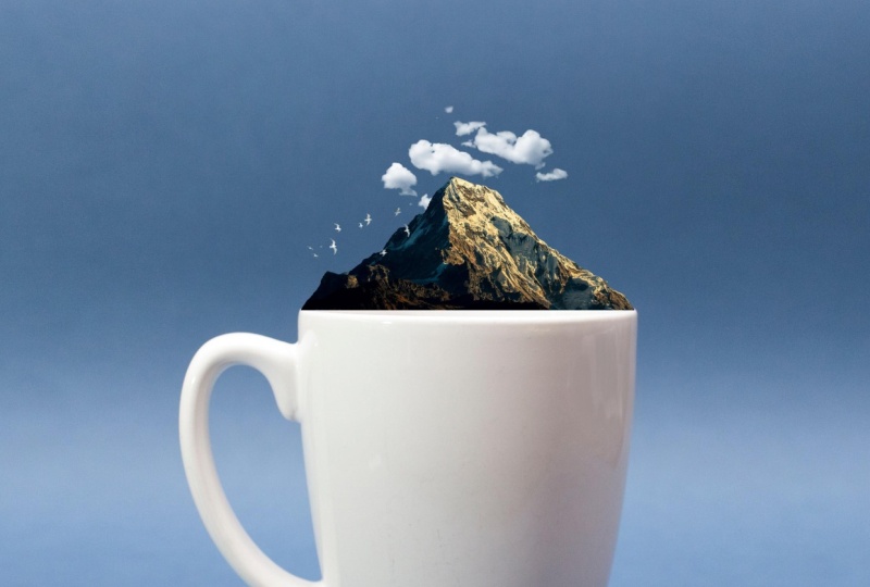
15. First homework: Hello and welcome to this video. After all that you have
learned in this class so far, you have reached a level
where you are able to create simple design like
the one you have right here. I would like you
to try to create this design and post it
in your class project. And I will take a look at it
and give you some feedback. I have included this
folder for you. It has all the images that you will need to create this design. So that's it for this video. Thanks for watching, and I'll
see you in the next video.
16. Creating the first homework: Hello and welcome to this video. In the former video,
I have asked you to create this
design on your own. And in this video we
will create it together. So we started by adding
the background image. Then we add the mountain
image next size, and we put it on top of the cup. We can use the
keyboard arrows to adjust the position
of the image. Perfect. Now we add the clouds image. We adjust its size and
we put it right here. You can set it to
any size you want. Just make sure that
it's size fits with the general
look of the design. Now we add the bird's image size and we put it right here. We can add an effect to it. E.g. we select lighter
color from here. Perfect. Here we are. This is how we can create
this simple design. So I hope that you
had fun creating this design. That's
it for this video. Thanks for watching, and I'll
see you in the next video.
17. Transform tools: Hello and welcome to this video. In this video we will talk
about the transform feature. Now when you select
an object and the Show Transform Controls
setting is checked, you will get this line
around the object, which will enable you to adjust the objects in different ways. And if the Show Transform Controls setting is not checked, you will not be able
to adjust your object. So after you select the objects, makes sure that
the Show Transform Controls setting is checked. We use the transform feature to just the size of the
object like this. Or we can adjust its
size in different way. We can select the object. And when we select the object, you can see the change
in these settings here. Then right-click on the
object and we select scale. The scale setting allows us to adjust the size of the object. Next we have the rotate setting. We select it and you
can see the yellow when we hover over the
edge of the object, we use it to rotate
the object like this. Next we have the skew setting. This allows us to scale the
object anyway, we want e.g. we adjusted to fit in this time. We can use the skew setting to fit the objects
in a way we want. Next we have the
distort setting. Much like the school setting. We use the distort setting to just the object and put
it anywhere we want. E.g. like this. Next we have the
perspective setting. We use it to align the object right or left and up or down. And we can rotate the object 180 degrees or 90
degrees clockwise. 90 degrees counterclockwise. We use this to rotate the object automatically
instead of manually. Next, we can flip the objects horizontally and we can
flip it vertically. So basically the transform
feature allows us to scale, rotate, skew, distort,
and flip objects. That's it for this
video. Thanks for watching and I'll see
you in the next video.
18. Crop tool: Hello and welcome to this video. In this video we will see how
to grab images are layers. We have this image here
and we want to crop it. So right-click on the crop tool. We have for tools in here. We select the crop tool. As you can see, we get these
lines around the image. We grabbed the left line,
scrub the left part. Same thing to the right. And we can cut the
top and the bottom as well to select the parts of the image that
we want to keep. After we select the parts, we want to keep weekly
integer from the keyboard, or we click on the check mark. And here we are. The
image is cropped. We click Control
plus Z to go back. We can crop the image
manually as well. We click and drag to select the part that
we want to keep. We can rotate the image
then properties as well. Like I said, after we select
the part we want to keep, we click Insert
from the keyboard or we click on the check mark. This is how we can grab our images. That's
it for this video. Thanks for watching, and I'll
see you in the next video.
19. History window: Hello and welcome to this video. In this video we will talk
about the history tool. We have this image here and e.g. we grab it like this. Now let's say that we want to undo this move
that we just made. To do so we go to Window and we check the History
window to show it. Here we are. This is
the History window. You can click here
to show or hide it. Here we have a sequence of Photoshop states recorded
during this Photoshop session. We can select any of the history states
to make it active. E.g. if we select this state, the image will go back to this stage before we dropped it. Or we can select the states. Again. We use the History window to select any state here. No matter how many
states we have, e.g. we rotate the image. And here we are. We
have a new states edit. If we made the mistake, we use the History Window to go
back to the previous state. Like I said, we can show or
hide the History Window. Open this icon here. Again, let's grab the image. Now we can use the History
window or we can use the shortcut Control plus C To go back to the
previous state. So this is how we use
the History Window or the shortcut
Control plus Z to go back to the previous state in our design and fix
any mistake we made. That's it for this video.
Thanks for watching, and I'll see you
in the next video.
20. Second homework: Hello and welcome to this video. I have homework for you. I would like you to try and create this design right here. The images that you need for this design are included
for you to use. So I will see you
in the next video to create this design together.
21. Creating second homework: Hello and welcome to this video. In the former video, I asked
you to create a design, and in this video we
will create it together. We start by adding
the first image. Here we are. Now we add the second image. We adjust its size. We check the Show
Transform Controls setting to get this
line around the image. We click on the lines of
this, we can adjust it. Then right-click on the
image and we select skew. Now we adjust the image to
fit it inside the artboard. Just each corner until we fit
the image on the ad board. Here we are. Now click enter
from the keyboard. The image is added to
the Edward successfully. This spot here
needs to be fixed, so we zoom in on it. We select Show
Transform Controls. We click on the line
around the image, then right-click on the
image and we select skew. We fix it to place
the image perfectly. Then resume it. And here we are. That's it for this video.
Thanks for watching, and I'll see you
in the next video.
22. Object selection tool: Hello and welcome to this video. In this video we'll talk about
the Object Selection tool. We use the object
selection tool to separate any object
from its background. To replace the background, we have this
immaterial to work on. We go to the Object
Selection Mode. It's the fourth
in the tools bar. And if the object selection tool isn't that the one showing here, we right-click and we select
the Object Selection tool. We place the mouse on the
object that we want to separate from the background
and it turns blue. In this case, it's the car. And we click on it to select it. Then we click on
the Layer Mask icon to remove the background. We can use the move tool to
put the car anyway we want. Then we can add a new
background if we want. Now we'll take a look
at another image. We use the object selection
tool to select the man. We click on the Layer Mask
icon to remove the background. Then we can replace
the background. We go to the Object
Selection Tool folder. It's included for you to use. We select this image and
we add it to the software. We click on Enter to
apply the change. Then we pull the
background layer below demands layer to show the man. And here we are. The background is
replaced in a simple way. That's it for this
video. Thanks for watching and I'll see
you in the next video.
23. Quick selection tool: Hello and welcome to this video. In this video we'll talk about
the Quick Selection tool. We use the Quick Selection Tool, two separate objects
from the background. Let's click on the
Object Selection Mode and we select the
Quick Selection Tool. We get these tools here. The first is the
new selection tool. We use it to select new objects. Next, we have the Add
to Selection tool. We use it to add something to
an already selected object. And finally, we have the
subtract from selection tool. We use it to disliked a previously selected
parts or objects. We select the new
selection tool, and we select the
sneaker we have here. Just like the other sneaker we hold Shift, then we selected, so this is how we select objects using the
Quick Selection Tool. Then we click on
the Layer Mask icon to remove the background. Now we move to the next
image. Same thing. We use the new selection
tool to select the object. We selected the
first objects only, and to select the objects we use the Add to
Selection tool. Here we are. Now we
slept less object. As you can see, this part
here is selected as well. So we need to deselect it using subtract from
selection tool. Deselect that part like this. Perfect. Now the
objects are selected. Click on the Layer Mask icon
to remove the background. We have a part of the background here that we need to remove. We selected we click on the lead from the
keyboard to remove it. Then right-click and we select, de-select. And here we are. This is how we can use
the quick selection tool to remove the background. That's it for this video. Thanks for watching and I'll
see you in the next video.
24. Lasso tool polygonal lasso tool and magnetic lasso tool: Hello and welcome to this video. In this video, we'll take
a look at the Lasso Tools. Right-click on the Lasso tool and we have here three tools. Lasso tool, the
polygon lasso tool, and the Magnetic Lasso tool. We select the Lasso tool. We use it to select and
cut any object manually. So we select these donuts. Then right-click and
select Layer via Copy. And we put the donuts up here. Now this way works only for images with single
color backgrounds. E.g. if we move to
this image here, then we use the Lasso tool
to select the golf player. Then right-click and we
select Layer via Copy. We drag the player here
and as you can see, we have parts of the
image around the play. So like I said, the
lasso tool works only for images with
single color backgrounds. If we want to cut
the golf player, we should use the
polygonal lasso tool. Just remember when we use
manual tools to cut objects, it will take some time to
cut an object perfectly. We better zoom in on it. So we zoom in on
the golf player. Then we select the
Polygonal Lasso Tool. We start selecting
the golf player. We click once. Now
we have a line, we drag it and click again. Then we direct light
and click again. We keep going like this until
we select the whole object. In case we clicked
on the wrong spots, we click Delete
from the keyboard to go back to the former DOT. I would fast-forward the process to save time because
like I said, selectin and cutting objects
manually takes time. Now we connect the line
with the first Dutch. The Gulf layer is selected. We zoom out. Then we click on
the Mask button. Here we are. The golf player is selected and cut from the image. We can zoom in and remove
this bacteria as well. This is my favorite way to cat objects into
software because it's loves me to select and
cat objects in a precise way. Let's remove the
mask, Let's click on it and we select
Delete Layer Mask. Now we take a look at
the magnetic lasso tool. We select it, then we click
to set the first dot, and we hover over the
edge of the object and the tool will select
it automatically. The only problem with this
tool is that sometimes it may not select and cut
the objects properly. Now the GOP layer is selected. We click on the Mask button. And as you can
see, the golf club was not selected properly. And a part of the golf
player for it as well. So these are the Lasso
Tools and their users. If you are to select
and cut an object, I recommend that you use the Polygonal Lasso tool
because like I said, it's loves you to select and capture objects
in a precise way. That's it for this video.
Thanks for watching, and I'll see you
in the next video.
25. Select and mask hair: Hello and welcome to this video. In this video we will
see how to change the background and images
that have hair in them. We select the object
selection tool to get these tools here. We have select subjects and
we have Select and Mask. So we click on Select Subject
to select the character. Then we click on the Mask button to remove the background. The background is
gone, but there are some leftovers around the hair. So we click on Select and Mask. We get this interface with
multiple tools to use, and we will use the
Refine Edge brush tool. We select it and
we set its size. From here. We can adjust the hardness and
the spacing as well. Now we select the plus tool. Then will you find
the edges of the hair like this to remove
any background? We keep going like this. In case we made a
mistake like this one, we select the negative
tool and we fix it. After we find the
edges of the hair, we can adjust these
settings here. The radius, Smooth Feather, the contrast to get
the result we want. This is the results
I want for now, so I don't need to
adjust these settings. After we are done, we click
Okay to apply changes. And here we are. The background is
removed completely. So we add the new background. It's included for you to use. We pulled the
background layer below the character's layer,
and here we are. That's it for this video.
Thanks for watching, and I'll see you
in the next video.
26. Marquee tool: Hello and welcome to this video. In this video we will take
a look at the market tools. A marquee tool allows us to
select a part of the image and work on it without affecting
the rest of the image. Right-click here on
the market tools, and we get four different tools. The Rectangular Marquee Tool, the Elliptical Marquee Tool, the singular Row Marquee tool, and a single column
marquee tool. We select the rectangular
marquee tool. We get this rectangle icon here. When we click and drag, we can select an area
in a rectangular shape. Now e.g. we select this area. I'm looking at the image layer, then right-click
on the rectangle and we select Layer via Copy. Now the area inside the shape is duplicated. We can
put it anywhere. We like. To move a layer, make sure to check the
auto selection setting. We delete this layer now and we'll take a look at
Elliptical Marquee Tool. When we select it, we
get a circle icon here. That means we can select an area in the
shape of a circle. Same thing, we
duplicate the layer. We have here, the
federal setting. We use it to soften the
edges of the selection. You can see this
selection has had edges because we didn't
use the federal. We delete the layer, we
increase the feather. We select this area, right-click and select
Layer via Copy. And here we are. This selection has soft edges. This applies to both foods, the rectangular marquee tool and the Elliptical Marquee Tool. We delete this layer. Now we use the rectangular marquee tool to select half of design page. And we click Delete on the
keyboard to remove it. Here we are. Now we dropped this image
to the design bait. We built its layer
below. And here we are. We have two images
in the same design. So this is one way to
use the Marquee Tools. That's it for this video. Thanks for watching, and I'll
see you in the next video.
27. Third homework: Hello and welcome to this video. I have another homework for you. After all that we have learned, you are ready to create a
design like this one here. So I included for
you a folder that contains all that you need
to create this design. Take a look at it
and give it a go. Then publish your
results for feedback. And we will create this design together in the next video.
28. Creating third homework: Hello and welcome to this video. In the former video,
I asked you to create this design because practice is the best way to
learn any skill. And now we would create
this design together. We go to File Open. Then we go to the images folder and we add the background image. Here we are. Now we add
the motorcycle image. As you can see, this image
has its own background, so we need to remove it. We saw how to remove the
background in the former videos, so it shouldn't be an issue. There are multiple tools
to remove the background. You can select any one you like. For me, I will go with the
object selection tool. Select the object
selection tool, then we click on Select Subject. Here we are, The
object is selected. Some parts of the objects
were not selected. So we need to
select the manually using the Quick Selection Tool. Select the Quick Selection Tool. You click on the add
to selection tool. Then we select these parts here. Perfect. Now click on the Layer Mask
icon. And here we are. The background is no more. We put the motorcycle here. We check the Show
Transform Controls setting and we adjust the
size of the motorcycle. Now we add the effect one image, its size to cover
the whole design. Then we select screen from here. We use the Screen
option to remove the black background
of an image. It creates an effect
like we have right here. You pull the effect layer
below the motorcycle layer. Then we add the effect to image. Again. We select Screen
and the effect is in place. And here we are. As you can see, it was very
easy to create this design. I hope that you enjoyed it. That's it for this video.
Thanks for watching, and I'll see you
in the next video.
29. Spot healing brush tool: Hello and welcome to this video. In this video and in the
coming videos we will be talking about the
autocorrect hill and tools. We used autocorrect healing
tools to repair images. The first tool we will see is the Spot Healing Brush Tool. Right-click on the
autocorrect here and tools than we select the
spot healing brush tool. As you can see, we
have this image here with some graffiti on the wall. So we'll use the Spot Healing
Brush tool to remove it. We set the brush size from here. Then we click and drag over
the graffiti to remove it. The graffiti is replaced with another part of the
wall that is untouched. We keep going like this. And here are the
graffiti is gone. Now we move to the next image. We have this character here
with the shadow and we will use the Spot Healing Brush
tool to remove the tattoo. We zoom in on the tattoo a bit. We select the spot
healing brush tool, we set its size. Then we remove the tattoo. Who are the tattoo is gone. So this is how we use the Spot Healing Brush
tool to remove some unwanted parts of our images. That's
it for this video. Thanks for watching and I'll
see you in the next video.
30. Healing brush tool: Hello and welcome to this video. In this video we will talk
about the Healing Brush Tool. Right-click on the
autocorrect here and tools, and we select the
Healing Brush Tool. We zoom in on the
character's face. The way that the
Healing Brush Tool works is that it allows us to repair selected area with
pixels from another area. E.g. we have this pebble on the character's face and we
will see how to repair it. We select the
Healing Brush Tool. We set the brush size. We can set its size from here, or we hold the Alt button
and we click and drag using the right mouse button until we get the
brush size we like. Now, we select the area that we want to take the pixels from. E.g. here. We hold the Alt button and we click with the mouse to copy this part. Then we click on the part
that we want to be replaced, in this case the pimple. And here we are. We copy this part here to cover
the other pimple. Here we are. Now we zoom in a bit. To repair this area even more. We decrease the brush size. And we repair this
area here like this. We hold the Alt
button and we copy the path to replace
the unwanted part. We keep going like this until
you fix this whole area. Perfect. Now we'll fix these
spots here on the forehead. Perfect. We zoom out and here we are. Go to Window and we select
the History window. We use it to retrace our steps and undo any move. We made. It look here to see the
original look of the image. So this is the image before. And this is the image after. So that's it for this
video. Thanks for watching and I'll see
you in the next video.
31. Patch tool: Hello and welcome to this video. In this video we will take
a look at the patch tool. Let's click on the
autocorrect team and tools and we select
the patch tool. We use the patch tool to hide
and duplicate any object. E.g. we have these birds here
and we want to hide them. We select them using
the patch tool. And we click and drag any direction to
hide them like this. The direction that
we grabbed sold is copied and replaces
the bird spots. Now to duplicate the birds, we select this area, then we clicked and
dragged towards the birth to duplicate
them like this. We can duplicate the
single bird like this. This is how we can
use the patch tool to duplicate single or
multiple objects. We can duplicate all
sudden bursts at once. Like this. Now we'll take a look
at the next image. We have this part
of the crosswalk that is not painted well, so we replace it
with this part here. We start by selecting
the unpainted part. Then we click and drag like this to replace it with
the other part. Or this part is
replaced successfully. And the crosswalk
looks better now, this is how we use
the patch tool to hide and duplicate objects. That's it for this video.
Thanks for watching, and I'll see you
in the next video.
32. Content aware move tool: Hello and welcome to this video. In this video we'll talk about the Content Aware Move tool. So let's click
here and we select the Content Aware Move tool. We use this tool to
change the position of any objects on the image, e.g. this tree here, we will move into this
position on the left. So we select the tree using
the Content Aware Move tool. Now I click on the tree
and we drag it to here, which is its size, and
put it right here. You can adjust its
size any way you like. I will leave it like this.
I click on the check mark. We wait for a moment
and here we are. The DRI is moved from
the right to the left. And as you can see,
the original tree is gone automatically. This is how we can
use the Content Aware Move tool to change
an object's position. That's it for this
video. Thanks for watching and I'll see
you in the next video.
33. Clone stamp tool: Hello and welcome to this video. In this video we will take a look at the clone stamp tool. So let's click here and we
select the Clone Stamp tool. The clone stamp tool is like
the Healing Brush tool. We use it to repair
a selected area with pixels from another area. So we set the burst size. We set the brush
hardness from here. If we increase the
brush hardness, you can see its
edges become hard. And if we decrease at
the edges become soft. We set the brush
hardness to 50 per cent. Then we zoom in on the object. We hold the Alt button and we cloned this part of the vase. You can see the path is selected and moves with the mouse. Now we go here, we collect
and keep going like this. You can see that
there is an arrow on the right that
gloms this part. And we keep going like
this until we are done. This is how we use
the clone stamp tool to clone any parts of the image. We click Control
plus Z to go back. Now this time we will fix this
graph in the flower vase. We hold the Alt button and we
collected clone this part. We try to clone the
closest area of the part that we want to
fix to keep the same color. Then we've fixed
the part like this. Now we clone this part
and we fixed the Greg. You can clone a single parts are multiple paths to fix the error. Because sometimes if we clone central part to fix a large
area, it will be obvious. Like I said, with long
the closest area of the part that we want to
fix to keep the same color. Our flower vase is fixed. Perfect. We zoom out
and here we are. This is how we can use
the Clone Stamp tool to repair any area in the image. That's it for this video. Thanks for watching, and I'll
see you in the next video.
34. Fourth homework: Hello and welcome to this video. We have a new
homework to create. I would like you to hide
these footprints here. The image is included
for you to use. So go ahead and I
will see you in the next video to do
the same task together.
35. Creating fourth homework: Hello and welcome to this video. In this video, we will create
our homework together. We have this image
and we will see how to hide these
footprints here. We can use any of these tools here to hide the footprints. For me, I will use
the patch tool. We select the first footprint. Then we drag to the
right to hide it. Perfect. Now we'll select
the second footprint. Same thing with drag to
the right to hide it. We keep going like this until we hide all the footprints
in the image. Perfect. And who we are.
So this is how we can hide the footprints
from the image. That's it for this
video. Thanks for watching and I'll see
you in the next video.
36. Levels: Hello and welcome to this video. In this video we'll
see how to adjust the darkness and the
brightness in our images. We go to the Adjustments
menu and we have here multiple tools that
we can use to adjust colors in case the
adjustments menu is not activated in your
interface and go to window and check adjustments. After we go to the Adjustments
menu, we select Levels. We get these settings here, and we get a new layer
named levels one. We have here a histogram. The left side is foreshadows, the middle is from mid tones, and the right side
is for highlights. This is a basic explanation
of the histogram. If we adjust the shadows cursor you can see the image
becomes darker. And if we adjust the
highlights cursor, the image becomes brighter. Same thing for the
mid-tones cursor. So make sure to adjust these
cursors appropriately. As you can see, this
image is a bit bail, so we need to fix it. Increase the shadows a bit, and we decrease the
mid-tone slightly. That's better. We hide the levels layer. This is the image before, and this is the image after. We can decrease the
highlights a bit. This is before and
this is after. As you can see, the image
looks a bit better. Now, let's take a look
at another image. This image is a
bit pale as well. So we go to Adjustments Levels and we increase the shadows. Now it's better. This is
the image before and after. We'd try another image.
Unlike the other images, this image here is a bit dark. So we go to Adjustments
Levels and we adjust the mid tones than what
you just the highlights. Perfect. Now take a look at the
image before and after. So this is how we can adjust the darkness under
brightness in our images. That's it for this video. Thanks for watching and I'll
see you in the next video.
37. Vibrance: Hello and welcome to this video. In this video we will talk about the vibrance and saturation. So we go to the adjustments
and we select Vibrance. We have a new layer. Now we can increase the
color saturation. And this image. As you can see, when we
increase the vibrance, we get more color saturation. Take a look at the difference. We increase the
saturation as well. And here we are. Make sure to adjust these settings
moderately, e.g. if we decrease the
vibrance too much, the image will become like this. The colors will not look good. Same thing for the saturation. If we decrease it to match the image will be
in black and white. So we said the vibrance and saturation at reasonable levels. If we increase them
too much as well, the result will not be good. Now we take a look at
another image. Same thing. We go to adjustments vibrance. We increase the vibrance. And here we are. Take a
look at the difference. We increase the
saturation as well. Like I said, keep
it reasonable, e.g. if we increase it too much, the image will no
longer be natural. So this is how we can
adjust the saturation in our images. That's
it for this video. Thanks for watching and I'll
see you in the next video.
38. Hue saturation: Hello and welcome to this video. In this video we will
see how to change colors in our images using
the hue saturation. So we go to adjustments and
we select Hue Saturation. We get these settings here. The heel to change colors. The saturation to adjust
the color saturation, and the lightness to adjust
the lights and the shadows. If we want to change all
the colors in the image, we just adjust the hue
setting like this. And we use the
saturation setting to adjust the color
saturation and the image. Like I said, we use the
lightness settings to adjust the lights and the
shadows in the image. To reset the settings, we
double-click on the heel. Now to change a single
color in the image, e.g. the color of the sneaker. We use this tool to
select the color. Then we choose the color
we want using the heel. Same thing. If you
want to change the background scanner you
selected, then change it. Let's try this with
another image. We select the color of the code, then we change it using
the youth setting. So this is how we can change
colors in our images. That's it for this
video. Thanks for watching and I'll see
you in the next video.
39. Whitening teeth: Hello and welcome to this video. In this video we will see how to whiten teeth in the
Photoshop software. We start by going to
the adjustments menu and we select Hue Saturation. You can see the teeth
are a bit yellow, so we select yellows from here. We decrease the saturation. As you can see, the more we
decrease the saturation, the wider the teeth become. Now we increase the
lightness. And here we are. Take a look at the
teeth before and after. We can increase the lightness
even more if we like. So this is how we can
whiten teeth into Photoshop software
using the saturation. That's it for this video.
Thanks for watching, and I'll see you
in the next video.
40. Black and white: Hello and welcome to this video. In this video we'll
see how to turn colored images to
black and white. So we go to the Adjustments menu and we select black and white. We get these settings here. And as you can see, the image is automatically turned
to black and white. We have here to presets menu. We have multiple
presets to choose from. And as you can see, each
be set is different. Now we go back to default, and we will see how to use these settings here
to adjust your image. We hide the black and
white layer so that we can see the image in
its normal state. We have here these
parts in yellow. We bring back the
black and white layer, and we use the yellow setting to adjust the parts in
yellow in the image. We can set it to white to black. Same thing for the scanner. It gives you did not know which setting represents the color. You use this tool to select
the color and it will tell you which
setting to use, e.g. in this case, it's right here. You show back the
black and white layer. We're just sitting. And here we are. Same thing for this color here. We selected and we use it
setting to adjust it like this. Now we'll take a look
at another image. We go to Adjustments,
Black and White. The image is automatically
turned into black and white. This part of the image
is originally red, so we just did using
the red color setting. We can make it lighter or darker dependent
on what we want. So this is how we
can turn colored images to black and white. That's it for this
video. Thanks for watching and I'll see
you in the next video.
41. Adjustment layers: Hello and welcome to this video. In this video we'll see how to light adjustments
to certain layers. We have this
background image here, and we will add another
image. Here it is. Now we have the background
image and the robots image. So let's apply an
adjustment, e.g. the black and
whites adjustments. As you can see, the
adjustment is applied to both layers and the whole
design is in black and white. Now. Now let's say I only want the background
to be in black and white. It's very easy. I put the
adjustment layer on top of the background
layer. Here we are. The background is
in black and whites and the robot is in full color. If I put the adjustment
layer back on top, both the robot and
the background will be in black and white. Now, let's say that
I want to apply the adjustment to the
robots only this time. It's very simple. But
the adjustment layer on top of the robot layer, then right-click on it and I
select Create Clipping Mask. Here we are. The adjustment is applied
to the robots image only. The robot is in black and white while the background
is fully colored. And of course this goes for all the adjustments
we have here, not just the black and
whites adjustments. So that's it for this
video. Thanks for watching and I'll see
you in the next video.
42. Colorize black and white photos: Hello and welcome to this video. In this video we will see how to colorize black and white images. We have this
immaterial to work on. So we start by going to
Filter and we select Neural Filters. We
wait for a moment. Here we are. We have here multiple filters. We select the colorize filter. If you are using the filter for the first time, you
need to download it. So go ahead and
click on Download. Aren't filter is downloaded
and activated automatically. As you can see, the
image is called arise. Now, this part here is
not falling colorized. So to fix it, we
changed the color of the we click on the
head from this window, we get the color
picker window and we select the color we
want to paint the hood where the head is not fully colored with
the color we selected. So we select the parts that are not colored from
this window here, and the software will
apply the color to them. We can change the color of
the sleeve here as well. We selected, and we choose the color we want to
paint this width. And here we are. We can access the color picker
window from here as well. We can access the color picker
window from here as well. After we are done, we click
Okay to apply the changes. Are this is the image
before and after. Let's take a look
at another image. We go to Filter and we
select Neural Filters. We activate the
colorized filter. And here we are. We can change the color
of any object, e.g. this little girl's dress.
We paint it in yellow. Let's any parts left of the
dress to paint it in yellow. Same thing for the
other girl's dress. This time we painted in blue. And here we are. So this is how we can colorize
black and whites images. That's it for this
video. Thanks for watching and I'll see
you in the next video.
43. Colorize white shirts: Hello and welcome to this video. In this video we will see how
to colorize whites objects. We have this character
here wearing white shirts and we will
change the shirts color. We use the quick selection tool to select the white shirt. The shirts is selected.
Now we change its color. We go to the adjustments tools. We can access the
adjustments tools from the adjustments
when they were here. Or we can click on
this icon here. To get this menu. We have
the adjustments tools, we use, hue, saturation,
levels, etc. Only this menu here has more tools than the
adjustments window above. The tool that we
need to use here is the solid color tool. We select it, we
get a layer here, and we get the color
picker window. We select the color
that we want to print the shirts width
and we click Okay. As you can see, the shirt
looks flat with no details. So we select Multiply or
linear burn from here. Now the shirts
details are visible. And we can change the shirts
color to any color we like. This is how we can
colorize any white object. That's it for this video. Thanks for watching and I'll
see you in the next video.
44. Fifth homework: Hello and welcome to this video. It's time for another homework. I would like you to
create this design here, you will find this
folder included for you. It has everything you need
to create the design. So that's it for this video, and I will see you
in the next video to create this design together.
45. Create fifth homework: Hello and welcome to this video. In the former video, I have asked you to create this design. So in this video we will
create it together. We start by changing
the color of the shirt. We use the quick selection
tool, just select the shirt. Now we click on the
adjustments menu icon and we select solid color. We get the color picker window. We select this color. Then we select Linear Burn from here. Now we add the bedroom image, just its size to fit the shirt. Then right-click on
its layer and we select Create Clipping Mask. Now we select Color Dodge. From here. We decrease
its opacity slightly. And here we are. The
design is completed. So that's it for this
video. Thanks for watching, and I'll see you
in the next video.
46. Create shapes: Hello and welcome to this video. In this video we'll
talk about shapes. We have the rectangle tool
here in the tools bar. We right-click on it and we
get multiple shaped tools. We have the rectangle
tool, the ellipse tool, the triangle tool,
the polygon tool, the line tool, and the
custom shape tool. We select the rectangle tool, click and drag to draw
a rectangle in here. This shape is not equilateral. To draw an equilateral shape, we hold the shift button,
then we draw the shape. After we told the shape we
get the properties window, we use it to adjust the shape. We can adjust the
width and height of the shape using the
transform settings. As you can see when we
tried to adjust the width, we adjust the height as well. Just each one separately. We click here to unlink them. If we want to adjust both of them again, will link them back. We have here the
rotation setting. We use it to rotate the shape. To put it back to
normal, we select zero. Next we have here
a default setting. We use it to change the
color of the shape. We can select any color
we like from here. Next we have the stroke setting. We use the stroke to the shape. It's not visible
because it's so small, so we increase its
size from here. We can paint it in
any color from here. You can remove the
fill from here, leaving only the stroke. The stroke as well. We have here the stroke type. You can change it from
a straight line to a series of dots or dashes. Next we have the angle
or corner settings. You can see that we have here four dots at the
corners of the shape. If we drag one of
them like this, we can make the corners rounded. In case you can see these dots. Make sure to check the
Show Transform Controls. Let's say this. I want to make just one of the coordinates round
and not all of them. It's very simple.
Double-click on the dot and drag it to
make the corner ramp. E.g. we make this corner around as well to
create this shape here. And you can always
double-click on the dots and make
the corner straight. Again. Like I said, we have multiple shapes here. We select the ellipse tool, hold the Shift button, and
we draw a circle in here. And it has the same
properties here. We can use the rectangle to draw a background rectangle
and we painted. Then we add an image
and here we are. E.g. we can adjust the shape
to cover half of the page. Then we add a new layer and we draw another shape to
cover the other health. We've painted in
any color, e.g. a. Red. And he does it for this video. Thanks for watching, and I'll
see you in the next video.
47. Custom shape tool: Hello and welcome to this video. In this video we'll take a
look at the custom shape tool. Let's click on the Rectangle
tool to get the shape tools less and we select the
custom shape tool. We get this shape list here. Click on it, and we
get multiple folders. We have wild animals, leave trees, boats, and flowers. We select any shape
we want, e.g. this flower shape. We hold the Shift button and
we draw it here. We can adjust the shape. We can paint it in any
kind of well-liked. We can remove its scope. Same thing for all
the other shapes, e.g. this boats or ER. So that's it for this
video. Thanks for watching and I'll see
you in the next video.
48. Colorize shapes in gradient colors: Hello and welcome to this video. In this video we'll see how
to create gradient shapes. We start by drawing
a circle in here. We go to the field setting and we click on the gradient icon. Here, multiple folders, each with multiple gradients options. We have the basics, the blues, the purples. We increase the size
of this window so that we can take a good
look at the options. As you can see, we have multiple
options to choose from. We have the banks,
the oranges, etc. Now we go to the
custom shape tool. We select a shape from this
list, e.g. this flower. Hold the Shift button and
without the flower shape here, we remove the stroke. We go to the fill and we select gradients option that we like. Like I said, we have
here a lot of options. Take your back. If you want to customize
your own gradients, you go back to the
basic gradient. We have here two colors,
black and white. Double-click on the
first color cursor. You get the color picker and
select any color you like. Then double-click on the
seventh color cursor, and deselected color you like. Next you can set the gradient
orientation from here. Next we have the gradient style. We have linear, radial, angle, reflected and diamond. This is how you can create
your own gradients. So that's it for this video. Thanks for watching, and I'll
see you in the next video.
49. Pen tool: Hello and welcome to this video. In this video we'll take
a look at the Pen tool. The Pen tool is located
here on the tools bar. We click on it to select it. We use the pen tool to
draw shapes and paths. When we select the pencil, we
get multiple settings here. We can select shape
or path from here. To draw any shape using the
pen tool, we select shape. We have here the field setting. We use it to paint
the shapes fill. Next we have the stroke setting. We use it to paint
the shape stop. We set the stroke
size from here. Now to draw a triangle here. We said the first dot here, then another here,
one more here. And we close the shape by setting the dots
on the first one. As you can see, we have
a triangle in here. Now with lead the shape. We can draw a rectangle in
here. Now with lead the shape. Now we will draw a shape
with a curved line. To draw a curved line with click and drag to the right
to get a curved line. We use this line to
adjust the curved line. Hold control and we
click on this dot, then we just the
curved line like this. We can click and
drag on this data at another lines creates shape. We can hold Control,
then click on this dots and drag
It's adjust the shape. Same thing for this data. And like I said, we adjust
the curve using this line. If you wanted to just
one side of the shape, you hold the Alt button and
you adjust its position like this without affecting
the other side. So this is how we
can grow shapes using straight and curved lines. To draw a simple line, we
deactivate the fill from here. Then we set a dot here
and another at the end. Like I said, we can set
the stroke size from here. We delete this line.
To draw a curved line. We set the first dot, then we click and
drag like this. We can add another dot here. We click and drag to
add a curved line. And we keep going like this to create this curved
or growth line. This is how we can
draw straight and curved lines using the pen tool. That's it for this video.
Thanks for watching, and I'll see you
in the next video.
50. Sixth homework: Hello and welcome to this video. I have another homework for you. You have reached a
level where you can create a design
like this one here. I would like you
to give it a go. Like always, I included for your folder with all that you
need to create this design. Don't forget to publish
your design for feedback. So that's it for this video. I will see you on the next video to create this design together.
51. Creating sixth homework: Hello and welcome to this video. In the former video, I have asked you to create
this design here. And in this video we
will create it together. We start by going to
the rectangle tool and draw a shape
covering the whole page. We painted in this column. Now we add a new layer. We select the ellipse tool, hold the Shift button, and
we draw a circle in here. We put the circle here and
we've painted in white. Now we duplicate
the circle, right, to collect and we'll
select Duplicate Layer, or we drag the layer
here to duplicate this. We put the second circle here. Circle, we double-click
on this layer, or we select the fill
sitting in this color. Now we add a new layer. We add a small circle here. You paint its stroke and white
and we increase its size. Perfect. Now we add the first image. We put it over the circle. Then right-click
on the image layer and we select Create,
clipping mask. Now the image is
inside the circle. We just have to sensor. Now we type the text. So we select the Text tool and we type the word
deserts in here. We select the word and we
changed the font style to bold. We increase its size. I'll change the font
style to black. That's better. We select the word and
we painted in white. Now what type of
special delicious e.g. and of course you can type
whatever you want in here. We select the text and
we change its font. You can select any
font you like. We increase the
text size slightly. Now we add more text in here. E.g. we typed this weekend only. We put it here. Now we had
the paragraph in here. We go to epsilon.com and
we copy this paragraph. We draw a rectangle here using the text tool and we
paste text inside of it. We click Control a to
select the whole paragraph. Decrease the size of the text. We changed the font area. We delete the parts of the
text. And we put it here. Now we draw a rectangle here. We make its corners round. We painted in white. Then we increase the
size of its stroke. And we paint the stroke with the same color of
the left circle. Now we type of
texts in here, e.g. ww.website.com. This is just an example. You can type whatever
you want in here. We painted texts in black. We increase its size and we put it inside the
rounded rectangle. And here we are. I hope that you have enjoyed
creating this design. That's it for this
video. Thanks for watching and I'll see
you in the next video.
52. How to type text in photoshop: Hello and welcome to this video. In this video we will talk
about the Text tool as we will see how to write texts
in the Photoshop software, we have the text tool
right here in the toolbar. Let's click on it and
we get four tools. We select the
horizontal type tool, we click anywhere
and the design page, and we get this random text. Now we type whatever we want. E.g. we type Adobe Photoshop. Since we typed text, we've got these tools bar here. We select the text
fonts from here. When we hover over the fonts, we can see it because we
haven't selected the text. So we select the text. And now when we hover
over the fonts, we can see it on the text. We select the arial font, e.g. from here we can
select the font style. We have regular italic, bold, bold, italic,
and the black. Next we have the font size. We have here multiple
sizes. This we can select. Or we can click on
the text size icon and drag the mouse to
select the size manually. Next we have the alignment. We can align the
text to the right or to the middle,
or to the left. Next we have the text color. We can paint the text
in any kind of way, like in case you want to change the color of
single word is like the word, then you change its color. You can change its size
or its fonts if you want. If we want to make a change
to a certain word or words, we select them, then
we make our changes. After we are done, we
click on the check mark. So that's it for this
video. Thanks for watching and I'll see
you in the next video.
53. Type text using shapes: Hello and welcome to this video. In this video we'll see how
to align text with shapes. So let's click on
the Rectangle tool. We have here multiple
Shape Tools. Select the ellipse tool, hold the Shift button, then
we draw a circle in here. Now we select the Text tool. We hover over the edge of the circle to get
this icon here. Then we click. Here we are, we have a text and
it's aligned with the circle. We hide the circle. And now we can change the
text to whatever we want. E.g. we type Adobe Photoshop
or anything we want. Let's try another shape. This time the triangle. Hold Shift and withdraw
triangle in here. We remove the fill from here. We select the Text tool, hover over the edge of the shape and we click to edit text. We hide or remove
the triangle layer. We click Control a to select all texts and we can
type whatever we want. We can change the text
size, font, color, etc. So that's it for this
video. Thanks for watching and I'll see
you in the next video.
54. Warp text: Hello and welcome to this video. In this video we will talk
about the Wrap Text tool. The Wrap Text tool
is located here, and to use it, we need to
select the text first. Then we click on it. We get this window and we have here multiple styles that
we can choose from. E.g. we select the style. As you can see, the text
is now shaped like an arc. We can just expand its horizontal distortion
and its vertical distortion. You can set it any way we like. Let's take a look
at other styles. We have the arc
lower or upper, etc. Like I said, we have multiple styles that we can choose from. We have the flag, the fish, etc. Let's take a look at the fish. We have the fish eye, etc. We can adjust the text to
get the results we like. So this is all about the Wrap Text tool and how to use it. After we are done, we click
Okay to apply the changes. That's it for this video. Thanks for watching, and I'll
see you in the next video.
55. How to type a paragraph: Hello and welcome to this video. In this video we'll see
how to type a paragraph. We're not going to take
a paragraph manually. So we go to lipson.com. This website offers example
paragraphs that we can use. We copy this paragraph. We select the
Horizontal Type Tool. Then we draw a
rectangle in here. Now with basic text
inside the rectangle. We select the text and
we increase its size. As you can see, we have a lot
of space between the lines. So we click on
character tool and we decrease the space
in-between the lines. We can adjust the spacing
between words from here. We can set the numbers manually
or choose from this list. We go to paragraph and
align the text from here. We can align it to the right, the middle, or to the left. We can align this
in a way that's all the lines in, at
the edge right here. We have multiple alignments
options to choose from. We can set a space at the
start of paragraph from here. You can select the text
and change its color. We can change its size, font, and size,
like we saw before. So that's it for this
video. Thanks for watching and I'll see
you in the next video.
56. Seventh homework: Hello and welcome to this
video. It's homework time. I have this design here and I would like
you to create it. As usual, I included
a folder for you. It has what you need
to create this design. So go ahead and I
will see you in the next video to create
this design together.
57. Creating seventh homework: Hello and welcome to this video. In the former video, I have asked you to create this design. Now in this video we
will create it together. So we started a new design page. We select the Text tool and we type the word designing here. In capital letters. We select the word and we
increase its size. We put it at the
center of the page. Now we add the background image. We adjust its size to fit with the text and we'll put
it over the word design. Then right-click on
its layer and we select Create, Clipping Mask. And here we are.
This is our design, very easy and very simple. As you can see, we have
this cool effect that we can apply to
any text we want. E.g. we change the
word designed to text. And here we are.
Whatever we type here, the effects will
be applied to it. So that's it for this
video. Thanks for watching, and I'll see you
in the next video.
58. Layer style: Hello and welcome to this video. In this video we will talk about later status layer styles are effects that we
apply to the layers. We have here, a text layer, and we'll apply layer
styles to all types of layers, text, images, etc. To access the layer
style window, we double-click on
the layer here. Here we are. This is
the Layer Style window. We drag the design
slightly to the left so that we can see the result
of our adjustments. As you can see we have
here multiple layer styles are effects that we can
apply to the layers. To apply a layer
style, you check it. E.g. you can see the bevel and emboss effect applied here. We click on bevel and emboss
to get these settings here. We use them to adjust and
set the effects, e.g. it just the depth, the size. We can substitute the
effects from here. So like I said, we have here multiple settings that we adjust to get the
results we like. Next we have here the cancer. And it's extra. We
select the texture. Here, multiple
textures that we can choose from and
applied to the layer. We can always uncheck the layer style to
cancel the adjustments. Next wave here,
the stroke effect. We use it at a stroke
around the text. We set its size from here, we set its position from here. We have inside or outside
or at the center. Like I said, we adjust the
size of the stroke from here. We can adjust its the
best city and its color. Next we have the
inner shadow effect. We can adjust its opacity. It's distance, Choke, size. Like I said, just the settings to get the results. We like. We have the cancer here. Next we have the
inner glow effect. We just its opacity here, its size, joke, color, etc. Next we have the sudden effect. Same thing. We, its opacity,
distance, size, etc. Next we have the
color overlay effect. We use it to paint the
layer and a single color. We select the color
and we apply it. Next, we have the
gradient overlay effects. We use it to apply a
gradient to the layer. We have here multiple
gradients to choose from. We click on the gradient here, we get this window and we can set the gradients
manually from here, which was the colors, and we
click Okay to apply them. We set the gradient
start from here. We have linear, radial, etc. We set the gradient
scale from here, and it's angled from here. Next we have the
pattern overlay effect. We use it to apply a
pattern to the text. We have here multiple
patterns to choose from. We have trees, grass and water. We apply them to the layer, whether it's a text or an image. We just did better
in scale from here. Next we have the
outer glow effect. We set the blend mode to
normal and we adjust its size. We change its color to red, e.g. we can adjust its noise, It's pestis, it spread
its cancer, etc. Unless we have here the
drop shadow effect. We use it at a shadow effect. We can adjust its distance, it spread its size. We can adjust its
angle, its opacity. And we can put the shadow manually like this
anywhere we like. We have here the cancer. As you see all these
settings here. After we adjust the
layer styles, e.g. we apply the pattern
overlay effect and the drop shadow effect
will move the rest. We click Okay, it's applied. As you can see, we have here a list of the applied effects. That's an overlay
and drop shadow. We can hide the list
or show it back. If we want to adjust any of these effects, we
double-click on it. We get the Layer Style window
and we adjust the effect. After we are done,
we click Okay. We click on the visibility
icon to hide defects. Remove the effects.
We right-click on the layer and we select
Clear Layer Style. So that's it for this video. Thanks for watching, and I'll
see you in the next video.
59. Creating a metallic text style: Hello and welcome to this video. In this video we will see how to create this metallic
texts effect. We start by creating
a new design page. Now we will paint the
background in gradients. Can we unlock the
background layer so that we can apply
our adjustments to it? Double-click on the
background layer to get the left side window and we check the Gradient
Overlay effect. We set the gradient
style to radio. We select the first
color, then the second. And we click Okay to
apply the colors. We set the gradient scale
and opacity like this. We click Okay. Now
we type the text. Double-click on the text layer. We get the Layer
Style window and we checked the Gradient
Overlay effect. We set the gradient
style so linear. We set the gradient angle to 90. Now we've made the text. We select the first color. We painted in gray. We click
here to add another color. We select the same color. We click here to
add another color. This time we will
select the color white. And for the less color,
we select this one. We check the stroke effect. We said it's tied to gradients. We leave the first
color as it is, and we add another color
here, the color white. We add another color here. We paint it in this color. Then we add another color. Again, the color white. Then we add another
column, this column. So we have six colors here. Just the space between
each kind of like this. Perfect. And we click Okay
to apply the effects. And here we are. We have
this metallic text effect. Let me increase the
size of the text so that you can take
a better look at it. That's better. That's it for this video.
Thanks for watching, and I'll see you
in the next video.
60. 3D text design: Hello and welcome to this video. And this video we'll
see how to create this 3D text design
using the layer stack. We start by going into
the resources folder. You will find the background
image that we will use. And you have here the link of
the font that we will use. So go ahead, download the font, then add it to the
software to use it. Of course, you don't
have to use this font. Feel free to use
any font you like. Now we add the background image, select the Text tool, and we type the word design. You can type whatever
you would like in here. The first letter is capitalized. We set the text size. You can select any
size you like. We painted texts in
any color for now. This is just so that we can see the effects that we
will apply to it. We can change the color later. Now, double-click
on the text layer to access the layer style. We check the bevel and
emboss effect to activated. We set its style to inner bevel. We said the technique to smooth. We set the depth 150 per cent and we set the
size to two pixels. And we said the soft
into one pixel, and we set the angle
to 90 degrees. You can set these
settings differently to get different results. If you want to get
the same results, I got, you set the
settings like this. Now click Okay to
apply the changes. You can see the texts
look like a bit in 3D. This is the text before and after we applied the
bevel and emboss. You can see the
small difference. Now gloves this layer, we add a new folder and
we name it 3D text. We named the text
layer 3D text as well. We add the texts layer
to the 3D text folder. Then we duplicate the folder. We select the move tool. Then we move the text to the left using the left arrow
and the keyboard. And we pull it up a bit
using the up arrow. I'll zoom in here so that
you can see the two layers. We click once on
the Left Arrow and the ones on the up arrow to
move it slightly like this. Now we duplicate
this folder again. Same thing. We select the move tool, then onclick on the left arrow and double-click
on the up arrow. Will duplicate the
folder 17 times. And each time we
move the text to the left ones end up once. Here we are to take
a look at the text. Now. The text looks like it's in 3D. Now we will name the
last text layer shadow, and we will remove
it from the folder. Next we will name the
top layer texts effect. Same thing, we will remove
it from the folder. We left 15 texts layers in the folder. We close the folder. As you can see here we are. We have two layers outside the folder and the
folder is between them. We remove these two layers
from the folder because I will apply an effect to the layers
inside the folder only. I do not want to
apply the effect to these two layers
outside of it. Now, double-click on
the 3D text folder to get the Layer Style. We select Color Overlay. Like this color, dark purple. We click Okay to
apply the change. Now we select the
text effects layer. We access the layer style,
whichever color overlay. And we select the color white. Whichever the stroke. We set the stroke
size to eight pixels. And we paint the stroke in the same color as
the background, only a bit lighter. Now we check Inner Shadow. We set the opacity to 73%. We set the distance
to 21 pixels. We said the job to 24%. We set the size to nine pixels. As you can see, we've
got a shadow effect inside the text. Now we want the shadow
to be more visible, so we will duplicate the inner shadow effects by
clicking on this plus icon. Here we are. We have two
inner shadow effects. Now, we click Okay,
and here we are. The shadow is stronger. Now we double-click
on the shadow layer. We get the Layer Style, which a color overlay. We select the same shadow color. Now whichever drop shadow, we set its opacity
to 80 per cent. We set the distance
to 42 pixels, and we set the angle
to 140 degrees. We keep the spread to zero. And we set the
size to 21 pixels. We'll leave the rest of
the settings as they are. Now click Okay. And here we are. This is our 3D text. We can add a small effect to it. We hold Command or
Control on Windows. Then we select the two
layers and the folder, which I show transform controls. And we rotate the
texts like this. Then we click on the check
mark to apply the change. Here we are. This
is the final look of our 3D texts design. You can use this way to
create your own 3D text. That's it for this video. Thanks for watching, and I'll
see you in the next video.
61. Inscribed text design: Hello and welcome to this video. In this video we'll
create this text design. The text looks like it's inscribed on the
floor or on a wall. We start by going into
the resources folder and we add the background image. Now we select the
font, we will use. You select any font you like, just make sure it's volt. We type the word floor
in capital letters. We set its size and
we put it right here. Now, double-click
on the text layer to get the Layer Style window. We check Inner Shadow. Inner shadow that I have
here is duplicated. I already showed you how
to remove it if you want. We leave these
settings like this. And we set the angle
to 82 degrees. We said the distance, Choke and size like this. Of course you can change
them if you like. But if you want
the same result I have here, set them like this. We duplicate this inner shadow. We select the second one. We increase its distance to 28 pixels and we decrease its opacity to 40 per cent to get a good
look of the inner shadow. Now we check the drop shadow. You painted in gray. We set its opacity to 100%. We set its distance
to five pixels. We set the spread
to zero per cent and decides to six pixels. Then we set the
angle to 90 degrees. Finally, we set
the blend mode to Linear Dodge to get
this result here. Now click Okay to
apply the changes. We close the layer effects. We select the background layer. We duplicate it. We'll put
this one over the text layer. Then right-click on it and we select Create Clipping Mask. Now we want this layer in
the middle to be dark. So we need to use the
adjustments layers, but we will not use
them from here. Go to Image Adjustments
and we select levels. We get to Levels window, and we said the mid
tones like this. To get this result right here. Now we click Okay to apply
the change, and here we are. This is the final
look of our design. Now we can select the
text and change it. E.g. we type the word knew, the word laptop or
anything in here, really. That's it for this video.
Thanks for watching, and I'll see you
in the next video.
62. Eighth homework: Hello and welcome to this video. I have a new homework for you, this design right here. So as usual, give
it a go and I'll see you in the next video
to create it together.
63. Creating eighth homework: Hello and welcome to this video. In the former video, I have
asked you to create a design. Now in this video
we'll create it to get started by painting
the background. So we select the
color from here. Next we select the
paint bucket tool and we click on the
background to paint it. Now we select the
Text tool and then we type the word news
in capital letters. We can see the text
because it's in the same color as
the background. So we click Control a
to select the text, and we painted in white. We put the word here, which
actual transform controls. To get this light
around the text, we click on the line here. Then right-click on the
text and Louis left skew. Just a text like this. Double-click on the text layer to get the Layer Style window. We check the color
overlay effect. We click on the
color picker and we select the same color
as the background. Now we check the stroke effect and we've painted in white. We set the stroke
size to four pixels. You can set it to
any size you like. Click Okay to apply the changes. Now we duplicate the text layer. We double-click on the layer. Remove the color
of light effect. We remove the stroke effect to. We shipped the gradient
overlay effect. We select the first color than the second. Click. Okay, to
apply the changes. We drag the second
word slightly up here. And here we are.
This is our design. I hope that you have enjoyed
creating this design. That's it for this video.
Thanks for watching, and I'll see you
in the next video.
64. Second week: Welcome to the second week. And this week we
will learn to add filters to images
to improve them. And we will take a look at the painting brushes and how to use them to create designs. We will also learn
multiple tracks that will make things
easier for you. Then we will move to
the effects as we will learn to work
with multiple effects.
65. How to add filters: Hello and welcome to this video. In this video we will see how
to add filters are effects. Two images. We have here, the filter menu. It has multiple filters
that we can use. If you remember, we already use the Neural Filters to colorize
black and white images. Now we'll take a look
at the filter gallery. You can see the image
is a bit zoomed in on. We can select the
Zoom from here. To show the image properly, we click on fits in view, a list of files or folders. We took a look at
the Artistic folder. We have 15 filters to choose
from. In this folder. We have the sketch folder,
styles, texture, etc. After we select the filter, we get these settings here
to adjust the filter. And each filter has
its own settings. After we select the filter
and adjust its settings, we click Okay to
apply the changes. We click Control plus
Z to undo the filter. So before we apply the filter, we unlock the image layer, then right-click on it and we select Convert to Smart Object. Now we go to Filter,
Filter Gallery, which left the same
filter and we apply it. Now the filter is visible here. We can show it or hide it, and we can click
here to adjust it. So this is how we
can add a filter or an effect to the image
and how we can adjust it. That's it for this video.
Thanks for watching, and I'll see you
in the next video.
66. Blur filters: Hello and welcome to this video. In this video we will see how to add the blur effect two images. We have this image
here to work on. So we'll go to Filter blur. As you can see, we have
here multiple blur effects. We selected the
Gaussian blur effect. We get this window and the image is
automatically blurred. We set the blur
radius from here. Now we go back and
let's say this. We want to make the background
blurry in this image. It's very simple and very easy. We use the object selection
tool to select the character. The spots of the character
is that selected. So we use the quick
selection tool to select it. We just add selection
tool to select this part. And we use the subtract
selection tool to deselect this part. Perfect. Now right-click and select Layer via Copy
to duplicate the layer. Now we go to Filter
Blur, Gaussian Blur. You can see the
background is blurry. Now. We can set the
blur radius from here. Then we click Okay to
apply the changes. We have another blur
filter, the motion blur. This allows us to get
an angle for the blur. We can set the
distance from here. We move to the next image to see how we can best use
the motion blur. We will apply the motion
blur filter to this image to make it look like
the car is speeding. First, we use the
object selection tool to select the car. The car is selected
alongside this path here, so we need to deselect it using
the Quick Selection Tool. Here we are. Let's collect and we
select Layer via Copy. To duplicate the layer, we
select the bottom layer. We'll go to Filter
blur, motion blur. We set the blur angle like this. We said that this does. And who are the car looks
like it's speed. We click Okay, and that's it. Thanks for watching, and I'll
see you in the next video.
67. Lens flare filter: Hello and welcome to this video. In this video we will talk
about the lens flare effect. The Once-ler effect
is the effect on your camera lens when you are
filament into light source. Whether it's a sun or a
lamp or anything else. Adding a lens flare effect your images gives you
a really cool results. So we go to Filter render
and we select lens flare. This is the lens flare here. We select the list
type from here. We said the flare
brightness from here. As you see, we have
four lens types. 5,300 mm zoom,
35-millimeter prime, 105 millimeter prime,
and the movie bright. We select the lens
type we'd like. We set the brightness and we click Okay to apply the effect. Here we add the lens flare
effect is an effect. Let's go back to last layer. We can set the flare
anywhere we want. After we are done, we click Okay to apply the
Florida effect. So this is how we can create
the lens flare effect. That's it for this video. Thanks for watching, and I'll
see you in the next video.
68. How to add trees to images: Hello and welcome to this video. In this video we will see how
to add these to our images. We have this image
here as an example, and we will add a gratuity. Now most people
would get an image with trees and remove
its background, then add the trees
to this image. But this takes a lot
of time and effort. So instead, we will see
an easy and simple way. We start by adding a new layer. And we select the
Freeform Pen Tool. Then we select the place
where we want to put the three end, e.g. here. Now we go to Filter,
render and select three. We get this window. And as you can see, we
have a three in here. We have here the light
direction setting. We use it to set the
light direction. Next we have the
leaves amount setting. To set the amount of
leaves in the tree. We can remove the leaves
altogether if we want. Next, we have the leaf size setting to set the size of
the leaves on the tree. Next we have the branches hide setting to set the height
of the tree branches. And finally, we have the
branches thickness setting. After we set the tree that
we want, we click Okay. And here we are.
Three is added here. The tree looks like it's put there and not part of the image. To fix that, we unlock
the background layer. We select the Lasso tool. We select this area, then right-click on it, and
we select Layer via Copy. To duplicate it. We pull
this layer to the top, make sure to select
a soft round brush. We set its size and we solved in this area
here like this, to make it look like
parts of the image, we can adjust the colors
of the tree if we want. We select the tree layer. Then we go to adjustments,
color balance. We must keep the adjustment
to the tree layer and we adjust the
tricolor any way we like. I will delete this tree now. We can add a different
type of tree. Same thing. We use the Freeform Pen Tool
to draw this shape here. Then we go to Filter, render and select S3. We go to basic tree type menu, and we select the three
type that we want. As you can see, we have here multiple three types
that we can choose from. Then we set its settings
and we click Okay to Edit. And here we are. This is our tree. So this is how we can add Greece to our images in an
easy and simple way. That's it for this video.
Thanks for watching, and I'll see you
in the next video.
69. Ninth homework: Hello and welcome to this video. It's time for a new homework. This here is the design that
I would like you to create. The image used for this design is included for you to use. And all we need to do is to apply what you learned
in the former videos. I will see you in the next video to create this design to get.
70. Creating Ninth homework: Hello and welcome to this
video in the form of a video, I have asked you to
create this design. And in this video we
will create it together. First we add the design
image I already edited here. Then we go to Filter render
and we select lens flare. We have here for lens types, I will select the 105
millimeter prime. Next we increase the
brightness slightly. And we put the flare over
the bikes headlights. Then we click Okay to apply it. It is. Now we go back to Filter, Render, Lens Flare, and we
keep the same settings. We just put the second layer
over the other headlights. We click Okay, and here we are. The effect is in place
and the design is done. So that's it for this
video. Thanks for watching, and I'll see you
in the next video.
71. Smart object: Hello and welcome to this video. In this video we will
talk about smart objects. We have this image
here to work on. We unlock its layer,
then we duplicate it. We hide that top layer and
we select the bottom one. Now, if we decrease its size, then we increase its back. The image loses its resolution. Same thing again, and image
will lose more resolution. Now we showed the top image. You can see the difference
in the resolution. Now we convert this
image to a smart object. When the layer is converted
to a Smart Object, we get this icon here. Now we decrease the size of the image. We increase its back. And as you can see, the image maintains the same resolution. We can decrease its
size and increase it several times and
it will stay the same. This is the difference between a normal layer and
the Smart Object. Smart objects maintains
its resolution. Now we move to another image. It will add another image. Here. We go to File Open and
we add this image here. We convert it to a smart object, which is Show
Transform Controls. We click on the line
around the image and we right-click on the
image. Then we select skew. We fit the image here. Perfect. Now, if we want to
replace this image, we don't need to repeat this process and
do all that again. We just double-click on
the smart object layer and the software opens the
image in a separate window. And we can replace it
with another image. E.g. we replace
it with this one. We adjust its size like this. We go to File and
we select Save. When we go back to
the design page, you can see the
image is replaced. This is how we can replace
an image like this easily when we convert
it to a smart object. And if we want to turn back the smart object
to a normal layer, we right-click on it and
we select rasterize layer. As you can see, the smart
object icon is gone. That's it for this
video. Thanks for watching and I'll see
you in the next video.
72. Tenth homework: Hello and welcome to this video. We have a new
homework to create. This. Here is a mock-up and I would like you to create it. These are the images
that you need to create this mockup design. They are included
for you to use. So all you have to do is
to use what you learned in the form of videos to
create this mockup design. That said, See you
in the next video to create this design together.
73. Creating Tenth homework: Hello and welcome to this video. In the former video, I asked you to create this mock-up here. So in this video we've
created together. We start by adding
the first image. We need to separate the
men from the background. So we use the object selection
tool to select the can. The can is selected now
right-click on it and we select Layer via
Copy to duplicate it. Now we draw a
rectangle over again. We've painted in the scanner. Then we convert it
to a smart object. We decrease its opacity so
that we can see the Can behind it and so that we can
adjust the shape easily. We showed the
transform controls. We click on the line
around the shape, then right-click on the
shape and we select rep. Now we can wrap the
shape around the camp. We Rapids from the
top like this. Same thing from the bottom. Perfect. Now click on Insert
or we click on the check mark to
apply the adjustment. We put the shapes
opacity back to 100%. Then right-click on
the shapes layer and we select Create, Clipping Mask, wrap the
shape around the bottle. Then we select
Overlay from here. And here we are. The canon looks authentic. Double-click on the smart
object to open the shape in a separate window and we
add the seventh image. We adjust its size
and we click Enter. Then we go to File and
we'll select Save. Go back to the exam page. And here we are. The design
is created perfectly. And we have our mockup. We can go to Levels, right-click on the levels
layer and we select Create Clipping Mask adjustments
on the cover of low. Then we adjust the light levels and again like this if we want. So that's it for this video. Thanks for watching, and I'll
see you in the next video.
74. Brush tool: Hello and welcome to this video. In this video we'll talk
about the Brush tool. The brush tool is located
here and the tools bar. We use the Brush tool to draw. After we select the brush tool, we go here to adjust
its settings. We can adjust its
size, its hardness. And here we have all the
brushes that we can use. We have multiple folders. The first folder is for
the general brushes. You can click on the
corner of the window and drag it like this,
increase its size. And to get a good look at
the brushes we have here. We can show the brush
tip here by clicking on the Settings icon and chicken
the brush tip option. This way we can see the
brush tip and stroke. After we select the brush, you can see the mask icon
turns to a brush tip. But it's sometimes the
brush may appear like this. That's because the caps lock is turned on at your keyboard. So if the brush is
lucky like this, make sure to turn
off the Caps Lock. To start drawing, we
need to add a new layer so that we don't affect
any images. We have. E.g. we have this image here. We set the color we
want to paint with. Then we paint on
the image directly. Now, we will not be
able to delete this. But if we add a new layer
first, then we paint. We can delete this simply by deleting the new layer we added. Or we can use the eraser tool. We select the Eraser tool. We set its size and would
leave this shape here easily. Now we go back to
the design page. We add a new layer. We set the brush size. Then we start to draw. You
can see this shape here. It looks sad because we are
using the soft round brush. Now if we select the
hard round brush, e.g. we draw the same shape here
and it looks like this. As you can see, we have here multiple brushes to choose from. We can access any
of these folders here and select the
brush we want to use. E.g. this brush here, we increase its size
slightly and we'd go here. And as you can see, each
brush is different. Let's go back to the
hard round brush. We delete these shapes here
and redraw the shape here. As you can see,
the brush is hard, but if we decrease
its hardness to zero, it will look
something like this. This is the brush tool and how we can select the brush we want, then adjust its settings
to draw any shape we like. That's it for this video. Thanks for watching and I'll
see you in the next video.
75. Create a custom brush: Hello and welcome to this video. In this video we'll see how
to create a customized brush. In the former video,
we saw how to adjust the brush
size and hardness. Now we will see how to adjust
its angle and roundness. We increase the brush size. You can see the brush is around. Now, if we go to
this setting here, we can adjust the brush round this to make it look like this. We can set its roundness
any way we like. Next we can adjust
the brush handle. Same thing we can
set any way we like. And of course we can select
the color from here. You can always save
these settings to use this customized brush later. To do so, we go to
the brush settings and we click on the Save icon. You get this window here. And we named the brush. We call it brush one, e.g. if we want to save the brush
with the color we selected, we checked the
include color option. If we only want to
keep the bus shape, we add checked the
include color option. Let's check it to keep
the color for now. Next, we have the capture
brush size in the preset. We check it. If we want to keep
the burst size, we don t want to check
this option because we might want to change
the brush size later. So click Okay, and here we are. The customized brush is
added to the list here. It's called the brush1 and
it's in blue, as you can see. Now we have this
preset brush here that we can use quickly
anytime we want, instead of adjusting all
those settings from scratch. So that's it for this
video. Thanks for watching and I'll see
you in the next video.
76. Brush shortcuts: Hello and welcome to this video. In this video we'll take a
look at some brush shortcuts. Now going all the way up here to adjust the brush
settings multiple times. It takes a lot of
time and efforts. Instead, after selecting
the brush tool, you can right-click anywhere to open the brush settings window. Just right-click anywhere
and the design page to get the settings window
and make your adjustments. Now to adjust the brush size without accessing
the Settings window, you hold the Alt button, you click on the
right mouse button, the brush turns red and you
drag to the right to increase its size or to the left
to decrease its size. This way you can
adjust the brush size very quickly. Same thing. If you want to adjust
the brush hardness, you hold the Alt button, then right-click with the mouse, the brush turns red. You drag the mouse up to
decrease the hardness, and you drag down
to increase it. Up and down. We adjust the
hardness left and right. We adjust the size. That's it for this video.
Thanks for watching, and I'll see you
in the next video.
77. Opacity and symmetry: Hello and welcome to this video. We are still talking
about the brush tool. And in this video we will take a look at some more
brush settings. We start by setting
the batch size. As you can see here, we
have the opacity setting. We draw this shape here. It looks like this.
With full opacity, we decrease the opacity
to 50 per cent. We draw the same shape. Now, it looks like this. And of course we can decrease it even more and it
will look like this. Now with lead these shapes, and we set the opacity
back to 100 per cent. Next we have here
the flow of setting. The flow is different
than the opacity. E.g. we set the opacity
to 50 per cent. And we draw this shape here. We click and drag without
releasing the mouse button. As you can see, when we
draw over the same area, the opacity is the same. It does not go above
or below 50 per cent. Now we said the floods
of 50 per cent. We set the opacity back to 100%. Now when we draw, you can
see the color builds up by 50 per cent each time we
draw over the same area. So when we draw using
a single stroke, the opacity stays the same
and does not build up. But with the flow
when we drove over the same area with a single
stroke, the color builds up. This is the difference between
the opacity and the flow. Next we have here the
symmetry setting. Let's click on it and
we select vertical e.g. we get this line here,
split into design page. We set it to fit the
design page length. Now when we draw a
shape on one side, we get the same shape
on the other side. To deactivate the
symmetry setting, we right-click on its icon
and we select Symmetry off. As you can see, we have multiple
options in the cemetery setting, vertical,
horizontal, etc. And at the end we have
the Mandela option. We selected. You get this window
and we can set the amount of
segments counts, e.g. we set it to seven.
We get this shape. We set its size and
we put it right here. We decrease the brush size. Now when we draw a shape here, we get the same shape
and all seven segments. This setting loves us to create some very cool and
beautiful shapes. These are some of the most
important brush settings. That's it for this video.
Thanks for watching, and I'll see you
in the next video.
78. Download and import brushes to the photoshop: Hello and welcome to this video. In this video we'll see
how to download and import brushes to the
Adobe Photoshop software. First we go to this website, W, W dot brushy z.com. This website offers free
and premium accounts. Before downloading any brush, make sure to read the
websites license. Now we will download
this brush here. If you go to this
lesson's folder, you will find the
image we used in this video and the link
to download this brush. When you get to the brush page, click on free download
to download the brush. You wait for a few seconds
for the download to start. Here we are. The brush
is being downloaded. The download is completed. We unzip the brush file using when rare or any other software. Here's the brush file. You go back to the Photoshop software. We select the brush tool. We go to the brush settings, we click on the Settings icon and we select Import Brushes. We locate the file
on our computer. We select the brush file
and we click on load. Here we are. The brush folder is added
at the end of the list. We opened the folder and we have here multiple
brushes to choose from. We select the first one. Here it is. We adjust its size. We add a new layer. We select the color white, and we paint the
image like this. We decrease the brush
opacity slightly. And who we are. We have here at the
schools, no effect. So this is how we can download and import brushes
to the software. This video, thanks for watching and I'll see you
in the next video.
79. Create your own brush: Hello and welcome to this video. In this video we will see
how to create our own brush. We have this image
of two dumbbells, and we will use it to create a brush in the shape
of a dumbbell. First, we need to separate the dumbbell from
the background. So we use the object
selection tool to select the dumbbells. You can select one
or both dumbbells. Now let's collect and we
select Layer via cup. We hide the background layer. I will use only one dumbbell, so I will delete this one. Now we've cropped the image.
We select the crop tool, we select the objects
and we grab it. Here it is. Now we've been
the objects in a solid color. So double-click on the
object layer to get the Layer Style
window with chip, the color overlay effects. And we paint the
objects in black. To turn the object into a brush, we go to Edit and we select,
Define Brush Preset. We named the brush e.g. New Brush, and we click
Okay, here it is. We go to the brush list and we will find the new
brush at the end. In case you did not find
it at the end of the list, type its name on the
search box to find it. Now we open a new page
to drive the new brush. We said the burst size. We click here and here we are. We have a brush in the
shape of a dumbbell. We can paint it in
any color we like. So this is how we can create our own brush in
any shape we like. That's it for this video.
Thanks for watching, and I'll see you
in the next video.
80. Art history brush tool: Hello and welcome to this video. In this video we will talk about the Art
History Brush tool. We use the Art
History Brush Tool to turn any image
into a painting. We go to the tools bar and we right-click on the
History Brush Tool. We get to tools, the
History Brush Tool and the Art History Brush tool. We select Art
History Brush Tool. Then we go to the Brush
Settings window and we select the brush we created
in the former video. Here it is, It's
called my brush. We set the brush size. Then we click and paint over the image to make it look like a painting. You can see the image lost
its details like this. So we add a new layer. We decrease the
brush size slightly. Then we paint the
image like this. We add another layer. We decrease the brush
size a bit more, and we paint the
image like this. The smaller the brush size, the more image details we get. We add yet another layer. We decrease the brush
size even more. And we paint the image. The character's face details
are becoming a bit visible. Again, we add a new layer, we decrease the brush size
and we paint the image. Like I said, the smaller the
brush size we paint with, the more details we get. And here we are. Now we move
to work on the next image. Same thing, we add a new layer. We set the brush size and we
paint the image like this. Now we add a new layer. We decrease the brush size. Then we paint the image. Again. New layer, decrease
the brush size and paint the image again. One more time. We keep going like this until we
get the results we want. As you can see, we
can see more details on the image as we keep going. Again, another
layer, we decrease the size of the brush
and we paint the image. Like I said, we keep
going like this until we get the
results we don't want. Like I said, we keep going like this until we get
the results we want. Now the image, it
looks way better. Now as the same image. And we select the
lightened blend mode. We decrease its opacity. This way we can add more
details to the image. You can see it's not much of a difference, but
it's something. Now we add a new layer. We set the brush size. We decrease its roundness. And we set its angle like this. We're just, it's a
bit more like this. That's better. Now when we collect two paints,
we get this shape here. We don't want to
paint this shape. So to fix it, we go to Window and we showed the
Brush Settings window. Then we increase the space
into 1,000 per cent. Don't forget to put
the spacing back to its normal state when we are
done working on this design. Now we hide this window. We click multiple times
here to create this effect. Then we go to Filter
blur, motion blur. We set the blur and the like this and the distance like this. Then we decrease
the opacity to 70%. And here we are. The image
looks like it's a painting. So that's it for this video. Thanks for watching and I'll
see you in the next video.
81. Eleventh homework: Hello and welcome to this video. It's time for a new homework. I have this design here that
I would like you to create. As always, I included for you the images that you need
to create this design. So now all you have to
do is use what we have learned in the former videos
to create this design. Like always, I will see you in the next video to create
this design together.
82. Creating eleventh homework: Hello and welcome to this video. In the former video, I have asked you to create this design. Now, we will create it together. We start by adding
the first image. We will turn it into a brush. As you can see, the image
is without a background. So double-click on its layer. We get the Layer Style window, which if the color
overlay effect and we painted in black. We go to Edit and we select,
Define Brush Preset. We get this window,
we named the brush, you name it, whatever you want. I will name it's my brush. We click. Okay, now this shape here
turned into a brush. We go to File New and
we open a new page. Now we add a new layer. We collect to paint
this shape here. Then we add the second image. We drag it and we put
it over the shape. Then right-click on
the image layer and we select Create, Clipping Mask. And here we are. The image is inside the brush shape and our
design is completed. I hope that you have enjoyed
creating this design. That's it for this video.
Thanks for watching, and I'll see you
in the next video.
83. Sky replacement tool: Hello and welcome to this video. In this video we'll
see how to change or replace the sky
using photoshops AI. We have this image here
and we will change it. Scott. We start by
selecting the sky. We go to the Select menu
and we select Skype. We add this guy selected. Now we change it. We don't need to use in images. We just go to the Edit menu and we select Sky Replacement. We get this window here. We get this guy and we have multiple skies to choose from. You can select any one you like. I will go with this one. We just shift edge
and defeat edge setting to merge the sky
with the rest of the image. Next we adjust the
brightness of the sky. Then the temperature and this k. We adjust the settings until we merged the sky with
the rest of the image. When we are done,
we can hit Okay. And as you can see, we got here multiple layers in a folder named Sky Replacements
group. We close this folder. This is the original sky and this is the one we
replace it with. This is how we can
use the photoshops AI to replace this
guy in our images. That's it for this
video. Thanks for watching and I'll see
you in the next video.
84. How to remove characters and objects from photos: Hello and welcome to this video. In this video we will
see how to hide objects. We have here this image
with two persons, and we will see how to
hide the left person. We started by selecting
the character using the Lasso tool. Now we go to the Edit menu and we select Content Aware Fill. We adjust the image here and we see the results of our work. On the right. We have here a default settings. We have the color
adaptation setting. It has four options,
none, default, high and very high to set the colors at the highest
quality possible. We select default for. Now,
we click on Apply then, Okay? And here we are. The person
on the left is gone. And this is the layer that the software used
to hide the person. Who hide this layer, the
person will appear again. This is how we can hide
any character or object. Now let's take a look
at another image. We will hide the
cup on the right. So we selected using
the lasso tool. Then we go to Edit
Content-Aware Fill. You can see the cup is
gone in this window. Now we select a very
high color adaptation. We click Apply then. Okay? And here we are. The cup is gone. So
this is how we can hide any objects from our images.
That's it for this video. Thanks for watching and I'll
see you in the next video.
85. Change billboards photos: Hello and welcome to this video. In this video we will see how to place an image on
this billboard. We already saw how to do that, but this time we will
use a simple way. We go to Filter and we
select vanishing points. We put a dot on each
corner of the billboard. We get this grid.
Now we click, Okay. We add the image that we want
to place on the billboard. Right-click on this
layer thumbnail and we click on select pixels. Then we go to Edit
and we select Copy. Go back to the billboard page, go to filter, and we
select vanishing points. Then we click Control plus
V to paste the image chain. And we drag it to the
billboard like this. We use the transform tool, just the image
position like this. We adjust its size to
show the whole image. We click Okay, and here we are. The image is added
to the billboard. You can always go back
to Filter vanishing points and paste an image
to replace this one. So that's it for this video. Thanks for watching and I'll
see you in the next video.
86. Change object package: Hello and welcome to this video. In this video we will see how to wrap this box or package here, we start by adding a new layer. Then we go to Filter and
we select vanishing point. We select the top
side of the box. So it puts the dots at each
corner to set the grid. We select the grids blend tool. And we drag the grid
from the middle dot to cover this
side of the box. We need to adjust the dots on the edges to fit with the bugs. Perfect. Same thing. We select the Create blend tool and we drag the grid to
cover this side. The box is selected.
So click on. Okay. Now we add the pattern that we will
wrap the box width. Here it is. We right-click on
its layer thumbnail and we select the
select pixels option. Then we go to Edit
and select copy. We go back to the box image, we select filter and we
go to vanishing point. Then we paste the image here
by clicking control plus V. We use the transform tool to adjust the size of the image. Then we drag it to the
box to rapid like this. Here we add the box is
dragged, it click, Okay. To make the pattern look better, we select the multiply blend
mode, and here we are. The wrapped box looks
way better now. You can go to adjustments
and we select Levels. Let's collect on the 11s there and we select Create
clipping mask. Then we adjust the light levels to get the results we like. So this is how we can wrap
it back into Photoshop. That's it for this
video. Thanks for watching and I'll see
you in the next video.
87. Object orientation: Hello and welcome to this video. In this video we will see how to merge objects with images. We have this image here
and we add this car here. As you can see, the car looks like it does not belong there. It's obvious that it's added and not part of the original image. For one thing, it's not going
straight with the street. So we will fix this to make it look like it's
part of the image. We start by selecting
the current layer. Then we go to Edit and we select perspective rep. Now we click
anywhere on the image, e.g. here, we get this grid. We adjusted to match the face or the front side of the car. Then we click here to
add a second grid. We drag it to the first-degree
to link them together. Then we adjust the second grid to fit with this
side of the car. Now we click on Wrap. And just the guts to
look like it's going on the street like this. When we are done, we click on the check mark to
apply the changes. And here are the car looks
like it's on the street. This is the car
before and after. So this is one way
that we can merge an object with an image to make it look like
it's part of it. That's it for this
video. Thanks for watching and I'll see
you in the next video.
88. Add shadow to characters: Hello and welcome to this video. In this video we will see how to add shadow to this image. We started by selecting
the character using the object selection tool. Right-click on it and we
select Layer via Copy. Then we'll duplicate
the layer again. We named this layer of shadow, Double-click on the shadow layer to get the Layer Style window, we check the color
overlay effect and we painted in black. We showed that top layer back. We select the shadow layer. Go to Edit and we select perspective rep. You click anywhere on the image
to get this grid. We adjusted to cover
the character. We do not cover the characters
feeds with this grid. We click again anywhere on
the image to show a new grid, and we use it to cover the
character's feet like this. Now click on Wrap. We get this line here and we use it to adjust the
shadow like this. We click Enter on the
checkmark by the changes. We decrease the shadows opacity. Then we go to Filter blur
and we select Gaussian Blur. We set the blur. We said the
blur radius and we click. Okay, and here we are. This is how we can add
a shadow in an image. That's it for this
video. Thanks for watching and I'll see
you in the next video.
89. Hovering objects shadow: Hello and welcome to this video. In this video we
will see how to add a shadow effect two objects. We have this ****** here and it's not placed
on the ground. It looks like it's floating. So we will add shadow to it. We start by adding a new
layer, rename it shadow. We select the brush tool and we select the soft round
brush. From here. The brush needs to be solved. We adjust its
roundness like this. We set its size like this. We select the color black, and we click here
to paint this area. We decrease the colors opacity. And here we are. We have shadow effect. Here. We select the move tool, we checked Show
Transform Controls, and we increase the
width of the shadow slightly to fit with
the sneaker like this. And then we can put
it anywhere we like. So this is how we can create a shadow effect
floating objects. That's it for this video.
Thanks for watching, and I'll see you
in the next video.
90. How to Crop objects with their original shadow: Hello and welcome to this video. In this video we will
see how to change the background while keeping the original shadow of this cup. When we change the background, we lose the object shadow. And when we create a new shadow, it does not feel authentic. So we will see how to
keep the original shadow. We start by selecting the cup using the object selection tool. The objects is selected. Now right-click on it and
we select Layer via Copy. We hide the bottom layer. The spot here was selected with the cup because it's
in similar colors, so we need to
deselect it manually. We zoom in and we use the Polygonal Lasso tool
to select the area. Didn't click Delete
to remove it. We click anywhere to
unselect this area. Now we add the new
background image. This image is included
for you to use. We pulled the background
layer below the top layer. The cup does not feel
like parts of the image, so we need to add shadow to
make it look more realistic. We hide the new Cup layer and we select the
original cup layer. Then we use the Lasso tool
to select the shadow. Let's collect and we
select Layer via Copy. We pulled the layer over
the background layer. And we showed the
background layer. The shadow is copied alongside
with this white area. So we need to remove
the white area. We select the shadow layer, and we select the
multiply blend mode. The whites color is gone, but we still have
this spot here. We go to adjustments
and we select curves. Then right-click on the
curves layer and we select Create clipping mask to apply
the changes to that area. Only. Then we adjust the curves to fix
the area like this. The shadow cursor
to add more shadow. And here we are. We have here the object with its original shadow to make
it look more authentic. That's it for this video.
Thanks for watching and I'll see you
in the next video.
91. Objects shadow: Hello and welcome to this video. In this video we
will see how to add shadow to this cup right here. We select the cup using
the object selection tool. We duplicate its layer.
Then we messed it. We select the bottom cup layer. Then we add a new
layer on top of it. We named a new layer shadow. We select the
Polygonal Lasso Tool, and we draw this shape. Here. We select the paint bucket tool. We select the color black, and we paint this
shape in black. We decrease its opacity. We click Control plus D
to unselect the shape. Now we go to Filter and
we select Blur Gallery, then we select tilt shift. We get these dots here. We hover over the edge of the
tub dot to get this icon. Then we rotate the
lines like this. We increase, we increase
the blur from here. Shadow effect in here like this. You can set the blur to
get the results you like. We can set the
distortion as well. After we set the blur,
we click Okay from here. And here we are.
This is our shadow. We can adjust its opacity
to get the results we like. We showed the
transform controls. We hold the Shift button and
we adjust the shadow like this. Perfect, That's better. Here we are. This is our shadow. So that's it for this
video. Thanks for watching, and I'll see you
in the next video.
92. Create an object reflection: Hello and welcome to this video. In this video we'll see how
this creates a reflection. We have the sneaker here. We use the object selection
tool to select it. As you can see, some parts of the objects were not selected. So we use the quick selection
tool to select the menu. We select the Add
to Selection tool. We zoom in on the sneaker, and we select these parts. Now let's click on the object and we select Layer via Copy. The second sneaker
layer is selected. So we go to edit transform
and we select Flip vertical, flip the second sneaker. Now we use the move
tool to put it here. We check show
transform controls. We click on the Free
Transform tool. And just the sneakers
edges like this. We need to just the edges to set the reflection perfectly. We click on Enter or the
checkmark to apply the changes. Now we decrease the
sneakers opacity. And we got our reflection. To make the reflection
more realistic, we select the reflection
layer, then we mask it. We select the gradient tool. If you have a difference
gradients option here, go to the Basics folder and
select the middle option. Double-click on it to select it. Then right-click on it here, and we paint the
first color in black. Then we click here and
drag up like this. Add a gradient to
the reflection. Now we move to the next image. We will add a reflection
to this object. Here. We select the object using the object selection
tool. Here it is. Now, let's click on it and
we select Layer via Copy. We go to Edit, Transform,
Flip Vertical. We lowered the object.
And as you can see, if we lower it here, we want to be able
to adjust its edges. So we put it here. Then
we go to Edit and we slept perspective rep. We click anywhere to get this grid. The grid to cover this
side of the object. We click here to
add another grid, and we just did with the
front side of the object. Click on Wrap. And now we can adjust the object like this to get
the perfect ruler. And now we can adjust the object like this to get a
perfect reflection. We click Enter to
apply the changes. We decrease the objects opacity. Here we are. We got
our reflection, same thing with the
reflection layer, mask it. We select the gradient tool. We select the same
gradient option, and we clicked and
dragged up like this to create this
gradients reflection. So this is how we can add
the reflections objects. That's it for this video.
Thanks for watching, and I'll see you
in the next video.
93. Content aware scale: Hello and welcome to this video. In this video we will
see how to stretch this image without
affecting its resolution. We start by selecting
the crop tool. We stretch the image
from both sides. We click on the check
mark to apply the change. Now we will stretch the
image to fill these areas. We can select Show
Transform Controls and we drag the image
like this to stretch it. This will decrease
the image resolution. So to avoid that, we
select the character in this image using the
object selection tool. Then we go to Select and
we choose Save Selection. We get this window, we
named the selection. Then we click, Okay. Now click Control plus D to
de-select the character. Then we go to Edit and we
select Content Aware Scale. We get this line around
the image and we use it to stretch the image to fill the blank areas on the sides. We click Enter and here we are. Image is stretched without
losing its resolution. So this is how we can stretch an image without
affecting its resolution. That's it for this video.
Thanks for watching, and I'll see you
in the next video.
94. Painting text on surfaces: Hello and welcome to this video. In this video we will
see how to paint texts on the floor
like we have here. This is the original photo
of this we will use. As always, it's
included for you to use so that you can walk
with me step-by-step. Now we select the Text tool and then we type
the word design. Of course you can type
whatever you like. Now we go to Edit,
transform and we slept rotate 90 degrees
counterclockwise. The text is rotated. Now we need to select the word. To select it, we
right-click on its layer, but we don't right-click
on the layer name. We right-click on the text icon. If we right-click on
the layer, name, it, get this long menu here,
which we don't want. We right-click on the text
icon to get this short menu. Then we click on select pixels. Now we copy the word either by Control plus C
from the keyboard, or we go to Edit
and select Copy. Now we hide the text layer
and we unselect the word. Now we add a new layer. Then we go to Filter and
the left vanishing points. We get this window. You can see the mouse icon is changed. Now we draw a grid here
to select this area, we draw a dot here
and here. Here. And finally here are,
this is our grid. Now click Control plus V to paste the word we
copied earlier. Here it is. We drag it to the
grid. We put it here. Then we select the
transform tool. And just the texts like this. You can set its size and
place it any way you like. Now it's good. After we are done, we click
Okay. And here we are. The text is painted
on the floor. Now we select
overlay blend mode. Now the painted texts
looks more realistic. Let's move to the next image. We will paint a text
on this corner here, we select the Text tool and we type the word text here, e.g. we set its size. Now let's
click on the text layer. Like I said, we right-click on the text
icon and the layer, and we click on select pixels. We go to Edit and select Copy. We hide the text layer. Now we add a new layer. Then we go to Filter and it
was left vanishing point. Same thing with
drove the grid here. We draw a rectangle like this. Here's our grid. Now we need to extend the grid to the other side of the wall. We selected the
grades plane tool, then would react the middle
dots in the right side of the grid like this to extend the grid to the right
side of the wall. Now clicking Pro Plus
V to paste the world. We drag it to the grid
like this and we adjust the text to get the results
we like. That's perfect. The text is placed
on the corner. We select the
overlay blend mode. And this is how we
can paint texts on floors and walls in our images. That's it for this video.
Thanks for watching, and I'll see you
in the next video.
95. Text masking: Hello and welcome to this video. In this video we will see how
to create the mask effect. We start by typing a text. Here. We select the Text tool and we type the
word city in here. We increase its size and
we put it right here. Now we will put some
of the texts behind the buildings in the
background image. So we click on the Mask
icon to mask the text. We select the color
black in here. We select the brush tool, and we select the
soft round brush. We zoom in here. We decrease the text opacity so that we can see the
building behind it. Then would lead this part of the texts that overlaps
with the building. Like I said, make
sure to set the color black as the primary color here. If we set any color here,
this will not work. We decrease the brush size
and we keep going like this. In case we made a
mistake and deleted a part of the text as we
don't want to delete, we set the primary
color to white and we draw the part
that we deleted. So it's like the color
black theorem of the text and we select the color
white to draw the text. Now we zoom in on this building. Remove this part of the text. Perfect. We set the text opacity
back to 100 per cent. And here we are. This is how we can mask parts of the text and put it
behind the buildings. That's it for this
video. Thanks for watching and I'll see
you in the next video.
96. Puppet warp: Hello and welcome to this video. In this video we will talk
about the puppet wrap. The puppet wrap tool allows
us to manipulate the images. E.g. we have this
image here and we will use the puppet tool to
manipulate this trunk. We start by selecting this trove using the object selection tool. Let's collect and we
select Layer via Copy. We hide the new layer and we go back to the
background image layer. This time, we select Destroy
using the lasso tool. Then we go to Edit and we select Content Aware Fill. Here we are. You can see the
stroke is gone here. We click Okay to
apply the change. Now we showed the straw layer. Right-click on its layer and select Convert to Smart Object. Then we go to Edit and
dislikes puppet grep. We add a dot at the
bottom of the stroke and another in the
middle, then one up here. Now we can use these dots
to manipulate this drop. E.g. like this. We can add more dots to manipulate the shape
any way we like. After we are done, we click on the check mark to
apply the changes. Here we take a look at the
stop before and after. We have another image here. This time, we will straighten
the stem of this flower. We select the whole flower using the object selection tool. Then right-click and
we select Layer via Copy. We hide the layer. We select the background layer, and we select the flower
using the lasso tool. If we don't remove this flower, when we adjust the other flower, this one wouldn't
appear behind it. So we need to remove this one. Now we go to Edit and we
select Content Aware, Fill, the flower
is gone. We click. Okay. Now we showed
the other flower, right-click on this layer and we select Convert to Smart Object. Then we go to Edit and
we select puppet grab. We add multiple dots here and we use them to straighten
the flower stem. Perfect. We click on the check mark
to apply the changes. And this is the flower
before and after. So this is how we use
the Puppet Warp tool to manipulate images. That's it for this video.
Thanks for watching, and I'll see you
in the next video.
97. How to add light reflection effect to images: Hello and welcome to this video. And this video we'll see how to add a light effect
to this image. We have the slides posted here, but the image to look dark, so we will add a
light effect to it. You start by adding a new layer. Then we select the
rectangular marquee tool. We draw a rectangle in here. We select the brush tool. We select the soft round brush. We set its size. Then we click here to paint this part
of the rectangle in white. Now we select the Move tool, which show transform controls. We click on the line
around the rectangle, then right-click
on the rectangle and we'll select distort. We just directly unlike
this, to fit with the lamp. Now we click Command plus
D to remove the selection. We uncheck Show
Transform Controls and we put the light effects
on the lamp like this. Next to go to Filter
Blur, Gaussian Blur. We set the blur radius. We click Okay. We set it
like this. That's better. We can adjust its opacity
as well if we want. Now we duplicate
the lights effect and we add it to the other lamp. Perfect. Here we are. We have
our lights effect. That's it for this
video. Thanks for watching and I'll see
you in the next video.
98. How to remove text from images: Hello and welcome to this video. And this video we'll
see how to remove any unwanted text
from our images. We have this immaterial
as an example and we will see how to remove
this text from it. We start by using the Lasso
tool to select the text. Then we go to the Select menu
and we select color range. We get this window and we
select highlights from here. You can see the text is
selected automatically. We can set the fuzziness
and the range from here to select the
text properly. Then we click Okay. Now we go to select modify
and we select expand. We get this window and we expand the selection
by two pixels. Then we click, Okay. Now we
go to Edit and select Fill. We select contents aware
from here, we click, Okay. We wait for a bit, and here we are at the text is removed. We click Command
plus D to remove the selection. And here we are. But there is one little problem. The text is removed by
the software is ai. And if you take a
close look here, you will see a part
of the character is removed with the text. Now we already saw
how to fix problems like this using the
retouching tools. We select the Clone Stamp tool. We hold Alt and we
cloned this part here. Then we paste it right here. Same thing with long this part, and we use it to
cover this part. Here we are, The text is removed and the
image is perfect. Now we can replace the text or leaved image
without any texts. That's all. That's it for this video.
Thanks for watching, and I'll see you
in the next video.
99. How to straighten tilted images: Hello and welcome to this video. In this video we'll see how
to straighten tilted images. We have this image
here as an example. As you can see, it's a bit tilted and we will
straighten it. So we start by selecting
the ruler tool. Now we set a rule or based
on the orientation of the image like this. Then we click on
straightened layer. Here we are at the software,
straighten the image. But you can see now we have
these empty parts here. To fix them, we select
the Magic Wand tool. We select the first empty parts. We hold shift and we select
the other empty parts. Now we go to select modify
and we select Expand. We expand the image
by seven pixels. Then we click Okay. Next we go to Edit and we select
Content Aware Fill. Here we are, the empty
parts are filled. So we click apply to
apply the changes. Then we click Okay. We click on Command plus D to remove the
select. And here we are. The image is
straightened perfectly and the empty parts
are felt perfectly. So this is how you
can straighten in itself that image. That's
it for this video. Thanks for watching and I'll
see you in the next video.
100. Polar coordinate effect: Hello and welcome to this video. In this video we will see
how to create this effect. We have this immaterial to use. Now we will separate
the character from the background and love
at the image layer. And then we use the
object selection tool to select the character. Some unwanted parts
were selected as well. So we zoom in and we use the quick selection
tool to deselect them. Now we're ready to
click on the character and we select Layer via Copy. We hide the background layer. As you can see, we need to
remove these parts here. We use the Polygonal Lasso
tool to select this part here. Then we click Delete
to remove it. Same thing here, here as well. And here we add a new layer on top
of the hidden layer. Name its background. We select the color white. And we use the paint bucket tool to paint the
background in white. You put the character at the
center of the design page. We need to take a sample of the character image
to create the effect. So we select the
rectangular marquee tool. We select this part
of the character. Then right-click and
select Layer via Copy. We select the Move tool and we checked Show
Transform Controls. We hold the Shift button and we grab the selected part
to the right like this. Then we drag it to the left. We will make this shape round. So we select the shape and
we go to Filter Distort, and we select polar coordinates. We get this window and we
adjust the zoom setting to make the shape round or oval. So we hold the Shift button and we adjusted
to make it round. We pulled the shapes layer
below the character's layer and just the shapes that character at the
center of the shape. We wanted to characterise, hence to be at the edges of the shape. Now, we will delete
this part of the shape. We mask the shapes layer. We select the layers, thumbnail. We select the brush tool. You can use any brush you want. And we'd leave this part here. And so this is how we can
create the stretch effect. That's it for this video.
Thanks for watching, and I'll see you
in the next video.
101. Neon light effect: Hello and welcome to this video. In this video we'll see how to create a neon lights effect. We have this
immaterial to work on. We start by unlocking its layer. Now we will draw
a shape in here. We select the Shape Tool. You can select any
tool you like. I will go with the
triangle tool. We hold the shift button, then we draw to get
an equilateral shape. Now we go to the
Properties window. In case it's not showing
on your interface, go to Window and
check properties. Now when I move the shapes fill, we've been disturbed in white. We increase the stroke size. Now we select the Move tool, which actually
transform controls increasing triangle size. And we rotated like this. We want to remove this part here because it's covering
the character's face. So we mask the triangles layer. We select the eraser tool. We zoom in and would
lead this part here. Perfect. Now we zoom out. Now double-click on
the shapes layer to get the Layer Style window. We check the outer glow effect and adjust the settings
to create the effect. We set the opacity
to 75 per cent. We decrease the nose to zero. We select the color, we like. We said, the split to 11 per cent and the
size to 92 pixels. You can adjust these settings
differently if you like. Then click Okay to
apply the changes. Now we go to adjustments and
we select Hue Saturation. Then we check the
colorize option. And here we are. Now we can change the color to any color we like using the hue. We can adjust the image
saturation as well. So this is how we can
create neon lights effects. So that's it for this video. Thanks for watching, and I'll
see you in the next video.
102. Photo manipulation road into sea: Hello and welcome to this video. In this video we will create
this design right here. We started by adding
the background image. This image is included
for you to use. You will find this folder with the two images that we will use. Now we add the second image. We adjust its size
and we put it here. We hide its layer for now. And we use the
Polygonal Lasso tool to select the street
parts of this image. Now we bring back the hidden
image and we mask its layer. Now we need to merge
the seat belts with the background to look
like it's a single image. The image is a smart object. To undo that, we right-click on it and we click on
Rasterize Layer. Because the match
color feature does not work with smart objects. Now we go to Image Adjustments
and we select match color. This feature allows us to merge the two images to look
like a single image. Now we select, now is let's background
dot JPG in the source. And we select managed
in the layer. You can see the two
images are merged. Now. We can adjust the fade, the color intensity,
and the luminance. Then we click Okay to apply
the changes, the effect. Now we'll unlock the
background layer. Then we duplicate it. We
put the copy layer up here, and we select
overlay blend mode. Then we decrease its
opacity slightly. To get these reflections
on the water surface. You can see this is before
and after. And here we are. This is our design.
That's it for this video. Thanks for watching and I'll
see you in the next video.
103. Light beam effect: Hello, Welcome to this video. In this video we will see
how to create this effect. We have this image to work on. We unlock its layer. We go to adjustments
and we slept exposure. We decrease the exposure. And we increase the
gamma correction until the image looks
dark like this. Now we select the Eraser tool, right-click anywhere on
the image and we select the brush with a hardness
of 100 per cent. You can select any brush and increase its hardness to 100%. Now we select the layer mask and we click and drag like
this three times. We have the layer
mask properties here. If it's not showing, make sure
to select the layer mask. Then we increase the feather. This way the effect
looks smoother. Now we go to adjustments. We select brightness
and contrast. We increase the contrast. Now since the light
source is from the right, this side of the
face should be dark. So we select the layer mask, we select the brush tool and paint this area to make a duck. This time we use a soft
brush. And here we are. This is our design. That's it for this video. Thanks for watching, and I'll
see you in the next video.
104. Sunglasses effect: Hello and welcome to this video. In this video we will turn these reading glasses
to sunglasses. We start by selecting
the glasses using the Quick Selection Tool. You click on the Add
to Selection tool. We set the tool size. We select the right
parts of the classes. We hold the Shift button
and we slept less part. We zoom in. We need to
deselect these parts. Here. We use the subtract from selection tool to
deselect these paths. We deselect these
parts carefully. Perfect. We zoom out. We go to adjustments
and we slept exposure. We have a layer mask. We decrease the exposure and we increase the
gamma correction. You add reading glasses,
turn into sunglasses. You can increase the
gamma correction to make the glasses
darker if you want. Now, double-click on
the exposure layer. We get the Layer Style window, whichever the Gradient
Overlay effect decrease its opacity. Double-click on the gradient, and we've painted
in this column. We select the second
color. We set the angle. We adjust the gradients
a bit like this. We decrease the
opacity slightly. Perfect. Here we are. This is
a different look. You can set the opacity
to get the look you like. And you can change the color
to any color you like. So this is how we can turn
reading glasses to sunglasses. That's it for this
video. Thanks for watching and I'll see
you in the next video.
105. Rain effect: Hello and welcome to this video. In this video we'll see how
it creates the rain effects. We have this image
here to work on. Now we add a new layer, then we select the
Screen blend mode. We said the colors here
to black and white. Color is black and the
second one is white. Then we go to Filter render
and we select fibers. We get this window. We set the variance to 21 and
the strength to 12th. Of course, you can set
these settings anyway, you like to get the
results you desire. Then we click Okay. And here is the effect. Now we go to adjustments
and we select Levels. Let's click on the
levels layer and we select Create Clipping Mask. Now we're just
delivers like this. And of course you can
adjust it any way you like. Now we select the effect
layer and we decrease the opacity. And here we are. This is the rain effect. We can add it to
any image we liked. Now we zoom out and we use the move tool to rotate defects. We adjust its size to
cover the whole page. Perfect. Go back to Filter blur and
we select Motion Blur. Then we set the blur angle like this to fit with the rain drops. We just did distance slightly. And you add the rain effect
looks way better like this. So that's it for this
video. Thanks for watching, and I'll see you
in the next video.
106. Glass effect: Hello and welcome to this video. In this video we will see how
to create the glass effect. This is the image
that we will work on. Now we add the glass
image and as usual, all the images used are
included for you to use. Now we set the image here. We just its size and
we put it right here. We click Enter to
apply the change. And we select the
Screen blend mode. Now we go to adjustments
and we select curves. We need to mask the image. There are two ways to
mess with the image. We right-click on the layer and we select Create
Clipping Mask. Or we put the adjustment
layer over the layer we want to adjust and we
click here to mask it. Now we just have
curves like this. And here we are. We
have our glass effect. The character looks like it's
standing behind the glass. That's it for this
video. Thanks for watching and I'll see
you in the next video.
107. How to light a lamp: Hello and welcome to this video. In this video we will see
how to light this lamp here. We start by duplicating
the image layer. Then we convert it
to a Smart Object. Now we go to Filter, render
and select lighting effects. We have multiple presets
here to choose from. We slept flashlight. The
lamp looks like this. Now. We need to make some adjustments so we increase the
color intensity, we decrease the exposure, we decrease the ambiance. Let's increase the
intensity slightly. That's better than just the
glass and the metallic. Now we go to color and we
select the light color. We select the scanner
and we click. Okay. After we are
done, we click Okay. And here we are. This is
the land before and after. So this is how we can
create a light effect. That's it for this video.
Thanks for watching, and I'll see you
in the next video.
108. Third week: Welcome to the third week. The third week will be for
those of you that want to work as freelancers and work
for design companies. As we will learn to create commercial designs like flyers, business cards, T-shirts,
and social media designs. We will also take a look
at the artboard feature, which we will use to create multiple ad banners with different sizes
in a single page.
109. Create business flyer: Hello and welcome to this video. In this video we will create
this slide right here. We start by creating a new page. So go to File and we select new. We go to the print menu because flyers are
usually printed. We have here multiple
presets to choose from. But the one that is used most frequently is the A4 documents. We have A5 as well, but a4 is the one we use
after we select A4 document. You can see the resolution
is set to 300 because the documents will be printed
in case you have 72 here. Make sure to set it to 300. And we set the color
mode to CMYK color. Because this is the color mode suitable for printed colors. Now and click Create. Here we are. This is our design page. First thing, we add a new folder to keep our design organised. We name the folder background. Now we set the background, select the rectangle tool, and draw a rectangle
covering the whole page. We can click on the
rectangle layer thumbnail. And we select this color. No claws, the background folder. And we add a new folder. We name its image
because we will put the flower image
inside this folder. We select the polygon tool. You can select any
tool, the ellipse, the rectangle, or
any other tool. For me, I'll use
the polygon tool. Now we hold the shift button, then we click and drag to
draw an equilateral shape. We want the edges of the
polygon shape to be round. So we go to properties and we increase the radius
of rounded corners. Now we rotate the shape and we'll put it right here. Now double-click on the
shape layer thumbnail. And we paint the shape in white. Remove the shape stroke. Then we duplicate the shape. We name the seven
shape polygon tool, which actual transform controls. We hold the Shift button and we decrease
the seven shapes. I slightly change its color to separate it from
the other shape. Then we put it right here. The decrease its size a
bit more. That's better. We duplicate the second polygon. We named this one polygon three. We change its color to separate
it from the other shapes. We hold the Shift button
and we decrease its size. Then we put right here. We remove the fill
for this shape. We paint, It's drove in white. We uncheck, Show
Transform Controls so that we can see
the shapes stroke. Then we increase the size
of the stroke slightly. Now we select the polygon tool. Let's click on it and we
convert it to a smart object. Now we double-click on
this layer thumbnail to open it in a separate page. We go to the images folder. It's included for you
to use everything we have here so that you work
with me step-by-step. Now we add this image. We hold the Shift button
and we adjust its size. And we put it here.
Let's click on the image layer and we
select Create Clipping Mask. You just, it's
positioned slightly. And here we are. Now
the image is set. Now it glows the image folder. We add a new folder. We name and title one. We go to our folder. We open the text document. This is the text that we
will write on the flier. Of course, you can change it
and type whatever you want. Or you can use this text here. Now we copied the sentence. We go back to the design page. We select the Text tool and we click here to base the test. We select the text and
we decrease its size. We select the first
word, the word creative. For this text, I use this font. It's included for you
to download and use. Now we paint the
first word in black. We select the second word, the word business, and
we painted in orange. The text appears
over the character. To fix that, we go
to the image folder, Double-click on the polygon
tool layer thumbnail, and we lowered the image. We save it. We go
back and here we are. The gloves, the image folder. We go to the text document. We copy the website. We select the Text tool
and we base it here. We select the text
and we set its size. You can set it in
any size you want. And we set the font
type two area. Of course you can select
any fonts you like. Now we've closed the
title one folder. We add a new folder,
rename its price. Now we select the polygon tool. Hold the Shift button, and we draw a small polygon shape here. Same thing, we adjust its
corners to be around. And we put it right here. Now we copy this text and paste it inside
the polygon shape. We can see the texts because it's in the same
color as the shape. So we click Control a to select it and we
change its color. We painted in white. We select this part of the text. We change its font type, and we change its font side, then will increase its size. Now we select the whole text. We click on the
character window and we adjust the space
between the two lines. We put the text in the
center of the shape here. We changed the polygon
color slightly. Now we select this part of the text and we've
painted in orange, glows the price folder. We add a new folder
name entitled to. We add another
polygon shape here. We said it's going to be
round. And we put it here. We rotate it slightly, increase its size a bit,
and we put it here. Remove the shape stroke. We select the fill and we
paint the shape in this color. You can change the shapes
color using the fill, or you can double-click on its layer thumbnail
and change the color. It's totally up to you. Now we duplicate the polygon. We change its color to separate
it from the other one. We click on Show Transform
Controls and we rotate it. Now we pull the black polygon
layer over the white one. We select the white polygon
and we remove its fill. Then we paint it
stroke in whites. Increase the stroke
size slightly. Perfect. Now we add
the logo image. We put it here. Now
we'll copy this text. We selected the text tool
and we base the texts here. We changed the text font, increase its size slightly, and we put it right here. Now we copy this text. Your base sit here, and
we change its font, change its font style. Then we click between these
two words with the mouse and we click enter to drop
the less towards here. And we click here to align
the words to the middle. We increase the text size. We increase the space
in-between the two lines. We select the word width
and we painted in orange. Now we copy this text. We draw a rectangle
using the text tool, and we base the text
inside the rectangle. We select the whole text
inside the rectangle using Control plus
a. Then we decrease. It says we change
its font style. We change its font type as well. And we decrease its
size a bit more. Now we close the
title to folder. We add a new folder and
rename its contents. Copy this text. We select this
area using the text tool, and we'll paste the text here. We select the text and
we align it to the left. We select the first sentence, increase its size, and we change its font
type and font style. We increase its size a bit. Now we select the
rest of the text and we paint it in this color. Then we increase
its size slightly. You paint the first
word in black. Now we copy this text. We select this area
using the text tool, and we paste the text here. We select the text and
we increase its size. Then we align it to the middle. You zoom in on the text. We activate the rulers. So we go to View and
we check rulers. Rulers appear here. We click on the ruler and
we drag to put a line here. This helps us to type the
text in the same line. Now we select this text. We decrease the space
between the lines. We duplicate the text layer. Then we drag the text
and put it right here. We duplicate it again. We drag it and put
it right here. Now we add the first icon. We put it here. We add a new folder inside
the contents folder. We name It's icons, and we add the first
icon inside of it. We add the second icon. We put the ruler
here to make sure that we put the icons
on the same level. Now we add the third
icon. We put it here. Other icons or icon folders, so we will change
their colors at once. We closed Icons folder,
double-click on it, we get the Layer Style window, whichever the color
overlay effect, and we paint icons
in this color. Close the contents folder. We add the last folder,
name, It's contacts. We select the Rectangle Tool. We add a rectangle here, wouldn't move its stroke. We select the fill and we'll
paint it in this color. Now we copy these numbers. We select the Contact folder. Click here using the text tool. Then we click Control plus
V to paste these numbers. Here. We select the numbers
and we decrease their size. Decrease the space
between the two lines. Then we put the
numbers right here. We slept the numbers again
and we paint them in orange. We copy this text.
You may sit here. We alignment to the left
and we put it right here. We put a ruler here
to check the lines. As you can see, the lines
are uneven. So we fix them. We adjust the text to put
them on an even light. Now we copied the last text. We paste it here. You make sure it's in the same
line as the other texts. We select the text and the
alignment to the left. Now we add the fourth icon. We put it here.
Icon is in black. That's why it's no
longer visible. So we add a new folder,
name, It's icons. We add the fourth icon layer
to the new icons folder. Double-click on the folder, whichever the color
overlay effect, and we've painted in white. Now, anything we add to this
folder will be in white. We add the fifth icon. You put it here. We add its layer to
the Icons folder. You can see the fifth
icon is in white. Now, we add the sixth icon. We put it here. We just detect slightly
perfect resume out, and here we are. We close all the folders. You can see each part of the
design is in its own folder. We can assign a different
scanner to each folder. So this is our flyer design. That's it for this video.
Thanks for watching, and I'll see you
in the next video.
110. Create flyer mockup: Hello and welcome to this video. In this video we will see how to convert our design
into a mock-up. This is the design that
we created before. We export it as a PNG image. We named our design
and we locate where we want to save it.
Then we click Save. This is our design
saved as a PNG image. Now we go to the
Resources folder and we add the floor image. We select the rectangle tool and we draw a rectangle here. We remove the rectangle stroke. We convert it to smart object. We select the Move tool, which
show transform controls. We click on the line
around the shape, then right-click on the
shape and we select distort the shape to give the impression
that it's on the floor. We click on the check
mark to apply the change. Now double-click on the shape. We get the Layer Style window. We check the drop shadow effect and adjust the shadow angle, which is the distance
and the spread as well. And of course you can adjust the settings any way you like. Just remember we want
a light shadow effect. For me. I will adjust the
settings like this. 45 per cent opacity, 11 pixels in the distance, nine per cent in the spread, ten pixels in the size, and the angle at 30 degrees. We click Okay to
apply the changes. Now double-click on the
shape layer thumbnail. We add the flyer design image. We hold the Shift button and we adjust its size
to fit the shape. Now we go to File and
we save the design. We go back to the main
page, and here we are. Our design is now a mock-up. It's like a flier on the floor. Let's increase the
size a bit first. We can duplicate the flyer. And we put the second
one here. That's better. So this is how we can convert our flyer design to a mock-up and presents
it to our clients. To replace the design, we double-click on the
shape layer thumbnail. We select the other
design and we add it. Then we adjust its size
to fit with the shape. We saved the design. We go back to the NACA page
and here we are. The flyer design is replaced. You can save this mock-up as a PSD file and change the
design whenever you want. Instead of creating the
whole mock-up from scratch. So that's it for this
video. Thanks for watching, and I'll see you
in the next video.
111. Create artistic flyer: Hello and welcome to this video. In this video we'll
create this flyer. We start by creating
a new documents, like before, we go to the print menu and we
select the A4 documents. We add a new folder. We name it background. We select the rectangle tool and draw a rectangle
covering the whole page. We click on the fill and
we select Gradients color. You set the gradient angle. We set it to zero in here. Then it will select
the first color. Now It's like the second color. Of course, you can select
any color you like. When I move the
stroke. Here we are, the background colors are set. Now we go to the images folder. As usual, all the elements
that we will use to create this design will
be included for you here. Now we add the first image. We adjusted to cover
the whole page. That we select, the
soft light blend mode. Now we add the second image. We adjusted to cover
the whole page and we select the color
dodge blend mode. We decreased the
Blend Mode opacity to 40 per cent because
it's too bright. Now we add the third image. We adjust its size to
cover the whole page. That we select, the
soft light blend mode. I have already tried
all the blend modes to decide the one that will
give me the best result. You go ahead and
take a look at them all to see which one you like. Now we add the fourth image. We put it here.
Then we go to Edit. We select Transform and we select Flip Horizontal
to flip the image. You put the image here and we select the Screen blend mode. We select screen to remove
the background from the image that there are some parts left from
the background here. To remove them, we go to adjustments and
we select Levels. We mask the levels, affect layer on the image layer
by clicking here. Then we adjust the levels
to remove those parts. Perfect, now they are gone. We add the fifth image, size n, we put it here. Then we selected the
Screen blend mode. We need to adjust
the image color. So we go to adjustments and
we select Color Balance. We mess with the color balance effect layer on the image layer. Then we adjust the
colors like this. And we could just its
opacity slightly. The background is
set with gloves, the background folder,
and we add a new folder. We name its image. We add astronauts
image. We put it here. We add its layer to
the image folder, and we select the linear
dodge blend mode. Now we select the ellipse tool. Hold the Shift button, and
we draw a circle in here. Remove the circle's fill. We've painted stroke in white. And we increase the stroke size. Double-click on
the circle layer. We get the Layer Style window. We checked the outer glow effect and we painted in the scanner. You can adjust these settings to get the results you like. For me, I will set
them like this. If you want to set them
like me, go ahead. Now we click Okay. We
must the circle layer. We select the Eraser tool. We zoom in and we'll lead
this part of the circle. We close the image folder, we add a new folder. We name it. Next. Go to the text documents and we copy this text. Select the Text tool. We click here and we paste the
text using control plus V, or we can right-click
and we slept spaced. We change the text
font to Arial. And we decrease its size. We select the character
window and we increase the space
between the words. Now we copy this text.
You paste it here. We increase its size. We split the text like
this to get two lines. We selected the number 23
and we increase its size. You change its font type. I left you the link to
download this one time before. Now we change the font style. We select the whole text and to increase the space
between the lines. We select the word June. We decrease its size. And we change its font style. We change it. It's fun type as well. Now we've painted
texts in the scanner, and we put it right here. We copy this text. We select the Text tool, and we paste the text here. We've got the word space. We select the word world
and we increase its size. We change its font type
and we painted in white. We select the Text tool with luckier and we paste
the word space. We increase its size. We change its font
type and font style. Of course, you can select any font type or style you like. Let's decrease its
size slightly. That's better. Double-click
on the word space layer. We get the Layer Style window. We chipped outer glow effect, the same setting we used before. Onset in here. We just decrease the size a bit. We click Okay. Now we go to the fill and we
decrease it to zero. To make the word
space look like this. Double-click on the
word space layer. We check the strobe effect. We set the stroke size. We click Okay, and here we are. We go back to the
outer glow effect and we decrease its opacity, slightly, decrease its
size, and its spread. That's better. Now we copy this text. We draw a rectangle here
using the text tool. We decrease this exercise,
then we paste it here. We zoom in on the text. We select the text. And we decrease the
space between the lines. We aligned the text
to the middle. Then we change its font style. We select the text and
we painted in white. Now we've closed the text
folder and we add a new folder. My name is logos.
We zoom in here. We add this logo. We hold the Shift button and
we adjust its size. We put it here, we add its
layer to the Logos folder. Now we add the next logo. We adjust its size and
we put it right here. We add the next logo. We adjust its size. And we put it right here. You put the ruler here
to make sure that it's all the logos are placed
on the same level. Double-click on the
Logo tree layer. We check the color
overlay effects and we painted in this camp. We scroll to the top of the design page and we
add this logo right here. You put it here. We zoom out and this
is our design. So far. We go to the background folder and we select this image layer. We decrease its size. And we put it right here. We add a new layer inside
the background folder. We select the color black. We select the paint bucket tool and we paint the page in black. Then we go to Filter render
and we slept lens flare. We select the 105
millimeter prime lens. We decrease the brightness
slightly and we click, Okay. We use the move tool to
put the lens flare here. Then we select the
Screen blend mode. We select the logos layers, and we put them in the
middle. Right here. We close all the folders,
and here we are. This is the final
look of our design. That's it for this video.
Thanks for watching, and I'll see you
in the next video.
112. Create websites ad banners: Hello and welcome to this video. In this video we will create
these ad banners right here. As you can see, we have multiple ad banners
with different sizes. Now we create a new document. If you go to the
Resources folder, you will find this image
here that illustrates some banner sizes
that we often use. We set the size of the
documents in pixels. We set the width at 300
and the height at 600. We set the resolution at 72, the color mode to RGB. Now we check the
artboards option. Artboards option allows us
to use different sizes. Never click Create. You can
see we have here an artboard. We name it with the page size. So 300 by 600. Now we select the
rectangle tool and draw a rectangle
covering the whole page. Double-click on the
rectangle layer thumbnail, and we painted in the scanner. We add a new folder. We name it background. We add the rectangle layer
to the background folder. We select the ellipse tool. Hold the Shift button, and
we draw a circle here. Then we bent it in this color, will move the circle stroke. And we put it right here. We close the background folder. We add a new folder
and rename it to text. We select the Text tool. We select the text
color. We click here. We click here, and we
increase the text size. And we type the word exclusive. This is just an example. You can type whatever
you would like. We go to the next line and
we type the word collection. Like I said, this
is just an example. We select the whole text. We click on the
character window and we increase the space
between the lines. Then we changed the font style. Of course all this
is just an example. You can select any font
style or font type you like. Now we'll paint the word
exclusive in this color. Later you will see why we
chose this color exactly. Now we select the ellipse tool. We hold the Shift button and
we draw a circle in here. We painted in the scanner
and we remove its stroke. Now we select the
Text tool and then we type 50 per cent
in the first line. Then the word off
in the next slide. Increase the text size. We put it here, and we decrease
the size of the word auf. Increase the space between
the letters like this. We put the text here. Now we paint the percentage
icon in this color. We close the text folder. We add a new folder and rename its image. We add this image. We put it here. This is why we painted that's
x and this color because it's the same
color as the main product. In this case, it's a sneaker. We did not paint the
whole texts in green. We mixed it with the color
white to make it look cooler. Now we add the image layer
to the image folder. We close the folder and
we add a new folder. We name its icon. We select the rectangle tool
and draw a rectangle here. We painted in green. We go to properties and we turned the
rectangle edges ramp. Makes sure that
the link option is activated to apply that
change to all the edges. Remove the rectangle stroke. We aligned the rectangle
to the middle of the page. Now we type shop now in here. Just the text size. We put it here. And we decrease the space
between the two words. We closed the icon folder. We add a new folder
and rename its era. We select the Pen tool and we draw an arrow
shape here like this. We make sure to remove the fill. And we'll bring
this token white. We draw the shape and we use the Add Anchor Point
tool to adjust it. Zoom in on it. Like I said, we select the Add Anchor
Point tool and we adjusted. You change the stroke
type two dashes. You click on the More Options. We said the dashed line to 20, and we set the gap to six. Now we zoom out. We select the Pen tool and we
draw an arrow tip here. Now we close the arrow folder. And here we are. This
is our first ad banner. In the next video,
we will see how it's created the same ad banner in different sizes
without having to create the whole
thing from scratch. So that's it for this
video. Thanks for watching, and I'll see you
in the next video.
113. Art board tool: Hello and welcome to this video. In this video we will create
the rest of the Adventists. Let me close the design first. Now read the next banner with a different size.
We'd go to layer. We select New, and
we select Artboard. We get this window. And
we named the artboard. We name it with its size. So 728 by 90. This is the size of this banner. We set the width to 728 pixels and the height to 90 pixels. Then we click,
Okay, here we are. This is our banner. It's placed over
the other banners, so we need to drag it. Right-click on the Move tool and we select the Artboard tool. We click on the edge of the
banner and we drag it here. Now we will copy this
design to the new banner. We duplicate the background
folder in the first banner. We uncheck the auto select and we drag the background
to the new banner. As you see when we
release the mouse, the background is added
to the new banner. Now we access the background folder to adjust the background. We check Show Transform
Controls and we adjust the background to
fit with the banner size. We put the circle here. Now we've closed the
background folder. We duplicate the text folder. We uncheck the auto select and we drag the text
to the new banner. We access the text folder and we put the exclusive
collection text here. We decrease its size
because as you can see, this banner is smaller
than the other one. Now we select the ellipse layer. We hold Control or
Command for Mac, and we select the 50 per
cent of layer as well, which actual transform
controls to see the shape. Then we put the circle
and the text here. We hold the Shift button and we adjust its size to
fit with the design. Then we put it right here. We close the text folder. Now we duplicate
the image folder. Then we drag the sneaker
image to the new banner. We hold the Shift button
and we adjust its size. We rotate this ***** to show it. Now we duplicate
the icon folder. We drag the icon
to the new banner. We hold the Shift button
and we decrease its size. Then we put it right here. Now we duplicate
the arrow folder. We drag with the arrow
to the new banner. We rotate the arrow by
90 degrees clockwise. We decrease its size. Then we flip it horizontally, rotated slightly, and
we put it right here. Here we are. We copied the design from one
band to another. Instead of creating
the whole design from scratch for another band. We have two banners right here. Now we add another one. So we go to Layer new
and we select Artboard. We named the banner
with its size. So 300 by 250. We set the width to 300 pixels and the height to 250 pixels. We click Okay. Our Banner. Same thing. We right-click on the Move tool and we
select the Artboard tool. Then we drag the better
to put it right here. Now we duplicate the
background folder in the first banner. We drag the background
to the new banner. We adjust its size to fit
with the size of the banner. We select the ellipse layer and we drag the circle
to the new bank, its size, and we
put it right here. Now we closed the
background folder, we duplicate the text folder and we drag the text
to the new banner. We decrease the size
of the first text. We make it in a single line. And we put it right here. Now we hold control to select the ellipse and the text layers. Drag the circle to the design
and we decrease its size. Then you put it right here. We close the text folder and we duplicate
the image folder. We drive the sneaker
image to the design. We decrease its size and
we put it right here. We drag the text circle to here. So this we can see
the whole design. Just the sneaker and its
x position slightly. That's better. Now we duplicate
the icon folder. We drag the icon
to the new banner. We decrease its size. And we put it right here. Now we duplicate
the arrow folder. We drag the arrow
to the new banner. We decrease its size. And we put it right here. Here we are. We
have three banners would create different sizes. This is how we can
create multiple variance without having to create each
one of them from scratch. We just create the
first one and we copied the design to
the other banners. And then we adjust the designed to fit with the different sizes. That's it for this video.
Thanks for watching, and I'll see you
in the next video.
114. Social media design: Hello and welcome to this video. In this video, we'll
create this design here. All the elements used in this design are
included for you to use SketchUp of the design. We add the SketchUp. You can see it's not that good, but it's just the first
idea for this design. The SketchUp layer should
be always on the top. Now we add a new folder and we put it below the
SketchUp layer. We named the folder background. We use the rectangle
tool to draw a shape covering the whole page. We've painted in blue. Now we add a background image. Here it is. This is
the background image. We hold the Shift
button and we can just image size to cover
the whole page. Then we select the
soft light blend mode. We close the background folder. We add a new folder. We name its image. We add the image, hold the Shift button and
we decrease its size. We rotated, then we put it
here like in the sketch. And you can adjust the SketchUp opacity
to make sure that you are setting again
in the right spot. We add the image to
the image folder. We close the image folder, we add a new folder and
we name it lightening. We add the lightening image. Then always let the
Screen blend mode. We add the lightening
image to delight in folder, and
let's click on it. Then we select rasterize layer to turn it into a normal layer. Now we select the Lasso tool and we'll delete this
part of the image. We delete this part as well. Now we put the image down
here and we rotate it. We hide the sketch up so this we can see the design properly. We need to turn the
lightening into white. So we go to adjustments. We select Hue Saturation. Muskets, apply the changes
to the image layer only. We decrease the saturation to paint the lightning in white. Now we go to adjustments
and we select levels. We need to remove
these parts here. We mask the levels, affect, apply it to the
image layer only. Then we adjust the
levels like this. To fix this area here. Close the lightning
folder, you duplicate it. Then we go to edit, transform and we select Flip Vertical. We'd drag it up here. We rotate it and we put it right here. We have another effect to add. We opened the background folder. We add the splash image. Hold the Shift
button, and we adjust its size and we
put it right here. Then we select the
Screen blend mode. We need to delete
this part here. Let's click on the
Splash Image Layer and we select rasterize layer. Then always select
the Eraser tool. We hold the Alt button and we drag to the right to
increase the brush size. Then we drag up to
make the brush set. And then we delete
these parts here. Now we closed the
background folder. The image is bales,
so we need to fix it. We go to Adjustments
Levels and we adjust the levels like this to make the image a bit darker. Perfect. Now we
select the Text tool. We click here and we
type the word energy. We click Enter to go to the next line and we
type the word drink. We decrease the size a bit. We select the word energy
and we painted in white. Now we'll select the word drink, and we painted in
orange, the same orange. And again, we showed the SketchUp increase its
opacity to 100 per cent. Here we are, our SketchUp
is now a full design. This is how we can turn
an idea to a design. That's it for this video.
Thanks for watching, and I'll see you
in the next video.
115. Create business card first face: Hello and welcome to this video. In this video we will
create a business card. We start by creating
a new document. I will select any custom size. We set the measurements
unit 2 cm. We said the width at 9 cm, the height is 5 cm. We set the resolutions with 300 and the color mode
to CMYK color. Then we click Create. We add a new folder. We name its image. We
select the rectangle tool. We draw this shape here. We go to properties and we'll
move this shape stroke. Now we select the Add
Anchor Point tool. We select the bottom right that, and we drag it here. We
duplicate the shape. We paint the first
shape in any color. We select the move tool. We uncheck the auto select, and we drag this shape here. We named the batch shape image. Then right-click on it and we slept convert to smart object. Double-click on this
layer thumbnail. We go to the Resources folder
and we add this image. We hold the Shift button and we adjust its size like this. Now right-click on
the image layer and we select Create,
Clipping Mask. We just image to show this part. And we save it. We go back and here we are. The image is added to the shape. That's why we named
the shape layer image. We closed the image folder. We add a new folder
and name it shapes. Select the triangle tool. We draw a triangle. We put it here. We use the Add Anchor Point
tool to adjust the shape to get the
same space here. Now we duplicate the triangle. Then we go to edit transform and we select rotate
90 degrees clockwise. You put the second
triangle here. We select the shape tool and it will move the triangle stroke. Same thing for the
first triangle. Now we duplicate the
second triangle. We drag it here and we
flip it horizontally. Then we put it right here. Now we'll select
the rectangle tool, hold the Shift button, and
we draw a box in here. We remove its joke. We painted in any color. We will set the
real colors later. Now we select the box, which
actually transform controls, and we rotate the
box 45 degrees. We hold the Shift button and we decrease the box size slightly. Then we put it right here. We close the shapes folder. We add a new folder
and we name it logo. We add the logo image. We put it here. We add the logo image layer
to the local folder. We add a new folder
and rename its texts. We add this icon image. We hold the Shift button
and we decrease its size. We put the icon here. We select the Text tool. We select the font style, and we type the website here. Ww.website.com. Of course, this is
just an example. We put the text here. We select the icon and the text layers and we add them to
the text folder. We select the text folder, we uncheck the auto select, and we put the icon and the
text under the logo here. Now we will paint
the business card with the same
colors of the logo. We check the auto select. We select this shape and
we paint it in this color. We select the box and we
painted in the scanner. Now we decrease the opacity
of the left triangle. We close the text folder. And here we are. This
is the front side of the business card. That's
it for this video. Thanks for watching
and I'll see you in the next video to create the backside of
the business card.
116. Create business card second face: Hello and welcome to this video. In this video we will work on the backside of
our business card. So we create a new
documents with the same size and settings that we used for the front side. We select the rectangle tool and draw a rectangle
here like this. We select the Add
Anchor Point tool. We click on the
top-left dots and we drag it here to adjust
the shape like this. Now we add a new
folder, name its image. We add the rectangle layer
to the image folder. We duplicate the rectangle and we name the second
rectangle image. You paint the first
rectangle and this color. We select the move tool. We uncheck the auto select, and then we put the
first rectangle here. We select the
rectangle tool and we remove the stroke
from both shapes. Now right-click on
the image layer and we select Convert
to Smart Object. Double-click on the
image layer thumbnail. We add this photo. We hold shift and adjust its
size to fit the shape. Now let's click on
the photo layer and select Create Clipping Mask. Now it just the photo to
show this part of it. And we save the photo. We go back to the main
page, and here we are. The photo is added to the shape. We close the image folder, we add a new folder. We name it shapes. We select the triangle tool and we
draw a triangle here. We flip it vertically. Then we put it right here. We select the Add
Anchor Point tool and we just the triangle
a bit like this. Now we duplicate the triangle. We do have the second
triangle here, and we flip it vertically. Then we put it right here. We decrease its opacity. Now I'll select the
Rectangle tool, hold the Shift button, and
we draw a box in here. We rotated by 45 degrees. We put it here and we
decrease its size a bit. Then we've been in this color, will move its stroke. And we decrease its
opacity slightly. Because the shapes folder, we add a new folder. We name it text. We open the text document that we have in the resources folder. We copy this text. We select the Text tool, we click here and
we paste the text. We select the text, go to the Character panel and we decrease the space
between the lines. We add some space to
put the text here. Now we changed the
font to Arial. We select the word
Alexander and we set its font style to bold. We select the word director
and we painted in this color. You go back to the front
side of the business card. We copy this code. And we go back to the backside
of the business card. We double-click on this
color and we paste the color code to make sure that we are using
the exact same color. Same thing for the bucks. And we're director. Now we close these folders. We keep the text folder open and we copy this example text. Of course you can type whatever
you would like in here. Like I said, this
is just an example. We select the Text tool and
we draw a rectangle here. Right-click inside the rectangle
and we paste the text. We select the text and we
decrease the space between the lines. We put the text here. We go to the Resources folder and we add the second icon here. We uncheck the auto select and we put the icon right here. We go back to the
Resources folder. This time we add the third icon. We put it here. Now we
add the fourth icon. We put it here. We have the ruler tool to
put the icons in a vertical order and to make sure that everything
is organized. And here we add icons are placed and the backside of our business
card is completed. That's it for this
video. Thanks for watching and I'll see
you in the next video.
117. Business card mockup: Hello and welcome to this video. In this video we'll create a mockup for our business card. So we create a new document. Then we select the
rectangle tool. Draw a rectangle
covering the whole page. Double-click on the rectangle and we paint it in this color. We draw another rectangle here. And we painted in white. We remove the rectangle stroke. Right-click on the
rectangles layer and we convert it
to smart object. We select the Move tool, which show transform controls. We click on the line
around the rectangle, then right-click on the
rectangle and we select distort. We just directly like this. We put it right
here and we click on the check mark to
apply the change. Double-click on the
rectangles layer, we get the Layer Style window. We check the drop shadow effect. We set the size to three pixels, the distance to four pixels, the spread to four per cent. And we set the angle
at 90 degrees, and we set the opacity to 45%. We click Okay to
apply the changes. Now we add a new folder. We name It's mock-up one. We add the rectangle two layer
to the mockup one folder. We named this layer Background. Unlock this layer and delete it so that we don't get confused. We add a new folder. We add the background
layer to it, and we name it background. We duplicate this rectangle. We pull the second
rectangle up using the mouse or using the up
arrow in the keyboard. Now we hold Control, and then we select
both rectangles. Then we duplicate them. We pulled them up a bit. Again using the mouse or the
up arrow in the keyboard. Now we hold control and we
select all four rectangles. You pulled them up as well. Again, we hold control and
we slept all rectangles. We duplicate them and
we pulled them up here. Now this looks like a
stack of business cards. We named the top
rectangle layer design. Because this is where we will put our business card design. Double-click on the
design layer thumbnail. We go to the Resources folder and we drag the design image. We hold shift and we adjust the image size to fit the page. Now we save the design. We go back to the main
page, and here we are. This is our business
card mockup. It looks like it's a
stack of business cards. Now we add a new folder. We name, It's mock-up two. Then we draw a rectangle here. We remove the rectangle stroke. We put the first mock-up
here to get some space. Now we select the Rectangle tool we checked Show
Transform Controls. We convert the rectangle
to smart object. We click on the line
around the rectangle, then right-click on the
rectangle and we select, distort it just direct angle like we did with the first one. Now this may look a bit
complicated, but don't worry, with some practice and
a little bit of time, you will master all
these techniques. Now, double-click on
the rectangle layer. We get the Layer Style window. We check the drop shadow effect. The settings are
set from last time, we just click okay
to apply them. Now double-click on the
rectangular thumbnail. We get the layer in
a separate page. We add the design image. We hold the Shift button and we adjust its size to fit the page. Then we save it. We go back to the main page,
and here we are. The second mockup is
added successfully. We can put it anywhere we want. So this is our
business card mock-up. That's it for this
video. Thanks for watching and I'll see
you in the next video.
118. T shirt design: Hello and welcome to this video. In this video we will create this design which we
will add to a t-shirt. We start by creating
a new document. We select A4 documents
in the print menu. We set the resolution to 300
because this design will be printed and we select
the CMYK color mode. Then we click Create. Now we paint the
background in black. We select the color
black, and we use the paint bucket tool to
paint the background. We add a new folder. We name it design. We
select the ellipse tool. Select the color
white so that we can see the shape
when we draw it. We hold shift and we
draw a circle in here. We put the circle here.
We select the circle. We click on these three dots
icon to show extra tools. We select Canvas from here. And duplicate the line,
the shape to the center. Now we'll paint the
circle and this color. We duplicate the circle. We check show
transform controls. We hold shift and we decrease the size of the second circle. Then we paint it in this color. We put the second circle in
the middle of the first one. We remove its joke. Now we duplicate it. Will hold shift and we decrease the size of the third circle. We painted in this color. And we put it on the middle
of the second circle. We duplicate less circle. We hold shift and we
decrease its size. Then we put it in the
middle of the third circle. We painted in white. Now we hold control and we
select all four circles. Then we convert them
to Smart Object. Now they are one single layer. Now we go to the Resources
folder and we add the city image will shift
and we increase its size. Then we put it right here. Let's hide the
background so that we can see the city image properly. Now let's click on the image
layer and we select Create, clipping mask to add the
city inside the shape. You go back to the
Resources folder and we add this image of
some tree branches. We need to remove the
background from this image. I will show you a very
easy way to remove the background from images
with a white background. Double-click on the image layer. We get the Layer Style window. In the blending options, we decrease the white
color in this layer. Here we are, the white
background is gone. Now we put the branches here. Then right-click on the
branches image layer and we select Create,
Clipping Mask. You hold shift and we decrease
the size of the image. Now we duplicate the image. We go to edit transform and
we select Flip Horizontal. Then we put the second
image at the left side. We go back to the Resources
folder and we add the character image. Will shift. We adjust its size and
we put it right here. Now we close the design folder and we showed the
background layer. We add a new folder. We name it text with select the text tool and we type super designer like this. We select the word designer and we paint it in this color. We select the whole text, we increase its size. Then we align it to the middle. Now we go back to
the Resources folder and then we add this
photo of a band. We rotate the image
by 90 degrees. And we put it right here. Hold shift and we decrease
its size slightly. That's better. If you want, you can
flip it like this. Now double-click on its layer. We get the Layer Style window. We check the color
overlay effects and we paint the paint in white. We hide the background so
this we can see the design. Now we will export the
design as a PNG image. Png images are images
without background. We go to File, we
select exports and we select Quick Export as PNG. We named our design. We locate where we want to export it to, then
we click Save. And here we are. This is
our design as a PNG image. In the next video,
we will see how to add the design to a t-shirt. So that's it. Thanks for watching.
119. T shirt mockup: Hello and welcome to this video. In this video we
will add our design to this T-shirt mockup. You will find the
T-Shirts image and the design image and
the resources folder. We add the t-shirt image first, then we add the design image. We put the design on
the T-shirt like this. As you can see, the
design does not look like it's printed
on the t-shirt. So we select the t-shirt layer. Then we use the object selection tool to select the T-Shirt. Right-click on the t-shirts
and we select Layer via Copy. We put the second T-Shirt layer on top of the design layer, and we select the
multiply blend mode. We zoom in on the
t-shirts a bit. We go to Adjustments Levels, and we click here to mask
the design on the T-shirt. Just delivers like this
to show the design. Now we go to adjustments and
this time we select curves. Mess with the design again. And we adjust the
curves like this. And here are the design looks like it's printed
on the t-shirt. Now, this is the design
before and after. So this is how we can add our designs to
T-shirts, mockups. That's it for this video. Thanks for watching, and I'll
see you in the next video.
120. Forth week : This is the final
week in which we will talk about photo
manipulation as we will learn to create professional
designs by immersion multiple images and edit their colors,
lighting, and size. We will even see how to
add multiple effects to make our designs look more
real and professional. Next, we will take a look
at the camera raw filter, which is used by
photographers to edit images taken by phone cameras
or professional cameras. In the end, we will
learn to create animated images using
the Photoshop software.
121. First manipulation design: Hello and welcome to this video. In this video and in
the coming videos, we will create this
design right here. So we go to the Resources folder and we add the background image. Here it is. Now we add a new folder and we
name is Background. Unlock the background image and we add it to the
background folder. We assign a color to
the background folder. You can see we have some clouds on this parts of the image, whilst we want clubs to
be on the whole image. So we need to adjust the image. We use the Lasso tool
to select the clouds. Right-click and do
Select Layer via Copy to copy this
patch right here. Then we put it down here. It's covered this
area right here. As you can see,
we need to soften the edges of the image here. We select the Eraser
tool. He said it's size. Make sure to select
softer brush. Then we soften the
edge like this. We want to soften the
edges in a gradual way. As you can see,
there's no difference between the two areas here. Now we duplicate the layer again and we put the image here. We need to adjust the image size to cover the image properly. Perfect. As you can see, these three areas
here are the same, so we need to adjust
them slightly. We select the patch tool. We select this area and redact here to change
the look slightly. Let's more perfect. This is just to avoid having three areas look
exactly the same. It does not give the
feeling of a natural Cloud. Now, our background
is nearly done. We just need to change
it from day to night. So we click on the
Adjustment Layer icon and we select Color Lookup. Now we go to properties. And we changed the treaty
lot file to moonlight. Perfect. Here we are. It looks like the image
is taken at night. The image looks a bit dark, so we need to decrease
the opacity slightly. We decrease it to 70 per cent. Now we go to adjustments,
color balance. We want the image
to look a bit blue. So it just the colors like this. Now the background is ready. We closed the background folder and that's it for this video. Thanks for watching, and I'll
see you in the next video.
122. Adding entrances to the design: Hello and welcome to this video. We keep working on our design. We start by adding a new
folder, rename its columns. We add another folder inside the columns folder and
rename its column one. We assign colors to
the columns folder. We select the column one folder. We go to the Resources folder and we add the column image. We just its size slightly
and we put it right here. We add image layer to
the current folder. We add a new layer, right-click on it and we select
Create Clipping Mask. Now I'll select this color. We select the brush
tool. We set its size. We already seen how to
adjust the brush size. Now we paint the
column like this. We decrease the
opacity slightly. We select the rectangular
marquee tool. We select this part and we
deleted same thing here. And in here as well. Double-click on the layer and we get the Layer Style window. We click on Color Overlay and we can change the
color if we like. You can select any
color you like. E.g. we select this color. This is the color
code for any of you. There's want to use
this exact color. Now we add a new layer. You put it below the
column image layer. We name its effects. Now we paint the area behind the column with the same
color using the brush. Then we go to Filter blur
and we select Gaussian blur. Then we set the blur
radius to 286 pixels. Then we decrease the
opacity slightly. Perfect. Now we need to
soften the column edges. We select the column layer, right-click on it, and we
select rasterize layer. You click on the
Mask icon, mascot. We set the colors
to black and white, with the color black
being the primary color. We select the soft round
brush, decrease its size. Then we hover over the column to delete this part
of the column. When the primary color is set to black, we delete the part. And when the primary
color is set to white, we restored the deleted part. Now with lead this part here. And on the left side as well. So that the column look like
it's inside the gloves. Now we close the column one
folder, then we duplicate it. We named the second
folder column two. And we put it below
codon one folder. We select the move tool. We uncheck the auto select, which show transform controls. We hold shift and we decrease the size of the second column. Then we put it right here. Perfect. We duplicate
the column again. We named this one, column three. You put it below column two. Then we drag the column here. We hold shift and we
decrease its size. Then we put it right here. We
duplicate the column again. We named this one column four. We put it below gone three. We will shift and we
decrease its size. We decrease the size
of an object to give the impression
that it's far away. We put it here. We duplicate the column again. We
name is Canon 5D. And we put it below
column for drag it here. We hold shift and we
decrease its size. Then we put it right here. We duplicate the
column one more time. We name this column sex. You put it below column five
and we drag the column here, we adjust its size and
we put it right there. Perfect. We closed the columns folder. And here we are the
columns or sets. That's it for this video. Thanks for watching and I'll
see you in the next video.
123. Adding boat to the design: Hello and welcome to this video. We continue working
on our design. So we add a new folder
and we name it's both. We go to the Resources folder
and we add the boat image. We hold shift and we increase
the size of the image. Then we put it right here. We add the boat image to the boat folder.
We zoom in here. We want to delete
this part here. So we mask the layer first, we select the brush tool, we set its size, then
we delete this part. Now we duplicate the boat layer. We named the second
layer of flexion. Then we go to edit transform
and we flip it vertically. But the second boat down here to create a reflection effects. We select the gradient tool. We click here and we select the middle option in
the Basics folder. In case you can find
the middle option, you select an option
and you click here. Then you set the
opacity to zero. Then you click Okay
to apply the changes. Now we select the mask
and we click here. Then with Greg up. We keep going until we
get the reflection. That's good. We add a new
layer, rename it shadow. We select the brush tool. Then right-click to
get this window. Just the brush round
and that's like this. And make sure to select
the soft round brush. Increase the brush size. We select the color black to
drop shadow effect in here. Then we click here
to add the shadow. We can decrease its
opacity slightly. You pull the shadow up a bit. That's better. Now we have the
reflection and the shadow, which changed the cell scholar. So we select the boat layer, we go to Adjustments,
Hue Saturation. We mask the adjustments on the boat layer since the
cell is painted in red, we select read from here. Then we change its color
to any color we like. E.g. we change it to blue. And we adjusted
slightly like this. Perfect. Now we go to the whites
balanced adjustment, mask it as well. Then we adjusted like this. You can change the characters
color if you'd like. For me, I will
leave it like this. Now we zoom in on the character. We need to lead these white
spots around the character. We select the mask, we
select the brush tool, decrease its size, and we put its roundness back to defaults. Then we use the brush to delete these white spots
around the character. That's better. Here we are. This is the final
look of our design. Gloves, the board folder, and we assign it to
any color we like. And that's it.
Thanks for watching. See you in the next video.
124. Second manipulation design: Hello and welcome to this video. In this video, we will start
creating a new design, the one we have right here. Now this is a more advanced
design, but that's okay. We will create it together. So we create a new documents
with the following settings. We click Create. Now we go to the Resources
folder and we add the background image size
to cover the whole page. And we pull it down
a little bit to set the mountain at the
center of the design. We add a new folder, we name it background. Then we add the background image to the background folder. Assign a color to the
background folder just to keep things organized. Then we go back to
the Resources folder and we add the moon image. We adjust its size and
we put it right here. Then we select the
luminosity blend mode. Now, the moon image acquired
the background color. Now we mask them on image and we will set gradients
in this area here. We select the gradient tool. We click here, and we select the middle option in
the Basics folder. Then we click and drag
up like this to set the gradient and make them all look like it's behind
the mountains. We can even decrease its opacity to make it look like this. Perfect. Now we go to the Adjustment Layer menu
and we select Color Lookup. We go to the Properties window and we select the moonlight greedy lot to make it
look like a dark night. Perfect. Our background is set, so we close the
background folder. And that's it for this
video. Thanks for watching, and I'll see you
in the next video to keep working on our design.
125. Adding the grass: Hello and welcome to this video. In the former video, we
said the design background, now we continue
working on our design. So we add a new folder.
We name is grass. We go to the Resources folder
and we add the grass image. We put it at the bottom here. We add the grass image layer to the grass folder and we
assign a color to the folder. We need to adjust the edges of the image so that it
looks like a part of the background to make sure that the design
looks natural. So we need to create
a new brush shape to use it to soften the edges. It creates a new documents
with the following settings. We select the brush tool and we select the soft round brush. We decrease its size
to the minimum. Now we add a new layer and we draw a curved
line like this. We select the Eraser tool. We select a soft round brush. We set it to big size and we soften the edges of the
line. We draw like this. Now we duplicate the line. We put the second one here. We rotate a slightly like this
and we duplicate it again. And again. We rotate
this slightly. Perfect. Now we will turn this
shape into a brush. So we go to Edit and we
select, Define Brush Preset. This is our new brush. We name it e.g.
we name is grass. And we click Okay, Here we are. This is our brush, but we still need to
adjust it a little bit. We go to the Brush
Settings window. To get the brush
settings window. Make sure to check Brush
Settings in the Windows menu. We select Shape Dynamics and we increase
the angle jitter. We increase the roundness
jitter as well. And finally, we check smoothing. We go back to our design page. We zoom in on the grass edges. We add a new layer. We put it below
the grass folder. We select our new brush, we decrease its size. We hold the Alt button, then we click on the
grass to copy its color. Then we draw grass
in the shape of our brush along the edge
of the glass image. As you can see, the
grass color changes slightly from one
area to the other. So make sure to select
the exact color of the area you are growing at. We keep going like this until
we covered the whole edge. And here we are. Now we mask the grass folder. Select the soft round brush. We decrease its size, makes sure that
you set the color black as the primary color here. Then we soften the grass leaves. Keep going until we
soften the whole edge. Perfect. Now the grass edges
are soft and, and the grass looks authentic
and parts of the design. We hold control and we
select both layers. Then right-click and
select Convert to Smart Object to merge them
into one single layer. Now we need to match the grass
color with the background. So we go to Adjustments
Layer menu. We select Hue Saturation. We mask the adjustments
with grass layer. And we decrease the saturation
because it's too high. And we adjust the
grass color like this. We go back to the
Adjustment Layer menu and we select Color Lookup. Same thing. We must
get to the grass layer and we select the
moonlight greedy left. Now we go back to the
Adjustment Layer menu and we select Color Balance. You must get to the grass layer. Then we adjust the colors like this to match the grass color with the background. Perfect. Now the grass color is exactly
like the background color. We close the grass folder and
that's it for this video. Thanks for watching, and I'll
see you in the next video.
126. Fire effect: Hello and welcome to this video. This is our design so far. So we'll keep working on it. We start by adding a new folder and rename it affects one. We go to the Resources folder and we add the effects image. We adjust its size
and we put it here. Now we select the
Screen blend mode to remove the image
black background. We add the image layer to
the effects one folder. The image background
is not fully gone, so we need to fix that. We go to the
Adjustments Layer menu, we select levels and we mask the adjustment to
the image layer. Then we adjust the levels to delete the background like this. Perfect. You go back to the Adjustment
Layer menu and we select Hue Saturation. We mask it. Then we decrease the saturation. We decrease the
lightness as well. Just the color, slightly. Perfect. Close defects. One folder, we assign a color to it. Now we add a new folder
and rename its fire. We will put the fire here. So we start with the reflection. We select the brush tool. We select the soft round brush. We set the brush size and we
set its roundness like this. We select the fire of color. Then we click here to set
the reflection effects. And we select the vivid
Lights blend mode to make the reflection
look like this. Now we go to the
Resources folder and we add the fire image. We just its size
and we put it here. Then we select the
Screen blend mode to remove the image
black background. The fire is set,
but as you can see, it's select some details
to look professional. Now we mask the fire image. You put the brush
round this back to default and we set the
brush size as usual, we select the soft round brush. And we so often
these parts here. Now we add this image
of a wooden lug. This wouldn't log is scrubbed
from this image here. I included for you
the cropped image of the wooden lug and the
original image as well. We add the wooden lug image
size and we put it here. We've asked the log image. We zoom in on the leg. I will delete this
part of the leg here and I will
put the log here. You can delete this part
like I did or leave it. It's up to you. Now we go to the Resources
folder and we add other fire image,
the seventh image. We adjust its size and we
put it over the fire here. Then we select the
Screen blend mode to remove its background. Now we add H image in
the resources folder. Grab this edge image
from this image here. Now we add the image. We adjust its size and we put it right here. We still need to
add more details to the fire to make
it look authentic. So we mask the image. We select the brush
tool, right-click, and we select the
brush we created in the former video for the grass. Here it is. We name this grass. We set its size. We zoom in on the fire and
we add some grass here like this year as well. Now we select the wooden lug, you select a mask and
we add grass around it. We bring the image back and we add some grass
around it as well. Now we zoom out and here we are. The fire looks parts
of the design. For the final touch, we go to the Adjustments Layer menu
and we select color bands. Because the grass is
green and we need to change its color to
the color of the fire. You may ask the
adjustments on the image. And we adjust the
grass color like this. Perfect. Now the fire looks professional and it looks parts
of the design. We close the file or folder, we assign it a color and
that's it for this video. Thanks for watching, and I'll
see you in the next video.
127. Adding car: Hello and welcome to this video. This is our design so far. Now we add a new
folder, rename its car. We go to the Resources folder
and we add the car image. We adjust its size and
we put it right here. We add the current layer
to the card folder. Now we want this side
of the car to be dark and decide to be bright
since it's facing the fire. So we will add shadow effect to the right side of the car. We add a new layer.
Right-click on it and we select
Create Clipping Mask. We name the layer shadow effect. We select the brush tool. We select the color black. We set the brush size. We select the soft round brush. And we paint this side
of the car in black. Then we decrease the
opacity slightly. This is the shadow effect. As you can see,
the car is green, so we change it to blue. We go to the Adjustments
Layers menu. And we select Color Balance. We mask the adjustment
to the car layer. We always make the
adjustments to apply them to the
specific layer we choose. Otherwise the adjustments will be applied to the whole design. Now, we change the
color to blue to match the general
color of our design. We go to the Adjustment
Layers menu. We select brightness
and contrast. Again, we must get
to the car layer and we decrease the brightness. We increase the contrast. Good. We go back to the color
balance and we adjust the blue color slightly better. Now we will work on the
bright side of the car. We add a new layer,
rename it lights effect. Right-click on it and we
select Create Clipping Mask. We select this color,
the color of fire. And we paint this
side of the car. Then we select the
overlay blend mode. And we decrease its
opacity slightly. Color looks a bit green. So we go to the
Adjustment Layers menu, we select Hue Saturation. We mask the adjustments
and we adjust the color. That's better. Now the curve looks like It's
puts on top of the grass. It does not look
part of the design. So we will do the same
thing we did to the fire. We add a new layer. We
select the brush tool. We select the brush, brush
that we created earlier. We adjust its size
and we zoom in. Then we add the grass here. It does not matter
what color we used for now because we
will change it later. We can change the grass angle
to make it more realistic. Here we are. Now we will
change the grass color. We did not care about
grass color because whatever color we use
here, it will stand out. So what we will do is we
duplicate the grass folder, right-click on it and we
convert it to Smart Objects. Then we pull it to the top, then right-click on
it and we select Create Clipping Mask.
And here we are. The grass is fixed
and it covers the car to give us an authentic
and professional luck. We can add more grass
here if we want, and it will be in
the same color. This is how we add the grass. And here we are the catalogs
parts of the design. Now, we closed the card folder. We assign it a color, and that's it for this video. Thanks for watching, and I'll
see you in the next video.
128. Adding character: Hello and welcome to this video. We start by adding a new folder. We name its character. We add the character image. We adjust its size and we put
it on top of the car here. The character's feet look inside the car, but that's okay. We'll fix that later. Now we add the character layer
to the character folder. Now we go to the
Adjustment Layers menu and we select brightness
and contrast. You mask it to the
character layer. We decrease the
brightness because the character image
is too bright. We increase the contrast. We want to match the image with the general look of our design, which is a bit dark. Now we add a new layer, rename it shadow effect. Right-click on it and we
select Create Clipping Mask. We select the color black.
We select the brush. We set its size, and we paint
the character like this. Then we decrease the
opacity slightly. As you can see, we have
the same shadow effect for the character and the car. Now we add a new layer. We name it light effect. Let's click on it and we
select Create Clipping Mask. We select the fire color and we paint the
character like this. Then we select the
overlay blend mode. And we decrease its opacity slightly. That's it. We close the character folder. We zoom in on the character's
feet to fix them. It's very easy. All we
have to do is to pull the character folder
below the current folder. And here we are. We assign a color to
the character folder, and that's it for this video. Thanks for watching, and I'll
see you in the next video.
129. Adding fire splashes: Hello and welcome to this video. We keep working on our design. We add a new folder and
we name its effect. Two, we add image number five
in the resources folder. We adjust its size. And
we put it right here. We added to the
effect to folder. Then we select the
Screen blend mode to remove its background. We select the move tool. We checked show
transform controls and we rotate the image. Then we put it at the
bottom left corner. We mask the image. We select the brush tool and we set the color black as the
primary color. Increase the brush size and
will lead this box here. We duplicate the image. We flip it horizontally and we put it on the
bottom-right corner. We duplicate the image again. And we put it at the middle. Rotated slightly, then
we put it right here. That's better. We close the effect to
folder, and here we are. That's it for this video. Thanks for watching, and I'll
see you in the next video.
130. Editing colors using camera raw filter: Hello and welcome to this video. This is our design
so far it's done. We just need to add
some final touches to make it look even better. So we save our design
as a PNG image. We opened the design
as a PNG image. We go to Filter and we
select Camera Raw Filter. Now we select the Effects menu. We decrease the vignette. You can adjust it
any way you like. We decrease the roundness and the feather to
soften the edges. Now we go to the
color gradient menu. We adjust the highlights. We can adjust the balance as well. Now we go to the
Calibration menu. And we can adjust the hue, which is the colors to
get the results we like. Now we go to the
detail menu and we increase the sharpening to
make the image more clear. This is the image
before and after. We already talked about
the Camera Raw Filter, we can use it to make
our designs way better. After we are done, we click
Okay to apply the changes. So this is the final
look of our design. That's it for this video
and thanks for watching.
131. Third manipulation design: Hello and welcome to this video. We have here a new
design to create. So we start by creating a new documents with
the following settings. Now we will set the background. So we go to the Resources folder and we add the background image. We set it like this. Then we add a new folder
and we name it background. We add the background image
to the background folder. We go back to the Resources
folder and we add the second image.
We mask the image. We select the gradient tool. We click here and we select the middle option in
the Basics folder. Then we click on the top
of the image and we drag down like this to create
a gradient for the image. And here we are. This
is our background. We closed the background folder
and we assign it a color. That's it for this video.
Thanks for watching, and I'll see you
in the next video.
132. Adding columns: Hello and welcome to this video. We keep working on our design. So we add a new folder
and rename its columns. Then we add a new folder inside the columns folder and
rename its column one. We add the third image in the resources folder.
You put it here. We add the image layer to
the column one folder. We add the next image. We adjust its size and
we put it right here. We will make it look like a
crystal on top of the column. Now we add the effects image. We hold shift and we
adjust its size like this, and we put it right here. Then we select the
luminosity blend mode. Right-click on the image and we select Create, Clipping Mask. And here we are. We have our
crystal. We add a new layer. Let's click on it and we
select Create clipping mask. We name it shadow effect. We select the brush tool. We select the color black, and we paint the shadow here. Then we adjust its
opacity slightly. Perfect. We go back
to the column. We want to add a
light effect to it. We add a new layer on
top of the column layer. We name it Light Effects. We select the color
of the crystal. We select the brush tool. We set its size, and we
paint this area here. Then we select
overlay blend mode, and right-click on the
lights effect layer. Then let's create clipping mask to mask the effects
of the column. And we decrease its
opacity slightly. Perfect. Now we close the calamine folder,
we duplicate it. We select the Move tool. And we put the
second column here. We check Show Transform Controls and we decrease the
column size like this. Then we put it here to
look a bit further. We want to delete the
bottom half of the column. So we open It's folder. We select the column
layer and we mascot. We select the brush tool. We set its size and we remove the bottom half
of the column like this to give the impression that the column is far away and
surrounded by the clouds. We took a beat the column
again. And we put it here. We decrease its size slightly. Perfect. Now we
duplicate it again. This time, we put it right here. And we decrease its size. We open discounts folder. We select the columns mask. We select the brush and with lead this part
of the column. Perfect. Now we close the columns folder. So that's it for this video. Thanks for watching and I'll
see you in the next video.
133. Adding the tiger and lightning: Hello and welcome to this video. We start by adding a new
folder. We name it lightning. We go to the Resources folder and we add the lightning image. We adjust its size and we put it here at the image layer
to the lightening folder. And we select the
Screen blend mode. We still need to delete
this background here. So we go to the adjustments
and we select Levels. We mask the adjustment
to the image, and we adjust the levels like this to delete the background. Now we go back to adjustments, hue saturation, adjustment
to the image layer. And we changed the color
of the lightened into green to match the general
color of our design. Now we closed the
lightening folder and we assign it a color. We add a new folder,
rename a tiger. We go to the Resources folder
and we add the tiger image. We put it here,
rotated slightly. We add the image layer
to the tiger folder. We go to adjustments,
why it's balanced. We must get to the
tiger image and we adjust the image color
to be slightly green. Now we go to Adjustments,
Hue Saturation. Again, we mask it to the image and we decrease its
saturation like this. We decrease the
lightness as well. Now we select brightness
and contrast. You must get to the image and
we increase the brightness. We increase the
contrast as well. Take a look at the
tiger image before and after we added
all the adjustments. Now we add a new layer, rename it lights effect. We select the color green. We select the brush tool. First, right-click on
the light effect layer and we select Create
Clipping Mask. We select the green color. We set the brush size and we paint the tiger's
face like this. Then we select the
overlay blend mode. And as usual, we decrease
its opacity slightly. To make it look like
we have a reflection of this lightning on
the tiger's face. Now we add a new layer. We select the color black. We select the paint bucket tool, and we paint the
whole page in black. We go to Filter, render
and select lens flare. Then we select the 105
millimeter prime lens. We set its brightness to
59% and we click Okay. Then we select the
Screen blend mode. Now we put the lens
flare over the tigers. I go to Adjustments,
Hue Saturation. We mask the adjustment
to the lens flare and we increase
the saturation. Then we changed the
flares color to green. Now we go to levels. We mask it to the
lens flare layer. And we adjust the
levels like this. The center of the
flower and the tigers are Here we are. The flare is inside the digress. I know we close
the tiger folder, we assign it a color and
that's it for this video. Thanks for watching, and I'll
see you in the next video.
134. Adding the character: Hello and welcome to this video. We start by adding a new
folder. We name It's floor. We add this image. We adjust
its size and we put it here. We add the image layer
to the floor folder. We add a new layer, right-click on it and we
select Create Clipping Mask. Select the brush
tool, right-click here and we adjust its
roundness like this. We set its size. We
select the color green, and we click here
to add this effect. Then we select the
overlay blend mode. Let's increase the
effect size a bit. That's better. We closed the floor folder,
Assignments a color. We add a new folder. We name this character. We add the character image. We adjust its size. And
we put it right here. We add the image layer
to the character folder. We duplicate the character. We named the second
character layer shadow. We select the shadow layer. We go to edit transform and we rotated 90 degrees clockwise. We adjust its size.
And we put it here. Now, double-click on
the shadow layer. We get the Layer Style window. We select Color Overlay
and we painted in black. Then we decrease its opacity. We add a new layer. On top of the character layer. We name it light effect. Let's click on it and we
select Create Clipping Mask. We selected the color green. We select the brush tool. We put the brush roundness
back to default. We set the brush
size and we paint the edge of the character
left side like this. Then we select the
overlay blend mode. We closed the character folder. We assign it a color, and that's it for this video. Thanks for watching, and I'll
see you in the next video.
135. Adding the mountain: Hello and welcome to this video. We start by adding a new
folder. We name It's mountain. We go to the Resources
folder and we add the mountain image.
We just its size. And we put it right here. We add the image layer
to the mountain folder. We go to adjustments and
we select Color Balance. You mask the adjustment layer. Then we change the image
color slightly to green. We go back to adjustments. And this time was let's curves. We just said to make the
mountain image darker. Mask of the adjustment
to the image. And we decrease the opacity. Perfect. Now we select
the mountain image layer. We go to Filter blur
and Gaussian blur. We set the blur
radius to 2.6 pixels. Then we click Okay,
goes nuts and folder. We assign it a color. And that's it for this
video. Thanks for watching, and I'll see you
in the next video.
136. Final touches: Hello and welcome to this
video. This is our design. It's completed, but
we still have to add some final touches to make
the design look even better. So we zoom in on the tiger. The tiger is here
and look scrapped. So we will fix it using the brush we created
in the form of design. Here it is. We opened the tiger folder. We add a new layer
inside of it's below the tiger image layer.
We named a new layer. Here. We said the burst size. We zoom in on the
tiger even more. We hold Alt and we click
to copy the colors so that the hair would be in
the same color as the tiger. We set the brush angle. Then we start adding
the hair like this. We change the brush angles
of it with the tiger. And we keep going. We changed the character fits
with this area. We will change the
color based on the area where we will
add the hair ads. We don't want the hair
color to be different. As you can see, the
tiger has black hair on some areas and the white
here on some other areas. So we paint the hair in the same color of the area
where we want to edit. We zoom out and here we are. Now we mask the
tiger image layer. We select the brush tool. We select the soft round brush. We set its size, and we set the color black
as the primary color. Then we'd leave this white
area around the tiger image. And here we are. That's better. Now we hold control
and we select the hair layer and the
tiger image layer. Right-click on them and we
convert them to smart objects. Now the tiger here is set. The gloves, the tiger folder. We go to the Columns one folder. We open the column one folder. Double-click on the light layer. We get the Layer Style window. We select the outer glow effect. We select the color green. Increase the opacity,
decrease the size. We decrease the spread. That's better. The crystal looks better now. Then we click Okay to
apply the changes. We can duplicate
this light effect. Right-click on the light
layer and we select capillary style and we paste
it to the other crystals. We paste it to the light
layer in each column folder. We need to fix this area here. We open the light in folder. We select the
lightning image layer. We mask it. We select the soft round brush. We set its size, and we remove these
unwanted parts here. That's perfect. So this is the final
look of our design. I hope that you have
enjoyed creating it. Thanks for watching,
and I'll see you in the coming videos.
137. Camera raw filter : Hello and welcome to this video. In this video we will talk
about the Camera Raw Filter. To access the camera raw filter, we go to Filter menu and we
select Camera Raw Filter. He raise. In here we have
multiple settings. This allows us to
adjust our images. Now when we adjust images, there are two sections
that we adjust. The colors in the image
and the lighting. With the colors. We adjust the colors, the saturation, etc. We will talk all
about that later. And for the lighting,
you need to know that any image has three parts. The highlights, mid
tones, and shadows. The highlights are the bright
spots of the image, e.g. in this image, this is
the highlight spot. In here we have the
mid tones and shadows. It's the dark spots
in the image. Here it is. I will turn the
image to black and white so that you
can get a good look. As you can see, we have
the highlights here, the mid tones in here, and the shadows in here. To get a good image, you need to set these settings perfectly. And this is what we
will learn to do in the coming videos using
the Camera Raw Filter. So that's it for this
video. Thanks for watching, and I'll see you
in the next video.
138. White balance: Hello and welcome to this video. In this video we will adjust this image using the
Camera Raw Filter. We started by unlocking
the image layer. Then right-click on it and we select Convert to Smart Object. We convert the image
to Smart Objects. So that's when we adjusted. We get the adjustments layers
below the image layer, which we can edit later
or even remove them. And if we do not convert the
layer to a smart object, the adjustments will be applied directly to the image layer and we will not be able to
edit them later if we want. Now we go to Filter and we
select Camera Raw Filter. This is the Camera
Raw Filter window. We have here a histogram. We can zoom in or out
on the image from here. And we can select fits in view to show the whole
image in the window. The first menu we have
here is the basics menu. We use the white balance
settings here to set the colors of the image, e.g. as you can see, this
image here is a bit purple and we will
set its color. We have three options into
white, balance setting. We have as shot, we
have auto to sit image colors
automatically and we have customed to set
the colors manually. Now we go back to
As Shot option. Here we have the
white balance tool. We select the tool and we
click on the white area, e.g. on this white shirt
here and here are the colors are
balanced automatically. Now we click Control plus Z or Command Z to undo our last move. Using the Color Balance
tool is good sometimes, but it's not professional. It's better when
we do it manually. We have here the
temperature setting. It has two colors,
blue and yellow. The blue color is
for cold colors and the yellow color
is for hot colors. We have here, it's inserting. Now, like I said,
image is a bit purple. We have the color purple
here in the tent setting. So we have to reverse the color. We drag the cursor
towards the green color. And you can see the image is starting to go back to normal. We have some blue areas here, so we reverse it
using the temperature setting. And here we are. The image is back to normal. We click here to see
the image before and after. Image is way better. Now, make sure to set
these settings moderately. If you increase them or
decrease them too much, the image will become distorted. So to balance
colors in an image, you reverse the dominant
color in the image. And after you are done, you click Okay to
apply the changes. Like I said before, here are the adjustments that we made. We can hide them or
show them like this. We can always double-click
on camera raw filter and the adjustment layer
to edit the adjustments. We have here, another
image to work on. We unlock its layer and we
convert it to smart object. Then we go to Filter and we
select Camera Raw Filter. Now we have too much
yellow in this image. It's even affects
this black area and the color of
the tree leaves. Here. We go to the basics
menu and we reverse the color yellow using the temperature
setting. Like this. We still have some
purple image here. Now, it does not have to be the exact color
here to reverse it. The color purple here represents all the colors that
are close to it. So we reverse the color purple. And here we are. Take a look at the image before and
after the adjustment. You can see the difference
on the tree leaves and in this black area here. So
that's it for this video. Thanks for watching and I'll
see you in the next video.
139. The basic menu: Hello and welcome to this video. In this video we'll work
on this image here. As you can see, the colors in this image are not very clear, but the problem here
is not in the colors. It's the brightness,
the highlights, or increased too much, and we have too much exposure
in the image. To fix it. We go to Filter and we
select Camera Raw Filter. We go to the basics menu. First we have here
the histogram, and it shows us the levels of
each setting in the image. We have here, the highlights, the exposure, the
shadows and the blacks. The blacks represents the
darkest areas in the image. The shadows represents
the areas in the image. It does have shadows in them, and the highlights represents the brightest areas
in the image. On the right, we have the
bright spots in the image, and on the left we have the
darkest spots in the image. Now as you see, we have
too much highlights and exposure in this image. So we decrease the exposure. When we decrease the exposure, you can see the difference
in the histogram. So we decrease the exposure. You can see this area here
starts to look better. Take a look at the difference. Now we increase the
contrast, slightly. Increase the highlights
just a little bit. We decrease the shadows,
increase the whites. So this we can see
the sky details here. We decrease the black slightly. We have here the texture. We increase it to
show more details. And we decrease it to make
the image a bit blurry. So increase it slightly. Same thing with the
clarity. We increase it. Next we have here the D Hayes. If we increase it, the
image will be a bit foggy. And if we increase it, the image will be more clear. So we increase it. Next we have here the vibrance
and saturation. If we increase the saturation, the image colors
look more alive. And if we decrease at
the colors will be pale. Next we have the vibrance, which is similar to the
saturation difference, is that we will use
the saturation setting to increase the saturation
and the whole image. But we use the vibrant
setting to increase the saturation only in areas
with low saturation in them. Which makes it a better option. We increase the vibrance
slightly better. Here, take a look at the
image before and after. We decrease the
exposure and the image, and we increase the shadows and the contrast in the image. So this is how we can set images similar to this one here.
That's it for this video. Thanks for watching and I'll
see you in the next video.
140. Curve menu: Hello and welcome to this video. In this video we'll work
on this image here. It's included for you on
the Resources folder. So go ahead and edit. Now we go to Filter and with
Flex Camera Raw Filter, we close the basics menu and
we go to the curve menu. We have the same settings here, this we have in the basics menu, the contrast, the exposure, etc. And we can also set
the highlights, the mid tones and shadows. As you can see we have
here the highlights, then the lights than the darks. And finally we have the shadows. We can adjust these settings
using this line here. We lowered the line to
decrease the setting, and we pulled the line up
to increase the setting. Same thing here for
the lights and darks. And finally for the shadows. We can also set the
settings from here. We can edit the settings
using both ways. With degrees the
lights in the image. We decrease the dark slightly. And we said the
shadows like this. Take a look at the
image before and after. The image has too
much exposure in it, you can see the car
hood is too bright and we can see its details. Same thing in the sky here. But after the car had looks better and the whole image
looks better than before. We can also edit the
RGB channel here, the red, green, and blue colors. These are the main
colors of the design. Let's edit the red color. We can increase it
or decrease it. We can increase it in
the highlights area, and we decrease it in
the mid tones area. Of course, you can adjust
it any way you see fit. Same thing for the green color. We can increase it or
decrease it depending on the image we have and
the results we want. We double-click on each Dutch, undo the adjustments we made. And we can always
click here to go back and edit the
parametric curve. So this is how we
use the curve menu. That's it for this video.
Thanks for watching, and I'll see you
in the next video.
141. Detail menu: Hello and welcome to this video. In this video we'll take a
look at the details menu. We go to Filter and we
select Camera Raw Filter. We have here the DCL menu. We open it and we get presents. The first setting
is the sharpening. We use it increase the
sharpening of our images. E.g. we have this
immaterial and we increase its
sharpening like this. Moral increase the sharpening, the more details we
can see in the image. We increase the sharpening
to the max. And here we are. This is the image before and after we increase
the sharpening. The details are more clear. But there is a problem when we increase the
sharpening too much. Take a look at the
character's face. After we increase
the sharpening. This is how it was,
and this is how it is. With too much sharpening. We get some noise on
the character's face. And to fix it, we use the
most reduction setting. We increase the noise
reduction. And here we are. Plus we don't have to increase
the sharpening to the max. We increase it based on
what the image needs. We decrease it here. And next we have here the color
noise reduction setting. We use it to reduce
the noise and colors. This is how we use
the detail menu to increase the
image sharpening, to show its details
in a better way. Now we'll take a look
at another image. We go to Filter and we
select Camera Raw Filter. We zoom in on the
image slightly. We increase its sharpening. To show the details of the character's face
in a better way. This is before and after. We can even see more details
of the characteristic beard. Here. We reduce the noise.
And here we are. This works better for
low quality images. You can increase the sharpening
to make them look better. So that's it for this video. Thanks for watching, and I'll
see you in the next video.
142. Color mixer: Hello and welcome to this video. In this video we
will take a look at the color mixer menu. We have three options in
the Color Mixer menu. First, we have the hue. We
use it to change colors. We have the saturation to
adjust the color saturation. And finally, we
have the luminance, we use it just the
colors lights. Each option have
multiple settings, and each setting with
a different color. Now we have this image
here with the red car. So to change the cars color, we use the settings that
corresponds with its color. E.g. if we had just
the greens setting, nothing will happen because
we have no green color here. So it just the red setting to
change its color like this. We can use the oranges
setting to change the color slightly because the color
red has some orange in it. So we change the
object's color using the setting that corresponds
with its original color. Next we have the
saturation option. The car is now an orange, so we used oranges
setting its saturation. We can increase it
or decrease it. Next we have the luminance. We use it, increase or decrease lights in
the selected color. Now we take a look
at another image. We go to Camera Raw Filter. If we want to change
the blue color, we go to hue and we adjust
the blues setting like this. Same thing for the
color orange in here. We change it like this. We can adjust the color
saturation as well. The colors luminance
like we saw. So this is how we
use the Color Mixer menu to change colors in our images and to adjust their saturation and
luminance as well. That's it for this video.
Thanks for watching, and I'll see you
in the next video.
143. Color grading: Hello and welcome to this video. In this video we'll take a look at the color gradient menu. This here is the
color gradient menu. We have three panels here, the Midtones, shadows,
and the highlights. We can adjust each of them
separately if we want. If you want to show each
of them separately, you click here to
show the shadows. And here to show the mid tones. And finally here to
show the highlights. And we click here to show all three of them at the same time. Now we adjust the
shadows in this image. Shadows are the dark
areas in the image. If I change it to orange, all the shadow areas in the
image will look like this. Same thing with the
blue and the green. Now we go to the highlights, the highlights or the
white areas in the image. We adjust the highlights
and you can see we changed the color of the
white areas in the image. Finally, we have the mid-tones. This mountain here is
the mid-tones area. It just the mid-tones
to change its color. The mid tones are areas between the bright areas and the
dark areas in this image. We can increase or decrease
the mid tones from here. Next we have the
blending setting. We use it to blend
colors in the image, and we have the balance setting. We use it to balance the
colors in the image. So we use these settings
to color grade our images. That's it for this video.
Thanks for watching and I'll see you
in the next video.
144. Optics menu: Hello and welcome to this video. In this video we'll talk
about the objects menu. We use the objects menu
settings to correct images, because sometimes when we use
wide lenses to take images, the images will be
slightly concave. So we use the distortion setting to correct
or fix the image. We go to the distortion
setting and we can increase it or decrease
it depending on the image. Whether the image is
concave or convex, we use the distortion
setting to correct it. Some images will
look like this, e.g. so we use the
distortion to fix them. We adjusted depending on the image and the
results we want. We have here at the
vignette setting. We use it just image vignettes. So these are the objects, menu settings and
what we use them for. That's it for this video.
Thanks for watching, and I'll see you
in the next video.
145. Geometry menu: Hello and welcome to this video. In this video we'll
take a look at the geometry menu in
camera raw filter. We use the geometry
menu settings to transform the images in
many different ways. The first setting we have
here is the vertical setting. We use it to tell the image
vertically like this. Next we have the
horizontal setting. We use it to tilt the
image horizontally. Next we have the rotate setting. We use it to rotate the image. Next we have the
aspects setting. We use it to set the
aspects of our image. We can widen or narrow it. Next we have the scale setting. We use it to enlarge or
reduce the size of the image. Next we have the
offsets x setting. We use it to drag the image
to the right or to the left. And finally we have
the offset y setting. We use it to drag the
image up or down. Double-click on any setting cursory to put it
back to default. Now, all these settings
are manually edited, but we have here the
automatic option. When we click on
it, the software transforms and corrects
the image automatically. This is the geometry menu
and how we can use it. It's incorrect images.
That's it for this video. Thanks for watching, and I'll
see you in the next video.
146. Effects: Hello and welcome to this video. In this video we'll talk about the effects menu in
camera raw filter. We have two settings
in the Effects menu, the grain and the vignetting. Let's zoom in on the image. Now, if we increase
the grain setting, we will get these whites,
greens in the image. Next we have here the
vignetting setting. We use it at a
vignette to our image. We can add a black vignette
and a white vignette. You put it back to
black and we click here to get more
vignetting settings. We have here the midpoint, we use it, the
vignette midpoint. Next we have the
roundness setting. We use it, it adds
roundness of the vignette. Next we have the
feather setting. We use it to soften the
edge of the vignette. So that's how we use the
Effects menu settings. That's it for this video.
Thanks for watching, and I'll see you
in the next video.
147. Calibration: Hello and welcome to this video. In this video we'll
take a look at the Calibration menu
in camera raw filter. We use the Calibration menu to calibrate the colors
in our images. We have the tin setting. We use it to calibrate the tense of the
shadows in the image. Next, we have the hue and
saturation of the red primary. The red primary covers
the color red and all its variations and
any color close to it. Next we have the green primary. And finally we have here
the blue primary, e.g. we have this red area
in the flowers here. So we use the view
in red primary to change its color like this. And we use the saturation to adjust the colors saturation. We can increase it
or decrease it. Double-click on the
settings cursor to put it back to default. Same thing in the green primary. We use the youth to
change and calibrate the color green and its variations. And we adjust the
saturation as well. And finally, we have
the blue primary. We use the YouTube
calibrate and change the color blue and
its variations. And we use the saturation to
adjust the color saturation. We have looked in
the background. So when we change it, the background color
changes as well. Then we adjust its saturation. Let's take a look
at another image. We can use the hue
in red primary to calibrate the
image like this. And we can increase or decrease the saturation dependent on
the result that we like. Same thing for the blue primary. We can adjust it
any way we like. When we adjust the
image, we need to be careful not to increase or decrease the settings too much to keep the image normal. If we increased or decreased
settings to match, the image will be distorted. So that's it for this
video. Thanks for watching and I'll see
you in the next video.
148. Introduction to animation in photoshop: Hello and welcome to this video. In this video we will
see how to create an animation using the
Adobe Photoshop software. We started by going
to the Window menu. We check the timeline window
to show it down here. We have here two timelines, the video timeline and
the frame animation. We select the frame animation,
then we click on it. We have here the first frame. Now we add a new layer. We use the text tool
to type one in here. We select the move tool,
click on the three dots icon. Then we select
Canvas from here to center the number
one in our page. Now we add a new layer. We hide the number one and we use the text tool to
type the number two. In here. We change its color. Same thing. We select the Move tool and we centered the
number like this. Now we hide the number two
and we type three in here. Again, we center it and
we change its color. Now we have three numbers, 12.3, each number
in its own layer. Now we hide the second
and the third layers. We keep only the first layer
and we add a new frame. So we click here to
add a new frame. In the new frame, we hide the first layer, the number one. And we showed the
second layer the number two. We add a new frame. We hide the number two layer and we showed the
number of tree layer. Now when we click Play, you can see the numbers change. But it's very fast. We can just speed from here. But first we select
all the frames. We hold shift and we select the first frame and
the last frame. Then we change the speed, e.g. we select 0.2 s. We click
Play, and here we are. Let's take a look at 1 s. We
click Play, and here we are. We select the duration
of each frame from here. So this is how we create an animation using the
Photoshop software. If you want to delete a frame, you selected and you click
the Delete icon from here. You get this window
and you click. Okay. And like I said, we click here to
add a new frame. In case you want to increase
the size of the frame. Icons here, you click here, and just let's Panel Options. Then you select
the large option. And here we are. So
that's it for this video. Thanks for watching, and I'll
see you in the next video.
149. Create first animated banner: Hello and welcome to this video. In this video, we will create
our first animated design, the one we have right here. It is included for you
in the resources folder. Double-click on it to open it, and you will get this
animation project. As you can see, we have
here multiple layers. Each object in the design
is in its separate layer. And we have here
the first frame. Now we will hide all the layers except the background layer. We add a new frame. Now we will show what layer
in each frame. Then we add a new frame. We showed the second layer
to show the sunglasses. We add a new frame. We showed the third
layer to show the shirt. Again, we add a new frame and
we show the fourth layer, the belt new frame, fifth layer, the first chew, another frame, the next layer, the other shoe, last frame, we showed
the seventh layer. And we have here the watch, we click Play, and here we are. Now we hold shift. We select the first and the last layer is
to select all the layers. It look here and we increase
the duration of the frames, 0.5 s. We click Play,
and here we are. This is our animation. And of course you can show the objects in any
order you like. You don't have to use the
same order I used here. So that's it for this
video. Thanks for watching, and I'll see you
in the next video.
150. Create second animated banner: Hello and welcome to this video. We have here another
project, as we will see, a different animation than
the one we saw before. As usual, you will find this projects in the
resources folder. Now this time the character and the text will come from
outside of the frame. We started by
unchecking the select, we select the character layer. The layer is called objects, and we drag the character
outside the page like this. We select the text layer and we drag it outside
the page as well. Now we add a new frame. We select the Object layer, we put the character
of that here. We select the text layer and we put the
text back as well. If we click Play now the
design will look like this. And we want it to be smooth. We select the first
frame and we click here. From here, we set the number
of frames we want to add. The more frames we add, the smaller the
movements will be. We add 15 frames. We click, Okay, here we have 15 frames that
we added to this. We're already there. So we have 17 frames
in total in here. Now we click Play, and here are the character and the text comes from outside the design
in a smooth way. As you can see, the
animation keeps me, Blaine. And that's because we have here the forever option selected. This means the animation
will keep playing forever. We have here two more
options, three times, and the ones we select wants
to play the animation. One time, we click
play and who are the animation starts playing and stops at the end.
Without replay. We can silicon
three times option to play the animation
for three times. So this is our animation. That's it for this video. Thanks for watching, and I'll
see you in the next video.
151. Create video timeline: Hello and welcome to this video. In this video we'll take a
look at the video timeline. As usual, you will find the projects in the
resources folder. So go ahead and open it. We go to Window and
we check timeline. And this time we select Create Video Timeline.
We click on it. And this is our video timeline. Similar to the timeline in the Adobe Premiere Pro and
After Effects softwares, we can adjust the timeline
length from here like this. Now let's say this, we want
to animate the coffee layer. It's very easy and very simple. We select the layer
and click here to get the animation
options for that layer. We have here treat
animation options. Now we only have
three options because the Photoshop is not made for
animation, as we all know. It's only offers us a few
basic animation options. The first option is
the position option. We use it to adjust
the object's position and put it anywhere we want. Now let's change the
position of this coffee cup. We click on the position
option to set a keyframe here. Now we changed the time to when we want the
animation to happen. And we put the coffee cup here. As you can see, the software edit keyframe
here automatically. We go back to the start, we click Play, and here we are. This is our animation. We can add another animation. We set the time when
we want the animation to start, and we
put the cup here. Here we have the new keyframe. We go back to the
start, we click Play. And here we are. This
is our animation. Now, we can edit the
animation speed. As you can see, this is the
speed of the animation now. But if we decrease the space
between the keyframes, the animation will be fast. Like this. You can remove any keyframe by right-clicking on it
and selecting delete. If we increase the space
between the keyframes, the animation will be slower. And the wider the space
between the keyframes, the slower the
animation will be. Now put the cup at the center. And we click on the Opacity
option to add a keyframe. Here. We go to the time when we
want the animation to happen. And we decrease the opacity
of the cup to zero per cent. We go back to the start. We slip plane, and here we are. We said the cursor here. We set the opacity
back to 100 per cent. We collect plane,
and here we are. The cup disappears and
reappears like this. Like I said before,
we set the spacing between keyframes to set
the animation speed. Next we have the option, e.g. we set the style key
frame at the start. We go here, now double-click
on the coffee layer to get the Layer Style window.
I have the drop. Shadow effects are
already checked. So I uncheck it to remove
the shadow effects. I click Okay to
apply the changes. I go back to the
start, I click Play. And as you can see, I had a shadow effect
here at the start, and then it disappears. Let's set a keyframe
at the start with the drop shadow
effect activated. We put the cursor
here, double-click on the layer to get
the Layer Style window and we check the stroke effect. We increase the stroke
size. We put it outside. We click Okay to
apply the changes. We click play. We play the
animation, and here we are. We haven't animated stroke. So these are all degree animation options in
the video timeline. That's it for this video. Thanks for watching and I'll
see you in the next video.
152. Twelfth homework: Hello and welcome to this video. After we saw it's creating animation with the Adobe
Photoshop software. It's homework time. Take a
look at this animation here. I would like you to
create this animation. All the files is used to
create this animation are included for you in
the resources folder. So go ahead, give it a
try and I will see you in the next video to create
this animation to get.
153. Create twelfth homework: Hello and welcome to this video. In the former video,
I gave you homework. I asked you to create a design. Now in this video we
will create it together. So we go to the Resources folder and we add the background image. Now we add the boat image. We put it here. Then we add the sky image. We hold shift and we
increase its size. Then we put it right here. We put the sky layer below the bud layer so that we
can see the boat image. Now we create a video timeline. We open the boat layer and we add a transform
keyframe at the start. We drag the cursor here. Now when I drag the boat here
like this and I click Play, you can see that the boat
is not moving correctly. The boat is shaking slightly. So we delete this keyframe. We put the cursor here. We click on the boat and we move it. Now, when we move the boats, we pay attention to
this red line here. This shows us the level of
the objects on the image. Even if we made a
mistake while moving it and went below
or over the level, we just have to make
sure that we are at the same level when we released the mouse
to place the object. Now we go back, we click
Play, and here we are. You can see the
boat is moving in a stable way along
the red line level. We closed the boat layer and
we opened the sky layer. We check show transform
controls to show the sky image. And we drag it to the right. We edit transform
keyframe at the start. We put the cursor here. Then we'd grab this guy
to the left like this. Again, pay attention to the red line and make sure
to stay on the same level. Now we click Play
and here we are. Increase the timeline length. And we widen the space between
the keyframes like this. For the boats and the sky. We click Play and
as you can see, the animation is
slow and smooth. This is how we can create this animation in an
easy and simple way. That's it for this video. Thanks for watching, and I'll
see you in the next video.
 Joseph Adam, Graphic Designer