Transcripts
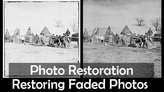
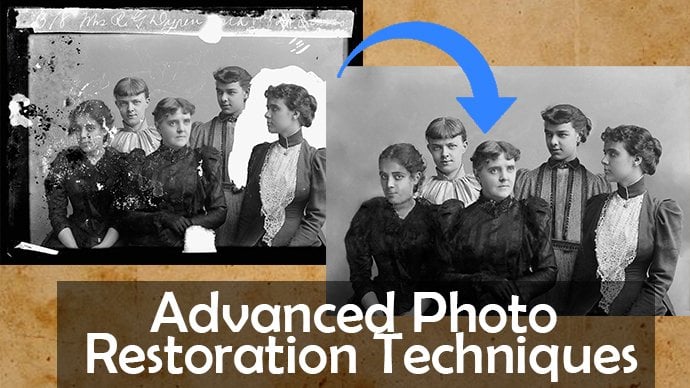
1. Photo Colorization Promo: Hi guys, welcome to this photo colorization calls. Now in this course, where we'll be diving into Photoshop with a black and white photo from 1865. And when we breathe in some life into it by colloids in it. So this course aims to give you guys a range of techniques, tips, and tricks so that you guys can take any black and white photo and colorize it in Photoshop by the end of this course. So the photo that I got has come from the LOC.gov website and I've got a load of old photos on there. So you can go and guess and get your own photo off there. Or you can download the one which I've uploaded in the project files. Now my previous courses have gone through how to restore damaged photos, but this one is just taken into a whole new level. I'm breathing life into these old photos. So I'm a lecturer from wails. I've been doing for two polarization myself for many years and I've also been teaching it. So I thought, why not orienting you guys on skill shares as well? So let us jump on into the course and make a start.
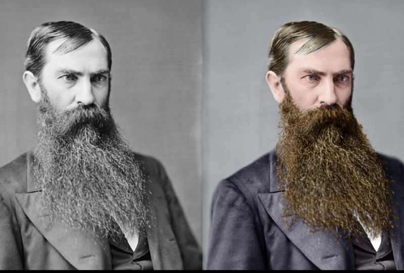
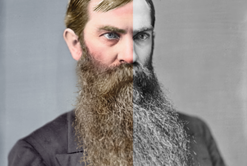
2. Lesson 01 Image Analysis: Hi guys, welcome to the first class in this photo colorization cause what I wanna do first of all is breakdown and analysis of this image and how to set up the image correctly. And I also want to take a look at the example which I've already done and will break down what I've done and how I've done the colorization. First of all, when you open up your image, you want to go to image and image size just to make sure that you've got enough resolution. So 72 pixels per inch is buying the screen. If you're gonna do print out, turn up to 300. And the resolution here, 860 by 1248. That's, that's fine for us. Next thing you wanna do is go back to image and you want to go to mode, okay? Now if we were to try and do anything with color, we haven't because it because we've opened a black and white images come in as gray scale. You want to take this to RGB color. Because if we were to try and draw any color down here, edges were able to show up as great. Okay, so changes to RGB color, brilliant. Okay, next thing I wanna do is break this down into manageable chunks. So I'm gonna go right, the background is going to be one. This isn't the order that we're going to be doing. N By the way, we've got the face and the ear. So the skin basically asking them to be another section so as to we've got the eyes. So that's three. We've got the hair. As for Susskind and needs, these are all basically separate paths that need colonization. We've got this jacket which is five, we've got his beard, which is six. And then we've got this waistcoats is seven. This shirt, but here I'm just going to leave as white. So we're not actually going to colorize that. So, yeah, we've got seventh areas that need colorization and need a bit of focus as fine. So what I'm also going to do now is a new layer. Turn that one off. I'm going to highlight areas which I think are going to be problematic. So to do this, I'm just gonna get embed color. Now. I know having done colorization before and having done this image, I know that this beard is going to give us some issues because obviously we look in, we've got some individual strands go in over other things of different color, okay? And you know, you've got some messy sort of stuff up here and up by here as well. So I know this is going to be problematic. Also, the face is going to be problematic because this will highlight that it's going to be problematic because if we turns off is very, very flat. So there's not a lot of contrast and this will have to manage that. By hair can also be difficult. So that's another area. So the easy areas are as clothing, OK. We're actually going to be starting with beard. So let's just disable these and let's have a look at the example I've got. So we turned down less now, we can turn off beard. Now, I've actually got a lot of things going on with the beard on top. I've got an overall sort of curves which is just darken in it. And let's turn these on one by one. So light color, I've just got a little bit of a tint coming in there, so I don't give the beard one whole color. I gave it a give it a mixture. Let's turn it back on. And you can see as a mixture of Kinda like brains and shades in there. Because if I just did one color, let's just do the one colour. Which one's the fastest to go for that one? Yeah, it was this hard see because yeah, basically we give a mixture. So you can see by here is quite flat, but when I turn this sort of orangey color on, I've paint that in just in specific areas and the same with these whites. You can see it just adds a little bit more depth to it. And as he turned all of these arm, then it kind of just adds more depth. If you just try and get one color, it won't work. We've done the same if you see with the face, with the skin. So I've got some yellows and reds. Silver turn yellow is off as was happening there, by turning the reds off as basically woman up in certain areas. So that's the key to kinda make in hair and skin and kind of work, right? So the other thing before we go into the next session and actually do the beers is, is really important to have some sort of research or inspiration. And when I need this is a photo from 1865. So I googled 1865 colorized photos. And what I got was this, It's a past president. So I've kind of used this as inspiration. So if we look at mine and I've basically taken very similar colors for the suit and similar colors for the house as well. I basically based my colorization of this. Okay. So this was done by another colorist. So I'm not taking any credit for him is works actually really, really good. Just Google search, JB colorization is really, really good at what he does. So I've based mine off his, and he basically did a project where he's colorized all the US President's That was shot in black and white. So check out his work. I'm going to end this lesson here. And then we're going to jump into the next lesson and start colorizing the beard. So I'll see you guys in the next lesson.
3. Lesson 02 Colourising the beard: Okay, so let's make a start on this. What we're going to do is, first of all, have a look at what I've got going on in example, which I've already completed. We've got a series of colour overlays and each of these four beard are on a soft light blended mode. Okay? And what I've done is they've got Layer Mask attached to them. And I basically painted these colour overlays in specific areas. So if we look, I've kind of gone over each individual hair with a small brush as well. So it does take a while, but it's worth it for that end result. You can see here just gone over specific areas I will be going through at the end of this lesson, when we did the white hairs, I will be going through a specific blush which I've downloaded and I'll be showing you where to download it and how to load it into Photoshop, and we'll be using that. And Nas quite nicely adds a lot of depth to it. So basically what I have done is made a color overlay for each use the layer mask just to kind of bring it in in certain areas and it is as simple as that. So let's bring this off to the side and comeback now. So what we're gonna do first of all, is just go to the adjustment layers down here and go solid color. And I think I'm gonna start with a nice brown and come into here, something like that. And I'm going to go soft light. Now with this, you can 100% comeback, double-click and change the color later on. To be honest, that's a 100% gonna do that. So what I wanna do now is control i with this, with this adjustment, no, sorry, Layer Mask selected control ie, it turns it black. And then if we get a brush and I'm just using just for now, a soft, so Tuna hardness ban, just a soft brush for this. Okay? And basically what it means is I can paint white on this Layer Mask and bring that color back in in specific areas. So I'm probably gonna do this for the whole bit. So basically I'm going to timelapse myself doing this. I'm going to use a smaller brush for these little song. Zoom in and you just smaller brush when it comes down to these parts than here. Even smaller than that. And just demo that go in completely kind of over every single one and try and do as much as you can for this. So spend some time because once we've done this mask, once, we don't have to do it again. Okay. So I'm gonna go like And time-lapse this. I'm going to do up to the tops here, probably for this, but I'll just use a general kind of brush like that. I may come in with a small one and do a couple, kinda like has like that just to kind of show and make it look as if it is actually attach into his skin. And same over here, I'll do a few Has like that and then just a soft brush, but most of it. Ok. So i'll time-lapse myself doing this and then I'll see you once we're complete. Now I'm more or less done for BAT. What I sometimes do as well as I sometimes get the blurbed rush. And I like to sometimes blurt some of these strands because again, my brush was, even though it was quite soft, brush doesn't always go as soft as I'd like it to. And that comes through a strong. So all I'm doing on this adjustment, on this lame ask now, I'm literally just coming through the blurb. Russians live in some of these strands and fits in a lot better than if you do that. So that's one additional touching. And due to this, just come through then I'm blessed with these, I think with good most part, split those edges. In fact, to be honest, I'd been blown Most of it now and I add, so if we come out, we've got the majority of our Bearden. I could probably come in and do a few more strands down here. But the best thing is, is you can always come back and add to this later. So sometimes I'll see, see what it looks like with the actual I'm suit. And if I think it looks okay then I'll sometimes I'll just leave it, you know. So that's our first one done. So I'll call this main Brown. Probably I probably could come up with a bad name for it than main Brian Lane Bryant, be it. So what I wanna do now is I want to start adding from variation in here because that is never going to look perfect because it's gonna look strange until it's all kind of colorized because just having the beard look like that on gray is always going to look strange so that some of the problem with colonization is quite often you'll need to colorize everything and then spend like an hour making adjustments just to kinda make things can fit together because you could have a very saturated beard and the, it may not match the color of the suit-up. Maybe two desaturated, an OLAP. Anyway, what I wanna do is make another solid color. I think what I'm gonna do this time is, well, there we go. Yeah, reds add some reds, maybe sort of orangey fiery red like that. Change it to soft light. And I'm going to get this layer mask. I'm going to right-click it and I'm going to delete it. Okay, what I'm gonna do now is right-click this one and add mask to selection. And then I'm gonna come to color fell one and click new layer masks or was going to do is it's gonna make a new layer mask act of the one we've already created. And then what I'm gonna do is I'm going to get my brush again. And I'm going to get a black color and basically erase this red for most parts, not all part, but for most parts. Okay. So I'm just going to go through and just, I think I'm gonna keep the read quite a bit more in his stash. And I'm going to take it out of his sideburns. What you can do is bring the capacity on this brush down to like 50% Only half of A's in it and what we want to be left with, and I'll take it out with the edges. What we want to be left with is a little bit of variation. So again, my Russia past, it's gonna come down to 16% now. And we're going to have a little bit of 58 in the beard, but not great in the mustache. So, but not a great deal in here. And some Rush interact, make a bigger brush. Rashid arrived. And what will be left with, say we'll leave it for the F and I will be left with is only appear in, in some areas. And you can see already, this looks a lot more, looks a lot more better. Looks a lot better than this. I am going to continue to take it out of here. My opacity of the plush 30, 16% now, so I have to do quite a few clicks. I'm not a fan of it over here. So I'm really turned my opacity up and get rid of it from there. I like it in the beard, but perhaps a little too strong. So again, 10%. And yet let's get rid of it. So what we've got now is we've got some variation in that. Turn it on and off, and i like that. So we're gonna do the same again. So new, solid color. I think I'm going to go for some sort of Rajesh yellow and, and then political top right-click Delete Layer Mask, come down to this bottom one, add mosque selection, click our top and click the Layer Mask icon. Also remember to turn the layer two soft light and we just check I did that with the others yet soft light. And again, it's going to be the same thing. Before I do that though, remember on this orange one, we can double-click and we can actually change the color now so we can make it a little bit of a darker orange. See, I think that works a bit bad maybe, but with darker orange. And we'll be doing obviously the same with the yellow. We're not going to have a boy yellow bead like this. So same thing on the layer mask. Let's get my brush tool and start painting Black. Well, we don't want to see it. So I'm gonna start off with a strong brush. Something like this, painted out of everywhere for the most part. There we go. But as Arjan, eighty-nine percent opacity, so it is still there in some shape or form. Now I'm going to come through and just painted out of specific paths, leave in just a shade of this yellow in some areas like this, okay, and now I'm gonna change this color to assault, white-ish, yellow SEA that looks yeah, we got some variation in their one going to do, I'm going to repeat this process now. I'm going to repeat it with probably another two colors. I'm going to do another sort of brownish color. And then maybe I'm gonna finish off with a white. But on the white, I'm not gonna time-lapse that bet because I'm gonna come in with a different brush for that and I'm gonna show you how to download and get up brush. So I'll time-lapse this next bit now. Ok, so I've just added another sort of brown layer to it. And again, if we see where we've come from, that was our first one. And you may thought you may have thought at first, you know, we're putting some color and that looks good. But now obviously we've got a whole range of color. I think there's orange, maybe a did change it. It may be a little bit too saturated. But again, the beauty of it is you can come back each time. What I wanna do is add some white strands in there now. And we're gonna use the same process as before, but instead of using a small brush cause I want to paint individual has, instead of using a small brush, I'm actually going to use a downloaded one. So if you go on to, and I'll put this link in the project files, there'll be a text document as well, and this link will be in there. If you go to Deviant Art, fallen brushes, I think is the fallen stock is the person who does it. Again, a link will be in here. Really nice brush set of sort of individual half-strands and stuff. So this is what we're going to be using. All you need to do is click the download button and you should be able to download. It. Makes sure that if you do use this, they've asked to be credited. So do not claim these as your own. Do not redistribute them. So that's why I couldn't upload the file to you. The sort of bushfires. I could've I couldn't upload it because they've asked me not to. So give them credit. Don't claim as your own and don't redistribute the file. But that's what I'm doing now is I'm credited in this person and encouraging you to have a look at best stuff as well, because we've got low, this person's got loads of other blushes as well. So you can see set one of how to look at the other stuff is loads here. So I would recommend taking a look. Anyway, once you've downloaded that, what you'll wanna do is go to your brushes up here and click the drop-down. You'll save an ABR file to wherever you want. There is a specific place on your soil, Photoshop, on your computer. You can actually save them too, but I saved mine in a folder full of brushes. So if you just go to this Coke but here and then go to Import brushes, you'll see I've got Photoshop brushes, I've got my own individual folder. Yours will default to like your program files and it'll go Photoshop and then brushes and you can save them in there if you want. But I just have a, I've started a new folder for the brushes. So you click it and then you click Load and it'll load in. But I'm not gonna reload mine or terawatt. Yeah. Why not load? There we go. And what you'll see now is I've got these brushes by here, or if I scroll down, I've got head blushes, a folder of two folders now. And you've got all these pluses in here. So let's have a look at mine. I've got my brushes open here. And think, let's, let's first of all make a new layer. So we can actually see here, lets read, and that's what the brush is gonna look like. So I don't like that one. I think that one's quite a nice one. And that one, I'll stick with this one. So let's delete that layer. What I wanna do is new solid color. And I'm gonna go white. Lights. I put that to soft light and I'm going to get the Layer Mask and control i to invert it. And what I can do now is basically use this. So changes to white uses to paint this back in, in specific places. However, what I want to do is bring in size down, first of all, down to something like that. I also want to go to the space in so I can actually click and drag. So you can see I can click and drag like that and it'll just do it quite randomly or space it. But also what I wanted to do is go to Shape Dynamics. And I want to the size of Jupiter, the size you'll have different sized ones large and small. And also I want to go to the angle Jeter's. They'll all be kind of like rotated at different kind of thing. So that's what I'm going to end up having a case. You can see that what I want to do now is basically our paint this in on his bed. So I'm gonna go through, Actually I'm not liking this blush because not that strong. So I'm gonna go back to the blushes and let's pick this one formula going to be, yes can be strongly. So I'll do the same again space in spaceflight. And yeah, I'm going to go for the size, going all the way down, something like that. And thus give me a bit more and this will take a while. In a while, you just kind of coming around and doing that. But I'll show you what it looks like once we have done as well. So I'm bringing my brush banners just ended a bit more depth to try and do a little bit more in the shadow areas. And it's just the agonies of white strands. So for turning on and off, you can already see is kind of adding a solvent new layer of depth to. It. Just adds more of here and add some disciplines up here, add in a bit more variation. And you can do this with other colors as well if you want. There we go is add in another layer of depth. What I'll also do as well is I'm going to get just my normal brush in case you don't want to download this. And let me get my normal brush. Normal soft brush like this. And I am going to that's what the problem was. I didn't know my blush capacity up earlier when I had that much selected, but of an hour there. So it's been incised down and space in up. And yeah, it's coming through a lot stronger. But anyway, soft brush size up opacity. So I sized dime and you can just go through and painting individual has like this if you want. And, you know, it's not terrible way to do it either. So just go through and paint in individual has like that. And I'll add another layer of depth. So you can go through and do that. If you have a lock, these brushes that are used, they are quite sharp. So what I'll also do is first of all say, well it see what we've done as quite nice salad, some depth. And also with this layer mask, I'm going to go to filter blur and gorgeous Gaussian Blur and just let a pi by one pixel. Ok, so just gets rid of any sort of hard edges. Okay, something like that. Seeking Sperry small is very small, but you can see what's going on on my screen. It may not be able to see a new colon, but I'm just gonna give it a one pixel blur. And what we've got now is we've got our Beard more or less done. I am going to bring down the orange slightly exists just a bit much for me at the moment. And also maybe this bitterness ONOFF. So I think you can turn down your past T of the layers as well if you want. But generally the beard like that for now and probably will come back and look at it later. Again, spit to read Paul, touch something like that. And yeah, I'm like in that. So what I'm gonna do is named each of them. And so let's go orange. This is a beveled belonged. This is some sort of, I'm just going to call this light, this light areas and whites. And what I'm gonna do is select all of these and put it in a folder. So it's gonna be called B it, and it just keeps everything clean. And like I said, where it's very likely we'll come back and visit this later. So I'm gonna end this lesson there. So GST and n, And I'll see you in the next lesson where we'll take a look at the, I think we're gonna go with the face. See you then.
4. Lesson 03 Colourising the face: Okay, so let's get to work on the face now that we've done the beard, we, like I said, we may well come back to the beard later, but let's just get a start on the face. Okay, so let's have a look at my other file just to see what we've got going on here, in here, the one I've already done. So let's turn everything else off apart from beard and listed in hair off. There we go. So next thing we're doing is the skin. So I'm gonna zoom in and I'm gonna show you what's going on. So obviously, we've got, we've got, well, we've got a curves going on here. Let's start at the bottom. We've got a curves Kourion on here. And the reason why is because the face is quite, is quite grey. It's almost more than one shade of grey, but there's, you know, round this area. There's a very similar shade and I just wanted to add a little bit of contrast into there and just pulling out a little bit more detail. So I did that with a Curves which is limited to just this face areas. If we turn it on and off, you can see as just in there in the face. And it just grew up with be it a little bit, but I but that doesn't really matter. Next thing I've got is something called a gradient map. And we'll be making one of these. And if I click here, you'll see that basically we've applied this gradient to the image. So the darkest part of the image or the darkest part of it will get this color and the lightest part will get this color. Okay? And so the mid tones can evolve come from here. So that's what's going on there. I've then got, instead of a color overlay, I've got a hue and saturation. And if n is called Reds, so if I turn this on love, you'll see I've just painted in some sort of reds and I've done the same for yellows as well. So for turn that on and off, it's very subtle, but you'll see what's going on. So for turn them both on and off, you'll see it just makes it less flat really. And then I've got General saturation, which is just the overall phase saturation. And I'm just saturates the fates face a bit more. And I painted that taken effect more in certain areas. And I've also got shadows are painted in SMS or dark shadows by here. Again, just to give the face more depth and form. So this is what we've come from because just overlay one kind of like this isn't enough. So I made a darker and then overlaid these. So let's go and do this in hours. Now what we're going to start off with the Gradient Map. Now in order to do this, I told you earlier that I was using a photo as reference. So I'm going to bring in my reference photo and hit enter. And we're gonna, we're gonna generate some reference or less. What I wanna do is I wanna get my eyedropper tool, make sure I've got a new layer. So let's turn that on. This delete desks have already kind of done it once. So let's make a new layer. I've got my reference photo here. Get the eyedropper tool, make sure all layers are selected and I'm going to pick a dark color first of all, so something like vat. And then on my layer one and we are my brush tool. Make sure it's a hard brush. And I'm gonna go make sure also that your capacity it all the way up. There we go. That's the color I've sourced. Alumni come back with the eyedropper tool. So hit ionic keyboard, Bangla, selected through the brightest part layer, which is probably going to be about up here and hit the brush and go on this layer. And there we go. I'm now gonna go and hit I on the keyboard to get my eyedropper tool. And I'm going to select a solid midtone rainbow there. But before my brush, make sure on that layer. And then I've got my three colors there. Alright, so that's the first task. What you'll wanna do is you wanna make sure that these colors are kept to the top because if they were down here or somewhere within the beard, they could get affected by adjustment, like any adjustment lazy you've got. So what want to do now is make a new gradient map. And so come here Gradient Map. And again, just make sure layer one, which is your colors. So I'll just call it ref reference, make sure that's at the top. So now that we've got with gradient map, if we click this icon, but here, this gradient icon, you then want to go up to here. And you want your dark color, this end. So let's click this peg, click color, and I'm going to click this OK. Let's click OK. Then I'm going to come to this end. Click color, my eyedropper tool, ban that. And also I'm gonna put one in the middle and it's going to be my midterms. Okay, so we've got this kind of setup. And what you can see what happens now is, let's click, let's click OK and zoom in on his face. And like I said before, his face is very, very flatten one color. So the darker areas are going to adopt this color and the lighter areas or adopt this color. But then all these colors and very sort of in the middle, so grace, they're probably going to be taken most of these colors in here. And you'll see that's why when we turn it on, it's still very one sort of color. Let's click this and come in. And you can see if I pull these dogs, are they start filling those dark areas there. And again, if I do this, it becomes very strange very quickly. So what you need to do is you want to use these sliders to kinda Chuck, I say an array of color, but you want to color and put more than one color in Nan us why we're using this Gradient Ramp. But I think something like that is going to be what I go for, for now. And by the way, you can always come back in, change these colors. So I say one changes color. I just wanna make it a little bit brighter. You can always come back, changes colors and change that position as well. So nothing's final. I'm going to click OK. Now what I wanna do is control and click this Layer Mask and control i to invert it. And now what we wanna do is we want to get our brush and we want to brush it back in just in the areas that we wanted, which funnily enough is on the face. So very low hardness on the brush. So like Xerox and hardness. And what I'm gonna do is I'm not going to go all the way up to the edges because I'm going to do that later. And I'm not going to worry about going over the hair. I shouldn't have gone over that much to be honest, but there we are. Not going to worry about the age is too much. Let's just fill the main bet in. And then I'll explain to you how I'm going to go about doing these edges. So what I wanna do is where we start to see it joined the hair as first of all, swap our colors by hit Next and paint this act Tibet. What I wanna do is painted back in but with an opacity of around 14-15 percent. So let's undo that. Undo. And yeah, you basically want to blend this so with a low opacity, you want to sort of blend these edges just slightly like that. And again, 14% or my brush and I'm just painted over the period only just, and again, it's a little bit too much over the period there. So swap my colors and I'm just going to paint it out a little bit just like that. And if we just carry on doing that all the way through, what we should have eventually is a face which is kind of nicely blended. So what I'm gonna do is I'm gonna time-lapse myself doing this now all around the edges. And also I'm gonna paint out the eyes. And when it comes to the i VI was well, I'm going to do is I'm gonna painted out so much on, paint them black on the layer mask with a low opacity. But I'm only gonna painted out about half halfway. There is still some pink in man because he drives is so kinda like especially this guy's eyebrows are going to be so sort of fine and everything you'll expect to see a little bit of color, color kind of in there. Okay, so I'm gonna go around and I don't tidy up this edge now with with a brush which is on lower pasty, and I'll time-lapse myself as I do this. Okay, so now that we've done that, I've masked that. What I wanna do next is I want to add a curbs to this. So if I go and load this as a Selection, so right-click the Layer Mask and go add mosque to selection. I'm then gonna go adjustment layer at the bottom, makeup curves. Click that and I put the curves below. And now it's got the same mask because we loaded that as a selection when we made it. So what I'm gonna do is I'm just going to darkness faces. I ever so slightly, just like bad. Okay. And they go, that's kind of what that's doing is bringing to a little bit more detail in there. So what I wanna do with this gradient map is double-click over on the right-hand side by here, and you'll get there. So blending, so layer's styles is called, you'll get this popup. Now what I wanna do is where we've got some darks and when we've got well, we've got very lights. In real-world where you've got dark shadows is not actually a lot of color in shadows. You can see it looks quite fake when we've got that color over his eye. But I it's basically like it looks like he painted on top and the same in the lights. So what we wanna do is here where it says blend, if we want to just take up our and this by here, not a problem that gives us is it does it very harshly. And if we do it here as well, you can see that's what it's doing. So we wanna take the color white, the lights and the darks, but it's a very harshly. So what you wanna do is you wanna alt click these, and then you can do them almost like separately, and it basically blends it. So I'm gonna set minor and I'm just gonna kinda have a look at mine now. A thin donor do the whites too much or something like that, I think. And the darks thing, let's have a look. Something like that. So if we go from before and after, you can see, that's definitely lock. The white of his nose is coming back through and that looks like shine because before when we paint over that shine, it just didn't look right. And again, with these shadows in that, so that's gonna really help it become a lot more realistic. So let's click okay. And like I say, guys, remember we can always come back and we can change these colors as well. I've just noticed that my mask on my hair isn't properly, properly saw idea at so I'm going to get lower opacity brush, just go a little bit smaller. I did rush it even now as time-lapse nets, it didn't really matter, but they go outlast us by an unavoidable the annual Bingo. So what we wanna do now is we want to start painting colour, some more color in it. Individual places. I am thinking that's actually quite black color pink, but look, we can come to that later and we can almost dial this diamond as well. Dialects layer down. Anyway. I will leave it like that for now. What I wanna do is instead of making a new color overlay, I wanna make a new hue and saturation. And I'm doing it this way just to show you that different ways of doing this. Now what I'm gonna do is I'm going to turn his face red. So whereas those sort of pinkish back here. Yeah, let's go. So by here, saturated more. Barry Joe asked us are bad, isn't it? So there we go ass right now, I'm going to rename this to rates. Get my Layer Mask control i to invert it. And I'm gonna get my brush, change it to white. Go larger this brush. And with a low capacity, say like ten or maybe even called ten. I want to paint in some reds back into his face now. And I'm going to do this in strategic areas so your nose will go red when you get cold. You know, that's well, our blood vessels are somewhat isn't knows to go a bit more, read his ears, especially the lower earlobes, they can go red. And also the tops of his ears around the eyes go lot blood vessels when they're so just run the eyes like that. Man this i and the psi and maybe touch on his head. We turned it on and off. You can see that's what we're doing. What add in some more depth in a bit more color. Says go cheeks. There we go. And just go with the last bit and go wider. There we go. Okay, cool. So that's the reds. Now we're gonna do the same again and we're going to do it for the yellows. So let's go hue and saturation. Unless you know how saturation one, us go yellow, whereas yellow. And there we go. Let's go a little bit more saturated and control. I now want to paint this in. It's going to be a bit more random. So on we go probably down to about 5% on this. To go even more subtle, I'm just going to bring in some sort of yellows just actually to go and swipe sense quite strong. And ongoing fall 3% and bring in some sort of yellows just to add some variation into the skin. It definitely millibars year there. And as we turn this on and off, you can see exactly what bath doing as well. So it's painted out a bit, but that I think, and then come back to the raids and paint a little bit and read in. By here. That's even I've seen work in. Lot less subtle on the red. In fact, that's why I was painted it out. They bring some read into that forehead. Are there. Okay, cool. So we've got one or two things left to kinda due to the space. Again is still, is not gonna, is never gonna look kinda like completely right, until we've got all the color added. I'm thinking his cheeks rosy, but there I'm thinking I could change these colors, Ryan, but I'm not going to look at that until we'd call everything colorized because that's when everything starts coming together. The beard is now probably look in a bit more normal, isn't it? Because we did that a while ago. So what I wanna do now is I'm gonna make our paint in some shadows. So I'm gonna go to the solid color now. And I'm going to pick a dark, dark brown, Something like this. Really dark rhyme. And click OK. Language. Call this shadows. Don't forget actually on call this one. Yellows. And in shadows now control i to invert it. And I'm gonna change the blend mode to soft light. What I wanna do with this is I want to paint in, basically is called Shadow. So I wanna paintings into shadows. So with a, so by 10% opacity, I'm basically going to paint this color in, in the shadow areas. And this can be very subtle, but literally when we enable and disable it later you're going to see just how powerful this is, says shadows under his eyes by here. And I think there's gonna be a parish shadow under his nose, Obviously. It's just painted in. And if we turn it on and off, all the sudden lock, you can tell just what that's doing, where painted shadows in the egg gives his face lot more depth. Okay. So I'm just gonna go through and just give give his face yeah. Just more depth relate a little bit a shadow under that head over there. And yeah, just go through under the eye while bones, eyebrow bones. Is that what we call them? I don't really know. Maybe a little bit in there and a little bit up there. Great. So now when we turn that on or off, we've got depth to the face. And let's go back now and see our original. That's where we came from and mass now where we're going. Okay? And again, if we turn this curves off, that's like such a flat skin. Look. This is where we go in. Now, what we did, why did do? In my other example, you'll see the pinks or a lot less, a lot less pink in that. So again, I said I'm going to come back to this later, but we can start dial in some of these things down as well. So like my gradient map, I could dial down, probably come and do that later. But what I also did add in here is I added a, I think I came back a day later. I looked at the saturation in the face and I just wasn't happy with it. So I did a general overall phase saturation just to make it a little bit more saturated, slide up the, up the Saturation to 11 bought lightness down. And I just painted that in, in the face and I thought I'd give it a bit more moody look. But I think looking at mine, I'm to be honest, I'm not that are not appalled by it. As a skeptic go though, mu hue and saturation, actually delete that. I wanna use this Layer Mask down here that we got for curves. So right-click mosque to selection, new hue and saturation. And we can just, when the lightness down a bit and increase the saturation. And no, I don't need to do that, to be honest, is put at the top actually, just before we make that decision. I we can I guess, to be honest, this is totally down to up it up to you. I think heavily on there could work. I'm not gonna delete mine because again, I want to see what it looks like with the hair and everything first. So I'm now going to delete my reference layer, make sure everything's named. So I'll just, I'll make, I'll keep curves named curves because I know that this occurs is the only curves there. So I'm gonna select mole, put them now in a folder and I'm gonna call it face. And I'm also before we finish this lesson, I'm going to do the eyes. So we could do one or two is a solid color. We could kind of have like a hue and saturation and just, you know, change color. Actually, no, I wouldn't work. So we're not gonna do a new solid color. And I'm gonna go, I think blue eyes. Again, you can always change color layer blue eyes. Invert this lame ask with control i or command di fuga Mac. And actually it's something interesting I do on this. So I'm going to get small brush, makes sure that my harvest is all the way down and my opacity it all the way up. And I'm going to paint in as turn this to color or soft, soft light. Yep. Change that. And I'm gonna paint this in like so. And you'll see now the little trick I do to make it blend better. Let's go across to his other eye and do the same. So just paint the value in, in this area like so. And now he's got blue eyes, quite dark blue or vivid blue almost. So you can dial down your pasty of this layer if you, if you wanted to. I probably well actually, first of all, what I always do when I'm drawing eyes, it always looks a little bit too crisp. Even our view, because it's because you're using a small brush and it can't really fair there it even, Aha, this is Diane, when is a small brush, it's really difficult to federate. Okay? So what I'm gonna do is I'm gonna get my, select my Layer Mask and go to Filter Blur, Gaussian Blur. I'm just going to blow it by one pixel. So if I preview Asian E13 duet, you'll see what that's doing to his eyes and it just works a lot better. And also dialing opacity down to about 75. And diagnose like see the detail, detail now going through in his eyes and a little brighter area just works a lot nicer for me. So I'm gonna go eyes and I'm going to drag this down into the face and keep it at the top, the LSAT. And yeah, now I'm kind of happy with how spaces look in. And I think the next task for your job then is to move onto his hair. And his hair will probably be, it's not gonna be too challenging, is going to be easier than the beard, probably easier than face. That's gonna be the next one. And then in the lesson after we're gonna do the waist coat, that jacket, the background, and then we're gonna do some final touches, so chooses to none. And I'll see you in the next lesson where we'll take on the hair.
5. Lesson 04 Colourising the hair: So time to make a start on the hair. That's first of all, have a look at how it was done last time. So I've got in the hand out to an on-off. You can see as the eyebrows and the head of hair, we are quite a few different colours in the habit of isis, very similar to how a mixture of how we've done the head down here and the face. First of all, I've got a gradient map. We could just keep himself and couldn't make it, but we're not going to. I've got a gradient map and it's got gradient of these colors by here. Okay, so just a few colors. And as click OK, then I've got some more browns which I've just painted in. And you can see, if you look closely, as I zoom in, you can see where those colors are coming in. And which turns off, maybe you can see with better. And also we've got these whites. Okay, so I painted the, painted in some lights on the white areas. So these two layers just add a little bit more depth to it and answer already. So it's combination now of the past two steps. What we're gonna do is we're going to go and create a new gradient map. And what you could do is you could bring in an image and kind of base it off that like we did with skin. But I'm not going to bother because it's just a few different colours we need to pick. So I'm gonna go click this icon. Was some people will do is they'll go to click the gradient, but they'll have the Layer Mask selected. So just make sure you've got this selected and click the Gradient Map. Now let's make a dark color for the hair. So really dark brown, First of all as getter brown and then go really dark brown like that. Click OK. Let's go up here. I'm almost going to pick like a really right, so belonged like that. And then I'm going to get from my mid tones, which is where most of this is gonna come from. I'm going to get solved my strong round like this, okay? Something along those lines. We can always add one like that. Actually. Let's make this darker and let's make this a little bit less saturated and darker. So my bat, okay, cool, happier with that. Now we can kind of play around with this. I think I'm gonna come down something like that for now. Let's just have a quick peek and see how similar that list, my last one. Very similar to the last one I clear. Okay, that's good news. The reason I, by the way, put mine down here is because when I was up here, it was mainly the hair with mainly captured a lot of these dark tones so as thinking, they're getting mapped to the soil area. So then if I move this down, they're not. Okay. So roundabout the basil could mixture. And let's click OK. What I wanna do now is, you guessed it. I want to invert this Layer Mask and I wanna paint this pack in just in the areas that I'm concerned about. So very similar to before. I'm gonna go around very slowly. And I am going to use almost like a sort of low opacity when it comes to this area. So lower pasty of like 5% and basically just gonna blend it very much like that, okay, and it's just blended in. And if I just go back up, I can now basically put in a Westphalian. So I'm just gonna time-lapse myself doing this. Okay, so now that I've drawn that Harry and I can see a couple of problems. I don't like how yellow those highlights are. So what I'm gonna do is I'm gonna come back in and I'm going to really take oh, that didn't want to put pink and and I take that yellow out, so I'm just gonna make it more and more white. Something like that. I'm also going to have a look and see what happens now when I play around with this. I think what I want to do is pull this up slightly warmer doing is pull this little halfway point up slightly, just stop them. Taken so much of this yellow. So basically what this let me go. Basically what is still a diamond does it basically alters the fall off of the gradient. So if I push it closer towards, solenoids are difficult. By project closer towards, up here, you'll see it, it, it, it's kinda pushes this sort of color over more to the highlights, but it is really tricky getting Attila perfect. So I'm gonna go for about there. And again, can I get a little bit less yellow on that? Not really if I try and do something like that. Okay, let's click OK. Actually, before we do majors, modify this color because this is quite warm. So let's just have a quick play around them. Difficult to match this to the hair. So I think maybe a bit more red in there. And the ASA, ASA, much nicer Brown actually, isn't it? And we can paint some sort of orangey stuff in there. Like we've gotten a beard. That's, that's looking a lot nicer actually. So let's click okay. And what we can also do, double-click the layer and remember this underlying layer thing, but here, alt click and we'll just like push it away, sludge just slightly like this. Just so if we turn it on and off it, we're not kind of putting color into the black areas. Want to do is I'm gonna click cancel, just kinda zoom in and show you that in more detail. So double-click and alt click this peg. And you can see now, as I previewed this ONOFF, these dark areas were not just punching color into there and the dark areas, but here we're not just flooding it with color, and that makes it look a lot more realistic. So alt click these ones as well. And something like that. Now as preview at home off. And this one just up a touch. There we go. I'm happy with that as making it more realistic. Click OK. And I think we got a similar color down here. We can probably try and match it a little bit better. So just scared of a warmer, warmer violin again. Yeah, okay, happy with that. And what I wanna do now, click OK. What I wanna do now is start just painted a little bit more color in there like we did before. So new solid color. And I'm gonna go for phi. We run like Bat and control i. And now let's scout rush, right. First of all, before we do that, shriek go color, Ocean Rico, soft light. So less as first of all, paid some of it back in just serious guerilla, like, I think you will be fine with color. Ok, so lower the opacity and basically just paint a little bit of variation in that low myopathy mole down to about 5%. Basically just going to put few different shades in there. So turn it on and off. You can see what we're doing. Add in some, most of color variation in that. I may want to make this a little touch War Mao as well. And yeah, we're getting similar tones narrowed down here. I'm going to do the same again. So solid color. I'm gonna make some whites this time. Terroir, not for the wide toilets, not necessarily as bright yellow, so blond parts in there. So control lie on a layer mask. Make sure its own color. And paint this in, in the, just in the light areas but here, stony light parts and for turn on and off. Not having cancer coming through there actually. But I think I'm no fan of bringing McCollum into that actually. So I'm going to go and see what happens. May get just white to thank for that. And as to an on-off. Yeah. So what you can do now, I think I'll probably leave mine round, but there, maybe dial it down a bit and have another play with the color in here. Let's make care. And then like that. So expect this head be a touch darker than the beard. Anyway, let's bring it back a little bit. Maybe. Yes, something I've completely vaulted up land. They would go click OK and be done with it so that you can basically carry on with that and carry on playing around with adding sort of little dabs of color and using the Gradient Map. And then let's just name this too. Warm colors that were added and on nameless to lights. And let's select the three of them, put them in a group, call. Them have, um, I've just realized war, I've forgotten to do. I've forgotten the Gradient Map to paint in his eyebrows. So let's not ignore those eyebrows. Let's go and paint them in. So down here in the Gradient Map, job lush tool. And we need paint white and we wanna painted in struggle and that may be not quite a strongest go 50%. And just painting some of that colour. And same on the other side. Paintings of black colour band. And we may want to do a little bit of the, oh, that's a little bit too much. So it's come down to about, say, 5% and it's painted a little bit of red and a little bit at these warm colors. Ok, and now we've got the, we've got the eyebrows done. So I nearly forgot about what I want you to do is just carry on kind of add into yours. I think I know probably lead mindset is I can probably go through and carry on finesse in it. But what I wanna do now is I want to move on to the coat of the jacket and a background and then we can look at master and everything. So chief to name. And I'll see you in the next lesson.
6. Lesson 05 Colourising the jacket, waistcoat and background: Write a thank, I've decided I'm going to try and do this. All the jacket, the waist coat, and the background or the Mongo, I'm gonna give it a go. Okay, so what I'm gonna do now is I'm going to start off with the jacket. So looking at our inspiration, it's O hogs on top. We're going to go for the soft color. Alright, so what I made is an Akita ROM for now, I'm going to go new, solid color and go for something like this to start with. And they're going to hit Control lie on the Layer Mask and turn this to color. I'm going to blend the brush now and rush it in. In here with a 100% of ASD. And what about soft light? Actually, soft light versus the Athenian we're soft light. Bohr want to do now is come back to the color and I'm gonna try and pick a color now which is going to be similar. So davka and a little bit more desaturated, something like that. I'm also going to do something later where I just do a curves on the coat as well just to move coat darker. So I'm going to click OK. As near enough. Now, disable, laughed and basically I'm now going to do that. I'm now going to rush this N, however people are going to get confused. Now what happens when we get to the beard? Well, it doesn't look too bad. We can still see that rhyme. But what I wanna do is I want to go to the pH. And this was the main one where we did the bottom one was where we did the whole kind of masked everything. So I want to do is right-click and I'm like go add mask to selection. And then I come back up to my jacket up here. And you can see if I start painting, I'm only now painting within there might want the opposite. So I wanted to go to select inverse. So now when I paint, I can painting, lived up to his beard, but it won't paint blue in his beard. Okay, so that's quite a nice little trick. And we are going to be using that trick quite a few times now. So just come up to the edge, something like that and do his shoulder. I'm just coming down. And now we're gonna do the same on the other side and come along like that. And there we go. Now, what I'm gonna do is under the de-select, and that looks really good. Ok, so if we'd gone over, AI doesn't look good like that. So that's how we kind of manage that. One would do now is I'm very quickly going to tidy up the a j's and like normal and a time-lapse myself doing that. Okay, now what I did when it came to this area of here, if I turn off, you can see there's actually quite a little bit of a blurb of air. So what I did is when I was a raising out, I took my brush time to about half opacity and then just kinda came over and just ached away at it a little bit. And that's how I deal with that, dealt with bad. Okay. So what we've got now is we've got him covered in by there. And it is quite difficult over over this side just to see where the line is. But I've made my line go kinda like down there so you can see where mine is. In fact, it could come in just to touch like that. And there we go. So we've got that done. And I'm going to call that and jacket. Now I'm gonna load this again. So right-click the Layer Mask and add mask to selection. And I can see now I'm an idiot and missing a bit by here. So control D to D select if you've done that. And let's just bring that bed. Let's go. Let's just bring that bit back in, okay? And we can try again. So right-click Add masked selection. And I'm going to go New Layer, the Adjustment Layer and curves. Okay, and I'm going to bring this down a touch. There we go. And what I can do now is turn this guy back on. Put him at the top. And now using a combination of the curves. So the curves is helping because we've got too many highlights in hours. So using a combination of the curves during this highlights, maybe diamond touch. Using a combination of these two and with a combination of these two and the color, I'm going to try and match this as best as possible. So then like this, and then I think the color can be a little bit more desaturated, Something like that. Vast, No, that's not bad to be fat. That really isn't bad. Some maybe just push up a touch. That's really not bad, match in. So I'm going to turn that off. And to be honest, I think creatively, I just want a little bit more blue in there. There we go. Something like that. Now. I want us all purple now for for his waistcoats, there's going to be very similar folks process. I'm going to go new, solid color. Let's go for a bit of a purple. And let's put down at the top. Let's go control I. And I want to start painting it in here obviously. So let's go to, I think soft lights or color. Again, I think soft flights a winner for me. And now with his beard, What I wanna do is right-click Add masked selection. And also with this jacket, I want to right-click and add that to selection as well. So now when I paint on, make sure you painted on the white one now Superbowl, but here is not go into its only do it in the beard and the jacket. So let's undo that and remember to select an inverse is now only go into paint in here. C is not going out there and it will go over the white shirt by here. But let's just fill this entire area like that. And we can just painted outliers. So x two inverse the blush to remove it. I'm just going to paint it out of this little what should we call it a shirt. Okay, and that's really quickly now done mat. So let's try and match the color. His, his very sort of desaturated almost succeeded to gray To be honest. Slack the color. Let's just take that right down. Like so it's still a little bit color now, which is quite nice. Or we can do is turn that off. Task matching To be honest. Or we can do is have a look and see what happens now if we paint this curves into there. So with this one and add mask selection like that, I'm just going to go into the curves and I'm gonna try painted in the curves to take effect and his waist coat. And let's see what happens. What effect does it have? I actually prefer with active NK. So yeah, there you go. And often a ball control D to D select, and we've got that now. So the final thing is our background. First of all, let's rename this. So lets go. This is the jacket curves. And let's put this, the thought was below earlier, below, and this is our waves to coat. And now what I wanna do is I want to do the background. So let's go to New solid color. And let's just go for a light blue account number. What Co actually went with? Let's go. Where is it? Either soft, light or color are soft life again for me. Right? So that's that. Now what I wanna do is I wanna get almost like load, loads of stuff into here. So jacket, let's right-click Add mask to selection. Let's go to the beard, Maine and mask to selection. Let's go to the skin. So where's the skin? Those Gradient Map we used? Let's add mask to selection as go to the hair. And let's use the gradient map at that one, because that was using everything and mask to selection. So now, apart from obviously the waistcoats on his eyes and everything, we've now got everything loaded as a Selection. So what we can do is, right, because of the way I've done it, I am just going to now actually has fine. I'm going to invert my Layer Mask like so. And o, when I've done that, I didn't realize, yeah, it kinda does it automatically. So let's undo that. I want to paint black now, any areas I don't want it, so that'll be him. So let's get my black brush and I'm just going to erase it after the, these areas which I've selected. And you'll see now I've got this Layer Mask fire control D to Deselect, because that will help us do that. They'll get my edge is done. Now, looking at this layer mask, I just want to get rid of the blue in this area. And let's also really bizarre. So it's coming in at a smaller brush painted over these areas. And is there anywhere else in here? I don't think so. I think that's all very good. Yes. So now it's only doing it in the background. So a quick look at wall color I used. It was almost like I can cheat here are enormous copy and paste this something like a value. So grayish blue, so very grayish blue. It was kind of over here, wasn't HBR. I remember. I've got my little code so grayish blue clicked. Okay, and I think I might use color actually over there instead of instead of soft light. So go for color was a color that I used. It wasn't aid. So yeah, that is now very similar to what I've got over here. If I just turn everything back on. Not a lot of difference between them, I think may be it is the main difference. I've gone a lot more saturated on this one. So what I'll do in the next lesson now is I'll start wrapping everything up and we'll make a few finishing touches. But yeah, well done if you got this far, let's now move on to the last lesson and finish everything up.
7. Lesson 06 FInal touches and summary: Okay, so let's take a look of finishing this up. Okay. So we've got our background, the waist coat jacket, jacket curves, have face beard. Now, looking at the image, uncomfortable with background and comfortable with the jackets, the beard needs to kinda come down a better bank. Hair, I think it's fine. And the face needs to cool down a bit as well. It looks like you just want a myosin filament. So Philip beard has come in and solve that on first. I'm going to three different ways you could do it. And I'm a chalk in a hue and saturation and put that at the top of the pile in a beard. And I'm basically just going to dial this down just like minus 15s and like that. And bingo. Now, note, if you were to put anything below this beard by here, this beard folder, let's say for example, this one is both at the waist coat. You'll notice let's put it now back above. Basically wasn't that notes polynomially, but what you've got going on is you've got an adjustment layer in here, hue and saturation and it's gonna affect everything below. So if we wanted to do it for the face, for example, we couldn't just go and put another hue and saturation layer in here because it'll affect everything below unless we mask into specific areas, of course, which is actually something that we could do. But I've done the beard. So turn on and off. You can see the effect has been on that beard banana. I like that, I think has quite nice. So now for the face. So another way we can do this is we can look at, right, well, let's dial down near capacity of some of these layers. That's a little bit too much. But let's dial a stand about 70%. The reds coming through to strong. No, I think that's just right now. The yellows could be a little bit stronger to be honest, but several look at duplicate in it and turning it down and opacity, is that worth it? I don't think so. Use always an option now. And again, I think now that we've just brought this one down to thinking about faces working better for me actually. Yeah, I'm quite comfortable with that. You can always go back and you can change the colors of these if you wanted to. And you know, you could always double-click and you can come back in and change this soft blend thing. I'm just going to undo that. Don't want to do it. And yeah, so that's that's sorted. The hair. We could look up bringing us down a touch I guess, and thinker, don't bring it down anymore than laughed. And that we have asked us look and find me. So as a whole picture, I'm like in math. So what I'll do now is shift click everything, put it into another folder and we'll call it hello ionization. If I've spelled that right now and never do colorization. There we go. I'm also going to do is click and drag this down to the New Layer icon. So you've got two of them now, looks a bit mental. I'm also go into drag the background down to New Layer. And this above sort of goes up, basically the same thing twice. So my copied folder and my copied image, I'm going to Control, click them both and go control and E. And we've now got a photo, Sophie, turn these bottom ones off. We've got it just as one flattened layer. Ok? And then we've got these then how it looks weird on its own without the photo. But if we turn a photo on, okay, so that concludes the course. So I really hope you find that course useful. I hope you learned a lot of new things. A member use brushes, have different opacities. Try and find Bush's online. We could've used some sort of head rushes on the hair up here like we did on the beard. But yeah, I really hope you guys enjoyed that. Course. If it was helpful, going give us an overview and say what you thought and also share your work with us as well. Any photos that you colorize, hooks them up, tests, we can have a look, So I'm really excited to see that anyway, and I'll let you go now. Thank you very much for joining in and I hope to see you in another one of my skill, shake horses.
 Jonathon Parker, Passionate MoGraph and VFX Lectu