Transcripts
1. Welcome to the Class: Painting a cityscape or urban landscape, incorporating all the rules of perspective and elements in it can be quite challenging. Welcome to Class 2 of the Cityscapes and Urban Landscape series. Hello, everyone. I am Geethu, an aerospace engineer, a watercolor artist, and an instructor based out of the UK. You might know me from Instagram as colourfulmystique where I post all my artworks and snippets of my process videos. In this class, I will be teaching you right from where to get your reference images to how to compose your paintings from that reference image, as well as the rules of composition which will help you compose your own painting from scratch. I will also be sharing with you step-by-step all the necessary techniques to carefully prepare the pencil drawing for your sketch, applying both linear and aerial perspective to your paintings, and how to you use the wet-on-wet and wet-on-dry techniques to paint the different elements in your cityscape. We will also learn how to effectively use different colors to paint shadows and reflections with a clear contrast and texture in our paintings. We are going to spend a night and day in New York, paint two beautiful city streets, and then head over to Prague to hook onto the night tram amidst the gigantic architectural buildings. We will also explore the trams in Lisbon and the Eiffel Tower in Paris. Are you ready for an exciting painting journey and creating unique cityscape masterpieces? Then join me now and let us travel to these places together.
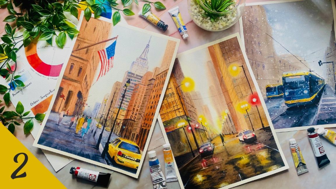
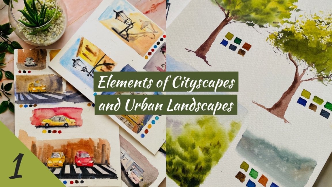
2. About this Class: In this class, we will be painting seven cityscape paintings incorporating the rules of perspective into our paintings. These are the seven paintings that we will be doing. I have sorted this out according to the different perspective rules. The first one is one-point perspective. We'll be doing a day and a night scene. Then obviously there is, again another one-point perspective, but with some buildings in the horizon so we'll be implementing aerial perspective. Then there is another one-point perspective where I want to depict an object focus in the painting. Then obviously we'll have two-point perspectives, that is this one and this one. Two-point perspectives in our paintings. Finally, we'll do a tram scene, again by implementing the perspective rules into our paintings. The only prerequisite for this class that you would need is to have a knowledge about the basic watercolor techniques. You can go through my ultimate guide to watercolors class in order to learn all of the watercolor techniques out there. I discussed all of the techniques such as wet on wet, wet on dry blending in different types and much more, a lot of other techniques that you can implement in your paintings. I suggest that you also go through the part 1 of this series of classes, which is elements of cityscapes, because it is based on that study that we will be painting these large cityscapes. In that class, I have discussed all about the additional techniques that you would require to paint cityscapes. We also went through a lot of sketching exercises and brush exercises to learn how to control and coordination. The sketching exercises will be helpful for you when you want to sketch the elements in your painting and the brush exercises will help you when you want to paint the final picture. Also, the lessons on color theory will be greatly helpful to you in choosing your own colors for painting. Lastly, I have extensively covered perspective in that class about one-point perspective, two-point perspective, three-point perspective, as well as aerial perspective, and how to implement them in our paintings. It would be really helpful if you know these concepts well, so that it will help you in deciding your own composition for the paintings of this class.
3. Art Supplies: Let us have a look at all the art supplies that you will need for this class. First of all, watercolor paper. I will be using this watercolor paper. It is Saunders Waterford, 100 percent cotton cold press paper. You can either use cold-pressed or rough-surfaced. I would recommend 100 percent cotton paper because we need our paper to stay wet for long duration of time. You can also go with any other 100 percent cotton paper which is cold-pressed or rough-surfaced. Next, we need watercolor paints, either in tubes or in bands. Whichever you're going to use is absolutely fine. I will be using my watercolor tubes from various brands. We'll also be using this palette, which I had set up in the elements of cityscapes class. All of the colors that I will be using is mentioned in that class. Some extra colors that I will be using will be told additionally in each of the lessons suggests cadmium red, cadmium orange, cadmium yellow. You will need a basic palette where you can mix your colors. You can use a metallic, ceramic, or plastic palette, whichever you have. Next, you need watercolor brushes. Ideally, I would recommend having a flat brush, which would aid you in applying the water onto your paper and covers a large surface area. Then some small pointed round brushes. You can either go for the pointed round ones or the mop brushes like these. I will be using mop brushes in size 2 and size 0. Then a detailer or small liner brush. This is a size 1-liner brush. If possible, try to get a flat synthetic brush so that you can use it for lifting techniques. Also, a pointed round synthetic brush will be helpful if you want to apply some dry strokes onto your paper. You will need two jars of water; one for washing off your paints from your brushes, and one for applying freshwater onto your paper. Some paper towels, a ruler, a pencil, and an eraser. I will be using a mechanical pencil like this one and a kneaded eraser like this. It can go for the normal pencil and eraser as well. A plastic board to tape your paper on, masking tape, to tape the edges of your paper to get clean borders. White gouache paint or white watercolors. I will be using these designers gouache permanent white from Winsor and Newton. You can use a spray bottle if you would like to re-wet the surface of your paper. Lastly, masking fluid or drawing gum. This is for masking certain areas of the painting so that they will stay white when you apply the paint on top of it and later on, you can peel it off so that area would be white and you can paint something on it later on, or you can leave it white itself. But this is not absolutely essential because these are areas where you want to leave white. You can paint them on later on using your white gouache or white watercolor. It is good if you have masking fluid for drawing gum, but if not, you can go for the gouache options, where you apply the white paint on top of your painting at the end. Now that you know all the supplies needed for this class, let us dive into each of the lessons.
4. Taping the Paper: As I have mentioned before, I will be using the Saunders Waterford watercolor paper, which is 100 percent cotton, cold-pressed and 300 GSM. As you can see, the papers are stuck onto this spot. I will be keeping on this for some of the paintings and for some of the paintings, I may use this board. I've already shown you how we can make a plastic board. You can either have your paper stuck onto whatever board you're using or you can keep it on the bad itself it's totally up to you. Here is the tape that I will be using to tape down the edges of my paper. When you're taping down the edges of your paper, you have to be really careful that you tape it down carefully because we do not want any paint to flow into the edges, so this is the reason why I'm showing you how to do this. The width of the border that you want to leave depends totally upon what is it that you would prefer? I prefer to go for like half a centimeter mostly. You can see I've stuck it down nicely, but then I try to move my fingers along on the tape so that it's fixed firmly onto my paper and doesn't have any gaps in between in which the paint and the water can flow. The same way for all the four sides. Once you have taped down all the four edges of the paper, make sure that you have your corners secure because that is the place that is most likely to bleed because of the double layers of the tape, so use a ruler or use your nails to secure the corners. There, so I have my board secure now and we can get onto the painting.
5. Angle of Board: Naturally, the first thing that comes to your mind when I see about using a board is why use a board not just a table surface itself? This is because we want to control the flow of water and paint. With a board and you have water and paint on your paper, you're free to move it around so you can move it to this side for the paint to flow this way, and you can just move it to this side for the paint to flow this way. Basically, it's making use of gravity for your water and the pigments in the paint to flow down, so that gives a lot more control on your work and there are a lot of techniques that we are going to be using by utilizing the angle of the board. That's really important. That's why we are going to use a board. Ideally, most of the times, I might be painting with my board at an angle like this, so that I have gravity acting on my paper and my water would flow down. I'll be using my masking tape underneath, mostly like this so that my water would flow down. This is the reason why we need a board, any kind of board that you can use so that we can lift the board and use it to our advantage. Or you can use an easel like this so this might be available in the shops and some of you may already have it. This is a small tabletop easel that you can use and you can actually set it up at any angle. It's got this here that goes into either of these three holes, not holes exactly, what do you call it? [inaudible] That just fits in and there, you have the angle. If you keep it there, that's flat and this one gives a 45-degree angle, and this one gives much bigger angle. I won't be using this but because you can clearly see what this does to the camera. I would have to change my whole set up, if I'm painting on this, I'd have to point my camera this side to show you how it is. Or even if I use this, you can see, it's not that clear but this is actually very nice if you already have it because it has that angle and serves the purpose. That is why if you already have such an easel, you can use this and you might have actually seen professional artists at work who actually use these kind of easels. Trust me, you don't have to be a professional artist to be using any of these supplies. Get that out of your head that oh, no, I'm a beginner. Why do I need this? Please don't think of that. All of these are just art supplies that enhances the way you paint and just makes your painting more beautiful. Even if it's like a beginner sunset sky or a simple sky, there's a lot of difference that you can create and there's an angle on your paper. Don't relate any of these to a professional artist or an expert artist. It's just enhancements for your work.
6. Setting Up Your Board: As I mentioned before, I'll be using this clear acrylic board to stick my paper on. This is mainly because I want a surface which will not absorb water. In this class we're going to have paintings where you're going to stick your paper on the board using the masking tape as well without using masking tape, by applying water on both sides of the paper and then putting it onto your board. When you're applying the water to both sides of your board, you want it to stick to the surface without the water getting absorbed by the surface. If you're using a wooden board, for example, the water would get absorbed and that would reduce the amount of time you have for working on your paper before the whole paper actually dries. This is because the water gets absorbed by that surface. If you have something that is made of plastic, it wouldn't absorb the water. That is the reason why I'm using this acrylic board. It can be easily available from the stores, but don't worry, if you don't have an acrylic board, I have another solution for you, I'll just show you in a while. This acrylic board that I have is of A3 size. Most of the paintings that we will be doing for this class is going to be in A4 size. This is the reason I got the next bigger size A3, so that I can stick my paper on this top, here, and it would be right inside the board. A4 would be just inside the border, so that's the reason why I got this A3 size. I actually have an A2 size of this as well, a larger size, because when I'm painting A3 size paintings, I need it. This is not that heavy or anything, it's not bulky, it's just a simple one. There are various options available. If you search for acrylic sheet or acrylic board, you'll be able to find it. There are two millimeters to, I think, six, seven millimeters available. You don't need all of those bulky ones. I think this one is just two millimeters thickness. You can either go for the two or the three, more than that would be really heavy and bulky. You can see it slightly bends, so this is prone to cracks as well. It's not glass, so you don't have to worry of this breaking if it falls down, it's just very simple one. What if you don't have this? I know that this might be a luxury. If you're not having that and you have your normal board that you're using. For example, this is the board that I used to be using before. I think this was one single plywood board and I cut it. This is what I had been using, but this is wooden and the wooden actually absorbs the water. When I apply the water onto both sides of my paper and keep on this board, this wooden board is going to absorb some of the water, and that would reduce the amount of time I have to work. See, I've just applied a little bit of water on this board. As you can see, it has gotten absorbed into the board. See that? This is the reason why wooden board is not going to work when you want to apply water to both sides of the paper. Then, what do we do? There is a simple option that we can do. You just need to convert this to having a plastic surface. Any plastic coating that you can give to your wooden board, would suffice. Here is something, many of you may have this, this is the normal cling film that you use in the kitchen for food storage and stuff. It's got a thin film, you can see that. This is a very thin film. I know that maybe you don't have this, this even might be luxury. If you're going to go and buy this, why not buy the acrylic board itself, isn't, it? It's not that expensive, it's really cheap, so don't worry about that. But in case you have these two, as in your board is not made of plastic or does not have a plastic coating, and you have this cling film at home, here is a simple way how you can make your board to not absorb the water. The simple method is to cover your sheet with the cling film. It's a little bit tricky, I think it too [inaudible]. Let me try. Okay, there. I might need to give it like a few rounds just to make it steady and stay. I've left enough gap at the top, so now I'll go towards this side again. Now I'll go back to the other side. This is simpler. Yeah, this is actually simpler, why did I keep using that. That looks much better. Don't worry about these folds because it's not going to affect, all we need is a plastic surface which doesn't absorb the water. Since this is going to be the top, I'm just going to give it another round and then cut it of here, then sticking the edges towards the other side. The cling film sticks well to itself, so it's really, really handy. If you have edges, just make it towards the outside. You'll see that it sticks to itself, so the water won't creep in through the edges towards the inside of the board as well. Now what you can do is just run your fingers along and remove any air bubbles or whatever that is. It's not going to affect your painting because the air bubbles are actually inside and it's not going to be coming on top of your paper. This is a simple solution to have your board made into plastic. In this class, we're going to have paintings, both where you're going to use the masking tape, as well as where you are going to stick your paper with applying water on both sides of the paper. When we are going to use the masking tape, do not use the board that you just made with cling film or whatever plastic surface that you sticked onto, because the masking tape is going to stick to this cling film and it's going to peel it off. You might need another board or surface where you can actually use the masking tape with. I know that this is again asking for luxury. Don't worry, when you want to stick your paintings with the masking tape onto a board, you can actually use any kind of board. You can go for cardboards, you can go for magazines or whatever, large pad or surface you've got. Just don't use the table, that's it, because we actually have to use the angle, which I'll explain in a while. Just these are the two options. If you really want to get the acrylic board, that's the best solution, because it's really worth it and it withstands all the problems that you will be facing. For example, you can use both the masking tape, you can use with water and all the options. The acrylic board is a good option, but here's just a backup plan in case you can't afford to get more supplies.
7. Finding Reference Pictures: Now, let us have a look at where to find the reference pictures. The most ideal situation for us to paint cityscapes or urban landscapes would be to travel to those places and then paint in real time, that is planar painting. But due to the various limitations, like travel restrictions or maybe simply because we can't afford to travel that much, we have to go for other options and look for reference images. Let us consider the scenario where you can actually travel, but you don't have the time to spend at a certain place to sit there and paint for a long time. Then the second option would obviously be to travel and take pictures while you're at that place. Click enough pictures showing different perspective, different buildings, different places, capturing the beauty and essence of that place. That's one way where you can get reference images, that is using your own photos from your travel pictures. I have painted some pictures like that from my travel photos myself, so you can either go for that option. But like I said, because of the limitations where we've gone, to actually travel itself. Then we need to go for other options to find our reference images. Here are some reference images that I have actually taken out from various places on the Internet. I'll show it to you how and where we can get such reference images. There are various places, you have to obviously look at the copyright conditions as well. We can't have photos in which you know there is copyright infringement. There are various sites from where you can get copyright free images, and one of them is Unsplash. It's a website consisting of hundreds and thousands of photos which are copyright-free. You do not need to predict the author or give someone credit for using any of the pictures in Unsplash. If you're going through cityscape, so basically, if you just search Cityscape, you might be able to find something, but then it just comes general pictures. When I'm looking for cityscape pictures, I choose to rather type place. For example, just I typed Paris, and you can see the beautiful pictures from Paris that has popped up. Here, you can just go through the pictures and find out which one you like the most. I actually like this first one over here because it's got a nice perspective of the bridge and it's got a nice lands, and it's like a sunset condition here. You can use that directly or you can actually look for, just search the place, or even if you have like a specific place, you can look that up as well. Let's see. Florence in Italy. That's the beautiful Florence coming now. Or maybe let's go to Venice. I love Venice. It's just so beautiful. Oh my God, look at this picture. This is just beautiful, isn't it? You can just look for pictures like that in Unsplash. One of the other website from where you can get free images is Pixabay. This is again, similar to Unsplash where you get free images. The same thing, you can search in Pixabay as well. You don't have to credit the author or the photographer of these images, so it's fine to use them as you wish. You can use them in whatever way. You can modify them, you can do anything with these images, they are absolutely free to use. It is fine. Other than Pixabay, another one is Pexels. There, it's again the same thing. Sometimes you'll find that the same image is found in all the three platforms. It might because that photographer has shared that image into those three platforms. These are the main sites that are copyright-free. Then another site that you can get inspiration from is Pinterest. There are tons and tons of images in Pinterest, but you must understand the images defined in Pinterest may not essentially be copyright-free. We have to be very careful about that. I have a Pinterest account, so I've just logged in into Pinterest. You can search for the same thing in Pinterest and you'll find tons of images. There are a lot of these images in Pinterest, but then it's a great source to check for images, but you must absolutely understand that they're not copyright-free. These images are curated from various platforms, various websites, and they're all in one place here, so you can use them as inspiration, but you can't essentially copy the exact same image. But I have a simple solution and a simple trick for you. You can use the images from Pinterest when you're doing urban landscapes and cityscapes. Hear me out first. Just the whole thing. It is okay to use because you won't paint exactly like that. If you're 100 percent sure that you're not going to paint it exactly like that, and you'll change the elements and color tones in the image, and because it is a place that exist in real. I'll tell you. Let me look for another image where I can explain more clearly. Where do we go? Let's go Rome. No, maybe some other place. How about Volterra in Italy? That's a very beautiful place. Just like the street here. This is a street in Volterra, Italy, in Tuscany. It's a very beautiful place. You can see this image, and the photographer has actually taken this image when standing on that street and he's just captured that picture. This doesn't look like a picture that is tough to take. Even if you go to that place, you will be able to take the exact same picture. But the only difference would be the color tones, the weather conditions, and all of that. This is the reason why I said, you can use it for your perspective and the sketch, but don't paint it exactly like that. Because what if, for example, this person who lives here has a land outside here? What if that land is artificial and he keeps changing it every time? We don't know that. That's why paint it according to your best judgment, you can use the photograph, but if you change its elements so much that it doesn't look like the original photograph, and also make sure that you make the best judgment here because we do not want any contradictions with the photographer or the person who has taken this picture, and if it's not copyright-free. We have to be very careful. But because of being to Volterra, and I know that these places are not tough to reach, so this is fine. I think I can show you another image as well. In fact, yeah, this one. This one actually looks like an image that somebody climbed up a mountain or some higher route to take this picture of Volterra. But no, actually it's not. Because of being to Volterra, this is the road that leads to that place. There's a point on that road where you can actually take this picture. I have a picture like this exactly in my drive as well. This is not tough to make. The only thing that is going to be different from his picture and my picture is going to be the atmosphere. If you don't paint the clouds and all of this exactly the same way. If you're going to make this into a sunset scene, then there is no problem in taking this picture. Because the buildings are not going to change, then they haven't changed. You see, Volterra exactly looks like this, only the atmosphere around is going to change. I know this information, so I can take this in my best judgment, but let's see other places. I know many of you may not have been to there. Let's try that as again, now for. For example, this picture, I did try the Louvre Museum. This is fine again, because this doesn't look like a picture that's been taken from on top of a building or from somewhere that's tough to take. It's just an easy position right near the fountain, right in front of the Louvre Museum, it looks easy to take. The only thing is again, is atmosphere that's going to be different when you are capturing it. This is the reason I said, if you're not going to capture the color tones and all those things exactly the same way, you can actually use this for the sketch, that's perfectly fine. That's the case when you're painting urban landscapes and cityscapes. You just have to be very careful. But look at this, for example, I don't know where this is. This looks like it's taken from a hotel room, a balcony. This might be unique picture because you do not know what hotel it is, you do not know the price of that hotel. Maybe it's a very expensive hotel that only VIPs can access. You do not know that. I wouldn't take this picture. Even though it's really beautiful to paint and looks nice, and even though you can change it so much that it doesn't look like the original, I wouldn't go for it. The main reason being, I don't know about this hotel and somebody has actually captured it from the room. It's too personal, and it doesn't look like it's too easy to take unless you have access to that room and you know exactly that view in that room and that hotel, and you've been there. Same goes with other pictures. Again, look at this, this is just a street view. This is again, taken from the street, somebody standing on the street and taken this picture. This doesn't, again, look like it's a tough picture to take. This is not like a forbidden street or anything. I've been here, so it's not that tough to take. You can see, it's just really simple image that anyone can use, only the atmosphere is going to be different. Even the lights are going to be the same because it's the lights of the building, but the atmosphere, that is the night scene is going to be different, and so are some of the reflections because it's a rainy day and it's got a reflection. If you can go with your best judgment of the picture, it's okay for you to use that sketch or that architectural element as it is. Just make sure that somebody hasn't gone to a huge length to take that picture. Like for example, this one is the same thing as I explained about the Paris. I filled out one. This is taken from a rooftop. This doesn't look simple to me. It doesn't look as an easy way to capture this picture, so I would never go for this one. It's like that. Here, I have actually taken a lot of images from Pinterest, from Unsplash. I have printed them out for this class, which we will be painting for this class. It is going to be really exciting, trust me. There is another thing that we need to take care of. For example, let's go to Lisbon, and here, I find this picture. This is very beautiful. Oh, it's a very bad example to show, but just imagine there were a lot of people in this picture. You found an image with lots of people and their faces are showing clearly. So long as you don't paint those faces exactly as it is and the position of those people exactly the same, then it's fine, considering you take all the judgment I told you about, like the location, the place, the subjects, the atmosphere. Just think of it, has the photographer going to very tough position or has taken a lot of effort to capture that picture? If you think the answer is yes, then don't use it. This is Lisbon. It's on the tram 9, so you can see it's not that tough to capture. But then possibly, this tram along with this car here might have been unique to this photograph, because what if that car is not parked there everyday? You can actually use this picture by simply avoiding that car, but that tram in the same place is just fine because it's a tram line and that tram is definitely going to go through that line every day. It's very simple. If there are people, try and change the position of the people in your picture. People is what I wanted to talk about. Change the position of the people because you can't paint exactly where they are, if you use a photograph from Pinterest or sites that are not copyright-free. Also the atmosphere conditions, and also just watch out for all the elements that might create a conflict. You have to go with your best judgment here. This only applies to cityscapes and urban landscapes, just because of their architectural element which doesn't change. That's very important for us to understand.
8. Plein Air vs Photo: Now let us understand the difference between plein air painting versus using photographic references. In plein air, you are at that place. You paint it with your own perception of the scene. You're choosing, the composition, the colors, the values, et cetera. Light and shadows are constantly changing. People, cars, buses are moving. Nothing is constant. It gives the added complexity and fun element into it. But when painting from a picture, half the composition work is done for you. There is only the matter of changing small elements here and there. Your judgment and your paintings will be influenced by the drawings colors in the picture; you can see where the shadows are, where the highlights are, because light is not changing and hence, it is already set for you. When you're starting out with watercolors and your images is from a completely copyright free resource, you can use the same setting, go with the same light, shadow, people, and everything. But with practice and with time, you can learn to change all of that. For example, you can change the light totally from the left to right and paint to your perception of it. Let us look at some other images and see what we can get. For example, I think I'll go to Venice again, so Venice. For example, this picture. It shows a great picture with the light from this side and the shadows of the buildings are here. But why would you need to paint it exactly the same way? I mean, you can totally change everything and change it into a sunset setting. But initially because we're not that pro in it, it might be tough. But then when in plain air, it's actually more tough because you don't know the measurements. Here in this picture, you can see the measurement of the buildings, you can see where it's positioned, everything. Usually artists use their pencil or their brushes to get the right proportions when they're painting in real time. For example, if you're standing here and you want to paint the laptop, what you would do is, you would use your pencil to get the measurement. If my laptop is going to be this, then how much would be the length across? That's around one and half of these pencil from this angle here, so that's what we are trying to understand. We usually use the pencil, so that's for a whole different lesson. It's a huge thing to understand about how to paint in real-time. In reality, it is much more fun because you're looking at it and your creativity is at the next level. Because there's nothing that's set for you. You can choose to ignore some elements in real time. Your scene is constantly changing. The cars are moving, people are walking, there are birds flying around, the noises, everything is just constantly changing. It's more fun to paint in real time plein air, but because of the limitations we go for photographic references. Remember the most important point where I said to go with your judgment when looking for photographic references, if you're using pictures from sites like Unsplash, Pixabay or Pixels; there are actually more site than this. If you're looking for photographs from these sites, then it is easier for you because you can paint it exactly like that. With regards to these Unsplash, Pixabay and all of these sites, they are also available as mobile and iPad apps. Here is Unsplash app and you can see it consists of the same images and the same features. You can use the search features to search for images and you can actually even login and have your account set up so that your collections can be saved. Each of these images, you can actually sort them into libraries or folders and store them in your collection so once you log in, you'll get that access. I actually logged in my mobile not in the iPad because I mostly use my phone when I'm browsing Unsplash. It's got the mobile app as well. In iPhone it's called Unsplash itself, but I think in the Android versions, it is called Resplash. It actually collects the data from the Unsplash website itself but I think in Android it's called Resplash. It was until a few months ago, but I'm not sure. The next other one is obviously Pixabay again, it also has a mobile app. You'll be able to search for images easily using the mobile app as well and again, if you log in, you'll be able to save the images. These are various options where you can get completely copyright-free images. If you're taking from Pinterest or any other resources, remember the golden rules that I have told you about taking of best judgment and considering whether the photographer has gone into a lot of it for him to take that photograph. Then another place where you can get images is obviously Google. If you can find a place, I don't know when I'm consulting for images the first thing that comes into my mind is [inaudible] . Let's go to Lisbon, for example. Lisbon, images and here are some beautiful images of Lisbon. I like this image very much, this one, but I don't think I'm going to use it ever because look at it this looks like they came from the top of a building or a mountain. I don't know what the photographer has gone into to capture this picture, it's very tough. It's beautiful but I can't use it anyway. This one is so simple, I can use this picture. The main reason being, even I can take this picture, I can stand on the street and I can take this picture when the tram goes by. The only thing that's going to be different is maybe I won't be having the same number of people here. I won't be having all of these people in the same positions, but the rest, all of it, the color of the buildings, all of these are going to be the same. The sky might be different. There might be some extra clouds and everything. This is just the thing that you have to look for your best judgment. That's another place, Google itself, where you can find the images just like Pinterest, but be very, very, very careful with what you choose. That's very important. Ideally, you can combine one place with another one place as in the atmosphere of one place with another. For example, if you were to choose a picture that doesn't look tough in its architectural form. Where can I get something? For example, this one, this is easy to capture. This image is easy to capture but obviously look for the car and the person. The tram is easy to capture but we don't know how that car is there. Is that every day? We don't know that, so avoid that. You can actually change the color of this car and move it to a different position, than it's unique to yours. This guy, what about if you can possibly add, see this guy. This guy it's got a little bit amount of clouds and if you can put that into this painting, it's totally unique now. These are ways that you can change your picture and use it to your best judgment. Go according to your instincts and be very careful do not get any copyright claims.
9. Rule of Thirds: Let us have a look at rule of thirds in painting or composition right now. This is trying to understand how to define the composition in our paintings. Rule of thirds states that if you have your frame, then you would divide your paper into three parts on all the sites. That is, on both the horizontal and the vertical direction. There, now you've got like nine squares. Let me strengthen those lines so that's easy for you to see. There, you've got nine squares. Not squares, but nine rectangles here. The rule of thirds states that when you're choosing your horizon line, you try to choose that at either of these lines or as close as possible. In a painting, usually, we never choose the horizon line to be in the middle. In a photograph, it looks nice because the photographer is possibly trying to achieve something, a symmetry on the photograph. But for painting, we do not do that. It somehow does not attract the viewer's eyes when you're putting colors onto the painting. If you're going to try and paint something, always try to choose the horizon line in either of these two lines. Obviously, if you're holding your paper like this, that is, you're painting in the portrait mode, then your horizon line is either here, which is one by third or here, which is the two by third. Or if you're going to paint it like this in the landscape mode, then your horizon line, again, in the one by third or the two by third. I guess if you're going for cityscapes, your horizon lines are going to be at the two by third unless it's a specific painting where all the details that you want to add are towards the bottom, and hence your horizon line is so far away. But you really can't say much. Both of these are the places that you need to choose when you're trying to choose your horizon line. But what if you were trying to draw from a photograph in which the horizon is exactly symmetrical and in the center and it looks so beautiful in the picture, obviously, but you don't want to paint it that way? What you want to try and do is, so this is the halfway point. Try and bring it even slightly little downwards. If it's the sky at the top, increase the sky region. Or if you want, you can move it a little to the top, which is one by third or two by third. Maybe not as close to this line or this line, but move it as much as you can from the center because that's what makes it attractive in a painting. That's basically known as the rule of thirds. Actually, I'm going to write this in my sketchbook because this is like a very important point.
10. Golden Rule of Composition: Now let us try and understand the golden rule of composition. Ideally, this needs to be explained by using the Fibonacci spiral, which is to basically divide your paper into different, smaller, smaller, smaller, smaller rectangles and you get the spiral. But that is a very, very complicated method and it takes a lot of time to actually sit and construct this rectangle. But if you would like to learn them, you can actually go and search for golden rule of composition and this would come up. It doesn't come up easily of course. You'd have to do a lot of research on it. But this is not needed. You could actually go for the simpler method that I'm going to show today, which is based on the rule of thirds itself. You've split your paper into these nine rectangles. The basic rule in composition is to try and place your elements at the intersection of these lines. You got four intersection. Either the main elements in your painting would go into these intersecting points. That is somewhere around there. Like if you're drawing a car, then maybe you would draw the car here. That makes the whole thing more attractive. Either the car would go there or like if you want to add a person, then that person would go there. It is much better to add it this way. I know that it doesn't make any difference even if you add it to the center, but in case of painting trying to fix the composition, this is the most ideal way. Also for your buildings, let's say that your vanishing point is there, it's better to have the edges of your buildings on these lines. That is on the two by third or the one by third lines. Much, much better. Or better if they're like as close as possible to these one by third and two by third position as much as you can. For example, if the building is there, then that the building. Let's have another building here. You can see what I mean. If you can start your building somewhere there, that would be the most ideal way. Let's have this building here, another tall building here. You see. It's much better if you can have your vanishing point somewhere in the center and the elements in your painting coinciding with these lines. But obviously it is not always possible because there are paintings in which you have vanishing points at the edge or vanishing point somewhere outside the paper. It all depends upon the photograph or the reference that you're using. But this is just trying to make you understand the basic rule of composition, which is better if you can follow it exactly like that. But what we always try and achieve in our painting is the rule of thirds, which is very important because believe me, I've tried myself to paint paintings in which the horizon line was at the middle. I did not like it at the end. It was horrible. It was a seascape, I think. I had my sea lion starting at the center. I don't really like it. I've never shown it to anyone because I don't like it at all. It would have made a whole lot of difference if the line was just a little bit up or just a little bit down. Just don't do it at the center. That's it. The rule of thirds is what is very important. The golden rule of composition, you just need to understand and try and match it to your free will. If you can, then otherwise it's fine. I think this for these points are very important that can go into our sketchbooks.
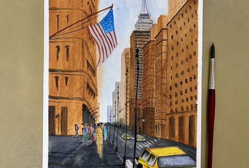
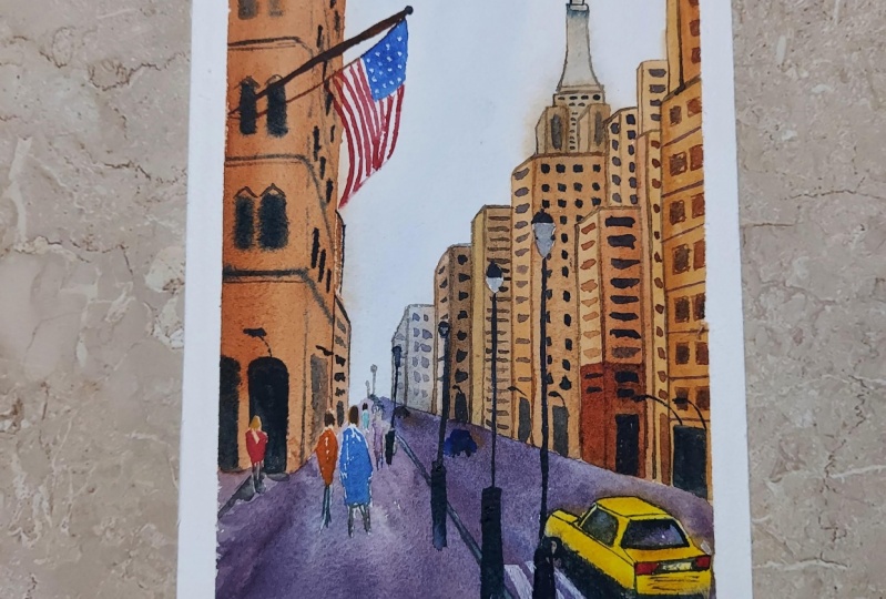
11. New York Day - Sketching: Here is the first painting that we will be doing. This is based on one-point perspective because as you can see, all of the roofs of the building are going towards one point and the other side are not curved towards a second, but rather are parallel to the horizon line. The horizon is somewhere here and all of the tops of the buildings are parallel to the horizon line. This is a one-point perspective during the day and this is what we are going to paint today. Obviously, the first step in making this painting is deciding on the composition itself. Following along the golden rule of composition, if we were to split the paper into the three parts, both on the horizontal and vertical space, then you can see that in this painting, the horizon is almost at one by third. That is our horizon. Then we have the road leading to the horizon, and then we have the pavement on where all the people are walking. You can see this building is almost along the line of the first and the other buildings are somewhere towards the center of the second one. But as you can see here, all the major components in our picture fall into the four corners, as in, we can have the flag here, even though it's somewhere on the top, we can add it at the bottom. All of the people and major elements we can add. But generally, when you have a picture that you can refer to, it's okay to just move the elements only slightly and not go through the whole process of following the composition. Here, first thing we need to do is to find the horizon, which we have. It's somewhere there. That's where everything seems to be pointing towards. Now we need to find the vanishing point. The vanishing point in such a picture, if you have it ready, is easy to find because all you need to do is try and trace back all of these buildings towards the horizon. They are bound to meet somewhere. If you trace it back, I have found this to be the point where they are all meeting. That means this is the vanishing point. Even these buildings, as you can see, this slanted roof is along the perspective and going straight towards the vanishing point that we found. Once you've found the vanishing point using any two buildings in perspective, you'll see that mostly all of the buildings follow towards that point in perspective. Even the road, if you look closely, it's following that perspective. Let us try and do the sketch for this painting now. Understand that when we're trying to attempt a cityscape, we don't have to go into a detailed sketch. A rough sketch would do. But if you're a person that would like to have a detailed sketch on your sheet, then go for it as well. But understand that this is a watercolor painting, so it's best to leave the sketches rough rather than have it too much detailed, because when you're starting to paint, you would focus on those little details in the sketch as well. Whereas rather if you have a loose sketch, then you're more free to move your pigment around. Taking one-thirds of our paper, that is the one-third. There goes my horizon line. Again, I'm choosing my vanishing point around one-third position. If I choose my vanishing point to be that, now it's easy for us to sketch all of the buildings. Let us start with the further off buildings first, so that when we come to the site, it may not be necessary to add in all of these buildings. Also, I'm not going to paint this bunch of flowers or plants here because it looks odd. I know that this must be protruding out because of some tree or foliage here, but I do not want to add this into my picture. Let's do this building first. The building on the left side. If we take it up the side, then the roof of that building is going to be slanted and pointing towards this. I think I want to move it a bit to the left slightly, ever so slightly to the left. That position seems apt and then there goes. You can either use a ruler or not, I'm just using it to actually get my perspective lines, as you can see. That is the perspective line, the edge of the building joining. Then obviously we have the next side of the building. As you can see, this building has floors that are curving towards the horizon. Let's add from the bottom the floors first. That's the first floor, then there's the second floor, and maybe that's the third floor and another. Now, all of these floors are curving towards the horizon. Again, towards the vanishing point. You will see that the curves are not equal, as in, the angle of the curves are not equal. This is because it follows the rules of perspective here. See how it goes. That curves of the buildings towards the vanishing point. We'll have some more at the top. That's how that building is. Then obviously we need to add the road. If I were to match my pavement to the one by third position. I would like to split my paper into that one by third position so that I can position my elements accordingly. If I take that is where my pavement is going to go. Then we have the road, of course. The road obviously has to end at the horizon. But then, because there are other elements there, we're not seeing the entire part of the road. If you look at the picture, it's around somewhere here. The picture is a great reference if you want to go and have it exactly as it is. Because I'm using an A4 size, you can go with the same as well. Assuming somewhere there, that means somewhere there on the side. I'm going to choose and add my road. As you can see, I'm adding them very lightly. You can have them to sketch darker if you want, and then use your kneaded eraser or any kind of eraser to rub them off. Now since we've added the road, now we need to get in the building. There are some smaller buildings here, not seeing much of it. Then other smaller buildings always follows the perspective. Then starts my next big building. Considering the height of that, that goes up to around the second floor, around there. If you want, like I said, you can use a ruler but I'm going to go with my free hand because I want it to be more loose. Then the head part, again towards the horizon. That is the side of the building in view. Then a little part of the building is seen. Then we draw the next building where it is obviously going to almost the next floor, somewhere here. That's the height of it. I'm going to reduce it a little bit because we didn't floors exactly as it is on this one. I want to have space to add in this tower on the top. Again, that building got a perspective, the side that we're seeing. This is the reason why I don't use a ruler. I would rather do with my hand and get shaky lines because otherwise, when I use a ruler, I start to get my lines in angles. There. That is the building. Then obviously the roof of that. I am going to have other buildings. All of them in perspective. There. This is the building on the top, then let me just add it roughly, and then we give it more detail. As you can see, I've increased the distance and we don't have much space to add the tower. There, that's how the tower goes. This is where you would have to improvise and adjust your buildings because I actually want to get that towering height. It looks so nice. Then that just means that we just have to decrease the heights of some of the buildings so that we can have that tower in there. Obviously, this is not a mistake because we learn from all of these things that we do so that I've reduced the size then I'll pick the next building up to there and now I'll have enough space for my tower. That's the thing on the top according to the horizon. Another thing on the top. Now there is enough space for my tower. As you can see, I'm drawing it in a very rough manner because we do not need to make it detailed. All of these things are far away in the picture. The closest in our picture is these buildings. There, added those. Now let's add the buildings closest. There is the building starting there. I've only added until here, but as you can see, all of them goes up to the pavement, will add the base later on. Let me get the buildings. As I said, I would rather do it with hand. There goes the building. We have more buildings here. It doesn't have to be exactly as in the picture. The picture is just for reference to get the overall picture. There is our bigger picture. See, as I said, if I start using ruler then all my lines go haywire. That's much better. What's the perspective line, vanishing point, there. Now I have more buildings on top, so I'd like this building to be crossover to this in the front. Then we have some tall building going all the way up on the top of that. Now, for the base, we have the pavement, the road, then we need to add a space for the pavement. Then a little extra space for where the building is going to be. Now, that's where the bottoms of all the buildings are going to be following the one point perspective. There. The same for this building as well. Let's have the base of that building go all the way there. That's the pavement on which the people are walking and the buildings come all the way down there. That's where it turns. Now, we've added that. The main things that are left now are obviously the details which you can add with your paint later on, but if you would rather add them, then always remember to go along the perspective line, which is very important. If you want, you can just mark them in the different directions. For example, the main buildings, you can mark them because that's where the windows should go. We'll be adding the windows in detail as well, so it's absolutely necessary that you get them correct. As you can see, I'm using that point and then bending my ruler in the angle to get my perspective correct each time. That is the line of the floors on these buildings. That is the floor, base floor. Then this building is going to have some doors or some entrance and because it's at the bottom, you'll see them in more detail. There. Then what else? We have a large car at the bottom here, then we have footpath here. Let's add in that footpath that's in a horizontal position. Again, the lines of the footpath, like I said, you have to go through the perspective. You can see how it changes. Now, we've added the footpath, now the next thing is to obviously have the car. I said, it is possible that it's difficult to add the car, but then we just look at the positioning of the car, so it's right at the edge of that road. We have the back window then this extends to the top to cover the roof part of the car, then the back side. That is where the wheel goes and the back wheel. Then we can get rid of the zebra crossing inside of the car. There is the light, the other light is obviously not seen. Getting the lines from the inside part of the car, I'm taking them out. I'll leave this picture, don't worry. You'll find that picture in resources section. Then the mirror. Even the wheels, check that they are in perspective and do the vanishing point. If you draw the front wheel that position, then remember your back wheel has to be lower. There. It's not evident with them. Now, the back wheel of this side has to be, again, along the same line and above all the unnecessary lines inside the car. There, added that car. Now we can add other cars in. The other cars are pretty easy to do because it's exactly like we had done before. Follow along the perspective lines always. Then another car along the same line. Remember how we sketch the cars? This is exactly the same way except that the cars facing towards the side now. We don't have to add them in detail. Also, you can skip all the other unnecessary elements such as this van and all of that. Also, we don't need to add the people, but if you'd rather prefer, you could just add the shape of their body, just that. Starting at the horizon, as I said, their heads has to be at the horizon. Let's just sketch this man. He's wearing a long coat. Remember the size 2, 3, 4, 5, 6, 7, seven heads. That's the length of this man if his head is this size. Remove the heads from side his body. Then obviously as you can see, these are not tall people, so this is the average typical height and you can see all of their heads are at the same level. Even all those people walking at the backside, all their heads are at the same level. This is what I meant when you're adding people, all their heads are always at the same level. It just depends upon the height of the person whether their levels of the head would go down or not. Just added few people. I think this shows a young woman or a girl so she's shorter. Obviously you can add all of those other people with your paint later on. The last thing left is obviously these lights. With regards to these lights, I'd like to move the positioning of some of these lights. Reason being, if you look at this light here, it's appearing at the crossover between these buildings. It is good in your paintings if you could move some elements so that they don't cross over along the same line, so that you could depict them clearly in a different manner. The first light in my painting, it's going to be not a crossover, but it's going to be right close to where this car is. We've moved all the elements in our picture and that's where my light is going to be. Like I said, I don't know why I keep using the ruler. Let me get this straight. That's where it would be. That's better. Now for the light, that's how the light stand is. Another light behind it. This is the top portion of the stand. Now we've got the first light and as you can see, it's not crossing over any of the buildings. The same way, I'm going to add the next one such that it is in this region and not crossing over any of the lines of my buildings. But obviously for the height of it, you have to watch out for the perspective. That's where the top end of my light is going to be. Then if I want to add in the same length for my lamps, and that's where it's going to be, then the bottom lamp is going to be there, and this little mark is going to be there. First, let me draw the center line. That's how the center line is. Then comes my light. That's the other light, which was under here. Then there's that mark. Since this is the first sketch, I'm showing you in detail how you would sketch it. For the others, it would be much easier for you to understand as well once we have gone through more of them. Again, checking along the perspective line. The next one could be here, and remember the distance would be shorter. But here for this light, I'm not going to add a lot of details in, we can add that later on. That's how the lights would be. Then last thing obviously, we have the lines on the pavement. I think this is enough sketch. We can just go straight to painting other little details, we can add it later on with our paint. If you want to add in the flag, I would add it somewhere here. That's where the flag is. Like I said, you can add that later on with your paint. There. Just added it just in case if some of you wants to add that plug-in as well. So this is our sketch for today.
12. New York Day - Layer I: Let us start with our painting. I have just added a few more people in here, that's all I have done. We're going to start our first layer. In order to start our first layer, we will be working with the wet on wet technique. We want to wet the paper nicely, the entire paper. Wet the whole of the paper nicely. This is why I use a large brush so that it covers a larger area of my paper. They're covered up nicely, the whole of your paper. Apply the water evenly. Make sure that the water that you apply is even and does not leave any large bowls, blobs of water. Make sure that you apply it evenly. You remember when we were doing the elements, I said that the people, all of these are going to be minor details. But then we have to keep our focus on their heads being on the horizon line. For example, I added another person here. That person is standing on the other side of the road. But then his or her head has to be on the horizon line that is along the same heads. The only difference would be the height of the people. For example, this seems to be a very short person, so then their height would be lesser than the others. The average height of the people is what you need to focus on to be on the horizon line. As you can see, we were to make a lot of changes to the objects in our picture. For example, we do not draw all the complete buildings. But it's okay if some of the buildings turn out to be larger or some of them did not fit. The only thing that should make sense in the whole painting is the perspective. As long as you get the perspective correct, then nothing is going to matter. Here let me just take off some water from the tape so that it does not flow back into my painting and doesn't create any harsh edges. This is a good practice to do, just remove all the excess water using a tape. Then I will also keep our tape underneath or something underneath my paper today so that I get an angle to work on my paper. You might have to apply the water multiple times in order to make your paper still wet long enough for you to work on all the details. Also the angle of your paper will help because then all the water is going to flow down and it will not create any harsh edges. Let me take off all the extra water from the edges. Then use your brush to run along the paper and clear out any extra water. Let us start painting. The first color I'm going to use is cobalt blue. I'm going to mix a very lighter tone of cobalt blue. That's what I'm going to apply into my sky, so you can see how watery my mixture is and how light my paint is. This is because I want my sky region to be light. We don't want too much of any details there. Because if you look in the picture closely, overcast condition, I would say not clear. Overcast condition, so it doesn't have any blue. But then always improvise. If you want to add in a little blue to your paintings, you can do that. That's why I'm just adding a little bit of blue so that it's not left completely white. It's okay to go on top of the buildings and it's absolutely fine. All the blue I've added towards the dark region. Let it be there. Then let me clear my brush and I will start adding some of the background building. I'm switching to a synthetic brush because I don't want a lot of water when I'm trying to add that. I'll go with lavender first. Here is my lavender. This is actually what I'm going to add to those further buildings. They're not obviously detailed. That's what I will add to the buildings. Maybe to my lavender, I'll mix a little bit of burnt sienna, so I get a slight grayish color. You can see the color I'm getting. These all buildings in the background, which we do not need any extreme detail. Then as you come closer, you can add more burnt sienna into your buildings and add them. See, this building, I've added a little more burnt sienna. As you can see, it's spreading. That's all right. Let it spread because this is the first layer. Then we'll go for the next, which is our largest building. Obviously, always remember we don't have to go with exactly the same colors as is in the picture. Here, I think I'll probably go with a mixture of yellow ocher, lavender, and possibly a little bit of burnt amber. That's what I'm going to add. You can see the color that I have added and have to be careful as well. This is the reason why I'm using a synthetic brush so that I do not have a lot of water in my brush. As I approach the bottom, I wanted to have more brown there. Then the next building, I think I'll add them with more burnt sienna. Remember this is the first layer. That's all something that you have to always remember, because otherwise, it wouldn't make sense as to why we are painting all of the buildings like this. Remember the four techniques that I had shown in the elements class that covers these techniques that we're actually using for the buildings. Let's now take more burns enough for this building towards the edge. I'm mixing a little bit of yellow ocher to it, so there all the way to the bottom and top area as well. The top, I'll make it slightly lighter. Then I'll take off the edges and make them straight. Now we added that. Let's add this building on the left. That's also going to be with a nice amount of burnt sienna. I'm mixing a lot of water because I think this region has dried or moist. You can see that there. Because of the angle, the top region starts to dry quickly. Now, along the edge. Apply along the edge. I should have used a larger brush. I actually don't have a size larger than size 8 for this escort up or last, so that's why I'm still using this smaller brush. If you want, you can skip the areas of the people. I'm just keeping the heads of the people and adding my burnt sienna. In the picture, obviously it's not a burnt sienna color. But then this is where I said, you choose the colors that you want to include in your painting. When we were doing the color theory and deciding on our color palette, I decided on having these colors in my palette and these are the colors that I'm going to be mostly using for buildings and as such in my paintings. This is the reason why I said, you need to improvise and find your own. Maybe in your color palette, instead of burnt sienna, you have a different color. Then you would paint with that. Here at the top, I'm going to go with a mixture of burnt sienna and brown. That's possibly too dark, so I'm going to lighten it up with my brush there like that. Maybe a little bit of the lavender. Just added the background layers and before the other things dry, I want to add in my base as well. For the base I think, I'm going to go with a mixture of ultramarine blue and burnt sienna that creates like a nice gray tone, more blue that makes it a nice gray. Yeah that's my gray, and I add that to the bottom. Because this is my first wash, I'm going with this gray that I have created and I'll possibly try to skip some of the people, not all. Mostly the body parts of the people, that's what I want to skip. That's ultramarine blue and burnt sienna together, creating a nice gray tone. Also observe that when I'm painting, I am trying to follow along the lines of perspective. I'm not going to be bothered about all these other elements such as lights or no. I'll possibly skip the car because I want to add no details to the car. Now I want to mix a little bit more darker gray, so I'll go with more ultramarine blue and burnt sienna. You can see my mixture is now almost very dry. This is because my paper is starting to dry, so I have to be really careful when I'm adding more water to my paper. This is the reason why I'm adding this lighter tone. As you can see, I'm adding paint but in the form following along the perspective line. I need to quickly add in the car as well, so let me add Naples yellow for the car. You can see the top areas are already very dry. Even the bottom part might be a little bit wet, but I don't want to take the risk so I'm taking off all the extra water from my paper with my brush and yes, smart that's completely dry yet. Let me add my car. This is Naples yellow. All the details in black, we can add them later on. This is Naples yellow. Remember to go and use the color that you have set up in your palette, so if you have like a nice yellow that you have, instead of my palette so we had already discussed all of this in the lesson on elements of landscapes, where I discussed about how to create your own palette and how I have curated mine, so based on that decision, if you were able to create your own, then go with the colors that you have in yours there. I've added that car at the bottom, and we need to add two these cars here. There. Added to those cars. I think now I'll take yellow ocher and I'm going to just add to my car while it's still wet. The paint that I just added, the Naples yellow, it's still wet, that's why I'm adding to my car to show some depth and shadow. You can see just adding some lines, so I've added a line and darken the bottom part. Then I'll possibly darken this area so that shows this portion here becomes the backside of the car. All of this, you can actually look at the picture and observe where is the lightest area, where is the darkest area and so on. Wherever you find darkest area, you add more color, so like this area is like really dark. I think I need to darken it more so I'll probably go with like a mixture of burnt sienna and yellow ocher. It's more dark maybe a little bit more of sienna. See I have added more burnt sienna there, maybe a line of burnt sienna at the bottom. Now you can already see how I've added those little details onto the car. Now let's go with the wheels so for that I'm taking Payne's gray. But to remember, my paint is like in a very dry consistency, so these are things that you have to remember because if your paper has started to dry then we can't afford to add darker paint in a diluted consistency, so those things you have to keep in mind. There is my car. At the bottom side of my car is a shadow. We'll add in the wheels with the darker tone later on again. This is like the first wash. Again, the shadow joining the two wheels. We have the shadow there, so I've fixed that part. Then this part before it dries, I want to sprinkle some water. It's going to create some bloom effect on my paper. As you can see, I'm holding my hand there so that it does these blooms does not fall onto my buildings. I've added some water blooms. Now, what we need to do is obviously to try this out so that we can add in and start the next layer. But I think these things are already dry, doesn't look too much wet to me. But I won't take the risk. I'll wait for it to dry and then I'll add in the details. This is the first layer, let's dry this out.
13. New York Day - Layer II: Here all of it is dry. Let's now go ahead and start adding the next layer. I'm going to start with a nice burnt sienna. Let me make enough of the burnt sienna on my palette. Prepare enough colors beforehand so that you'll have enough. I think that's more than enough and possibly I'll add a little bit of yellow ocher to my mixture of burnt sienna. Maybe a little bit of lavender, just a little. That's a nice mixture. Let us now take the burnt sienna and start applying onto the top of our buildings. This time when we are applying, as you can see, I have a lot of water in my brush and I'm making sure that the stroke that I am applying, that is my previous stroke, goes right next to the previous stroke so that my strokes doesn't dry and doesn't create any harsh edges. This time, let us try to get along the borders. But also don't first do much about like a perfect border. Just go with your brush and create whatever you can. Undo the base. This time let us clearly avoid the people in our picture. I'm going to do something else. We didn't add a lot of buildings to the other side. I'm just going to with my brush just add some things at the right side there, so that looks as though there are some buildings there. Now before this dries, let's get ahead and start drawing those floors. We're drawing those floors, I am going to add my transparent brown, but my transparent brown, I'm going to mix it with lavender so that I get a nice opaque color. That's my transparent brown. I'm going to start with the bottom ones first. As you can see, they are going to blend because the paint that we applied is still wet, but that's alright. But obviously, make sure that even if you can't see your lines, you need to follow along the perspective lines. A perspective line there. As you go towards the top, try and reduce the strength of the paint that you're using, so the bottom ones can be nice and dark. But then as you move towards the top, try and suck up all the paint and go lighter. Just added the lines. Then let's try and add in some of the floors and details. I think each of the floor has an extra line. Then obviously, we need to add in the windows. I think the windows on this side are fine. Just add them like that. They are straight, horizontal in our picture. It's basically just holding your brush at an angle like that and creating some vertically downward strokes, and the same with the top. But now let's strengthen the ones that at the bottom so that it's darker than the ones at the top. I think now I'm going to go with lighter tone and add windows here in these floors. Obviously, again, make sure to check the perspective line. That's a perspective line. They're not going to be clearly seen, as you can see, just added some random lines. Like this. This one is completely congested, you are not going to see any details. Maybe the window here, you'll start to see more of details. As you go towards the top, try and reduce the color that you're using. We don't see much of the colors. Let us see what else is there in that building. We need to add little details on top of those windows. The top ones, leave them as they are. Then maybe some line, but this is not like the edge line. You can see I'm adding broken lines. It's very, very important that we add broken line. Then we have a large door there at the bottom. Added that. That's coming all the way to the bottom. Let's add more doors because I think the length of this building for me is larger than it is in the picture. This is how, like I said, you need to improvise, I need you to keep adding more details as in how you see fit. Then I think there's a slight umbrella type thing here. Let me add that. That's how it is. That goes to the side. I think I'm going to mix it with lavender so that I get a nice gray shade. Let's add that. I think the base of this building is completely dark, can't see much what's going on there. I think we can use lavender to add some edges to the buildings. It just adds more diverse or I can't get the correct word, but you just add beauty. This building is now done. Let's try and focus on the other ones. For the other ones, the ones that are far away, we painted them with lavender. I'm going to go with a lighter shade of lavender over them. I'm not going to add any too much detailing. They're like faraway. I've just added some very loose strokes on them. The same thing, I'm going to do with this building. That's still a dark tone. I'm just going to lighten my tone. Just added some strokes. These are buildings far away. Don't bother to give too much detailing on them. Then as you come closer to the picture, try adding more details to the building. Here I'm taking my brown and the mixture of another that I had made, so we get a nice, darker brown shade. This is what we'll start adding to the other buildings. This one, I think I'll add more. I've added something. Now, the side of it might go with a bit more darker tone. There, have added that building. Now is our main building. I think I'll go with a further darker tone. But before that, I want to add in the windows on this one. For the windows on this one, I'm going to mix my lavender, burnt sienna together, and create a nice slightly darker-brown tone. Since those windows are on the same as the horizon, I don't have to bother about perspective, it's on this side, so just adding them. Then make sure to get darker tones as you come towards the bottom. There I've added windows on that building. Then I think now the edges is probably dry. I'll probably go with the same darker-brown gouache that I created by mixing with burnt sienna, and I'll add. Towards the top it should be lighter, so let me just lighten that up. The darker tones should be towards the bottom. Let me add to the bottom there. Now, let us paint this area at the bottom. For that to the same mixture, I'll mix in a little bit of yellow ocher. That's yellow ocher, burnt sienna, and lavender. These are mostly, as you can see, gets a muddy mixture. That's what we want for all of these buildings. But obviously that's what I want. You need to improvise and decide on your own. As you can see that's what I'm adding. Adding right to the base. Then we have this building. This area is just wet. Let's go ahead and paint the one at the top now. To paint that at the top, what I'm going do is I'm going to mix this nice lavender shade, and that's what I will add. I think that's too dark. I need it to be lighter. That's actually perfect. I did with the lavender, and then I dipped it with my brush, I mean, with my tissue so that I get a lighter tone. That's what I want. Then take it off and apply the darker tone again to only those areas where I want the darker tone. I have absorbed that, so it's now lighter. Now, I need to mark the edges of this building. We do not need that to be too detailed. Let's get that lighter. Then I think the building is going to be, again, lighter tone. I'll use water and land down. That's good enough. We can add in the windows once it has started to dry off a bit. Towards the bottom part, add in more lavender and see sienna together. Oops, I add a little bit of yellow there, and that is mixed. Here my burnt sienna and my lavender together. That is what I'm going to go for the side of this building. As you can see, the angle that we have on the building helps for the paint to flow down. I mean, angle that we have for the paper helps the paint to flow down. There and there. Now, before all of this dries, let us add in the windows and other details. Here I'm taking my transparent brown, and I'm just going to add some lines on this building. Always don't forget about the perspective, of course. Then let's add in the windows on that. I'm mixing a muddy gray tone and I don't want a lot of water on my brush. Absorb all the water, and this is the reason why I'm using a synthetic brush. You can see that. There, a lot of those building, the top building has windows know some smaller windows there. Then the next ones are obviously a lot of dots. We've added a lot of those windows. Let me just dub them off because I don't want it to be that detailed as you can see. I think I want some line there, but very subtle. In order to get that subtle line thing, I'll use a little bit water, and add that subtle line. I've added that subtle line there. Just added the same mixture, but then I took it off with my tissue. That's what we do. Then let's add in the windows for this one. That's very essential, isn't it? Let's take Payne's gray and mix it with this round shape that we created. This one is actually going to be tricky because you actually need to add in lot of windows. You can see I'm just adding squares now, and it's obviously spreading at the top, so we'll let it spread at the top. That's fine. Leave some gaps when you're adding in those windows. Make them more prominent towards the bottom. The reason why I say do have more details towards the bottom is also because of aerial perspective. Whoever took this picture is standing here and he's looking to that scene. These buildings are further off. The roofs are further off. We always have to focus on the aerial perspective side. There, I did a lot of details onto those buildings. These are all still very rough. Now, let's paint the next building. For that, I think this is still wet, so what do we paint? What else can we paint because that is wet? I think we can go ahead and paint the road now. Here I have my paints, but then I want to make it warmer, so I'll take a little bit of burnt sienna. Warmer as in I want to make the gray that we made earlier, so the burnt sienna and the ultramarine blue, remember that? To that, I mix Payne's gray. Doing that, and I think but this time again I'll award the people in general. Here I'm just going to drop in a lot of paint in my brush. Did you see what I do? It looks as though it's the heads of the people already, and the other heads will add in detail later on when we're actually painting the people. Remember, it has to be darker towards the bottom. This is because the viewer is standing there. All the details that he will see are towards the bottom. This is the reason why we need details at the bottom. Now, we take care of the pavement. Careful along the edge, but we'll also need to add the details onto the road. Let's first do this here. Then let's make a more nice gray. Here, what I'm doing is, I mix my Payne's gray with lavender. That'll give me a different kind of gray. This is why I said, we have so much options to paint different kinds of gray. What I'm going to do is, I'm going to leave a slight gap between the road and my pavement. Also, make sure you remember the there was a zebra crossing there. Up to this far, that's where the road is. Now, we'll take care to skip the regions. Earlier, when we were painting, we were painting with wet on wet techniques, so we weren't bothered about knowing all the colors and how it's spread. Now, towards the further end, I'm just blending along with water because I do not want a darker shade there. Because of the aerial perspective, the darker shades comes towards the bottom, and so there is my pavement, and my pavement there. Like I said, we leave a nice gap between the road and the other pavement that we have done. Follow along the underside of the car, just take more black and add it to the underside of the car. It `starts like a shadow. That's more Payne's gray or black and adding to the underside of the car. All of these things that when we're adding them, you need to understand the concept as to why are we adding these things. Once you understand that, then you'll learn to appreciate your strokes more. I'm adding more details to the bottom here. Because, as I said, this is the closest point where the person is standing, so it's bound to have more details based on the aerial perspective. Blend it to the top, all those details, and the black areas would be the bottom. Then there's a road here that's separating. That's where all of these people are standing to cross. You can download the picture and look at it closely. Again, you can drop in some water so that you get these blooms. It's a nice way to show some texture. Now, I've switched to my synthetic brush again, and I'm going to mix my Payne's gray, and just going to add in some vertical lines. Maybe you can add in a little bit of burnt sienna to that so that your lines are a little drowned. But you can see my tone here, it's a little drowned, and I'm adding horizontal lines now. Just note all of these horizontal lines. They are wet on wet itself because the paint that we just added is still wet. I've just added some wet strokes. Then maybe create separation in the road. There, I've added some wet strokes, you can see the drama going on there, and you can also see how now the road is separated. Now, I think this part is ready to painted. Let's get to that. Let's get to the burnt sienna, and let's paint this building. That building is going to be burnt sienna. Now, we go with a nice, more darker tone like we said, up to this building, of course. As we come closer, we need to get in the details correctly, and we also need to get in the dark or the depth of the buildings correctly. Up to the roof of the car, so we are done with that. But let's add some depth to one of the sides. Here, Here taking more burnt sienna, mixing it with a little bit of lavenders, so that I get a little darker shade, and that's what I'm going to apply to this side. You can now see the use of my lavender paint, what I do, because I use it to brighten or darken colors at the same time. We got that side of the building. I think we also need to paint the top part. The top part, like I said, it's going to be slightly lighter than the one at the bottom. There, I'm using up a little bit of wet paint and added it. I'll go with a lighter shade of burnt sienna towards the right. I think, to all of these buildings on the right, we can go with a lighter wash itself. Here I'm just taking lighter washes and just adding and covering up my pencil stroke nicely. Actually, if in the ideal way or in the ideal world, we wouldn't add a pencil stroke there because it has to be light, and it has to be mostly in the wet on wet method. We shouldn't ideally add a pencil stroke there, but it's all right anyways. Now this is too wet, so let's just paint other things now while it's wet. This is saving the time for us to work on the other things, but I wanted to go with this in proper, what do you say? Layers so that you understand the process that's possibly draw inside the car. I'm going to wet the area inside my car. You remember how I had painted the inside of my car? I mostly go with a nice lavender shade. Also, in the picture, you can actually see it's reflecting the blue sky. But instead of painting blue, lavender is a good color to add in there. This is the reason why I'll add lavender. The whole of my window, I'll add lavender, then just in some areas, I'll add my Payne's gray so that it looks blended together. That's exactly actually how it is in the picture. You can see for yourself. I added that region of the guard. Now let's add these other two regions, Just wet it. This time I'm going to mix my gray with lavender. Because as I can see in the picture, it's a little bit more darker. Left that middle area lighter, we need to get the shape correct. There, maybe I can add a little blend there so that it doesn't look odd with my lavender in there. There, I think that looks much better. Now I think this is dry, and we can go and add in that building. Now to add in that building, this needs to be even more darker. I think I'll mix it with my transparent brown. There, I got a darker shade, but I wanted to be a little bit mixture with lavender. Lavender creates a little violet tone in it that I like to use. But for example, if you prefer to go for more cold colors in your building, then obviously it's going to be totally different for you. This is the reason why I asked you to prepare your ballot beforehand and decide the colors on your own. You don't have to go with exactly the colors that I am using. This is why I asked you to practice vertical strokes with brushes as well because you see when painting all of these buildings, we need those vertical strokes really a lot. I'll get back to more burnt sienna in there and add this region. Let me get it lighter at the top slightly. Added that, now the next building will be more darker obviously. But I think while this region dries up, we can add in some windows to these ones here. For adding the windows, let's mix a nice dark brown shade. Using the dark brown shade, let's add in the windows. But then we need to look at where are the windows, but because I think there are some other buildings at the bottom which we need to add later on. I think my windows are going to be starting there. As you can see, this is just with my brush directly. No pencil sketch, just go ahead and add in whatever way that you can. Some of them as you can see are filled, some of them aren't. As you can see, I'm not picking any more paint as I move towards the dark because I want it to be lighter. I will also try to lighten up my strokes towards the top. Not all. You can see towards the top it gets slightly lighter. Yeah, that makes sense. There. That's much better, I think. Also, I think we can go ahead and add that new building at the bottom. For that, I need Payne's gray and brown. So that's that building at the bottom here. It needs to go into perspective. All of these, like I said, it's completely fine that you can add with your brush itself. We know that there isn't much needed for a pencil sketch if you can actually get the hack of understanding perspective and all that directly. Here I'm going to add in windows with my brush itself. There, just added some windows, and let's make this darker here because I can see it's dark and can't see any detailing there. Yes, possibly to the top of the roof part. I'll drop in some lavender. Well, we can do that later as well. Now let's paint this building. That building, like I said, is going to be the closest building. Let's get that mixing yellow and burnt sienna together and that's what I'll paint. I have painted, and we need to get that in a more brighter color towards the bottom because like I said, that's the building that's closest to us. There, that's really closest to us. Now let's go ahead and add some of the details at the bottom, so there is a flow there. Then there's obviously going to be some door of some kind. Added those doors at the bottom, then we also need to add in the windows. Here I'm taking Payne's gray. For the Windows, remember I had mocked in the lines, we need to take care of perspective, that is something that we can never forget. That is our vanishing point. Let's start from there, so that would be the first point where we get the windows. I've added the windows, but I don't think they are in the exact line as they are supposed to be with the vanishing point. It should come under there. That makes sense when we are adding the windows. The same way for the next floor. I think if I add the floor there, the bottom is correct but the top part also I need to get it in perspective. You can use a ruler, you need to use some method to get your perspective line. Let's keep adding, I think I can go with my brush statically now. If we can go and add in all the windows. Here, it's going to be almost in this line. This one is going to have like a slight angle, this one is going to have more angle. There. We've added lots of those buildings, but I'm going to absorb the ones towards the top because I want them to be lighter. You can see I've absorbed the ones towards the top. Also, the building here at the top. If you want, you can add some windows there too as well, but as you can see, I'm using a very, very lighter tone of Payne's gray. Remember, they have to follow along the perspective which is here. These are horizontal. I want them to be very light there. They're very light and in the background. This is the second layer done. That was quite long, isn't it?
14. New York Day - Layer III: Now let us get on to the third layer. For the third layer, what we're going to do is we're going to add some more windows to the buildings that are missing and the floors possibly. For adding the floors, let's see, there. Always remember to check along the perspective line. That's very, very important. I missed the floor here. Another one here. There we've added the floors to those ones, then I think we need to add in a lot of little stuff to those regions, but before that, let's add in windows to these cars. I need them lighter. Very light, added in the windows. Then the wheels, see, added the wheels, then the shadow at the bottom. Added the shadow at the bottom. Then like I said, there are a lot of elements on that side of the road, which we need to add in, otherwise it would look odd. But then how do we add all of those elements, because they're far away? What we will do is let's just take our brush and apply some water to that region and there, and then absorb the edges of the water so that they don't look odd or you can spread them onto the buildings. Now we have added water there, and here is what we're going to do. We're going to take a little amount of gray and we're going to add to that base there. Make sure it doesn't come to the road because what we're adding is the elements along the edge which we don't know and it's just like absolute small detailings which we do not want to give in detail because they are not really part of the whole detail and we can't see what's going on there. But I think you can see that there's a little green there so maybe if you want, you can mix a little bit of olive green and add it. Just tiny bits of olive green. Make sure that it doesn't come to the road and get it. I've added bits of olive green, but we need to add more other details. I say details, don't confuse as to it being absolute details. These are just things, it's possibly doors, entrance to buildings, all of which we cannot see in detail along this length. Here again, for example, this building has side. Just added some elements there, which will come in handy later on. Then again, I'm going to pick up a little of my gray and add in windows to this building, windows and floors, so let me go with my perspective again. Always keep a tissue in hand, that's very important. Painting a cityscape is obviously larger, but in the end, it gives us a lot of satisfaction when you see the completed picture and you're like, I painted this. I've added that. Let me just quickly add in some floors or windows. I'm using the same gray in my hand and adding them. You can see as I go to watch the top, I've lightened my strokes and I think the top of this building has a sheet. Add that. Two of those floors have a sheet. That makes sense. Then what else can we add? I think we've added a lot of those details here, some windows, some doors to this bottom here. Now is the time where I'm using the dry stroke that we learned. My strokes are dry because there's not enough water in my brush. I'm purposely making them dry because I don't want them to be dominant strokes. If you look closely here, the strokes are very almost dry making them not dominant in the picture. Now, what else is left? We can paint the lights in the car. The other light is not seen, but then some lack. They're added the backside of that car, something else there to give more depth to the shadow. Yeah, that's the shadow. Then what else? Then there is the mirror of the car. That's the mirror, then maybe the front line we can draw, but don't make all of them too dominant, I'm just adding short lines as you can see, I'm not completing them, just some few drops. There is something there. Some lines or some spots, whatever you can add, make sure that your brush is dry. You can see I've added some lighter strokes to air, and now we can get to the wheel and possibly add in a little bit more detail on to the wheel, because now the wheels can be seen clearly on top of the dark background. You see. Just added some dark strokes on top of my lighter strokes. Did you see what I did there? That's my number plate. I get this line straight, maybe a bit more depth to my red. We've done almost so many details of the car, maybe we'll do for the other car as well. Get some red and add it. Now, that clearly shows that it's the backside of the car and also the black to depict the center portion and mirror just little drops of color. See, so very little, it's very subtle. This is the reason why I said mostly in acid escaping things we don't have to go for too much detail in our paintings because they're really subtle and light. Now again, if you want to add some darker details to your car, you can go ahead and add. Here I'm taking a bit of my yellow ocher and burnt sienna and adding them to my car. I missed this area, to the top there and make it blend into the car. I've added a darker domed towards the top and then did it. Possibly I'll do that to this side as well and blend it. I think that looks good now. There is the little area of the road that I missed, so I'm going to take my pinks gray add it there so that it's not white. Lots of details we have filled. I think now it's time to add in the ultimate details in our painting, do you think so? Then the whole thing would make sense and come alive. Let's get into the final details. This was the third layer. You can't call it a layer as such, but we are just adding so many of the other stuff. Let's now get into the details.
15. New York Day - Details: Let's get into the final details. For that, let's start with our flag, which is going to be fun, of course. For the flag, we obviously need a nice burned sienna here. Now, because it's the details, we're mixing darker darker tones. Let's take our burned sienna and I'm using a synthetic brush. Using the synthetic brush, I am going to draw a line of my flag. This is where I said that when you're adding all such elements into your painting, mostly your strokes are going to be loose. This is mainly because you don't want them to be like perfect strokes. It adds beauty more or less when your strokes are a little bit loose and not that perfect. Now, for the flag, I think we need to go with a nice opaque color. I am going to mix a nice blue. We can go with a nice dark cobalt blue. Forgetting opaque, I'm mixing it with cerulean blue, but you can mix it with white. But if you're mixing it with white, remember that you'll only get a lighter lighter color. But in order to darken it, you can add more blue, but then it will turn its opacity well. Under that. Adding the stars later on so it doesn't matter. As you can see, my strokes are almost like in a dry manner. I don't want to complete my strokes too much. Then obviously, we need red. For that, I think we need to go with cadmium red because it's such a nice red. What I have here on my palette is alizarin. Here is cadmium red. I think I'll take that one little in my palette. That's a very, very nice red that we can use. Where was the flag? That's the flag. It would appear on top of brown. This is what I said when I say we could use opaque colors to its advantage. Trying to get the bend in the flag. Just three lines, I don't want to ruin the American flag. Another one, which is not seen very subtle, there. Wow, that's looking great, isn't it, that flag? We'll add in the white as well later on and some clients. But here let's first take a little bit of lavender and I'm going to add to the top of my flag line. Just a little we'll also add white later. Then I've taken some Naples yellow. Let's take some nice Naples yellow and I'm going to add sudden lighter strokes to my buildings. If you look closely, you'll see that some areas are reflecting out. You see those lighter strokes. That's Naples yellow. Let's now draw in the lamps. For that, I will go with my Payne's gray, again, in a nice darker consistency. There is my Payne's gray, and here is my lamp. I can see my pencil sketch. I'm sure that you would be able to see it in your paper as well because we drew this underlying building lightly. As you can see, I'm just almost sketching with my brush itself. Even if you make some mistakes with your strokes, you can always correct them. You see, I'm dropping water in all these areas, or maybe there's water in my hand. We need a darker stroke because we are going on top of our curve area now. There, so the front of the car is not going to be clearly seen, it's going to be behind the lamp post. See, that's our first lamp post. As we go further away, remember that we have to make them lighter also. That's my second one. As you can see, it's not that clear now. I'm not making it as clear and dominant as the first one, following the rule of aerial perspective of course. It is this thick. We need to get that thickness all the way to the top. We've added the second lamp and it's got a little bit of angled but that's fine, I think. Then where was my third? I can't even see it. There you are. Now, remember about all the respective. Very careful. As you can see, it's lighter, so go lighter. It's lighter and subtle than the first one. There are more but we need to add all of them. But let's make them subtle enough. This one is going to be closer and there. Then where are the other ones? Okay, you see? I have added in the lamps and as they go further away, they are following the aerial perspective and lighter. You can make them lighter. I just made some lines there and they're very light. Now to add in the lamp itself, I'm going to take my opaque Naples Yellow and add it. It's just come on the top very clearly there. That's my opaque Naples Yellow. This is the reason why I talked about opaque pigments because they are going to help in creating our paintings. Okay, there. I think that's enough. Now the only thing left is to obviously add in the people in our paintings, which is the most important, isn't it? Before that, I want to draw some lines. So here I'm taking my gray, paint gray, and we obviously have a lot of lines like for example, this. This wasn't dry, that's all right. The line of our flag post. There are more lines. There is this line joining here, then I think there is a line where my flag post's joining down there. Then there is the line towards there. Then there are other lines protruding out from the buildings, so just add a few lines. There is one maybe some street lamp or light. There are other lines or street lamps so you can just add them. But remember that when you're adding them, again, you need to follow perspective always. As you can see, I'm making sure that I do not cross over any buildings as such. I think you can't see these lights, but this is just me adding them. But you can see how our painting is almost complete. The only thing left is to add the people. Here I know the light has drastically changed a lot. The main reason behind it is obviously because it was getting dark outside and I wanted to finish this painting, shooting this today itself. So I've turned on my lights and this actually looks good. I'm wondering why I didn't start this when I started the third layer. Really sorry about that and I apologize for the lack of light in the previous part. So, just added lights or something and I see along. I don't know what that is, yes, that's actually a traffic light. You remember the traffic light exercise where we did in the elements. That's a traffic light and it's got a pole standing there. Then there are other poles and bolts. You can add all of them, whatever bolts you want to add. There are two lines sticking out. Then what else? I think there's another street lamp or something here. We don't have to add all of them, remember that? I'm just adding whatever would make this whole thing look a bit better. Now let's add in the lines. Not detailed again. Did you see my stroke? It's very light. I added them in a broken manner also. We can obviously add in a little bit of detail to the bottom. So for that, I switched my brush and I'm taking my synthetic brush again. As you can see, I've skipped a lot of details, such as those chairs and stuff on that road pavement area. Now, just take your brush and just running along in a horizontal manner like that. We already have some brown strokes that we added. Now this will be on the top, there. It doesn't look like a lot of detailing, but then it's just like some strokes. Then I think there's water or something there and we add the same amount of detailing to that bottom area as well and maybe to the other areas of the road. I want that to be lighter. We've added that. Now, let's get a little bit of white. I want to add it to certain places, like the top part of this flag. Yes, there is the stripes on top of the building is what we need to whiten. Now that's much more better, isn't it? Then there's the stars, but we don't need to add them in detail. Just adding some stars. They need to be in detail. Just adding them as dots. There, that already makes a lot of sense. Now let's get into painting the people. That's the final stage. Painting the people, I'm going to go with some people facing towards us and I'm painting some people going away. The people walking towards us has burnt siena faces and the others who are going away from us will have black heads. I did a lot of those black heads. Now let's give them for this. Just giving them this horizon blue shade not to all of them. This guy and maybe this guy is going to be wearing yellow. He is actually wearing a gray suit person like a jacket. Adding some darker strokes or stripes on his dress. Let's give these guys a nice blue pant. Same for him as well, him or her. His head need to be a little more bigger. Then what? He or she is wearing white. But let's make that like a shell pink shade. Possibly, let's give that person a dark pant. He's got a darker pant, then for this person possibly are red and don't need to be detailed. As you can see, many of them are strokes, are blues. Then we actually have more people standing there. She is carrying a bag there. I've added a bag. This person actually has a crossover bag or something. Then who else in our picture? Just going to add different colors there. That's not going to be clearly seen. Just adding a bunch of different colors there, you can see that. That is probably like a lady with red suit, that's her head standing on the opposite side. Then there's two lot more people that I have added. I shouldn't have divided this many. I think that's good now. This person doesn't have a clothing. Looks like I've haven't painted him. I think that's much more better. Now, let me give some hands to certain people. This guy, this guy has a hand. She can have a hand. I think that's already good enough. Now let's just give these people some shadow there. All of the shadow was towards this side because you can see for the car here. Let's do dark, I don't want it to be that dark. Let me get the paint off my brush. Just adding a lot of lines there because these people, they seem to be a lot of people in the background. Have added a lot of detailing. It's okay to leave all so many white spaces in between, because it doesn't ruin anything, it just adds the beauty to the whole painting. I'm going to take the black. I think there's another American flag here. Just going to add that, but very subtle as you can see. I added a blue. I know this is not even clear. Let's just a little thin stripes there. Let's fill in the traffic light, it's red. There was another traffic light showing red there. The last bit left is to add in some strokes here and there for the windows, not all of them. You remember these ones I said these ones you can add some details or anything later on. This is where you would add the color to the windows. This is horizon blue, you can also go with Turgis green. We've added some nice strokes. I think I'll add some yellow strokes as well in-between. I've added my light nicely, I want to darken some material off the light. What else? Possibly some lavender as well. We can add some lavender strokes. These are all just extra details that when you look at the painting as such, it looks good to see it. But then when you're doing it, you're like, why am I adding it? It's just those strokes, so just random places. You can also do the same. I think I'll add a little bit of lavender here because it looks like that in the picture. There is this umbrella thing. That's again, like I said, improvising based upon what you are looking. I think I can add like, I don't know what that is, but just some stuff there. Maybe it's a symbol and I had a feat to it. Obviously you can add people on the other side. Wait that's not the same eye-level. If you were to take the same eye there. A lot of people there. I've added some people their further off. You can add some dressing to them if you want, like some yellow or some greenish tone. I don't want to add too much detail in there. Maybe I'll add some white strokes. Here is my white paint. I'm just adding some white strokes at the base. We don't know what they are, but they are just like the other side of the picture, which is why they are going unnecessary details or some lights and stuff. I think we're almost complete, isn't it? The point is just to go and keep adding strokes better where you see art like here, I'm taking my yellow and adding certain windows. If you add to certain places and I think there's a street lamp. There's a traffic light here and it's possibly facing this direction for this road. Yeah, that is what it is. Then I think I need to add another pavement for that. That makes much more sense. What else? Others like post or something here. I guess some small word, red in it. I've just added some red stroke there. This is all about adding some strokes at random places just to add the final look to your buildings. Like I've added some red strokes, I think there was too much, so I'm going to absorb it. I think I'll add more lavender instead and maybe yellow. It was too much watery on my brush. Just add some strokes further off. Again, we can't see what is going on there. You could drop in lines there. I think it's good to go, have I missed anything? I can't think clearly now because we've been painting for so long, trying to get into details, but I think I can strengthen the tops of these buildings. Just added like a head to those buildings because those were looking empty. I add them and absorb them that because I don't want it to be too dark and visible there, that's the reason. I think we are good to go unless have missed something. If I've missed something, that's what you are, therefore, you are going to them. I found something. I'm going to take my white paint again, and I'm going to add the road. I think it's another zebra crossing or some lighting, and then there's also the line on the road and some markings on the road. If you want to show a depth to this, you can add wheels again and the numbers. It's enough, I think I should stop. We can remove the tape and see our final painting. I love the tape. This is the first time I'm actually using this tape, but I can see why artists recommend it. It's got such perfect edges. This is setup perfect if you're looking for a tape. But even the date that I used to use before this one gets me perfect edges. So here is our final painting. I hope you like it.
16. New York Night - Sketching: This is the picture that we are going to do today. It's very simple as you can see with respect to the first perspective. It's just that I wanted to focus on the elements such as lights in here that you can see there's a lot of reflection on the road as well, so that's what I wanted to cover. For finding the vanishing point, it's quite easy in this picture, as you can see, all of the parts of the road are going towards one point. It's somewhere here in the middle. As you can see, even all the buildings are going to that point. Obviously, that is where the vanishing point is and obviously you know where the horizon is because the head of the person is already on the horizon and so is the heads of other people walking on this road. We'll try to sketch this image now onto our sheet. Here I have my paper, which I have dipped firmly on all the four edges and we'll start to paint. As you can see this is almost like in the halfway point, but following the rule of thirds we do not want to go to the halfway point, so let us reduce it down. Since I don't think that adding more road and taking this up to the one third position would be ideal, so I'm going down to the two thirds position. Two-thirds position means the road is somewhere there, that's where I'm going to take it to. That's the straight line for the horizon that our horizon is going to be in this picture. That's the horizon. T6hen as you can see, the main focus part of our buildings are already following the rule of the bold again where it's in the first and the second lines, so we can follow that again. Around halfway, that's not halfway, one by third the two by third position. That's where it would be. The vanishing point essentially in this picture is exactly halfway. That's what it is, at halfway point. That is our vanishing point and from there we can add in all the buildings. Right Right since we're not seeing a lot of those buildings, those are very tall buildings. We are just going to add lines. I added the first line. Let me add the line for here. We're not seeing the perspective edges of these buildings, which is good, of course, so we don't have to draw them. Just drawing many lines so that it covers the buildings. Then the same on this side. Like I said, we don't have to always follow exactly as it is in the picture. Feel free to change and feel free to add the buildings in any manner that you want. Now we've got more buildings to add behind, and I'm going to draw them lighter, so as you can see, it's not clearly evident in the sketch. I'm drawing them lighter, mainly because I want them to be lighter. They're like far away and also this is a wet scene, so it's like a rainy day. Here now the edge of that building, I'm using my vanishing point to get the perspective. We draw on the line joining that building downwards then I have another building here again, which I'm drawing very lightly. I have another building in the front and all of these and then I have this edge of the building going towards the vanishing point. A lot of that is covered, then I possibly want another building there, the edge going to the vanishing point. In my case, I don't want to draw it exactly like it is as in this somewhere in New York. I don't want to mimic the exact same amount of buildings or exactly as it is, but you're always free to do that if you want do. For me, my point is to accentuate the colors and just some of the elements in this painting so that I can make it more attractive while painting. I think I'm going to add another small building there, have its edge towards the vanishing point there. We've drawn all the buildings, but now we need to have the road in which they are slanted. That is the road, which means that all of the buildings are now going to come all the way to the bottom of that. The same with this side, that is the road. All the buildings are going to come there. Now we don't need the horizon line anymore as you need it just for getting the other basic shapes. This building here, which is on the front, has side to it that we want to add. That is the side and that side is the next side of it is going towards the perspective, so that follows the perspective then let's draw the other part again. Even that line would be in perspective. You can see how the angles of these two lines are actually different because they are in perspective. This is what we have to clearly observe and understand. Then something else that we need to note is, I want to add in light here, just like in the picture. There are two lights. Those are one of my attention seeking points in this painting, which I wanted to pick. That's the light coming out, and we have the light there, and on the same side, but round here is the other light. It's on the same level. On the other side we have the line coming, and there's the pole of that light. That's pole of that light. Then I think on that same pole we have traffic light, which is approximately along the same as this line. It's just basically all these things trying to understand based on other elements in the picture. Then again, we have all the other lights in the picture and as you can see, they are in perspective, see that? Spot the first one where do you want them to be, so the first one is right about this, is there. Then the other lights are easy. Just draw a line and they'll be along that line. The same way for this side. The other light is here and you put the other lights along that perspective line. All of this is just basically very simple to do and then we have three point light here, there are the same on this side. That's the three-point light there. Now we have that part of the road complete, so there's the middle line of the road. Again that too in perspective. Don't forget the perspective always that's very, very important. Then let's add in the car. This car, the two cars that they are also focal points in the picture. Before that, I want to show there is this man who is crossing the road, apparently. He is walking. That's the man added. Now the car is somewhere along this lane, so let's add that. It's just a right below the horizon. I'm just observing the shape of the car and trying to do. I've shown you the simplest way to draw cars in the elements of cityscapes class, so you can follow along that and use your rough sketch to get that if you want. This is a car facing backwards. I'm always following the shape. As you can see that the wheels of the car that goes all the way down, then that's the back side of the car and joining there, and that's the other side of the wheel. Then this car obviously goes curving to the front. Its line is going to be along the perspective line always. Then we have the mirror and even the base. That is going to follow the perspective. Even the wheel, everything just perspective. That's the only thing that you need to note when you're drawing such a thing. I need to add the dark portion of it, there. That's one car added and the lights are obviously huge and that. Now let's add the other car. It's got to be on the same line, there. They both are supposed to be in perspective. They're almost in the same line. The other car, that's the backside of the other car. That's the wheel, the side wheel. I think we need to extend a bit more. Okay, there. That's the lights. I'm just roughly sketching, as you can see because this is a wet scene so we don't need to add too much detailing. All of them almost in the same line. The mirror. Okay, there. Roughly sketched all the cars, I think the heights are a little less. Okay there. Now that's fine. Lights are there then let's just mark the positioning of the reflection lights. These are the reflection lights, not the shadow. There's a reflection light of this huge tree light here. This reflection light maybe somewhere along the bottom here. The same for this and right along the bottom here. This reflection lights here. They may not be exactly the same as in the picture. Because we've moved our lights a little bit to the left and right, we have to be careful when we are writing the reflection light. They have to be exactly below the light. Don't just follow blindly what's on the picture because as you can see in the picture, this is where it is and this is where it is. But for me, as you can see, it's not the same way aligned. Those little things is what you have to take care off. There is my reflection light, my car lights are there. This light here, this light here, this light down there, and this light down there. Because these are closest to us and those are further away that's why they're further, further away. Then what else can we add? That thing. This is the side of that building because we did horizontal lines. This is a side of that building. Then this building here, let's add a side to it, so that this lamp is on the road. There's possibly like a corner edge or something in which as you can see there is a road going there and this isn't a cartilage. That's what I have added. I think most of it is complete and we're good to go. The other lights we can just add them. Remember to add them closer as you go. There, added so many of those lights. Let's get rid of unnecessary pencil marks and the vanishing perspective lines and all of that. This is how our sketch is going to be.
17. New York Night - Masking Fluid: Now for these lights since we want to keep them as white as we can and the white of the paper is the best solution for that. I will be using this masking fluid to cover the areas in white. It's okay if you don't have masking fluid because I know that it's something that maybe many of you may not have. In case if you don't have masking fluid, you can clearly skip this step entirely and after drawing the entire picture, you can add that with whitewash. Those white circles, and all the whites in your painting. You can add that with your white paint or whitewash, white acrylics, whatever you have. I'm just going with the easy process which is to apply white so that it stays white and I don't have to do anything in the end. Although yes, again, we'll have so many details to add with white again but this is the easy process to add the lights. I'm going to use this masking fluid from here because the other one was completely dried up and unusable, didn't realize that. See here, I'm using a very old brush because masking fluid is a brush killer. It would destroy your brushes to the fullest. You'll never be able to get its shape back, so be sure to use something that's very old and which you don't want anymore. I'll never use my good brushes with masking fluid. You can see even this one has almost dried up. I might have to use white in the end. I need to get a new bottle of masking fluid. It's just basically dipping my brush and applying to all the areas where I want it to remain white. These further off ones are okay because they're just small dots that I need. The lights on the cars and the reflection of the other lights on the road. I think we've covered almost all the white areas. The white of the car doesn't need to be because if we can observe it, it's not as bright as the white of the lights. Now we have to wait for the masking fluid to dry because we can't paint unless it is completely dry. Also do not use a hairdryer to dry up the masking fluid because it would stick onto your paper and it'll be really hard to remove them in the end.
18. New York Night - Layer I: The masking fluid is now completely dry, so we'll start painting. The first thing, obviously because we're going to paint the background, let's apply the water onto the paper. We're going to apply the water to the whole of the paper. Let's keep an angle on the board like I have explained. It's very useful to have the water to flow down. Use whatever you have to draw a nice amount of water onto your paper. I mean, add nice amount of water. Make sure that the water that you add is even. As you can see, we've masked the white areas, so it's not going to appear on the white areas, carefully along the edges of the paper. Every area of the paper needs to be wet. Use the water nicely. While the paper absorbs that water, freely mix the paint, and then we'll add the water again. Here I'm using my mop brush. I am going to mix a nice Naples yellow. I will also keep some Indian yellow ready. That's a really nice transparent yellow and it's very good to paint the lights. Let's keep that Indian yellow ready in our pallet. Mix the things beforehand and have it ready. We might need obviously more while we're painting. But let's just have it ready in our pallet. That's Indian yellow. Then we also need red. For red, I'm going to go with alizarin. To that, I'll mix a little bit of orange because my alizarin is a little bit pinkish. If I want to get it red, I'll mix my orange with alizarin. There you can see that. That's my alizarin mixture. Then what else can we mix? We can have burnt sienna ready on our pallet as well, as well as lavender for the background. Lavender and paints gray for the background. Lavender, then let's have burnt sienna right next to it. I know that many of you may not have such large pallet to have all these beams ready, but It's completely all right. You can do it in between. Also, there is no pressure that you should do it along the same time. Please don't pressurize yourself on that. It's just while I'm waiting for this to dry, I'm doing this. Not not dry, but a little bit absorbed, that first layer of water. That's what I'm trying to do here. Now let's make some gray. As you know, I love to mix my gray using burnt sienna and ultramarine blue because it's a great combination to create such a nice gray. That's a nice gray using ultramarine blue and burnt sienna. We have that. Then we'll also use the normal paint gray. We have a lot of our colors mixed and ready. Things might be perhaps started dissolve the water and you can see the sheen of water, so it's not much. Let us reapply the water. Starting from the top, that top areas dry quicker because we have the angles, all the water flows down. Keep applying. This time because you're applying the water multiple times, it stays wet long enough for us to work on the background. That's the reason why we apply like this. This is the most important step for painting the background because then otherwise your paper wouldn't stay wet and you'll get a lot of harsh edges. We want to get softer edges for the lights and many of the elements in our picture. This is the reason why we do this. I'm just going to absorb all the water using the tissue from the edges of the tip so that this water does not flow back later on and create any blooms on my paper, unnecessary blooms. There I've absorbed the water from the edges. Now we can start painting. Here I'm going to use my mop brush again. Let's take that nice Indian yellow. We're going to start with the lights. The light, as you can see, there's a yellowish shade around, so you just add it round like that. Add it for all the lights that has yellow tint around. Sometimes you may have to add it multiple times just to get that nice color. All of these lights as well. That's done. Now we need to get to the alizarin or the red mixture that we have made and add the red colors. There is the red light. As you can see, the light spreads out and creates this beautiful glow around the light. The other thing, it's going to stay right, and around the lights of the car. As you can see, it's spreading a lot and it doesn't really matter. Then we have the reflection for the cars. I'll pick more alizarin and try to add around those lights. Where else? We had a light here and then there's no night there, so around this and the reflection. Those are the areas. Then I think this one became too bright, so let me just spread it around there. Now we need to get back to the yellow to add onto the ground for those reflection of the yellow lights. As you can see, my paint is spreading because there's just a lot of water on my paper but I don't mind. I think I can just absorb it off at the bottom like that, there and there at the bottom. Here I'm using a mixture of the Naples yellow and the Indian yellow. Add these small strokes, just horizontal strokes like that to depict some of the light. We need to work faster to get all of these strokes into our paper before it starts to dry. Now we've added almost all of the lights, so a lot of reflection lights have been added. Now let's work on the background. For working on the background, here I have my lavender and I want a very lighter shade. This is what I am going for my background, if you want to go and add lighter beans gray, you can do that as well but for me, I am going with lavender. It's just very light, you can see how subtle that lavender is that I have applied. It's just that not to keep my paper white. That's it. Careful along the edge because you don't want to put that yellow paint towards the top, there. That's the background lavender done. Now, next I'm going to mix this burnt sienna and lavender together. But again, I'm going to use a very lighter shade of that for my buildings in the background like that. Can you see? It's very light because those buildings are in the background, the main reason obviously. I've got my yellow coming up towards the top, so as my stroke comes down, the yellow is being picked up by my brush and that's coming on the top. That's all right. We just have to be careful that we do not do any backward strokes. Make sure to keep and add those burned enough strokes for the buildings all the way down. Burnt sienna or lavender, any of these you can use, I'm going with a mixture of both and as you can see, I add them along the line since they're far away. Then I'll go with the more nice amount of burnt sienna but you can go for yellow ocher, so it's totally up to you what you want to go. I'll go and add that to my buildings here. This is a wet scene. If you look closely at the picture, you can see it's raining. Because it's raining, we don't want to add any details, so simple as that. Here I am avoiding the areas of my car mainly because I want to leave my car. Here, I'll take my yellow ocher and apply it around the light area that we have painted. You might have to go and take the yellow again and add it so that it mixes well with the red as well because those areas now are starting to dry and I do not want it to dry and create any harsh edges. You can see how almost dry it is, which I do not want, so I take my yellow and add around it again then go with my burnt sienna strokes again on the top. That's my yellow ocher for this building, I want to go with a mixture of yellow ocher and burnt sienna for this building also. Now we have to work quick. As you can see, my strokes and my paper is starting to dry, so I have to work quickly. I'll take more red paint and try to mix it around so that I don't create any harsh edges and the same with yellow. It's just that you have to reapply some of the colors so that it blends with the background dots that you're adding, so here I'm adding burnt sienna, yellow ocher and all of that mixture together. I just want them to be able to bond together. The water on your paper needs to be in the same consistency level. If you find some areas that are drying, all you have to do is make sure that you do add some paint or some water onto that area to keep it wet. There I've added. Then add a little bit of gray tones. I'm taking a darker version by mixing my burnt sienna and lavender together and I'll apply to this building because I think it's darker. Obviously, these paintings require a lot of water control and as you can see here, I'm reapplying my yellow because I just want to add the paint again to that area. Like I said, it requires a lot of water control and it's just basically trying to understand how your paper is drying, how it's behaving, all of that, there. We've added a lot of background colors already. Now if you want, you can go and try to strengthen some of the strokes because they wouldn't spread out like before. We have a gray tone. I think I'll add a gray here now. Can I go for gray? I think I can go for a darker gray tone on top of my burnt sienna, there. This is ultramarine blue and burnt sienna that I'm mixing, you can see that. I'll add that to this region because I see that it's a darker tone for the building. Obviously, like I said and taught you, you need to go with the colors that you have chosen in your palette. If you are a person who needs to add a nice background tone and colors, then you may not use the exact same color or same mixture as I'm using. That is something that you have to take care of and that you have to implement on yourself. I don't want you to go ahead and use the exact same color tones or mixtures that I'm using. What is the point of that? You need to be able to improvise. What we need to understand is you don't need to paint it exactly as it is in the picture. There is no demand that your color tone should be exactly as it is in the picture. No one forcing you to do that. I'm just blending it along because I can see that area had dried. Then we need to go with gray tone towards the bottom here. As you can see, those areas had already dried, so I'm going to reapply some of my Indian yellow to those regions because I want those regions to be wet and so with the red. Added the red. You can see my paper is dry, but I'm quickly adding the color. Now I'll add the gray tone. I'll quickly add the gray tone around it. Here I'm preparing the gray. I'm going to mix a little bit of transparent brown as well. We'll use the gray later on. Because of our gray, the mixture that we added has ultramarine in it that is likely a chance that we'll turn it into green on our paper. Since we don't want that, this is the reason why we paint with brown first and join along the areas where there is the yellow, there, and red in between. Convened all those regions in the car. I think along the center, I want it to be more lighter. It's going with a light tone of the paint. Using water and just blending along. The bottom part is where we need to add in more color. That area needs to be lighter, so I'm lightening it up. Now let's add more color, as in fill up the other areas that's missing the brown paint. We'll still avoid the areas of the car. Now we've added the brown paint at almost all of the places and that causes the background. Now we can go ahead and add our gray mixture of ultramarine blue and burnt sienna, or you can go and directly use the Payne's gray itself. There is no cut and dried rule that you need to use the same. I'm going to add this gray mixture. There, mixing my blue nicely. Now you can see because of the underlying tone of brown it doesn't create a green there. It just goes on to add gray. This is still the background layer that we're working on. We want the lights on the ground to be subtle. Now, I think we can start adding Payne's gray on the top as well. I've added it in form of lines, now I need to spread it out and blend it. That's a lot of our background done. We'll add more color on the top later on. Now, the background work is done. Now we can wait for this to dry so that we can add in the next layers on the top. But because this is a rainy scene, if you want, you can sprinkle some water. What I'll do is I'll sprinkle some water to the bottom just using my hand. You can see it's creating blooms. Possibly I'll sprinkle some along this building. Some here on this building, but I think it's already almost dry, but the bottom part is where I'd like to add more of those sprinkles. Now we've added a lot of blooms, we added the background, done a lot of the lights and everything, let's now wait for this to dry.
19. New York Night - Layer II: Our paper is now dry and we'll start with adding detail to our buildings. Here, I'm going to take burnt sienna and mix it in lavender, a little bit of ultramarine blue. That creates a nice effective gray color. I'm going to add that to the buildings. Going to add that to this ground building there. Now this time, this building is in a little bit of detail sketch. You can adjust the edges. Hold the paper in whichever angle suits you because obviously you need to get it right. There. Note what I am going to do here. As I approach the light region, I cleared my brush and I'll possibly take a little bit of yellow, and I'll join towards the edge. Then I'll go back with my paint towards the bottom. That's what I'll do so that the blends that we get are smoother. Otherwise, the point where the yellow is joining to the building, you'll get it totally uneven which we do not want. The same here, just make sure that the yellow does not have any uneven or dark edges and just blend it along into that yellow. You see, now we still maintained that softness for the yellow and the soft region of the building as well. These buildings are in the background, so they are blurry. But as we come closer, we want these two buildings in the front to have a little bit of detail so that's why we're going with that color. Let's get to this one on the right. For that, I'm going to go with a burnt sienna but I'll just mix it a little bit with this palette itself. What I have observed if it escapes mostly is that, if you can try and mix up your colors, mix and match, just don't go and do it like what do you say? Like a coloring book. Instead of that, try and mix and match your colors, blend along different tones together. This is why I don't bother now about what colors I'm mixing in my palette. It's just fine, let it mix together. What's going to go wrong? Take that attitude when you're trying to blend your colors like here, I have some ultramarine blue. I'll add that in. A little bit of toner difference in that area. So what? It's just yeah, so what? Possibly a mixture of that gray as well. Just a lot of these colors. You can see now that building has got like, maybe it's dead or maybe it's reflection from some source, or it's like the shadow of something. That's why you try to dry it with different mixture of colors. I need more water on my brush, it's drying up too soon. There, you'll add it to the base and do there. This base, I'm just going to spread it around. Because it's rainy, seeing this lot of water, that [inaudible] and all those things around. We just don't want to create any soft and just error. Let's get to this building now. That's the side of that building, and I think I'll go with a mixture of this yellow ocher into this. It's going to give me a muddy yellow ocher mixture. Like I said, if you look at the color in that building, there is no need for you to create that exact tone. You can go and improvise, and if you want to go and add a green building in there, you can even do that. This is why I said, we don't have to bother about exactly the colors that we're using. Because this is my confident part, I'm going to draw it like that. Then add in my paint. You can see it's just different mixture to that muddy mixture already on my palette. You know what? Maybe I'll even add some drops of paint cream into it. I'm just showing you so many different ways and techniques that we can do this thing. Now the side of that building, there's one side here because this angle comes into there. I'm going to paint it with brown. That's the side of that building. Now we have these other two buildings to paint. I'll take my yellow again and I'll now go for this edge, which I'm going to do with my yellow ocher, and just added subtle in a certain manner. As I approach my light, I'll use my water to blend it along. See, so that I don't create a harsh edge around with my yellow ocher. Now we'll have to paint this building in the front again. That has a lot of details that, not details, but we added a lot of splashes. Let's do the same and add a second tone to it. That was a mixture of burnt sienna, lavender, and possibly a little bit of ultramarine blue. Yeah, that's what it was. This color, we'll add it to the top now. I'm careful to follow along the edge and along the line of the light, but we have to work quickly because we don't want to lose the softness. We spread it and just blend it with water. That's how quickly we have to do. Here, I've added that tone back on the top, but now I'll blend to retain the softness. The same for these lights. Use water and blend it because we want to retain that softness, there. I'll get back to the same color tones at the bottom. That's the edge of the buildings, so we can add the edge, there. Now you can see we've added the front buildings and everything. Let's now add some of the details on this and then we need to add a darker tone to these buildings here. For this one, we can go with a wide variety and mixture of colors because I think it's a funky design on there. [inaudible] you can see that, it's just a funky design thing there. First of all, let's strengthen that yellow paint. Before that dries, I'm going to go with my funky colors. I'm going to take a little bit of green and I'm going to add it. I'll probably go with a little bit of ultramarine. Along the side of the yellow, if I mix, yes, it's going to mix. Then I took a little bit of alizarin. Just a few colors. I think I'll add some paints gray. Again, I was too dark. Let me lighten that up. There, I've lightened that, and I'll add that. As you can see, I'm trying to soften it out. It's just basically, like I said, using water at the same paints to try and soften, and now trying to get those softened edges. We add some more color. See this has already started to dry, so I need to work on it. I don't want that harsh edge, so I'm using my water and running along with the brush to blend that and remove that harsh edge. If it's just dried, you might be able to remove the harsh edge, just like I did now, there. I've gotten rid of the harsh edge, and now, I'm going to add it to the end of that building where we've marked it. Then we need to blend it along on the top of the red. Just added some things. Now let's add some colors at the bottom also. At the bottom, I think, I am going to add some orange tones in there because I can see a lot of deflection from the lights. Here I'm taking yellow, and I'll mix it with a little bit of orange. I get a nice Indian gold. If you have Indian gold, go ahead and use it. I'll drop some orange tones like that. I think I'll drop one here. Then the other areas, I am going to mix it and add Payne's gray. We can see how that Payne's gray is mixing. But make sure of all the soft edges that you have around the lights. That's very important. Do not lose the softness around any of the lights. Also, these oranges, don't let them get a harsh edge. These are the times that you need to actually work really quickly, so that you can get your strokes in there. Here, now I've applied water on top of them, and then I'm reapplying the orange, so that it stays wet. Here is our Payne's gray, and I'll just add four colors. That's a flat area. Then also you can see, I'm leaving certain blanks. It looks as though if it's like a door or maybe like a deflection or something. I know the whole thing looks like it's really tough. But trust me, when you try it out for yourself and try to follow the steps that I am doing, then you'll be able to get it right. Only the colors is what you can go with your own perspective. This is why I wanted to teach you color theory, so that you are able to do it on your own. Adding the tone everywhere as it seems fit. I've added a nice base. Now I need to soften the edge around this red light, and possibly add a bit more orange to that side, and Payne's gray at the base. Here I'm skipping the car, as you can see. We've added the base to that. Now let's get to the root. Again, for the road, I want to go with a mixture of Payne's gray and burnt sienna. Now, that's what my mixture is. I'll just continue along, so that it doesn't form a harsh edge there. Just going to avoid the car. In fact, if you even add onto the car, it's fine, because you would add with a darker tone later on. It's totally fine. But let's not do it. I've covered that area, only up until there. Now what we're going to do is, we're going to take Payne's gray. Let me switch my brush to a synthetic brush, because I don't want a lot of water. Switching to my synthetic brush now, we're going to add strokes of Payne's gray into that wet region and then outside. Let's take more Payne's gray and keep it ready on our palette. There's the Payne's gray ready on our palette. Let me just strengthen the yellow shades already there. Here I'm applying yellow there at the base. Then we also need to get into the red. Here, the red strokes. Because it's almost tied down, so let's take that mixture of burnt sienna and Payne's gray and add it along. Then we'll go with the synthetic brush on the top. Otherwise the colors will be dull because if you don't add a second layer to the yellows that we have added. We already painted with brown and Payne's gray at first, but now we're just adding more. Be sure to go and work fast, because these strokes of red and yellow that you applied may start to dry, and we don't want it to dry. So there. That's the red. That's the yellow, going with my gray. That's a second layer that I have added. I need to now blend along the center, because I want it to be lighter. Now, we'll get to our synthetic brush, and start adding some strokes with our agree. Okay? Some of the strokes are going to be dry stroke, some of it's going to be solid stroke, some of it's going to be wet stroke. This is the reason why we use a synthetic brush that we do not introduce a lot of water. First, I've taken transparent drowned now. I going to add a pavement for a separation, something there. Then I'll get back to my paint's gray. I'm going to add my paint's gray there. Right at the bottom there, that's where the car is joining. But you can see what I'm doing. I won't join this completely. I'll leave a slight gap there, so that gap forms that pavement on the road. Then I'll take my paint's gray, and we are going to add the water on the road. Okay? You can see right from the leg of that person to dock. I'll lighten it up. I've taken off the paint is gray. [inaudible]. Then taken the paint's gray stroke, that's the reflection actually of that person there. Then we have more reflection lines. Make sure that your paint is almost dry so that it doesn't spread too much. Just keep on adding so you can already see how that, water is forming the road. See that? That's what we're trying to achieve here. This is the reason why muses into depression that it doesn't spread too much, and also when we do the strokes, some of our strokes are going to be hard. Some of it are going to be softer. We just don't know. This is just trying to get in. I need to follow along the line of that perspective line for some water there. Now we get to this side. Here, some strokes at the end. Starting from there, we will have a mixture of dry, semi dry strokes. This is the reason by the user brush that doesn't have a lot of water so that when you do these strokes, it creates that dry brush effect. It's basically starting with wet stroke, and then moving your brush on to get that dry brush stroke. Towards the left, make it darker because it's the end of the road, and even in the picture it's dark. Wash the bottom extremely darker. Then as you go towards the right, let's add those dry brush strokes. What we're trying to add is all the water on the floor. Okay? I've added a lot of water on the floor. We need to add reflection under the car, and so many other details as well. That's the reflection of the car, the lights from the car. Both cars we need to do the same. If you want you can soft in some areas by just using your brush, and blending along. Then soften those areas. Now, just like the left side, we need to paint the right side. For the right side, the whole thing was flawed. The pavement is there. I'm going to leave a slight gap. Then add my transparent drum so that looks as though it's the pavement again. The part of the pavement, then the rest of it is rowed. We need to get a stroke's in again. I'm going to use a little bit of water, and dry so that it gets a little bit lighter there. The strokes I want them to be a little bit lighter there because that seems to be the road which I want to depict in a different manner. Just add transparent down stroke that strengthen both the transparent ground strokes. That shows the pavement. In this road it's just a little bit behind. We need to add the pavement in here as well. This is not going to be seen much even here seems to be the end of the road. Now what I need to do is I can see there's a lot of yellow light in that region. Yellow, orange, and those colored lights. I'm going to add towards the base. Yellow lights, I'll take orange as well. It's just basically trying to add these lights that I see to the base of those buildings. Towards the bottom, I'll blend along with gray. The gray, I'll just blend along, and as I reach towards the bottom, I'll change some of my strokes to dry strokes so that it looks blended. You can see now we've got that yellow light regions there, but we need to take a little bit of paint's gray, and just add a sudden strokes. We can already see the bottom part coming into picture. What I'm going to do now is, I'm going to take a little bit of paint's gray, and then fit a model. Then I want to add some splatters. It's good to add some splatters at the base. You can see how it looks on the splatters that we have added. You can add some strokes. Dry brush strokes. That's already a lot of detailing that we have tried to add. Let's now try for the cars. What I will do for the cars is I'm going to try, and add the windows in first. I've taken muddy mixture of lavender, and I'll add that. Possibly dropping some paint's gray strokes to some areas. I'll use the same lavender here. I have added that, then now we need to paint the other regions of the car. Here I'm picking Payne's gray. I'm drawing along the edge. This car, as you can see, was white. That's why we are adding the other regions which are supposed to be in black. We need to get the shadows in there. I think, let me do that part. Let me get that absorb that video, reflect tissue. Yes, that's right. The reflection obviously it's not the backside, is not going to be clear. But now you can at least randomly see the shape of the curve. That's going the other side. If we add in the other windows, might make more sense. Now that car makes more sense, it looks as a white car going to up that side. Adding in the middle, that's the middle. I think there's the taxi head on the top. Just very minute lines I have added. Looks as though it says something. Then obviously, again, the next thing is to add the details on the number plate. Backside again, added some lines and drop it there. I think they're extended bit too much towards the left. There, added the number plate, now we paint this car. This car is the opposite, it's black. We take black or Payne's gray, whichever you're using. I'm using my Payne's gray as black, so we use that. When you're painting this car, you have to take care of the lights that we added. I've added the Payne's gray, but then I need to soften the area around the light. Or you can take your alizarin and add again. Oh my God, that was too much alizarin in my brush. Anyway, if you take more alizarin and add it, then you should be able to paint the rest of the car. Again, the backside of the car is all going to be shadow. Take care of the light again. I've drawn around the light, and taking alizarin now, and I'll mix it, so that that light seems focused again. The back side of the car I have added. I want to go with a lighter shade of gray towards that side. See now we've added a lighter shade of gray and added that. Now let's paint the back of the car because it's still light I think, and the wheels, then reflection mislead slumped. The whole thing is going to be, we're not going to see the back really well. It's going to blend that. I think I'll take a little bit more alizarin and blend it. Thing with alizarin is it pushes out the pigments and spread out. You must have seen when we are applying the background how the alizarin spread out. We'll go with the light. Payne's gray and apply to the top region as well [inaudible] that's the glass. I'm going to add a little bit of reflection or something inside the glass area. I've added a little bit of Payne's gray and I will now spread it around. Now it looks as that car is going towards that side. We can take our white paint and add the number plate as well. But I think I'll hold on because I think it's still wet which I don't want to ruin. I think we can call this layer complete and we'll move on to the next layer where we can add in the windows, the lights, and everything on the buildings.
20. New York Night - Layer III: Let us now add in the windows. For that, I'm going to turn my paper to get a nice angle and Here I'm going to use Payne's gray. Using Payne's gray, I'm just going to use my pointer tip of my brush and I'm just going to draw lines. You need not have continuous lines, it can be broken as well, there. You can see some of the lines are thick and some are not that thick. This is the reason why I'm actually using this brush and not a liner brush because I don't want it to be too clear, just little bit of roughness to that. Then we'll add some horizontal lines as well, just like we see in the picture. It's not exactly going to be the same, but it will vary, of course. But then try and get that subtle lines. There, we have added the lines. Now what I'm going to do is we'll just add some strokes and color into some of them, like we see in the picture. What I'm doing is I'm holding my brush at an angle like that and then just painting inside. You don't have to add the paint to the whole of them. You can see some areas are left brown. I'm not following what's there in the picture as well. It's just totally random and adding that. I will also do the same with a little bit of burnt umber on my palette as well. Some areas, I'll take, did I say burnt umber? Burnt sienna. I'm doing the same with burnt sienna. Let's add some dots or some strokes with burnt sienna also. If you want, you can just do some dry brush stroke. These are dry, observe that, very dry brush strokes. As you can see, and I'm pulling down some of my Payne's gray. It's just a random mixture that I'm trying to get. Then now I'll go back to my Payne's gray and then I'll darken some of the lines. Just trying to add something there. It doesn't really make any sense. I'll take my liner brush now and we'll try the other details. That other details are going to be for this building, for example, think I dropped water there. For this building, I'm just going to draw the lines. Remember to draw and draw the lines on top of the yellow. These are the details on this building, so we don't have to fill them up. Now maybe vertical lines. We did horizontal lines now. I think there's a floor or something there. It's got more lines. Then we can add the vertical lines. As you can see, they are broken lines that I'm adding. I'm not adding proper lines, broken in certain places. Then for this part of the building I think I'm just going to take my liner. Again, add some vertical lines because as you can see, it's too crammed together, which we cannot see the details. Then in between those broken lines, I'll add windows. But again, following the perspective you can use a ruler. See I've drawn these windows slanting so that they follow the perspective. I'm going to add in this line, then it would be, again, following the perspective each time. Don't forget that. They're too crammed and close together that we can't actually see what sides they are on, so that's why. There we've added some lots and lots of stuff there to the buildings. The same with this building, I'm just going to add some slanting strokes like that. If you look in the picture, I think it's a staircase or some balcony or something there. All of these because it doesn't need to be detailed, this is the reason why we're going with loose strokes. They are not the detailed part or parts of the building. Again, for this building, again, you can go with lines and they need not be detailed. Like I said, again, you can go up and add some links windows. I think I want them to be lighter. Just added a lot of them and I've drawn them light too. It seems it's slanting part going away from us. Then what else? This side again. For that side, we need to follow the perspective for all of these lines. Follow along the perspective line. You can see the slanting part of the building. Remember, I'm not adding complete lines, broken lines add beauty. Okay, there. Didn't add the whole of it, but just random lines. I think there's some writing here, I'm trying to figure out what it's written. I can't figure it out, but you can name whatever you want. I think I'll put some sort of writing there on that building, there. Then I want that to be lighter. There, we've added that lighter. Now I think all we need to do is add some of the more subtle details that we see. Here I've gone back to my Payne's gray and I'm going to add to the edge of this board. The board actually comes out a bit. I actually did [inaudible] on top of my red, which I shouldn't have. That's the board. Now I think we can go ahead and add in the lights. Again, pick up a nice amount of the Payne's gray and I'm going to add in the lights. Remember, when you're adding the lights, we want loose strokes. But at the same time, if you can actually make it a little bit more detailed. You can see, but don't touch the yellow line. My brush is too wet, I need a bit more dry stroke, but these lights are okay because it's here. We have this big light to paint. That big light was coming from there, going in, and comes down there. So it's got a head and a line might be [inaudible] get a straight line. There, so we've added that larger light. What else? This side. I need to write on my paper. Here and only to the bottom of it. Where is that light? That light is actually on the edge of this pavement. There, added that light. Then obviously we need to add more of the other lights. There was this traffic light here. Now, obviously, make sure that you have your brushstrokes more dry because we don't want it to be too wet because we're drawing things that are further away, so you might want the lines to be subtle. Subtle lines on the other side as well. Also, I think before I paint that area, there is one thing that I want to do because for me, this area looks too light and I think there is a lot of buildings and lots of activity going down there. So what I'm going to do is I am going to add water to that region and I'm going to add darker paint. I've taken Payne's gray and I'll just drop it in there towards the dog and add some vertical strokes, not just Payne's gray, you can also add burnt sienna. It's parts of buildings, stores, we don't know what they are, just basic some detailing of those strokes going on there. That's now better because otherwise, it looked too light in that region. I'll use that to spread and add some depth in the road there because I want to add some water in that region so I've added a very lighter tone of Payne's gray. There. I think I'm going to extend this a bit because otherwise, it would not be exactly on the pavement. You see how we can adjust everything even during the last movement? Now we need the light from that pavement instead of it being in there. Let's get back to adding the lights and other details. Here I have my Payne's gray again. Yes, we need to add to this thing here. Where else can we add more lights and any detailing? Maybe one of these buildings, we can have some lines, but we'll add that later on. For now, I want to darken these regions. They seem to be pretty dark for me so just added some paint there. Then I'm going to spread it out. Blend it towards the bottom, so there. I think that looks much better. I'll do the same with this side. I take some paint and blend it towards the bottom like that, as if it's paint dripping down. Don't forget to blend the light each time because we don't want it to be having a harsh edge. There. I think that looks much better now with the shop around it. Now we can go back with the liner brush and add in the lines or whatever. The thing that's like a line joining these two. Add another one as well because the other one got broken. But you can see how subtle it is. It just adds beauty. I'll possibly add or strengthen one of them. One of them is subtle and one of them is dark. Then, I think there is another subtle one there in the middle. You can add another other subtle ones. If you think that you haven't got or joined them, don't bother to join them. Now, let's draw the base of the lights. Again, as you can see, I'm adding them in a very subtle manner. We've added the base. Let's just add some lines and some details towards the center. I'm just making a stroke with my liner itself and making it towards the center. There were other cars in the picture which I haven't added. We do not need to go much on that. I think this building can have some lines, but they need to be subtle, don't need to be that dark. Then what? Maybe some details. I mean, whatever you can add. I think this can go there. Then, where else do you think we can add those details? I think I'll just use my liner and add dry brush strokes onto my pavement. When it dries up, it'll look nice. Though it looks strange and weird now, but when it dries up it'll look much better. The same here, just add some dry brush strokes. That's again, holding the brush at an angle and adding dry brush strokes. This is just a detailer brush, hold it at an angle and add dry brush strokes. You can do the same for these regions at the bottom. There. I think if you want, you can do that with your synthetic brush as well because I think, that might give us much more better. It's actually much better than the liner. You can see even I am improvising as I'm painting. What else do you think we can add? There is a lot more detailing that we can add to the picture. Like I said, different people like to paint it in different ways. I think I'm going to give it a little bit more green in color there. Hope you add a bit more colorful experience on that area and blend it around. I think that's much better. I'll take green and add there. The whole thing just depends upon how much detailing you want to add, what kind of detailing you want to add and all that. I think that's now much better. I like the way it looks now. I'm just dropping some beans clay for some designs. Now, we have that person to add, so here is the person as well. That's his head and that's him walking. I don't know what he's doing in the middle of the road. Also, my leg has gone down, so now it seems as though he's not in the front of the car, he's in-between the cars. That's one mistake that I have added, I have to live with it. I can't do anything. Here's his back leg, I've just brushed it around. I'm not going to see it in detail. Possibly add some other people there at the back, but like I said, all of their heads has to be at the horizon and we can't actually see the people clearly. Just adding lots of people here and there. Child or maybe some poles. We just added so many lines and stuff here. What else can I get? I think now I can go and start using the white. Before we start using the white, I think we're ready to remove the masking fluid. All we just need to do is rub it off and remove the masking fluid. Oops, the paint just spread. That's easy to fix. What I actually did was this man was wet and I pulled it along, that's what happened. That's okay. You can't do anything now. I'm just trying to remove a mistake that I have done, and then just quickly absorb that. Yeah, that's much better. I've taken off, it's still somewhat visible but there's nothing I could do about it. These lights, I went with Indian yellow, you could also go with Indian gold instead. Now, there is only one last thing that I want to do, so I'm going to take synthetic flat brush. That's a synthetic flat brush. I'm going to try and soften the edges of my white strokes. We did with masking fluid, but then if you use a hard brush and try to run along the edges, you will see that you are able to soften those edges. Take your time in doing that and try and soften the edges. You can see this edge now is softened and looks much better. Then you can also use a synthetic brush to try and soften the edges of the lights also, so that you get rid of any harsh edges. It's quite hard to do this but if you spend your time and try and remove those harsh edges, the painting look a bit more beautiful. This is the only drawback of using the masking fluid, but then there is another way of fixing those. But then I feel that if you use that way you loose the purpose of why you used the masking fluid in the first place, that is to get the lightness of the paper. Let me just show you that way as well. Here is a small synthetic brush, and I'm going to use white wash. But like I said, this method actually gets rid off the purpose of using the masking fluid in the first place, so it's not ideal. It's just basically trying and applying the white paint around. Then using your brush to apply that white paint, unmask that harsh edge. But then obviously if you don't apply that white paint towards the center, then I think maybe the purpose of the masking fluid is served, like here I didn't apply at the center but then I left it as white itself, and I blend towards the edges. Now you can see I don't have a harsh edge like I have here. Let me try getting rid of that harsh edge here as well. Here along the edge I apply the paint, then I use water to blend it to the yellow. Yeah, I think that looks better, so we can do that, and get rid of all the harsh edges. Or you can actually apply water along the outside first and then apply your white so that it spreads outward. I think those are good enough. Now I'm just going to add my other last strokes with whatever I wanted to add with white. Here is my brush. Clean your brush nicely because we don't want any other color. One thing that I missed, the shadow in this part, the car, that's much better. Now, taking the white I wanted to be subtle. I'm just going to add, maybe it's a pavement where this person is walking, but very subtle as you can see. I don't want the white to be too out there, just something, so it now looks as though it's a pavement. Then obviously we had this line along the line of the car with the line on the road. Then maybe we'll add a line in the middle, I think it's there in the picture. If you want, you can add something to this side as well. But always remember perspective is very important. I think that's enough. If you want you can drop some white, just a very little I have added.
21. New York Night - Details: Now we're almost done. All that's left to do is add teeny tiny drops of detail that you think, here, the number plate of this car, with white, you can see, just added something. Then maybe a window of that car because it's both in paint gray. I have just added the line. Then maybe this possibly could be a taxi, so just added something there. Just the last bits of lines and any extra line or stuff you think you can add. Remember, we did the same with the other painting, so you can use some of the same colors as well. Just adding dots or lights wherever you want to add them. I want to take some Naples yellow and drop some Naples yellow. This is the last bit of detail that we'll add to our painting. Now, we'll go with turquoise blue or horizon blue in my case, you can also for turquoise green and add some strokes at certain places. Just some colors. You can see it's totally random. You can use the same in these areas. Any opaque colors that you have, you can go for them. Here, I have some a nice pink shade. This is shell pink. I am going to add that as well. Possibly just something that's too much, I want to make it subtle there. Maybe the road on that side, there is a pavement and just added some colors. You can do the same. Take some Naples yellow and just add to the base. That might be the reflection of these lights. It's just basically trying to have now whatever little details and stuff. Dropping our colors here and there. You can do with lavender too. A little of lavender [inaudible] in here, some lavender. Some strokes of lavender in my buildings. See, just here and there, and that's it basically. One can basically, honestly speaking, can never stop. You can just go on adding as many details, tiny things, as much as you want. Basically, you can never stop. So we just got to find a point where you have to stop and then stop. I think I'm going to stop here, but if you think that you want to add more details, everything, you can just go on. This is my preference of colors, but to think of it, I maybe could have used a little bit more orange as well because if you look at the painting itself, this is my preference because this is my color and I don't like to use orange a lot, but then if you want, you could use a lot of orange to these base hear as well, as you can see, rather than yellow, it's a little bit more orange-ish or you can go for Indian gold as well. But then it's different color choices. That's why I said you need to decide your rule. The only thing that we need to learn from all of these is the techniques. Here is our final painting. My final painting. You need to decide what yours is going to be obviously. There you go.
22. Prague - Sketching: This is the image that we are going to try and paint today. This is a street view from Prague. Let us try and see how we would decompose this image. As you can see the horizon line is somewhere there. That's where the road curves and ends. There's a tram. There's some buildings in the background and on both sides. The horizon line is almost already at one by third of the paper, follows the rule of thirds, that's fine. Then we have these lines, all of them joining towards the horizon line and obviously, it's very easy to pinpoint the vanishing point because you can just join any two of these lines and you'll see that they meet at a point and that would be the vanishing point. Let us see how we can sketch this. I'm fixing my horizon line at one by third like we've discussed. Around one by third here. Then obviously, I am going to put my vanishing point. I'm not going to focus on getting the exact point because we don't want to be able to do that. We want to try and make it our own. I'm going to put my vanishing point there. Then obviously, I want to put these buildings in first. What I am going to do is I'm going to start from the center because I want these buildings in the center. I don't know how much of the edges I can fit. Although as you can see, it's just an A4-size painting picture itself. Then we are going to obviously improvise and change it. I'll start with the dome. The first top part is somewhere there, the line starts there, and the other line somewhere here, assuming. Then there is something like a dome. That's the first of the dome then there are more inside. First of all, we don't have to paint [inaudible] clearly because these are like in the background. If you look at the image, it's far away and these are the things that are closer to us. This is obviously behind the horizon line, which means that it's very far. But if you want to focus your attention to these things, then you can draw it clearly. That would be the door to the building. In front of this is going to be the other building. You just try to place all of these elements as they are and they don't exactly have to be in the same place as well. Because if you look at it, the photographer was standing here and looking at that way. But if he had just moved in even a tiny bit to the left, then you would see more of the dome towards the right. That is why I said you can move the elements as you wish, a little bit to the left or right and it doesn't exactly have to be the same. I just marked the top here at first, but now you can see it's changed after I've done the sketch. That's where it is going to be. That's the top part. Now let's get to the bottom. That comes all the way there. Then there's some buildings, another building and that's where the roof of another. Now we'll start with the building. These buildings here are actually almost in the middle part. If I take it to the middle part and it has to be way below, it doesn't have to start there. The first initial building is going to start somewhere there. If you take that as the top, now all of these has to follow the perspective line. Let's make the top smaller. Around here, if that is the height of the building that is how the building is going to be, and that's the front, then that's the side that you see and that's the roof also following the perspective line and it goes like that. Then we have the next building, which is obviously a little shorter. That means it's going to be around somewhere there. If I take the line of perspective, again, that's going to extend until here probably and I bring it down and the same for the roof of that one. Then on top of this building, obviously this line here is supposed to join there. But then on the top of this, there are some other building here, which [inaudible] now. I'm not going to go exactly the same. We'll just improvise and try and mix and match the way you want it. That is how it is. Then this end here comes at the top. That is why, because this building is taller. The tall building almost extends onto this point here, which means it's this point. That's the topmost point. That's what I say. You can compare the heights of different objects by finding out where are the places that you actually drew them. Again, following the perspective lines, there goes like that. That's obviously okay. We'll draw the bottom part later on. Now let's focus on the top region. This building is almost the same height. Let's take that and that's how it is. But the top part, as I said, I didn't fit the whole of it inside there because I actually possibly strengthened all of these out a little bit. We don't have to exactly draw as it is. Improvising based upon the look and perspective of the buildings, that's what makes it more interesting. I did our main vanishing point here. This is assuming that you remember I said in the perspective lesson that actually the vanishing point is somewhere there by the road but if it's a bending road, just assume that it's moving towards the left. You don't have to essentially follow the same thing. You can just go with the same vanishing point. But then for the road, you have to make it curved. This is the pavement and it's curving and it's reached here. The base of the buildings is going to curve and join somewhere here. I'm not going to draw these cars here because I don't know if that car is there every day and if that point must be something unique to this picture. I'm going to remove that element. All the others as you can see it's easily there every day. We don't have to worry about it. The tram [inaudible] it definitely going to be there. Take the base of that building, so we've got the road here, and we've got the tram lines also curving. Then we've got more lines. The tram is actually on base line, there. We've added the base. Now, all we got to do is add the center, and the others it's okay. There, we have this building here. We just added that. All of these details you don't necessarily need to add them because you can add them with your brush later on. I'm just marking the spot where these things will go so that it's easy for us in the end. Here, it just looks okay. I put the clock tower in there. Is it in here? Yes, it is. It is in there. We have the smaller clock in there. That's good enough for that. Then what? We have some pipelines here. Even the pipelines, actually if you've added the bend there, the second bend, it should be following the perspective. here perfect. We add the roof of this building. It's got a triple roof. We've done these buildings. Now let's do this. They're more, so we don't need to do exactly like they are as I've said, so just to mark out their positions. Moreover, they are in a grayish stone. You can see this is like an evening sky, so we're going to do that evening sky itself. Then road is bending here, so I'll take this at an angle and have some roofs over here. I've just added so many lines, as you can see. I just added some roofs. Then let's get to this sides. These are still on the flat side of the horizon. That's way I'm just adding them. I'm not coming down to the base because we need to add the tram there. Then, obviously, now comes the buildings in the edge, so that will take its form there. The base, obviously, we need to look at where it is ending, so it goes there, and we don't see, and that's the pavement, so the building comes under there. Now for the height of the building perspective, coming back to the perspective there. Then when I add a taller building right next to it, that again will follow the perspective there. Then we have another building here. We've added all the buildings on the top of this. Then it just gets cool. I think that looks good enough. There is a lot of drama there in the center. Now, just let us add in the flow levels as well, so this one one. That's like a roof itself, so there. Then another one here. That's the base. Then the doors. Now for this one, there's two of them, and they all need not to be in the same level, remember, because they're different buildings. I'll add one more there. That's where the doors are going to be. This one has a split in the middle. Then it's add for that one. The main one for that is at this level. Then there is one at this level. Actually, this is the place where when you come to these two buildings, that's where you actually need to move the vanishing points a little in order to depict the curve of the road. In order to depict that curve of the road, assume that the vanishing point has moved a little to the right side here. We moved actually to the left side in the beginning because if you take from the start, the roads, actually, these are all coming from this point. But as it reaches towards the curve part, that's where it move to the left, so remember that lesson on perspective. For these buildings, if you actually check, they are not going to be in the same line as this one there. It would have moved a little to the right in order to get that curve on the road. Let's take this new vanishing point for these buildings. There, it's slightly different as you can see. That's much better for the look of those buildings. Then I think we don't need to do anything. You can add the windows later on in perspective. If you want, you can mark them out, so I'll probably mark them out. If you want, you can also do the same. What else? Now we're left with the tram. Let's add in the tram. The tram comes in there. That's the head of the tram and that goes near towards the center, curving roofs. Again, the tram is going towards the horizon, so towards the vanishing point. That is the length of the tram. Always remember about the vanishing point which is very important. There you go, that's it. Then we just add poles and stuffs. All these lines, you can add them later on. For the sketch, that's it. You see, it's all about observing the vanishing point. Trying to find out where are the lines and everything. We've got the head on the head of the tram. We've got the electrical connection. You don't need to add that with your pencil either. You can do that later on. But if you really want to just mark out the position, you can do that just like I've done here now, there. This is our pencil sketch.
23. Prague - Part I: Now that we're done with the sketch, let us start painting. We're going to start with applying the water to our paper. This is going to be an evening scene and we'll start with the background so it's going to be wet on wet. Let's start applying the water. You can clearly see that actually I'm shooting this at night so when I'm applying the water, you can see the reflection of my light. That's a drawback but now that summer is almost over and very little daylight remains in the evening, having to get back to shoot at night again. Don't worry, I'll keep my paper at an angle. First, let's apply the water. Here is my masking tape which I will use to keep an angle on my paper. Make sure you apply the water multiple times and cover the corners and the edges nicely. Water down the paper enough so that you get enough time to work on your wet-on-wet technique. Now I'm just going to absorb the water from the edges of the tape so that this does not flow back into my painting and creating blooms from all the four sides. There I've cleared and all the extra water from the bottom as well. While this paper sinks in the water, let's try and mix up paints so here I am with my mop brush. We'll start with the sky, of course. For the sky, let's go with a nice cobalt blue, or you can go with cerulean blue, whichever you want. Here is my cerulean blue. I think that's also a good color. I think I'll mix all the blues together. It doesn't have to be the same, don't worry. So there is my blues ready for the sky. You can mix more paint and get it ready. Then of course we need paint for the rooftops. For that, I'm going with horizon blue and I am going to mix it with a little bit of yellow-green. That gives me a nice, gorgeous turquoise green color. You can mix your own darker green color or you can go directly and use turquoise green that you have. Now for the buildings, I need to create a grayish tone. Let's see. I'm taking burnt sienna and I'll mix lavender with it. I think I'll add a little bit of this horizon blue to my mixture. That's like a nice grayish tone, a little bit more burnt sienna. That's nice. Then do one and I'll mix a little bit of yellow tone. That's good, that's Naples yellow. I've mixed the colors here on my palette. Then we'll also need some grays so we'll do all of those mixing in due time. Let's try and reapply the water because I think now the paper has absorbed and sunk in all that nice water that we applied. Let's just strengthen our strokes. I'm applying my water flat like that. Now, I'll get back to my sky there. That's the paint for my sky. I'll just drop in the color. You can see where I'm holding my brush. This is because when you hold it at the top, you loosen your strokes. We actually need to make this into an evening scene. In order to make this an evening scene, we actually need to bring in some red to our sky so what I'm going to do is, I'm going to take a little bit of, this is cadmium red but very little. You can see, just very little. You can see how subtle it is, that red is not even visible there. And the same for this side. Just make it very subtle. Red can go with more of your blue at the top. And because of the angle, your paint is going to flow down. Don't worry about the tops of the buildings for now because they are something that we will add later on. Then I'll take a little bit of yellow so that Naples yellow and I'll add that to the base. That makes it like an evening scene. This is why I said these colors are not actually visible in the reference painting as such. But then that's the whole point of trying to paint it. We try and accentuate or identify the colors that is used so that we can make it or convert it into a scene of our choice. I think I'll take a bit more red and add it there. The reason for using cadmium red is if you start using other red, there is a chance that you might make a purple on your painting, but then in order to avoid the purple, all you have to do is just make sure that the regions between the blue and the red don't cross, that's it. It's as simple as that. There I've added that background. Now let's move on to some of the ground areas where I wanted to add a nice turquoise color so I'm mixing horizon blue and my yellow-green to get this turquoise green color. Then I think that there is this turquoise green below here at the pavement. We've avoided the cars so we can see that. You don't need to make your strokes perfect, remember that. There is a light there, some turquoise shade but we can add that later on as well. I might actually paint on top of it later on so that's not necessary. Let's get to the other areas of the road. For that, I am going to go with ultramarine blue and mix it with burnt sienna and so that gives me a nice gray shade. The reason for mixing is because then I can adjust the coldness or warmth of the paint. If I add more blue, it's cold, and if I add more burnt sienna, it's warm so that gives me the freedom to mix the paint I want. There's just too much water here. Let me absorb that. You can see it's taken off the color but we'll just add that back there so that's better. And adding back the colors, so we mix ultramarine blue and burnt sienna. This side, I want it to be colder so more blue for that side there. Paint, then as I come towards this light area, I wanted to be more warm, so there I've mixed more burnt sienna into that mixture. You can see. Then I need to add some lights there. In order to add the light, what I'm going to do is I'm going to pick up a little bit of orange, mix it with my Naples yellow. Not a lot. Then just add it there and there. Those are the two lights. I've just hold on the paint like that, mix it with orange there, added the lights. Let's get back to adding a road, so that's again ultramarine blue and burnt sienna. To adjust the coolness or the warmth of the color by mixing both of these together, you can see that's what I am doing. Don't bother about the tram or these other colors for now. There we've got light, we've got the pavement almost done. Maybe I'll make it a little bit tad more darker, so I've mixed a gray again, and going with a darker tone at the bottom. Remember it doesn't have to be perfect. Mix more warm and towards this side. Now, the next thing I'm going to do is we're going to just drop some water sprinkles. Another method that you can use to add water sprinkle is you can use a nice fan brush if you want. That will give you nice water sprinkles. Here is a flat fan brush and now just dropped some texture onto the ground. That's done. Now, let's get to adding some buildings. Let's think, these are still a tad wet, it's not too dry, just a little bit wet so that we can start adding the background, which that building is a lot in the background. You can see that. I'm switching to my synthetic brush because I don't want to add a lot of water onto my paper. This is still the first layer that we're painting on, and here is my synthetic brush and we go with the same paint mixture. But then we don't want a lot of water, so try out and take all that extra water from your brush. Just a paint, try paint as much as you can and see. It shouldn't spread as much as it spreads on the pavement. We just want softer borders. That's why we're using a synthetic brush and also while the paper is still wet. We've added color there, then where else? This area here. Where else? I think that's all for the background building. Then let's get that gray tone that we mixed, let's get it there onto our paper. Obviously, you'll see it flow altogether. That's fine, it's background, okay, because it's this building is far away. This is the reason why we pre-mixed these paints so that it's easy for us to paint them. That's just burnt sienna, horizon blue, and a little bit of lavender that we have mixed. We've got that background color there. Let me switch my brush and will start painting this area as well. Let's go with the same color mixture, that's horizon blue, that's lavender and burnt sienna. I think we also added a little bit of yellow. That's the color we have mixed. It's like a nice gray tone and let's apply that. I'm not bothered about what color goes into the top at the moment. We'll add all of those details later on. Right now just focus on putting down that color. You can have a various color change in the tone by, as you can see, I've mixed a little bit of burnt sienna now, and here, that's a different tone on top of it and I think I'm just going to go over this area as well. It makes that tall thing, it's missing some burnt sienna and that yellow. I've added colors there, let's go with this side. As you can see, my paper is already starting to dry, so we can easily add paint. But make sure that you don't let all these colors seep into the existing areas that you've already painted. I got it. Now, what I'm going to do is I'm going to add a little bit of my horizon blue to that because this building here looks like a little bit bluish tone to me. When we mix with it because it's got the yellow, it's going to give us a green tone, but that's all right. I don't want to go with the exact same colors as the photograph. I think I'll leave it at that, then I'll get back to my gray. Get back to my gray, and add all grays here in the center. I think I'll get back to all the grays, start adding just grays there because we'll add the other colors later on. This is the first layer that goes into our painting. I think that's good enough for now. We've covered a whole lot of other things. The tram is something that we can add as a detail later on so that's fine.
24. Prague - Part II: My painting's not completely dry yet, but let's start adding watercolors onto our painting. Here, I'm taking burnt sienna and mixing with the same mixture that we already had. What we're going to do is, we're going to create some of the darker shadows. Just drop in the color and let it flow, that's fine, along the lines. Just dropped in some burnt sienna, see at the top, and actually along the vanishing lines, not the vanishing line, the flow lines which comes from the vanishing point, if you remember when we sketched it. Just dropping some paint there. Then let's do the same for the other buildings. This is just trying to separate them. How about we add the separation line. Here, I'm going with Lunar Black and mixing with my burnt sienna. I don't want a lot of water, so I'm absorbing all the water from my brush and I'll add the separation line. I think we need to make the paint more lighter, there, added lines. These will be the separation lines, and you can also see how this dual-color tone has given little beauty to that buildings. You can add more by adding the flow lines in the other buildings. But remember to just follow along the horizon line, which is very important. I think the other areas are now starting to dry and we can start adding some of the details. Here, I'm going to start with my transparent brown. Here is my transparent brown. I want to make it a little bit more opaque so I'm going to mix a little bit of my horizon blue with my transparent brown. You can see it turns it into an opaque color, transparent brown is transparent, but the horizon blue is opaque, so when I add it to that, it becomes like an opaque color. I take a little bit of Lunar Black as well because I want it to be a bit more darker. I think that's better. We'll start at the top. First, let me just get rid of these colors here on the edge which are more likely to flow back. Now, we have to follow along the line. Don't forget the vanishing line, then it joins the top at an angle, there. Now we've added the top. The reason why I applied while it's still wet is because some of those paints will flow down. Then what I'm going to do is I'm going to take a little bit more of the same color, but a slightly lighter tone and apply it. But as you can see, there's a slight gap and we fill that area, there. From the top, it'll just flow down onto that area, and now we'll take a bit more darker tone. Added that darker tone, I think we'll add more color to the buildings in the front because it looks too lighter to me. Maybe I'll go and mix the same colors again. I think that's much better. I'll drop in the color onto this one. You can see even though we already have our burnt sienna and when we applied on the top, it doesn't affect it much. Just gives a nice undertone, that is the burnt sienna that's already there. If you want, you can pick up a little bit of burnt sienna and add it again on the top, like I'm doing now. A little bit of burnt sienna. Just a little at some places. Now about these buildings, I think I'm going to go and mix a little bit more of my horizon blue and add it to the top so that we get a nice color scheme. To the edge of this building here, what I'm going to do is I'm going to take a little bit of more transparent brown, mix it to that mixture so that it becomes a little darker brown. I think that's enough, we'll spread it out. That gives a nice side to the building. Then we'll take the same other color mixture that we just have and add it, but this time, remember, it has to be lighter because you're going away and farther, the darkest tone should be here. The same thing, let's add to this building here, and horizon blue. That's the horizon blue added. Now let's get to painting some of the roof areas of each of the buildings. For that, we're going to need a nice red shade. Here, I have my alizarin, but then I'm going to make it opaque. Here, I've mixed it with horizon blue, which was there on my palette, there. Take more alizarin which will make it red. Because it's an evening scene, I want to make it a tad darker. I'm adding my Lunar Black or you can add Payne's gray. Now the whole thing is almost opaque. Let's get on with the roofs. Adding to the roofs, very careful, as we approach the sides. We don't want it to spread too much. Then, we have this top, this one we'll spread, but that's all right. Because we just painted that and let it spread, but that will create a nice, beautiful edge. There is a tiny [inaudible] back here. We're standing here, and this is very far, so that's why I said let it spread. Then, here. Then, where else? After just spread, you can go and add a second tone to it. You can see how that roof looks now. It looks more water gallery, that's exactly the way I like it. Lets paint these roofs. As you can see, they are all spread a lot. That's fine. You can take a little bit more of black, and start adding on the top for some dark because it's for the shadow there. It's got to have a shadow than this building here. It's red, but also it's dark- red color. That's what we're trying. Also the same onto the top here. You can see the color how it looks. It looks at the top, a little bit of red, but then it goes a little bit of black or not black, then it goes to red tone. Then let's get adding to the other areas. That's red. Then to make it opaque a little bit of the horizon blue. Add a nice amount of red and a little bit of the lunar black. Let's get back to adding a lot of these roofs. That roof is done. Then there is this. We have more roofs here. I've added a lot of these roofs. You can already see how those roofs are coming into picture. Now if you want to add in the shadow, remember, you just take a little bit of the black or paints gray and add it at the top. Now, I'm going to take a little bit of that lunar black, mix it with the same mixture so that I get like a nice dark color, the same you've been using for shadows, and we put it at the end here. That roof area is done, then we need to get on to adding more of the details at other places. If you find any harsh edges, you can soften them with your brush. Like here, just soften them. I think we'll go and start adding the details there. For that, getting back to the horizon blue and my turquoise green color. Now I want to add on the top. You can see just added some strokes to the same. But it's the background, I want it to be loose. I think I'll bet down that area and then add the strokes. I've wet the area. In order to make it dark if you want you can add different green as well, so there. That is a nice dark. Just added some lines, but it gives this water there, that we just applied. It will spread and let spread. I think the same thing we'll do to this off area. We go with, a mixture of horizon blue, lunar black, and my turquoise green shade. See, I've added and let that spread towards the bottom. We'll do the same for the right side. This one. That added. Then, there's some details there. Now that we've done that, let's go ahead and add in the windows and everything in the background. For that, I've picked up a little of this color and I'm just going to wet this region. That will possibly pull down some paint from the roofs because it's too wet, but that's all right. There, so I have just wet that region. Paint it nicely. Now we'll start adding some details there. For that, I am taking lunar black and mixing it with the brown mixture that we already had. We can start at this places. You can see I'm just dropping in colors and they'll just blend. But make sure to not use a lot of water because you don't want it to be spreading too much. Just that. I added like a nice side. I think I'll add a little bit of brown to it. Then there's this. I need to remove all the water from my brush. We've added some tones. Then what else? We watered this region. Let's add some details there, so I can see some tiny windows. They're all going to spread. But that's all right. We don't want it to be detailed as we'll be doing this on purpose. Remove all the extra water from the brush because that's what we need to be really careful about. There is this shape kind of windows. Let's add that. Some windows there are in the background. More lines. We added more lines. See, now we've added those background details there. I didn't paint this roof red earlier because this region was still wet. Now let's pick up that red paint and try adding that roof. There, I've added that roof. I think I want to make it more red, I'll pick up more alizarin and add to the base. That's more red. If there's any spreading out, I'll just blend it with my brush and remove all that spreading. Then we have another roof here at the bottom, so they can go together. What separates them is a line of lunar black like that. We've got that covered in. Let's water this area again so that we can paint the details there. As I said, they are in the center, but they need not be as light so I'm going to apply a bit more of the paint. In order to separate the different buildings, we can go with different color choices. Actually, maybe let's make one of them a little blue. I think this building here can be a little bluish tone. Adding the bluish tone, what I do is, I take my horizon blue and add it like you can see, but in a very lighter tone so that it just separates these buildings there. Now we've already added buildings, let's add some details there. For adding the details there, what we'll do is, we'll pick the same mixture of transparent brown and lunar black. Remember to have a dry stroke similar to the ones that we added at the top. Added some structure there. Then, we need to add structure to the roofs here and draw two doors. There needs to be a red there, we'll add that later. For the windows, use my stroke. Just make it a downward stroke like that. That's to make sure of transparent brown and lunar black, you can also mix it with Payne's gray. Let's just add in the windows. Add them in the same line like that. There, that's a lot of windows added. This one has just two then some windows there. Then what else can we add? There's a door or something there. Stop bothering about the bottom areas now. Here, I need to go with a darker tone. I'm just going to paint the whole of that region with this lunar black mixture. There, we've mixed that. Now I think we can get to our alizarin again and add that red roof. There I added that red roof. It's going to spread but that's all right because it's the background. Like I said, it's okay for it to spread and be like that. Now let's get to painting the windows on this one. Even this one, I want it to be on wet on wet so I'm applying water. But this time I'll go with a darker tone. I'm picking more lunar black to go with more Payne's gray and taking off all the extra water from my brush and I'll add. This time, follow along the lines of perspective, which is very important. There we've added a lot of those buildings. Now, I think the other details are on the next layer, or we can sort it as an expert. Maybe I think I should paint this because this is also the background. I'm applying the water onto that region. We'll mix the same gray tone again, not gray, the dark brown tone. I'll take off all the extra water from my brush. Let that paint spread. There is that door area. I did that. Then let's go to the top over here. Added some top region there as well. Then where else? Here. There's the clock. There. I've added those things nicely. Also on the top of these. I think now that's enough for this layer.
25. Prague - Part III: Now let's get back to painting the sides of this building. I want to make it a little bit golder, so I'm adding blue to it. You can also add a different blue, like maybe ultramarine blue. I think I've added a little bit of ultramarine blue, so now that looks a bit more blue. Then we'll add the windows. Going with the black again, I just added some windows there. There's no window here, nothing. Then we'll add the rooftops. For adding the rooftops, I'm going to make it golder, so I'll mix this with ultramarine blue and more transparent brown. More of ultramarine blue so that it's more gold, you can see, and that is what we will add here. To each of these areas here at the top, that's what we'll add. We'll let that spread to the bottom, like that, so that it doesn't look separated out. Just soften the edge so that it flows down. See what I did there? Just soften that edge so that it flows down. That's what do you need to do. Then let's add the floors. Remember the perspective lines, which are very important. These floors, they're not at the same level. So I added floors. Now let's add in some nice windows. For adding in the windows, I think these ones can be going with the gold-bluish tone that we just created by mixing transparent brown and ultramarine blue. With that, you see the spread? But that's fine, we let it spread. We'll add more detail later on. Here at the bottom, they won't spread. But again, we have to follow the perspective. The windows are going to be larger as you come closer and follow on the same line as well. Here at the bottom, we can paint the whole of it because I think it's the bottom part of that building. We'll add a road, later on, that'll make sense. Then coming to the next ones, that is where this gets interesting. I think we'll go with either cerulean blue or royal blue. This is one of my other pallets. It's almost exactly the same as this, but it's got two additional colors, which are, this is the Naples yellow-red, and this is royal blue. If you want, you can go for any opaque blue. Remember all you have to do to create opaque blue is to mix your blues with white. You can use that. I think I'll just use royal blue here. See the blue it creates. Adding royal blue. These are just vertical strokes, remember, as I told you. Maybe for the next one, let's try a cerulean blue. That's actually good. Remember, they are dry strokes because these buildings are closest to us. You have to follow the perspective lines. It goes with this. The windows will have depth as we come closer. Added the windows. I think those are the bottom region we don't need to add anything there. The windows, as I said, need to get bigger as we come closer. Now we've added the windows. It's already looking nice after adding those windows, lightening these buildings. Let's add something at the base. This is Payne's gray, and I'll add two windows and a door. Then I think it's got more windows there. Now we're not done yet, I want to add in more details. Actually I think I'm going to switch to my synthetic brush. Again, we still have the road and the tram to paint remember and I'll mix my transparent brown with my Payne's gray so that I get a darker brown. Same here. That's what we're going to add to the base of these windows. Let's perspective line. These buildings they have some rooftop regions like that. Remember they don't have to be exactly the same. I think it's best to use a ruler if you want to get the perspective lines correctly and the same at the bottom. You get the perspective lines correctly even though you didn't draw the windows fully, but adding those lines makes a lot of difference. Only you need to do for the first line because the second line, you just need to add it parallel to that then there's that structure again. For the same this windows then at the bottom of those windows. Each time I'm cross-checking with my vanishing point, that is very important. When this dries up, it will look really nice. That's like the door going inside. Then even these windows, you can add some lines. These are just detailing now that we're adding on, it's still not the ultimate details, you can see that. Just added some details there, then where else can we add? I think we can do the same to these ones. I have added those buildings, now what else can we add? I'm going to go with red finish there. That's great, then now let's go and actually paint the ground again. For painting the ground, we need to mix our same colors again. Ultramarine blue and burnt sienna will give us the gray. Then we have our Phthalo green and horizon blue. Let me add those strokes there at the bottom again and then quickly go over with my ultramarine blue and gray mixture. Wet on dry strokes but on the top, again so that we strengthen the colors that we already used. Now we have to work carefully and faster also if we want to apply the tones because we don't want our previous strokes to dry out. There it's wet, let's get back to adding naples yellow and orange for the lights. Added those lights. Adding a separation between the lights, just go on with the same gray. But making it more warmer because this side, we made it warmer, there. Now you can see there's that clear separation between the lights, it's what I mean. That's the lights. For adding the shadow of the tram, I'll go with Payne's gray and right underneath, this layer that we applied is still wet that'll help in getting that nice shadow. Apply a darker tone towards the underside of that tram. We've added the nice shadow, will strengthen the shadows later on. Now let's get to painting the tram itself. For painting the tram, what color should we go? Let's actually paint the window part of the tram, so for that I'll take first lavender and then makes things gray. If you remember the elements class, I had shown you how we can add different colors to the inside of the glass area to make it look like glass. I think I'll add a little bit of the horizon blue as well. Basically, it's just going to be a mixture of lot of these colors. It's because it's glass, it's usually a reflection of all the colors seen in the front. Then we get back to painting. There, added that on the tram. Now let's get back to adding the parameter, that is my alizarin, so I'll add my alizarin also to the front add a [inaudible] the big ground lights white. There, we've added that. Now I'm going to go with Payne's gray again and add to my tram on the right side because it's dark there, and we add into windows as well. There, added in dark windows. The front part still looks light, so we need to add some color to it. Let's go with lighter tone of Payne's gray and just mix all the grays or everything that's there in your palette and try adding that. Just mixed all of that, I'm just going to spread it out and lighten it. Basically, we just don't want to leave it white, that's the whole plan. That's it. Just to add some color. Now you can see it's not that bright white, but it's also not too much gray, that's it. Apply gray to the right side because that side has got that dark shadow. The road that we painted is dry. Let's get back to adding the details on the road, so for that I'm going to mix my blue and my burnt sienna again. This time I'm going to make it more colder. I'm going to start towards the top. I'll just apply water and I'm going to paint along the pavement line like that. You see. Just along the pavement line, so this is like the pavement, we painted just the pavement. Don't worry about the top region because that's just the joint, but there, just the pavement. I think I might go with a little bit more darker dawn at the base here. I've added the darker dawn there to the base, now I'll get back to the mixture of my dark guaze green shade. What I'm going to do is we leave a slight gap or line and add the colors. We need to work quickly enough before all of these strokes dry out. There, we now get back to that. Leave that line there, that's the line gap for the pavement and that pavement will go thinner as you go towards the top. Not just thinner, you'll just join with the other color that we added to separate that out, but this edge here is where we separate out. Now you can see it already lifted up that part of the pavement. This is the reason why we did it like that, then just paint the whole thing same color but remember was colder to this side. I need to get to my orange soon. That's basically added the pavement, I think now we can go on to the next layer.
26. Prague - Final Layer & Details: Let's get to adding the details here on this building. We also have a roof here to paint. We will take the same mixture of light alizarin and add there. Let's add light alizarin there. Then we'll add the windows to this one. For adding the windows, let's go with the same cerulean blue and add in the windows. You can go and use the same perspective blues to add in the windows. How much should be the base of it and do there. I will add some windows there. Then let's add to this one as well. Then the lines. Remember to go get the same mixture of brown and blue not black. Added those, then this. [inaudible] Added that side as well. Now what we need to do is we need to add the tram lines. For adding the tram lines what I'm going to do is, I'm going to take my flat brush to lift off some paint. Remember these lines that we have added. Along those lines, if I remove some paint, see that, just a little. These are just two ways that I want to show. One is where you could leave a gap like that. The other is where you could use lifting method to lift off a line. We've lifted off. This is the use of flat brush, which I have said we can use to lift off like that. Then there is another tram line here. Follow those tram lines I have lifted. You don't need to follow through towards the end. Now we'll add in more details. For adding in more details here, I'm going with my liner brush and paint it's gray. Let's take it in [inaudible] paint is gray. There are lots of details that we will add, like here at the top. We added those lines at the top, then let's strengthen just some, not all. You can see I'm not even completing the circle, I'm just adding a little bit. There we missed those lines, but we can add them later on. This is like adding the finer teeny tiny details. Paint the door just a little part. If you feel it is too dark you can absorb it. See? Just getting all of these small lines that makes a lot of difference. Then what? There's this wipe line that runs along the side of the building all the way to the bottom. Both the buildings has them. Then what? Now is the light. That light is approximately around this floor. That's on the pavement. Then what else? There are some lines sticking out. Then obviously we need to add the tram lines. That is the tricky part. Let's add the tram lines. One goes from here to here. I'm just going to add it. See? Just lightly. That's enough. Another one. Then what? From this center portion here, goes upward. This is joining this. There are more lines in the center. There is strand lines everywhere. Obviously this tram is attached to that tram line. These broken lines are what adds the beauty. Remember that. Don't make it like perfect lines. We don't want that. Just a lot of lines meeting in the center. I'm just adding, dropping some paint there because we don't know what's going to be there. I mean, this is like far the further ground. Now comes adding the tram lines and all the details. That is the end window of the tram. Just added little thin tiny dots and detailing there. Then some things onto the top of the trams. Now you can see already has see how all of this is making a lot sense and coming out right. Let's paint the tram line. Now when you're drawing that line, make sure that you draw it just above the line where you remove the paint. You remember where we lifted off. Leave that lifted off part then right off that try adding those lines. There, like that. That is that lighter shade. Then there's the darker shade for the tram line. Either above or below. I did above for this, I'm going below for this one. I'm going to draw another line in parallel here and also to the right side of the separation between my pavement added a line there. Then we'll add more lines on the pavement itself. Remember to follow along the end perspective. There. Now, let's add the pavement. It's just these horizontal lines. Just few lines here and there. That's it. You can drop some paint and do this. These are dry brush strokes with the side of your detailer brush. Just add the pavement lines. Almost small lines. You can see how I have added the pavement carving. The pavement lines. Always remember to follow along the perspective lines. Here the perspective was bending at an angle. This is why I choose this picture essentially because I wanted to show you how we'll paint such a bending perspective one. Then only thing left is to add the last details. We have the large light here, and we have a smaller light here. Then there's some color there. Then what else? We can have the number on top of the tram. You can add that with blue as well. I've mixed a little bit of blue there. Then we can have more signs and symbols. Just drop all of those colors, I'll take cerulean blue, and add them as well. These are signs and symbols for far-off places. Same here I guess. Taking my detail brush and we'll add base to so many of these. What about people? That's the horizon line I don't want to show any detail. That's the head and that is the body. Just added two people, far off. I don't want any closer people, that's why. We're almost done, but I just want to add a little bit of light here and there. Here I've taken my orange and just add a little. Ensure that you close, so just a little bit of orange there. Maybe a little orange to the base here. That's lit. A little for the road. Just spread it out a little. There. Add a little orange there, so that's like reflection from possibly inside the tram. So add orange light for inside the tram as well. Just a little, see like that. Now, we'll add some light. Naples yellow to places, so this will lighten up areas. There's the clock there. Then there's this clock region , this top region. These are not seen on the picture itself. I'm just adding at certain places so that we get that beautiful look. Like here on the tram, maybe the number, and like maybe a little on the ground. It's just light on the ground, so you can mix Naples yellow and orange together so you'll get opaque color. Just along the tram lines just to make it light. Just a little bit of light. I think that's good enough so I'm just going to go and add that little thing that I missed, which is basically to wet that region, and add in that little circle there on that number that was there and I missed. That's it. Then, possibly I'll go with the darker tone and add those lines again while it's still wet. There. That looks really nice now, isn't it? I apply the color to the top as well, and I'll spread it out. Just adding some color to the top of this as well. I think that's good enough. Now, let's get to adding white in our painting. There are around a lot of areas that you need to add white, just some places, like the center of this light, to make it bright. Then maybe a little pavement. I'll take white and add along the road. But you can see, I'm adding broken lines. Very important to note that. There's going to be a pavement here where the tram is and it has to follow the lines of perspective. That's quite tricky to obtain. The horizontal part is fine. It's just these bends that are tricky. See how I'm adding, so they need to follow along the bend , as you see. I'll make that light. We need to get lighter here because there is the shadow of the tram and it shouldn't go to the shadow. I think this went all the way towards the top. It should be horizontal. That's much better, I think. There's just this head that I want to strengthen it up because it looks too light. Maybe some of the reds you can liven it up because it's just turned out to be very light but not the entire thing. Just dropping in color and blend them like that. Any areas that you feel are lacking in color, I think like the base of these buildings. I think that's much better. Here it is. Let us remove the tape. Here is the final picture.
27. Lisbon Tram - Sketching: Welcome to the next painting. This tram scene from Lisbon is going to be our painting for today. Let's just analyze this. From the picture you can see that it's got the horizon and the vanishing point somewhere there. Because all of these lines, they seem to be converging to that point. All the lines on the building, do you see them, all going to this point here? The vanishing point is somewhere there and so are the lines on the road, all going towards the vanishing point. This is one-point perspective that I want to show you. We will be doing this. We won't do it exactly like this, but we can change the image the way we want it. Let's see how it turns out. This is going to be my version. You obviously have to create your own version and take any influence from that, obviously. I'm going to split my paper into three because I want my horizon and the vanishing point to be there. If I take that to be my horizon, that's at the one by third, that is following the one by third rule. That's that. Then my vanishing point, I am going to take it somewhere there. It's not two points, only one is the vanishing point. The one on the right is the vanishing point. Then let's just mark the road. The first road, I want to start from somewhere at the one by third position. Again that's one road. Then there's another middle part of the road actually. The middle part of the road has thickness. All of these lines does have thickness but we don't have to essentially mark all of them. There, that's the next tram line. Then I've got the last tram line. These are all the tram lines. The reason for adding them first is obviously because we want to mark where the trams are going to be. That is the tram line for that one, this one is there, and let's add the thickness to this one. Those are the tram lines. Then our first tram obviously is going to be here. The other tram line is not going to be seen, but that's all right. If we add the front of the tram, the front of the tram, around slightly there horizontally, vertical line of the tram here. Should we go way above the horizon line, we can look at the picture and find out. It's totally up to you whether you want to do it or not. If the horizon line is there, I think it's almost just right up to the horizon line. That is that. Then we got the front of the tram. I think, I'm going to make it slightly more thinner so I want it longer. That's the front of the tram there. We'll have more things in the front. Just try to sketch out exactly as you can deduct from the picture. Then that is the front. Adding the windows, I will be adding these reference images into the resources section so you can download them and use that for your own reference. Now the backside, I'm going to the backside, so that's obviously going to where the vanishing point is. Let's say that is where it's going and so does the side. We've added that line then the backside is going to join. Then there's going to be a little roof part of the tram that we are going to see. Again, from there, that goes to the horizon and the vanishing point as well. Everything towards the vanishing point, that is what we have to remember, and that is how we will get the perfect sketch for our painting. That's the front, then there's a light here. Maybe let's add other smaller lights here just like in the picture. The tram is obviously at a height from the ground level. Then we need to add in the doors and the windows inside the tram. That is the back window part. Then we can add the door of the tram right there. That's where the door goes. The door is a bit three-dimensional that we have to add. Three-dimensional, I will show you. This is the door. In order to make it three-dimensional, let it have a surface towards the inside like that. That makes this area here inside three-dimensional and then goes the windows. We've added the fast tram and obviously, any depth would go there, the shadow in the front. We don't need to draw any of those in detail. This is the road. It's like the middle crossing on the road. That's the road. Then what else? The next thing is we'll add the next tram. The next tram is supposed to be around the same line as the back. It's there. It's on this track, so it's obviously smaller than this one. It's on that track and goes way above the vanishing point and the horizon line. That's the top then we'll add bigger roof just like in the other one. Then the windows or the front glass. There is a big light here in the center. That's that tram. What about the behind part? The behind part is going towards this vanishing line again. As you can see, it's going to be really close. There. That's how that tram is going to be. I've just rubbed the lines that goes through my tram. We don't really need to mark all those lines. There. Now, how about the buildings? For the buildings, I'm going to go for the one by third rule on here as well and my first building is going to be there. I don't want such a long height, I'll stop there. The roof of that building is going to be like this, from the vanishing point going towards the top. I think my ruler just moved. It's got a wavy line and that's fine. Let me just add a bit of thickness to the roof area. Again, always looking at the perspective. That's something that you have to never forget. Let's add another floor on top of this. Even that in perspective. That's how that building is in perspective. Let's make this building a bit three-dimensional because it looks flat. If I go and add in a little depth for the roof. There. A little depth is that's what it's called. Now let's just add the lines for the windows. I'm going to have my first set of windows here then my second set of windows on this line. That's going to extend all the way here. This building obviously, we have to add the space for the road. That would be depending upon the tram line so that tram line is going to be somewhere here. If you assume that tram line is there then that's the tram line that goes behind then is the ending of the road. The ending of the road is there and that's where the building end is. The building is going to come down all the way there. There it is. Now that we've added the two floors then that's the first ground floor. Let's just add in where all the windows and the doors are going to be. This level is where all my doors are going to be. I'm just going to add like many doors here. That's where all the doors are going to be. Then what else? Let's come to this side. On this side is the pavement. That's the pavement. Then how about the ending of the road on this side. Let's make it and the other one by third position there. That's where the buildings on this side are going to be. Let me take off all the unnecessary markings. The height of the buildings are going to be that much. Actually, we won't have the buildings all the way up to the vanishing point, obviously. That where the buildings are going to go inwards, and that's the height of the buildings. There are some other buildings and stuff in the background, which we do not want to paint in detail. You just can roughly sketch them if you want, or you can leave them. There is this other building in the background which we need to add. My other building, that's the side of it, and it's joining there. It's got a slanting roof. That should go to the vanishing point as well. I'll make it up to that. This is the line for the windows. I think that's good enough. Maybe we should add some of those smaller house type structure on the top. There, then on the top of this tram, there is the balcony which we can add, so I start there, put that in. The lines of the balcony, they should also be in perspective. That's the first floor, so it should be on the top of it. That's where the balcony goes. That's why I was thinking, something is missing on this. Anyway, that's the line of the balcony. That's the first balcony, then we got the second one, the third. You can see how I'm increasing the distance as I come closer to this side, which is next to the viewer. Then this has to join. This is how the balcony is joined. We have just joined to the building. These lines, they're too much slanting, I should make them exactly horizontal. Only then it would make sense. Now it looks as though it's joined on these ends. Now they do look like balconies. Obviously, they will have doors inside, so the lines of the doors. Remember to make these doors three-dimensional. The way you make them three-dimensional is to add depth towards the inside position. Now they do look three-dimensional. Then we can go on adding windows. If we were to add a bottom line for the windows, this is the bottom line of the windows. We've added windows. Let's add windows on this side too. I've added windows there. We need to add windows on the top as well, but you can do it with your brush later on, if you would prefer. Then there is some watermarks that goes there and the part of the roof. The sketching part is the most difficult part when it comes to all of these paintings. The reason being, we need to get that absolutely correct if we want to go with a cityscape painting. So you can clearly see how much time I'm taking to make all of these sketches so that we get our sketch correctly, which would eventually make our painting much better. Don't you agree to that, that we should have our sketch correctly at first? The buildings on the left are done. Then what else? I think that's it. Then the lines of the trams we'll do them later on. We can do them with our brush later on. It doesn't matter. These are the only things that are most important. All good there. That was the floor. Then this is the line of the bottom part or the bottom floor. Let's just add the destination of the tram. It's got to have a board on the top of it which shows its destination. That's where that's going and that's where that tram is going, so we've added that. As you can see, here is the picture. If you want you can go ahead and add more detailing, or any lines and stuff that you think that you might want to add to it.
28. Lisbon Tram - Layer I: Let's start painting the background on our sketch, so I'll start with applying the water. Obviously, you'll start seeing the problem now. You couldn't see my ring light that I am using, that's the only drawback of painting at night for me. I hope you'll forgive me for that. Use a nice dry brush to apply the water all over your paper, take your time in doing this because this is very important step and we need every inch of the paper to be in water. Really take your time, and you might know by now, until applied the water, remove all the excess water from the edges so that they do not see back into the paper up while bending, because it's really dangerous if they see back to the paper. I think you got that. Let's keep for our paper there. I've got an angle now. Now let's just run our brush over once more, and get all the water on our paper to be even. I'll make sure all the parts are covered, give it time to do this. This is the most important step; that is applying the water on the paper. Then let's absorb all that water again. Now that we've absorbed all the water, you can clearly see how the light is so bad, anyways, so we're going to start with the sky. For the sky, I'm going for slight mix off lavender and my cobalt blue, but in a very loose consistently see how much water I have on my palette, and we'll apply that. You can also go for it, settled in blue if you want, any blue, which you find comfortable, so don't bother about if it's growing on top of the buildings now. Let it go. That's absolutely fine, so here on the dot. Then we'll add some color to our buildings as well, so I think for that I am going to go with my cerulean blue, but again, in a very wet consistency. I'm going to pad the paint. You can see where I'm holding my brush, I want it to be loose. I've added that loose maybe now I'll go for some brown, so here this is a transparent brown, I want to mix, a little bit of lavender, not a lot. Then there, so that gets added on to our building. I actually forgot to tell you, so the only two extra colors in my palette that I have added is Indian yellow and Naples, yellow, red, I've added here. Naples, yellow, red, I'm not sure, Indian yellow, I definitely know that I'm going to need it for this painting, so this is the reason why I added that color onto my palette. There is transparent brown I've added. It's added onto this side as well. There I have added a transparent brown. Now what I'm going to do is we're going to just drop some water because I want to add just like a little bit of texture. I've added the water and we'll start with the bottom, so you can see how Indian gold did I say Indian yellow, so this is the Indian gold is such a very dense color such a beautiful color. When I apply it on to the floor area here, and some there, so it's at such intense golden shade, if you don't have Indian gold [inaudible], you don't need the same color. You can actually mix and make Indian gold by using orange and yellow together. Maybe add a little bit of brown, you'll get Indian gold, but there are so many ways to generate Indian golden bright. I am just directly using it out of the box, there is no specific rule that you need to do the same, so there I have applied a little bit of Indian gold. Let's apply on to the trash as well, just some to areas. There's some areas, and maybe some areas here, some parts inside the tram as well. Just dropping my colors. This is still the background layer, remember that, so that's why we're dropping all those colors everywhere. Then let's get to orange now, so that's my orange at the base of the tram. I guess I don't want too much Indian gold there, then maybe a little here blending together, then we actually need to paint this background here before it starts to dry. For that background. I think I'm going to go with it, it looks like a mountain, not above-ground something, so I'm going to go with a mix of my green and Payne's gray so that it's darker version of greens here, the green color, and just going to drop it there. I've dropped the background there, let's just add a little bit of burnt cyan as well, so this would show that there are some buildings there. Maybe some lavender. That's just it for the background. We don't need to add anything in detail there. That background is done, now let's get to the ground again, so for the ground, going back with my brown sheet, so this is transparent brown again and bring to apply it at the base there, along the road area. Adapt to the bottom as well. Let it mix with the orange and the Indian gold. It's just going to create a beautiful shade. We can also use burnt umber. This is transparent drawn, but it almost the same as burnt umber. This is the base there that we are adding. Add the darker colors towards the bottom remember that. Here's something that I learned that if you're going to paint on your paper and when you pick up the paint, if you want it to be blending nicely in the wet-on-wet, always mix it on the palette, like that, because those pigments might be dense on your brush, and when you mix it on your palette, you are actually making it loosen up and mix nicely with the water. This is the reason. Make sure that you mix them on the palette. This is something that I learned very recently actually, and it's been really helpful. That learning for me has been really big lessons. Here, like I've dipped my brush in the paint, let me just show you what happened, so see, that's very dense. This is the reason if you were to actually mix on your ballot and then added onto your paper, that would make sure that the pigments spread evenly, while you're painting,. I think I'll add a little bit more of golden shade, and mix it. We've added the base, now what I'm going to do is, I'm going obviously, if you know by now, we're going to drop some splatters, just at the bottom. Then I'm also going to drop some of my brown paint, so on wet brown paint. I'm just hiding with my hand because I don't want it go to go over my tram area. You see? Just added. Let's add some more to go to the base, mostly, so make sure that you cover it up with your hands. Any extra water, there was an extra water on my brush, which is why I just dropped it off, let's drop the paint again. I think that's good enough, now we obviously have to wait for this layer to dry so that we can paint the next layer. This is quite different from the way that we had painted the other three paintings, because we're going for, going for more vibrant colors this time, as well as we're going for what is in layer by layer basis. The other one was not exactly in a layer by layer basis, if you would like to call it like that, so let's wait for this to completely dry.
29. Lisbon Tram - Layer II: Our first layer is now completely dry. Let's go ahead and start adding the buildings in the background first. I'm going to be adding them with transparent brown color. Here is my transparent brown, but I'm going to slightly change that color. What I'm going to do is I'm going to mix a little bit of violet. See a little bit of violet into my brown. That makes it a little bit more different darker brown. That's what I am going to use, so make sure to add a lot of water to your mixture because I don't want it to be too much dense. Because I want the buildings to be lighter and the focus to be on my trams. This is the reason why I'm doing this. Let's get with a very lighter tone. There is the lighter tone that I am applying. Follow along the lines of the building. This is what I said. Here we're going with a wet on dry method for the buildings. Remember the last time when we were painting, the buildings in the background mostly were on wet basis, if you remember. This is slightly different. Let's go ahead and start adding our brown color. Here, I'm adding the brown color. Remember, I said it needs to be light. It's very light color that I'm using. That's the most important part here. Also careful to skip along the regions of the tram. But even if you go a little on the droplet it's fine, because that area is going to be a bit darker. What I'm going to do is, I'm going to mix that area with water because I want to get that to light bluish tone there. I'm going to go back with my cyan blue, a little lighter cyan blue. I'm going to add that back into that area. There is the cyan blue and along with that brown. There's that brown and there is the civilian blue going in. You can see the bluish touch there. Let it be. This is basically a mixture of those two colors. I'm back to my brown and back to my trams so very carefully along the edge of the tram. I don't want to go inside the tram area. We've added the buildings. Now before that starts to dry, let's do something. I'm switching to my synthetic brush because now I don't want a lot of water on my brush. We're going to add the top parts of the roofs of the building. Here now I'm taking a darker version of the transparent brown and I'm going to mix it with Payne's gray so that I get a sepia color. You can also mix it with a little bit of violet so that you make it darker. See, that's a nice dark violet color. Make sure you mix nicely on your pallet because you don't want the pigments to be dense. What we're going to do is we're going to add it to the roofs of these buildings Know where you marked the roofs. We're going to add it. This area is still wet so it's going to leak out a little. But because you're using a synthetic brush, it might not sip down too much. That's the trick that we're going to do. The edges are not going to sip out. Only it's going to sip out to the bottom part. That's the trick. Like I said, this is different from the ones that we did the other day. I just wanted to show you different techniques. Let's go over the top one. Totally went in a different direction. This is because I'm trying to prevent my hand from coming very close to the [inaudible] actually. We can fix that. All I need to do is just make the whole thing bigger. There, I fix that edge. Then there's got to be those here so I'm going to add that with the same color. Don't forget perspective. That's good. Then what else can we add? I think the rooftops of those buildings are now fine. I'm not going to do anything there. Then maybe these windows I'll add them with lighter brown, this dark brown color. But in a small stroke like that. Remember the strokes that we used to do, the downward strokes for the windows. Here I'm going to do the same. As you can see, I'm only marking on the left side of the windows. Only for this rightmost window, I have added a double line. The others were just single lines. Still the same for the bottom one. They needn't be clear towards the left. Only as you come closer to the picture, that is closer to where the viewer is. This side is where we'll start adding darker tones. Now, I start adding more tones. I'm doing this right now itself because while that paper is still wet, I can get some strokes to move and be wet. This is the reason. Although you can see how dry my paint is, that's exactly what we want. I think that's good enough for that side. The building on that side will have the other details later on. Let's move to the left side now. For the left side, again, we're going to go back with that brown shade we made there. Let's add that paint. Feel free to move your paper in the direction that you feel comfortable. For example, for me, this is the way I feel comfortable to paint along a line like this. There is that building. You just add paint and along the line of the buildings. Because the other end is the pavement. There I have added the building. I'm going to switch back to that synthetic brush that we just used so that we can add the roof of that building there. Going back with the same color, and I'm going to add a roof. It's too dense, too loose, so I'm hardening it up there. Let's make it comfortable for me. Feel free always to choose the direction in which you're comfortable. I want to leave slight gaps in between, for the building, so this building goes like that. Then obviously, as I go towards the horizon, I've made it slightly lighter. You can see. Let's add a darker tone towards the outside. That's the one towards the outside and I've made it more darker, the ones towards the horizon I made them lighter. Now, I think this region is dry. What I'm going to do is I'm going to switch back to my mop brush. I'm going to add a little depth to the side of that building. The side of that building I make it with a different color, not different but the same color. But if you add paint on top of it, again, it'll get that different color on it, see that? It's the same color that we painted, but then just adding that side to it has made all the difference. Now that building has a side. See that? That's the difference. What else can we add? Let's see, that does that. Then there's a side of this building but I think this paint is too wet. I'd like to wait for it to dry before we add anything in between. Next, how about we add that building in the extreme background. That's going to be very light. This is the reason why I'm using my mop brush itself. We will just add, so what? It's got a roof and some window and the base. That's how it is and it's lots of things there. We don't know what's happening there, but yeah, I've just blended the whole thing. Applied some water and blend it downwards. Now we've added that building, there's the window of that building. That's too dense dark so I'm going to lighten it up, there I think that's fine. What else can we do? Let's paint the tram now. That looks interesting to paint, isn't it? Here I want to start with my Indian gold sheet. Using my Indian gold sheet, I'm going to start and apply in the center. Then I am going to go with orange. Then orange. I think my orange is like too dense. I'm going to mute it down for that. I'm going to add a little bit of blue. You can see how the orange has muted down as soon as we add a little bit of blue to it. Because this is what you need to understand, it muted down because it's the complimentary color of orange, blue. That's the reason why I added blue. Now, we have to be careful along the edge. I will also probably take a little bit of brown and drop it at the edges so that it blends automatically on to my tram. Gives it a mixture of these brown, orange, and rusty colors. There, added that to that tram there. Think we can add more. Then let's blend it, more orange. Muted down orange. Then let's paint this tram. Actually has been the side of the other tram. So that I'll mix it with a little bit of orange. Orange and transparent brown together you can see the shade that I have obtained here. That is what I'm going to add. There, added that. Then I'm going to take brown and the edge here. Then for the roof of the tram, again, we're going to be using this color that we made. That's violet and brown together. You'll get a nice star, actually you can also make sepia or this is more closer to a feel when I gave brown. You can make that using that mixing brown and violet together. That's what we add at the top of the tram. The top of the tram and let's make it to the side again. Then in order to make it dark, I'll take a little bit of Payne's gray and just drop color on some areas, so that I get a little bit of depth on that area. Also, use the tip of your brush to mark any lines on the tram. As you can see I've marked very lightly there. If you feel it's dark, feel free to always go with your brush and brush it out. There, I think that tram looks good to me now. Actually, this tram shouldn't have the bend like I'm adding. Maybe I should flatten that curve out. That will make it look better, maybe. I think that's actually much better. Yeah. Let's flatten it out. I don't know why I've added that bend. Now let's get to painting this one. Going back to my Indian gold sheet, I'm going to add that Indian gold sheet to this area here starting with that because I can see a lighter tone of color in that area, which I want to retain on my tram. Careful along the edges. Then I'm going to go with my orange and brown mixture. There, more orange to this mixture that makes it orange there. We'll add that. I'm adding that orange tone on top of that Indian gold sheet. Let me just bend it so that I can paint it correctly. I think that's good. That's the yellow, and back with the brown. I'm going to just add, and drop the brown at some places just like we did for the other one just to give that tram a depth at the top. It gives a nice dwell color, and after it dries up, it's going to look more really beautiful. Now we've got to add the side. There's the side. I am going with my Indian yellow there again. Indian gold, I don't why I keep saying yellow. Anyway, back to orange right next to the Indian gold, and follow the tram line. There. Now I'll take it to the bottom. Then, let me add a nice brown to that existing paint because there's already less light here at the backside. So I just need to depict some shadows which is why I'm adding it with the brown, and those orange, and there's the Indian gold. Now that we've already added those colors, I want to add in the shadow at the bottom. For the shadow, I'm going to go with my lunar black, mix it with the brown that I already have. I'm going to quickly add it so that my paint would flow down. Remember to have this angle on your paper which is very important. There I have the shadow. How much do we need the shadow? There, I've added the shadow. Now we need to blend in the shadow with the ground. Here I'm going to blend in that whole thing. I've blend that shadow in, you can see what happened. If I mix a little bit more. You can either go for lunar black, beans gray, or whichever gray you have and add it. This front part here, I need to add paint on it again, orange paint. Let's not ruin it with more details. Now we've added the shadow. How about the shadow for this one? We'll add it later on I think when we paint the ground. What else? There's the top part of this, yes, and then obviously there's the inside part of the tram as well so let's paint the top part of that tram. So going back with my dark brown color. You can see. Adding the dark brown color on the top. I'm actually going to rotate this whole thing. Because like I said, for me, I am comfortable to draw a line at it's base like that. Again, perfect lines when I do that with my brush, and here as well. It was a curve but I'm flattening it out. I've added the top. Now I'm going to go with a dark color, which is by mixing beans gray, and just go at the base. Also, I've got my paper upside down so then that would help the color to flow towards that side. We can see how that one's turned out. Now we'll add the paint inside. For the paint inside here I'm starting with yellow, and then I'll go and add orange, but I'll leave that white gap. I might add a little bit of lavender, would make it a bit more muddy inside. We can go for brown and add to the edges. We will do the same for this tram. But for this tram, because it's a bigger tram, I'm going to concentrate on getting the shape correctly, so I've left a gap of white. Any other adjustments we can do later on, so don't worry too much about that. We can always add stuff with white so here I have added orange, then I will probably go and add in the brown at the end there, at the base I think and inside, because we can't really make out what's inside, can we? The same way for the other two ones. Let's go with orange, back to the brown at the edge. You can see how adding that brown at the edge is making that whole thing pop out, and you can add the brown inside as well. I know they look like doors, but they're actually the opposite side windows. Adding the last of the front area, go with orange and brown, so just adding some figures or shape there at that side. That looks really good. Now, what about the backside? For the backside, I'm not taking Indian gold, but I'm going to go with orange directly. The whole of it, I'm just going to take orange and apply, but I leave a gap at the base for the white area. Don't worry if you didn't leave the white area because you could add with white later on, don't forget that. Any mistakes you can always correct it later on and adding brown. Added lines also with brown. Now we need to paint the door. The door also, I think, inside part, I'll go with orange at first, and then I'll add some brown on the top. I'm going to go with a nice orange all the way down. We need to add the depth details also. For the depth, here is the top, and here is the side. That's that layer done, so the only thing left is now this bottom ground. Make the shadows a bit more, and then lastly, to add the details on these buildings. That's it.
30. Lisbon Tram - Layer III: Now, I'm going to use a flat brush to apply more color to all the places. The whole paper is now dry, so I'm going to start with mixing up nice amount of paint. First of all, a little bit of transparent brown. There mixing a nice amount of transparent brown but in a lot of water, observe that and then I'm going to apply on top of the existing layer that we already painted. This is the reason why I said that we needed to be completely dry. Here, I'm using a flat brush, so make sure that you cover it only up to where the tramp is. Remember to add a lot of water then we get back to the blue and start adding. Nice amount of blue mixed with water, there you can see, so careful along the top of tramp. Let's get back to the brown, so here I'm going to take a bit brown and add it. You can see, added a bit dark spots there. You can drop some water there, so that it creates a nice blooming effect. Just use your brush and try to swirl it around like that. That is the end, so that it drops some water or you can use your fingers to sprinkle water, so any method is absolutely fine. But you can see it's given a bit more color. If you want, you can drop in more color just like I've dropped in some more of blue, so that's going to bring out this whole part of the building. I think I'm going to add a bit more to the top as well. I think that looks good. Then let's get to this side. For that side also, I'm going to go with a nice brown but mixed in water, remember that. Starting from the top and I'm using my flat brush, observe that. There, then going to my blue here, so we'll add some blues now to the left side. We had not added a blue at all to the left side until this point. Now we'll drop in some blues on the top. I know the light is tricky; isn't it? You can't see clearly. Why not, let me put an angle there, so that it becomes a little bit more visible or I can hold it like this. That much better; isn't it? There, I'll drop in the blue paint. This is where the importance of the drop comes in which I had taught in the elements lesson in the techniques part where I said, moving down the drop is absolutely essential and important. Now, we've added some blues in that area. If you want, you can go ahead and add some blue to the extreme edge as well. There, I've added the blue. Now, let's get to painting the road. For that, I'll go with my transparent brown again. I think that whole chunk of paint then I'm going to go with my Indian gold shade. But here, observe carefully. You know those lines for the tramps that we did? We are going to leave. Here is my yellow and this is the reason for using a flat brush because I want to leave those areas, so those areas we're not going to paint there. Let's get to the brown, there is the brown, so very carefully along the line. There, same way at the top keep dropping the paint. It will just flow down because of the angle that you have for your board. You can also mix a little bit of orange at certain places like here towards the right. Remember, you can hold your paper in whichever way is comfortable for you. For me, this is the comfortable position, so that's why i have rotated it. You can see I'm moving along the line and then pulling down my paint. It's very important that we work quickly because otherwise the lines that we're drawing they would dry out, so this line along the tramp line, it's fine. We want a hard edge, so that's fine there. Drawing along that line again. You can see, I have painted that part. Then where else? I'm getting a harsh edge here of the top, so let me just blend it up towards the top, there. That looks blended. Now I'll move on to the next region. For the next region again, I'll pick up my Indian gold shade and I will add it in that region. Pulling back with my brown. I think I'm going to hold it in my comfortable position again. Take your time, don't need to rush any part of this. There, adding all the brown. Let me shift again. Remember the perspective line. I can actually see the pencil line that I had drawn. If your pencil line is gone, make sure that you add it again with your pencil before starting this process. All you have to do is just follow along the perspective lines, which is simple, isn't it? I have added. Now, what I'm going to do is, before this paint that I have added dries, I want to drop in some spots, so here I'm going to take my brown. I'm just dropping some splashes. I'm going to add a bit of gray to that to make it darker. Just at the bottom, I have added a lot of splashes. We need to continue our painting process towards the right side here. Even that. Make sure to follow along the perspective line. Then we have the line of this brown, so add it there. We can paint. I'm going towards the back as a whole, because that's fine. I've added paint all over there. I think I need to drop some yellow all this side. Then back to adding yellow for our tramlines here all the way up to the end. Maybe a little bit orange, a bit of red as well towards the side. Just drop a little bit of red. You don't actually have to do this with a flat brush itself. You can go ahead and use any normal brush that you have. Flat brush is just convenient for me to use, which is why I'm using it. There, just drop some red. You can see that. Then we obviously have this side, but this side is actually the pavement, so this is the reason why I skipped that first. Let's get to the pavement. For adding the pavement, I'm going to mix this brown with a little bit of lavender, and then we'll paint that. In order to paint that, because it's the pavement, I want to leave some spaces or some designs on the pavement. What I'm going to do is, I'm going to pick up this color, and move along the line that we already have for the perspective line. With this end here, I already have a line for my pavement. There, just added a line like that. I'm going to add another line again towards the center. Make sure always to follow the perspective lines. Then what? I'll do it towards this end. I'll drop that off. Then what I'm going to do is add some horizontal strokes like that. They need to get lighter towards the top, so I drop in using water. They can flow down. Just dropped in a lot of paint, and obviously we can add some splashes also here at the base, there. We've added a lot of splashes. Let it blend a way it wants to. Now we can see the tram lines, how they have become so distinct. We'll add them in detail later on. Now let's get back to these buildings. I guess these buildings have started to almost dry, so I'm just going to drop in some blue paint along the edge of the buildings now so that I can distinguish each building. There. Dropped some blue paint and then I just blend it. Already I can see a clear line between that building. I'll do the same probably to this one. Now we'll add some windows inside. For adding the windows, let me switch to my synthetic brush. For adding the windows, I think I'll mix a little bit of Payne's gray to this brown. We're going to add windows following the rules of perspective. Here is our vanishing point. If my window was to start here, would last into there. You can see it spread a lot. I think I'm going to have to absorb all the paint. There. We need the paint to be dry. There and then at the base, just added some doors and things at the base. We can do the same to the other buildings as well. Just make sure to follow the perspective. We can see now it looks as though there are buildings there. Let us switch back to the other brush, and I'm going to drop in doors for these ones. I'm using this lighter paint that we just used, and adding the doors. What I'm going to do is, I'm going to pick a decoration of the Payne's gray and just add it towards the right side of those doors. See, just added towards the right side. That gives it a dimension because it looks as though there is something towards the right side. Isn't it? It looks as though it's open or like part of a door pathway towards inside. Then let's just add more doors. First I'm just dropping in the paint, you can see that. Then we'll go with a darker shade towards the right. There, added all those darker spaces towards the right. The pavement looks whole cranky now, I know. We can adjust that later. Now what else is left? It's the main doors. There's supposed to be a main door on this side. There, added a main door there. I think now we can go ahead and start adding some of the details in our paintings. Yes, let's get to it. Here, I am going to use a lot of Payne's gray. Let's make some Payne's gray, or you can use lunar black, whichever is comfortable to you. Here, makes a little bit of lunar black. Now we'll start adding. Let's add. On top of those existing windows, you can add details. What else? We can have windows here, and windows there. Then there is something I want to do before I get to the details. Here I'll take my Payne's gray again. I need to darken the shadow, because that's very, very important. Here is the shadow of the tram. I need an angle so to get the line straight. There. I'll wash off my brush and blend the background. This is how you create that soft edge for the shadow. As you can see I've created a nice softer edge. We do the same for the shadow of this tram. This tram, it's got a lot of light there, so I'm going with nice brown color for the shadow. I've washed the brush so that I'm going to soften the edges. There, I've softened the edges. Once you've soften the edges, if you drop in more paint, it will just spread and create that soft edge itself. It won't harden out. It's okay for you to reapply some of the things. What else is left or pending to do? I think now we can go into the extreme details of this painting.
31. Lisbon Tram - Details: Now that we're done, we can go into the details. I'll switch to my synthetic brush, and I'm going to take Payne's gray or lunar black or whichever black you are going to use. Here is my nice black paint that I have mixed. Let's just add in whatever detail that we had seen fit. I want the brush to be more dry. There. I think that's a hole or a light or something is there, what else? We have a lot of lines. Yeah, there is a light here so let's add that light. That needs to go. I have a vertical stand. That's the light, and some lines on top of the windows. Just an edge to that road. Then what else? Yeah, I'm going to vaguely draw a line along the perspective line. I think I'll switch to a smaller brush for the details, because the height of that brush was too high. He has a very small brush. This is a size-one brush. I'm going to use that, or you can go for the liner brush as well. Whichever is more comfortable with you, go ahead and use that. First of all, this balcony. Keep adding that balcony there, and remember to go lighter as you move further away from the horizon, which is very important. Added that, I want to dig a bit of transparent brown using another brush to add that base to the balcony. Here, added that base, and now you can clearly see how that balcony looks as through, it's called a base. It's not standing out on the road. We can get back to our black. I think better than this is liner brush, I feel it more comfortable. This is what? Go ahead and use a brush that is more comfortable for you. I just use the same brush because I'm using it. There's no point in doing that. Here, the liner brush, I think a lot of light here that too must add. Make sure to follow along the perspective. I've just added some tiny dots, and bits there. Then let's get to adding the tram lines. Something on the tram here that's going to attach to the top of this tram. That's going there. Then what? It's going to be a line from the horizon going to attach to that one. I've created a break there. That was deliberate because we want to create different combination of the tram lines. I'll add horizontal one here joining that one. Let's have that all the way to this building. You can see the tram lines are broken down. I don't want it to be like they're simply joined there. Can have some kind of joined there. Let's have this to somewhere there. Another horizontal, but let's make that into too much detail. Then I think I add another one go all the way like that. Then we have to have the head for this tram. It's going to have a lot of tram lines moving here, and there. Just draw very mini lines. Can even see the mini lines that I've added there. Then let's add in the trucks. For the truck, leave a tiny little gap between that line that we've already done, and increase that tiny gap as you come towards the bottom. This is because of perspective. Also the thickness, you have to be careful about that, see. Now that's looking good. Let's do the same to this one. It can have mixed up lines because, have you seen the trucks, they are not purely even. They've got some staggered lines as well here. That is why both of them don't have to look perfect. Then let's trace this back. I don't want it that dark so let me absorb it quickly so that it gets lighter there. We've added that tram line. Then what else? What else an we add more details? Whatever you didn't fit, and you want to add details, you can go ahead, and add that. Yeah, here. Actually I'll add. Now that looks like the attachment of the building. Let's get these windows look more like windows. Just the ones closer to us. As you can see for these doors, what I'm doing is I'm painting towards the right side of those doors so that they look and have that dimension facing inwards. Do you see that? Let's do the same for the other doors. Even though we added a darker color earlier on, adding it once more on the top of it will give it a bit more dimension. I added those things, then what else? We've got this side of the tram line. I don't want it that dark, so let me absorb it. I think that's good enough. Then let's get this door. Just adding some lines and details. It doesn't have to be anything that you can clearly distinguish as to what kind of detail it is. It's just add some lines, some stuff in there, and for the tram line as well. Just something there and I think some lines there at the bottom. Then where else? Yeah, I think the board, we missed the board so let me add that board in. I'm going to add that with this black paint itself. There. Add the board for that and that else can be fine. I think that's enough for the details. Now I'm going to just add some water, that is the water area that we have to the left. For that I'm going to go with a nice brown. Here is the brown shade. We're going to start at the base and I'm going to add in clear hard line, see. We added a clear hard line, and paint on it. As you move towards the top, make sure to lighten it up. There. Can you see how it's added that hard line? But then we'll drop in some black paints at certain places because then that will look like the reflection. I'm picking up my black paint and adding it in some horizontal lines. There, did you see that? We can break off the edge at certain places. We're just using water to break off the edge, and blended it. See how that's created like a rough surface or rough texture there? Now what we'll do is, now we'll go back to adding a lot more splatters, so it'll be like the details on the road. But I want to cover up my tram because I don't want any paint on top of it. For the bottom. Let's add some splatters with our nice cerulean blue as well. Here is the nice cerulean blue. As you can see, it's not that clear. But they are in this angle. You can see the blue splatters. Now we get to our white paint, and start adding any details or anything that we've missed. Here is the white paint, and let's start adding. Here this tram circle is going to have a nice bright white. Then here, some here. This is going to have a white circle. Just some lines there. Then the thing on the top of this tram, and on this line. Some light colors we need. Now is the time to shape out any uneven surface when we painted the bottom part of the tram because we need those to look good. This area here, because in the rule of perspective, we should be able to clearly see the white on this area, and so is this. Let's add some white lines in between. There. We've added the tram line, see how good it looks. Do the same for this side. There, giving those tram some look. Where else can we add? Wherever you think that your white paint can beautify the whole thing. Then what I'm going to do is I'm going to start mixing my white paint along with some of my Naples yellow, so that I get a nice yellow shade on my palette, which is actually very opaque already so we're going to make it more opaque and fill up stuff. You can see how it's turned out. I've added a line there and it's very opaque. I'm going to add this to some of the windows as well. Just a light shade, just very lightly. Just some lines. These things are what makes your painting look unique and have some, we'll be wondering, "What's that detail?" But it's not even a detail. It's just something is there, but something is not, those things. Like for example the lights on this other tram. You can see I have just added some lights. Then what else? I need a bit more white in this mixture, and I'm going to add a road sign. There is the road sign. I accidentally touched the blue, which I really don't want. Then what? We've got the road here, so let's add that. Follow the perspective again and make it bigger towards the bottom. Remember, it doesn't have to be in perfect detail. You can see it's like a dry brush stroke, but also it's not too much dry. These are the things that you know you change, and get it. There I think that's a lot of detailing there. What else can we do? I think we can add some to the edges. Already liking how the whole thing has turned out. If you want, like I said, you can drop in some darker shades as well and do the tram. What else have we got? We're just going to straighten up the tram line. I think it looks much better straightened up. I'll take my white paint and erase off any extra lines. In order to match the end, I'll add a gap here too. I think that's much better. I'm going to go with the black paint again, and just add edge. I've touched my hand there, so we need to go over it again. I'll go over that paint again with my white and cover up that region. There. Then we have the destination on the tram. We're not going to make it clear. Just add something, add a number. There. We have the tram destination, and for this tram also it has a destination. Not that clearly visible, but there it is. I think I'll add some amount of orange inside of my tram because I feel that it's too light there. I've just added a bit of orange and brown to the inside of my tram. I think that's much better because you see otherwise it was too light, but I wanted it to be a little bit dark. I'm not sure if I should add the people here because my focus was on the tram. I may actually leave it like that. If you want, you can drop in white. I think I'll drop in some white here at the back as well because I don't want to show what the deal is. This is not snow, it's just some random detailing that we're adding. We can do the same with a little bit of black or brown paint as well. Not too much. It shouldn't be too much watery. There, some tiny spikes and drops. I think that's much better. I think this is good enough. Like I always say, you can always go and keep adding as much details as you want and it'll never be enough. Like here, I'm trying to darken this white up a bit because I felt that it's too white. There. I've just added something or a shadow towards the back with my brown, which is a very light brown. I think that looks much better because it's got that look there now. Let's finish off with the pavement. On the pavement, just adding lines on the pavement. See, now we've made the pavement a lot more interesting. You can also add splashes there and even try strokes if that helps. I need to make my stroke really dry. There. Just added dry strokes there. I think I want to add some dry strokes to this side as well on the road. Just using my dark brown, burnt umber, whichever dark brown you have. Just using dry strokes to run along the edge. Go out of the edge and these dry strokes. I think that looks more really pretty, actually. I like it. Maybe some towards this side as well. Just some dry strokes, which would make the whole thing look interesting. I think that's pretty enough. I am just going to finish off with some red strokes. Not too dominant. That's too dominant, so let me lighten it up with my orange. I'm going to add just some little drops of red there for the roof of that building, or you can actually use burnt sienna also. Lastly, let's add some blues to the windows. Remember we did this in the other paintings. You can also go ahead and add lavender. Just mix it up and create that beautiful look. I think that's good enough. Is everything dry? I think the edges are dry so we can remove the tape. It's looking amazing, isn't it? There you go. That's the final painting. If you want, you can go ahead and add people or more and more details in this painting. I like it the way it is. I'm not going touch it because my main focus was these trams and the road. That's why. There you go.
32. Paris - Sketching: This is a painting that we are going to do today. I mean, this is a photograph. You can see it's a scene from Paris, and it's a one point perspective, that's going to be the Eiffel Tower at the background. All these buildings converging to that one single point. We will have this vehicle here in the front. I don't know what do you call it in your place, but we haven't heard of names for this, it's either called autorickshaw or tuk-tuk, we'll have that. We're not going to paint these cars, but just this in the front. That's how we're going to paint this, and we're also going to change some of the colors in this picture so that we can make it more interesting. This is one lesson where I'll show you how we can change the colors to make it more attractive in our paintings, because until now we've been doing paintings in which most of the colors are brown and looking exactly like a picture. This one, we're going to change it a lot. I'll upload this to reference section, don't worry. First of all, we'll start with the sketch and for this one, I'm not taping down my paper, I'm going to go straight onto it because I'm going to use my acrylic board and use the applying the water to both sides method today. Finally that, but it is okay if you want to go with the tape method itself, don't worry. If you don't have the acrylic board or any non-absorbing surface, it's all right. You can go ahead and tape your paper, this is just one of the methods that I'm trying to show you. Again, here, I'm going to start with my sketching. I'm going to go with 1/3 of my paper for choosing the horizon line which would be somewhere here, I would say, there. That would be my horizon line. I'm going to have my vanishing point there on that horizon line. Then from there, we'll have our road. My road is going to extend there into that corner and around this corner. This is how the road is going to be, then the center line of the road, slightly slanted. That's the center line of the road. Now for the buildings. My top building, as in these buildings here, all the way up to here, I guess that should be fine. Then I'm going to draw the end of the building, which would be vertical to horizon line. This side also going to have my building and I'll probably extend it until there. That's how our buildings are. Let's just add in the floors as well. How many floors do we want to have? One at the top for the roof part. That's the roof ending, then we'll have one floor, another floor, three floors let's say. That's where the roof ending would be. Taking that again, do the perspective line, it goes up, next floor do the vanishing point. Always remember to move it towards the vanishing point, that is the angle that image you're doing. That should we do towards the vanishing point. When you see how that goes in perspective, do you see that? Then the same way this one, it's here, there. That is how it is in perspective lines, and the base also. We choose the end of the road as that. The base of our building is also going to be exactly the same under there. That's going to be the base of our building, then let's do for this building as well. We'll have more variety, but this is just a basic line that I'm adding right now. Again, for this photo it could be the line of the roof that I want to, then I'll go for the same number of floors. That's be 1, 2, and 3. Now taking that a long the vanishing point, and also the line of the roof, then the next flow line, there. We've added the floors, then I think we will have a horizontal line here which is going to be where the Eiffel Tower is, another horizontal line. This horizontal line extends towards the bottom, there. Then what? The height of the Eiffel is going to be somewhere up to this point, or maybe lesser cause I think it needs to go only up onto that point. That is going to be the height of the Eiffel Tower, just to add more base. Here at the base, I think I need to add one more building there. I'll extend this a bit. That makes a lot more sense. That's the building there. Then let's actually separate these buildings. I'm going to have the horizontal edge of that building there, then this building in the front, that's the height. Let's remove that small teeny-tiny portion in between there. You can see now these two buildings separated, do you see how that works in the one point perspective method. This building is quiet large. Let's make it come all the way to the edge here. That is the separation of that building, but as you can see, this building is like a little taller, let's make that taller. Once we've made that taller, we need to add the line again for the top of that building. That's the top of that building. What else can we add? Just add some separation lines. That's good. Then same way let's add the buildings here. I've added that. This is the end of that building and this is the next building, lets remove that separating part. Same way let's come up to here, that there is the end of that building. I think these are good enough now. Here what I'm going to do is I'm going to add another line or floor layer. This is where the shops and all those things are going to be. That's the line of the shops. Now the umbrella heads of the shops that's where that line is, then obviously they extend downwards like that. See how I've added the front part of those shops. I'll move that line a bit. That's a dashed. What about for this one? Let's not have any shop but rather lets have a door. Added a door frame there then the umbrella. Always observe how I'm looking at the perspective always. Because there is literally no change to the way that you have to add the perspective. That always has to be there. The perspective is like something that's really important and you cannot skip. I never say this always that's because it's the most important thing. Here for this one, let's add in the balcony. This balcony is supposed to be this one here, starting here. Let's get that in there. Then the balcony is extending, it's like a half hexagonal shape. That means it goes outwards like that, extends inwards. Now that already looks like a little extension outward, isn't it? Let's take that upward, even the floor here that's going to have a bend. But again in perspective, but along the same line so that the floor until here, then bend horizontally. If you remove that line, now you can see how that curves inwards, that part of the buildings. Even the top part, we need to do the same up until here. The sketching part is what we need to take a lot of time to do it, because it's actually very important for us to get that sketch correctly. Now you can see how that building has turned or curved as you reach this point, do you see that? But then its part of the roof that extends. Now that's good, we've got the curve ring like the end there. Now we add in the balcony here, right next to that one. For that, I'm going to go for the horizontal line again and then that line will go until where the balcony is in the height of the balcony around this much. Again, horizontal part of the balcony. Then the other part, we need to work the perspective there. The balcony is attached to a structure somewhat like this. We keep adding that structure, then right under that roof area then the line for the windows. That's the line for the windows, then even this has a balcony. There's the balcony for that and at the same place, the balcony for this side. Then this side has a balcony, which is quite smaller than the other ones. There, just adding. Then the roof has a small chimney-like structure, we'll add that, it has one there, that's one there and one there and attaches horizontally. That's already good enough. What else can we add? We don't need to add everything in complete detail. But if you would prefer, you can do that. I think it got a balcony here, we are adding that. Then we have that line for the windows, that's where the windows are going to be. Let me just add them up. There, added the windows onto that one. We don't need to mark the windows. We possibly can just mark the lines where the windows will be so that when you're done adding the paint, you can still see them. We can just add lines for the windows, which will help, and maybe lines for the doors as well. Since I've just dropped in lines, all of these things need to be in perspectives, so this is the reason why I tried to add them. Also, these are floors of the different buildings. These line was not in the right place, let me remove that line. Because this is the line of the building which is the end of that balcony. I think not up to the end, but rather because this balcony is standing out. This is where the building should be, that's correct. That looks better. But I made a slanting line, so I need to straighten it up. That's straight, isn't it? Yeah, this is straight. It looks much better. Then the floor of this building here, I think I'm going to make it to this height. All the floors, they'll not be in the same height. That's where the windows or the doors go, that's the base part of the windows or the doors. We've added the doors or the windows. Then this building height is fine. But here at the base, we are going to add the bend. Horizontal and then bending. We've added the bend. Then this has got some long windows. I've added the windows there, then let's add a balcony to this floor. Extend it a bit outward because the balcony is going to extend outward. That's extended. Do we want to add some baldings here? Let's do it since it's staining there. I think that's good enough. Here on this line as well. Then parts of the door that's going to be visible. See how we made up the sketch from the scratch. Then let's just add the pavement now, so that goes to the pavement. Once that is done now let's add in that rickshaw tuk tuk or whatever you call it. That is the front of the rickshaw. That front part is going to come around there. It used to be tin, remember that. There. Now the backside obviously needs to go towards the perspective. That's the top head going towards the perspective line. There. The back side, then we'll add the front wheel. There, added the front wheel. Removing any top portion that is obstructing the inside part. Added a weird looking rickshaw there, and that's the front part. Then there is the shadow here that will mostly do as I said. Then we'll have a zebra crossing here, right where the rickshaw is. Obviously, remember to add the perspective lines for the zebra crossing, and you can use your skill if it's helpful for you. This is all a one point perspective, remember that. There, we've added that. Now what is the last thing left? Obviously, let's add that. It's slanted a bit, isn't it? So here is the flow area. Let's see how much we need to add that bends goes towards that area. Under here is enough. Then it needs to go towards the top, there. Goes slanting towards the top, and the same here along the side. That is also slanting towards the top. Looking at a weird angle towards the sides, I need to get that right. Let's get that symmetry line in the middle, so that'll give us a perfect line that we want. That is the symmetry line. It will now would be easier for us to draw. Then the same slanting part here. This is the vertical part we have added and or the horizontal stuff we have added. Then we just need to add the window lines here. Let's just quickly drop them for the side. That floor is done. For the next floor. We've added enough lines and enough things. Here is our pencil sketch. I know it took quite a while. This is just because we are trying to get that sketch perfectly onto a paper. But once it's done you know it's done. Then you only have to worry about is now painting it. Let's do it.
33. Paris - Layer I: Here I've taken out the paper from my board as in the set and we are going to use the acrylic sheet to apply water on both sides of the paper. But like I said, you don't have to follow this method. You can take your adjusts to the edges of the paper and apply water as well. You don't necessarily have to follow this method. Please don't stress yourself that you need acrylic board or need to follow this exact same thing. I am going to apply water to the backside of my paper. The reason why I've used the acrylic board, I've already explained it. This is because the acrylic board doesn't absorb water. You can also use a cutting mat or any non absorbing surface, any plastic board that you have will work. It's only the wooden board that doesn't work because it absorbs the water. Apply the water evenly to the backside of the paper nicely. Take your time. Don't rush because this process is very important. Then rotate your paper, put down your paper and stick it. Then we'll apply water in the front. Again, take your time to do this so that you make sure that your paper sticks to your board. You can see how it works. As I'm applying the water my paper is sticking to the board. I'm also making sure that I get rid of any air bubbles underneath. This is why a flat brush would be helpful, but it's all right if you don't have a flat brush, you just have to make sure that you place nicely with whatever brush that you're using. Just make sure that you press enough nicely and all the water is absorbed by the paper nicely and there is no any gaps. You might have to apply the water multiple times in order to get it correctly. Let's apply the water once more. Because I don't want my paper to dry at any point while I am painting the background. I think it's good now. Now what we have to do is because we are using this method, we have to wipe off the water from the sides because there is a likelihood that this water might flow back into the paper when you're tilting the board or accidentally your hand might touch it. Lots of things that can go wrong so rub along the sides. This is one method that I've been using to paint for my patrons a lot because it works and the paintings that turn out after this method is kind of like gorgeous and vibrant. I really love this method. If you do have a known absorbent surface like this and you must definitely try it out. When I am applying, I'm making sure that I do not go outside of my paper and if it actually does then obviously you can always go again with your tissue. Now, we have applied the water nicely. Let's get to our first layer in our printing. For the first layer, I am going to be using my Escoda size 8 brush, which is a nice pointed round brush. You can see the point. We're going to start with the sky, of course. This is where I said that I will be changing the colors and everything in my painting. We are not going to paint exactly as it is in this picture. This looks like a single color to me and I want to bring in a little more beauty to it. I am going to start with a nice cerulean blue for the sky or maybe I am mixing a bit of cobalt blue as well. That's cobalt blue, you can see it's a very nice blue. I've mixed in nice cobalt blue and I am going to apply it to this sky. See how nice and dark my sky is coming out. Don't be bothered about the tower now, will paint that later on. But I'm just dropping in paint such that I leave some gaps for it to look as though they are clouds. I'll go with a more dense color towards the top. I have added a nice dense color towards the top. You can also see towards the edge, as I paint, the paint goes out and you can always use your tissue to wipe them off, the main reason being you don't want it to flow back into your paper. See how gorgeous that sky is already looking because of the water is just spreads around and creating that gorgeous look, isn't it? Then the next color I want to use is, I'm going to go with a nice Naples yellow. Let me pick up a nice Naples yellow, mix it with water. Mix nicely with water. Then I'm going to add this to my buildings. You have already understood by now, buildings are going to be nice, yellowish and brownish tone. This is the background and this method of painting the background works a lot because we already have a lot of water on our paper and it's going to help. Then I have taken more Naples yellow and I have applied it to the right side. Don't bother about all these shops and surfaces for now I am just applying Naples yellow and then I'll do the same. This side as well towards the edge there. Go in with a nice Naples yellow shade, don't be bothered about creating perfect edges or anything, just drop in that color. That's the most important thing for now. That is to drop in that color onto our painting. Done with Naples yellow. Then what do we do for the bottom? Here at the bottom, let's go with a nice cobalt blue and burnt sienna mixture, which will give us a nice gray shade. Mixing gray like this gives us a nice control over the gray. I'm going to mix a little more blue towards the right side, and more burnt sienna towards the left side. It's just basically trying to mix all of these colors together and dropping them. I think it looks good now. Even the zebra crossing don't bother about it now. For now, we just paint. What I'm going to do is, I'm going to pick up a nice olive green shade, Olive green or Serpentine Genuine, whichever you have. Olive green is going to absolutely work, so olive green shade. That is what is going into the background here. There are some background trees there, and that is going to be with olive green. You can see, I've just added olive green. What I'm going to do is I'm going to pick up a little bit of my burnt sienna and drop it at the bottom. It will look green. So that we've added a nice amount of olive green there. Then we're going to pick up some olive green and I'm going to add it to this balcony there. This time observe my brush doesn't have a lot of water. Just make sure that your brush doesn't have a lot of water. Otherwise, it will spread out too much, which we don't want. These are just plants that these people are growing in that region, on that balcony there. That's really good enough. Now what we're going to do is we are going to do something exciting. Here is my burnt sienna. I'm going to take my burnt sienna, and I'm going to mix it with nice water. Then I'm going to drop splatters here onto this right side, but I'm holding my hand there so that it doesn't go to this sky, see what I did? I'm going to do the same thing to this side. Make sure that you cover up the sky region because I don't want those splatters. Cover up as you can, place a tissue there because it's already wet. That's why I hold it in the air. The paper is still wet, so these splatters are called wet on wet splatters. Nice-looking splatters. I think I'm going to add a little bit of violet splatters too. Not a lot, you can see the paint here , just a little. For this ground region also, I'm going to add some burnt sienna splatters. I think that really looks so pretty right now. Then what I'm going to do is I'm going to switch to my synthetic brush because it doesn't hold a lot of water. Actually, I don't want a lot of water for this process. So I switch to my synthetic brush and I am going to take a nice blue. We're just going to drop in some blues to this picture here, but not a lot. I think I'll go with my cerulean blue or royal blue, whichever blue you have. My brush had a little bit of yellow so that's gone to a greenish tone. Let me just rub that off. Here's my nice blue. In order to get a nice blue I probably use it with, either you can use ultramarine or you can use [inaudible] blue and mix it up. That's good. Here is my cerulean blue mixed with that Indanthrone blue. I'm going to make sure that there isn't a lot of water to my brush so here I'm absorbing that extra bit of water. I'm just going to drop that paint here, but you can already see there's a lot of water on the paper, so it's going to spread. But this process is just basically dropping in the shades. That's it. That's the first round that we're trying to do. Then I'm going to mix up a dark green color. So I'm using a dark green, this is the green 725 from White Nights. In order to make it more dark, I am going to mix it with Indanthrone blue. So that makes it really nice and dark. But I want it to be a little brownish, obviously, I'm going to mix it with a little bit of Payne's gray. That makes it a dark olive green color, and that I am going to drop and I'm using my synthetic brush, note that, that's very important. Dropping that at the base, I think maybe let's mix a little bit of Payne's gray as well to it. Mixing a little bit of Payne's gray and dropping that at the base. That's what covers the edge of these buildings. Added some [inaudible] there. Before this entire thing starts to dry, what can we do? I think I need to soften out the edge here because it's going on top of my [inaudible] That's good. Then here comes all the techniques that I've been talking about. This is still a little too wet. I need to actually wait for it to dry out a little bit more. But once it dries out, I'm going to use a palette knife or you can use whatever sharp object you have to create some external [inaudible] on those trees and those boundaries. What we're going to do is just pull out paint like that, it creates like an empty space, but it's not doing right now because it is still too wet. So we actually need to wait a bit before we can do that. I think it's a bit too dry now. Then here I'm going to use my palette knife and use one edge of it to create some lines. But do you see that how it's created a nice line? See that how it's done a nice lighter line. That's what we're trying to do. I think that's good enough. Don't want it to be too much. Just some lighter lines. I think that's good enough. If you can't do this and if it's not turning out well, don't worry, you can actually use white gouache or white paint in the end to add those lines. Please don't stress out, it's absolutely fine if you can't do it. Now that the first layer is over, Let's wait for this to completely dry so that we can add in the second layer. So just something to note about this thing is that if you're using this method, applying the water on both sides, then don't use a hairdryer with a lot of force because then the water at the bottom is going to come out and your paper will start sticking out of your board then it's going to be really hard for you to work with. If you're going to use a hairdryer, just use it at the lowest setting and try to place the heat but don't give it too much towards the edges because that's where it starts to come out. You have to be very careful with that.
34. Paris - Layer II: Here my paper is dry. I wouldn't say completely dry because the underside is still wet. I've only dried it up at the top so that when I apply the paint it's not going to spread too much. I'm going to mix a nice color now. I'm going to mix a nice yellow and I'll switch to my size 8 natural hairbrush. That's a lot of water. I'm going to start. Here is my yellow and I'm going to start with this at the very edge. I've mixed a nice, you can see, a watery mixture, which is exactly what we need. This is the second layer and I've mixed a nice watery mixture as you can see. As you move towards the right side, you can add more yellow to your mixture. But we do need a lot of water because we need it to stay wet. See my palette here and carefully follow along the edges. Don't forget that. Earlier on we painted with just the wet on wet. This is now wet on dry but with a lot of water on our brush. But all those drops that we added in the background will still be there and will still be visible. You can actually even add some more of those beautiful texture drops that we did. Just going to hide my sky region again. That's still there. Then going over with the brush. Now what I'm going to do is before this region that I just applied dries, I'm going to have my synthetic brush in hand. You can see this is my nice burnt sienna. This burnt sienna is from mangalore. It's a very, very, very beautiful nice shade. It's a bit more orange than any other burnt siennas that I've seen. This is the reason why sometimes use this burnt sienna because it's just so gorgeous. What I'm going to do is we are going to use this burnt sienna just towards the edge here. The reason for switching to a synthetic brush is because we don't want to have a lot of water on our brush, so make sure you absorb all that water out there. Then using the burnt sienna so you don't need the same burnt sienna. If you don't have the same burnt sienna, just mix a little bit of orange to your existing burnt sienna. That would do. That would perfectly, perfectly work fine. Add to the top just like that. That's going to spread out on to the building and that's absolutely fine. Let it spread out. Okay, but then it gives the top edge. You see the top edge. We're going to do the same to the further end. But I'm going to make it 1/3 lighter. See just a 1/3 lighter. If you want, you can just spread it around with your brush because we just want it to be lighter because it's pottery. Remember that that's very, very important that we understand that it's far away. So it needs to be lighter. Any edges, you can soften them using your brush, let it spread, if you soften them, they'll spread down evenly towards the bottom but just kind of what we want, so the same for the flow levels. Let's do that. Just going to drop in the paint using the same brush. Dropping some to the base here too and then you can just soften out any corners. That's looking good enough. Now, before that top region that we just painted dries. I am going to add in a little bit of brown as well. Here is my transparent brown. If you want to make it more dark your brown, you can mix it with a little bit of violet and it'll turn into sepia. Here is my transparent brown and as you can see, there's very little water on my brush. That's something that you need to take care of. Here what I'm going to now do is, I'm going to run this down along the extreme top of that burnt sienna. There's burnt sienna at the bottom now. Just along the most extreme edge is what I'll do and run the brown. Now that edge looks darker. Let's leave it at that. The same process now we're going to do to our left side. Let's do that. This is a lot of water. Start with the maple yellow but with a lot of water because that edge of that building, we want it to be lighter there. Careful along the top of direction. Now is the time where we taking care of shapes as such, all the shapes for our buildings. You can go over your olive green also, that's fine. What I'm going to do is, I'm going to turn this around because that's my comfortable point. Whichever is your comfort zone, you have to paint it that way, remember and see along the edge here. Following the edge very, very carefully. It's okay to do this. That is, you know nobody is perfect so everybody prefers to have their direction of comfort. This is mine so that's the reason why I bend it and do it that way. I want to go with darker yellow now that I'm towards the side. Yellows, but I'm going to drop in some paints gray splatters like for the other side. Remember to mask out the sky because when you can't have the splatters onto your sky. There. I think that's good enough. Have got some paints splatters. What I want to do is, I need to draw the burnt sienna on that side as well. But before that, I want to repaint the road because this region is now going to start drying soon. Before that happens I want to paint the road. Here I'm taking ultramarine blue and burnt sienna. We're going to mix ultramarine blue and burnt sienna and create a gorgeous gray and that's what we are going to paint here. You can see when I touch the edge, it just blends together. Now, I'm going to take care of the pavement also and the edge of my picture. This is the point that you mix burnt sienna and blue together and you also try to vary the color that you are using. Oops, I mixed the wrong burnt sienna. The problem with the burnt sienna for a [inaudible] is that it's got yellow in it. When a burnt sienna has got yellow pigment in it, the problem is it will turn into green if you mix with blue, so that is something that you have to be careful with. We are going to go with a lot of water towards the backside. This pavement here I'm going to add it with burnt sienna. I'm not just dropping in colors at random. What we are going to do is, we are going to also drop in some water, so that'll give us some texture. This is just my brush and I'm going to drop in some water. You can see, it creates a nice blue effect. Also, you can drop in burnt sienna there. Some nice burnt sienna effects and I've drawn some lines here with burnt sienna. There. Now we've dealt with the base. This is the reason why I wanted to go along first. This region that we painted yellow is somewhat still wet. All of those region is still wet. Now, we can go ahead. I'll switch to a brush and get that mid-yellow burnt sienna or a burnt sienna mixed with orange and we can add that. I'm going to turn my paper because that's my comfortable zone, like that. There's my mid-yellow burnt sienna and I'm going to use that for the edge. Even for these little chimneys that we added, same. You can see, make them lighter as you go towards the horizon. They are literally light. I've added that. What I'm going to do now is pick up a little more of that yellow and add to this chimney region here. I guess you can see. They are now white so I just need to add them with yellow. Then going back with my burnt sienna to the top. Now that's much better. We can see those chimneys standing out actually in the picture that I saw many on the right side as well but I skipped it. I just thought, let it be. If you want to draw some difficult, all you got to do is follow along the perspective there, I think. Let's add another one here. Not bad, so I'm not adding too much. Just as much I can add. Oops, you see this is the problem and there's a lot of water on your brush. But no problem. We can just wipe it off. Just added. Now I'll just wipe off the whole thing so that it doesn't have too much water there. I think that's good enough. See, now we've added those chimneys to the right side as well. Then what else can we do? Now let's get in the floors of this one on this side. That would be here, that's the line of the floor, the base where the balcony is going to come. Then there is the base here, another balcony. Then what else? There's another balcony here. This thing has got a bent. Lots of these that we need to add, very feeble towards that side. Then now let's just soften it with our brushes. There, I've softened it with my brush. Now I'm going to add, you remember the brown line along the end here. Let me turn that again to get the comfort. I think that's good enough. Now that this whole thing is still wet and we're still painting things, what else can we add? We can possibly add in the windows along the further end. Here I'm going to go with burnt sienna and a little bit of this brown mixture so that it's a slightly lighter brown shade. I'm going to add in the windows. See, just some lines and they're further away, and the same here. We just added those lines which make them look like the windows of those buildings. Now let's add to the next building, so adding to the next building. We've already marked the spaces for these ones. I marked a line where the windows are going to be, so we're going to follow along that. Then the line towards the bottom is going to be extremely vertical. We are just going to take care of that. There. See, they're all vertical. Just adding some lines. It's following along the perspective line which I have marked, then adding vertical lines all the way to the bottom. They look gorgeous. Then this one as well. Then let's go for the next floor. Next floor again. Remember to add them in vertical direction towards the bottom. It's good if you can follow along this line. Here, as you can see, I'm going with a slightly darker shade as I'm moving because this now more close to the viewer. I need to just add that because I think I'm messing the line and I don't want it to ruin it up. That is the line of my window on this side. There. You see we've added the windows there. Now let's get to the next floor, which is, again, more close to us. We don't have a line, so let me just drop in that line for the window. That's going to be line of the window. As you can see, I'm painting towards the right side because that would give us our depth as if the window surface has a little bit of depth. That what I'm trying to achieve here. I think that's fine. Now, really good to go. I'm using a really dry paint as you can see. That's really helpful because we want to get these lines on our buildings to be as dry as possible. See, we make them dry. Dry paint. Just last one set of floors to add here. Added the line for the windows. You can see they're getting slightly darker because it's the bottom where the person is standing and capturing this picture. I'm going to take a little bit of brown now and drop it to the right side of these burns here now that I have added. Maybe to the bottom layer. You can see this side already looks so beautiful. Let's get to do the same thing towards this side as well. Here I'm going with my bands here now, and let's mark in. I've already marked in some of the windows. We've got that. Mark to the bottom places of those areas as well. Then let's mark the doors for these regions. For that one I want it to be darker. I'm going with a dark brown and adding to the edge there. We have another window here. This one, as you can see, it's a proper facing us window. The same to the window that's going to be up here. Because this side is actually facing us. This side of the building obviously is not in perspective. Then what else? We have windows here. The window here is not going to be seen because it's covered by the olive green. I've taken my nice brown and I'm just adding it at the top here for the floors. Getting back to my brown I'm going to add some windows on this one. Checking the perspective line. Added those windows, then what else, I'm going to add in these windows. You can see my paper is still a bit wet and the whole reason for this staying wet is because you remember we applied water to the backside, that's the main reason why this is still wet. Just drawing some lines. Then what else? Now, I'm going to pick up my bands here now again and it's dry. Just note my brush is really really dry. I'm going to run that along the top, just at the top. Just run it along so that it gets a little darker there at the top, giving a nice separation. We wait for this to dry so that we can add in more details.
35. Paris - Layer III: Now we've added all of those, let's now get into a bit more detailing. For that, I am going to take my liner brush. The liner brush, because it's lighter it doesn't hold a lot of water. Here I'm going to take my dark brown, and I'm going to mix it with a little bit of that Mijello brown. All you have to do is mix your brown with orange and you'll get this nice shade that I'm going to use. What I'm going to do is I'm going to just draw some lines, but again I will be strictly following the line of perspective, remember that. Just painting along the edge here and just sliding my brush along. But you can see, it's almost as dry as it can be. There. Same thing here, and we want this side as well. This is just like adding a separation for each of the floors. See, just added separation to so many of the floors there. Now let's switch back to our brush and what I'm going to do is I'm going to pick up a little tiny bit of my mixture here, but mixed with a lot of water. I'm going to add it to the edge of this building. This will give it a nice separation between the side of that building. See already how that building's got a side and a nice separation. The same thing, I will do this edge here. But note how I'm doing this very, very light, we don't want it to be a dark color. Just to drop in that separation between the side of the building. You can also actually drop in a little bit of ultramarine blue because the reason being it's in shadow. That area is in shadow, it's not getting any light. This is the reason why I add it. Now that's the side of the building. Now let's get to this bottom part. That looks like it's got a lot of drama there. What I'm going to do is I'm going to take my brown paint and first paint all of those region there. I don't want an edge, so I'm just going to soften the edge and let it spread. Soften the edge. Now I'm going to take a bit of Payne's gray and drop it. Before it spreads out, let me just rub it off and mix it nicely. I'm also going to drop off in some spatters there. Again, to this door, I've added a little bit of Payne's gray to that door region. We'll bring that in detail later on. Now what else, what else can we add in more details? I think that is the separation of this building. I'll take that brown again and add it, or a little bit of blue to that mixture. There. That is the separation of that. Then what else? I think that's already good enough. Let's now go ahead and start adding minute details that we do need to add. Here, I'm taking my transparent brown again and mixing in the same mixture. We're going to add it. Just adding it on top of the burnt sienna that we had already applied. Let me turn it to my comfortable position. There. Then what else? Very lightly, I think we can add some lines on to these buildings, but use a very light tone. No need to complete all of them. See, just some lines on those buildings. These are horizontal, and then we got slanting ones. Then towards the horizon. You can see I'm applying them very lightly. We need to be very careful about that. Can you see it's just very minute details, but that makes a lot of difference when you add them on top of the buildings and they have to be in perspective as well. This has started to dry down a bit. I'm going to add in some doors there underneath. Just using my brown again and dropping in. Now that we've added that, what else? Now is the time for the balcony. What color do we give for the balcony? I actually don't want to paint it with black because it's going to make this whole painting dull looking. I don't think I'll go with black. But first of all, let's add in that olive green plants here. Just took a light tone of olive green and add it. Maybe even dropping like a little bit of alizarin so those look like flowers. Don't you see it looks like flowers? Back to the brown I think what we will do is painting that with our dark brown. Here's my dark brown, I have mixed my dark brown nicely. I'm going to start with the balcony at the top. Because this is a comfortable position to put that's why I'm going to do it like that. We've got the balcony here at the top. You can see just adding some vertical lines, we have another vertical here, then what else, this is another balcony. I'm going to still have to hold it towards this side because that really is my comfortable position. Then three more small balconies there. Then, one larger one here at the next floor level. Then what else that we got? There's no balcony for this one, but there is this [inaudible] our olive green, more here. This one is got a bent one, a bent one is what I'm going to add there, it's bent. At the bent one, we've added so many of those balconies. Then this window actually has a balcony. That's good. Then I'm just drawing the ends of the lines here. Just marking some areas, and I think I'm going to pick up a little bit of Payne's gray and drop it to the base. Sorry, did I say Payne's gray? I meant burnt sienna because this is like the base of the balconies, that needs to stick out. Then, of course, there is this region here of the balcony that we need to paint, so what I'm going to do is I'm going to switch to my [inaudible] synthetic brush and paint those regions, here, there. What I've done is I've applied the brown tone and then I'm going to spread out the end. Apply the brown tone, then spread it out. Now it looks as though that those things are attached to the wall. These are little tricks that you can adopt to get the shapes that you want, see that, it really looks as though that balcony is attached, isn't it? We've got some olive green plants there as well. There are some windows here which we haven't painted. That's good enough now, let's get to the other stuff. Here now I'm going to go with a little bit of alizarin there, I'm going to paint these front part of the windows, not the windows but these shades of the shops. I'm going to be dropping a little bit of Payne's gray at places, dropping in a bit of Payne's gray at the edge. Now you can see that looks like a nice separation, isn't it? I'm just dropping a line of alizarin here. Again, getting back to my Payne's gray to add in the door, that's the door. That's too black, here I'll take my brush and just spread it out and then I'm going to pick up some brown and drop that in there. That already makes it look as though it's like having a door towards the inside. I think we can call this [inaudible] then we go on to the Eiffel Tower, the rickshaw and add minute detailings.
36. Paris -Details: Now that we're done here, let's get to painting the rickshaw. There's the nice blue shade, and I'm using cerulean blue. You can see I'm skipping around the light, and also leaving some lighter tone from the previous wash that we did. There it is. Some beans gray to the bottom here. Taking beans gray and adding it for the wheel at the front. Then we also put the wheel here at the side and the inside line. Then obviously we need to paint inside the window area. I've just applied a little bit of lighter tone of beans gray. Blending together, here I'll go with possibly a bit of lavender. There, that's the nice inside part. Then I think inside here, I'll add a little bit of burnt sienna, and mix up the whole part. There's the new door, there's the line separating. Just adding some lighter tones for the lines. There, just added some lines. You can see that. Then what else? I think we can move on to our Eiffel Tower now. I'm going to switch to one of my detail brushes. This is a size 0 brush. What color do we add there? Let's make it a nice brown shade but mixed with the same brown that we've been using. Lavender mixed with that brown that we had. We're only going to paint it very lightly so this is the reason we use a very small detailed brush. I hope all of these regions are dry. Yes. I'll get to my detail brush. You can see I'm drawing very very lightly and using the tip of my brush. Here, you can give it a little darker color because it's the the reflection from the top region. Remember you can add broken lines. Those lines may not be perfect. This is where the next detailing comes in, so you would have to go and add in. I'm just drawing x's, because it's really difficult to get all of those lines perfectly, you can understand. You can't leave it at that because it's looking too light, isn't it? Let's just add more x's. I think that looks good enough, so I just need to add some varying colors onto this one, so that it doesn't look weird. Now what I want to do is, I'm going to take Payne's gray. That's Payne's gray and I'm going to drop it, and I'll add to this right side here because it's the side, that isn't a shadow, not too much paint so we absorb that. Then I paint its inside part as well. I think that's good enough for now. We've added the Eiffel Tower. There's this place actually, which is important. But that's masked out by the foliage in the front, you don't need to add too much of it. I think once we've done that, we can get on to add some more details. Here I'm going to go with a nice amount of lavender, and I'm going to add to this window here. Just adding some lines into these windows with lavender. Now that we've done that, what I'm going to do is, I'm going to switch back to my liner brush and take that cerulean blue shade, and drop it at some places to add in some blue-toned windows. That's good enough there. Let's add to these edges. The whole thing just pops out if you adding some color like that. So this is the reason why I go with this blue tone. Not the whole window but just dropping that little amount of blue so that it sticks out, and pops out of the picture. Add to this side as well. That looks already pops out. Then I'm going to take the same blue color and add some lines onto my balcony as well. Not all of them, but at certain places, because that will also bring out and make that balcony pop out. Then I'm going to take my lavender shade this time, and we're going to add it to our tower, Eiffel Tower. Just add at some places to give it a pop of color. Added some lavender there to the bottom. How about we add some to these edge lines as well? Hey, that's good enough. Now the final thing I want to do is, you remember this, olive trees there, so olive-colored tree in the background. I've just applied some water and I'm going to drop in some more olive green and maybe this darker green that we make mixed here. Just drop it, and maybe some edges, see, some of them again have like an edge. If you remember, we did it in the foliage lesson, in the elements, so that just you know those trees are there in the background, but also can be seen a little towards the in front, but not too much, so I've just watered it down. Then what I'm going to do is I'm going to just apply some water here at the base. This is for the final detailing, some water here that I've applied and I'm going to take my Payne's gray and add in some splatters. Some burnt sienna as splatters as well, towards the ground, and then Payne's gray after that. We're also dropping to the edge here. So I'm just dropping a lot of Payne's gray to this side here because actually, we haven't drawn those cars. So I don't want this area to look empty. So this is the reason why I have applied that Payne's gray and burnt sienna splatters so that there is some drama going on in that side of the building. Otherwise, it would look empty and too perfect then. This is why I just dropped in some Payne's gray but you can spread it out. Finally, add some blue splatters as well. See just a little some blue splatters. That's a nice picture. Is the roof of the rickshaw done? I think we are almost done with all the parts of the painting. You can always go on, keep adding as many details as you want. This is a never-ending process, right. You can just go on. There is one thing that I forgot though, can you remember? That is the shadow of the rickshaw, very important. Here I've added, paint's gray. I'm going to pull it out. Soften the edge for the shadow. There I've softened it out. Then we have the wiper blade. Added those things. Then what else can we add? No just maybe some lines here and there. We want to get these windows to be a bit darker. That is why I've dropped in a little bit of paint's gray, and mixed it. We don't need too much detailing there. Dropped in lots of paint's gray and one see another. Now, that we've done that, there is one little thing that I wanted to do. What I'm going to do is, I'm going to pick up a little bit of my blue, cobalt blue. We're going to add a shadow to these buildings. Here on the top, just add up under there and then just cover it up, it's a very lighter tone of the cobalt blue, or you can also use ultramarine blue. But I've added it to the top of all buildings and added the tones. Now, this line here, it's like the shadow of this building cast onto the right. Did you get that? You can mix that gray by mixing ultramarine blue and your burnt sienna together and add that. But remember, your mixture has to be really nice and watery like I'm adding now. Only then it will make sense. Now, you can see this area is lighter, this is somehow darker and we've got a lot of drama going on here at the bottom. Because this left side is what I do not want the focus of our painting to be. I want the focus of our painting to be towards the center here. This is the reason why I'm adding and dropping a lot of painting and washes there because I don't want it to be any detailed. There. Just let that corner be. I think we're good to go. Once this dries, it's completely done. Here is our final painting. I hope you like it. Look at how this looks after drying up, it doesn't pop out of the painting and it looks as though there's a lot of drama there. We've got all of these things correctly, right? Look at the original picture and look at this. We've changed it so much to suit our liking. Obviously, I've made a lot of mistakes because here in my side of my hand, there was paint. As I was painting, it's touched all of those. But mostly you can mask them out by adding some birds or anything there in that corner, in those places where you think you've made a mistake. But see how we've done a lot and learned a lot from this painting. How you can change the look of anything that you want to add in your paintings there.
37. Night City - Sketching: This is the image that we are going to try out today. It is a combination of one-point perspective and two-point perspective. Because these buildings here are in one-point perspective. But then we have one building here in the front that got going towards both the sides, which means that it is in a two-point perspective. That is why I wanted to show this. Obviously we've already covered the lights, so I wouldn't be painting it exactly like this one, but we'll be painting it in a different way. Let us see how we can transform this into a painting. But obviously remember that you're free to choose your own colors and decide how you want to take it. Maybe even some people try to paint these type of paintings monochrome, even you can do that. Just go with whatever you find comfortable. This is what we are going to try and sketch today. Like always, this image is kind of like the halfway, but we're not going to do it like that. We're going to take the 1/3 for following the rule of thirds so that we get a better composition. That is why I said, feel free to change the image the way you want it. Taking two by third. I guess somewhere there is going to be my horizon line. Let's take that horizon line perfectly. That is where my horizon line is going to be. Then my vanishing point for those buildings. Again, I'm going to consider the 2/3 of my paper and I'm going to put my vanishing point there. That's the first vanishing point. Then we're going to have another vanishing point for that building towards this side. But I think it's going to be out of the paper. We'd have to try and find out the optimum point. First, let us go through these buildings first. I'm going to have buildings starting from there. I have one building there, one building there and where else. First of all, let me sketch that one towards the vanishing point and there. Then that's the front. Then next building also towards the vanishing point. But only that much. It's got height. Let's add a taller building. That's tall enough. That's the front of it. Then another one really close to it. Again, towards the vanishing point. Just keep adding these buildings the way you see them. That one's really tall. Then we go for the next tall building. Then I think this building can go towards the front. So that is the tallest building on our painting but there's others behind it. I think let's have another building here. That's the side of it. That also it's front part going towards the vanishing point. Then now the road. Let's say the turning is there. Then that is where the road is going to be. That is the route. Then that means the bottom part of all of these buildings need to come all the way down. Again, following the vanishing point. Needs to extend a bit more down. Because this is the building in the front, so only at the base of this building could be the road. Let's see how we can do that. There you go. That's the side of that building and that's actually where the road is going to be. But actually, I think this building is a little bit behind this building, or we can actually extend that a little bit more. There, that's the base. Then what, this building, let's say it's a little behind. Now the front of this building. Like I said, this building is a little bit behind. So there. Now we have got the front of those buildings. Now let's get to this side. This side, again, that's until where older buildings come in. We have smaller buildings towards the edges. I'm just dropping in lines first so that we can add and cover it up. There goes our tall building. This tall building here. We don't even see the side of it towards the horizon. By now you must have understood that sketching is the most toughest part, isn't it? That is where a door building comes in. Then door building is also going to have a little side to it there, I think a bit more if we can add. The side facing the viewer in that side. Then we have a door here. But I think that reduced the height of it a bit so that we can add more to the top of it. I think that should do. That's good. That's the door. Then we have the extended door. We won't be seeing much of the sides actually because it's bend straight like that. State this downwards. In front of this is going to be our other building, which is in perspective. In order to sketch that at first, first let us draw the front side of it. The front side of it, I guess, I'm just going to draw two lines first. It's going to be in this level. Let me draw two lines for the front of it. That's the front. It's called the curved front part. Now the side of it is what is going to be in perspective. The side, there is the perspective line towards the vanishing point. Extending somewhat onto there, I guess it's fine. Now let's bring that down. Also, the side of it needs to be following the vanishing point. That would be the side of that thing. But then like I said, this is showing a bit of it's side and it's shaped like that, an old shaped building. We need to find the vanishing point. Let's say that point is somewhere here outside on the paper. If I want to take it to that point. Let's see, start point. I don't want it that much. As much as we see on the right. The point was there. If I were to use my skill to learn to get there. Erase off the other line. Now we have that building and that is the front of that building, then I think we'll have another floor level there. Each of these floor levels on the side, it has to go through the vanishing point there, you cut side. Now again, without moving your paper, just let's quickly sketch the side here too. This is the point. I have marked it on my table here so that it's easy. Otherwise, it's hard to get that, isn't it? Now we have that building. This is why I said it's a combination of this one point and to one perspective. This is the one-point perspective. It's a load that's got us there. Bring it down here. That's how it is. There are so many areas here and some lights there. Let's not draw all of that now. Let's just fill up the building. Now the top part of this building, we have only done under the lower half. The top half of that building is what we're now going to try. Let's see. It's got like a dome extension towards the top. Let's take it to the top. We want it to be thinner, a bit inwards, I guess. Let's take the dome at the top again. Add the dome at the top. We have to mark the center point if you want to get the perfect. I think we've got that dome now. Let me just add more. That looks good. We've added that there too, but I think there's some windows in the middle. So for adding the windows, they are really dark so it doesn't matter much. But it's just good to add it with our sketch so that when we're painting that reference point is somewhere there for us to refer. There, and then it's got like solid big doors in the front. Again, the top part I need to know where the line is. It's here, there, added those. Then there's going to be windows here as well, so if you want you can just mark the position where the perspective line is going to be so that it'll help you when you're painting. That's what I'm doing I'm just marking them here on those floors. There, so I've marked on those floors. I think here again I have marked on both the sides. Then now at the back here, we have those buildings to fill, but I think then before that there is that little structure here for that side building. So that goes under there. Somethings like that at the top. That looks good. Then should we add for the side here as well, so adding to that side. There's my matching point. I think that's good enough for that side. Then what? We need to add some buildings towards this side which are behind. But first of all behind that there is the joint for this building. Then the tall building behind here. It's got like a step like construction, so I'll just add that. That's enough for that step like construction. Lets add some buildings here on the side again forming that little tiny vanishing point. I think that's enough. Then at the base, some buildings and somethings on that side which we don't know. We're not going to add in much detail there. There, so now you can clearly see that road having like a separation. Then let's just add a line for the road. Lets not go through the middle, and another line here. Think that's enough. All the other lines need not be too much visible. Is that good enough? Maybe add another part of a building there. There are some lights here which I do want to add. That light is here and another light, but again I want to follow along the perspective. Added those two lines there. Then, what else? I think in front of these buildings there are lots of lights but that we can add later on with our paint, for now let's just focus on this. There is the side of the road here. I think I can call this a sketch now. I don't want to add anymore, too much details already I think. Here is our sketch. Now we'll get onto the painting part.
38. Night City - Layer I: Let us start painting. As you might have already seen by now, I've got my paper taped on all four edges, which means that we're going for the taping method again and not for the board method where we apply water on both sides. We've got to be working really fast. Here I have my brush, and I'm going to apply water to the whole of my paper again. We're going to be working with the wet-on-wet method first, so let's just apply water to the whole of my paper. Use whichever brush you have to apply water to the whole of your paper, just don't skip any regions. You can see I've got an angle here for my paper as well, which is really important when we are applying the water, because I feel that the water would just flow down and wouldn't settle at places and create any pools of water on the paper. It's really helpful when you have that angle on your paper, but it also means that the top side of your paper is going to dry quickly, because all of the water is flowing down. Like I always say, take your own time to do this. Do not rush this part of the process. This is the most important part, if you want to keep your paper wet for a longer duration of time. Let me just absorb the water from the sides like always, because this tape has a plastic coating which doesn't allow it to absorb any water. This water droplets that are there on its side, they're going to stay there forever and while painting, it poses the risk of flowing back into my paper. This is the reason why I try to absorb it off. In case if it flows back into the sides of my paper, it's going to create blooms on that region if the paint has already dried up there. Now, I'm going to use my size 8 brush to start painting. What we're going to do is we're going to start with lighter colors first. Here, I'm going to go with my Indian gold shade. It's a nice golden shade. You might have already seen me use this color, but don't worry if you don't have the Indian gold shade, you can mix it up on your own. All you need is a yellow and alizarin, or mix yellow, orange, and a bit of brown together and you get this nice golden shade color. I'm going to apply to the front of this building and let it flow down, and also right at the bottom of these lights that it flew down like that, and here as well. Let those lines flow down. What we are essentially doing is you can see that we're pulling down the paint. Let me just absorb the water from this bottom here, because I think this is just too much water and I'm just going to apply water there evenly. We've added the Indian gold shade. Now, let's get to adding some alizarin. Here is my alizarin shade, and I want to add that in some places as well. You can see the alizarin spreads a lot, it's all right. I've added that. I'm going to go back with my Indian gold again to strengthen those strokes a bit, because as you can see they are turning lighter, which we don't want, we want it to be darker. We've added that. Now before the top region dries up, let's try to add paint to the top region. For that, I'm going to go with that nice lavender shade. Let's make some lavender nicely. This time it's a night scene, so we're going to mix up more of the lavender. Because it's a night scene, let's also mix up a little bit of Lunar Black into the lavender, so you can see the shade I have got. You can mix it up with paints gray, there, and use a lot of water. Here, I'm going to add the top. Observe here, I'm not bothered about these buildings. Even if your paint goes on top of it, that's fine. Let it go for now, we'll be painting them with a darker color anyways. For now, let it just fade. That's the lavender. We've added that. Now what we're going to do is, let's get back to our Indian gold shade. I'm going to apply my Indian gold on the top here of some of these buildings. What it's going to do is it's going to work out like a light in those buildings and maybe some there. This background stage is basically just dropping in lots of color at various places, as you can see. Also, remember to have darker colors towards the top. That's why I'm adding more of my lavender mixture towards the top, and you can see it flows down. That's nothing to worry about, let it flow down. If you feel that any of your colors are starting to dry, just go and add those lines and things again, like I'm adding here now. Then where else can we add more colors? What I'm going to do is I'm going to pick up a bit of my alizarin again and I want to add on to this building, so you can see it spreads out. The alizarin I have is from Daniel Smith, and it just spreads out. But right now we're just adding the background to all of these places, so let it spread out. Then here, let's go with brand cyan. There's my brand cyan, and I'm going to drop that also on the top. Make sure that when you apply this brand cyan, we don't want it to be spreading towards the outside. I'm careful not to touch the edges of these buildings. Just applying the paint, so that I cover all of the background first. You can see what's going on, same here. But like I said, this is just the background. We've gotten yellow paint that's flown out here. What I'm going to do is I've taken my lavender mixture again and applied, so that it is towards the inside. Towards the inside if we have lavender, it's fine, but it's not okay to have the other paint towards that side. I'll take my transparent round shade and the rest of the places on the road, I'm going to fill it up. Towards the bottom here, and you can see, so I'm just drawing lines in between. Let's cover up the whole of the bottom. I'm going to take my Indian gold again, because each time I just want to build up on this that we have. We had a line of alizarin there and there, maybe we'll add a line there. But very subtle as you can see, and then more of the transparent brown. Now I'm going to add horizontal strokes, you can see horizontal strokes, but only mostly at the bottom. I think it's already looking good the background, I'm just going to drop in a bit more alizarin on this one. That is one place that I want to add in a little bit of Indian gold, so that's here at the top. But be careful, we don't want it to flow outside. Prevent it from flowing outside, take your lavender and go around the edge. I think that's looking good now the whole background in the painting, so this is the first layer.
39. Night City - Layer II: Now my paper has completely dried, let's start to paint these buildings in the background. I'm going to use my same brush again, so make sure that it has a nice pointed edge, or you can also use a mop brush, whichever you find comfortable. What we're going to do is, we're going to mix a nice blue violet shade. Like I said, we are going to go with a very different color combo here. You can see I've taken violet, and I'm going to mix a little bit of blue to it, so that's Indent Dream Blue, a very nice amount of Indent Dream Blue. You can see it's turned into a bluish bit, I think I need to add a bit more violet, it's like a blue violet shade. Then a little bit of brown. No, that's too dark. More violet, and to lighten that up, we can actually mix in a little bit of lavender. Yeah, I think it's already getting better. Now we need a lot of water in that mixture. Here, adding a lot of water. In fact, another color that I have here is this color, which is a very beautiful violet shade, it's called Amethyst Genuine from Daniel Smith. It's a beautiful shade and has a glittery texture. You can also use that if you want, but for now, let's get to using this. You can see I've got a lot of water in my brush, and that means it's a lighter tone that I'm going to be using. We're going to use that to paint these buildings. You can see I'm going to follow along the line. This is unlike the other ones where we have actually just painted using the wet-on-wet itself. This is almost like the Paris one, where we painted by following along the lines. Remember that one? The last one. There you can see, it's following along the line, and we do the same for almost all of the buildings. As you can see, as you get to the bottom, it gives a light tint of yellow, because of the golden shade that we applied. We can have the paint up until here. Careful along the edges, because we don't want it to flow out a lot. This is why I said, we're going with a really different color scheme than the one that we already have on our picture. This is my choice of colors, but if you want to go and paint your buildings dark green, then that's also fine. It's just each of us have our different choices. I feel that when I added this violet, it looks more like the picture, but also not exactly like the picture. Because of all these colors in the background, and because we're having a lot of water in our brush, you can see how the underlying tone is affecting the strokes that we're adding. Now is the interesting part, what I am going to do, I am going to leave some gaps of these yellow at certain places. See? So it's going to look like the windows, like floors of this building. Not at all the places, just at certain places, if you can leave. See, there's just some lines. I'm just applying it all together because otherwise, we'll form a harsh edge there, so just preventing that quickly, and no light towards these edges. We can just keep painting. The light only is on that top building. I think that's enough, but you can already see how it looks as though it's light in those building. We'll add more later on, but for now, this is all right. I'm just mixing up all of the colors. We got the ends of the building, so what I'm going to do is I don't want a harsh edge, so I'm going to go and soften the edge of these buildings. I've softened the edge, and making sure that there are no harsh edges anywhere, and also no paint marks. I think I need to re-apply this color a bit so I'll just go over this building. The reason is because it was forming a harsh edge, but then we can just, when I painted it along the line there, it looks as though there's a separation between these two buildings. We just have to be careful when we're doing all of these. Now, let's get to this building, we're going to do the same thing that we did for this one. I'm going to go with my violet. As you can see, I'm adding continuous strokes. Now is where we'll add gaps in our building, just to show that little yellow. I'm going to rotate my paper to get my comfort zone, to get really along the sides because I want those lines to not go out of my paper, or the lines of my buildings. See that? Then we'll go around adding more floors and lights. Just leaving even a tiny gap is giving us a lot of control of how it looks. Just leaving very, very tiny gaps. We'll add more lights later on. But this is just like the first basic lights. I've added. Let me rotate the paper again, to get the other side. Then we have those buildings here at the front of it. Let's add the same to that as well. There I've added those buildings. Now I'm just going to soften the bottom before it dries out. Quickly soften it so that it would just flow out because I don't want to have a clear border there. Those beams were just filled out. Then we have this spending as well to cover using the same method. As you can see, I'm just rotating my paper to get it at my comfortable angle. For this building, obviously lets start adding lights again. Just skip some regions and start painting. This building has got more light turned on. I managed to create that. Let's get it from all the way down to where it is. Now, towards the bottom side of these buildings here as well. I want to give it a completely different color tone. Here I have mixed my brown together. We're just going to apply that towards the base. Now before that dries up again, I'm going to soften the base because I really don't want to have a distinguishable base. See the color just flows down. Actually that's fine. Let it flow down. Now we've covered the background buildings a lot. This is the center of attention of our painting, which we have to add and then some light in the front. But I think now this side has completely dried. I'm going to go with a darker tone on the top of it. It's got already those brown lines. Now what we are going to do is, let's actually take Payne's gray. Here is my Payne's gray. I'm just going to mix it up with the same mixture of not the whole place, but just in the corner here. Also with a lot of water. I'm going to add now Payne's gray to the top of this building. But now for this building, what I'm going to do is, I'm going to follow along the perspective line. I'm going to create some windows by not painting it, just like we did right now. Some lighter tones. Not all the basis, just some areas. Just at the top and then I'll bring it down to the bottom. I've painted that front building. What I'm going to do is again soften the bottom because I don't want it to have an edge that already looks as though it's standing out. Now, what we'll do is we take a little bit of Payne's gray and start adding to the base of these other buildings as well. As you can see, I've just created a shade going upwards. Let me soften the base again. This is mainly because so that it doesn't look disconnected from this side. That's why we have done this. Now, as you can see, it will look as though these buildings are connected. Lots of unnecessary details, what do you say? Not unnecessary but some things going on there, but also not disconnected from the others. I'm just using water to spread out the paint and see now it looks connected. Otherwise, if you looked at it at first, it was looking at this building was standing out and disconnected from the whole of the paintings, so that's why I did that. I think now, these areas are dry. I can get to painting this. For painting this, what I'm going to do is, we are going to make a nice dark green. Very nice dark green. I think if you mix a little bit of violet with my green, that should make it really dark. See. Now that's a really nice dark green. Again, need a lot of water. I'm going to paint this dome like structure, and using the tip of my brush to get the precision. I think this picture is going to be a really colorful diagram. That's the whole point of it to change the colors freely and no be not stressed about it. You can see I'm applying the color giving that dome part and the top part of this building a greenish tone. This is why I said when we're painting the background we actually don't have to be bothered about if it's going on top of any of our buildings or anything because we anyways are going to apply a darker tone so it's not going to affect it. Now that we've added that I'm going to quickly take my synthetic brush because I want to add in some darker tone in there, and for that darker tone I'm going to go for this violet shade. Using this violet shade I'm going to go over on the top. You see I've added undertones on top of the green so then now it looks as though it's the shadow. Because we mixed that green with violet it's not going to look weird, and the same thing towards this side here. Just mix it up. We're doing this quickly before our green dries up. There's the green, and in order to make it have a dome-like appearance, see just added these lines on the top. Also, we'll do the same for this. I think this dried up, so I'm just re-applying some water on the top of it. Now I'll take a violet tone and add it. See, just adding some lines with the violet, and also the sides of these. Now what we'll do is before these things dry up again let's apply the color to the base of it. For that here I'm going to go with burnt sienna. I've got like nice burnt sienna that I've applied. Then towards the base of it at the bottom of that burnt sienna I'm going to apply this red tone. Then I'll go with my brown shade on the top. Just a little bit of red to be seen there. See, it just looks a little lighter red there, the rest of it is with dark brown. See, just a little bit of red shade at the top, and the same thing we're going to do, so I actually going to mix my alizarin and brown together. There, that's my brown, and we'll start applying to the base here right below where we've painted the green. Let me make sure that that green is not dry yet. We'll just apply water to the edge of it so that it doesn't dry. Then we'll go over the brown shade right below it. By this method when you're drawing, obviously the windows are not going to be seen but obviously, you can adjust that and add it later on. For now, let's just focus on getting the colors. I think I'm going to switch to my synthetic brush because it holds a lot of water and paint, obviously. See it's easier to paint with my natural hair brush not synthetic because it holds a lot of paint and water. It's only up to this building. Then this side. Now to work the base of that right where the center portion is I want to add in a lighter tone. First, let's just cover up this side. For this building, we'll have the edge of course because this is like the center of attention, the main. Now I'll get back to my burnt sienna and that's what we're going to add. See, that burnt sienna gives that lighter tone there at the base. It's though as if that front area of the building is glowing, isn't it? I'll take a bit of Indian gold as well and add it. There, now it looks as though that whole thing is just glowing, but now we got to blend it because it doesn't look blended enough. Use your brush to go over each of the areas. I think that looks good enough. Other top areas we can apply more darker paint. Now see we've added a nice darker paint to all of those other areas, and this building does stand out now. That was the main aim of this. Then I'm going to just soften the front part and maybe a little bit of the side but I know I did say that we don't want but it's already dry, so now it's okay to soften that. I think now we can call this a layer or should we also complete this, but I think this edge is still wet so I'm not going to complete it now let's wait for it to dry.
40. Night City - Layer III: I've dried this edge up so we can go ahead and cover this building so we go with that violet shade again and cover the edge. I will also try this amethyst color. Don't worry if you don't have, you don't need that. I am just going with whatever I have so same way you should go with whatever you have and don't stress out that you don't have all these colors. That's absolutely important. Building corner soft on the bottom, like we've always done with the others. Now that we're done with that part. Let's start painting the bottom of our painting that is the road mainly. What I'm doing here is I'm pre-applying the water, you can see that. Let's pre-apply the water onto our paper. I have pre-applied the water. But I'm now going to use a synthetic brush. We're going to take first Indian gold. This is like an ice golden shade and we're going to strengthen the strokes that we've added. But like you can see, the use of the synthetic brush is, it wouldn't spread too much like with the others. We've got one here, we've got one here. Then let's just add more here, one there, and then smaller ones. Another one here. There. That's added the light in. Let's do the same with those alizarin lights, that's the red. Now that we've added the lights, let's get back to adding the brown on our paper. Going with my brown, I'm starting at the base obviously. Then we want to get in to the edges of these lights that we just added and also to the base. Make sure that it doesn't have a clear base. Let me just blend up the whole thing. You can use a different brush. I just want to use mine to re-apply the water because it's quickly drying up. I'm just re-applying the water to those places, to the road area. Because I've got an angle here, none of it would flow up and that's how we prevent it from mixing up with the building paint. Going with my brown know in-between the yellow areas. I accidentally went a little on top of my other building, so I have just wiped it off. Otherwise, let's get a clean vertical stroke line. Towards the base, you can go on a horizontal line, but like in-between these lights, I want them to be vertical. Now let's start painting along the horizontal line. We still have the paper which is wet, this is the reason why I pre-applied the water. At the base, I'm going with a darker tone, and then towards the side, I'm going to go and create these lines like strokes, see that? Horizontal and cover up most of these middle parts because I don't want it to be that light. Let's try and get these strokes. Then as you move, start moving towards this middle. Also, remember to always add your lines towards the perspective. That is towards this side, and also this side has another perspective that we need to take it off. You can see, just some horizontal lines and don't make them too continuous. Now, once we've added all those browns, I'm going to add now Payne's gray to the bottom. So it'll make it more darker and give it a nice contrast. More Payne's gray at the bottom, just at the bottom, don't go towards the top. The main reason being most Payne's grays contain blue and if you start applying your Payne's gray there, you're going to create greens because you've got yellows there. These are little things that obviously that we need to take care and it'll only mix when your paper is wet. If it's dry, then all of this is not going to matter, you can easily apply Payne's gray on the top. I've added to the Payne's gray to the bottom, but now we can see how that whole thing has a nice light effect. More brown towards the dark regions and towards the center. I think that's good enough for now. I missed a little bit on this side, just the edge of that building. Now, we do actually have to wait for all of this to dry, but since the top part is dry, I think we can get ahead to painting some things that we've missed. Here, we have the connection between the building, so I'm going to go with that violet shade again and add it here. I'm using the same violet color. Added that connection, but then I am going to add little bit of darker tone there. Not too much, just a little to create a separation line. There, I think that's good and it also shows the shadow here at that edge there. While this region is drying up, let's strengthen the edges of some of these buildings. We're going to go with the violet. There's the violet. Now, this time we have to be careful, so I think I'm going to shift to a smaller size brush. I've got my size one brush here and I'm going to paint the edge of the building because if you look in the picture, you can see that it's a bit darker, so this is the reason. Don't worry, it will get slightly lighter, it won't be this dark. Towards the base, obviously, I'm going to just blend it up, like so. We've managed to get that nice side for our building. I'll turn it this side again because I want to get that line to be straight. I think that's much better now. Then what? I'm going to go and add a lighter shade. I've added a lot of water, you can see that. Using that water, I'm going to add add to the other small buildings as well. Towards the base, I'll just blend it, there. The same for some of these buildings. I think the front part, I'll add something. That distinguishes the side of the building from the side in perspective. See, now you can see that each of these buildings has a side, which you can clearly distinguish from which one is the front half and which one is the side of it. Clearly observe how the paint in my brush has a lot of water, so it gets flow down smoothly. That's absolutely essential, otherwise we wouldn't be able to create such even or lighter strokes. I think now you can see the separation of each of these buildings. Then I think the base has dried a lot now. What I'm going to do is I'm going take Payne's gray, mix a nice amount of Payne's gray. We're just going to add some details here at the bottom. It could be some trees, some poles. We just don't know what detailing they are, or it could be some cars that are parked there on the side of the road. Let's actually add in a car parked there. If you remember correctly, just follow that box method that I showed for painting the cars. See I just added some light in there. I'm going to add some more. I don't know what things they are, but just dropping in paint. What we can actually do is you can spread it out so that the whole thing doesn't look odd. It will also act as the shadow and because we don't want it to be too even, you just dropped some paint there at the bottom. Can you see that? We have to do the same thing to the left side here. First, I'm just dropping water, and then I'll drop the paint. It's good if we can't distinguish as to what are the structure that's there, but there is something. This is the reason why we applied the water so that it just spreads and doesn't look too uneven. See, now it could be some trees, some people walking, whatever. We just don't know what they are. See to this edge, I have applied the water, and then I use my brush to drop in some paint. This is why I said we didn't want a harsh edge there at the base. Now, we have to wait for that to dry so that we can add in details but okay. While that is drying, why not let us paint other stuff? For that, I'm going to take my dark brown shade again and mix it up a little bit of Payne's gray so that I get a nice sepia shade, and that is what we're going to use for this separation of this building. There's the separating line, and I want that area to be darker. It is the side of that building to be darker. I've applied the paint, but now towards the bottom of it I'm just going to use water to blend it. That would make sure that there is a connection but also not a dark color than at the left side. But you see how that separates the front from the side. We're going to do the same thing towards the right side. Line the paint by mixing sepia. I've applied the color. Now, I'm just going to use water to spread that. That will give me a nice separation. I know that painting cityscapes takes a long time, and it's obviously a bit harder than all of the landscape paintings rate but do you know at the end, the satisfaction of seeing the final painting, I can't tell you how beautiful that is. Now, we've got the sides of that building covered. That thing has these regions dried up yet? Not yet. What we can do is let's add some doors or frames, windows to this building in the front. I'm going to mix lavender and the brown together, more of lavender, and then that's what we're going to use to create. Can you see the shade? It's just a very lighter tone that has appeared there. Use the nice effect that we'll want for the windows. See? The same. I'm just only adding little half of the windows. Can you see that? Not entirely the windows, just a little and dropping the color. See I just dropped a tiny bit of color but that also makes it looks as though it's got that line. Then I'll use the same lavender, draw the lines in the middle and in a lighter tone in those regions. Then let me get to that dark brown shade again. Just going to add the door frame. We don't want it to be completely perfectly seen. Just few lines should be enough mixing sepia. See just a little part of a door frame, not even full. Just added some lines. Can you see that? Likewise, let's do the same for the windows. I think for the windows, we can go with a little bit more darker shade because otherwise it wouldn't be seen. Let's see just drawn it such that it's very subtle. Look at it closely. The same thing I can do to this side. But remember the perspective always. This side is obviously too dark for us to see anything. We'll just draw in very lightly, but this side is where you can actually see something, and there I've added it. We've added those buildings in the front. Again, I think we can call this layer and then go into the final details.
41. Night City - Details: Now for the final details, I'm going to take my liner brush. Go with the smallest size brush that you have, like this. Let's take Payne's gray. Here is my Payne's gray. We're going to draw lights. We have to follow the perspective for the lights. Let's say that the height of the light is going to be this much. I'm just marking out the lines. That's where the lights are going to be, so we just need to add the vertical strokes for the lights. Obviously, they also need to again follow the perspective line. Let's see. We've added those lights. Let's do the same to the side. [inaudible]. We've added a lot of lights there. Let's now add some more lights in the front. Here I'm not even looking at the picture, because I think we can just choose on our own will. Added a base, and then, see, just a light. We can do the same to this side, I think. Adding a base and that would be the top. I think I'll add another light to the front of this door as well. Added two lights there. Then obviously, remember we sketched out two lights here. Let's add that. Added those poles. Now, what we can do is we can add some whole lines in between so that will make it more interesting. At the further end, make sure that they are very light. This is the use of a liner brush because you can get those lines to be very light. See the lines are very light and it's okay if they're not connected enough. I'm going to add thinker one more here. Just added a drop in the middle so that it looks as though they're electric poles, they tend to have all these different things. We'll add another light here. Added a lot of these pole lines and here I'll add something else here. Then now what we're going to do is we're going to add the line on the road. Now we have to follow the perspective line. Here is the line. The horizontal lines, we can just and them. As you go farther away, make those horizontal lines thinner. I think we've added enough of lines. Now, let's get to more teeny-tiny details. For that, I am switching to a synthetic small-size brush, and what we're going to do is, we're going to add lights as such. For that here, I'm taking my Naples yellow. This yellow is opaque, this is the reason why I'm using it, so copy that and add it at the top. I'm adding at the top of all of these lights that I had added. I have added a lot of lights. If you want, you can also drop in some smaller lights at the bottom. Then now what we're going to do is, we're going to use the same Naples yellow, and we're going to add lights in these buildings. Again, just drop smaller lines. This is why I said, if you couldn't get to do this, you can add it later on with your yellows anyways and add these lights in, so it's absolutely fine. Let's just add more lights into each of these buildings. If you couldn't add a lot of lights earlier on, now is the time to add it. In fact, in this method, you can actually make it have a perfect floor light also because you can follow along the brush line. See, like this. Added a lot of lights there. Now, if you want to add orange lights, all you got to use is cadmium orange or you can mix any opaque color in those lights. Just added some orange lights. Maybe if you want, you can give orange surrounding your lights as well. See. Dropping lots of orange paint. You can also give red lights. Remember we added two alizarin lights. We have to add that. I think just adding a lot of drops of alizarin there, and I think I'll add some alizarin lights there, so that's what the reflection is. Now the whole thing is just going on adding little details here and there. I'm just using all of my opaque paint to drop in lights at various places. Here you can use that. Just use that to draw a line. I've dropped a lot of green light starring the center, so that takes away whatever that was for my vanishing point because I don't want it to be seen. This building, I've given it a good green light. You can also go with lavender. Any opaque colors that you have, for example, cerulean blue or royal blue, they're also very opaque, so you can use that. It's just a matter of adding all of these colors and everything. I think I missed out a pole line here. To add other pole lines here. Just add lots of pole lines there as well. Then what else can we add for adding the details? It's just the top of that building and maybe any lines on top of each of these buildings. Sticking some more yellow so that I can add some more lights here on this side because I feel it's lacking a bit of light there, maybe another light there. Now let's get [inaudible] white paint, mixing up more white paint. I think we can have a board or something there. That is going to [inaudible] using this gray to the bottom. It's just a matter of now taking all of your colors and adding as much details as you can. Here, I've mixed up my white paint with this leftover golden shade that I had so to turn my golden shade into opaque now because the white is opaque. What I'm going to do is I'm going to add at certain places like here. I can see some lines in the picture. That's what I'll add there. What else? It's not even there in the picture, but I just added it. Like I said, it's just basically going on adding all of these little details. This one does not need any light on that part as well. Okay, I think that it is now good to go. Now the last bit I want to do is add some texture onto the road. For that, I am going to go with my brown. It's already finished but that's okay. I'll take as much as I have or maybe mix a little bit of this burnt sienna as well and a little bit beans gray so it doesn't make it brown. Burnt sienna and beans gray will make the exact transparent brown that I had, and I want my lines to be in a dry method so I'm absorbing all the water from my brush and I'm going to apply it. See? They are dry strokes. I know dry brush technique is something that everyone tells me. It's quite hard, but you can first try it out on a different sheet of paper and when you start getting those dry strokes, that's when you use it on your paper. Just getting a lot of these extra lines. See? It gives that nice texture. Lastly, splatters. I just love splatters, and I tend to do it almost everywhere, but here, I wanted only to the base covering up the dark areas. Using the transparent brown, my transparent brown is finished, so I'm using burnt sienna and beans gray to mix up a transparent brown shade that I had. That's good enough. None of it has gone to the top, although my table is now full of splatters. I think It's good to go. You're free to add more details. I chose to give these violet and lighter tune, but if you want to give it more a darker tone, you can also do that. Like I said, it's totally your wish. My point was to accentuate this building here in the front. That's the reason why I painted it that way. I got some color there that's why I'm trying to get rid of that lighter color. I think it's looking good. It's the way I wanted. Here, it could be a car, it could be something there, but we don't know what that is. But if you want to actually make it look like a car, you can take a bit of red and drop on the top of it. Obviously, the red that I got is a really bad red. It's alizarin, which is transparent, so it's not going appear on the top. We need cadmium red to make it appear on the top. Adding that alizarin on the top was really a waste unless if you look closely, you can see that. Because we're done, let's remove the tape. My favorite part in this painting is this building obviously because that was what we're trying to bring out in this painting. The other buildings are all in the background. I wanted the focus to be on this. I think I'd really love this tape, and I can see why many artists have been recommending it. It just creates perfect borders. I've never ever got a bleed with this tape. It's Tesa Perfect. That's what the name of the tape is. The brand name is Tesa and it's Tesa Perfect. I used to use this tape, which is different. I still use it when I'm making reals, but this does sometimes bleed but very little if I'm using a lot of water or something, but the other one, Tesa, it never bleeds. It's perfect. Anyways, here is the final painting.
 Geethu Chandramohan, Colourfulmystique - Top Teacher, Artist