Transcripts
1. Welcome to the Class: The joy of serving the
details of an urban scene. I would like to represent
them in Gala color. You're very welcome
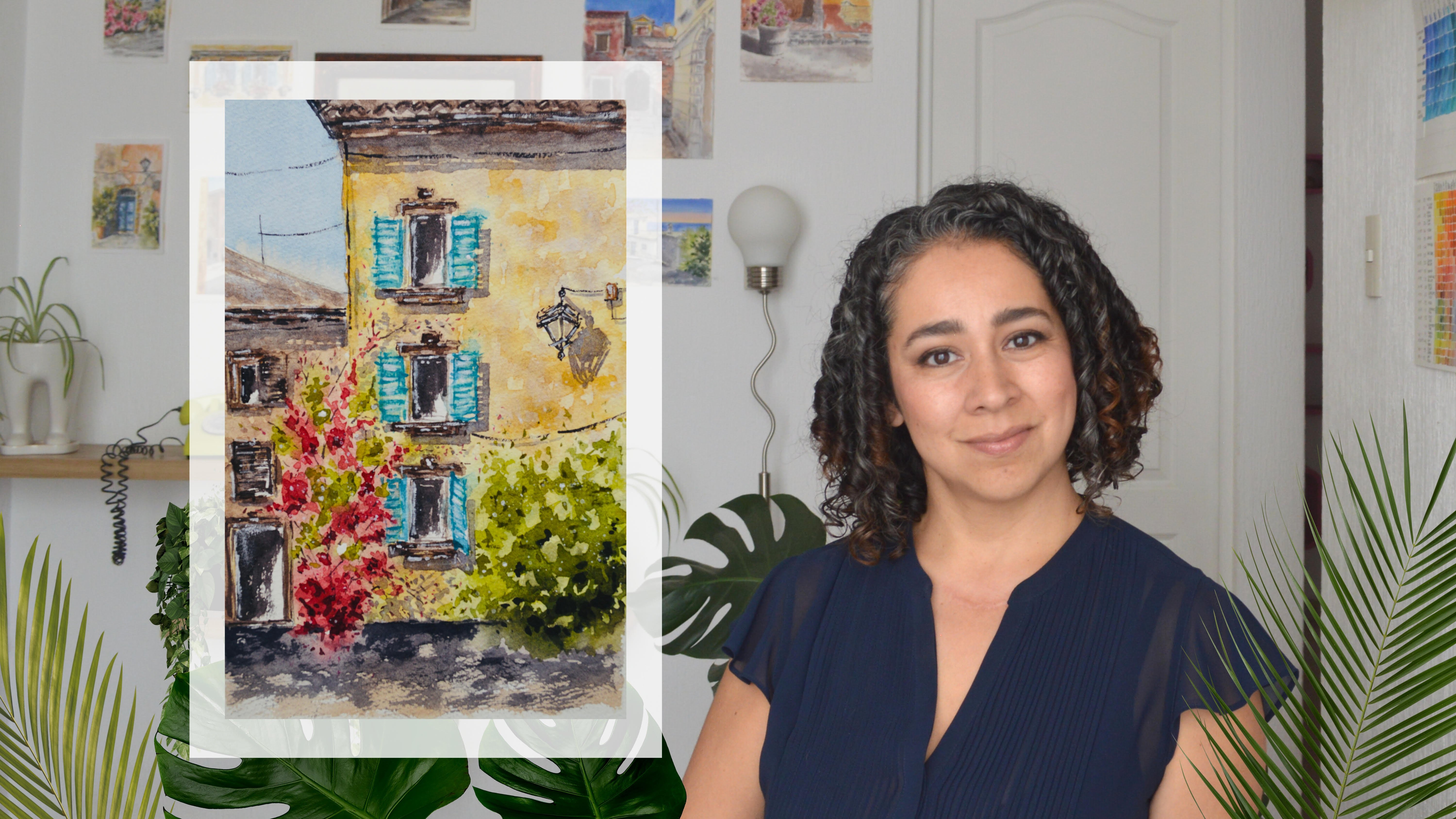
to this class. My name is Fernanda. I am an architect and a
self taught Warclor Artist. City scapes are probably my
favorite subject to paint. My background as
an architect has certainly helped me to
simplify the process. In this class, I'll
gladly share with you basic and effective tips that will help you through
your own artistic journey when painting it escapes. What we need to bring to
our drawing is balance, contrast, depth, and proportion. To achieve this, single
point perspective is a really useful tool that will completely
improve our work. We will find out the main
concepts of perspective. Horizon line, single
vanishing point, convergence lines,
and human figure. I know perspective may
appear too challenging, but the approach
in this class is totally focused on
the artists need. Once you get the idea, you will realize how
playful it becomes. By the end of this class, you will have very
handy skills to capture the essence
of an orvacy.
2. About the Class: Hello everyone and
welcome to our class. Perspective may seem
too challenging, but what do we really
need to know as artists? Well, we definitely don't need to go to technical or look for a perfect drawing in order
to create our class project. We will learn how a simple, structured and dynamic drawing will complement our
war color painting. If we are going to
depict an urban scene, we need a drawing
that allows us to locate each element
in the correct place and with the correct size to give the idea of
depth and proportion. Single point perspective,
basic concepts are perfect. To achieve this, for
our class project, we will work with a
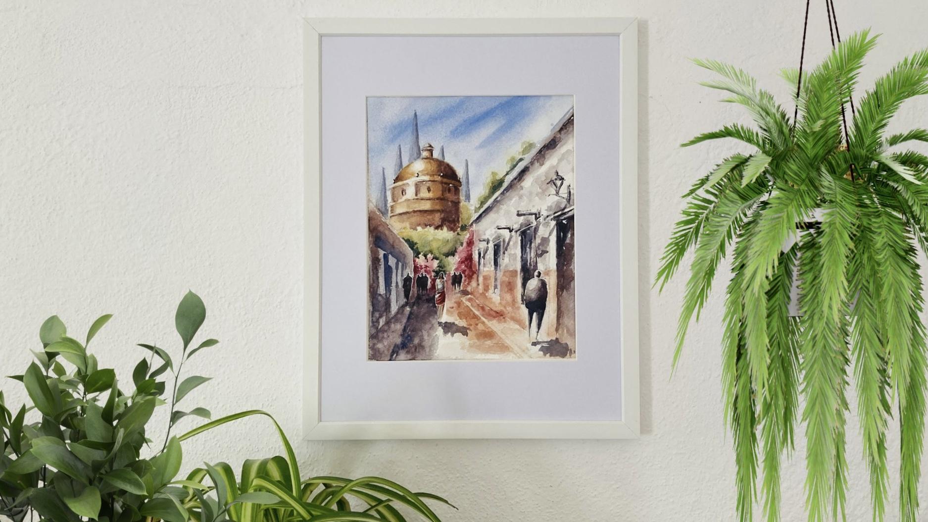
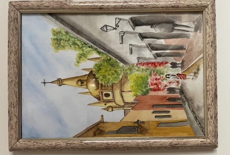
scene from San Ige, a colorful town located
in the center of Mexico. I really hope you
enjoy the class. I look forward to seeing
your class project. In the next lesson, we will
talk about art material.
3. Materials Overview: For our class, we need the
basic war color materials. In this lesson,
I'll share with you there are supplies
that I will be using. I highly suggest to take your war color paper to a
plastic board so we can move, rotate, or tilt our paper. While we are painting, make sure to have round
brushes with a good tip. Two or three different
sizes will be enough. All the brushes that are used
are made of synthetic hair. A modeler will be useful to wet the whole area of our paper
or create a big wash, but you can also use a
flat brush for our sketch. We need a mechanical
or a regular pencil. We need a soft eraser
and needle eraser to remove the graphite and make link corrections
if it's necessary. You can also find the materials
in the class description. Feel free to use the
art supplies that you have at hand and
make the most of them. In the next lesson, we will start talking about
perspective fundamentals.
4. Fundamentals of Perspective: In this lesson, we will take a look at what single
point perspective is and why it is a useful tool while
sketching city escapes. The overall idea is that with single point perspective
drawing technique, we can translate the
three dimensionality onto two dimensional space. This means that it allows us to represent on paper
objects with volume. And from a specific point, this representation
becomes the structure of our drawing and of
course, of our painting. Now we will find out the main
concepts of perspective. First by observing some of my sketches and then by
analyzing our photo reference. The easiest way to understand single point perspective is
by observing this image. Here we have train tracks that
in the distance they seem to join in one point
in the horizon line. Of course, train tracks are parallel lines and
they will never join. But this is the effect of
perspective and depth. These are exactly
the same concepts we will be using
in our sketches. In this sketch, I have used the same perspective
concepts here. Again, what brings
the idea of depth. Perspective are these lines that converge to the same point. This point is our
vanishing point. This is also the level
of our horizon line. Our vanishing point will always be somewhere on
the horizon line. If we draw people in our sketch, we will draw the head of the
people on the horizon line. We have the convergence lines to one single vanishing point, and we have the horizon line. Let's take a look at
these sketches here. Happens exactly the same. We have these lines that
join to the same point. All these lines, if we
extend these lines, these convergence lines,
they will join to one point, which is our vanishing point. It doesn't matter if there
is no people in our sketch. We know where our
horizon line is by finding out where is
our vanishing point. Our vanishing point will always be at some point on
the horizon line. In this sketch, the single vanishing point is out of the frame,
which is here. All these lines, the
lines in the street, the lines in the facade, the lines in this building, all of them will join to
one single vanishing point. In these three sketches, I have used the same single point perspective
drawing technique. The difference
between them is that the vanishing point is
on different position. Here is in the center, this one is to the left, and this one is to the right. Boat out of the frame. It doesn't matter where
our vanishing point is, as long as it is on
the horizon line. Now let's take some time to
observe our photo reference. This is the image that
we will be working with. We can apply perspective
fundamentals to this image. We have these lines
that we can extend to see how they join to one point. Here will be our
vanishing point. We have this reference of
people walking on the sidewalk. As we know, horizon line will always be at the same height
of the viewer's eyes. We are applying the
perspective principles that we have already learned. Also, we can develop our whole sketch by
extending other lines. For example, if we draw a line from this
point to this point, we will be able to locate
each window and each door, and all these architectural
and urban elements. We should take a moment here to review and some more
perspective concepts. First we have the horizon line, then the vanishing point, finally the convergence lines. Now that we know
perspective fundamentals, in the next lesson, we will
create our first sketch.
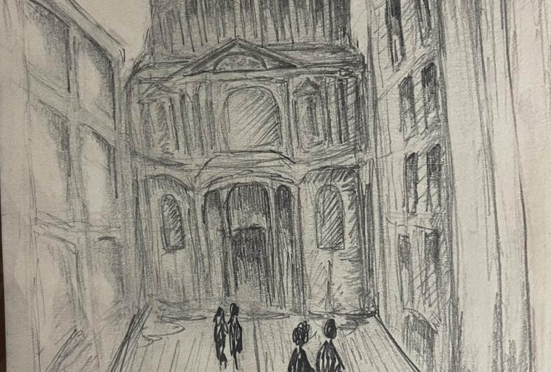
5. Pencil Sketch: Let's create our first sketch. In this lesson, I will be
using my war color paper, but feel free to use regular paper to
practice your sketch. When you feel happy and confident you can go to
your war color paper, we will start drawing the main structure as we
saw in the previous lesson. Then we will complete our sketch adding
architectural elements, greenery, and some
important details. Since we have the
main structure, we can develop the whole sketch and place each element properly. Keep in mind that
we don't look for, create a perfect drawing full of details or an exact copy. So let's keep it simple to recap. Let's
think about a plan. This steps to create a sketch with single point
perspective drawing technique are first the horizon line that is always at the head
of the viewer's eyes. Then the vanishing point
on the horizon line extends the parallel lines that converge to the vanishing point to give the idea of perspective. And de, add architectural
elements in a very loose way. Try to practice what we have learned through
these lessons so you feel confident when
developing your pencil sketch. In the next lesson, we will be discussing two
important aspects. Tonal value and
reduce color palette.
6. Tonal Value: Before we turn our pencil sketch into a war color painting, we should discuss tonal value. Understanding tonal
value will also help us to enhance the
idea of perspective. I think that the best
way to understand tonal value is by creating
monochromatic sketches. This could be a simple
graphite drawing or a war color exercise. Let's observe our photo
reference in black and white and identify lights,
mid tones, dark. Now we will continue
with a sketch of the previous lesson to create
our tonal value study. Let's draw the three values. Light, which will be in
all the area of our paper. The mid tones that will be
in the shadows, the facade. Some other elements like
greenery, doors and windows, and finally the darks. That will be mainly
in the details. It's important to think
in another value, that is the white of the paper. Sometimes it's useful to leave white areas to bring light
to our final painting. In general, elements in the background have
higher tunnel value, which means they are
more transparent. And elements in the foreground
have lower tunnel value, which means they
are more opaque. Besides useful, monochromatic
sketches are funny for me, is an essential part of my creative process when I create monochromatic
sketches is when I understand what I'm
going to paint and it also helps me to simplify
the whole process.
7. Color Palette: Saigende is definitely a warm, sunny, and colorful place. We can capture this move with
our warm color painting. A warm palette will be great, but cooler colors
will help us to add beautiful
contrast and balance. There are many advantages
of working with a reduced color palette
for our project. We need only five colors. We need yellow, orange, purple, blue, and an earth tone. This is my color selection. But make sure to work with the colors that
you have at hand. Any color from the
color family will work. But these are some
alternatives that, in general, are included
in any basic color set. You shouldn't have any problem
to find these pigments. Let's start creating
our mixes for the sky face greenery
and shadows. Let's practice, get technique to create the mixes in the
palate but also in the paper, so we have to wet our
paper previously. Let's start with wet paper and a pigment not
too transparent, but not too creamy. To create the blue for the sky, I'd like to add just
a drop of orange. If we mix blue and orange, it becomes less bright. Here you can see the
difference between the pure blue and the blue
with a drop of orange. For the fact, let's mix
yellow, whit orange. Now we add a of purple, and at last we add a drop of
lue to make a darker tone for the greenery. Let's use yellow and blue to
create a green. But let's start with
a warm green with more yellow and little by
little adding some blue. I'd like to add
Born Siena at last. I'd like to add more blue with burn sienna to
make a darker color. Here we can see the warm color
turned into a cool color. Let's create the color
for the shadows. We start with burn sienna and we have blue to create
this gray color. That can be a warm gray if we have Siena or a cool
gray if we have blue, then I like to add some
purple to change the color. I like to play with
this variation of temperature in the
color of the shallows. Now let's apply these mixes to the sketch from
the previous lesson. Don't forget that this
is a color study. There is no pressure
in this sketch. We are finding the
correct color palette for our final sketch. I like to sum up my
color palette by creating some schemes
next to my sketch. First the colors that I have
chosen and then the mixes.
8. Watercolor Techniques: To gain a deeper understanding
of how our color behaves, we are looking at two different
techniques that involve managing of the humidity of the brush and the
thickness of our pigment. In both techniques,
we use wet paper. I wet my paper and wait a few minutes until
it absorbs the water. If I need to wet it again, I do. So we have pigment to the wet paper exactly like we
did on the previous lesson. My mixes are also
exactly the same. I change to a smaller
brush and add more pigment by using a
wet brush on wet paper, we can observe how
we can't control the pigment spots and
color mix on the paper. We get soft spots
and blurred edges. We allow the pigment to
move and the water to do its own job and wait
for the final result. When it, the pigment will
move while the paper is wet. Now we will work on
the next technique, which is dry rushing
on wet paper. So I start by doing
the same thing. I wet my paper and
add a pigment. Now, I will use a smaller
brush to add more pigment, but this pigment will
be dry or creamy. The spot is clearly more defined and do not move like
in the previous technique. I continue adding
this creamy pigment and we will see
more sharp edges. As a paper dries, it is only possible to see the final result when our
paper is totally dry. Now we can see the textures, the intensity of the pigment, and the shapes of the spots.
9. Human Figure Drawing: Acid skate drawing
need human figure to life and the
sense of proportion. I like to keep it very simple. For me it is all
about basic shapes. Let me show you some tips on how I like to draw human figure. Here we have the horizon line and this is the punishing point. We already know that
the horizon line is at the same level of
the viewer's eyes and the people in the street. I have to define the height
of the human figure. I divide the height in two, but not half on half. The top part of the body is bigger and the bottom
part is shorter. Now I draw the head like
a shape of an noble. Then the body like a rectangle, and then the legs
like two triangles. This looks awful. This looks like a robot. I know we have to add
movement to the shapes. I like to incline. The line of the shoulders, the line of the hips put
in opposite direction. One leg is shorter and
the other leg is longer. This gives the idea of movement or the idea that
the person is walking. Of course, we should draw this
more expressive and lose, draw continuous
lines will help you, but also you need to practice. And of course to have
your own style to find out the height of other
human figures in our sketch, we can use the same perspective principles
that we have learned. We use our vanishing
points and draw a line using the height of the human figure that
we have already draw. It's exactly the same method
that we use to find out the correct size and location of the architectural
elements in our fade. Take note that people
that are closer to the vanishing point is because they are
in the background, and therefore they
are smaller shapes. And people that are further to the vanishing point is because they are
in the foreground, they will be bigger shapes. Now we can add as many
human figures as we want will turn these schematic shapes that represent people into
war color strokes and spots. I start with think
and dark pigment. This is a mix of blue
and born sienna. And I make a small stroke
to represent the head. To create the body, add pigment with loose stroke, but don't do it like if
we were feeling shapes. It is better to think of
brush strokes and let the pigment of each part
mix and connect the shapes. We connect the top part of the body with the legs
using thick pigment. Think of one single
schematic shape instead of separate shapes. When I want to represent
people in the background, I use a darker pigment and
consider one single shape. I take advantage of humidity to add shadows and mixed colors. We paint the projected shadows. The spot touches the longer leg, but not the shorter leg. And all shadows follow
the same direction. I paint a dark
background and let it try to show you how to
finish human figures. We need a brush with a good
tip and with white wash, we will add an outline to
separate the elements.
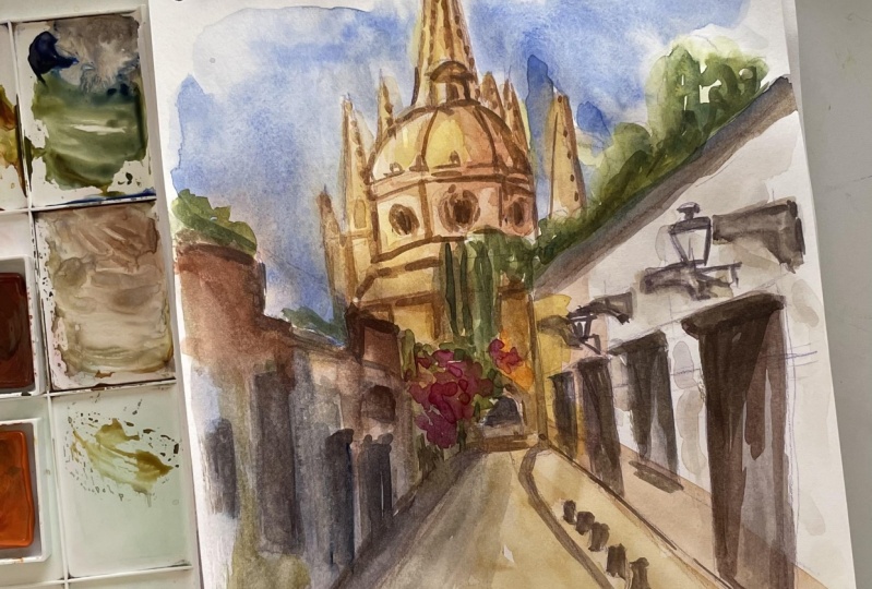
10. First Wash: Now is time to start with our final war color painting and put everything we
have learned together. I have created my
pencil sketch on my work colored paper and now is staked to
my plastic board. We will start with
wet on wet technique, adding pigment as we need to paint the light and contrast. I am using my blue color and just add a drop of orange
to make it less bright. And I start painting my sky. I have just more creamy pigment
to add this contrast to the sky and like a free stroke and let
the water the work. Don't try to separate each
area of our painting, Take advantage of the pigment and start painting the facade. I have pigment to make
a thicker pigment. Just play with the mixture
between blue and burn. Siena. Don't try to separate
the elements, just let the pigment and if the jello mix with the
other pigments, it's okay. This is like our first layer. This is wet on wet
technique and we should let the pigment
do its own job. That's the beauty
of water color. We let the pigments
mix as they want. I add yellow pigment
to the dome, and just more CNA to
set the shallows. If you feel that your
paper starts to dry, you can spray some water. If this spray creates
some texture on the areas that we have already painted,
it's totally okay. Now I start painting
the green area and some red spots for the
flowers in the background. I create this color
with orange and purple. Now I set the shadow
of my facade and I paint the part of the doors with the mixture that we created
with blue and sienna. Remember to play with the
temperature of the mixture, adding more sienna or blue. I will stop here because
my paper is getting dry. And I think it's enough
for the first layer.
11. Depth and Contrast: Now that we have painted our first layer and that our
paper is completely dry, we can continue with
the second layer. We will start with the
top part of the paper and set the volume of each
element by adding layers. I will use the same mixes of the previous lesson,
but thicker pigment. To add contrast, I have
mixed born Siena and blue, but with enough water to
make it very transparent. I am painting the church
in the background. I am adding another to
give the idea of volume. Let's paint the dome. It's better that we don't cover everything that we
have painted before. Let's keep some areas
without painting. Keep the light and intensify
the color in the shadows. And we can also
suggest some details. I like to soften
the pigment with clean and dry brush to make a softer transition
between light and shadow. We can add more shadow and start to define the volume
and the shape of the me. But remember, we are not going
to paint too much details. I'm adding more pigment
to add shallows, to make the contrast
in the shapes so the layers as you need in order to keep a
more transparent pigment. Let's paint the greenery. I like to think of bigger
shapes and then go to smaller areas
to add and volume. Let's play with warm greens, adding more yellow and cool
greens, adding more blue. This area has enough light, but also has strong shadows. We should work with thin
pigment in the light area, but also with
thicker pigment for the shadows and try to
create this layering. We are also painting the
area of the Bugambilias. Adding the pigment created
with orange and purple. You can see that I do
not detail the shapes. I just at the pigment for this facade. I'm going to add
thicker pigment, playing with a temperature by
adding more Siena and blue. I am also going to
leave some areas without painting to
suggest doors and windows. I am also going to suggest the sidewalk and
the shadow on the street. To add texture to this pigment, I'm going to splutter
some drops of water and wait a few minutes
to see the result. If you feel you need more information about
basic war color techniques, you can check out my first
class here in Skillshare. In this class, we review basic color techniques and
this may be useful for you. Now let's add shadow to the
bottom part of the corn. We don't paint this
element, this corn. We let it with the previous
layer to keep the light. But we have the shadow below
this architectural element. I also paint the doors, but it's the same thing. I won't paint the whole area. I will leave some ******
without painting. Since we are working
in the foreground, I can use thicker pigment
and give more contrast. This creamy pigment
helps me to work with dry brush and add more
texture to my painting.
12. Final Touches: I don't want to keep the
facade completely white. I'm going to add a layer with pigment created with
the same mix of blue. And Born Siena, I'm
going to create like a cool gray with a lot of water. To add just a very
transparent layer were color becomes very
light when it dries. So make sure to
add enough pigment to give the texture that we
look for in this facade. But avoid opaque pigment because we need to keep the
light on this facade anyway. We can work with more
layers if it's necessary. I also work with the
orange part of the facade, painting some spots and try
to connect these pigments. I also suggest the sidewalk and some texture on the street. Try to play with sharp and soft edges
using a clean brush. I like to give the idea that
not everything is finished. We can only suggest elements. And I think this makes our work color painting
more interesting to paint these elements. I like to paint a light
layer when it's dry, I like to have another
layer suggesting the details with a
loose brush stroke. The same thing happens
with the all light. I paint a light layer and then I have some other brush strokes. I like to paint broken
lines in these elements. It seems like the
element is not finished. To make my war color
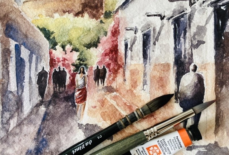
look more expressive, let's paint human figures. I will start painting the
people in the background. The process is exactly
like we saw before. I start painting the head, then the body and legs. Feel free to add as many
human figures as you want. Now you know how to
draw them correctly, and it's always funny to
paint these human figures. Let's paint the human
figure in the foreground. And I start with a
light layer and I will add more creamy pigment
to add shadows. The pigment is even
thicker and we can make dry rush stroke
to paint the legs. I add another layer to
the door in the back of the person to add more
definition to my human figure. If it's necessary, add another
layer to the people that are in the shadows and add contrast to the
people in the light. If you feel like we can create a different
human figure here, we use skin tone created
with yellow and orange. We suggest a woman walking on
the street and with layers. We create this figure. Again, it's not about
painting exactly the shape, but suggest the figure. And finally, we can add shadows. We use the same mix of
born sienna and blue. I let my painting and took some time to
observe my result. Added some pigment in the back of human figures
to add contrast. And then I just finished
them with whitewash, as we did in the lesson
about human figure.
13. Tips and Conclusion: Let me share with you the
final tips that I sum up here. When we try to convey
urban scenes in war color, the whole process starts
with our drawing. Although this is a playful
and intuitive process, we need hacks to make it easier. Besides the structure
that we achieve using perspective
drawing technique. Make sure to ease
your drawing with guidelines like we did with the churches
in the background. Think of the center
of the figure and locate your guideline
to develop the element. When we are in the
war color stage, we have many decisions
to make to help you. I share with you this chart. These are not absolute rules
but guides in general. We can think that the elements in the
background are smaller. They are also more
transparent and colder. Cool colors help us to
give the idea of depth. Elements in the
foreground are bigger, they are closer to
the viewer's eyes. They are more opaque to give more importance in the
scene, and they are warmer. If this is your first
approach to the subject, the learning process
takes time and it is as important as
your final result. Please keep practicing because practice will make
all the difference. In this class, we have
learned how useful perspective fundamentals are and how much freedom and
confidence they bring to our drawing and
painting process. But we have also worked with other essential
aspects, war color, tonal value, reduced color, palette and wet
on wet technique. This glass is full of tips on how to paint urban
scenes effectively, how to improve your
war color painting, and how to make your artistic
process more complete. You can depict the
places you love. Please share your paintings on the project section if you want. You can also share on Instagram. If you do so, make
sure to tackle. Thank you and see you next time.
 Fernanda Arandia, Self-taught watercolorist & Architect