Transcripts
1. Welcome to Personal Branding for Beginners: Hello everybody.
My name is Dylan. I'm a content creator, actor and business owner. Having your own personal website in today's world is a must. It's a great way to
showcase your skills, e.g. you could use it
as an online CV. You could use it to share
your creative portfolio as a photographer,
modal or actor. Or you could just have
it as a record of achievement today I'm
going to be showing you how you can create
your own personal website from scratch as a beginner. And then how we can
design your website in a very professional way to
make it look very attractive for anybody that might be
looking at it and ultimately create a well-rounded
personal brand for you. And I can speak from
personal experience, having a good brand and website, it opens a lot of
doors for people. And that is why I
think this course is gonna be super valuable
to anybody watching. Because small details that I've learned over many years of creating my own brands and websites make a huge difference. Now I've got 55,000
subscribers on YouTube. I'm also an actor and my personal acting
website has also got a lot of great feedback
from the industry. So trust me, you're
in great hands. Please take part in the
class projects where I want you to design your own
homepage for your website and really take on
board everything you're going to learn
today because there is some cracking info that took
me many years to learn. But without further ado, let's jump into class one.
2. Creating your Personal Brand! (Key Class): Welcome to class one, building your personal brand. Now before we move on to actually designing
your own website, we have to figure
out what our brand is and what we want to
convey with our brands. So right now I want
you to grab a piece of paper and I want you to
answer these five questions. And I'm gonna do exactly the same because I'm going to build my own personal brand and website with you
on this journey. So the first question I
want you to answer is, what do I do now for
me that is going to be content creator or actor. Now for today, I'm
going to write down actor and we're going to
roll this as the theme. But you might be a
self-employed photographer and have your crazy portfolio. You might be somebody
who's aspiring to climb the career ladder. I want to showcase your
CV or you might have your own blog or book is completely up to you
what you put down here. But the next question is, what am I looking to achieve? Now, for me, I'm building
enacting websites. So this is gonna be for
me, question number two. I'm looking to sell myself, but I'm also at the same time as selling
myself to do this. I'm looking to showcase my work. Now. Everybody is going to have a different answer for
that personal brand. Maybe you're a photographer and before client's
book on with you, they head onto your website so they can learn more about you read about your experiences
and see your portfolio. So in that case, what you'd be looking to sell
would be your work. Maybe again, you're looking
to sell your stories. So if you're looking
to sell your stories, people might come onto your
website and just want to read and learn about you and then read about
your articles, who travels and so on. But most of the time it's
gonna be selling yourself. Question number
three, what should my personal website
do now for me, as we said, I'm trying to
sell myself, showcase myself. I want my personal website
to show my show reel, which is as an actor, is basically my
portfolio of work. I wanted to show me. I won't have a
picture of me so that if anybody comes
onto my website, they see me and they
go, Okay, cool. This is who I'm working with
are looking to work with. Then I would also want a tiny
section that is about me. And I also want to have a
clear minimalist design. The emphasizes me and my
work. If it was to e.g. allow people to discover you, then you might decide
that you want to have a massive timeline
on the website with all of your achievements
in chronological order and how you went about doing those crazy things
that no one else has done. Now, there is plenty
of stuff that my website could
do hypothetically. So e.g. I've chosen to focus my brand here on one
thing which is acting. I'm not even looking at
my content creation. I'm really going down
a specific niche. Now when you're starting out making your own
personal brand, having a target area and the target niche that
you want to focus on is a great thing to do because if you create
your own website, e.g. and you do, let's say 20
things and for some reason you decide you want to showcase all 20 things on the homepage. It's gonna be really
tough for people to get a feel for what you do, because there's so
many things they're moving on to question
number four, how do you want people to
interact with your website? This is a clear personal brand error
that many people make. They basically
designed something. And when it comes to sending out their website or sending out
business cards or whatever, they haven't thought
about what they want the other
person's reaction to be when they receive the business card or when
they go onto their websites. So essentially they've made this great website
that is fantastic, but the actual utility
of it is quite low because they didn't think about that when they
were designing it. So right now, I promised
this is a key one for me. What do you want people
to do on your website? So as an actor, I've spoke to many industry
people as a creative. If I send somebody
to my website, I want them to see my
work straight away. I want them to see my
face straightaway. You own people to interact with it in a way where they come on quickly and they see everything
they're looking for. So I'm not aiming
for people to be on my personal website for ages. I wanted to come on, get everything they want
and then leave e.g. if let's say a photographer, what you might want
to do because being a photographer is a
very personal thing. You might want to have a bit of a different ANY you want people
to stay on your website, look at the about me page, and then look at my creative
portfolio of photographs so that people get a sense of
who I am, my experience. In that case, you'd
want people to come on your website and
stay and explore. Maybe you're an online
coach and you want people to come onto
your website and be easily able to contact you straight away from the homepage. There's plenty of
different ways people could interact with
your website and having that in mind will help us target how to create a successful
personal brand. And finally, what is the dream and goal
for your websites? So for me as an actor, my dream and goal would be
for people to see my work and my show reel and then
book me via my website. But there's one common theme
in all of these outcomes. We always want to
seem professional and we always want to be
perceived in a good light. And today I'm going to show you exactly in the next few
steps in the design classes, how we can design our website so that we've seen professional welcoming and
psychologically give us the best chance
of being booked, slash completing and
achieving our end goal.
3. How to Create your Website: Welcome to class to, in this class I'm going
to be showing you how you can set up your
website from scratch. Basically, have the piece of paper next to you
that you just wrote down all of the answers to your questions that we
discussed in last class. And then I want you to
type it on Google Wix, or you can choose
any other website designer if you choose to. But for me, which
is the easiest, It's one of the most
cost-effective currently. And it's just a great place for beginners to start building
their own website. So once you're on Wix, click on it, select it, and create an account. Now once you've
created an account, you'll probably see
a menu like this. On the left-hand
side, there'll be a home button above
that are Wix logo. And to the right there'll
be a little drop-down menu. Now, on this drop-down menu, you might not have anything yet. Am I just say your name
because you haven't got any sites, but click on it. Now on this drop-down menu, select Create a new site. Then it will take you to a new page where
it's going to load up what kind of website
are you creating? So we are, if we're making a personal website for
ourselves and stuff, we're going to select portfolio because this is all about
our personal brand. And what Dusko general
portfolio for now, e.g. what do you like to
call your website? I'd recommend typing
in your name here. So I'm just gonna call
it Dylan reuse fellows because mine is
all about acting. So I want it to represent me. Now, what do I want to
have on my website? You see, select a few of these. So portfolio video, we don't
really want anything else, but select what you want
to have on your website. And then I'm going
to click Next. It's going to say start
designing your site, begin with a template or let
Wix create a custom site. Few minutes. What we're gonna do is begin
with a template. Now, I've made stuff via Wix is custom build and
via our template. And the custom-built is great. But once you want to
change something, because you haven't built every single layer
of the website. Trying to change stuff
is very, very hard. Now, what you're going
to see right here is loads of amazing templates. Now I'm not going
to deny that all of these templates look stunning. I'd say have a little
look at them and discover what template you
liked the looks of take a picture of it, but don't click it
and don't use this as the basis for your
website because it makes it so much harder to customize it once you want to add more
stuff later down the line, It's great to begin
with to customize. It is very hard.
What we wanna do is select a blank templates
in the right corner here. So again, why would
suggest that when you're on the blank
templates page, take a look at the templates
that you liked the looks of. Now, as we said before, we're going to start from
scratch in this class just so anybody who's on
a different site and doesn't have
these templates, can join in and design
that perfect website, but have a little
view in a new tab. So right-click open
link in new tab, have a little view, some
templates that you like. And then we're going to
recreate these from scratch. And this can be done
in any software. By doing it in
strapped in Scratch. It just gives us that extra
customization and it can be a great basis to
start from having this template to the side
and then making it yourself. So I personally, out of
all the templates here, I like this one for my acting. I can have a picture of myself, a bit about me if my credits and then a link to
my show, real e.g. if you are a photographer, you might love this
template where you can showcase all of the
images that you've taken. Or you might like a CV, professional CV sort of style. Have a picture of you, your work, you've,
what you've done. This, this overlapping
layout might be quite cool, but there's plenty
to choose from. But for me, my favorite is
the strip had a layout, but I'm going to create
it from scratch. So I've opened it in a new tab, and then I'm going
to head on to start from scratch and edit.
4. Designing the Header: Welcome to Class II, Designing the header
of your website. So as we discussed
in last class, once you select the
blank template, it's going to open up this page. Now, let me just
take you through a few basic principles before we go into
designing our header. Header at the very top, you've
got your main body here, and then you've got your
footer at the very bottom. So e.g. what is a header? Header is something where you have whatever
you want to have, but it stays on
every single page. So e.g. if I was on the homepage, the
header would be there. If I was on the gallery page,
the header would be there. And this the same
for the footer, except the head is at
the top of the page, the fittest at the very bottom, then the main body of work is unique to every single
page with our header. If we take a look at our template that
we're going to roughly copy site name, menu. Maybe we want to leave the
menu up the whole time and an image at the
top, let's say e.g. so firstly, less elastic, click add elements and, or select the left-hand menu
and then add text because we're going to add our
site name to start with. So again, there's so
many fonts to choose from when it comes to
creating a website. And this is again branding,
branding, branding. So when we look at these fonts, what fun represents the work
that I'm trying to showcase? What fun represents me. The elegant title does
look pretty nice. It kinda showcases
professionality. Somebody who's very elegant, somebody who does a
professional job. So I do quite like it. And I'm going to have my
name Dylan Reeves fellows. I'm going to type
this in, not too big, so it's nice and minimalist. And then I'm going to move this box till I get a line down the middle book is
that it's now in the center of the page. When it comes to the
header, I can change the header design so
I click on it twice. And then I can look out, what do I actually want behind
this header for right now, I'm going to leave
it as no background. But then coming down, we're going to add
another element. Now, you're gonna have
to trust me on this, but we're going to add
a menu on our homepage. We want to have a link to every other page that we
have basically. So e.g. right now we've
only got one page, but this menu, what
we're gonna do is drag it to the
top of our homepage. I've dragged and dropped it
from the main section up to the header so that it's always gonna be
visible basically. So I'd recommend doing that
to start with as well. We're going to drag this across
all the way to the right. And in this class we're just
designing the header of our website and we're going
to add a few pages, right? So if selected pages in
the top left-hand corner, Managed Pages and we
want to add a new page. Now, we're going to
select a blank page. We're not gonna use
templates just because people may not have the
same templates we have. So once I've added a blank page, I'm going to call it contact me. Now. This is just so that
if anybody sees my work or wants to get in touch with
me, they can do that. Always have a contact me
page on your website. So now we're going to design the contact page me later on, right now what is
sorting out this header? Now again, there's
another page that everybody should always
have on their own website. It could be my stories, my work, whatever
it is that you're showcasing, you
want to add that. So when out of blank page
again, Manage Pages, rename this right-click,
Rename and my work. So this is a basic
template really. And now we can see
already that we've got this quite nice little
template actually going on here in the header where
it says my name home, my work, contact me. Now, if we wanted to change the design of this
menu on the header, click on it, select design, and then we can kinda see
what other stuff we like. No, just go through the
menus and think about what colors are going to work
for me and my brand. As I said, I quite like this option that we've
got on the default, but you can customize the design and choose one that
you like yourself. Now another thing, personal
branding wise to watch pretty well here is I've chosen
to stick with this menu, is I like it, I love
all the options. And it also noticed that there's
a fun difference between my name and the contact me
at my work and the homepage. Now, what this certainly does personal branding wise is that my name is in the more elegant, more elegant and
stylized format, as opposed to the rest of the words on the screen
right now, the menu. And it's subtly makes
my personal brand seem very professional, elegant. And that the work I'm gonna do is gonna be the top businesses. It's this weird
psychological trick where it helps the brain associate
you because your names in elegant italics
with professionalism versus the header which is
standard, is different. It's like, it's like
you're above standard because this is a standard font. Your name is non-standard font, so it's a small subtle trick their diet, the y points out. Now, there is one final
thing that I do like to do when it comes to my
website in the header. And that is add a location
tag to my header so that people can instantly see where I currently am located. So I select the left-hand menu, the plus, then I would
select Add Element. Now, Wix has some cool built-in features
called decorative, where they've got a few icons. Now on the icon list there's gonna be a little location tag. So I'm going to select
that location tag. It's a bit big at the moment. I'm going to drag it over here. I want this to be
in my head, but really quite small,
to be honest. I make it really small. Make it in line with my
self Maya macho name. I'm going to change the
design of it because it's currently purply blue. I actually want it to be black. And then I'm simply going
to select the plus again. I'm going to add a
tiny bit of text. Now on this sort of text, again, this can just be very basic
small paragraph text. And I'm going to
send me say london, London, nice and small. I'm going to drag this up here. If e.g. you didn't have
this little location tag, all you would need to
do is go into Google, type in location tag. Png is find the
one that you want. Right-click Save As
if you select Image. My uploads, upload
the image and then you'd upload the location
tag you just saved. And once this header
is now completed, which is when we go
back to the editor, we're going to check it
works on all of the pages. The same on Contact
me, the same on home. And step one in creating our own professional
website is done.
5. Designing the Homepage: Welcome back to lesson
four class for, in this one we are going to
be designing the homepage. We've done the header,
as you can see here. I do like the looks of that. If we take a look
at our template, we're going to go for
a little big title. We're gonna go for a subtitle, some about me, a photo, and then a contact
button that's gonna redirect us straight
to our contact page. Okay, so firstly, let's
start with an image. So we're going to go to
the menu, select an image, and then select my
uploaded images, then upload an image that
you would like to have. I would recommend here either a picture of you doing
some work or a head shot. Then select Add to page, then it will come up right here, as you can see right
here, I've gone for enacting headshot, one of mine. I'm then going to make
it a tiny bit smaller. Now I'm going to drag it to
the very edge of the margin. And then I'm going to
enlarge it slightly. I'm going to increase this page as well, make it a bit bigger. So we've got a head shot
on there right now if we select preview,
how does it look? It doesn't look quite
right at the moment. We need to add some more texts. I'm also not going to have
that on the very, very edge. I'm going to drag it
down right here and have it a bit more incentive frame, but not on the very
edge of the margin. Next up, let's add a text title. So let's add a big
title to start with. Gather in line with a header. Then we're going to add a
smaller title, a subtitle, e.g. you can choose the same point
or you can go different. It's really up to you. I think I'm going
to choose to go for a classic one
as the secondary. Then when it comes
to the font type, I might choose to have just
a standard paragraph text. Cool. So we've got
then got our title, subtitle and paragraph, and
we're following along this, this layout quite nicely. Lastly, we're going to add a contact button so it's
like the Select button. And then what we're gonna do is select any design
that you want. I think I've got a dark theme and a white theme going on here. So I'm gonna choose
a dark button. I like this one which
hovers when you go onto it. And then we're gonna
get this bottom. We're going to change the
text and it's going to say, contact me, write like this. And I'm going to select
the button again. And this is where a
bit of magic comes in. We're going to link this
button to our contact me page. So we're going to select it.
Then what we're going to do, we're going to select the link and then we're going
to select page. Now, once we're on page, we're going to
select, Contact me. Now what this does
if we preview it. If I now select this button that hovers white when I
go to click on it. So it's quite nice. It redirects me to
my contact me page. Then I can go back to my
homepage and see this again. So now we just need
to pad this out and really make it look rather nice. So once you filled out
some information about yourself and added the headings in, we get something like this. Now I'd recommend for
personal branding reasons that you have an
About Me section. And you stay at what you are, what your experiences and
what you're currently working on slash might be
working on next and then, uh, where they can find out
more information about you. So e.g. I'm a UK based actor, five years of experience, professionally trained,
worked on a lot of projects recently and I'm starting work on a
new one next month. And my additional show real work can be found
under this page right here. I'm also going to add my show roll to the
bottom right here. So next up, I'm going to add
a YouTube video to my page. So I'm going to collect,
select the plus, and then I'm going to
find video and music. I'm going to select
YouTube video because what you can then do is e.g. if this is the
video that I have, the link for the video that I
want to have on my website. I can expand the video
player to as big as I want. Let's say for my show, I want it like this. And then I can select,
Change the video, YouTube. Then all I have to do is find the link from YouTube. So e.g. once you've got the link
to the YouTube video, you want to showcase, change the link,
paste it in here, and boom, the show reel. In my case, my work
instantly comes up. If you have an
introduction video, Let's say if you are
putting your CV, this your website is your CV. You might decide to film
an introduction video which showcases yourself. You can then put that
video on YouTube and then upload it
straight to your homepage right here, e.g. I'm gonna do, I'm actually
going to put this video here. Right now. This looks a bit
cluttered to me. I'm going to space out in
line with my headshot. Space that out. Leslie, I like, I think that
looks quite nice actually. Then what I'm gonna do is right now it's a little cool
trick I like to do, is what I might do is to create some sort of
scrolling effect or separation between these things
on stage, on, on screen. Right now, I might add a few lines in just to
create some distinction. Let's head back to the editor. Let's select the plus, let's select decorative,
and let's select a line. Now again, a lot of website
design is trial and error. You're never gonna
know what fully works until you actually play around with it and
are happy with it. But e.g. adding in lines to create some separation
is some tricks that I've learned over the
years and a key piece of advice if your
cranial and website, sometimes having separation
is good because it allows people to
psychologically separate out thoughts there like right. This is who he is. Separation. This is his show real Perfect. Now what I might do is
make this fully big, big, big, big, big. I'm actually going to have this and then I'm going to copy this. Right-click, copy, paste it. I'm going to move
this up to here. Now one thing I noticed in this website the moment
is that as you can see, as I scroll down, my header stays right here. And the problem of the head
is staying right here. It looks quite messy
at the moment. So I'm gonna go
back to the editor. I'm going to change how to
design, costume design. And I'm actually
going to look for one that is basically a
semi plane color. But as we can see right here, it's a bit gravelly because
now when I preview the page, when I scroll down, my head stays the same
and it stays visible. I think that actually
looks a lot nicer. So I made a small
adjustment there. And these sort of
adjustments that fine to make whenever you
need to do them. I it's just super clear. So you go on my
website, you've got my name, my work contact me, My Location about me and my professionally trained
actor is shot at me. How you can contact
me some stuff I'm working on. Scroll down. You've got my show row
now. All that's left to do is add a little
title for the showroom. To keep the theme constant. I'm going to take
copy and paste that. Scroll down. And I'm going to place this
in the direct center of the page and below it I'm going to add a
bullet proof list. So let's actually
make this homepage. Now, this could be fear for
Europe, for your own work. You might put a label of the shoes she'd been on
the label of the voiceovers. You've been doing
all your training, your certificates, your skills. So e.g. I. Could either do it in
a long list like this, which I do quite like a
little less like that. I think that looks
quite nice actually. If you wanted to make
it a bullet points, all you'd have to
do is e.g. a, B. And to see the highlight, the ones you want
a bullet point, select the bullet
point list right here. And boom, you get that there. So this is exactly
what I've been after a nice clear
Mendelian list, Fresh website and boom, I think personal branding wise, because of how clear it is, what I am, what I do, what my experiences, and then
how you can see my work. I think it works pretty well. So that is how I build
a basic homepage. Now again, what content
you include here and here is gonna be different depending on the type of
website you're creating. But the About Me section is
roughly going to be the same. And I think when it comes
to selecting a photo, e.g. choosing a photo
while you're smiling, especially if you're
not interacting, is a fantastic thing to do because it creates
a sense of warmth, a sense of loving, all
that sort of stuff. So smiling photo is great. And then when it comes to theme, play around, see what you like. But I think that this is
looking very clean right now.
6. "My Work" Page (KEY!!): Welcome to class five. Now in this class we're
going to be designing the My Work section of the website and your
personal brand. So this section is great for showcasing all of
the work that you do and all of the achievements that you've previously
accomplished essentially. So first I want you
head onto the page. We're going to have our nice
header at the top here, and then it's simply
going to be blank. So the first thing
I'd say we want to start doing is we want to think about the type of things
that we want to add to this page in order to
showcase our work. So e.g. let's add an element now for me
as a creative person, two things I'm definitely
going to want to add to my personal brand
and website is a gallery of images and a gallery for videos,
Let's say e.g. a. Showcase image gallery. Now this is going
to be rather big. It's going to expand slightly how the margin video gallery. So we're going to select
plus elements again, videos or music will go
for a classic right here. So that's going to add
to the page as well. They're both quite big, big template, so
we're just gonna make them a tiny bit smaller. So then another thing we're
going to want to add on this page is most
probably some texts. So let's just get a generic
paragraph right here. Then finally, we're going
to look to add some sort of news kind of gallery just so that when people come
onto our website, they can see exactly what we've been up to
in recent months. So we'll add this down here. Let's just put this right here. I'm also going to
need a little header for whatever this is
going to turn out to be. So we've got a big title
in there. Perfect. We're also going to
want to copy and paste a line divider from
our last homepage. So I'm going to head
back onto the homepage. I'm going to click this
line, right-click Copy. Then I'm going to
head back over to the my work section and
then right-click paste. Just so we've got a line to
help divide the page here, just below the big title. The photos are very cool. If you're a photographer
or an artist, you might decide
to have a lot more photos than anything else. Now, for me what I'm going
to do is I'm going to move this photo thing to
the side and get the videos at the top
and a paragraph two, the writer videos explaining
what the videos are. So first I'll bless managed the videos once
you've selected this and find all of the videos
that we want to add to this, this, this gallery from YouTube. So then once you get
up on this page, you simply select,
add videos, YouTube, paste the URL link that
you've just copied from your YouTube video that you want to
upload to the site, select, add to library, and then it will upload and
then embed into your website. It close this channel. And we'll see all of the
videos that we just added. Thing that we
actually want to have our paragraph title
at the very top. So I'm just going to
actually swap this out. I'm going to make this paragraph nice and big to cover
the whole page. And then I'm going to
start typing some of the information about
what's below on this page. So I've just typed
in and welcome to the My Work page here you can find recent news for projects I've been working on my show, real headshots, spotlight
and falling teens. Now I'm going to
copy this big title, and I'm actually going to
bring this to the top as well because right
now design wise, I think we need a
title, my work. I'm going to
underline it as well. So we're going to have this
underlined just so that people can have some sort of clarity about what
page they're on, the title, subtitle,
slide, paragraph. And then we're going to delve straight into the actual work. Now with sunlight,
this y could do is expand that out full
length video section. And then we might separate
the videos from the photos by copying and pasting
this line like this. And then I think I'm actually
going to make it so that the next section is recent news. You see, I think
it'd be much more valuable at this
point to present some new information to
whoever's on my page. So e.g. letting them see my recent news. Now, the reason why I'm doing
this instead of a photos, because whilst the photo
is more important, I've already let them
see a photo of me at the very start on the
very first homepage. So the likelihood
is that they don't need to see another
photo just yet. If they're interested,
they'll scroll down and actively seek out
my additional photos. So we're just going to put
this gallery here instead. I'm also going to double-check what fonts were used on
the very first page. So yeah, we use the same fonts. I didn't actually underline
any titles on the homepage, so I'm actually going
to underline this. I'm also going to make this
a tiny bit smaller as well, just so it matches up a
tiny bit more to the, the very first page we made. Now, if we want to customize the design video box,
we had the settings. And then we'll see a
section saying design. And then here you can
choose the title, the text. I'm going to change the button
designed to make it round. The player is fine. Wash it is shown frame. I'm going to make it show the actual title of the
video that I've uploaded. So you can see right
here, down below, you can see there's
more videos that I'll show you how it
all works very soon. If we then scroll down again, we can see that this is
where we're going to have the recent pretty
self-explanatory. So for the recent news section, I've taken all of the
things that have happened recently with two of my
career, my personal brand. And I've put them all into
this section so we can see fresh headshots
in October 2022. Shoot with climb magazine,
a modelling thing, filming project, the Merlin project I recently
film that I'm whales. There's all of those
sorts of things that have recently happened within my life that relate to my
personal brand and my career. I reacting that I think is great to put it onto your website because it
shows that you're active. It shows that you're in demand. It shows that you're
actually pursuing something whereas having no
recent new section, it might be like, Oh, what's this person up to? We don't know. They
say that they're doing this and they
wanna do this. But where's the proof? And this is great for
personal branding. And even from the perspective
of if you're looking to get a new job and somebody goes onto your online CV or
online website. They see that you've got new
qualifications, new skills. They see your previous
experience or whatnot, It's gonna be fantastic. So again, this could be
a recent new section. It could be a my
experience section. There's so many options. Depending on your professional, you're going to want
to change it up. And then finally, take
a look at this gallery. Now what do we want to
add to the gallery? And as I said before, depending on if
you have a gallery or a video gallery first, or even your recent
new section is going to depend on your profession. So we're going to copy
and paste actually this title and this line. And then we're going to
type in here headshots. Now here's what I'm
going to upload some more photos in
a gallery style. Now, I'm actually
not too keen on this layout, settings layout. Oh, I'm actually going to
go for a ready-made preset by Wix where you've got one
main headshot on the left, four separate headshots
on the right. Now, let me upload my photos. So to upload your photos to
the gallery, simply select, Manage Media, select
all, delete them. I select Add media images, and then I'll drag and drop all of the photos
I've just uploaded, add them to the gallery, then I'll rearrange the order that I want these photos in. So let's say I want maybe
I'll have that one on the left actually first
rearrange them like this. The magic gallery
will do this work. And that is perfect. That's exactly what I was after. So right now, you can see that I've got on
my work section, I've got a recent new section and I've got my
headshot section. Now the one thing that
looks odd again from a design perspective
is on the homepage, I've got a line at the very top. However, on the My Work page
right now I have no line. So really to make it consistent, I'm going to select
this line again, copy that line, drag
everything down a bit and have it
exactly like that. So now we've got
my work section, we've got my recent news, We got my headshot section. And then what would actually
happen is we're going to have a footer here that we're going to design very soon. But I think that is
great for my work. What I've done from a
branding perspective, I've chosen three of the
most important things to do with my brand,
to do with my work. And I've included it
onto the My Work page in a very simple and easy
to discover manner. So e.g. once you head
onto my webpage, there's no messing around
clicking here or there. A straight title. Welcome, Here's what
you're going to see. Then you've got all
of my main body of work, which is my videos. Then you scroll down,
you've got my recent news which shows how I'm
active in the industry. I'm actively pursuing
stuff and I'm doing well. And then below that
you've got some more head shots which
are kinda like, again, to show what
you look like, to see if you're
right for the part. So you might decide to
have your gallery first. If you're a photographer,
you're rock. If you're an artist, you'll see v instead
of recent news. If you're looking for a job, There's so many different
things you can do with it. But here's exactly
what I've done in a very neat and easy
to follow away. And if I select the
preview page right now, we can actually
preview this page. We can see that it's very, very clear exactly what is going on. So we got my work straightaway. We got some videos
where we can play this video straight
onto YouTube. Scroll down again, you've
got some more videos. Select Play. It moves on to the
different video. Scroll down again, We got my recent news. I can
easily read that. And then scroll down again.
We've got some headshots. And then if you
click on that, it basically enlarges the headshot. So e.g. we've been consistent
in the theme. The same design as before, is on the Mayawati
pages, the homepage. And it's the same principles
of clarity and simplicity. How to design your
My Work section, I would recommend
doing it like that. So thank you for watching
this class onto the next one.
7. Contact Me Page: So welcome to class six. Now, in this class we're
going to be taking a look at designing
the contact me page. Now, this is going to be a very, very simple and quick class. So first up, let's
do as we do on the home and the my white
page for your brand. And we're going to copy
the line right here. Let's have to take it
from the My Work page. We're gonna get the copy them, head over to the contact me page and then simply
select paste. Once they're pasted,
move it up here, make it nice and center. Now once you've got the
line on the screen, we're then going to
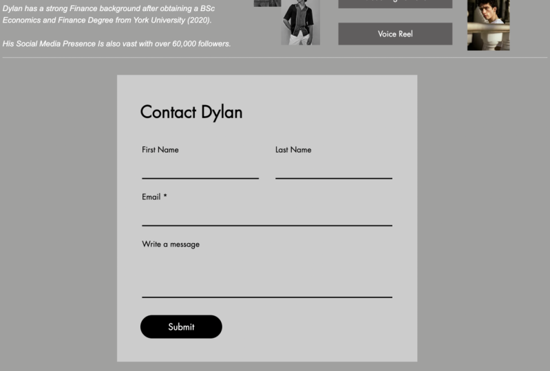
add a contact me box. So select the select elements, select contacts and forms. Now the bulks we choose, we want it to be
very, very simple. We want it to be a contact box. Now I like this one right here. It says Get in touch
because it's green, it's got a green background. It fills up most of
the page and it's very clear and it stands out
from the white background. Now you see if you
make it bigger, it doesn't actually make
the insights bigger. So what we wanna do is
leave it the size it is. So about that. Move this contact me box. It will take it in the
center of the page. And then what we can also do is maybe have a small paragraph. Let's, let's move to contact me box to the left hand side, and then a small
paragraph saying, please contact me
for any requests. Simply just let people
know what they should contact you for or about. This page doesn't really
need much else added to it. It's a very simple page. So there maybe we can add
another header exactly like we did from the
my work or homepage. We're going to copy
that homepage title, head over to the
contact me page, paste it, changed the name, change it to contact, job done. Move it over. Very nice. And maybe even we
could put your name. And that to me is a very nice
way to potentially allow people to make contact with you and make it
seem very friendly, very formal and
very professional, very nice and easy
quick class there. That is the contact me page.
8. Designing the Footer: So welcome to class seven. Now, in this class I'm
going to be taking you through what to do
for your footer. Now, as we discussed before, the header is exactly
what we looked at it. It's on every single page. You have a menu there, your
location and your name. Now, the footer. Again, what you wanna do, the footer is add some
stuff that you'd like to have permanently on
every single page, no matter what you're looking
at homework or contact me. And you want to have all that stuff at the bottom of the page, then you should add
it to the footer. So let's choose what we want to have the design
as much like before, we can customize the design and try and find exactly the same
design as we did before. Maybe you change the
color to make it white again so it
matches the top. So it's quite nifty
trick this basically having the footer match exactly
the same as the header. Let's head back onto the
homepage for to judge this. Now again, what we might like
to do is add a few links on our footer so that
if people ever get distracted or end
up at the bottom, they can easily head over to whatever
they're looking for. So what I might do is add
a link to my spotlight. Now, I'm going to add a button, type it in spotlights the name, and then link that to a web address and
get the web address, copy the web address, and then paste it right here. So now when people pretty
go onto my page, e.g. if I preview it, if I
scroll down to the footer, I click this link and it
opens up my spotlight page, heading back into the editor. What I might decide
to do as well is put some sort of small paragraph. The header, and I'm going to call it silane reads fellows, so people know that
it is up-to-date. I might also decide to
put another link there. So I might copy and paste
this, put another button, and I might put my
Instagram here this time, just in case people want to
connect them in Instagram. Then get the link. I
then changed the link. And then finally I might say that Contact Me button as well and leave that full-time at the bottom just to just to make it easy basically for people
that want to contact me. And then I might
put other very end. So for a further, that might be all
you need to do for others and not as
important as headers. But it's still good to include a few useful links
that are gonna be related to your
personal branding, related to things that
people might want to check out of yours if they're
on your website. So your spotlight for me
as an actor Instagram to connect and contact me page
plus my name to show that. This is up-to-date.
9. Website + Branding Review: So welcome to class eight. This is the final product. This is the final website that we have built in today's class. Now this is really reflecting
my own personal brand. And hopefully I've
taught you today how you can build something
exactly like this. But right now, let's
review the website. Let's take a look at how it
seems, how it comes across, and it does it achieve
the goals that I set out to achieve at the
very start of this class. Now, firstly, once you
head onto the website, you can see it's very simple. We've got a nice highlight
structure going on here that whatever page I'm
on is highlighted blue. And if I highlight another page with my mouse, it goes blue. So I know that I'm going
to click on that one. We got my location by
location tagging that symbol. We've also got my name
at the very top here, which is very clear and precise. Now you scroll down, we've got a nice divider
with this white line. We've also got the menu stays
the whole time so people know and are encouraged to click on my work and people are
encouraged to contact me. It's very easy to do so. And we can also see that I've
got an About Me section. So there's a picture of me. I'm a trained actor. Here's
what I've been doing. Again, a contact me button.
The works perfectly. If I click on it, it takes
me to this contact me page, which is exactly what
we built in last class. And you'll notice
that the bottom of this contact me page, we've got my footer, which contains some
additional links. Contact me again, contains
my Instagram spotlight. There's even more
ways for people to check out my official work, to connect to a meter, to contact me again. Again. You can type in all details required and submit
that from this page. But back on the
homepage, scroll down. Super easy to find
my show row here, super-duper, easy to find it. Along with some
credits at the bottom. That homepage is super simple. It's super quick and easy
to access and to navigate. And then there's also a
section called My work for those that want to
check out more of my work. Now, once you click
on this section, you see welcome to
the My Work page. Here you can find news for recent projects I've
been working on my show, real headshots, spotlight
and falling scenes. So I've got some
videos right here. Click on Play. And it opens up straight
into a YouTube link. And down here there's
even more videos that I can play it anytime. So I've got a great
video gallery here to really showcase
all of my work. And if anybody wanting
to see more of my walk, this is absolutely perfect. Scroll down again. You've got some recent news. Now this is all the whites, the blacks, the grays. So great color scheme to have because it's
very minimalistic, It's very fresh
and it does work, the lines work, the
separation works. Recent news, again,
looking very nice. Here's six of the most recent
things I've been doing. Show some active,
shows them fresh. My name is still
there. I'm liking it and scroll down some more. And you've got my head
shots exactly there, which are looking very
nice and tidy indeed. Overall, it's a very,
very cool website. I think it does. The job is very minimalistic. It serves its purpose
for branding reasons, because it portrays what I do. It betrays my work, it betrays my photos, and it portrays a way for
people to contact me. So I can literally, if
anybody is interested in my acting on my
work and my business, I say, yep, Go on this link, clicks my name, and here's
everything you need to know. So hopefully you've got a very similar
website to that now.
10. The Class project: So welcome to the
class projects. Firstly, congratulations
on completing this course. You have done absolutely
amazing and I hope you've learned a lot now for
the class project, I would like you to design
your own website and design your homepage to reflect
your own personal brand. And then I'll be
giving you feedback on what you could have done better, what you've done well, and any suggestions
that I have from me to you to reflect more of what
you're trying to achieve. I will give in the
discussions and then reflection section
of the class projects. So remember everything
we've learned today, whether it be the colors, having the image, the type
of image, the domain name. There is so many factors to
think about when designing and completing your own
website and personal brand. Even small nuances like
when you click a box, does it hover in? Sound silly, but that takes your website from
good to excellent. So definitely have a go at creating your own
website and web page. You can use any of the services we've chosen Wix
today obviously, but let me know in the comments down below how
you're finding it. Any questions, any
advice you need, just ask me down below.
11. Thank you & Well done!: And at this point, guys and the outer, there's
only one thing to say. Thank you very much for
tuning into today's class. This was all about
your personal brand and how you can design
your personal website. If you did enjoy this,
do leave a review, leave a comment down below in the discussion board if you have any questions and if you would like to see a another website
design course all about business branding or
social media branding or anything of those
lines, your own blog, e.g. do you want to create
your own blog? How do you design that? Well, I've got all
of these. I've been doing them now for many years. I'm a bit of a social
media guru because I had literally been doing so many things on social
media for so long. I'm just request any class is
down in the comments below, and I can definitely do them, but thank you for watching. I appreciate it and I
hope you learnt a lot. Good luck. Take care.
 Dylan Reeves-Fellows ⭐️, YouTuber, AI & Professional Editor