Transcripts
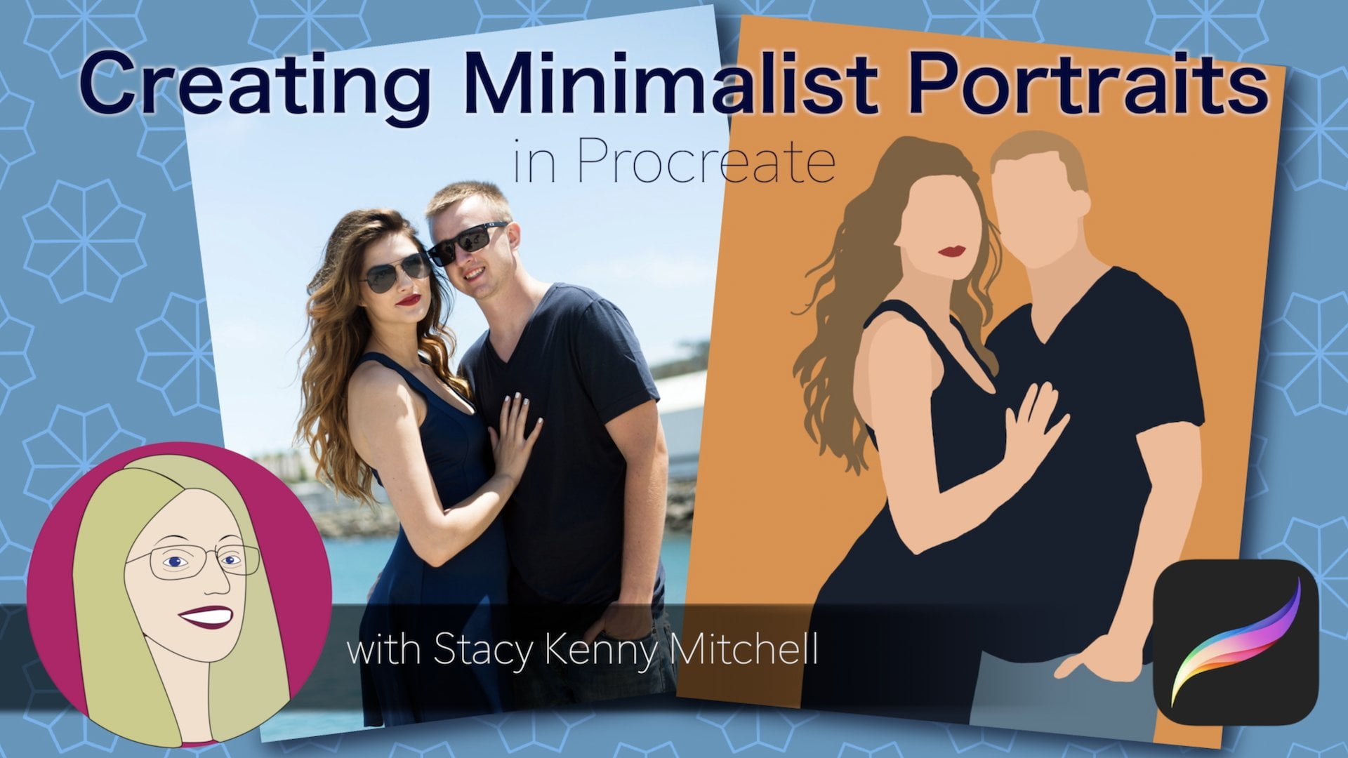
1. Introduction: In this class, you will
learn graphic translation. That is how to transform a
photograph of yourself or someone you love into a
beautiful, bold graphic project. What makes this project different is that
you're going to use just one brush and one
color, just black. But the result will
be something that you can frame and hang up on a wall. Or you could reduce
the portrait to a tiny little size and use it as a profile pic
on social media. The simplicity and the
single color scheme means that this project will stand
out even on a smartphone. My name is Geeta, and I'm an English teacher and
a graphic designer. I have taken many classes
on Skillshare and I decided that it's
time to give back. So I'm excited to be on the other side of the
camera talking to you. This class is for everyone
from beginners to Procreate, to people who already know
their way around the basics. If you already know
stuff like adding files, adjusting opacity,
creating new layers, etc, then you will enjoy learning the principles
behind graphic translation. If you're a beginner,
I'm going to show you every single step, so don't worry. My approach will be direct, I'm not going into every button and every option that Procreate
has and it has a lot of them. I'll just show you what
you need to know. And I'm going to practice
what I said about being direct by going directly
to the next class. See you there.
2. Lesson 1: Theory: Hi, Let's begin class by discussing what is meant by
the term graphic portrait. If you Google the term
graphic portrait, you will find that
"graphic portrait," is used for portraits done
in a variety of styles. And all that they seem to have in common is that they are all artistic representations of
humans done on a computer. For instance. If you look
at these two versions, you can see that they are
simple and symmetrical. They have a sort of
geometric feel. If you look at other examples
like this one or this one, or this one, you can see that they get a lot of
mileage out of shadows. And they have a 3D feel
which is different from the geometric
symmetrical versions. Then there's this outlier,
this particular version. And this one is so
much more detailed. It has so much more of
lines and details in it. So I'm going to call
these three styles, the icon style, the 3D style, and the linework style. Or as it is more commonly referred to the
"graphic translation." Let's look at each one of these three styles to see
how to get each effect. so that we're not
just drawing blindly, but understanding what we need
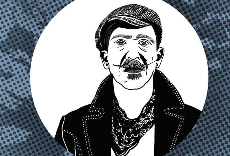
to do to get each effect. First off, here's a painting
of the author Shakespeare, and here are some
icon style portraits. The main thing in the icon
style is that it tries to get at the essence of
a person's appearance. In the case of Shakespeare, what we notice is
the high forehead, the flowing hair,
the curvy mustache, and the pointy beard. The icon style emphasizes these particular
attributes and elevates them by making them symmetrical. Another feature of the
icon style is abstraction. The essential features are emphasized and very often the non-essential
features are left out. For instance, in this
particular icon style, you see all of the
facial features. But in this one, the nose
and the mouth are gone. And in this third version, you can see that only the
hair remains: the hairstyle, the mustache and beard. And all the other
features are left out except maybe
the high forehead, which is suggested
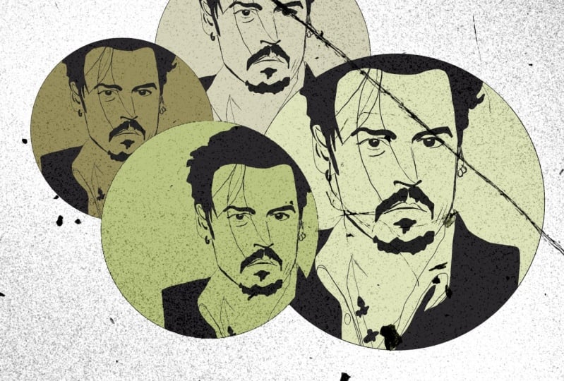
by the face outline. Now let's look at the painting
of Benjamin Franklin. And next to it are two
examples of the 3D style. It is pretty clear that
the 3D style achieves volume and depth by
emphasizing shadows. You can see that the shadows
on Franklin's right cheek, next to his nose, under his eyes, under his chin, are all emphasized in the
portrait by using black shapes. The black shapes
that are created for the shadows are
organic and flowing. But you can see lines
in the black shapes. In the 3D portraits. They look like lines that have
been painted are done with a brush because they have the same soft flowing,
and organic feeling. Let's take a quick look
at this photograph of Albert Einstein and
two portraits of him. Here, there's an icon
style portrait in which all that has been
used or the hairy parts, the hairstyle, the
mustache, and the eyebrows. And then you have the 3D
version where you see the shadows on his left cheek
and his eyes and mouth. Both portraits are awesome. In the icon style, you see
the beauty of simplicity, and in the 3D side, you see the beauty of
drama and mystery. However, you have to know which effect you want to achieve
so that you can make it, take the steps that are appropriate to
getting that effect. If you want to make the
icon style version, then you have to spend time
thinking about which are the most important facial features
in your reference photo, and which are the ones that
you can leave out. If you want to make
a 3D style portrait, then you have to pay
a lot of attention and look very carefully
at the shadows. You have to examine which shadows are the
darkest and which ones you can
leave out because they are the lightest shadows
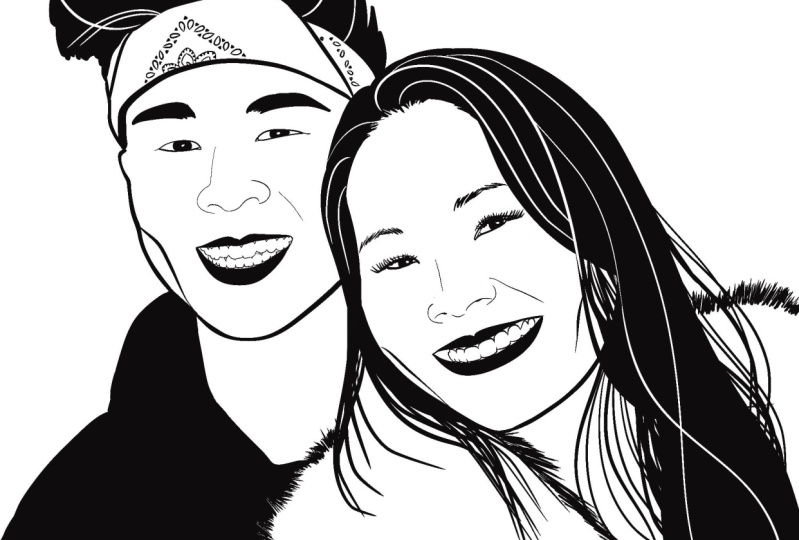
in the photograph. Now let's look at
the third style, which I'm calling
the linework style, and which is also often
called graphic translation. In this version of Einstein, you can see that all his facial
features are represented. Unlike the icon style, here you can see all the details in the
graphic translation. Unlike the 3D style, here, you don't see shadows and
highlights; it's very flat. Another important feature of this particular style
is the contrast in the lines. You can see the thick lines of
Einstein's jaw. And in contrast, the thin lines that
are defining his nose. There are curving, flowing
lines for his hair, and there are angular
lines for his collar. You can see that the hair-- the lines of the hair --are
long and flowing and curvy, while the lines of his mustache are short and they
are densely packed. These contrasts are what lend
interest and individuality to this particular style: the
graphic translation style. And this is the style
of portrait that we'll be making in this class. Let's look at one more example. This is a photograph
of the writer, Virginia Woolf.
On the left side, there is a portrait made in the linework style
that I found online. And it's made by this
artist called Irina Ivanova. On the right
side is my version. And I'm putting these
versions together because if you look
at Irina's version, you can see that she has
achieved a very angular look, almost like a woodcut style, by probably using
this angular brush, a brush that has, that produces
angular and sharp lines. In contrast, have
used a brush in procreate that's called
Syrup and Syrup, like its name suggests, produces very smooth
and flowing lines. You can see that my version looks pretty different from her in
terms of the line. And that's because of
the brush that I used. In the introduction video. I said that we'll be
using just one color, black. and only one brush. And that's true. I will be using the Syrup brush. But you should
decide for yourself, what is your ONE brush? You need to decide what
kind of line you want, and then you need to choose
the brush accordingly. Also feel free to choose more than one brush if
that's what you want, if that is what works for you. The important thing
is to understand that the linework style is
really all about the line. So the choice of the brush
is really important because that is the tool that
you need to produce the kind of line that you want. So here's a review of the three different
styles that we talked about and their qualities. And in the next class, we're going to start drawing!
3. Lesson 2: Technique: Let's start making
the graphic portrait. So the first thing you
do is to add a canvas by clicking the plus button
and then choosing paper. And you can adjust
it on the iPad. Next you choose, and insert
your reference photo. Adjust it, move it to the corner and then
increase the size. Then lock it in position. Go to the layers
and open them up and adjust the opacity
all the way down. Then lock in the layer. Next, you need to
choose a color. So go to the color circle and then choose the blackest
black in the corner. Then choose a brush.
Go to inking, and choose the Syrup brush, and then adjust its size till it is 10%. Now open up the layers
and add a new layer. And then start drawing the outline of the
hair on the face. Draw all the way around, choosing just the hair and
making a complete outline. Then fill it with black. After that, add a new layer and start outlining the clothes. So again, outline
the clothes that the person is
wearing and fill it with black. Now, in a new layer, adjust the size of the
canvas so that you can see a large version and start drawing the eyebrows
on this new layer. If you make mistakes,
you can tap on the surface a couple of times and it'll delete
what you just did. Add a new layer and start
working on the eyes. And once again, if
you make a mistake, you can always tap the
surface a couple of times and remove what you
did and then start over. Here you can see that the eyes are somewhat
difficult to draw. And you might need a
couple of attempts, but still it's worth
it to get the eyes right. Now, adjust the
size of the brush, start a new layer
and do the nose. Then add a new layer. Adjust the size of the brush, and start drawing the lips. You can draw the upper lip
and you can fill it in. Then draw the lower lip, and then you can
fill it in or not. It's your choice. Add a new layer, adjust the brush downward
and now draw the jaw line. Now, just take a minute
to look at what you have. And then you can decide whether to draw
the pieces of hair. Add a new layer. Then start drawing
the little pieces of hair that are coming
out of the hair shape. Draw as many as you need. And then you're done. Now start drawing
with the delete tool. So I'm making sure
that the Delete tool also has the Syrup brush. And then I go to the hair
layer and duplicate it. And then I choose Delete and
make sure that it's at 10%. And then I start drawing
on the hair layer. I draw lines and
basically the lines get cut
into the hair layer. And by adjusting the brush, I can also make more
delicate lines. Then I draw, add a new layer. I turn off the visibility
and I check what I have. And then I need to start
drawing the earrings. So this is going to involve adjusting the
properties of the brush. So I increase the spacing on the brush and then
I get dotted lines. And then I also go
to the delete tool. And I make sure that the
Delete tool also has increased spacing so that it will also
turn up as a dotted line. And now I add a new layer. Then I go to the earrings and I draw using
the normal brush. Then I go to the clothes
layer and I duplicate it. And then on the
duplicated layer, I use the Delete Brush. And then I draw the
rest of the earrings. Now I turn off the visibility
of the reference photo, and as you can see, the earrings look good. So next, I make sure that the
layers are unlocked and then I select all of them. Then I swipe to the right. They turn blue, and
then I can group them. After that. I can flatten them
and then I can adjust their position anywhere I like. Now, I'm going to make
the clipping mask. First I'm going to add a new layer and pull it
under the flat layer. And then I'm going to turn
the brush color to white. And then I'm going
to make sure that my brush properties
are back to normal. Put the spacing back to 0. Then I adjust the brush size and I draw a rough circle around the image and make it into a perfect circle
and fill it with white. Then I make it into
a clipping mask, choosing the Clipping
Mask option. And I adjust the size so
that I'm happy with it. I can adjust the
position anywhere I like and then I'll
lock it in place. And my profile pic
is available now. So I group it and flatten it. And then I choose the flattened
image and I can save it. So I go to the wrench
icon and I choose save, and I save it as a PNG. And then I go back
to the layers, turn on the background
white color, go to the flattened
image and increase the size and position. And then I can go to the Wrench
icon and save as a JPEG. And now I have my printed
picture ready to go. Now I'm all done. You know, if I was going too fast, then make sure
that you check out the PDF on resources because it has a very clear
step-by-step instruction guide. So if you have that printed
out in front of you, then maybe it'll
be easier for you if I was going too
fast in the video. And I hope this process was easy and focused
and fun for you. I can't wait to see your work!
4. Conclusion : Hi everyone. I hope you enjoyed the class! I would love to see
your graphic portrait. So please post your project to the submission link that's
just below this video. And I promise to give feedback to everyone
who posts a project. This is my first
Skillshare class, the first one I'm teaching. So I'm really eager to improve. Please leave me a
review and let me know what's working for
you and what is not. In this. my first attempt at teaching
a skillshare class, my aim was to create a class
that's both fun and focused. So that is why I
had just two lessons. The idea was that
you would create this nifty thing, a
graphic portrait, but along the way, you would learn or practice some very fundamental
techniques in Procreate. I hope you will continue to make portraits even after you're
done with this class. I make lots of portraits! And one thing which I've
noticed is that it has altered my views on beauty in humans. Nowadays. I recognize the variety
in human faces. I see that what
culture calls a "flaw," is very often the thing that makes people unique
and memorable. If you want to see
more examples of the portraits that I make
or other art that I make, please look me up on Instagram! The link is on my profile. And I hope you continue to
make art and enjoy making art, and once again, thank you so
much for taking my class!
 Geeta Sadashivan, Illustrator and Designer