Transcripts
1. Class Trailer: You want to get your
hands dirty and dip your metaphorical
toes into a new medium. Welcome to the world
of think drawing. I'm Vera, an illustrator
and animator from Germany and I love drawing. I think it is the
medium that has dominated Mustache books
for ten years by now. Even as a full time artist, I always make an effort to find time to unwind
with some ink drawing. In this class, you are
getting insights in the odds and ends of this particular
tool set and will, with a bunch of fun prompts, take the first steps
into drawing with ink. With an introduction to three
different kinds of pens, you are free to pick and
choose your tool and come along with me through seven sets of prompted ink drawings. By following along, you
will end up with a bunch of cool finished illustrations to share with us and the world. If you're an artist who has little or no experience
in drawing with ink, this might be the
right class for you. The instructions and prompts
are beginner friendly and all you need is a bit of
time and the wish to create. By the end of this class, you will have ink
on your fingers and a bundle of new art
tools in your belt. Come along and have fun.
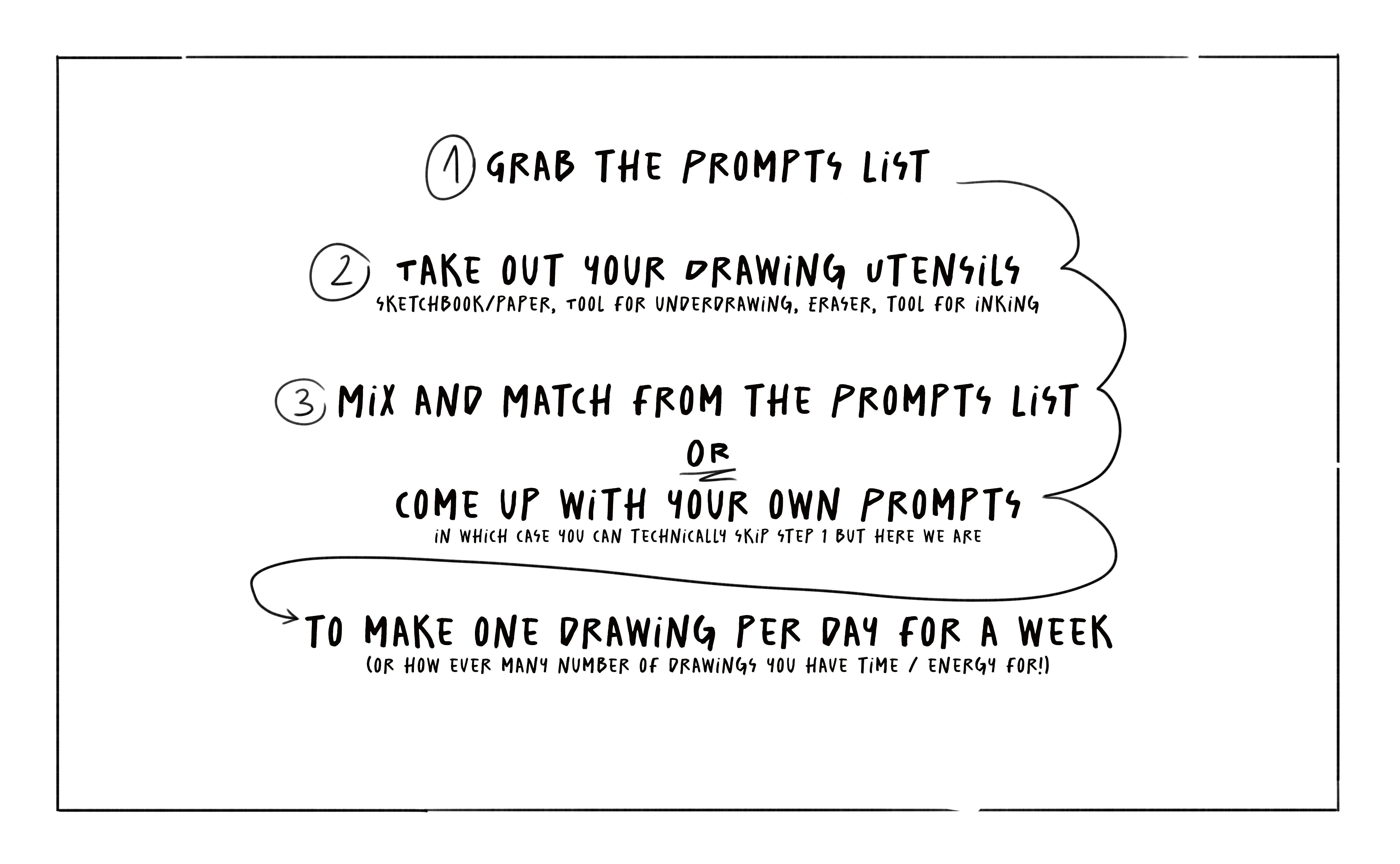
2. Class Project: This class will take you through a beginner friendly
week of ink drawing. After an introduction,
you can take the class day by day
and follow my prompts. Or pick and choose from the provided list to create
a unique drawing each day. By the end of the class,
you will have made seven illustrations by giving you the framework
to the medium ink. I hope to take out
the pressure a bit and make it less
intimidating to begin ink drawing is one of
my favorite ways of creating. I hope to recruit a lot of
artists to give it a try. I recommend taking
an hour out of your day to focus
on the drawing. Don't take on too much at once. Just go at your own pace. No matter how big or small the illustration is that
you want to create, just take your time and
embrace the process. I would love to see
all your exercises, sketches, and of course the final seven illustrations in
the class project. Don't worry if you don't feel like creating seven drawings, remember all at your own
pace and capacity Now, get some supplies ready,
like colored pencils, paper and eraser, and of course, your inking tool of choice. Should you be a bit lost
on what those could be, don't worry, I will cover
that in the next lesson.
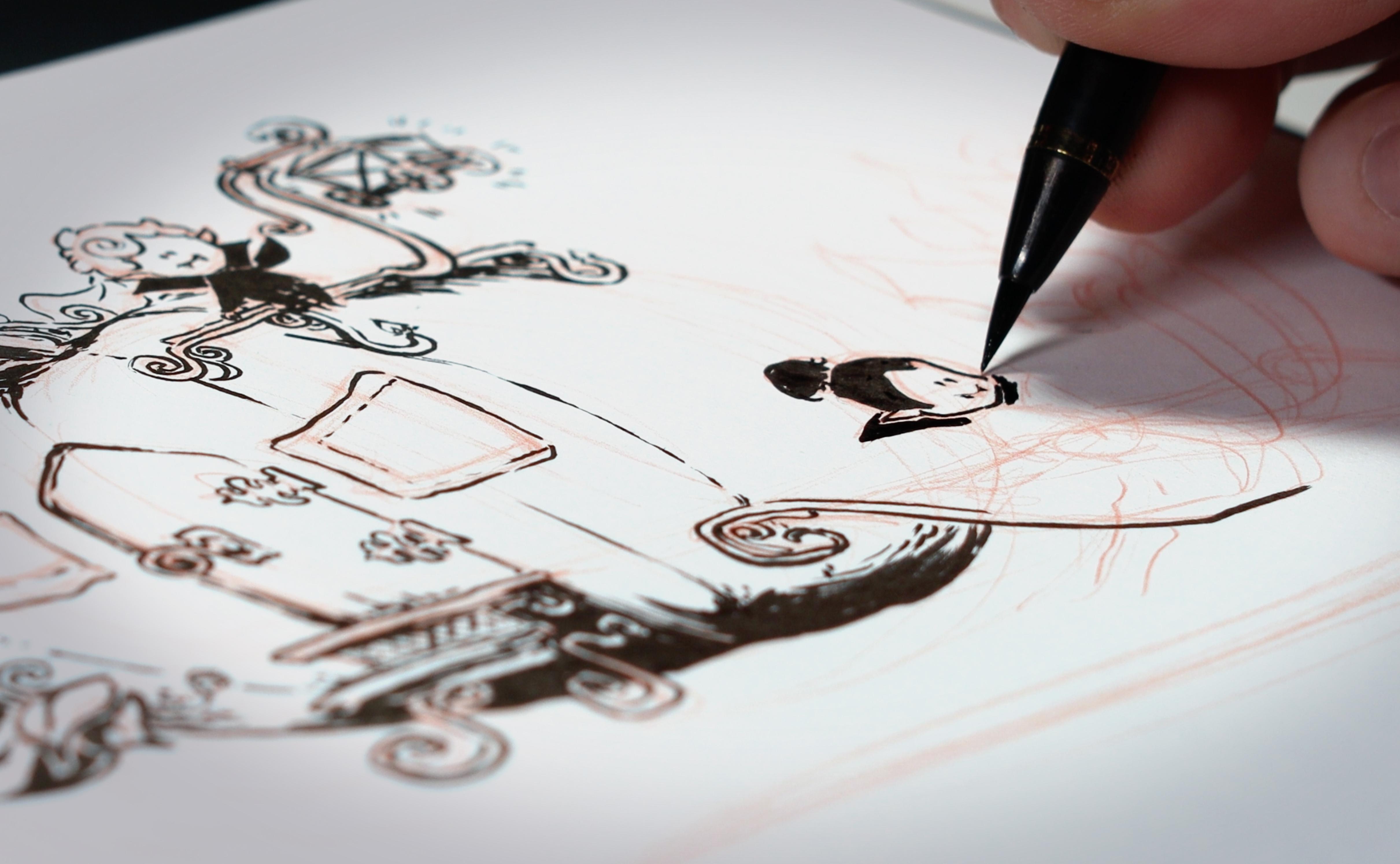
3. Materials: You might wonder
what pens to use. Honestly, it doesn't
really matter. The only thing that matters is that you are feeling
comfortable with them and that you like the
look they create well, that they draw in some ink
for the classes purpose. As a beginner and ink drawing, you might not want to invest in expensive tools right away. First of all, many are
just a waste of money. Secondly, they do not
guarantee a better result. Find your own way. First, see
what pens you enjoy using. If you get super excited about the most expensive
pen in the world, later on you can still get
it if you really want that. I will show you a few of the tools that I'm
working with so you get an idea what the options are and what their
lines look like. These are trusty tools that I have come to love
over the years. I will make sure to
add the links in the description for you if
you want to pick them up. Now without further ado, here is a non exhaustive
list of tools in no specific order of
preference brush pens, These come in different types, but what they all have in
common is a cone shaped tip. I have two different versions
of this felt brush pen, one with the softer tip, one with a bit harder tip. They both have a
great stroke variety and are reliable to control. The soft felt brush has a little broader range
and stroke thickness is generally a bit more
easy going in how it moves across the paper
than the harder filter, but that might also just
be a personal preference. The soft bristle brush
now has a great line, variety is pretty hard to
control and unpredictable, but so much fun. The ink is very black and it's
great for big dark areas. Expressive strokes, all of these brush pens have
a pretty black ink, are great if you'd like
to combine thick lines or dark areas with
detailed elements. Ballpoint pen, this is probably the most
accessible tool to come by. I really like working with a
simple, cheap ballpoint pen. They come with a ball tip, there's no great line variety. The pen acks some texture when you're filling
an area due to the rather thin tip it's
in looks a bit more dark gray than black in comparison to the other
tools on this list. As I said, it is still
one of my favorite tools. I really like the
flow and it has an almost pencil like
final look. Fine liner. Another rather common pen are
the so called fine liners. They have a stiff,
angular felt tip, no huge line variety
depending on make and hardness
and even blackness. These come in all tip sizes. I get pens with from
0.8 " all the way down to 0.05 They have
a very smooth flow, but you will literally see
every der in your hand. They can be a bit
tricky to control. I like how you can create
the finest detail with them, with great reliability
in the strokes. I'm also using a specific colored pencil form
under drawings. Feel free to use
a graphite pencil instead or any erasable tool that you feel comfortable
drawing with. The paper I'm working on is a very inexpensive sketchbook. Just find a paper that
you like working on. Some people like it extra smooth or extra thin,
or extra thick. But just be mindful, if it's too smooth the
ink might not take well. If it's too thin,
you might get leaks. I am unfortunately not
an expert on paper, but I trust your judgment. I'm sure you will find some
paper to start out with copy. Paper is absolutely fine. Prepare your ink drawing tools, a pencil or something for
the initial sketch or under drawing an erasor and some
paper or a sketch book. In the next lesson,
we're going to get comfortable with
our found tools.
4. Getting Comfy: Before we jump in, I want you to try out how the pens
feel that you chose. Just draw some lines
straight or curved, or circles, or eggs, and other round or
angular shapes, or just scribble
something absolutely. Mindlessly, this is just
to warm up your head, to get a feeling for
the tools and relax. I recommend doing
this every time before you sit down to
make an illustration. Even in between, if
you feel like it, maybe you're getting too
much into your own head or you feel that your strokes
are lacking a bit of life. Notice how you can create the illusion of
darkness and lightness. Depending on how close
together your lines are and how thick the nib or brush
of the tools you're using, you can create real
depths with that. But it is also a
choice to stick to outlines or make shadow
solid black areas. There are literally no rules. This class is about finding
your own voice and ink. Just take a few minutes
to just go crazy. Once you feel you've gotten
the hang of your tools a bit. Let's move on to some
simple exercises.
5. Control: You have warmed up
your hand a bit, so now you're ready for the
next step, Learning control. I feel a bit like a made
teaching an apprentice. Important steps to mastering
the arcane forces, sorry. Okay. Anyways, I have
prepared a few worksheets for you that provide
a loose frame for you to find out about
the following things. How does the direction I draw and change how
the tool reacts? How does my tool behave with
rapid change of direction? How do I indicate light and shadow with the
different tools? How do I draw lines
with confidence? You can print these
worksheets or feel free to use them as inspiration and just work on a blank
sheet of paper. As a general rule, I would recommend working
towards your main hand. If you're right handed, like me, work on the left
side of your page first or make sure to
rotate your artwork in ways that you don't touch fresh lines or you might get
stains all over your page. When it comes to the
direction you draw into, it depends a lot on the
tool and what feels comfortable with
a felt brush pen, the ballpoint pen and the
finer drawing towards you or away from you does
not make a huge difference, only maybe in terms of
seeing where you're drawing. But when you use a
bristle brush tip, the hairs of the brush
will behave differently when you draw towards you than when you
push the pen away. Similarly for rapid
change in direction. If you draw swirls,
circles or waves, be mindful of how
the nib or brush reacts when indicating
light and shadow. First, think about where you
want the light to come from. Shapes will be covered in
darkness on the opposing side. You can choose different ways
to treat this shadow area. One option is to fill
the area with black. The brush pens are able to
make this pretty seamless, but the fine liner
and ballpoint pen might create more of
a texture dark area. The amount of pressure you apply will influence
the results. You can also use a form
of hatching by either following the form of the shape you're
shading with lines. Or you might cross hatch, where you layer lines in
an angle over each other. The distance between
the strokes will create a more dense darkness
or a lighter shading. A very nice but also
very time consuming way of shading is using dot work. Again, the closer together
your dots and strokes are, the darker the area will look
if you're feeling fancy. You can also hatch in
a way that you can assemble groups of lines
that are adjacent, but in different angles like so. I don't know what it's called. This creates an
interesting texture. I find it personally
a bit harder to control but very charming. Now lastly, when it comes to
confidence in your strokes, you must not be scared
to make mistakes, the mistakes will
happen anyways. The secret lies
in taking charge, guiding the direction
of your pen by looking at where
you're drawing towards and remembering that happy little accidents are
never the end of the world. Concentrate and do big motions guided by your elbow
rather than your wrist. For confident lines,
try these tips on the worksheets that you can find attached or on a blank page. And remember to share
your progress with us. I feel like you're ready
for the first prompt. Let us move on to
the first drawing.
6. Prompt 1: Each of the next lessons will introduce the tool
I chose to use, as well as the prompts
I'm working with. You can choose a different
tool for me as well as different prompt or
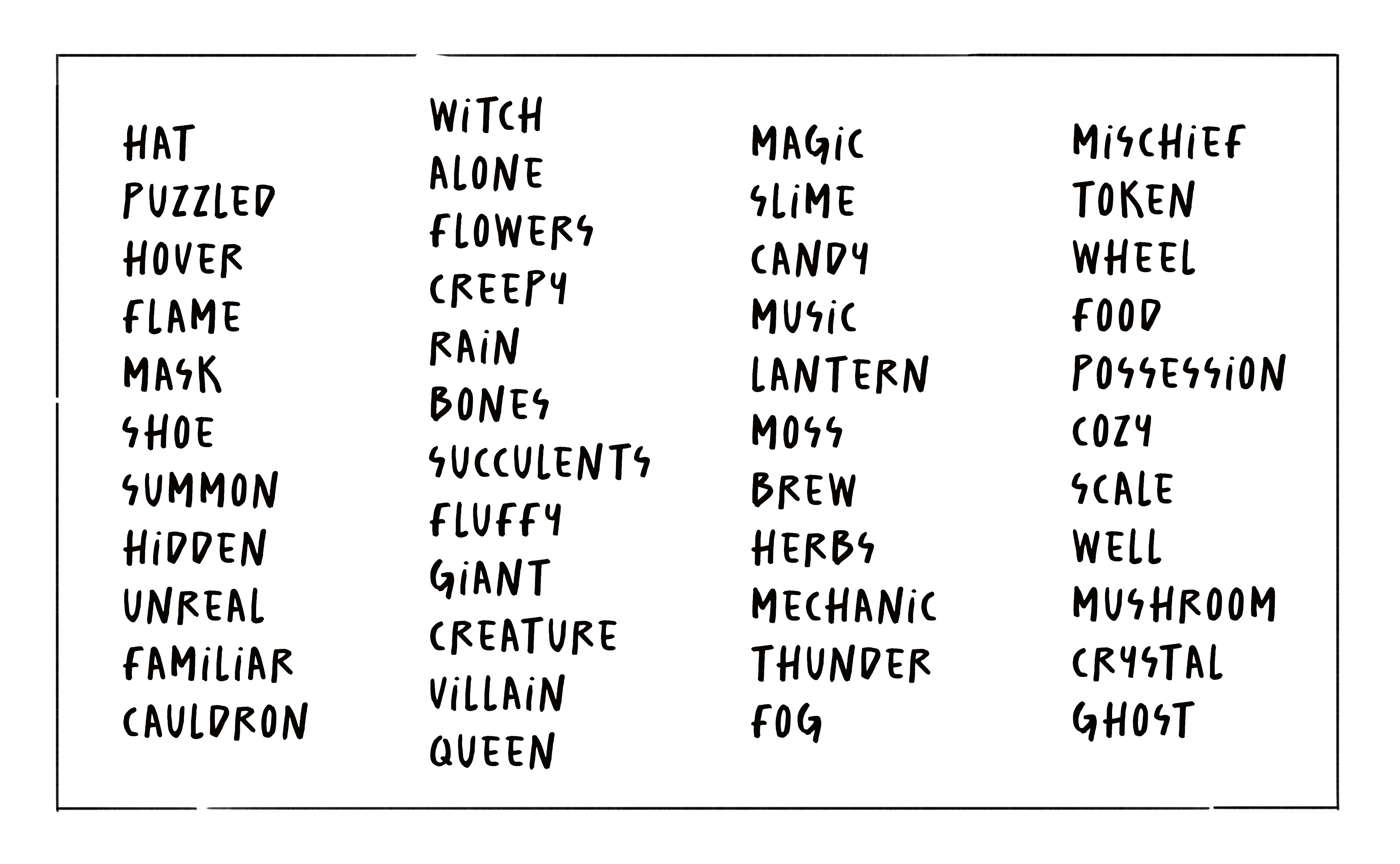
prompts For each assignment, you can find a list of
potential prompts attached. Feel free to adjust
them to your liking, mix and match, or come
up with your very own. The year is closing in
on the month of October. As I'm making this class
and I'm giving all of my illustrations a
little Halloweeny twist, see for yourself if giving
a challenge like this, a grand overarching
theme helps you, or if it creates
too much pressure. For the first drawing, I'm
using the hard brush pen, and my prompts are
hat and queen. When I set out to make an ink
drawing from a prompt list, I like to brainstorm
with myself a bit first. This can take different forms, but mostly I'm sketching out ideas on one side
of my book here. You can also make mind maps or write out
associations you have. But what if you don't
have any ideas? It happens that you begin
to overthink the prompt you got or that you just have one of these days where you
don't feel very creative. Things you can do to
inspire yourself in these cases could be
to put the prompt into Google or Pinterest
and see what comes up to look at art of
other people that inspire you or you might want to emulate or to be as
literal as you can. With the given prompt. When
I have come up with an idea, I sketch it out
in the right size on the new page and
then begin inking. You do not have to make complex illustrations with
four middle end background, but when you begin
inking your design, be mindful of things that are
in front of other things, you do not get in your own way. Here I work myself from the lab dragon and the
queen's face backboards. I draw the most
relevant parts here, heads and crown, before background elements or
things like the skirt. I mix a bit different techniques here to create minimal shadows, as well as textures. We have both small dark areas
for especially dark spots, hatching that follows
the form of the object, and cross hatching to imply texture of a head or
a different color. The brush pen allows for
dynamic lines and fine details. One thing I have learned
from this drawing is to figure out details
in my sketch as well. I did not think about
the queen's face and was not happy
with initial ideas which resulted in
indecisive lines and a bit of a messy
and unfocused look. But I like the
contrast I created between the bottom
area with dress and skulls versus
the central area with her sleeves
and face and hair. Versus the almost gradient like transition into the pile
of hats and the crown. It creates a flow. Pause for a moment. Pick
a prompt, start drawing. Remember that this
won't have to be perfect, not even pretty. It is okay to make mistakes, and it is okay to start over
or even abandon a drawing. Remember to share your work in the project gallery
whenever you are ready, and I see you for
the next prompt.
7. Prompt 2: My drawing number two will be
made with a ballpoint pen, and my prompts are
ghost and shoe. Let's take this prompt. Very little. Shall we
ghost and shoe? Let's see. Maybe there's a couple of curious little ghosts
inspecting a shoe, or a tiny ghost checking
out a huge heel. Sometimes it's good
to keep it simple. What do I love more than combining simple with
elaborate detail? Check out the ghost with their beautiful cowboy
boots. What do you think? Are they actually
attached to the ghost? Or are they just standing
there and the ghost likes to pretend they have
boots. We don't know. I'm using a cheap ballpoint pen. They come in a ten
pack for a couple of years. I just love these. I always have a
ballpoint pen with me. It doesn't matter if I lose one. The hair is just
so very reliable. Try out using all sorts of
contrast in your ink drawings. The contrast can be the amount of darkness
versus lightness. It can be big shapes
versus small shapes, simple versus complex shapes, or level of detail
in different areas. Here I am combining the
simple and big shape of the ghost here with a high level of detail
in the small boots. I'm separating the part
of the boot that is inside of the ghost from
the part that is outside. This is indicated by
the level of detail and the amount of pressure I'm applying and thus the contrast. I felt like this picture
was missing something because the ghost felt a bit too floaty on
the white background. I used water colors
and a lot of water to add a bit of a
black wash backdrop. A thing I've learned
from this drawing is to be mindful of the
overall composition. The drawings overall
appeal is in the contrast of
simplicity versus detail. It feels a bit stiff and could have profited from a
more dynamic pose. Take your time to work
on your chosen prompt. If it takes you 10 minutes, an hour, or three,
it doesn't matter. I'm only asking you to give it your undivided attention for a bit of time and see how
you progress and level up. Remember to share your work in the project gallery whenever you're ready and then I'll
see you for the next prompt.
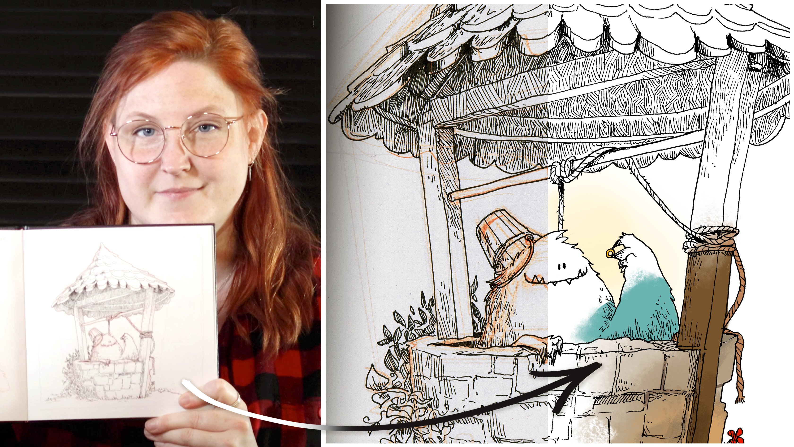
8. Prompt 3: For my third drawing
with a prompt. Well, creature, I knew pretty much from the get go
what I wanted to do with it. The monster has found
something shiny in the well. As I'm getting the
fine liner 0.1 ready, I would like to
point something out. Whenever I'm making
an under drawing, I start from the outside going inwards big shapes
before smaller ones, the bigger picture
goes over detail. But as I'm starting
the inking process, I begin with small parts and I'm working myself from the most
important elements outwards. Whoops, Mistakes happen. I did not think this through enough and I was too excited. I messed up this
part of the, well, I'm using a white acrylic
marker to cover it up. If something like
that happens to you, you can use wide
out or you can glue a little piece of
paper in the spot you want to fix and
just draw it again. No harm done. Moving on, I'm adding parallel hatching
to indicate fur detail and a bit of shading on the
stone inside the roof though, where it is darkest, I'm adding this criss
cross hatching. I really like the
look at crates and it is fun to make with a
fine tip of my pen. This drawing has taught me to be patient and persistent
because there were many moments in which I doubted my creative
decisions and cursed myself for going the time consuming path
or making mistakes. But I think it was worth it
and it turned out great. In the end, I hope you can tackle the drawing with an
extra portion of bravery. Don't get discouraged
when you make mistakes. Take it as an
opportunity to pause, review what you are doing, and adjust your way of
thinking or working. Please remember to share your work in the
Projects Gallery whenever you are ready and I
see you for the next prompt.
9. Prompt 4: With a soft brush pen. Ready? I'm diving
into the prompts for drawing number four,
Flowers and Color. I thought, hey, maybe you
challenge yourself today. You tend to do character
focused drawings and those are maybe intimidating
to other people. I don't know why not try to make a drawing
without a character. And I was sketching
out my ideas. With this in mind,
the thought behind my drawing is a focus
on composition, how things are
distributed on the page, how you can guide the eye, and creating a set up
of elements that look interesting and tell a
story without a character. I'm not an expert
on drawing flowers. Maybe I should have opened
some reference pictures, but I wanted to draw from
her visual library alder, things that my brain
comes up with by itself. When I think flowers and
the challenge myself, plants and flowers are
really hard to draw. All I'm thinking about what happened here and what created
this overgrown cauldron. Abandoned mid brewing, I
bet some powerful magic. The ladle is a very under
nose visual guide through the picture to the top of the cauldron until the very end. I wasn't sure what to add there, but then I came up with this
almost skull looking flower. Does that count as a character? I don't think so, but
maybe you disagree. I think actually
there's only two ways. You either start
with the thing you want people to look at,
you draw that thing. No. In between, is that just me? Something I'm taking away from this illustration is that it is okay to not have a
fully fleshed out plan and just go with the flow. I hope you're enjoying
this challenge so far and you know the drill. Remember to share your work in the project gallery
whenever you are ready, and I see you for
the next prompt.
10. Prompt 5: In this drawing, I'm using the cheap ballpoint pen
again, because I love it. For the fifth drawing, my prompts are mask and fluffy. The initial sketch gives
Batman needs a haircut, but I ended up liking the field, the very sturdy angular
shape of a mask, in combination with just very, overly hairy creature gives. I translated my
sketches onto the page, but something didn't
sit right with me. The motion didn't quite flow. I ended up redrawing the legs so many times
until I was satisfied. In the ink drawing process, I really focused on emphasizing
the different textures. Hair, fur, cloth,
and wooden mask. They all get a different feel, a different detailing
and hatching. I really like drawing wood. It's angular thickness and grain is just very
interesting to me. One thing I'm taking away
from this artwork is the fact that some drawings need reiterations
and adjustments. You have a great idea
but don't seem to get it right on paper. We
all have been there. Step away for a bit. Look at it. Mirrored. Try again
on a fresh new page. If it's not getting
there, finish it. Anyways, finished is always
better than perfect. Now please remember
to share your work in the project gallery
whenever you are ready, and I see you for
the next prompt.
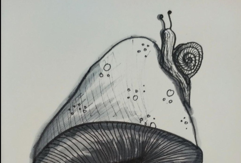
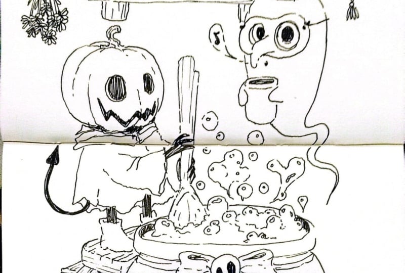
11. Prompt 6: Drawing number six is based on the prompt, summon and mushroom. I initially thought of a summoning circle where
mushrooms to the ritual, but I couldn't come up with something fun a group of
mushrooms would summon. I rethought the idea, who might summon a mushroom? Maybe a cook who ran out of ingredients before
they began cooking. What if this cook was a demonic creature
itself, full circle. I think a fun story idea can
really enhance a drawing. Executing the drawing brought a lot more detail than
I had in my sketch. I'm not sure, I'm
happy about it, but that's just
sometimes how things go. I think for the sake of
simplicity in my sketch, I should have drawn the final
image with a brush pen, but I went with a finer, which just gets me into detail
a lot more quickly than when I am almost forced to stick to big shapes with
a thicker pen. What this illustration taught me is focus on the storytelling of your idea and always
consider your tools carefully. I hope you have had a less frustrating process
for this one, but even if you did,
you're not alone. Remember to share your work in the project gallery
whenever you are ready. And I see you for the very
last prompt in the next video.
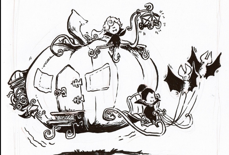
12. Prompt 7: Last drawing. Last
prompt. Are you excited? I worked with the prompt, hover and lantern for this one. I felt a very strong vibe for the Halloween
theme from these, the immediate idea of a hovering pumpkin
lantern came to mind. As I started sketching
it, I thought, hey, this should be a
hovering pumpkin carriage. Cinderella means Halloween. The carriage is
drawn by bets and the stuff driving our vampires. For the ink drawing, I'm working with a
bristle brush pen. Because it is using a lot of ink in comparison
to the other tools, I'm careful to work
from left to right, so I don't accidentally smug
the drawing with my hand. It's impressive how fine
this brush can work, and I enjoy combining black
areas and fragile lines. Also big fun squiggles, swirly things, and
happy little vampires. I also added a lantern
on top of the lantern, which looks like a carriage. The matter level in this
drawing is out of this world. I'm wondering who is
riding inside the pumpkin, Maybe a scarecrow or
just another vampire. The process of ink
drawing puts me in an especially
concentrated state. Every stroke mattered, and it was just such a joy to
see it come together. I think what I'm
taking away from this drawing is this joy, the pure excitement of seeing an artwork come together
from a blank page. And my idea, it is worth every
minute of time invested, every insecurity
encountered, every moment of frustration where you are afraid to put down
the next stroke. Enjoy this last drawing of
the Seven Day Challenge. Really savor it. You deserve it. Once you're done, please share
your work in the project, including your sketches
and exercises. Even if they are not perfect, they will be highly motivating
for other students to look at and will bring you a great
sense of accomplishment. Let's move on to some last words where I'm going to
wrap up the class. Good job.
13. Final Words: Well done. You have made it
to the end of the class. We have learned a
lot about drawing. And in being fearless
and tackling a prompt. If there's one thing I hope you take with
you from this class, then it is the little
spark of joy when drawing And really
concentrating ink. Drawing is not easy. You can be really proud of yourself for tackling
this challenge. Please remember to share
your beautiful drawings with us because I can't wait to see what you
guys came up with. Let me know if you
would like to get some feedback or if you need
any help along the way. Feel free. Follow me for
future classes and insights. I would like to ask you
for an honest review. This will help me to improve
the classes I make and your fellow students to choose if this class
might be for them. Thank you again for watching. Have a great day. I
see you next time.
 Vera Rehaag, Freelance Artist