Transcripts
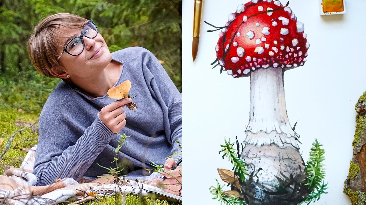
1. Welcome to the Class!: Hi and welcome to my class. I'm anesthesia from
the thrill of strata. In this course, I
will teach you how to transform your physical
paintings into products. In the real-world, we will
be making patterns here. Possibilities of pattern
design are really endless. And I think it's very rewarding
for every artists to be able to see your work on
products in the real world. To me, it always seems
like magic when I see my illustration printed on something and then want you to experience this magic tool. I created this class with painters and illustrators and traditional artists in mind, just like myself, with
years of trial and error, I figured out the method
that I personally use. We're making all of my patterns. And I also figured
out the program that works best for the kind
of work that I create. And that may be e create. For this class, what
you will need is just a PC with installed
Adobe Photoshop, and you will need a couple
of finished illustrations. If you don't have any
finished illustrations at all, No worries. Inside the class, I
provide ready to use free PNG illustrations that
you can use and play around. So if you're ready to see your illustrations on products in the real-world,
Let's dive in.
2. What is a Repeat Pattern: Hi and welcome back. In this lesson, I will explain
you what is a pattern, and we'll show you what
is a tile square and how patterns actually work in what do we mean by patterns? So what do you see on my screen
now is my final pattern, but we will be making in
this course together. And actually this
is a square tau, this is what we
call a square tile that our pattern
is composed off. And I will explain
to you what I mean. So I'm just in Photoshop now
and this is a blank document just to regular blank document
with my pattern in it. And now I just zoomed out and
said this is the document, this is my pattern square tile. To show you what is a pattern, I will grab this square
and I will just put it on the side and I
will duplicate it. And I will show
you what happens. So to duplicate, I just press
Command J and then I drag this pattern and I hold Shift to keep it
aligned to my square, and then I just release it. When I see these lines, these pink lines appear. And as you can see, this square matched
perfectly the other one. And they created a sort of a
continuous repeat pattern. And if I do the same and I
copy these two tiles again. So common J and I just grabbed and dragging them to the side again and
then release them. Once I see the pink lines, see this is a pattern, so we have a seamless
pattern here. As you can see if I zoom way in, you cannot really say where one square ands where the
other one starts. So this is why we call
patterns seamless, because our eye is
kind of tricks. We don't really see, we don't really notice where
was this initial square. So of course this is a
quite as simple patterns, so you can see where it repeats. So you see what mushroom, you see another
one, another one. And you can actually notice that all the elements
repeat the same way. But yes, that's how
the pattern looks. So if you delete all
of these squares, you see that everything is just composed of only one squared, just only one pattern tile. And I will explain you
what is the trick here? So if you notice, we have these elements that can cross the edge and
they get cut off. But what is interesting here is that if we cut a part
of this element, e.g. we will find this part
on the opposite side, and then the same
thing vertically. So our pattern, our elements, needs to be repeated
horizontally and vertically to be able
to create this illusion. Let me bring your
attention to something. So see this mushroom here. So as I told you, when we cut it here, we need to put this piece here. And then I see there is a piece missing here and here as well. And just take a look. We have them on
the opposite side. So on the upper
side of the square. And the same thing happens
with all the elements. So if one elements crosses just the left side and does not cross the upper
or the lower side. We need to repeat it
only horizontally, like we see this leaf, e.g. so we have a
duplicated only here. And the same thing with
this element, this leaf. We can find it here, but we do not need to
repeat it vertically as well because it does
not cross this line here. So e.g. what we were supposed to do with this Shantel mushroom because it crosses the horizontal axis
and the vertical axis. So that's why we need to duplicate it on
all of the sides. So basically that's
what a pattern is. And now you know how it works. And actually Photoshop makes this super easy
for us because v4, we needed to manually
position all of these elements and move them
and make some calculations. But with this new
feature that I told you came out with CC 2021, everything became so easy. So you will see that we can make patterns in
matter of minutes. Now, this is super exciting. And just one more thing I
wanted to tell you about the pattern tiles is that
I made a square here, but your title should not
be necessarily a square. It can be a rectangle. And the most important thing
is always the same that your elements should be repeated on the left side
and on the right side, and the same thing vertically, this is the most
important thing. So square or rectangle, it doesn't really matter. Now when you know what is a pattern and what is
a pattern tile square. In the next lesson,
I will show you some basic types of patterns and will explain you what is the pattern that we will be
creating in this course? See in the next lesson.
3. Types of Repeat Patterns: Hi and welcome
back to the class. In this lesson, I will show you four basic repeat pattern types. So these are not the
only ones that exist, but I just wanted to show you these four really basic ones that you can try on your own. And I will show you
what is the type of pattern that we will
be making in this course? So I just zoomed in so that you can see my
presentation better. And what I will show you here is the original motif that I will use to explain this concept. So just this couple
of mushrooms. So let's say this is our
motif that we want to repeat. The first pattern type I will show you today is a
full drop repeat. So a full drop pattern is the
most basic pattern repeat. So it's very simple to
be able to create it. You just need to repeat your subject horizontally
and vertically. So you just copied, pasted, copy and paste it. And this is the scheme
that how it looks, and this is how it will
look without this grid. So put these grids just to make it easier for
you to understand. So this is the most basic
repeat pattern we can imagine. So you just duplicate
your image and you do the same thing on the lower row. So very, very easy. The next repeat pattern
is a half drop repeat. So half drop repeat is quite similar to the full drop repeat, but it breaks the
uniform look that the full drop repeat
can sometimes give. And to be able to create
a half drop repeat, you just need to copy the motif horizontally and then align the top of the second motif to the center of the first motif. So I hope this scheme helps. So as I said, just like
in the full drop repeat, we have these two elements
and then we don't align the next row
elements to the first one, but we put it in the middle
of these two bricks here. So that's how it works. And this is what it gives. It gives a more of
an interesting look. And it does not look as maybe repetitive and a
bit boring like here, also looks a bit less obvious. So this is kind of another way of creating
a more dynamic pattern. I would say this was
the second type. The third type is a
mirrored pattern. So to create a mirrored pattern, you need to duplicate your motif in a row and then
flip horizontally the elements from the second row so they can face the
opposite direction. So this is very easy. This is exactly like
a full drop pattern, but the second row, as you can see, it's
flipped horizontally, so it's mirroring the first row. So very easy, and that's
how it looks like. And then the fourth
type of patterns, and actually the one
we will be creating in this class is a task or
random repeat pattern. So in this kind of patterns, the elements of the design are scattered within
the repeat unit. And the unstructured nature
of a toss repeat pattern actually gives a more
organic and natural look. So I will show you
here what I mean. So as I said in the
previous lesson, we need to position the
elements that way so they are repeating on the
left side and the right side, on the top side and
on the bottom side. This is exactly
what we have here. So this mushroom, we see that this upper part is cut off
and we see this part here. So to be able to create this kind of patterns,
first of all, we just position the elements crossing the board
of our tile square. So what you see here is
actually our tile square. And then you have
this empty space here that we will
just need to fill with other elements
so that we don't have this empty space here. And the elements
that we place here, we can actually place
them any anyway. So that's the final result. So as you can see, these are the two mushrooms. We find them here. And then I just put these
elements in the middle. So I filled this empty space here with this
mushroom, I flipped it. And these two leaves, this acorn in this one relief and this kind of
tricks your eyes. So this kind of
patterns are a bit less easy to notice than e.g. these ones, or these ones, or especially these ones. So this one is super obvious. And then this kind
of patterns give a more intricate look
and more organic look. So we will be creating a task or random
pattern in this class. So I hope if you've never
heard about patterns, now, you have an idea what kind
of patterns we can create. And if you want to
have this document, if you want to study this
document a bit more, you can actually download this PDF in the class resources
if you want to keep it, if you want to study the basic repeat pattern
types on your own. So in case you miss something, in case you want to have this document and
get back to it, just go and download the
PDF that is there for you. Thanks again, and I will
see you the next lesson.
4. Photoshop or Illustrator?: Hi and welcome
back to the class. In this lesson, I will explain
to you the main difference between Adobe Photoshop
and Adobe Illustrator. It might be very confusing
in the beginning, which program to
choose and which programs suits your needs. Photoshop is a pixel
based program. We have two apparently
identical images here, but there is a
significant difference between these two images in, I will show you what is it. So if I zoom way in
on this left image, which is a pixel-based image, so a raster image, if I zoom very, very close, you
will be able to see that this image is
made of pixels. So all of these tiny squares are actually individual colors. So each pixel, each
square has its own color. So before I explaining all the advantages and
disadvantages of pixels, I just wanted to underline
this key difference. So raster image is
made of pixels. So these images are
typical to Photoshop and Illustrator
works with vectors. So this is a complete
different thing in the, I will explain you why
vectors are shapes and lines. So when you see me zooming
way in on this image, you can see that my image
is not composed of squares, but it's made of these
little shapes here. So each color now is represented by each one of
these tiny individual shapes. And if you zoom way out, we don't even realize what's the difference between
these two images. The advantage of
vector images are that they are famous for
being scalable. So no matter how big
this image is printed, it will not appear blurry. The only thing is even vectors have their limits in a
certain way because yes, you can zoom in and you can print this image super
huge on a billboard. But you will still be able
to see these little shapes. So in this case, your image will look
less blurry, e.g. let me show you here. I'm zooming same distance
on my left image, which is made of pixels. See, it looks a bit blurry. When I zoomed that close. Without zooming
out, I'm going to the right image where I
have my vector-based image. And as you can see, this image does not look blurry. But it looks a bit funny though. We don't see the blurry effect, but we can actually distinguish all these little
individual shapes. And we kind of lost this realism that we
initially had here. So this is something that
vectors cannot overcome. That's why vectors are
suitable for flat images, e.g. for flat graphics, and something that you
draw on your computer. Something more
basic, I would say, and less detailed and without
a lot of color transitions. And now I will talk a
bit more specifically why I encourage you
to use Photoshop. If you're someone
like me and if you create this kind of
illustrations here. So for instance, if
you want to create a pattern using
your illustrations, you can totally do it
with both of these files. So actually how I
obtained this image, I just vectorized
my raster image. You can do this in Illustrator. But let's understand what's
the purpose in this case, I don't think it's very logic to vectorizing these
kind of images. If I click on this image, you see that it became blue. This blue is actually all of the outlines of my
individual shapes. There are thousands, hundreds of thousands
maybe of shapes here. This means that this kind of image will be terribly heavy. And imagine that this is just only one element
from your pattern. So my experience, the
result of this will be a huge file size that sometimes becomes really
impossible to work with. You can do some
adjustments and make these shapes a little
bit less complex. And you can even
reduce the number of these shapes and colors, but it will inevitably bring you to a flatter looking image. So if you want to keep this
kind of level of details, there is no much you can do in Illustrator to obtain the
same kind of re-listen. But having. Lighter weight file. And there is really
no big sense to it, because if you scan your
images at a high resolution, you actually don't
need most of the times this opportunity to pay more to print your
file on a billboard. I mean, if you're aiming
specifically to that, maybe you should think about it. But if you want to print
your image quite big, even for a wallpaper or fabric, you actually don't need
to scale it infinitely. You just need to scan it at
a good resolution. So e.g. 300 DPI or even better,
600 DPI minimum. This way, you can print your image at quite
a large size, e.g. this original painting
was about 20 cm high, but if I scan it at
600 DPI or 1,200 DPI, I can actually print
this image even on a bigger size and it
will still look great. The other thing you can try to, is to paint bigger. E.g. if you know
already that you want your image to be huge, e.g. you want to print beautiful watercolor
brush strokes on a huge size for a wallpaper. I will suggest you
actually to not paint these strokes
with a tiny brush, but to actually paint these brushstrokes are
ready with the big brush, maybe on a quite a
big sheet of paper. So this way you already have the advantage of
having a big image. So if you scan it at
a good resolution, you can print it even bigger. So basically that's
the principle. The other thing I wanted to
talk about here is about the versatility and
the possibility to make changes and
adjustments to your images. E.g. if you've transformed your raster image into a
vector image, it's good. So it's a vector. But if you want to
slightly change its color or make any
tone adjustments, maybe wants to make
it lighter or darker. There is nothing you
can do in Illustrator. So if your image is vector, you need to work
with it as it is. There is a way of
recoloring simple subjects, but there is no way
you will be able to recolor this kind of
a complex image here. On the other hand, if you want to do
something like this with a raster image
in Photoshop, it's gotta be
actually super easy. So I'll hop in Photoshop now and just show you how you
can do it there. So e.g. if I want to make this image
darker and she's very easy, I go to my Adjustments
layer and I can instantly change the lightness. I can make my image
image lighter. I can make my image darker. I can adjust the saturation
of my illustration, e.g. so you can play around
with your images. And if you want to
change something, even on the very late stages, Let's say you have already
done your pattern and you realize that maybe
these elements does not work quite right. One with another. You can actually manually
adjust elements or parts of it. So I hope now the
difference between these two programs
is clear to you. I don't say that it was
Twitter is a bad program, but for other kinds of artworks. And I will show you
which ones, e.g. here I have my forest
pattern collection that I made some time ago. This dear pattern is made
in Illustrator and I actually designed it directly in Illustrator with
my Wacom tablet. See that these shapes
are not that complex as those we have on
this mushroom here. So as a result, my image does not look as
realistic as this one. And this is not what
I'm trying to do here. I don t want to imitate
the reality here. What I want to have is a decorated look and maybe
more like a stylized look. So if you're creating
something more like this, something very flat, very, maybe a little bit naive. I think that Illustrator
will be perfect for you. And that's why I
chose Illustrator to make this pattern
because it was much more logical and suitable
for this kind of style. But when you want to use
something very realistic, like your hand painted
illustrations, photoshop will be
your go-to program. I really hope that
now you will have less doubts about which
program to choose. If you're a bit tired of a technical side of
things, don't worry, because in the next lesson, we will take care of a more
creative part of our process. And we'll start making
a mood board and start thinking about our color
palette. I'll see you there.
5. Choosing Elements and Color Palette: Hello and welcome
back to the class. In this lesson, we will finally do something more
creative and we will start to think about
the color palette that we want to use
for our pattern. And if you have some
painted elements already, I will use it the
method that I usually use with my own artwork to select some
elements that I think will work nicely for my pattern. And I will also show you how I choose my color
palette if I just have an idea in mind and I want to paint my
elements from zero. So we are in my Instagram now, if you don't follow
me there yet, you can do say you
can find me by tapping that tutor
dot illustrator. And I post lots of
process videos and pictures and other
inspiring stuff regularly. So I think you will,
you will like it. So what I'm doing here, I'm just taking a
look at my feed here. And it gets me instantly some ideas of what kind of
artworks I want to grab. And I will then
find these images in my computer by my experience, just to function this way, I like to take a look at my feet because I know
everything is there, all my artworks are there. And it kind of gives
me a quick overview of what I think it can
work well together. So I already have an idea
of my pattern in mind. I know I want to make
something forest inspired and autumn inspired, and I definitely want to
include mushrooms there. So I will start to pre-select the images
that I think will work. I will grab the mushroom. So what I do, I just
do screenshots. So I'm pressing Command
Shift four, my Mac. And you see there's this
little cross appeared and I can drag an
area and drop it in. It will instantly give me a screenshot that
you now see here. If I just don't do anything, it will appear on my desktop and I will
grab it then from there, I will just keep going this way. I think I like this
mushroom here too, and we'll make a screenshot
of this piece as well. And basically that's
what I'm doing. I'm just scrolling down and looking what I
think might work. I think I will take
this plug Eric Command, Shift four again, and
I'm making a screenshot. And that's just the
way I'm doing it. Sometimes I have
the same subject many times, e.g.
flying Gehrig's. But I think I will
just pick one or two. Like this central mushroom. I have this flag here too. Maybe we'll take a screenshot of this one as well and we'll
see if we want it or not. I will grab this composition. I painted it with the
pattern already in mind. Even the way I placed the
elements on my sheet of paper is already
working as a pattern. I will explain you
later how you can also paint with
patterns in mind. So if I was about
to paint something from just from scratch and I knew I wanted
to make a pattern. I will paint it in a certain way and I will explain you how. Next one, I think I
will take this acorn. So it's also very important
in your pattern to have elements of different complexity
and different sizes. So e.g. I. Will not grab only
very complex subjects like this one because
otherwise it will be boring. So the main rule is that he
should have complex subjects. And usually these are
the biggest subjects, medium subjects, so medium-size, medium complexity, and then small and easier
subjects like the acorn. So you should have these
three types of images, and this will make your pattern richer and
look more harmonious. And it will just give you
the diversity necessary to obtain a visually appealing and
interesting looking patterns. And yes, I want a definitely
want to use these leaves. So again here, I actually painted these from
my own picture. So I put the leaves
in this composition. So I already
composed my picture, my illustration directly
with my leaves. I placed the leaves on
a white sheet of paper. I took a picture of
it and I painted it. I really like how
these look altogether. So I think it's very natural. There's a lot of movement. Some of the leaves are
crossing each other. So I think this one
is really nice and perfect for patterns because
we have different leaf size. So we have a big one mediums
once and the small one, and they all will
work nicely together. So there's movement,
there's a dynamic here, and they have different colors. So we have yellow, orange, red, kind of a lighter
yellow, dark one. So it will make a very
interesting composition for us. So I will definitely use these. So I will make a screenshot too. And I think it might
be enough for us. I will just continue
making a quick tour here just to make sure I don't
want to grab anything else. You can also include animals
in your patterns, e.g. I think this squirrel will
make a very nice fit to, but I think I want to
make the fly agaric, kind of a main character
of this pattern. So I think if I put
the squirrel T, it will not be very clear. What is the main subject, what is the secondary subject? I think I will just keep
the fly agaric as main one. I think that's it. I think we have
enough images here. So now I have all
of my images here. And what I will do, I will just put them in my new folder, which is called
forest pattern ideas. Grab these, all, drag and
drop them to my folder, and then I open the folder in, place them on a white
sheet of paper. So I will open a
Photoshop document. So I go there, I opened my Photoshop and now I just create a blank document. There's my pattern here already, so it doesn't matter the size. I think I will just take a normal A4 format may
be horizontal ones, so I think it's good
Create. Here you go. Now what I do, I just place
all of my images here. So if you put a bunch of these, it will give you a preview
and then you need to click on Enter to confirm that you
want to place the image. So I'm just confirming
many, many times. So that Photoshop now. So I really want all
of these images there. So now what I do,
I want to reduce them so I can see
them altogether. So to do so, I just select everything, press Command T or Control T. And there is this square
that appears and it allows me to just
drag by holding Option and reducing the
size of these images. And you need to hold option to be able to scale
these proportionally. And so now I just
can drag all of these images side-by-side
and see what they think. I'm sliding this these and to be able to keep them in line, I just press Shift. I think I want to put one more panther cap here
to see how it looks. This is the panther
cap I was looking for. I will make one more
screenshot. Here you go. Close my Instagram, it
put it here directly. You can also do this. So now I have a pretty good
overview of what I have. And I think I have some repetitive
subsistence Definitely. So these four gags, I don't need all of these. So I think I will
just use this one. I don't think it will work
good with the small one. I think it's gonna
be too repetitive. So I actually want to create the main element by combining
these two fly chaotic, so a normal fly gag and
then a panther cap. So I think I will
use this one also because this is a smaller size, but it's still pretty
detailed and I think it will make a nice
match with this one. What else? I think I wanted
to Shantel my stream. I think I will take this one and maybe I will
use this mushroom. I'm not sure yet. I think it can be
a bit too complex, but I will grab it and see if
I wanted to use it or not. I will definitely use an acorn. And I will use all of this, of these elements
from the composition. So we already have
the mushroom here, and I especially
want this pine cone, the leaf and this acorn here. I will take the leaves for sure. I don t think I will
use the bleak mushroom. So again, don't try to put all the pretty stuff you
have in one artwork, in one pattern
because you can make many patterns using
your illustrations. These are my
pre-selected images and I will just go and find
them on my computer. Later on, I will not
make you watch this. Let's talk about the
color palette here. I also wanted to talk why I chose all of these
elements here. So I had a certain
color palette in mind. I wanted to have quite
a lot of warm colors, like the ones we
see on these leaves and on the cap of my mushrooms. And I wanted to have a few cooler elements like
this green leaf, e.g. and maybe this pine
cone here that is a bit less saturated
than the other ones. So that's what I had in mind. I had a warm color
palette and contrast. So this is something
you should look for. I think all of these
will make a nice fit. So now I will show you
one more method I use sometimes to find inspiration and just to come up
with a color palette. So I already have a certain color palette
on my Instagram. So I use it a lot of wood, I use a lot of warm colors. So I already have this in mind. And when I go to Pinterest, because that's where I like
to find my inspiration. So this is my Pinterest. I have lots of inspiring
stuff here on my Pinterest. So check me out. And what I usually like
to do is just to tap e.g. autumn color. Palette. And it already gives
me some ideas. This is mine. Wow,
I love this one. This is a pretty image. So you see it already gave me some examples of the color
pallets you can use. So here, for instance, you already the colors that
the pre-selected colors. And then, yeah, this
all looks really nice. So you can choose
something more of a muted color palette
like this one, which is very pretty to
something warm like this, or even something like this. This is more the
principle that I'm using. So you have cooler colors
like these greens, and you have warmer colors like these rust colours
or orange colors. It looks very nice together. So there's really a whole lot of things that you
can choose from. What else you can do. You can actually grab a picture and make a color
palette from a picture. So e.g. I. Will take my own picture. I just put it on my desktop. I go and I put my image in Photoshop document
that we just created. So what you can do, you can go and actually see what colors are used
for this image. I will use a eyedropper tool. So it works like a color picker. So you see this circle appeared. I can just click once. And here, see there
is a color period. So it means that I
use this color here. So you can click around, you can see the
colors that you like. So e.g. I. Like this yellowish color. What I will do, I will
grab my brush tool, create a new layer, and paint with this new
color to have it here, and to be able to make
my color palette. So I will take the
eyedropper tool again. I like this dark brown as well. So I will put this dark brown
color on my palette too. Again, I'm just painting with my brush back to eyedropper. Think I like this kind
of a red brown as well. It looks very nice too. Then we have a few greens here. So I think greens are
important to have contrast to green
and maybe yellow. I like this saturated
yellow here. So I already have five colors. And why we're making
this exercise. So if I need to paint all of my elements from
zero and I just want to get inspired and I want to have the idea already in mind
of what I want to create. It's just so much easier. I've already having a
certain color palette that you want to stick to you. Because if you just
start to paint random elements without
an idea in mind, you can easily paint a bunch, even very pretty stuff, but that will not
look well together. So that's why we already think about the
pattern we want to make and about the color palette we want to use for our pattern. And I think this
is just way more efficient than just
randomly start to paint. If you already have
a lot of paintings, you can definitely go
and choose from there, or you can choose the
ones you want to use. Let's say, I know I
want to use central, but I don't have other elements. I know. Okay, I have the yellow already. Have the yellow and I will
paint something darker. So maybe I'm bullied
mushroom using this dark color and
maybe an acorn. So I'm making a color palette really helps you to guide
you when you painting, when you prepare your elements. So it doesn't mean
you need to use only these colors to
paint your composition. You can definitely
use other colors to. This exercise really
helps me to start the painting process with a clear idea in mind
and a clear plan. What I know, I want to
make an atom pattern with different elements will
have different complexity. So complex elements, easier elements and
very easy elements. And I want to make them
have a different size. And this is the color
palette that I want to use. When you have all these
elements in mind, it's just gets
very easy to paint exactly what you
want and make it all look together
well in nicely. I think it was helpful
and that now you will have a better idea of how to approach making patterns. And in the next lesson, I will show you how I paint my elements with
patterns in mind. So I will not paint
very complex elements here because we don't have
time for that in this course. But I will show you the main principles and
I think this will be very helpful if you want to paint your images
from scratch. So I'll see you in
the next lesson.
6. How to Paint Elements for Patterns: Hi and welcome back. In this class we will
do a bit of painting. Like creative stuff begin, I will just make
a quick overview of my art supplies here. So for today, we will be using a normal watercolor sketch book. So this is a 300 gram paper. I'm using a watercolor set
by edgeR, just 24 colors. I'm using a few brushes, that medium one and a small one. These are synthetic brushes. I'm using a pencil,
just a normal pencil. I like working or and that's it in I have my
ceramic palette here, a jar filled with water. So that's all we need. So today I will show you how to paint with patterns in mind. So what I mean by this, if I was just about
to paint something for myself without wanting
to make any pattern, I will probably put it
right in the center. I will make maybe a straight subject and I will
just go from there. But what makes an interesting
pattern is dynamic. Look, dynamic composition. And it's nicer when
you're elements look like they all were
made one for another. And there's a particular
way of painting that will help you to
achieve this effect easily. First thing first, I
want to make a list of all the elements that I want
to paint for my pattern. So as I said in the
previous lesson, we need to have big elements
and complex elements, medium elements and
small elements. So don't forget this. You need to have these
three types of elements. Big ones, medium
ones, and small ones. So e.g. a, big element
can be a flag Eric. So I will already kind of draw
a schema applying medium. One can be a leaf, Let's say elif and small
one can be an acorn. With this super quick scheme, we already have in mind
what we want to paint. What I like to do
next is to kind of make an outline of how
I imagined my patterns. So kind of a vision
of my patterns. So I can make a square here. And I can really just play
around and imagine how I can place my elements
in this square so that they look nice altogether. I'm just outlining
my mushrooms here. So I will already put a
couple of Lego bricks here. So you see I'm sketching
very quickly and not caring all about
details and all this stuff. Next, I need to make these
elements can move altogether. So you see the
first thing I did, I placed the flag guy
is not straight on my, not straight at my
sheet of paper, but I gave them an angle. So see, this is the
direction where they go. So this already gave me kind of movement here in my pattern. Now I need to place
other elements. So this is the
biggest element here, so I will even outline it
with this circle here. And let's say this element can also repeat here and maybe here, something like this, then I can think about medium elements. So let's say I want to place one medium element here,
probably one here. I want to make this leaf here. And the important
thing is you see, I gave this element
and movement to that. I'm not painting it
straight in this one. I think we go in this direction. If you want to get
an organic look, try to keep this
in mind to paint and give this curved finishes
to your illustrations. Even to mushrooms. Actually you can paint
a mushroom like this. So this mushrooms
will look very, very nicely for a pattern
because you are ready, gave them this kind of
a curved line here. So this is very important to straight lines will make
you a very regular, a very rigid pattern. And if you use more curved
lines, organic lines, it will help you to build the pattern and naturally create the movement
inside of your pattern. So now, when I have my big elements and medium
elements like the leaves, I think I can place a few
small elements like acorns, so I can really place
a lot of these. So that's the other principle. You need to use a
few big elements. So I just have 123
more medium elements. So I have 12345
already and I can even put more and a
lot of small elements. So I will put a lot of acorns just to give them more
interests to my pattern. And more mushrooms here. Now you know the principal. So this is just a rough
sketch of what I want to do, but I already know what kind of pattern I want to create here when it's
coming to painting, what we just did in
the previous lesson, we selected the color palette. So what I like to
do when I paint, I actually like to put my color palette on
my piece of paper. So to do so, I will
just grab my brush. I don't have to use the exact
color palette I selected. There are my computer, but I can play around with my watercolors now
and mix a few colors that I really liked
that I think can work well with the whole
idea of my pattern. So make sure you have a few
light colors and make sure you have also some dark
and medium colors. So this is very important too. I think I will use something
very light like this and something more dark
like a darker brown. So this will be one
of the darkest ones. And maybe I also like to
use this super dark colors, like almost black
colors for the details. So I will use a thing that
black tube and then crumbly, I will use some reds, oranges, and then a few greens. So it doesn't mean that I will be using all
of these colors, but I'm placing on paper what
I just did in my computer, what kind of ideas I had, what kind of mood board I did an interval just
really helped me to start painting with
these basics in mind. So now I have the general
idea of all the colors that I wanted to use
for my pattern here. And now what I will do, I will just make a
super quick scheme. I will not paint the
elements here with you, but I will just show you how
you can paint your elements so you don't need
to paint them this way already placed on a pattern, but you can have this
scheme to be able to paint these on your paper. So let's say
something like this. And then I want to leave. And I will make like an oak
leaves, something like this. So I'm not really trying to make something super realistic. This exercise is just
to show you how I use this color
palette in practice. So how I will use it
actually my illustration. So I will start from the leaf, I think it because it's
the easiest subject. So I want to use all of
these colors for the leaf. I will put one more leaf here. You can give it the same curve
because actually you can then reflect it and
rotated in your Photoshop. So it doesn't matter if your, all of your elements
go in one direction. Like it doesn't really
matter at this stage. I want this leaf to
use these colors here, and I want this leaf to be
more like using these colors. So let's try some lifting off some of the paint just to create Illusion of
these veins here. This was more painted with
this green color palette, and now I will paint this one with the orange color palette. If you want to learn
more principles about how to paint
natural subjects, were to start from how to make a drawing in all of this stuff. I highly recommend you my previous class where I teach how to paint a
realistic flag, Eric. This is a one-hour course
here on Skillshare. It's very easy even
for beginners. So I teach you my method of
painting realistic fly Gary. So since these are already
looked very different, so this is more of a green leaf and this is more
of an orange leaf. So this is very
important because if you just paint all the
leaves orange, I think it might be a bit boring to see only
orange leaves. So try to buy Ryan at only
the shape of your elements, but also their color
and their shapes. So this is very, very important for a pattern. Here you go. This
is just the idea. And now when I
paint the mushroom, I want to remember that
the cap should be read. So I already made the
basic outline of the cab. You don't have to create
something super intricate, super realistic to be able
to make a nice pattern. So very quickly I just
created something like this. And then I want to just add some shadow so I
will mix kind of a gray color that
I don't have here, but it's something like this. So just in a matter of minutes, we created something
looking like a flag. Then I will play around
with texture here, put some strokes and just
give the idea that there is a MOD or something attached to the stem
of my mushroom. Maybe we'll put some
green moss there. So this is just like a speedup process of me
painting the mushroom up. I'm teaching you in that
class I was talking about. So this thing I'm
showing now is very cool if you want to
create something quickly, but if you want to create
something more outstanding, something more
realistic, you can go and watch that class too. I think you will
love it. So see, we already have this
nice difference here between all the elements that we have, the tonal difference. So we have a light element that is the stem of my mushroom. We have darker details
like the one we see here on the bulbous
part of my mushrooms. And here you go. And then I can paint an acorn. So these elements will be enough to already
make a pattern. Or this scheme can help you to paint more complex elements
with patterns in mind. So again, don't forget
about the curved lines. When you draw your sketch
already think about this. This is especially
important for the leaves, even for an acorn,
same principle. So think that they should be all connected in all kinds of turning around on your pattern and this curved line
will really help you. And then one more
important thing, big elements, medium,
small elements. So try to keep this variety. Don't forget about this. And then the color palette, make the color
palette on your sheet of paper in the beginning
and it will guide you to paint your illustrations with already the idea of the pattern that
you have in mind. This way you will not get
lost on your way and you will make a more harmonious
and good looking pattern. I hope you enjoyed this lesson. So in the next lesson,
we will start to build our pattern and let
the magic happen. See you there.
7. How to use Masks: In this lesson, I will show
you how I prepare my elements for print and how
I separate them from the background using masks. Masks can seem a bit confusing, especially if you're a beginner. But I promise it's not that
complicated as it seems. If you've seen my last
course here on Skillshare, where I teach you how
to make a sticker. This course is actually
all about separating your illustrations
from the background and preparing them for print. So if you want to
learn more about it, you can go and watch
that course as well. And in this lesson, I will teach you another method
that I find very helpful. And it's also nice pretext of teaching you how
to work with masks. So just stick with me and I will show you my process
from start to finish. So I have this pine
cone illustration here that I want to separate
from the background, and I just drag and drop
it to my Photoshop. And here we go. Now, what I need to do
next is I need to go to my Layers panel and I just
click on Create New Layer. Then I drag this
layer underneath my pine cone so that my
pine cone is on top. Then I just grab my paint bucket tool and I
click on my background once. And I colored my
background with black. So you don't actually
see it now on my screen because the pine cone layer is now on top of my background. But if you see underneath, the layer itself, got
colored in black. So the next thing I will do, I will grab my
magic wand tool and make sure this time you're working on the pine cone level. And I just click once on
the white background. And as you can see,
it got selected. And I see these little lines that kind of started
to run there. What I do next, I press
on the Mask icon. So don't be afraid, this weird thing just happened. So like you see on my screen, our pine cone gut kind of cut off of the white background. And this is the first step. So it's okay if you
see this right now. So what do you need to do next is staying at the same level. You will press Command
I or Control I on a PC, and this will invert
your selection. And as you may notice, our pine cone got back and we just got red
white background. And what it allows us to do is to instantly in
delete the background. If you notice, we
still have some of the weird bits though
that we need to delete some of the parts of other illustrations that
we don't want to see here. So to be able to erase this, I will actually not
use the eraser tool, but I will use my
paint brush here and I will show you why
masks work this way. You can paint with
black, war, with white. And depending on the color black or white
that you're using, you can delete some of the
areas or restore them. Just select the
thickness of my brush. And if you see there, my black color is selected. So I just paint with my black and it kind of
works like an eraser. So you see me erasing
these parts of my illustrations that I
don't need so very quickly. And now, if I want, I can change the
size of my brush. I can change the
hardness as well. You see my outline of my pine
cone is a bit too strong, so I want to make the
edge a bit softer. I select a smaller brush size. I just paint with my
black color again. And as you can see, it kind of gives my
edge a softer look. So it's much more
convenient if you use a mouse here or if you
use a Wacom tablet. So this way you have
much more control over what you're doing. But if you're quite skilled, and I have to admit I got quite used to work just on my laptop. So I just doing it
with my finger. So if you train yourself, you can totally do it as well. And now I will show
you what will happen if you select white
color instead of black. So to switch, you just need to click on this little arrow. And now you see that the white
color is on top and black. It means white is selected. And if you see me painting now, you see that e.g. I. Will show you a
quick example here. So let's say I deleted way
too much that I needed and I want to restore this area that I just accidentally ruined. So what I do, I select
my white and I paint again with it and look
how magical it is. Parts of my pine cones
start to appear again so I can actually restore the
areas that I'm missing. So that's the basically
the principle of working with masks, black conceals,
and white reveals. So that's exactly
what's happening here. I'm painting with white
and you see all of the parts of my pine cone that started to
appear again here. So that's how masks work. I will just go with my
brush and I will adjust all the outline of
this pine cone if you just use it right away
without adjusting your edges, you are edges can
be a bit too messy. And you see these little bits of white and irregular edges
that you end up with. So we don't really want to
have this kind of result. That's why I always like
to make my edges perfect. So I will just let you
watch me finishing on working on this pine
cone illustration. So what I do now, I need to export my image
as a transparent PNG. So to do so, I just unchecked my
background layer. So you can see that there is no icon near my
background layer. So it means that this
layer is invisible now. And you can see that
we have a bunch of these little gray
squares as a background. And this means that actually our background is
transparent now, and this is exactly
what we need. So I just clicked
on Save a copy. So this is another way
to export your files. So you can either do export or what I like to do
is saving a copy. So click on Save a Copy and select PNG in the
format dialog box. And then I just name my file. I put pine cone and I
click Save. I just click. Okay, So I want to save it
as the large file document, and when it's ready, I will find my pine
cone on my desktop. So now I just drag and drop
it in my Skillshare folder. So I really hope that you
will find this method useful. I personally use it quite a lot. So now when this new method, I will see you in
the next lesson.
8. Best Photoshop tool for Pattern Making: Hi everyone and welcome back. In this lesson, I will
show you how to make a pattern using Photoshop with your hand painted
illustrations. So here we have all
of the elements that I want to use for my pattern. This is the mushroom
that we've painted together in one of
my previous classes. And they also have some
other elements here. Some of them I just
showed you how I separated from the
background and now you know, one more way of doing it. So basically you need
to make your elements first and then we can start
to work on our pattern. So let's open Photoshop. I have Photoshop CC 2021. And actually what
I wanted to show you is this new feature
that Photoshop has. This feature is available
in CC 2021, newer versions. So if you have CC 2021, it's an amazing thing
because this new method that photoshop gave us will literally save you tons of time. So let's jump in. So we need to create
a new document first. So I click on File New. And here it allows me to
select different sizes, but I think I will just
put here a custom size. So I will put 3,000
pixels by 3,000 pixels. And the resolution, I think
I will put 300 DPI and just in case I want to
print this later on. And here you can choose
between RGB, CMYK and others. I mainly work with RGB and CMYK. So if you want to
print your pattern, you should select CMYK if you want to use
it only digitally. Let's say you want to post it on your social media,
then choose RGB. I will just choose RGB for this tutorial and
I click Create. Now I have my white
document here. So if you're new to Photoshop, I have a tutorial where
I actually show you the basic Photoshop
tools that I usually use in my work and in this class, which is a Skillshare class, where I teach also how
to make a sticker. In this class, I show my method,
photographing your work, bringing them to Photoshop and separating them from
the white background. If you want to learn
more about this, you can check out
my previous class. We already have our
elements for the pattern. So in this lesson, I will mainly explain
you the tools that we will need to
create this pattern. As you can see, my
background is locked now, so I will just go and unlock it. That's just the way
I prefer to work. So before to be able to make a seamless pattern in
Photoshop, you had to. What I usually did, I used a template that
I pre-built myself. And what you were
supposed to do is to move your elements from left side to right side from top to bottom, and vice versa, to be able to
create this repeat pattern, which was okay, but it
took much more time. So this new feature allows you to make absolutely
the same thing. But in a fracture of that time, this is amazing and let's
discover this tool. So what we will actually do, we will access the pattern view. And to be able to do so, you just need to go to view and then you have
it pattern view. So you just click
once and you see this little warning
message appeared here. So it says that this
pattern preview works best with smart
objects and it's okay, and I will explain
later on what are smart objects and you don't really need to worry
about this now, so you just click, Okay. So what do you see here? Is this a new layout? So all the screen Became White and I will show you
what it does for us. So I have my folder here
with all of my ready to use elements with all
of my illustrations that I want to bring
in this pattern, I just take the first elements. So let's say I will
take the fly agaric, I drag it and drop it into
my file and look at this. It instantly created
a pattern for us. So actually what you see
here is already a pattern. These mushrooms are repeating
themselves infinitely. See that? How amazing is it? So basically, that's what
this new feature does. So you can move
the element and it will move not only the
one you place there, but actually all of these
duplicated elements, photoshop actually
duplicate them for you and make them
match perfectly. So as you can see, we
have this line here. So this portion of the mushroom is repeating
itself here perfectly. So before we did
all of this process manually and now it just
here automatically for us. So it's amazing in
what he can also do. You can actually
rotate the subjects. So this is my image. And if I rotated see, it rotates all of
the images together. So it's great. You can also scale
it to be able to be. So I just press Command
T for transform, and then if I hold Option key, I can scale it. And what I mean by the smart
object, as you can see, our image that we
just dragged and dropped to our document is
already a smart object. This icon means that your
image is a smart object. And if you click on it twice, it opens in a new tab and you can actually
adjust your image here. And these images will
automatically be updated in this, in your original document,
in this document. So this is just a
quick introduction of what our Smart Objects.
9. Composition Tips: So now we have one element
already in our file. So this is the beginning
of our pattern, and I will just keep
adding elements. So what I will do, I will take this panther cap
and place it here as well. So it's getting
out automatically. Duplicate it as
you can see here. I just press Enter and I will change the position of
my first flag, Eric. So now I can really
play around with these elements and
start to build, kind of build my composition. So I'm placing these mushrooms
this way temporarily. So I just wanted to see how they look
together and I think it's actually quite cute having these mushrooms
as a couple here. So there is a big one, there's the small one and I
think it looks quite nice. So I will just leave this part of the
composition as it is. I will maybe scale this
one down a little bit, and I will then play later
on on their exact position. If you want to select both, you can just select your
illustrations Command T, and now you can move
them altogether. So let's say I want
this group to be here and maybe I think I
will scale it a bit down. And I will continue adding
elements to this composition. So I think the next one I
will place is this leaf. Some taking the
leaf scaling down. And I will see how I
want to place these. I will just roughly
put them here in the beginning and then I
will see what works best. So actually what you can do is if you already have an idea, you can make a sketch of how
you want your pattern to look like so that you already
have an idea in mind. Or you can do the same
thing I'm doing here. So just playing around with
your existing elements and seeing how they work altogether. So that's why for now, I will just place all of my elements on my
document and I will see later if I want
to use all of them or if these are too much. So I will see this one more leaf and
scaling it down, rotating it. It's very nice that
you already have a preview of how your
pattern will look like. So see how this is. This is nice so you can
actually make our red. Imagine making some of
the ribbon here you see this kind of a repeating
line pattern coming here. I think it's very nice. And then the next element, I think I will put
a central mushroom. Let's see how this one looks
with all the other elements. Now, it's really about
your creativity. So you can play around, you can move your elements, you can see what works best, and you have the instant preview of how it will look like. So isn't that amazing? Let me take a look
at how this looks separately one from another. I'm not sure I want to
put these together yet, but we'll see, we'll see. I will just continue
to add elements. An acorn. I definitely want
to have an acorn. So what's important is to have different elements,
have different sizes. So as you can see here, I have a big elements. So I want this mushroom to be the main element
of my composition. And then it has smaller elements like these leaves, this leaf. And then I have the
smallest elements like this little leaf
here and the acorn. So it's important to have the elements of three
different sizes. Big ones, medium
ones, and small ones. And what I usually
like is having one big element or maybe
a few big elements, and then all the others
should be smaller. This way, your pattern will
be more harmonious and the viewer will instantly understand what's
the main subject in your pattern and what's
the secondary subject? So actually I like how
these two look together. I think this part is not very
clear what's going on here, but I will show you a trick
on how you can actually make these two separate
illustrations look united. And I will show you
this a bit later. So now I will just
keep adding elements. I actually have one
more mushroom here. Let's see how this one
works with everything else. I will rotate it. I think this one is a bit, gives us a messy look. I'm not sure I want this
element to be here. It might be too much, so I will delete it
for now and maybe think if I want to put
it there later on. So the pine cone, I definitely want one and
we'll scale it down as usual. I'm holding the option key
to scale it proportionally, scaling and down even more. And I will place it
somewhere here, I think. So as you can see, my pattern
starts to look better now. So what I'm basically
doing here is I'm trying to avoid these
white holes here. Now I see that this
spot here is quite empty and this spot is repeating
itself as you can see, because it's a repeat pattern. So I want to fill
this spot definitely, maybe I will already
start doing it. So now i'm, I have more space
for one more element here. But I think the overall
composition looks pretty nice. Let's add more elements. I have one more acorn
that I can still use. And let's see where
I can place this, this acorn maybe here. I think it's a bit
weird that the end of this leaf is
touching the acorns. So I will rotate
this leaf even more because I don't want these two elements
to cross each other. So this already looks
nicer to me and I will rotate this
acorn as well. So I think it looks much better. And I think there's
still quite a hole here. So maybe I will move these two mushrooms or maybe even make them
just a bit smaller. And so as you can notice, it's just about playing around
with elements and trying to find the best place
for all of your elements. Actually what you can also do, you can flip them, you can flip them horizontally, you can flip them vertically. So what I mean by that, if you click on the element, you press uncommon at t, and then you click
with your two fingers. If you're on Mac book or
you make a right-click. And now you have
this fly out menu. And you can select
Flip Horizontal from the menu and you see it
got flipped horizontally. Or I make Control Z. Or you can select Flip Vertical
and it did this for you. That's one of the tricks
that you can also use to give more variety
to your subjects. But I think mine
was fine as it was. So I think I will
just leave it and I will see what I can change
here in this pattern. So for instance,
I think there is not enough space between
these two elements. So I will move this
leaf a bit further. And let's see what's
the overall layout. So I think I like how
everything looks together. So actually I think I'm pretty
happy with this pattern. What I want to try is to put a background so you can actually leave
the white background. Or if you want, you can choose a
different background. So what I will do here, I will create a new layer and I will fill it with
my new band ground. So to be able to select a color, I just clicked once
on this black color, and it gave me this panel here from which I can go
and pick my color. I want something badge,
something very clear. So I just go and kind of play around with the slider
here and choosing my color. So maybe something like this. Let's see how this one works. And I just clicked on the Paint Bucket tool and then I click once on my new layer. And as you can see, it got instantly filled
with my new color. But I think this color
is a bit to present. It looks a bit too yellow and I'm not sure I
like how it looks, so I think I will choose
something more calm. This one looks better already. Let's see how it was with white and let's see how it
looks with badge. So I think I actually like
how it looks with badge. So maybe I will leave
this color for now.
10. Final Adjustments : Dodge and Burn Tools: And what I wanted to do now is to show you
how you can unite these two mushrooms
and make them look a bit more harmonious together. So I go on my flag Eric layer. So I think there's a
bit of a mess here. So I want to darken a
little bit the stem of my fly agaric just to make this panther
cap pop a bit more. So what I do, I click on my flag Eric layer. The tools I want to show you now are Burn tool and dodge tool, and you will find
these tools here. So under this hand a con. And if you click twice, you see this fly-out menu
and you have the Dodge Tool, Burn tool and Sponge Tool. So these two first are the
ones that we will be using. So I will try the
burn tool first. And if you see I have
this little cross here. So if I try to work with this
tool, That's what it says, that this smart object must be rasterized before proceeding. So what does it mean
is that you should do these changes at the very end. So when you're completely happy with your composition and
how everything looks, you just want to make a
couple of final adjustments. Otherwise, weird
things can happen. So I just advise you to make these kind of changes
at the very end, when you're 100%
sure that you want to leave your elements
where they are. So I'm happy with my composition and
that's why I will hit, Okay, and now it will allow
me to work on my image. This tool works kind of like
a brush and what it does, it makes your illustration darker in the place
where you're using it. So this part here that I
painted became darker and I will do the same thing here
on this element as well. As you can see, it
becomes darker and this panther kept it kind
of pops out a bit more. So I will paint this even more. So as you can see now, it's almost black there. And I think it
visually separated these two mushrooms
quite nicely. I will probably
do the same thing here on the lower side as well. So basically what I
wanted is to make the difference between
these two mushrooms a bit more visible. And I think I will paint a bit
more on this side as well. And probably here too, I'm giving the
impression that there's actually a shadow or something like this that my panther cap is casting on the
other mushroom. And that's what happening here. So I will continue adding a bit more of a shadow
here and there. And then I will show
you this other tool, which is a Dodge tool. Okay? That does the opposite. So it makes some of
the elements lighter. So this is the opposite
of the dodge tool. So what I will do next, I will do the same process
on the panther cap as well. So I'm going to the panther
cap and the same thing. I'm rasterizing
this layer because I'm happy with how it looks like and I will
take the burn tool. Okay. And we'll do the
same thing here. You can also adjust the size. I think this wide spot
is a bit confusing here, so I want to make it darker. I think it looks pretty good. And I think there's something
a bit weird happening here. So we'll go back to
mine, fly agaric. And I think I will paint
this area here to actually, I think I will paint this one
with my regular paintbrush. So I'm just taking the color, this color here,
like in dark one. And then I'm taking
my brush and I'm just painting this area
because I think it is a little bit confusing. I think maybe these elements
are a bit too dark. So I will go back to my dodge tool so you can really play around
and see what works, what does not work. And decide for yourself. If you want to try this method or maybe your illustrations
are ready, look nice. Bit more here. I think this looks good. And one more adjustment here. I think I will make this part of the mushroom just a little
bit brighter because I think it's a bit too dark
and it kind of confuses the the I I will lighten up
this area here a little bit. I think even more here. So you can adjust. Even you are finished
illustrations in Photoshop. If you're not happy
with something, I will adjust this part
of my flag or Intuit. Think this bit too
dark. Here you go. I think now I'm pretty happy
with how it all looks like.
11. Adding Textures: So now when we're happy
with our pattern, I wanted to show you one more little trick
that I like to use. So my background is looks so my background
looks fine to me, but if you want to make it
look a bit more interesting, you can also add
a texture to it. So what I can do, I can create a new layer. Just click on this icon, which makes a new layer on
top of my background layer, on top of my color, and under all the elements
that we have here. So makes sure this new layer
is under your elements. What I will do, I
will take my brush. So I go to brushes and click on this icon here
to select a brush. And I want to add some kind of a texture to my background. So I choose this brush. And what you can
actually do here, you can change the spacing of the elements of your brush
so you can see that it, it is changing now. So it can be very, very scattered or it
can be like this. So you choose what
you like and you can also change the
size of your brush. You can change the direction of these individual elements. So I think it looks fine to me and I will test out this brush. So I need to select a color now. So I'm closing this panel. I want this color
to be quite light, so I don't want this
texture to be too visible. So what I do, I
select my background, and now you have, I have my background color here. I click on it twice
and it shows me exactly what color
I'm using right now. What I want to do, I want to select a slightly darker color. So I just go with this color picker and
I click on the darker colored somewhere underneath
my existing color. And here I have a
preview of my new color. And if I like it and
just click Okay. And now I have this color here, so we'll be working
with this color. Now what you need to do, click on the Brush tool
again and just paint. As you can see here, I am getting these little spots here that create a
more spontaneous look. And as you can see here, they are repeated on other
sides of my patterns. So they get repeated as well, just like all the
rest of my patterns. So I will just randomly place
some of these spots here. And I think I want them to be just a tiny bit more visible. So I will leave
these as they are, and I will choose a new color, probably a slightly darker one, maybe something like this. And I'll see if I want to
change my brush settings to see maybe there is another
brush I want to play around with. This one. No, maybe this one. Let's see what effect
this brush gives me. No, I think I don't
really like this one, but as you can see, you can play around with
all of the brushes and see if you like these
effects or not. So I will delete these and I will go back to
my brush settings, pick something else, maybe
something like this spacing. Yeah, I think it
looks pretty good. And I will try. My darker color. Looks good. We'll put just a few
splashes here and there. Maybe I will try actually
to make it lighter. So let me try it on a new layer so I don't mess up
what I just did. Because now you can toggle on
and off and see if you like this new layer or if you
prefer what was before. So if you make it
on a new layer, this adjustment will
be non-destructive. So to be able to keep this layer as it is
and play around more, I added, I created
a new layer on top. I will try to paint
with white to see what kind of effects
this gives me. And I think it looks quite pretty because I have a
lot of white on my flag, Eric, and I think it gives
me an interesting effect. Maybe I will play around
with the size of the brush. Yeah, not bad. So I will add some
of these kind of spontaneous splashes very
quickly and very easily. So if you want to
add something like this now you know that it can be really effortless
if you want to add just a bit more texture
to your patterns. Now you know how to do it. It looks pretty, I think
it looks a bit more united with all of the
rest of my illustration. Maybe I will add just a few
more even darker splashes. I think I will pick a
color actually that I like something Brown
made me like this one. I will go to my brushes again. I'm spacing and I will choose a very small spacing,
something like this. Let me try. This works. Maybe another brush,
maybe this one. And let's see, it
gives us these kind of splashes and trying to
place these irregularities. It's not that obvious thing, it's not bad actually. I don't want to put
too much of these. Otherwise, it can become
obvious that these are not your handmade elements. But yes, I think it looks a little bit like a mud
from your mushrooms. Maybe I will add just a
few touches here too, just to unite these mushrooms
with the rest as well. And I think I
actually like how it looks in what kind of
effect it gave me. I think my background is a bit
more interesting this way. And the whole pattern looks
a bit more harmonious. So I think I will
leave this as it is. And I think now we are ready
to export our pattern.
12. Exporting our Pattern: So what we need to do, we need to merge all
of these layers now. So before you do so, you need to be super sure
that you don't want to change anything else
or what I usually do, I actually save a
reserved copy for myself. I actually save the file, the original file, and
I give it another name. So let's say I want to
save this file as it is. And if in the future I want to get back
changed something, make any adjustments,
I can do so. So I just go and save a
copy and I select Photoshop as format and I will
name it autumn adder. And be sure it's a PSD. So you want it to be
in Photoshop format, and I'll save it on my desktop. So this is my, my file. It already gave me a previous. So this is actually a tile
that is repeating itself. So everything you have on top will be repeated
on the bottom. This is just a reserved
copy that you have. And if you want to
get back to it, you can always do it. What I will do now, I will
continue working with this existing file because the name of this
file is different. This one remained untitled. And what I will do now, I will merge everything
I have here. So to do so, I go and click twice on
any level doesn't matter, and you just do Merge Visible. And now what you get, you have this one level. So instead of having many, many layers, you have
just one level here. So it means you cannot move
your elements anymore. You cannot make any changes. I will show you why we do this. Now we need to exit this
pattern preview mode. So to do so, you can go to View and uncheck the
pattern preview sign. And there you go. So this is your
pattern square tile. So this is the file
that will repeat itself infinitely because
that's how it was made. So you see this little piece of the mushroom that
is missing here. You will find it here on top. Same thing with the leaf, the missing part of the leaf. You will find it on the
left side and so on. So this is actually
your repeat pattern. So you can now save it. You can save it as a PNG, as a JPEG and it's going
to be ready to print. If you want to use a
print on-demand service, you can totally do this. What you will upload
there is this file, or you can actually do
one more thing here. So you can go to Edit and then
you find defined pattern. So you click on Define Pattern, you give it a name. So pattern, you click, Okay. And now it created a
pattern for years. So you just go to patterns
and you find it there. And if you don't see
the patterns window, you can always find
it if you go to Window and you'll find patterns. So what does this
actually do for you? I will show you if I create
a brand new document, just a standard document,
I click, Create. What I can do. I can easily fill any kind
of document with my pattern. Now what I do, I just take my existing
pattern that I just created, drag and drop it to my
file and look at this. It filled my document with
my pattern automatically. Isn't that great? You can feel any
kind of surfaces, any kind of documents
with your patterns. Now, if you want to rotate your pattern or if
you want to scale it, if you want to make the scale of your pattern smaller or bigger, what you can do, you
see here that there's this icon appeared here,
this pattern icon. So you click on it
twice and you see this dialog box open here. So you can change the angle, you can change the scale. Let's say I put it to 50, e.g. and you see my scale
instantly changed. If I want to rotate it, I can do this as well. I just give it an angle, hit. Okay, and here you go. It got rotated. It's a very fun feature. Just keep in mind that
this new document is not your repeat
pattern tile anymore. So if you save this file and
you send it for printing, it will not repeat itself. Has it was with our original tile because we rotated it because
we changed the scale. This is not your
pattern tile anymore. This is not the file that you can go and send for
printing, but e.g. this file is very good if you want to post your
artwork on Instagram, if you just give your original tile as it
is and you just posted. Someone can just grab
it and replicated and easily start selling
products with your patterns. If you want to protect
yourself a bit more, always be sure of changing
the scale and maybe the angle of the patterns
so that you're not giving away your
repeat pattern tile. And basically that's it. Now, I will export this file. So I just go File Export, Export As I think I will
export mine as JPEG, I will put a great quality. I'm not changing anything here, so my width and height
remain the same, and I just click on export
and give it a name. So here we go. Now I have my file that I can use and I can send
it to print easily. Next, what I wanted
to show you if we don't merge all of the layers
that we did previously. And to be able to show you that, I will open our reserve file, the one that is unmerged, as you can see here
on the right side, all the levels are still here. And if we try to toggle here and exit the pattern
preview, look what happens. I click on it. And do you see that some of the elements just disappeared
away from our documents. So actually Photoshop
just deleted. He did not considered all the elements that he
duplicated for us. So if you don't
merge your elements, you will not be able to
export the real patterns. So I will undo that
pattern preview. So if you click on it
again, they get back. But to be able to
export it, as I said, you need to merge all of these layers so you
just click once, like I said before and do merge visible or flattened image. We already did it. So I'm not going to
repeat this because we already have our
pattern square here. But it's basically
just to explain you why we actually need
to flatten the image. And if you want to be safe, I always suggest you to save a reserve file saved
named differently. And this way you can always access it and make any
changes if you want. So here we go. Now you have your
amazing pattern here. And now, just imagine what kind of things you can
do with this pattern. I already imagined that you
can print it on fabric. So I think it's really cool. So actually you transformed
something, hand painted, something that was on
your paper into a pattern that can be printed on
any kind of surfaces. So I think this is
very, very cool. So now you know how to make your own pattern using
this new method that became available
for us since the CC 2021 for the shop
virgin, test it out. I promised you will
have so much fun. Play around with your elements, play around with backgrounds. I'm sure that you will come up with something
you really like and maybe you will even wants to
print it on something, e.g. on wallpaper, on fabric, just to decorate your home. And just imagine that
you can give gifts to your loved ones with your
own illustrations on it. I think it's amazing. Now, you should have all the
tools you need to get really creative and express your love for nature in a whole new way.
13. Bonus Lesson!: As a bonus, I wanted to show
you something exciting. It will be especially
useful if you want to sell your patterns or if you want to present them
in a portfolio, or even if you want to post
them on your social media. What's a very nice way of
showcasing your patterns, not only in a simple
way of presenting a square or a shape
filled with a pattern, but to actually showcase your
pattern on a real object. And this method
is using mockups. It's such a great way of showcasing your work and
even for yourself to imagine how your
work will actually look like on something
on a cushion, e.g. in this case, in mockups are an amazing way of instantly
testing your patterns. So you can purchase mock-ups. Or there are websites where you can even find them for free. And it usually comes
as a PSD file. So you can see here PSD, so it's a Photoshop file. So basically when you
open it in Photoshop, That's what happens
on the right side. In our layer panel, we have a lot of layers and each layer controls a
particular thing, e.g. this is the pillow layer. So when I click on and off, when I toggle on and off, you can see that it disappears. And then we have the bed
layer in the background. So to be able to see your
pattern on a subject, you need to go to the
layer of this subject. So in my case, pillow. So I have a group here. So I go inside of this group
and I have more layers here. So I have shade, I have light here. And this is the layer
that actually allows me to change the color or
the pattern of my pillow. So it's even written
here, your image here. So it makes it super easy
to understand how it works. Usually it's pretty intuitive. These layers are even
underlined with red so that we know where we
need to put our image. So to be able to change the color or the
pattern on this pillow, we need to go to this layer. So as you can see, this is a smart object. And if you remember, if we click twice on the smart object and new
document will appear. And this is kind of an open
version of this pillow. So we can actually
put our pattern in this new window and it will get automatically applied
it to our cushion. Isn't that magical? So what I see here is I just told off this original
layer that was here, so this is the background. What do we actually do? We need to change the
background so it's super easy. All you need is to
find your pattern. So I already have mine here
in the pattern's panel. If you don't see patterns panel, you can go to Window
and find patterns. And if you forgot how to
bring your pattern here, just rewatched the lesson
when I show you how to do it. Then it's as simply as it is. You just drag and drop your pattern on this
background layer. You release it, and here you go. Before leaving this document, you need to save this one file. So you just make a comment
S or Control S on your PC because you need to commit
these changes to be able to see the changes on
your original document. Once the saving
process is finished, you go back to your
document and look at it. Your pattern is on the cushion and it plugs
just like in the reality. So isn't that amazing? So you can instantly imagine
how it will look like. You can check out the scale. So for instance, I think
this scale is a bit too big for my cushion and maybe I even want to change the
placement, the rotation. So how can you do this? This is actually very easy. So here, as you can see
in the layers panel, we have this new layer
on top of your image. And this layer is responsible
for this pattern. And if you click twice on this pattern icon,
see what appears. There is a dialog box that allows us to change
the scale, e.g. let's say I want to put 50
per cent and it instantly shows you how this
pattern will look at 50%. I can maybe see what
looks like 70 cell. Pretty nice. So this is how
it will look like at 70%. And you can really play around, you can put 30%, 10%. This looks way too small. I think I really
liked this scale here because we see
the mushroom nicely. We see all of the subjects and we don't really
see the repeat here. And we can also change the
angle of the patterns. So e.g. let's say I put 19 and something and see
everything changed here. If I put 50, let's
see what happens. So you can really play
around with it and see what it gives you what
you liked the most. And if you put minus, let's see -40, see this little thing got in
the opposite direction. So it rotates it for me. But I think I actually liked the original placement
of my pattern here. So I will click. Okay, and Photoshop just
committed these changes for me. So now you know how to work
with mock-ups as well. And as I said, this is a very nice way of visualizing your
work on subjects. And it's also a very nice way of presenting your
work to others. I hope that you enjoyed
this bonus lesson. And of course, I hope that this whole
course will help you to bring your physical
illustrations into digital space. And as a final
step that you will be able to see your
paintings on products, on fabric or anything else. I really hope that you
enjoyed the class. Please don't forget to upload your projects to the project
section of the class. I'm super curious
to see your designs and your patterns doesn't
matter if you use your own illustrations
or if you use my files that I
provided in the class, I really want to see your designs and
what you've created. Thanks again for watching
and I'll see you next time.
 Natura Illustrata, Anastasiia - Watercolor artist