Transcripts
1. Introduction: Hi. I'm Melissa Lee, a professional Illustrator,
surface designer, and licensed fabric designer. Back in July of 2022, I published part one of pattern collections
and portfolios, does Don'ts and Myths,
and it's been one of my most popular classes
here on Skillshare. In that class, I focused on
the fundamentals of creating pattern collections and building a surface design portfolio. Things like collection size, complexity, color palettes, and how to present your
work professionally. Well, it's been over three
years since I made that class, and I have learned so
much in that time. I've licensed more collections. I've worked with more clients, and I've had countless
conversations with students and fellow artists
about what's working, what's not, and what
questions keep coming up. So, I decided it was about
time to create Part two. In this class, I cover all the things I didn't
get to in part one, along with updated insights based on my experience
since then. We'll talk about setting realistic licensing
expectations, the different types
of licensing deals, whether you really need
to work in vectors, how to curate your portfolio to specific companies,
and so much more. If you haven't taken Part one, I highly recommend starting there, as these two classes really
work hand in hand to give you a complete picture of building a successful
surface design portfolio. But if you've come
here from Part one, let's dive right in.
2. Setting Realistic Licensing Expectations: I wanted to share a couple of lesser known licensing
facts so that you can set realistic
expectations from the start. One thing that a lot of people don't know is that in reality, only a small percent of
your art will be licensed. On average, about ten to 40% of your artwork will
be licensed or sold. This isn't a reflection of your talent or the
quality of your work. It's simply a reality
of the industry. Different clients have
different needs and what doesn't resonate with one
may be perfect for another. Plus, you can always sell those unlicensed
designs via print on demand or on your own
manufactured products. The designs you license or sell may never actually be used. Even when a client licenses
or purchases your artwork, there's not always a guarantee it will appear on
their products. Companies often collect more artwork than
they end up using because they build
a collection to choose from as their
product lines develop. That said, you should
always get paid regardless of whether they
end up using your artwork. This is one that a lot of
people seem to be unaware of. So there are two types of licensing royalty licenses
and flat fee licenses. Royalty licenses are what
we're all most familiar with. A company licenses the use of your art for their
product or products, and you'll receive a
percentage of sales. Those royalty payments
get paid out to you in regular intervals, usually quarterly over the
span of the contract duration. Flat fee license,
on the other hand, is when a company licenses the use of your art for a
specific period of time, and you get paid a one
time flat fee upfront. The more freedom you give them broader usage rights or a longer time period, the
more you should charge. You keep the copyright
of the art so you can potentially
license it elsewhere. One pro of flat fee
licenses is that you get paid a lot more quickly
than with a royalty license. But royalty licenses do give you the best chance
to get paid the most. So there are pros
and cons to both, and it just depends. Lastly, a buyout
is when you sell your artwork and its copyright
directly to a company, which means you no longer
have any claim to the art. Byots should command
the highest price because you're giving up
your rights completely. Remember, this career choice is an endurance sport,
not a sprint. It can feel so
discouraging to pitch and pitch and pitch and feel
like you're getting nowhere. You feel like you sprint to
make things happen and expect this reward at the end of the sprint, but you
don't always get it. In fact, you're much
more likely not to where people tend to
give up or lose the race, if you will, is when their endurance runs out and they don't or can't
continue the race. When you sprint too hard,
you need to remember to slow down and give yourself
space to feel your feelings, self care, and re energize so that you can
continue the marathon. Creator of Mindfulnice
Debby Lightman said something that
really stuck with me. Actually, she said a lot of things
that have stuck with me, but the example I wanted
to share here is she said, Rest is an action, too, and it's an important one. Shaming yourself for
resting when you need it does you no good and can
stagnate your progress. I read a story
about Stephen King, where he shared that
he basically made a game out of receiving
rejection letters. So every month, he had a goal of collecting a
certain amount of nos. Reframing it like this for
myself has made it feel like an accomplishment rather than a failure because I'm
still taking action. I'm pitching, I'm
doing the work, and I can feel proud of myself for reaching each month's goal. Plus, I love anything
that's a little bit cheeky. And to be clear, I count
a lack of response to both my initial pitch emails and follow ups as rejections. So I get to tally those
in my no pile, too. I have had many moments
over the years, where I have felt overwhelmed and been
so close to giving up. But I did whatever I
needed to do to re energize and stay the
course. You can do it, too.
3. An Updated Note on Print On Demand (POD): I wanted to give you
an updated perspective on Print On Demand
because I've learned some things since making
part one of this series that I think are really valuable for surface designers to know. What I didn't realize back
then is that there are drop shipping POD services
like Printifi, gelato, contrado, and Printed
Mint and more that sync directly with
platforms like Etsy and Shopify. Well, in truth, I did
know that they existed, but they had a reputation for low quality products
for a long time. What I didn't know was that the quality has improved
a ton over the years. Anyway, this is a game
changer for a lot of people because it means you can sell products on
your own storefront, and the drop shipping
company takes care of all the
fulfillment for you. So when a customer orders a product with
your design on it, you don't have to worry
about printing, packing, or shipping anything.
It's all handled for you. This is a big advantage
because you get to maintain control over your brand and
your customer relationships, which you don't get
in the same way with marketplace style POD sites. And if you sync with Etsy, you can take advantage of their existing audience and
built in traffic. When you manufacture
your own products, you have a higher profit margin, but something else that I
think is really useful about POD is you can test products and see what is
selling and what isn't using POD means that you don't
waste a lot of money buying inventory on something that maybe won't sell very well. Then there's the fact
that some artists make a majority of their income from marketplace style POD options
like Spoonflower. For both drop shipping
and marketplace POD, you do have to invest time into marketing and
building your audience, but they're really great
option if you don't have the space or funds
for inventory, and you can continue to license and pitch work on top of it.
4. A Quick Note on Flexibility: I see. Say it with me, folks. Licensing isn't the only option, and I think that's something
really important to remember as you're building
your surface design career. A lot of artists get hung up on licensing as
the ultimate goal. And while licensing is great, being flexible about how you work with
companies can help you close more deals and build
stronger client relationships. Here's a really
practical example of how this might play out. Let's say you pitch
your work to a company and you get a response
along the lines of, I love your style, but I'm shopping for
Halloween right now, and I don't see anything in your portfolio that
fits what I need. Instead of just
accepting that as a dead end and losing
the potential client, you could offer to create
something custom for them. You could say
something like, I'd love to design a Halloween
collection for you. Are you open to
commissioning custom work? Now, they might not
have the budget or the timing might
not work out, but by being flexible and
offering that option, you're keeping the door open. If they say no this time, you've shown that
you're willing to collaborate and that you're
not rigid in how you work. The same goes for buyouts
and flat fee licensing. If you're open to
it, you're giving yourself more opportunities
to get your work out there. Now, buyouts are
a little trickier because you don't want to sell the rights away to your
favorite work, right? But if there are pieces that you make that you
don't feel super attached to and maybe you're
a very prolific artist, remember that there is the
option to sell those outright. Also being open to
selling your work through POD or
wholesale on Etsy, Shopper v, Spoonflower, et
cetera, you have options. Being flexible doesn't
mean you have to say yes to everything or
compromise your worth. It just means you're open to
different ways of working, and that openness can lead to opportunities you might not
have considered otherwise.
5. Are Vectors Required?: Good evening. There is a common
misconception in the surface design
world that concerns me, and it's that companies
only accept vector files. Allow me to bust
this myth for you. This simply is not true. You do not have to master
Adobe Illustrator or any other vector
program in order to become a professional
surface designer. Now, it is an incredible
tool to have in your toolbox that can open up a wide range of
career opportunities, and I personally way prefer
creating repeating patterns in Illustrator or affinity
over Photoshop and Procreate. Plus, they're really
good for logos and mascot graphics and all sorts of things. Vectors are awesome. I love vectors, but
you do have options. I really like how professional
Illustrator Sarah Watts put it in her Pattern plus
process Substack newsletter. The whole point of
being an artist is to express your vision, and there are many programs to choose from that fit
your vision best. I've linked to Sarah's
Substack under the Projects and Resources tab. I know many professional
artists who have shared that in their experience working as freelance illustrators
and surface designers, their clients were happy
to use the Raster art created in programs like
Procreate and Photoshop. Companies often
purchase Raster art as well as vector art. Of course, there are
exceptions to every rule, and there are companies out
there who prefer vector. If that's something
you want to explore, you might consider
learning Affinity Designer or Adobe Illustrator, but it's absolutely
not the only path. I personally use
both Illustrator for the desktop and Affinity
Designer for the iPad, and I love working in vectors. But it's a complicated
process and medium that is very
different from raster art, I E pixel based art, which is what most people new to the digital art world
are used to using. Procreate and Photoshop are both Raster programs,
for example, now, this is not meant to discourage you from learning
how to use vectors, but to simply set more realistic expectations.
I love vectors. Like I said, they can be an
amazing tool in your belt, but they are a whole
different beast, and you don't have to
know how to work with them in order to be a
successful surface designer.
6. Some More Thoughts on Collection Size: Good evening. I wanted to talk a bit more
about collection size. As I mentioned in part
one of this series, a lot of artists primarily
work in mini collections of just three to four patterns with one hero pattern and two much simpler
coordinates or blenders. And here's something
interesting. Some artists only make
hero prints because hero prints are the
most likely to sell across the widest range
of product categories. And that's absolutely
a valid strategy. You really don't have to work in full pattern collections
unless you have your heart set on quilting
and sewing fabric. That said, I still
stand by what I said in part one
about working in collections being
incredibly valuable for developing your skills
as an artist and designer. Through designing and
collection after collection, you're essentially building
your understanding of color, complexity, composition,
and balance, which all lead to more cohesive and polished
work overall. Try making a bigger collection, and if you enjoy
working that way, then you know what
to do going forward. And if you're still
struggling with what to do, consider where you see your
work and go from there. Try to study one or two
industries where you want to see your work and then decide if they warrant
full collections, mini collections, or just
standalone patterns. If you feel inspired to go
back through old work and turn some standalone patterns into collections, then great. But if that doesn't excite
you or feels like too much, don't stress about it too
much because designing it in collections is
industry dependent and not absolutely necessary. I think the bigger picture
for your portfolio is really about presenting
a cohesive style. It's the job of an
art director to see the potential in your artwork no matter how much
you've created. So I would absolutely include standalone pieces
in your portfolio if they fit with your
signature style, and you like to
see them licensed.
7. Should Surface Design Collections Only Include Repeating Patterns?: So should surface
design collections only include repeating patterns? Well, the truth is, unless you're submitting
to an industry that requires technically repeating
patterns like fabric, wallpaper, and some
home decor products, just to name a few, then no, your collection does not
need to be all patterns. In fact, it's actually
a really good idea to also include illustrations
that don't repeat. And just a pro tip, hand lettering will also
boost your portfolio. There is this
prevalent idea amongst beginning pattern designers
that pattern collections must only include patterns. But the truth is
that in reality, just as many products or surfaces don't require repeating patterns as ones that do. Over the past five years, I have either taught
or supported in quite a few creative
courses online within the surface design
corners of the Internet. And it is honestly kind of shocking how many
people have asked me or my fellow support team members
if it's okay to include illustrations
alongsiden patterns in their surface design portfolios. Of course, it's okay. Greeting cards, T shirts, tea towels, stickers, puzzles. These are just a few of the
things I can name off the top of my head that commonly utilize or require non
repeating illustrations. I have a theory about this. So some of the most well known and respected
educational voices in the industry focus on and emphasize Surface
Pattern Design, which is essentially
the subset of surface design that specifically refers to repeating patterns. To be clear, I am
not criticizing this emphasis on pattern
design by any means. Making repeating patterns is a complex technical
skill that is hugely beneficial
for artists who want to sell their work on
products to know how to do. So, of course, people
are teaching it. But I think what happens is these industry leaders teach what they have done
to achieve success, and a lot of the time, what they have done is pitch full pattern
collections to great success. And then students have this tendency to want to
emulate their mentors. And then they worry
that if they're not doing exactly what their mentors are doing, they're
doing something wrong. Now, emulating your mentors
is not a bad thing. Obviously not. That's
why we have them. We need them. And we
need them to guide us. But what I think many artists forget is
that it is guidance, not like a strict set of rules
that you have to follow. I've done this myself.
I did the same thing as a few different
surface designers that I respected admire, which was to go to Quilt Market and set up meetings with
fabric company reps so that I could show them my
portfolio in the hopes that I could secure a licensing deal
right then and there. I did not, in fact, secure a
deal during the convention, but it did ultimately lead to me signing my
first licensing deal. So I literally followed in the footsteps of my
mentors, and it paid off. But I was also
going after fabric, which full pattern collections
are perfectly suited for. I'm a serial course taker. I collect online courses like some people
collect Funko pops. So I know for a fact that
the educators I'm talking about always present it like these are some
best practices. And also, here are
some other examples by other artists who do
things a little differently. But what I have learned over the past five years of being in the unique position of a support team role
is that students will still worry if they are not following these guidelines
set by the teacher to a or they will feel overwhelmed
by all of the options, and as such, choose
the easiest route, which is to follow
them to a like I said, it is not necessarily
a bad thing. It ultimately led to
great things for me. I just want you to be
aware of this so you can make the best choices for
yourself and your career. Now, one important
choice you'll need to make is how to organize
your portfolio. Do you organize
it by category or do you organize it by
complete collections? For example, let's say you have a floral collection
with a hero print, some coordinates,
and some blenders. Do you keep that
collection together as one cohesive group, or do you pull out all
of your floral work from different collections and
group those together instead? There's no one right answer. It really depends on what
you're pitching and to whom. When pitching for general
product development or any product category that does not necessarily
require collections, I recommend organizing
your portfolio by category, like florals, holidays, abstract
animals, nursery, and full editorial
illustrations. But if pursuing fabric or stationary set
licensing specifically, I reorganize everything by complete collections made
up of hero patterns, coordinates, blenders,
and even panels. So in conclusion, please
feel free to include non repeating illustrations in your portfolio if you
feel so inclined. Even bolt fabric
companies use them because fabric panels and
sewing notions are a thing.
8. Portfolio Tip! Don't Include This: It can be tempting to include everything you've ever made in your portfolio just
in case something grabs the eye of an art
director. But here's the thing. If you used to design, let's
say, wedding invitations, and you no longer want to
do wedding invitations, don't put those in
your portfolio. You're just going to
potentially attract the wrong person and the wrong work that isn't a
good fit for you anymore. For example, I used
to make logos, and well, I never
really enjoyed it. I do have quite a few
that I'm pretty proud of, but I don't showcase
them anywhere because I'm just not interested in doing that kind
of work anymore. It stresses me out. It saps all the fun out of
doing this job. And you know what? That's okay. Your portfolio
should reflect where you want to go, not
where you've been. If you put work forward that
you want to create more of, you're going to have a
much better chance of actually getting to make
more of that type of work. Your portfolio is essentially
telling art directors, This is what I love to do and this is what I'm really good at. So be intentional about
what you include. Think of it as
curating your future, not just displaying your past. Here's something you
do want to include. At the bottom of each
page in your portfolio, include your website,
copyright information, and the best email to reach you. That way, if a potential
client is flipping through your multi page PDF and
sees something they love, they can immediately note how to reach you without having
to search for it. I did not do this for my
first or second portfolios, and I regret it. It's so simple and just a nice easy thing to put in there for people to make
it easier for them.
9. Scale and Mockups: Good. In part one, I briefly talked about
multiple colorways and making sure that the scale and positioning of each pattern is consistent across colorways
in your portfolio. But I want to talk a
bit more about scale. First of all, your patterns
can be presented in your portfolio at whatever
scale you think looks best. If including a
collection of patterns, you want to display them
at different scales to show how you envision them
working alongside each other. Even if the final scale ends up being different
and it usually will, you'll still want
to present them at different scales to potential
buyers because you'll want them to reflect
how they will look in relation to each other
as closely as possible. This is why a lot of
artists will include either a full page or half page of their hero prints within their portfolios so
that they can showcase the entire repeat either at scale or at a scale close
to how they envision it. I sometimes like to include a pattern at a larger scale in the square or rectangle and a
smaller scale on a mock up. So that way, you can see details and the full repeat.
The sky is the limit. Companies will always work with you to make sure that
scale is working. If you're selling on POD or producing it
yourself, though, it's a good idea to order samples to test scale
as well as color. And speaking of, mockups can be a really nice way to showcase your work in your portfolio, especially if you're trying to help potential collaborators visualize what your art could look like on their products. Seeing your pattern on a
throw pillow, a tope bag, or a set of pajamas can make a much bigger impact than just seeing the pattern
repeat on its own. It helps art directors
immediately understand the potential of your work and how it might fit into
their product line. That said, mockups
aren't absolutely necessary and you don't need
to go overboard with them. A few well placed mockups throughout your portfolio
can be effective, but you don't want
them to overshadow the patterns or
illustrations themselves. The patterns should
always be the star. If you do use mockups, make sure they are clean, professional looking,
and relevant to the industries
you're targeting. There are tons of
great mockup templates available online, some free, some paid, so it's
pretty easy to create polished mockups without having
to be a Photoshop expert. I've linked one of my
favorite mockups sources under the Projects
and Resources tab.
10. RGB or CMYK?: Good evening. Goodbye.
Good evening. Should your portfolio
be in RGB or CMYK? It depends on the application. CMYK is ideal for printing, while RGB is ideal
for digital screens. If you need both print
and digital versions, I usually suggest
creating your portfolio in CMYK first and then converting a digital
version to RGB specifically for when displaying
your portfolio online, on websites, social
media, email, et cetera. I almost always work in CMYK and convert to
RGB when necessary, because it is much
easier to convert CMYK to RGB than the
other way around, as there are a ton more colors
in the RGB color gamut. RGB can nine times out of ten match CMYK colors
extremely accurately. I personally haven't
had any issues with color profile changes making a huge difference
when I start in CMYK, but I have experienced some wild changes when
I used to start in RGB. That said, that was
quite a few years ago now, and technology changes. And I haven't noticed
a huge difference in color output when I start in RGB on my iPad in apps like
Procreate or Adobe Fresco. There's also the fact that
many printers online, particularly for
Print on Demand, use digital printing, which can generally handle
RGB just fine. Pantom color books can be super helpful for matching CMYK, but even those don't always give the most accurate representation of what the final
color outcome will be. As an example, cotton fabric
off whites and creams vary. Therefore, the colors printed on them will vary
slightly as well. So regardless of
what you start with, you always want to
order test prints anyway to make sure you're
happy with the colors. Most digital art desktop apps, you can always export things in different color modes
or convert your docs to different color modes if those specific color modes
are required by a company. All that said, the general
rule of thumb is as follows. Use RGB when creating a digital portfolio or
PDF for online viewing, displaying your portfolio
online websites, social media, email, showing work on screens,
tablets or phones. Use CMYK when your portfolio will be professionally printed. You're specifically
showcasing print design the recipient explicitly requests print ready files.
11. A Quick Note on Contracts: Another question I see come
up occasionally is if you should include a contract
when pitching your portfolio. It's not something you need
to include in your portfolio because contracts aren't really necessary until the next
stage of the process. Every company is different, and most companies, unless they are new and
less established, will have their own contracts
for you to read over, ask clarifying questions about and negotiate on, if needed. It is smart to have a
contract on hand for the less common
instances of when a company interested in working with you does not have
their own contract. And even then, don't include that contract with your
portfolio submission. Keep in mind that you
may also need to tailor said contracts to the company you're potentially
partnering with. Don't know where to
start with contracts. Here are a couple of
contract recommendations, specifically tailored for creatives and surface designers. I've included these links under the Projects and
Resources tab as per use.
12. Portfolio Tip! Curate to the Company You’re Pitching To: Good. Remember my story about going to Quilt
Market and ultimately securing a licensing deal
with a fabric company? Well, in hindsight, I have realized that
part of the reason I was successful is
because my portfolio was tailored to the quilting fabric industry specifically. It was my number
one licensing goal. I had dreamed of becoming a
fabric designer since 2015, so do I regret this at
all? Absolutely not. But what I have
noticed in the years since is that it
is much harder for me to secure licensing deals in practically any
other industry. My work was so well
suited for fabric, it almost wasn't suited
for anything else, or it was at least difficult for art directors in
other industries to see it on their products. Which leads me to why it is so important to curate your pitches to the companies
you're pitching to. I want to share some
really valuable insights that I learned from artist and former art director
Corinne Wells, who has a really unique
perspective from being on both sides of
the pitching process. As per usual, her details are linked under the Projects
and Resources tab. When she was working
as an art director, one of the biggest
mistakes she saw artists make was sending generic irrelevant artwork that didn't fit the brand that
she worked for at all. The company Karin worked for as an art director had a quirky, character driven
style, and focused on pajamas sold in gift
stores and the like. It was a niche market, but
almost all of the pitches she received were fairly generic
all purpose pattern repeats. Most of them she had no use for. Even if something
could have worked, she would have had
to rework it to add typography and a
catchy spot print, and it would have been more work than it
was worth for her. Here's what she really needed. A ready made spot print, that's a non repeating
illustration or placement print paired with
a coordinating pattern. That's what would
have actually caught her attention and
saved her time, but it rarely showed up in
her inbox because artists weren't tailoring their pitches to fit the company's
specific needs. Art directors are busy, so anything you can
do to make their job easier will make them more likely to give you
the time of day. The lesson here is clear. Do your homework. Take a quick scan of a
brand's website and get a feel for the type
of artwork they actually use on their products. If it's not a match for your art style, don't bother pitching. But if your artwork
could genuinely help them sell more products, then start working on a pitch that will catch their attention. Relevance is everything.
13. Pitching Your Portfolio: Goodbye. Good evening. Alright, so you've
done your research. You've tailored your portfolio to the company you
want to pitch to. Now what? What does the actual pitching
process look like? So how do you find company submission guidelines or art directors contact info? I see this question
come up all the time. This is tricky. You definitely
have to do some sleuthing. Check the companies about and
FAQ pages on their website. If it's not on their website, I like to check LinkedIn. First, I'll look for
the company and then look at the company employees. Even then, though, the
art director may not be on Linktn or they have
a different title, such as director of Design
or Creative Director. And then even if
you do find them, they may not include
their email. However, look at
their profile closely because they may include
submission instructions. Use LinkedIn only to find
the contact information. Do not use Linktn's
internal messaging system to put your portfolio
directly to contacts. If all else fails, ask for submission guidelines. I don't like to use
this method very often, but sometimes you can find contact information
on social media. Search for the company
that you're interested in pitching to and then send them a direct message and
ask them if they have submission guidelines
for artists who want to potentially
collaborate on a project for art licensing or buyouts
if you're open to them. If I need to ask for
submission guidelines, though, I way prefer emailing the company's general
support email and politely asking for
submission guidelines or relevant contact information. I have been sent
submission guidelines or art director contact info by a few different companies via emailing their general
contact email. And in one of those instances, I was signed on as
a new designer. So let's talk about exactly what an effective pitch
email looks like. Your goal is to
make it as easy as possible for an art
director to say yes to you. And that means you're not
just pitching your art, you're pitching yourself
as a collaborator, someone who's professional, reliable, and easy to work with. I want you to own your
worth as an artist. Be your own biggest cheerleader. No one else is going
to advocate for you the way you can
advocate for yourself. So how do you actually write a pitch email that gets results? First off, remember that the person you're emailing
is just a person. They have a lot going
on in their life, and their job is to find
amazing art to put on products. They want to find you. They want to discover new
artists whose work will sell. So with that in mind, here are the key components
of a successful pitch email. Keep your subject line
clear and professional. Personalize your greeting, use their name, if
you can find it. It shows you've
done your homework. Introduce yourself briefly and highlight what makes
your art unique. What's your style? Why would your work be a good
fit for their brand? Share links to your portfolio or a tailored PDF rather than
sharing bulky attachments, unless, of course, they've
specifically requested files. Close politely with
a sincere thank you. Keep it warm but professional. If you don't hear back, follow
up in a couple of weeks. If they don't respond
to the follow up, consider one more gentle touch
two to three weeks later. Then from there is when
you might move on to reaching out again with
new work down the line in, say, two to six months. Following up is a huge
part of licensing success. The artists who really
succeed are the ones who pitch frequently and
follow up multiple times. They don't take
silence as rejection. They take it as a
sign to try again. Remember, collect those noes
and consistency is key. I've included a very
handy dandy pitch Email Templates PDF for you
to download and customize, which you can find in the
Download resources section under the Projects
and Resources tab.
14. Do You Need an Established Brand or Large Following to Secure Licensing Deals?: Good evening. I often see students worry
about needing to be established or having
a big following. This is a question
that I answered from a student in one of the courses
that I've supported in. So they asked, If you want to create products under your
brand and you're a newbie, are POD or print on demand
sites really your only option, assuming that the cost of
manufacturing is too high? Are there licensing
companies that are interested in co labs
slash C Branding, or is that only reserved
for more veteran designers? I got a licensing deal with the fabric company
Riley Blake Designs, without an established
brand and with very little following under two K on
Instagram at the time, and fewer newsletter
subscribers. So no, licensing opportunities are not reserved for
veteran designers. Art directors are interested
in the quality of your work way more than they're interested
in your following. It can be helpful to have
experience with licensing, as that is an
automatic signal to art directors that you are a professional who knows
what they're doing. Um but it's not the only way to achieve
success in licensing. Not having that experience
is not a barrier to entry. This is in a different realm
still within illustration, but not surface design, but
I still think it's relevant. I have a book coming out
next year with David and Charles publishing on
how to draw caricatures. Generally speaking,
book publishers like it if you have a
following to market to, but my following is
still relatively small. I've got about
2,700 followers on Instagram and about 1,600
newsletter subscribers. But my artwork and
the fact that I had taught a short
class on it here on Skillshare was enough for
them to greenlight the book. Don't let a lack of following or professional experience stop you from pursuing your
creative career goals. Something else important to
remember is that you don't have to include all of your
artwork in your portfolio. The quality of your work matters way more than the quantity. Especially if you're
just starting out. What you include in
your portfolio really depends on the type of
licensing jobs you want to get, but you want to include the best of the best that you
currently have to offer. When I update my portfolio, I always rotate things so
that my most recent work is at the front where prospective art directors will see it first.
15. Thank You!: For your class
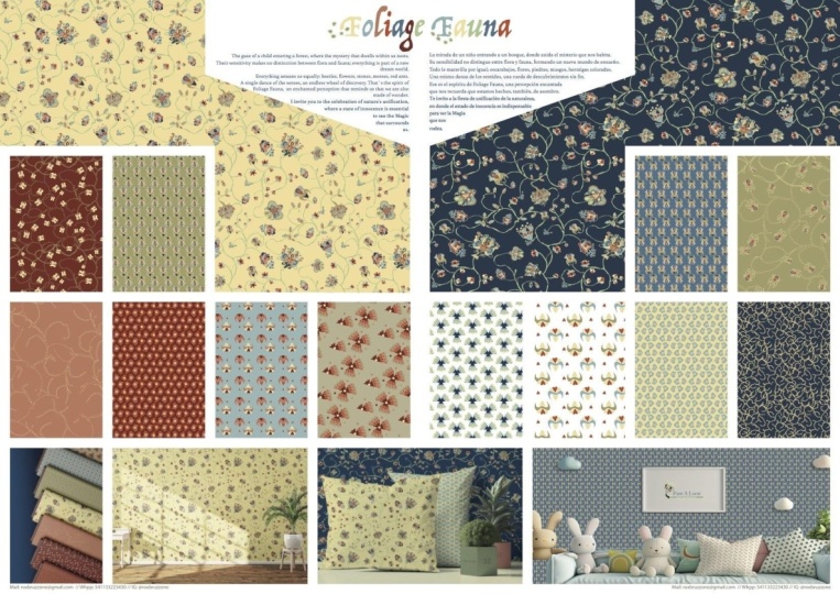
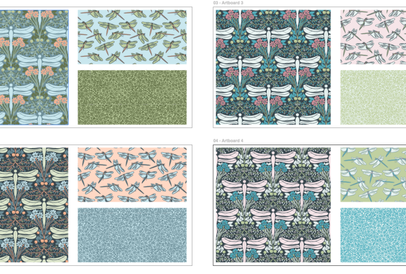
project, I'd like you to do the same thing
I asked in part one. Share a screenshot
of your current body of work or link to your
website portfolio, Instagram, or Contrast,
and I'll be happy to offer whatever
feedback I can. And then tell me what your
next step is going to be. If you don't have work to share
yet, that's totally fine. Just pop in a sentence or
two about your next steps. Remember, these steps can be as simple as researching
one company, sending one pitch email, or sketching for 5 minutes. Focus on the smaller, easier tasks that will eventually lead to
your larger goals. I've also linked to
additional resources in the main body of the
Projects and Resources tab. All of the PDFs are the same
as P one's downloadables, save for the pitch
Email Templates PDF, which is totally
unique to Part two, so be sure to download that. When you're ready to
share your project, just click the Big Blue
Submit Project button. One important thing to note
is that you can only create a class project via a
desktop computer or laptop. You cannot create one via a mobile device or the
Skillshare mobile app. If you get stuck or
come across any issues, please post your questions in the discussions
section of the class, and I will do my best to answer them as
quickly as possible. I hope you enjoyed this
class and found it valuable. But regardless, please leave a review so you can help me
and your fellow students out. I really cannot express how grateful I am to people
who leave reviews. I enjoy reading all of them. If you want to stay up to date with what I'm hosting here, like if you want to know when my next class is
coming or when I post updates to old classes
or do membership giveaways, don't forget to hit
the follow button. You can also follow me
at Melissa Lee Design on Instagram or sign up for my monthly
educational newsletter, HuesmHs on my website,
Melissa lee.com. Thanks again for joining me. I hope you found
this class series inspiring and encouraging. As always, I wish you
all the very best, and I can't wait to see where your careers take you. Hello.
 Melissa Lee, allow yourself to fail before you succeed