Transcripts
1. Introduction: Good
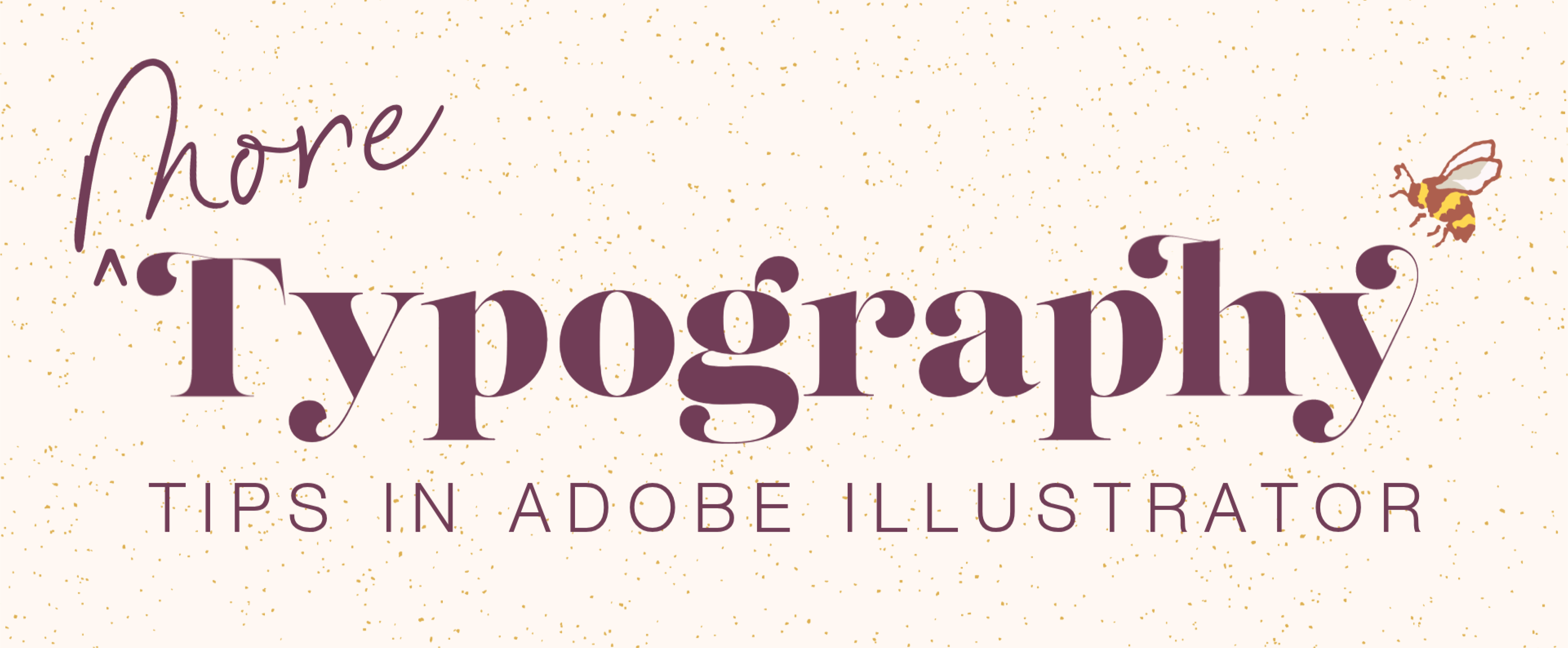
2. (More) Typography Tips in Adobe Illustrator: Hello. Thank you as
always for being here. When I posted my
first typography tips in Adobe Illustrator short, I also released my first ever font for sale called Miss B. As I was making all of the
promotional material for it, I realized that I had
more I could teach on typography in Adobe
Illustrator. So here we are. Installing fonts is pretty straightforward whether
you're on a Mac or PC. You simply double click on the OTF or TTF file to open it, and it will open in whatever font software your computer has. It mostly just
depends on whether you are on AMAC or a PC. Either way, you simply click Install and wait
for it to install, which should only
take a few seconds. It should automatically
install in any Adobe app, even if you have one currently open when you install the font. Sometimes it doesn't for
whatever tech glitch reason. But if that's the case, usually, all you need to do
is restart the app. Tap T to activate the type tool, or you can find it over
here in the toolbar. I demonstrated how to use all of these cool typography tools in the first typography tips in Adobe Illustrator
short that I created. So check that out if
you haven't already. So I'll type something. Then I'll go to character up here in the control bar,
which is contextual. So it changes
depending on what tool you're using or what object
you are selected on. It auto populates with the most commonly
used tools, panels, and actions within those panels, all relating to what
you're selected on. Because I'm selected on text, it has character and
paragraph, et cetera. All I want to do right
now is change the font. The font menu is pretty cool. You can do a bunch
of stuff in here to make searching for
fonts much easier. One of my favorite things to
do is to click this symbol here that says filter
fonts by classification, and that opens up the
classification window. You can select what type of
font you want to search for. So this one is Sans Serif, which means without serifs, and it's got an example for you. Then we've got Serif with
again, an example, script, which is flowing or eigraphic, et cetera, and so forth. Can also search based
on the properties, so on line weight width
lowercase and uppercase, all sorts of cool things
if you want to get really specific with
what you're looking for. Next is show favorite fonts. So that's just any font
that you have starred to stars favorite Afont
in any Adobe program, you just hover over it and
click this little Star. The next one is Show recently added and lastly,
show activated fonts. Remember to click on each symbol again to return to
the main font menu. You can also come over here
and change the sample text. The default when you have
text highlighted like this is to show a sample of
that specific text. You can change it to
any of these options. However, if you don't have
any text highlighted, selected text will
simply say sample. So be sure to highlight
it if you want that text to show up
here in the font menu. You can also hover over each font to see a preview
of it on your workspace. Oh, whoops, I forgot to
re highlight my text. In order to make any
permanent changes to your text or to see a
live preview of it, it needs to be highlighted. So I'll highlight this. So that's all really helpful if you are searching for
something and you want a better idea of how it will
look in a specific font. Lastly, you can change
the sample text size to small, medium, and large. I know what font I want to use, so I can start
typing the name of S font. And click to apply. There are some text panels
that I like to have in my panels that do not show
up in the control bar, namely open type and glyphs. To access these, if you don't
have them open already, you can find all panels
that you need under Window. If you don't know if whatever
you're looking for is a panel or if you don't know where to find
something in general, you can always use
the search button, this magnifying glass symbol in the top right corner here, which opens up the
Discover window where you can find anything. In this case, you'd search
something like glyphs, and from here, you can
simply click it to open. But I like to hover over the search result because
when you do that, a blue box pops up, pointing to wherever it can
be found within Illustrator, and it shows you exactly
where you can find it, which is especially helpful
if it's nested within a menu. So, as you can see,
window, type, glyphs. How flip and cool is that? You'll never be lost
in Illustrator again. So anyway, I'll go
ahead and go to Window, Type and click Gliphs. It will pop up somewhere
random on your workspace, and you can slide it over into
your panels on the right, which are completely
customizable. I like to have mine in
my mini panels bar. Actually, I'm going to click
and drag this back out because I want mine with the
rest of my tight panels. I'll pop it up with this group. I just hovered over it
and released my mouse to drop it in and it drops in in whatever the
default order is. Usually, character and
paragraph come first, in this case, followed by
the less often used panels. I'm going to expand my panel. Because I made this font with so many different ligatures, embellishments and
alternate letter types, M Giffs panel is quite large. I also made matching
symbols and numbers. It's multilingual, et cetera. For a lot of fonts, the panel is much smaller because they don't have nearly
as many options as I opted to make
for this font. That's usually the reason why some fonts are more expensive than others because a font maker spent a lot more time making stylistic alternates and various different
embellishments and fun things like that. If you look here, some of
these have a little arrow in the bottom right
corner and that means that that letter has a
stylistic alternate. Some of these standard
ligatures are automatically applied when typing and some
you have to manually apply. In the show drop down
menu up here at the top, you can click on Let's do
Access All alternates. So that will show you just
the stylistic alternates. Standard ligatures are ligatures that are automatically
applied when typing and discretionary ligatures are up to the designer's discretion. So you have to manually apply them if you
want to use them. You can switch between fonts
down here if you want to. You can click Zoom in or Zoom out to get a
better view of these. Okay, there are a couple of different ways to apply these. For both options, click and drag over a letter
to highlight it, and then double click the alternate in the
Glyphs panel to apply it. Or when a letter is highlighted, if it has an alternate, a little box will pop up in
the bottom right corner, and you can click
once to apply it. If a letter has more
than one alternate, all of the options will show up, and again, you can
click to apply. When you apply a
stylistic alternate or a discretionary ligature, Illustrator defaults
to assuming that you want to use those
alternates from then on. So if I were to type something else like, for example, hello, as you can see, it's
now automatically applying that set of
stylistic alternates. This is why I like to have the open type panel
present in my workspace. The open type panel
has symbols at the bottom here for all of
the different letter types. I know these symbols
well by now, but you can just hover over
each to see which is which. Symbols that are grade out are letter types that I
don't have in my font. Because I just used a
stylistic alternate, it's highlighted in
a darker color here. All you need to do
is make sure that the letter that you want to keep altered isn't highlighted. So your cursor is just
sitting at the end of your letter and click the three bar hamburger menu
in the top right corner of the open type panel
and select Reset panel, which sets it back to
the default settings of whatever font you are using. So there you go. So remember, if your font
is behaving weirdly, reset the open type panel. Last but certainly not least, I would like to
introduce y'all to a feature called Snap to Glyphs. In order for these to work,
you need to make sure that your smart
guides are enabled. Go to your preferences, which on a Mac is under
Illustrator and settings. And on a PC, it's
under the Edit menu. So preferences or settings
and Smart Guides. Need to make sure
that alignment guides has a checkmark next to it. So we've got Object Guides, which is what we're used
to with Smart Guides. And next to it, we
have our GliphGuides. You can change the colors of
both of them if you want to. I'm just going to keep
them on the defaults. In the character panel, click the three bar Hamburger menu in the top right corner
and make sure that show Snap to Glyph
options is checked. If a function is still
grade out like this, that usually means that it's not enabled
in the view menu. So go to View and
click Snap to Glip. Smart Guides should
be enabled, as well. So view, and Smart Guides has a check next to it,
which is what we want. And this feature won't work
if SnapTGrid is enabled. So make sure that that doesn't have a check
mark next to it. Okay, view, it should work now. Now, snap to Glyphs is
exactly like smart guides, only it is specifically
in relation to text or in other
words, glyphs. What Snap to Glyphs
does is it generates guides that align with
the baseline of text, the X height, and the
bounding box of text. And that applies to just
one singular line of text, as well as a paragraph of text. So these guides allow you
to align objects with text so much more easily than
before this was a thing. I have it set to
proximity guides, which turns on all of
the Glyph guide options. So when I move an object
around the text to align it, I'm seeing the green
lines for the baseline, X height and bounding box. If this feels too
chaotic for you, you can turn off
proximity guides and then select the specific
guide you want to use. So I'll demo with baseline. Remember, you can
tell the difference between the guide
types by color. This magenta line is a
regular smart guide, and the green line
is the Glip guide. You can also snap to a specific glyph with the selection tool,
not the type tool, right click on a Glyph
or letter and select Snap to Glyph it will have which letter you
clicked on in brackets. In my case, why it highlights. I don't really use the
anchor point option much, but so that you
know what it does. It makes it so that you can find anchor points on a glyph
by hovering over it with a pen tool and you
can click to drop pins that are snapped or
aligned to the glyph. I prefer to draw my shapes separately and align
them to the text later. So I use the angular
Guides option. Angular Guides lets you snap objects to a single
glyph that has angular segments like a Y or to a glyph that is
rotated at an angle. Like so. Both of those are on the far right under the Snap to a
specific Glyph symbol. To undo the individual
Glyph selection, you can either click release Glyph in the Control panel up here or right click on the letter and
release Snap to Glyph. And again, you click to toggle all of these
options on and off. Alright, those are more of my typography tips in
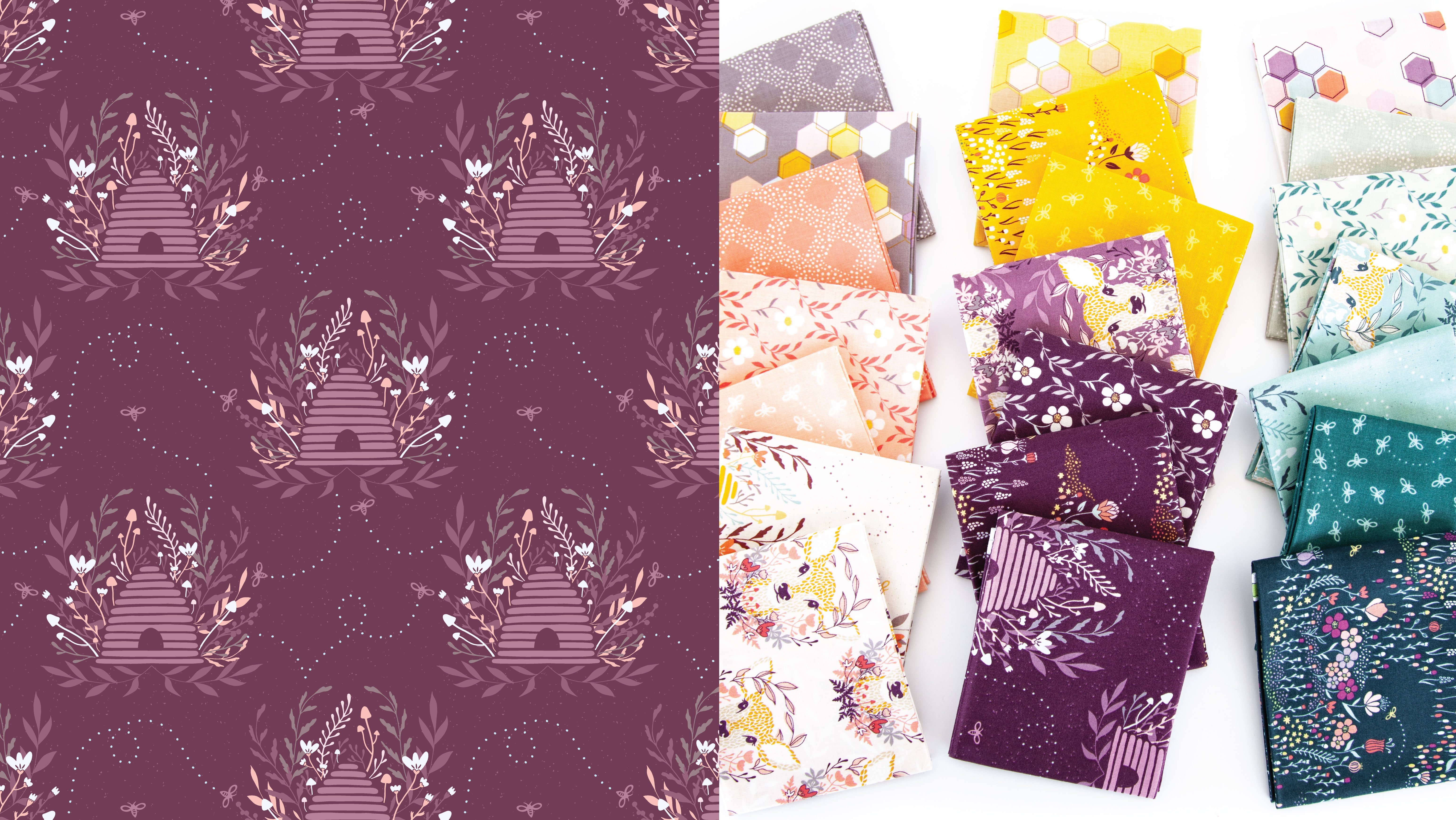
Adobe Illustrator. If you like my font, it is available for purchase
on Skillshare, along with an all caps version, all of which I've linked to at the bottom of the Projects
and Resources tab. I'd love to see any screen caps of your typography practice in a class project or even graphic design
projects where you used some of these
typography tips. That would be pretty darn cool.
I would love to see that. If you enjoy this class,
please leave a review so that you can help me and
your fellow students out. As always, I am so eternally grateful to
people who leave reviews. I read all of them, and
they bring me so much joy, and I'm just so
extremely appreciative. If you want to stay up to
date with what I'm posting, like if you want to know when my next class is
coming or when I post updates to old classes
or do membership giveaways, don't forget to hit
the follow button. You can also follow me at Melissa Leesig on
Instagram or sign up for my monthly newsletter on
my website, melissesign.com. Thanks again, and take care.
 Melissa Lee, allow yourself to fail before you succeed