Transcripts
1. Introduction: As artists, we always
search for inspiration. We continuously think
about what to draw, where to draw, how to draw, and what colors should we use. As an artist, I would
like to share with you a beautiful source of
inspiration, which is Sicily. My name is Ana. I'm
an illustrator. I'm teacher here on Skilture. So I'm Polish, but
I live in Italy, and I'm lucky to
be surrounded by this beauty of Italy to travel a lot and to
see beautiful places. And lately, I was in Sicily, and I thought that I
would like to create a class to inspire you, share with you how I search for inspiration to show you
the beauty of Sicily, to create a fun
project that will be easy and colorful
and fun as summer, as traveling, and tasty
as Italian gelato. So in this class, I will take you for a short trip to Italy. Then I will show you how to create color palette
by observation. How to search for inspiration, how to make studies
of inspiration. At the end, we will create illustration based on the
Sicilian inspiration. I think that these tools are useful not only
for this class, but also you can use it
in your everyday life. For now, I want you to immerse yourself by Italian beauty,
by Sicilian beauty. I hope you're inspired and
that you will join me.
2. Class Project: For the clasts project, we will create an illustration
with watercolors and gh, and it will be
illustration based on the inspiration
of the Sicily. So first, I will take
you to the Sicily, and I will show you a
little bit of places. Then we will see how to create color palette
based on observation. So no color theory
will be included, just observation and
inspiration by what we see. And then we will do a study
of things that we can draw. We will see how
we can search for things subject to paint. And in the end, we
will pick some of them the favorite subjects, and we will create
final project. And it will be a
colorful Chan Colas based also on the
Sicilian inspiration, which is ceramics, which are often made of the
colorful collage. So if you feel inspired, they join me, and
in the next lesson, I will show you art supplies, and then I will take you
for a little trip to Italy. So I hope to see
you in the class. Oh.
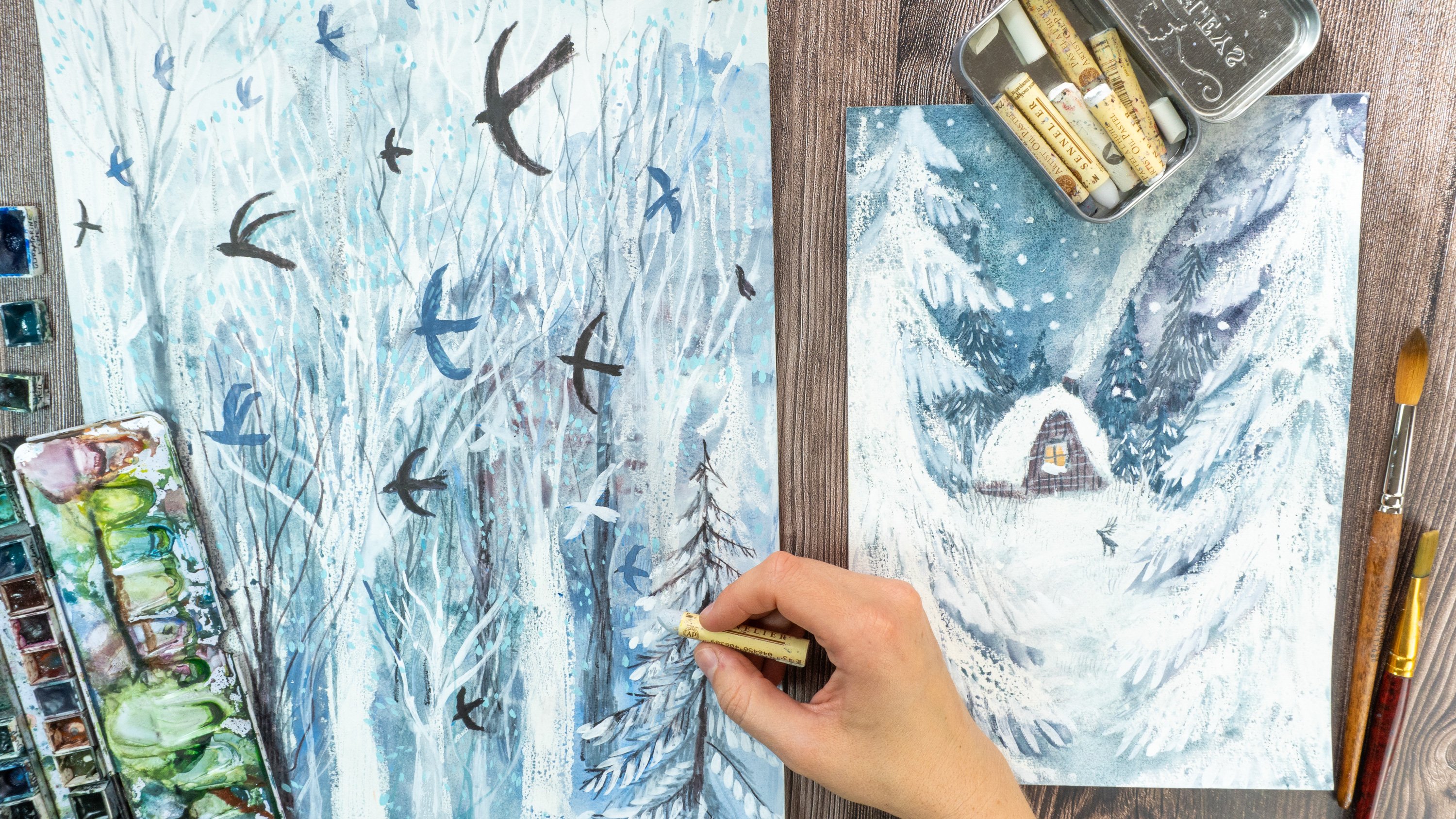
3. Art Supplies: Let's see the art materials that we will need for this class. We can start from paper. I will both use sketchbook
and a block with paper. You can use different
kinds of paper. The best solution would
be watercolor paper if you will use both
gah and watercolors, but you can also use mixed
media paper if you're happy of how it works with
water cools, water mediums. This sketchbook is mixed media. It's nothing fancy. I use it for different
kind of medium, so I will use it for my
sketches for the research, but you can use also
paper obviously. So this is the paper that I
will use H anemul, Britannia, 300 grams, but you
can use thinner. Maybe 200 is a good compromise. As for the colors, I will use both wash
and watercolors. So it's up to you. You can use only, only watercolors, or you
can mix them as I go. If you like to work with gua, then why not try it. Also, if you're new to gah, but you have gua at home and
you would like to try it, then go for it. Use this class to know it. I won't explain how ga
and watercolor work. The only thing I can
tell you that well, gua is basically
like watercolor. As you can see, they are
different kind of guache. They usually in tubes. I have also this kind
of gah and jars. You can water them down and make them look
like water colors. But if you paint a
thick layer of ga, they are really opaque and
they cover really well. And what else? Maybe you should know
that when they dry, they tend to be Mm lighter. For example, if you
make a layer of blue, maybe it will seem
darker when it's wet, but when it's dry, it will
get a little bit lighter. So maybe that's the
only thing that I would like to tell you
about wash for now. And also our good,
trusty watercolors. I will use the one that I have. I have different sets. Those are warm watercolors, but I also have blues and greens in the other the other box. Okay. As for the brushes, I invite you to use
different kinds and shapes. I won't use big brushes because I will work
in a small format. But you can use really
thin, small for details, medium size, for,
for larger areas. And also, I will use this square brush
and this cat tongue, which is rounded, tip. It has round tip, because it will be easier
to fill, for example, square backgrounds, I will also use spray water spray to activate color and
to create textures. But if you don't have
it, don't worry. It's not necessary,
but it's handy. If you have then you can use it. And also a palette to prepare your color palette
to mix your colors. I have this palette
ceramic palette, which is really fancy
and nice, and I love it. But you can use plastic one. You can use your watercolor box. Or sometimes, I will also mix colors just in the
simple plastic plate. Yeah. So you can be creative in creating your color palette. Okay, so, obviously, obviously, I will also use pencil and
eraser to to create sketches. Okay, so prepare your art
supplies, prepare your colors, your paper, and I'm so happy to start with you this class. And the next lesson, we will create our color palette.
So let's dive in.
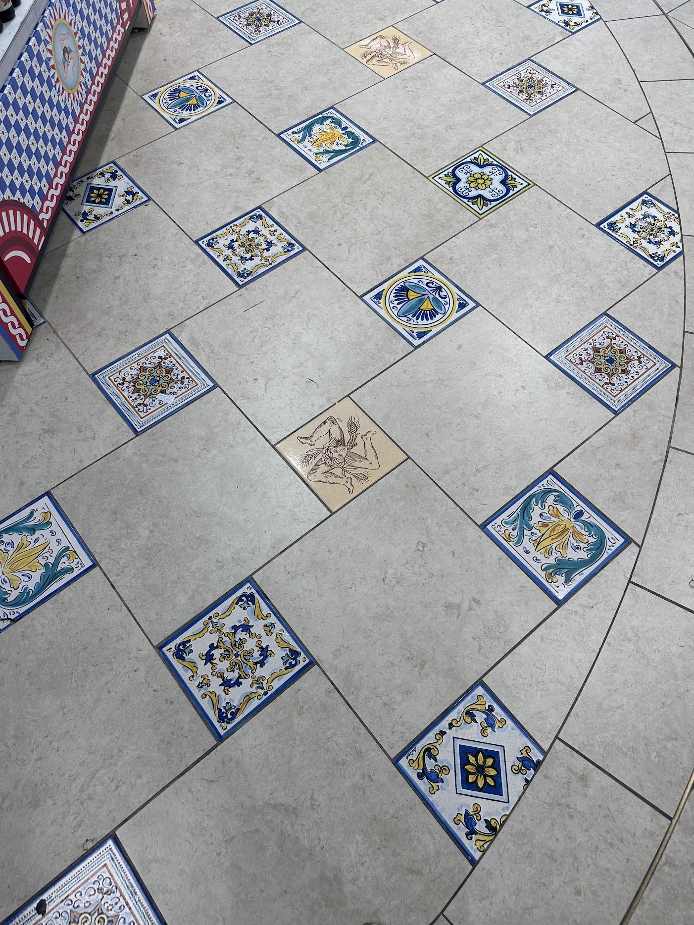
4. Come With Me To Sicily: My dear friend, let me take you to a little trip to Sicily. I don't know if you've ever
been to Sicily or Italy. I live far away from Sicily. I live in Italy, but I was in Sicily many times
and last spring, I went to Palermo. I wanted to share with
you this beautiful, beautiful city and all the inspirations
that surrounded me. In this video, I wanted to
show you different places, different aspects
of the inspiration, trees, beautiful
gardens, and plants. All the things that
cuddled five senses. This I cannot share with you, but you can imagine the smell, warm wind, all the colors obviously taste,
which is amazing. Palermo and Sicily
is full of beauty. Magnificent architecture,
incredible story. Different cultures that created what the Sicily is right now. I if you've never
been to Sicily, then I will tell
you just one thing. Go. I fell totally in love
in Palermo, in Sicily. It's full of different
contrasting things like this beautiful rich
story, churches, gold. And incredible story,
but also chaos. So many people. But it's all
incredibly inspiring. You can find
everything you want. You can find quiet places. For example, I discovered this garden in this
beautiful old church. And then you can go to the
street full of people, and when you're tired, then you can escape in
the places like this, full of silence, full of
inspiration and story. I wanted to share
with you this video. Just look watch. I won't give you names. It's not a documentary film. If you want, you can watch
it and silence my voice and just and fill yourself with this beauty. Those are the colors that are incredibly
beautiful, bright. There is almost always sun and the streets
are full of surprises. You can find old people doing all the rural old professions. You can find oranges
on the trees. Clothes that are
drying so typical, but, they are there. The life of the
street food markets. They are incredible. They're really incredible. There are many of
them in Palermo. And the food is really gorgeous, so tasty, so good. How not to be inspired
one way or another, there's something that
you will love in Sicily. Here I'm on the markets,
all the colors, all the materials, and ceramics, that will be the main
inspiration of the course. Bright, bright colors. Look at this video and
I hope you enjoyed my little guidance in Palermo. I will leave you also photos
in the classes resources, so you can also
watch at the photos. I will leave you the pinterest
mood board that I created. If you want create
your own mood board, search for your own
inspiration and immerse yourself in
wonderful Sicily.
5. Your Own Inspiration: So this is the Sicily that I saw with my own eyes
that I interpreted, and that inspired me most. I prepared for you the
Moodboard on Pinterest. I will leave you the link and also the PDF with my photos
in the classes resources. So be sure to check it out and you can use it
for your inspiration. But I truly invite you to create your own moodboard and to
search for your own photos. Maybe you've been to Sicily. So search for your
own inspiration. Se it with your own eyes. Maybe there are
some other elements that you would like to include maybe more C elements. I don't know. Just be yourself and search
for your Sicily.
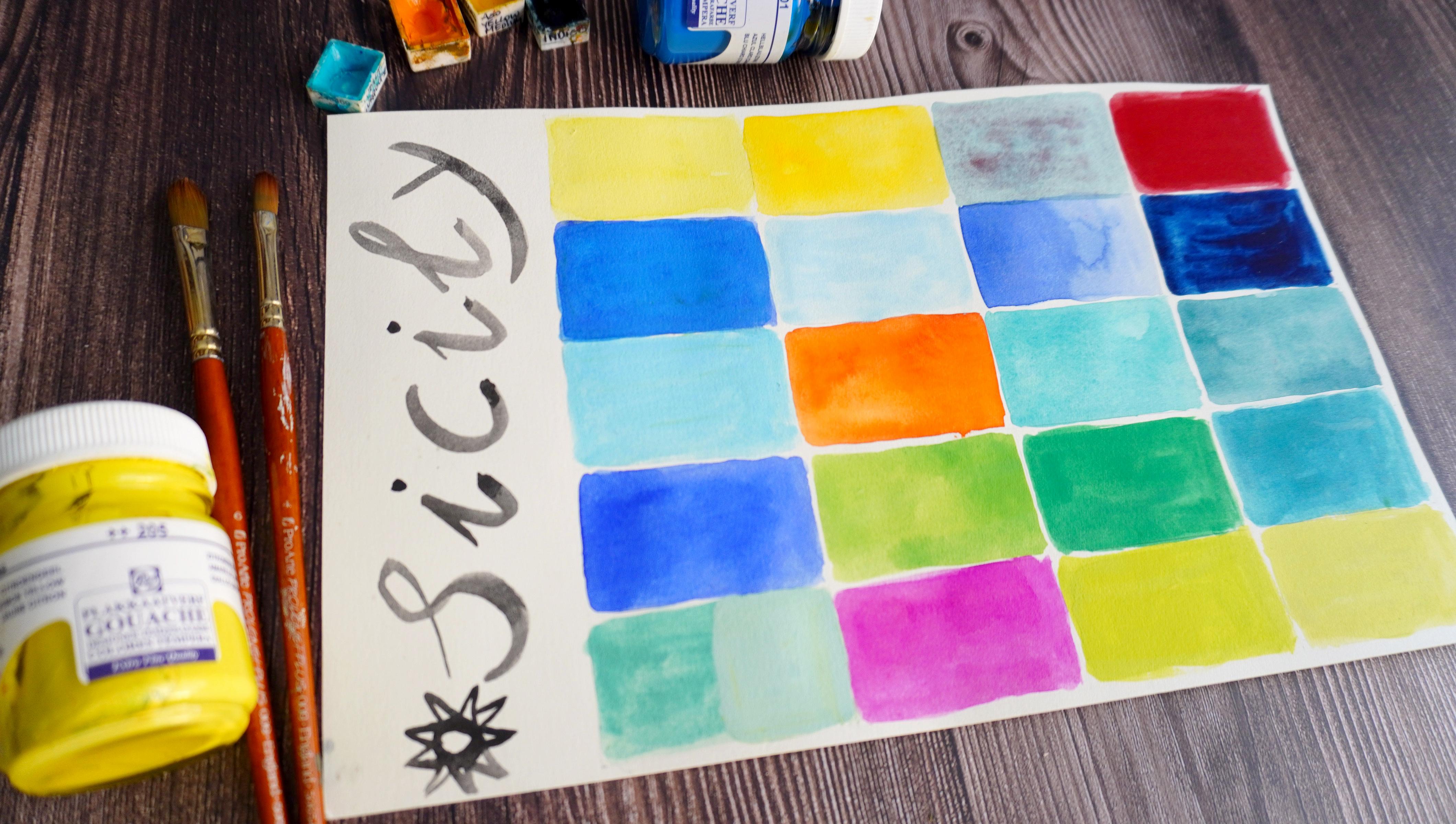
6. Colors Of Sicily - Create Your Color Palette.: In this lesson, you
will dive into colors. You will see how to create
a simple palette of colors based on observation, and on your personal references. I created, I prepared
this chart beforehand. I will have more
or less 20 colors, I have 20 squares. You can do them less, you can do them more.
It's up to you. You don't have to really limit
yourself, but if you want, you can use few colors, and if you want to expand
it, I leave it up to you. I want you to feel
really free about it. Really free of any
expectations, any pressure. If you want to make a lot
of colors then do it. Maybe too many colors can
be difficult in terms of, you can get confused. But you can always, create a big chart and then exclude some colors
that you don't like. So Feel free to do whatever
your intuition tells you. In front of me, I have my
computer with a moot board. I want to print my photos. If you want, you can
print the photos if you feel that it would
be better for you, more comfortable you can print them moth and
have them beside you. I will look at my computer
and the moot board that I created and my photos
as well from Palermo. And I will watch for the photos and for the colors
that I like that I see, and I think, Oh, wow, this one is great. Or this combination is great. For example, I have a photo
of ceramics of plates, and I was really attracted by these combinations of colors. There are a lot of
contrast colors in Sicily. You can see a lot of blues
together with yellows. It's very classic
or greens with red. And that creates really
crisp and strong contrast. This time is for you to explore both the
colors that she like, the combinations that she like. If you don't like the palette, you can create another one. You know, the important
thing is to take the first step and see
where it will lead you. I brought the rings
because For example, you can think of colors
that you like and add some others that are related maybe to Sicily
to those colors. This is both my mom's rings. She gave them to me. It's like legacy,
and I love them. I love this tquise blue color. I don't know if
it's focused here. Anyway, this color is so nice because I love the
turquoise blue. Sicily have some of the
colors in nature as well. You can find it in the ceramics or clothes
as well, patterns. But you can see
it also, the sea, the sea is so crystal
turquoise clear in Sicily. You can think also in
s of your experience, your memories, What kind
of colors strikes you? Why are you attracted to
some kind of colors more? So you can include them in
your color palette as well. Yeah. When I saw this rn
today morning in bathroom, I said, Yeah, I have to
include this color as well. I love it. It's both
my memory and Sicily So even if I don't see it so often in the photos that I did, I also didn't see
the s this year. But it's the color that I
would like to include for, you know, sentimental reasons. So yeah, that's f. So
let's get started. I will show you some supplies already I already showed you. I will both, I think I
will use also gah as well. So here I will use watercolors. You know, you can use org or just watercolors
or you can mix them. If you're new to gah, I won't explain it in
this lesson as well. But basically, it's
like watercolor, you can water it down. It's water soluble medium. You can water it to be more
translucent like watercolor. The reason that I want to use them is because they
are more opaque. You can apply them in
very opaque color. You can cover the
layers that are underneath much more
easier with watercolors. Basic I will use
them for their o. So another tip that
I can give you because we will mix here
in the intuitive way. There is no color theory here. The the intent intention
of this class is to be inspired by the colors
that are there that you saw, that you see every
day, or in this case, be inspired by Sicily, by your journeys, by
your vacation traveling. So I won't explain you
how to mix colors, but I can give you one tip. If you're really new
to mixing colors, you can both see some of my classes that I already did
about the color of theory. But I have this easy
way to mix colors. This is my gah chart. So basically, I created
all this palette. From five colors,
and they are yellow, magenta, cyan, black and white. So I ordered this this palette. This is gas like this one, but in another format. For example, this
is the same brand. So I had this one. I ordered those five colors. And basically, what I do if you really don't know
how to mix colors. With five colors, you can really achieve a a lot of colors. So I just mix them in this way. I mix first with the second one. Then I add one, two plus three. I have this one, and I add gradually more
of, for example, blue. I have green and
then by adding blue, I have this kind of greens. Then I go one plus three, one plus three plus four. And one plus five, and then one plus
three plus five. I proceed in this way. It's very easy. As you can see, there are really
infinite possibilities of creating the church Lot, for example, I would like to use my turquoise from the ring. I can use three p basic colors that I have or this
green, it's so lovely. Or for example, look at this. I'm really fan of neon light
green. I think it's fun. I, complicated,
nothing difficult. So I will keep it right here. I will probably use it as a
sheet. Let's get started. We talked through
a of useful stuff, but now the fun
can really begin. So I am watching my photos
from my mood board. Here is my computer, as you can see, here it is. So I will leave I will leave
you here because basically, I want to comment it or less. Maybe I will just tell you in the meantime what colors
I would like to include, but I won't explain you
how I actually mix them. I want you to explore it in a very intuitive
and playful way. If you want, you can create the charts of your
colors as well. If you new really really
new to the color mixing. Okay, so let's get started. So even if I'm a not big
fan of yellows and oranges, I will include them
because it's so classical. It's really so nice. These combinations of blue and yellow within Cici ceramics. I have this palette which
is ceramic palette. You can use the plastic one. I could use the plastic one, but it's already dirty
and have colors in it. This one was clean. This is primary yellow. So it's quite
bright. But probably I would like to
have a cool yellow. I will try to use lemon yellow that I
have as my water color. Another thing to do is, if you're not sure of the color
if you want to swatch it, you can first swatch it in
some other sheet of paper. I will try, for example,
mix two yellows. Even if I don't like oranges, I will give it a try. I mean, it's not that
I don't like them, but I'm not a big fan. But since I think I will try
to do my own kind of orange. Now, how can you put
an orange when there are a of oranges, clementines. All different kind of fruits. I don't know what kind of
color I will put next to it. This is how you discover things. I can already see some
lovely combinations. When I put let's say
blue next to it. We'll see. We'll
see. As you can see, I'm using quite pure colors. That's because the
Sicilian colors are really vibrant,
bright, and pure. Let's try to make some
blues. Yeah, blue. I have primary blue,
I have ultramarine. I would like to have two blues, one bright and maybe
three. I don't know. But one should be light, and one should be
like dark blue, which can be seen
also in ceramics. For the dark blue, for sure, there is ultramarine. Let's start with this one. I want to create one and the really
bright light blue. So probably would
add white to it. Let's create the dark blue. The So as you can see, I
created more blues. I'm searching for a
blue that is really bright and really intense, but I can't find it. So right now, I'll
try to make and maybe then try to do intense,
really, intense blue. Right now, I'm switching
to water colors. I'm using this granulating glacier green from Sminke,
which I really love. It's It has this
water turqus pipe, but it also has particles
of violet pigment, which I really really like. I'll see if I'll
stick to that or if I will do some other
combinations with it. I finished my palette. I will walk you through briefly. What I created here. I'm basically happy
about this palette. I really like some colors. Some of the colors maybe
are too many, for example, my famous turquoise that
I want to recreate, maybe those two are too
similar or those three, but it doesn't matter. I just wanted to try them all. For example, I would like to create some lighter
and darker tones. Actually what I will do that I can expand the colors by adding white or black and making
different tones of it. For example, here, I wanted to try this color with more white. So, I'm happy about
this palette, and I will leave it right now, and I invite you
to the next lesson where we will draw
different motifs and search for what we want to do for our final
illustration. See you there.
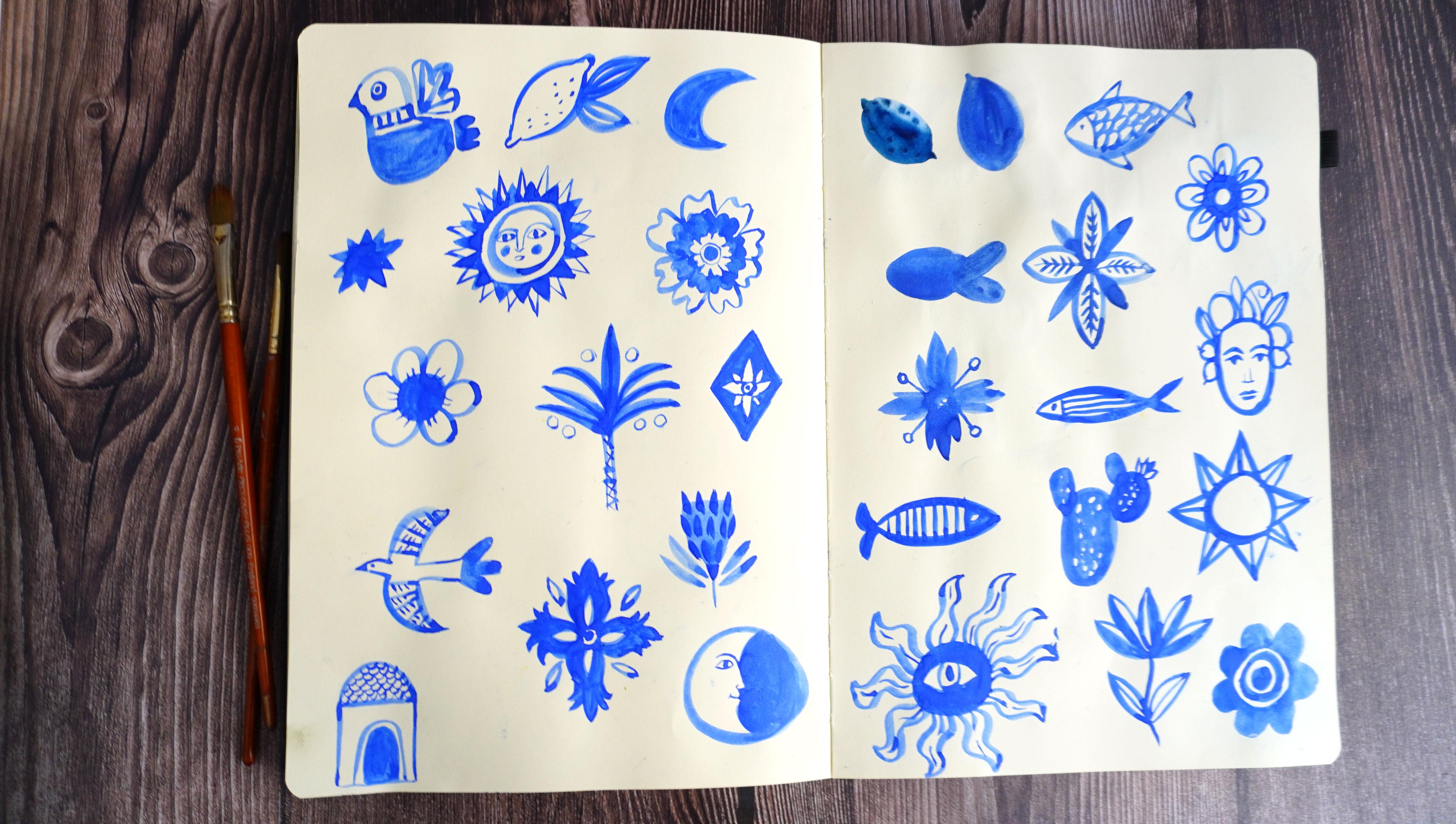
7. Search For The Inspiration: In this lesson, we
will search for an inspiration what to draw. Before jumping into
the final project, the final illustration, let's
take the steps gradually. Now we can just paint
different elements that we like that we feel
inspired by I will again, look at my mood
board at my photos and paint in a very simple way the elements that I prefer. To do that, we will
use just one color. You can obviously use
more colors if you like. But this will
simplify the process. You can use black,
you can use graphite, you can I will use blue, just one single color. For each element. So right now, you won't have to be
focused on colors. You will just try to warm up the hand and figure out the elements that
you want to include. So what can be the things
that inspire me, for example. Almost everything that
I see on those photos, the elements on the ceramic, It could be obviously lemon. I love fish that I saw on
the backs on the market. I love the floral elements. I love flowers. And probably I will
include also a bird. It wouldn't be me if I wouldn't
paint at least one bird. So I can also, you know, let my imagination
flow and Think of the things that I saw
during the travel, my journey. But I can also let
my imagination flow and paint the things
that comes to my mind. They can be linked to
Summer to traveling, to Sicily or not. Everything that brings me joy. So I will get started. Why not to start
with a simple Memon. I will use my
sketchbook, by the way. You can use sheet of
watercolor paper. It doesn't have to be anything
perfect or elaborated. You can warm up your hand, you can explore shapes. If you don't like one, you
can ski to another one. I can do more. Why not? I really like the
fish that I saw on the necklace in
this Italian shop. I will try to
recreate this shape. If I'm not hy, I can different
kind of shapes of fish. Maybe this time outlined. And the other element that
I will show you, let's say, There are those kind of
floral geometrical shapes, and I really enjoy them. I really like them. I think I
will include them in my co. I will proceed with
my exploration. I think I will draw
a lot of them. You don't have to
include everything, then you decide what you prefer. Maybe the first fish
you don't like, but then you try another and until you find something
that excites you. Enjoy your exploration,
enjoy your research, and I will leave you and
speed up my process. This is the outcome
of my sketches. I filled out two pages. If you want, you
can draw elements. I'm satisfied. I think this exercise is
because I wouldn't come up with some of the ideas
And during the process, some of the ideas came out, for example, the
sun with an eye. I started to do a sun, then I thought to put an eye in. Then I did sun in this way with a face and combining
this with this. I combined elements
both from the pictures, from the photos, from the
elements of the patterns. And also from real
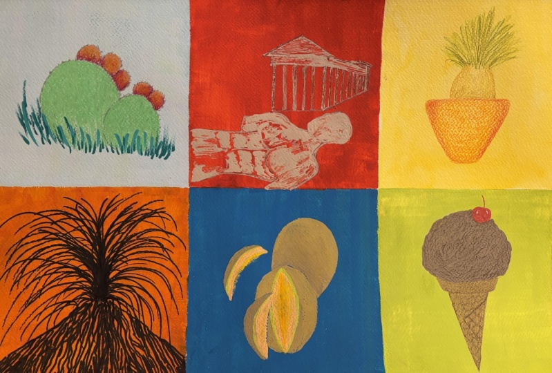
life, for example, I try to simplify the palm
tree that I saw in Sicily, which are really
everywhere basically. For example, the moon and the sound are typical
for their ceramics. I played with different shapes, simple moon, this kind of
moon, the same with sun. And from the real life, I also draw this tower. I saw in Palermo on
the cathedral roof. When you're in Palermo, please go to the cathedral, and then you can go on the roof. There are this kind of
elements on the roof. I decided to draw it as well in a very simplified way then also the cactus
from the real life. I could continue
and continue and continue and I will probably do it for
other illustrations, but right now I will stop. I will have to pick
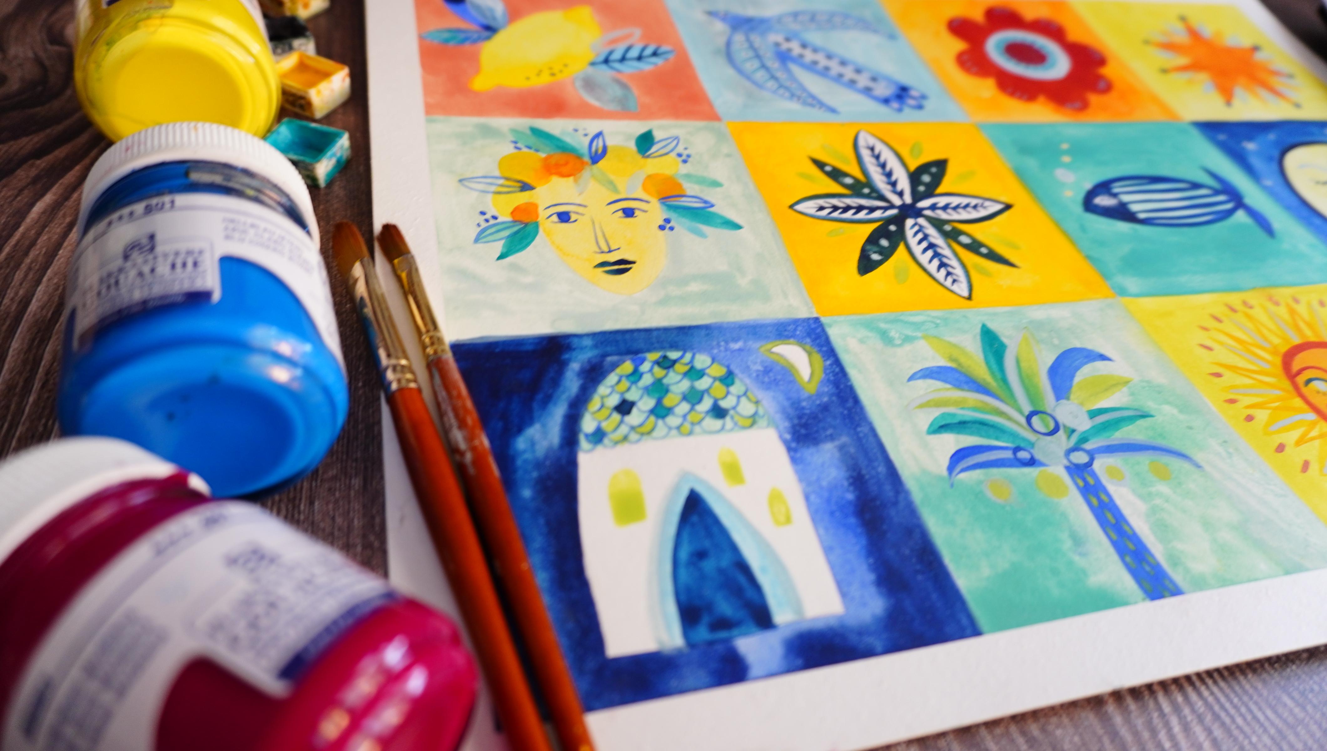
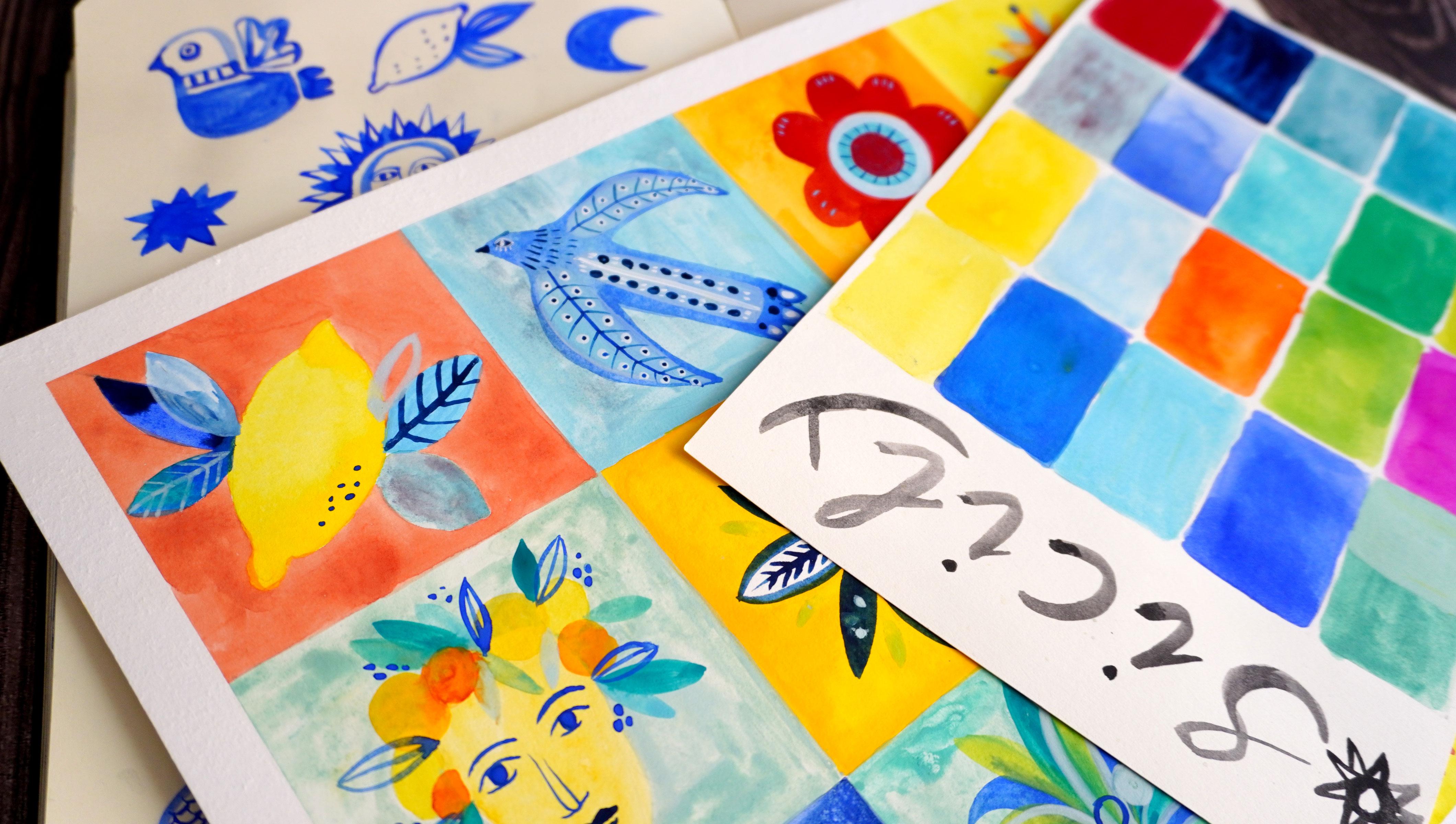
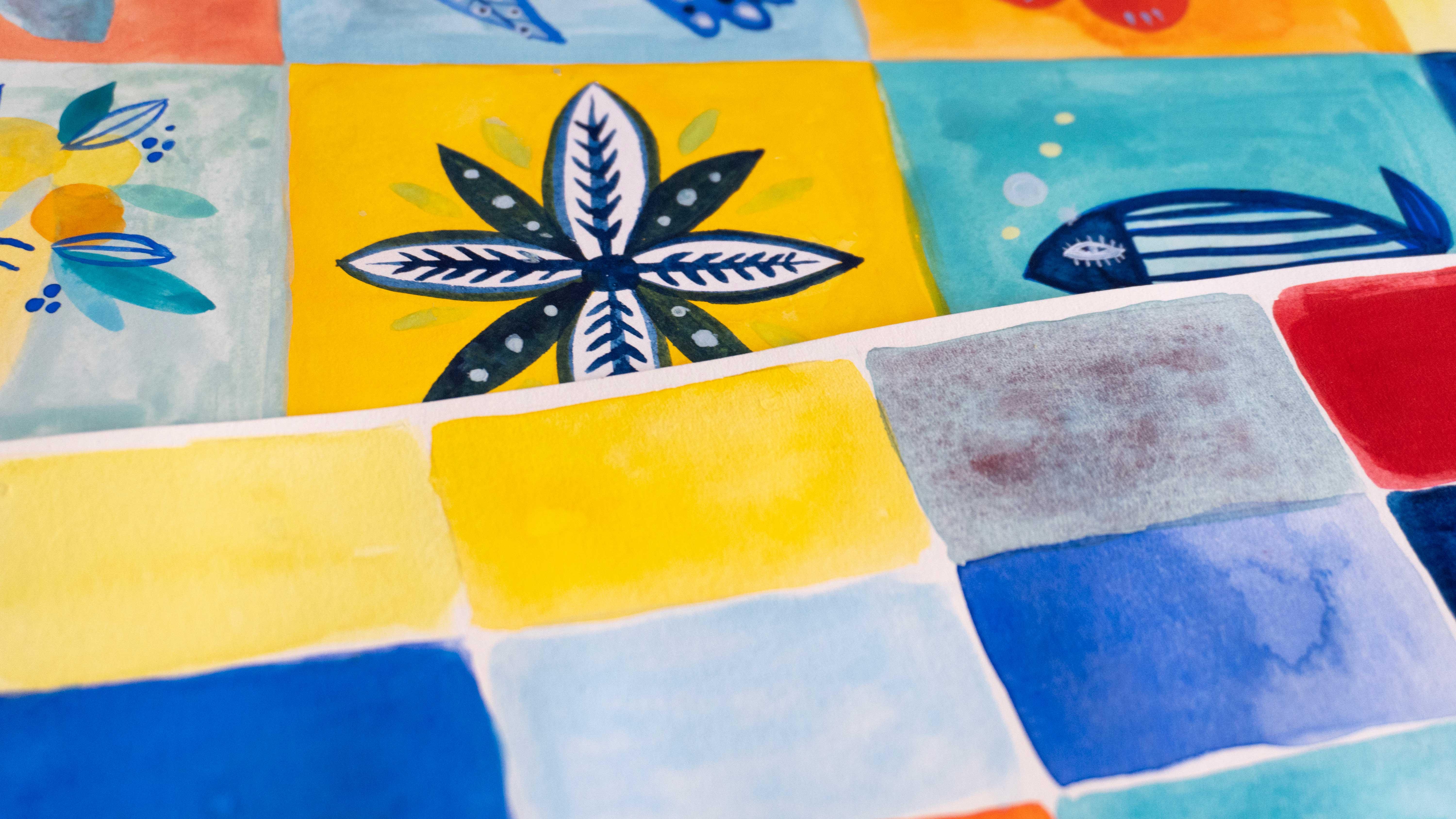
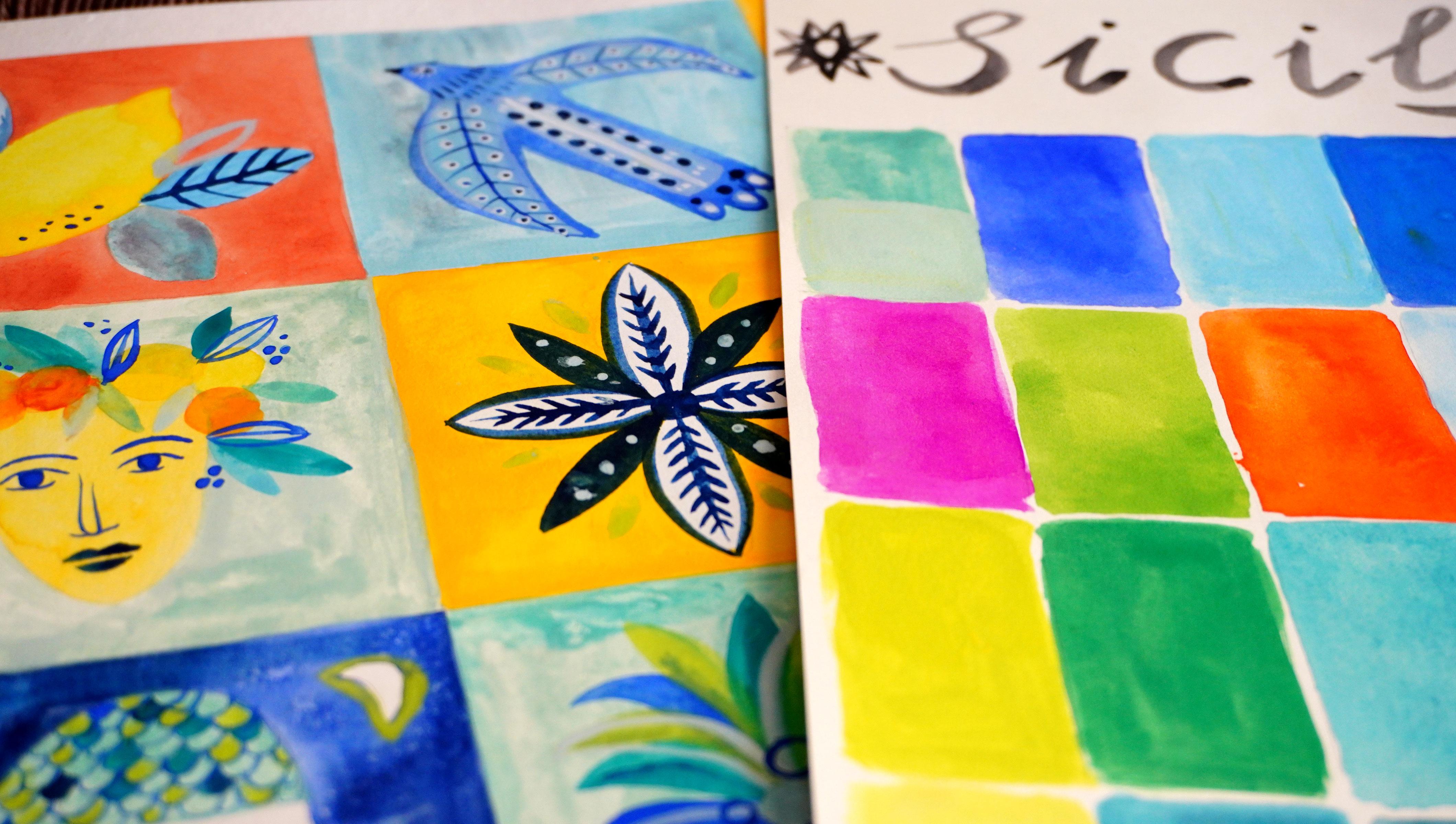
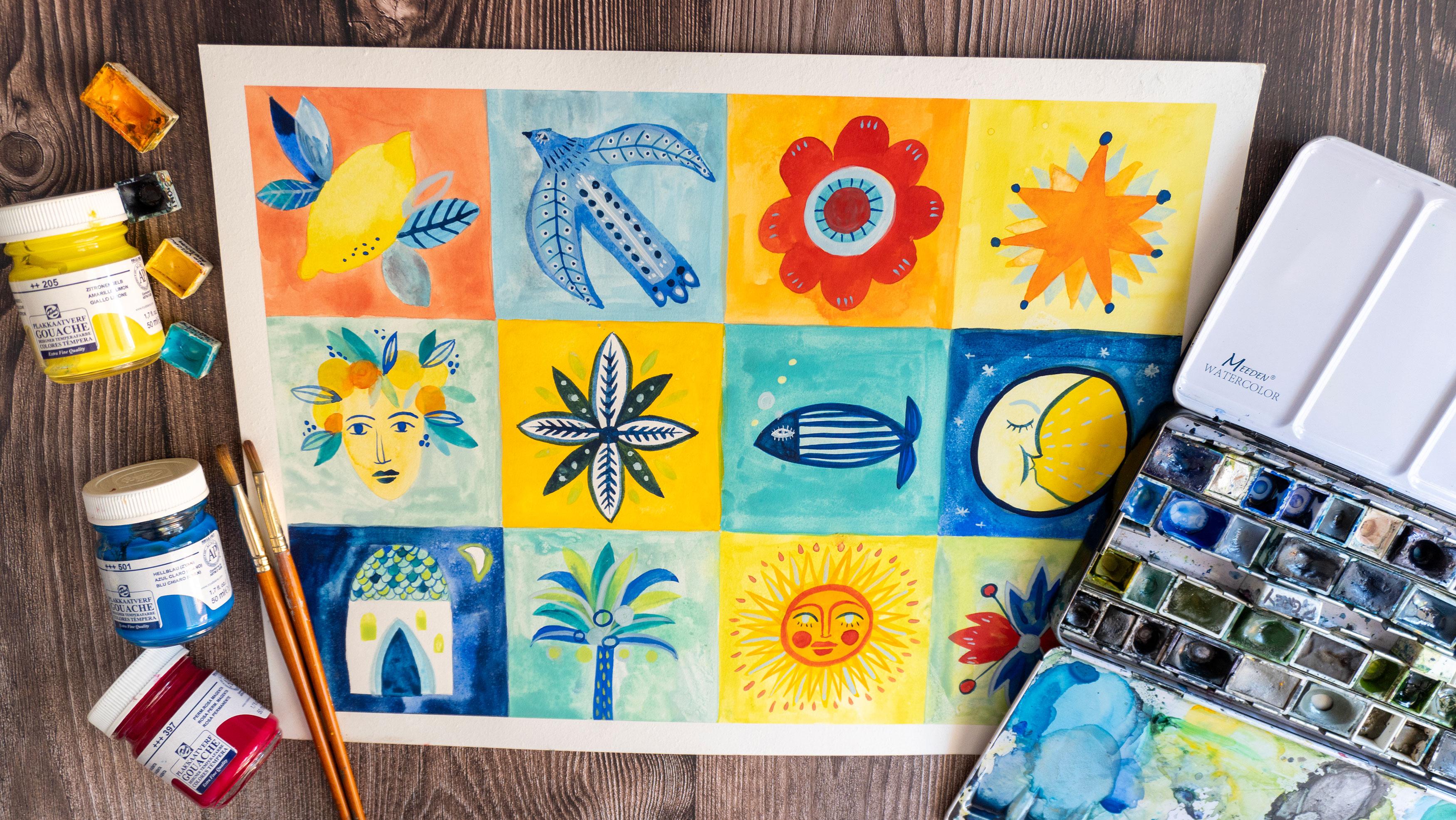
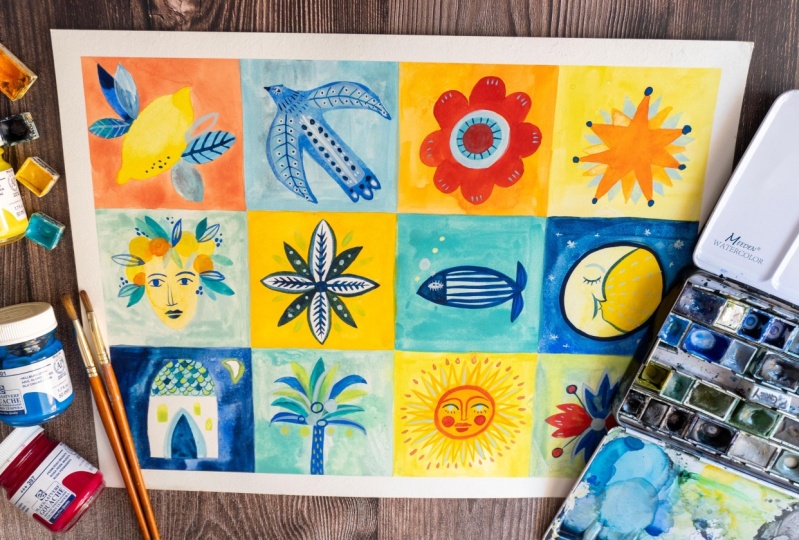
from those elements 12. My final illustration
will have 12 squares. You can do less,
you can do more. You can do bigger squares, and if you want to do more, you can just divide your page into lot of many tiny squares. Oh, you can do just four or two, it's up to you really whatever
you feel inspired to do. In the next lesson, I will
start to do final project. I can't wait. So see you there. Oh.
8. Final Project Part 1: Let's start our final project. As I already told you, I wanted to do this
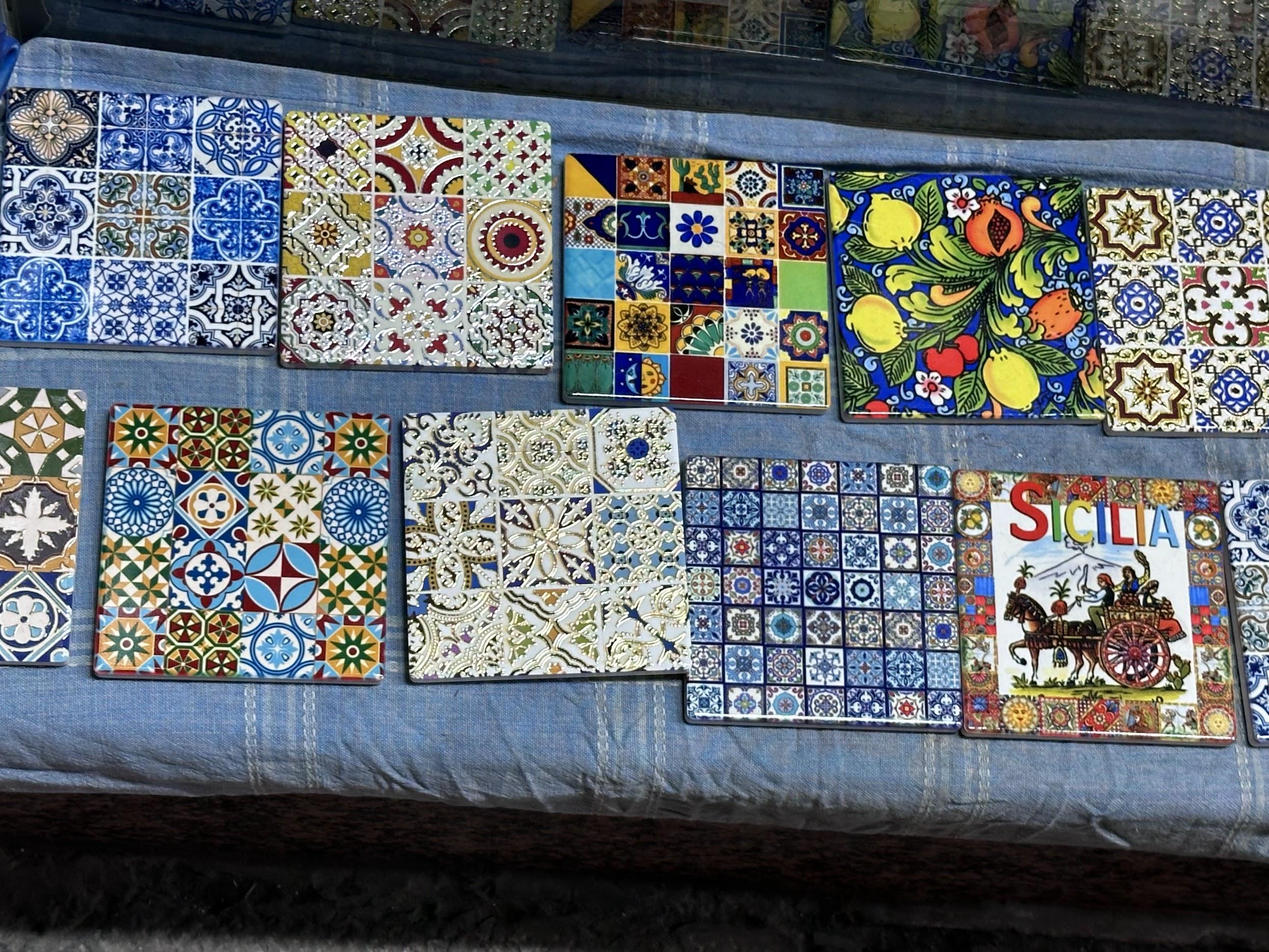
kind of colash. It's because of the ceramics, Italian ceramics are often
divided into those squares, so it's also an inspiration
to do this kind of design. Now we will proceed. I already sketched my elements. I picked the elements
from my sketchbook. And they're already
sketched with pencil. And for the color, I will choose as I go. Not sure what colors will I use? Will I use all the
colors from the palette. But the good thing is that
I already chose them. They are already here. I don't have to think about it, to create new colors. I can modify the
ones that I have, I can make them
lighter or darker, and That's already something
that simplify the process. As I told you, I'm not sure
if I will use all of them. For example, I use this pink because I thought
I will paint cactus, but in the end, I
picked other elements. But maybe I will use it
for some other details. So the process will show. The things that I can tell you in the beginning is that you can create your colors by
working with contrasts. And to simplify the process, you can pick two
kind of contrasts. The first one is the
contrasts of colors. For example, red and blue, it would be contrast of
worm and cool colors. You can create contrasts of
two strong and bright colors. You can create
complimentary contrast, if you want, I did a class
about complimentary colors. There are many
kind of contrasts, but I wanted to tell
you about the two, and the other one is the
contrast of bright and dark. For example, you can use the same let's say blue
and make background, the light blue and the
element dark blue. So there are many
different ways you can approach this kind of process. I will draw square some squares with you and I
will explain you the process. Probably I won't go. I won't follow the order, so I can paint first this one, then this one, then this one. I'm not sure. I will do
what my intuition tells me. I will follow my guts, yes. Let's start. So piece by piece. No panic. I will
start with the lemon. Obviously, you can paint lemon
whatever color you want, but I will just do the
classical Yellow lemon. That's because I really love the lemons on on the
Sicilian ceramics, and they are yellow.
Let's do that. I will cancel a
little bit pencil. Make sure it won't
show through my color. In in this case, I think I won't make background. Probably I will leave the white background,
but we will see. I can always paint the
background around the lemon. So I have my lemon color here. This one is really almost greenish almost greenish yellow. Misses Water color,
So also here, you can decide if you want to
use squash or water colors. If you want to make flat
colors or if you want to put some texture and
gradients into it, I could, for example,
make some blending. Yellow into yellow blending. As for the leaves, I will use blue. Different kind of
blue, green blue. The color is still.
You know what? I will skip to another s because I don't want
the color to bleed. Let's do the tower. So I decided to draw a tower, the one that I told
you that I saw on the roof of the
Permian Cathedral. I want to do it kind
of a night scene. So I will make a night
sky with the moon. I will use this Prussian blue. Which is this one. It's wash. It can be tricky to maintain
the straight lines. Since I'm not very
precise person, it will be a challenge
for me. We'll see. You could, for example, put the masking tape in
between different squares. In this case, you would have white lines in
between the squares. I'll do my best. Let's see. You know what? I can help
myself by using a square brush. I will mix different kind
of train and Prussian blue. Since I really like I really
like textures in the skis, not really flat color. I will try to make wet on
dry lending technique. That's good. Exercise
precision at least for me. I will proceed with the sky. When I was in Palermo, the nights were so stunning. That's why I decided
to do a night sky. Also, because I really love night illustrations,
night scenes. You would have to see the
Palermo Cathedral. Seems gold. It seems so yellow against
the blue sky of Palermo. It's really, really gorgeous. So That's what I'm
trying to recreate here. I really love to add textures
into my illustrations. So you can do that or you can maintain a flat backgrounds, if you put my courses, you know, that I love to splash, to create night sky. Again, here, I will
leave it to dry. So that's the other thing that defines my process
because I will skip to another square and then
wait for the other to dry. My lemon is dry. I can come back to the lemon. So I will do as I
told you, blue, I love this blue and
yellow contrast. This one is wash. You
can see the difference. It's more opaque. It
covers the lemon. It covers paper,
sorry, really well. Here, we are quite all right. I will do this. I've thought to make it
turquoise, the roof. The roof on the
Palerma was greenish, so I will try to
recreate it somehow. I saw the ceramics again, which inspired me
for this piece. This one, I would like to
make orange, red and blue. So I will make
orange background. Maybe I will make
it a little bit lighter than the one that
I have in my palette. This is my orange. I will add
a bit of this yellow here. Since the flower will be red, so I can cover at
least the petals. But I can tell you
that the square brush is kind of a game changer here. If you have a square brush, then I recommended
because again, waiting for this square to dry. I will fill inside
the with darker blue. The one that I used for the sky. And for the roof. I will pick different kind
of turquoise and greens. Again, you can make
yourself things easier. For example, for
this kind of petals, I can use this brush, which is tongue bruh. Is she rounded, so it is easier to fill
in the shapes of petals. If you're new to mixing
gas with water colors, then a little tip here, use gash over the first layer, if you want it to be very opaque and to cover well the background to
create flat color. We can proceed with lemon. Let's fill in the flower center. I will do it with
different blues. Here, I will paint the star. I will paint it what first, I will paint it with a lighter. Orange. Another
explanation here, I continue to use both
ga and watercolor. The star in this case, is diluted, but it could
be also watercolor. Be aware that you can play with different quantity of
water and color when you mix them together
in order to create more opaque or more
translucent layers. Try to play with this as well. And maybe I'll give
a last detail here. I will make tiny dots. This is also how your
personality shows through. I started with Sicily
Folklore and right now, I feel like I'm putting some
of my polish roots as well. Okay, folks. So I will proceed. I won't annoy you anymore
with my vocal guidance. I will decide step by step, what colors will I use? Maybe details. In the end, I will see. You can observe, you can
paint along with me. I will see you in the
end of the process. Oh. O Here, you can see another
example when I paint with more diluted or it could be also a water in order to create more translucent and textured illustration over
the first layer.
9. Final Project Part 2: Oh. I decided to tell you that I did a little pause
in my drawing. So I'm starting it
all over again. And in the meantime, in the meanwhile, all
the colors go dry. What I do to reactivate them is the same as what I
do with water colors. I will just give it a
little bit of water. I have this spray bottle. It works also with guash,
it will reactivate. Some of the colors
I already finished, so I will have to
made them again, and maybe that's what
I will do right now. And then I will
start again to do my drawing. All right. So I recreated my
palette more or less. Maybe it's not perfect. Maybe no of the colors are
originally what they were. I wanted to show you
this only because if you feel like you're a little
bit lost with colors, maybe you changed them
during the process. It's totally normal. I mean, we don't have to be perfect. It's Again, I'm always repeating that
it's about the process. So even if the colors
aren't exactly the same, that's more or less the
palette that I created. And I just keep you know, I just keep going and and
it's okay to be in process. So As you maybe you
saw in the speed speed up video that I recreated those greenish bluish
colors, Turquise colors. By using just those three
basically, which is yellow, can and white, and
it's all about making different
proportions, quantities. Sometimes I added this my favorite favorite
glacier green. I never stopped talking about this color
because I love it. Schmincke, which is turquoise
with this particles of let, which I already showed you so. Let's get back to my drawing. As you see, I already
have those squares. So I can, for example, make some of the
details on the bird, and then I have this fish, which I have to define. I can do that before I will
switch to other pieces. You can, for example, use details to explore
your own style, to explore your own
personal style and Maybe they don't have to
be necessarily linked to Sicily or Summer, but they can be just something
personal that you do and you can try to do
whatever comes to your mind. For example, I make some light blue
details for the bird. M I use gash. One of the characteristics
of guash is that when it dries,
it becomes darker. What I will do is
that I will add really a lot of white because
since it's very watery, I'm sure that you
can see that when it dries, basically not visible. I wanted to do something more Light, very light blue. I will try to mix
this kind of blue. I'm not sure what
I will put here. Maybe some flowers. As I told you, you can feel free to add whatever
elements that he wants. It doesn't have to be all
linked to the Sicily. The process of painting was
quite long and I decided to leave it to you
the whole process, but I will speed it up and
this way you can watch the process or skip it if you want at the end of the video
or paint along with me. At the end of the video, I will leave final thoughts. Oh. O O So I finished the
almost everything. I will add some last details. Just a little bit of update. I will only repeat that some solutions came to me
as I during the process. For example, I wasn't
convinced to leave square white because the other one was already filled with colors. So I I've put the
background later on. So I created this
color based on red, I added a little bit
of yellow and white. So this is based on the
colors that I used here, so it's cohesive because that's the mix of this and
this and white. U for example,
some details here. I add dots here also. So you know, the solutions
comes while you're going. So I will continue, and I will turn back to you when I finished
all the illustration. O Oh Oh I finished. I think I will yeah.
I will stop here. Obviously, you can
add and add details, but I think it's
already saturated. Maybe I think some of the details I could
not do, for example, not sure about circle
here, but yeah, that's a good place to stop if I feel that maybe I
exaggerated a little bit. But I'm really happy
about the outcome. While I will taking
of the masking tape, I wanted to leave you some thoughts that I
have right now about creative process about being happy or not with the
art that we create. I'm happy about the outcome. But I also have thoughts like I could have
done it better. I would change so many things and I don't know if
it's good enough. But those thoughts are fine. I'm sure you have it too. I wanted to just to chat with a friend
from artist to artist. In the end, I wanted to do some light and fun process
without the pressure of making some
serious and you know, good art of peace. I want it to be light and fun, and that's why I'm leaving
those thoughts and yeah, let me know what do
you think and if your ener critic is strong and were you able to quiet
it a little bit. I hope that this project and this class
helped you with it.
10. Final Thoughts: Thank you for taking
this journey with me for traveling with me to Sicily. I really hope that
you enjoy the class that it was helpful
and useful for you. And I hope that you not only
fell in love in Sicily, but also found useful
tools that you can use for your everyday art and for your everyday searching
research of inspiration. I would like you to aploud your final project in
the projects gallery. Please share with us
your final illustration, but it would be lovely to see your study of color
from observation, your study of inspiration, share with us what
inspired you and why. So it would be
really great to see your process and you're
behind the scenes. At the end, I would like you to leave the review if
you like this class, share it with your
friends, if you liked it. It will help my channel to grow. I appreciate it very much.
Thank you in advance. And I hope to see you
in my other classes. By or better say, Chow,
 Ania Kropla Malinowska, Award-winning illustrator