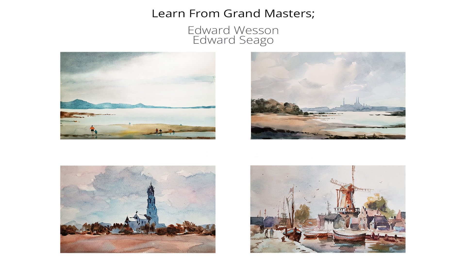
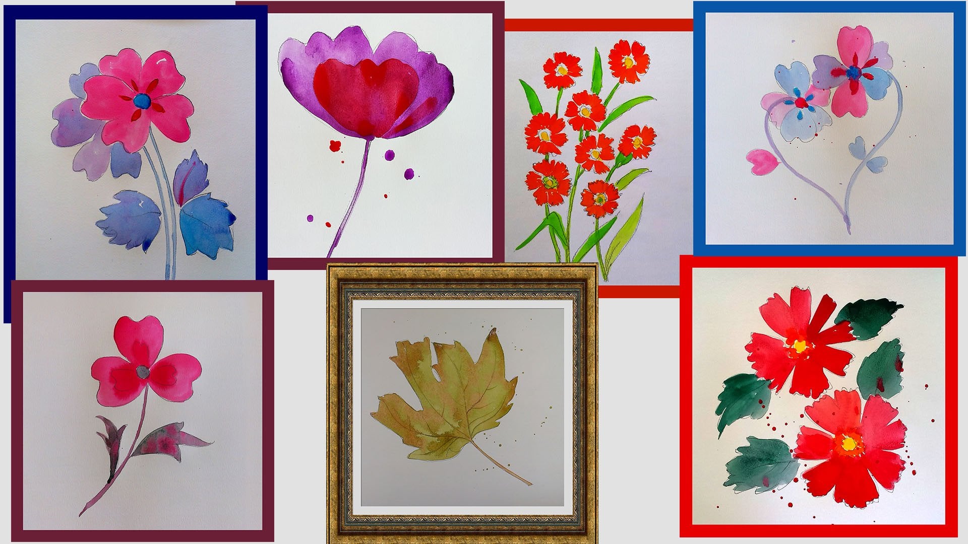
Transcripts
1. Corse Description Seri 4: Hello, everyone, and welcome
to this wonderful course. The course is dedicated
to felleral subjects because followers are beautiful
and after each lesson, you will succeed in making a beautiful flower
or feleral subject. The aim is also to
ensure that you practice the very
basic techniques of watercolor painting
several times. Ich lesson is designed to
be less than 10 minutes or just a few minutes so that you can easily accomplish each task. Basic techniques such as
vet Ovet or vet invet or splashing techniques are repeated now and then
for several times. That's make you and
me sure that you have a solid understanding
and experience of those techniques with no
or less perior knowledge, you will succeed in doing
those beautiful paintings. Also, if you have some prior knowledge
and you want to know more about
federal subjects, or you want to make a solid basin foundation for more advanced levels of
particular painting, I strongly suggest you
to take this course. This course is part
of a series of very simple federal
painting subjects and is designed to be
a separate course, could be part of
a year course for those who are interested
in exercises. So I highly encourage you to accomplish each
course separately. And if you are interested, also, I suggest you to
take other courses. This is magic, and I've
been busy doing painting, drawing, and also giving art courses for more
than two decades. So I know what makes the students successful
in their artistic career. This way, you would be that what you are going to
learn is what you want. Each lesson is
designed carefully. That you will learn
something new or you will repeat a
very basic technique. Once again, so that
you and I will be sure that have the solid
understanding of that technique. There's no need to
care about techniques. We will repeat them several times and also I will highlight the most important tips
several times during the course so that you will
understand them very well. During past two decades, I've tried this
techniques several times, so you can be sure that without any prior knowledge or
less prior knowledge, you can do and succeed in these courses and
in these subjects. After each lesson, you will have a very beautiful painting so that you can
keep it frame it, put it on your table
or you can gift it to a friend as a present
from your heart. I hope you and I would have a very wonderful journey and quality time
with each other. Let's get started.
2. Yellow Daisy Flower: Today's painting is very
retroactive while the technique, and also the design
is very simple. Just a few colors, including yellow,
orange, and red, and the techniques in on, wet on, and splashing. Without any sedation,
let's get started. Using a number four round
brush and ordih yellow color. I start from outer part of each and every petal
towards the center. It's really crucial to keep the outer part of the
shapes and neat because our mind discerns
the shapes based on their outline, basically. And to keep the
Brushes turk economy. I also try to move my hands in rhyme with
the form of each petal. It's really important to
convey a true sense of form. From out side towards the inner part or from the
center towards the outer part. The only thing that
I try to stick to it is trying to rhyme with
the forms of the petals. For the center, while my
brush had some yellow, I dip my brush into the red h, and the result would be
somehow orangish color. Now, while the previous layers
are still wet and using a smaller number two round
brush and with red color, I add extra details
to the petals. And to emphasize the volume
of the flower center, using the same red red color, I try to add some volume to the lower part of
the flower center. I change my brush and paint
the two other petals. You can consider this as finished or add extra
details to the petals. And I'm going to splash some yellow and dots
here and there. And I believe that this
painting is really amazing, and our job is almost done. Okay, let's put it somewhere
to the dry out and frame it. I hope you have enjoyed
this beautiful painting. Oh
3. Simple Stylized Rose: Hello, everyone. This is also another very beautiful
stylized combination or composition
inspired by roses. But matters here is to
paint inside the shapes. Here we are trying to master
coloring inside the lines. Also we try wetting slightly in leaves and choose a
variety of adjacent colors. The colors that I'm going
to use include variations of red like pure red
and purplish red. And also sap green
or whatever green that you have in
your watercolor set. Let's get started. I usually prepare my colors before painting and
here is no exception. I have premixed my
colors and start from the upper flower
and with pure red. As I always insist what matters is to choose right
size brush and also trying to rhyme the brushstrokes with the forms that you are going to paint it. And here is no exception. For the second flower, I'm going to use
purplish red and try to have a neat painting and
color inside the lines. This is what I'm
trying to practice in this painting and I hope
we could do it very well. In some cases, you
have to use the tip of your brush to be able to paint smaller shapes
or finer details. This is basically a
practice to be able to paint or color different shapes
and different size of shapes using the same brush. Trust me practice makes perfect. If you still have some troubles, repeat the lessons several times and with slightly
different colors so that you can
experiment with colors and master the brush socks. I try to keep some white
areas between the petals, this way our shapes
will be defined, and the rest is just
coloring, in fact. I start from outer
part of each and every shape and simply
just fill the inner part. Now it's time to the first
layer or fast colors to be dried and then start
coloring the leaves. Here I'm going to use number
three or number four, medium sized round brush, while the first layer that was a yellow color is still wed. I will add some green to it so that they mix and I benefit
the wet in wet technique. As I dipped my brush into yellow and then
dipped it to green. My brush has two colors
on it and starts with the second color and then ends up with the first
color that I pick up. Always I have a variety
of colors on each shape. As you can see here, the leaves show a
variety of colors. Sometimes I use a
thicker version or thicker mixture
of the same color, then add the thicker
color so that they mix and I have some
variations in colors. For fine details, you can choose a final brush or use
the same brush size. I would say that our
painting is finished. If you are interested,
you can use the splash technique or
just it to d and frame it. I hope you have enjoyed this exercise and
beautiful rests.
4. Irirs: Iris lovers are really,
really beautiful, and their forms also
is very attractive. For today's painting, I am
going to paint this wonderful. Our palettes are
also very simple, including two tones of blue. A watery bright and a
slightly thicker dark blue, yellow and green for the leaves. That's it for the color palette. Also, you're going to
use a spese technique and on wet technique for
this beautiful painting. Without any further
hesitation, let's get started. I start using a numbered
four round brush, and with my watery
paint blue color. I paint the upper part
of the is flower. For the lower part, using the same bruh, but darker color
and thicker color. I paint the petals. The thickness of the
color must be like coffee while the upper part
must be like t, for example. Simply, we painted the
flower and now it's time to use yellow color
for the leaves. I try to stick to the forms, but sometimes it's okay if
you go out of the forms. Using the same yellow. I paint the inner
part of the flower and while they Yellow
layer is still. I paint the green layer over it on top of it
and they mix naturally. Now I try to splash a few drops of the green color here and there and that's it for
today's beautiful painting. This time to let it dry, I hope you have enjoyed
this beautiful painting.
5. Gold outlined beauty: Gold usually is not
considered as standard color, but you can use it as a
decorative color here and there, and I prefer using even silver and gold
colors in my paintings. Usually, the result is really
amazing and beautiful. So for this lesson, I use just pure color like
pure green and pure red, and I will outline the drawing using
gold acrylic color. That's it for this color peak. One important tip
I have to share is that after using acrylic colors, you have to immediately
clear and wash your brushes. Otherwise, they would be ruined. Also, instead of acrylic colors, you may use colors, so you can choose between
or acrylic gold colors. Let's get started. I have prepared my washes. And by wash, I mean, the color that is
mixed with water. And they are very votary, so I have basically
prepared only two washes. One is a very thin
and votary red color. The other one is slightly
thicker green wash. For all the painting, I use number three, round brush for the flower, and also for the
leaves and a stem, and to benefit the
splash technique. I use a slightly
bigger round brush. You can let it dry at
this stage or just continue using the gold color. I prefer to mix colors
while they are still wet. I don't let it dry and
using the gold layer. And using my number
two round barge, I outline all the lines
of the drawing underline the ring and fill
them with gold color. Also, I try to make variations
in thickness of the lines. Basically, some lines are slightly thinner and some of
them are slightly thicker, so it makes some variations
in age of cold color. Always try to keep it simple and also Enjoying is
really important. Enjoy your painting
while you are doing, try to discover and try to embrace the accidental effects that happens here and there. Our painting is almost finished, and now it is time to let it
completely dry and frame it. I hope you have enjoyed this beautiful
decorative painting.
6. Tulips: Hello everyone for this
beautiful painting, I'm going to use
adjacent red colors, and also different thickness
of colors or washes. As you know when we premix
the colors, called hes. For this lesson, I'm going to use two different
thickness of colors. One is t, and the other is slightly
thicker and like coffee. And the colors that I'm
going to use include orange, red, and purple. Let's get started. I use a number four round brush while I'm painting each floor. I use different colors
so that they mix naturally and bin naturally as the previous color is a steel t. Basically, it is a
gradual painting using the vet technique. As you can see, I started
from a battery red color, and for the rest of
this beautiful flower, I'm going to use a ticker
version of the same color. And you can see that
they blend naturally, and we have a a gradual
change in color, and this makes it
much more beautiful. Also, I'm going to go through the same process
for the third flower. I start from a very
vary red color and from the half of the shape, I choose a ticker version of
the color and you can see that they blend naturally and it makes a variety of
colors that is beautiful. As you can see also, my board is slightly tilted. The lower part of each shape is slightly darker,
that is natural. Even though I use
the same color, the lower part of each shape
would be slightly darker. For the finer shapes, I use a slightly smaller brush like number two or
number three round bruh. Now we have down all of our red orange color and
time two paint the stems. I use number two or number one round brush
for the details, and try to do it in one
go and prevent our doing. To be honest, confidence is
really important and crucial. Even if you are not very good, just be confident and do
it in one go, please. As you can see, I'm
painting the small details with small brush and large spaces and large
forms with larger brushes. This is really
important and it is one of the key factors
in every painting. Our painting is almost done. You can leave it as
it is to be dried, or as I enjoy, you can also use the spattering
or splashing technique to have some color
dots here and there, and I believe that it will add visual interest
to your painting. Okay, our beautiful painting
is almost finished. And now it is time to
let it dry and frame it. I hope you have enjoyed
this beautiful painting. Oh.
7. Bees : Some insects like bees, lady bugs or butterflies, add a sense of life and feeling of life
to your paintings. For today's painting, I am going to use a very
limited palette, including yellow, red,
violet, and green. Also we are going to have two small bees in our
beautiful painting. I start it number
four round brush and violet color to paint
the first fell shape. I usually pay much more
attention to outer part of the shapes and simply fell
the inner part of each shape. To prevent colors mixing. It is better to let the face
color be dried completely. I let the violet colors be dried and then kill
my brush using killing water and dip it into the yellow color and paint the second
layer of the flower. Painting is very stylized. But it is really
beautiful in my opinion. What matters is, in fact, repeating the techniques
that you already know. The main goal of this series is to keep the
process very simple and let you try the
techniques several times so that you can master
them after some while. Without any prior
knowledge or experience, you can go after what I'm doing and you can reach
really beautiful result. As you can see, because the
previous layer is a stilt. While I'm adding
the second layer of the colors using the same
brush and red color, they mix, and I don't
care about that. Andalso I welcome this
incident, in fact. As you already know, it is called tin wet. It means that the previous
layer is still wet while you are adding the
second layer and this makes the boundaries very vague and the colors
mix within each other. For the very central
part of each petal, I use a smaller brush
and violet color. As the red color was still wet, the boundary of the shapes would be dissolved
into each other. The colors mix, and it
is called wet in wet. Now I let the painting to
be dried before painting the leaves and using number three or number four
round brush and Sap green. I very easily feel the shape of the leaves and
also the center of the. Now it's time to color
these beautiful tiny bees. I use pure yellow
for their bodies. Using a watery
bright blue color, I paint their wings. I believe this painting is
finished, but as usual, I try to splash a few color
drops here and there. Yes, it is finished. Okay. Now, it's time to let
it completely and frame it. I hope you have enjoyed
this beautiful painting. You can repeat the
same painting using different colors and also
butterflies instead.
8. Three Stylish Roses: Hello, everyone. These beautiful flowers are made of two different techniques. One is about the
thickness of your color, and the other one is
using adjacent colors. For adjacent colors,
I'm going to choose a wide variety of colors from orangish to
purplish red colors. Also for thickness, I'm going to use tea like
the watery color, and also coffee like that is slightly thicker and
less watery colors. The technique also
is very simple and includes vets on dry and
also vet on vet techniques. I already prepared my colors, and also as usual, I test my colors on the same
type of paper to ensure that what I'm going to use
is the same as I want. I start from a very purplish
red color that in fact is a mixture of purple and red and enough water
to be very wary and thin. The other important
tip is that as usual, I start from outer part of each shape and pay enough attention
to the outer part and just fill the inner part. As usual, the outer
part of the forms is much more important than
the in part of the forms. To have a variety
of colors here, add a tinge of pure
red to this y color, they mix and also I
have some variety. To avoid mixing colors
with each other. I usually don't paint the shapes that are
connected to each other. I color the inner part of
the flower also and leave it to bear and continue
coloring the other flower. As usual, I emphasize on the
outer part of the shapes. And simply feel the inner parts. As you can see here, the color is slightly thicker and is like coffee
compared to te, less water and more
pigment are here. I the flowers to be dried so that I'm able to
color the third one. Now I'm going to use a
thick color like coffee like and pure red color for
the third flower petals. Sometimes it's also fine if you leave some white
spots here and there, if you think that it's
okay to feel them, keep it simple and
fell all the shapes. Now that the second flower
is completely dried out, I can color the inner
part of that flower. Also using the same pure red, I feel the inner part of the th. Now using a very
watery pure red color that I tested on
the piece of paper. I feel the inner part
of the first lover, and also the inner part
of the third lover. As the previous
layer is a still, they mix naturally
with each other, and as you know, it
is called tin vet. We need to master this technique
because it has plenty of usage and as it said,
practice makes perfect. We need to practice it several times and in different subjects. Now it's time to
color the leaves. I simply use a pure green color. You can use sap green or
any other green that you have on your color set. This is very watery like t, and the thickness of the
color is like t. Also I am going to use a
darker version and also less waary version
for the second leaf. And it's important to
let the first layer of red colors of all the flowers
be completely dried out. Otherwise, they will mix. It would be also great, but for this lesson, I have tried to keep everything
very clear and clean. For the leave,
while it is still, I choose some red colors. There would be more
harmonious combination of leaves and also the flowers. As usual, I welcome spattering, splashing, technique,
and that's it. Now it's time to let
it dry and frame it. I hope you have enjoyed
this beautiful painting.
9. White Vase and red flowers: Oh. Hello, everyone. Today's painting is
really beautiful, yet very simple because I have tried to keep my
palette very limited, and we try to cover several techniques or
rehearse several techniques, including a gradual coloring vet and splashing water and
also colors on the painted. The palette is very
limited, including orange, battery orange, Unusual red
and also pure pair pale. You can prepare your
colors as I usually do. Also, I welcome to some colors that have
remained in my palette, or you can use colored
inks, both are possible. I use a flat brush with some of my pus colors in my
palette and mix them with the orange color that I've prepared and color
the vase simply. Also, it must be very bright because I'm trying to convey
a sense of white vase. For the rest of the painting, I'm going to use
this pure red mix with my orange prepared color. Also we'll use a
number 41 brush. Maybe the only important or maybe the most important
thing as usual, is trying to rhyme your brushes strokes with
the forms of flowers. I start from painting the top flowers downwards and pay much more attention to
outer part of the H form. But the inner part is really simple and just
feeling would be okay. Now to add more variation, I use pure red color. This is slightly darker. As the orange color
was still red. There wouldn't be any
border in between. Once again, I use
orange and once again, I use red so that my bush
storks are different, and this will make a
sense of variation. So the result would
be very beautiful because we have a
variation of colors. They're adjacent, but
at the same time, they vary Also now I'm going to use pure rose
color or pink color. You can use pink purple or
even violet for this painting. I use purple And while the
previous colors are yet. I use this color and
paint some inner flowers. As you can see the colors
mix with each other, the result would be
really, really amazing. I use the same dark color
for the lower flowers. This will make a sense of volume and the only thing that I try to consider is trying to keep my brush strokes in according to the
forms of the flowers. As you can see, I try to dip each time I brush
into different colors. I start, for example,
from orange, but continue with red
or with violet or with purple Now it's time to drop some pure water
drops here and there. After drying out,
water will back the colors and so the water drops would
be slightly brighter. I usually welcome this
texture within my paintings, and believe me, trust me. This is really
beautiful texture. Also, I use a splash technique and drop some drops
here and there. For the lower part of the vase, I use my orange color mixed with some green that has been
left in my palette. Then just by adding water, I am trying to make
a gradual color. I believe that this is really amazing because it adds
some volume to my painting. And using my fingers, I drop a few here and there. Our painting is finished, and now it's time to let it
dry completely and frame it. I hope you have
enjoyed this really, really beautiful and
technical painting. We can repeat this
painting using different colors and see
how would be the result. Oh.
 Madjid Yeganegi, Art instructor