Transcripts
1. Introduction: [MUSIC] Do you struggle with picking a color
palette for your paints? Do you feel like you're
good with color but it just doesn't seem to
show up in your artwork? Then this is the class for you. I'll be giving you
an introduction to color theory
that will help you crack the code on picking the perfect colors
for your paintings. Color is all about
relationships and the sooner you understand and
see those relationships, the better your artwork
is going to become. Hi, I'm Ann Shen and I'm an illustrator and author
based in Los Angeles. I worked in the industry for over 10 years with
clients like Disney, Facebook, and Jeni's
Splendid Ice Creams. I've also written
and illustrated three books published by Chronicle Books titled Bad
Girls Throughout History, Legendary Ladies, and
Nevertheless, She Wore It. In this class, I'm going to be teaching all about color theory. I love talking about color
and artwork because it's one of the most powerful
tools we have as artists. Colors evoke emotion, can direct the viewer's eye and can convey powerful messages through
the visual medium. We'll be using gouache, my favorite paint, for the
projects in this class. I'll go over the
basics of how to use it so that with practice, you can master the meaning. Of course, you're
always welcome to use whatever medium
you have on hand. There will be three main
sections in this class. The first one is going to be an overview where I will go over common color terminology that is used to describe how
we talk about color. Two, the color wheel. We'll do a color
wheel that'll go over hue and value and teach you how to make a
harmonious color palette with just four colors. The third section will
be butterfly studies. We'll experiment with
creating our own versions, testing out how
monochromatic, complementary, analogous, and split
complementary colors work. My hope with this class is
that you'll come away with the tools to become the master
of your own color domain. Now, let's get started.
2. Class Orientation: [MUSIC] The project for today's class is to paint a color
wheel and then do a series of butterfly exercises that will explore monochromatic, complementary, analogous, and split complementary
color schemes. I'll be teaching you how
to paint in gouache, which is an opaque
watercolor media. I'll be going over the
basics so that through this series of
butterfly exercises, you'll start to
master the medium. In the next video, I'll go over all the
materials we'll need. We'll be doing exercises in a sketchbook that will
help you practice these techniques
and each exercise will build on the last. You'll have the option to design your own butterfly and I'll
go over how to do that, or you can download
the template that I provided in the Projects and Resources section of this class. There is also a 14 day
color sketchbook challenge that you can take on
after the class is over. The prompts can also be found in the projects and resources
section of the class. If you decide to
join the challenge, please upload your work to the
Student Project section of this class or on Instagram using hashtag Art with [inaudible]. Ready to get
comfortable with color? Let's dive in.
3. Materials: [MUSIC] In this video, I'm going to be going
over all you need to know to get started
with gouache. First, let's talk about paint. There are a lot of
options for gouache these days so let me
walk you through them. Traditional gouache
is an opaque, water-based medium which dries matte and can be
reactivated with water. It's usually a mix of
synthetic or natural pigments, water, and some gum Arabic. It's use dates back to the 15th century but it came
into mass popularity in the mid-twentieth century
because of its matte and quick drying qualities making it easy to reproduce or scan. My favorite brands
of professional grade gouache are Winsor and Newton and Holbein which is what I use in all
of my paintings. Today there's also an
alternative called acrylic gouache which is a mixture of gouache
and acrylic paint. It has the body of acrylic
paint which makes it plastic and a little bit
easier to work with. However, you cannot
re-wet it with water. It's still dries matte
like gouache but has more of a plastic quality than traditional gouache does. My favorite brands for acrylic gouache are
Holbein or Turner. A budget friendly alternative is Jelly Gouache sets which are starter sets that have about 24 colors in them that you can get
for pretty cheap. However, just be aware
that they don't have as high pigment quality
or light fastness, meaning how long the color lasts as professional
grade gouache. But they are great for practice and a great option
for this class. They last about 6-12
months and you'll have to add water or glycerin
to keep them activated. But other than that
they're pretty fun option. Now, back to traditional gouache which I'll be using
for this class. But again, feel
free to use any of the other options or
whatever you have on hand. A few tips on understanding
the colors you're choosing. For Winsor and Newton
gouache for example, they grade their paints from AA to C in terms
of light fastness. Again, light fastness means how permanent that color is
when you paint with it. AA means it's very permanent
and the pigment will not change color or fade
with time or with light. You generally want to
pick colors from A or above if you want to have
paintings that last. Now, for the colors
in this class, you can work with whatever
you have on hand or if you feel like treating
yourself to some new paints, you'll want to buy colors
and the yellow, red, and blue hue family which we'll talk about
in the next class. Make sure you have a permanent
white and an ivory black. For a full overview of the
colors I keep in my kit, checkout my Oh My Gouache
painting portraits with gouache class. For brushes, you'll just need
a few watercolor brushes. They don't have to
be very expensive. I usually buy them in bulk
when they're on sale. You'll just need a
minimum of flat brush, two round brushes about size 4, and a round brush about
size 0 or one of those nail art brushes I like to get
from the beauty supply store. Your brush is to last a long time as long
as you take care of them and don't leave them
sitting in the water jar. You'll also need a round pallet. You'll see why later
in this class. It's even better
if it has wells. Next, paper. Personally I like to paint on hot press watercolor paper
because it's smooth, making it easier to scan. You can also paint on cold
press watercolor paper which has more texture if you
like that for your artwork. It's all a matter of preference. For the sake of this class we'll be using a watercolor
sketch book. Additional supplies you'll
need for this class are a color race or a
mechanical colored pencil, a ruler, a spray bottle
filled with water, a cup for water, and an eraser. Don't forget your paper towels. For cleanup I like to use a brush cleaner
like the masters, just run your brushes
in a cold water, Side your brush up
with the cleanser, and rinse until the
water runs clear. Now let's learn some color terminology in the next lesson.
4. Color Terminology: [MUSIC] In this class, we're going to go
over a few terms used frequently when we talk about colors so we're
all on the same page. First up is hue. Hue refers to the color and it's sometimes can be used
interchangeably. But most often is also referring to the color
family that it belongs to. For example, rose, magenta, and burgundy are all part
of the red hue family. Next is value. Value refers to the lightness
or darkness of a color. Then there is saturation. Saturation refers to the
intensity of the color. A highly saturated paintings means that all the colors are turned up to a 100 percent
of their saturation. A muted one means that the paintings can
have the same colors, but maybe softer
and more pastel. Muting saturation can be as simple as adding more
black or more white to the original color or
it can be a little more complex by adding
the complimentary color, which we'll explore more
in the lessons later. One of the greatest
strengths and challenges is mastering saturation balance. Your value and saturation choices set the
mood of your piece, and finally, there's
temperature. Temperature refers to the
coolness or warmth of a color. For example, a lime
green is warmer than an emerald green because it has more yellow tones and
warm tones in its hue. Temperature
technically refers to the way that the
light reflects it. But for our purposes, it's going to refer
to whether it's more on the warm or cool
side of the spectrum. Now that you learn
the technical terms, let's break out our brushes
and get to painting.
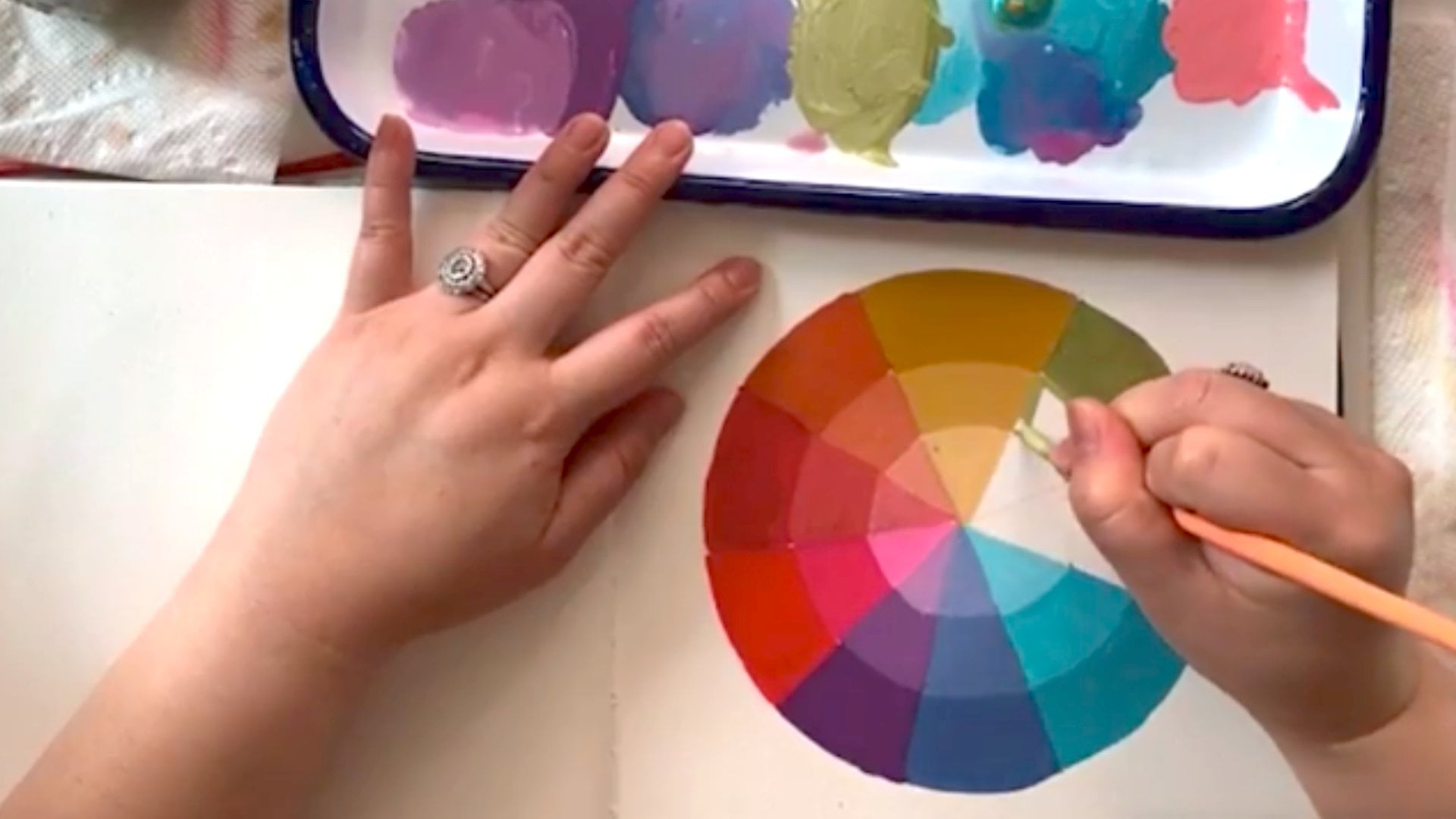
5. The Color Wheel: [MUSIC] Fill up your
water containers, roll out your sketchbooks
and pull out your pencils. It's time to start
on our color wheel. In this lesson,
we're going to paint a color wheel using
colors from the red, blue, and yellow hue family. It will include
primary, secondary, and tertiary colors so
we can learn how they work in relationship
to each other. In this process,
we'll also learn how colors exist in
relationship to each other. Step 1, we're going to
pull out our sketch book, and open it to a blank page. Then we're going to
take our palate. Now you know why we
needed a round one, we're going to trace our
palette for our color wheel. Put it in the center of
the page best you can, and just trace it
with your pencil. Second, we're going to measure the diameter
of the circle. It's about 6.5-ish
or a little over. I'm going to do three and a quarter to get the center dot. Then what we're
going to do is draw six lines through that center. I like to do it crosswise each time so that you
get equal pie slices. That's two lines making
four pie slices. I need to make four more lines. I'm just eyeballing this, trying to make it as
even as possible. It's not really a big deal, that it's precise but
you get the idea. Then one more line. You can see, pretty
much you get the idea. My triangles aren't
all perfect in size, but that'll work
for our purposes. Just to note, you might
also want to note this on your color wheel just
for your own practice. You're going to have a primary
hue and then count 1,2,3. Then your next primary
hue is on the fourth one, and then 1,2,3,4 blue. This way it helps you stay organized when we get
into the painting of it. I'm also going to just put
in the secondary colors. Red and yellow are going to make orange in the middle one. Then red and blue, in the middle is
going to be violet, and then blue and yellow in the middle
is going to be green. This just helps me keep things
on track as we're working. A sketchbook is
all about keeping little notes to yourself. For this color wheel, I'm going to choose Opera
Pink for my red hue, yellow ocher for my yellow hue, and a turquoise blue
for my blue hue. You know what a traditional
color wheel looks like. You'll see how different colors in the same hue family will create interesting and different
types of color palettes. Squeeze out about a pearl size. You'll squeeze out
about a large pearl size of each paint. Sometimes you'll want to
massage the tube because the binders and the pigment
might have separated, which is what's happening
over here. No problem. It's not a big deal.
It's just that sometimes more water will
come out than pigment. Then some are drier
like this yellow ocher. That just means we're
going to have to add more water when we're
mixing with it. What we're going to do is
add some water on our brush. Then one of the secrets
with gouache is getting the paint to the consistency of heavy cream before you're painting with it. That'll give you
the most flat and opaque lay-down on the paper. I'm going to do that and
then paint in my slice of bread with this Opera Pink, one of my favorite colors. It's just so pigmented
and saturated. Now I'm going to paint in
my two other primaries. Again with that yellow. I'm adding water because it came out very
thick from the tube, which means it's a
little dried out. I'm getting into that
heavy cream consistency, just by adding water. You can tape off each
triangle with artist's tape. It's like low-tech tape that
won't tear up the paper. But since it's a
sketchbook exercise, I like to use it as
an opportunity to practice the
steadiness of my hand. Make sure your brush
is totally cleaned between each color so that it doesn't mix in with
the color before. Now, this blue has a pretty
watery consistency already. I'm going to add just
a touch of water, but not as much as I did
with the yellow ocher. Make sure you just paint
over any part of paint that feels raised to get
it smooth when it's one. [NOISE] Again, I'm going to
get my brush totally clean. Then when you're mixing
secondary colors, you want them to visually be
50/50 of each primary color. I say visually because some pigments are
stronger than others, and Opera Pink, for example, is a more transparent color. However, red is a really
strong hue compared to yellow. Just watch that when
you're mixing with it, it's not going to be
50/50 of the paint, you're just visually trying to get to 50/50. Even though that pink is so saturated with the yellow ocher, which is a more of
a dusty yellow, we get this more desaturated, almost a terracotta orange. You want to make sure you
mix a lot of the secondary, so that when you're
doing the tertiary, you could just take some
of that and then add in more of that primary color. Visually, you want it to
be 75 percent of the red, and 25 percent of the yellow. You are getting this red orange, that's more of a coral
with these hues. I'm going to take that secondary, more yellow ocher, [NOISE] to a make more yellow
version of that orange. But it's still more orange
than the yellow ocher. Now you've seen we mix the
colors for all three levels, let's do it for the rest
of the color wheel. [MUSIC] There you have it. A color wheel using untraditional shades of
red, yellow, and blue. You can see with this
color palette you have more of like a retro, 70s vibe going on
with these colors. You can see how colors
can really shift the emotions and
mood of a piece. Now that we've done this, let's move on to painting
our first butterfly. Meet me in the next class.
6. Monochrome and Values: In this class, we're going to paint a butterfly using a monochromatic
color scheme. Monochromatic means
using just one color, but with the addition of
white and black paint, you'll see how we can
get a whole range of values that can make
the colors really pop. Step 1, we're going
to draw a butterfly. Pro tip, all professional
artists use reference. Most pull a lot of reference
or shoot their own. For practice only, it's okay to use reference that you found
on Google or Pinterest, but if you're planning on
sharing or selling the image, then you're going to have to use reference that you either shot yourself or something
that you paid for. You can also use a
royalty-free website like Unsplash to find reference images you can draw
from without paying a fee. Or you can also use the
template I provided in the projects and resources
section of the class. I'm going to use some
images I pulled from Unsplash to draw my
own unique butterfly. Now you'll want to make the usual trademarks
of a butterfly, which is two pairs
of wings that match. I'm going to make the
wings extend out more. Don't worry about
the sketchy mess. We're just going
to paint over that and make sure they
have an antenna. Then I want to add some areas where I can paint in darker and
paint in some details. That's a good start. Now that you've got your butterfly drawn, let's move on to painting. I'm going to choose my
hue and now remember, even though we painted a color wheel with
three primary colors, you're always welcome to use colors straight
from the tube. For the sake of that, I'm
actually going to use a spectrum violet straight from the tube to show you
how to play with value. I start out with squeezing out quite a bit of that violet because I'm
going to be using it a lot. I just want to have
it ready to go. Now when you're painting
with an opaque medium, light gouache or acrylics, you want to paint large areas to small areas and back to front. Because it's opaque,
things lay on top of each other easily unlike
with watercolor, where you would go from front to back or from the
lightest to the darkest. I'm going to take some of that spectrum violet and I'm going to squeeze out a
bunch of permanent white. You can see this violet
is really pigmented, so I'm going to mix them and then when you're
mixing colors, it's easier to mix
dark pigments into the light pigment because the white will be eaten up
really fast by the violet. If you keep adding
just a little bit of white to the violet,
it will take forever. I like this value, this much lighter value of that spectrum violet
and I'm going to start painting in just the
largest part of the wing, which is the main part. I'm going to leave
all the details. Then I'll paint a
different color, just white of the
paper right now. Because gouache lays best
on just the bare paper, so where I can, I'm going to try and leave
the largest area as possible, still does that bare paper so it's easier to paint on later. I want the inner wings to
all be this light violet. I actually want to
create a little bit of a gradient so that the wings look like they're
receding into the body. When colors have a darker
value and less saturation, they actually look
like they're going backwards or going
back in the paint. I'm adding a touch of that
violet I mixed with the white. Now the trick with gradients is that you want to
have two brushes, each loaded with a
two different colors on the gradient that
you want to blend. I'm going to take the darker
color and start blending it in on the inside where it's going to touch the body
because I want it to look like the wings are going
down to touch the body. Also, the other tip with gradients is that you
want to be working wet on wet so that you're going
back and forth with two brushes to create
a smooth transition. I'm actually going to pull out this color a little bit more. But I noticed that it's getting lighter because it's mixing, so I'm going back in here
to add in the darker value. Again, blending it out
with my lighter brush. I'm also using
this darker value. Let me make it a little
darker a little bit. Also using this darker
value to create a shadow where the top wing
is or the bottom wing. Again, I'm going to blend it in with my second brush
loaded with my lighter color. Now this gradient still has little marks on it, like
little brushstrokes, and I like that for
this butterfly, but you could also just
completely blend it smooth and that would be a good challenge if
you want to try that. But since it's a butterfly, I want it to have
a little bit of the segments the
wings seem to have. Then you're going to do the
same on the other side, paint in that lighter color. You can also see here
how this color is already drying darker
than when it's wet, so you can see what I mean about mixing enough
color so you don't have to try and match it again because the wet
looks so much lighter, which makes it really
difficult to try and match. Not impossible, but difficult. Now that we have the mass
of the wings painted in, let's paint in the body. I'm just going to
use an ivory black with a touch of
the violet in it. Because this violet is
already really dark hue and you can always swatch it
in your sketch book too. Look at how dark that violet is. It's already a really
rich, really dark value. What I'm going to
do is actually take a little of the violet
that I had with some white already and
mix it with the black. That's also another pro
tip to unify a palette. Sometimes what you
want is just a hue or tone temperature that
unites the whole thing. In this case, we're using a hue. Even though that purple totally
disappears in this black, I'll bring it back
as a highlight. Another important note is that you're going
to want to wait until areas of your painting, if you are painting
over it, to be dry, overlapping over it because you don't want to pick up
that paint underneath. Remember, the unique thing about gouache is that it can be
reactivated by water too. If you're repainting
over something, some area that's already
been painted over, you want to make sure
you're really careful and don't go over the
area multiple times, which will pick up
the color underneath. You'll just want to
lay it down flat. Put the little antenna in. I'm going to go back
up to that purple. Add it as a highlight. A little body. Since the value of this
purple is so dark, I'm just going to use the purple straight from the tube to do the outside of these wings. If I wanted it to be darker, but it was a lighter hue
like that, opera pink. I may add more of a dark
red to it, or some more. Now remember with your painting, you can always turn
your Canvas around to help best suite your hand. It would've been really
hard to paint over that wet paint area since I'm right-handed so I just turned
my sketch book upside down. You can always turn
your Canvas around. Now I left some white area
and then I'm painting over this area so you can see that you can do it both ways but it's going to be a little more hard the way that I'm doing it here if you are painting
on top of other paint. You'll see that it's going to
be a little harder to paint over such dark paint but that's why the magical
gouache also comes in. Another trick is
that it's easier to paint pulling down or towards you to get a smooth
line than it is pushing away. Add a little more landing till here for the bottom
or the top way. Now I'm going to let that
dry for a second or pro tip, if you happen to
have a blow dryer on here and you could just
blast it real quick. Now I'm going to
go back and add in details of that purple, whether they're shades of
purple to make it really pop. I'm going to take
the violet here, I'm going to add some
more white to it. I want it a little
darker than my base. I'm going to add a little
more spectrum violet and it's always a good idea
to mix up a lot of paint. This hue while the value is a little lighter
than the violet, it's still a pretty
much medium value and you can tell when you squint your eyes and just see the lightness and
darkness of each color. Again, it's a relationship
to each other. I'm going to go in
with his darker, light violet to paint
on some details. You'll see as we work on this, the monochromatic palettes
don't have to be boring. In fact, they can be
really sophisticated or a dramatic way
to use one color. I'm just having fun and making it up as they go along too. This is beyond what
I had sketched. But again, these are all sketchbook exercises for you to experiment around
with your paintings. I'm adding a little shadow
with a shade too and I want to blend it in with this
lighter shade I had. That was the darker shade, darker than the base coat. Then since it's a butterfly, I'm going to mirror
image the painting, the pattern the best I can. I'm going to flip that Canvas again to make it easier
for myself to paint. Now I'm going to go back and refine some edges on that body. This is all the detail
where you do at the end to really
refine your painting. You'll see that ivory
black tends to dry a little grayer and a little
lighter. The one that's wet. I'm going to clean up some more edges. I'm also going to mix in to their value shade that's a
little lighter than this, but a little darker than this. I'm going to start by
taking this one over here. It makes it a little more white. Then I'm going to swatch
it next to this one. Swatch it here. I swatch this one so that I
can tell that it's darker, next to it. The best is to let it dry
and then you'll know. Well, I'm going to
take this in-between color and I'm going to use
that to create some of those. I can see when I painted
on there that it's not going to be light
enough or dark enough. I'm just going to add
a little more purple. I'm just going to mix
more of that color but make it a little darker. You create those little facets that you see in a better flyway. Again since it's a butterfly, I'm just trying to mirror image. See what happened there,
the black was still wet, which is why I warn you about drying each section before
painting on top of it. I'll do this one. We go back to the original parts to clean it up a bit. In fact, I think
I'm actually going to unify it even more. I didn't touch more of the pure violet
straight out of the tube, the dark violet in a little bit more detail
within the details. It's all about balancing what is inside each
painting and you don't want everything to be equal
and even because that would make a really boring
composition for your eye. Even when something is
symmetrical as a butterfly, you still see butterflies have a balance of
values and colors. For them, it's biomimicry,
perhaps for protection. But for our artistic sake, it creates really
beautiful patterns. Even though a lot of them are only one color or two
if you count black. I'm going to wait for
that to dry a little bit more to lay the color down because it's picking
up the color underneath. There you have it. We have a beautiful
monochromatic butterfly. Let's move on to complementary
colors in our next lesson.
7. Complementary and Analogous: In this lesson, we're going to learn about
complimentary colors and how they bring out
the best in each other. Putting complimentary
colors next to each other makes each one brighter, and when you mix them together, it neutralizes them without
doling their saturation. Complimentary colors
are colors that are opposite each other
on the color wheel, for example, red and green, blue and orange, and
violet and yellow. When using complimentary pairs, remember that every temperature and value is also
available to you. In this lesson,
we're going to paint another butterfly
and monochrome, but this time on a complimentary
color background so you can see how the butterfly
pops so much more. This is a tool you can use in your paintings when you want to make your subject pop out more. Step 1 is to sketch
your butterfly, this can be the same butterfly
from your last sketch, the template in the class, or a whole new butterfly. For me, I sketched out
something that was inspired by the monarch butterfly because the complimentary color
pair I'm going to use is orange and blue. For my blue, I'm going with an
ultramarine this time. I'm going with a
deep sapphiry blue. I'm just going to use it straight out of the tube and I'm adding water
with my big flat brush, this is a size 12 flat brush and I like it for this size for sketchbooks just because you
have edge control still, but you also get nice
brushstrokes out of it, nice flat coverage. Now when you're
painting something, just an opaque flat color, you want to work
fast and wet-on-wet, so everything smooths over
quickly and together. Remember, gouache adheres to
blank paper the best, so I'm leaving the
large areas of the butterfly largely untouched, I'm just painting basically
an outline around it. Again with opaque paint
mediums like gouache, acrylic, you go
from back to front, so I'm painting in
the background first. Now see see I didn't
have enough paint, so I'm going to
squeeze that way more. Feel free to mix
the color here too, if you want, you
don't have to use the blue straight
out of the tube. Again, I'm smoothing out those ridges that the paint sometimes makes when too
much of it pulls together. Now, that paint feels too fixed, so I'm adding more water to get that heavy cream consistency. Again, if you have a little drop of paint
somewhere you don't want it, you just use a clean
brush, lift it up, basically what you're
trying to do is get rid of that texture so that the paint can still
lay flat on the paper. Going back over the areas
that are a little bit pooling with my paint. Just a little bit more. Now I'm going to pull my orange, so again, you could just use colors
straight from the tube, you don't have to mix your own. So I'm going to use
this orange lake light, but what I am going to do is
add some brilliant yellow to it to get some variations
of that monochrome. So adding yellow to it makes that orange get it a little
lighter too actually, in value because
yellow is lighter in value rather than adding white, we still get some more
saturation and color. So with the orange, I'm actually going to maybe
add a touch of red to it, so I can get a little
bit of a gradient going from the top of the wing
to the bottom of the wing. Just because monarchs tend
to have that pattern, so I'm going to mix
up enough that orange for the top wing, see how that orange is really popping on this dark
blue background already, even more so than if
it was just by itself. Then I'm going to mix some
of this yellow, orange, I'm going to get more of that yellow in
there because like I said, lighter colors tend to be overwhelmed by
the darker hues, so you want to really add the
orange to the yellow to get more control over how fast
it becomes a lighter color. So what I'm going to do here is actually, I want to bring
some of that red, orange down into
the bottom wing, and I'm doing that
gradient method again where the brush is loaded
with both colors and I'm just going back and
forth until they really blend together
pretty seamlessly. That looks pretty good, so
I'm going to move on to the next, bottom wing. So we have the base of
the wings painted in. Now for the details
of this butterfly, like the outer wings, they tend to have a
stark black contrast, so I'm using the ivory black
and I'm going to paint in the body first. Now for this piece, you
want to make sure it's completely dry before
we add in the details, because now there's
no more bare paper. This is important because when we paint on top of gouache, it is reactivated by color. When it's dried, you have a little bit more time with the wet gouache
laying on top. I'm going to add in some of
the details or the veining, or the facets inside
the butterfly wings. I'm actually going to
take a cooler red here, mix it with our orange to get a little bit
of a darker orange. Again, not adding black, so I don't lose the hue. Then I start to vein
in the details. Actually going to
do these details in black because I realize that monarch butterflies have
black faceted details. But you could also do the same hue like I was doing before if you wanted to
get a different effect. Now, to get some highlight
details on the body, I'm actually going to
go in with more orange. Just straight out of the tube, on the body of that
monarch butterfly. Then I'm actually going
to take that blue. Use white. Just a touch of it to it, to do the top of its body. Actually I'm going to
take the ultramarine. Make a lighter one, but not
as light as I had before. Just add some detail
again to the body. Taking that black, moving it back over
the wings just because I feel like
I'm seeing some edges. I'm going to add
a touch of orange to frame the head a bit. That's just to start pulling
color into the body, which would be
somewhat reflective. Now, I'm going to
take pure white to add some patterning
to the monarch, but I'm going to take some
creative liberties with it. Now see how laying the white
on top of a drag black, the white really
pops because it's not picking up any of the
black underneath because I'm only just hitting
it with one stroke. If I continued to go
over that stroke, the black would
start to pick up and the white would start
to turn grayish. This is monarch
butterfly inspired and not exactly a replica. I'm going to go back in and add more details to the edges of the butterfly
to sharpen it up. Voila, you have painted
a butterfly with a complimentary
background to see how much that butterfly
really pops off the page. For practice, you
can also reverse these colors and do
a blue butterfly on an orange background
just to see how they play with each other and
give you a different effect. You can see these examples of other butterflies I painted too. The contrast between
painting it in an analogous meaning a color close to the subjects color or opinion in a complementary
scheme here. Neither is right or wrong, it's just a tool to achieve what you'd like in
your paintings. For example, for an
optional Step B, you can also add leaves
to the background of this painting and a color
analogous to that blue, so that you can add more detail without distracting
from the subject. I'm going to take some
of this turquoise blue. For simplicity, I'm just using colors
straight out of the tube, but feel free to mix
your own colors. I'm going to add some
leaves into the background. But even though
they're bright, or this turquoise blue
as a bright color, it's adding texture
in detail without distracting from
the main subject, which is the butterfly. This is how you can apply it to your more complex paintings that you're going to want
to do that in future. Also notice how, even though
this is a turquoise blue, when I'm painting it on
a cooler background, a cooler blue, like
an ultramarine, it starts to look really
green or more yellow toned, which I think is color
theory in action. Isn't that cool? Now in this next lesson, we're going to
start experimenting with an even broader scope of colors with a split
complementary color scheme. Join me in the next video
for our last color exercise.
8. Split Complementary: In this lesson, we're going to go over
adding more colors into the mix because most paintings
have multi-colors in them. I wanted to give
you some guidance on how to pick those colors, and a split complementary
color scheme is a great place to start. What is the split
complementary color scheme? It's a color scheme that
uses colors that are opposite on the color wheel, but the main color
will be say a red, and then the opposite
will be the two on either side of its
complementary color. For example, a yellow-green
and a blue-green. I'll be using these colors for my next butterfly
sketchbook exercise, but feel free to pick your own split
complementary color set. Let's get started. Step 1 is to sketch
your butterfly. You know by now, you can
either create one on your own, use a reference, or use the template that's
provided in this class. Step 2 is you're going to mix the color that's going to be the biggest mass in the painting. For this, it'll be
the background. I'm going to do a
lighter blue-green that's a little
desaturated so that you can see the things
that are further back are lighter and
more desaturated. Step 2, you're going to
squeeze out those paints. I'm going to take
some of this green. Then I'm going to add this
turquoise blue to it, to blue it up without
adding just pure blue. Let me take a lot
of this white over here and some of that
green already on my brush. I'll start mixing up
this minty color. I want a lot because it is
going to be the background, and it's the largest
area in my painting. Now you'll see it's very
bright right now still. What I'm going to
do is actually add a touch of the
complementary color, which is a red to desaturate it. See how it dulls it down
without the way that adding black will make it more gray
instead of just desaturated. I'm going to add a touch more. It's really neutralizing
that green, but in a very still
pleasing way. I feel I'm going to need more, so I'm just going to add
some more white into it. I'm going to actually use the opposite
side to swatch it. Actually, I want that
to be even lighter, so I'm going to add
more white to it. We want to paint the whole background. Now that the background
is painted in, I'm going to wait
for it to dry a bit. Then I'm going to paint
in the pink wings. While that's still drying, I'm going to mix some more pink. I'm going to add
white over here. I'm going to make a lighter hue of the red that we
also call pink. I start by adding red to the white because red
is a really strong hue. It will just gobble
up that white, if you're adding
white to the red. Now the nice thing about
having swatches here is that you can
swatch the color next to it and see if you like
that color next to it. I'm pretty happy with it. I think I'm going
to add more white because I know I
need more paint. It's a little bit paler,
but I'm good with that. Now I'm going to start
painting in the pink wings. Again, this is a totally
made-up butterfly, not based on anything. I'm just having fun with it, and I encourage you
to do the same with the butterflies in
your sketchbook. I'm going to pick a little bit of a darker
paint to blend in. Again, those wing details to create more depth
in the painting. There's blue on this brush. There's blue on that brush. I'm just going to
mix a new little well of pink because the blue tinted the
pink a little bit. Again, I'm going to swatch
it here to make sure it matches. It's pretty good. You can see with this color, it's drying actually
a little bit more red than it
looks when it's wet. That's just part of getting
to know your colors. Each paint color
behaves a little bit differently because of the
pigment that's being used. Now that we mostly
have the body of the butterfly in
or the wings in, I'm going to mix the color for the body which I'm
actually going to use red and green because they're complimentary colors
to make a dark brown. I'm doing this instead
of black to make a dark color that feels like black in the context
of this painting. It's the darkest value
in this painting. But have it feel
harmonious because it's still part using
the same two color hues. Like I said, part of
creating color harmony sometimes is making sure you're using something that's
the same family, either a hue, or temperature,
or maybe even value. There you go. Sometimes I don't really like to use black and a whole lot of paintings
because every black, it really just goes
to the most extreme. Whereas when you're mixing
a dark value like this, even though it's very
extreme in its color, in the context of
this whole painting, it still has color and you
can see that it's more of a dark green brown instead
of just straight black. It just gives it a
little bit more life to have color in it. Now for the outside, I'm going to take the red, but I'm actually going
to take a touch of a green to dilute it down
and desaturate it a bit, so I'm not having
this super bold red. I'm going to swatch it next to this one to see if I like it. I really do, actually. I'm going to make more of it, so I make sure I have enough. I'm going to do
the dark edges of the butterfly wings
and this darker, desaturated red that I desaturated with its opposite
complementary color. But because it's the same
base hue of that flame red, it's still really playing well with this
pink that I mixed. You see how the colors are already coming together
in a really lovely way. Even though they're
colors, I wouldn't necessarily have thought
of using a dark, muddy olive green and
a dark terracotta red. Always going back in. This is why you want
to make sure you have enough paint too. You're always going
to go back in and refine those little spots. Now I'm actually
going to go in and do some more dark pinks to
pull out those details. Too desaturated. I'm
going to start over. I'm going to take this pink. Just a touch of this blue-green. Probably a little more
red. There we go. Now I'm going to go back
in and actually add more yellow to the green
to get more of a lime green. You can see when
I desaturated the green with the red for the body, we're already getting
a lime green there or more of a yellow-green
than a blue-green. We're going to take
this lime green, and add some touches to
the butterfly wings. That's still going to
this color palette. You wouldn't think a
lime green would go with a terracotta and a
pistachio green. But I'm really digging this. I hope you are too.
Also going to take this lime green to
touch the body. Give it a highlight, and
give it a little detail. Also, we're going
to go in with some white because why not? I'm going to add some
detail to its outer wings. You can get as detailed or as simple as you would
like with your butterfly. That's the fun part of
these sketchbook exercises. They're just a little
exercise and helping you discover what you like to
do with your paintings. I like to balance my
mix of simple shapes with more areas of detail because I think it
just makes a nice balance. But sometimes it calls
for a lot of detail. It's all in the mood that
you want your piece to have. Of course, with butterflies, I'm trying to do some
cheerful, happy pieces. Sometimes for these
sketchbook drawings, I also like to
indicate the colors I was using and the date, just so I know. Just so I have some good notes
on my color explorations. There you have it. You're
well on your way with the tools in hand to create
your next masterpiece. I have a little bonus for
you in the next video, with secret ways that
the Internet can help you pick out a color
palette. Join me there.
9. Creating Harmonious Color Palettes: [MUSIC] Now that you've learned how to use
the color wheel and all different types
of colors schemes to help choose your
palettes, let's get deeper. Colors can really set the mood of a piece
and you just have to decide what story you're telling
with your artwork first. A [inaudible] romantic
scene would have more desaturated pastel and
light valued colors. An exciting scene may have
full-color saturation with dark blacks to punctuate
the high contrast. Explore the story and find the color palette
that will support it. Along with the tools that
you've learned in this class, I wanted to share two of my favorite websites
to go color hunting on coolors.co is a website that features color palettes that
you can browse by trending. One of my favorite
ways are randomly generating a beautiful
palette just for you. Use this to help with
your color practice. Generate a color palette and do a sketchbook butterfly painting. The next website is colorhunt. co. It's a website
that also features color palettes that
you can sort by popularity or by vibes. The next time you're
creating a new artwork, consider using one of
these websites to help you narrow down that
palette faster. Meet me in the next video
for more information about the 14-day sketchbook
challenge that will follow this class and to wrap up
everything we've learned.
10. Wrap Party!: [MUSIC] You've made
it, congratulations. You've completed introductory
to color theory. We've covered a
lot in this class, so it's a big deal. In this class, you've
learned how to discuss and see color
in terms of hue, value, saturation,
and temperature. How to create a
full color spectrum using just three colors. Different types of
color palettes and schemes including
monochromatic, analogous, complimentary, and
split complementary, and most importantly, how to use color to tell your story. I hope that through
the lessons and exercises in this class, you'll learn more about
how to handle color and now create better artwork
as a result of it. Please share artwork in the Projects and resources
section of this class. I'd love to see it and be able to give you feedback
and comments on it. I can also help you
troubleshoot if you need. Additionally, there
is a 14 day challenge that you can take on
after this class. You'll continue playing with color and butterflies
by following a prompt list that's
available for download in the Projects
and resources section. I'll be doing it along with
you for the first one in this class and would love
to see how you're doing. Please share your
challenge paintings, also under the Student project
section of this class, and also on Instagram using
hashtag art with Ann Danger. Thank you so much for
joining me for this class, I make these for you and
I would love to hear feedback on more classes you'd
like to see in the future. See you next time and
until then, keep painting. [MUSIC]
 Ann Shen, Illustrator & Author