Transcripts
1. Introduction: Have you ever wanted to paint in a more graphic
illustration style but you don't know
where to start? Do you admire great
mid-century artists like Mary Blair and Alain Grée? But you want to find your
own modern style inspired by their work? Then you're in the right place. Welcome to Gouache Painting
Graphic Stylized Fruit This is a hands-on class where you'll be
learning to paint with gouache and use the elements of design to help you find
your own art style. I Ann Shen and I'm
an illustrator, designer, and best-selling
author based in Los Angeles. I've worked with
clients like Disney, Adobe, and Jeni's
Splendid Ice Cream. I've also written and illustrated
three books titled Bad Girls Throughout
History, Legendary Ladies, and Nevertheless, She Wore It,
all published by Chronicle Books. Together they've all
sold over 400,000 copies. I attribute all of this to
finding my own voice and style, in which I'm
going to show you the building blocks of
in this class. In the following lessons, you'll learn about three
elements of design that are key to a
graphic illustration style. How to gather and use photo
reference to design your art. How to paint with gouache to
get the effects you desire. Designing interesting shapes that still read as your subjects. Creating limited
color palette and using negative space to
create a better composition. If you're ready to level
up your gouache painting, whether you're painting
for the first time or the 40th million time and find
your own illustration style, join me in this class! I'd love to have you.
2. Class Orientation: Hello and welcome! In this class we're
going to be designing and painting three
tropical fruits. The exercises in this
class were designed to introduce you to three of the main important
elements of design, shape, color, and space. Once you learn these elements, you can incorporate them into your own illustrations
down the road, We're painting tropical fruit because they are a
fun and trendy motif in art licensing
and illustration work. Also they come and beautiful
shapes and colors, nature is the ultimate designer. First, we'll start with finding good reference photos
or taking our own. Every artist uses reference photos and
I'm going to show you the way to use them
properly so you don't infringe on
anyone's copyright. Second, we'll simplify
the fruit down to graphic shapes
for sketching. From there we'll learn to mix
colors and learn how to get the perfect consistency
for painting with gouache. Then we'll paint the fruit and add our own little
design touches. Finally, we'll clean up the painting and prepare
it for scanning. By the end of this class, you'll be able to take
any subject and turn it into a graphic illustration.
Isn't that exciting? Let's get started. I'll go over materials in the next class.
3. Materials: In this class,
I'll be going over all the materials needed
to paint with gouache. As with all my classes, even though I'll be
teaching in gouache, you are free to use any
materials that you have on hand, be it markers, acrylics
or even your iPad. The design elements
that we'll go over apply all the same. I do hope you'll explore gouache with me in
this class though, because it is a beautiful
and rewarding medium once you learn how
to work with it. Why gouache? Many
mid-century illustrators used it as their medium of choice because of its beautiful, opaque quality and matte finish. It also dries fast so
you can work quickly. The matte finish makes it a
dream to scan or photograph, which makes it easy
to reproduce either as a print on your own
or for client work. First, let's go over paint. My favorite brands are
Winsor and Newton and Holbein, which are great quality
paints that you can easily find in your local
art store or online. I usually try to
have a warm tone and a cool tone of each color. Warm shades have more red
or orange undertones, and cool shades have
more blue undertones. If you're interested in
more info on color theory, take my Painting with Gouache: Introduction to
Color Theory class. Here are the colors I
always keep in my kit: A flame red, alizarin crimson, opera pink, brilliant
violet, spectrum violet. And that's an example of a
warm purple and a cool purple. Ultramarine. And primary blue. Turquoise blue, brilliant green, permanent green middle
and olive green. Linden green, brilliant yellow, primary yellow, yellow ochre, and orange lake light. My neutrals I always have
on hand are burnt sienna, burnt umber, and ivory black. And then of course, I always get a big old tube of
permanent white. You'll find and tailor
your kit as you discover your color palettes
that you like to work with. For example, I always have turquoise and opera
pink in my kit. But that may not be for everyone Here are the painting
tools that you'll need. Brushes, of course. I like a synthetic watercolor brush and it doesn't have to
be very expensive. This is a place
where you can play around with different price levels of brushes and see which
one works for you. You'll want to have round
brushes in a variety of sizes like 0, 2, 4, 6, 8. You'll also want an
angled flat brush at about a quarter inch, and then two flat brushes, about half-inch is a good size. I always get my
really tiny brushes from the beauty supply store. Nail art brushes are great for this and they're
pretty cheap. You'll also need a water jar, a spray bottle with water. Again, another thing
I like to get at the beauty supply
store because they have ones that have
a finer mist. You'll need artist's tape
or washi tape, and then a palette. For palettes. I like to find ones
that are ceramic or ceramic coated because
they're easier for cleanup. One of my favorite
things to find are vintage egg dishes
at flea markets. You'll also need a
roll of paper towels, which you'll put your brushes on. Now let's talk
paper. For painting with gouache, because it
is a water-based medium, you'll want to use a type
of watercolor paper. There are so many options available at all
different price points. The main thing to know
about watercolor paper is that there are two
types of finishes. There's hot press, which
is totally smooth. And then there's cold press, which has a texture. Now which one you use is
a matter of preference. I tend to like the hot press
because it's totally smooth, which goes with the flat graphic illustration
style I like to do. But with a texture,
you also get a nice, beautiful textured,
more painterly edge. So it's up to you. It's a matter of
personal preference. Other options of paper
that you can use that are more economical and
good for practice are sketchbooks
and Bristol board. Bristol board is a
multimedia paper that's thick and relatively
inexpensive. I love using Canson's
Bristol board. It mimics the texture
of a hot press paper. I also love a
watercolor sketch book. This one is by Arteza and what I'll be
using for this class. When I'm painting
more full paintings for gallery shows and
things like that, I'll use the more
expensive Arches paper because it's worth it to
have it on a block where the paper is totally
stretched and flat so that when you're painting it doesn't curl up
or get distorted. This paper also has better archival qualities is because it is a
higher-quality paper. Okay, we're almost there. Here are the last few things
you need for sketching. You need a Col-erase pencil. Any color really works. Erasers like a
Tuff Stick eraser, which is a very skinny
eraser like this. And a rubber eraser, a ruler, a sketchbook,
of course. Then any round caps you have
laying around the house. Now that you've learned
about all your materials, let's get started. I'll meet you in
the next lesson.
4. Finding Reference: In this class, we'll
go over finding reference images. As a
bonus gift for you, I've included a pack of royalty-free images that can be found in the Class
Resources section. These images come from Unsplash, which is a great website for
finding royalty-free photos. Every artist uses reference. It's how we learn what
things look like, especially things that we may not be able to
find in real life. The key to using reference
correctly as to not copy directly from any
photograph that you find on Google or Pinterest. Those images are copyrighted by the artist who created them. That includes the images that I designed for demonstration
in this class. You of course, can copy me
step-by-step for practice, but you cannot sell or use those in your
portfolio as your own. So how do you make sure
you don't do that? Collect a lot of
reference images, and do a lot of study sketches so that you understand
what the object looks like without referencing
any one photograph. A fun bonus exercise: do a bunch of studies
from photographs. One way of doing studies
is sketching a bunch of images so that you
can learn how a subject, say a pineapple, really looks. You're trying to draw as realistically as
possible to the image. So in this case, you may be copying the photograph
you're referencing. But these are for your
own private practice only and not for art that you
would sell or post online. That's an important
key distinction. When in doubt, always give credit. For more on
drawing from reference, checkout my Iconic Women in History: Draw Your
Inspiration class. The point of doing
these studies is to really see the subject and
understand what makes it what it is, the color, the shape, the details. Another thing you can do
for reference is of course, license the image
from the photographer. You can do this by
using a site like Adobe Stock or reaching out to the photographer directly to ask if you can license their
image for reference. That usually includes a fee. I personally rarely
do this because I'd rather create an
image of my own. But it may be necessary
for things that need to be very specific and
difficult to find. A third thing you can do, of course, is create
your own reference. Go out and get your own
pineapple and take photos of it. That way you can
draw directly from your photograph all you'd like. Now that you have three ways
to find and use reference, Let's start making art with it.
5. Design Element 1: Shape: In this lesson, we're
going to talk about one of the main
elements of design, Shape and Line. In the
most basic terms, shape is a two-dimensional area that's defined by an outline. There are two main
types of shape that we're gonna deal
with in this class. Organic, which is natural
forms found in nature, and geometric, which
are shapes like triangles, squares, and circles. In graphic illustration,
we often use geometric shapes to simplify
what we're designing. Most objects can be simplified into circles,
triangles or squares, or a combination
of all three. We'll use those three shapes
in addition to line, to design our fruit, I'm
going to show you how to put this design element into practice as we sketch
our pineapple. First, we're going to pull up all our reference images
of our pineapple and our studies. That will help us understand the basic
shape of the pineapple. Now let's simplify the pineapple
using geometric shapes. Coming off from our
studies and our reference, we know that the body of the pineapple is more narrow
on top than the bottom. I'm going to draw a
curved oval shape that's more narrow on
top than on bottom. And then one common
theme is using curves, against straight lines in
graphic illustration. So I'm going to actually
make the bottom a totally flat, straight line. You can see that the
pineapple is already more stylized than a natural, it's natural organic shape. Now for the leaves, I'm going to do
curved triangles to simplify that top topiary. And sometimes I might use
the curve against straight again. Another common theme of graphic illustration
is symmetry. And so what I'm gonna
do is actually make this top leaf part
reflect each other. And be symmetrical. And then I'm going to add a
little leaf in the middle. And then another element of
graphic illustration is using a straight line down
the middle to help represent form that we're
going to show through color. And then finally, to simplify the texture of the outside
skin of a pineapple, which is kind of
a diamond texture with little triangle points. I'm going to do
this cross pattern. Then to illustrate that
little pointy part, we're going to do a triangle in the middle of each diamond. Mine's not perfectly
symmetrical on both sides as you can
see, and that's okay. Just kinda up to you how perfectly symmetrical
you wanna go. And that's part of
your stylization. There we have it. So now our sketch is
prepped for painting. Meet me in the next video where we're going to
break out our paints.
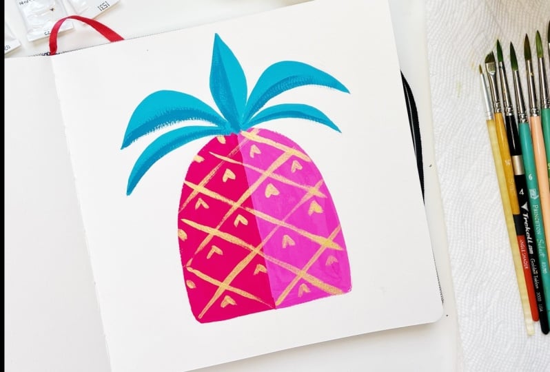
6. Painting a Pineapple: Now that we have the
sketch designed, it's time to break
out your paints. It's easier to start out with a general idea of what
colors you're going to use so that you can get into the flow of
painting more easily. We'll start by looking back
at our reference images. We can go with a more
realistic palette, yellow, green, and brown for
the colors of this piece. Or we can go more imaginative, maybe pink, blue, and gold? The world is your oyster! We'll discuss color more
in the next lesson. So for mine, I'm gonna go with a more
traditional palette, which will be yellow,
green, and brown. So first you're going to squeeze out paint into your palette. You want to squeeze
out a good amount so that you have
enough paint because the worst thing is not having enough paint and trying
to re-mix that color. One thing to know about
gouache is that colors tend to dry darker unless
they're darker colors, which then tend
to dry lighter. So in order to best
understand that, you might wanna do little
swatches on the side of your sketchbook to understand what color it's going to be. But to re-mix that again
is very challenging. So that's why you
want to mix up, that's why you want to
squeeze out enough paint. I'm going to take my round
number six brush and there's it's wet but not
not dripping wet. And I'm going to take
that brilliant yellow, add a touch of that
primary yellow. And what that does is neutralize the yellow so it's not
too warm or too cool. I'm going to use that actually as the base
color of my pineapple. So actually what I want to
do is mix up even more. So adding more paint to that. Paint straight
out of the tube is the consistency of butter. And what you wanna do is
add drops of water, one at a time, to get it to the
consistency of heavy cream, which is the perfect
consistency to get that flat, opaque lay with gouache. So what I'm gonna
do actually is also another pro tip is taping off your painting
to get very clean lines. What I'm gonna do is take a
piece of scratch paper and my washi tape. Measure about the length of the area
that I want to mask off. Another pro tip is I
like to tap my tape on my shirt to get it kinda lint-y so it doesn't
stick to the paper as much. Because if it's too sticky
when you're peeling it up, it'll rip the paper. Another good rule of thumb with painting with opaque
mediums like gouache or acrylic is to
paint from back to front, and largest
to smallest object. And so since there
is no back on this, I'm going to paint
the largest object, which is the pineapple body. And so now that I have that tape all nice
and cleanly applied, I use my thumbnail to kinda make sure that
edge is clean and tight. I'll start painting. You'll see the blue is showing through, which is why I prefer
to use a vermilion or a lighter color
when I'm sketching. But for the purposes
of this class, I want to make sure that
you can see it on camera. And plus it's not
a big deal because I'll just apply another layer of paint in order to make sure
that it's fully covered. So this is the first coat. You don't want to go
over areas too much when they're dry – I mean because
when they're wet, because they'll
just kinda pick up. So what you wanna
do is just make sure you have that clean edge. And it also helps to pull
your brush towards you to get a smoother edge than it is when you're
pushing away from you. I always try to move my
canvas if I need to, make sure I'm pulling
towards myself, pulling my arm down. And now you want
to make sure it's completely dry before
you paint on it again. One thing about gouache is that because it is a
water-based medium, it can be reactivated by water. So we're going to paint back over places you've already
painted with gouache. You want to be
careful and not go over the strokes
too much because then you can start to pick up and reactivate the
paint on the bottom. Now one thing you can do to help speed up the process is use a fan or a blow dryer. You can tell it's dry when
it's no longer shiny. So your paint may have dried a little bit in texture while you were waiting
for your painting to dry. So all you can do, All you need to do is just add a little light mist and you'll get back to that nice
heavy cream consistency. I'm going to go back
and do another layer. So you can see now I'm getting more coverage over the
sketch blue lines. The blue sketch lines. Again, I'm trying
to just go over it once, so that it doesn't reactivate the paint underneath and start to pull up. This is not a big deal when I'm painting over the same color. But it can get
tricky when you're doing more complex paintings
and painting over things. Now, for our next step, we're going to peel up the mask. And you'll want to
just pull straight up so you get a nice clean edge. Perfect. You want to make sure
that the paint is totally dry even on
the edges there. Okay, and now what we're gonna
do is going to carefully tape that edge and mask
off the other side. Now. Now we're going to also mix
the color for the other side. So I'm gonna do a
darker yellow to give the impression of
a shape or form. So now I'm going to
take my yellow ochre, which is a darker yellow, take more of that brilliant
yellow mix over here. And some of that primary. Again, you want to make
sure you mix enough color. I'm actually going to add a little bit more brilliant yellow and a touch more yellow ochre. And a drop of water because it's starting
to feel a little thick. Okay. Now I'm at a nice
heavy cream consistency. I'm going to use that round brush again. I'm going to start painting
in with nice flat strokes. You wanna make sure
that the edges of the paint are
all smooth flat. So make sure you use your
brush to go over it a couple of times so that there are
no edges so you don't get it like ridges on the end of
where your brush went through. Now that we pulled it up, you can see both sides of the pineapple. Now you can see it's a little asymmetrical, which
is totally fine. I'm going to just adjust
mine a little bit by bringing up the curve on this side because I can
see it's a little lower. But otherwise I love that nice
clean line in the middle. All thanks to masking. Okay, next we're going to paint the second largest shape,
which are the leaves. For that, I'm going
to use an olive green because it is more in the
yellow tone side of the family. Maybe a little of
the linden green, which is also on the more yellow tones
side of the family. I wanted to have a
little more harmony. And to create color harmonies, you want to use colors that
have similar undertones. So for painting with green, I'm taking a clean brush. Again, just loosening that texture
straight from the tube. And I'm going to add it
to the linden green. One of the tricks of using
gouache is also adding darker colors to lighter colors because you'll see the adjustment
happens so much faster. Whereas if you're
adding lighter colors to darker colors is going to take a lot more light color to lighten up that dark color. I like this color. I like the consistency. I'm going to just
start jamming on it. Now again, what I
said about you can rotate your canvas or the
piece that you're working on, the paper you're working on. So that it's easier
for you to pull down. Which is more
natural and control for your arm. You're pushing up. It's harder to get a
smooth, curved edge. This is important in graphic
illustration because you want those nice clean
lines and edges. Don't worry if your hand is
shaking in the beginning. With more practice, you'll
get a steady your hand. Alright, so one coat of the
green will do for the leaves. Now what we're gonna do next is we're going to
let the leaves dry. We're going to add
in the details of the skin on the pineapple. Do that. We're going to take a
smaller round brush. And I'm going to squeeze
out some burnt sienna, which is a warmer toned brown, and some burnt umber, which is a cooler tone brown to get a little
more neutral brown. Also going to add
a touch of white. Overall, lighten it up. Okay. To do those criss-crosses, you'll either reference
your sketch from before or you can just eyeball it,
which is what I'm gonna do. And again, I'm just pulling
straight down. And I like that there's a little thick
and thin texture. That's just for
me, if you want it totally even, feel
free to go over it again until you get
a very smooth, flat line like you'd like. Add a touch more water. Brown is a bit dry and you can see because it's picking
up that dry brush. Okay. And now that I have
the lines painted in, I'm going to paint in
the little triangles. Okay. Now, now that the
leaves are dry, I'm going to add a
little dry brushing, which is a painting technique that can help create
a little bit of texture and also
dimension without making it look like too
rendered of a painting. I'm going to take
that olive green, which actually is pretty wet. And then I'm going to take off a lot of that paint
on my paper towel. And then, and then
you'll see you get this nice dry brush texture where you can see the texture
of the paper come through. This is where using
cold press is nice. Because you can have that
texture of the paper work with the texture
of your dry brush. I'm going to use a little bit of dry brushing here
just at the roots of each leaf to give a sense of dimension that
they're coming closer together. You can see that in
your reference images. I'm doing it just on the
bottoms of the leaves, the bottom curve of
the leaves to give more of a sense of
dimension and texture. All right, We're almost done. We're just going to add a
couple more details and then some sparkle passes,
as I like to call it. I'm going to take this green that I used
for the leaves and a little bit of the white
to make a lighter green. I'm actually going to just add a little dab on the
tip of each triangle. Just to add a little
bit more dimension and detail that's reflected from the organic shape
of the pineapple. I might actually go in and take straight white
out of the tube. So when you're doing this
sparkle pass at the end, you want to use
paint that is like the texture of butter where it's thicker so that you
get that nice opaque touch. Also, once the white
has some color in it, you just have to use white
paint straight from the tube. And now I'm going to take
that straight white and add another dot on top
of that lighter green to really make
it pop and sparkle. And I might do some on
the leaves to dry brush. A little sparkle. There we have it. Our first tropical
fruit is done. Join me in the next video
where we're going to learn about color
and painting citrus.
7. Design Element 2: Color: In this lesson, we're
going to learn about another key element of design
in graphic illustration. Limited color palettes. By limiting your
colors to just three, you create more stylized
and sophisticated palettes. This is an opportunity to
set your brand apart or create a collection around
a set theme of colors. Even though you're
limited to three colors, you can use all shades
and values of that hue. For the sketch, which I
did a rough one here, you're going to use the
elements of design that you learned about
in the last lesson. Shapes and lines. You can use the
bottom of glass or the cap of a candle to help
you draw round shapes. So I'm going to just
use this to help me assist drawing some
of my citrus slices. I'm drawing lightly
so that it'll be easy to erase away the
parts that I don't want. I'll even use the
bottom of my tea mug to help me draw a circle, whatever works for you. Having a rough sketch
helps me remember what my final sketch should
look like as I refine it. Now that I have all
my curves in place, I'm going to put
in some straights. I'm going to use those geometric elements
of design of triangles, squares and circles
to continue help designing the rest and simplifying the rest
of this design. For the orange slices inside, I'm going to use triangles. Then I'm going to add
some leaves on this side. Fun to add some more dimension
and playful details. Now that we're done
with our sketch, we're gonna do a
little color study. A color study is just a
tiny thumbnail version of your sketch that you paint with the colors that you
want to paint your piece. And that way you can kind of explore and see if all
those colors are going to work together before you go into the full painting
for this piece. I'm gonna do a grapefruit,
orange and lemon. So I'm going to use
orange, pink, and yellow. I'm squeezing out a good amount
of paint for each color. Since we're using
the warmer tones, I'm only using the flame
red and not the Alizarin. And for yellow, I'm going to
use the brilliant yellow, but because it's a lemon, I want to use more
of a neutral yellow. So I'm going to use both the warm toned and
the cool toned yellow to get the
color for the lemons. Alright. And then we're definitely
going to need white. So first I'm going to
mix up my pink for my grapefruit by adding red to white. So what I'm gonna do is probably do this little
color thumbnail. I'm going to paint
in the pink there. And then I'm gonna
do the orange, which will probably be a pretty orange straight
out of the tube. And the second one is
also orange straight out of the tube. We're going to do that yellow, we're gonna it mix that
neutral yellow. That's gonna be the lemon here. And then this slice here. Good to me. Then I'm going to take
this brilliant green, which is a more
warm toned green. I'm just going to indicate the
little leaves on the side. That's my little
rough color study. So I think the green
is actually too light, which is good to know
because I learned that doing this study. So I'm going to add a
permanent green deep. It's a little darker. I'm gonna try that one instead. And that feels better and more balanced to me.
Because it's darker, The brighter colors in the
middle are more contrasted, and it makes
everything pop more. Now that we've done
my color study, I'm going to move on to
painting the full piece. So meet me in the next
lesson to get started.
8. Painting Citrus: In this lesson, we're going
to practice painting with gouache and mastering our
limited color palettes. We're going to start
the same way we started the other piece by painting
in our largest shapes. So I'm going to mix more of that pink I had
for my grapefruit. I'm going to add a
touch of orange. Just get a lovely peachy
pink for this grapefruit. And now what I'm
gonna do is paint the inside triangles
and the outside rind. But I'm going to leave
that white pith part of the citrus free and just
the white of the paper, which is a more modern approach
to painting with gouache. Make sure you're getting that
consistency of heavy cream. Right now I'm using a
number six round brush, which is good for using the fine tip to get into the
little more detailed parts. And then you can lay it down broadly and spread it out to get more coverage
when you're painting. It's an overall very
versatile brush. If you make mistakes
while you're painting where the edge is
not as clean as you'd like. Don't worry. You
can always go back with white gouache
to clean it up, which will do at the
end of this painting. I'm painting over
it a second coat to get it totally opaque again. You can't see the blue
pencil marks underneath. Okay, now that we're done
with the grapefruit, let's move on to the orange, which is the second
largest object. So for this orange,
I'm actually going to lighten the orange a little bit by adding
a touch of white. Okay, so I'm going to
use this darker orange right now to paint
the outer peel, which is this part, and then also the
outer rind here. Another tip for painting
curves smoothly is to rest your wrist on the paper and
then just move your wrist. Rotate your wrist down while
you're holding the brush. The angle of your wrists creates a nice smooth
curve as well. Then I'm going to
do that again here. I'm going to anchor my
wrist on the paper. And then just rotate my
wrist to get a nice circle. You can choose to mask this off like we did in the
last class if you'd like. But I'm not going to at
this time because it's a smaller portion and I feel
like I can handle that. Again. You want to
go back and smooth all the ridges so you don't
have unwanted texture. You want everything to lay
perfectly flat and smooth. Alright, now I'm going to
mix a lighter orange over here for the inside
orange slices because they tend to be a
little bit lighter inside. I make sure I have
enough so I'm going to take more orange, more white to create that color. I'm going to swatch it over
here because remember, colors sometimes dry darker, and then dark colors
sometimes dry lighter, but this is a lighter color, so it's going to tend
to dry a little darker. I don't want it
to look too close to that peachy pink though, which it kinda looks like here. So I'm going to add a
little more orange. When you're choosing colors
for your composition. You want to make sure you're
creating enough contrast between colors in order to, for things that you want
to pop the pop or to look different because I don't want the orange look too much
like the grapefruit. I want to make sure
that my orange really reads as a rich orange. You can always rotate your palette so that it's closer to you. You just want to work
smarter, not harder. Okay. I'm going to finish
up the lemons by mixing up a bunch
of that yellow. When you drip on your painting,
don't worry about it. It's gouache so it's opaque. You can pick it up
with a clean brush. And then we'll paint over
it again with the grapefruit color once it's dry. So what I'm gonna do
is paint the rind yellow and then the full lemon. This deeper yellow. Gouache really works well for graphic illustration
styles because it is so flat and opaque. So when you're painting, you
can get really clean edges. I'm going to mix up a
much lighter yellow for the interior slices. Now I'm gonna go back for a
second coat on that yellow of the lemon because you can see the pencil lines
still coming through. I'm using a flat
brush this time to get more smooth paint coverage. I'm going to let that
yellow dry while I go back over the grapefruit slices. And look! It's like the yellow
never dripped there at all. Okay, now let we got it mostly
painted in, we're going to wait for it to dry so that
we can clean up some edges. Then you're gonna take
your Tuff Stick eraser, which has the smaller tip, and go in and erase away all the pencil lines you
can see on the white paper. Then we're going to
take a clean brush. A double 00 is
good because it's really tiny and detailed. And we're gonna take that white. I just want a touch of water. We're going to go back in
and clean up some lines. The slices got too big over here, but it's no problem. Just use your white gouache. I'm rounding off the edges of the triangles just
so it looks a little bit more like the fruit which has this center in the middle that looks like a
star or a bloom. And then for the lemon, because I didn't paint slices, I'm going to draw in those
straight lines with the white gouache to
indicate the slices. White gouache is your best friend
for cleaning up the edges. I'm rotating the canvas
so it's easier for me to reach the orange up here without having to put my palm or hand into all the
other painted parts. I love getting into flow
while I'm painting. It's just one of the best
feelings in the world. I really think that painting
is a form of self-care because it's one of the
few things that you can do that puts you
into a state of flow, which is a state of deep
relaxation where you're just totally focused and present
in what you're doing. I think we could use more
flow in our lives these days. It's all getting
into a good point. So I'm going to
continue painting in more of the smaller details,
which includes the leaves. I had this darker green which
I liked for the leaves, what I wanted to add just a
touch of that lighter green. I'm going to test the color over here. It looks great. Then I'm going to paint
in all the little leaves. I'm using a round brush
again because I liked that it can give me that
detail to do the edges, the flexibility to do
these curved edges easily. All right. Now I'm going to use
dry brushing to add in the textures and
shadows of the piece. For the lemon, I'm going to
add in a little yellow ochre. Using my angled flat brush and mix in some of
that yellow a little bit at a time since
it's dark already. Then I'm going to
swatch it over here to see how dark it is
and that looks perfect. I'm going to dab it on my paper towel so that
I have a dry brush. And then I'm gonna go
in there and paint in that bottom curve of that lemon to give it a
little bit of dimension. And I might add a
touch right here. Where this lemon rind is
behind the lemon in the front. I'm gonna do the same
with the orange. I'm going to use
some fresh orange that straight out of the two. Then I'm going to
add a touch of that red to get that
darker orange color, but without sacrificing
the saturation of that beautiful hue. Again, I'm swatching it here. I can see it's really lovely. So I'm going to wipe
off the paint on my paper towel and then go in and dry brush that edge,
that curve in. The thing I like about dry
brush is that it's very light. So you can add more and
more to build it up. Adding some shadow here
as well, just a touch. Great. So now we've
added texture and dry brush to our citrus fruits. I'm going to add a
touch to the leaves. I'm using olive green to mix a darker shade. Swatch it here. It
looks nice and dark. Dry brush some of that. Just at the root of the
leaves where it would connect to the stems because that's where it would be darker. I love that you can use it straight and create
more of a thin line. And you can also use it on the side to create
a broader line. Okay, so for the last touch, I'm going to add all the
sparkle pass details. And so for that, I'm going to add
a touch of white into all the little slices. So it looks nice and juicy. We're using those dot elements, which are like little circles to create the impression of
the juice and the pulp. That's another simplifying your design into graphic shapes. I'm going to add just
a couple more here. And then I'm going to wipe off some of the white
paint so I can get a dry brush and get
the top of the lemon. And a couple of more sparkles
to get that shiny lemon. And then we're
going to not forget the leaves and go in
with a brighter green. I want this contrast
to be much more subtle than the white
on the oranges. And so I'm gonna go in with
that green that's lighter, but it's not white. I
didn't even add white. To do some of the leaf details. Maybe I'll add a touch of
white into that green. There we go. We have our citrus design
with a limited color palette. So I can't wait to show
the last design element with you in the next lesson. Join me there.
9. Design Element 3: Space: In this last lesson, we're going to discuss
the importance of space in your composition. What you don't paint and draw is just as important
as what you do. Making use of space in
your design will help guide the viewer's eye around
your piece as you intend. Positive space is the space
your subject matter takes up. Negative space is
the space around or inside your object
that you don't paint. We're going to draw
our last subject, which is my favorite
fruit, dragon fruit. If you haven't had it before,
I encourage you to try it. It's like a nice blend
between a kiwi and a pear. Once again, we'll pull
up lots of references. See how the dragon fruit
is a nice rounded shape, like a long oval
with a wider bottom. Do that as the fruit. And then I'm going to
add the spiky leaves, but I'm going to
stylize them a bit. I'm making the top
leaf spiky part that comes off the fruit a little symmetrical. And then I'm going to present the other half of the dragon
fruit as the inside flesh. Now this I wanted to offset
because design is difference. And creating this offset is more interesting for the eye than if they were right
next to each other. And so it's gonna be
offset and a little bit behind what I'm going to have as the
outside of the fruit. And also the inside. I'm going to draw just the edge where you can see the skin. And again, the leafy top. So there you have it.
Now the outside of the, now the outside of the
dragon fruit also has these little kind of
triangular spines. And so I'm going to
draw a triangle, but instead of a flat bottom, I'm also going to
have that point up. So it's almost like
a little arrow. And then you'll notice,
I'm kind of mimicking the pattern of what it
looks like on the fruit. Then the inside, I'm just
going to leave blank. This is my negative space. And we don't need
to draw the seeds. We can do that with
our brush later. Okay, so now I've drawn
the dragon fruit. We're gonna move on
to painting it in the next video,
I'll see you there.
10. Painting a Dragon Fruit: In this video, we're going to paint our dragon fruit using a limited color
palette and examining the negative shapes. Using the same tools we learned
from our last lessons, I'm going to tape off half
of this dragon fruit. I can paint one pink and the other a darker pink
to create a sense of shadow. So I'm going to use my opera pink for this beautiful dragon
fruit exterior. Going to add some white. So some colors tend to
be more transparent, like pinks and yellows
straight out of the tube. So what I like to do is add a
bit of this permanent white to give it a bit more body and
a bit more opaque texture. Just a touch. Alright. Swatch it a little thick, going to add a drop of water. And here we all are going
to do that first layer. One of the things I
love about dragon fruit is how beautiful that exterior hot pink can be or interior depending on
which variety you get. Peel up that paper. There's a little bit where
it went into the overlap. Don't worry about it. Not a big deal.
I'm going to use some more tape because this tape
means a refresher. Okay. Then I'm gonna go back in, use more of that
straight opera pink. And a touch of alizarin crimson because
that's a cooler red. And this opera pink
is a cooler pink. Remember, cooler means
more blue toned. I'm going to add a touch
of water. There we go. You can tell it's dry when
it goes from shiny to matte. I'm going to go back and
touch up a couple of little points on this
side and then we're good. Alright. Now I'm going to take the darker pink
that I mixed up and paint the exterior skin
of the dragon fruit. But we're looking at
the interior flush now. The inside is white and I'm just going to leave it the
white of the paper. That's maximizing our use
of negative space, baby. I'm using the darker
pink here because it's like the darker
shadow color, which then shows that that
piece of fruit is behind the other piece of
fruit that's up left. Okay, now what I'm
gonna do here is add green for the little leaf
spikes on the plant. And I'm going to use
that linden green again and some olive green, just a little bit. So we're going to take
that linden green, add a touch of the olive green. One drop of water to get more of a heavy cream consistency. I'm going to paint it in. So the way these leaves attached
to the dragon fruit, it's more like it's a part
of a fruit than separate. Like say in the way
citrus leaves are. So what I'm gonna do
is try and create a blend between the
pink and the green using dry brushing so that it looks like it does in
life where it's attached. Like it's part of the
whole body of the fruit. I'm also going to add a
little bit more, just that like bright, lighter green on top. And I'm gonna do this while the green is
still somewhat wet, just so it blends
a little easier. See how it blends
smoothly versus a dry brush where you
can see it more on top. It's a really subtle. When you're doing
wet on wet blending, you're gonna get more of
that smooth rendered effect. Okay, now I'm gonna
go back with my pink. And this time I'm not
going to add water because I want that
dry brush effect. I'm going to dry brush up
into the green a little bit. So now we're not trying to
create a smooth gradient, we're just trying to create
like a visual gradient and that just gives it a
little more texture and play. I like that green texture
more than a smooth texture. Sometimes I think the contrast of having that
smooth green on top. And then there's more contrast-y pink to blend just feels like a nice design difference. That not everything
is like. Same, same. So it's not like a
perfectly blended gradient, but it's a visual
gradient which is nice. Okay. Now you're gonna go
back with another brush. Nice clean brush. We're going to pick up
more of this light green. And actually I'm
going to add some permanent white to it to again, bulk up that texture. Like we did with the pink. What we're doing here is adding in those
little arrow points. Again, in simplifying this shape from what it is as the fruit. Just for the sake of
creating a more designed and graphic illustration. This is a symbol of a
dragon fruit and not an exact medical illustration
of it. Let's say. Alright. Now that
we've done that, I want to add a little
bit of shadow underneath the arrows and that's just like as simple as a little
darker green line. Again, to give that
little bit of a contrast and dimension, the details are really nice to draw that out. So again, you'll see that we've simplified this dragon fruit into a graphic illustration by simplifying the
shape into an oval, triangles, lines, and curves. It's easy as that. Now we're gonna do our finishing touch, which is to add all
the little dots that are inside
the dragon fruit. So we're going to take black. However, we're gonna do two
different shades of black. We're going to do like
a lighter gray block. We're gonna take our fine
point double 0 brush and go in and do the dot work that's like the inside
of a dragon fruit. The dots vary in shape and size, and so you can play
around with that. The key to making it
look more realistic is that they are not evenly
spread out like polka dots. It's not a pattern like that. They're more in like
little clusters. And it looks more random
than a polka dot pattern. Okay, then you'll
take that black, which I added a touch
of the gray to so it's not like
the darkest black. If it was super, just
the darkest black, you could do that too. It might be too much contrast. And the eye would just keep going to that because
it's black and white. But you do want to make sure
there's a little bit of difference enough that you can see that there are two
shades of the black seeds. That gives it again that
more dimension like seeds that are a
little further back in the flesh would be
a lighter color. And the ones that are more at the top would be a darker color. Alright, there you have
it, a dragon fruit. Meet me in the next video for our finishing touches and
preparing it for scanning.
11. Finishing Touches: We're almost there. We finished three graphic
illustration paintings. And now we're just going to
put on the finishing touches. The first thing is to make sure your pains are
completely dry. You can wait a day or
you can blast it with your blow dryer to
make extra sure. Once you're sure
everything is totally dry, go back in with your eraser
and erase any stray marks. I like the big rubber
eraser for anything larger. And of course I like my
little Tuff Stick eraser and for all the
spaces in between. Second, one of the most
important parts of being an artist is
signing your work. Always have a
more legible signature so that when other people
are looking at your work, it's easy to read and
they can find you. I like to use a graphite
pencil to sign because graphite is
actually archival, whereas many inks are not. Sometimes you might
even want to date it so you can look back and
acknowledge your progress. Finally, one of the
best parts of being an artist, sharing your work! Go ahead and scan
or take a photo of your painting and then upload your painting to the
student gallery. Do this by going to the projects and
resources tab under this class and then click on
the green button on the right that says
Create Project. Once you're there,
you'll have the option to upload a cover photo, add a title and a
description if you'd like. I'd love to hear about
your process, learnings, and which painting you enjoy
the most in the class. Once your projects are uploaded, it will be live in the
student project gallery where you can see each other's
paintings from the class. I encourage you to like and give feedback on each
other's work as well. There's nothing like fostering and support of our community to help keep you inspired
and motivated. Meet me in the next video
to wrap things up.
12. Final Thoughts: Thank you so much for
joining me in this gouache painting class that's an introduction
to graphic illustration. In this class, we went
over three elements of design to use when you're creating a graphic illustration: shape, color, and space. Tips for painting with gouache to get the effect
you're looking for, including the perfect consistency for
each type of brush stroke. And how to create
illustrations that feel modern and vintage
at the same time, creating your own unique style. I hope that you'll incorporate the lessons
that you learned in this class into
your own art practice. If you'd like to
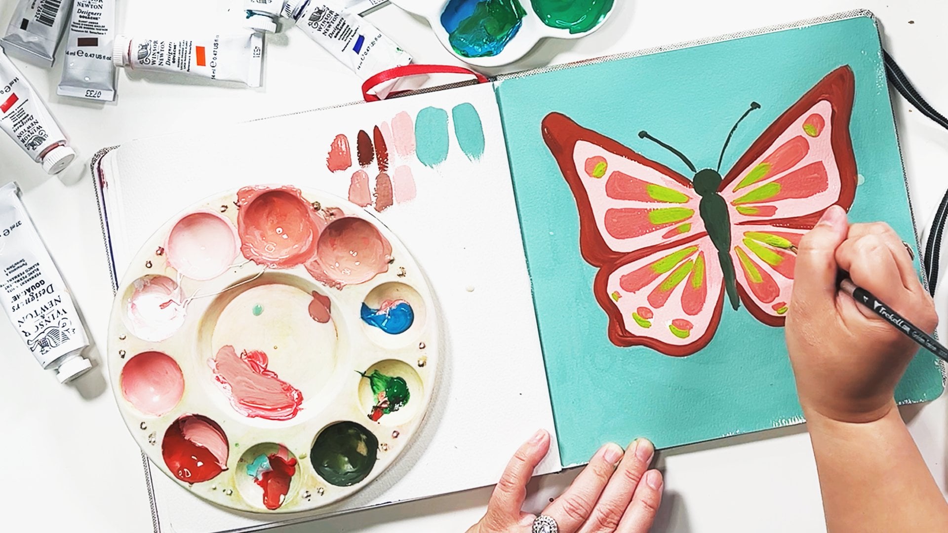
learn more about painting with color in your art. Take my Painting with Gouache: Introduction to
Color Theory class, where we practice
with butterflies to explore different
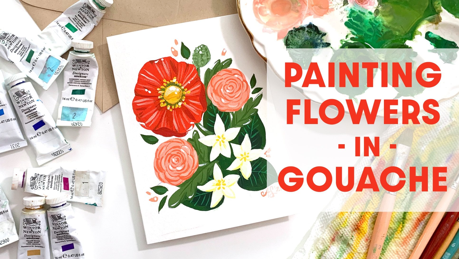
types of palettes. For more gouache practice, I recommend my Painting
Flowers in Gouache: Making a Floral
Greeting Card class, where we explored florals
and make a practical gift. You may find these
classes and more by clicking my name and
scrolling down my profile. Make sure to click Follow
button this video too, so that you're always be the first to know when
I have a new class up. I also send out
special messages to my followers which
include inspiration, announcements, and
gifts just for you. If you enjoyed this class
today, please leave a review. I read each and
every single one of them and appreciate
them so much. These classes take
a lot of work to produce and your
kind words keep me going. If you share your
work on Instagram, please tag me at anndanger
or using the hashtag, #ArtwithAnnDanger so that
I can see your work and share it to my Stories to
get more eyes on your work. Say hi Dolly! Thank you so much for
joining me in this class. Until next time, keep painting!
 Ann Shen, Illustrator & Author