Transcripts
1. Class Introduction: You're going to learn
some exciting techniques to paint this watercolor parrot. It's going to be
a really fun and colorful watercolor
bird tutorial. And you can use these skills
on other birds as well, so you don't have to just
stick to the parrot. If you want to
paint this parrot, that will be great because
you can follow along with me. I'll be showing you step by step how I painted it and I'll also be giving lots of
explanations about my color mixes, the art supplies that I used, and also the techniques
that I'm using as well. But you don't have to just stick to painting the parrot
because you're going to learn some new
skills you can use on other watercolor
paintings as well. You're going to learn
essential skills such as painting wet into wet, blending colors, softening and edge painting a
bird's eye and beak. How to avoid muddiness
in your painting by avoiding mixing complimentary
colors together. A little bit about color
theory because I'm going to be mixing just three
primary colors together. I'll be using a limited
palette for this. You'll also get to learn how to paint bird's feathers
in a really simple way. Sometimes I find
painting a birds can be very time consuming and
it puts me off sometimes. But the way that I like to paint birds is to simplify
the feathers. So I'm not worried about painting the birds
because to be honest, painting feathers is not my favorite part of
painting a bird. And I just like experimenting
with lots of bright colors. So that's my favorite
thing to do, to watch all the paint
merge and mix together. That's my favorite part, not spending ages on painting
individual feathers, which to be honest to
me is very tedious.
2. Supplies and Colours: I'm going to go over
the art supplies and colors that I used. And you don't need these
exact art supplies, but sometimes it's nice
to know what I've used. The paper I used
was by cancer and it's 100% cotton paper, and it's cold pressed and
this comes in a gummed pad, so you can just rip off a piece of paper
and tape it down. Then I'm going to be using
my pointed round brush, and this is by Escoda. It's got a beautiful pointed end to it and it's a size 14. I'll also be using a range
of ceramic mixing palettes. I've got quite a few of these, so I will be using a few, but you can just use a plate. And I did get this from
the local supermarket. It cost me about four pound. And these work brilliantly
as a mixing palette. I'm also using some scrap
paper for testing my colors. I'll be using a variety of tube paints by Daniel Smith
and Windsor and Newton. I've got quite a selection now, but you just use
whatever you've got. If you've got pans, use pans. I'll also be using
my maskin tape. This is by Uni bonds and
I get this from Amazon. This maskin tape is brilliant
for keeping my paper flat. I don't tend to get
color bleeds with this mask tape and also this
painter's tape as well. And I get this from
the DIY store. I'll be using some
clean jars of water. I use 2-3 jars of water. I'll use the first jar of water for giving my brush
a really good rinse, and this jar does
get really dirty. And then I'll use the
second one as clean water. And I'll also be using some old rags and cloths as well for
dabbing my paint brushes. I'll be using a limited
palette for this, so I'm going to use a red. I've got Qrinacrodone red here, but you could use
mostly any reds. Then I've got a warm yellow and this is a handsome yellow. I would recommend using
more of a warm yellow. I've also got Windsor blue, which is the same color as a thalo blue or an intense blue. If you're using Cotman colors, this is a cool blue and I would recommend using a cooler
or brighter blue. And then for my darkest colors, I'm going to be
using this beautiful color by Daniel Smith. This is soda like
genuine and it's very close to indigo or pains gray. So if you've got any
of those colors, you can use that or just use a black for your darkest colors. If I use it straight
from the tube, I'm going to get a lovely
dark color like this. So it's a beautiful blue gray. I just like to play
around with my darks, and I try to switch
it up now and again and just use
a different color. So as long as you've got
a lovely dark color, you could use most
colors like a dark blue, A dark purple pains gray. Any gray, as long as it's dark. And a black as well. The Chnacrodone red that I'm
using is more of a pink red, but you can use red. In the parrot in the
reference photo, we've got lots of oranges. And these oranges are more of a dark orange, a warm orange. So what I'm going to do
is mix my Hanser yellow, which is a warm yellow with
the Chronacrodone red. Scrodone red is a cool red. I'm going to get a lovely
bright orange like that. If you've got permanent
rose or Alizarin crimson, they might work nice as well. Just have a little play
around with your color mixes. And then the thalo blue is
a beautiful, intense blue. Look at that blue.
It's a lovely, cool blue, but it's a
lovely bright blue as well. The reason why I'm going
to use this is I'm going to use this on a
few of the feathers. I'm also using lemon
yellow because I want to mix this lemon yellow. So I'm not going to use the
lemon yellow on its own, but I'm going to
use it as a mixer color with the thalo blue. So I got a lovely bright green that we're going to
use on the parrot. I'm going to mix this in
different quantities. At one point I'm going to
add a bit more blue to it, so it becomes more of a blue
green or a darker green. And then at points, I'm going to mix more yellow in it into it, so it becomes more
of a yellow green and a really bright
yellow green. With the yellow green,
you want to start off with the lemon yellow first, so it's more lemon
yellow than it is blue. And then pick up the tiniest
amount of blue and then add that in so you get
more of a bright yellow. So it just means that the
main color in this is yellow, and blue isn't the main color. So you don't get more
of a blue green. You get more of a yellow green. Look how beautiful
and bright that is. So for the face, we're
also going to use some very diluted
chronacodone red. So it's a pink then, because I don't want it
to be a bright pink. I pick up the tiny bit of the green and I'm going to add that to the
pink to dull it down. The reason why it dulls the pink down is because
these two colors, the pink and the green,
are complimentary colors. Which means that when
they're added together, they actually make a neutral and they help to dull
each other down. If it ends up
looking more green, you could always
just take your pink or your red and just
add more of the red in. So it's more of a pink. But we just want more
of a dirty color, so it's not a really
bright color. I'll also be using the tiniest
amount of cobalt blue. You can take any blue
that you've got. The reason why I'm
taking the cobalt blue is because it's a
lovely primary blue. The reason why I'm
using cobalt blue is because I want to make a
lovely turquoise for the hat. So I'm going to add the
thalo blue, lemon yellow. Now we've just made a green. This is a lovely bright green. But of course I want
more of a turquoise. To get a turquoise, you need to add green and blue together. Take my cobalt blue
and I'm going to add a little bit into the mix, and that's just going
to make a turquoise. Can you see how that's
more of a turquoise now, rather than a green or rather than just
a blue on its own, It's a really good way
of making turquoise. Just have a play around with
your color mixes though. This does take a little bit
of practice to get used to Some lovely ways
to make turquoise is to add your blues together. What I'm going to do, add your
blues and yellows together if I use cobalt, cobalt blue. And maybe let's mix
the handsome yellow together into that
and see what happens. Can you see how that's
made a dirty green? You don't want that. You
want a nice bright color. Handsome yellow
is a warm yellow. If you use a lemon yellow, which is a cool yellow, this leans more towards blue. Pick up the cobalt blue. And if you add
those two together, that makes more
of a fresh green. Then for argument's sake,
let's take a different blue. So what I'm going
to do is actually take my French ultramarine. If I add that in, can you see how that's becoming more
of a dull turquoise now? So it really does matter what blues and what
yellows you mix together. Another color that you
can use, and I love, is the Acro Green by
Windsor and Newton, And this is a
professional color, so could you use that
for the head as well? There's also a turquoise
that I've got by Windsor and Newton and Cotton that
is a turquoise as well. So this is just
called turquoise. This looks very similar to thalo blue, it's
a gorgeous color. You could also use cobalt
turquoise light as well. I've got that in the
Schminka range and also the Windsor and
Newton professional.
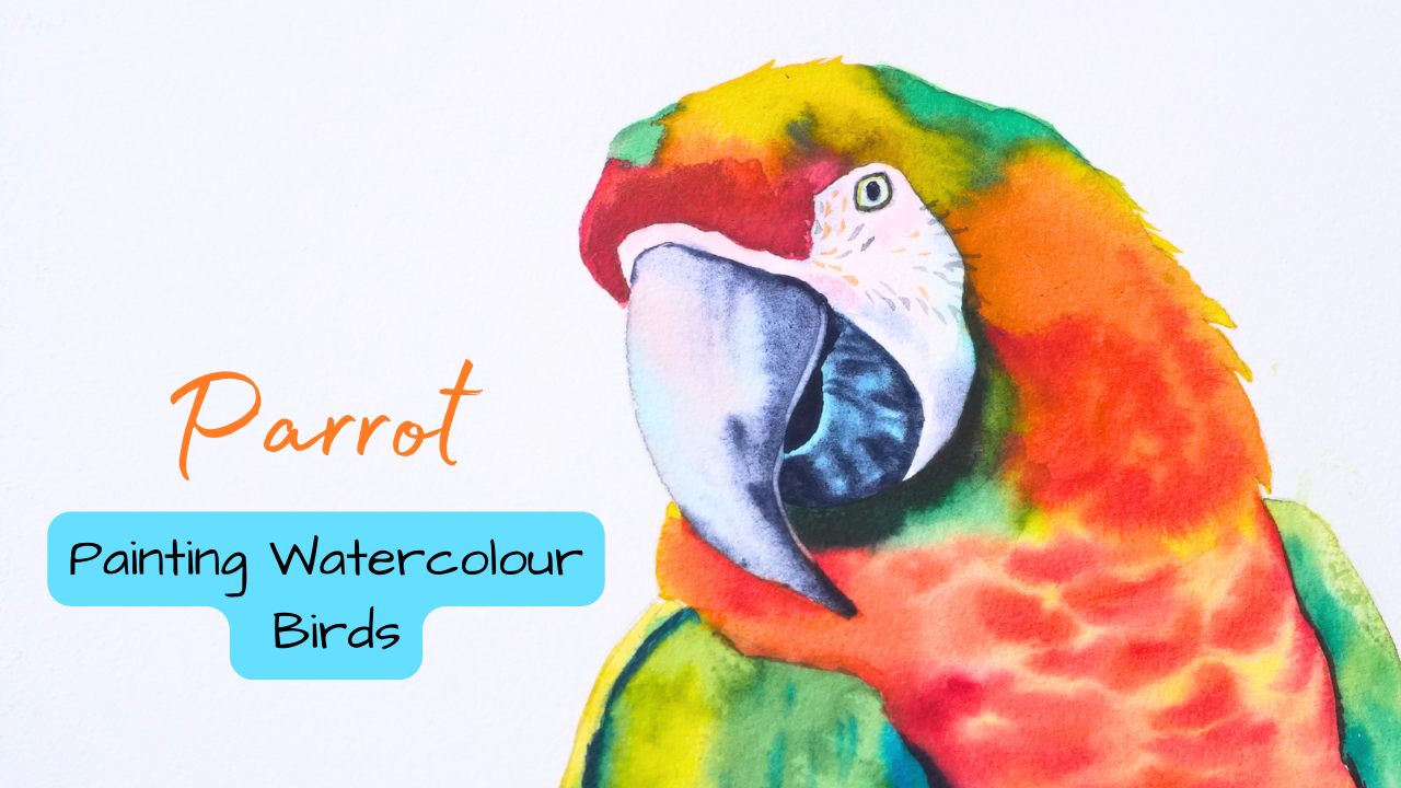
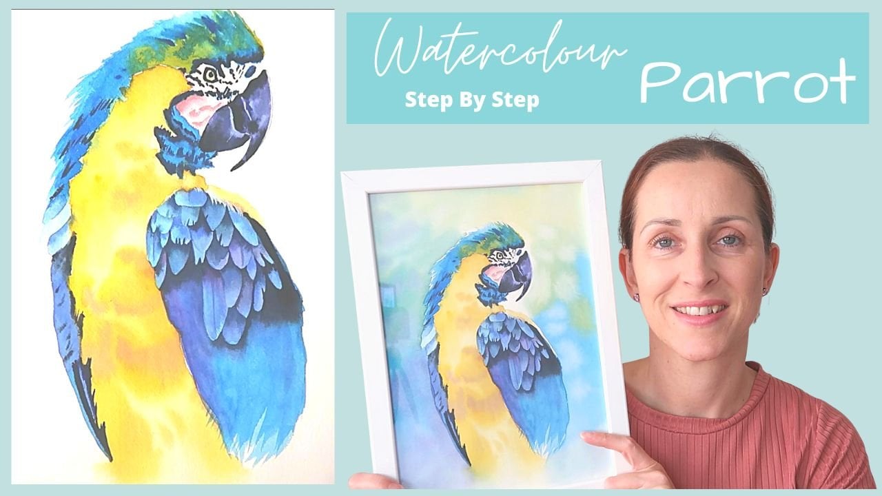
3. The Drawing: In this lesson, we're going to paint this beautiful parrot. And don't worry, it's not
as complicated as it looks. I'm going to be taking
this step by step. Just follow along with me and
we'll paint this in layers. I'm going to start
drawing the birds now. I'm going to be using
my three B pencil. It's just one of my
favorite pencils, but just use whatever
pencil you've got. My method of drawing is
a little bit different. What I like to do
is actually look at the angles of the
outside of the bird. So what I'm doing is
looking at the angle and the length of the parts of the
bird and where it's lying. So for instance, this part of the bird comes out
at this angle. And then it comes
up at this angle. Then it comes up a little
bit at this angle, and this is the length of it. And then it comes
across like this. And all I'm doing
is just looking at the outside shape
and length first. And then I'm going to go in
and add the detail later on. I just find this is
a bit more accurate. And instead of trying to work out how big the
head is going to be with a circle and the shapes and I just find it really
confusing like that. So this is the way that
I do it and I find it much more easier to
draw it like that. Remember, you'll find
this reference photo and a line drawing in my
projects and resources area. If you don't want to have
a go at drawing this, don't worry about it.
You can print this off. But I do recommend that
you give this a go, at least because this will bring your drawing skills
on a lot faster. What I'm going to do is just focus on the top
of the head first, just so I can make sure that
I get the whole part in. The length of the head
comes up like this. Then the front of the head
comes down about that long, then it comes down. And then in a little
bit you can see that I'm just drawing for
now, some angular lines. We will go in and
refine this and make it look more shaped
and more curved. After I've done this,
this is just to work out the length of the
different parts of the part. First, I'm just looking at the
angles and where they lie. I'm breaking this down
into little chunks. This part is quite curved. I'm going to curve
it a little bit. What you'll find
me doing is going back and forth so
that I can make sure that the sides of the
parret line up perfectly. There's the beak. Now the beak comes out. I'm going to curve
the beak around. The beak is actually quite long. The top of the beak
comes up a little bit. Actually, down, down so far. Just take your time with
this, because drawing a bird is actually
easier than it looks. But you do want
to make sure that you get the beak and the eye correct because that part of the bird is the
most important. What I like to do at this point is to give myself a
little guideline. And I'm drawing a
line from the top of the head through the
middle of the eye. Then this will give me some idea of where to pop the beak, because the middle of the eye lines up at
the edge of the beak. That's why I've drawn in
this little guideline. There we go, and I think
that's a bit better. That's the edge of the beak. I found that the beak was
a little bit too big. I needed to go in
and adjust things. I'll leave that guideline
there now because that will give me the
positioning of the eye. What I'm going to do is
just draw the beacon, the beak is quite long and then it coves a little bit and then it curves
around like this. Think I've got that
quite accurate. And then we're going to curve
off the edge like that. Also, feel free to go
in and change things. Don't worry about make mistakes just looking at
this little curve thing. Because this curve
thing will give me an idea of where the
bottom of that beak is. That's about there, I think. Yeah, I need to refine
this a bit better. It's a bit flat there. Then it comes up, so it's not completely circular. Then it does meet about there, right, to raise that area. Then what I can do
now is actually get in the little crease of the mouth or the little crack of the mouth which goes like this. It's quite wide, just going to make this area
a little bit flatter. Then the bottom of his mouth, he's got this little area
coming up like this. Then his face comes
up like this. Is the white area of the parrot. I'm just going back and
forth trying to work out the length of where the
top of these things stop. So I'm just going from
the top of the beak, It stops about there. Just raise that. Guidelines are a real
useful thing to pop in. And I've not learned how to
draw or anything like that. This is just from practice. I do see people doing this and I can understand why they do it. Face comes out like that. This is the white
part of the bird now coming around like that, we will put in the wings. I just wanted to get
the head accurate first because I think
that's the hardest area. We'll just get that out the way and then we can
relax a bit more. Now, when we're
drawing in the body, this area is quite flat here. Now I want to pop in the eye, and you want to make
sure that you get the positioning of the correct. So have a look at
the top of the head. Have a look at the reference
photo and just try to work out where the E lies
within the head. You can pop in some guidelines
like I've done here. All I'm doing is just have a
look at the reference photo. I'll pop in some
guidelines here like this. You can work it out with
your pencil like this. I'm looking at the top of the pupil or the
middle of the pupil. It's about here in the head. I just want to put myself
in a little guideline. The top of the sits about there, We can erase these lines. Then the middle of the middle
of the pupil sits here. So I'm looking at the
back of the head. I work that out to
be about there. I'm just going to pop
in guideline there. Just a faint idea really, of where to pop the eye now. I've got that in, I can pop
in the pupil to start with, put the little pupil in, then
I can work the eye around. The eye is not a
complete circle, is a funny shape, it's
more of a almond shape. Try not to draw the
eye too big as well. I've got a habit of drawing
birds eyes really big. I'm just going to
flatten that out there. Might have to draw it
a little bit smaller. I think I've drawn it too big. I can pop the pupil in. I think I might have drawn the pupil a little bit too big. And that's why I drew
the eye quite big. Just draw it a bit smaller. See what I mean, though I
always draw eyes too big. Make it rod. There we go. That's a bit more
stuck in a bit better. Now we've got the in, we can go back over
the white area. This part of the
white area is fine. I just needed to go in and fix up this area here and
bring it down a bit more. Like I said, don't feel like you need to stick
to your original sketch. I'm always going in
and fixing things. So I do this as I go. I've drawn something in
Once you move one area, for instance the eye or the beak or something like
that, and make it a bit wider, then you'll find that you
need to change other parts of the drawing. Just take
your time with this. There's no rush to this at all. Feel free to make mistakes as far because we do learn
from our mistakes. I definitely make
a lot of mistakes. For instance, I need
to make this a bit, now I'm going to make
this a bit narrower. There we go, See easy. Don't worry about
it. Don't sweat it. As long as you've got an erasor, you're not working straight
on your watercolor paper. I've just got some
printer paper here. So I'm not working straight
on my watercolor paper. And I will show you
how to transfer this. I'm going to draw in
the rest of the birds. Now what I want to do to
start with is actually just get in this little
black area under here. I just want to make
sure because this is quite dark and I
just want to give myself a reminder that this
area needs to be quite dark. We're not going to map
out the other colors, because we're just going to
blend those as we paint. Now, I'm just looking
at the neck area. I'm going from the
middle h of the bird. I'm looking at the
edge of the beak. I'm drawing myself
an imaginary line because it looks like
that's where it starts. I'm going to get
in the neck area. Then that comes
around a little bit. I'm going to get in the wing. Just angular lines for now. Not worrying too much on
the actual shape of things, just trying to work out
the length of things. This comes out that your
wing angles down like this, that's a chest area. Then the wing comes
from about there. I think we're going to stop that there because the
reference photo is cut off. So what I'm going
to do is just draw a line across like that to show you that's the bottom
of the reference photo. Obviously, it doesn't show
the rest of the photo. I'm going to get in
the rest of the neck. Now, picking out where the
bottom of the neck comes, drawing a line across. There we go. And then
the body, chest area. And then the little wing
which comes out at the side. Drawing myself an
imaginary line from across the top of this wing to make sure that these wings are the same height. It comes out and down like that. Let's make it a bit more curved, make it look more like a bird. I'm just looking at
the outside shape. It is a bit of a
strange irregular shape on the outside of
the bird's head, which is beautiful actually. I'm just going to get
in the flat area, comes out like this, and
then curve this area around. I think it's a bit wider here. We got a lovely little
feather going on, then it comes out a little bit. I just want to draw in these feathers because
they're beautiful. I'm just making sure I got those fluffy little feathers in. There you go. These
are the feathers. It's beautiful at that. And then just making sure I
get the little neck area in, I'm not going to put too
much detail here for now. I've decided that
I'm going to take the feathers out and I'm
going to put feathers in just because I know that as a beginner painting
feathers really put me off, so I don't want to put you
off having to go at this. We'll make this really simple. I'm just going to make it a
bit curved so it looks like, or gives the idea of feathers curving this
little wing around. Now I'll show you
how you can transfer your design onto your
watercolor paper. You want to get yourself
a soft graphite pencil. This is a Faber
Castell graphite. A crawl, which means it's a water soluble pencil
and this is an eight B, you don't have to have eight. I normally use like a two
B or a four B and you definitely don't need a
pencil that's water soluble, just use a normal
graphite pencil. What you want to do is flip your design over and I've
got a sheet underneath, so I don't transfer this
design onto my table. So I do suggest that, then what you want to do is
hold your pencil on an angle, so I'm just going to have
it flat to the paper and I'm going to scribble
over the back of my design. What this is going to
do, it's going to add a lots of graphite to
the back of the design. When you flip your design over, this graphite is going to
transfer onto the paper. It's actually acting
like transfer paper. I have got transfer paper, but I don't really use
it because I don't like the fact that I can't
erase it afterwards. So now what you want to do is
flip your design back over. Take your watercolor paper, place your design on top. Take a sharp pencil and I like to use my
mechanical pencil. This is just a rotting ticky. I got this from Amazon. I'm going to hold the paper
flat with one hand and then I'm going to start
tracing over my design. Because my paper is rough, I am going to press quite hard, but you want to try and use like a medium pressure depending
on what paper you're using. If you're using paper that's
got a bit more tooth to it, I would press a bit harder. If you're using a cold
press or a hot press, then press quite lightly because you don't want to
add grooves to the paper. What I like to do is
hold the paper and then lift up my paper as I go as well to make sure
that it's transfering and I'm filling
in all the areas. I just checked that I haven't
missed any areas out.
4. Tips and Techniques: Tip number one is to mix
enough color so that you've got your colors ready to go before you even
start painting. The reason for this is
when you wet your paper, you want to work
quite quickly on that paper so that
it doesn't dry. If you've got your
paint mixed already, it's really easy to
quickly pick up that paint so that you can apply
it to the paper while the paper is wet. I made some mistakes
as a beginner, whereas I would wet the paper. And then I would go
along and mix my colors. And while I was mixing my
colors, my paper was dry in. So by the time I came
back to my painting, my paper had dried, so I
had to rewet it all again. So you want to make
sure you mix up your color colors ahead of time. I'm mixing together
the thalo blue and the lemon yellow to make
a beautiful bright green. I've got this lovely mid strength green here
at the moment. This looks like a very
artificial green. So all I'm going to do is take
the tiniest amount of red, and you can see the amount
of red in my brush. That is literally
the tiniest amount. You don't want to add too much. You could always add more. As you go to pick up the
smallest amount to start with, I'm going to decide to pick
up a little bit more now. Just add it gradually
and you want just enough to dull
that green down. Can you see how that's
dulled down a bit more now? It's more of a natural
looking green. When we paint the beak. I'm going to be painting on a thin layer of
paint to start with. This isn't the exact color
that I'm going to be using, but I wanted this to be a bit darker than I've painted
in the actual tutorial, just so you can see
it really well. We're going to be
painting wet into wet. So we're going to paint
on this wet layer. Then we're going to
pick up our gray or our darker color that
we're going to be using. We're going to add
some water to it, so it's going to be a mid
strength consistency. We're going to start dropping
that into the wet layer. Make sure that you've got
wet paint on a wet surface. Otherwise this
color is not going to blend out nicely for you. Do want to make sure that
this first layer is wet. If it does dry, you can
allow this first layer to dry completely and then you
can rewet it with some water. Just try not to go over this if you see it
starting to dry. Don't go in with some wet paint because you're
going to cause some back winds and
cauliflowers and harsh marks. Can you see now, because I've applied this paint wet into wet, so this is a wet paint onto a
wet surface or a wet paper. Then we're going to get
some lovely soft edges. Can you see how the
edges are a bit fuzzy? Let me show you
how we're going to paint the bottom of the beak. We're going to start off
with a layer of blue. And the reason for
this is because I want part of this blue layer to show through when we pop
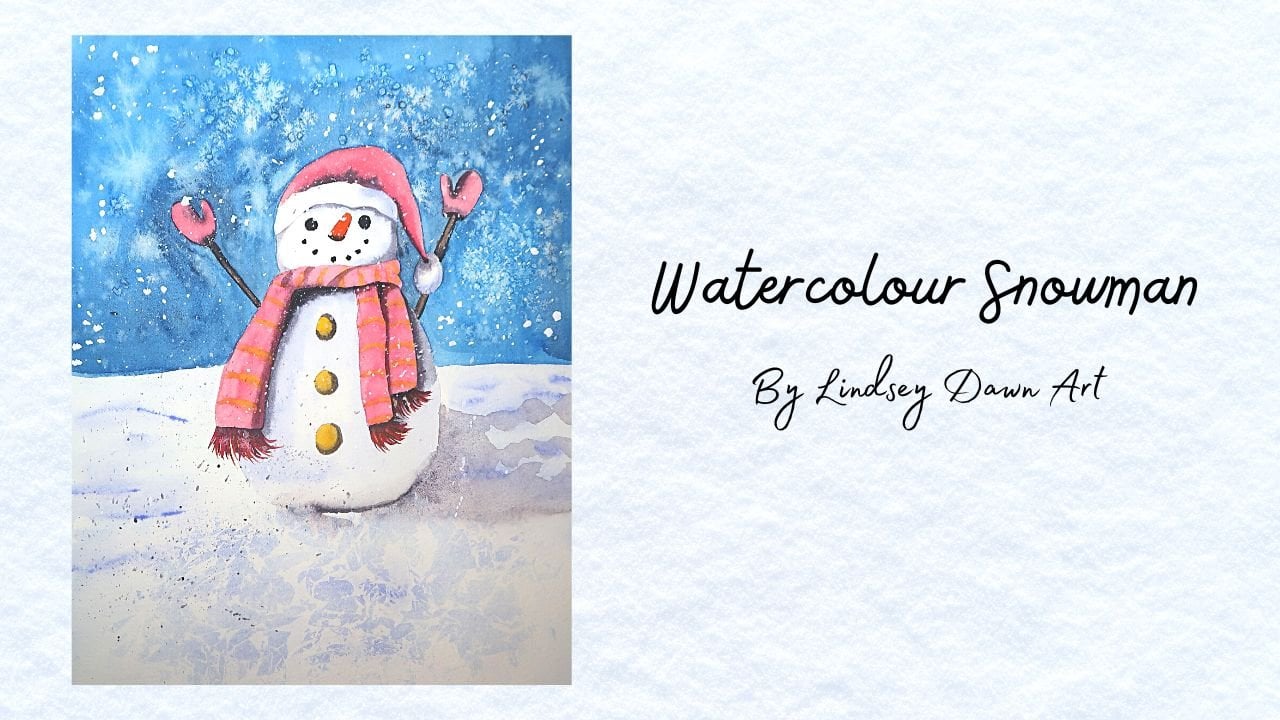
in the dark markings. I love using this method. If you've taken my snowman, you'll see that I use this
method on the snowman's hat. It was a accidental discovery. I really loved
using that method. Again, we're going to be
painting wet into wet. So what I'm going
to do now is I'm going to pick up my dark paint. It has got a little bit
of water mixed into it and we're going to
start dropping that in. We're going to do two layers of dark color on top of this, we're going to have
a mid strength. This is going to
be your mid color. So you've got your
lightest color, which will be the
blue, your mid color which will be lighter, this slightly darker gray and you're going to
create some markings. We're going to be
painting wet into wet. If you get these blobs of paint, which happens to
me all the time, can you see there's
like a feathery blob of paint coming out When
you lift your brush, the water is coming
off your paint brush. The way that I like to
fix that is to start with the point and then bring it down to the bottom
of the painting, and it just helps to hide that blobby mark because it
can be a bit frustrating. Now, I'm going to pick up
so much thicker paint. This is my dark paint, I've just rubbed my wet
brush over my pigment, over my paint that's
tried on my palette. I'm going to start
dropping this in. Can you see how
here, actually we've got a bit of a color
bleed going on, and that is because this
layer of the beak wasn't dry. When I painted the blue
and the gray on it started flowing into that
first layer that we put down. We don't want that to happen
because it's not going to separate the top beak
from the bottom beak. To avoid this, just allow
this top beak to dry completely before you
paint in the bottom area. I'm going to add
this dark paint now. Can you see how that
is noticeably darker? Because we've got less water
in our brush and more paint. That paint isn't going to spread as far as
the first one did. So I'm going to be able to get some darker markings but
also some tighter details. We're going to use three
strengths of paint here. These are not going to
be the exact markings that are used in the painting. Don't go copying me here, but this is just
a demonstration. Let's move on to the feathers. Now, with the feathers
and the chest, I'm going to be painting on a layer of yellow to start with, because I wanted to keep these
feathers nice and simple. I'm going to be using some
really simple techniques and movements with my breast to
paint really simple feathers. Like I said in my introduction, I don't want to spend
ages painting feathers because I don't want to put
you off painting this bird. If you're a beginner or
an intermediate painter, sometimes looking at
really detailed paintings can put you off to start with, I wanted to keep
this nice and simple and easy for beginners to try. You do want to make
sure you haven't got too much watery
paint in your brush. To rectify that, just dab the edge of your brush
on a cloth like that. That'll just take off
a lot of the moisture. It won't take the paint
off the tip of your brush, It'll just take off
lots of moisture in your brush so you haven't
got too much there. And I'm going to
start making these little markings with my brush. All I'm going to do is just
press down and lift up. Can you see how I'm
getting that blobby mark? Just spread it out. If that happens to you,
just spread it backwards, I'm going to press
down and lift up. The reason why I'm
getting that blobby mark is because there's probably a little bit too
much moisture in my brush. Again, I can dab it on a cloth.
Let's see if that helps. All I'm going to do is
press down with my brush, adding a bit of pressure,
and then lift up. And can you see how that's
a bit better now because I haven't got as much
water in my brush. The markings don't need to be perfect with these markings. All I'm doing is just
painting a simple U shape. I'm just using the tip of
my brush to start with. We get the thinner part of
the U shape and then I'm going to press down so we
get a slightly thicker part. I'm not using the whole
belly of the brush. And then I'm going to lift
up off the paper that right at the end only the tip touches the paper,
it becomes thinner. At the end, you
get a smile shape, which is really simple
in some of the markings. I'm going to just sweep
my brush along like that. So I'm just going to
use my brush more like this and I'm just going to sweep it
across the paper, you get a slightly
thicker marking. I'm just applying this part of the brush. Let me show you. On dry paper, I'm just
pressing it down, I'm sweeping it across
and then lifting up and it just creates
this thicker shape. Have a little practice
practice on some scrap paper. You can use the
tip of your brush to create these little U shapes. Some of these shapes are going
to be smaller than others, you just use the
tip of your brush. To use the tip of your brush, you can hold your brush
more upwards like this. You're not pressing too much of your brush onto your paper.
5. First Layers - Head & Body: ' I'm mixing together the thalo blue and the lemon yellow to make a
beautiful bright green. Got this lovely mid strength
green here at the moment. This looks like a very
artificial green. All I'm going to do is
take the tiniest amount of red and you can see the
amount of red in my brush, that is literally
the tiniest amount. You don't want to add too much. You could always add more. As you go pick up the smallest
amount to start with, I'm going to decide to pick
up a little bit more now. Just add it gradually
and you want just enough to dull
that green down. Can you see how that's
dulled down a bit more? Now it's more of a
natural looking green. We're going to start blending all the colors wet into wet. Now we're going to apply
water to the paper, and then we're going
to start adding all the colors so
they blend into one. What you do want to
be careful of is when the green and the
red blend together. So you want to try to avoid
this as much as you can. There is going to be one part of the head where the green
and the red touch. And don't worry
about it too much. But it's worth knowing that when green and red mix together, they end up making
a neutral color. You'll end up making
more of a brown or a gray when those two
colors mix together, they're fresh at the moment. But if they mix together, then they end up making
more of a dull color. Can you see how that's
making more of a gray? These are complementary colors. They're opposite on
the color wheel. When they mix together, they help to dull each
other down and they create a neutral color
or a more muddy color. It's well worth knowing
the complementaries. I'm going to apply some
water to the head, all over the back of the neck, and also down the
chest area as well. I'm going to start with this
part of the part first. You may have noticed
that I've left a bit here where I haven't
drawn that part in. That is because I want
that to be a lost edge. If you don't know
what a lost edge is, it just means that you
don't paint that part of the animal in or whatever
subject you use in, you don't paint that part in. It looks like a lost edge and it looks like it's blended
out into the background. This is a beautiful way of adding interest
to your painting, allowing the viewer to use their imagination to fill
the part in that you haven't painted over the chest. You could always paint
in this part with water, or you could wait until there's
paint on your brush and then paint the feathers there because they
are quite fiddly. If you're not very
confident with painting, those, don't worry so much. Now with the water is hard sometimes knowing
where you're putting the water when it's so
transparent or so see through. If you need to apply
an extra layer as well, go ahead and do that. You just want to
make sure that your paper is nice and wet. Start off with my red, I'm going to take it
quite concentrated. Front of the head is very
concentrated in that area. Anyway, to start off with
that lovely bright red, I just using the tip
of my brush to get into smaller corners
straightaway. You can see that that
color is bleeding upwards, so don't worry, just let
it do its own thing. It might travel a bit
further than you want it to. If that happens, just let the water seep into the
paper a little bit. Or have less water in your
paint and your brush. Because the more water
you've got in your brush, the more water you've
got in your paper, the further this paint
is going to travel. If you feel like it's
traveling too much, just clean your brush off and dab it on a cloth
so it's a bit damp. Just have a damp brush,
you can feel it. If it's got too
much moisture in, then you could just
use your brush to stop the moisture
from spreading. Taking my green,
start adding that in. Like I said, don't worry
if these two colors touch. If you can try to avoid
it, that would be great. But at the end of the day, you're not going to be
able to stop them fully because we are painting
them quite close together. At the moment, I've got
a severe bleed going on. I am painting the green
over the pink and you can probably see it becoming
quite dull in that area. It doesn't matter. We're going to apply
the green here as well. I just missed the top of the head because I don't
want to paint that in. I'm applying this green here. We will go back over this area with the lovely
turquoise that used. If you're using turquoise, you could pop that
into this area here. I'm also going to
paint a bit of this green underneath the neck area. Can you see where this
pencil mark is here? I'm going to pop that
green there as well. Smoothing that out, just
underneath the beak. Then I'm going to rinse
my brush off really well. I'm going to start picking
up my handsome yellow. You can allow the pink
and the red to mix together because that's going
to make a beautiful orange. If you're adding a lost
edge like I am here, just try to avoid painting that. I'm just going to
paint this area here, leave the top here. I'm going to paint the
rest of that yellow. This is a handsome yellow. I'll do a little
bit of yellow at the top there just to
fix that color up. You can see that
I'm not following the reference photo exactly. And you don't need to follow the reference photo completely. You can do your own thing. But I am trying to
follow it a little bit like it is on the reference
photo as much as I can. But you could use
your own imagination and just swap the
colors up if you want, as long as it looks
a bit similar to the reference to, you're
going to be okay. This is the handsome yellow now, and I've got this quite thick, it has got a bit of
water mixed into it, is the consistency of
the handsome yellow. Handsome yellow is quite
a strong color anyway, and it is lovely and creamy. Anyway, what I'm going
to do is just bring this to the edge of the parrot, then I'm just going to use
the tip of my brush to paint in these little feathers. If you wanted to,
you could also use the tip of your
brush to bring off some little feather
flicks like this paint. This yellow also
around the top here, part of my paper
has started to dry, so this paint is not
spreading as far. If this happens to you, where
you get quite a harsh edge, you could rinse off your brush, make sure you've got
just a damp brush, and then you could
blend the edge. Just touch the edge of the paint and that will help
to blend the edge. I'm just going to add the
yellow at top as well. I decided not to
have my lost edge because I lost it completely. I'm still working on lost edges. Just pull in some of that paint out to create
little feather flakes. I'm also going to add this
yellow all over the chest. And the reason for that is
because when I add the orange, I want parts of this
yellow to shine through. We're just getting
our first layers on. See, I accidentally painted
over the beak a little bit, but that's okay, because
we're going to be adding quite a dark
color there anyway. I want to try to avoid
that if you can, especially if you're
using a gray or a indigo or something like that. Because when blue and
yellow mixed together, they create a green. I'm going to mix
the hands yellow and the Rnaone red together. I want this to be
quite dark so I don't want to have too
much water in my brush. I want it intense color. Nice and vibrant. Look at that beautiful
orange color, that is so gorgeous. I picked up the
tiniest amount of red there because red is
really strong color. I'm going to pop it into
a few areas because we have got little bits
of orange in the parrot. Get some in around here because we got that dirty
yellow color going on. But I'm going to turn that
to orange. This is orange. Could you use any premade
orange that you've got to pop A little bit of
orange under here as well, and a little bit around the
back of the feathers here. I'm just going to pull this
color down a little bit. And then what we're
going to do is add a bit more of
the cronacodone red. So it's more of a red orange. And I want quite a lot of this yellow undertone
showing through. So what I'm going to do is
just add it into a few areas. You could just always
dab it in like this and that's going to
create some lovely texture. Or you could use the tip
of your brush and do these U shapes if you're
getting this spidery thing, like a spidery blob. It just means when you
lift your paint brush up, you're adding water
to the paper. Just have a bit less
water in your brush. You could swipe it on
the edge of the jar, then that will probably
prevent that from happening. Can you see how I've got
less water in my brush now, so it's not happening as much. I'm going to pop a little bit
at the front of the beak. Bit underneath his beak as well. I want more red at
the bottom here. Don't worries if it's
a bit messy in areas. This is a painting, not photo, you can just do what you want using the tip of my brush to clean up the
edge of the beak. I'm just going to continue to add these little
blobs of red. Want more yellow
at the front here? I'm just using the
tip of my brush here. Let's do it in slow motion then. You could always fill in more of the red at the bottom here, because there's more
red on this side than there is on the
right hand side. But you could also
add some pure red. We've got that beautiful
bright punch of red, just adding it in a few places to add a bit more of the
red up here as well, because there's quite a
little red in this area. I've just used my
chronocodone red straight from my palette. I'm just using this little
sweeping motion with my brush, creating these little U shapes. These U shapes don't
have to be all over, it could just be in a few
little areas like this. Then you could just
use your brush to add some wide marks like this. It's a bit more broken
up with the markings. Use the tip of your brush,
create some little U shapes. I'm also going to add some of that red underneath
the neck area, just a tiny bit that's
added to the green. That's going to create
a lovely dark color. Anyway, it's quite dark
underneath that area. You are going to
add the soda light genuine over that area. Anyway, I've also got
some ronacodone red. Again, straight from my palette. I'm going to add more
red to this area. I want to fill in
some of the yellow because I don't want it to be so bright on the left hand side. It could be more bright
on the right hand side. Use the tip of my brush. This is nice and
thick ronacodone red. Now I can also add it down on the
right hand side and fill in some
of these feathers. I'm just going to fix
up this area here. I'm not going to go
too wild with that. And I'm going to leave
this to dry fully now.
6. The Wings: We're going to paint
the wings in now. And I'm going to start
with my handsy yellow. Handsy yellow is quite
a thick consistency. It is looking rather thick. I'm not particularly using
this in a thick strength. I've got more of a mid strength, half paint, half water. Next I'm going to pick up
the green that we got from mixing the thalo blue and
the lemon yellow together. I'm going to use the tip of my brush and start
dropping it in that green. While the paint is still wet, the handsome yellow
is still wet. This is a wet into wet method. That just means you're applying wet paint onto a wet surface. Because you're applying
wet paint into wet, you're getting those
colors are going to blend together and you're
going to have soft edges to those colors, so you're not going to
have some harsh lines. I'm also going to bring some of that green a little bit into the top of the wing and then blending at the top of a clean, damp brush, taking
the thaler blue, I'm going to start dropping that in while the green is still wet. So I'm just touching that blue
to the edge of the green. And when that happens, those colors are
going to merge into one another and start
blending nicely together. And then I was just adding
a little bit of blue over the red that we've
already put down on the Temi. I'm going to take my blue
a little bit thicker now, so I'm just taking
it from the dry, sticky pigment on my palette. And I'm going to start
using the tip of my brush. I'm just adding a few
little little patterns and little lines really. So I want this to
mimic feathers. But like I said earlier, we're going to keep
this nice and simple. And I'm also going to add a tiny shadow to the
left of this wing here. I'm going to clean
off my brush now. And then I'm going to dab it on a cloth to take off
some of the moisture. And I'm just going
to rub it along the edge of that shadow
to soften the edge. Next, I'm going to take
my hands the yellow again and paint in a
little bit of this wing, so the top and the bottom. And then take the green
that we used earlier. I'm just going to
apply that to the yellow so you can see those colors emerging
into one another. And that's because
both paints are wet, so you don't want
to let this dry. And I'm going to take a bit
of darker green and just add it to the left
of that wing there. And that's going to create a shadow and make it
look like the wing is slightly behind the bird
or on top of the Tammy area. I'm also using the tip of my brush to clean
up the edge here. In the next lesson, we're going to paint the face and the beak.
7. The Face & Beak: Let's paint the
face and the beak. I'm going to start off with a puzzle of water in my palette, and then I'm going to add some very diluted
ronacodone red. This is going to look more of a pink if you have a
pink use that very diluted and then
I'm going to add the tiniest amount of
green to dull that down. The reason why that
dulls that pink down or that red down is because those
are complimentary colors. When they're added together, they're going to help to
dull each other down. I'm going to use
this super diluted. No, this is very light. Almost like a salmon
pink on the bird's face. I didn't want to
leave this white because the white of
the paper can look a little bit too flat and
a little bit too bright. I wanted to add a
tiny bit of pink. You could use a super
light gray on this area. If you've got a gray or a very light brown or
a very light yellow, yellow ochre, very wred down
might work in this area. But just test it out on a
scrap piece of paper first. Then I'm going to
take a little bit of my chronocrodone red. And this is still light, it's just got the tiniest
amount more paint in it. And then I'm going to add a
little bit of blue as well. This is the thalo blue. And I'm going to drop that into areas of the face to
add a bit of shadow. Now I've got the
soda light genuine. This is very light again, and I'm just using the tip of my brush to add it in
a few little areas. This is all being
painted wet into wet. The background is
still wet and then I'm using wet paint on top. Now I'm going to really muddy up that pink by adding
a bit more green. And I'm going to apply it to
the first layer of the beak. This is just going
to go in one layer. So I'm going to paint
this all over the beak. And I have sped this up a tiny
amount just for interest. Take some light thalo blue. This has got lots of
water mixed into it. I'm going to apply that
to parts of the beak. I'm just using the tip
of my brush and just applying a few little
streaks of that blue. And this is being
painted wet into wet. Taking the soda genuine now. And I'm going to take off
a lot of the moisture by dabbing my brush
on a cloth like that. I'm going to apply
that to the tip of the beak and also the
one side of the beak. This is going to create
a bit of volume, a bit of depth, and a bit
of shape to the beak. It's going to make
the beak look more rounded if we didn't
put this shadow in. The beak is going
to look very flat, and it's not going to
look like a rounded shape because a parrot's beak is
lovely and rounded at the top. So I wanted to get
that look in and I can use a few little
streaks here and there. Using the tip of my brush, you want to make
sure you haven't got much moisture in your brush now. Because when you
lift your brush, you're going to get that
little blob of watery paint, which is very annoying and
it happens to me a lot. So if you do get that, just give your paint
brush a little dab on a cloth or a paper towel to take off some
of the moisture. It just means you've got a bit too much water in your brush. I've picked up some more of
the soda like genuine now, but this is thicker paint, so I just rubbed
my wet brush over the sticky pigment that was
on my plate or my palette. And I'm going to use
the tip of my brush now to sort of paint in
these little patterns. If you have a look at
the parrot's beak, it usually has these streaks
of dark color which I love. And it is the one
thing that stands out for me when I'm painting. A parrot dump in my brush on a cloth Now to take off
a lot of the moisture, I'm going to rub my brush
over my thick pigment. So if you're wondering what
I mean by sticky pigment, it just means the dried
on paint on my palette. Or you could just
use your freshly squeezed paint right
from the tube. And I'm going to apply
this dark paint in areas. I applied it to the top of
the beak to create a shadow. And then I'm going to apply
it to the bottom as well. Now taking the thalo blue, I'm going to apply that to
the bottom of the beak. This is going to be painted all over the bottom of the beak. And try not to touch that wet paint from the top of the beak, because otherwise
that blue is going to start blending into the gray. And you don't want
that to happen. This is going to be painted wet into wet, this bottom area. Try to work quickly
with the next step. I'm just making sure the
layer of paint is even. And now I'm going to pick up my soda light januine
from my palette. Again, nice and dark so
it has got a little bit of water mixed into it but
it's not super diluted. And then I'm just going
to apply this into areas. Remember that we're
painting this onto the wet first layer, so that blue layer is still wet. If yours has dried, just let it dry
completely and then just re wet the area
with some clean water. You don't want to go into that area if it
started to dry because it's going to cause cauliflowers backgrounds
or blooms to form. So I'm just going to paint
this into a few areas, allowing some of that blue
underlayer to shine through, skip little areas,
and leave gaps. That's the reason why I
painted the blue on first. Taking the soda light genuine or whatever gray you're
using really thick. I'm going to apply a shadow
to the left hand side. Then I'm going to apply
this in a few areas. This is still being
painted wet into wet. I'm just painting on these
streaky triangle marks. I had a good look at the beak, and to me it looks
like there are triangle shapes and markings
and streaks within the beak. I really wanted to get that in. I'm just going to use
the tip of my brush just to outline the bottom
of the beak as well. I'm going to paint
the eye in now, I'm just adding a
tiny bit of green to the yellow to make it
more of a yellow green, I'm going to use my
tiny size tube brush to outline the eye. This is just the yellow
that's going on. Now, I'm going to take
my green, very diluted, and I'm adding a little bit of thalo blue to that to make
it more of a blue green. And I'm adding lots of water to make sure it's
nice and diluted. It's more of a green, blue, or a turquoise color. And I'm going to apply this diluted to the
middle of the eye. Now I've got some
soda light genuine. And I'm using my size brush. This is a tiny
brush, you want to make sure that your
paint isn't too wet, otherwise that gray is
going to spread quite far. Using my size two brush, I've just taken a
little bit of orange. And this is just the
Rinachrodone red mixed with the handsome yellow
that we used earlier on. I'm going to apply
these little specs or these little flecked shapes. If you have a look at
the reference photo, the parrot's got these beautiful little markings in his face. So I just wanted
to get a few One. I'm not going to go wild
with this because I do want to add loads and loads
of detail in this area. You could always choose to add or take away areas
of your reference photo. You don't have to paint
everything that you see. I'm also going to paint these. They don't like little whiskers, but I think they're
little feathers. Using my size two brush again, I'm going to take some darker
silver light genuine now so it's quite thick and I'm using
this to outline the eye. Use a tiny brush or the tip
of your brush to do this And just take your time with it because gray is quite
a staining color. So if you make a mistake, it is hard to remove taking
that paint nice and thick. Now you could use a black or a very dark gray
like a paints gray. I'm going to apply
that to the middle. I'm just painting
in the pupil of the parrot now with
my eradicated brush. And this is by Billy Showell. I got this from Jackson's Art, but I believe you could get these brushes in
different brands as well. Have a look on Amazon or in
your local art supply store. I'm using this damp and clean and I'm just
going to use it to take off a little bit of color just on the
edge of the beak, because I found there wasn't much contrast and the
beak wasn't standing out. So I wanted to separate the top of the beak
from the bottom. And all I'm doing
is just rubbing my dry paint and
picking up the paint, and then dabbing it on a cloth. Taking a small brush again, and I'm just going to take
my soda light genuine again, this is lovely and creamy,
so it's nice and dark. I'm going to paint in
the middle of the beak. This is going to
be the gap between the top of the beak and
the bottom of the beak. And I'm just going to paint
this beautiful shape. This is my si six
brush that amusing. But if you wanted to use a smaller brush, go
ahead and do that. When I get to the end,
I'm going to use a clean, damp brush and just
blend out the edge, it's not completely
thick at the top, it is a bit more diluted. I'm also going to use
some nice dark paint at the top to create a bit
of a shadow in this area, taking the soda light genuine again and it's very diluted. I wanted to apply a bit of
a shadow to the bottom of the face because if you have a look at the
reference photo again, it looks like a bit of a
shadow is in this area. And then I was blending it
out with a clean, damp brush. Next, we'll be finishing the parrett with some
shadow and detail.
8. Finishing Touches: Let's add the finishing
touches to the parrot now. I'm going to grab my
Chronacrodone red and I'm going to start
adding it to the wing here. I'm going to just fix up the
shape of the wing because I think I painted it a little
bit wrong to start with. I'm also taking my soda light genuine and
adding that to the top, creating a bit of a shadow. And then taking a clean, damp brush and blending out the edge to keep
it nice and soft. Now I'm going to take some
dark green and you can get a dark green by adding
more blue to the green. Remember, we got that
color from mixing the Hanser yellow and
the thalo blue together. But if you've got lemon
yellow or more cooler yellow, you can use that as well. So you could also
get a dark green by adding more blue than yellow. And then I'm just blending
at the edge with a clean, damp brush, taking some
yellowish green now. So this has just got
more yellow in it. And then I've got some very
concentrated thalo blue, but you could use your dark
color like your dark gray. And I'm just blending out the edge with a
clean damp brush. And here is the parrot finished, but I just wanted to show you, and you may not have to do this. I'm blending out this harsh edge here with a clean, damp brush. In the final lesson, I'm going to share my thoughts
and set you a project.
9. Final Thoughts and Project: Well done for
completing this course. I hope you had fun learning
how to paint the part. I really hope that you'll
give this a go yourself. You can use these skills
that you've learned in this class to paint
other birds as well, so you don't have
to just stick to the parrot once you've
given the part a go, go and have a go at using these skills on
other birds as well. I'd love to see your paintings in the projects and
resources area. You'll find that tab
underneath this video. Just click on the Projects
and Resources title, then take a photo using your phone or your
camera of your painting, and you can easily upload that to the projects and
resources area. If you've got any questions, just ask me a question in the discussions area and I'll
get back to you with help. Have lots of fun experimenting
with color techniques, texture and backgrounds,
and paint as many birds as you like using
the skills I've taught you. Have a lovely rest of your day and I'll
see you soon, bye.
10. Bonus Tip - Adding A Shadow: I'm going to add a little shadow because if you have a
look at the reference, it looks like the top of the head and the left part
of the shoulder is in direct sunlight and it looks
like the sun is shining behind the parrot and then
causing shadows on the front. If you don't like how
bright this is looking, you could always add
a little shadow, and that's what I'm going to do. But obviously this is
completely optional. I might not like the end result, so we'll just see how it goes. I'm going to take a
very diluted version of my soda Light genuine. So if you've got a gray, you can use that
very watered down. You could also muddy up your yellow by adding
a bit of gray to it. It is completely up to you. Just make a darker version of the colors that
you've got here. Add blue to the orange
to muddy up the orange. You could make a shadow
color like that as well. But I'm just going
to make this easy and I'm going to
use a light gray. What I do want to do to start
with is to wet the head. And the reason for
this is because I want the edges of the
shadow to be soft. I want the shadow to look like it's blending in the feathers. I don't want any harsh edges. If you just wanted to just paint the shadow straight on
and have a hard edge, then just paint it
onto the dry paper. But I'm just going to wet just the top of the head because I just want areas to be
quite soft in that area. Then taking my light gray, I'm going to avoid
the top of the head because I think that's
quite dark there. Anyway, on the top of the head, I want to be the lightest. I'm just going to start
around the side of his cheek. All I'm doing is just
simply tapping that gray in very softly because
I don't want to disturb any of the
underneath layers. I'm just going to tap that in. You can see here that because we've put water on the paper, those edges are quite soft. Then with the rest
of this, then, I'm going to paint just
onto the dry paper using the very diluted gray because there's lots
of water in this gray, you're going to still see
those underneath layers. Don't worry about covering up the layers that
you've put down. This very light layer
is just going to darken up those areas
and make it look like the pit there is in shadow
painting it all over. All over the wing
area here as well. It's very light, but it is
making a subtle change. It's just dulling down
those colors a little bit, ever so slightly,
so you can still see the bright range
coming through. I'm also going to paint it up to this beak area here as well, leaving the left free. And also this wing as well. Just paint it half on the wing. Then what I'm going to
do is take my damp brush and I'm just going
to blend the edge out just to soften it out. Cause I want the left
hand side to still be bright so it looks
like the sun is shining. And that's the
parrot finish now, I think that has made
a bit of a difference. It's made a very subtle
difference where it is now. The top of the head
looks lighter. On the left of the
shoulder looks lighter as well because we've put
that little shadow in. I hope you enjoyed this tutorial and have a lovely
rest of your day.
 Lindsey Dawn Art, Watercolour Artist