Transcripts
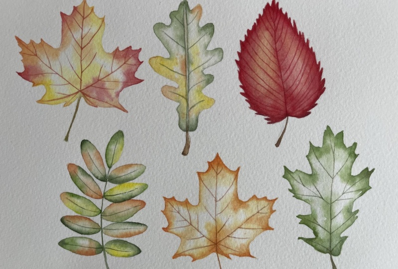
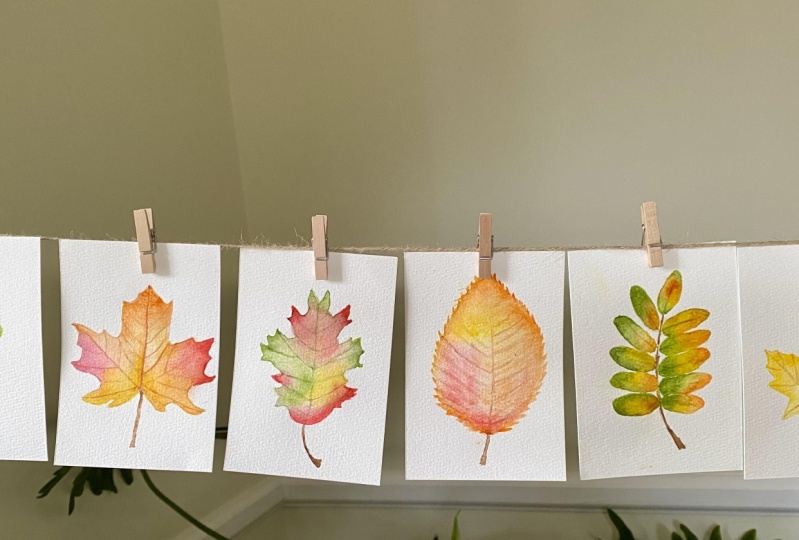
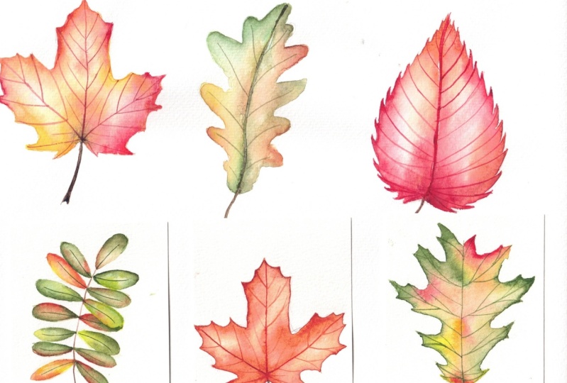
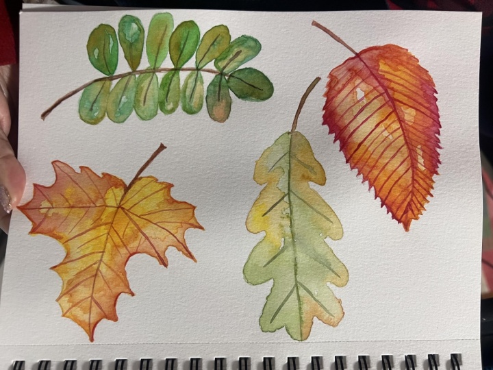
1. Welcome to Class!: Fall is such a beautiful season full of vibrant colors
and unique leaves. In this class, we're
going to capture that beauty with watercolor by painting six different autumn
leaves a red maple leaf, a white oak, copper beach leaf, a roan leaf, yellow maple, and a Northern red oak leaf. But you're always
encouraged to add your own unique flair
to these projects, or you can even paint an
entirely different leaf if there's one you
like even more. I'm Pria from Petals by
Pria Watercolor Designs. I'm a watercolor
artist and teacher, and I love creating classes
that are approachable, fun, and perfect for anyone who wants to relax and enjoy
the painting process. This class today is
beginner friendly, but it's also great for anyone looking for a fun
seasonal project. I'll guide you step by
step through all of the techniques so you can paint along with me
with confidence. By the end of this class,
you'll have a collection of six beautiful watercolor leaves perfect for the
upcoming fall season. So grab your paints,
brushes, and paper, and let's bring the colors
of autumn to life together.
2. Supplies & Resources: Let's go over the
supplies you'll need. I've included a free
downloadable PDF below with everything
I'm using in this class, including exact brushes, paints, and links in case you
want to check them out. You'll also find a second PDF with all of the leaf
sketches we'll be painting. You can print those
out to trace, use them as reference, or if you'd rather
not sketch at all, you can definitely free
hand these leaves. For paper, I'm using 100% cotton cold press
watercolor paper. Brushes are a Princeton
short liner brush and a few round brushes, all of which are listed
in the supply guide. For paint, I'll be using a
variety of tube watercolors, which I'll share
more about as we go. I also like to use a
ceramic mixing palette, a jar of clean water, a paper towel, and a pencil
and eraser for sketching. Go ahead and grab your supplies, download the PDFs, and
we'll start painting.
3. Red Maple Leaf: This is the first leaf
we'll be painting. It's a pretty standard
maple type of leaf. And this is, I would say, probably one of the
more complicated sketches out of the six. And what you're going to do is, I like to always start with this middle line that kind
of helps me keep on track. So I start with that middle
line and then add a stem. And then you'll have three
main sections one, two, three. And each section is going to have these little sharp
pointy edges to them. So I start at the top. You can do one side at a time, and I start drawing in
these very sharp edges. So that's one section, and then I move to the next one. I have this gap in between them. And start adding more
and more sharp points. They don't have to be perfect. They don't have to
be symmetrical, but you do want to keep them
in three separate sections. And then when you
add in the veins, I have primary veins
going to each section, and then each little pointy tip has a vein connecting
to those primary ones. All right, so I have
my outline here. And for most of the projects, we're going to start by just wetting the surface of the leaf. So I'm taking clean water
and a sizate brush, and I'm just going
to start by laying down a base layer
of clean water. Don't want it to be super watery to where
there's pools forming, but I do want enough water there so that when I
go in and add paint, we can get some bleeding
and blooming happening. So go ahead and add a very
base layer of clean water. Now, this first leaf,
I want it to have a mix of yellow, orange and red. And the yellow is definitely the lightest color of the three, and I always like to work light to dark with water colors. So I will start with my yellow. This is cadmium yellow deep. Again, all these
colors are listed down below in the description
box, if you're curious. But I'm going to take
a good amount of that, and I'm going to start by
tapping down some color, and you can see it expand out. That's because we already laid down that base layer of water. So I'm going to start tapping
in more of this color. You don't have to add your color exactly where I'm putting it. The best part about
painting these leaves, as I mentioned, is you
can just get so creative. You can add color
wherever you want. But I just usually like to have the yellow down
here at the bottom. And then I'm going to start
adding some of the tips. So I really want the yellow to focus in this bottom left area. You can see I have a good fine tip on the
edge of my brush, and I'm going to gently
with a very dark pigment, tap that color in right
around the corner. We're going to be doing a lot of wet on wet throughout
this tutorial, so you can see I'm
going back in and dropping in a little bit
more pigment on there. And because that surface is wet, it bleeds and blooms on its own. So I'm going to leave
that as is for now, rinsing off my brush, and I'm going to gently smooth
out some of that yellow. One of my favorite
parts about painting these leaves is having those blooming organic
watercolor effects. So I don't ever want
any harsh edges. So anytime I have
edges like this, I take a clean brush
and soften it out. Now, while I have the
yellow still on my brush, I'm going to add some up here on the top
right side as well. Like I said, you
can really add any of the colors anywhere on
the leaf that you want, and it'll look beautiful. So there's not one
specific way to do it. You don't have to put your color exactly where I'm putting it, but I'm dropping
that in and then taking a clean brush
and softening it out. And you can already see
these really gorgeous bleeds starting to form that
I absolutely love. Now I'm going to
move to my orange. And to make this orange, I'm mixing quinciena with
cadmium yellow deep, and you can play around
with the ratios to either get a darker
or lighter orange. And we're going to
do the same thing. So I have some of my
orange up here at the top. And I'm gently tapping that in, and my paper has stayed pretty
wet on that base layer. I'm using 100% cotton paper, which I definitely recommend. And I'll do the same
thing using the tip of my brush to create the
fine edges on the leaf and then rinsing off my brush and softening some of that
color out with clean water, gently tapping it, helping it kind of move along
that edge there. Again, feel free to tap these
colors wherever you want. Just make sure to
leave room for the red because I want to have plenty of room to add red
throughout this leaf. So leave some of
the edges for that. But we're going to be
doing the same technique, tapping in some of that color, and it doesn't just have
to be along the edges. Like we have this yellow here,
you can add some orange. You can add some of
it up at the top, or maybe over on the right side. But every time you add color, make sure you take
a clean brush and kind of help blend that out
into the rest of the leaf, because we really
don't want to have any harsh edges once
everything dries. Taking my brush, kind of
smoothing it out here, helping that color blend out
into the rest of the leaf. And look how gorgeous this is. We're just dropping in color. We're letting the water really
do all the work for us. Because we wet it with that
first base layer of water, everything blends
pretty seamlessly. We can help it along, but we don't have to do
too much work here. I'm going to add a
touch more orange here, and then we can
move on to the red. Let's add some up
here on the left. And like I said,
with the sketch, it doesn't have to be perfect
because you can always go in and add more
tips with your brush. So let's say, for example, if I want to add
another tip here, it wasn't in my sketch,
but I can go in, drop in some more paint, and there's another edge. So you have a lot of
creative freedom here. That's why I don't want you
to put too much stress on your sketch because
you can always make adjustments as
you start to paint it. And finally, let's add some of this orange down here
right at the bottom. Now, one of my favorite
parts about painting leaves like this is having
this very light value, almost like a highlight
throughout the leaf. So I do encourage you to maintain some
of this light color. You don't want to fill and saturate the leaf with
too much color as you go. If you do start to get that, you can use the
lifting technique, which just means using
a clean dry brush and letting your
bristles soak up excess. You can see it lifts
that color right off the page to create
a strong highlight. Now let's move on
to our t. I'm using a mixture of Quin
sienna and Quinn lake. I do like to add a little of that lake color to really deepen it and add a touch of this
purply hue to the red. And what we might need to
do because we've taken so long already is this part's already looking like
it's started to dry, and I want to be
able to get those nice bleeds that
we've been getting. So I'm going to rewet Again, you don't want any water to
be pooling on the surface, but you want enough
moisture there to get those bleeds as soon as
you drop the pigment down. I'm also going to add
some red tips up here at the top and also maybe
one over here too. So all I'm doing is re
wetting it a little bit. And then I'll load up my brush
with my bold red mixture. It's one of my
favorite fall colors and start to tap that in. And because we re wet it, you can see the paint exploding out into the
rest of that area. And this color just blends
so well with the other two. So continue working your
way around the leaf, and you're probably going to get sick of
hearing me say this, but please feel free to add in whatever colors you
want wherever you want. There's not one specific
way to paint these, but I just wanted to share
some of the techniques that can then be applied to
fall leaves of any kind. And again, here, all
I'm doing is using a clean brush to soften
out some of these edges. And clean up my lines and make them just a
little bit more crisp. I also want to add
some of that red color throughout the leaf,
not just on the edges. So I'm going to
add some moisture there and drop in some of
that red down at the bottom. All I'm doing is tap, tap, tapping that color in. And you can see that. If I left that as is, it would create some
really harsh edges. So using my clean brush again, clean and damp, and using it
to gently soften that out. Now, what I also want
to do is add some of these dark red tips to
some of the other areas. So say, for example,
these orange areas, I really want to keep
the general area orange, but I want to add
some bold red tips. So I'm using the very
tip of my brush. I'm not re wetting it because I don't want it to
expand out too much, but I'm using controlled
strokes to add a little bit of red to the very tippy top of
some of these orange areas. Rinse off my brush, make sure you don't have too
much water on there. And gently soften it out a bit. I'm not pulling out that
color too much because I want it to stay up
at the very tip. So softening that edge but not pulling that
color in too much. So this project is really great for practicing your water
control and your blending, too, because we have three
different colors here, but it's all blended
really nicely, and they're all working
together really nicely. We have our reds, we have
our yellows and our oranges, but it looks like
one cohesive leaf. So now I'm going to
move to my liner brush. This one is also linked below. I love to use it for details, and I'm loading it
up with raw umber. I love to use this for the stem. And I'm going to gently
start drawing in that stem. I'm barely applying
any pressure down, and then it gets a little bit
thicker down at the bottom. I'm keeping my lines nice and
dainty and filling that in. Now, if you want it to blend a little bit more with the leaf, you can re wet it right
where it connects and kind of help that brown blend
into the base of the leaf. So adding a little
more of that brown, and then I'll do a second layer with an even darker
value of raw umber. I'm keeping a light hand, not applying a whole
lot of pressure. And by tapping in some
of that darker value, it adds some nice
texture to the stem. Alright, so this
is looking good. I'm going to let this dry
before adding my veins. And you can still see some
of those sketch marks there. I want my veins to be
very crisp and clean. So I want to make sure
this is completely dry, and then I'll go in
with my liner brush to add in all those
little details. So now it's nice and dry. I'm going back to my
short liner brush and I'm loading up some of
this red orange mixture. You can really have your veins as light or dark as you want. I'm going fairly dark, but I'm using a very light hand, and I have this
short liner brush that is perfect for
details like this, using the very tip of my brush. Because I don't want
these veins to be super heavy handed or to distract from the base
layer underneath. I want them to just be very dainty and I'm bringing that line all the
way up to the top. We'll start by adding
these three primary veins. Let's do this one on the left. Using that very tip of the brush and connecting
it down at the bottom. Let's add the third and
final primary vein, starting at that same spot and
bringing it up to the top. I'm also going to add these fine little veins
down at the bottom, carefully adding those in and you can see,
it's a very subtle. This one might have been a little bit thicker than
I would have liked, but it's a very subtle
addition to this leaf. I don't want it to be this
beautiful base layer and then heavy lines
distracting from it. I just want it to be a
complimentary little detail step, but nothing that's taking
away from those base colors. So now we can start
adding all of the little veins coming
from each sharp little tip. I'm using the same technique, and I'm going to work
my way around this leaf adding these in point by point. Okay. So now that I've connected all of the
sharp edges that we have, you can go ahead and add as many more little
lines as you'd like. It's really up to your
personal preference and style. You can keep it simple or you can have a lot
of them if you want. I just like to add a few
more little subtle ones, even if they don't have anything to necessarily connect to. I never want to have too big of gaps anywhere in this painting. So I'm really happy with
how that one turned out. Take your time, adding
your final details, adding the texture onto
the stem and the veins, and then we can move
on to the next one.
4. White Oak Leaf: Now our second leaf is going to have more of a curvy edge. The first one is very
focused on the fine, sharp tips, but the second one has a little more
of a curvy line. They're very easy to sketch. This is what it
looks like. Again, I always recommend starting
with that center line. You can give a curve to it
and then adding your stem. The stems always get slightly
bigger there at the bottom, and then it does not
have to be symmetrical. You can see this one
definitely is not. But I've added these
wavy little lines. You can see some of them
have more separation, like those the ones
up at the top are more of just a connected
squiggly line. Then down at the bottom, I have more of a shape here where the leaf
connects with the stem. So just have fun with it, create whatever shape you want. The technique will
still be the same. We'll do it step by step. But go ahead and sketch out
your leaf however you want, and then we'll start painting. Now for this leaf, I want to use more of a green color palett. So between all of
these projects, we're going to be switching
between this red, orange, yellow palette versus
more of a green one, but I'm also going to use some of the orange and
yellow in the green. So we're going to be painting this leaf in two
different chunks. So we'll start with
this left side, or if you're left handed, maybe start with the right side. But I'm going to paint
everything on the left side of that center stem first and then we'll paint everything
on the right side. Once again, we're going to start by simply wetting the paper. I'm not wetting the
entire leaf, though. I'm just going to lay down this first layer on the
left side of the stem. Make sure it's nice and even. Once you have that first
layer of water down, we're going to be creating
some highlights and shadows. We're not going to
go too detailed, but I do want to add some
highlights and shadows. And so I want to have most
of my color right along that center vein and on the
outer edges of this leaf. So the middle is going to be mostly light value
or just water, and that'll help create
a sense of highlight. So keep that in mind
as you start to paint. I'm going to use my sap green, and I'm going to start
up here at the top. I'm dropping in some of that sap green right along
that center line. And because we were very intentional with where
we put our water layer, you can see that green
has that edge there. It's not going to be seeping
over into the right side. So I'm going to start
gently smoothing this color out using clean
water and feathering it out. And I'll work my way all the way down to the
bottom of the leaf. Again, I don't want this
to be too detailed. I still want it to
be loose style, but it can still be
loose while also adding a little bit of
shadows and highlights to it. So we have the center line done, and the rest of the
pigment is going to be focused more
on the outer edges. I want to leave that middle
section pretty light. I'll start adding
a little more of this green on the outer edges, and I'm kind of working
between adding in color and using my clean brush
to soften out any lines. If you want to stick
to just green, you can absolutely do that. You can add in some
yellow if you want. I'm going to add in some
yellow here on the left side, and I'm using primary
yellow for this one. I'll tap some of that in, and I'll also add
a little bit of my orange here at the bottom. It's kind of matching up with where that yellow section ends. Once again, because we added
that first layer of water, you get those really
beautiful bleeds forming. I'll load up some more green and just start to accentuate
some of these areas, still keeping in mind where I want the darkest pigment to be. But as it starts to dry, watercolor always
dries a bit lighter. So sometimes it
takes a few layers to really bring
back that vibrancy. And I'm making sure
to not cross over that center line because I want the left side to be distinct
from the right side. Again, I like to work with all different colors just
because it really gives it that color changing look that you get in the
early fall time. When the leaves
are just starting to turn from green to red, you get a lot of different
colors showing up there, and that's what I want to
convey in these paintings. It's not a perfectly red leaf
or a perfectly green leaf. It's kind of in that
transitional period. I'm also going to add
some deep sap green to my sap green to make it even a little more
bold in some areas. And I just love
painting leaves like this because there's
so much room to be expressive and
creative and to use whatever colors you want and just have fun with the process. And before it dries, I'm using a clean dry
brush or damp brush to smooth it out so you don't
get any super hard edges. This is why I love the
wet on wet technique because it just creates
such beautiful effects. Again, you can use
the lifting technique that I mentioned in
the last project. If you're getting
too much color, use a clean dry brush and lift some of that
pigment off the page. That'll help you create
that nice highlight. Again, that's my favorite
part of all these leaves is these really light
translucent areas. It's such a nice
watercolor effect. I never want my leaves to be too overly saturated with color. I never want them to get muddy. But you can go as detailed
or as loose as you want. Sometimes it's easy
to go overboard, adding in color and blending
it out 1 million times. So I'm just going to do
a little bit more here, and then we'll move
on to the right side. Alright, once it's time to dry, we'll do the same thing
on the right side. So I'm going to leave
the tiniest amount of space between these
two where the vein of the leaf will be using the
tip of my brush to create that and then evenly applying water to the
entire base layer. Same principles will apply
as you start to do this. I want the majority of color
to be on the outer edges of the petals and the inner edge
right by that center vein. So that middle area, we're
maintaining the light value. I do want to have a little bit of green up here at the top, so it doesn't look
like too stark of a difference between the
left and right side, but I'll have it fade
from green to orange. And if you're struggling
with the blending part or if you want your leaf to
be a little bit more loose, you definitely don't have
to worry about adding in the darker values on
the inner and outer edges. You can do it more
like we did in this first leaf
where we just kind of dropped in color on the
whole base layer of the leaf. But I just wanted to show you some different
ways that you can help your leaves
look a little bit more realistic if you want to. So I'm adding in some of that color on this
very inner edge, rinsing off my brush and using clean water to smooth
out any harsh edges. And you can see, I
like to start with this very light
layer of everything, and then I go back in to
add more color on top. I never want to add so much
pigment right from the start that it looks a little
too saturated or muddy. I really like having
these light white areas, and then you can add
additional layers with more pigment to bring
back that vibrancy. So it's always easier to start
light and then go darker. It's a lot harder to start with too much and then have
to try to take away color. So I'm just continuing
this process. I do want the majority
of the leaf to be green, so I'm using mostly the sap
green and deep sap green. But I have some touches
of color as well. You can really have fun with
it and make it your own. I always say this in all of
my classes and tutorials, but I never want you to
feel like you have to put paint in exactly the same
areas that I'm putting them. If you want to follow along
perfectly step by step, you can absolutely do that. You're always more than
welcome to do that. But if you do want
to start building up your own artistic confidence and be able to create stuff
on your own eventually, then even just small things like choosing your own places
to add certain colors, it can really help to start
building up your confidence. Now, I have that dark
green on the bottom left, so I want that to continue into the bottom right as well to make it look like it's not so separated in that middle vein. Each side kind of
blends into each other. So now we can give
this some time to dry, and then we'll go back in to
add the stem and the veins. Now that it's nice and
dry, we can add the stem. Similar to how we did
on the first one, I'm going to take
my raw umber using my liner brush and delicately
adding in this stem, it gets a little
wider at the bottom, I'll rinse off my brush and kind of blend
it up a little bit. I never want my stems
to be one solid color. I like to have kind of a
transition from light to dark, or you can always
go back in with a dark value and just kind
of tap in some texture. I love doing that for
that branchy look. I never want it to be
a full solid color. And now we can start
adding the veins, and this will be a
very simple process. Just like we did
on the first leaf, I'm using my tiny
little liner brush, and I'm going to use a very light hand to
add in these details. I'm pulling towards the center
vein with that dark green, so it matches that
center vein really nicely. Pulling it down. I'm not going all the way up to the very edge on this one, like we did on the last leaf. Just pulling it towards
that center vein. And I'll do the same process
all the way across the leaf. And that is our second leaf. I absolutely love this
one. It's super cute. And now we can get started
on the third leaf.
5. Copper Beech Leaf: Third one is pretty
easy to sketch out. It has a lot of jaggedy edges. But if you don't want
to sketch them all out, you can also add
them with paint. So like I always say, I start with the center vein. I made my stem kind of curved, and then it's almost like
a upside down heart shape. But I'm moving my pencil up on this sketch to create
those very jaggedy edges. And these are going
to be really fun to paint with that bold red color, and I'll do the same
thing on the other side. Now, I'll show you
my test run on this. This is kind of the look
that we're going for. Once again, we're
going to work in sections just like we did for this second leaf so that we have that center
vein separating them. But we have this really
beautiful, shiny highlight. So once again, we're going
to concentrate all of the pigment on the
outer edges like that, and then the inner
edges along the vein. So let's start with this left
side, or if you're lefty, start with the right
side and go ahead and put down your
base layer of water. Same technique that
we've been using, and that's the fun part of painting these leaves
is you're getting a lot of great repetition and practice with
the same techniques, but the outcomes are
all so different. I'm going to start
with my orange. I'm just going to have
a little bit of orange. The majority of this leaf
will be that bold red, but I want a little of
the orange up at the top, starting to gently add that in, and you can see I'm
using the tip of my brush to create those
sharp, jaggedy edges. The tip of the brush
does the work for me, laying down that color and
dropping in that orange. Same thing down the center vein. Gently adding that in, leaving that center area
white so that I can rinse off my brush and use a
clean brush to blend it out. But I really like
having that light, transparent sheen in the middle. So I don't want to drag
too much color into it. But now we can move on to the
red, which is my favorite. Again, if you want
to use the same exact color mixture
that I'm using, all those details are down
in the description box. So same thing using the tip of my brush to create
those very sharp edges. And because there's already
that base layer of water, you get the bled starting
to form on their own. So I'm going to work
section by section. I want to make sure I can
blend everything nicely. So using my clean brush, pulling some of that color
out, but not too much. And I actually want to
make this even darker, so I'm going to load
up some more pigment and go over it one more time. I still want this to
be a loose painting. I want all of these leaves
to be considered loose, so we don't want to add
too too many layers, so I try to get my desired effect within the
first one or two layers. So continuing to
blend stuff out, I'm rinsing off my brush. Every time you see my
hand go out of the frame, I'm rinsing off my brush so that I can maintain this light area. If I didn't rinse off
my brush as I did this, I would get so much pigment in my bristles that even when
I tried to blend it out, it would be too muddy. So I'm going to go back down to my orange here for
the very bottom. I'll add a little
more pigment here using the tip of my brush to
create the jaggedy edges, rinsing off my brush and
blending everything out. And that is looking good
for the first layer. You can see the highlights, you can see the shadows. I'm just kind of touching up
the top part a little bit. And that's looking really great. I am just going to
add a little bit more of the red down
here at the base. I want the base to
be nice and bold. So adding a little
more up there and maybe at the very,
very top as well. I'm going to add a
little bit more of the Quinn lake to give it that purple hue making things
a little more bold, but you don't have
to do this part. And as I blend everything out, I'm kind of pulling this
color towards the center. That's the general
shape we're going for. I'm not at the stage where
I want to add veins yet, but as I blend, my brush strokes are following the direction that
those veins will be. Okay, we can move on
to the right side now, starting once again with
the base layer of water. There's our base
layer, and again, where we want to
start light to dark. So I always start with the orange before I
go in with the red. It's always easier to
work from light to dark. So starting off
with that orange, adding a bit of that
at the very top, just like we did
on the left side, pulling that orange down
a little bit further on the right side to make sure
it's not too symmetrical. And I'll use a clean brush
to start smoothing it out, making sure to maintain
that light middle area. That's why I'm rinsing off my brush quite a
bit as I do this. I don't want it to
be oversaturated. Now we'll switch
over to the red and continue doing the same process
that we've done so far, adding in the color on
that center vein and the outer edges and blending
everything together. I'm gonna speed up this part, but be sure to take your
time as you do this. Alright, so it's a lot
of back and forth, but I'm going to finish
blending this out. We'll call it good,
and then we can add the stem and the veins. So now it has had
some time to dry. I'm going back in
with my raw umber, just like I've done
with the other ones and adding in my
curvy little stem. Remember, like I said,
with the last one, you want to have some
light values in your stem, some dark values,
tap in some texture. But overall, these stems are
pretty basic and simple. So now we can add the veins like we've done with
the other ones, we're going to add a dainty vein for each of these
sharp little tips. I'm using my liner brush
and I'm going to work my way gently lining
towards that center vein. I'm actually going to
darken that center vein here too with my dark red, make it nice and bold. That way, you can see it
better when you start adding in all of these
connecting veins. Again, I'm keeping very
light pressure as I do this, working my way all the way down. So go ahead and do it for
all the little spiky edges. All right. And there
is our third leaf. It's looking very beautiful, and our fourth one is going
to be quite a bit different. So let's get to it.
6. Rowan Leaf: This will be the fourth one,
starting with the sketch. As you can see, it's quite a bit different than what
we've done so far. We'll start with
the center stem. This is one of the
easiest ones to sketch. You can give a little
movement to it, and then all you're
going to do is add these oval shaped
leaves to either side, and they're matching up so the left and right ones are matching up at the same point. You can have some of them
overlapping or underlapping, and then just pencil in
these lines for the veins, and you can add as many
or as few as you'd like. I'm going to work leaf by leaf. So I'll start by
applying a base layer. You can see I have
a little bit of that red leftover
from the last leaf, so I'll try to rinse that
out and apply a thin layer. Now, I'm going to go back
to our green color palette. So we have some hints
of yellow and orange, but it's primarily sap green. Don't worry on this one about
creating perfect blends. We're just going to line
the outer edge with some of that green kind
of soften it out, but I'm not worrying about
making perfect blends. Just be loose with it.
I'm going to go ahead and add some deep sap green as well to make it a
little more vibrant. I'm going to primarily,
like I said, be using my greens, make
sure we have soft bleeds. Make sure you maintain
some of that light value, so you have some highlight
in each of these leaves. And then I'm also going to
add a little hint of orange. So I'm going back
to that first style where we just kind
of drop in color, but we're not too worried
about making everything perfectly blended or creating those highlights and shadows. We're just kind of dropping in color and smoothing things out. And I want each of these leaves to look slightly different. So have fun with it. Start with those base layers
of clean water, and then drop in your color. If you're following
my color palette, you want to use primarily green, dropping that in
along the edges, letting the water
blended out for me, but then just kind of
softening those edges. So I want all these leaves to have the same color palette, but different arrangements of them all to keep it interesting. Every time I add a color, I rinse off my brush and
gently soften it out. And when I say soften, all I'm doing is taking my
clean damp brush and kind of feathering out
those edges so that I don't get harsh
lines when they dry. So a lot of the same techniques we've used in the first three. For my green, again, I'm using the same green that
I did for the second leaf, where the lighter
color is sap green, and then the darker
one is deep sap green. And I'll probably end
up doing two layers. I want this to have the same
vibrancy as the second leaf. And this first layer is
drying quite a bit lighter. So we're just setting the stage or blocking
in these colors, but we'll probably have
to go back in with that second layer to
bring back the vibrancy. So I'm going to drop back
in some primary yellow on this third one
along with my green. Letting it blend out
and I'm just filling in these oval shapes
with our color palette, making sure to keep it nice
and varied and interesting. I'm not making every
leaf the exact same. So go ahead and repeat this process for all of the
leaves in the first layer, and then we'll go in with a second layer to
brighten things up a bit. Okay, so I have my first layer
all done, and like I said, I want to kind of follow a similar vibe to this
one where we have those really bright
vibrant oranges and yellows and greens. And our first layer, we were just blocking
in those colors, but it looks pretty washed out or light after everything dried. So I'm going to go back
in with a second layer. It's going to be a lot
of what we just did, but really deepening
those values. So, for instance, the green faded quite a bit as it dried. So I'm going back over
it with plenty of rich pigment straight from my palate and then gently
softening it out again. So I still want to get
those gentle bleeds, but I want slightly more
vibrant bold colors. I'll do the same thing
with the orange. I'm dropping in these colors in the same places that I
did in the first layer. We already blocked
in those colors, but bringing it back to
life with a second layer. Don't forget to blend
it out as you go. Rinsing off that
pigment so you can maintain clean
bristles as you blend. And you can always use the lifting technique to
lift any extra pigment. And you get those really
beautiful blends of color just like we did
in the second one between all three
of these colors. So the second layer, all you're doing is
making it more vibrant. You can see I pulled that color straight from the palette to get a very pigmented, vibrant shade. I'm lining the edges, rinsing off my brush, and
smoothing it out. We're getting a lot of great practice with these techniques. It might feel repetitive, but that's how you
start to build up your muscle memory and
improve your skills. So go ahead and do the
second layer if you want to. You don't have to do a
second layer, but if you do, go ahead and take your time,
add in that second layer, make things more vibrant,
smooth it all out, and then we'll meet back up to add the veins and the stem. Okay, so I have added
my second layer. You can see that second layer really brought this
leaf back to life. Again, you do not have to do additional layers if
you don't want to. I just really wanted
to have all of these leaves be in the
same level of vibrancy, which can sometimes be lost
when your first layer dries. Let's get started with
the raw umber stem. It's the same one
I've been using and I'll take my
fine liner brush, and I'll start with
the base of it. It has a little bit
of a curve to it. It gets thicker at
the very bottom. And then working my way between the leaves using a
super light hand, making a very dainty stem behind all of these leaves and
piecing it all together. So now we have the stem, and we can start
adding the veins, just like we did
on the second one. I keep referencing
the second one because it's the same color
palette and I really like how that deep sap green vein
looks with that base layer. So that's what I'm going to
use for these veins as well. It's deep sap green with a
little bit of sap green. And I'm not going to
go all the way up to the top for all of these veins. I'm using dainty light
pressure and connecting them. They have a little
bit of a curve to it. They're not perfectly straight, but I'm pulling
all of these lines in towards the center stem. As I've said, you
never want these veins or stems to take away from
the beauty of the leaf. They're just an extra step of details that helps
bring it to life, but you don't ever want
them to be too distracting. You want the colors
and the base layers to shine. And there you go.
7. Yellow Maple Leaf: Next one's going to be almost
identical to the first one, but I'm only going
to use one color. So you can choose
any color you want. I'm going to do my
warm orangy yellow. But if you want to make it green or yellow or red
or blue or purple, whatever you want to
do, it's up to you. As for the sketch, like I said, it's almost identical
to the first one. I did make it slightly smaller, but you can use
the same sketch as you did for the first
one if you'd like. And I wanted to show you
this so that you can see how we can paint the same
project in just one color. If you're someone
who doesn't want to worry about blending colors together or if you just want to focus on one color for
a specific project, we can absolutely do that. And before we start, just a quick note on value. The total value is the relative lightness or
darkness of a color. For example, this outer edge is a dark value of Quinn sienna. And this inner light
area is a lighter value. It's the same color, but the lighter area is
more watered down, whereas the edge is more
saturated or more pigmented. So that's what we're going
to focus on for this leaf. We're only using
one color mixture, which is that warm
yellow orange, but we're going to use different tonal values
to bring it to life. So that it's not
just one flat color. So start with the base layer, just using clean water all the way across
the entire leaf. And then once it's
filled in with water, we can start tapping
in the color. So very similar to what we
did in the first project, starting by tapping in that
pigment at the very bottom. Rinsing off my brush, we're going to be doing
a lot of back and forth between rinsing off and blending and adding
in the darker values. As I said, this is
a dark value of my color because it's pulled
straight from my palette. It's very pigmented
and saturated. And then as I rinse it off and create these lighter areas,
they're lighter values. So it's all the same color, but we're utilizing
different values to make it a little
more interesting. So now, just like we did
in the first project, I'm using the tip of my brush
to create the sharp points. So it's basically
the same technique, but it's easier because
we're not having to worry about blending the red with
the orange or the yellow. We're just focusing
on this one color and blending it out into
the rest of the leaf. So every time I add color, I'm also rinsing off my brush and using clean water
to soften it all out. Remember to maintain those light areas because that's what really gives these leaves the
beautiful, delicate effect. Of course, if you do want to use more colors like we did in the first one, you absolutely can. I just wanted to show
you how you can utilize values to just work
with one color. So for the most
part, as I do this, I'm tapping in the color
on the pointee edges, but I'm also adding
some areas within the leaf that have
a darker value. That's the great part
about working with a wet base layer is you can
drop in color like that, and it automatically
starts to bleed and does all that work for you and creates these beautiful effects. I know I'm working a little bit quicker on this
one just because it's pretty repetitive to what we did in the
first project. But as I mentioned,
it's the same process. Just be sure to take your
time as you do this. At this point, I'm going
to leave it as is. We'll let it dry and we'll
add the stem in the veins. Now that it's dry,
let's go ahead and add the stem first
using my raw umber. The stems basically are
the same on all of these, but you can make them curvy. You can change the
direction of some of them. This one's curvy. This one's a little
more slanted. Just have fun with it. They're
pretty simple and easy. Now for the veins, I'm
going to use a dark orange. I don't want to use red because there's no
red in the leaf, and I want to maintain
the orangy effect. Red would be a little
bit too jarring. So I'm going to mix up
a nice orange color, and we'll do the same
thing we did in this first one with those three
primary veins, and then the additional ones coming from each
sharp little edge. And there we have it. So same technique
as the first one, but just using one single color, and it turned out to
be very beautiful.
8. Northern Red Oak Leaf: You can kind of see
the pattern here, and this last one is going to be back to our green
color palette. I'll show you the example
that I worked on here. This is what it's
going to look like. It's a lot of the same technique
we did in the first one, but using the green
color palette. Let me show you really
quick this sketch. This is what it will look like. You can start with
that center line, and then it's a little bit
more jaggedy like this one. But you can just kind of
move your pencil as you go, creating jaggedy
lines, pointy leaves, and then every so often give yourself a big gap
like this here. So that you have individual
sections like this. So you can probably guess
what the first step will be. It is applying that
very base layer of water just like we've
done on all the projects. Now, since I want my green to be the focal point in
this color palette, I'll start with that. I'm using sap green with a
touch of deep sap green, and I'll start by applying that color to these
very top sharp areas. So this will be, as I mentioned, similar to how we
did this very first one where we work
kind of in sections. So for example, I'm
adding the green here, but I'm just going to add it
to this little top section, and then I'll move
to a different area, rinsing off my brush, smoothing some of this out, maintaining that
light highlight. I'm going to darken some
of these edges here. I always like the very tips
to be the darkest value. So that's why lots of times you'll see me going back
in and darkening those. And now let's move
to the next section. I'll add some more of
that green down here. On the left, feel free to add your green or whatever color you're working with
wherever you want. You really can't go wrong with these projects because there's not one specific way
that these leaves look, especially in the fall time
when the colors are changing. Sometimes they're
a lot more red, sometimes they're
a lot more yellow, but now I'm going to move
over to this right area. So I'm working in chunks. I don't have an exact plan of where each color
is going to be. I'm just feeling it out and making sure I
have a good variety. Every time I add color, I'm making sure to rinse off my brush and smooth it all out. Moving on to my red, I'm letting the tip
of my brush create those sharp edges for me and
gently adding this color in. Red and green can sometimes be tricky to blend without
it turning muddy. So make sure you give yourself
plenty of room in between them and plenty of rinsing
of your brush as you go. But look at that gorgeous bleed. That's all natural. I'm not even blending that
out very much. But that base layer
that we put in first really allowed that
color to spread gently. And then we'll add some red up in the top right
corner, as well. I definitely don't want to
go overboard with the red, but I'll add a little bit
here up at the top right, and maybe a little more
down at the bottom. Don't forget to also add
color throughout the leaf, not just on the edges. It's all still wet,
so you can tap in some more green if you
want, or some yellow. Just have fun tapping
in these colors and watching them interact
and play with each other. I'm adding the last
little touches here. I'm not even doing too much blending
because, like I said, that first layer of water is so nicely put down that it does a lot of the
blending work for us. I'm going to leave this to dry and then we'll add
the final details. Everything is looking
so beautiful together. I absolutely love
these fall colors. But let's go ahead and
finish this last one. Going in with my raw umber, you know what's up
next, adding this stem. I'm going to keep the stem
pretty short and stubby. Just having fun adding all these different types
of stems to my leaves. It's getting a little bit
thicker at the bottom. Nothing too difficult
about them. Just kind of placing down
that brown and then adding a little bit of texture on
top with a darker value. So for this final leaf, I'm going to go with my deep
sap green for the vein, bringing it all the way down, and then pulling in these veins off of each of these
sharp little edges. And you can add as many or as few of these veins as you want. Just work your way throughout. I usually do one from
each pointy edge, and then sometimes kind of off
shooting from one another. And then if there's any
big gaps like that, I just add a little
dainty vein like that, but it's never
anything that's too distracting from the main leaf.
9. Final Thoughts & Resources: Congratulations on
finishing the class. You now have painted six
beautiful autumn leaves. I hope you enjoyed
the process and feel more confident with
your watercolor practice. Don't forget to share
your final projects in the project and
resources section. I'd love to see your work, and so would the
Skillshare community. If you enjoyed this class, you can follow me
on Instagram for more watercolor inspiration
at Petals by Priya, and be sure to check out
my other classes here on Skillshare and tutorials on YouTube to keep
creating and learning. Thanks so much for
painting with me, and I can't wait to see
what you create next.
 Petals by Priya Watercolor, Watercolor Artist & Teacher