Transcripts
1. Welcome To The Class!: Hello, everyone. My name
is Will Alliston and today we'll be painting a beautiful countryside landscape
in watercolor. This class is all about
capturing the peace and beauty of nature in a
loose and enjoyable way, no stress, no need to worry
about perfection or details. Just a good opportunity
to let the paint flow, have fun, and create
something wonderful. We'll be using simple techniques like wet and wet
blending, layering, and dry brush work to
create soft skies, rolling hills, and
reflections in water. Whether you're a beginner or have experience
with landscapes, this class will show
you how to simplify the scene and paint
with confidence. I've been a professional
artist for many years, exploring lots of different
subjects from wildlife and portraits to cityscapes
and countryside scenes. I've always been entranced by the possibilities of watercolor. But when I started,
I had no idea where to begin or
how to improve. I didn't know what
supplies I needed, how to create the
effects I wanted, or which colors to mix. Now I've taken part in many
worldwide exhibitions, been featured in magazines, and been lucky enough
to win awards from well respected
organizations such as the International
Watercolor Society, the Masters of
Watercolor Alliance, Windsor and Newton, and the SAA. Watercolor can be overwhelming
for those starting out, which is why my goal
is to help you feel relaxed and enjoy this medium
in a step by step manner. Today, I'll be guiding you
through a complete painting, demonstrating a variety
of techniques and explaining how I use all
my supplies and materials. Whether you're just starting out or already have some experience, you'll be able to
follow along at your own pace and improve
your watercolor skills. If this class is too challenging
or too easy for you, I have a variety of classes available at different
skill levels. I like to start off with a free expressive
approach with no fear of making mistakes as we create exciting textures
for the underlayer. As the painting progresses, we'll add more details to bring it to life and
make it stand out. I strive to simplify
complex subjects into easier shapes that
encourage playfulness. Throughout this class, I'll be sharing plenty
of tips and tricks. I'll show you how to turn
mistakes into opportunities, taking the stress out of
painting in order to have fun. I'll also provide you with
my watercolor mixing charts, which are an invaluable tool when it comes to choosing
and mixing colors. If you have any questions, you can post them in the
discussion thread down below. I'll be sure to read and
respond to everything you post. Don't forget to follow
me on Skillshare by clicking the Follow
button at the top. This means you'll be the
first to know when I launch a new class
or post giveaways. You can also follow me on Instagram at Will Elliston
to see my latest works. So let's grab our brushes and enjoy the
process of painting a calm and atmospheric
countryside scene together.
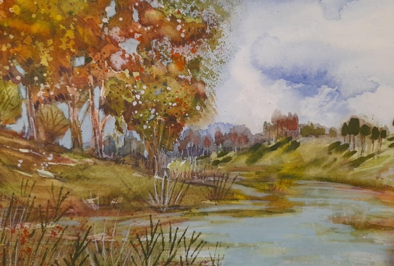
2. Your Project: First of all, thank you so
much for joining this class. I'm very excited
to show with you this painting that is
relaxing and rewarding. One of the best
things about painting countryside scenes is that
it's so fun and forgiving. You don't have to
worry about getting every detail perfect. Instead, we'll use light, color, and atmosphere to
bring this scene to life. In this project, we'll
explore soft skies and distant hills using
simple wet on wet washes, laying and glazing to build depth without overworking
the painting. Reflections in water to create a sense of
calm and realism, and loose expressive
brushwork to suggest foliage, trees, and grass without
painting every detail. The goal is to capture
the feeling of the countryside rather
than every tiny element. By the end of the class, you'll have a painting
that feels fresh, natural, and full of life. And most importantly, you'll
have enjoyed the process. In the resource section, I've added a high
resolution image of my finished painting
to help guide you. You're welcome to
follow my painting exactly or experiment with
your own composition. As we're going to be focusing on the painting aspect
of watercolor, I've provided templates
you can use to help transfer or trace the
sketch before you paint. It's fine to trace when using it as a guide for
learning how to paint. It's important to
have the underdrawing correct so that you can relax and have fun learning the
watercolor medium itself. Whichever direction
you take this class, it would be great
to see your results and the paintings you
create through it. I love giving my
students feedback, so please take a photo
afterwards and share it in the student project
gallery under the project and resource tab. I'm always intrigued to
see how many students have different approaches and how they progress with each class. I'd love to hear
about your process and what you learned
along the way, or if you had any difficulties. I strongly recommend
that you take a look at each other's work in the
student project gallery. It's so inspiring to see
each other's work and extremely comforting to get the support of your
fellow students. So don't forget to like and
comment on each other's work.
3. Materials & Supplies: Before we start the painting, let's go over all the materials and supplies you'll
need to paint along. Having the right materials can greatly impact the
outcome of your artwork. So I'll go over all the supplies I use for
this class and beyond. They're very useful to have at your disposal and will make it easier for you
to follow along. Let's start with the
paints themselves. And like most of the materials
we'll be using today, it's a lot to do
with preference. I have 12 stable colours in my palette that I
fill up from tubes. They are cadmium
yellow, yellow ochre, burnt sienna, cadmium
red, alizarin crimson, Opramarne blue, cobalt blue,
serlean blue, lavender, purple, viridian, black, and
at the end of the painting, I often use white gouache
for tiny highlights. I don't use any
particular brand. These colors you can
get from any brand, although I personally
use Daniel Smith, Windsor and Newton
or Holbein paints. So let's move on to brushes. The brush I use the most is
a synthetic round brush like this scodaPol brush or
this Van Gogh brush. They're very versatile because
not only can you use them for detailed work
with their fine tip, but as they can hold
a lot of water, they are good for
washers as well. They're also quite affordable, so I have quite a few
in different sizes. Next are the mop brushes. Mop brushes are good for
broad brush strokes, filling in large areas and creating smooth
transitions or washes. They also have a nice tip that can be used for smaller details. But for really small details, highlights or anything
that needs more precision, I use a synthetic
size zero brush. All brands have them,
and they're super cheap. Another useful brush to have is a Chinese calligraphy brush. They tend to have long bristles
and a very pointy tip. They're perfect for
adding texture or creating dynamic lines
in your paintings. You can even fan them
out like this to achieve fur or feather
textures as well. And that's it for
brushes. Onto paper. The better quality
of your paper, the easier it will be to paint. Cheap paper cuinkles easily
and is very unforgiving, not allowing you to
rework mistakes. It's harder to create
appealing effects and apply useful techniques
like rubbing away pigment. Good quality paper, however, such as cotton based paper, not only allows you to rework
mistakes multiple times, but because the pigment
reacts much better on it, the chances of
mistakes are a lot lower and you'll be more likely to create
better paintings. I use archers paper because that's what's available
in my local art shop. A water spray is
absolutely essential. By using this, it
gives you more time to paint the areas you
want before it dries. It also allows you to
reactivate the paint if you want to add a smooth
line or remove some paint. I also have an old rag or t shirt which I use
to clean my brush. Cleaning off the paint
before dipping it in the water will make the
water last a lot longer. It's always useful to
have a tissue at hand whilst painting to
lift off excess paint. Also, you never know when an unwanted splash or drip might occur that needs
wiping away quickly. I also have a water dropper
to keep the paints wet. When you paint, it's
important to have them a similar consistency to what
they're like in the tubes. This way, it's easier to
pick up sufficient pigment. A hair dryer is useful
to have for speeding up the drying time and controlling the
dampness of the paper. And lastly, masking tape. And this, of course, is just to hold the paper down still onto the surface to stop it sliding
around whilst painting. Also, if you plan on
painting to the edge, it'll allow you to create a
very crisp, clean border. And that's everything that
you need to paint along. But I encourage you to
experiment and explore with whatever materials you want to make this painting
truly yours. Now, let's get on
with the painting.
4. How to Sketch It Out: So when sketching this
countryside scene, a lot of the same principles relate to this as
any other subject, whether it's an animal
or a cityscape, we've got to think
about the big shapes first and the perspective. So I'm using broad lines just
to map out the big shapes, so straight lines to map out the triangle of the
hill, the water, using big broad
circles instead of outlining every single
tree or blade of grass, we're starting with
just broad circles, thinking about land masses or the groupings of trees,
the overall composition. And you can try squinting
your eyes at the reference to help simplify these
details and allow you to see the bigger
shapes more clearly. Because the guide
that I provided the template is quite confusing because nature
is quite organic, so it's difficult to
really interpret. You can trace out
the lines and then match it with the final image just to see how to
fill in the details. But try to avoid too
many hard lines. In nature, most of the edges are actually soft and organic unlike city scenes where straight lines and rigid shapes dominate. Landscapes require a bit more of a looser, more
gestural approach. That's why using the trace
or at least looking at the template can be a bit confusing because it's
a bit more random, so to speak, than man made shapes or objects
that can be broken down. I'm using broken light
pencil strokes rather than hard outlines because I don't want the
painting to look stiff. I still want a bit
of flexibility. So I'm going to
take some time to get the drawing all nice and neat and then
upload the template.
5. Light Underlayers: Hopefully, you have
got your sketch fairly well organized
because nature, like I say, can be quite confusing to look at because
it's so organic and random. So we have to put a lot of
faith in the composition. But we can start off slowly
and break it down into small steps like now I'm mixing burnt sila
and yellow och, and we're just going to
apply a light underlayer. And you can have my final
image as a reference, as well as the pencil drawing right now just to see where I'm applying that fine kind of it's almost like
a coffee color, but a bit more warmth to it. And the consistency is
just like coffee, really. It's got that it's not
too thin and transparent, but it's not too thick. It runs easily on the palette. I'm even using water to
lighten it up a bit. And the brush the sponge that I have on the top
right of the screen, I just use to draw out
some of the pigment. If it's too light or too dark, I can control how much pigment I take on and off
while it's still wet. Dabbing that sponge again, just to make sure there's not too much water on the brush. And now I can go in with
a bit thicker pigment. This is pure burnt sienna now. And because the paper
is slightly damp, those little splotches sleath out and add a bit of a texture. They're not going
to be hard lines, but they're going to keep
a lot of their shape. Now moving on to the main tree, I guess is the kind
of eucalyptustre. I needed a light tree to
contrast with the rest of the bundles or
groupings of trees because a lot of the
trees are in shade. I wanted something to capture
the center of interest. I'm just painting
the underlayer. Of course, at the moment,
the bark of the tree, it looks darker because we're contrasting against the white
of the paper, but later on, we're going to paint dark
around the tree and it's going to make this burnt sienna yellow och
color really pop. You don't need to be so loyal or strict with the
colors that I'm using. I just needs to be
roughly the same, just a warm, earthy tone. And again, you can
squint your eyes just to see the shape of
what I'm painting, what area I'm blocking out. Even though it's a random shape, it's not like a
square or a circle. I'm thinking in terms of shapes. I'm looking at the
edges where I'm painting to what I
need to fill out. So try and match that shape that area I'm blocking
out onto your painting.
6. Mixing Sky Colours: So we'll come back to that underlayer with
some green later on. But I think we can start
working on the sky now. So I'm going to mix
some serlean blue, a bit of ultra marine blue. But of course, you
can experiment with whatever blues you like or
whatever pigments you've got. A bit of purple in
there. Just a touch, maybe a bit of red to help boost that purple.
That's a bit too much. Let's add a bit more serlean
to balance that out. I'm mixing quite a lot because the sky is quite a big
area and I don't want to paint half the sky and realize that I don't
have enough pigment. So it's better to mix
more than you need and premix all of it before
you start this wash. And I'm using a small
medium size brush, really, to mix the paint. But when it actually comes
to painting the sky, I think I'll use a bigger brush. There's going to be little
gaps inside the trees, and I want the gaps to show the same color of the
sky as everywhere else. So I'm just going to paint an underlayer of where
those little gaps are. And when it comes to
painting the trees later, I'm going to try and keep
those areas exposed. It's quite random at the moment. But if you want to follow along, you have to match me. You can experiment. You don't necessarily
have to place these blue slodges exactly
where I'm placing them, but you've got to
remember that we're painting these blue splotches
for the sky later on. So wherever you place them, remember that you
have to leave them exposed when it comes
to painting the trees. It's also a good procedure to paint these bits of blue now because we can see
what kind of color it looks on the white of the paper before we commit
to the full sky. So if you wanted a bit
warmer sky or a bit greener, a bit more serlean or turquoise, you can use that
as an opportunity. Now, I'm pre wetting
some of that paper, you just noticed there because I want the clouds to
have a soft edge in some areas. A
7. Painting The Sky: And we have to act
quite fast with a sky. Unfortunately, it's not such a thick pigment
when we paint the sky. It's quite diluted.
As you can see, it's quite a light blue. And because there's less
pigment, it dries faster. So once you start to avoid hard edges and to have
a nice clean sky, you have to work quite fast. I'm trying to I'm not
painting all the way down. I'm trying to keep a kind of hilly up and down rounded
shape for the clouds. Once you've covered an area, then you can go back in
with a bit more pigment to make sure the tone is
right or the color. Now, that's where
the clouds are, it's like a check mark. I've added a bit more
serlean blue in there, a bit of a cooler
blue than before. I don't want the clouds to
be all this hard edge low, so I'm going to have to
soften some of them. I'm changing to my
smaller brush and just smudging some of the edges
there with pure water. But my brush isn't
overloaded with water. It's just slightly saturated. So when you smudge the edge like that with water and it
starts to bleed through, you've got to
counter the time it takes for pigment to
move with the water. You don't want to get it looking perfect straightaway because
it will carry on moving. So you've got to
wet that edge with the water and then put your
faith into the water and the pigment to do
what it has to do without tampering with it too much because then
the magic will be lost. So at the moment, it doesn't necessarily
look the way I want it to, but because I've wet the edge, I know that it's going to blend in about 5 minutes by
the time it's dry. Then underneath the cloud, I'm going to add a few
organic sploges of blue and it's easy to overpaint the sky because nothing else is
painted on the page yet. So it's all we're focusing on. But at the end of the painting, the sky is not actually
going to be the focus. It's not going to be
the central point, so it doesn't need to
be highly detailed. It can look unfinished now and still work
very well at the end. But if you overwork it, then it will take a lot
of their tension away, and it'll look overworked, and it won't have that kind of serene look that
we're looking for. So I'm going to
leave it as it is now and we can move on
to the underlayer again.
8. More Underlayer: Pre wetting where the
reflections are because, of course, there's a
body of water here, wherever it's a river or
a lake, I'm not sure. But we need to add some of
that sky color in there and it's going to be slightly lighter and slightly
less saturated. And as we move the brush up, we add more water so that
it's more of a transition. So the middle doesn't
have any pigment, and the bottom has more pigment. And you can zig zag
your brush marks, your big brush ropes to
imply subtle ripples. But even though I say I
add more water as I go up, that doesn't mean that
the brush is full. I still have to use
that sponge or a towel to make sure that my
brush isn't overflowing, even if I dilute it
with more water, it's very easy as a beginner, like it happened to me, and it took a lot of
practice to make sense of it and to remind myself to control how much
liquid is on the brush, even though we're using
water all the time to change the amount
of pigment we have, we still have got to make sure the brush isn't overloaded with water or the other way around. Sometimes there
isn't enough water or pigment on the brush. So when we paint our strokes, the pigment doesn't fall off. Um, so now I've mixed a green. This green is viridian green. We have a bit of yellow ochre. But you can experiment
with mixing your greens. There's a lot of
different greens we'll use in this painting. Of course, when we
think of green, we think of Varidian
or sap green. Those are pre mixed greens, but you can mix your own. You can take cadmium yellow and mix it with any of the blues you've
got cobalt blue, cyan blue, ultra marine and create lovely natural
looking blues, greens, rather. And now that that underlayer
of the earthy tone is dried, we can paint this green up to the edge without it blending in. We're starting off with
a nice light layer, and then we can add more pigment if we feel like
it needs to be a bit darker. Of course, there'll be a reflection of this
pigment, of this grass. So much like the drawing, we're using broad brushstrokes
to begin with. Big shapes. And as we go along
through the process, we'll start using smaller
brushes to refine the details. But we must always start off
with expressive brush marks. It doesn't matter if we go over the lines a
bit in the stage. That actually adds to the expressive feeling,
the aesthetic. We always got to think
forward with watercolor, what we're going to paint next. 90% of the process, it looks a bit odd until we add the dark tones later.
It just comes together.
9. Finishing The Underlayer: Now using the same green of viridian green and
capium yellow, we're going to fill out some of these bundles of leaves
or foliage in the trees. Again, it's quite random, and I'm definitely not
thinking of individual leaves, just blocking out areas, trying to space them out in an aesthetically
ordered composition. I'm thinking of masses rather
than individual strokes. And it's all pretty much the
same tone at the moment. We're trying to simplify
it and by simplifying it, what I mean is we don't need to think about
the whole myriad of tones. We don't need to be so strict. Basically, everything
that we've painted so far is a light mid tone. It's not a highlight and
it's not a dark tone. We don't need to think about how light or dark every
single brushstroke is. We're keeping everything
about the same at the moment. There's lots of
different ways to paint, and depending on the subject, sometimes I start with
thick heavy pigment, but countryside
scenes tend to have more of an open airy feel. So I'm trying to avoid overly heavy pigment
to start with. It's a completely different way of painting than cityscapes, because unlike city
scenes where there's sharp architecture where there's lots of precision and structure. Natural scenes or
landscapes should feel a bit more
layered and organic. And now I'm starting to paint the underlayer of
the distant hills and you may have noticed that the colors that I'm mixing were pre existing on my palette, and that's one way to keep
your palette harmonized. I didn't bring a
brand new color. I mixed the green
that we already had and the earthy brown
that we already had. So that it looks like
it belongs together. If I were to try and
mix my own color, it would look disjointed because they wouldn't be related to
anything else in the image. That's why it's a
good idea to make a habit of mixing more than you need rather than not enough.
10. Starting The Distant Hills: So now I'm going to mix
a darker blue because blue color recedes
and we're going to paint the distant mountains
or distant hills rather. And not only the blue
cool colors recede, but they'll also
be less saturated and less contrast,
it's more gray. Carefully painting
to the green edge, but being quite open for
interpretation at the top with the shape of the hills and then painting up to
the little tree or bush, painting a few lines that might be peering
through the gaps. To indicate a
little thin branch. Then we can work through
to the other side. And this is a light blue. And as we paint the
rest of the hills, the pigment will be
getting darker and create that illusion of atmosphere in the air,
perspective and depth. I actually added a bit
of warmth to this blue. You can use purple
or alizarin crimson. Actually, it doesn't matter
about the specific pigments. I think in terms of temperature. So when I think of warmth, it can be any warm color. It could be cadmium
red, lazarin crimson, purple, I'm painting
the underlayer for the rest of the
hills because there'll be trees and then
there'll be fields. So I'm using that brown. It's also a bit desaturated that brown rather than the warm foreground brown. Likewise, with this
green, you can see it's not as vivid as the
green in the foreground. It's a bit more grayed out, and that works well because
it's in the distance and it will be less vibrant. If you think about
all the particles in the air that block out the color I'm actually going to
paint a little bit into the body of the
water because there'll be a bit of a reflection of this
hillside into the water. So I'm using a light bit of pigment just to
soften that edge. And I must apologize
in advance that the camera cut out while painting half of
these distant hills, but I'll explain my process
11. Painting The Reflections: So sorry again for the
camera malfunction and not actually
recording the footage of painting these distant hills. But I'll briefly
explain how I did it. Of course, I waited
for the under layer to completely
dry with a hair dryer, and moving from left to right, it's basically one single wash. Even though we've
got a whole variety of tones and colors in there, it's all connected
with one wash. It has the illusion
of complexity and it looks like it's
more than one layer because it has a
feeling of depth. But it is actually
just one wash. We started off
light on the left. And gradually moving along
to the right and we're changing from blue to brown and then green
on the very right. Then once we've
painted that section, we go back into it at
the bottom with darker, almost black pigment, but you
can use any dark pigment, whether it's burnt umber, burnt sienna, even dark blue. We're using thin lines
to connect it all at the bottom and hard edges at the bottom and going
up to the water line. And you shouldn't aim to paint it exactly the way I'm painting it
because in fact, I painted it too dark
and once it's dried, I'm going to go back into it and add a bit of a
white tint and I'll show you how to do
that to correct the value and add more
to that perspective. That's one of the advantages of watching the
whole thing first and seeing the full procedure and determining how you're
going to approach it. So whilst painting
these reflections, I've started off with a kind of grayish green on the left, and it blends into a yellow
ochre burnt sienna color. But you can experiment with all the colors you want
to merge into this. I've even added a
bit of a red color to match the red kind of tree
we've got up at the top, adding a few vibrant greens and I'm concentrating on
horizontal brush strokes, but also vertical brush strokes. And this is wet onto wet
painting at the moment. At the edges, I'm trying to add very thin lines
using the tip of my brush to create a nice contrast between
the land and the water. If I was painting
this off camera, I'd paint this angle so that
the water would run down. Although it's difficult
to see on camera, I'm actually using my water gun every so often to
spray it and add more water to it so
that it runs a bit freely because I don't
want it to dry so quickly. And if I had it tilted, then the water would run down vertically and help that
illusion of reflection. It has to be very saturated and wet for
there to be soft edges. We don't want many hard
edges in this reflection. And I was very careful
to make sure there's a little gap between the land
and the reflection there. But we can also come back
later with the highlights to indicate tiny little ripples and where the land
meets the water. You can see how when
taken as a whole, the finished piece, it
looks quite refined. But when we break it down into small little
steps like this, for example, this reflection, it's actually very abstract, and the trees above are very abstract when you look
at them by themselves.
12. Tinting The Hills: When painting these reflections, we don't want to go
all the way down. We want to reserve some space to show the
reflection of the sky, and it can get a bit out of hand because we do want
there to be nice soft edges. But as long as we keep the
wetness level appropriate, as long as we don't allow the paper to dry,
we can control. Once the paper is dry, then we've lost it and it'll
start to look a bit muddy. But we can keep on going back and forth with
pigment and we can clean the brush and use it to draw out pigment if there's too much all as long as we
keep the paper wet. Adding vertical lines
at the bottom there, and I pre wetted the paper at the bottom so they're not
going to be hard lines. They're just going to blend out. And you can use your brush to control how far down it goes. You can have a tissue in
your other hand like I do, just in case there's an
accidental spill Notice how I'm not just
moving my wrist. I'm moving the whole of my arm. In fact, for parts like
this, I even stand up, so I've got nice control because if you just use
your wrist to paint, then it looks very
constrictive and there's less momentum or control. But using your whole
body allows for a more confident stroke that does make a visual
difference at the end. Of course, when it comes to
painting the details later, I will sit down and use a bit more controlled wrist
or finger motion of my brush. But for big broad,
confident marks, I tend to stand up. Now, I just made a mix
of yellow and green, and I just using a large brush to tint that field because
it was a bit too light. And it only takes one stroke. I don't go over it a second time because then it
smudges what we've done. If it's dry and you
apply one thing stroke, then it tints it. So it adds another layer, but without affecting all
the brush work behind it. And that's what I'm doing
with this white now. It's a very diluted
white white guash. And I want to make the
background slightly lighter. Now, you have to be a bit
wary of this because when you first apply the
brush stroke like this, and you can see I'm not
going over it twice. I'm just filling it out. When it's wet, it looks a lot
lighter than when it dries. So it looks like I've
done a lot there. But you'll see when I
use the hair dryer, that it suddenly goes darker again. We've got
to counter that in. Don't be too afraid
of it looking too light because once it's dried, the white particles will
sink into the paper and it won't look as reflective and it'll ultimately
look darker.
13. Starting The Trees: Now I'm mixing a similar
color as the ground, the earth tone, but a
bit more yellow ochre. It's less warm and
it's more yellow. I'm just filling in these gaps, trying to avoid the blue because
I don't want to overlap. Filling in the white
gaps of the leaves. Again, I'm thinking
of large masses rather than individual leaves. Blending in a darker
green at the bottom. I'm using a mop
brush at the moment, just because I don't need
to do fine detail of this. I just need a hard edge, but I don't need fine lines. I'm just filling
out these areas. But that doesn't mean you have to use a mop brush
if you don't have one. Using slightly thicker pigment
there you can see when I use fast strokes, it leaves a bit of texture, a bit of the white of the paper. When you use dry brush, you have to use a
vertical stroke. That's why unfortunately,
my hand is blocking a lot of what you're
seeing because I have to hold the brush vertical to glide
across the paper fast. If I held it at an angle, then the brush hairs and the pigment will fall into those gaps and it won't
leave that texture. Mixing a green. So basically, for these trees, I'm
varying the tones. I'm varying the greens. I've got viridian green
mixed with a bit of yellow ochre and
maybe a tiny bit of black just to darken it. I don't want to say black and then over mix the black is just a little touch of black just to make
it less vibrant. This dry brush strokes a different kind of stroke
to the usual strokes. As I say, it's more of a glide over the
top because we've got to think what dry brush is. It catches onto the
tooth of the paper. If you're using hot press paper, then there's no tooth, so it's pretty
much impossible to do dry brush on
that kind of paper, but cold press like
this or not press or rough paper in particular has more tooth so it's
easier to achieve. And it's this dry brush mark
that implies the leaves. So I'm not thinking
of individual leaves and painting them independently. This dry brush texture mimics
it implies the leaves. So we're gradually
building up the tones now. Of course, on the
distant hills there, you can see we have some
of the darkest pigments. There's even a bit
of pure black there. But on the trees, it's
still a mid tone. It's not the darkest
tone it will be. So we're building
up tones gradually. And now I'm taking a lot of this burnt sienna and filling
in a lot of this area. I'm trying not to
be too precious. I'm allowing the blue
little sections, the holes in the branches and leaves to show some
of the blue of the sky. But I'm not trying to
be too particular. We can leave the
refining for later. At the moment, I
just want to add to that expressive and that
expansive feeling of nature.
14. Adding Darks: The mentality that
you have when you paint is probably the
most important part and sometimes the most
difficult part to work out because it can be
quite stressful watercolor when it gets chaotic. But if I were to stress
and think about details, for example, when
painting this area, there'll be no expression to it and it'll be overworked and that stress that I feel
about trying to get it perfect and right will be
conveyed in the painting. Whereas if I try and
force myself to paint in a liberating way and shut off any feelings of apprehension or anxiety about it going wrong, for example, because
those thoughts do come up when I paint. I, of course, want a
painting to be successful. Everyone does. That's
why they paint. So I have to work hard
to snap out of it when these thoughts come
and sometimes I go a bit overboard
and for example, now I'm using bold black. I do something a bit outlandish. Just to keep that feeling
of freedom and remind myself that it's
just pigment and paper and the world
isn't going to end. Even if it turns out to be inaccurate or even
if there's errors in there, at least it will look like a painting that was done with
intention and confidence, and it's that kind of message, whatever the subject
is that makes a painting actually
emotional and captivating. It's not about the accuracy or how many mistakes in there. It looks intentional,
and ultimately that conveys a kind of reassurance to whoever's
looking at it. If it was painted with anxiety, then it would probably give off that emotion to the
viewer who's painting it. It would show hesitation. And a lot of my paintings, especially when I was
learning, show hesitation, and I can see even looking back at my old paintings
that I've stored away, I can see that hesitation, it makes me cringe looking
a bit looking at them. But that still happens now. When I practice painting for these classes when I'm doing
my practice paintings, there's a lot of
hesitation to begin with. So like with nearly everything, it's just as much
a mental game as a technique orientated
discipline. But back on to the
specifics of this painting, I've added and continuing
to add dark pigments. These are going to be the
darkest darks of the painting, particularly here, you can see that underlayer we did of
that main eucalyptus tree. It looks light now. It was
the first thing we painted, and when we did that
against the white, it looked quite dark. But now it almost
looks too light, so I might have to go over that later and refine it a bit more. I'm using this palette knife to scrape and refine the
edge of that tree. And I'm trying to achieve
a dry brush mark. Every time I'm
blocking the camera or blocking the
brush with my hand, it means I'm trying to
achieve a dry brush effect. I painted that blue
and now going over it, that blue isn't actually the blue of the sky. That's
not why I painted it. There's a lot of orange
color in these leaves, and the complimentary
color of orange is blue. So I thought it would be quite appealing to have some
blue in the shadows there. So one of the branches or the trunk of the tree
is going to be blue. That's what I did. And now I'm
painting dark black around
15. Dry Brush: So when I try and achieve
a dry brush mark, I'm not moving my hand. I'm kind of rotating my hand. That's why I'm covering the camera because
I'm pushing down, so the bristles of
the brush angle, and I rotate my wrist along so that the brushes skim
across the edge of the paper. So they're not digging
into the teeth. They're just gliding
across the top. So you can pause
every time I take my hand away to try and
match what I just did, even though you can't directly see every single brushstroke,
every now and again, you can see the general idea of how I apply the
brush strokes, kind of just skimming
them a lot like that. Now, one of the most
important concepts that relates to countryside scenes, but also other
paintings in general, but maybe more appropriate
to countryside scenes is the idea
of principal color, one color that binds
everything together. This isn't directly
obvious to the viewer, even though the effect of it does make it more
appealing to the viewer. If I were to ask you what you think the primary color
of this painting is, you might find it
difficult to work out, and a good challenge that I give myself is when looking
at other paintings is, what is that primary color? When primary color,
I don't actually mean the primary colors
of red, yellow, blue. It's just the outstanding color that gives a
consistent undertone, a sense of harmony and cohesion throughout the
whole of the composition. And in this painting,
it's yellow ochre. Because apart from the blue sky, every single element of paint has a touch
of yellow ochre in. Even though it might
be very subtle, it's still got a
little touch of it in. Maybe the very
distant hills where it's a light blue gray,
it doesn't have it in. But the greens I put it a
little bit in the burnta Siena, it's a little bit in there too. Even though it's not actually
a yellow ochre color, we've added a touch of that in there just to
balance it altogether. In every single part of the mix, and it utterly unifies
the entire piece. And it's a little
trick you can do to help give a little
bit of cohesion. Think of it like a filter. Just as a warm or cool overlay
can unify a photograph, a dominant color
in a painting can ensure that all elements feel
like they belong together. And like I said, it's especially useful in landscape painting where
we want the trees, the ground, and the
water to naturally feel connected rather than
separate blocks of color. And it's useful because
sometimes you might want to add colors that aren't necessarily connected
to the piece, but adding that yellow ochre
then brings it back into it. It keeps it within the
same visual family, so to speak. It's
a subtle thing. Like I said, it's
not an obvious thing the viewer can just pick out. But it doesn't feel
forced and it doesn't feel overly controlled. A
16. Adding Shadows: Now we have to paint the shade on this little
hill underneath the trees, and I'm starting with that
same color that we painted the massive leaves in the trees above that burnt sienna with
a touch of yellow ochre. And one tree I'm
painting in between. To make it interesting, I'm going to take the
complimentary color, which is blue, in
this case, lavender. This pigment lavender has got quite a lot of opaic pigments. So it's going to interact
in an interesting way, and I'm allowing it to
mix where it wants to. I blended that out
into the trees. So you've got a nice
transition between the darks and the oranges
of the trees above, and it blends with the
purple into that brown. Can add a bit more brown. And because they're
complimentary colors, they mix well together. They kind of neutralize each other and make a
nice kind of gray, tapping a little bit
of green in there. See how I'm just
letting it spill. Completely filling up my brush with pigment and just dabbing it in there so that the
papers overloaded. Now I'm painting
from the bottom up. This area will be the
shaded area of the hill. And I'm going to connect it with that brownish mix we made above, leaving a few little
lines untouched. So we see that
underlayer beneath it. And automatically,
adding this shade makes that underlayer look like sun. You can see the vibrancy of it. That contrast makes it
feel like there's sun glowing on it and trying to
connect everything together. I'm using the same
color to connect it to that tree and its shadow and
this bundle of trees here. Just a few lines, flat lines
that indicate shadows. Now I can connect this to the blue tree or at least
the trunk of the blue tree. Agitating some of these leaves with a mid tone because we've got the black there
and then we've got the brighter colors
like green and brown. And now I'm just smudging them together with
this mid tone green. Now we've done the expressive
part of the leaves. We can start thinking
about how we want to refine them or smooth them out or make sense
of them a bit more. So some areas I'm just
going to connect. I almost want to add
order to the chaos. So we've had the
expressive chaos stage, and now we're using a
bit more refinement to make it easier on the eyes because at the
moment, it's a bit confusing. There's not really a
simple visual language or message that we've got here. So I'm just going to have to connect things a few together, take a bit of a step back and think about how I want
to clean up this chaos. Maybe I should use a bit of contrast to help
make sense of it. Adding darker shadows
next to some areas behind the branches so that it's easily perceivable what is a branch and what's a tree. Then we can use the
tip of my brush to paint little
branches that connect all the bundles together
so they're not just floating in the air. H.
17. Refining The Trees: Now, it's starting to dry, so I'm just spraying
a little bit of the water spray on
there to keep it alive. Now, as well as tones, I'm also thinking about edges. And in nature, most of the
edges you'll find are soft. Of course, there's some
sharp contrasts that cause hard lines and hard
edges like the trunks, the light trunks
against the dark, and then the thin little
dark branches that connect the bushes so I dried it all off and I took a step back and again, I simplified it. I took all that chaos
and I made it a bit broader because I was getting
a bit too into the detail. I made the shapes a little
bit larger so you can see that larger brown shape,
larger darker shapes, getting rid of some
of those fine lines and unnecessary edges and just making it a bit
broader and more general. I was trying to preserve
some of the light branches, but whilst doing that, it kind of affected the
feeling of expression. So I decided I'm just
going to paint large, big, dark brushstrokes,
and then afterwards, I'm going to go back on top with thicker opaic medium that's a bit lighter to
paint those branches. So that's what I'm doing
now. I've got this lavender, which is lighter and opaic. So you can paint on
top of dark pigments. Which some people frown
upon with watercolor, but all I care about
is the end result. There's no such thing
as cheating in my book, as long as you're creating
something you want to create, you can use whatever
tools or materials you want and whichever way
you want to use them. So now I'm using these brush strokes just
to go on top of that dark. Because these lines
are so thin that it would have been
painstakingly difficult to be so accurate and
it would have lost the momentum to try and paint in between what
these blue lines are now, now going in with pure white
and doing the same thing, just refining and
pointing out some of these branches that
are in the dark. Using the tip of my brush. I've made sure that this
white pigment is very thick because I don't want
it to be translucent. I really want it to poke
through the darkness and make it look like we're
looking at the sky behind it. And if it dries too pale and it looks
gray or translucent, then it looks like well, it doesn't look like the sky. It looks like we've attempted to make it look like the sky, but it wasn't successful. So even when painting with this white gouache, this white watercolor paint, I'm trying to keep the
shapes suggestive and broad. They're not really small shapes. They're big
brushstrokes, like that. Triangles basically. Add a bit of blue to this white pigment,
of course, the sky
18. Opaque Paint: So I like going back and forth. So no doubt after I've
applied this white guash, and we can even do dry brush marks with
this white gouache. The same way we did it with
the black pigment before. It's even easier, I think, to do dry brush with gouache because it's a thicker
pigment and it's opaic and it just
has the tendency to skim across the paper rather than deep into
the teeth of the paper. I'm squinting my eyes
a lot because there's a lot of mid tones and different tones in
general going on here, and it's easy to get
confused or overwhelmed. So by squinting my eyes, it summarizes and basically eliminates the
unnecessary tones, and it makes it easier to
read when I squint my eyes. So I know which bits I can edit, which bits are definite shadows, which bits are
definite highlights, which bits are midtones, my mentality when painting
this is not to think, what does a tree look like? Does it look like
a group of trees? Am I succeeding in
conveying trees? That's not what I'm thinking. What I'm actually thinking is, are the tones correct? Like I was just talking
about, are the edges correct? When I look at my
reference pictures, I'm seeing how the nature
of the tones work, how the nature of the edges are. Are there lots of hard edges
or where are the hard edges, where are the soft edges? Then the shapes. What shapes are they? Are they circular shapes? Are they more
rectangular or straight? Then by getting those
elements correct, then they just
naturally appear more like trees without
thinking them as trees. So just taking another step back and further refining bit by bit seeing what the major shapes look like and then how
they're connected. I know it sounds
a bit repetitive, but with whatever
you're painting, the elements of
art always apply, and the seven most
common elements of painting or art in general. And that's line, shape, texture, form, space,
color, and value. And by individually
looking at your subject, observing and seeing what each of those elements
have as a characteristic, then it kind of gives you a strategy for how to
convey it yourself. Like, you can see the line, the nature of lines and trees, at least the trees
that I'm painting, they're kind of wavy and thin. And the only use of line is to connect the larger
masses of shape. And then the texture
like I went over, a lot of it is smooth, but we also use dry
brush to indicate some leaves or natural
textures that you see there. And then space,
that's what we use the white for negative
space and positive space.
19. The River Bank: So we're done with
the trees now. Let's start working
on the foreground. We spent a lot of
time on those trees, by the way, because
that's the midground, and 90% of the time, that is where the
central focus is. The trees really are
the center of interest. And because of that, that's where we spend
most of the time doing the detailing in the midground. The background didn't
take too long, and this foreground
that we're painting now shouldn't be too difficult. We shouldn't make it too
difficult for ourselves. We don't want to add
too much detail, otherwise it will
compete with attention. Adding a few thin lines for little twigs or branches that might be poking
up little shrubs, where the shadow
meets this ridge, I want there to be a hard line, hard edge, again,
talking about edges. Looking at this painting, you can see where
the soft lines are, the transitions, and
where the hard lines are. And that's the kind
of thing you should be observing when painting for yourself and when
following along here. If you get confused about what
color I'm using or how to achieve the step that I'm
painting at the moment, then you can always
refer back to the elements of art
and break it down into those seven elements to figure out what you need to do. What's the line, the shape, the texture, the form, the space, the color,
and the value. So I'm just transitioning
that brown into a blue, which I like to do a lot because they're
complimentary colors. Adding a bit of texture
there at the bottom. Make a bit of camium yellow
into this green mix, a bit of serlean
blue and viridian green because there's
further shadow down here. You see the angle of the brush, I'm painting it in
angle of the hill. If you observe in the shadow
on the grass on the left, we negatively painted or we left out a few little streaks
of highlights in there. And then on the other side,
the side that's in the light, we just painted some dark
lines with the dark pigment. And that contrast of dark
on light on light on dark is another technique you can do to make it a bit
more visually appealing. I'm adding a bit of
dry brush marks here, so that means the pigment
is a lot thicker. And I'm doing fast strokes to
just hover above the paper, not putting much
pressure because we're using dry brush to indicate
possible leaves on the trees. Down here, I'm using
drybush to indicate or imply stone and rock
and dirt texture. Because we don't want to paint every single little bit
of dust and dirt or sand. So we're making the most of every technique of
the medium to achieve a visual language that
is compelling and agreeable or believable
is what I mean. Because we know it's just
paint and pigment, of course. So it helps create the illusion.
20. Painting Rocks: Painting these rocky, stony details on the little
edge of the water here. An easy way to think about it or easier way to think about it is we're not painting
the object itself, but we're thinking about how light and shadow
interact with it. Really, we're only
painting the shadows. We don't need to paint the
shape of the rock necessarily. We're just painting
the sharp shadows and the direction of the shadow so the shadows are
always going to be on the left because the sun's coming from the
right onto the left. So if we just paint shadows that are on
the left hand side, then it kind of indicates or implies that
that's what they are. I'm just changing
to a small brush, and there's not a very
dark tone in this water. So I'm just adding this
dark little log or broken off branch and adding a little
bit of a reflection there. Just to give it context, because it's hard
to actually see where the stone meets the water, where the reflection
meets the thing itself. So adding that
little black branch there just helps define where it's switching over to water and continuing with
this thin brush, I'm adding a few
reflects highlights on the distant trees and their subsequent reflections
on the water. It's easy to go overboard with these reflections because
they're quite fun to do. I have to be careful not
to keep the white to diluted because they'll just
disappear when they dry. I think that's
enough. Now we can do a few horizontal lines very thin with a lot of precision in the distance just where
that land meets the water. I'm going to mix a
bit of yellow into that. Do another one here. Just a few horizontal lines that indicate ripples
in the water. I don't want to keep them
on all the same level. I'll do one line
on one level and then another one slightly lower
or higher, just slightly. A few fine lines to
that edge as well. See the lines didn't dry as light as when we painted
them, so I'm going back. A,
21. Starting The Foreground: Now with this same thin brush
in the very foreground, I'm going to add some
little twigs that might be floating in the water or branch
is just peeking through. And again, it just adds to
that illusion that it's water, not just unpainted area. And by painting them very dark, you can just imagine
that contrast in real life with the
reflection of the sky and then few twigs just poking up that break that clean water. You don't want to overdo
it, just some thin lines. They don't want to
be thick lines, and then gradually
we're going to connect them to the left
hand side where we can painting some reads or long grasses that connect it to the midground then
everything is connected. You want to try not to keep anything disconnected
or by itself. Of course, you can have the
odd brushstroke or cloud or little bit of a branch
poking up through the water that's not directly connected. But even if they're not
directly connected, they might imply some
kind of connection. There's a direction
a leading line, for example, those twigs
are facing inwards. The cloud is horizontal. It's connecting the
left to the right. It's connecting the
sky to the Earth. So let's start painting
the left foreground, the reeds that connect that bank to the twigs
we just painted. Mixing burnt sienna. Start off with a
little underlayer. You know, it's a
dark underlayer. Still painting that
ridge and connecting it. Adding these thin lines indicates where the
stone meets the water. Now, whilst it's wet on wet, we're applying darker pigment. But then we can use water to
weaken it and spread it out. We don't always have to make the pigment on our brush
exactly how we like it. Once we apply it to the paper,
we can still change it. Especially when you
want to do transitions. If you want to create a fading out effect like
I'm just doing now, you want to apply thicker
pigment and then you're adding that thicker pigment because
you're going to use water to spread it out a bit and
gradually dilute it. So you need to
compensate for that. Adding a few more of those
thin horizontal lines that add to the
feeling of ripples. And connect the water to the land and now
some vertical lines. When it comes to the water, we're really thinking about
horizontal and vertical. Leaving a little gap from the reflection of that
main highlighted tree.
22. Long Grass: There's a lot of Ss
in this composition. S is a common
compositional shape. If you look around, you
can see it everywhere. You can see the S or Z
because they're sharper. You can see the S coming from this hill going down
diagonally to the water, and then it's
coming back down to where I'm painting now and then going back across to that red or little
twigs in the water. There's a few more as as well. If you look at the tops
of the distant hills and then the diagonal lines from those hills to the water
and then back up again, and then the
highlighted ripples. Thinking in shapes of S is a nice way to ground a
composition and add movement. Now I'm mixing a
very thick pigment, and I'm really playing
with contrast here, the contrast of these
dark reads that are in the shade against the light
reflections in the water, flicking the brush around, creating abstract shapes because I don't want to mess
around with details. But at the same time, I don't want it to be off puttingly
abstract or messy. So it's finding that
balance and it takes a bit of getting used to. Sometimes it takes
longer to create a mess than to try and do
something detailed and refined. I don't want it all
to be black, though, so I'm just adding this
yellow ochery burnt sienna. Now mixing a bit of dark pigment onto that brown whilst
it's wet wet on wet. But it's not soaking
wet. It's not sodden. It's moist. Flicking
up some horizontals, like a bit of long grass, connecting it to
that river bank. Thinking of silhouettes. What does the
silhouette of it look. It's a bit like a stage. We've got this little
prop in front, which is the leaves
and the reads. Then we've got the background. And then the center of attention is the trees. That's
the main show. I'm just darkening this
shadow because it didn't contrast was
slightly off for me. So I felt like I had to
darken it a bit more, but it's not
completely essential. And then I got to change
to a different color to darken the shadow of the rock. So let's paint
that in. That just makes the highlights
pop even more. And that's another
S shape or Z shape.
23. Finishing Touches: Now this painting is
coming towards an end, so I'm just taking a step back and refining
any small details. Nothing too important
at this stage. There's nothing major I'm
going to do from now on. Just thinking about
little touches that could help
possibly improve it. What feels off and
what can I change? There's something off
about this foreground. So I think I'm going to
add a bit more pigment, make it a bit more solid. Mix that blue into the brown, and it basically makes a black. I don't have to use
the black in my pan. It makes a more
natural looking dark. Add a few more
horizontal ripples, maybe in that blue
or turquoise kind of green varying the
greens a bit more. I think what I'm going
to do is dry it off and start adding a few
little highlights. And now, whilst
the paper is still damp but not moist or
wet, I'm scraping. You can use a toothpick or
I'm using a palette knife, and I'm just scraping
highlights in there. But that wasn't enough, so I had to go back with my guash. On my pet, I have
three opaic colors. I have the white
at the very top. Then I have a light yellow ochre called Juan two by Holbein. Then I have lavender below that. I've got a neutral
white opaic color. Then I've got a warm
opaic color and then the lavender is
the cool opaic color. Trying to make sense
of this foreground with just vertical colors and horizontal colors and large
shapes rather than fine. Then I'm going to
start mixing using those opaic colours to
mix highlighted green. Because when I went
over that shadow, I lost those beautiful little
gaps to the underlayer, so I have to repaint
them and using that same color to add
a few more highlights, maybe mimic that brick color and add a few highlights there. And now my favorite part
is taking the tape off and revealing those nice crisp
edges and the white border.
24. Final Thoughts: Welcome back and congratulations on completing this
countryside watercolor class. I hope you found it
rewarding and relaxing. Painting landscapes is such
a great way to slow down, let the paint do all the work, and most importantly,
have a great time. We explored techniques
like soft washes for the skies, laying for depth, and simple brushstrokes to
suggest trees and foliage, all of which make landscape painting easier and
more enjoyable. Remember, landscapes
don't have to be exact. As long as you capture the mood and feeling, you've succeeded. Remember, watercolor painting is not just about technical skills, but also about expressing your creativity and
personal style. I encourage you to
continue exploring, experimenting and pushing
your boundaries to create your own unique
watercolor masterpieces. As we come to the
end of this class, I hope you feel
more confident and comfortable with your
watercolor painting abilities. Practice is key when it comes
to improving your skills, so keep on painting
and experimenting. I want to express my gratitude for each and every one of you. Your passion for
watercolor painting is so inspiring and I'm honored
to be your teacher. If you would like feedback on your painting, I'd
love to give it. So please share your painting in the student projects
gallery down below, and I'll be sure to respond. If you prefer, you can
share it on Instagram, tagging me at Will Elliston, as I would love to see it. Skillshare also loves
seeing my students work, so tag them as well
at Skillshare. After putting so
much effort into it, why not share your creation? If you have any questions
or comments about today's class or want any specific advice
related to watercolor, please reach out to me in
the discussion section. You can also let me know about any subject wildlife or scene you'd like me
to do a class on. If you found this class useful, I'd really appreciate
getting your feedback on it. Reading your reviews
fills my heart with joy and helps me create the best
experience for my students. Lastly, please click
the follow button Utop so you can follow
me on skill share. This means that you'll be
the first to know when I launch a new class
or post giveaways. I can't wait to see
your paintings, and I look forward to
painting of you in future classes until
then happy painting.
 Will Elliston, Award-Winning Watercolour Artist