Transcripts
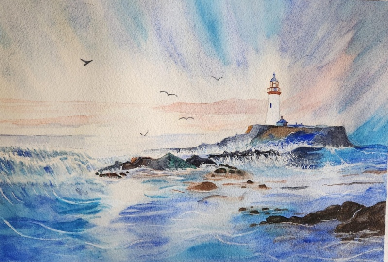
1. Welcome To The Class!: Hello, everyone. My
name is Will Elliston, and today we'll be painting a beautiful lighthouse
by the sea at sunset. This class is all about capturing the serene
essence of the ocean, the movement of the waves, and the soft glow of
light at the horizon. We'll be using a combination
of wet on wet blending, layering and lifting
techniques to create a sense of depth and movement
in the sky and water. We'll also explore
how to paint waves, reflections and the
structure of the lighthouse itself with a loose and
expressive approach. Even if you've never painted a seascape before, don't worry. I'll guide you
through each step, making this class fun and relaxing and giving you many tips and tricks
along the way. I've been a professional
artist for many years, exploring lots of different
subjects from wildlife and portraits to cityscapes
and countryside scenes. I've always been entranced by the possibilities of watercolor. But when I started,
I had no idea where to begin or
how to improve. I didn't know what
supplies I needed, how to create the
effects I wanted, or which colors to mix. Now I've taken part in many
worldwide exhibitions, been featured in magazines, and been lucky enough
to win awards from well respected
organizations such as the International
Watercolor Society, the Masters of
Watercolor Alliance, Windsor and Newton, and the SAA. Watercolor can be overwhelming
for those starting out, which is why my goal
is to help you feel relaxed and enjoy this medium
in a step by step manner. Today, I'll be guiding you
through a complete painting, demonstrating a
variety of techniques, and explaining how I use all
my supplies and materials. Whether you're just starting out or already have some experience, you'll be able to
follow along at your own pace and improve
your watercolor skills. If this class is too challenging
or too easy for you, I have a variety of classes available at different
skill levels. I like to start off with a free expressive
approach with no fear of making mistakes as we create exciting textures
for the underlayer. As the painting progresses, we'll add more details to bring it to life and
make it stand out. I strive to simplify
complex subjects into easier shapes that
encourage playfulness. Throughout this class, I'll be sharing plenty of
tips and tricks. I'll show you how to turn
mistakes into opportunities, taking the stress out of
painting in order to have fun. I'll also provide you with
my watercolor mixing charts, which are an invaluable tool when it comes to choosing
and mixing colors. If you have any questions, you can post them in the
discussion thread down below. I'll be sure to read and
respond to everything you post. Don't forget to follow
me on Skillshare by clicking the Follow
button at the top. This means you'll be the
first to know when I launch a new class
or post giveaways. You can also follow me on Instagram at Will Elliston
to see my latest works. So let's dive in and create
something beautiful together.
2. Your Project: Thank you so much for
joining this class. Painting the sky and the sea is such a great way to practice so many different
techniques in watercolor. We'll use soft washes, layering, and fluid brush work without feeling pressured to
get every detail perfect, creating a soft atmospheric
sky that sets the mood, capturing the
motion of the waves with loose and expressive
brush strokes, and painting the lighthouse as a focal point without
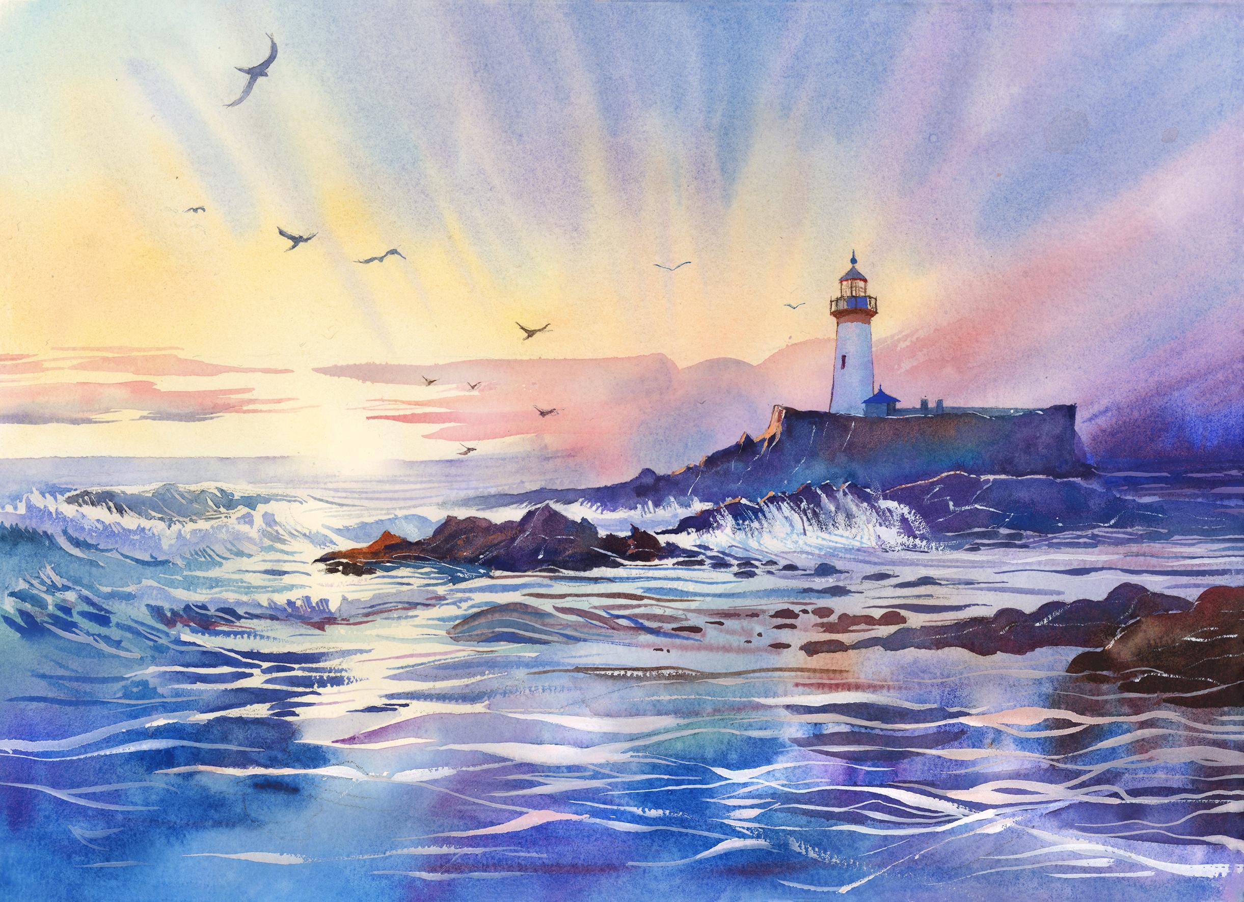
overcomplicating the details. In the resource section, I've added a high
resolution image of my finished painting
to help guide you. You're welcome to
follow my painting exactly or experiment with
your own composition. As we're going to be focusing on the painting aspect
of watercolor, I've provided templates
you can use to help transfer or trace the
sketch before you paint. It's fine to trace when using it as a guide for
learning how to paint. It's important to
have the underdrawing correct so that you can relax and have fun learning the
watercolor medium itself. Whichever direction
you take this class, it would be great
to see your results and the paintings you
create through it. I love giving my
students feedback, so please take a photo
afterwards and share it in the student project gallery under the project
and resource tab. I'm always intrigued to
see how many students have different approaches and how they progress with each class. I'd love to hear
about your process and what you learned
along the way, or if you had any difficulties. I strongly recommend
that you take a look at each other's work in the
student project gallery. It's so inspiring to see
each other's work and extremely comforting to get the support of your
fellow students. So don't forget to like and
comment on each other's work.
3. Materials & Supplies: Before we start the painting, let's go for all the materials and supplies you'll
need to paint along. Having the right materials can greatly impact the
outcome of your artwork. So I'll go over all the supplies I use for
this class and beyond. They're very useful to have at your disposal and we'll make it easier for you
to follow along. Let's start with the
paints themselves. And like most of the materials
we'll be using today, it's a lot to do
with preference. I have 12 stable colours in my palette that I
fill up from tubes. They are cadmium
yellow, yellow ochre, burnt sienna, cadmium
red, Alizarin crimson, Opramarne blue, cobalt blue, serlean blue, lavender,
purple, viridian, black. And at the end of the painting, I often use white gouache
for tiny highlights. I don't use any
particular brand, these colors you can
get from any brand, although I personally
use Daniel Smith, Windsor and Newton,
or Holbein paints. So let's move on to brushes. The brush I use the most is
a synthetic round brush like this Escoda Purl brush
or this Van Gogh brush. They're very versatile because
not only can you use them for detailed work
with their fine tip, but as they can hold
a lot of water, they are good for
washers as well. They're also quite affordable, so I have quite a few
in different sizes. Next are the mop brushes. Mop brushes are good for
broad brush strokes, filling in large areas and creating smooth
transitions or washes. They also have a nice tip that can be used for smaller details. But for really small details, highlights or anything
that needs more precision, I use a synthetic
size zero brush. All brands have them,
and they're super cheap. Another useful brush to have is a Chinese calligraphy brush. They tend to have long bristles
and a very pointy tip. They're perfect
for adding texture or creating dynamic
lines in your paintings. You can even fan them
out like this to achieve fur or feather
textures as well. And that's it for
brushes. Onto paper. The better quality
of your paper, the easier it will be to paint. Cheap paper crinkles easily
and is very unforgiving, not allowing you to
rework mistakes. It's harder to create
appealing effects and apply useful techniques
like rubbing away pigment. Good quality paper, however, such as cotton based paper, not only allows you to rework
mistakes multiple times, but because the pigment
reacts much better on it, the chances of
mistakes are a lot lower and you'll be more likely to create
better paintings. I use arches paper because that's what's available
in my local art shop. A water spray is
absolutely essential. By using this, it
gives you more time to paint the areas you
want before it dries. It also allows you to
reactivate the paint if you want to add a smooth
line or remove some paint. I also have an old rag or t shirt which I use
to clean my brush. Cleaning off the paint
before dipping it in the water will make the
water last a lot longer. It's always useful to
have a tissue at hand whilst painting to
lift off excess paint. Also, you never know when an unwanted splash or drip might occur that needs
wiping away quickly. I also have a water dropper
to keep the paints wet. When you paint, it's
important to have them a similar consistency to what
they're like in the tubes. This way, it's easier to
pick up sufficient pigment. A hair dryer is useful
to have for speeding up the drying time and controlling the
dampness of the paper. And lastly, masking tape. And this, of course, is just to hold the paper down still onto the surface to stop it sliding
around whilst painting. Also, if you plan on
painting to the edge, we'll allow you to create a
very crisp, clean border. And that's everything that
you need to paint along. However, I encourage you
to experiment and explore with whatever you want to use to make this painting truly yours. Now, let's get on and
start the drawing.
4. How to Sketch It Out: So starting off very
lightly with my pencil, just creating the horizon line, splitting the paper into two, basically straight
down the middle. And then just off center, about a third of the way across, I'm going to do
that vertical line for where the
lighthouse will be. See how I'm starting with
very light pencil markings. Just enough to map out the main elements,
nothing too detailed. With watercolor, we don't
want heavy lines as they can show through the paint or at least restrict our looseness to the brushwork we
want to apply later. So placing that lighthouse
just to the right off center, following the rules of thirds, this gives us a more
dynamic composition than just putting
it dead center. And then the lines of rocks
help lead the eye towards it in a kind of S
pattern or a z pattern, creating a natural
movement across the page. See how I'm simplifying the rock formations into
basic angular shapes. So they don't need to be
perfect or overly realistic. We can suggest detail later
with the brushwork and value. Marking out different planes, the foreground, middle ground, background, a few birds to
help create a sense of depth. Because this sketch
is just a foundation. It's not a blueprint and it gives me confidence going
to the painting phase. But I still let the watercolor have a say in how
things develop. Just the structure, the skeleton to the painting
and what builds it all up will be the
watercolor paint. A.
5. Painting The Sun: So starting with one of the main principles
of watercolor, and that is painting
light to dark. So painting the light
values to begin with, starting with the sky,
the background and pre wetting the area where the sun will be right in the middle. Because we're not
actually going to paint the sun directly. We're going to leave the
white of the paper to create that illusion of
glow where the sun will be. And then gradually, we're
going to add more pigment as we go out to create
a smooth transition, starting with this
cadmium yellow. So the paper is wet
where the sun will be. You might not be able to
see it on the screen. I'll also premix
some serlean blue as well because we're going
to use that for the sky. I just want to make
sure I get an idea of my color palette
in my mind's eye before I commit to starting the painting before I put any pigment on the paper, I want to be sure
of my color scheme, just to visually see
it because it can be difficult to see things
in your mind's eye. So getting the physical
colors onto your palette, you can just see them with
your own eyes and how they might be used
in your composition. A bit of red mixed with
that cadmium yellow. So camium red and camium yellow mixed together to
make a lovely orange. When there's no other
pigment on the paper, it's easy to paint too strong. But we want to remain
very light at this stage, adding a bit more water to help flow that soft transition, then applying a
very little amount of that yellow onto the brush, barely perceivable, really. And we work down into
where the sea will be, where the waves will be to
imply a bit of glow there. But you can see, as we spread it out, it's barely perceivable. You can hardly see that yellow,
and that's what we want. We don't want it to
be that obvious, a little subtle indication to take the whiteness
off the paper. The good thing about this
stage is that it's so light, it really doesn't matter
too much because it won't influence the main
image at the end. It's not too jarring a contrast. It's a very subtle thing.
Just using a tissue to soften out or take away some of the
water where it's too wet. And now we can start applying
the next round of coat, a nice circular motion conveying that circular
nature of the sun. Gradually building up the
pigment still very light, but we need to
proceed with caution. That's why we do it
light because it's harder to take away pigment
than it is to put it on. So just swooping back and forward across that
arc of the sun. I'm using a mop brush. It helps using a medium
size brush, not too small. If it's too small, it'll
be difficult to get all that pigment on
in a nice, even way. It's better to have a
brush that's too big than too small for this
part of the painting. And it's all cadmium
yellow at this stage. Only now when we're moving
to the right hand side, where the sky is
behind the lighthouse, we're starting to
add a little bit of that orange, but not too much. Now we're going back to the sun, and again, it's pure
cadmium yellow. When you first apply
the brushstrokes, it might seem uneven, but if the paper is wet enough, then it'll even itself out.
6. Painting The Sky: It's about experimenting
and getting used to what the correct amount of
water should be on your paper, not just on your brush,
but on your paper. If there's not enough water, then it won't move the pigments and it won't be distributed
in a nice even way. And if it's too much water, then as it dries,
it'll dry unevenly. So some areas will pull
with water and be very wet while other areas
will start to dry. And then, again, it
won't look as even. So it's about finding
that balance of having just a subtle
sheen of water, a shen of reflection. Without it being
overly saturated. And you can see, I just applied silan blue
at the top there. And because the pigments, the particles in the pigments
are different sizes, as long as you don't
overdo it with the brush, add just a few confident
brush strokes, then it doesn't mix with
the yellow to make green. The blue doesn't
mix to make green in this particular scenario because the pigments are different sizes and they
don't combine so fast. They block each other out. Again, you have to be cautious and maybe I'm not being cautious enough with the
wetness of my paper. It should be a bit
wetter actually because these brush marks should
ideally blend out. But notice these brush strokes, these lines are facing
the lighthouse. They're pointing towards
the center of interest, which is that lighthouse. And on this right hand
side, we're using purple. So there's a nice
range of colors. We're using a contrast of warm tones and cool
tones in this painting, which creates both an emotional balance
as well as tension. The warmth suggests like that early morning piece or the sunset, the
peace at sunset, while the cool
tones suggests like the ocean power or the
vastness of the sky. So we're using a balance of oguus colors and
complimentary colors, which we'll talk about later, but just to briefly
run over them, ogulous colors are colors that are next to each other
on the color wheels, for example, blue and purple. They're next to each other. They look nice together, and then complimentary colors
are opposite each other. Purple and yellow,
as you can see, is happening on the
screen right now, purple and yellow are
complimentary colors. We're experimenting with the color wheel and
the color choices, and I'll talk about
that later as we go into the full color scheme when we integrate more
colors down the line. Just on this right hand side, where the sky meets the rocks, I'm using heavy cobalt blue. And because it's wet, it'll be a nice
smooth transition. I don't want there to
be a very hard edge there because it's not
the center of interest. I'll keep the
strongest edges and the strongest
contrasts of light and dark and color where
the lighthouse is. So even though it is dark, I'm trying to make it a
bit more of a transition.
7. Painting The Clouds: Now we're about to
paint some clouds that are illuminated by
the warmth of the sun. So I'm going to use a red, maybe a few oranges, although the sky is
a bit yellow anyway. So using red on top of that yellow will
automatically make it a bit orange anyway without actually having to
add much yellow in. But it's best if you're not too confident to completely
dry your paper first. Mine is slightly just the
smallest bit of damp, but that's not necessary. It's much easier to control the second layer once
it's completely dry. And I'm using very
horizontal lines here. Adding a touch of blue as we go up away from that horizon
line, but just a touch. If we add too much blue, the contrast will be too
strong and it won't look so cohesive and together. I will lose its unity. I'm attaching it to the
rocks and the lighthouse here because I don't want
things to be in isolation. Connecting them all makes
it more pleasing for the eye where this
cloud meets the rock, I'm adding a bit more blue. I'm thinking of it as
line work, actually. Even, of course, the brushes the brush marks are thicker than just
a pure thin line. I'm thinking about the
direction of these lines. So these clouds are quite
horizontal and the lines in the sky point towards
the focus point, the center of interest,
the lighthouse. And these clouds do, too. And I'm making it a point that the lighthouse is the only vertical shape
in this painting. Everything else is horizontal or pointing towards
the lighthouse. And that's what
makes it stand out. Now we need to start
painting the clouds on the other side of the sun
from the left to the right. Again, you can completely
dry it if you want, if you don't want to risk touching the wet.
That's what I just did. I might have to place my
hand on the paper and I don't want it to
touch the wet areas. Again, using thin
horizontal lines. My brush is a fairly small one now because it's got
a nice little tip, but it still holds enough water. It's not a little needle brush. It still has to hold
enough pigment and water. These brushes that I'm using
right now, this brush, in particular, is one of the
smallest brushes I'll use. I wouldn't go much
smaller than this because it just wouldn't pick up
enough pigment or water. And actually, the
tip on these brushes is a lot finer than a brush
that's smaller, ironically, because the water acts
as a kind of bond that brings all the strands and hairs of the
brush to a point. And if the brush is too small, there won't be
enough water tension in there to bring it
all to the point. It'll almost fold out at the
point rather than go in. So I try not to go with a
smaller brush than this. When we're experimenting
with transitions here, we've got the red glow
of the cloud above, and it goes slightly blue as it goes closer
to the horizon line. These clouds not only add a directional sense
to the composition, but also increase the
contrast where the sun is.
8. The Distant Sea: Now we're starting
to paint the sea, and similar to the sun above, I need to add pure water to where the sun is
and then create a bit of transition from the
left and the right. But instead of the sun
where it's a full circle, this is a line, so we don't want to paint
above where the sea is, and we want to make
sure that this line is parallel with the edges of the paper at the
top and the bottom. We want to make sure
it's completely straight across like
the horizon is. Gradually filling
in more pigment and transitioning
it to pure water. You can have a tissue in your
other hand just in case it gets overloaded or
you need to redo it. I'm painting down
until the first wave, which is subtly
marked with pencil. Using cobalt blue. But you can use any color you want. It doesn't really matter. As long as it's a
blue, the blue is the main color in
this composition, so it's nice to have a variety
of different blues anyway. Now I'm painting the lighthouse, and I'm purposely
scrubbing my brush a bit because that red cloud that we painted underneath
has a hard line there, and I want to get
rid of the hard line and make it nice and smooth. So I'm using the bristles
on my brush to scrub away any hard lines to
make it nice and smooth. Now, ideally, I want
this lighthouse to be lighter than the background. But of course, it won't be because the
nature of watercolor is, the more pigment there is, the darker it will be
because it's translucent. So I'm just at the moment, blocking out the lighthouse, and then I'll come back later with some white wash
just to make it pop. I'm just simplifying what
a lice house should be. It doesn't need to
be so detailed at all just so that it conveys
the view what exactly it is. Adding a little
triangle roof there. A couple of windows,
maybe circular balcony. Roof can be darker than
the rest of the building. Maybe we can add a
bit of red to make it pop using fine lines. Because this is the
center of interest, we can add most of
the details here, add sharp lines,
sharp contrasts, so that encourages the eye
to focus on this area, even though there's
much more to look at, and it's not
necessarily going to be the favorite part
of the painting. It's intended to be the
center of interest. So now I think it's time to
paint over it using white. And white can be tricky because when you
first start using it, it looks very intense. It looks very white indeed, right now, it looks
super strong. But you'll notice when
I start drying it how it darkens because when
white paint is wet, it looks much lighter
than when it's dry. Likewise, when
dark paint is wet, it looks darker than
it is when it dries. So when I put the
hair dryer on it now, see how quickly it darkens up and you can start
building it on layers.
9. Painting The Lighthouse: If you don't have white
paint, that's perfectly fine. You can just leave it as it is and paint a darker lighthouse. It's not really a
problem at all. In fact, having it darker
will increase the contrast, which might be something
that you want anyway. There's no right or wrong. The only real reason
I use that white is because of the cloud
shape behind it. The translucent nature of
watercolor made it so that it was difficult to camouflage
that underneath brush froge. So just using that white to
block it out helped me a bit, but you could also paint darker. You could paint a dark
lighthouse, if you want. Using a very soft line just to go up the edge of the house, just to refine it, maybe adding a little window halfway
down, the tip of the brush. Don't want anything
too big or obvious. Just because it's small
doesn't mean it's not obvious. Sometimes subtlety is just as impactful as something
that's directly obvious. Using cobot blue
at the top here. Just creating a little
bit of a framework and a few boxes and simple shapes, really, triangles,
squares, rectangles. I've purposely positioned
this lighthouse to the right, roughly a third onto the right, which creates a kind of asymmetrical balance instead of centering it dead in the middle, which would feel quite
static or predictable. So placing it slightly
off center allows the scene to feel more
dynamic and natural. And it's balanced off with the open space on the
left, with the sky, the sea, and then
the sweeping motions of the waves we paint later. It visually balances the weight of the
lighthouse on the right. And the whole composition leans into that contrast between the solidity of this structure and the movement of
the sea on the left, even though we haven't painted
it yet, that's the plan. I'm also thinking about how the lighthouse is
supported compositionally. So we'll have jagged
rocks below to create a sort of a staircase or natural lines that guide the viewer's eye upward
towards this lighthouse. And even the subtle
gradient of the sky, where it gets brighter
behind the lighthouse, it helps it to stand out more
like a little spotlight. So the tonal contrast
gives it presence without needing to
exaggerate too much detail. It's also interesting to think about the contrast
in shape here. The lighthouse is
very geometric. It's a clean, upright cylinder with refined railings
and the roof. That structured man made shape stands out beautifully
against the more organic, irregular forms or the
rest of the scene, the rocks, the
clouds, the waves. So that's another way
we can use contrast in form to make it feel grounded, strong, and it anchors
the whole scene, really. So when painting
these buildings, this is where I'm being a bit more precise
with my brush work. Everywhere use, including
the waves and the rocks, although we'll still have
to be somewhat precise, we can be more
expressive and loose.
10. Starting The Waves: Now we're going to start
painting the waves, and I'm using Cerlean blue, which is my favorite blue. But we can start integrating lots of
different hues as well. And I've got purple as well
to add a bit of variety. Something that we need to
keep in mind when painting the waves is we're
using the white of the paper to maintain
the highlights and achieve that sea foam
on the crest of the wave, the top of the wave
where it crashes. So there's a bit of precision with maintaining these whites. But because we have
the drawing set up, we can see where the
tops of the waves are, and all we need to do is
paint down to where the lines are I'm thinking in larger shapes rather
than fine details. So I'm looking at
the area I want to paint and I'm basically
filling it in. But in between that shape, I'm allowing a few
white gaps of the paper through in the direction
of the curve of the wave. So if you imagine a wave
curves up with water, I'm allowing a few white lines of the paper to stay there. So it's not a solid shape. It's a kind of cut
off kind of shape, but in my mind's eye, I'm thinking of it
as a bigger shape. Of course, we can come
back to it later at the end with whitewash
to refine it further. So it doesn't need
to be fully refined. It just needs to be
generalized at the moment. And I encourage you to look at my final painting as a
reference because I can understand how these
little abstract details and shapes can be a
bit overwhelming. I'm adding a little bit
of variety of tone. You don't have to be too
concerned about that, think about the
shape to begin with, and then you can come
back with a second layer to correct the tone
later on if you need to. Using the tip of my brush, and you can see how
I'm rotating my brush, lots of different
angles to try and get the tip in various places. Really, I'm kind of
trying to set the tone, trying to establish
and figure out where the flow of water is where one wave breaks
before it connects to the other starting off light. It's actually very abstract. A lot of the marks are abstract, and it's just a few things
that hold it together. It looks like a bit of
a mess to begin with. But once we refine where
the crest of the waves are, add a few horizontal lines to keep it in place
to anchor the waves, then it starts to make
a bit more sense. But I'm keeping the
colors quite diluted. Of course, soft blues, maybe a hint of violet. Then as we go towards the right, we'll add a bit more of a peachy warm color to it. T,
11. Water Tones: I want to keep the hues
cool but not lifeless. There's still a bit of warmth
from the sun in the water. But we don't need to
think about that yet. That'll be coming
on a bit later. At the moment, we can
just think about blues, and I've been incorporating
serlean blue, cobot blue, ultra marine blue. As we're coming up to
the foreground here, I'm building up the tone, I'm making it a bit darker. And this is basically
ultra marine blue, but there is still a
touch of serleon in here. And I'm thinking about
the pattern of the waves. And after the wave breaks, there's a lot of
foam in the water, and I'm kind of painting that
foam using negative space. I'm painting in
between the foams and allowing that white
of the paper in between. I could and probably
will come back with white gouache at the end to further
enhance the lines. But at the moment,
I'm just painting little spots basically of water filling out little areas, but not connecting them. Then we can soften the
edge of water to the left. We can start
integrating a bit of green to make it
nice and turquoise. Varidian green is a
lovely color for this. Mixing that viridian with ultramarine blue or seran blue makes a beautiful
turquoise sea color. Like a tropical sea color. Of course, this isn't
necessarily a tropical scene, but I always try and make or take advantage of
bright colors when I can. And this turquoise color is
one of my favorite hues, so I'm definitely
going to try and implement it in this scene. And I'm using a bit of water on the bottom there just
to create a soft gradient. I don't want there
to be a hard edge in the left hand corner. We'll come back to it
later and connect it. Now I'm adding a bit of
purple on the other side.
12. Expressive Foreground: And now you can
see where the sun is that these highlights
are in line with the sun. They might be horizontal lines, but vertically, they
connect with the sun. So there's a little bit of a gap in between where the sun is, and you can see the
white lines that we painted by just leaving
the white of the paper. But now we started the
big main wash of the sea, and we're connecting it all and infusing lots
of different colors, and we can be very
abstract here, but we still want to achieve
smooth, soft transitions. We've sorted out all the details and the highlights on the left, and now we're experimenting with color range and being abstract with our color
choices and even tone. But we want to try and maintain a nice smooth transition
between each color. So really taking advantage of
wet and wet technique here. This is where you can
be very, very bold. We've taken the wash up to where the rocks start on the
right, you can see. Now in this area, it's just a playground of color. Adding a bit of
burnt sienna to add that warmth that I was
talking about because we can't just use
pure cold colors. We've got to use
complimentary colors as well. Abstract brush
marks, but because it's wet and wet,
it's still soft. There's no hard edges here. Because we'll be coming
over this area a bit later with more refined
brushwork. We're painting rocks. We'll add a few highlights
for the sea foam to give it context and help
the perspective of it all. But we need to create this interesting organic
feel of color underneath it. Really where watercolor shines is in its magic. We're
not painting it. We're allowing the
watercolor to do its thing by influencing
it with pops of color. Once we've had fun
experimenting with color and abstract brush marks, we can start refining
the edges a bit more. So where this wash
meets the rocks, we've got to soften
some of the edges. It's because we don't want the hard edge randomly on the rocks. We've got to think about where
we want this wash to end, maybe bring it up to
connect with the sky, so it's nice smooth transition. Then as it starts to dry, still very damp, but we can start adding brush
strokes that melt in there, but still keep its form. Before when we were
being nice and abstract, the paper was so wet that if you were to apply
a brush stroke, it would virtually disappear. But now it's had a bit of time to dry and to
absorb into the paper. We're also using a less
diluted brushstroke. We're using thicker pigment. So these brush marks now will
hold their form a bit more, but maintain a nice softness
to them at the same time. I'm thinking about where
the rocks are and adding these dark brush marks where you'd see the rocks
underneath the water, but they'd be a bit distorted, diffused from the water. Now, these horizontal lines that again are going to blend softly, they're going to have a
nice soft edge to them. These will be implied ripples. A few dabs where the waves are
breaking at the top there. This is a very warm
color, a warm purple.
13. Refining Waves: We can start going back into the waves to refine them a bit more to make sense of them. So mixing a nice turquoise blue and just following
that curvature of the wave thinking
about the shape of the wave as a whole and
then what lines we can leave to show the layers
beneath to give it structure. Moving back to my thin
brush, of course. We had to use the
big brush to do all the abstract colors we just did on the
right hand side, and now we're using the thin
brush to contrast that. So on the left, we've got
quite a lot of detail. Even though it's quite
abstract detail, we've got a lot of hard edges. A lot of hard shapes and edges. But on the right, we've got
soft abstraction, soft edges. So it's balancing those two that makes a painting
very dynamic. Whatever we paint or what elements we have
inside a painting, we're using them for their
compositional advantage. We're not just painting
something for the sake of it. We're trying to do
it in a way that helps the composition and
design of the painting, and these waves
are no exception. The waves give rhythm and
movement to this painting. Otherwise, it's quite stagnant. Their repetition, their flow, and the direction naturally lead the viewer's eye
across the scene. And you can see the
general direction. If you follow the waves across, they do lead towards
that lighthouse. So we're using curved horizontal
brushstrokes to create the flowing movement
that carries the gaze from the foreground
to the middle ground. And we're varying the
heights and the directions subtly and the spacing prevents
it from being too stiff. It adds a more natural
feel to the piece. And the white foam and
bright reflections contrast very sharply with the dark water beneath,
especially here. Giving a real sense of wetness
of light and reflection. It makes them sparkle almost. And you can enhance that
with color contrast. You've got cool blues and
violets in the shadowed water, and then we've already got some sunlit edges of the water or reflections
from the sky as well. And while the waves aren't
actually the focal point, they do support
the composition by guiding it forward and towards, they're like compositional
arrows flowing in the way that subtly points the viewer
towards that lighthouse. And the main color of
the water is Cerlanblue. And I guess cerlan blue
is the main primary color of this painting because
the sky has cerlan blue, and the water echoes
that similar hue, and it creates a unity
within the whole painting, and we'll add a bit of that
into the rocks, as well. I'm just adding a few
horizontal lines, not perfect straight
horizontal lines, but a few horizontal lines
just to give it a bit more of a grounded feeling because we can't all have
it abstract and wavy. We want some soft ripples. And I'm using a warmer
but slightly muted color. We've got a nice vibrant blue, which is a cool blue. And this red, well, this maroon kind of burnt red brownish kind of
color adds a bit of warmth, but also a bit of darkness, a bit of contrast to it as well.
14. The Main Rock: Now we're going to start
painting the main rock, the rock that the
lighthouse is actually on. And it's a big bold shape, and it's literally
the foundation of the vocal point, the lighthouse. So it's a dark, solid mass, and it has a lot of contrast. In fact, the most
contrast of the painting, and it contrasts in
many different ways because we're using
dark pigment, and it's going to have a
lot of sharp angular edges, and that contrasts with
the softness of the sky. It also has a distinct texture, and it anchors this
area and makes it intentionally grounded and the obvious focal point,
the center of interest. And that's why the waves don't actually need to be so perfect because they're not the
main focal point there, of course, interesting
to look at. They're not where the eye is naturally going to be led to. That's why we want to increase
this contrast bit by bit. We don't need to start
off with solid pigment, we just need to at the moment, fill out the areas that
we know we want to paint. I'm using a bit more of a diluted paint at the
moment, a bit of purple, following that line of
the rock upwards and not painting directly to the bottom of it
either at the moment. Leaving a little white
gap where the waves will be crashing onto
the rocks there. Just blocking out a nice
ragged or rugged outline. And then, now it's all wet, we can start dipping in thicker, darker pigments and getting the tone the way
we want it to be. And the color
palette I'm thinking of should be in harmony
with the rest of it. We don't want to
suddenly use an orange because we don't really have an orange on there, for example. So I'm using blue and purple. And I'm going to mix my own
dark pigment using brown, burnt sienna, and a bit of blue. That automatically makes
it dark like a black, and I'm just tapping
it at the top edge. And because it's wet
on wet technique, it's going to spread
out by itself. I don't need to
influence it that much. Then we can just use the
tip of our brush just to move the pigment
around where we want it. It's a bit too blue now, so maybe I should add
a bit more purple. I don't want it to be the
exact same color as the sea. But I want to keep it unified, so I still want it
to be a cool color. Even the brown that
I'm using here, I'm going to connect
it with some purple to how relate it to the
rest of the color palette. The good thing about painting against the light is that it's
mainly just a silhouette. The sun is behind the object, so we're just seeing
the silhouette, just the main shape of it. If we're behind the sun and the sun was facing the subject that we're
trying to paint, there'd be all kinds of difficult textures and rock formations that
we'd have to paint. So the best subjects
for watercolor are with back lighting when
the light is behind the subject and we just need
to focus on silhouettes. Anything that helps
us take advantage of lovely washes and gradients and pigments blending
and merging together.
15. Focal Point Details: After a while,
you'll start to get an intuition about how you can manipulate the pigment
and when it starts to dry and the kind of
mallebility of it. If the paper gets too dry, then you're not able to do
nice soft gradients anymore. So you should just
be focusing on little fine details rather
than big broad brushstrokes. As the paper is dry, you
can see how I'm moving to smaller gradients like even
the little huts on the rocks. Now, using a bit of white to make it
stand out a bit more. I think I want to make the
lighthouse pop a bit more, add a bit more white, where
the sun is on the left. You'll notice how the sun dictates the lighting
of the scene. So on every object on the left will be
lighter than the right. And on the main rock we'll add a bit more
highlights later on. These little bits now aren't meant to be
anything in particular. Of course, they're little
buildings or huts, but they're not
meant to be obvious. They're not meant to
take the attention. Just adding a few more details
in this area will again help the vocal point create
that center of interest. So I think that area is pretty much done
now and we can start thinking about painting some of the rocks that
will help ground the piece and add
order to the chaos of the water because there's a lot of
movement in the water, and these rocks will
obviously station it. And I'm going to add
this nice warm sienna, this orange kind of glow
right where the sun is because that warmth of the sun is going to be
reflecting off the wet rocks. And we're going to
create that transition. And this orange or sienna burnt sienna goes so lovely against the blue because
they're complimentary colors. I'm using that purple to transition the tone as
we go along to the right. These rocks help
with the sense of perspective, the spatial depth. The ones in the foreground will have slightly more
detail or harder edges, while those receding into
the background now will be a bit softer and lighter
or a bit more ambiguous. As always, we're starting off
just filling out the shape, basically the same tonal value. But once it's all wet, we can start using light and shadow to turn these flat
shapes into solid forms. And to do that, we think
about the direction of the light and the sides of
the rocks facing the sun will be warmed with
light browns while the shaded sides will be
a bit cooler and darker. Soft transitions
or sharp shadows can suggest different
kinds of rock surfaces. And even these angled rock
shapes or cracks can act as a kind of subtle guide to pointing towards the
lighthouse, as well. The base of the
cliffs helps move the viewers eyes
naturally upward. And they're in line
with the waves as well. There's a natural flow.
16. Middle Ground Rocks: Like with most aspects
of watercolor, it's best to actually
limit the amount of layers we do to capture the energy and the
feeling of watercolor, it's best to try and
do it in one go. I understand that's
not always possible. But once we've figured
out the main shape, we want to inject it
with energy and paint it quickly to avoid overworking and flattening
them basically. Often what feels messy close up actually reads quite
beautifully from a distance. And this is one of the
most valuable things we can learn as painters, especially when
working in a loose, expressive medium
like watercolor. Up close, a brushstroke
might feel uncontrolled, uneven, or even chaotic. And you might see a bloom
that wasn't planned or textures that
weren't intended, a line that looks too
wobbly or a texture that feels unresolved or
a bit mysterious. But it's easy to
get caught up with those details and almost kill the mood by trying
to correct them all. And it's easy to feel like the painting
is failing somehow, and we try and control that
chaos, and in doing so, we ruin a lot of the energy, the authenticity of it, like it's too rough or too random or not matching
your expectations. But that's the whole magic of painting when we
take a few steps back or when we come to the end of the process and the
paintings actually done, and we put our faith in the medium when we view our
work from that distance, we see all those loose marks
merge into some meaning, the soft edges that seemed
vague become atmosphere, and the jagged lines that
felt awkward suddenly look like realistic
rock textures and the uneven wash that was
worrying you might actually be the most interesting part of the painting full of
light and energy. For me, at least, some of the most compelling paintings aren't actually the
super detailed, perfect, up close works of art, even though they're
very impressive. They're the ones that
are full of bold marks, broken lines,
confident decisions that were made with the
bigger picture in mind. And that's what
creates visual impact and emotional depth. So our goal isn't to
create a photograph or a pure replication. It's about invoking a feeling, a sense of the place,
a sense of what your emotions are
about the subject. The fleeting moment. Even though you're studying my painting, I'm sure you have
emotions about it, and I'm sure you have different opinions or directions
you may want to take it. And for it to be a success, it's not done
through perfection. Is achieved through suggestion, suggesting things rather than directly conveying
or commanding it. Right here, I'm
trying to suggest waves splattering
against the rocks or coming through the rocks, creating that foam using a
bit of dry brush effect, which is dry brush, of course, is not direct detail. It's the suggestion of texture. It's especially true when painting elements like
rocks or waves or clouds where texture and energy matter much
more than precision. So when you're in the middle
of the process facing the chaos of the scene of
the paint and the medium, every mark feels like a
make or break moment, but when you actually
stand back and see how it works together, the eye stops reading
each brushstroke individually and interprets
the image as a whole.
17. Trusting The Medium: I'm painting in the rest of
this rock area on the right, and I'm trying to match
the same tones as above, but just leaving
a little sliver, a little line of the pigment
of the paper underneath to create a little highlight without having to use
the white wash. We can just be careful and save some of the white
of the paper there, and then just using
some horizontal ripples to ground the piece. Like I said before, most of
the lines are horizontal. It's only the lighthouse and the leading lines
or implied lines directing the eyes towards the lighthouse that
aren't horizontal. I edit out the parts where I take a step back to
look at my painting, but I do that, too, and I encourage you to take a pause because
it's so important to take a step back and view your painting from a
distance during the process. You can even hang
it on the wall, look at it from across the room, squint your eyes, look at it
through the mirror as well, to see what it looks
like reflected, see if there's any
inconsistencies, and you'll often be
surprised the parts you are most unsure about are
often the most expressive. And the errors you wanted to fix are exactly what
gives the painting life. Because when you paint them, they might feel uncomfortable. But after a couple of days, if you disconnect
and come back to it, then it can actually look
very interesting because you disassociate from the moment and see it in a new light. Then you are aware of
these things and you don't really need
to take days off before looking at
your painting again. You just have more
faith in the medium. So next time you feel the urge to overcorrect or
smooth something out, just take a breath and step
back and ask yourself, is it actually a
mistake or is it just the messy beauty of
watercolor doing its thing? And remember that what
feels messy up close can sometimes be what makes the painting look great
and expressive from afar. Now I'm experimenting
with a bit of contrast. We've got that light
expressive underlayer. Now I'm adding a few darker dots for the rocks that are coming
through the water because it's all reflective that water and these rocks that
poke up add to that contrast. That's a nice striking
visual language that we can make the most of And if you look
at the lighthouse, you can see where the
leading lines are working. If you follow rock the jagged
rock from the lighthouse, down to the left, then
it's a kind of zigzag. It goes down the rock, back down to the other rock, then back down to
the next rock along. Then it follows the ripples of the water zigzagging across
to where I'm painting now. There's a lot of zigzag S shape compositional factors
in this piece. Using that same purple color, but then adding brown to
the very foreground rock. But connecting it, I'm adding
those little white marks of the paper or at least preserving some little whites of the
paper in between the rocks. But then connecting
it with a few swipes. So a bit of the
purple comes into the brown and a bit of the
brown goes into the purple. And then those few little
highlights imply the shape.
18. Patterns: I'm going to start painting
some ripples into the water, and I'm thinking about patterns
and the rhythm and how these elements of
composition are a subtle way to
visual storytelling. They're easily
overlooked because there's so many things to think about when
you start painting. But actually, once you learn the technical side of painting, when it comes to constructing
your own original pieces, these are the exact
things you need to think about the structure, the flow, the visual
harmony of a painting. So I just mentioned
how there's a kind of z like structure in
the rocks and the water, and that's a very common
tool in composition. It's known as the S curve, and it's a flowing line
or shape that moves throughout the composition
in S formation, and it guides the viewer's
eye across the scene. And it's used in many
different things in landscapes, sea scenes. It could suggest
a path, a river, a shoreline, and it adds a
natural rhythm and movement. The arrangement of the
foam and painting, the ripples, the rocks. It's a kind of dynamic
journey for the viewer, and it slows the eye down, and it encourages a calm kind of progression through the painting rather than a sharp
directional movement. It adds a feeling of comfort in a way because
it's just reassuring. We trust the scene
more because it flows the way in this example, a real coastline or the way
patterns in real life do, the way the waves are formed. Triangles and pyramids
are another shape and pattern you can use to
structure your composition. And technically, the lighthouse is a triangular composition. It gives a sense of
structure and groundedness, and it connects the
sky to the foreground.
19. Adding The Birds: Here, I'm painting
in some birds, various sizes and
various angles. But the whole idea is to
add a sense of depth. By having these birds
painted at different sizes, we know roughly what
kind of size a bird is. So in our mind's eye, it adds an illusion of depth, and it also reinforces the visual cues to look
towards the lighthouse. I'm subtly positioning
these birds so that they're facing towards
the lighthouse, not necessarily
facing, actually, more just they're
arranged in a way that naturally leads the eye
towards the lighthouse. Not completely uniform. I don't want just a few dots
of birds directly facing it, but if you were to attach a line from the general
flow of the birds, it will be swooping towards
the lighthouse there. There's actually a lot of reoccurring letter shapes
used in composition. We just talked
about the S curve, but there's also the L shape. You can see is used here subtly. You can't necessarily
see a direct Al, but the landmass that extends from where the
lighthouse is provides a visual anchor that contrasts the openness of
the left hand side to the more structured
right hand side. And again, it gives a feeling
of stability and weight. It frames the focal point
and gives it context. We also use the V shape
in this painting. You can see the rays of light in the sky and even the
birds have a kind of V nature to them and they converge
towards the lighthouse.
20. A Few Accents: There are a few things
left to do that will take this painting
to the next level. The first thing, I'm going
to take the white guash and refined some
of the waves and some of the highlights
because it's a bit difficult to paint
all the details of the water purely by using a brush to paint negatively and leave
the white of the paper. So we have to use this whitewash to add a bit of texture and refinement that's just nearly impossible to do just
with negative painting. And I'm adding also a
few leading lines on the rocks here that aimed
towards the lighthouse, but they also add
to the realism. I'm not just doing it to lead the eye towards the lighthouse. It makes it a bit
more exciting adding these subtle little tiny little highlights,
the reflections. I can imagine these rocks are
wet from the crashing waves and the sun in the distance is just catching the reflections. And at the moment,
just pure white. But maybe at least on the tip, I'm going to go back and paint some nice orange glow just to help that contrast really pop. Using the tip of
my brush to create a few sharp lines in the flow
and rhythm of the waves. We've been expressive
with the other part. We're allowing the
watercolor to do its thing, and now we're just using a
few controlled brush marks to give it context to ground it. Just a few touches of white paint give the
illusion of complete form. Because remember, it was
just a blocked mass, really. Adding these few little
dry brush white marks, the pigment is very thick
on my brush, actually, with this white paint so that when it glides
across the paper, it doesn't paint a solid line, it creates a bit of texture. And that of course, implies the jagged rough
texture of the rocks. Just some ambiguous textures. And it's very ambiguous
on the right there because I don't
know even myself, where it's rock and where
it's sky or where it's water. I need to emphasize the point that these are very thin lines. I'm not being very bold
with these brush marks. I don't want to overdo it. Just trying to add a
bit of clarity to it. We've got a nice range
of waves going on there. We've got some that's
just about to break. So that are breaking through the rocks in
the middle there. Now I'm mixing that
burnt sienna with the white and just
applying it to the tip here to suggest the
glowing warmth the sun. And it's quite a similar tone actually to the sky behind it, but maybe there's a
bit more warmth to it. And just on the left hand
side of each of the rocks, where it would be
reflecting that sun, I'm applying that warm touch.
21. Finishing Touches: Another way to help give your painting a
bit more depth is to think of it as three
distinct spatial planes. Of course, we can connect
these different areas. To give more depth
and dimension, but it helps the
viewer understand the spatial relationship within the image and make it
feel more immersive. We have the foreground,
which we're painting now, the closest waves, the foam, the textures at the
bottom of the image, and then we have the middle
ground where we've got some more rocks and the lighthouse is really
where the middle ground is. Then in the far distance,
the background, we have the expansive sky
and we have connected them all using directional lines and compositional tools
like the letter shapes. Now we're going to start the bit that I've been
looking forward to, which is creating the ripples and the sea foam to
create even more depth. And I'm basically
using I'm thinking of swirly diamond shapes
or zig zag shapes, depending which way
you think about it, I'm negatively
painting the ripples, but using white this time. I start by painting
a single curvy line, and then I branch off from
it a bit at an angle, keeping them quite diagonal,
not straight here. And I start off
with a thin line, but then I build on it
with thicker pigment. Just getting the rough
idea of the shapes first, and then we can go back
and fill it out a bit, because we don't want the
pigment to be too wet because it dries too light or not
light enough, really. And I'm connecting these
white lines to the white of the paper we preserved before
the reflection of the sun. And I'm changing the width and thickness of
these lines as well. You can see where they curve up, they're quite thin and where they curve down,
they're quite thick. Just creating a variety of shapes and lines crossing over, you can think of
them as diamonds or you can think of them as Xs or Zs incorporating Zs. You can see quite
a few zs there, curvy zs or curvy Xs If when this white paint dries too light or
it's not solid enough, it's too translucent, you
can go back over it again. But the good thing, it
doesn't really matter if it's too translucent. It's nice to have a bit
of a variety anyway. It's very abstract. It's not much about the right
side of the brain. You're not having
to think critically about this or it's
not mathematical. It's more about feeling. Looking, does it feel right? Spatially, is it balanced? Where should I apply a thick line and where
should I apply a thin line? And if two thin lines are here, maybe one thick line below
it will balance it out. Or if I add loads of thin
lines on the right side, then maybe only a couple of thick lines on the other
side will balance it out. So you can have
asymmetric balance. The reason I like this bit, adding the white
guash at the end is because it bridges the gap between the white
of the paper we preserved and the white
bits we're adding now. It's impossible really to tell the difference
at this stage. It connects the two. It harmonizes it all tonally. Whilst doing this, I'm taking a step back to look
at the painting as a whole, seeing if there's
anything that sticks out. Luckily, there isn't getting
very close to the end now. The vocal point is clear, the values are strong enough, the contrast feels balanced, as well as the color
and the light. Is there anything that's
competing for attention that shouldn't just adding
a few small accents. But I don't want to overwork it. Even though the
painting's finished, it's easy to think
it's overworked. We just need to disconnect now, and hopefully that's it.
22. Final Thoughts: Welcome back and
congratulations on completing this lighthouse by the
sea watercolor class. I hope you found this
class enjoyable, relaxing, and easier
than expected. Watercolor is the perfect
medium for painting seascapes because it allows
for natural blending, soft transitions, and a
real sense of movement. We explore techniques
like laying for depth, wet on wet blending for the sky, and simple brushstrokes
for waves and reflections. Remember, the beauty of
watercolor is in its fluidity. Let the paint work
for you rather than trying to
control every detail. Remember, watercolor painting is not just about technical skills, but also about expressing your creativity and
personal style. I encourage you to continue
exploring, experimenting, and pushing your
boundaries to create your own unique
watercolor masterpieces. As we come to the
end of this class, I hope you feel
more confident and comfortable with your
watercolor painting abilities. Practice is key when it comes
to improving your skills, so keep on painting
and experimenting. I want to express my gratitude for each and every one of you. Your passion for
watercolor painting is so inspiring and I'm honored
to be your teacher. If you would like feedback on your painting, I'd
love to give it. So please share your painting in the student projects
gallery down below, and I'll be sure to respond. If you prefer, you can
share it on Instagram, tagging me at Will Elliston, as I would love to see it. Skillshare also loves
seeing my students work, so tag them as well
at Skillshare. After putting so
much effort into it, why not share your creation? If you have any questions
or comments about today's class or want any specific advice
related to watercolor, please reach out to me in
the discussion section. You can also let me
know about any subject, wildlife or scene you'd
like me to do a class on. If you found this class useful, I'd really appreciate
getting your feedback on it. Reading your reviews
fills my heart with joy and helps me create the best
experience for my students. Lastly, please click
the follow button Utop so you can follow
me on Skillshare. This means that you'll be
the first to know when I launch a new class
or post giveaways. I can't wait to see
your paintings, and I look forward
to our next class together until then
Happy painting.
 Will Elliston, Award-Winning Watercolour Artist