Transcripts
1. Welcome To The Class!: Hello, everyone. My
name is Will Elliston. And today, we're painting a peaceful countryside
scene that captures the gentle warmth
of a sunlit landscape. This class is all about
exploring the light, color, and textures of nature as we
bring to life a quiet moment by the water surrounded by
the trees and golden colors. We'll focus on creating atmosphere and depth
using layered washes, expressive brushwork and
subtle temperature shifts. Is a perfect project for
anyone looking to develop their landscape skills and experiment with capturing
light in a natural way. I've been a professional
artist for many years, exploring lots of different
subjects from wildlife and portraits to cityscapes
and countryside scenes. I've always been entranced by the possibilities of watercolor. But when I started,
I had no idea where to begin or
how to improve. I didn't know what
supplies I needed, how to create the
effects I wanted, or which colors to mix. Now I've taken part in many
worldwide exhibitions, been featured in magazines, and been lucky enough
to win awards from well respected
organizations such as the International
Watercolor Society, the Masters of
Watercolor Alliance, Windsor and Newton, and the SAA. Watercolor can be overwhelming
for those starting out, which is why my goal
is to help you feel relaxed and enjoy this medium
in a step by step manner. Today, I'll be guiding you
through a complete painting, demonstrating a
variety of techniques, and explaining how I use all
my supplies and materials. Whether you're just starting out or already have some experience, you'll be able to
follow along at your own pace and improve
your watercolor skills. If this class is too challenging
or too easy for you, I have a variety of classes available at different
skill levels. I like to start off with a free expressive
approach with no fear of making mistakes as we create exciting textures
for the underlayer. As the painting progresses, we'll add more details to bring it to life and
make it stand out. I strive to simplify
complex subjects into easier shapes that
encourage playfulness. Throughout this class, I'll be sharing plenty
of tips and tricks. I'll show you how to turn
mistakes into opportunities, taking the stress out of
painting in order to have fun. I'll also provide you with
my watercolor mixing charts, which are an invaluable tool when it comes to choosing
and mixing colors. If you have any questions, you can post them in the
discussion thread down below. I'll be sure to read and
respond to everything you post. Don't forget to follow
me on Skillshare by clicking the follow
button at the top. This means you'll be the
first to know when I launch a new class
or post giveaways. You can also follow me on Instagram at Will Elliston
to see my latest works. So let's begin the
process of painting a sundrench landscape with
warm and calm energy.
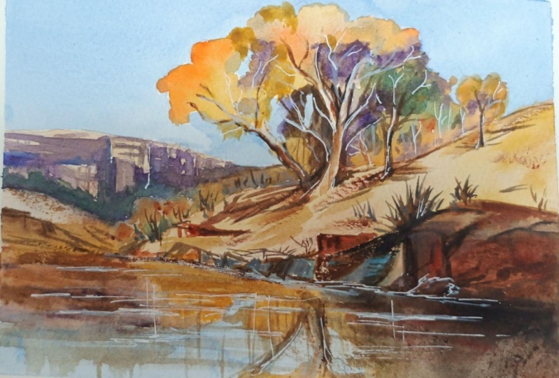
2. Your Project: Thank you so much for
joining this class. I'm excited to guide you through this warm and calm
countryside scene. We'll explore how to use a limited palette
to build depth and contrast and how to create glowing light using a balance
of warm and cool tones. We'll start with the background washes to suggest distant
cliffs and foliage. Then work forward to richer details of trees,
rocks, and water. We'll play close attention to how sunlight interacts
with each surface. This is a great project
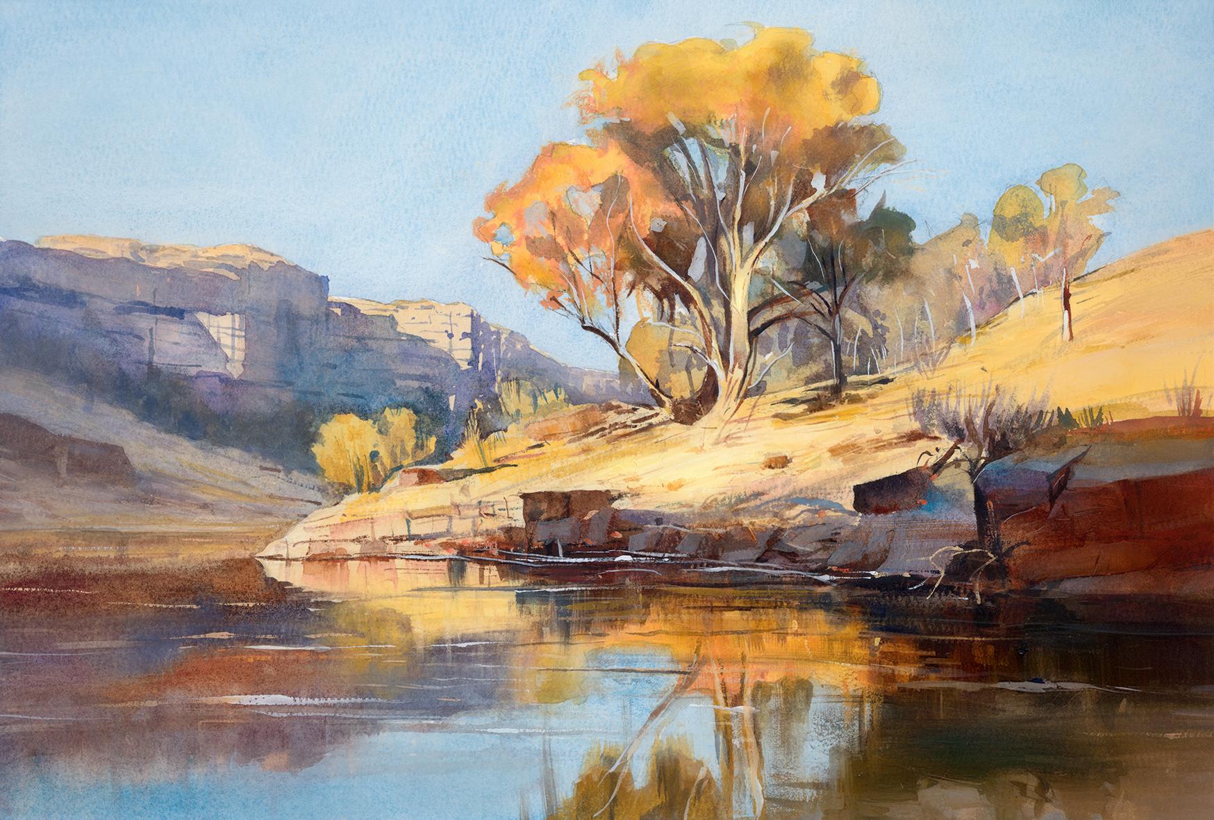
for practicing harmony, atmosphere, and natural texture. In the resource section, I've added a high
resolution image of my finished painting
to help guide you. You're welcome to
follow my painting exactly or experiment with
your own composition. As we're going to be focusing on the painting aspect
of watercolor, I've provided templates
you can use to help transfer or trace the
sketch before you paint. It's fine to trace when using it as a guide for
learning how to paint. It's important to
have the underdrawing correct so that you can relax and have fun learning the
watercolor medium itself. Whichever direction
you take this class, it would be great
to see your results and the paintings you
create through it. I love giving my
students feedback, so please take a photo
afterwards and share it in the student project gallery under the Project
and resource tab. I'm always intrigued to
see how many students have different approaches and how they progress with each class. I'd love to hear
about your process and what you learned
along the way, or if you had any difficulties. I strongly recommend
that you take a look at each other's work in the
student Project Gallery. It's so inspiring to see
each other's work and extremely comforting to get the support of your
fellow students. So don't forget to like and
comment on each other's work.
3. Materials & Supplies: Before we get started with
this landscape painting, let's go over all the materials and supplies you'll
need to paint along. Having the right materials can greatly impact the
outcome of your artwork. So I'll go over all the supplies I use for
this class and beyond. They're very useful to have at your disposal and we'll make it easier for you
to follow along. Let's start with the
paints themselves. And like most of the materials
we'll be using today, it's a lot to do
with preference. I have 12 stable colours in my palette that I
fill up from tubes. They are cadmium
yellow, yellow ochre, burnt sienna, cadmium
red, Alizarin crimson, Opramarne blue, cobalt blue, serlean blue, lavender,
purple, viridian, black. And at the end of the painting, I often use white gouache
for tiny highlights. I don't use any
particular brand, these colors you can
get from any brand, although I personally
use Daniel Smith, Windsor and Newton,
or Holbein paints. So let's move on to brushes. The brush I use the most is
a synthetic round brush like this Escoda Purl brush
or this Van Gogh brush. They're very versatile because
not only can you use them for detailed work
with their fine tip, but as they can hold
a lot of water, they are good for
washers as well. They're also quite affordable, so I have quite a few
in different sizes. Next are the mop brushes. Mop brushes are good for
broad brush strokes, filling in large areas and creating smooth
transitions or washes. They also have a night tip that can be used for smaller details. But for really small details, highlights or anything
that needs more precision, I use a synthetic
size zero brush. All brands have them,
and they're super cheap. Another useful brush to have is a Chinese calligraphy brush. They tend to have long bristles
and a very pointy tip. They're perfect
for adding texture or creating dynamic
lines in your paintings. You can even fan them
out like this to achieve fur or feather
textures as well. And that's it for
brushes. Onto paper. The better quality
of your paper, the easier it will be to paint. Cheap paper cuinkles easily
and is very unforgiving, not allowing you to
rework mistakes. It's harder to create
appealing effects and apply useful techniques
like rubbing away pigment. Good quality paper, however, such as cotton base paper, not only allows you to rework
mistakes multiple times, but because the pigment
reacts much better on it, the chances of
mistakes are a lot lower and you'll be more likely to create
better paintings. I use archers paper because that's what's available
in my local art shop. A water spray is
absolutely essential. By using this, it
gives you more time to paint the areas you
want before it dries. It also allows you to
reactivate the paint if you want to add a smooth
line or remove some paint. I also have an old rag or t shirt which I use
to clean my brush. Cleaning off the paint
before dipping it in the water will make the
water last a lot longer. It's always useful to
have a tissue at hand whilst painting to
lift off excess paint. Also, you never know when an unwanted splash or drip might occur that needs
wiping away quickly. I also have a water dropper
to keep the paints wet. When you paint, it's
important to have them a similar consistency to what
they're like in the tubes. This way, it's easier to
pick up sufficient pigment. A hair dryer is useful
to have for speeding up the drying time and controlling the
dampness of the paper. And lastly, masking tape. And this, of course, is just to hold the paper down still onto the surface to stop it sliding
around whilst painting. Also, if you plan on
painting to the edge, it'll allow you to create a
very crisp, clean border. And that's everything you might need for this class today. If you want to experiment with other tools and supplies,
that's perfectly fine. Let's get on and
start the sketch.
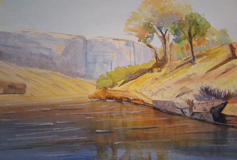
4. Preparing The Composition: So the first thing
to do when planning your sketch is to map
out the large shapes. I'm starting with the tree because that's basically
the focal point, and I just put a simple
circle for that. And then I map out where
the rough horizon line is. Of course, we can't see the
horizon in this painting, but it's just a guide. And then, bit by bit, we add more shapes, always starting
large down to small. So you can see it's very
rough, but that's okay. We don't want to add loads
of detail to begin with. It's only now that we've mapped out all the major shapes and figured out a composition that then we can start
adding the details. It's always best to start
with the end in mind. You don't want to start drawing until you know where things are. So that's why starting
off with large shapes, helps us organize our
mind to begin with. And you can do a few
small thumbnail sketches. You can even do the
whole painting, no larger than the
size of your palm, just to get an idea of
the composition and the color scheme and the tones that you want to
do for the main painting.
5. Underlayer Wash: So I'm going to break
everything down step by step. We're first going
to do a underlayer, and I'm going to
use yellow ochre and a bit of burnt sienna, but you can also use raw sienna, and you can also use
your own judgment. If you've got different
pigments that you're used to, you can see on the screen
what kind of color I'm using. And if you've got a similar
one, you can match that. It doesn't matter whether
it's a different brand or even a different
name for the hue. You can see it's a warm, brownish yellow kind of color. So we apply a very light
diluted tea kind of wash, and then use the wetness
of the paper to just drop in slight variations of tone because we're
just doing underlayer. And we're obviously doing the main rocky kind of bank
on the water's edge here. We've got to make
this area darker than we think it is because the rest of the paper is white, but this will actually
be the lightest part of the painting later on. I'm using pure yellow now
where the reflection will be. We don't have to be so
precious actually to where we're applying these colors because it's just
the underlayer. It's meant to be
liberating just to get as in the flow of putting
pigment on the paper. We have the drawing
all sketched out, so we've got a rough
idea of where it is. So within the confines
of the pencil sketch, we're fine to just
experiment and have fun. We can apply color and then correct and make sense of
it all with tones later on. So I'd say yellow is the
mother color, so to speak, the principal color
of this composition, and everything will work around
that to create a harmony. Whether we use complimentares or adjacent colors to
help harmonize it. So orange is obviously
adjacent color to yellow, so that's why I'm using a lot of these oranges and burnt sienna. You can even put pure red
on there like I am now, and that mixes with the
yellow to make an orange, a nice vibrant orange. So that whole
section is wet now, and now we can just push
and pull with the brush. I'm using a mop brush. It's actually a
very cheap brush. It's not my best because I don't need to be
refined for this. So I don't need to use
expensive brushes. It's just not a small brush that doesn't hold
a lot of water, something that's a little
bit larger so that you can apply lots of
water in one go. So the reflections, I'm actually adding now have a bit of a
hard edge at the bottom. And then it goes
slightly lighter where the bottom of the bank is. And then as we go up to the top, it's slightly lighter again.
6. Building The Tones: Continuing on with
the same colors. We can now build on
thicker pigment, using the same pigments and colors that
we're using before. But because it's
starting to dry, the brush strokes will hold
their shape a bit more. So we can use thinner
lines like this. I'm still using that mop brush because it comes down
to a nice little point. But if you don't have a
mop brush, that's fine, you can change it to a
smaller brush if you want, just to create these
nice little lines, these soft lines and these soft lines are
done with intention. They're not randomly directed. They're following the planes of that bank so that you can
see they're following that diagonal kind of fall
from high down to the left. Some of them in the
reflections will be vertical to imply that kind of vertical
nature of a reflection. Softening some of those lines
now are a bit too heavy. That's the good thing
about wet and wet. We can soften them, push and pull, have a tissue in my hand because I don't want
to go over the edge here. I'm being very careful about that because we're going
to paint a blue sky and we're going to do our best to create a strong contrast, a division, not a
blurred line there. Because blue on top of brown or orange will neutralize
each other. Because they're complimentary
colors, they'll go gray. So we've got to be
a bit wary of that, but we don't have to limit our freedom and
expressiveness because of it. Try to experiment and not
just have a flat wash here. You can see how I've
incorporated some orange, yellow, and also I've made some areas lighter,
some areas darker. Again, it doesn't have
to be exactly the same. You can assess your painting, look at where it is on mine, and take out the lighter bits, pull away with the
brush, clean your brush, use a sponge or a towel to
make your brush like a sponge, basically, and reabsorb
the areas which need to be lighter and drop in more pigment where it
needs to be darker. See, I'm pinching my mop brush
here to get a fine point. And I'm going up
some of the tree trunks with the same yellow. Of course, in nature, it's not the same yellow, but we're using these kind of limited palettes to keep everything harmonized
and together, cohesive. Just playing around. This is not the time in the painting where I'm thinking about
anything specific. I'm trying to not think
and just play, basically.
7. Background Underlayer: So I've dried it out completely, and we can move on
to the next stage. And that will be painting
the distant cliffs. I'm not going to add
yellow for the time being, just pure burnt sienna,
just to start off with, to get the feel for it, and
maybe a bit of yellow ochre, not cadmium yellow because camium yellow is a
bit too vibrant. And this is in the distance
in the background, so we don't want full
vibrancy in the background, otherwise it steals away
from the focal point. So we're keeping a
bit more subdued. Again, trying to
follow that line, not going over the
pencil line at the top. So there's a clear division between the sky and
the rocks here. Rotating my brush around
to get that point where I want it to be so it
curves around the rocks. I'm not painting
all the way down. I've got some bushes on that little bank that little mound that I need the
white of the paper for. The rest of it down here can be blended in quite smoothly, but there's a few little bushes that I want to remain because I'm going to paint
green on top of there. Going back over here
again because it's dried. We can add a little
layer, a bit of texture onto that bank. So it's all very
harmonized at the moment. We haven't really
varied much color, but now we're adding
a bit of green onto those bushes that I
was just talking about. And I've been quite careful not to connect it with
the wash above. If a little bit
touches, it's okay. It'll blend quite softly
because you can see I haven't put lots
of water there, and you can see it is
blending in there, but that also is controllable.
8. The Sky: Now it's time to paint the sky. I'm starting with Cerlean blue. That's my main
color for the sky. And you can just use that straight out the tube
or from the pan. But I like to vary it a bit, at a bit of ultramarine blue, just because Cerlean blue even
though it's still a blue, it goes more towards
green on the color wheel. And ultramarine goes
more towards purple. So ultramarine is actually
a warmer blue than serlean. So mixing the two together with a different kind of pigments and
granulation in there, on the paper, when it dries,
it looks more interesting. This is something that's
not very obvious through a photo or when seeing
it through a screen. But in real life, in
your own painting, you'll see how the
different levels of pigment flatten on top of each other and make
it a bit more dynamic. See how much use of
my palette I've made. There's free pans, basically of this wash because I
need to make sure there's enough for
this whole area. It's quite a large area, a large wash and
sometimes large washes can be intimidating. It's taken a lot of practice to make sure you
get a clean one, especially with serlean blue, which has quite a
lot of granulation. It's quite a thick pigment. So you have to mix a lot
and work quite quickly. If you agitate the error again, you kind of have to redo
the whole thing because the brush stroke
will be out of place again because it starts to
dry the moment you put it on. So you got to work
rather quickly, which can be a bit of challenge
because as you can see, I'm being very careful not to go over the orange of
the distant hills. And the trees here because I want the white
of the paper there. That's why having a mop brush or at least it doesn't have to be expensive
mop brush, actually. Mop brushes can be expensive if they're natural
hair, but this brush, you can see in my materials
and supplies video, the Cassio is not natural hair. It's a synthetic, so
it's a lot cheaper, and that means I'm
not scared to use it, and it holds lots
of water and it holds a nice fine tip
at the point of it. So I can get around all
these trees and I can soften up some of the edges because I don't want
it all hard edged. Now that we've painted the sky, we understand the relationship with this foreground
a bit better, and we can start changing
the tones a bit better. So I'm using this old brush
just to scrub it a bit, reagitate the pigment
and using a tissue to pick out to make it a bit
lighter in some areas. It's always hard to
get your judgment correct when you're painting
the under layer first off, but the good thing is
there's no details yet, so we can correct it. Likewise, with the sky
here, a similar brush, just scrubbing away where
some of the trees are. We could have done this when painting the wash for the sky, but I didn't want to jeopardize the wash. You can
always go back and scrub as long as the pigment that you're using isn't
a high staining one. Cerlan blue, cobalt blue, ultrane blue is
not high staining. Thalo blue is, so it would
be harder to scrub off.
9. Trees Underlayer: Now we can start
painting the tree. This is cadmium yellow. Maybe a little touch of cadmium red just to make it
slightly more orange. I have swap brushes now to my
synthetic Van Gogh brushes. Just like ScodaParl
brushes, actually. They're just a
little bit cheaper because I actually get
through them quite quickly. But they're only like
two euros or $3, depending where
you're watching this. So they're about
half the price of the scodas and they still
have a very fine point. So while we're using
this bright yellow, we can think where
we can use it to create harmony
across the canvas. So painting these
little bushes here. This is still an underlayer. So even if we don't want to
end up with yellow bushes, we can add a bit of blue
later to make it green. But because we've already
established this yellow, it's got a kind of connection.
It's not out of place. Whilst it's still wet,
dabbing in some red. So a bit of wet and wet
on this underlayer. When painting trees,
we've got to think of the main shapes
to begin with, and then we can start
separating the details. Think of it as
blocks of tone and color rather than thousands
of different leaves together. I think trees are one of the
hardest things to paint, but when done well, they're very striking, and I
constantly want to practice, so that's why I keep
on painting them. Allowing little gaps
to come through. We can always add the
blue of the sky later, but actually the mind kind
of fills that in for us. So see the tree
as a shape first, not a collection of leaves. You've got to mask the
canopy as a whole, then break it with a few
strategic negative shapes. So there's usually three
stages to painting the tree. At the moment, we're
in the blocking phase, but you can see we're gradually moving
to the second stage, which is thinking about edge quality and how
we should vary it. It's harder where the
light hits against a dark, but softer where the form turns away or bleeds into
similar values. So you can see where the
orange fades into the yellow. It's generally more soft. So that's what I'm trying to do. Of course, there's some
areas that I've missed, but that actually creates
a bit of authenticity, like these little mistakes
actually make it seem real. It's not about some kind of forced perfection because it's not perfect if it's forced. So allowing these
little mistakes or little gaps that I've unintentionally
missed actually makes it feel a bit more real,
a bit more authentic. So I'm adding a
bit of purple into the background because it's not the focal point, these trees. It's not the main
tree. So adding a bit of purple on top of
this yellow subdues it.
10. Distant Shadows: By subduing it, it
adds a bit more depth. It's more in the distance. It doesn't steal or
compete for attention. Likewise, what I'm
doing now with the distant cliffs,
which is ultramarine. It's basically a
pure ultramarine. I have a little bit of neutral tint that I've mixed up there. Also, playing around with
different blues like serleon, maybe a bit of purple. And I'm getting a little bit of the sun kissed
rock at the top. And then the rest is shadow, and shadows are cooler, and because it's in the
distance, it's a lot cooler. So that's why I'm
using the blue. The cliffs recede because
they're cooler in temperature. It gives that feeling
of atmosphere, distance because it is
a background element. If we made it as
vibrant as the tree, then it would look odd. It would bring it forward when we want it to go backwards. Also, it'll be lighter in value. I know at the moment, it's the darkest part
of the painting, but the shadows that
we'll be using on the foreground, where
the reflections are, where the rocks are on the bank, those will be pure black. So it'll be lighter in value, cooler in temperature, and
softer in edge quality. So I have some hard
edges at the moment, but this is just an underlayer. We might soften them up later. I've allowed a bit of that goldness to come through,
especially at the top. I'm using a lot of
angular strokes, so I've even done the kind
of triangle on the left there and a few vertical strokes to imply the shape of
the rock coming down. You only need one or two and
then a few abstract edges. Dropping in a bit
more pigment to imply the form of these rocks. A lot of this detail,
though, is suggested. That's why we're making
use of the wet and wet. We're never stating it
directly with hard lines. Of course, I'll take that
with a pinch of salt because I have added
hard lines there, but I will come to
soften them a bit later. It would be impossible
to harden a soft line, but we can always soften
hard lines in the future. So the shapes remain mostly horizontal to
reinforce distance and contrast with the more
complex verticals and diagonals in the focal area, like the trees, very vertical. So having the horizontalness of that background creates
a sense of balance. So I'm bringing it
down to the bushes.
11. Wet on Wet Shadows: Now I'm mixing viridian
green into this blue, as it's still wet on wet. I'm just dropping
it in now that I've painted the areas that I want to cover around the bushes here, using the tip of my
brush just to fill it out and connect it with that wash below
because of course, going to be darker at the bottom less light gets there and green because the bushes
are green at the bottom, but not a yellow green, kind of cool green, a bluish green. Trying to organically
bring my brush up there. There's a little
interplay between cool and warm in this piece, because it's a very warm scene. That's the whole idea of it. Got that warm
golden sunset feel. But even in this kind of sunlit, yellow scene, we have to introduce some
subtle cool notes. The sky, the background shadows. And these little accents
of coolness make the worms feel even
warmer by that contrast. So this little subtle
trick is actually very powerful to convey the
feeling of temperature. If I were just adding browns
here for the shadows, it wouldn't actually
feel as warm. It would just feel like a
filter is covering everything. And these shadows actually are all complimentary
colors to the foreground. So it's mainly yellow
in the foreground. So having purple as the main shadow color
complements that yellow. And then we've got some
oranges, of course, and then we've got
blues in the shadow to complement the
oranges. A bit of red. So that's why we've
got a bit of green. So adding those horizontal
details while it's wet on wet. Wet and wet because
it softens the edges. And you can use a spray
gun to squirt it. But actually, if
you work quickly, force yourself to work quickly, then it creates a
more organic feel. So I dried it off completely before starting this new wash, and I made this wash by mixing burnt sienna into the green
we just had on our palette. So it's a burnt sienna and
a green to make this color. And I'm going over that area that we painted before,
but because it was dry, it has a hard edge, and it slightly softens out
as we agitate it a bit more. Mixing a bit of blue
into this brown.
12. Bringing The Wash Down: As we go further down into
the water, it's more vibrant, so mixing a stronger brown exactly in level with the
water and then merging it up. Also being careful to not paint over the
bank that's coming diagonally over to
the left bit by bit, stroke by stroke, keeping
my strokes very horizontal, adding pure water so the wash
just comes down by itself. Using the side of my brush to create a kind of
dry brush effect. So it's not a flat
line at the bottom. And we can start dabbing
in some blue and altering and playing with this wet and wet wash bit of purple, trying to
get the tones right. Taking a bit of time to
assess what I need to do. I think the whole thing
needs to be a bit darker. So bit by bit, dabbing in more blue, then adding some yellow ochre into the brown I
have on my palette. I'm going to quite boldly work from the bottom
up, adding to the wash, so there's a nice gradual change in tone cause I want there to be a nice strong contrast on
this bank, this river bank. But I also want it to
gradually fade into the shadows of those
distant hills. Making the color much
richer as we're going down. Making my own green by putting yellow ochre and
mixing it with blue. It's still wet,
still quite damp. So applying these little strokes slightly blend into
the wet and wet, they pretty much
hold their form. But they suggest detail rather than explicitly stating it. And if I think
they're too rigid, then I'll go over it
again with more water. So ultramarine blue. Trying to choose which edges should be soft and
which should be hard. Because I don't want
to be a blurry mess, but I need to imply some
kind of shape there.
13. Distant Rocks: Taking a look back,
it looks like there's more details than is
needed in the background. So I'm softening
it out altogether with a little bit of purple. The mind has a
tendency to want to over detail things, and
it still affects me. So often I find myself
spending time adding details that I later just go
over and soften out. Adding some diagonal lines for this distant hill on
the bank just to imply the direction because there's almost a zig zag element
to this composition. You can see lines are
coming down that way. Then the bank goes
the other way, and then the reflection
goes down the other way. And this zig zag composition
adds to the perspective, but it also draws the viewer in. It makes it more immersive. If you look at a lot of
countryside paintings, you'll see Ss and Zs
are a common theme. Adding a darker brown now. This goes straight
off the edge of the paper so there'll
be a nice clean border, and it gets thinner
as it goes in. So it creates almost
an abstract arrow. Of course, it doesn't
look like an arrow, but that's the
kind of intention. I'm still trying to
make it look organic. But all these little zigzags and shapes are like
arrows pointing inwards. They're implied
directions, implied lines. They add a sense of movement of flow so that your eye
doesn't get lost. You can look anywhere
in the composition. There's a kind of guide that brings you around and
adds a sense of flow. I use brown for this
mound of rock or shape or this abstract tool that
I've used for composition. If I use blue, I think it
would look a bit too abstract. We've already used blue above. So having it as brown
adds a bit of variety.
14. Dark Transitions: I still might soften
that bit up a bit later, but I'm moving on because
you can easily get caught up in an area and lose sight of
the bigger picture. So I'm moving on to the
reflections down at the bottom, pre wetting the paper
first and then dropping some yellow ochre
and cadmium red. Basically matching
the colors that we're using in the foreground. And notice how I'm
not bringing it down. I'm leaving a little
white gap at the bottom because I'm going to add a
little bit of blue there, so it transitions
from orange to blue. And I won't agitate it a lot
because if I agitate it, the blue will mix with the orange and
it'll look quite muddy. So whenever you're working with orange and blue or any
complimentary color, you could be careful that
they don't interact too much. But you don't have to stress too much because bear in mind, this is just an underlayer
for the reflection, so we're pretty much going to paint over
all of it anyway. It'll just be a
subtle influence. They look next to each other. They look nice when they're
playing with each other. But when they blend completely, they go gray or green. Sometimes we want a bit of mud, so I don't mind having a
bit of greenness in here. You can see there, I haven't messed around
with it too much, just a few upward strokes to convey that feeling
of reflection. And the orange hasn't blended with that blue to
make a muddy color. It's still quite clean looking. And they're filling
out the rest of the blue on the other side for the underlayer of this
reflection and water. So the wash at the bottom, where it's blue is
completely dry now. I used hair dryer and we can
start with the second pass, the second layer on top, which will be much more
vibrant and stronger in tone. I've mixed burnt
sienna and a bit of yellow ochre again and
gradually bringing it down, making sure it doesn't
go over the bank. I'm using it to negatively
paint the bank, actually, and I can drop in a
more subdued brown, a darker brown with
less vibrancy. So a dark that's been mixed with neutral tint
or you could even use blue to neutralize it a bit. So you can see
we've got a kind of horizontal reflection going on. It starts off with the land, then it goes to brown, and then it gradually fades to a darker more subdue brown. Making sure these strokes,
even though they're soft, they're horizontal
because that's how we create the
illusion of reflection. A nice vibrant,
pure burnt sienna. But then we drop in
some darker pigment. You can use purple,
blue, black, even, whatever color you
want that's dark and pigment to organically
mix and blend. It looks like black,
but it's not. It's blue ultramarine
blue mixed with burnt sienna to create
a very dark pigment. And this is cobalt blue. Look how dark that looks. But when it thins out, you can start to see
the vibrancy of it.
15. Adding Variety: So we go back and forth
between light and dark. Now I'm going with that
vibrant burnt sienna, and I'm very careful to
leave white streaks of paper and keep them
there like that. I purposely left a couple of millimeter space because that will look like a reflection, and it separates the blue, the dark blue and
the brown and I go around the other
side to connect it. But I keep that little
white gap there. You only need one or two
of those, and of course, you can add them with
white guash at the end. I actually started to add a little bit of yellow
ochre into there because I'm seeing that bush on the bank and that's
reflecting down onto it, so I want to influence
it a bit with that. And now I'm thinking
above that bush, the distant mountains
are a bit purple. So I'm adding a warm purple. It's more like a
maroon color now. It's not the same purple, but it's a kind of red that's very it's a
cool red, basically. It's not a yellow red. It's tilting more towards blue. Adding horizontal
strokes at the moment. Horizontal or vertical. When it comes to
water, you don't want to think in diagonals, or at least limit them. Stroking every now and again horizontally with
the tip of my brush, making use of the
different drying stages. Now I'm adding vertical lines. So holding my brush at the end and using my fingers
just to stroke up and down. Adding a bit of abstract
brush marks here. Doesn't need to be clean or tidy because it's not the focus. Trying to create some
interesting organic shapes because water is quite
distorted anyway. It distorts the
shapes of things. So we can allow ourselves to be a bit more
playful in the water. Oh Notice I haven't gone all the way up
with the reflection. I've allowed this bank to have a light reflection
for the time being. There's a few things
you can do to build the illusion of water. So obviously,
reflections are placed directly underneath
their source shapes, but they're slightly darker. That's why I'm making the
sky here a darker blue, and they're softer in edge than the thing that
it's been reflected. So that means a lot of
wet on wet technique. Most of it is
horizontal strokes, but we use vertical pulling and strokes to create that
idea of reflection. And then the horizontal for
the ripples to suggest that. We're trying to avoid making
reflections as sharp as the object because we don't want it to
look like a mirror. Ideally, we want to imply a feeling of movement
of flowing water, of ripples gently moving along. So we don't want it to be like a stagnant, clean mirror. H.
16. Tree Shadows: Now we can take a bit of a
break from the reflections, allow it to dry a bit and
start refining this bush, using a bit of dry brush to dot out the shape of it,
the negative shape, and then filling it with
a bit of orange or a bit of red on top of
the yellow to make orange darker at the bottom, and gradually getting lighter
and pachier as we go up. We don't want it to
be perfectly round. We want to kind of agitate and make it a bit
irregular as we move across. They don't actually need to
look like obvious bushes. Like if you were to
cut that section out, it doesn't need to
look like a bush. It's just the indication
of some foliage there, very abstract shapes, really. And as we go further
up this mound, the bushes are more distant. The contrast is less, and we connect it with the
shadows into the background. Moving on to the tree again now, I'm filling in some of the
white areas with a bit of blue and then using a
tissue to soften them out. Just so that it matches
slightly with the sky. Then mixing a very dark brown, using a brush that can hold
quite a lot of pigment, but has a nice, fine tip because we
can start adding a bit more depth and
contrast because this tree is arguably
the focal point, so we need it to really be
the center of attention. That doesn't mean we have to
fuss over lots of details, but we've got to create
a bit of contrast, some sharpness going on. This is the second
stage of the tree, basically, because the twigs and the fine detail come last. And only in the
focal kind of areas, they should feel like
a natural accent. This is not like
a botanical study where everything has to be even. I'm just trying to paint around the yellow
branch to make it pop. Connecting the bright
vibrant bushes with the ground below bit by
bit, using different tones. We only need a very
fine line in some of these areas just to
imply the shape of it. Keeping warm colors
for the time being. You can see we're
using burnt sienna with a bit of black,
a bit of purple, and now I'm using I've
now mixed a very thick, vibrant pigment to
add a bit of texture. So that's cadmium yellow with cadmium red to make
a nice strong orange. I'm brushing trying
to create a bit of dry brush mark to
create the kind of feel of leaves
still thinking large, but because it's dry brush, it creates texture and
therefore implies leaves.
17. Tree Masses: You can see it's a
multi layered approach. We started off of
that pure yellow. Then we went over
with a medium orange, and now we're going over with a very thick orange along the edges, quite
randomly sometimes, scattering it along to
create that organic feeling, try not to overthink it,
creating a bit of a mess, and then later on, making a bit more
sense out of it. I added a few shadows first so that I could
go over it with this vibrant mix because
camium yellow is quite opaic. It's got quite thick pigments. So you can paint over the
top of a lot of shadows with this cabium yellow,
a bit like gouache. Mixing a natural green there. And I do that not even
touching viridian. Varidians quite an
artificial green. I used the cerrillm
that I had for the water reflections
of the top pan and mixed a bit of yellow
and yellow ochre in there because it's
a bit more subdued. Also, to create
realistic greens, they have to have
a lot of variety. So just using pure viridian or pure sap
green, it's too flat. Nature has countless
varieties of green. So making your own green actually makes it
more realistic. And actually, it's not in
the context of the painting, it looks green, but it's actually more of a
yellow, a subdue yellow. Filling out the areas, but trying to leave some white or lightness from the paper below just to indicate
some branches. Then I can dab in with
other colors like this lavender to add some
coolness where again, it'll create a bit of depth. So it's all a bit
wet and wet and just dropping this
in makes it elusive. And it does the work
for us, really. At the moment, there's quite
a clean division between the shaded area of
the trees and where the mound is where it suddenly
goes to light yellow. So bit by bit, we're going to have to connect it in a way that's
not too jarring. So we can do that by adding zigzagged strokes
using the tip of the brush to gradually indicate shadows or inconsistencies
that help connect it. So I'm using the same color
now on my brush and using fast strokes that are dry
brush to imply a few shadows. And other things we can do
are to add more mini trees, vertical trees, which are basically just simple
strokes that we'll add later on to connect
it to the foreground.
18. Defining The Branches: A, using the same
color on my brush, that kind of lavender mix, smudging some areas
to soften them. Thinking about where
the shadow would be. So it's always light at
the top and then where it curves around away
from the light. Not being too shy
with thick pigment. This is a pure burnt
sienna I've got. Move to an even
smaller brush now. So I've got a nice fine
point. So sharp shadows. H. I haven't yet
used a pure black. Even the darkest darks at
the moment are a mix of complimentary colors that
come together to make a neutral tone that's dark. In this example, it's burnt
sienna and ultramarine. You need to go full dark. You need to save those tones in the areas that you want
the highest contrast, and we'll add them
later if needed. Oh using my drawing to see which parts I want to connect to the leaves and the
branch to the ground. See how it starts
dark at the top. And then as it goes
onto the shaded area, it actually turns light. Some of these branches
transition from dark to light. Now we're starting to connect
the trees to the foreground by having shadows come down
into the lighter area. Negatively painting
out that main tree. Starting off with a darker
tone, just to fill it out, and then we can
either soften and use our brush like a sponge to
make it lighter in some areas. So I'm starting to block in more color with a
stronger green, filling in a rough area,
an abstract shape, nothing too geometric, and then using dry brush to soften
out some of the edges. So keeping some hard
lines, some soft edges, then fully wetting
my brush to have some soft transitions it's always a bit of a
push and a pull when it comes to these trees. Being aware of the little
gaps of the sky behind it, I don't want to
cover all of them. So when it comes to connecting, I have to be cautious that I
don't block everything out.
19. Dry Brush Textures: Now, that's the tree
pretty much done now. We might at the very
end add a few accents, just to enhance it, but that's
enough for the time being. Now we can start thinking about the
shadows on the ground, adding a bit of form and forcing the perspective
a bit more, the contact points, darker, some cooler notes,
some warmer notes. Using a dry brush, keeping that diagonal direction
with most of these shadows. So everything's in line
with that kind of zig zag motion filling out where
some of the rocks would be. Some of these small fine lines, even though they're very
subtle when we paint them, they have a very important
place in the painting. They subtly influence
the composition, the movement and the
direction of the eye. And you can agitate
some of them. Once you've used your dry
brush to put them in, you can clean your
brush, add pure water, or even a slightly light wash of a different color just to agitate them so they're
not all uniform. As always, starting off light and then building up the tone, the darker pigments afterwards. You can go over the
whole foreground area, even going into where the reflections will be
because we're going to add strong shadows and contrast
for the main rocks later. So this is kind of
still the underlayer. The subtle underlayer. Even though they are shadows, they're texture, where we're
making it feel like dirt, like sand or soil or little undulations in
the forms of the rocks. Using the same
pigments we used for the underlayer at this stage, but just in a more
concentrated consistency. Creating ambiguous
shapes, shadow shapes. A few stretched out rectangles, lopsided triangles, connecting
them with fine lines
20. Bush Reflections: A few sharp, short, vertical strokes,
and then connecting them with horizontal or
diagonal strokes, rather. I'm starting to prepare the water and the
reflections now. So some areas trying
to distinguish first where the bank actually
reaches the water and where it turns into water because when we paint
reflections like this, it pretty much looks the
same for the time being. But I have my pencil line there. I want to lighten that
area because there's a bush on that bank that
I haven't considered, so I'm scrubbing
away the pigment, making it as light as I can. And then I'll add a bit
of greenish yellow into there to mimic that
bush at the top. And I can soften
that out a bit using the same color or scrubbing with a clean brush so the surrounding
colors merge into it. Again, it can be quite rough and abstract because
it's just a reflection. We can start adding a few
more horizontal lines and vertical lines, thinking quite broadly
for the time being. A few pops of orange because the reflection will be
darker than the bank. Adding a few fine, thin vertical strokes to mimic that kind of
hazy reflection. You can use an old
brush to scrub or even a flat brush
like I'm using, which scrubs and adds
a horizontal line. You can also use a tissue. You can wet the area that
you want to scrub and then sharply rub with a tissue
to take away that pigment. Using some dark pigment to go back to some
of these rocks. So waiting for the water
to dry a bit again.
21. Rock Shadows: We can go back up to these rocks and add a bit more definition. These lines add to the sense of perspective because we're
seeing them at an angle. If we were looking straight
down like bird's eye view, we would see larger shapes, but seeing them as lines kind of skews them
and flattens them and makes us feel like
there's depth going on there. Now, to start with
the reflections, I want actually the rocks on top to seamlessly blend into there. So we're going to
paint the rocks on the top using bold colors, starting with this
strong burnt sienna that has a bit of
purple mixed into it. We can, in fact,
mix a bit of blue. So Burnsiena by itself will obviously be a
more vibrant brown. And then as we add blue, it'll neutralize itself and
then go to a cool blue. So we're making the
use of that spectrum between brown and blue and the grayness that
comes in between it. So starting off with
brown on the left, and you can see how
it's transitioned to a blue as we're
moving to the right. And we can just choose. We can make our own
personal choices as to whether we want this
area to be blue or brown. There's no hard rule about how we want to
create variation. Using quite a
vibrant blue there. And you can see how this blue contrasts with the
orange above quite nicely. And the purple contrasts
with the yellow. So it's quite a hard edge at
the top where the rocks are. Adding using this shadow color, this purple to create
a little bush here, some little grasses to connect these rocks to
the background area. So nothing feels
isolated, really. Everything's connected. So that's the purpose of that little grass area is because the rocks
would be quite isolated. There'd be a bit
of a gap between the rocks and where the
banks and the trees start. So having that grass connect it with that
distant tree there. I'm just going to
allow that purple and blue wash to dry a bit, and I'm going to get some
thick brown pigment, quite dark pigment on
my small little brush here and accent it. Add a little few pops of dark, some sharp shadows, again, to connect things so that
nothing's really isolated, even if it's very
subtly connected or implied rather
than directly stated.
22. Defining The Rocks: I've mixed this
thick dark pigment that appears to be black, but it doesn't
matter whether it's very dark blue or
very dark brown. It's the tonal quality that we care about, the fact
that it's dark. If it's too light,
add more pigment. We can start to think
about incorporating a slightly lighter brown,
so it's not all black. Going on top of this purple
with a bit of brown. We want the darkest point to be where the rock meets the water. And we want it to be thick because we're going
to come back over it with water to soften it out and create a nice
smooth transition. So we're not actually doing
wet and wet at this stage. We're planning a wet and
wet, but we're first of all, applying thick pigment that we will reactivate a bit later. Thinking of abstract shapes
again, blocking it out, thinking of volume as well, where I want it to fade, the shapes of the rocks, it's
almost like a silhouette. H. Kind of odd shaped rectangle that starts off black
at the top and then brown as it fades down a few wispy bits using
the point of the brush. And then on this last one, actually, it's a blue
rock because why not? All the other rocks you
can see are dark on light. But with this last rock here, I'm actually painting
it dark behind it, so it's actually a light on
dark rock, and it's a blue. So it really shows how you
can use contrast and variety. And still make sense of it. Making the bottom of this
rock a very rich brown, pure burnt sienna here. And I don't want it to be
one big rock, actually, so I'm using this
burnt sienna to kind of chisel out the
shape of the rock, curving it around in shadow. Mixing in a bit of purple
that's nicely diluted. And because it's wet,
when I apply this stroke, it'll blend down
nice and softly. And when we reach the bottom, we can connect all
of them together. So like I said before, it was very hard pigment and
heavy thick pigment. But now we're going
to reactivate it using this burnt sienna wash. So what looks like dry brush mark at
the moment will be reactivated and smoothed out. And that blue that we
used in the shadow, it doesn't actually
look so blue anymore. It's kind of mixed with the burnt sienna to
look kind of gray, using the tip of my brush to
create a few sharp ripples. So we've got some dark
ripples on light, and then a few light ripples
on dark on the left. Starting off with a
few vertical strokes downwards to give that
sense of reflection. Oh
23. Vertical Reflections: You can even use
a thicker brush. I'm experimenting
with this flat brush, but you can still do
it with a round brush. The reason I'm using this
brush is because it's quite cheap and it doesn't have a tip, so I'm not worried when
doing this dry brush effect, that it's going
to damage the tip because there is no
tip to this brush. It's a flat brush. So I'm using these kind of
strong verticals grouped together that implies a kind
of reflection coming down. But really, I'm just
using this to prepare my mind for the next step because a lot of this is
going to be painted over. So you don't have to think too much about what it
looks like now. You're kind of preparing for the future with
the main wash, what kind of colors you want to influence the reflections
and the shadows. The main idea is just to
bring about a feeling of vertical and horizontal in the water area, the reflections. So we're going to come across with a lot of
horizontals in a bit. So using this brush, to create some confident
vertical strokes. And the dry brush could imply
small little ripples, too. Also, thinking about the form of the tree that
I'm reflecting too. So that one diagonal brush mark reflects that diagonal
tree that's on the ground. And then applying
this orange here, it's going to be darker
because it is the reflection. And also because we've
got a blue wash, it's going to be muted
anyway, but that's okay. A. Looking at the elements above and trying to mimic their shape a bit and
color in the water below. Trying to do it with
minimal brush strokes. You can get away
with them being very abstract because they're meant to be a bit distorted anyway. They're not meant to have
the high contrast and vibrancy that the main
shapes on the land do using some camium yellow to apply very thin horizontal
strokes where it's dark.
24. Bold Reflections: Now, you're welcome to use a mop brush or a flat
brush like I'm using. The whole idea here
is to use a nice, deep, bold color, and this
is pure neutral tint. The darkest point where
the rock meets the water, and then as we move down, we can start inverting. So adding a bit
more of that brown. And I quite like
this flat brush. I rarely use it actually. But something I'm
finding is that it's forcing me to be bold because
there's less control. There's no tip. So
it's making me think in really clear shapes. It's trying to make me simplify. So it's not essential
for the painting. It's more just
tricking your brain to think how you're going
to do something a bit more. Makes it more intentional. So I mixed a green
with this brown here in the very foreground, because if you think
when you look at water, when you look
directly down on it, there isn't really a reflection. You actually see the
color of the water, and then as you gradually look up towards
the horizon line, then it reflects the
color of the sky. So this area is, of course, reflecting the dark rock, but more than anything, it's another compositional tool. I want there to be
a sense of weight. And a kind of anchor for the painting because it's
not the focal point, the focal points, the tree, and the area of higher contrast. Even though it's dark, I'm
kind of fading it so that it's not a sharp area of contrast. It's a gradual change
into a darkness there. And having that deep value in the corner acts as a
kind of visual anchor. It grounds the
whole composition, and it basically keeps the
scene from feeling too top heavy with all the bright
sky and the sunlit bank. And on top of that dark, we're going to use
this vibrant orange, this cadmium yellow with a
bit of cadmium red to add a few little touches
across there to really create that
illusion of a ripple. I'm using this flat brush, but it can be a mop brush
just to add a bit of a tint, a tint of warm hue over the rocks because I think it
needed a bit more contrast. Now that we've added that
darkness in the corner, it made it clear
that we needed to balance it out a bit
better on the top. Now, whilst it's still wet, let's go over where this
bank touches the water just to refine the shapes because we've done all
the abstract washes now. Now we've got to make some kind of sense
out of this chaos. And basically, we can use
pure black to just kind of convey the shape of the rocks
using shadow, pure shadow. Just creating planes because
if you think about rocks, some of them have curves, but a lot of them are jagged. So these jagged edges
have very sharp lines. And to make it feel a
little more realistic, we can add a few imperfections, a few, like, undulations
in the rocks. These sharp, little lines make it feel like it's had a bit of a history to it, a
bit more character.
25. Reflection Accents: Now that we have the full
tonal range on our palette, we can start arranging everything and balancing
it out even more. So areas that feel like
in the foreground, they need more depth,
like these grasses, and we can go back over
them so that there's a gradual change as it
goes into the background. There's more sharpness
and definition and contrast in the foreground
in terms of tone. And then as it fades into the midground,
there's less dark. There's hardly any pure black actually in the midground
where that tree is. And then as it fades
into the background, it's much softer and less
severe in terms of tone. Still the strongest part
of contrast is the tree. That vibrant orange against
the blue is what makes it the focal point because there's such a striking contrast there. And the shapes, the
branches are full of contrast and a bit more
precision and detail. So once we're happy with
the darkest dark areas, the full blacks, and the tones, we got to think about the
other end, the highlights. What little accents can we bring in to
really make it pop? Oh we're in the final
stages of the painting now, the last 10%, the
accent stage, really. These final accents to
enhance, not to repair. We've gone past the
repairing stage. If there's little elements in your painting that
you need to repair, you have to do them
before this accent stage. This is just little areas to deepen the shadows
in the tree trunk, maybe, the core area there, but we've done
that now, so we're thinking of the light ripples. A few sharp lines
using the squash, ideally dry brush mark so that it's very fine
and slightly textured. When it's a dry brush mark, we know that the white
gouache is thick enough and it won't
drive too pale. Also adding a little fine line where the rock meets the water, where there's going to be more ripples there
because it's constantly the waves are just
tapping the rocks. Just a few accents. Now we're going to do
a big well, not a big, but a bold accent right across this dark shadow here
using pure white. Really makes it pop. A few
reflections of the tree above. Maybe some lights hitting
these rock faces. Overworking here can undo all
the effort that we put in, so proceed with caution. In fact, I think
that's too strong, so I'm going to use a
tissue to take that out. Oh
26. Pulling The Painting Together: It now I'm going to move away from my white
gash and actually use this warm yellow ochery
and cium red guash. That has a bit more glow to it. It's more in line with the
colors that we're using. In fact, I'm not scared to
go over the white gash in some areas because the white at least brings
back the tone, and this secondary guash
brings back the vibrancy. You can mix this yourself
with yellow ochre or cabium yellow and camium red. These little thin, you
have to make sure they're very thin strokes really adds to that feeling
of reflection. If they're large strokes, it'll ruin the illusion a bit. You can add a few black strokes underneath as well
in some small areas, one or two of them at the most. Going back to my
white and connecting those backgrounden trees
to the main midground, the focal point because again, it was a bit disconnected. I really making this tree punch. This is the focal point. So these highlights,
although few and small really increase
that feeling of contrast and density where we really want the eye to focus on, really. Of course, we want the viewer to actually look around
all the painting, but it's more pleasant
to have it guided around in a nice flow rather than not being able
to land anywhere. I've actually mixed
a very pale blue, using the guash and a
bit of cobalt blue, just to paint out some of these negative
shapes that I painted over. And I'm aware that this squash will dry darker than it
looks when it's wet, and that's okay
because I don't want it to be too striking. I just want to kind of suggest the feeling of light
coming through the trees. Because these areas are
pretty difficult to avoid when you're painting
the tree and you're being all abstract. It's
difficult to judge. So coming back at the end, just to make these
branches a bit sharper, it's not cheating. It's using everything at our disposal to try and
create a pleasing image. Redefining some of the edges. Then we can take the tape off and really
assess the painting. Maybe after an hour, we
can disconnect from it, because with the tape and
the kind of painted edges, it's hard to judge, but
taking the tape off, taking a step back,
we can reassess
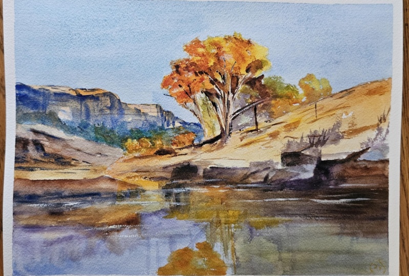
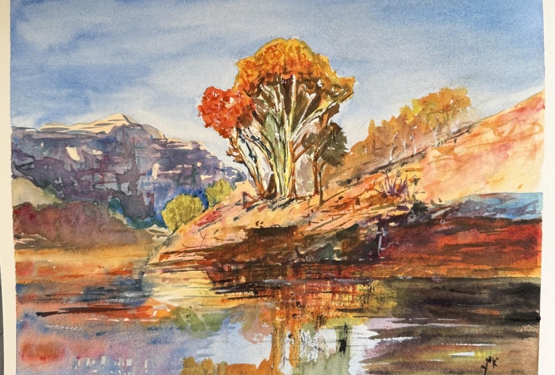
27. Final Thoughts: Welcome back and congratulations on completing this
countryside landscape. I hope you enjoyed painting this warm sunlit scene and found the process both
peaceful and rewarding. From building soft backgrounds to laying richer tones
in the foreground, we explored how light
and color can be used to shape mood and bring
depth to a natural scene. The quiet warmth of this setting makes it a versatile subject. Remember, watercolor painting is not just about technical skills, but also about expressing your creativity and
personal style. I encourage you to continue
exploring, experimenting, and pushing your
boundaries to create your own unique
watercolor masterpieces. As we come to the
end of this class, I hope you feel
more confident and comfortable with your
watercolor painting abilities. Practice is key when it comes
to improving your skills, so keep on painting
and experimenting. I want to express my gratitude for each and every one of you. Your passion for watercolor
painting is so inspiring, and I'm honored to
be your teacher. If you would like feedback on your painting, I'd
love to give it. So please share your painting in the student projects
gallery down below, and I'll be sure to respond. If you prefer, you can
share it on Instagram, tagging me at Will Elliston, as I would love to see it. Skillshare also loves
seeing my students work, so tag them as well
at Skillshare. After putting so
much effort into it, why not share your creation? If you have any questions
or comments about today's class or want any specific advice
related to watercolor, please reach out to me in
the discussion section. You can also let me
know about any subject, wildlife or scene you'd
like me to do a class on. If you found this class useful, I'd really appreciate
getting your feedback on it. Reading your reviews
fills my heart with joy and helps me create the best
experience for my students. Lastly, please click
the follow button Utop so you can follow
me on Skillshare. This means that you'll be
the first to know when I launch a new class
or post giveaways. Thank you for being here. I look forward to painting
with you again soon. Until then, Happy painting.
 Will Elliston, Award-Winning Watercolour Artist