Transcripts
1. Introduction: Hello everyone. Welcome to this class. I'm so excited to be with you here, and I'm going to be taking you through my process of artistic freedom. For me, art is something that inspired me to always keep on creating and give out or share a password me with the outside world. I'm also able to experimental nodes or see different concepts come into reality through taking on different materials and different projects. Just to ensure that I can always walk into ads or walk towards creating the vision that are working on. In this class, we are going to be going through all that, Luke creating a piece which is very special to me and that is going to be a landscape painting within the savanna region. So because I live in a Ruby era and in the African area, they tend to travel a lot in the region. And they can see a lot of the savanna elements which are very unique to the region and because of the color balances in the Defense, unique colors that come into this clip. And for this piece, we're going to be doing all that. We are going to be incorporating all that beauty into working on a final piece that I am so excited to share with you. I want you to join on in this class if you look into or if you're interested in exploring landscape art. But it's something that you've always wanted to work on. Also, if you appreciate the vast landscapes in that savanna region is very unique from painting in an ocean area. So we're gonna be exploring all that in. I'm going to share with you all my tips and experiences that have been formed, how I paint and create my final ices.
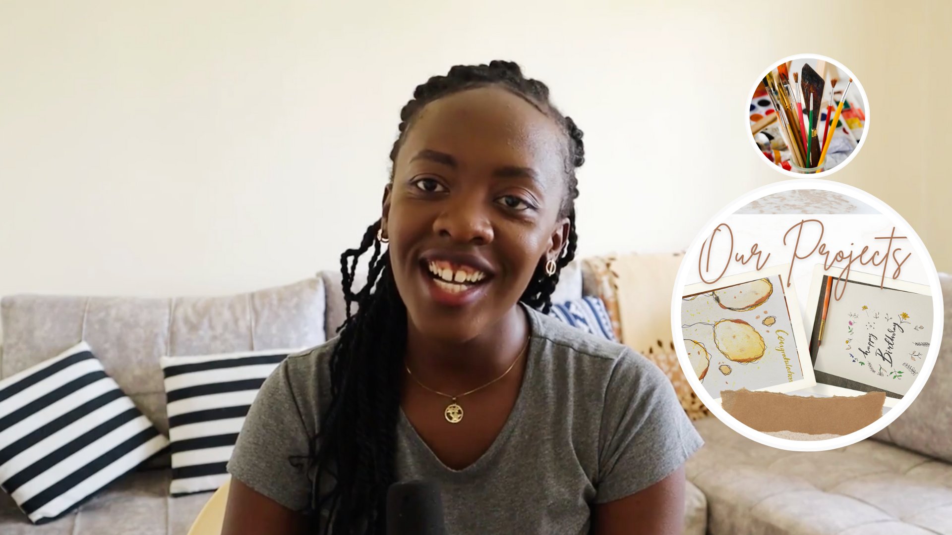
2. Your Class Project: For your project, yeah, we're gonna be working on creating something replicate, replicating the safety and the time laughter. So because the landscape within the region is kinda similar, we're going to be working on recreating that. You can take on new inferences from Nat Geo if you want to look into that or pictures online to just understand the diversity of the landscape era. And then we're going to be incorporating all lumped into your final piece, which I have incorporated into small projects that you can walk on during the processor does you're taking the class. So the final piece should be something that incorporates the savanna area. You can choose to leave out some of the elements or incorporate all the elements that I've worked on on this class. And I want you to show that in the project gallery below and just tell me what unique experience stood out for you.
3. Materials Needed: Welcome to this first block of the project that you're working on. So in this class, Bush and I'm going to be teaching you the materials we need for this project. And first of all, as you can see, 0s, we have the canvas right here, and I'm going to be using Canvas before. So this is prime p bar, which is 300, GSM, actually 290 Gibson. And I like this paper, any acrylic paper. So it is a bit more patent. Well, I'm going to be using Payne's. I prefer using this paper because it has better observability of the paint as compared to water color paper. Aside from that, I'm going to be using four different paint colors. So to start off, I'll use some black. I'll also use this is cadmium yellow. And aside from that, I'll use the titanium white and some cadmium red. In addition to that, I have some different impressions. So this is one of my bigger brushes and I have smaller brush, a detailed brush because we need that Nita on for the trees and adding some more dimension. So this is a 000, the two inch brush or two to crash. I also have a 0 brush, so you can just have that in hand. In addition to that, I'm also going to be using some black pens. So I'm going to be using this Sackler of the stumbled, sorry, the stumbled brush pen for the painting. Because I want to draw some better outlines for the trees. And finally, I have my my polychrome color pencils because I wanted to do some outline walk leader on. And for that, I'll use yellow MOSFET or the painting and you can use any color you want for this portion. The main reason I'm using the colors is to just provide me with a better final result of mixture that I get the result I want out of this painting from the stand. Aside from that, I have my area for mixing the paints, which is right here. I have already just point out some of the things that I'm into music. And we're ready to start.
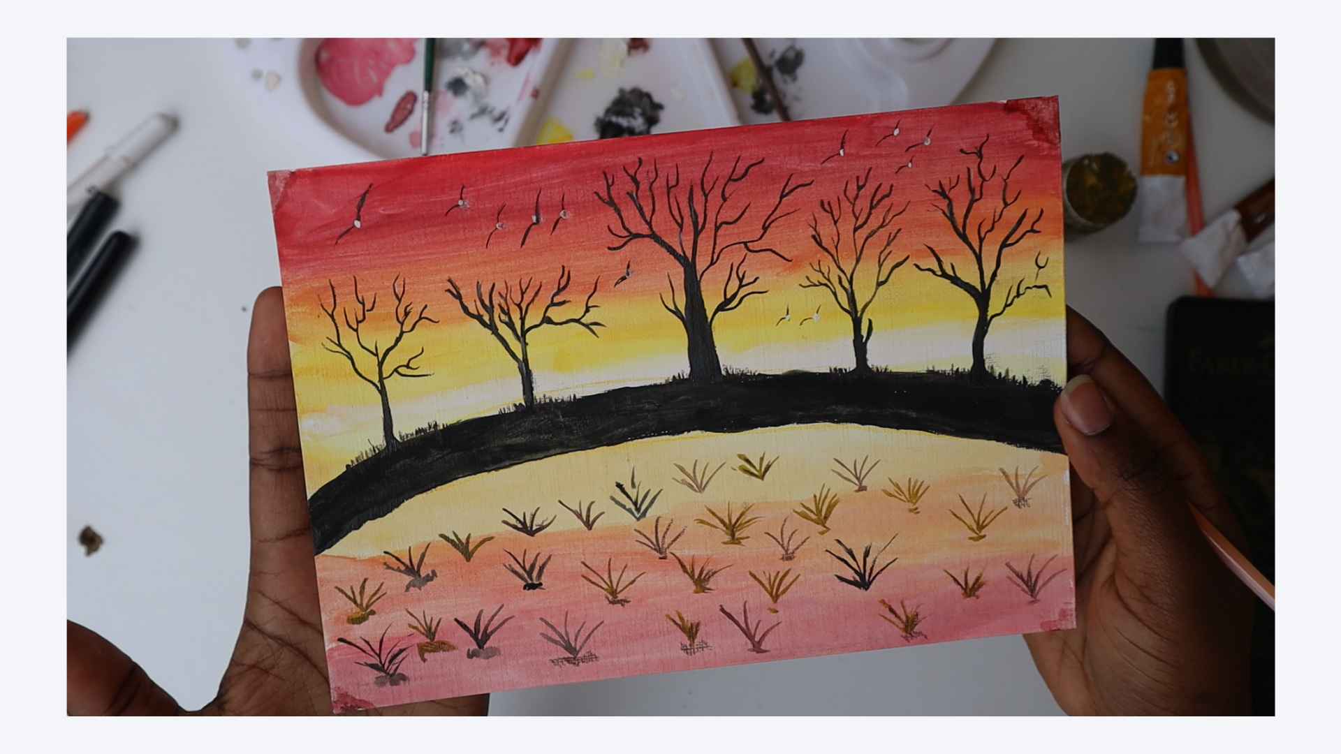
4. Color Mixing & Painting Layer 1: We're back with the painting being dry. And in this part, I'm going to be sharing with you how to create the outline. So for that, I'm going to use my Faber-Castell pencil as I had shared with you previously. And this spot, I'm going to lean on on the yellow color because it's the middlemost color. And I'm looking to create an outline within the middle area to just show the land, the land within the savanna. And then we're going to fill that in, in black and proceed after that. Let's draw a line out within the middlemost area and drew one at the bottom. So this, this should be curved lines. And the main reason I prefer to use colored pencils for this portion is just to ensure that I can eliminate errors. It's easier for me to create a more clear a piece of wax by using my color and later filling it out with ink rather than using my black pen initially or my black ink initially. So now I'm going to go in with my Tombow Fudenosuke brush pen and just fill out the black area. The outline of big parties? Likely following the initial line that I used. I don't have I'm not leaning more on a lot of perfection here. I just wanted to clear the outline and we'll fill it back in to now using some black paint. So we get a bigger brush. I'm going to use the site. So deep your brush and some water and tap that out as I am doing and then take on some black paint. And you're going to start with your father most. So the main reason we are using some plain water to just dip the brush is because the water mix the brush more easy to flow. It makes the paint easier to flow across the painting. And that works in your favor because you're able to cover the whole area rather than using the paint itself, which is more saturated with arguable, so able to eliminate any eras in terms of giving gap species was because the paint does not flow easily. I'm just going to wait out for this patch to dry out. I'm Linda, be still using my pencil or my black pen to draw it the cheese. Now, I'm going to drink cow trees on the upper portion to gestural, that cheesy hinder area, but also going to draw out some greenery within the front Monstera, which is the area and Yara you. So for now, just rinse out your brush. I'm doing right here with my water and just drag it out for use within the next year, even if we wouldn't be using this brush for now. And what I'm going to do before that, I'm going to fill in some bit more of this using my brush pen. Alternatively, you can use a Pentel brush pen as I'm using my tab.
5. Painting the Foreground: Part I: Okay, So in this past pot, I'm going to be taking you the color mixing process. And this is going to be very different from normal column mixing because this is a painting where we want some ingredients. I prefer to deep my color into the plane Calla and add in some accent. I'm rather than premix colors. So to start off, I'm just going to wet my colors which are ready in. So this is my red and my white and black and yellow that I had previously. So first off, you're going to want to create some gradients at the top, you want to have a lot of red color and a bit of black. So to do that, you just want to take on new red with your paint brush and just start off at the top with even with even brush strokes. So I prefer to do this on to just ensure that I'm getting the right color that I wanted for this, for this guy. And the main reason I should add that we're using red is because and the tone within the Savannah is more of a reflection of the lamp itself, so it's more orange. And we want to add that or creates that resemblance of color. And to this red color, I'm going to deepen into some black, just a little bit of black and add in some of the color into it. The main reason we're using black over just darkening this color is because I want to make the Red be a different tonal dread. You just want to wash your brush out through and just dip it again in the plane red to just even out the color that has appeared on the painting. And then once that's done, you want to take on a fresh yellow color. Because now the main reason I want some yellow is because I want it to blend into the orange, but into the red. But I'll start painting the yellow at the bottom part. So that's where I'll start off with the yellow because it's more yellow there rather than spread. I don't want it to mix seen earlier on with the rest of the painting. Another reason why you prefer to start off with the yellow at the end is because I'm a nerd, I'm going to be premix in missing that in later on with some other colors which it wouldn't be in this case will be some of the white color later on. So I want that to just make scene evenly and take that ONE into the red color to just create a better accent for the painting. So now to even things out, I'm going to take my other brush which is dry and just blend it all through. Don't worry about creating the perfect piece at this point in time. Because what we're going for is more of a sunset. Feel. The savanna in that has a mixture of colors in it. But the main thing is for the yellow, we're going to want to take on some plain white yellow now at this point and still pin lower part with some yellow. So just keep doing that. And then just for like an inch. And then now we're going to go in with some plain white. So another thing I want to do at this point in time is greens out my dry brush in, lend out and blend out my yellow into the orange color to just to ensure I have no whitespaces. What all these pieces are fully covered. Now we go. So that's entirely fine. At this point in time, I need some plain white color, so this should be fully white and I'm going to take on some fully white paint and just dip my brush into the paint after dipping it into some water. So just have some hands-on on the white paint and just create a line at the bottom of the loop. So this point up here very clearly initially, and that's entirely fine. The main thing we want here is the fact that we want to create an impression that this is coming through from the sky. So once the white color is in, just add a little bit more white. So the main reason I prefer to add some more white is because now in this case scenario is that they some bleed through in that I see some accent of pink or the red on top. And the main reason I want to just do that is to create an illusion that this is a point where the sun meets the land. And once that's done, you're going to go back in with your Yale of your yellow at the bottom part of the painting. And just blend that out lightly. Let's try and mix it into the right match. Instead the pure brush in some way to paint and add that into the top of the painting right here, as you can see what I'm doing. So the plain white should remain white. But to create some inability of the weight into the yellow, just add in some more white color at the top portion. And then once that's done, you're going to want to go ahead and add some orange, as we had done before. So at the bottom path, adding some orange color, jazzy model and in some orange color in few seconds. So you want the orange to continue on a bit more into the lower parts. The main reason B is eat provides like a good slow into the red at the bottom. So this is sort of reflection of what's occurring at the top. And then finally, we're going to go in with some red color and just start at the bottom area so that you can blend that into the top. As you remember, in the top posts. In the topmost portion, we adults read into it and we added some black into it. And that's the exact same thing that we're going to be doing here. Just lightly. To just even more, more of an illusion that this piece of land is closer to you, then the other area. Just wash that out and then now add in some yellow and red to just blend that through into the orange color. And once that's done, you're going to leave this out to dry so that it just has all the areas for the blended through. That theme that we want to add here is a foreground area. But we can only do that once the whole paint is blended crew. And I'm gonna do that through using a different brush, which is dry. Because it just works better.
6. Painting the Foreground: Part II: So in this first section we're just going to be going over how to draw out the tree. So I'm starting off with using my black pen by tumble. In later on I'm going to go and shift into using my my Pentel brush pen. I prefer to use a pen, as I mentioned, starting heart because it gives me more control of the painting and making sure that what I want to appear is actually what is shown within the painting. And that's ideal because you want to be able to manage the, the end result of the painting as you start off. So I'm going to show you a good example of using the pen within this past tree. And then we're going to use now the black ink, all the pins for this painting. I remember I'm using my gouache paints, but you could also just switch around and use some acrylic paint for this more. So if you walk into that bigger piece, I prefer to use acrylic paint for bigger pain teams, while for smaller paintings I prefer to use wash. So when you're drawing the tree, just remember to add in some accents through creating the impression of the branches. Remember my work? Or I could share that my walk leans more on impressionistic act rather than the realistic, realistic version of art pieces where I prefer to draw out the leaves. I don't prefer to draw the leaves. Instead, I prefer to just draw out the impression of the branches within the painting and the later on, just leave that out. Another thing is where it's within the Savannah Asia and we have a lot of acacia trees within this region. So bringing out there the full essence or just their identity through using impressionistic art is something that works best for me and is also ideal for anyone starting out because you don't have to lean more in having a lot of detail within the painting. And you also remember that this painting shows trees that are a bit distant from you. So it is not as important to bring out all the details of the CI. Rather just bring up the impression of the tree. Now moving on into using our paint, our normal paint for this section, I would want you to take your smaller brushes. So if you have a small, small favorite brush that would be ideal for this one, I'm going to try out using the zeros double 0 brush. And to start off, just take on some paint after dipping the brush in a little bit of water. These ensures that the paint can easily flow through. To just avoid the mistake that I have made within this fast Pasha and show you just dip it in a little bit of tissue. Some tissue paper. Lately to just dry out the excess water. This ensures that your pain does not smart or spread the white area or spread the water across their area where you don't want to be muscle if you're working with watercolor paper, because that tends to be more absorbing of the people of the water and paint as compared to the paper I'm using, which is acrylic and oil paper. I prefer to use this because it's just easier for me to manage and easier for me to correct any mistakes that have made. So when you're working with a brush, just correct any errors you've made through just and in one some more black. So for this case scenario of added, of increased this pan of the stem. Smallest stem, but now because of the era of contract, through increasing the width of the stem. So you can now also just use the brush to create the branches as you have seen in the previous string. So this will be a little bit less, less free-flowing as compared to the brush because sodium, so this will be a new list spread out because you want to just give, I'm printing the tree based on how you want there in general outline of the tree to appear. And remember, we're still going for impressionistic art here. So don't be too precious to be perfect with it. And we'll welcome to just bring in any mistakes. And I'm welcoming any questions that you may. Okay, Now in the sperm are going to be taking my pencil, sorry, my pen. And I'm going to draw a bigger tree because this is the middle arrow, the focal point. So I prefer to have a bigger tree in this area and prefer to use my pen also for this to just ensure that I have all the core details sorted out first, viola can go in and add more factors later on. Also just gives me more control, which is important for me when I'm working with creating an alkyne, which would be our focal point for the painting. So now in this part, I'm just going to go ahead and go up into the topmost status. I want this to be actually that standing out more than the others. And while I'm going to add a few more trees to the right side, I want this one to just be the point where the artist or the point where people viewing the piece will find the ad or find the most attractive point. Therefore, I have more focus on this area and I'm going to make it stand out more than the other areas would stand out. So once that's done, I'm now going to go in with my other pen. So this is my pentel pen and I'm going to fill out all the black areas with the color. I like to do this because this has a more consistent color frequency of compared to using the paint. As we've seen in some areas, the print leaves out some white spaces, which I don't want to be the case for this painting because it's going to be the one which is standing out more than the other pieces in the background. So I'm just going to use that to also bring on some more highlights through just creating some points. We fit branches and just make that stand out.
7. Adding Life: Painting the Trees: Okay, so now that we're back, I'm just going to be going over how to correct any errors. So now I'm just going to go over all the areas I had previously painted with my ink, with my brush through using my pencil because this is darker. And the main thing I want you to do is to increase the saturation of the colors or the areas where it's faded off when I was using a normal brush. And to do this, just go over it. You can also choose to use your brush. I'm in deep it with some deeper paint rather than use the pen. And for the next tree now I'm gonna go with my with my brush. As I mentioned, I'll show you how to use a brush. I prefer to use a smaller brush. For now I'm using a 0.02 brush or the number two because it has better Bristol. This is something which is software for me to use. N has a tight nib. So when I wet it doesn't really free or the school of two ie Police where I don't want the paint to go into and that's the type of brush you want to lean on when you're trying to do draw the trees in this area because it will capture all the details as you want in the way that you wanted to capture the details. Aside from that, just ensure that you give, give you a tree and Lato life. So that is by giving it a big stem and making sure that the areas which need to be thicker, thicker. So later on we're going to go over all these areas, adding in some more color to just create more distinction within the region. And that provides you with an opportunity to just correct any mistakes you'll have. And also just ensure that the color is as dark as you want it to be. And you can switch around as I am doing between my Pentel brush pen and the normal brush with some black paint. The main reason I wanted to switch around this is as I mentioned, when I'm walking with a smaller piece, it is easier for me to manage your time painting when I'm using a brush pen as compared to using a normal brash muscle, four colors which need some black. And if it needs black-white, why not? Why not? Yeah, so I'm just going to go over all the trees. And at this point in time, as you can see, I'm adding some some grass elements at the bottom. So you can do this using your brush pen. You can use your normal paintbrush because it will provide you with some more focused areas are more focal points within the piece. And when you zoom in, you can really see that it creates more attractive and more attractive to him to the painting, which is generally what you want for the peace and the end result and you're creating this piece. So now I'm just going to go in and add more detail using my brush. As I mentioned before, I tend to vary and provide alkyd good balance between the brush and depends because here we are working with black paint. So I can use my brush bends easily. But because of painted for a long period of time, it comes more easy. It is also just normal for me to use a normal paintbrush. Also just because I'm more used to that or I have more experience in that. So if you're trying to walk on this painting as you fast piece, just remember that when you study you off, it may be easier for you to use a normal a normal brush pen. But I also would advice for you to try out using the paint brushes because actually provide you with a good way to manage how paint flows across a painting, which is very important as you grow and learn within your creative journey and just explore the various options that we have available in exploring our creativity. So for this piece, I want to increase the thickness and also just some character to have the piece. And I'll do this through adding some more highlights on the cheese. This is an important element to just ensure that there's a good balance of there's a good balance of how the trees appear versus what I want my end result to be. And it is important for you to remember to add accents as you go along. You can also just go over all the areas that you feel needs some more dark tone. So that could be within the ground itself, which is the main dark area, or at some of the branches that may be faded off because of mainly using mainly using paintbrush. So if you then go over these areas, once the painting is dry, you'll be able to have a final piece that looks or is consistent with the savanna. And also one which provides a point where a viewer can see there is evident flow across the painting. So just walk on that, review your eras and then let's meet again or we're going over the next portion.
8. Adding Accents: Painting Birds: Now that the trees are fully finish, we're going to add more life into the painting. And I like to do this through adding some birds at the top. So I'm going to show you both options of using the brush and using the pen. So to start off, just take your brush. The brush that I'm still using is a 200 brush and dip it in a little bit of what I try that out then keep it clean, some paint as I'm doing right here. You can also just add in some water. So once you're pleased with the general level of paint within the painting, just used to like draw two lines which intersect in the middle, but are a bit inverted. Draw a new line. W, a WW letter, but a bit more flat to just create the impression of the bird. So that's my bird, right? That, and I'm going to just go back into my brush because it's just easier, easier for me to acquiesce. But in case it's not as ideal for you to use a brush. Remember, you can also just use a pens that you were using before. You can draw them as many bots as you want within the terrain. So I'm going to go in with the black color. And then we'll add on some white later on within the middle area. So these are the normal birds within savanna area, but I'm also just leaning more on the easiest but that we can use to just create an impression of some life within the painting. I love to do this a lot. I love to create a lot of bugs, to just create a more, more vibe tunes, or it's just that the accents for me. So I really love the buds. And then once you're done during all the buds, you want to draw, just take out or deep dry out your brush after cleaning it and get some white paint, some freshly paint. And deep which yo detailing brush. So for this one, I'm still going to use the same brush. But you can choose to use a smaller brush because we're leaning more in detail. Just take your brush, some paint at the topmost area as you can see right here. As you can see. So some paints. And so at the point where the two lines intersect two you can deep in the white paint. And that creates the identity over the bird. And That's really my theme that stands out. You can also just choose your brush. I'm going to add a bud right here. And in case you don't have white paint or you'd want to use our white pen, you feel free to do so. I prefer white paint because it doesn't blend into the black paint. And I can just create a drop of V2 and leave the impression of the bird. And once that's done, you're going to just leave out the painting as a team.
9. Adding the Grassland: So I'm going to go into my lower area and add in some more sense using still my black color. Or we have a lot of shrubs in the area. And I'm going to just create the impression of some shrubs within this lower portion. Still using my brush pen. But I'll also just use my my normal pen ink as you go along. So that's shop. Now I'm going to just switch back into my brush because we want to do that. We want to use the pen. We only use the brush as much as become. Another reason why it's good to use a brush for here is that it's a bit faster. Owing to the fact that they'll be more paint. And you can create more FECA lines at the bottom of the shrub as compared to just using normal. So remember to start off with the right-most area. I didn't do that for me, but they're going to correct that right now. And I'm just going to go in with a little bit of my khaki color. We seeing, I'm actually going to use what you've seen this pot, this top part because we just want to create their identity, all the dimension of the shrubs. And we don't need so much color for that. In truth, you just want to dry out your paint on your brush a little bit and just drought the shrubs again within this lower area. So I'm just going to dry that out a bit more because it has so much water on it. And using a V motion, you're going to just draw the shrubs across the different areas. So the main reason I started out with the black is because it's kinda similar to the green in that from a distance you can't really note that defense. But now that we're using the green, It's more outstanding or brighter. And we're just going to go across different areas. And I'm going to use five stems. Just draw out the area and then create a darker portion beneath the pad to just have more space for the tree for the shop. So you just going to do that across this whole area. You can just draw this out. Just kinda looks like some pineapple leaves. But don't worry about that. The brushes tend to look the same or the shrubs tend to look the same. And once we are done with the, using the Cauchy of a green color, I prefer using Cauchy rather than green because the shrubs tend to be more dried out and intrude, they're closer to brown rather than the two green. It's important to read for you to just be able to incorporate that within your painting. So once we're done with using this Cauchy kinda gonna go ahead and add in some accents using some brown, just a few more shrubs to just provide some more dimension to the piece, or a little bit of balance to the piece. As you can see, some of the green is really standing out now that we have more of that in contrast to the black, I prefer the combination of the colors because it's five painting. And also another reason why if we find a combination of colors is that there's not so much pressure to lean on and perfection rather insert, it's important for you to swap with what feels more inclined for you. And for me that's using some bit of different colors for this area. So remember to just dry out your brush after washing, cleaning in total the cookie deep between the means of the brown as I am just doing right here. And starting from, make sure your hands are dry and add in some of the brown as planned. So this will just ensure that there's more color within the piece and there's a balance. And you can also just choose to add in some more accents or at a few of this color, depending on your preference or your taste. This is just going to blend very easily within the other colors. Because so close to each other. And they are very wear lipstick of the actual terrain of the area. So this is an important step for you to just think of adding. So I think I'm pleased with what looks now the current to reign of beach right now. And at this point in time, which is going to go ahead and add more accents using the color pencils.
10. Adding Dimension & Character: So I'm just going to open up my color pencils. And first of all, the kinda that's really calling me is this dark brown color. I'm going to use this for the trees for sure. And I'm going to also balance that out with some meat, more of a brown. So as I could share with you, the colors I'm using here is Bond, OCHA and walnut brown here. And I'm going to start off with a walnut brown on some tree. So because the light is coming on from this side, I want to just add on some bright accents on some of the sides of the painting. This will not be as bright or a PEA as much as I would want them to appear. But we'll provide some good dimension for me who's seeing it more up close. And in case this doesn't appear as much as you'd want it to appear. You can choose to go in with some color, some brown color would work perfectly for this. For this portion. I just wanted to create some idea of some shadows and some light striking the painting. And we're going to use white actually to just blend that out. And then we'll display that out in a bit. So on some agents, I'm going to use the white on some of the branches to just create an illusion that the light is striking those areas of the tree. And as you can see, leaning more on some of these high-need areas on the top. And just doing it very lightly to just ensure that I can blend that into the brown that we've already added beneath. So you can also just choose to leave this out. If you choose to live it out. That's also entirely fine. I love the spot because it's a thing that provides more character for my trees. I'm going to just do it lightly also on this other side and add in some of the darker brown color into it to just blend that out and make that a softer shadow. So I'm just going to use this three colors in truth. In the main being ease the light provides an opportunity for you to just add more of the light striking the Asia in increase the shadow, hitting the era in blending some, some burnt umber into that and just make it softer. You can just do also just make those lines or be tada, me feel like I don't wanna do that with good reason also. And now in the final trees, then, now that that's done, we're going to just take in some of the green pen. So I'm going to be using my emerald green pen on this. Asia's where we added some of the, some of the branches or some of the sorry, I'm going to actually so I didn't like their parents. So the green, so instead I'm going to go with my daka, daka, daka brown color. This color, this is my walnut brown color. And just draw out some more scrap within that Asia. Just slightly increase the amount of lines. Or the idea of some, some grass within. This tends to reign across the entire piece or across MEA. All the tree is actually just lightly drawing some lines. So this will just provide me with an opportunity to make sure that My my my grass is more of a kinda that I'm more inclined to. And then now we're going to just go on into the lower portion. So this is a lower portion. I'm still using my my brown color will go dark and some other areas for all the trees, including the ones with GKE. So this color is really blending into the other. And the main reason being for me doing this is because there's dust in the area. So it's important for you to just incorporate that the rule, darkening some of the trees or just creating some sort of shadow. You can also choose to just add in some more of the branches using this approach or some of the shrubs very conscious to add some more shrub using this approach. Let's just try that here. And that works really well because it's so even, it's more even than using the brush in looks the same way as it would within the area. So we'll also just punish duck in the oil, provide more of a shadow for why the shrub is growing across the different shop. And that will generally be the highlight for me. I think I am pleased with the current appearance of the whole painting as far as it looks like now. And we can call this a complete piece. I really just appreciate all the accent. As you remember, we had glued some of the paper with some tape down at the edges, but I don't mind that a parents actually, you can choose to just add in some red color, which I'll just do right now. To just even that out at the end. Just deep some of the the brush in some red and black color. Lately, black color. Remember we mixed some black UPN and just added to the topmost area. This is going to look a little bit different, but it provides some option for you to finish the ash piece as you'd want it to appear in. I don't mind the lack of perfection you need. You can fool that. It's not as, even as you'd want it. You can choose to just lightly tap back out to some tissue because that we'll create some more Swiss for you to edit. I like how it's appearing so far. And this is all complete peace. Don't you love it? Then she loved the presence of the trees, the birds, the shadows within the plants that you've created within the foreground. And then the distance was the branches. And as you can see right here, there is some accent of some shadow as well as right here, which is just perfect for you to show some dimension within your painting. I really contrary to see what you're going to work with or what you're going to share with me. I'm so excited to have shared this and to share with me what you create within the project description. To begin the project calorie and reach out to me in case you have any questions.
11. Final thoughts: Thank you so much for taking this class. I am so excited that you are able to be part and parcel of understanding my experiences within the region. I believe that being able to explore art is something that provides you with an opportunity to take on your nanny, speak on your learnings and bring them out in every environment I country to see what you worked on. And thank you so much.
 Silvia Njoki, Creative, Artist & Marketer