Transcripts
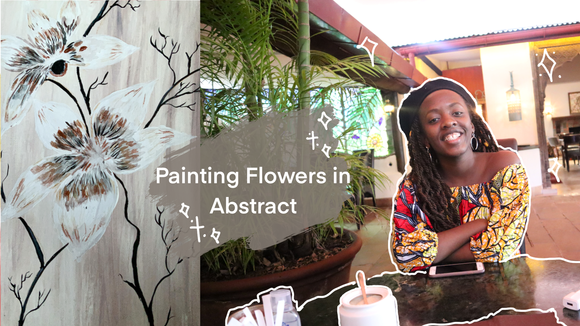
1. Introduction : Hello everyone,
Welcome to my class. My name is so
Venter key and I am an artist and illustrator
living here in Nairobi. And in this class are
going to be going over how to paint roses. So I'm going to be using an
abstract example right here. And I'm gonna be showing you my step two step process of how to create a beautiful rose can incorporate these key
steps where you recreate your same example or you similar thing that
you went to our coin. My main inspiration behind
artistry and painting is that it gives me a channel to shout my individuality,
we the world. It also gives me an opportunity
to explore options. Choose what I want to walk on, and also just be free because it's my own
art piece in the end. So I want you to
find your own why? Well, we'll walk you
through this painting and also understand your
main drivers of walking in the atomistic flow because
that will give you a lot of freedom and you'll be able
to explore so much more.
2. Your Class Project: In this portion
and we're going to be covering your class projects. So for this class project, I want you to recreate an rows using the same ideas are the same classes that I am. You can choose to use
different colors, but I want you to
recreate something and share it with me within
the project gallery. Also, share with me your
key points that you land over the process or difficulties that
you experienced. And we can see how we can
handle this as a Guangdong.
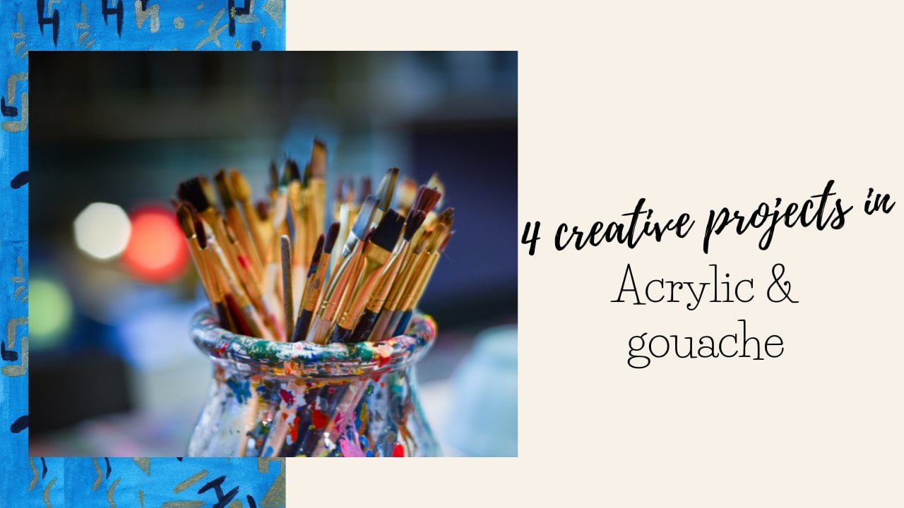
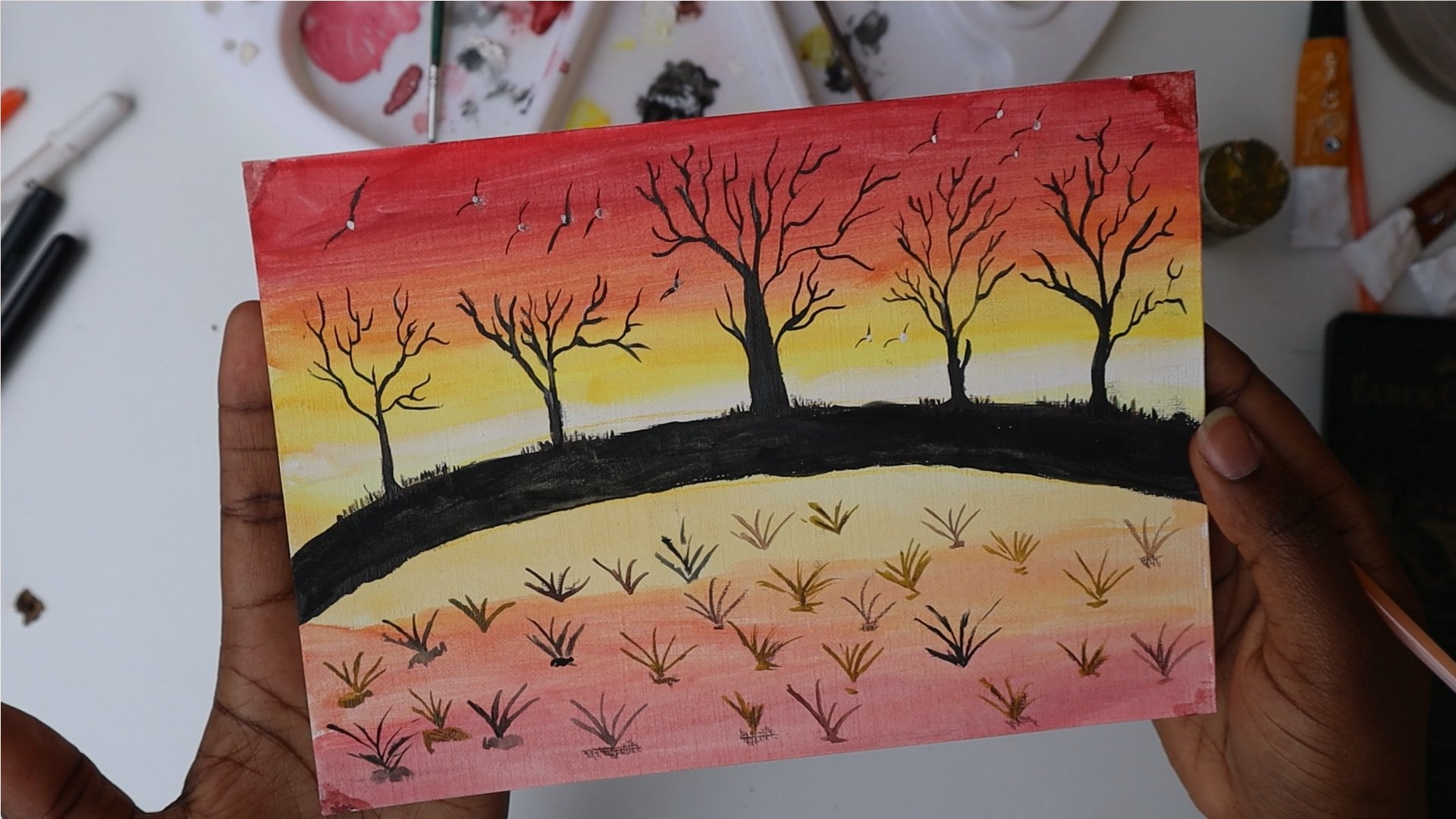
3. Materials needed: For this painting, we're going to go over the first things, which is a materials you'll need for the class. So first of all, I have my primed paper right here. This is cold pressed paper. And for this painting we're going on for something that's vertically shift are that's what every far for painting roses. And the main reason I do prefer this type of approach is because it gives me an opportunity to have longer stocks. So it is going to prepare up paint right here or paper and just sticking with it some of tape at the edges. Just use your normal paper that you use to beam. So for me I'm going to leave my cold pressed 290 Gerson people. So this is better for acrylic paint and oil beans. And I'm going to be using a combination of gouache and acrylic paint for some accents, for some balance. Because I like to combine my paint. Aside from that, you're going to need some burnt sienna. But here I'm going to use some, actually, you're going to need some burnt umber, some white paint aside from the lateral also going to need some black paint. And this is what we're going to primary use for the painting. And then we're also going to use, we're also going to, we're also going to use our Polykleitos most colors to just add accents along the end and have a couple of brushes on standby. To just spread the painting, spread that paint across the whole paper.
4. Adding the Base : So to start off, you want to just take some mixture of some white and brown paint. So I have my brown paint and my white paint 3D, but I'm just going to add I'm just going to add in some more white paint to my palette. And we're going to just lightly mix that enough to deepen our brush in some water. So take your brown paint as well as your white paint. And then just using upward stroke, spread the paint across the paper. You just want to lightly mix it freely using the brush itself rather than hand mixing the paint. And the main reason being is you want some exons of both colors coming out. We're not looking for an even brown tone. Instead, we're looking at For a balance of some sort of abstract accents into it. So take Cohen's white paint on one side of the brush and then some brown paint on the other side. And just spread that across the painting, all of the paper. As you can see, this is creating some good assets which I really like dopamine. If some areas at Dhaka actually, you went out with balance, which shows that you're using different colors. So it's entirely fine for the band, amber to show up on some areas in the white to show up reminding you and others because we want a good balance of the strikes that recruiting within the painting. So this provides me with a good background for the painting. It like this approach because it makes my, my flowers pop when I'm painting flowers. And it's something that gives me ease when using a plane rather than using a plain background. I know that there is a good balance of colors within my painting. And I love the, the accents of each color showing up. I'm just going to go over that tightly. We've rinsed brush to just even out some of the agents feel needs some more even 2ND. And then once that's done, you're gonna just want to review this paper out to dry out first. Mainly because you don't want the colors to seep through to their top layers. And then we're going to just tape it down again because it's popped off the tape. But just give it a minute or two to just to dry out fully. And then you can come back here and prepare the painting of the Druze.
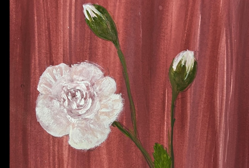
5. Sketching The Flowers : So now that we're back, I went to still go through the outlining process. So for me going to show, I'm going to be leaning more on the type of roses that I like to paint. And it's something that I've done before. So to do that, I'm going to be using my public Christmas colors. And the main reason I wanted to use a color pencil, and for this one I'm going to go with a white pencil just ensure that it's easy for me to correct is because I wanted to eliminate mistakes. Another thing is using a normal pencil gives you a graphite on your walk. And I don't like the graphite popping up because it always pops up. So you can choose to use white color or you can choose to use a brown color which is close to the background depending on which part of the painting, that painting. But I'm going to be using my white for this one because I think that will suffice. So what I'm gonna do is just the outlining process and I'll start just start off. We just drain out the flowers that I want. Actually, I'm going to switch that to the brown because that can't be seen teddy. So I just want to draw some roses. We are joining curly. And this is why I actually prefer to use a pencil to just miss, eliminate some mistakes. That's such a mistake that I've already just made right here. And the main reason I also prefer this is it gives me a good picture of how the end result should appear. And that's what you generally want in any process of art. Or you can also erase something. So I don't like how that has appeared so far, but I'm not going to be erasing it. I'm just going to color on top on the outline. And then I'm going to have another rule is right here, the top. Maybe I'm going with a little bit bigger than a needed for them to be, but don't mind if you make any mistakes. The good thing is, it's your painting and I'm just showing you my whole process because, and I like to include my mistakes because I tend to learn from the process. We're going to leave some space here for, for the bad, right here. And then we're going to have another rules, or another flower buds starting right there. So this is going to look a bit too complex part, going to edit it a bit. And no, mine the sketch looking very rough. And the thing is, I want to add is the stocks themselves. I want the stroke to be appearing right there. And I want the stroke for this rules to be just beneath. Going right above and around it? Yes. So generally, I think I'm ready with what I want it to look like. And for the stocks, it's okay for you, for you to just use a normal pen. But I'm going to lean more on the painting itself. N for this one, we're going to go with some mixture of white. So I'm going to use a lot of white for the painting. The main reason being is I want my rows to have, I want my rows to have a lot more white rather than the brown colors. So the brown is going to come in to just give it some, some more hue or the balance with the background. And for this, I'm going to go and use my two-point brush. So I have a few brushes right here. In to start off, I'm going to paint the background of the, of the process we fight. The main reason being I am going to use that highlight is because I want it to be the base of the color of the painting. And I'm going to use my white and to ensure that I have a good clear understanding of where all the roses are going to be. I like my sketch so far. I also just think that it's going to walk. It looks kinda message I temperature during which a really need to be careful of. But we're going to add some more accents as we go along. So to start off, I have my white right here, as you can see right here. And I have my paper towel just right next to eat. So just take on some white in after deepen your brush in paper and start off with the father's trues. So that's the one right here. Try and paint within the area. But you can also just go lightly outside to just ensure that you cover the whole area and note the color seep through. The good thing about this type of paintings is that you could always add in, you could always add in the lines later on using some of the pencils. If you don't like to use the brushes. But it will be great for you to learn how to use the brush is fully for the whole art piece. I prefer to just start off with the brushes and then later on just let the colors just blend in into each other. As you can see right here, the white is really just looking good. I have my first petal down and I'm going to go into the second. Remember to start off if you're left-handed, start off on this side. And if I write hundreds Stato form on the left side, start off on the left side to just prevent any okay. To just prevent any smudging of the paint with your hand. So that would be ideal for you to do. And remember, because we're just starting off on this painting right here. When we're painting normally it doesn't look like the end result will turn out great, but it does stress the process. I'm okay with this textures showing up. Also, remember we can use the color pencil to just correct whatever we made errors. If you feel like your brush is too big to, to use. For setting such as this point. Remember, you can always just choose a different brush for such details. So I'm just going over all the areas which have painted before. To make it more transparent. I actually make it make the color behind it not seep in. And so we're now going to go into the lower roses and just fill out the white again. Remember, I'm just doing an outline of high one, the whole painting to appear. So. So the main thing is I want the white to first sit through, through all the areas. And then I can go in with my accents and my additional colors to just give the painting more identity or just more of the viable wanted to have. So this is normally referred to as the color blocking era or the blocking phase because you're just putting in the base colors that you want. And remember for this painting we did a good background and treat background in truth. So now a color blocking some white, which will make the roses be white with some ground accents to just much with the background that we're going for. Don't worry if you make any errors within the process. Actually, you able, fully able to just make that turn into something beautiful for this petals, It's important for me to just ground yourself and know that interests the process. Sometimes you wonder whether the end result will appear the way you want it, but you can only know when you are at the end. And that's something that gives me comfort through just knowing it's okay for me to enjoy the process. So just at this point in time, just add in some more white through all the lower patent until you feel that they have the consistency and the color that you're going for. You can take and some as I have right there. Or just remember you can't make them thinner because the colors are AD underneath. So the only option if you want to fully correct the whole piece is to do it all over again, but you don't have to really do that. So I'm just going to put some lightweight within here because this is going to be area where the two, whether plants meeting, where the pedals are meeting. But we don't want it to be very thick with color as compared to the other areas. Final wash of color. And then we're ready to go into the next part. Don't mind too much about it being perfect. We're going to correct everything, even case. You feel like you've made an error. I love how it looks so far. I'm just going to and I'm going to continue on to the next portion. Now.
6. Outlining the Flowers: So one of the things that I want to add in right here is the bark of the tree. And that's this lower portion. So I'm just going to go over that because this is not a very clear color depiction at the bottom with DACA brush with a darker pen just right here to give me a better outline of where I want the bird to appear in what the next color will be. So this will be a dukkha bad. And then we'll add in some white accents. And we can choose to correct this color group. Removing it or adding a different roles owl choose to add talk right there and just connecting into this stock. Just add that as I go along. So remember not to be afraid of mistakes as I have corrected this one. Remember you can also just correct retrieval you've done. And now this point in time, I'm just washing out my brush and cleaning out it. Cleaning it out fully with some clean water. You want it to be fully clean because in as much as we wouldn't use it, the same density of the brush within the next stage, it would be important to have it on standby in case we need the same brush. So now I'm going into using my smaller brushes and I'm looking for one which works well. And I'm gonna go with this one. This is a bit smaller than the previous one that I was using, as you can see right here. This works better for a little bit more detail. And I'm living out my painting to dry for a bit. And then we'll come back and just add in some accents. Also, just remember you can entry some of the areas. I'm going to try and do that to just make sure that I'm having what I want as the end result. Okay, So now back in, what I want you to do is just remember your previous color which use which is a band amber, and have that ready. So I'm going to put that right here. And a little bit of black as well. Because we're going to be creating some accidents. Are going to be creating some accents with painting. We're going to use mainly some brown and some black. Later on we're going to go back with color pencils and just add in some more highlights as we see feet At this point in time. But generally like to have a good understanding of what I'm working with. So as we can see, it's important for you to have to just clear out the space. So for me, I'm just going to correct these areas by erasing the previous column max that I had added. Which Dean walk with my end result that I want. That's going to lightly show up, but have no problem with that. The good thing about color pencils is it's always able, you always able to correct it. Another thing is we have different areas within the painting. As you can see. We have some white and some tips, which I want to add some white to. So I have two options right here. I have my Gelly Roll sacra pencil, which I can choose to increase or just add in the color. As you can see right here. That's just faster. But I prefer to go in with some white paint and just keep that in with your smaller brush and just lightly. Sure that all the areas that you wanted to have, the white-collar have the white color in the way that you want it to be. So if you want the petals to be shap at the edge, this is a point to go in with your detailing brush and just make sure that the whole base color is the way you want it to be. Yeah. In case you feel like you also want all the brown color which we used underneath to not appear. You can also go over the outline of the painting to just ensure that that whole Kali is at the background rather than the foreground of the painting as I am right here. So do this with light strokes with a good brush. And it shouldn't pose a challenge for you. For you to finish the same. Just remember to wet your brush appropriately so that it's even for you. The paint can move evenly across the whole area. And once that's done, you can clean out detailing brush because we're going to use the same brush for the accent. And we're going to be adding into the painting. Okay. So now that that's done, I'm just going to clean out your brush and then start out the details.
7. Painting the Petals: I'll start off adding the accent. And what I'm going to do is start off still on the rightmost era. And for the colors within our rules, it's important for you to add the accents within the middle area. The main reason being the light shines on the outer area. It therefore, the most eras with the accents can be the place where this more forecast for the painting. So for this one I'm going to use my burnt umber. And we're going to just lightly start with the color actually premixed when we're creating the background of the painting. And I'm going to just tap out a bit of that in startled with a light stroke. So we're going to use strokes for this painting, actually a light line just like that. We seen the area. And the main reason being is we want each to just show the direction that the petrol or the flower is going. And then quickly just drag that out and try and blend that into the middle barrier. And don't worry too much about turning out graphically at this point in time. Remember, the thing that we want is to just ensure that the flowability of the paint. Another thing that we want right here is to ensure that we are creating an impression that this is a petal, leave a lot of color on it. And now I'm going to go in with a bit of black, just some light accent of black color. And I'm going to actually just drag all of that out and go in on the inner side and add in some more of the black color lightly and just blend that into the brown. For the best result, the block should be completely diluted to just ensure that it can blend out. And then on the high areas, that's where you want a bit less diluted colors. Use some light strokes as well. Some parallel lines for me as I'm walking into this type of way to just ensure that it shows the direction and also just provides you with a way to just blend the colors with the background of the rules. So here the main thing we want is for the white petals shout. But as we come into the middle, we want to create a good outline for the rows. And we're gonna do that through the brand color, a mixture of some brown and some black. So electric do this because it separates each petal from the others. As you can see now somebody can clearly identify that this area is a bit more darker. And in as much as it may look very strong initially was just going to go along with it and add in some more of that accent on top of the previous color that reaches blend it in. There we go. Yeah. And then now we can go on into the next choice right here and repeat the same thing. In this scenario, we're going to have a longer brown color. So making sure that you start off with some brown, slightly diluted with somewhat up to just ensure that each can flow. Remember to also just basically outline the rose petals. The same color to just show the end of the petals of each petal, as you can see below. And then we're going to now start off from the most, mixing your brown in some black, lightly. Add in some water. And then you can write that out using our feast paper towel right here. And starting in from the enamel stereo, going to paint some strokes. Paint light the outwards. So the main reason I prefer to use strokes for this area is because it ensures I can blend out the colors, like as you can see right here, easier. And make sure that you blend out the colors within the same approach by using the strokes rather than leaving out some had tunes or just leaving out the color as it is. So blending it will ensure that you can easily add on a color on top, like the brown that I'm adding in right now. So now we'll add in some some brown accents right around every this areas. To just make the rules be more more. Show that the roses coming into the middle. And at this point in time, remember this is the bad area, and I want that to be in the lightest hue of brown. So to some brown color. As you can see right here, we're going to add in some white, taking some white-collar, taking some white color right here, and iodine into this brown and dip it in some water to just blend it easier, then we're going to add that into the most middle section, which is right here. And that's going to provide a good balance because it's not the same brown that you use or the same weight, but rather it's a brown color. And we're going to use that to actually add the accents now at the top of the flower or the sides of the flower to just make sure that the file, rather than white, appears to have a brown tone on it. So keep doing that across the flyer on different areas, fully in the flow of the flower, in an outward motion on that area. And don't worry in case it looks as if it's not very appear like it's not very bright initially, it's going to blend out into the other colors and do the same thing for the other petal at the top. Then go back in with a brown color and black color to just add in accents at the bottom where the petal meets the bad. Remember to add some brown accent, some plain brown accents. To just ensure that there is some flow. Also that somebody can see where the petal is ending. And remember to add in some brown right here on different areas to just ensure that there is more flow of the different colors in the brown also act as a edge of the rows. So in some areas where you want to distinguish the two roses, it's good for you to just do that. Adding the colors because it shows a shadow. So like at this point right here, I want to show a shadow between these two pedal. And we're gonna do that through adding some brown black at the back, just as you can see. And then that bring, bringing that into the middle because that is the shadow of the rules. And you don't want that to appear on the front area. Then we can go in and just add in some brown accents. Again. Remember to lightly tap you pen, you brush to just eliminate any errors as I have made right here. And at this point in time, you're going to just blend out the brown that you've added with some black. With a black bean at the most Middle Asia, with the lighter colors extend out hoods. So because we want a badge to appear here in the middle, we're going to go in with some plain black color. This is going to be the darkest area of the petrol. So just going to go in with some plain black. And then we'll draw an outline of waiting the other colors. And as you can see now, of rows is really forming now because you've been able to really blend out the colors and also just provide some highlights through adding the black and the brown. But in this middle area, I want to just change that a bit through adding some plain white to this white Asia. So we're going to just go back with some plain white color on this pusher. And to do that quickly, I'm going to go in with my pen. Main principle. So taking some plain white again, so don't mix this with any color. You just want it to be fully white. And with your brush, don't worry about tax citizens. As I have done some accidents right here already. Well, we'll be able to correct those anyway. So take on some of your way to paint right here. Just dip your brush in some clean water, fully clean water. And then dry it out and take some white to paint on this area. Just make sure that it's fully white because it's a transition between the petals. And you just want that to appear as white. Then you can blend the white into the brown colors and the black colors now. So, so that will make the bad pop. And now we're going to outline the body some more light at the bottom area. And that's our current on the plant. And I think now we can add in some accents using the pencils. So I'm just going to leave that out to dry a bit and then we're going to continue on to the plant and repeat the same thing. So just deep in some brown as I had shown you before. And remember to start off with the father strike area and draw in some of the color using some light strokes towards the center. Because the center is a bit darker. Then with that deep in some black. And just blend that out. Add that into the lower area. So without washing your brush out. So that provides a good way for the paint to blend into the other color. And also just ensures that there is no hard line in between the two areas. And repeat the same thing for the other roses. So for this other roses, because this is more round for this side, you're going to use this small shot on this one, this type of motion. So you're going to paint strokes towards the center. Using from this side. From this side you're gonna do the opposite stain. This is to just show because a petrol is COPD. So we're going to make that be very visible. Then we can blend that out into each other. Like lead through, just adding in some B24. And this just ensures that there is a clear flow of how the painting is progressing over the brushes, the brush strokes to ads, and differentiates each petal from the others as well. So I'm just going to use the underlying brown for each petal and this point. And then we'll add in some more color later so that they don't have to repeat the same thing for the other pedal. Remember, you can add in some more water if you want the colors to really blend easily into each other as I have right here. And add in some more color to make some areas a bit darker rather than lighter. So now that that's base color is done, we're just going to go in with some black and add that across the three different petals. So just that dry that out to prevent any color being too much as it has been in my case. So remember, use this motion on the side of the painting in the saddle and on this other side, for the most middle area, I want to go in with some light haze of brown to just show that the petals are because that's the darkest area. You want to still make sure that the colors are really blending into each other, but it's not block really black area. So you want to just go in with some accents of brown and some black, but don't make the whole area dark. So just blend that brown color out and within the area and add, remember we added in some white. And just make sure that the strokes are able to differentiate all the strokes you use. Say for instance, right here. Adding some brown right here will show that this is the petal that I'm painting. In the same case goes for adding some brown on each petal at the edge of each petal. So now that that portion of the work is done, we're going to add in some, some light haze of mixed who, some less hands of white and brown into the painting. So it's just gonna deep your brush in some one patch, white, three-part one, sorry. One part brown, three paths white to just create some light His of Brown within this color as you can see right here. So in the same way this color shows. So once you've made this color, we're just going to add it to this top areas. And just going to make the color be the rose, be more brown, light brown at the top and blending into the white area within the middle era. And we're just going to go around the whole painting. As you can see right here as I am nightmare doing. And then we're going to just leave that out to dry first so that we can come back and add in some more oxygens. And for you to see more clearly what so this is what we've done, we've added. So there's some brown, light brown right here, some white, and that's what I want. I'm going for so some brown and then we're now going to add in the accents, Lita.
8. Adding the Stalks: So at this point in time, I'm going to go in with my pen. As you remember, we're going to use a combination. As you remember, we're going to use a combination of some pen to draw the stocks. I'm going with some black stocks for these petals right here. And then now we're going as the painting dries are going to add in some more oxygens to make the colors of the flowers pop out. Pop out using pencils and some pen. So starting off, in this case at the topmost area, we're going to use the outline I initially drew. And you can choose to use a black pen, right hair or black paint. But I prefer pen for this work because it's easy for me to manage. So if you're going to paint within this middle area, put your thumb on one of the most dry areas in bitchy of last finger or your pinky. In, draw out the line. In this go over all the areas where you went to this line to be the stock to be for the plant. So this is my ration of the stock is just holding on into different areas. Remember this is impressionistic art. And that is how the stock is going to be. And now I just wanted to go over all the dark areas in dark in them a bit more. So I'm just going to darken this, this circle right here for the BOD and add in some, like some light branches right here. Remember you can do that across, everywhere to just make your painting pop out a bit more. This is the part I really just enjoy and really loved doing. Mix the paint, painting up here that this is some spikes of the tree for the rows. Some thorns. Yeah. So this has some thoughts for me and in my opinion, and I'm just going to draw them out across the whole stock to just give it to some more character. And within areas where I feel would work will ensure that this mall drive towards a painting. More dimension and more character. Yeah. So this adds for me the character of the painting. And it's such a simple approach and just gives it some more blue to some extent. And now that that part of the stock is down, we're gonna go back into the painting itself or the roses. And we're just going to add in some bit more black using this pen within some areas. And this is to just insinuate the fact that that is some darkness. So while the black is while the black paint is really popping, it's not as bright or not as dark as I wanted it to be. So we're gonna go with some light strokes, don't we're in, in case you make any mistakes right here. This is the thing that just makes the painting pop more and it's very important for me. So just do that if you'd like it.
9. Adding Accents Using Colors & Metallics : Once you're done using the blank, I'm just add in some more black on the lower petals to just give it more outstanding, less in, in terms of the black luxury blended in is not as bright as I'd want you to be. And because it's blended in I12 stroke, so black to appear on each petal. So using lightly do that as I'm doing, remember to follow the shape of the plant, I'm sorry, the shape of the flower. To just give it some more direction in the way you working in. And once that's done, you can now moving into the other color. So for me I'm going to be taking on my smaller brush and going back in with some clean white. I'm just deep fat after dipping into two somewhat IN writing that out, dip it into some clean white. And I'm going to just go over all the sharp points, which I want to stand out a bit more like right there. Also at the top right here. So some of these areas are not as bright as I want them to be. And I'm just going to go over that. Aside from that, I'm going to add some highlights onto the branches using some white at the edge. This is different for me in that it just gives it some more corrupt. I'll just makes it more my own end lightly blend that out into just create more of a shadow effect rather than a hard white color to make a gray color. Do that for the different strokes. So I'm gonna do that for this one right here. And then I'm going to just blend it out. As you can see, there's some white right there and I'm going to blend it out across the whole stop. Just create some great tune. Okay? Which just shows the reflection of light as well as the brush doing the same thing on the bottom area. To just make the painting up here more, more like my own. But you could also choose to just leave out this white and go in with some brown. I prefer the white for me, and I tend to do some brown with some pencil instead rather than the white paint, rather than using some brown paint actually. So once that's done, I'm just going to add some bit more dots. So once I'm rotating effect on some of my petals, are we added some more brown to just make it more, provide more dimension right there. As you can see, they like better balance of color. Rather than a hard. It just provides with me to have some better color balance. And I like their parents of having some more white hours or more accents on it. But you don't want to overdo this and I think that I'm a vote should just overdo it. So we're going to stop right here. And now I'm going to go in. I'm going to stop now. And now I'm going to go in with my pencil, my color pencils, and all the color options I have. I'm going to use this brown color for the for me to just add some more color, some more brown accents within the rules itself. So this is the initial brown color we used before. And I'm just going to zoom that in for you to see that, that it's creating. It's more of a lighter background rather than a D21. So it provides a good balance for me to show that there may be points where the light is hitting more. So it's a lighter brown rather than the darker brown color which will appear on such areas. Another thing that is coming off from doing this is that this a bit more flow of the colors? In that it appears like to my, my petals have some. Different colored tones of brown showing up on it lightly. Remember to just do it lightly because you don't want to stand out too much. And in case you don't like this color, you can always leave that out. And finally now I'm going to go in with my white and just perfect those as well. I wanted some more white to appear or just accentuate the white areas. And then we'll have a complete one. So within this area, I'm going to just correct that actually use in some paint, we're going to dip that normal brash intercept paint in the outline this. But once more, to just make it be more realistic. Now that it's standing out my preferred, it's apparent and I think to prevent more era on this painting or just ensure that I don't overwork the piece. It's important for me to know the end and I think I love how the painting has appeared now, I'm just going to show this up-close for you. So as you can see, petals are really bright, allow the balance between the brown and the darker browns. I also love the appearance of the white blended out into the stocks. The stocks have burglary brought in some good dimension for me. I'm going to add in some more tapered effect. Some more of a thorn. In fact, right here. I think that's the thing that's missing for me. So I'm so excited for me to have shared this experience with you. I really love just creating and without any hindrance or just feeling like I am having a creative blocked. So this is a good painting for you to try. When you're just starting out. I know that you may wonder whether you have to color blend everything. That's actually something that I struggled with initially when I was setting off on my painting journey. It's not very common for you to find artists choosing some headlines or some lack of blending within some areas or using the abstract background. So having this unique identity for me or just bringing out is painting in this type of waveform. Me just gives me a lot of freedom and I'm so excited to have shared it to be q. I want you to show what you've worked on with me within the project gallery below. And I can't wait to see what you've come up with. And also in case you have any questions or struggled to treat this beautiful piece within the the abstract background, just share your concerns or your questions with B. Remember you don't have to use the same brown. You could also have a gray background instead of a black wine, with the trees being the same color, or you can choose to have them. The petals have the same color with a different background entirely. Just feel free to try out and experiment as you wish. And remember, you can always add some accents as I am doing. As you see fit with a painting. Don't feel restricted as I was initially to just use one medium which was a paint brushes. You can always just add in some more things. You can choose some brushes. You can also choose to add some more dimension using inks. Feel that you want to also just use something entirely different that is entirely up to you. I'm just going to change this up a bit. I really loved doing that. Actually. This looks more negative area. And this this is just like one of my final thoughts intrude. You can always fill in the negative spaces. It should feel like it's too big or it's standing out too much. You can always just change that up. Just as I have right here. Don't feel restricted or bound to having one approach of doing things. All is your painting. Remember you can always choose to add in some more accents as you go along with me. I have some metallic paints. Here with me. I have some metallic paints and you could choose to add in, actually, I'm going to add in some metallic paints. So one of my random ideas now is to add in some metallic pins, which is very new. I had no plan previously to do this. And this is for me to just provide more reflection on my petals. So some realism, some Impressionism. You can always choose to have whatever works for you. This is really working well with the brown colors are added underneath. And we'll provide some good reflective tone for me as I go along with the painting. So I'm just going to add that across everywhere. I'm using my red be my paint set for metallics. This is our kinda set or metallic set. Our really love how that's turning out. Zoom back in Iowa, how this is turning out. You can choose any colors. I am not going to go with a gold. I'm going to go with this darker colors which walk more with a color palette that had initially chosen. So remember, you can freely experiment this as I am right here and add in something that's different from what you've added before. This is a beauty of working with abstract art is that you can do exactly anything that you wanted to try out. Um, another thing, even if it's not abstract at this, that gets your own app please. So feel, Feel free to completely add anything accents that WACC for you or colors that work for you. And all of this looks just so beautiful now that I've added that in. And as you can see this such a beautiful reflective tone, which is so unique to this piece and only comes in through adding that hint of color from the from the metallic paints. Just struggling with that in the middle air. To just make that pop a bit more. I love it, I love, I love how this is going to turn out. I tend not to add a lot of these colors when I'm walking with the pieces. Because previously I felt a bit like this, a book, there's a guidebook that they need to follow, but now I'm finding that I am free to create my ad as I please. It's my, it's at, that's for me also. So just doing that or feeling free to do anything is something that's so important because it makes you feel free to experiment and just bring out at pieces in the way that just is unique to you. And that's why we love to see it, because it's unique to an individual. And we're able to just see what they're thinking, what they're experiencing within different times and what more beautiful than that. So adjusting, adding some of this, some of this dark colors into my petals. And I think that's going to be it. Now. I don't want to add anything more. That comes a time where you need to stop. And I think I found my stub zone. So this is a final Luke with the painting. All, this is so beautiful. I think this is so beautiful. I would want to see what you recreate some abstract art with some roses. And I want you to trim something similar to this.
10. Final Thoughts: Finally, we've come to
the end of this class. I am so excited to have to
achieve this while I'm, it was a good procedure for
me to just go over how to recreate something
experiencing challenges and adapt by adding y and z, the metallic elements
that they added in. I think every
atropine is unique, even when you read, try and recreate the same thing twice. You kept, you come up with two different things in some
cases because you're able to incorporate a bit more as you go along and also able to challenge yourself to be to taking on some elements that
you may not recall. If you feel like copying the CMT or doing the same
thing you did the first time. So I'm excited to see your
project and I look forward to understanding what you really appreciated
about this class. And that's it. Thank you so much.
 Silvia Njoki, Creative, Artist & Marketer